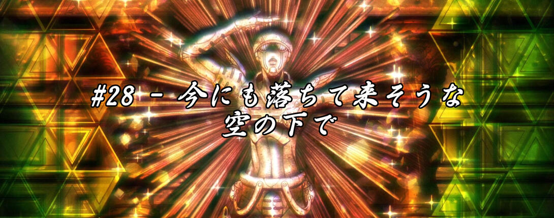
Hello hello, friends! Welcome back. We are here today to pay our respects to a fallen ally and friend… And also to see how much better the episode that depicts his death has been made in the Bluray version! In other words - it’s time to take a look at Vento Aureo #28, “Beneath a Looming Sky” (non-literal translation)!
Let’s go (get killed in Sardinia)!
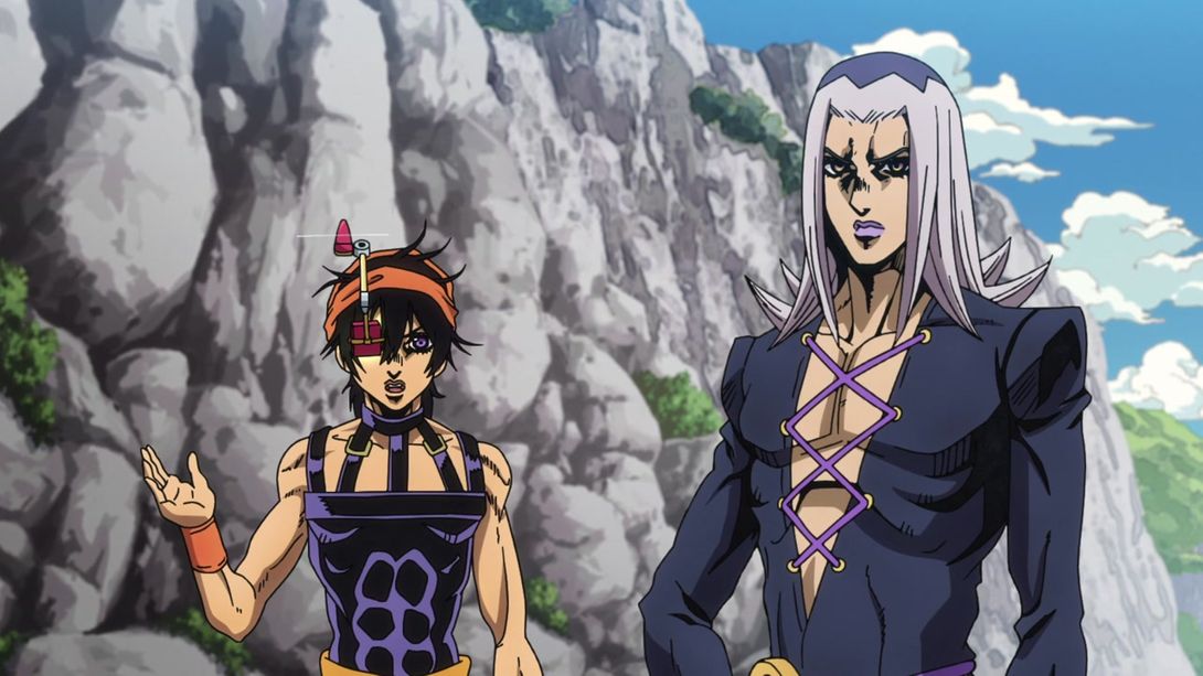
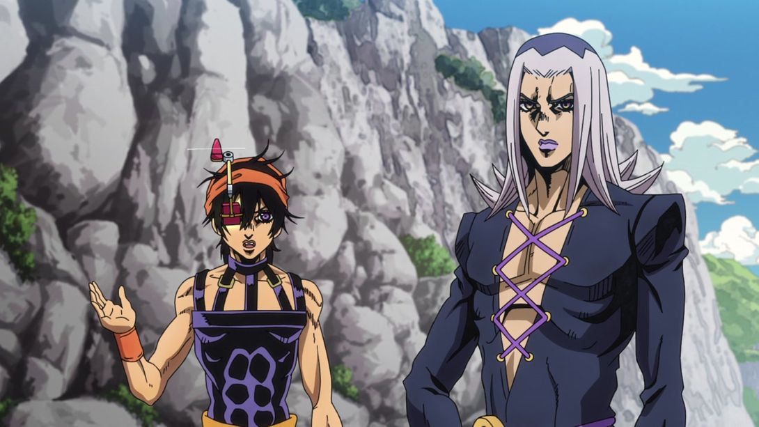
- Today’s first difference is this scene, in which both Narancia and Abbacchio are drawn with sliiightly thinner lines:
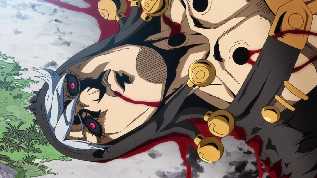
- Risotto’s blood is darker and more textured, here:

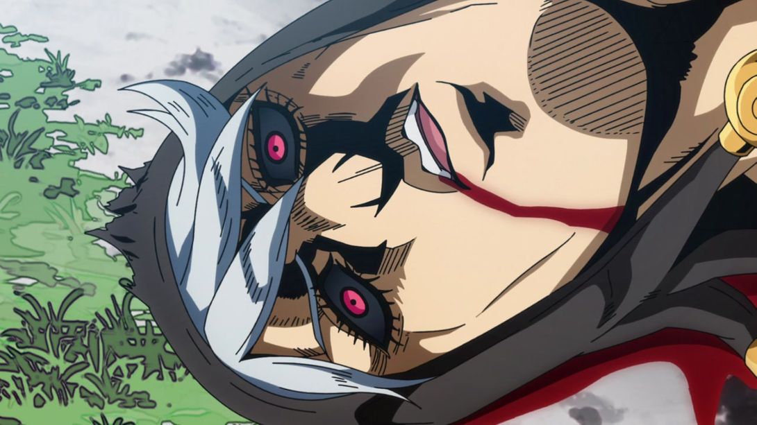
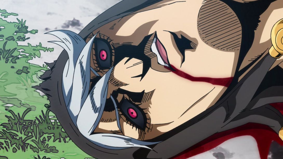
- The blood is looking less flat here too, and in addition most lines on Doppio are thicker and the bottom-right of the frame is darker:
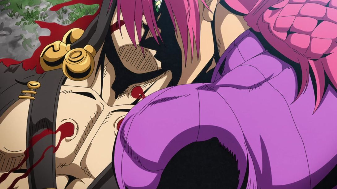
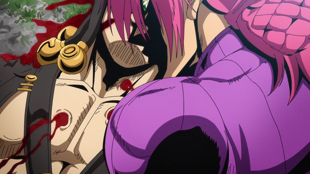
- This Aerosmith pew pew shooty scene is, as usual, brighter…:
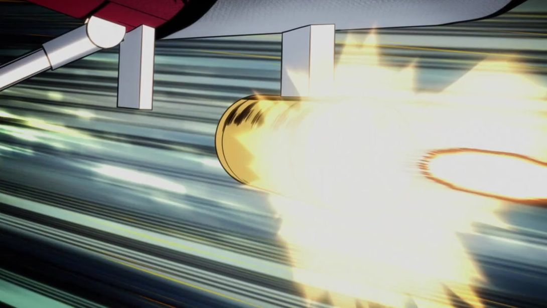
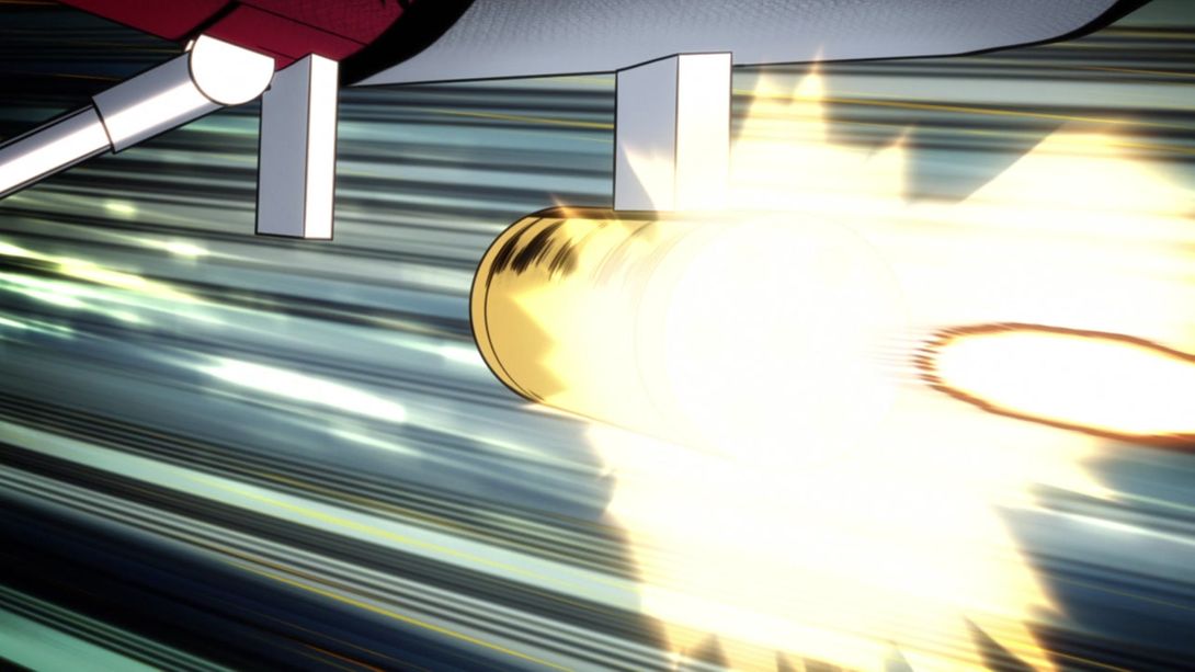
- In this creepy shot of Doppio, the sun is no longer shining behind his hair…:
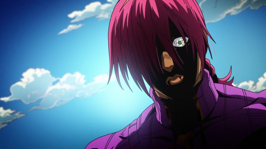
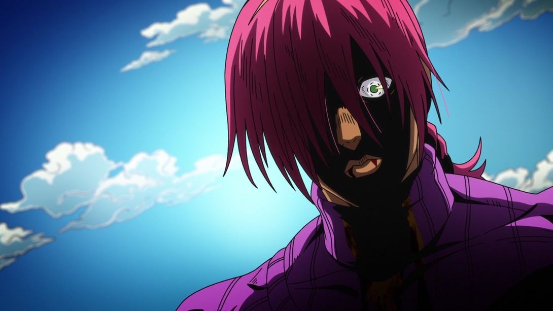
- …And later, when King Crimson shows up, the aura has been moved from the stand to the stand user (along with the relative pink-ish softer shading):
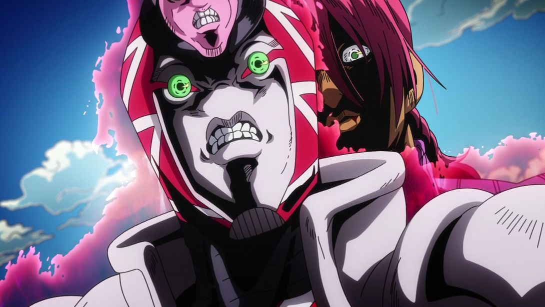
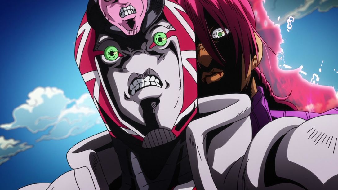
- In the TV version of this shot, Aerosmith’s propeller sort of… detached itself from the stand as the camera zoomed out; this has been fixed in the BDs:
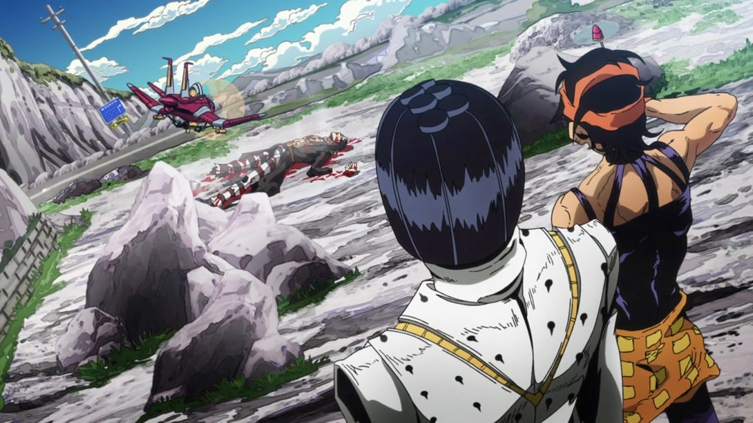

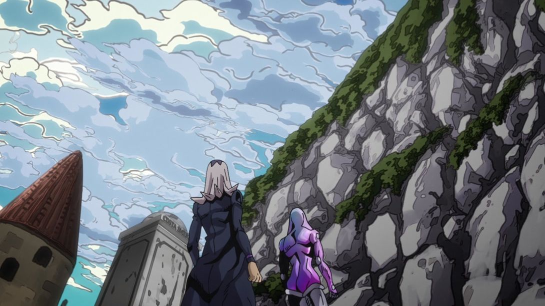
- A bunch of clouds are no longer semi-transparent, here:
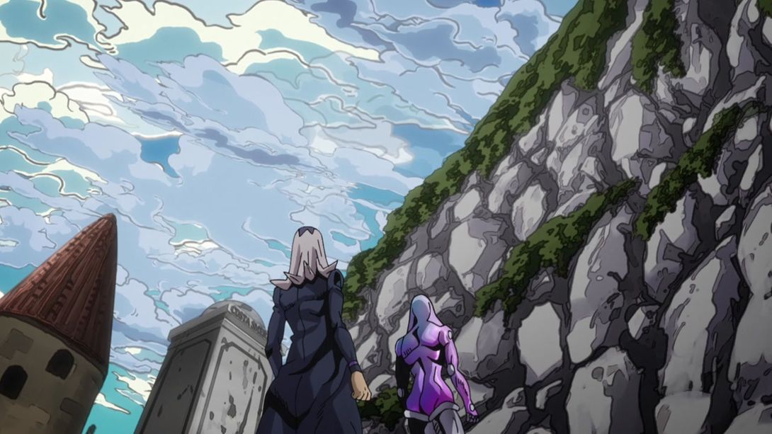
- Aerosmith’s radar is showing one less blip, here…:
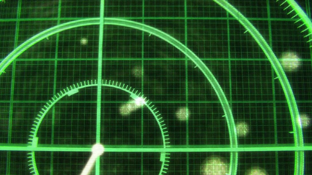
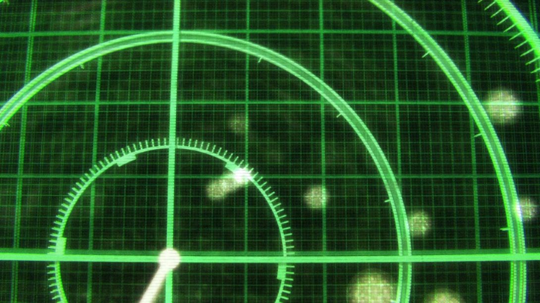
- In this shot, Narancia has taken out his Aerosmith:
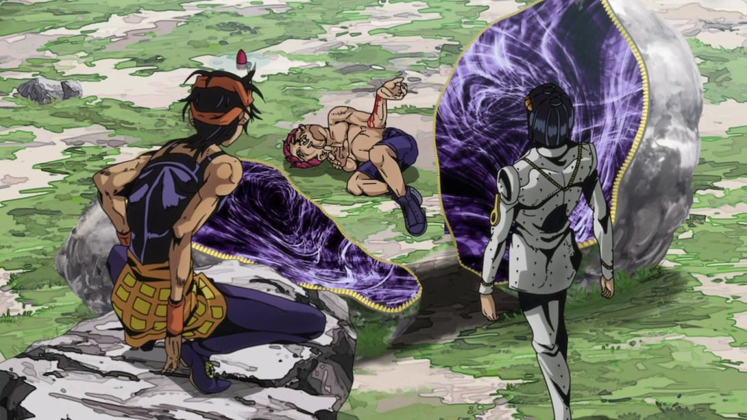
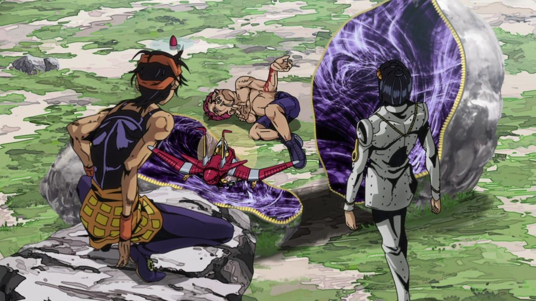
- Let’s take a look at the usual eyecatch, friends:
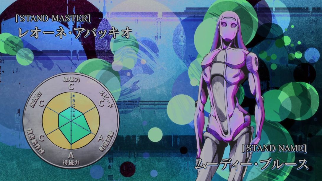
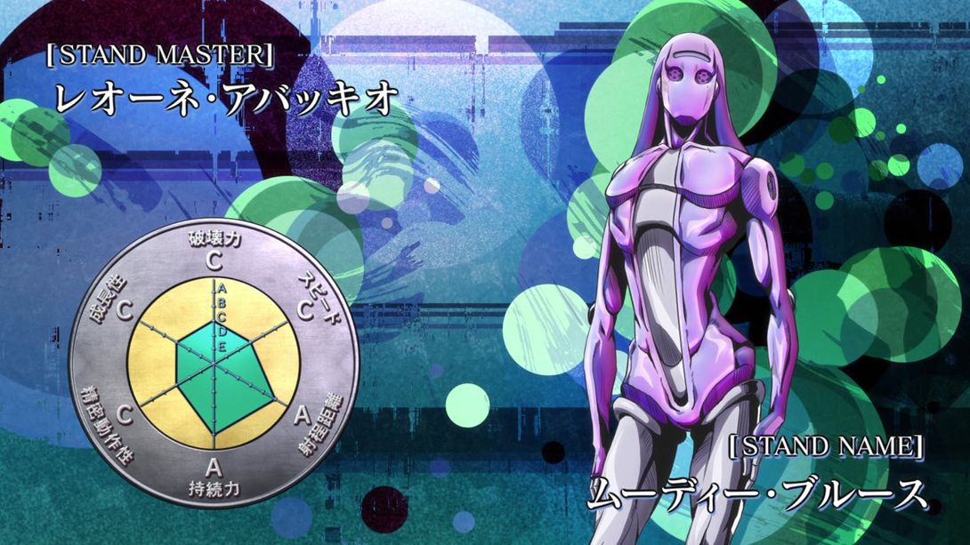
- The lighting in this dramatic scene is different:
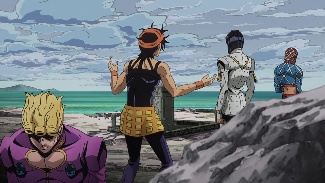
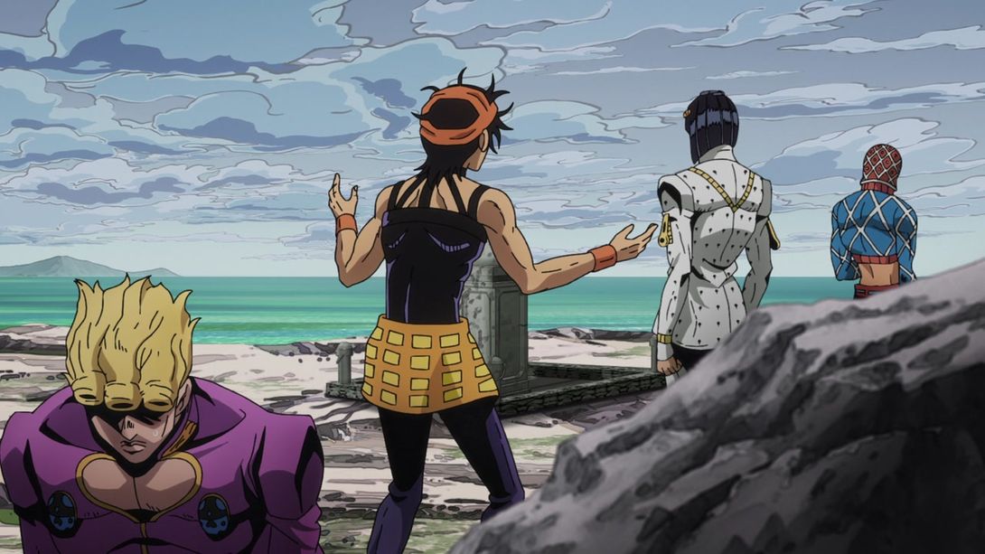
- And here too, in the lower part of the background; in addition, the horizon line is less sharp and Buccellati’s suit pattern is different:
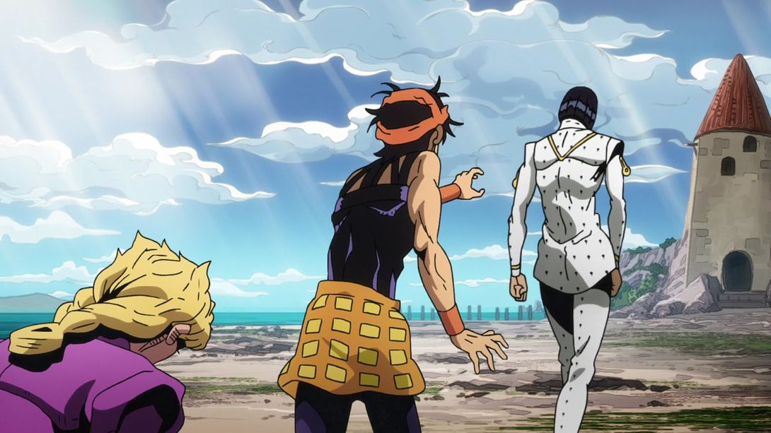
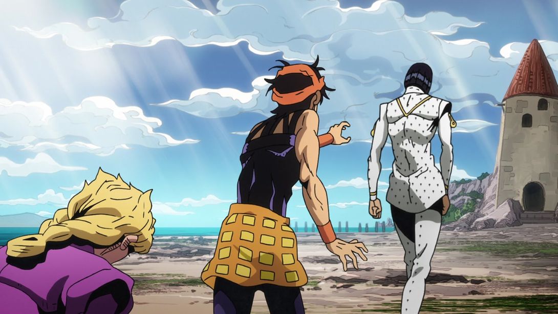
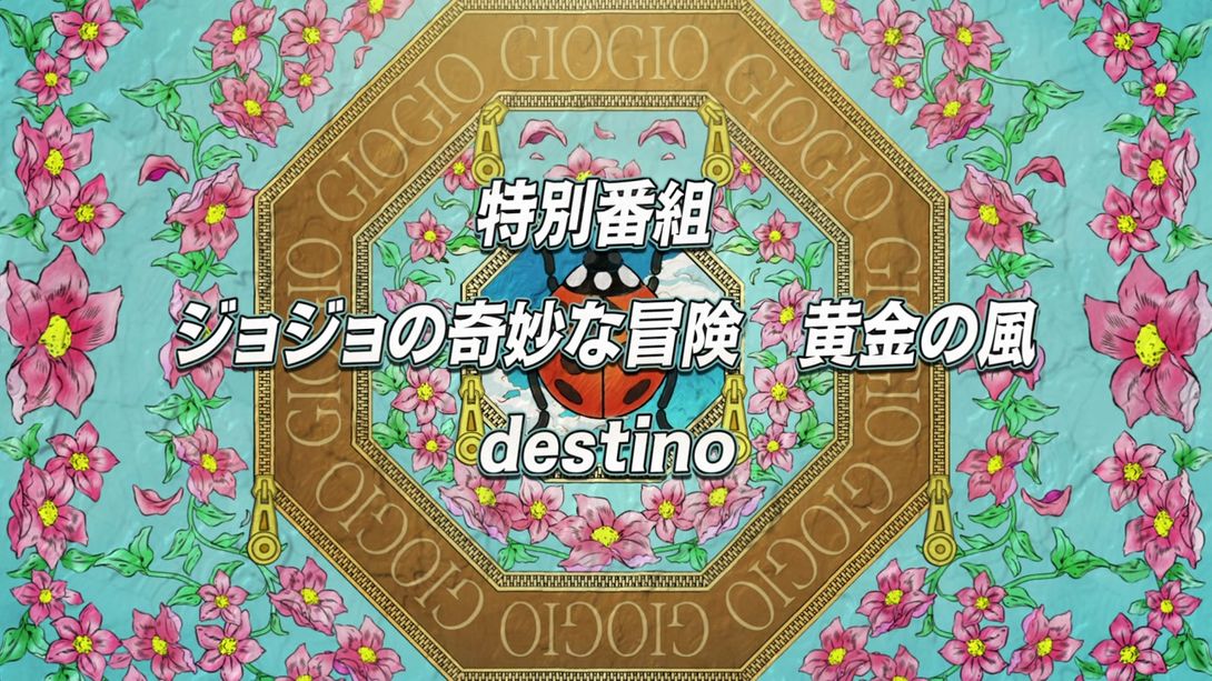
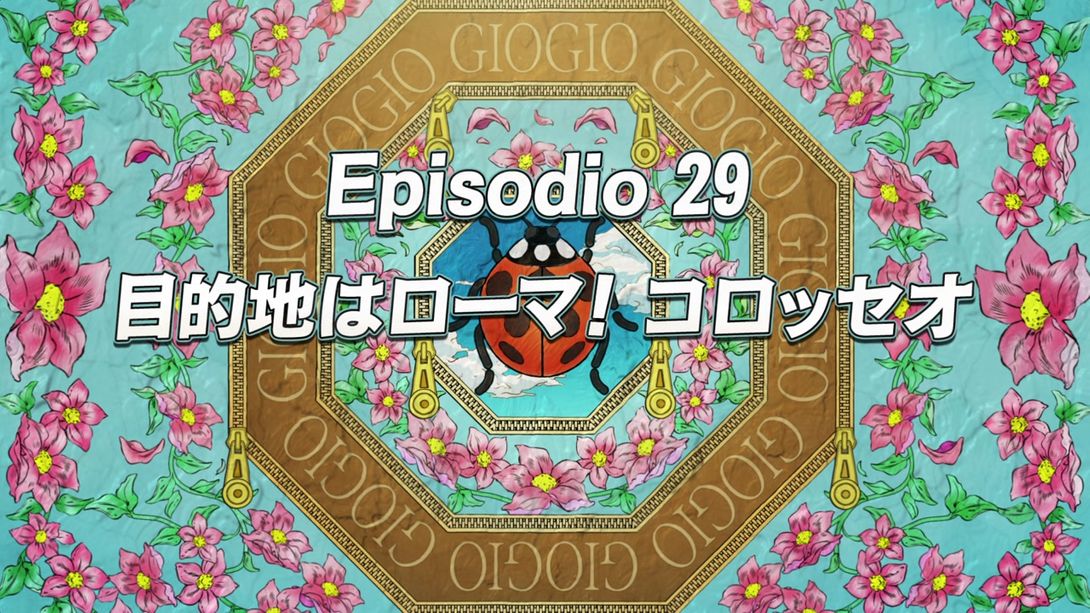
- Aaand here we have today’s last one! The last different next time title…:
And that concludes today’s comparison! Just a few differences, nothing major. Speaking of differences… As I mentioned on my twitter, I’ve been trying to optimize the blog somewhat! Over the past few days I implemented lazy loading on all images and videos (which means that the page will only load what is currently showing instead of loading EVERY IMAGE and EVERY VIDEO all at once! Yeah, I know, I should have done that earlier) and responsive images (which means that there are now three versions of every image - a 1090px, a 768px and a 512px one). The browser should now serve the right one for your screen size, which should result on faster loading times on smaller screens. All in all, you should be having a smoother and faster browsing experience! You might see some “loading” images here and there, depending on your connection speed, but in my opinion that’s a good trade-off for faster loading times at the beginning. Let me know if you see anything funky, though!
See you next time for Vento Aureo #29, “Destination - The Colosseo in Roma!”
Ciao!

