Hello again, and welcome back to another sporadic JoJo comparison! Once again I let one week slip by without updates, I hope you’ll understand that although I try to keep on schedule, there sometimes can be things that disrupt it, or make it difficult for me to spend a couple of days to work on a comparison. Thank you for stopping by once again, though! I promise this will be worth your time.
Without further ado then, let’s dive into DiU #24, “Sheer Heart Attack - Part 2”!
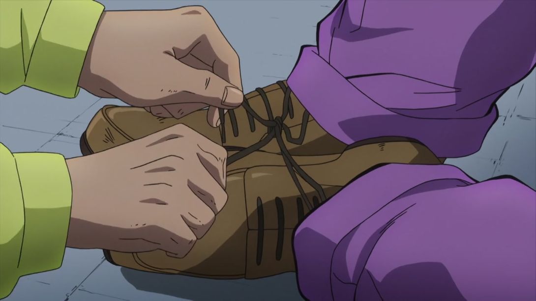
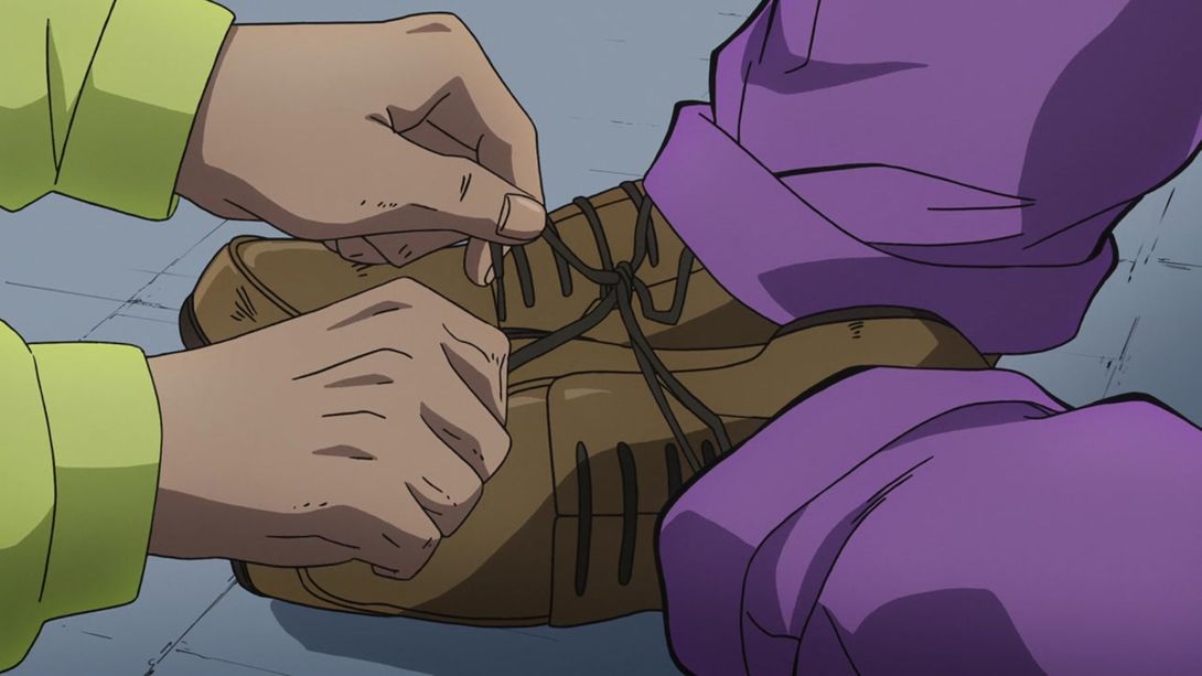
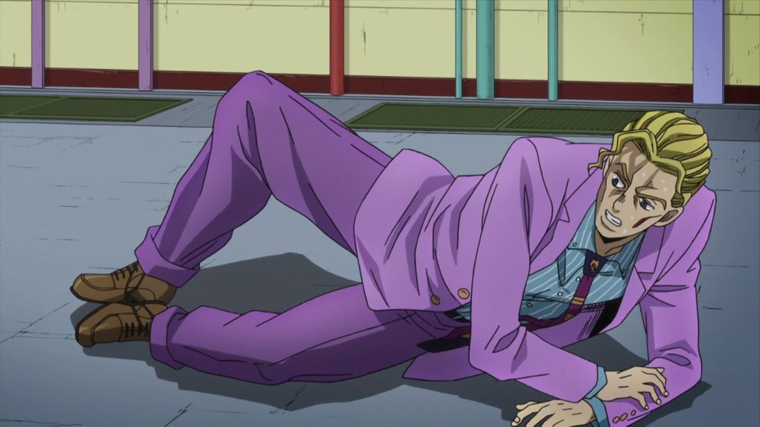
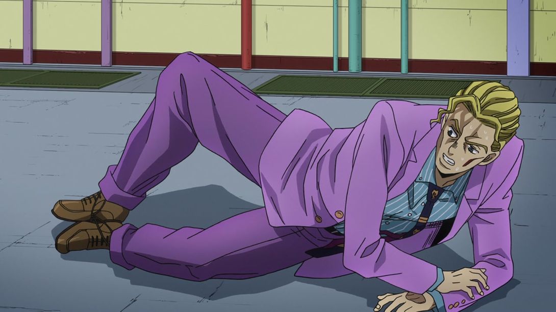
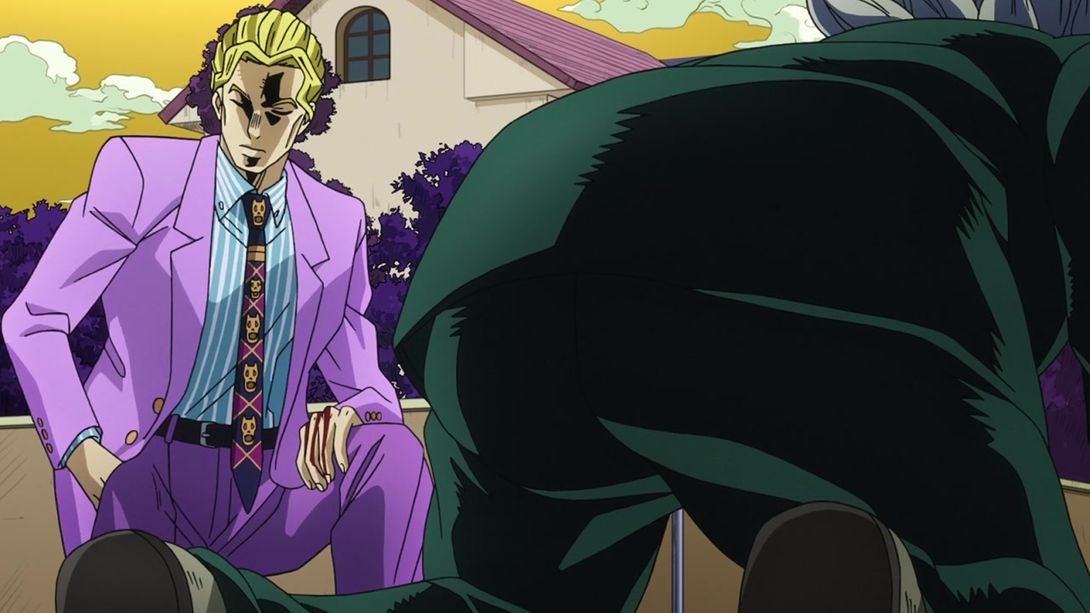
- Today’s first comparison is this shot of Kira spending the most humiliating day in his whole life. As you can see, the lighting in the background is more natural, and there’s a new shadow on Kira’s forehead. The shading on his suit is also slightly different, and the shadow beneath his feet is a tad darker:
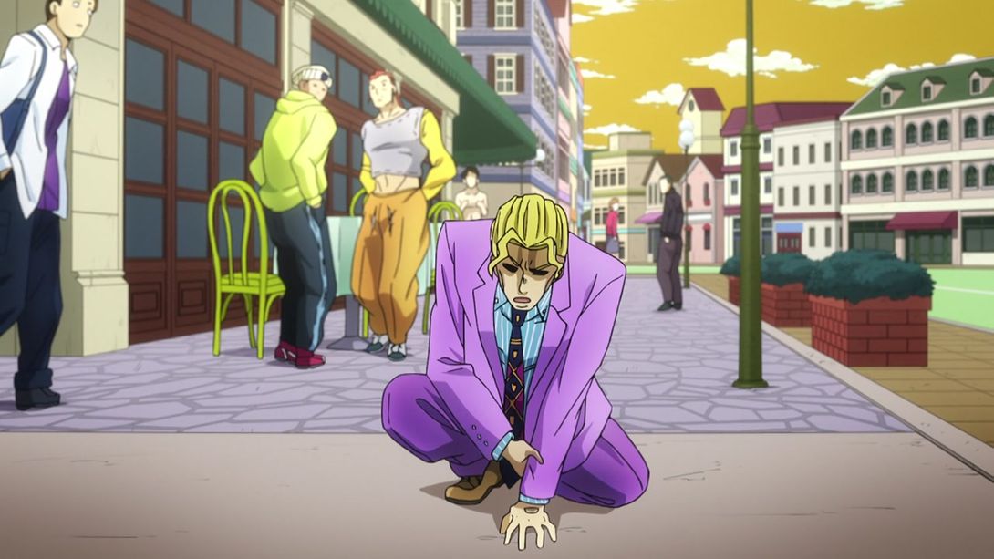
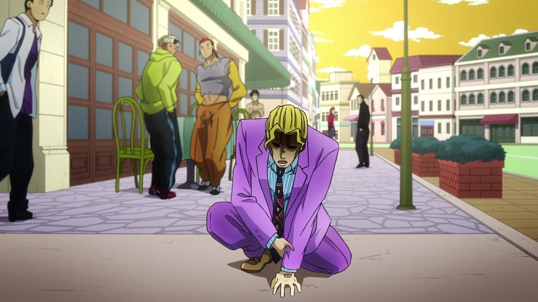
- This bit is brighter and sharper, but since it’s basically just a still frame moving up and down, I don’t think you really need to see it in motion. In the first frame, Kira’s face and hand have also been retouched, and they also drew in the missing hole from SHA:
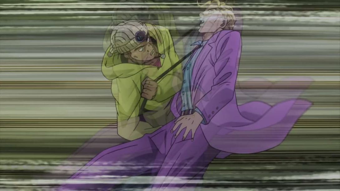
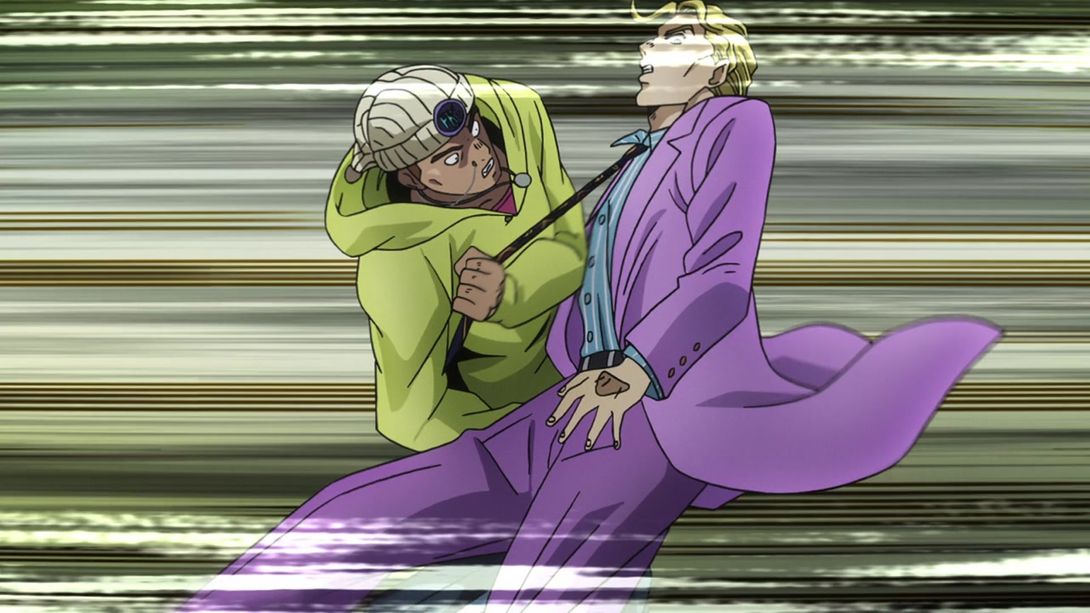
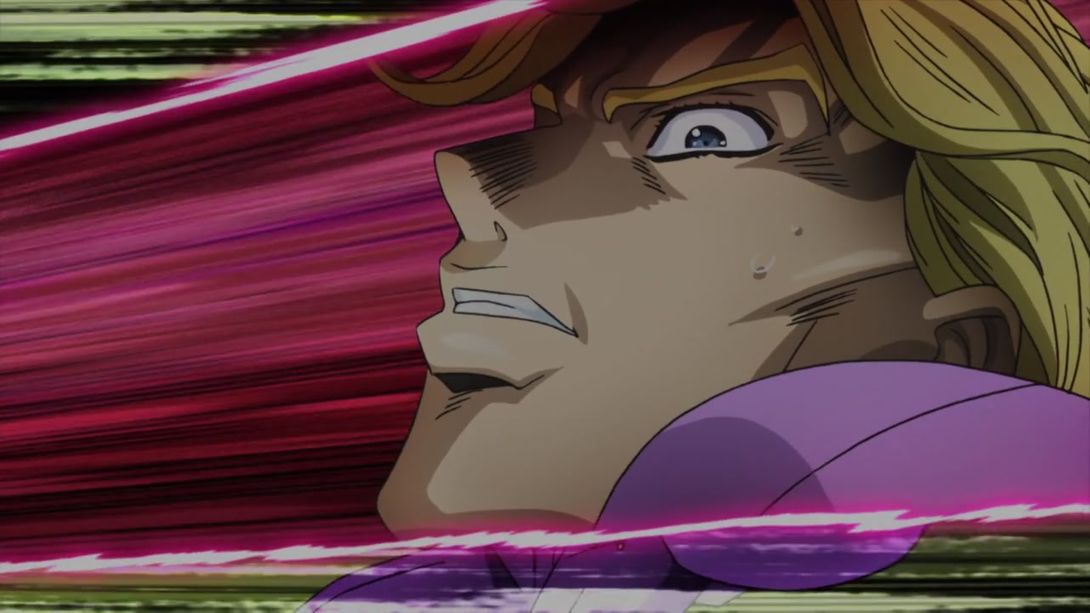
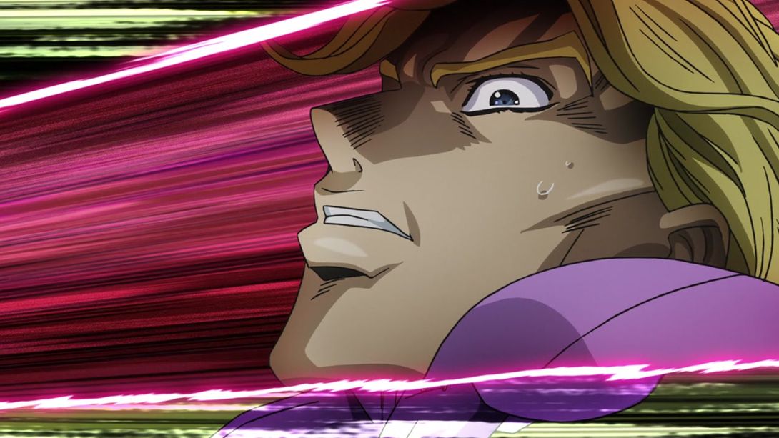
- In this shot, the outlines are slightly thicker, and Kira’s shadow is a bit lighter; once again, they added the SHA hole, and the colour of his tie is a bit different:
- Here you have an uncensored shot of that dude’s exploded fingers:
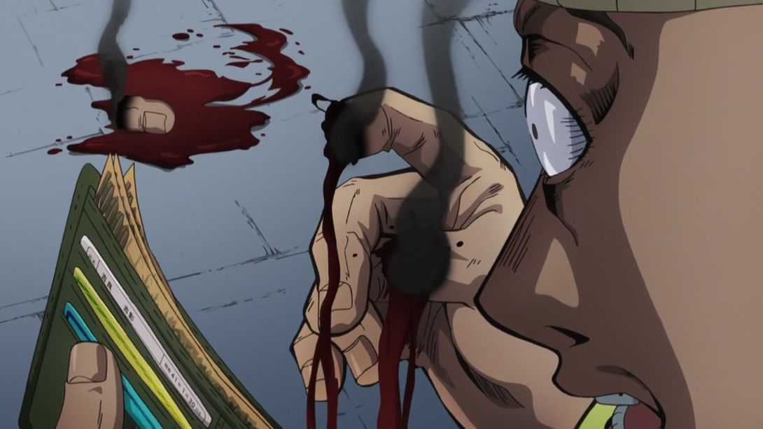
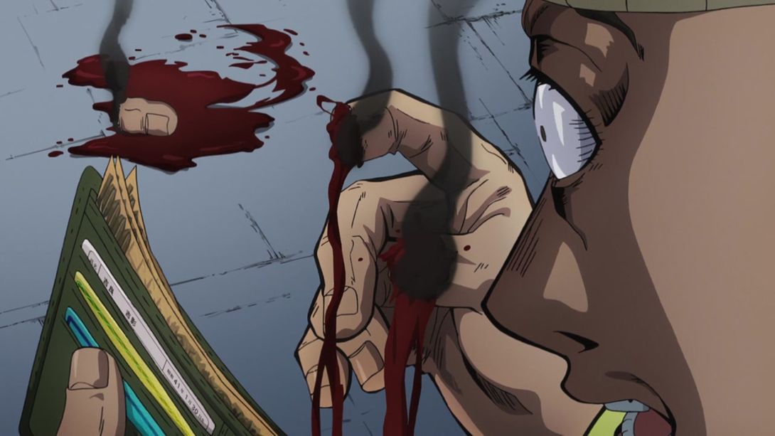
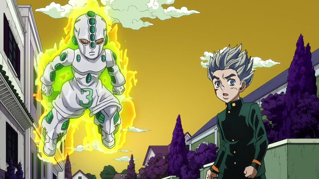
- Act 3 has been dieting a bit, as we can see from the BDs:

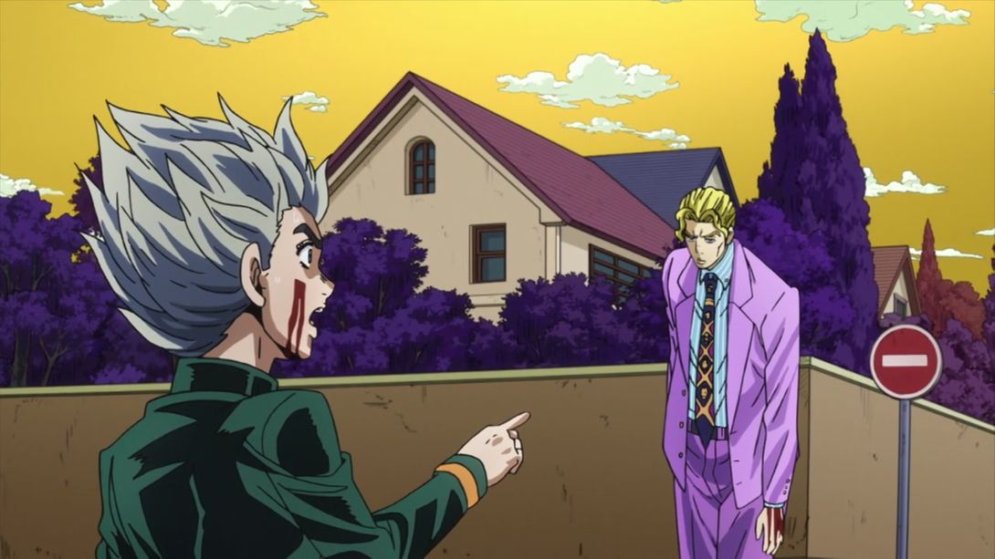
- In this shot, Kira’s mouth is drawn a tiny bit higher:
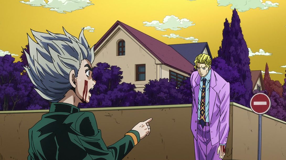
- In this couple of shots, Jotaro has been completely redrawn and repositioned (the two plant vases have also been moved around a bit):
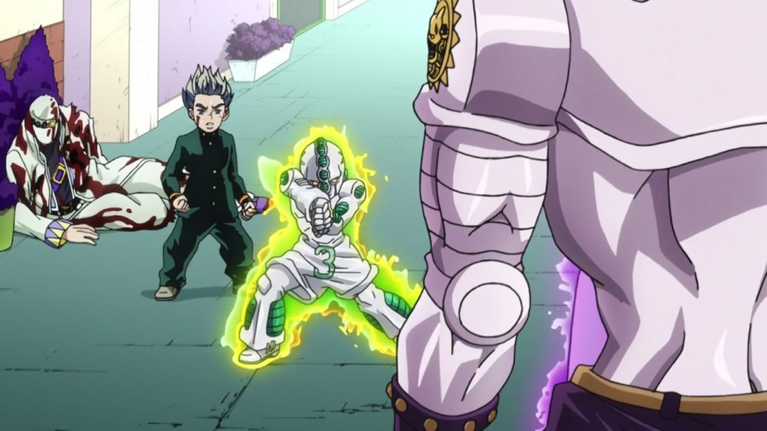
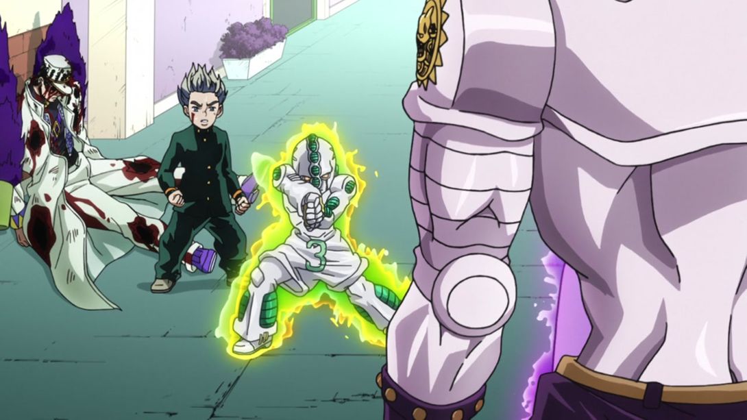
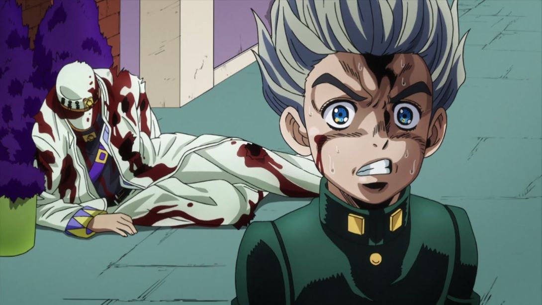
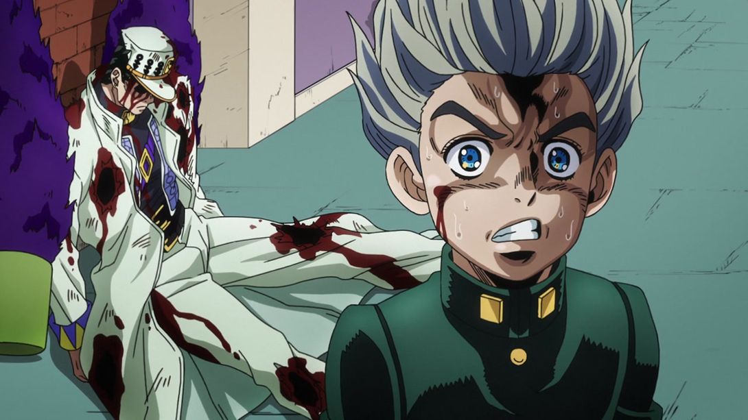
- The BDs add a little blood on Koichi’s cheek, and slightly change the pavement texture:
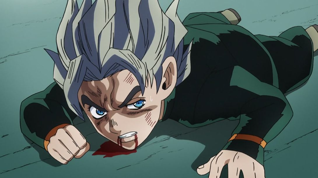

- Thankfully, they retouched and reshaded Kira’s face in this section here:
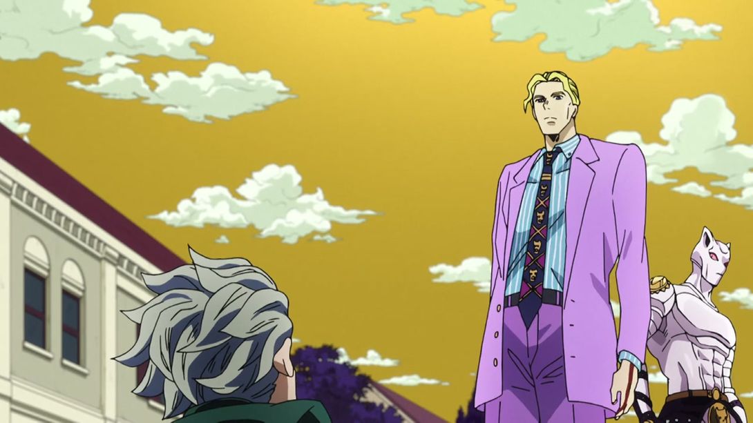


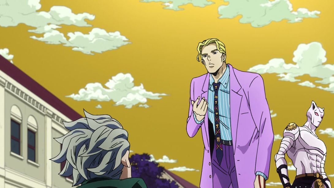
- This bit of Kira punching Koichi has received the same kind of different background lighting of one of the previous frames in this comparison; in addition to that, Kira’s forehead is darker, the blood particles are more blurred and there’s a slight fish-eye-like distortion on the edges of the frame. Check it out:
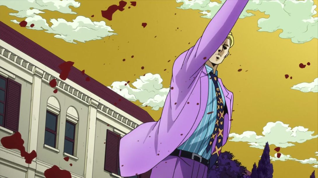
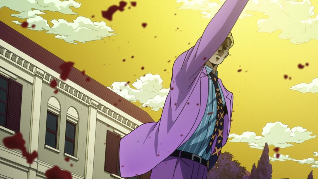
- There was one KQ skull missing from Kira’s tie in the TV version of this shot; the BDs obviously fixed that:
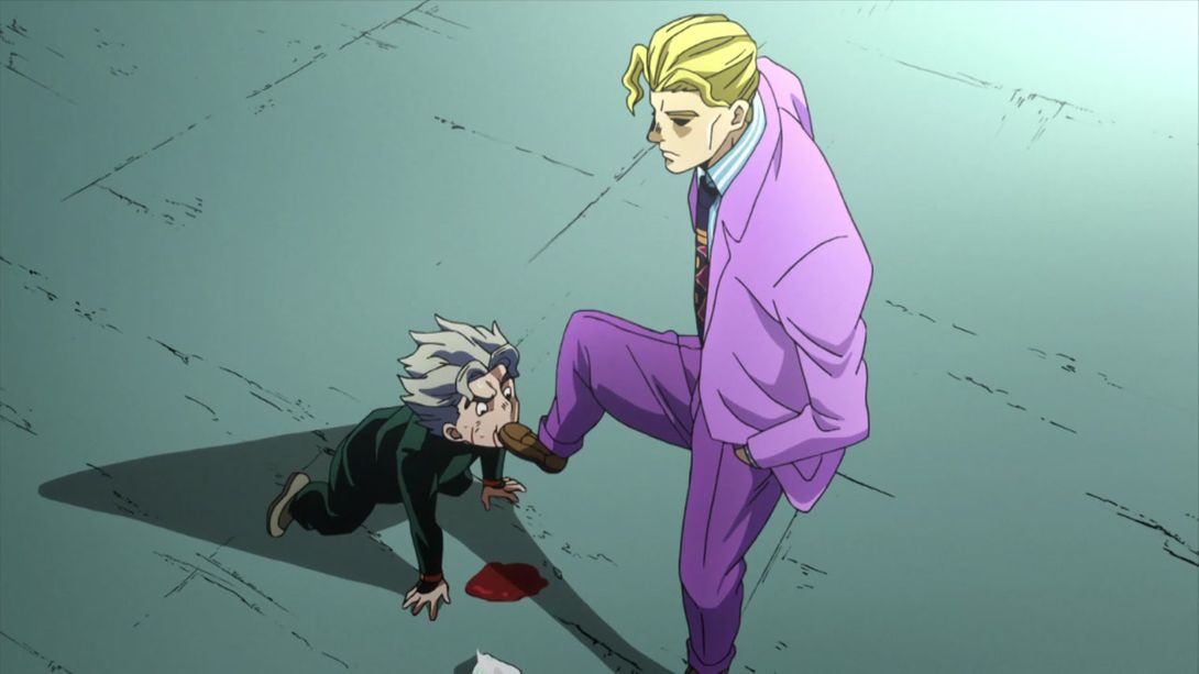

- That same fish-eye-like distortion is way more visible in this shot; in addition to that, Kira’s tissue pack is slightly closer, and a splotch of blood is visible under Koichi’s head:
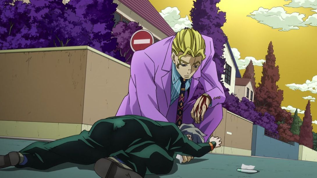

- This animation is more zoomed out, and as a result we can see Koichi’s blood on the ground:
- They actually drew the KQ skulls on Kira’s tie here, instead of just making some golden ovals; the shading near his right eye is also different:

- Here we have a shot of Koichi cosplaying Kakyoin in its full uncensored glory:
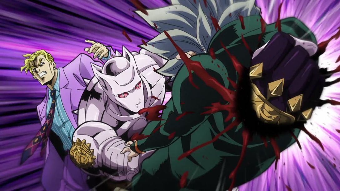
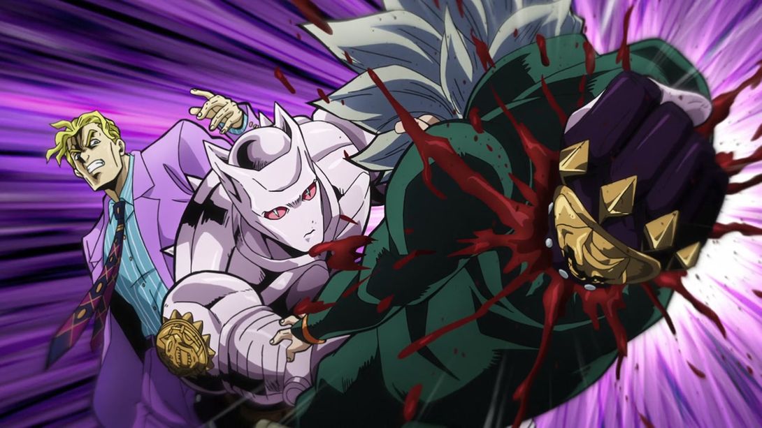
- Once again this shot is uncensored, plus the upper right corner is brighter:
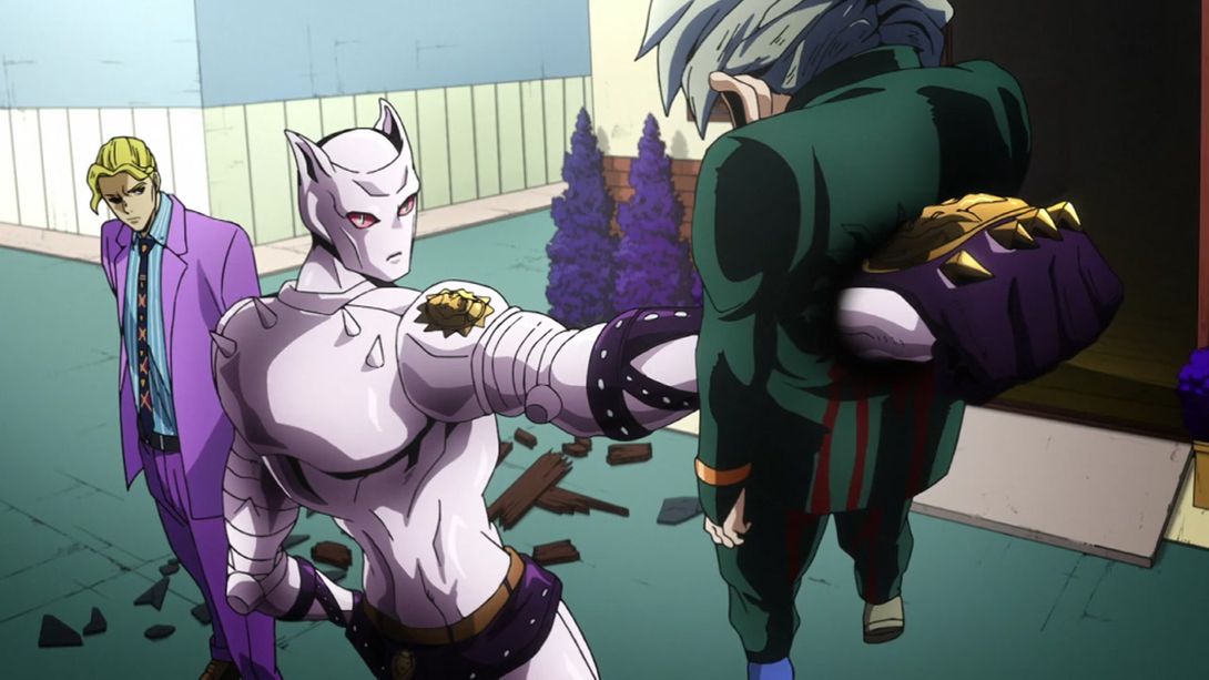
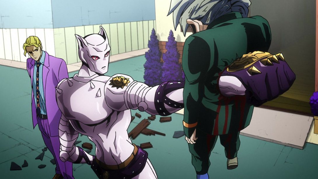
- This animation of KQ taking out his hand from Koichi doesn’t have that silly zoom in the BDs, and as a result it’s a bit more brutal and effective, in my opinion:
- S-H-I-T:
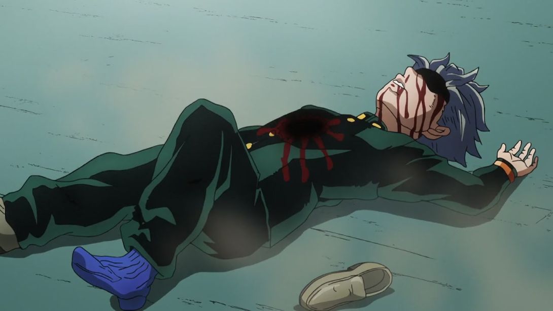
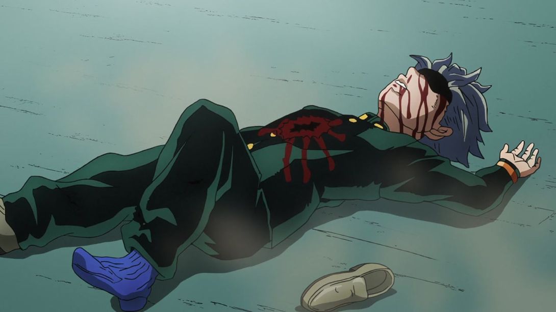
- A little bit more of Kira’s tie pattern is visible in this shot:

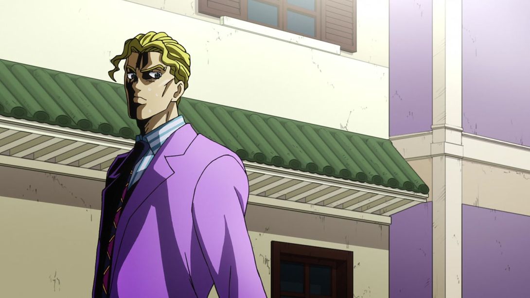
- Jelly_donut.png:
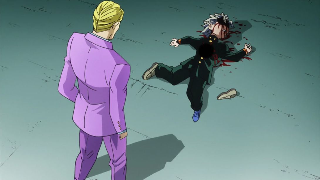

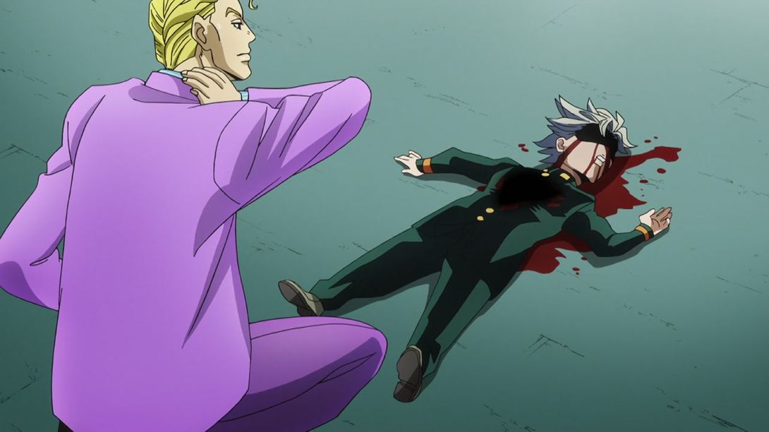
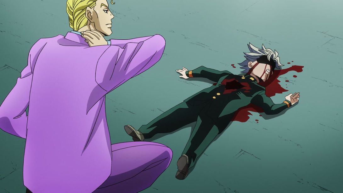
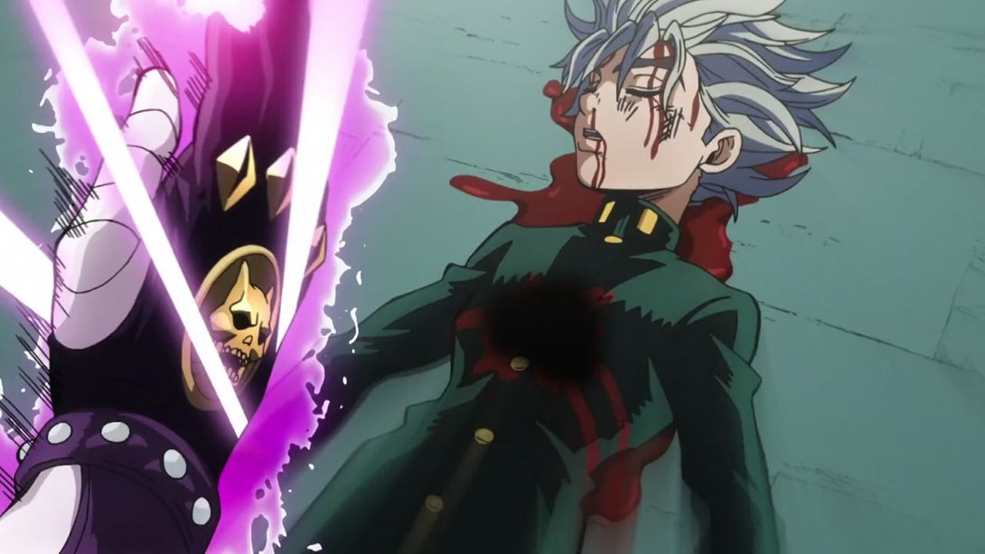

- In a couple of shots of the TV version there was some blood on Star Platinum; I’ve never thought about it, but apparently that’s an error, and as such they removed the blood from the BDs. In this one, part of SP’s right arm has also been recoloured:
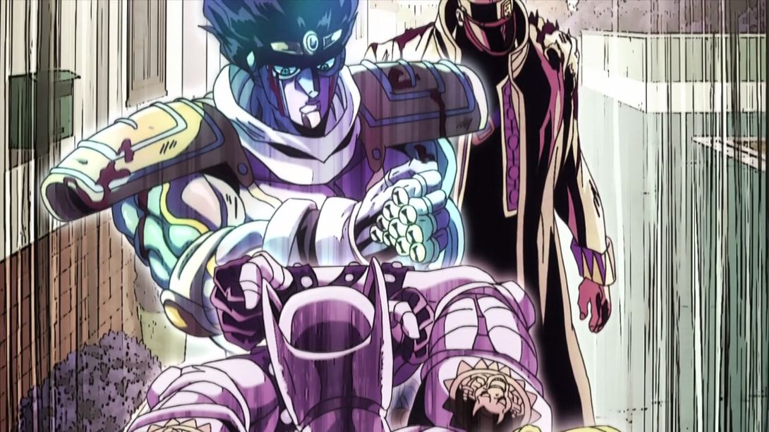
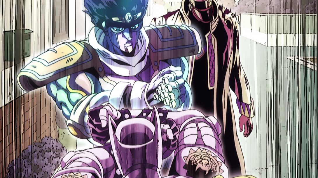
- In this shot we have a bunch of different things: the fish-eye again, a different lighting on the bg trees, a different shading on KQ and Kira, and a new sky they apparently had forgotten in the TV version:
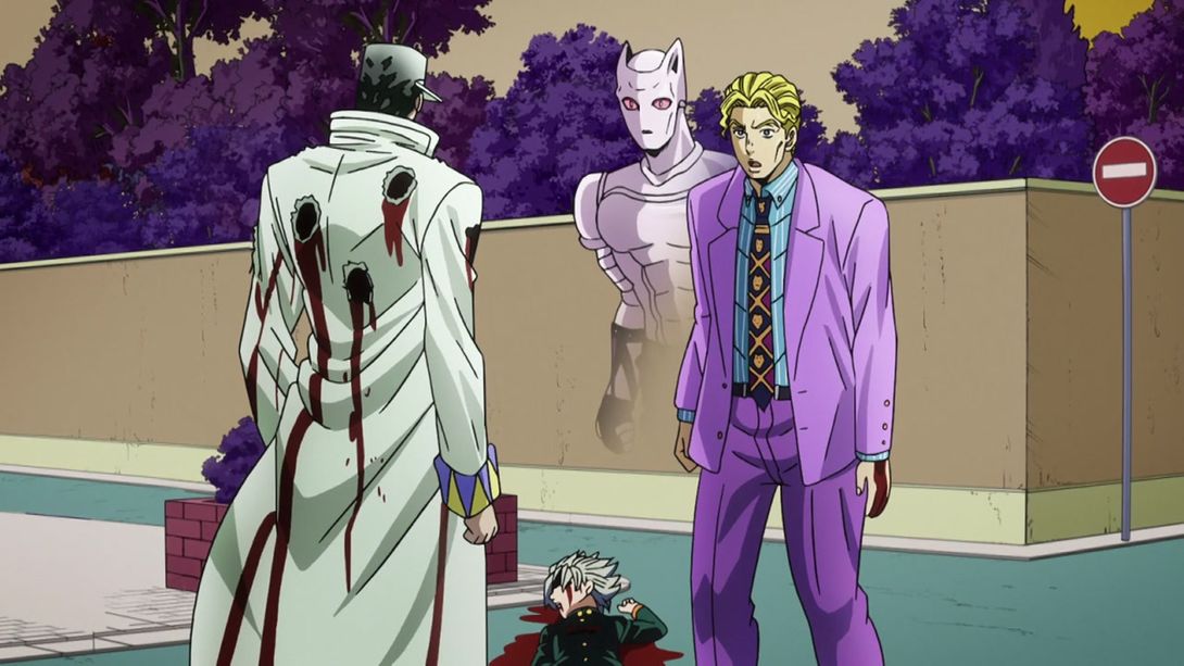
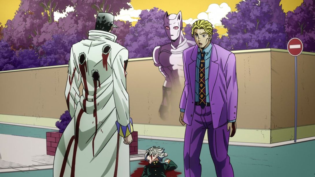
- In this shot Jotaro has, once again, that weird hand-thing on his belt, Kira’s face has been redrawn and his clothings retouched; the trees and the sky in the background also have a different shading:
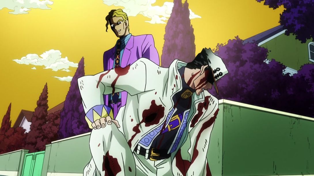
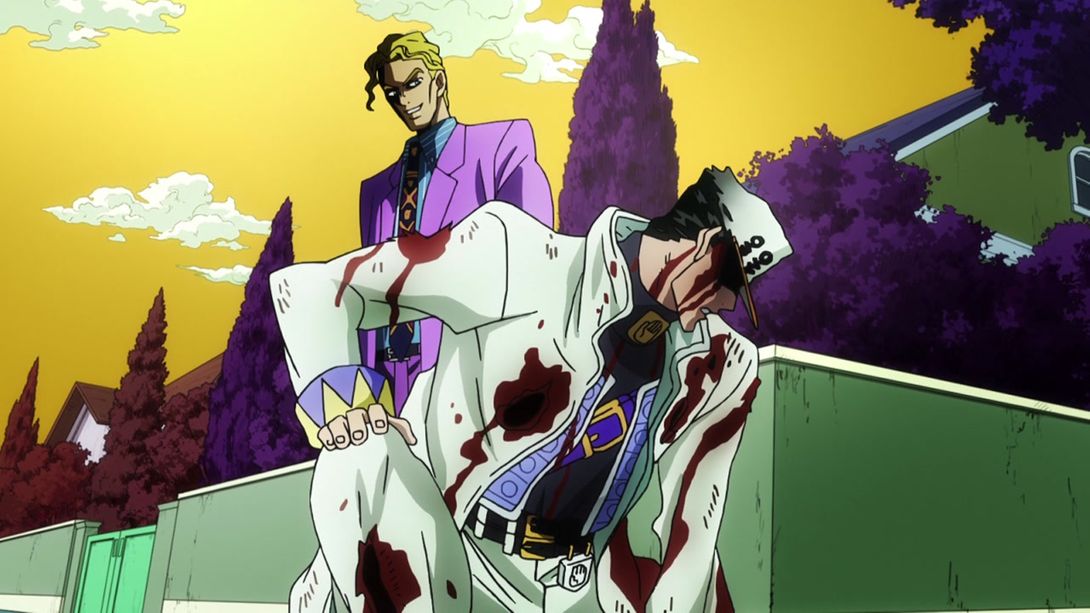
- The inside of Kira’s mouth has been coloured white in this shot, and the background aura is more purplish in colour:
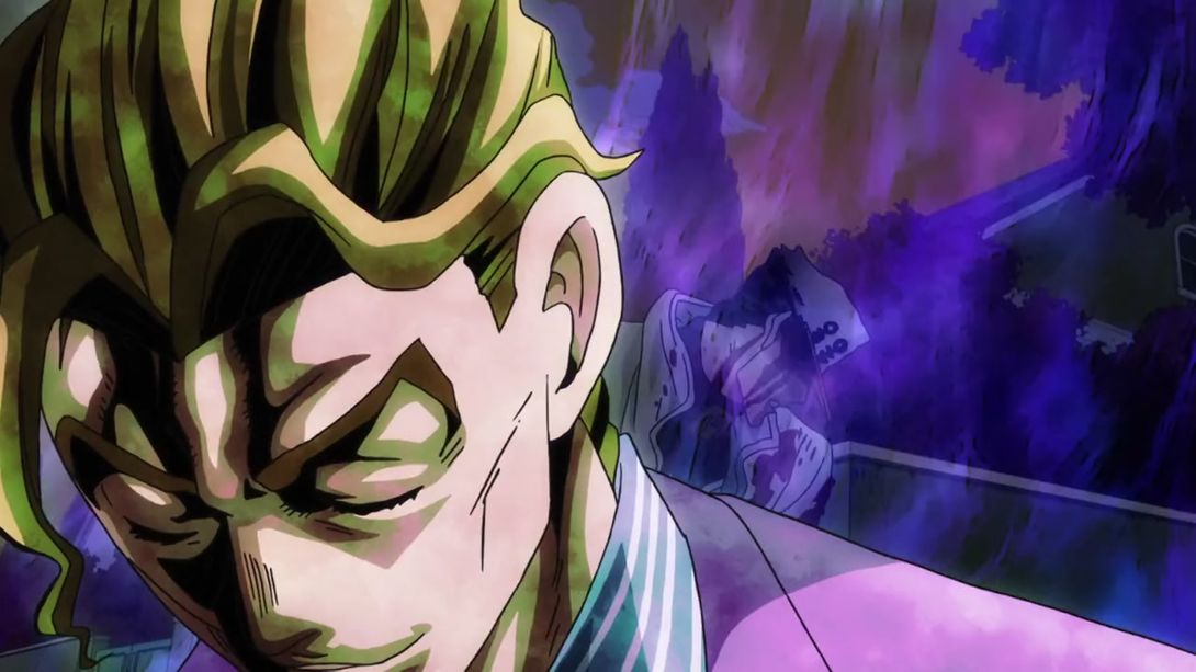
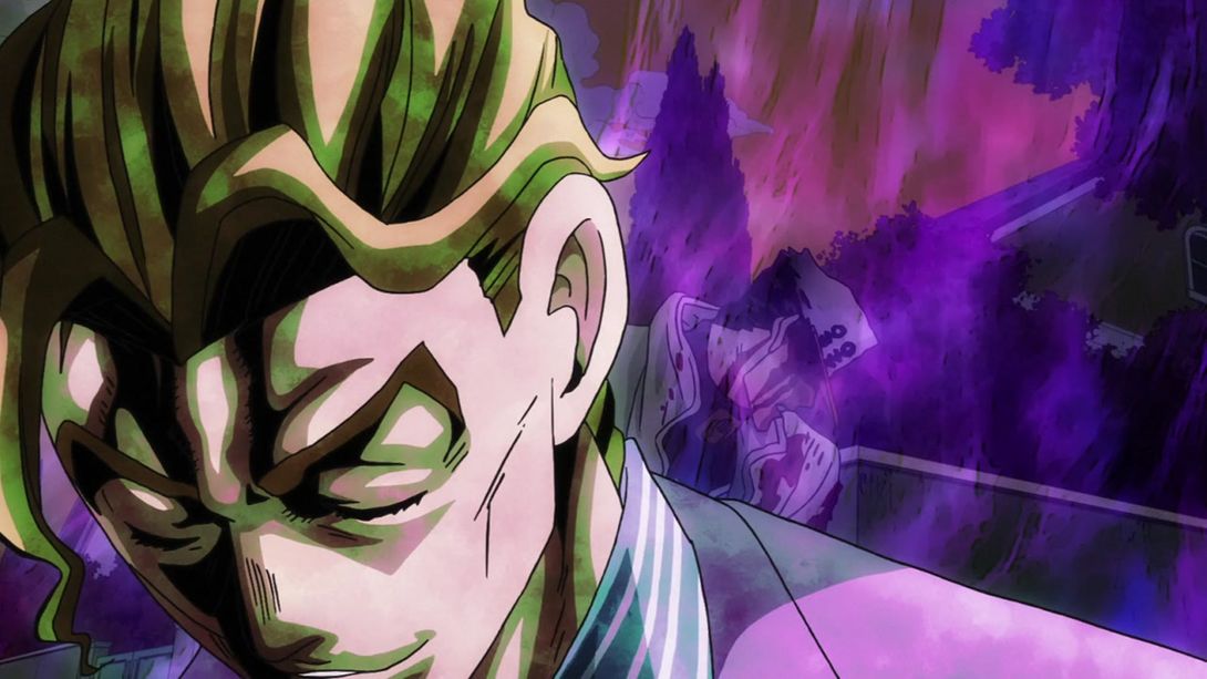
- Once again the background aura has been recoloured (and is actually different), and Kira’s eyes have a less dull shading:
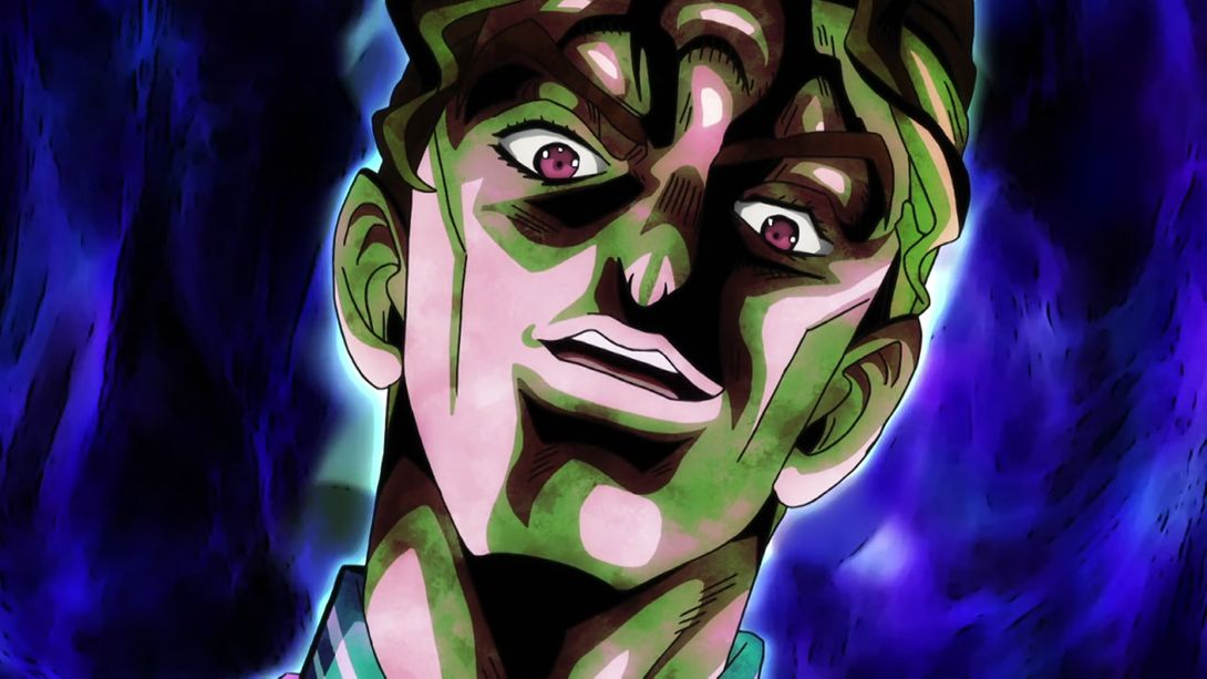
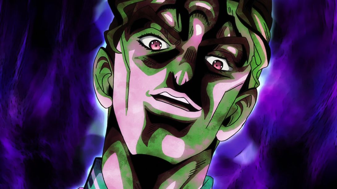
- In the TV version, this part of Kira talking menacingly ended with a whiteout; in the BDs it just cuts to the following scene without that:
- As you might have guessed from the previous animation, it’s now time for a Brighter & Sharper! Take it away, Killer Queen:
- Right after the last animation there’s the “Nice watch” scene, and that has a bunch of differences too. First off, Jotaro’s belthand has been recoloured white…:
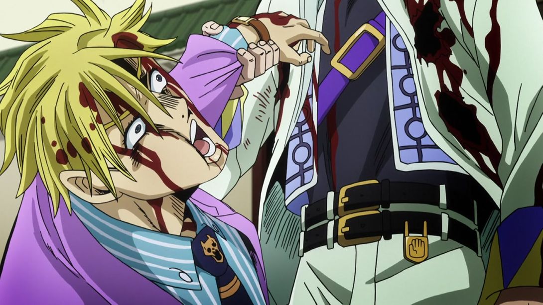
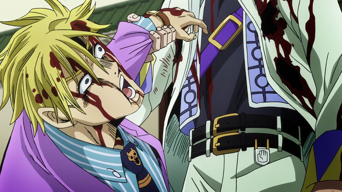
- …Kira actually moves his mouth while talking…:
- …Jotaro’s head has been retouched…:
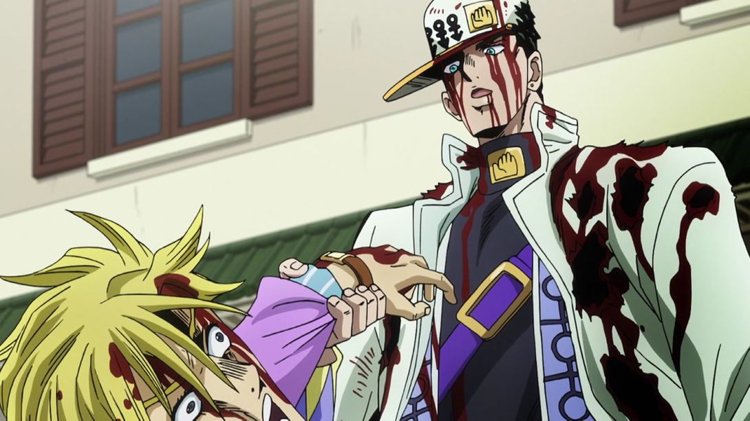

- …Jotaro throws Kira down a bit later, but faster…:
- …and Star Platinum stands a bit farther from his user:
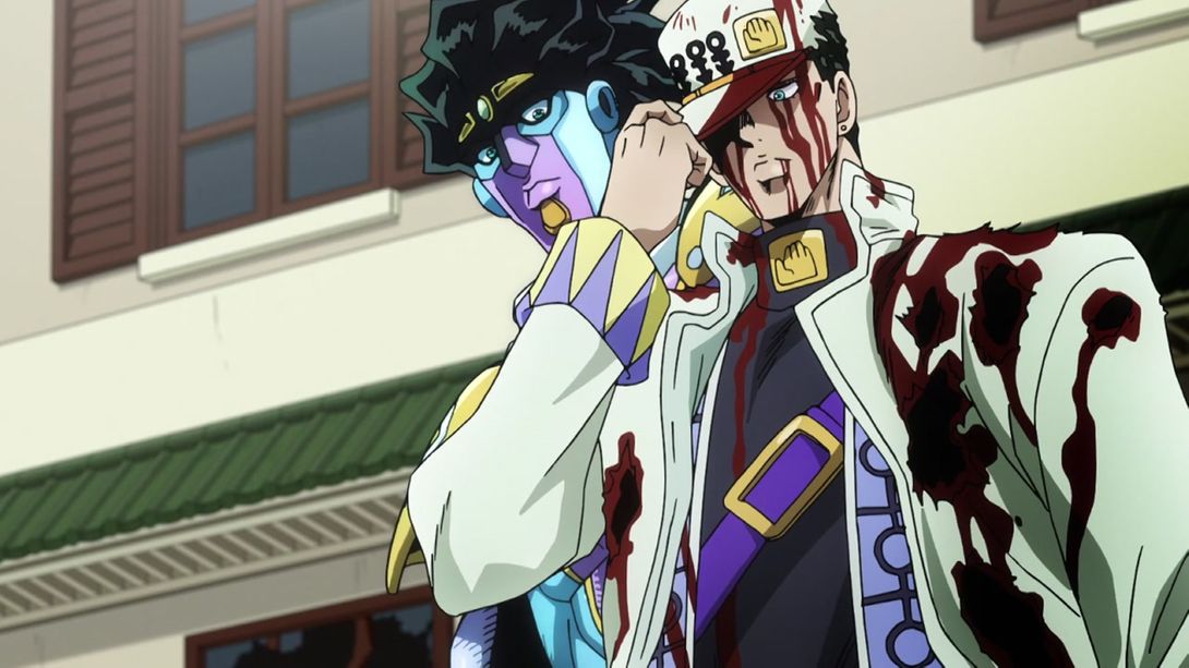
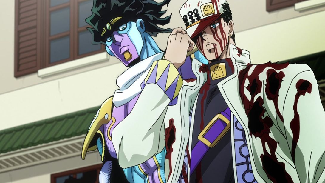
- Have a bunch of brighter and sharper animations, on the house:
- White Stands Can’t Bleed:

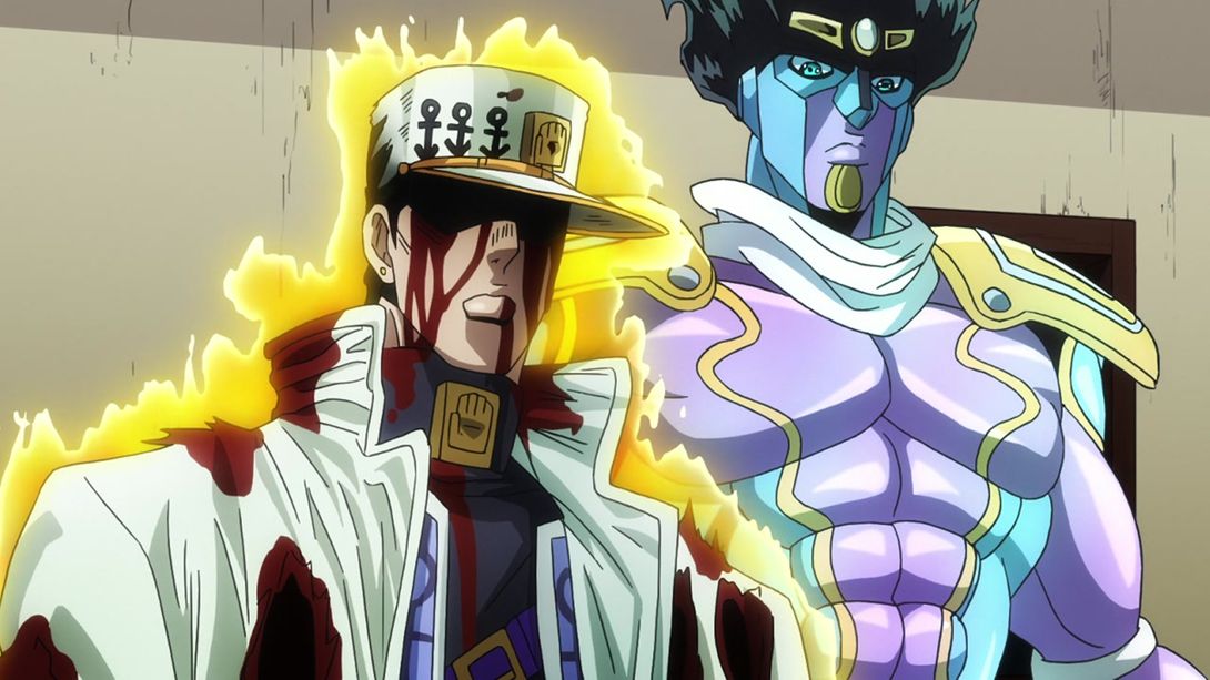
- For some reason this shot is deformed in the middle, and has a different lighting:
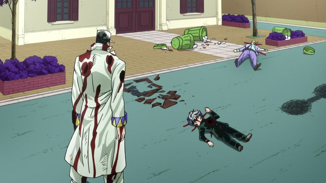
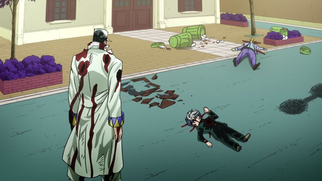
- “Why does this keep happening to all my friends?”:
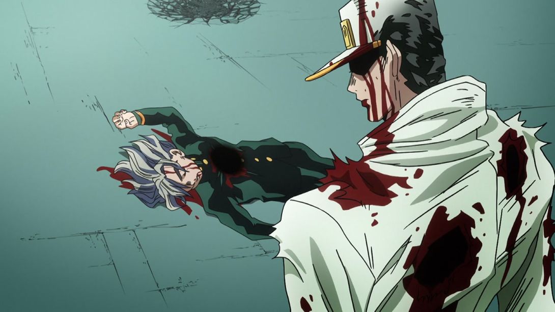
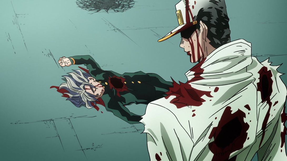
- For some reason, the top right and bottom left corners of this shot are slightly brighter in the BDs:
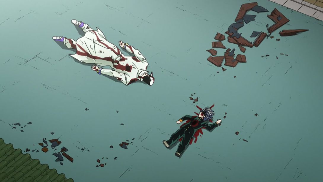
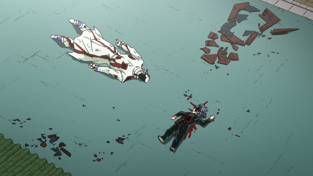
- Uncensored napping friends:
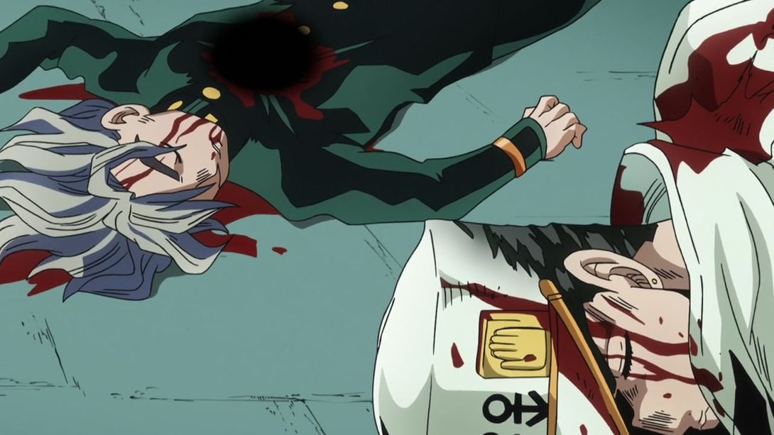
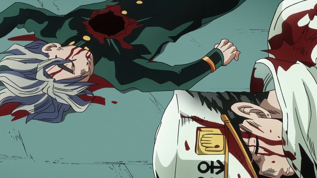
- Kira’s tie has been recoloured, and a bit in his ear has been shaded better:
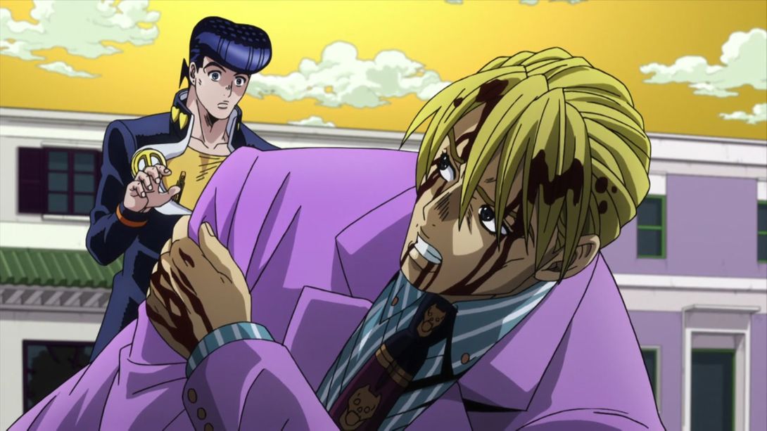

- Why didn’t Killer Queen also lose his hand here though?:
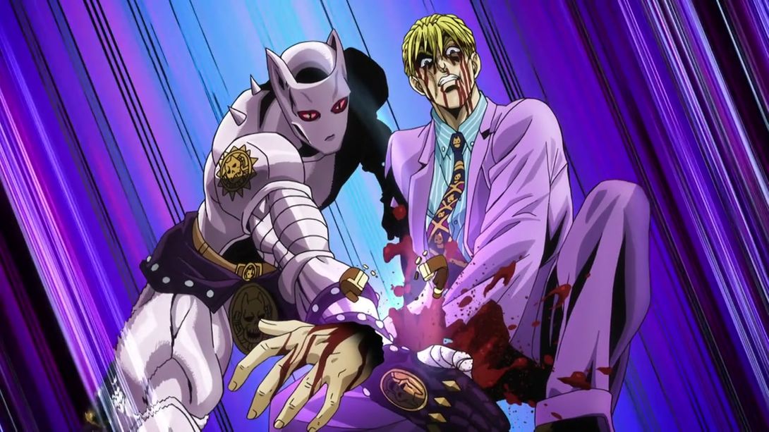
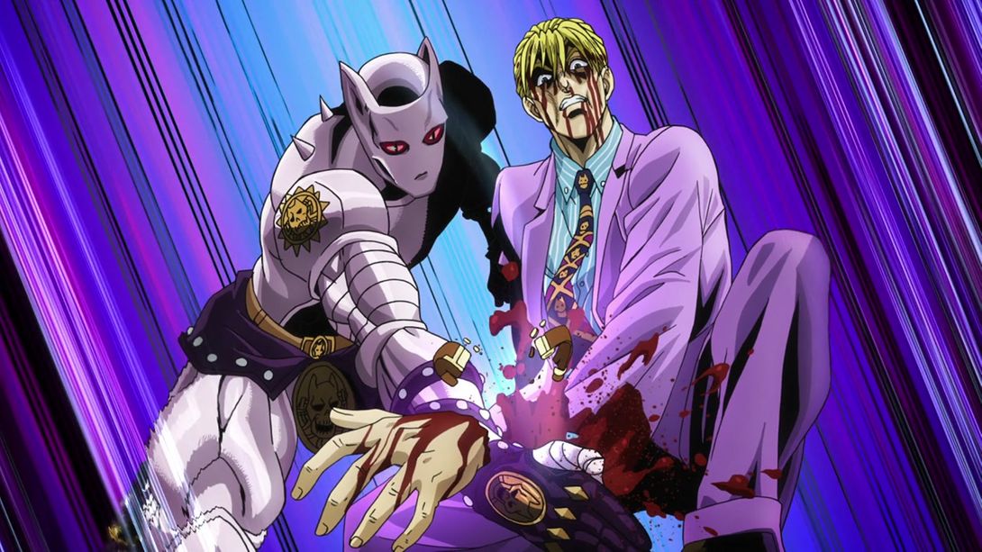
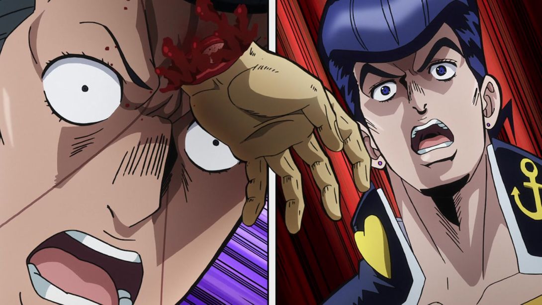
- Here we have, again, Kira’s uncensored hand, plus a slight fish-eye distortion and slightly different colours:
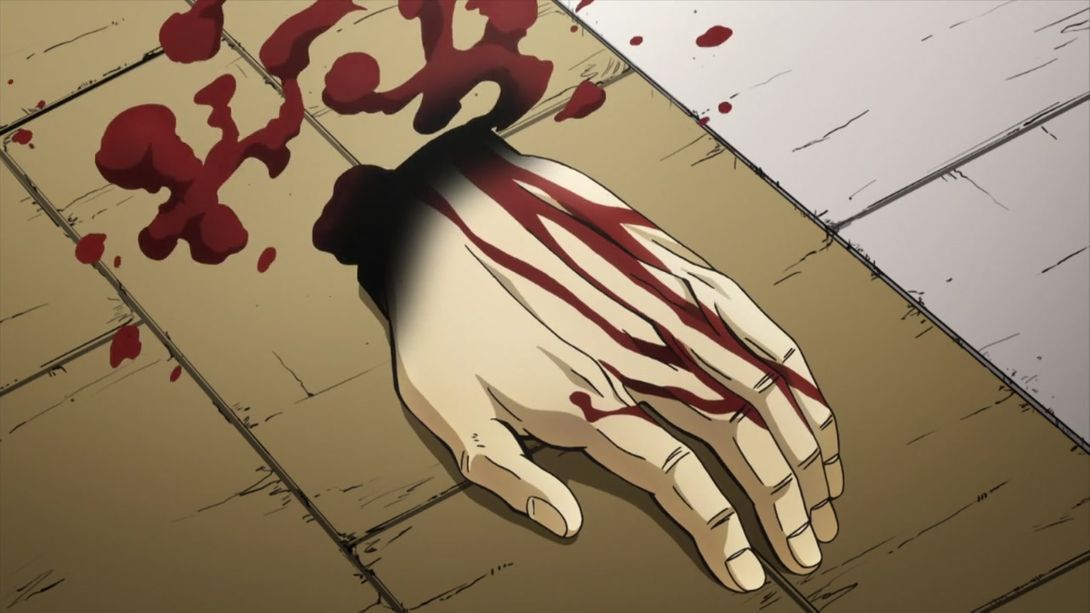
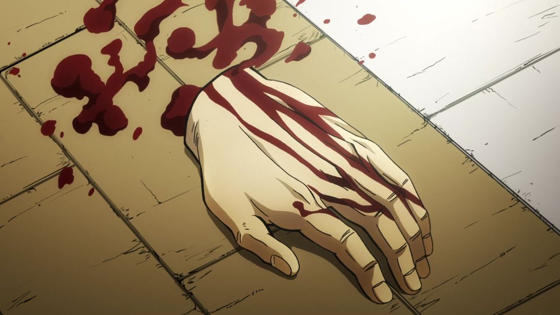
- Have a bunch of uncensored hands, buddy:
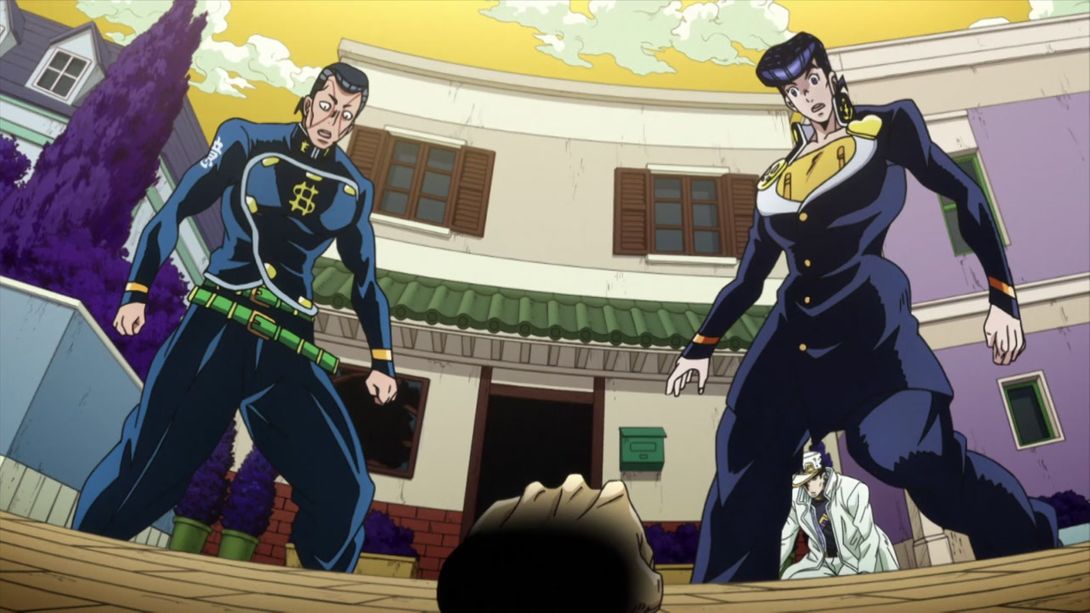
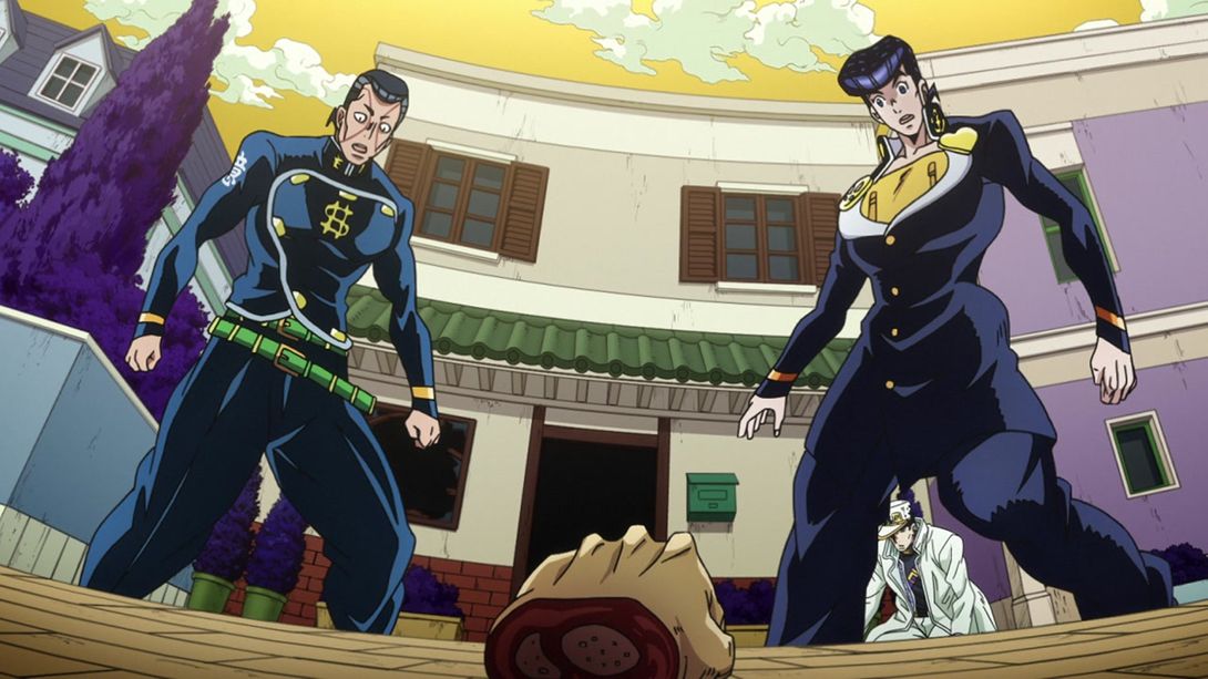
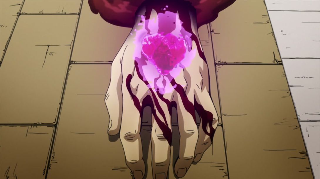
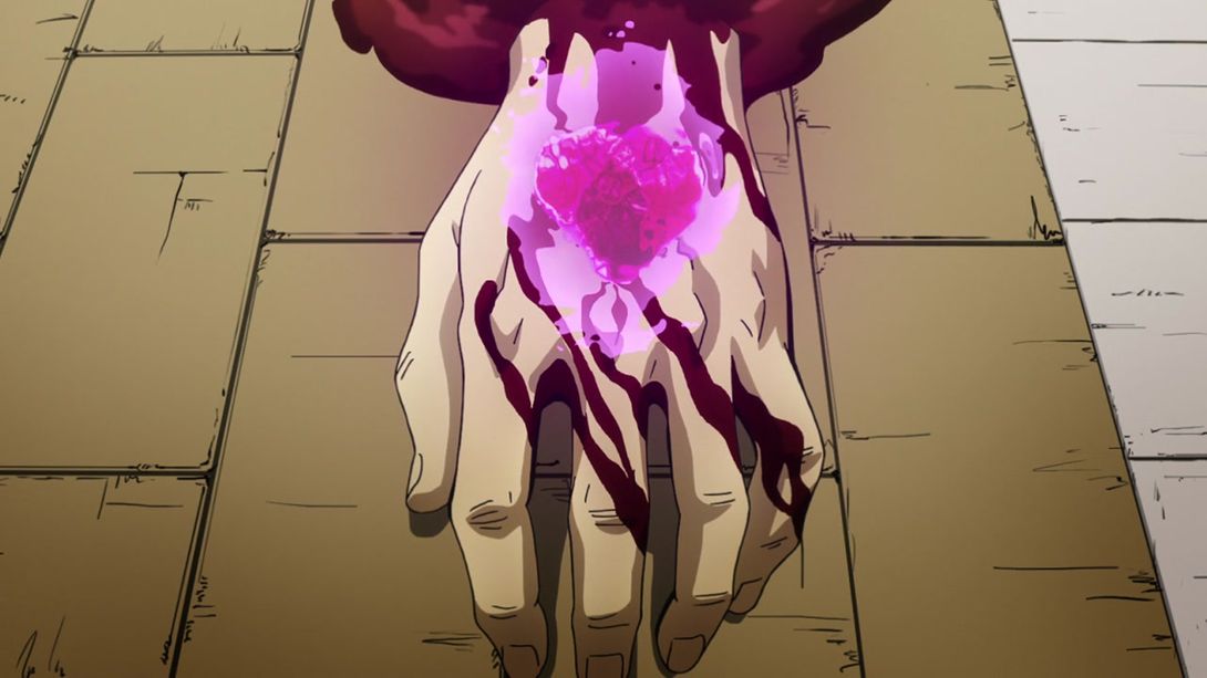

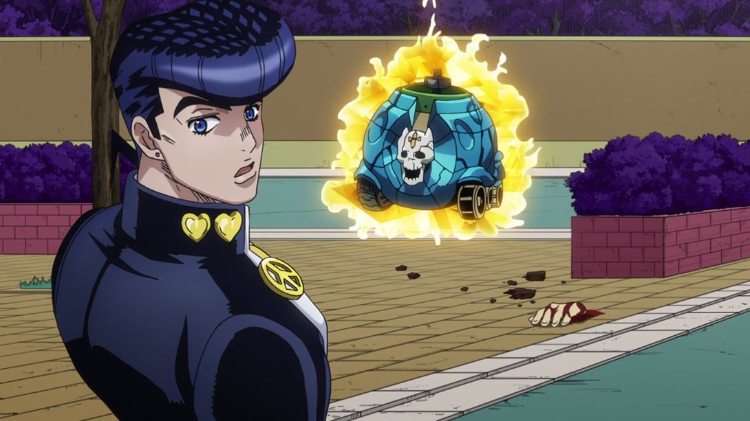
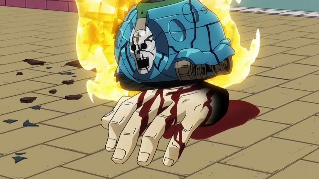
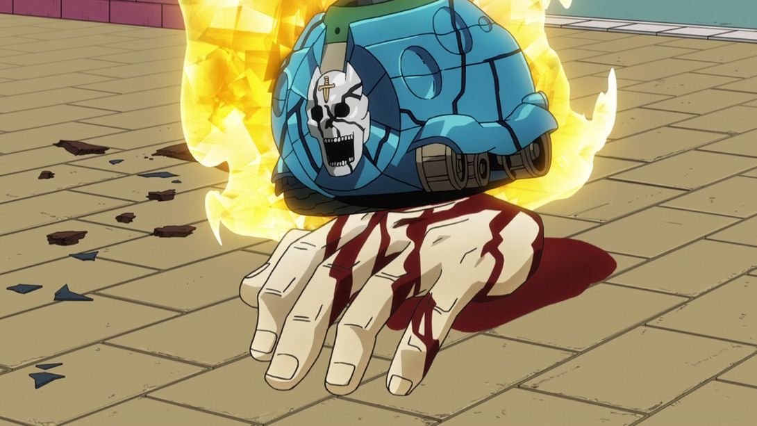
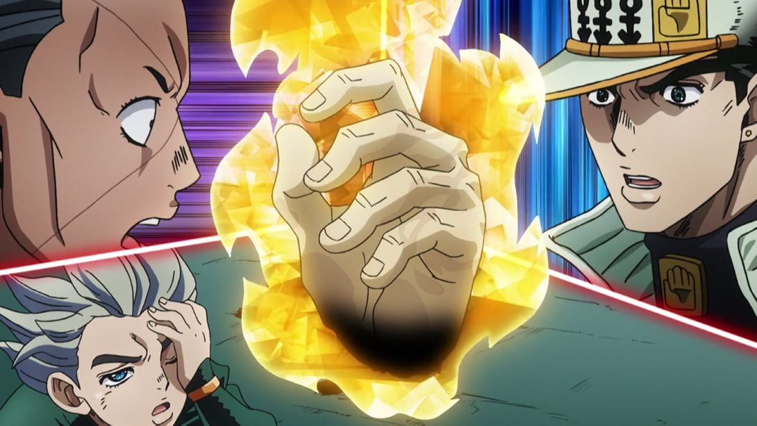
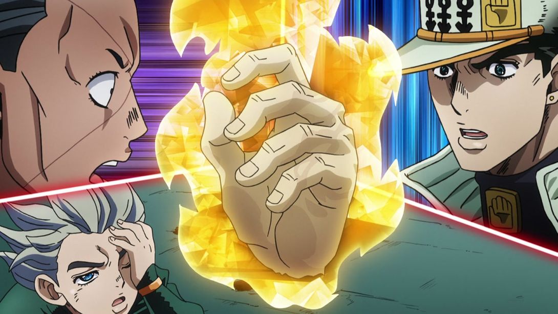

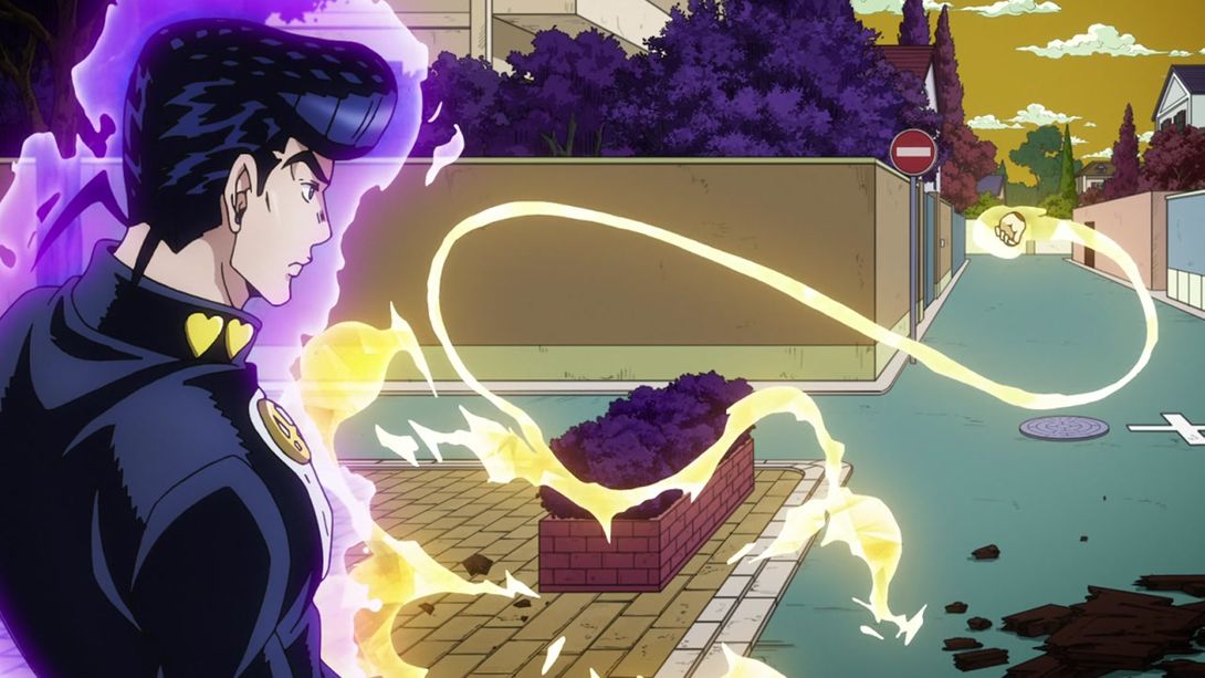
- Here, Jotaro and Koichi’s heads have been retouched. Are they holding hands? I never noticed:

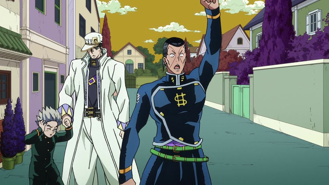
- In this shot, there is the usual distortion, the random passersby have been moved around and the shading on the bg is different (darker in the foreground and slightly lighter in the back):
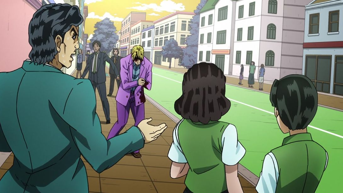
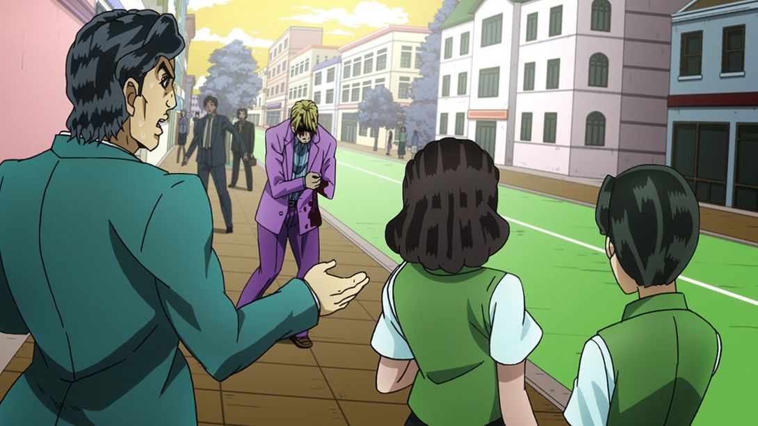
- Here, a corner in Kira’s hair has been shaded differently:

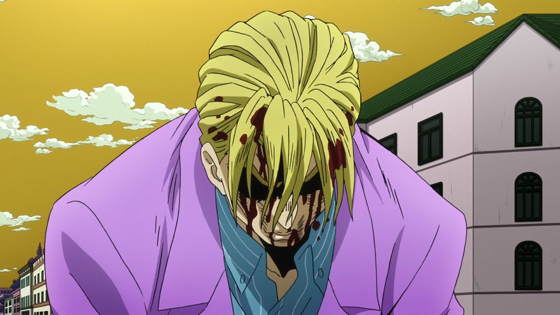
- Do you need a hand, mate?:
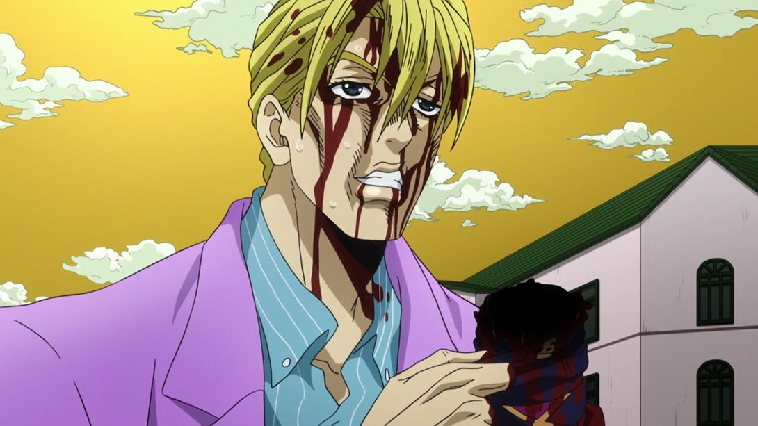
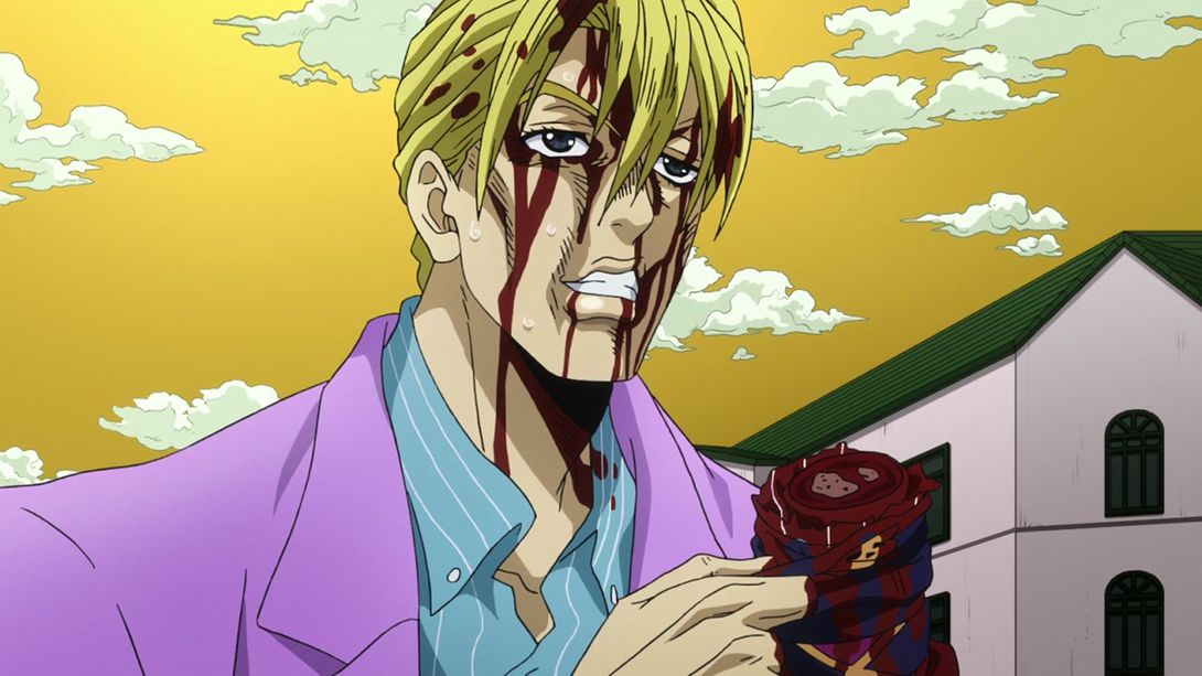
- As it sometimes happens with uncensored bits in Jojo, here they darkened not only the censored part, but also the area surrounding it. The BDs restore the normal brightness:
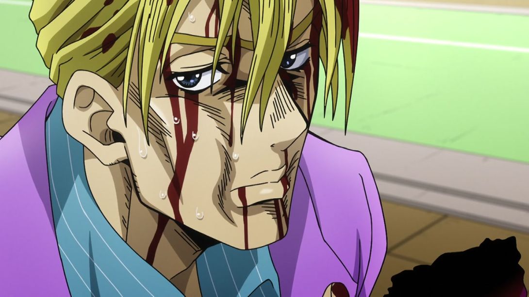
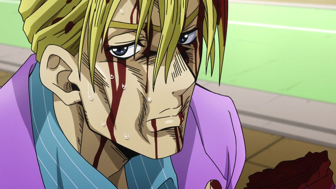
- Alright, alright. Now there’s going to be a truckload of uncensored shots of various body parts. I mean it. A truckload. Are you ready? Yeah, of course you are. Here you go!:
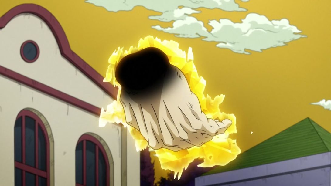
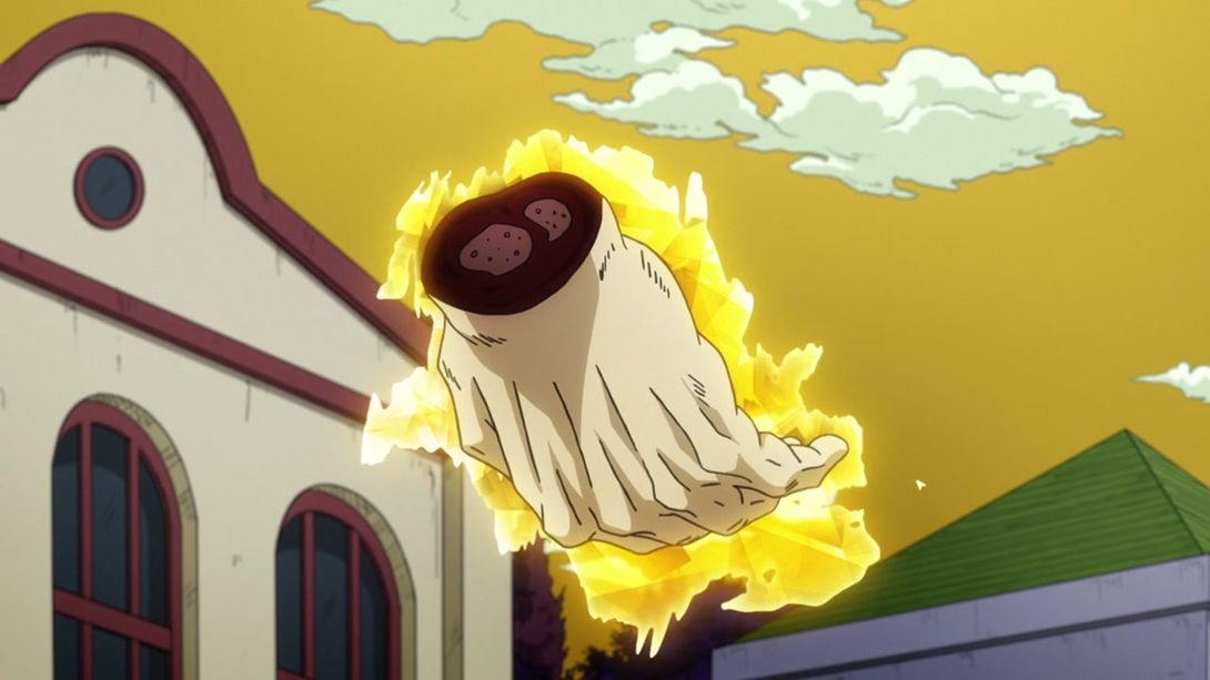

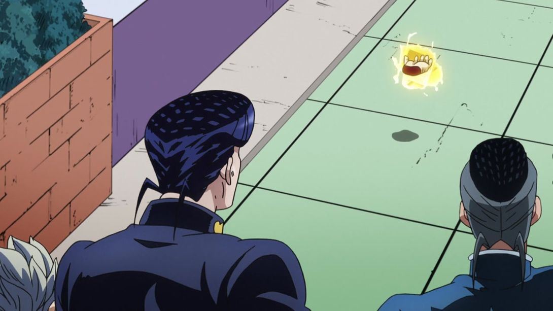
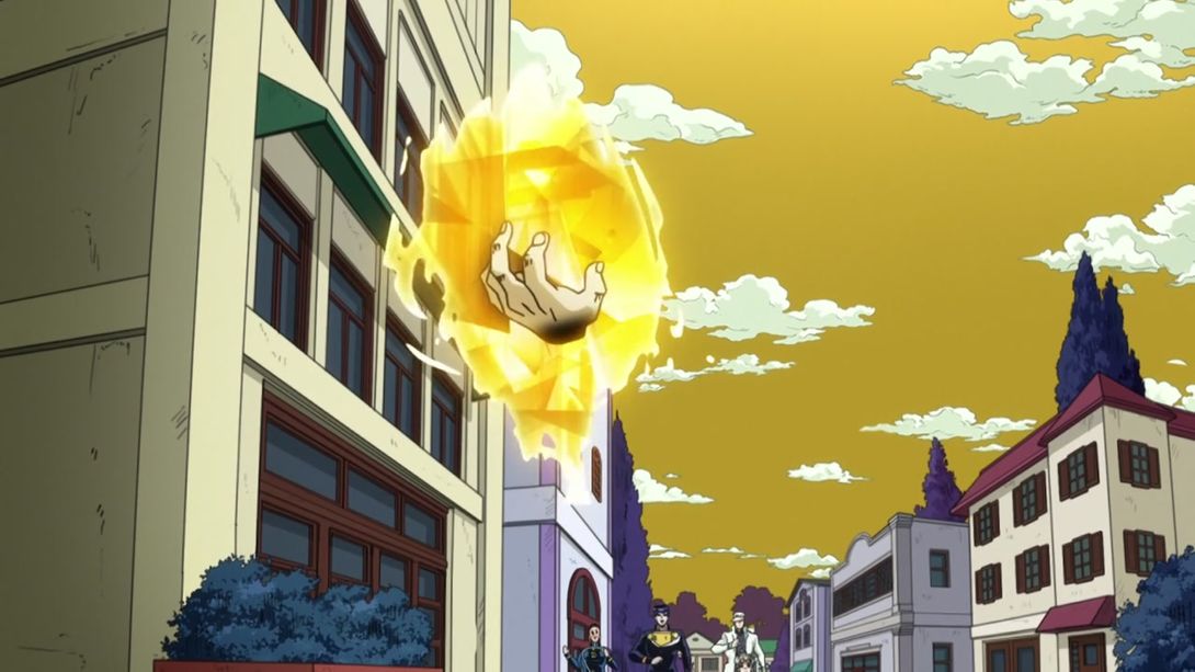
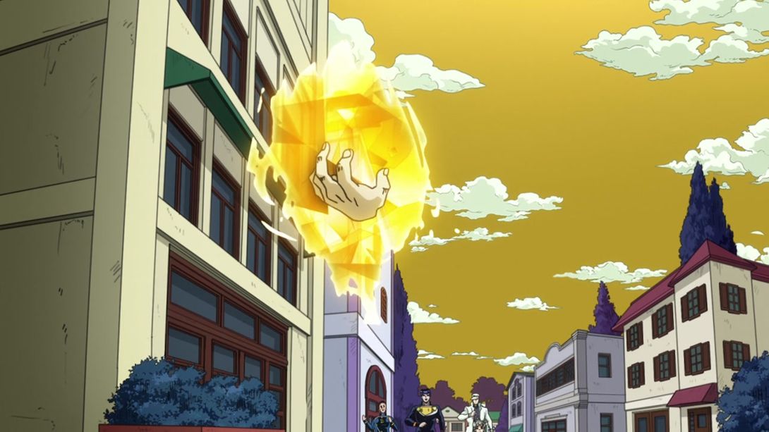

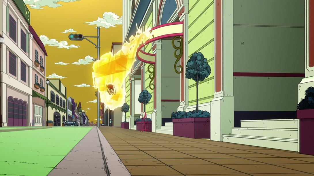
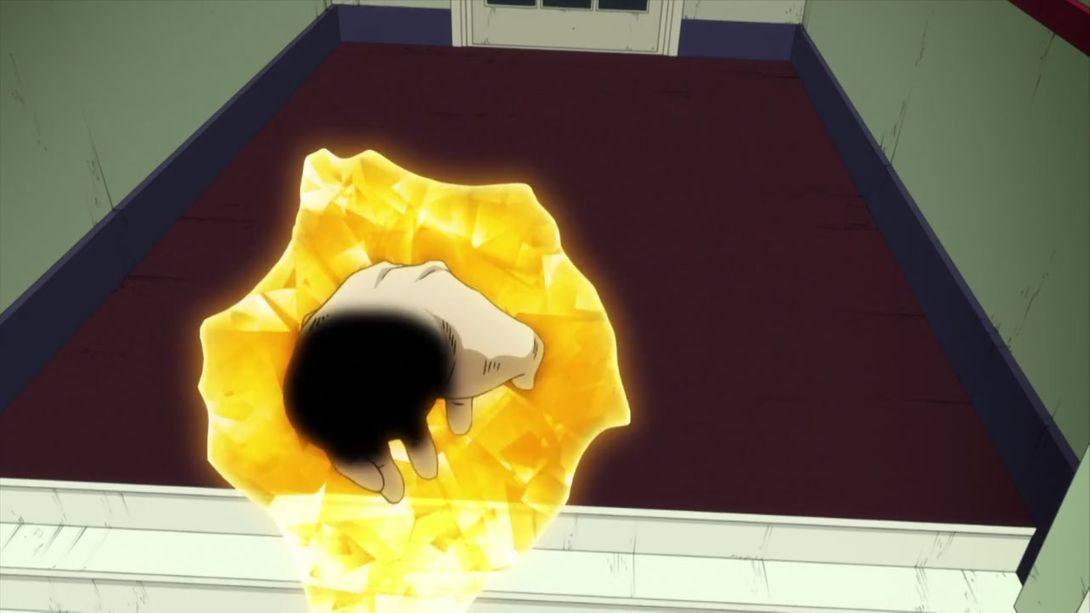
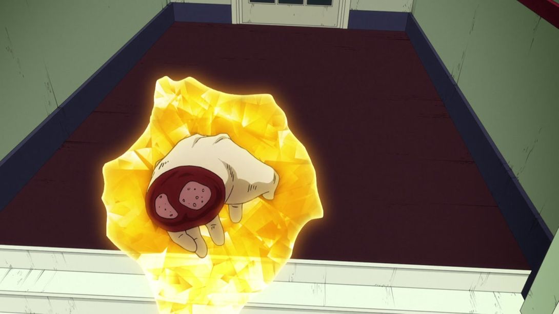
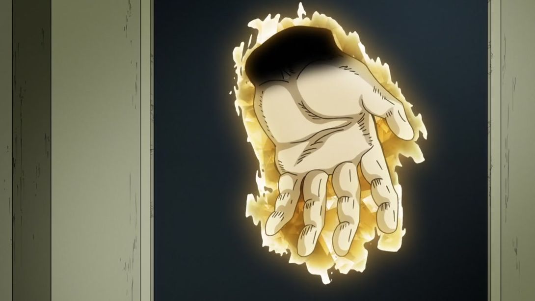
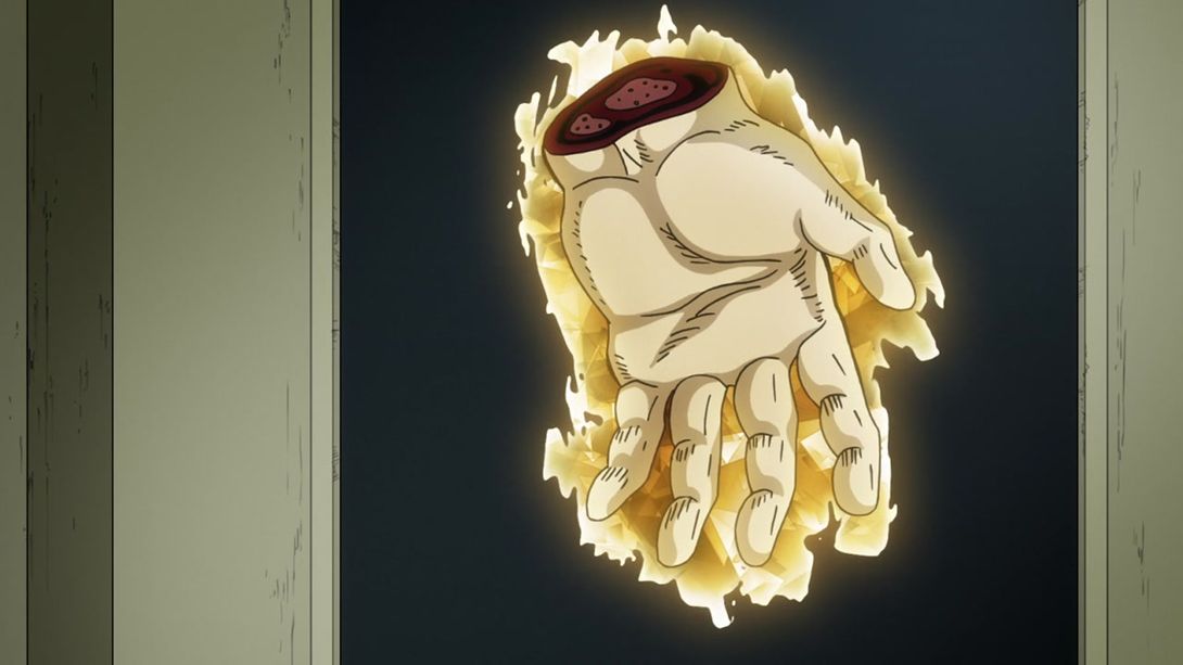
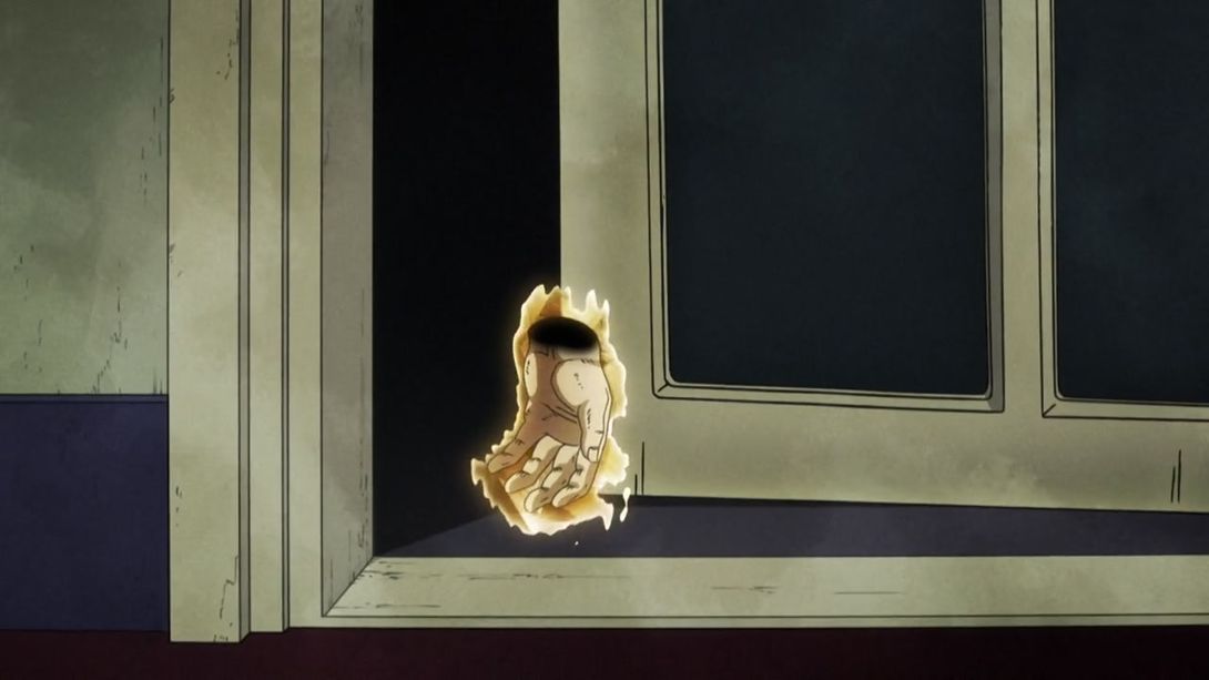
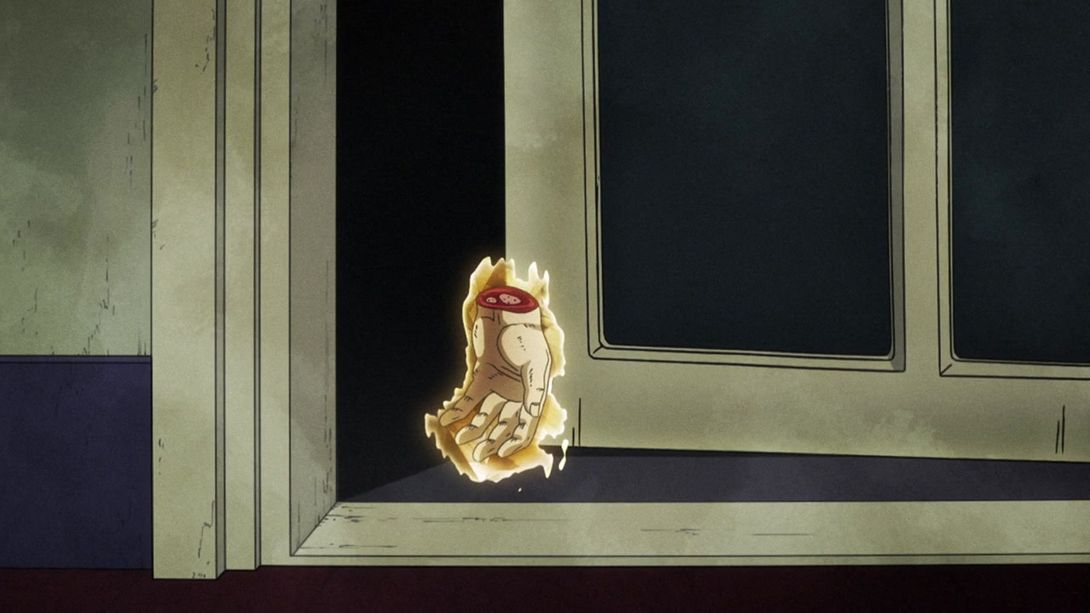
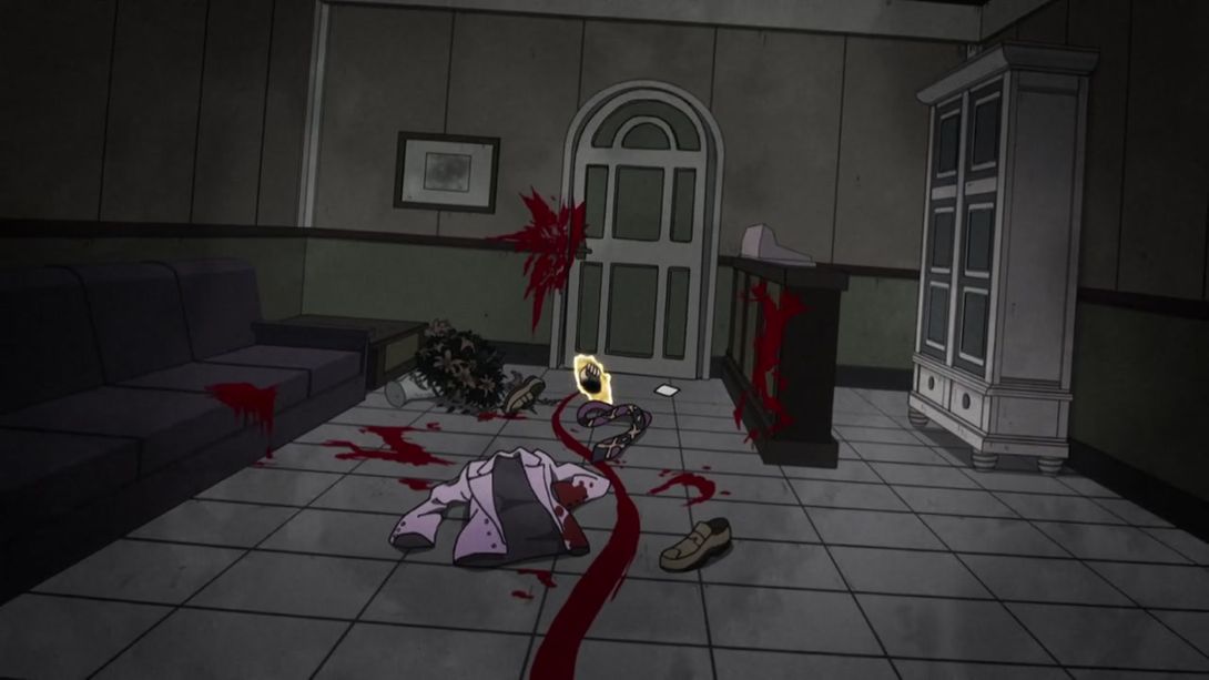
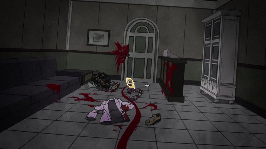
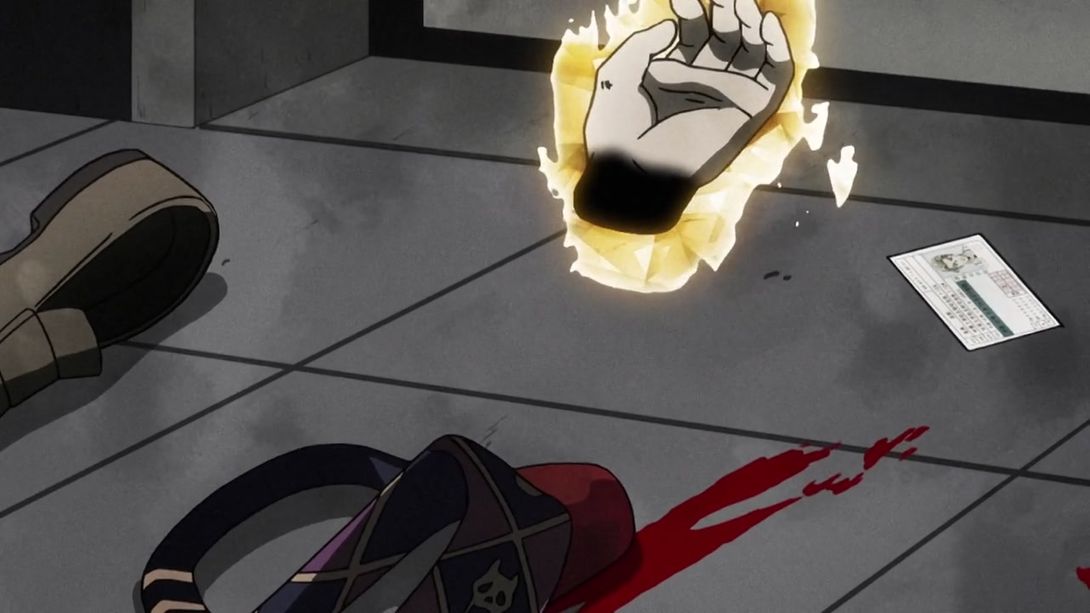
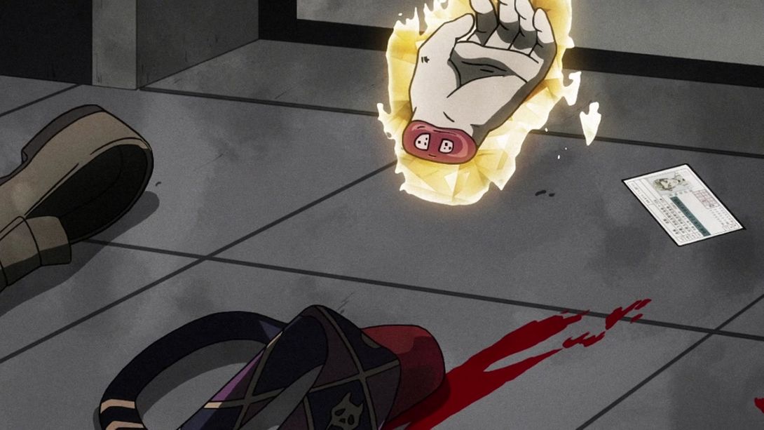
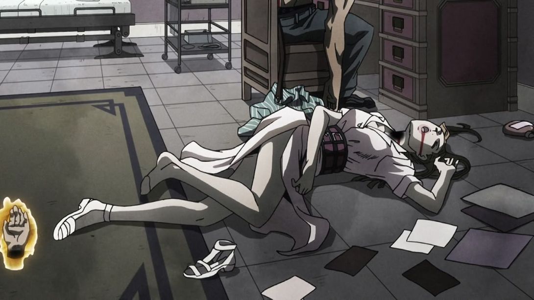
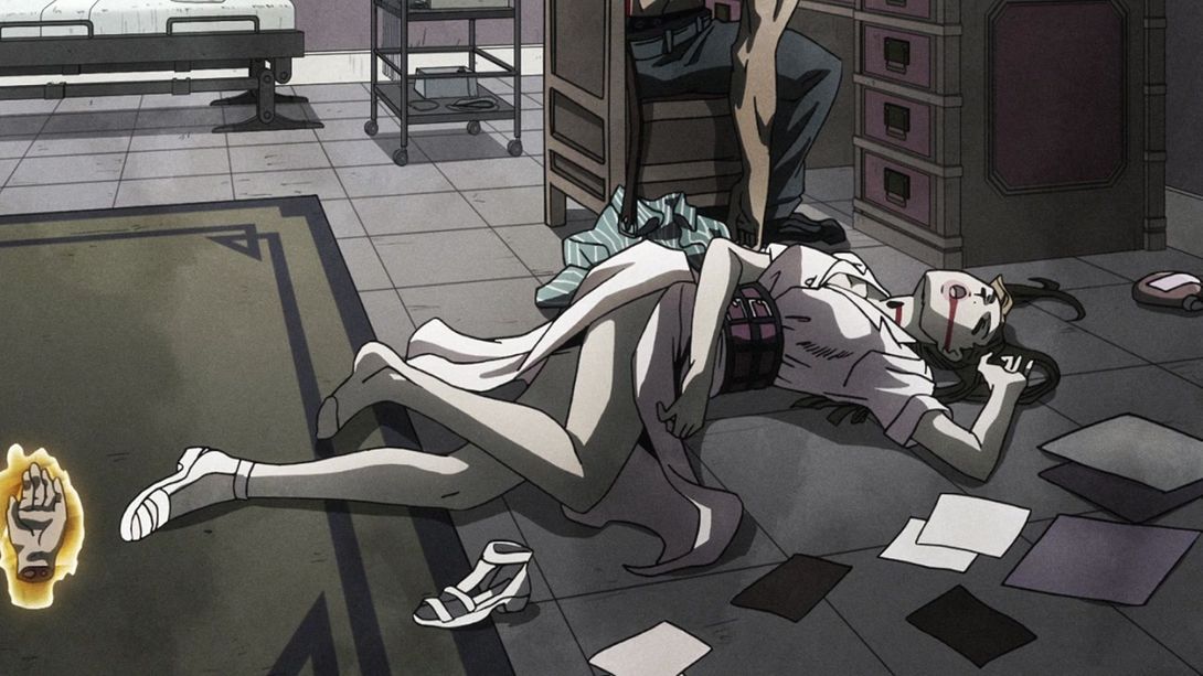
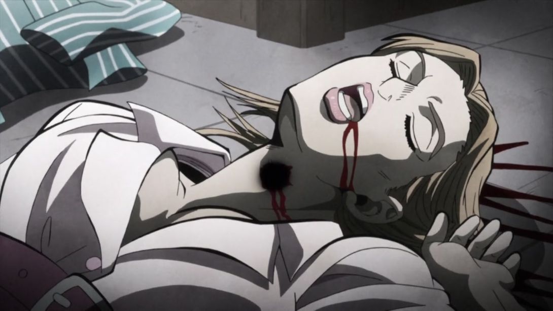
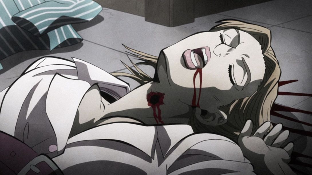
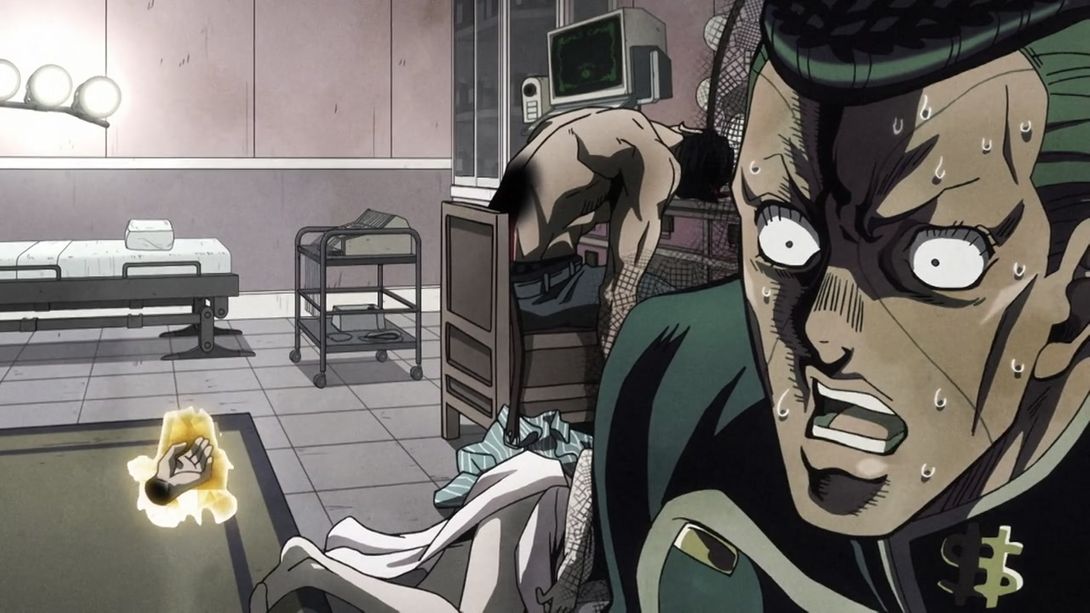
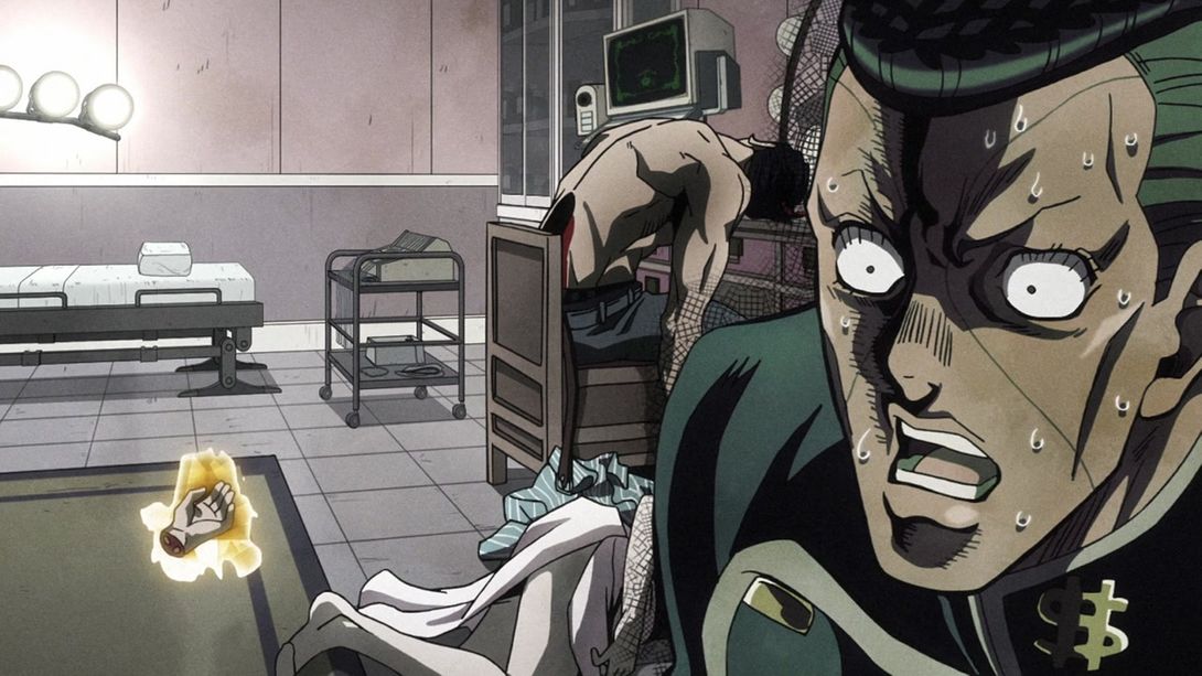
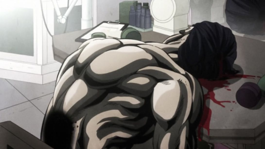
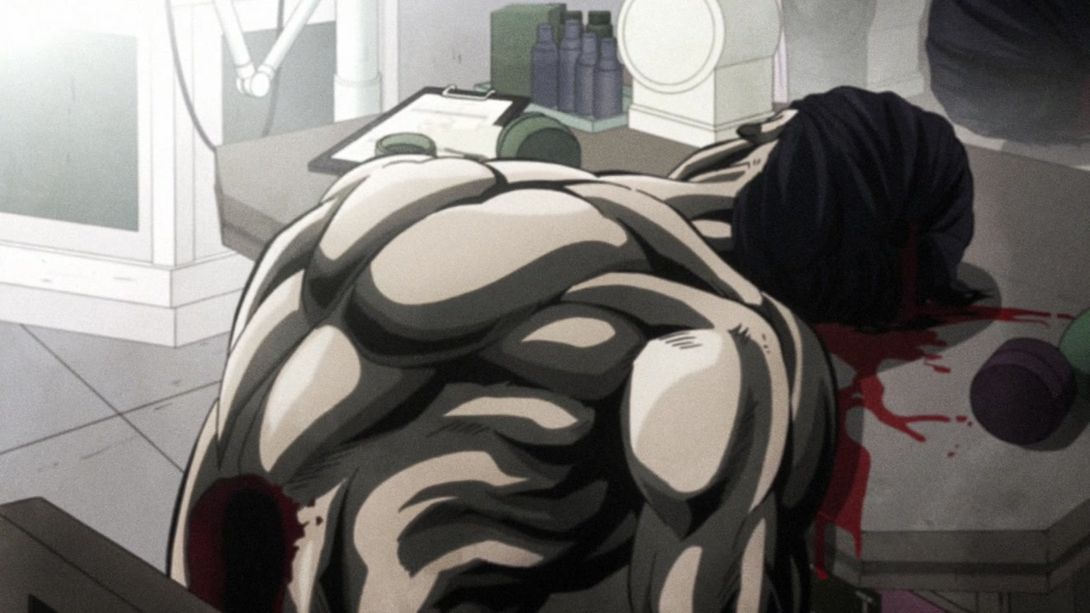
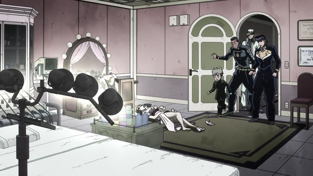
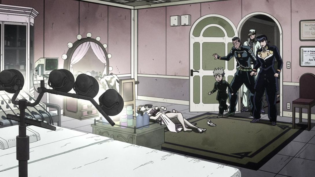
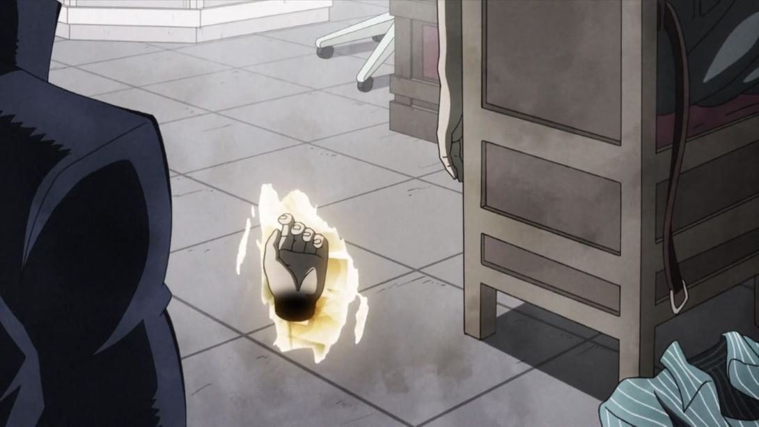
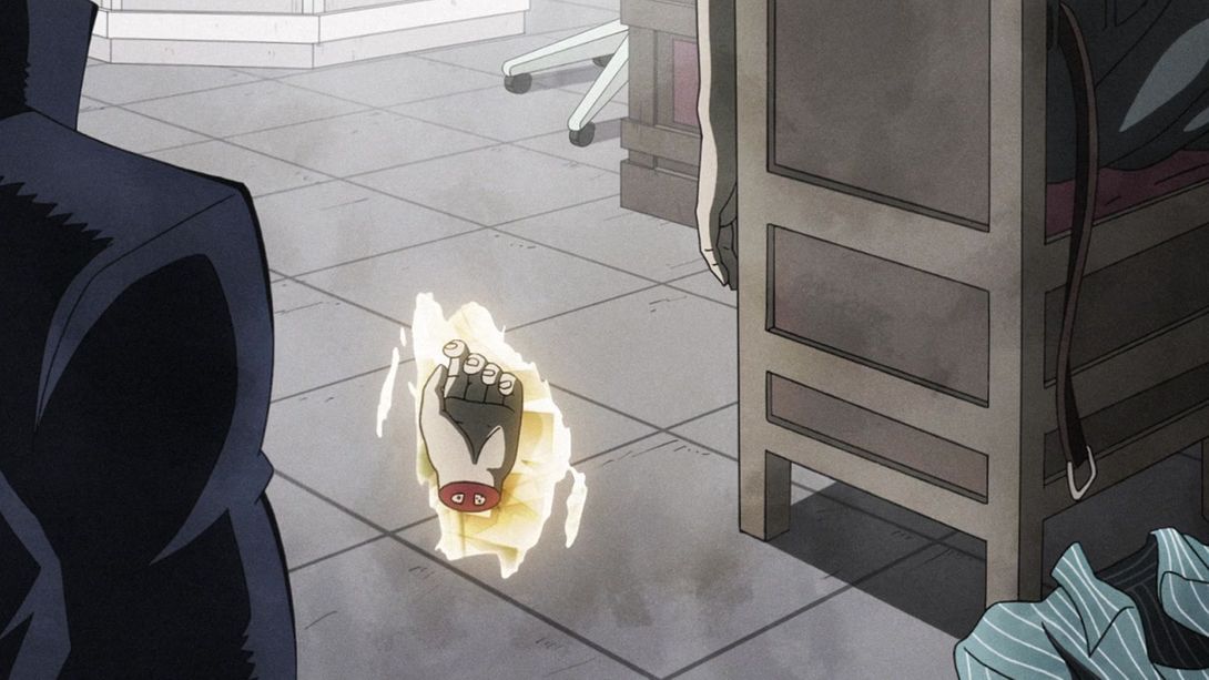
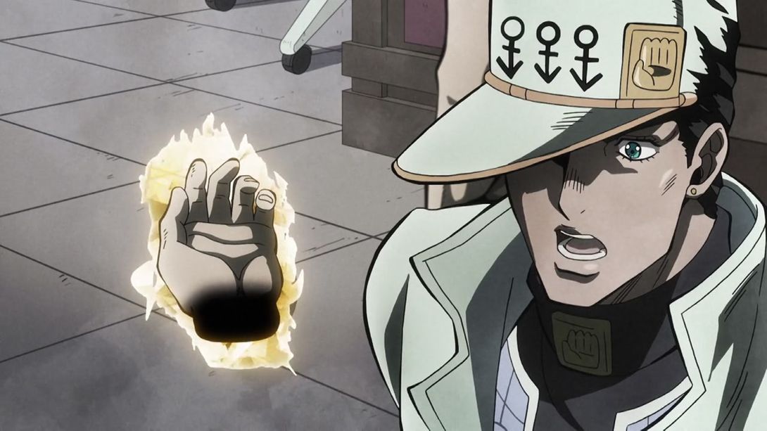
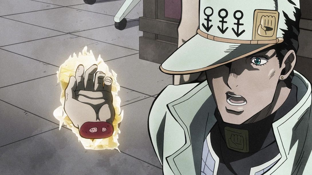

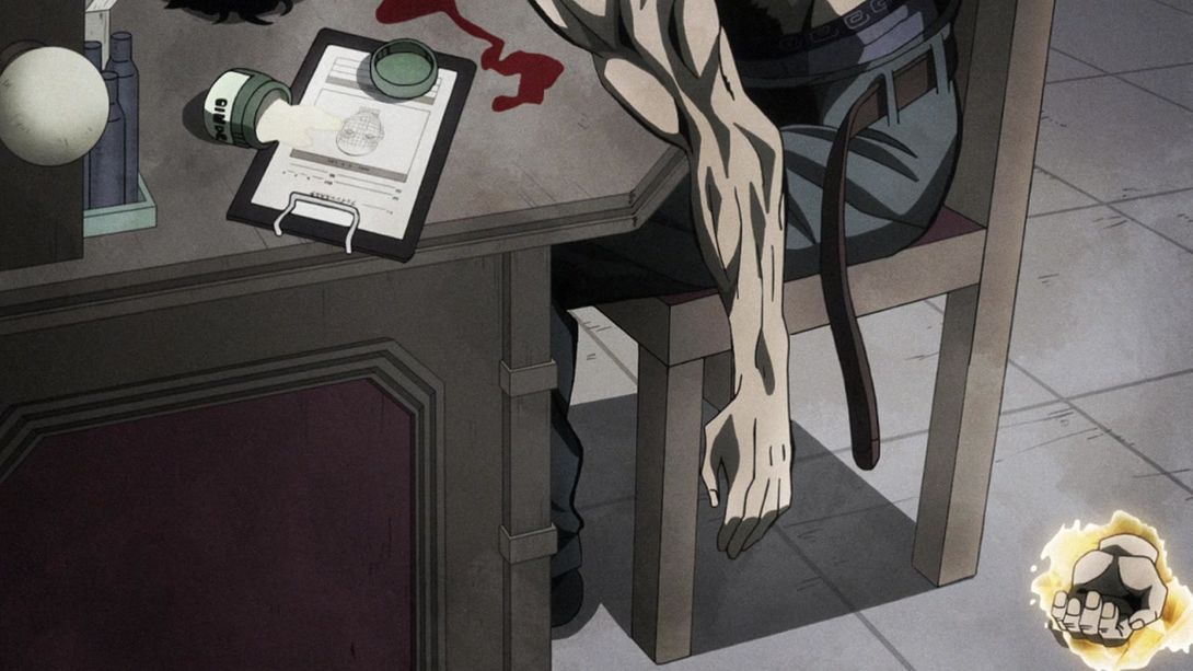
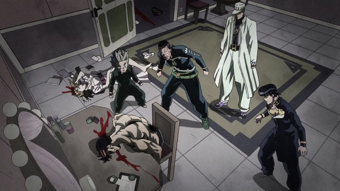
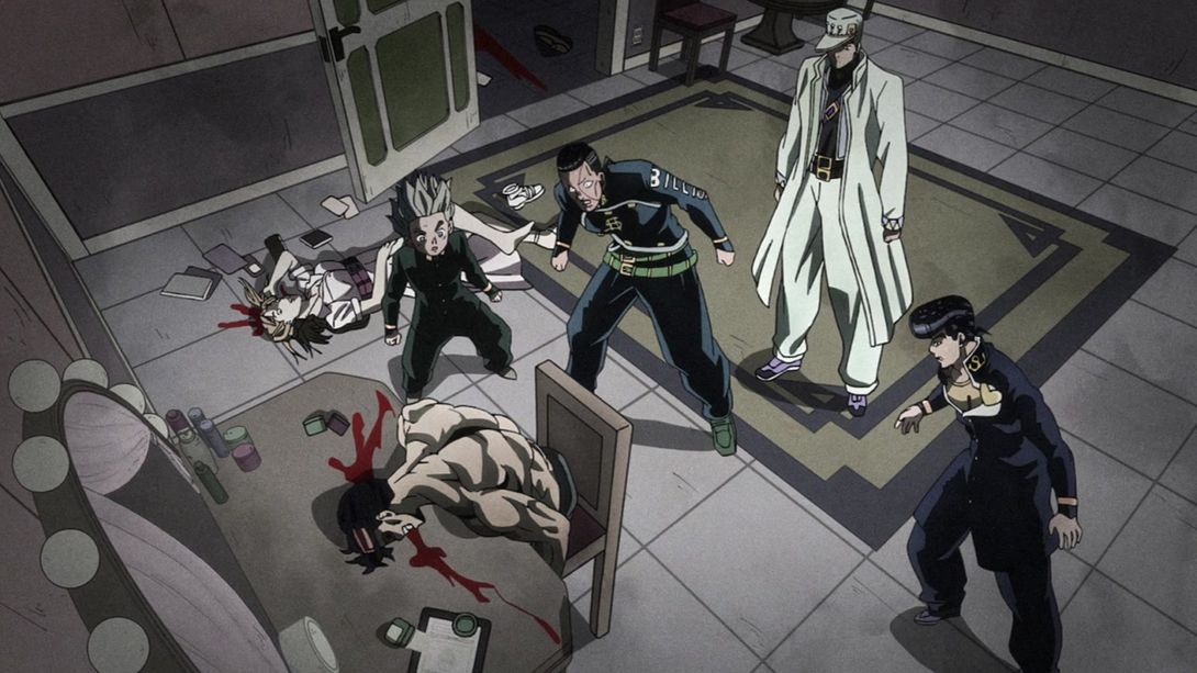
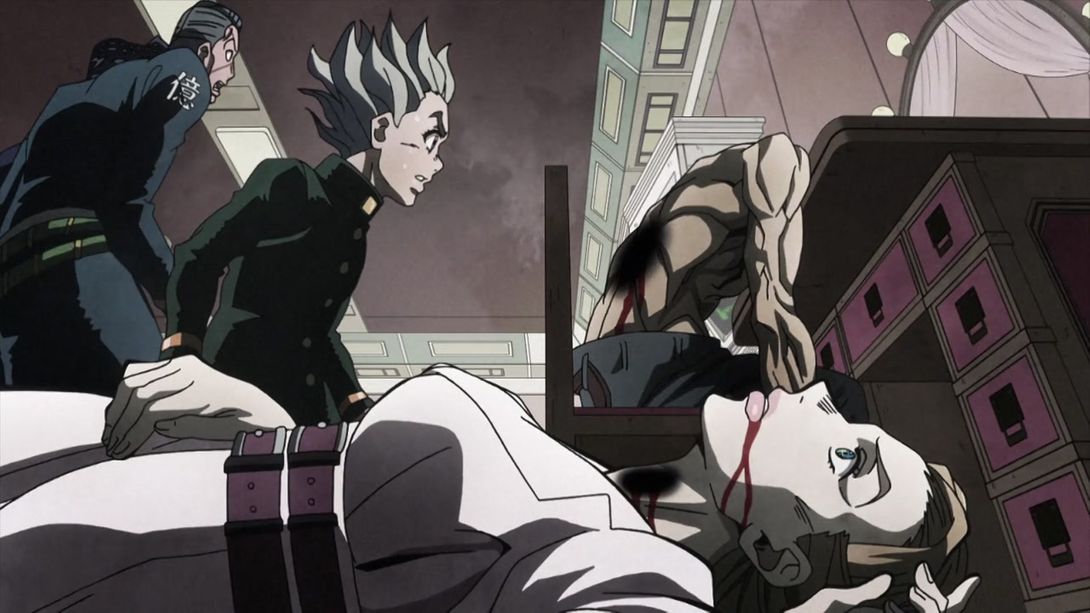
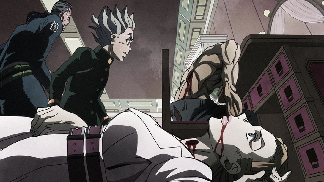
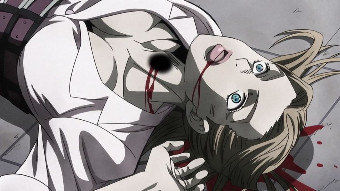
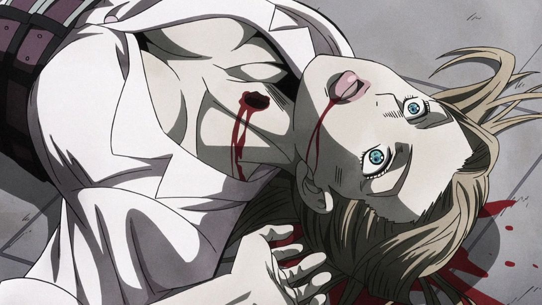
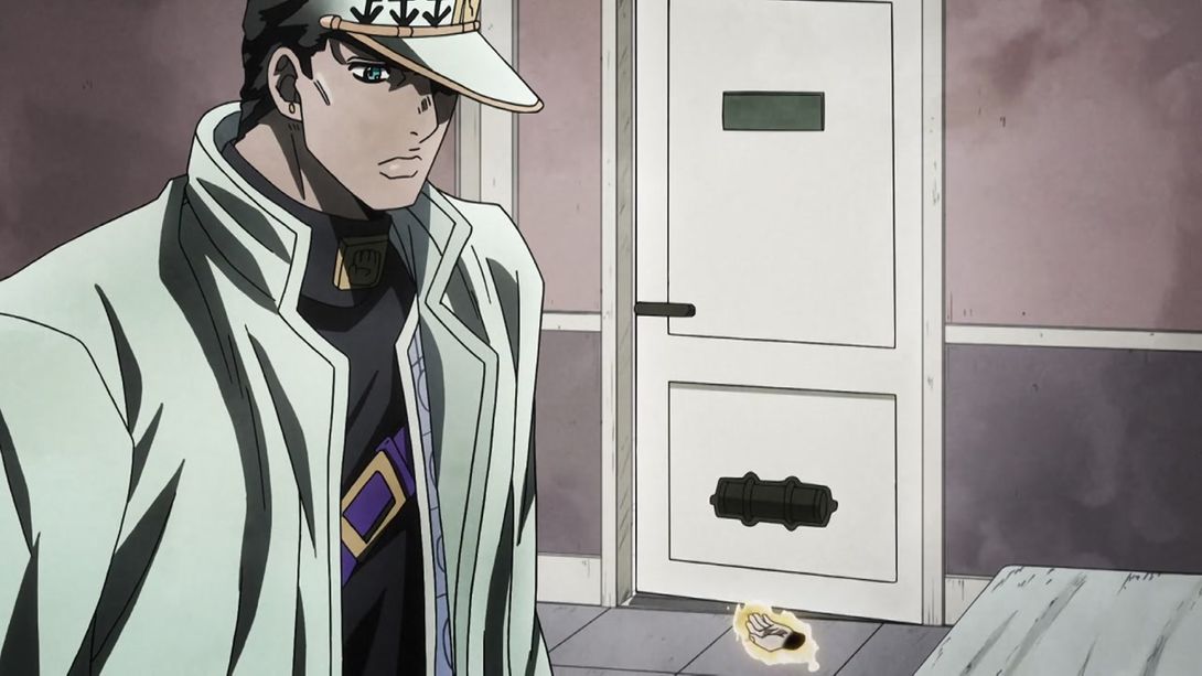
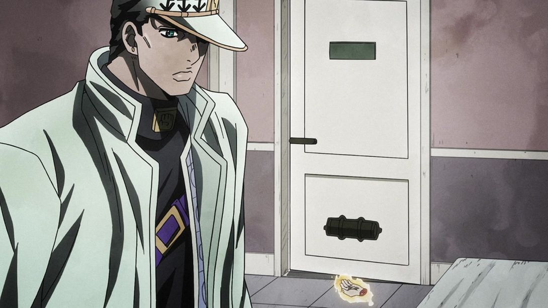

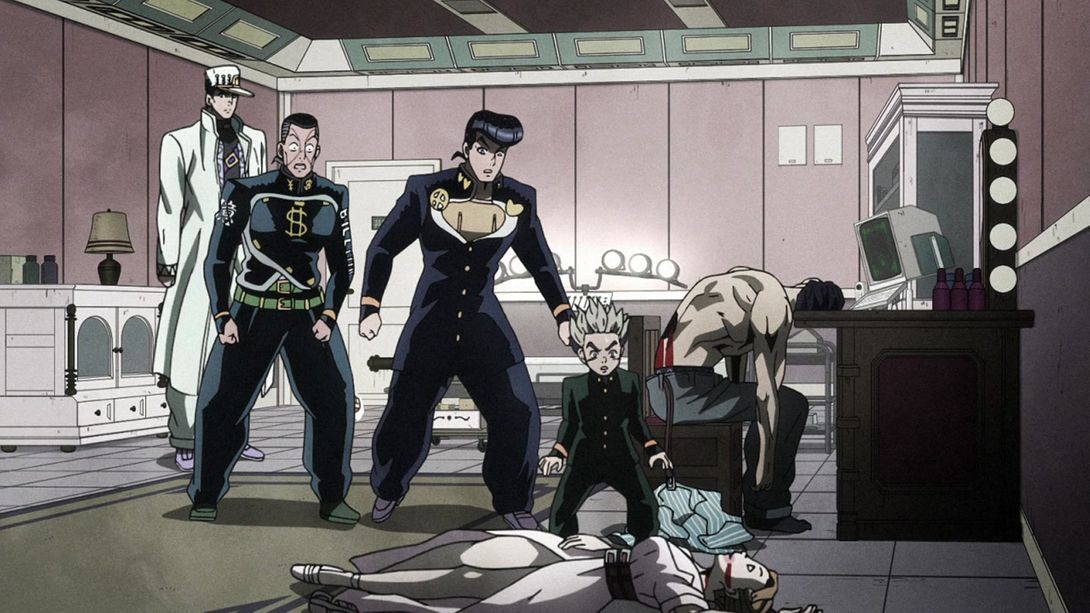

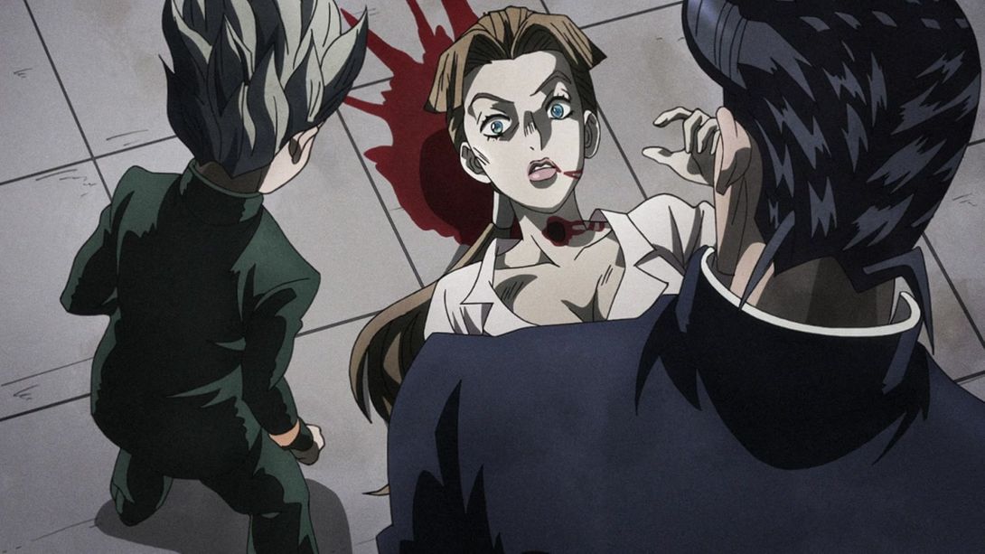
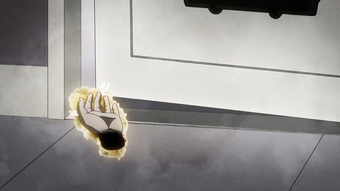
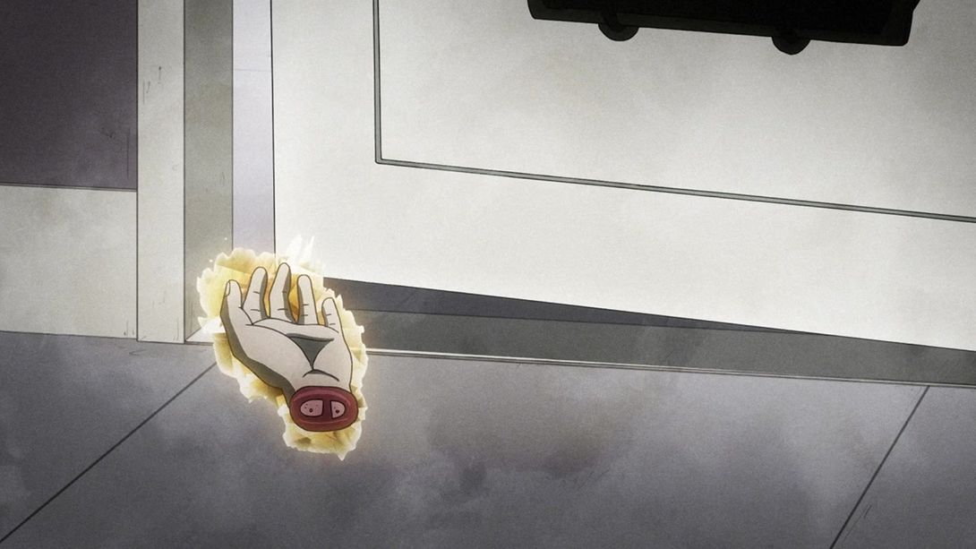
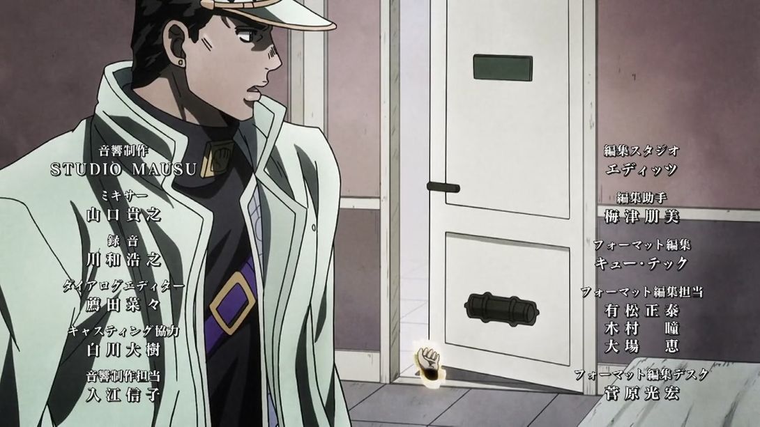
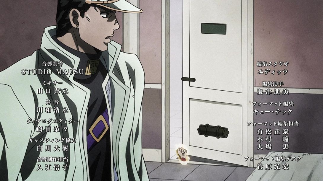
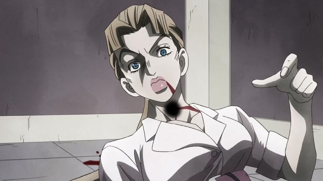
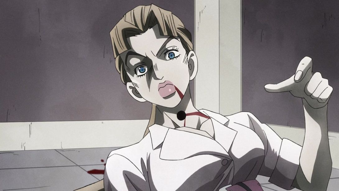
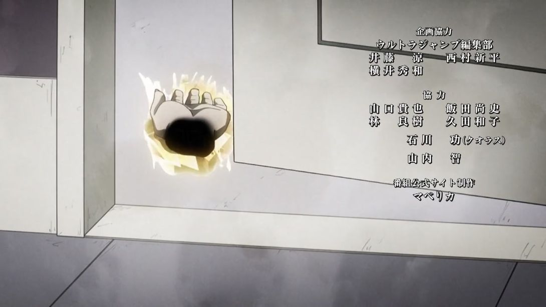
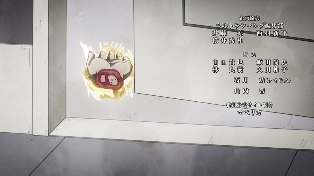
- Phew! That was a lot! I did warn you, though! Now let’s move on with a final couple of differences. In this shot, Assistant Director 内田陽子 (Uchida Yōko) has been added to the credits:
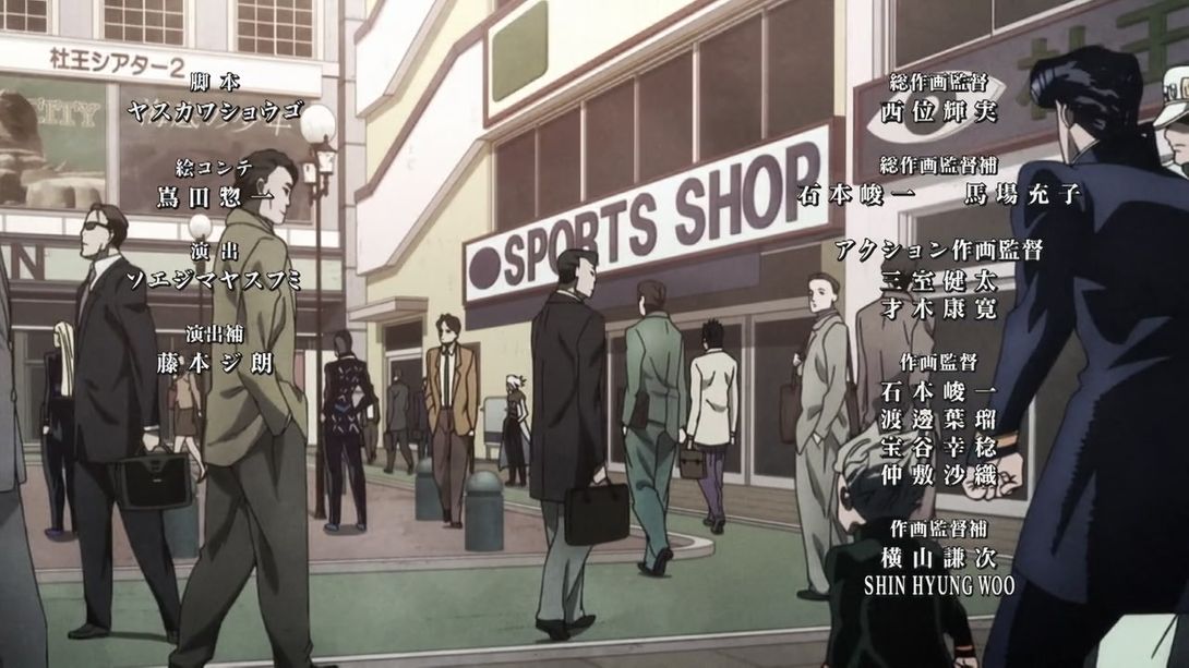
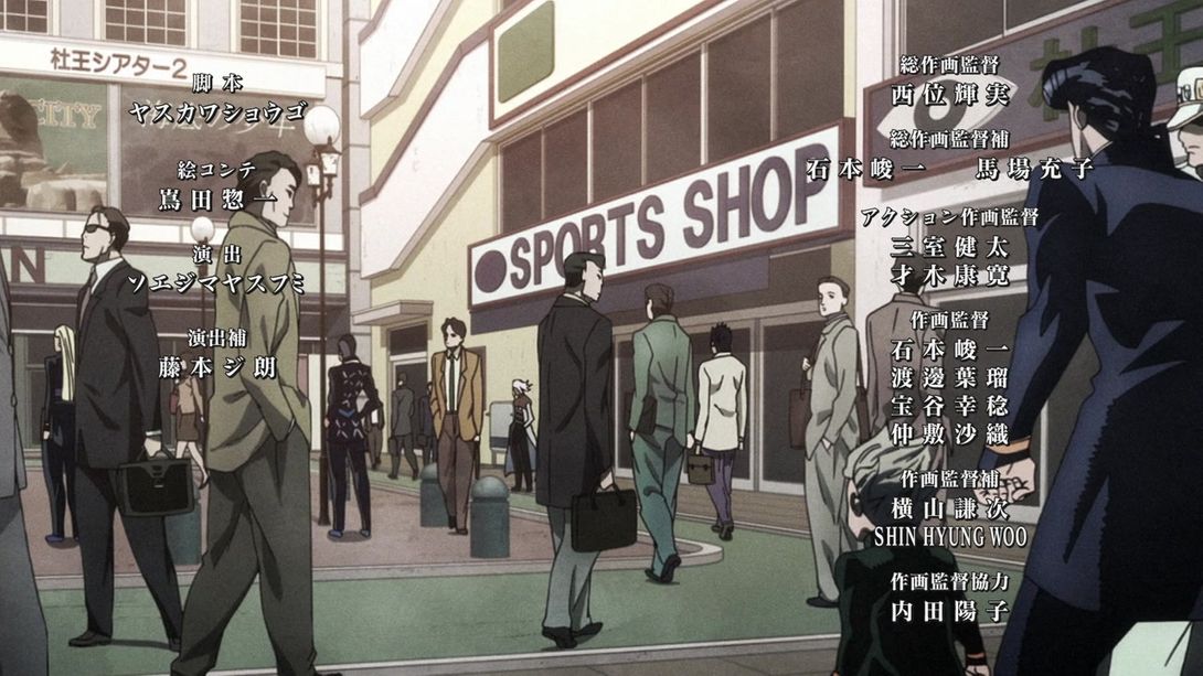
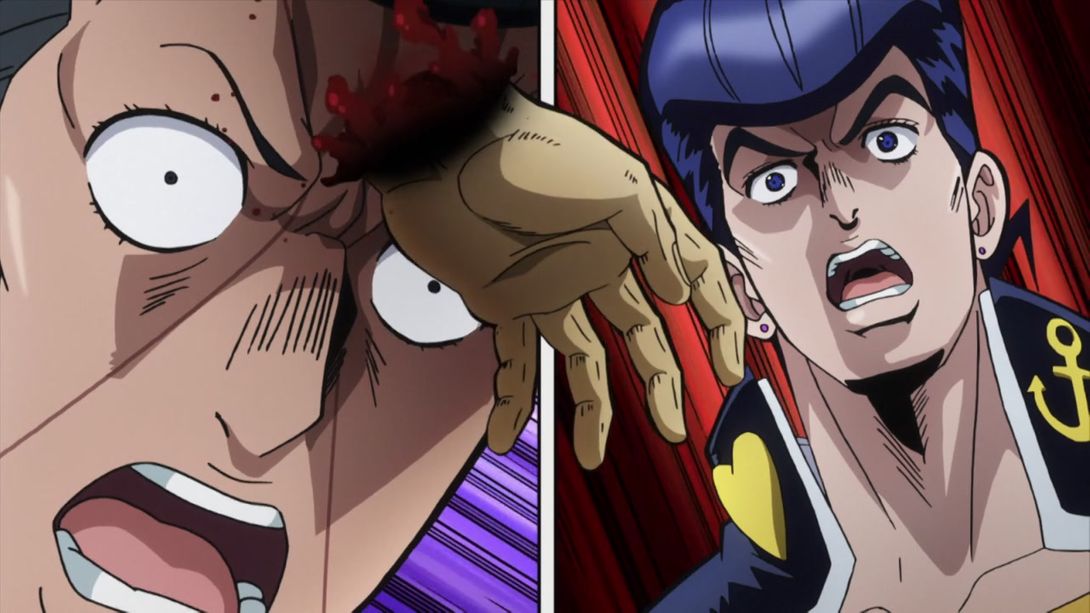
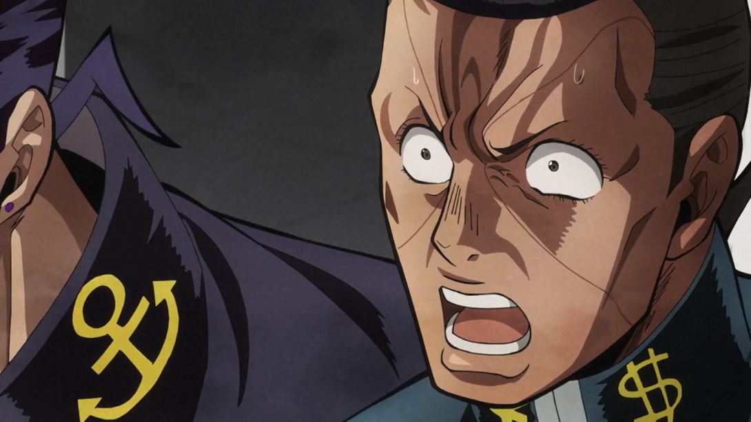
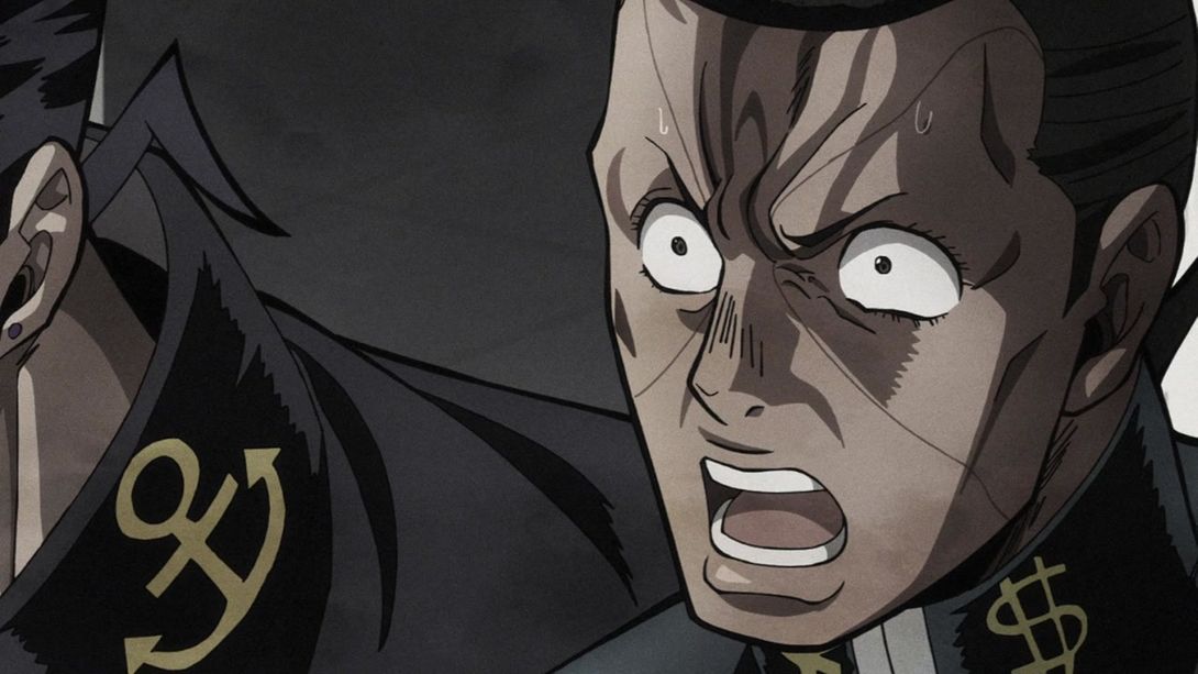
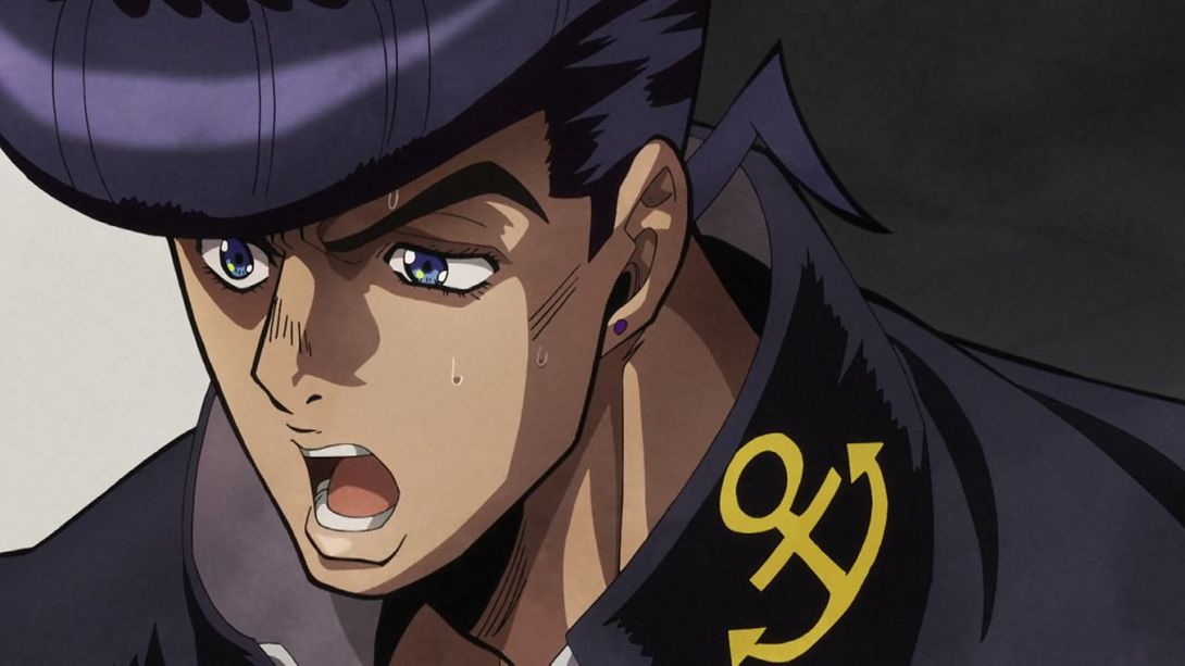
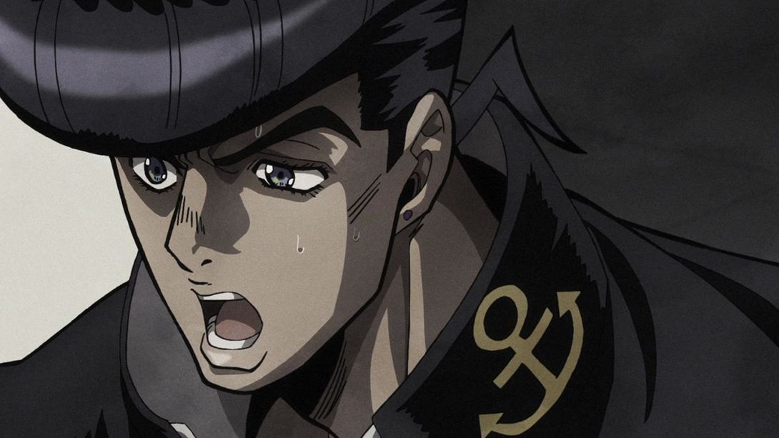
- And, finally, the colouring in this scene of Okuyasu and Josuke screaming after Kira clashed a bit with the drab tones of the rest, and was therefore toned down for the BD version:
Aand that’s it! Damn, this was probably the longest comparison for DiU (and maybe overall?). I had fun doing it, though! I hope you liked reading it. See you (hopefully) next week for Episode #25, “Atom Heart Father”!
Set the controls for the heart of the sun…

