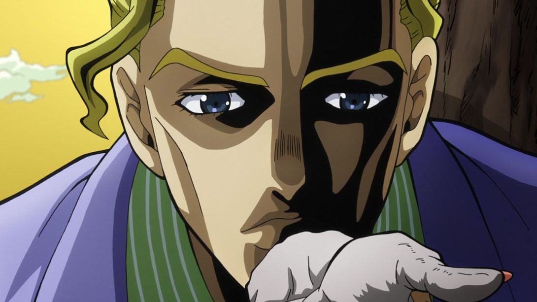
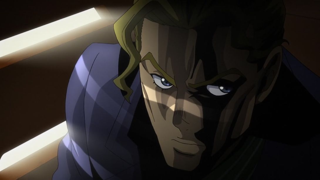
Hey there! Oh! What’s this? Episode #21, you say? Yoshikage Kira Just Wants… A Quiet Life? Part 1?
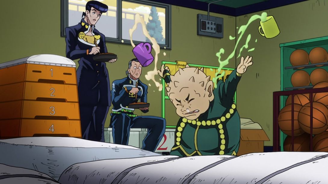
Why yes, that’s precisely what we’re going to take a look at today! I can’t believe we’re finally here. Before we begin, I will say this is a very long comparison (one of the longest in DiU history), but… It’s not perfect. There are plenty more things that could have been redrawn, plenty of wonky shots of Josuke and Okuyasu that still made it unscathed through the redrawing process (especially those in the gym storeroom). But this is what we got, so it’s no use crying over spilled milk!
Let’s get right to it!
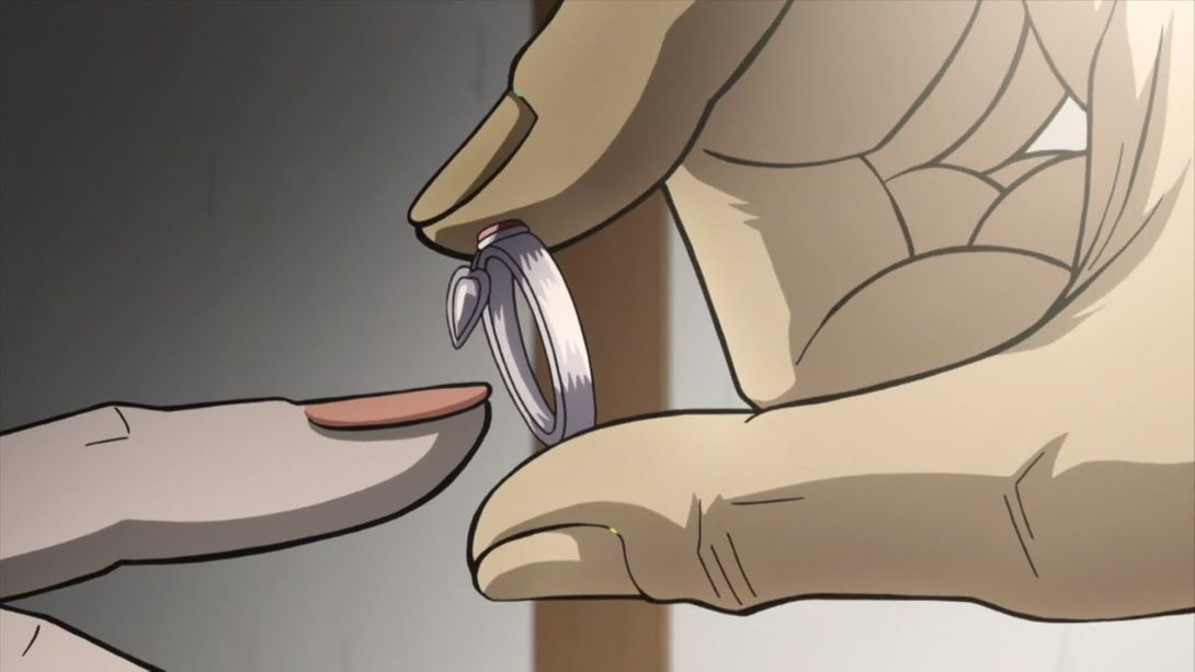
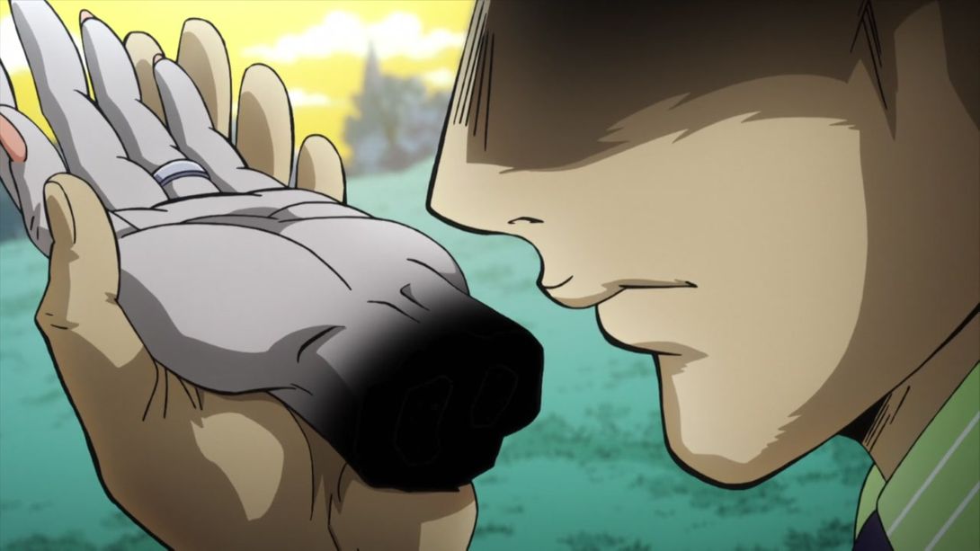
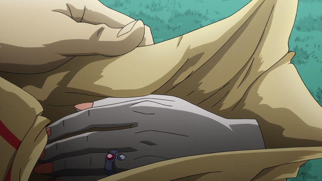
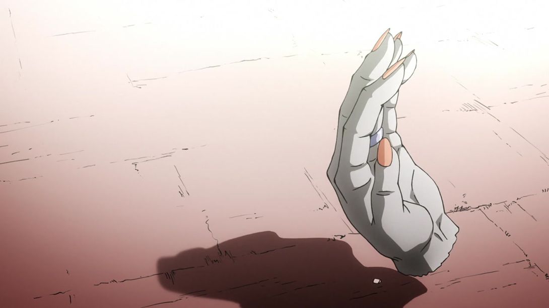
- Let’s begin with a rather minor difference. In this scene of Kira putting a ring on her girlfriend’s hand, two very tiny bits on his nails were not properly coloured black; this has been fixed:

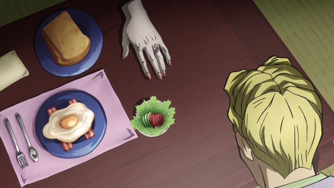
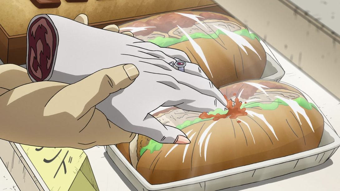
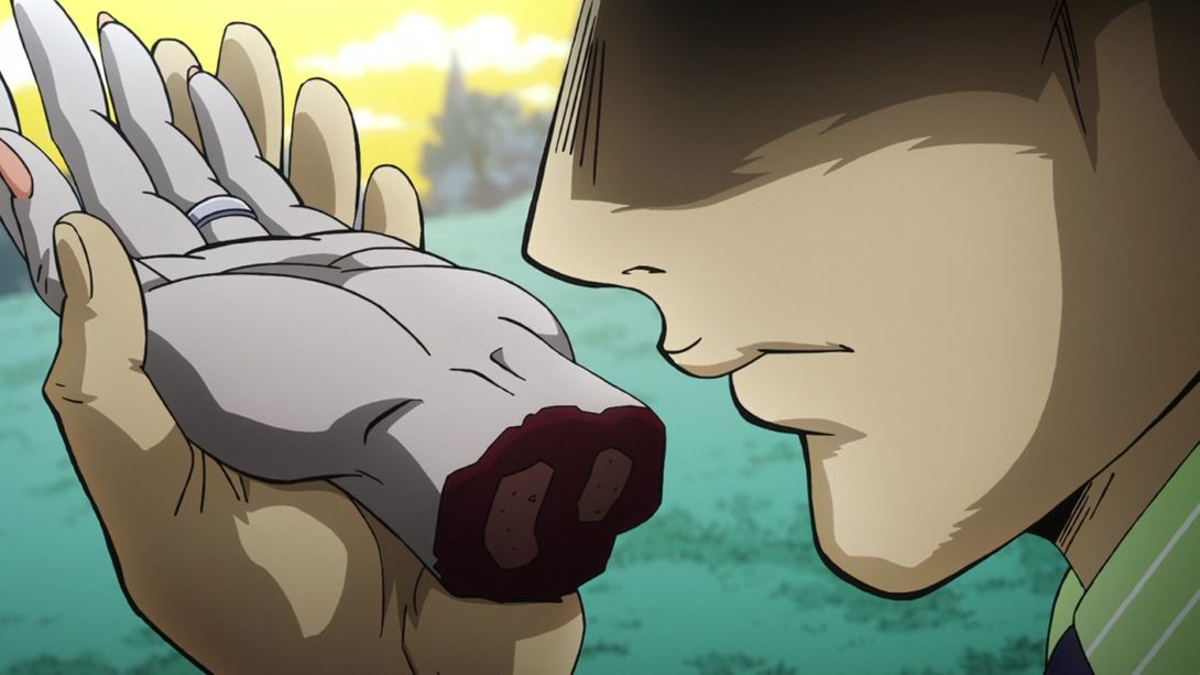
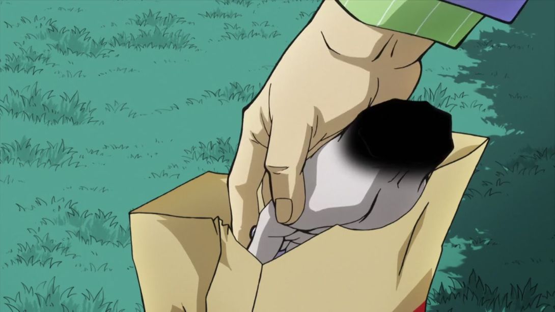
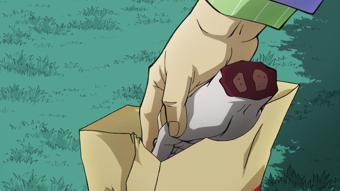
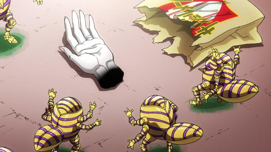
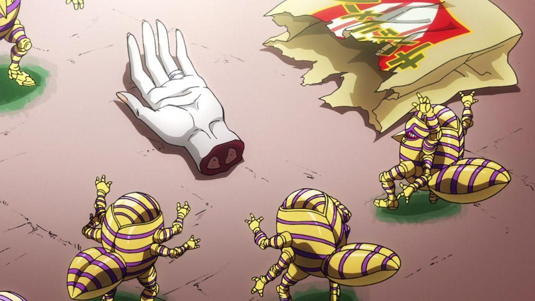
- In this shot, the hand is uncensored; plus, the handkerchief and the plate with the toast have been swapped:

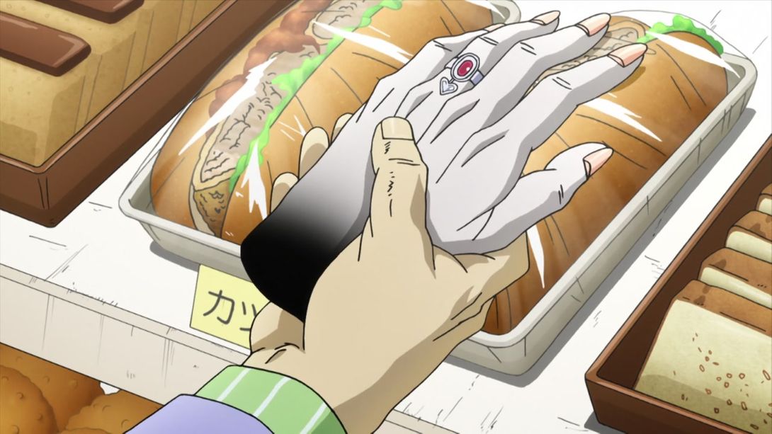
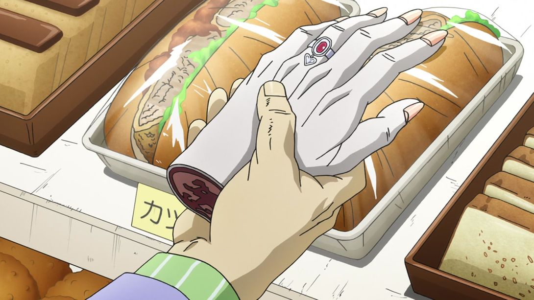
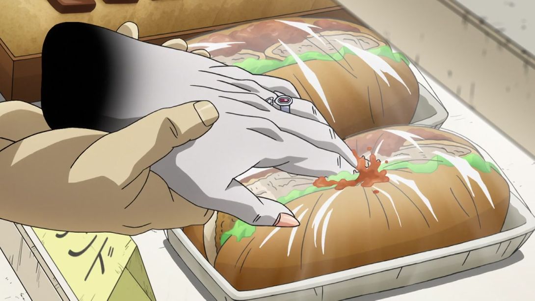
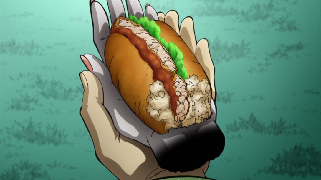
- Ah, the joy of choosing lunch with your partner… Apart from the obviously uncensored wrist, the croquettes in the shelf just below the sandwiches have also been shaded a little bit better:
- Man, Kira’s girlfriend sure looks beautiful in the BDs:


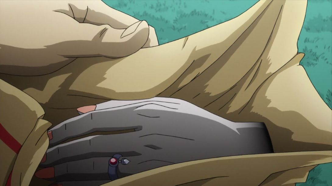
- Another uncensored hand here, plus the shading on Kira’s right shoulder and hand looks more natural:
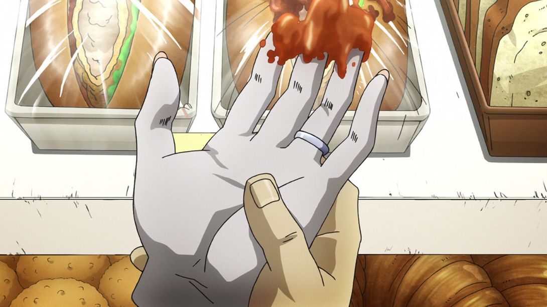
- Aand back to the regularly scheduled uncensored hand:
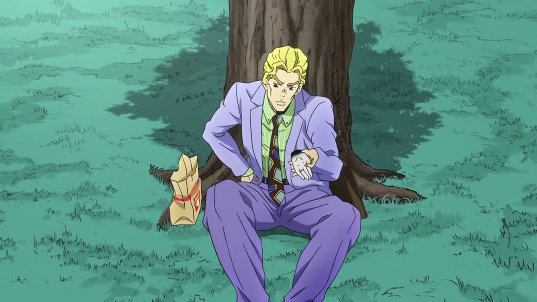
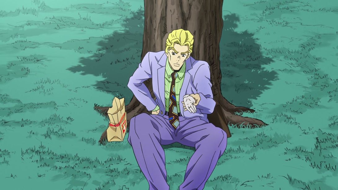
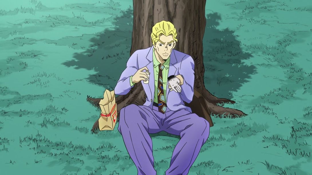
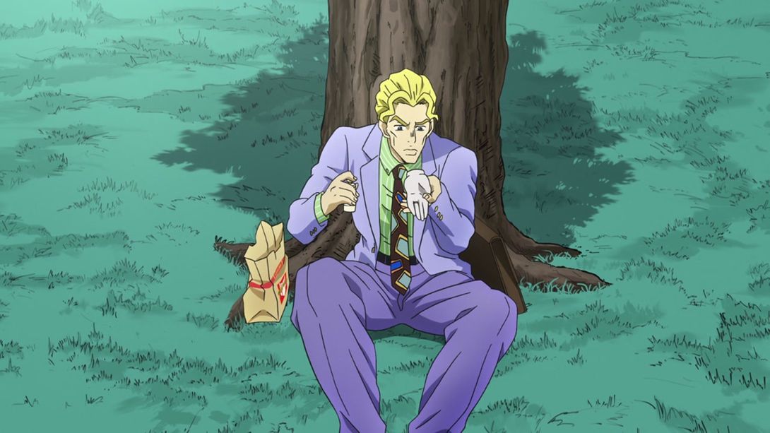
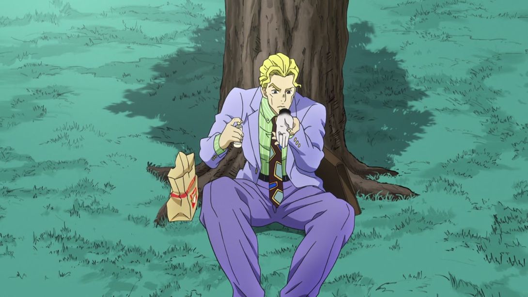
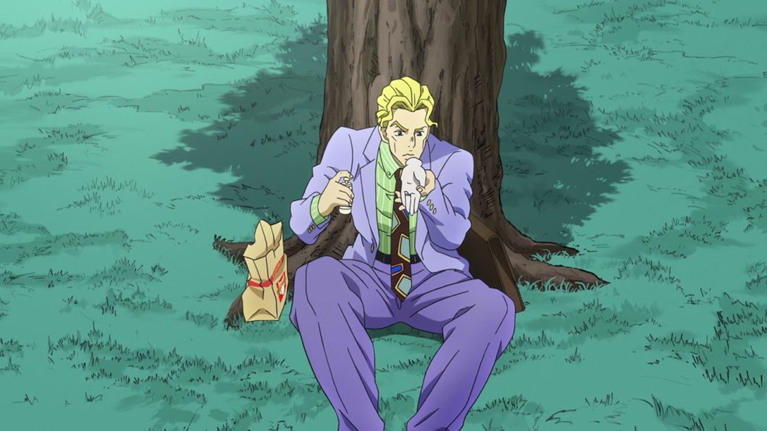
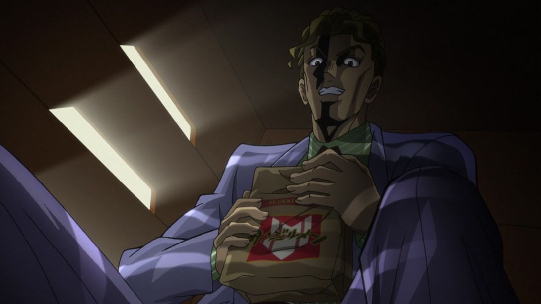
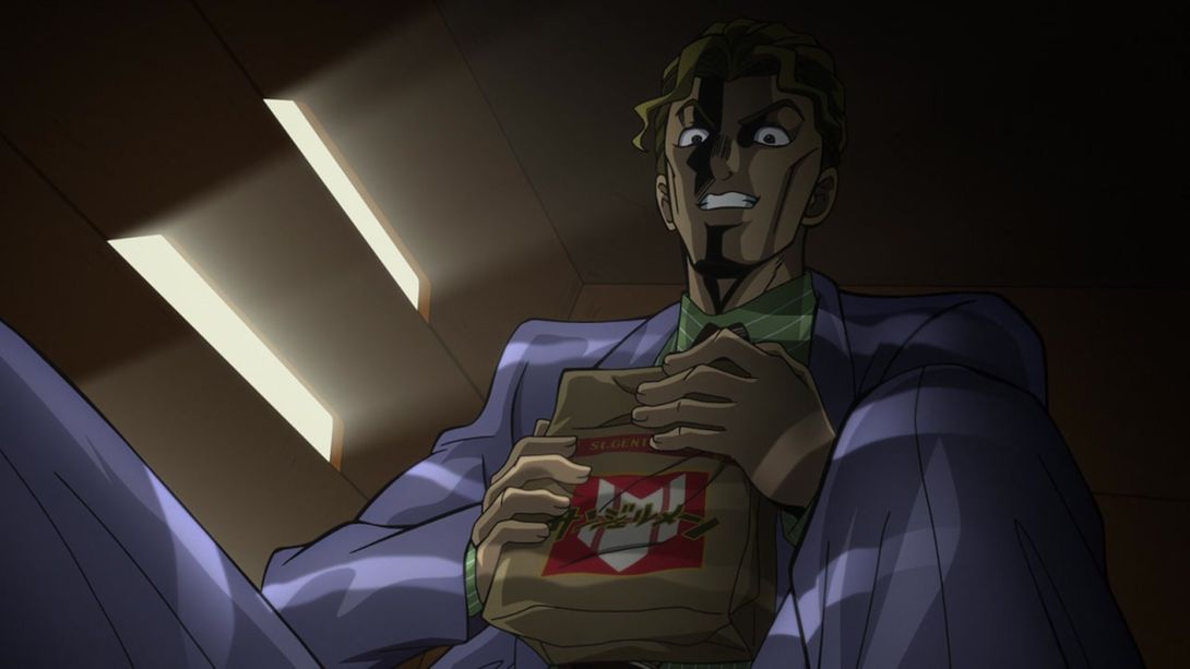
- Here we have three shots, each one with the usual uncensored hand, plus three different things. The first one (and, to a lesser extent, the third one) has slightly retouched eyes on Kira, the second one has an overall different stance that leads to a smoother transition to the following torso position, and in the third one, the perfume bottle in Kira’s hand has been slightly retouched. Check ‘em out:
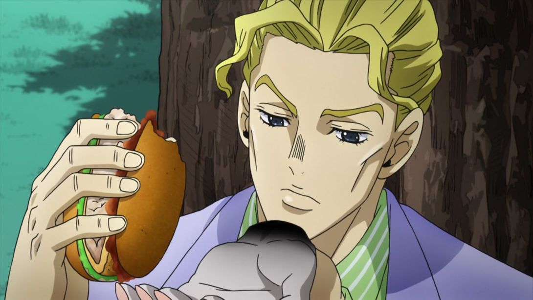
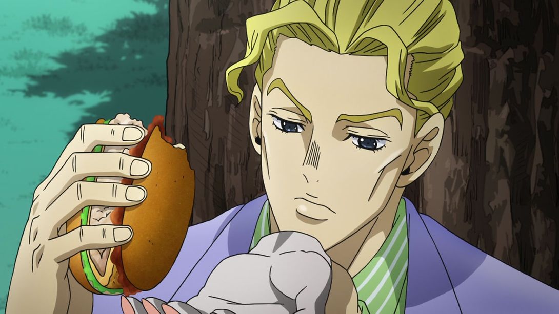
- Ah, what a healthy relationship:
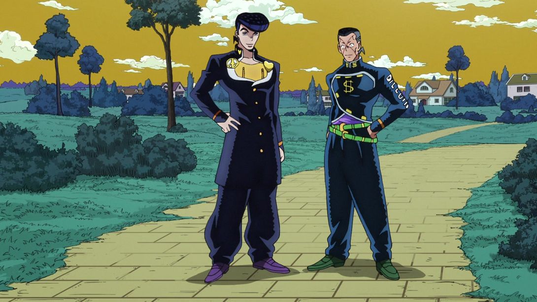
- In the next couple of comparisons, Josuke’s mouth and Okuyasu’s face have all been retouched; in the second one, the missing BILLION has also been added back on Okuyasu’s left sleeve:


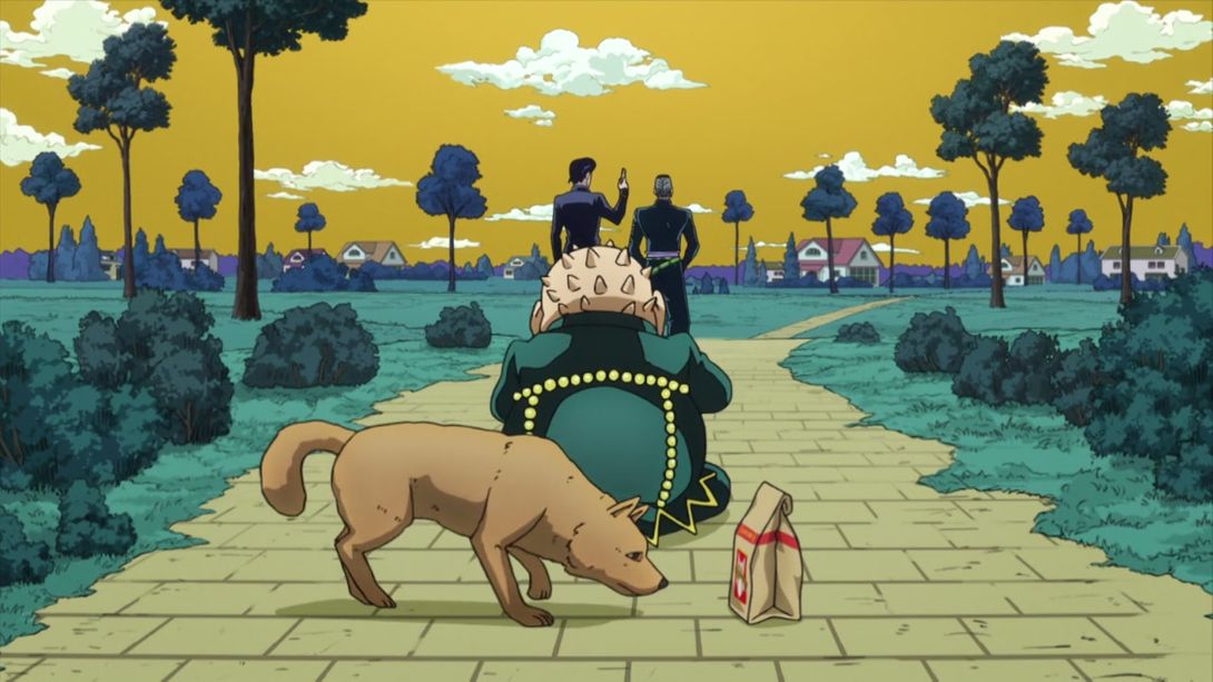
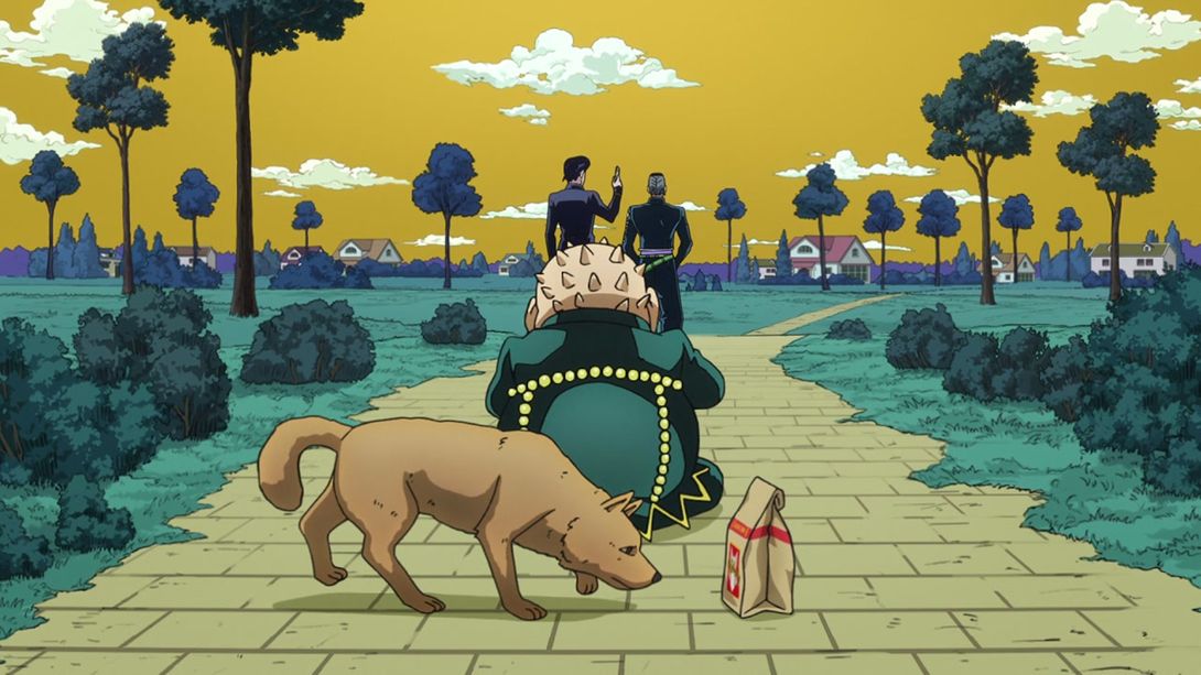
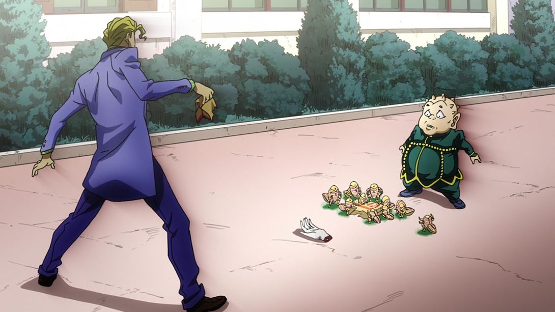
- Here it is! The dog that started everything! He’s been slightly re-shaded, and his legs have also been redrawn in some frames:
- A brighter background and a new layer of shading on top of Kira make for a better couple of shots here:
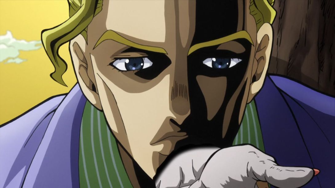
- In this close-up of Kira, his eyes and the area behind his nose have been shaded a little bit better:
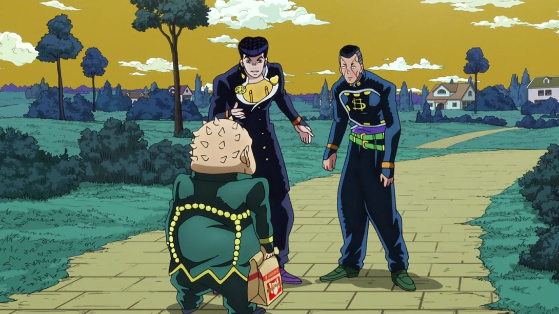
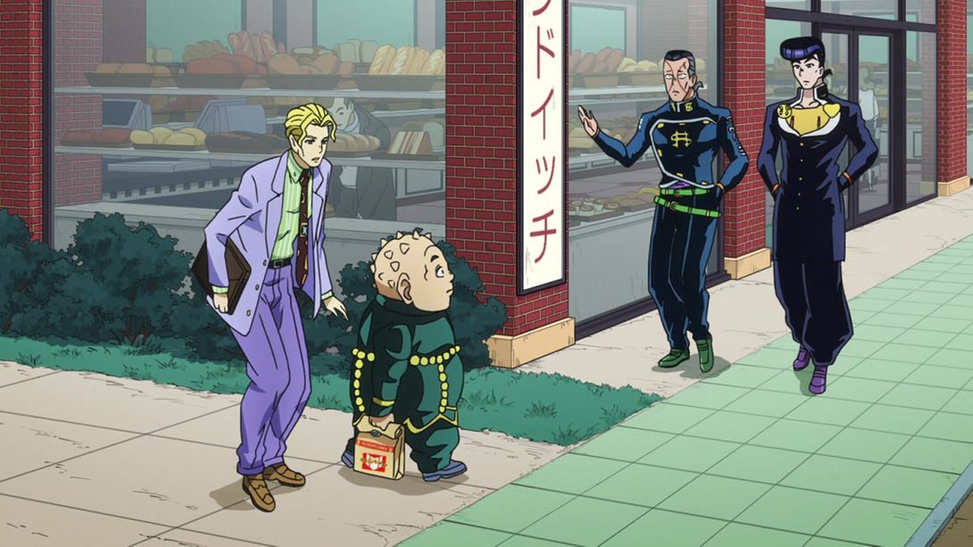
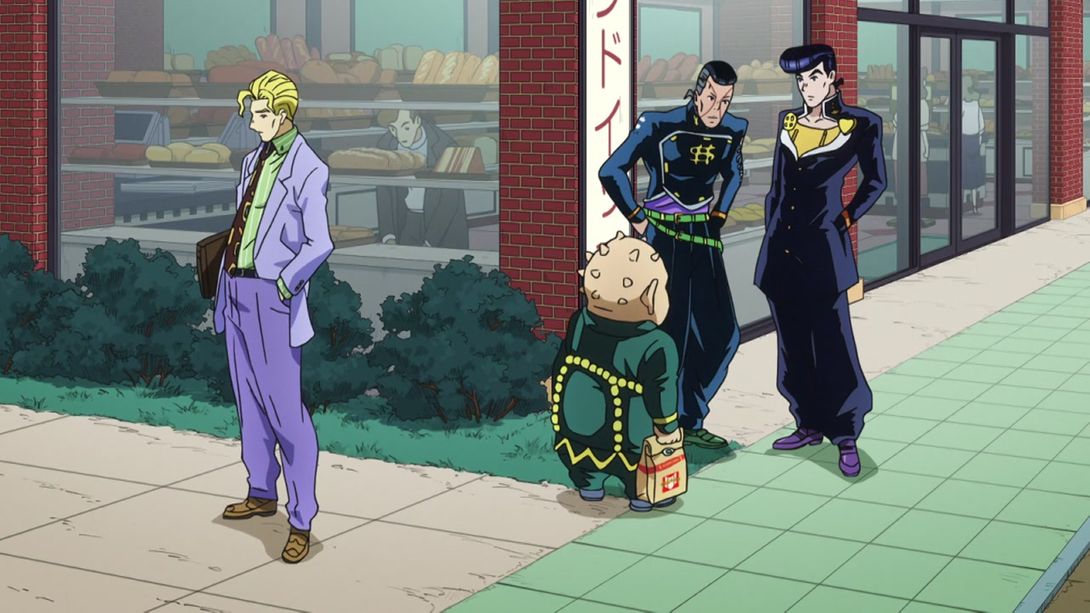
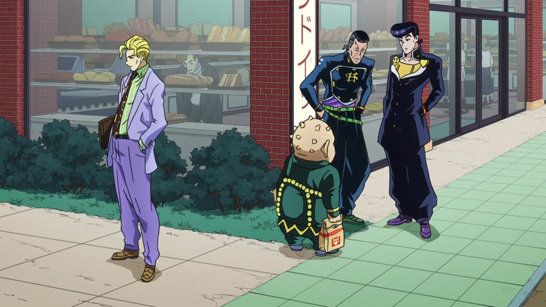
- Kira, Shigechi, Josuke and Okuyasu’s faces have all been retouched in this shot; the lady in the bakery behind has also been moved to the left:

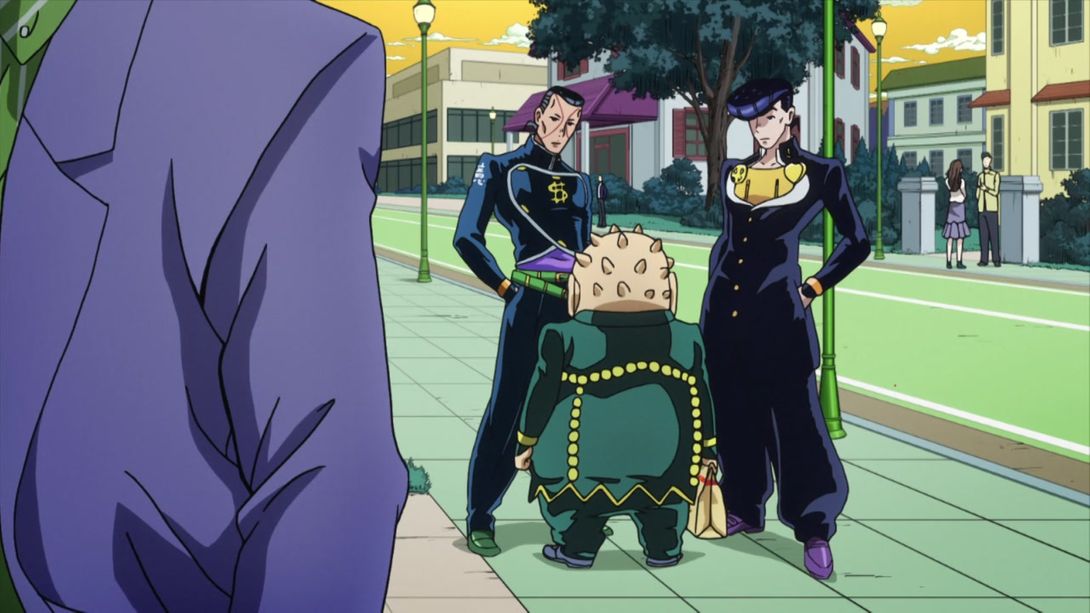
- Again, Josuke and Okuyasu’s faces have been redrawn here; the anchor and yen symbols on their collars have also been added in:

- Shigechi walks slower here:
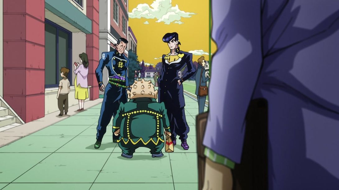
- In this shot, both Josuke and Okuyasu’s faces look better, and everyone in the background has either been resized or moved slightly:
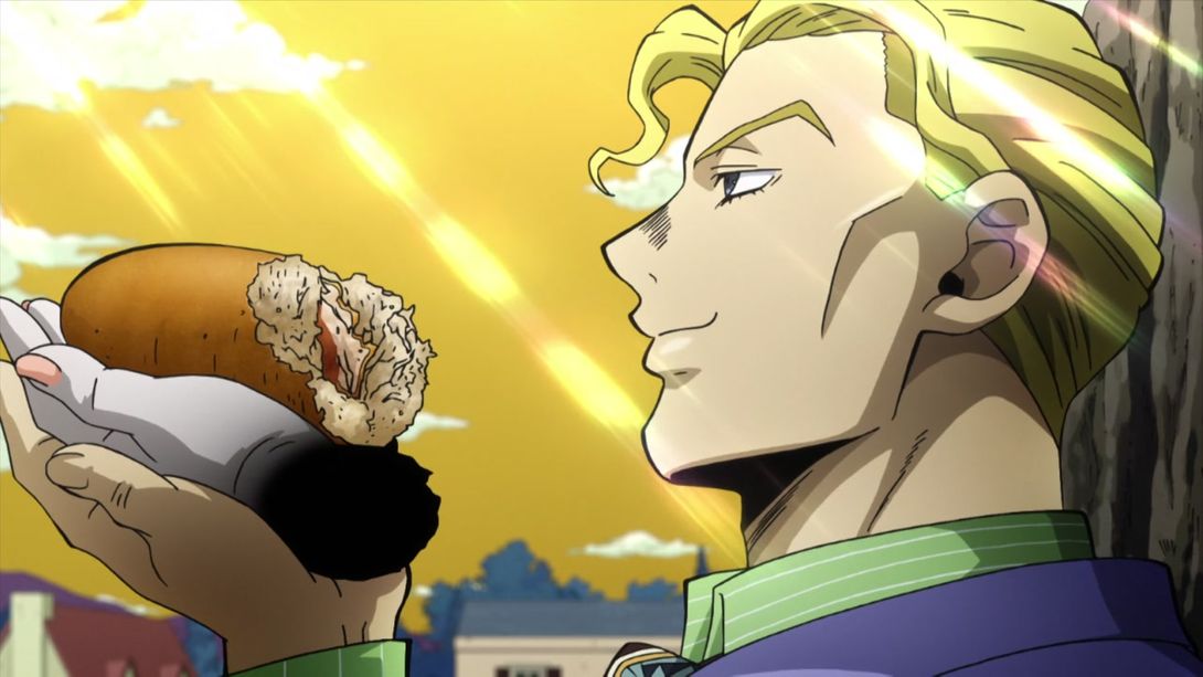
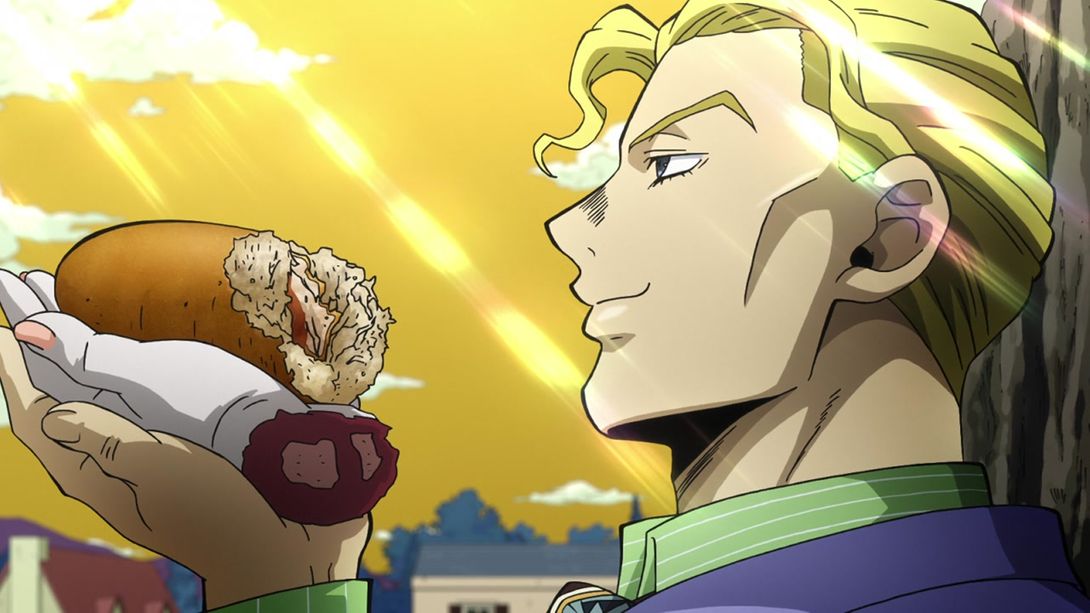
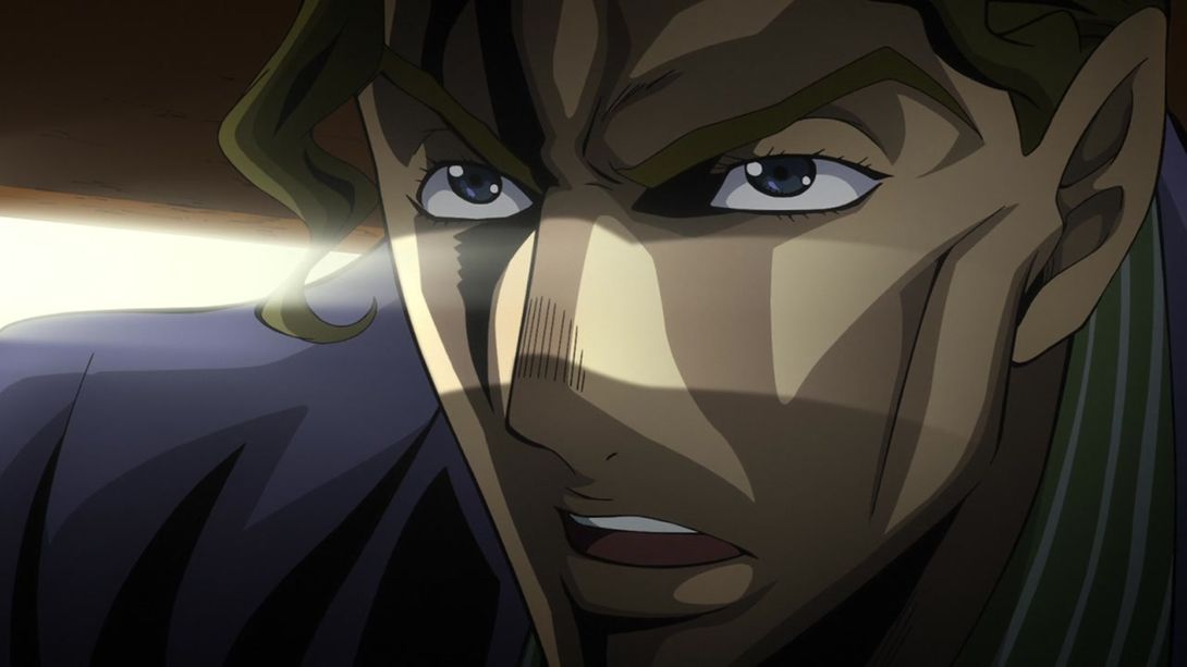
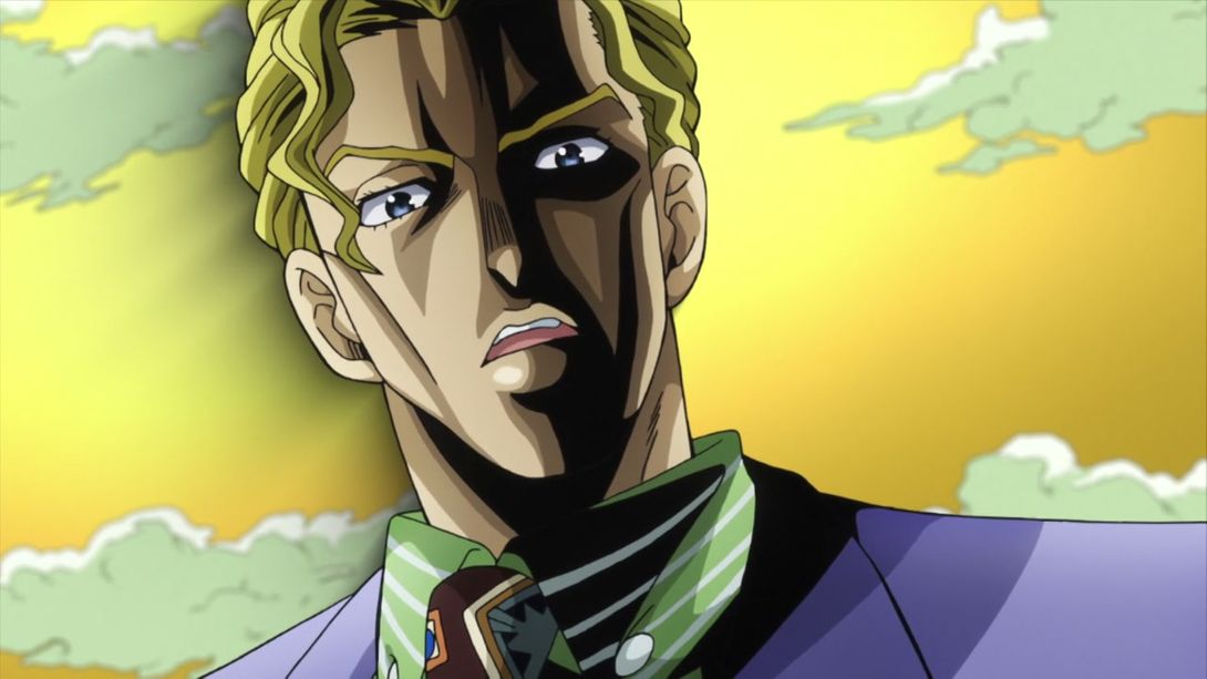
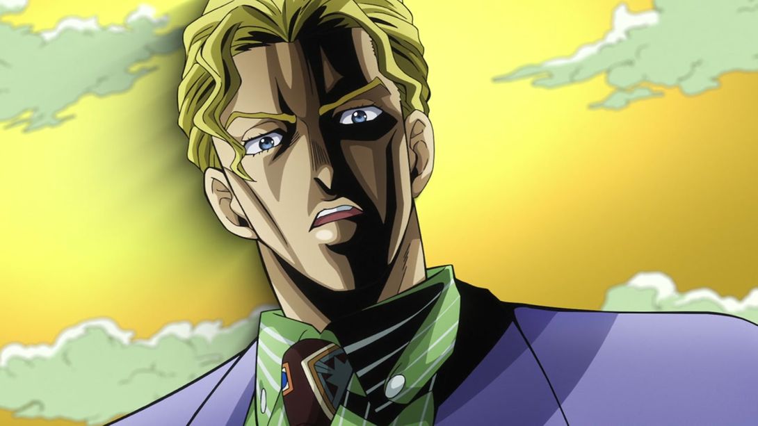
- Kira’s face has been retouched here:


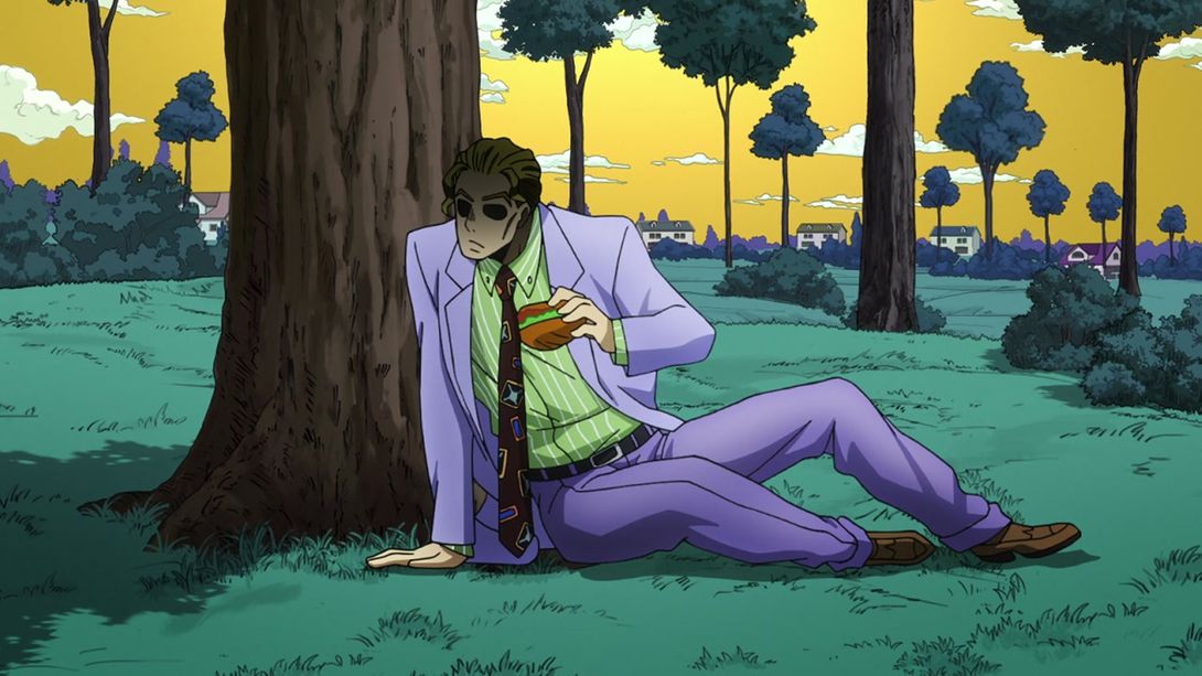
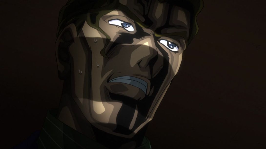
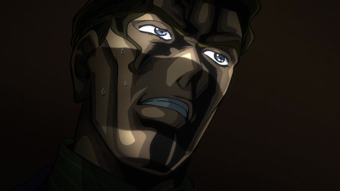
- Practically all the shots of Kira under the… Wait, what’s that thing again? Anyway, every shot of him under there have been slightly retouched. This is the first of them! No sweat, thinner lines and it seems like everything’s been redrawn, although it looks really similar:
- Shigechi’s eyes have been redrawn here:

- Here, Kira’s tie and shirt are both sharper, the light effect on his left knee is less bright and, as before, almost everything looks as if it’s been tweaked, retouched and redrawn:
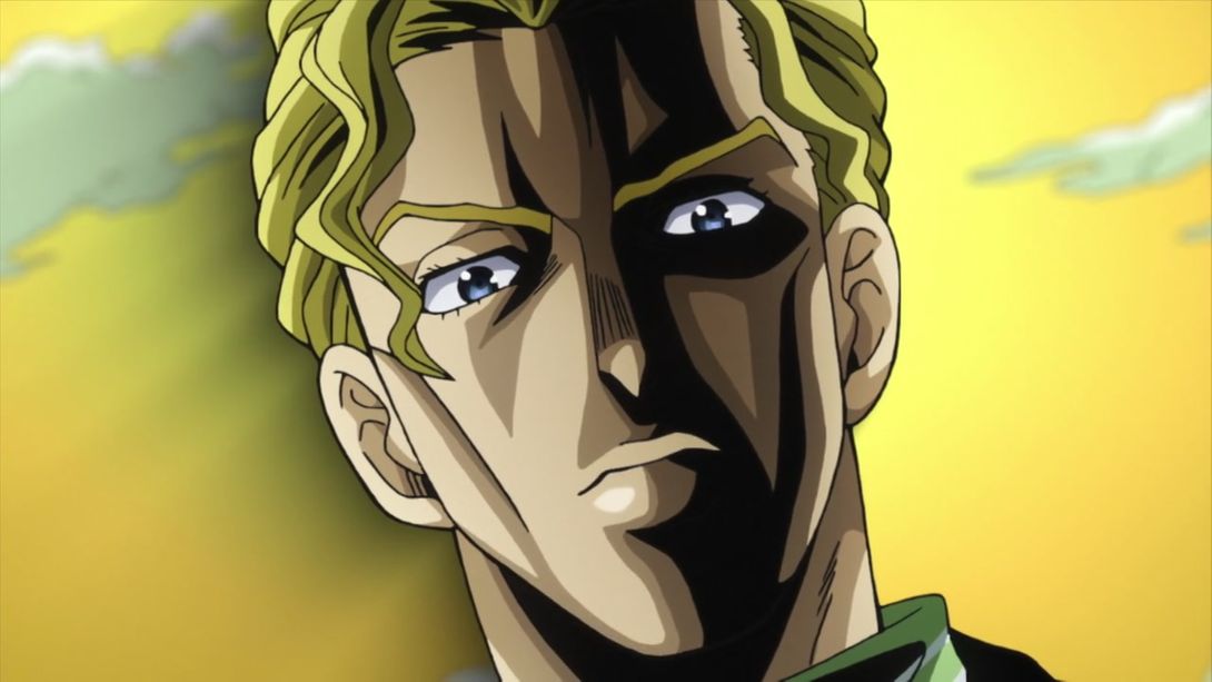
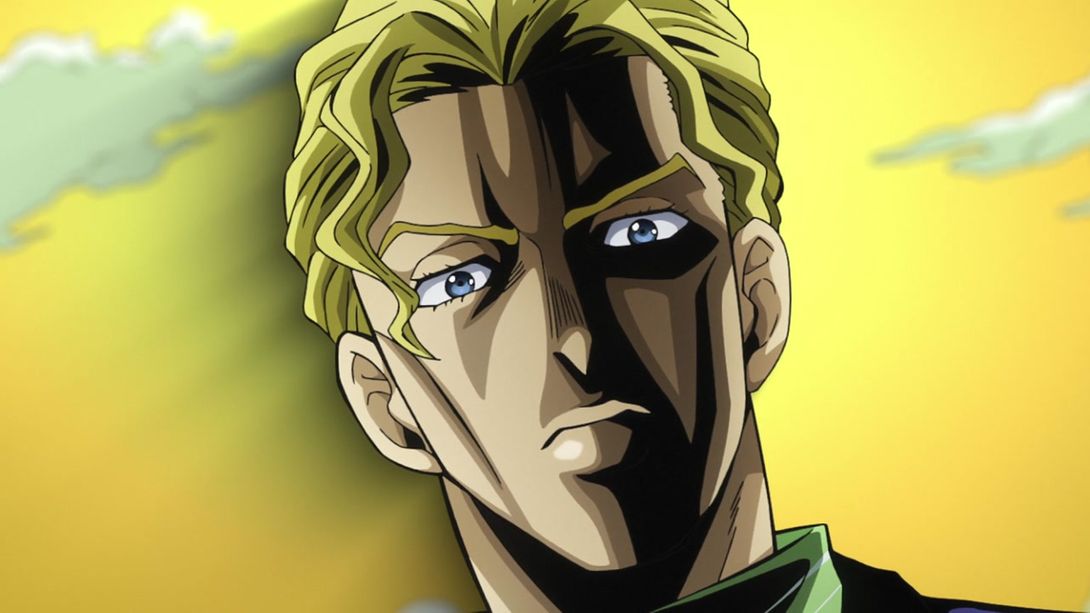
- Again, a couple of tweaked Kiras for you:
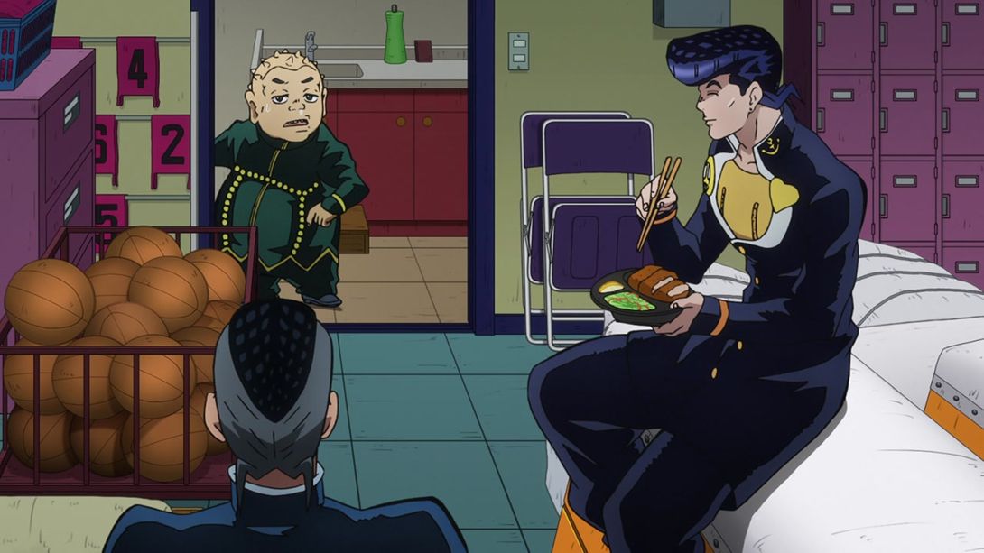
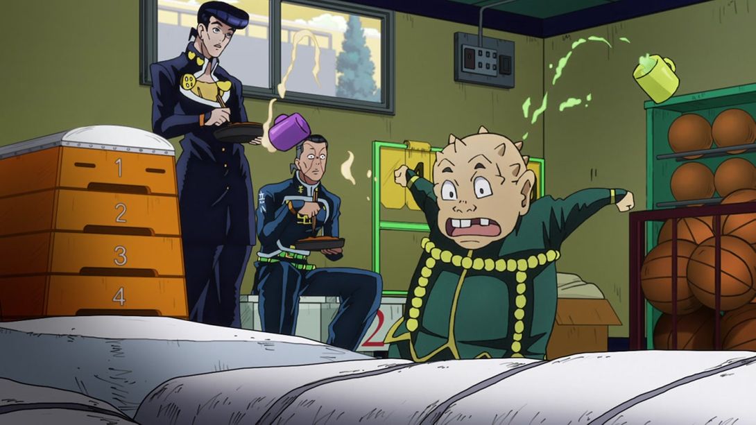
- Plenty of frames in this animation of Shigechi freaking out have been retouched. Not the awful Josuke in the background, though! Nah, he looks fine, am I right? Anyway, if I showed you an animation of it you probably wouldn’t notice the differences since they’re all pretty minor. Have a bunch of frames instead! In this first one, some of the balls on Shigechi’s uniform are smaller:
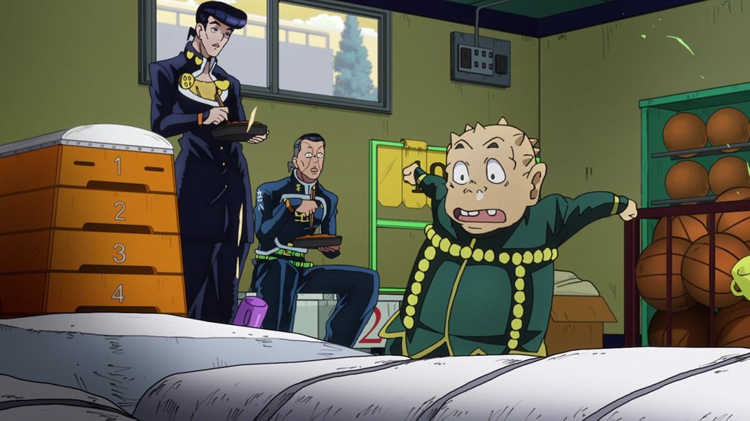
- Shigechi’s eyes are more focused now, and a tiny bit of his uniform is shaded differently:

- Shigechi’s eyes again:
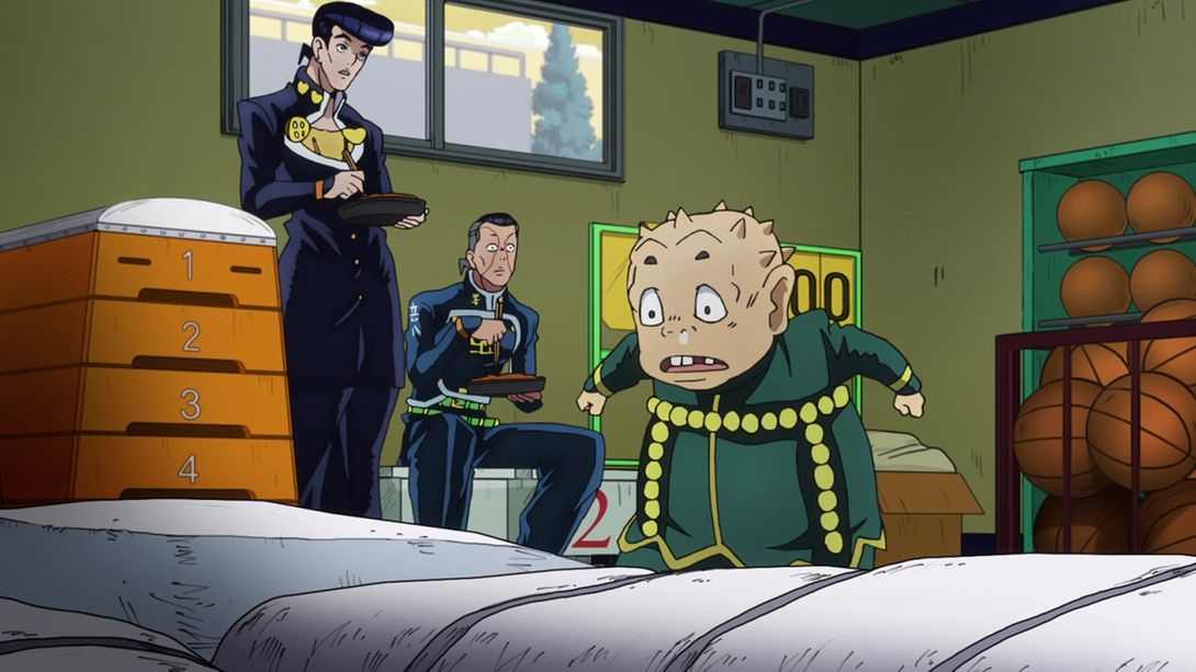
- Both his eyes and his eyebrows have been retouched here; plus, the center of his uniform is less shaded:

- In this last frame of the animation, there’s one extra ball on Shigechi’s vest and the bottom of it has been properly shaded:

- Whew! Now that that’s over, we can get back to what really matters. Here’s another retouched Kira:
- Kira no longer looks like he’s turning his nose up at something here:

- In this bit of Kira turning, he briefly closes his eyes in BD; when he opens them back, they’re also slightly different:

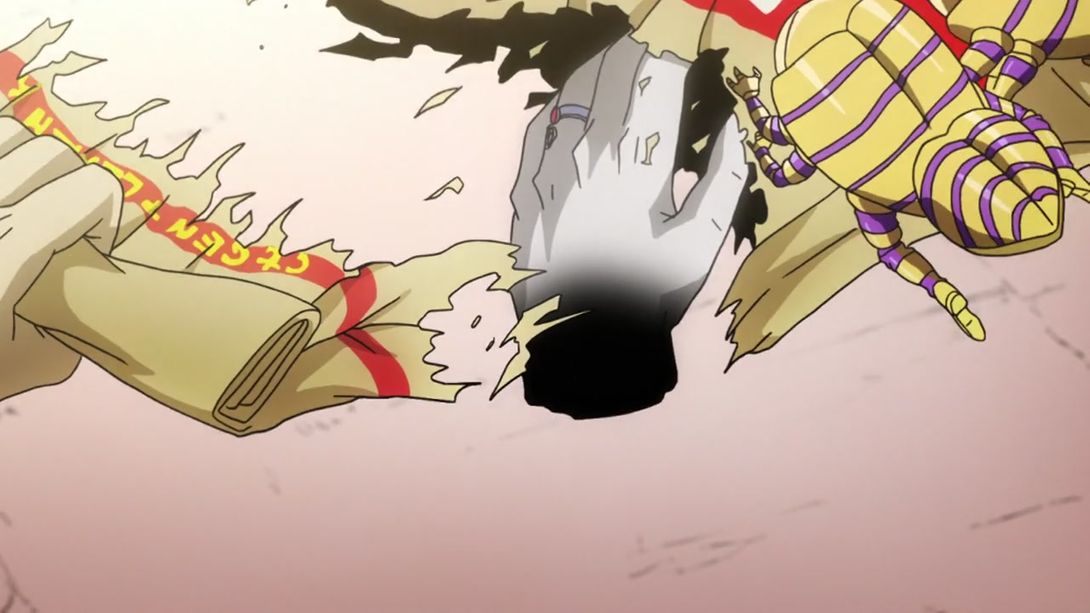
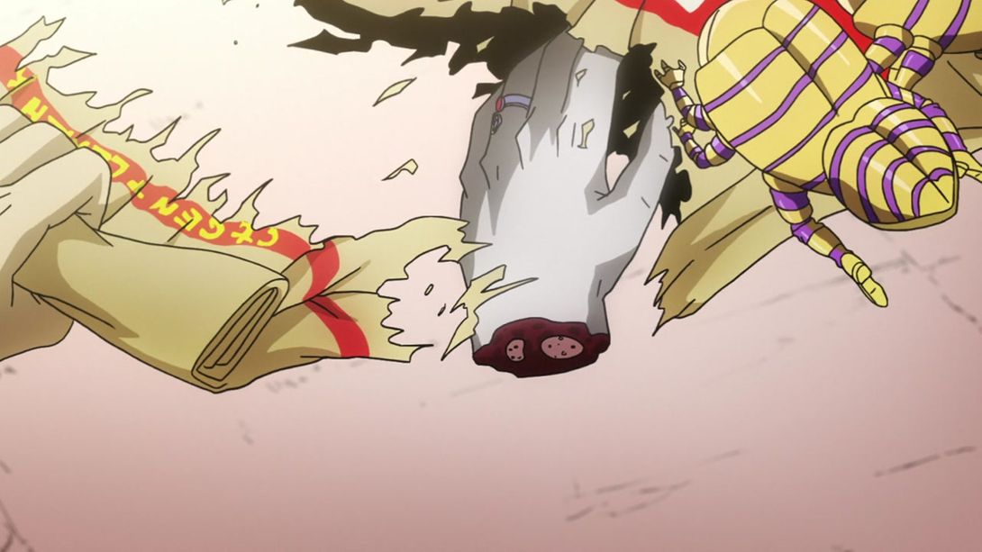
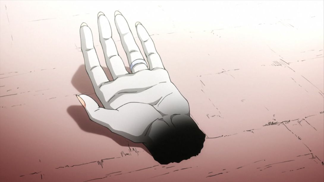
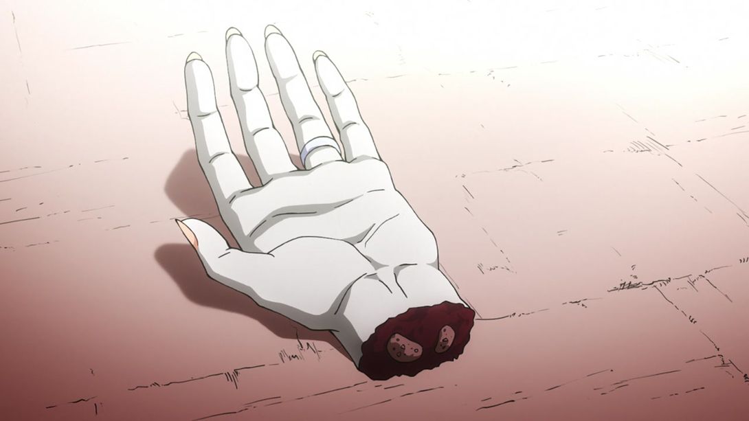
- Ah, finally! Another bunch of uncensored hand shots for you:

- And again here; plus, for some reason, the top right corner is slightly darker:
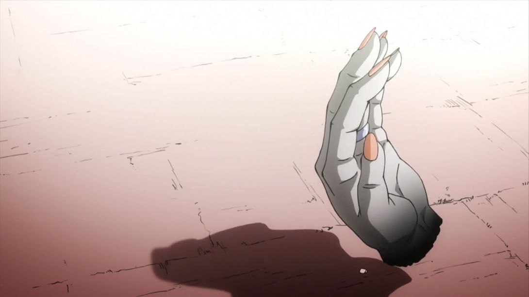
- And back to the purer, simpler uncensored hand shots - Kira’s looking real good in the first one:


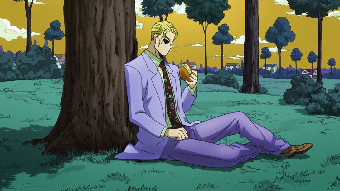
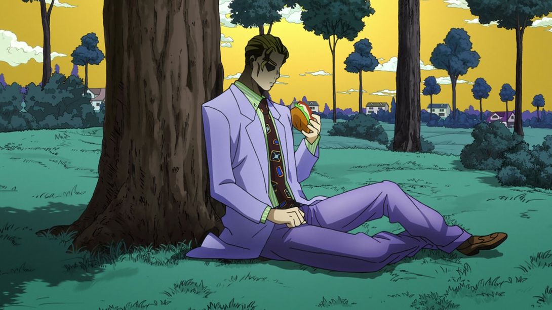
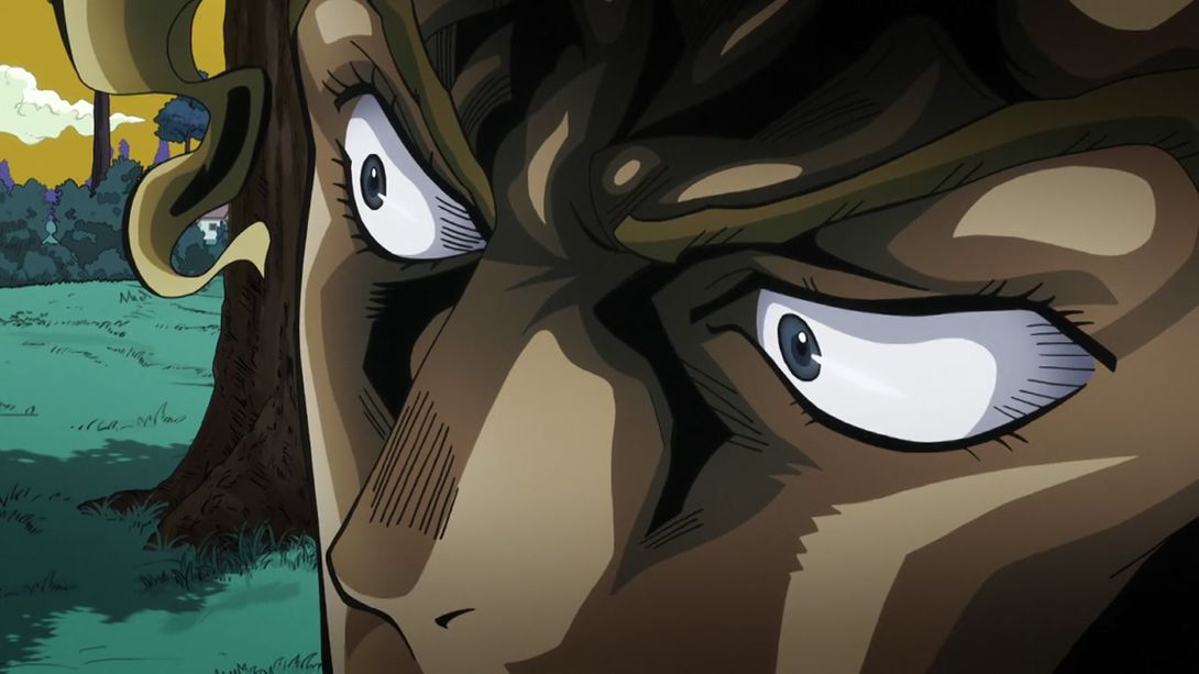
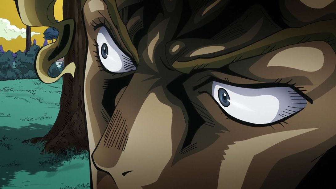
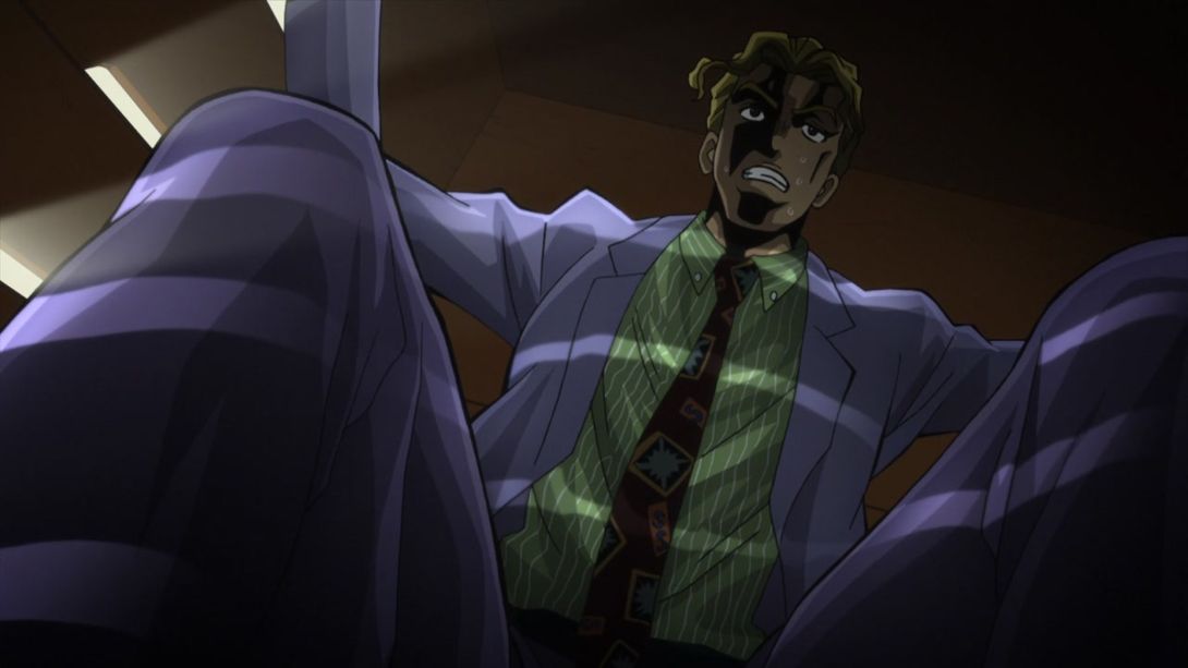
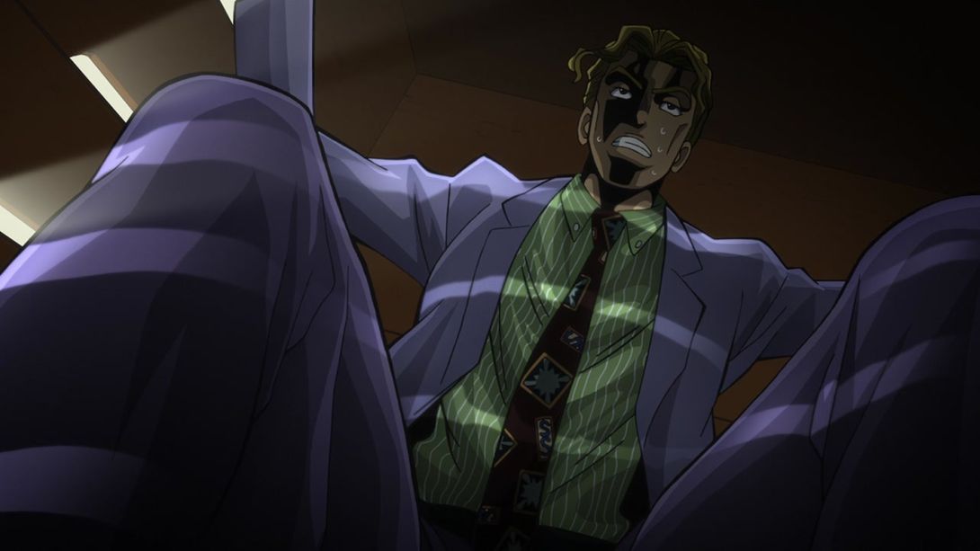
- These two shots are more zoomed out in the BDs, and Kira has been retouched, especially in the eye area (thanks, Patrick Falcon!):
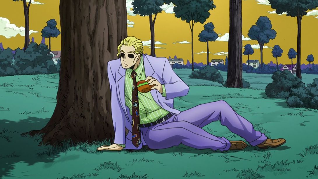
- Kira’s, once again, been retouched in this shot here. Most lines are also thicker, his eyes look slightly more menacing and his hair is coloured differently near the bangs:

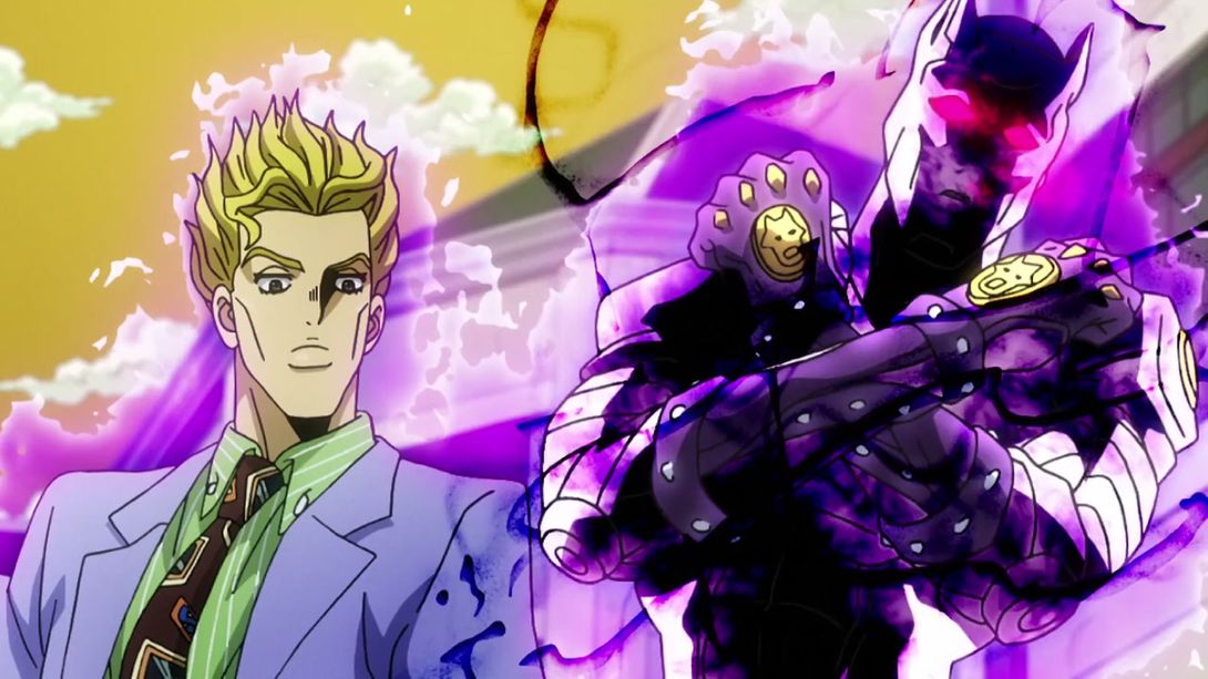
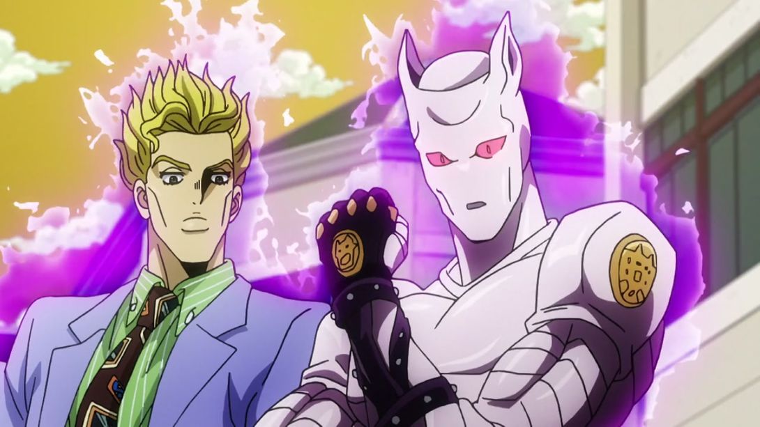
- And, finally! Finally, here we are! Let’s take a look at how Killer Queen looks in the BDs. First of all, the cat skull emblems on his fists and shoulder look waaay better, and even in this first comparison, you can see they retouched his eyes. The aura is also less transparent and the sky is brighter:
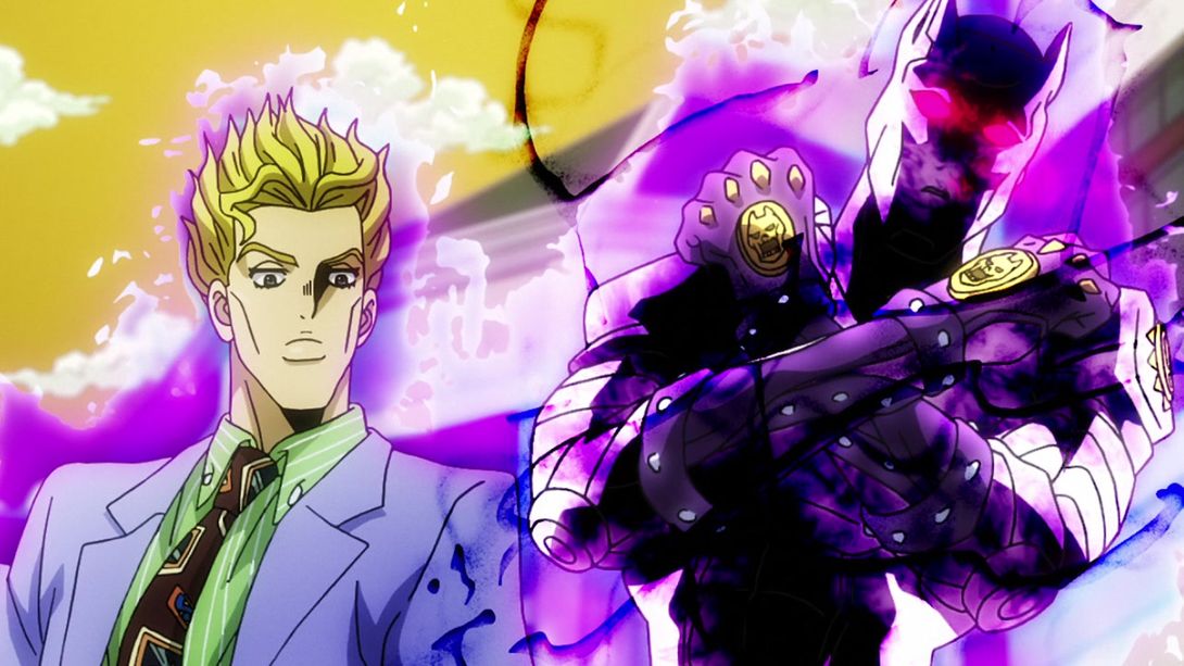
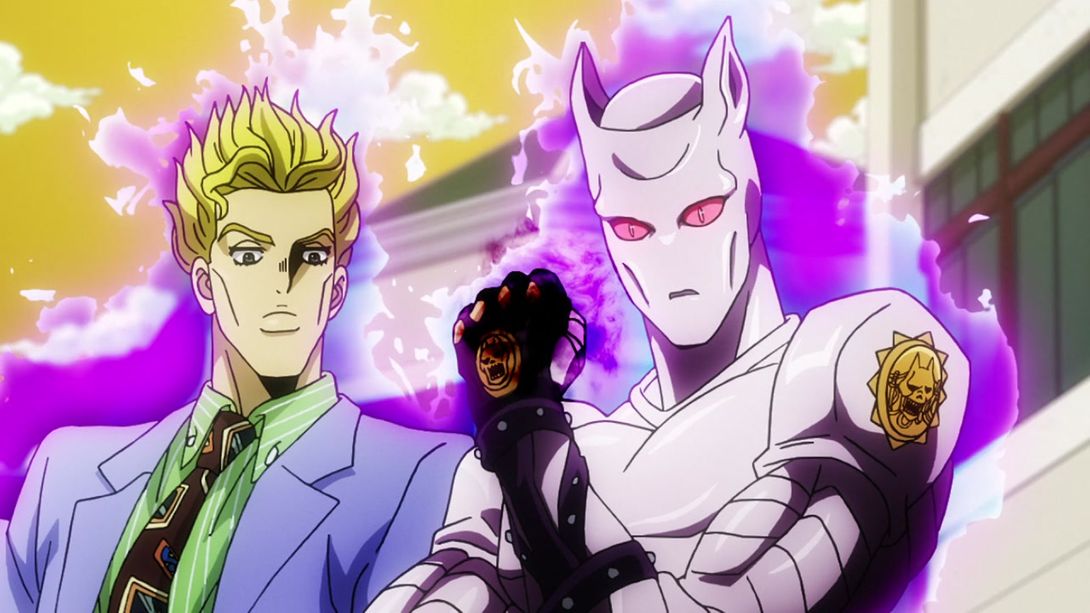
- Here, you can see that there’s more black in the aura, and it looks slightly darker:
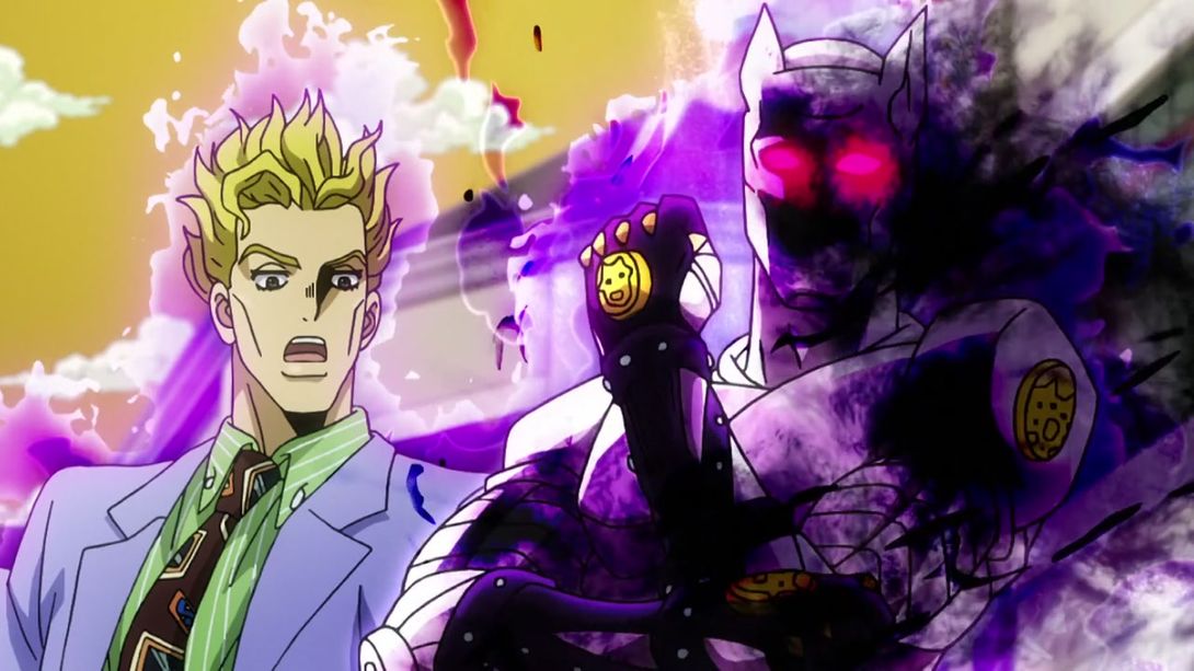

- And here, finally, we can take a look at Killer Queen in its full redrawn glory. Alright, alright, I’ll be the first to admit it doesn’t look that different, but the lines are way better, and it no longer looks like he’s been drawn by an eight-year old. The design stayed the same, but it’s a more competent drawing:
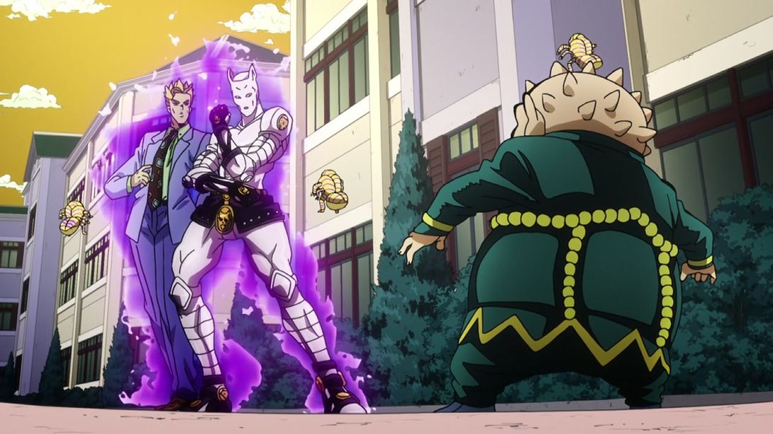
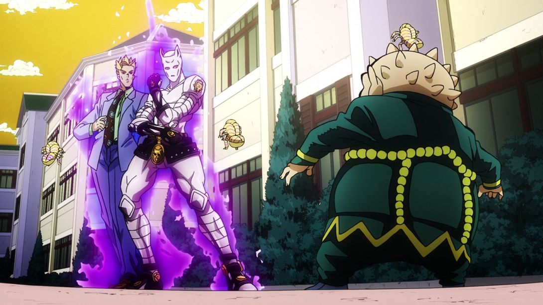
- And, in this zoomed-out shot, we can see that Killer Queen has a retouched face and slightly better-shaded legs; the school in the background is also brighter, probably to create more contrast. The aura is also different!:
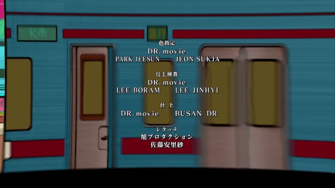
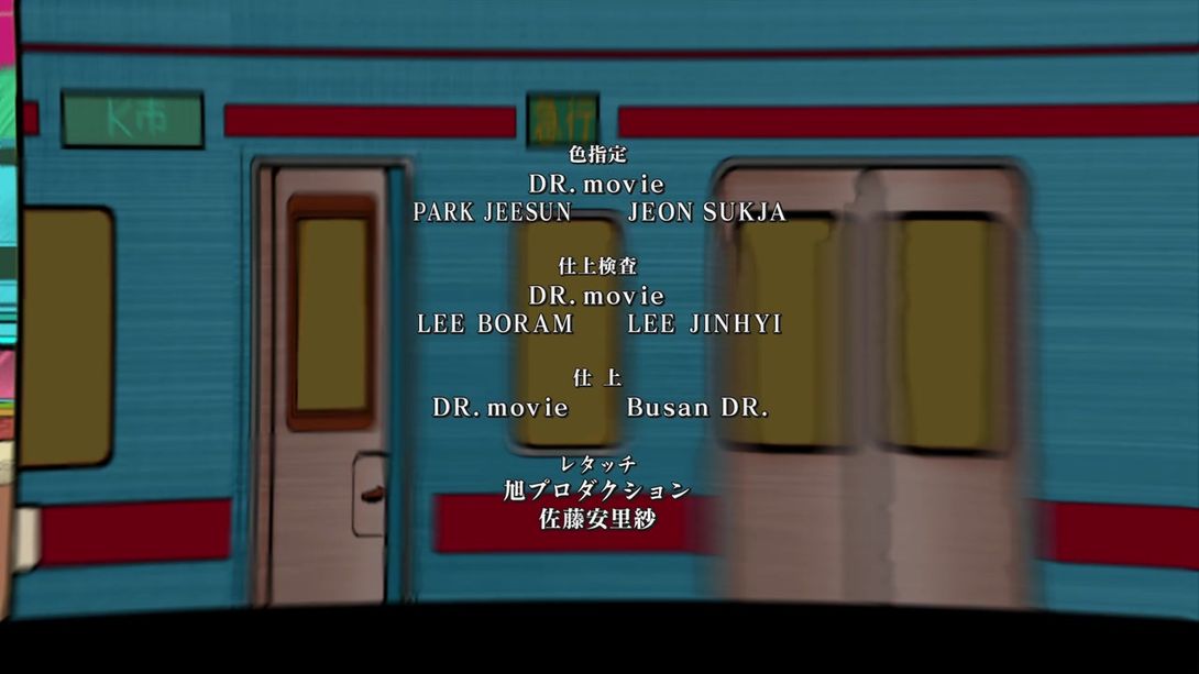
- The episode itself is over, but don’t go away yet! It’s time for a couple of credits differences! Wait, where are you going…? Anyway! Here’s the opposite of a couple of episodes ago. “BUSAN DR” is no longer all caps, and has been rendered as “Busan Dr.”

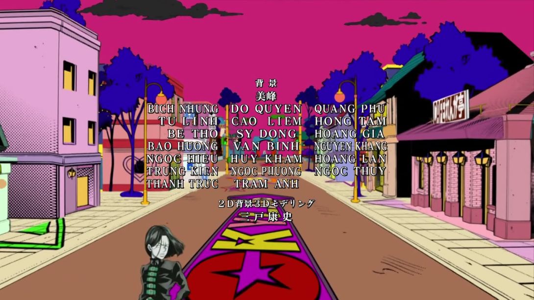
- And here, TRAM ANH’s name has been spaced better:

Whew! This was a very long one! The longest in all DiU in terms of images, but since there were only two video comparisons, it loses by a very small margin to DiU #12’s comparison, which had a ridiculous amount of videos. So! What can I say? The BD version is surely looking better, but it is by no means perfect. I, for one, was not expecting this one to be entirely redrawn, so I have to say I’m not disappointed. I hope you feel the same!
Take care, and I’ll see you next time with Battle Tendency #15! Ciao!