Hello hello, friends from all over the world! We are here today to celebrate the end of Vento Aureo - and what better way to say goodbye to what has been perhaps the best-animated part so far than with an incredibly long, incredibly in-depth analysis of the differences between the TV and BD versions of its last episode, “Sleeping Slaves”? That’s right - it’s going to be another long one, so let’s not waste any more time - this comparison ain’t gonna make itself!
Cominciamo!
- Today we’ll begin with this scene of Mista pointing a gun at Scolippi! There are a bunch of different things here, so let’s make one of our usual lists. In no particular order: Mista has been moved, the general lighting has been tweaked, Mista’s face and Scolippi’s head have been retouched, there’s a different distortion and Scolippi’s picture has been moved to the correct layer:
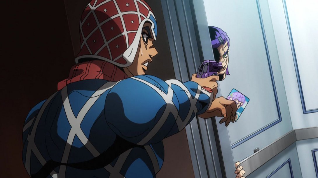
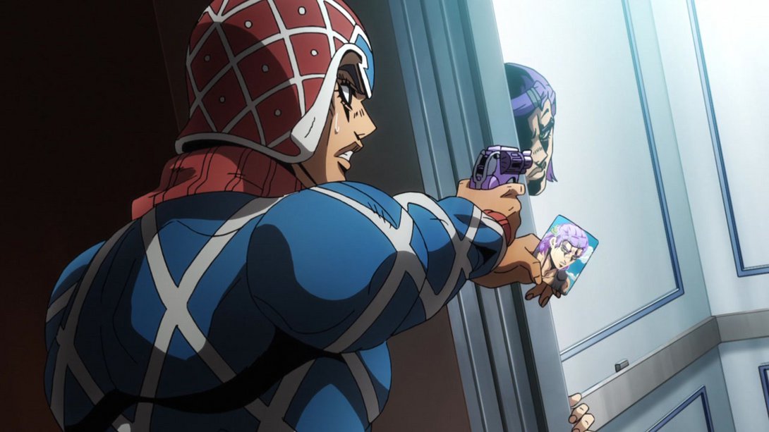
- Here, one bit on Mista’s right cuff has been correctly recoloured, his gun is much shinier and he’s now casting a shadow against the elevator dooframe; in addition, there’s a new vignette along the edges of the frame, Scolippi’s face has been retouched and Rolling Stone has a different texture:
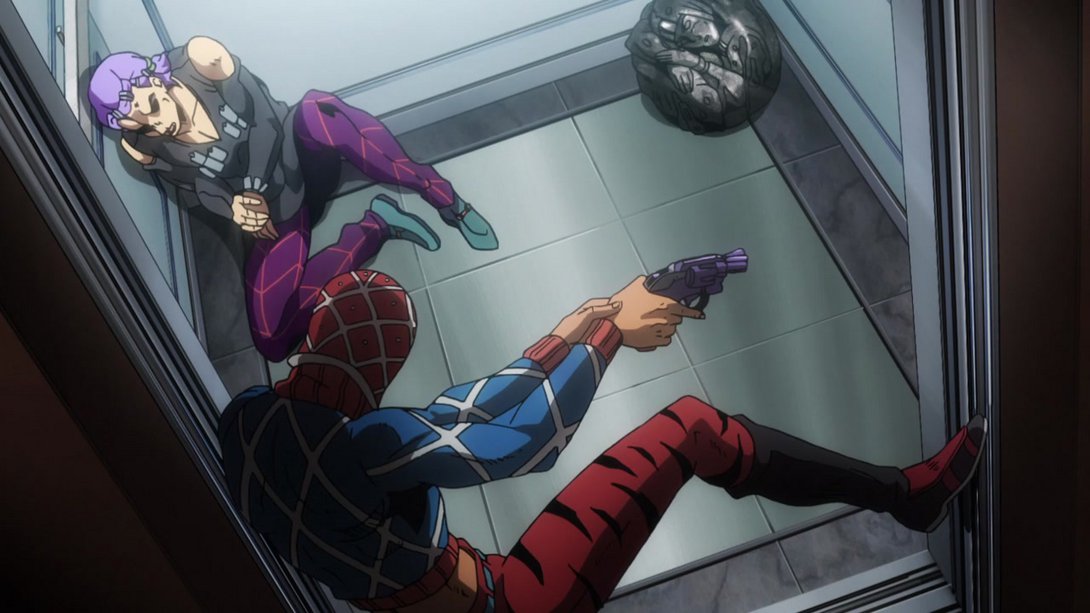
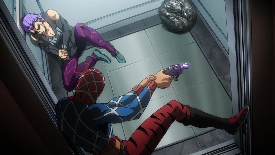
- Here, on top of a different lighting and colouring, Mista’s face (and, later, neck) has also been retouched:
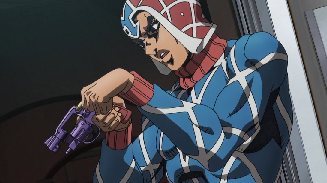

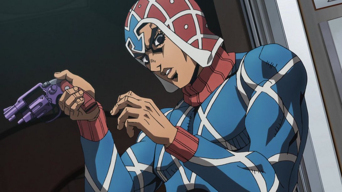

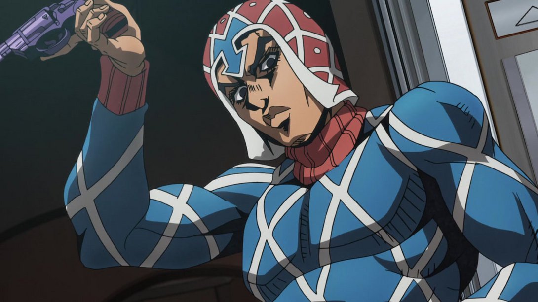
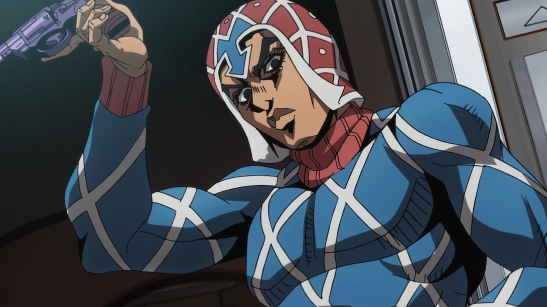
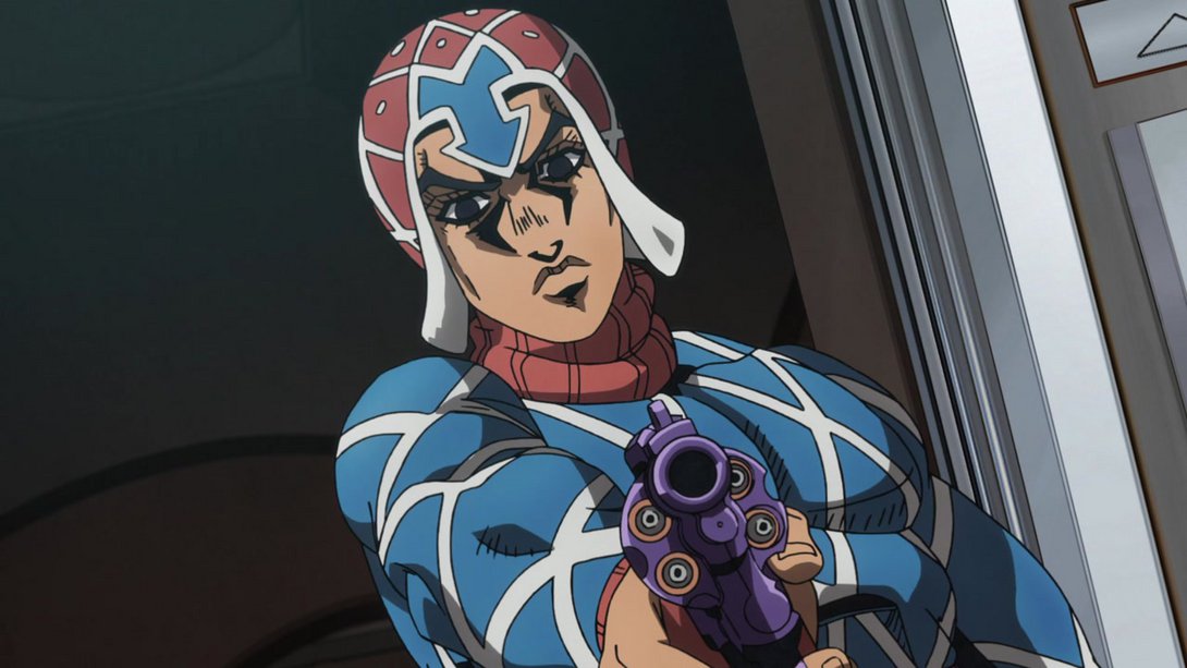
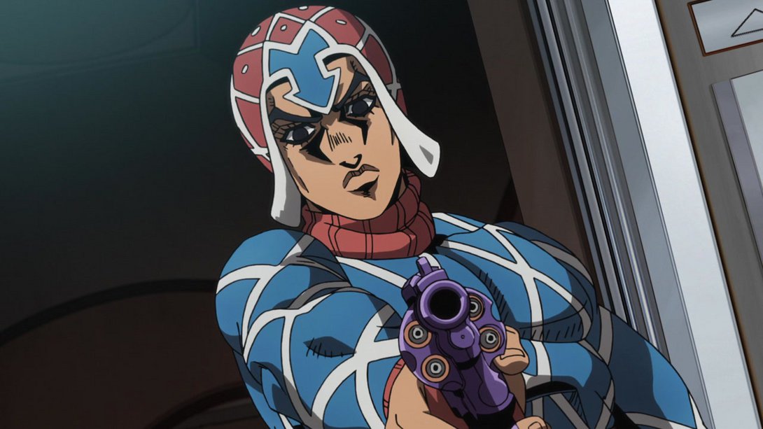

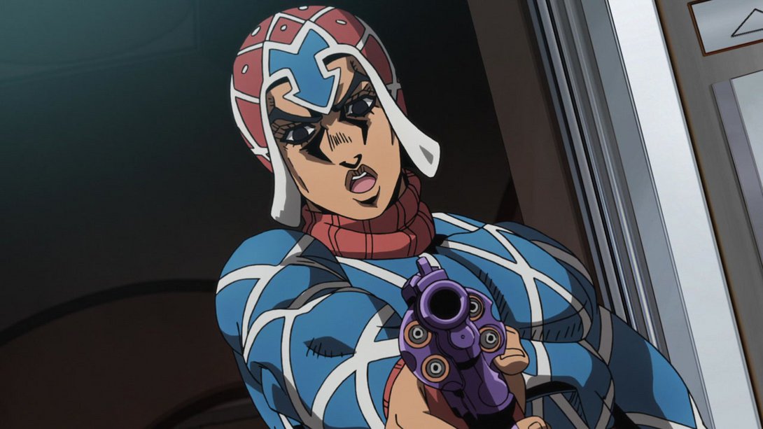
- Here, on top of the usual shading/colouring differences that have characterised many of the differences throughout Part 5, the shadow cast by Mista and Scolippi is slightly brighter and Scolippi’s face has been retouched as well:
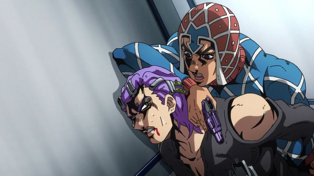
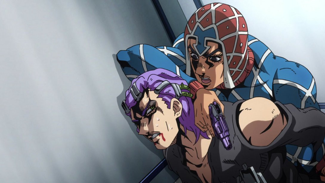
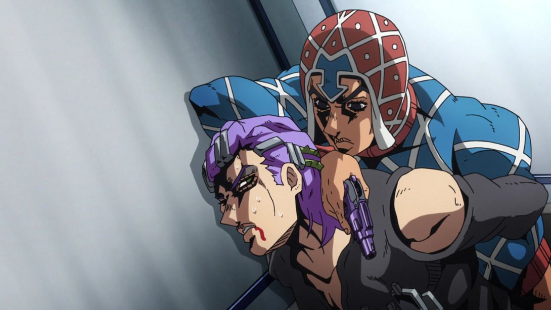
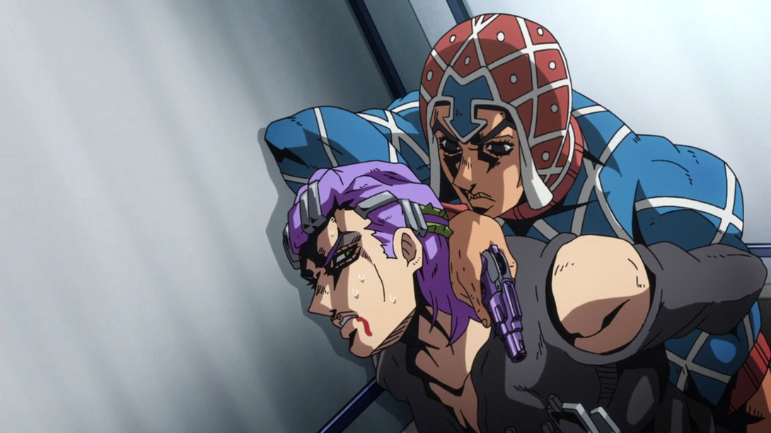
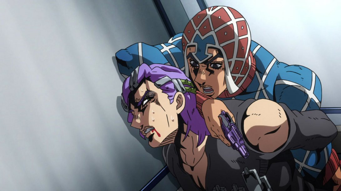
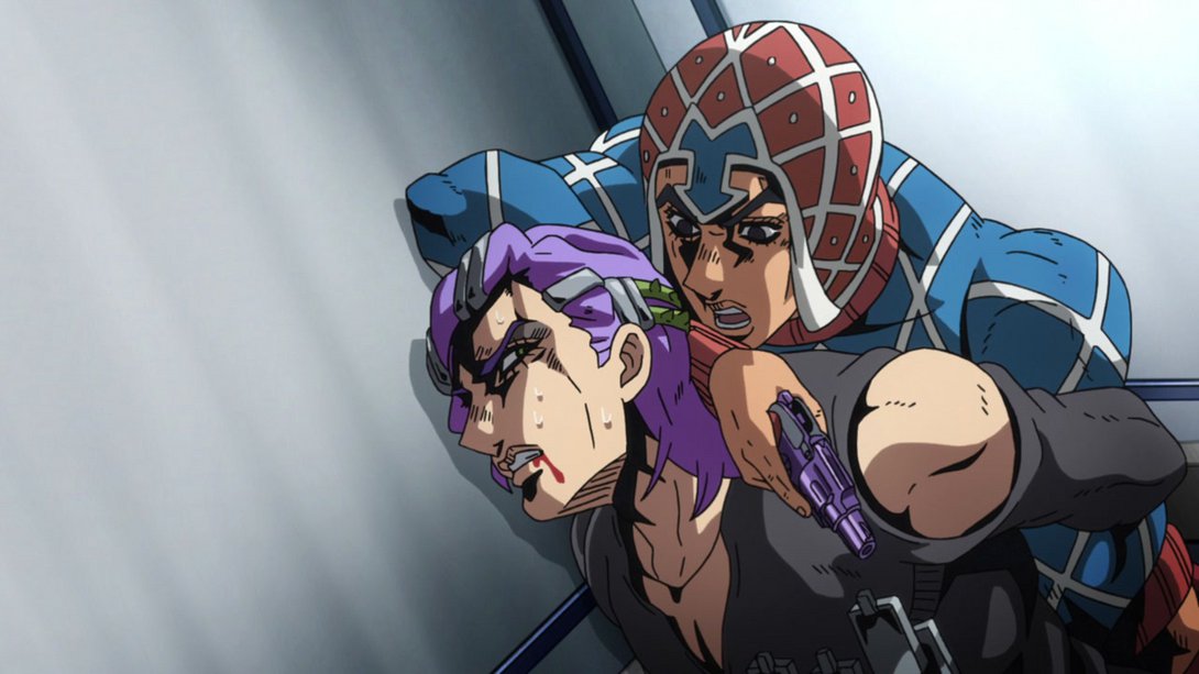
- Here, the background is completely different (because, you know, he is being pushed against the elevator wall_) and most of the black elements in the frame are a little darker:
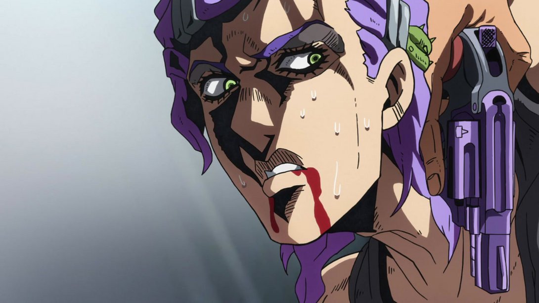
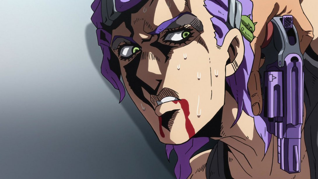
- This scene is now completely devoid of smoke…:
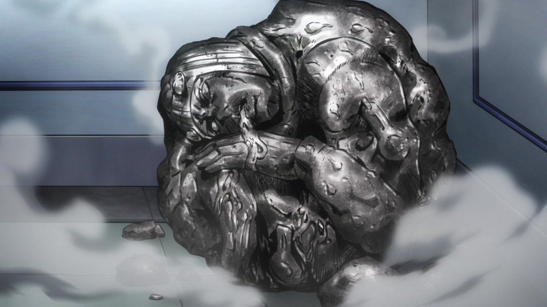
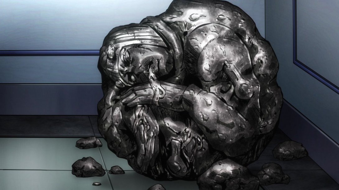
- Alright, let’s make something clear: almost all of the frames I’m going to show you today are going to have some differences in lighting, shading and/or colouring; I think it would be a waste of your time and mine to keep listing those changes for every single one of them. I’m instead going to only talk about other details that have changed in the frames, ok? For example, here, both faces have been retouched and a bit of Scolippi’s collar is also slightly darker:

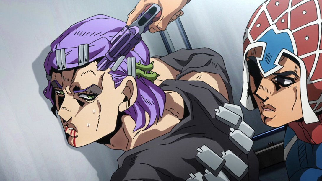
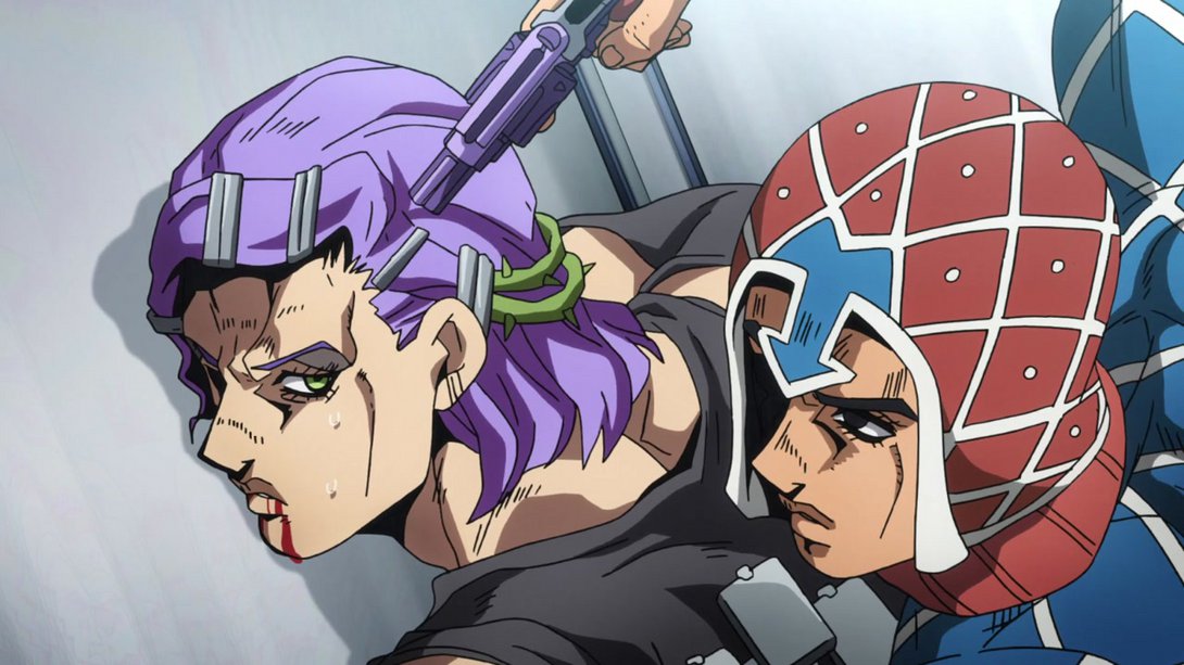
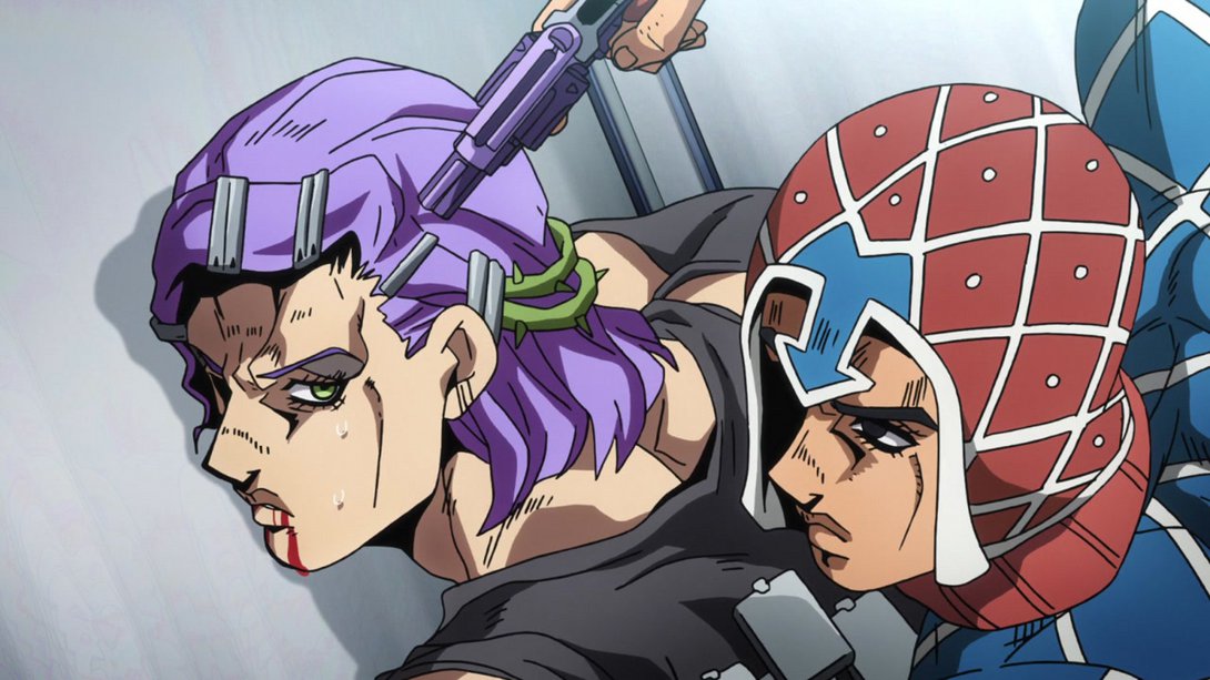
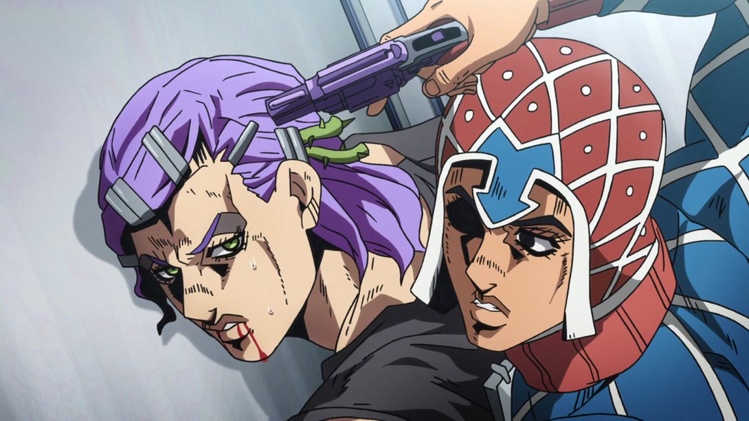
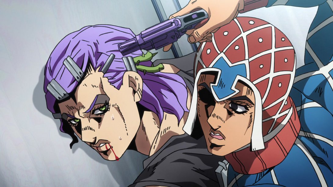
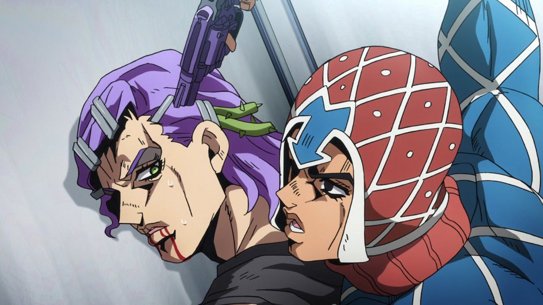
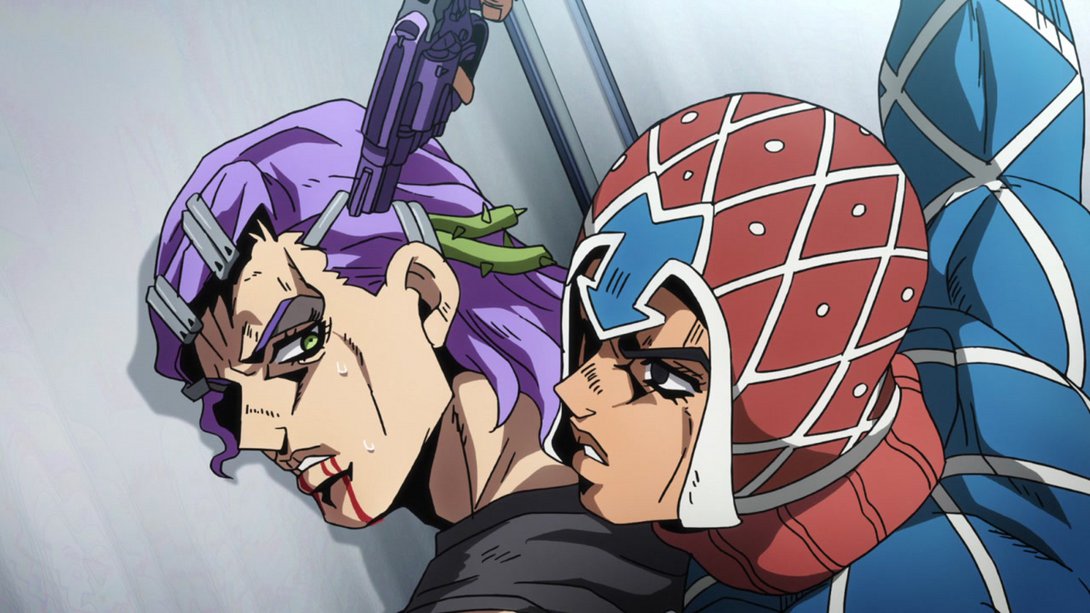
- Here, on top of the lighting in the background being very very different, Scolippi’s shadow is brighter, most lines on him are thinner, his right shoulder has been properly recoloured and both faces have been retouched as well:
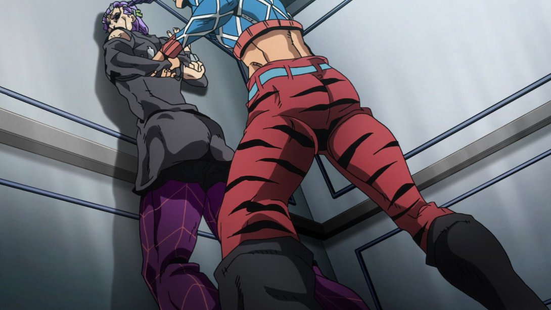
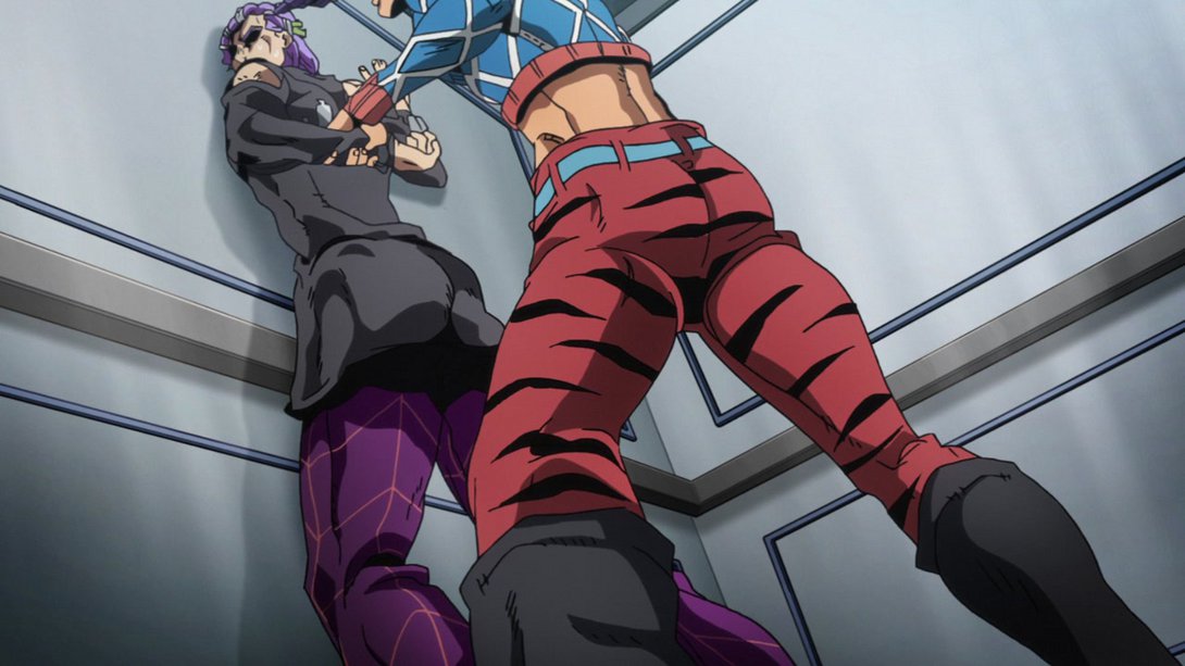
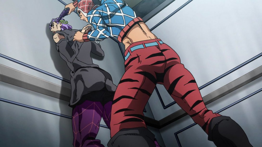
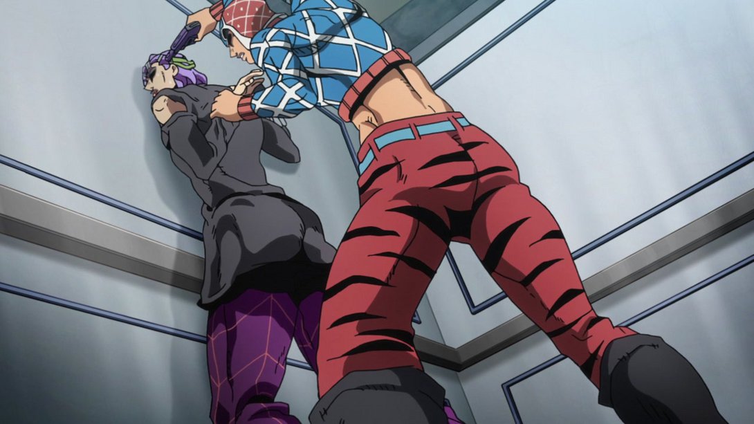
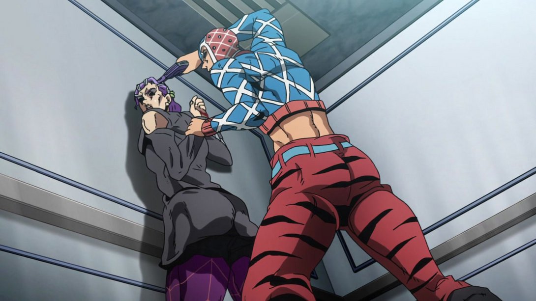
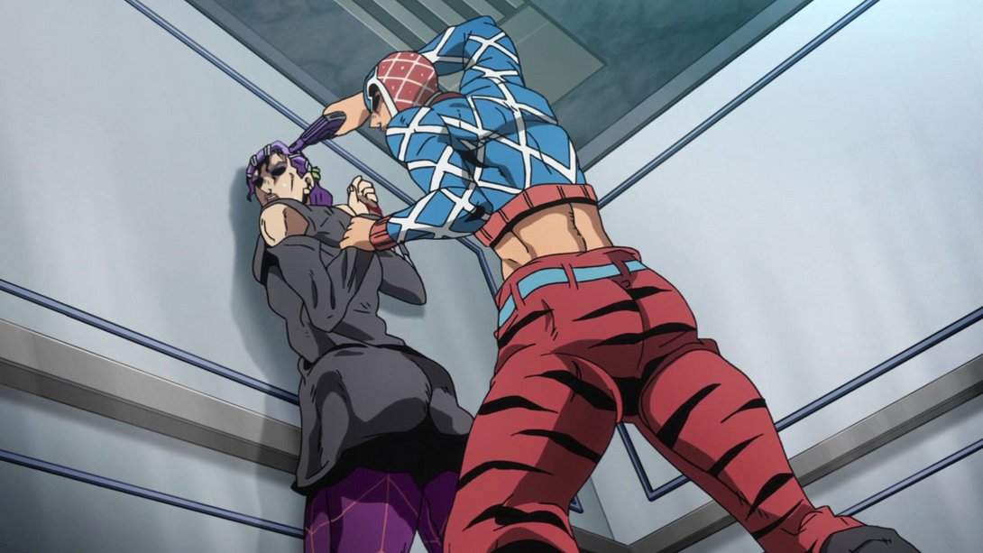
- Both Scolippi and Mista have been retouched in these handsome frames (and most lines are thinner as well, in a couple of them):
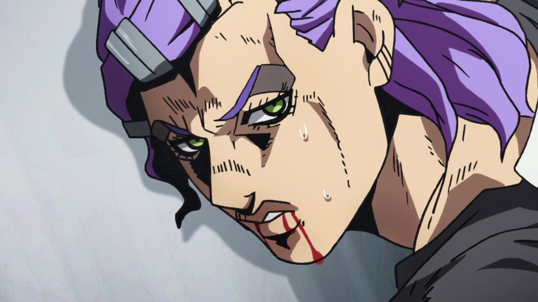
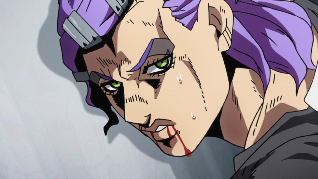
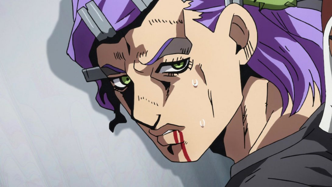
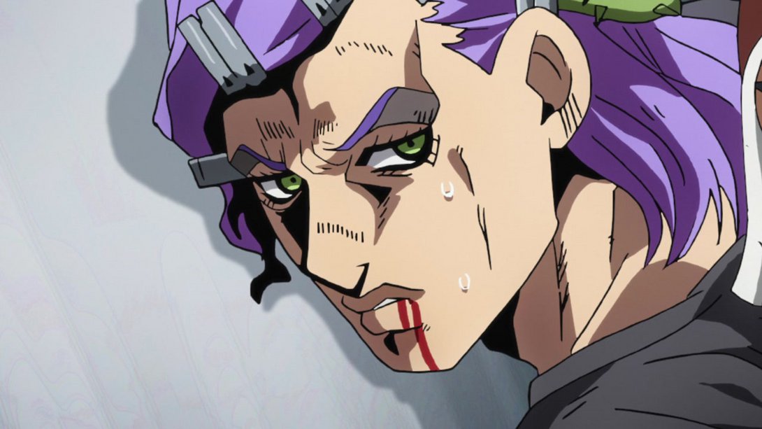
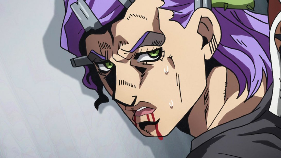
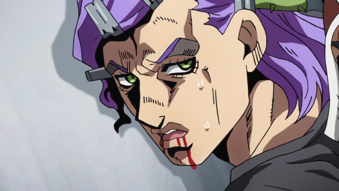
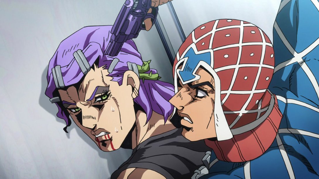

- In addition, the timing on the zoom out is slightly different:
- Here, most lines on Mista’s pistol and right hand are thicker, and his eyebrows are also darker…:
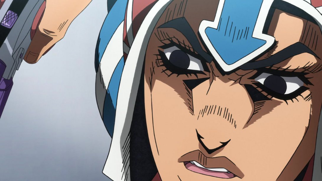
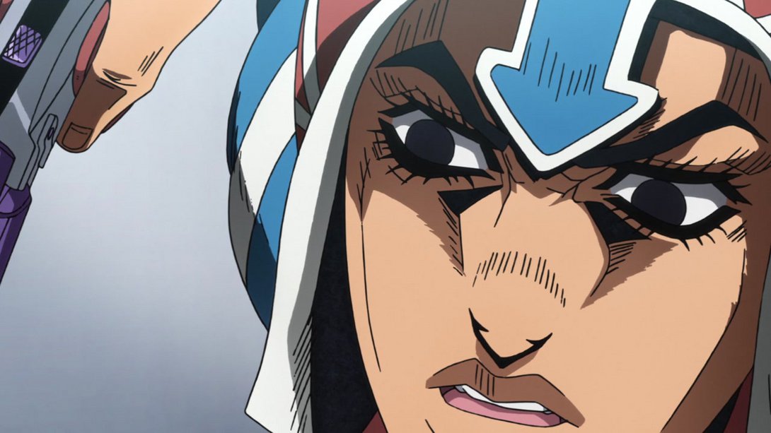
- And, when Scolippi’s face appears on the left side of the frame, you can see that most shadows on his face are also significantly darker:
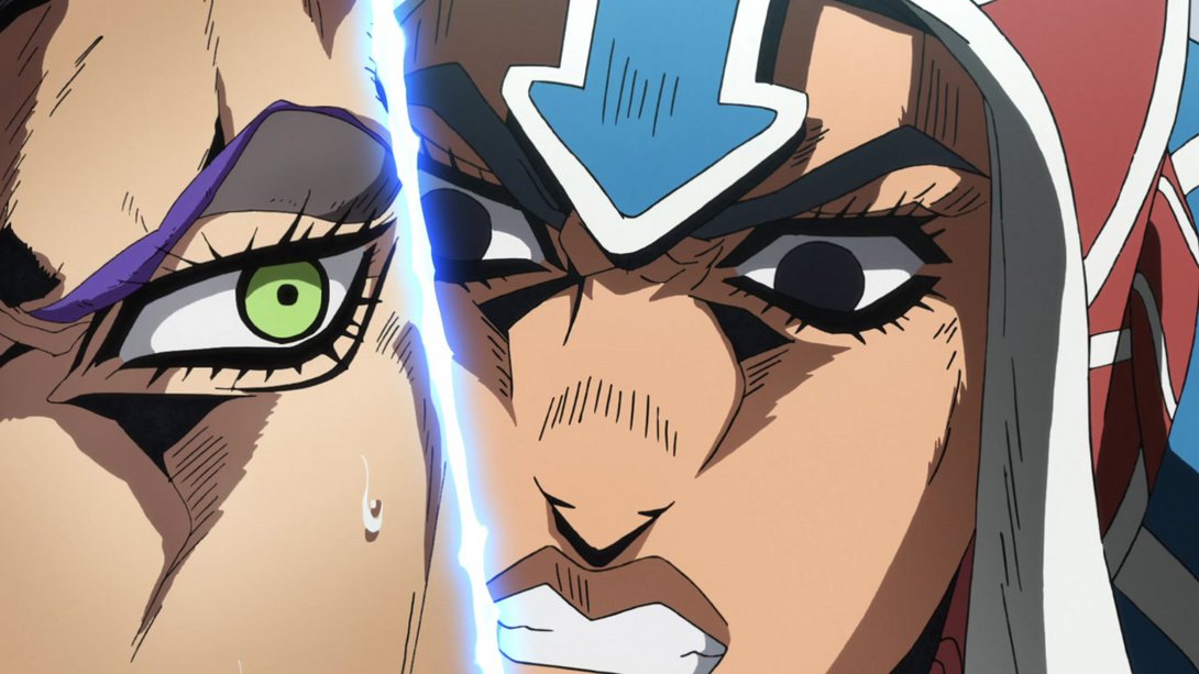
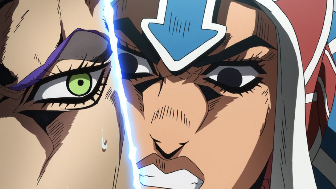
- Here, the background is darker in the bottom-left corner, a couple of bits in Mista and Scolippi’s faces have been retouched, a tiny line in Mista’s elbow no longer goes outside the outline…:
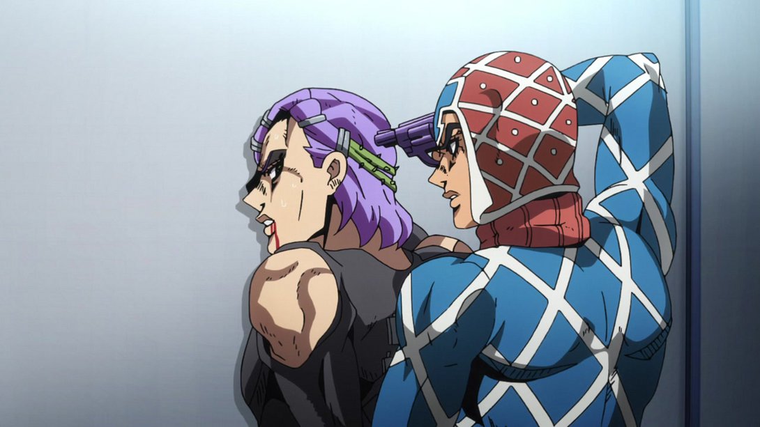
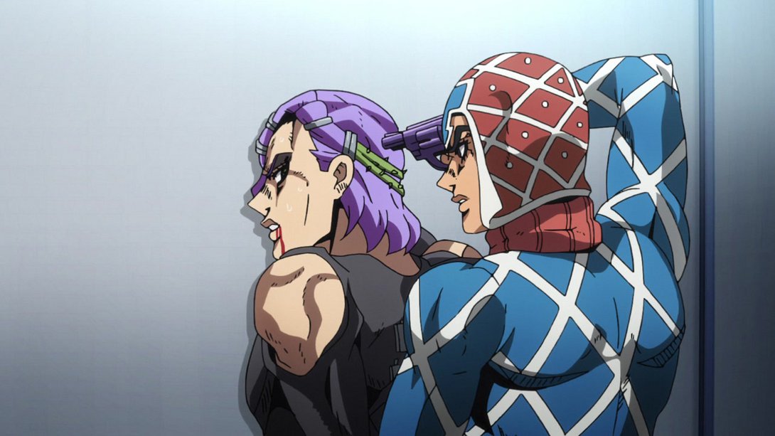
- …and, later on, the gun has also been moved to the correct layer:
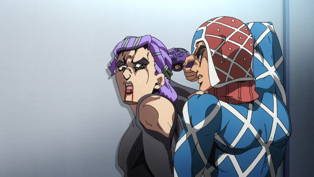
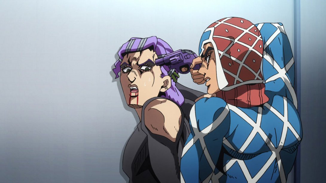
- Here, Mista’s gun has been redrawn and, later on, a tiny bit next to his right eye has also been retouched:
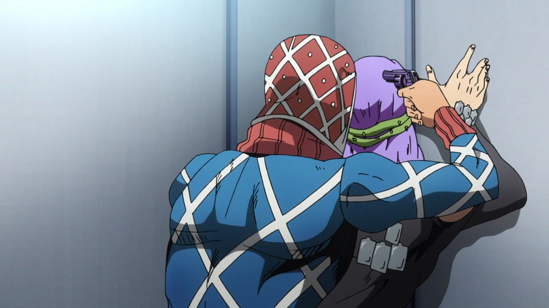

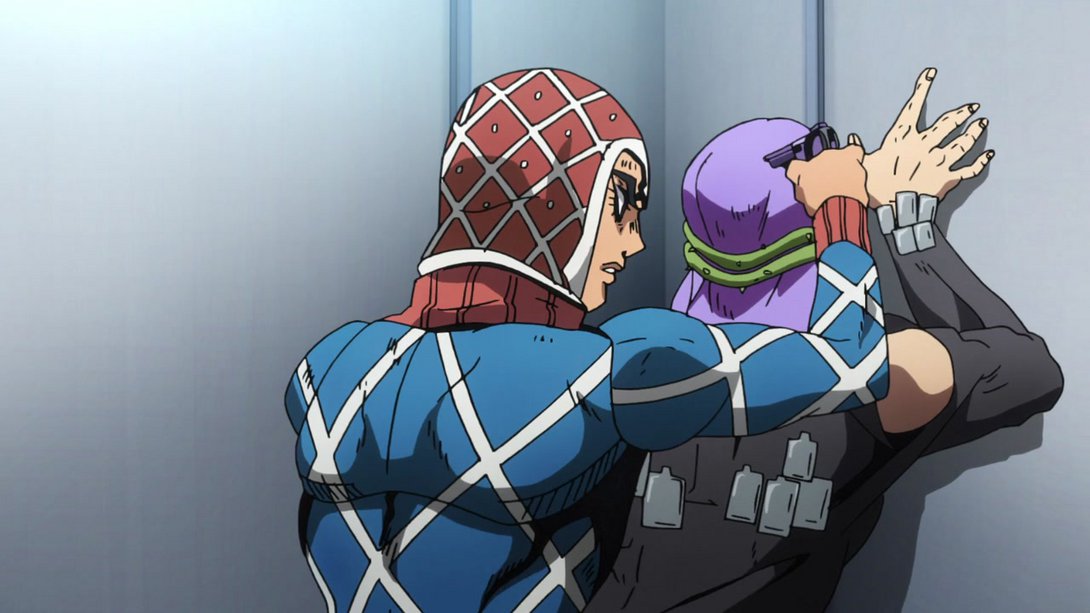
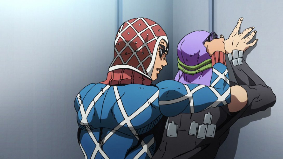
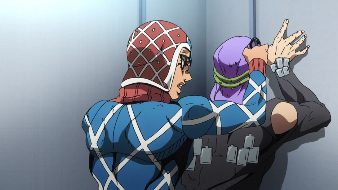

- Mista’s mouthflap has been tweaked here…:
- …and a couple of lines in his upper lip no longer go past the outline, here:

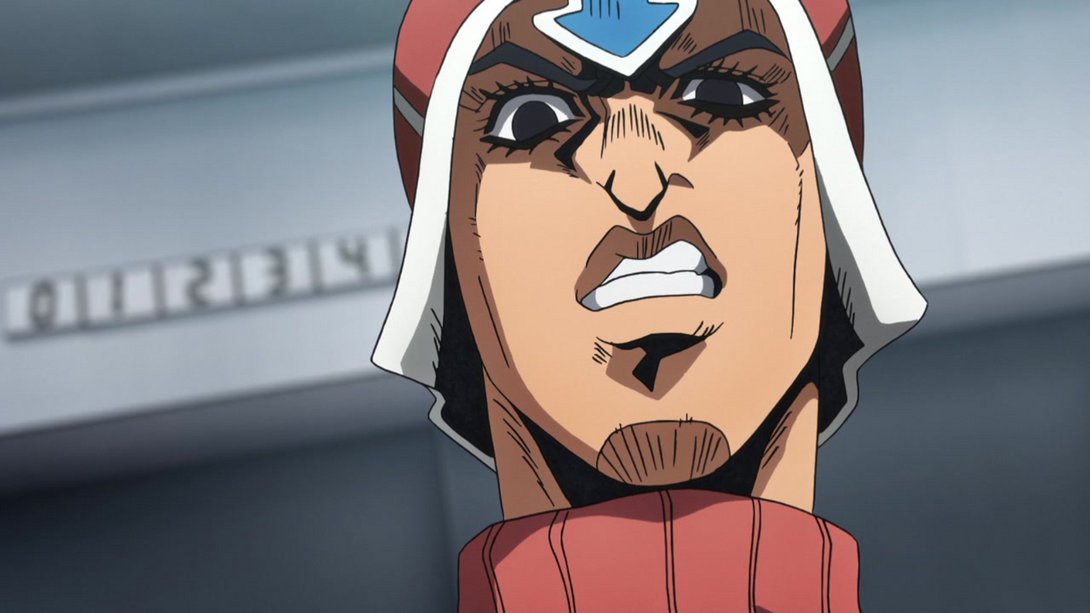
- The shadows cast by Mista and the small rocks no longer have a reddish tint here, but instead start out black before eventually changing:
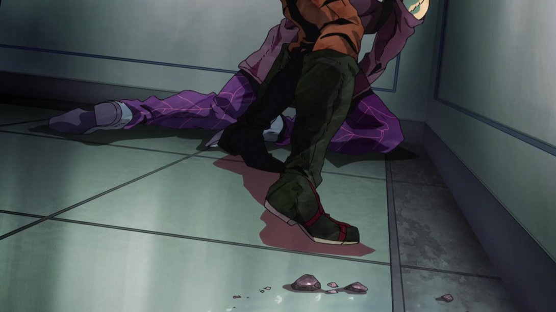

- Both Mista and Scolippi have been retouched, here:
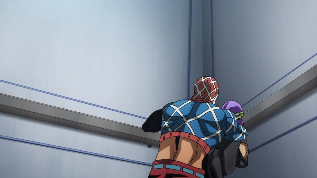
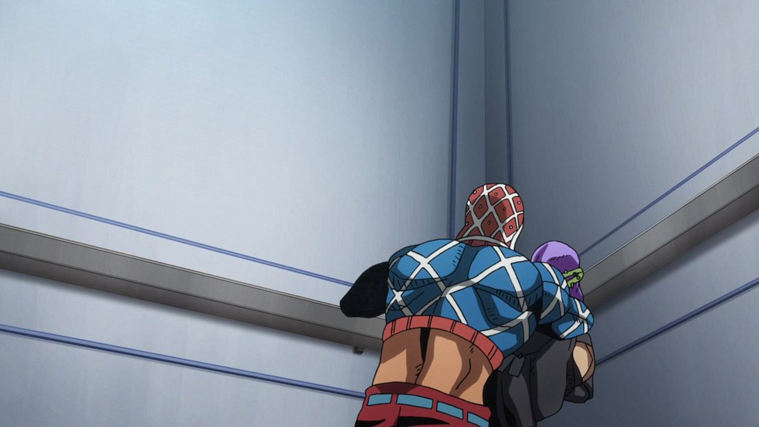
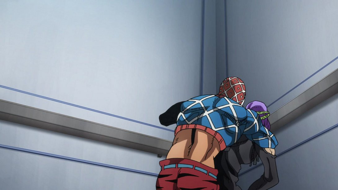
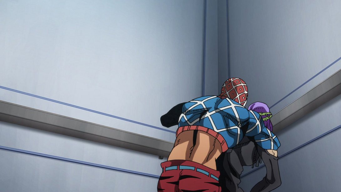

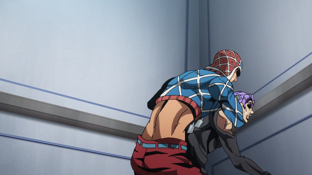
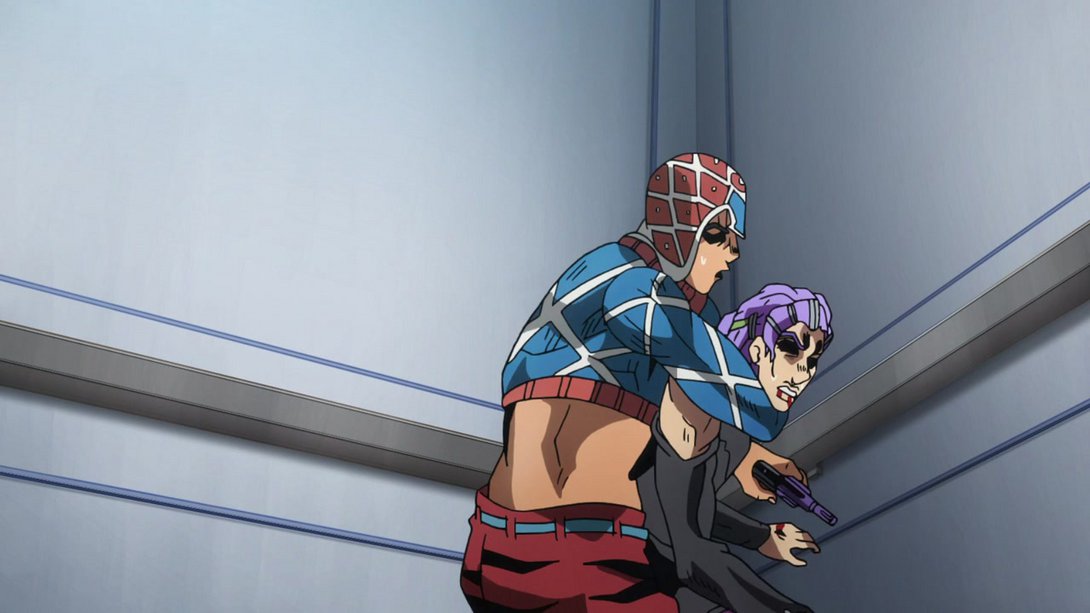
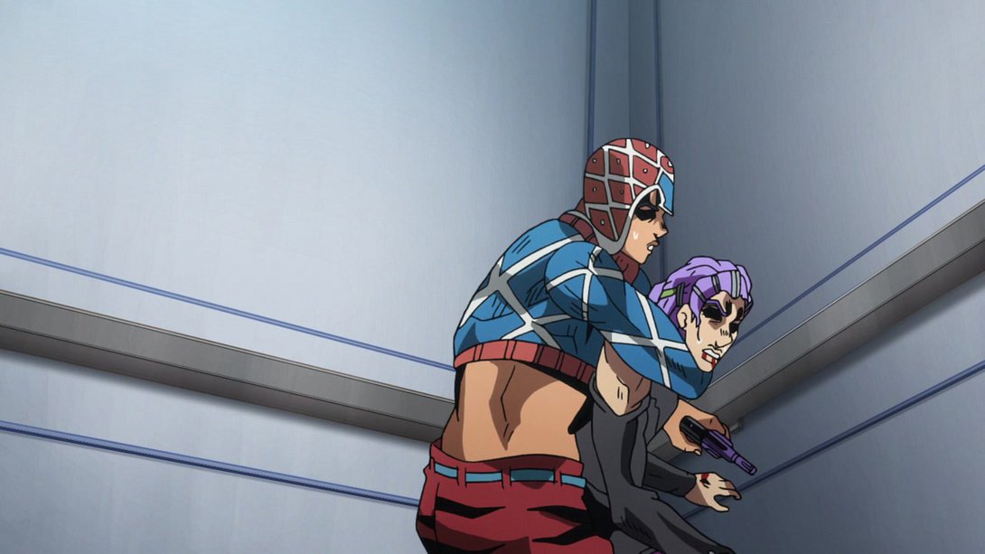
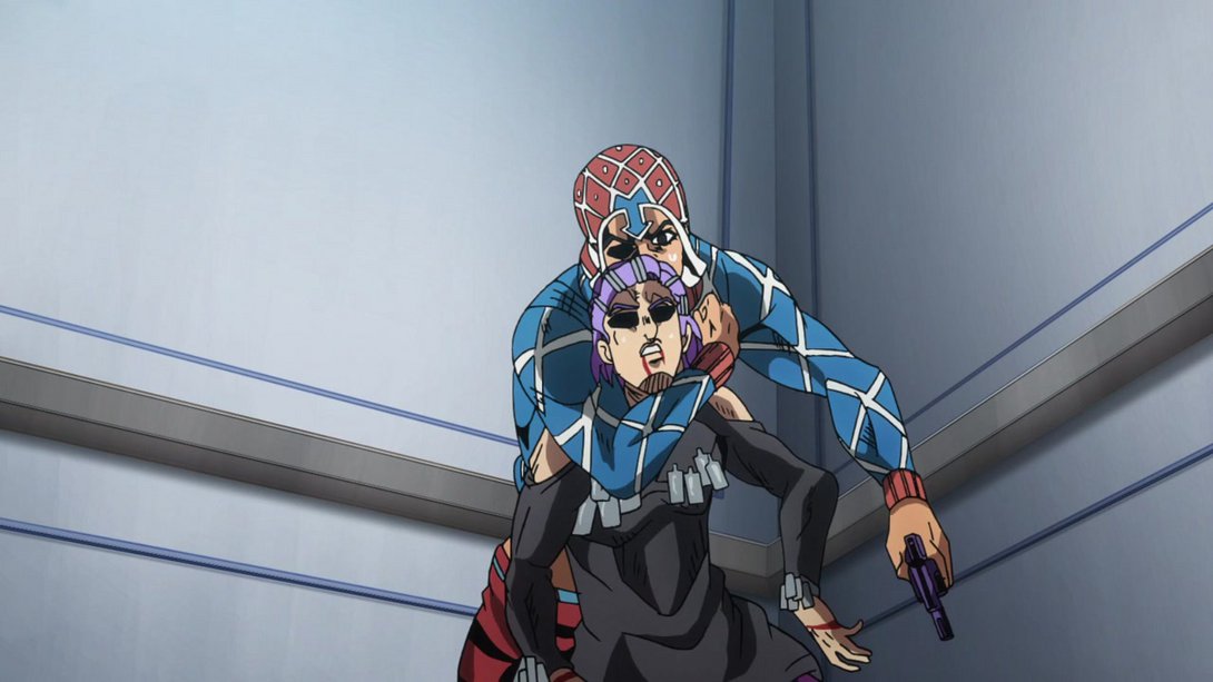

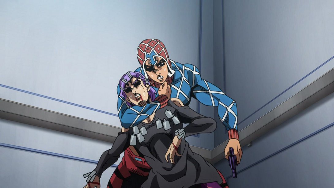


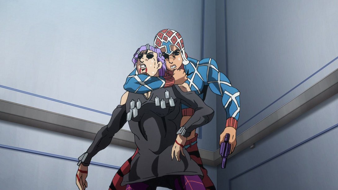
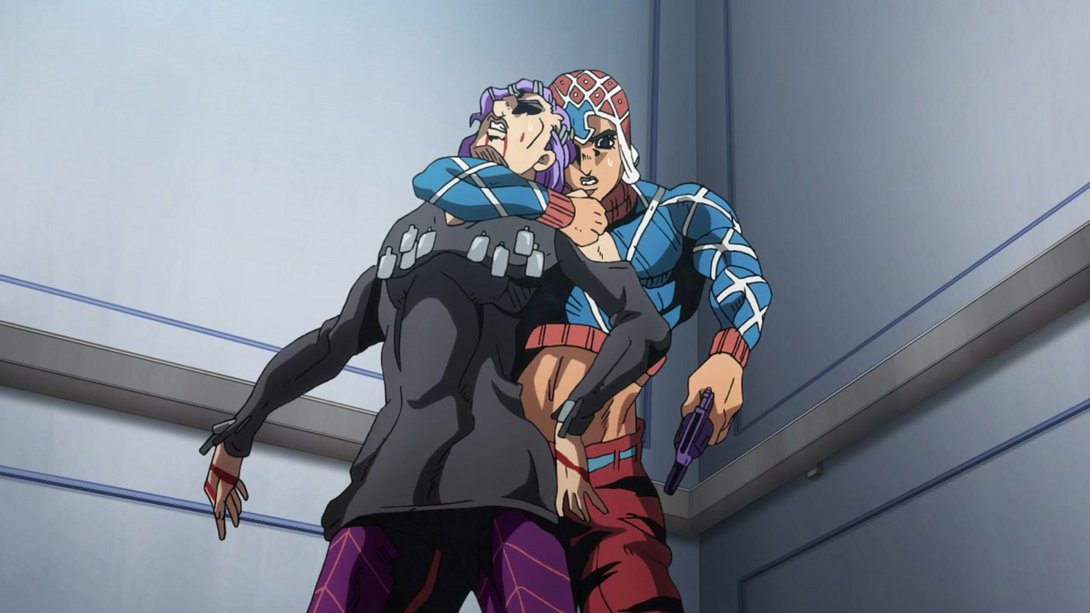
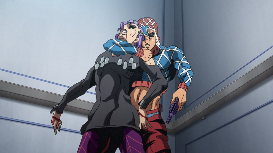
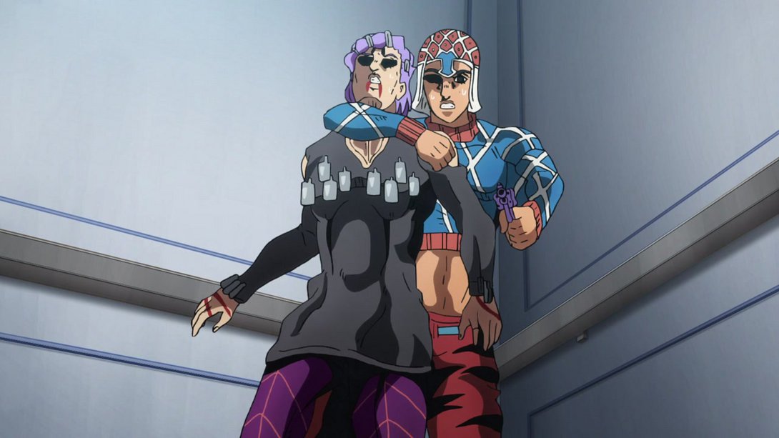
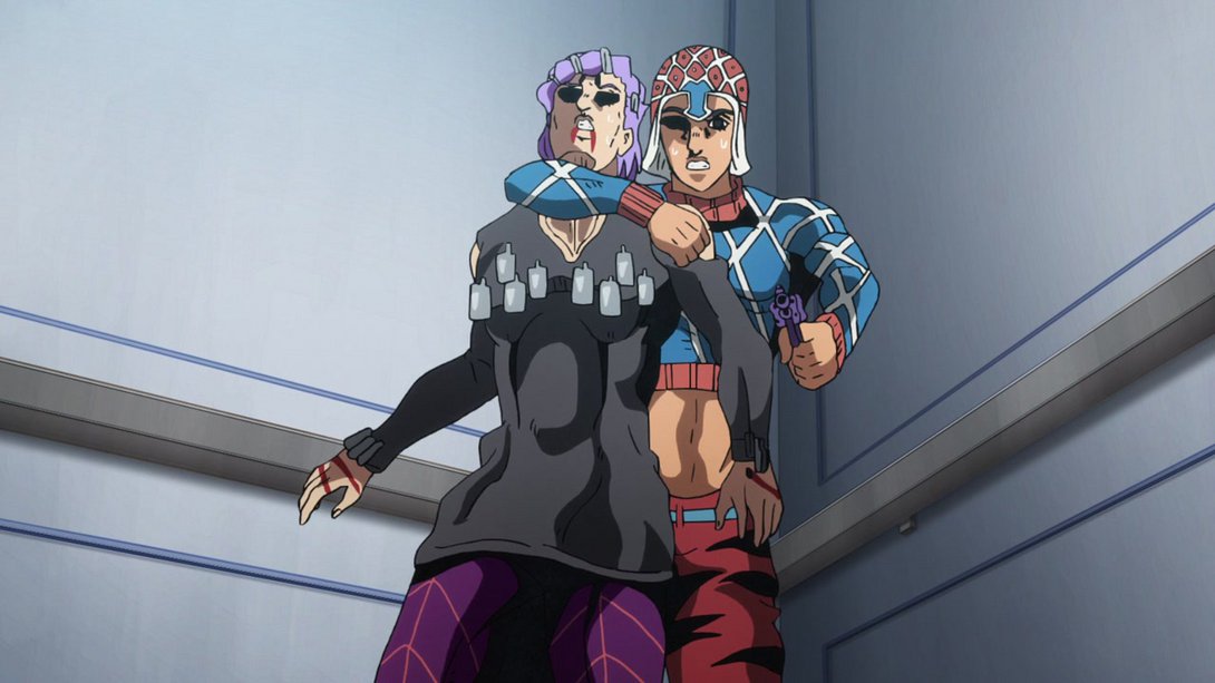
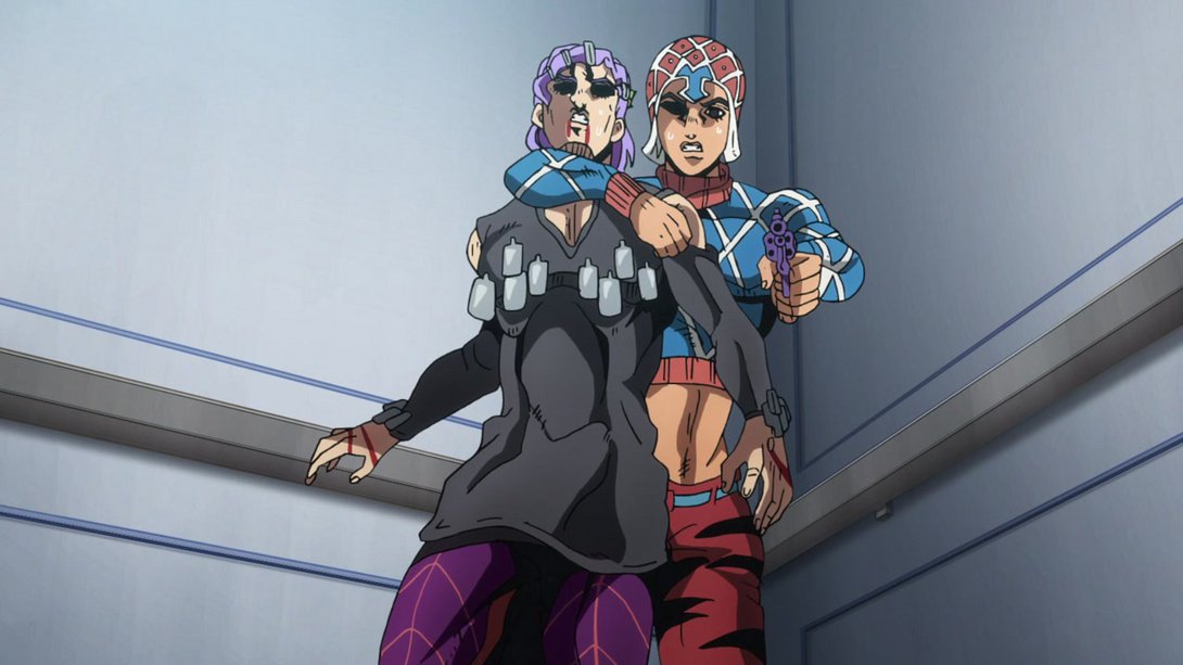
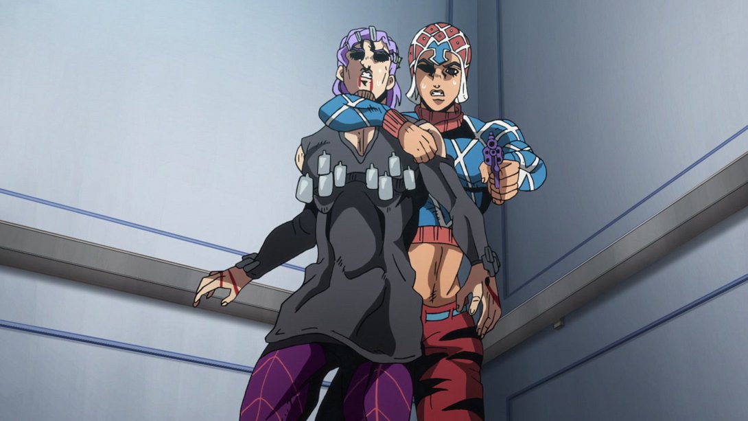
- Here the first frames of this animation are much blurrier, Scolippi is now casting a shadow on the elevator wall and most shadows are also significantly darker:
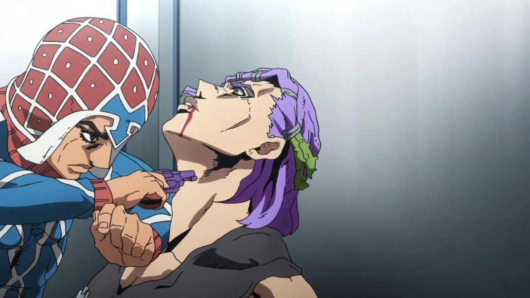
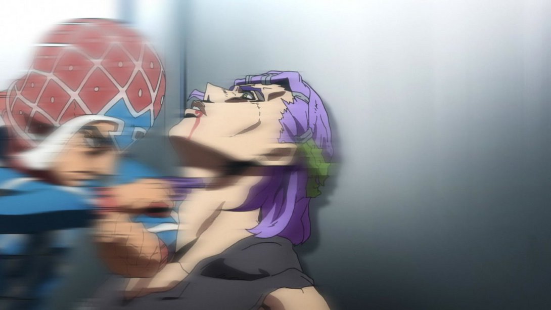
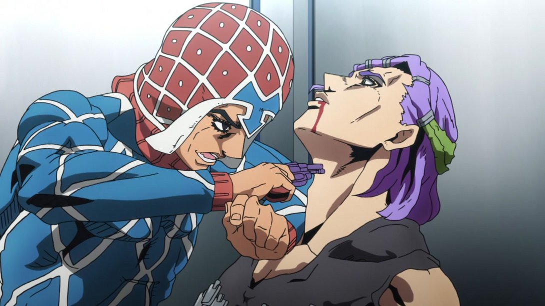
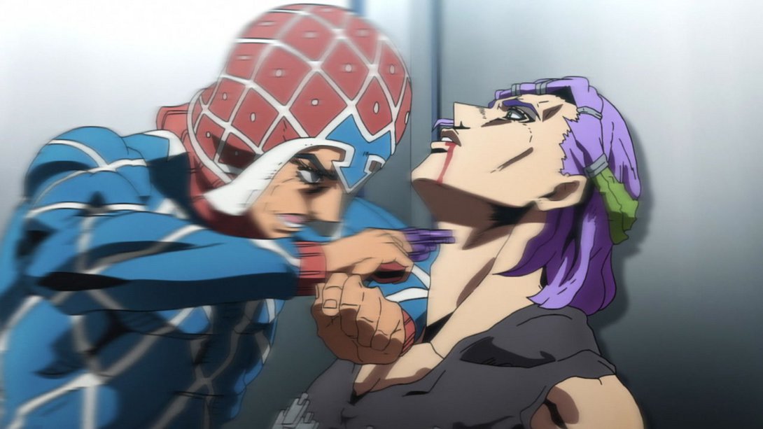
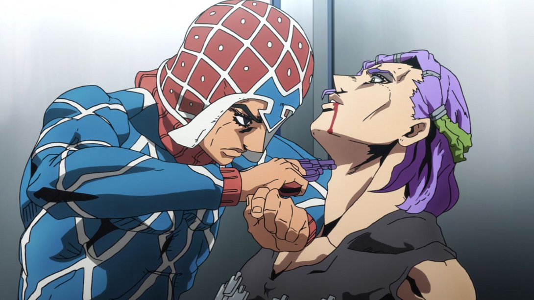
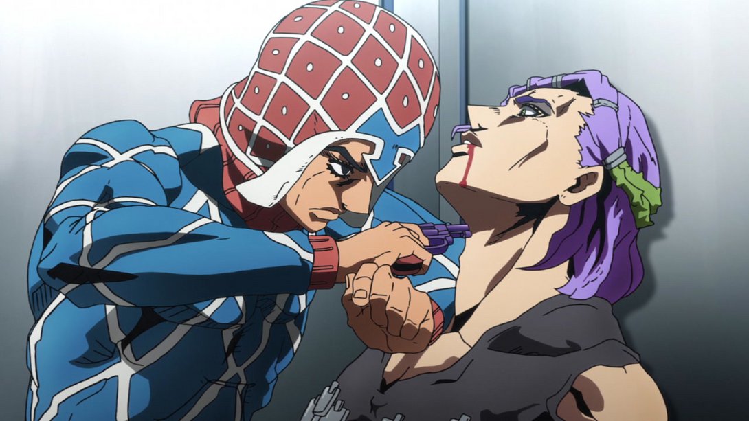
- Once again, Scolippi’s cast shadow is back here, and the background on the left side of the frame is also slightly different:
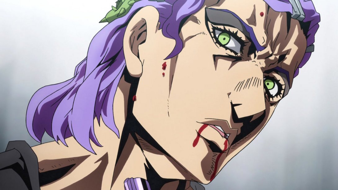
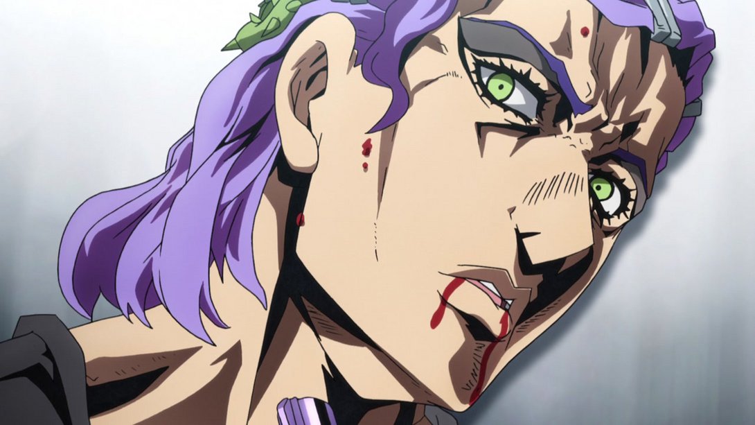
- This scene starts out way more zoomed in and ends up with most things moved down a notch:
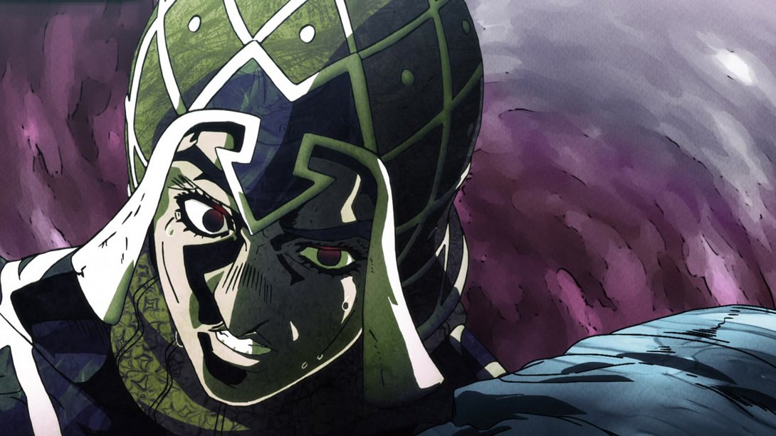
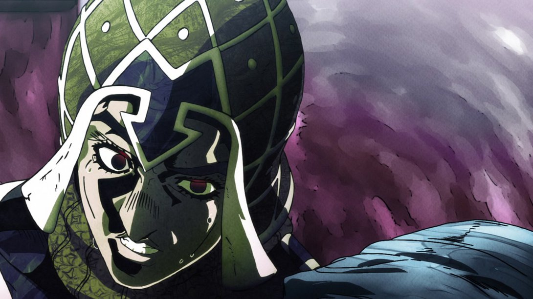
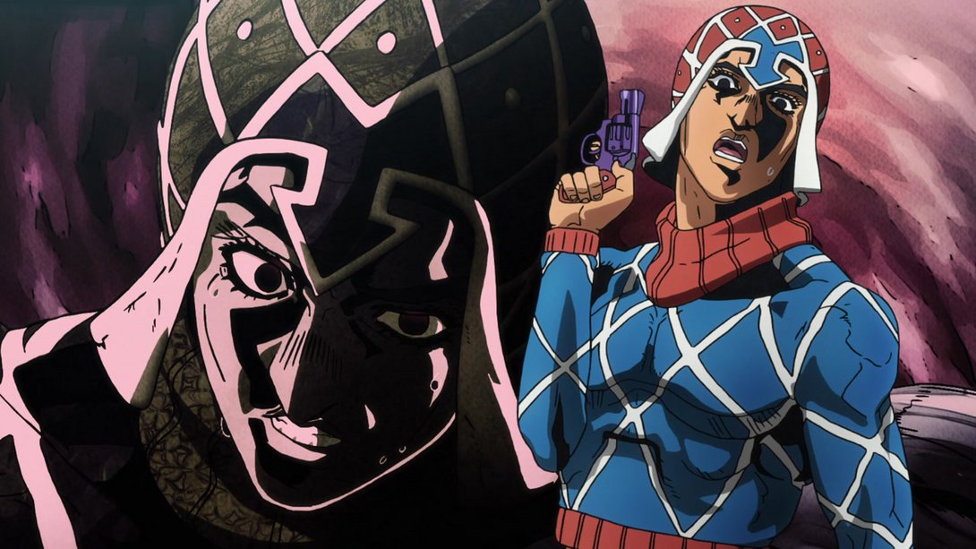
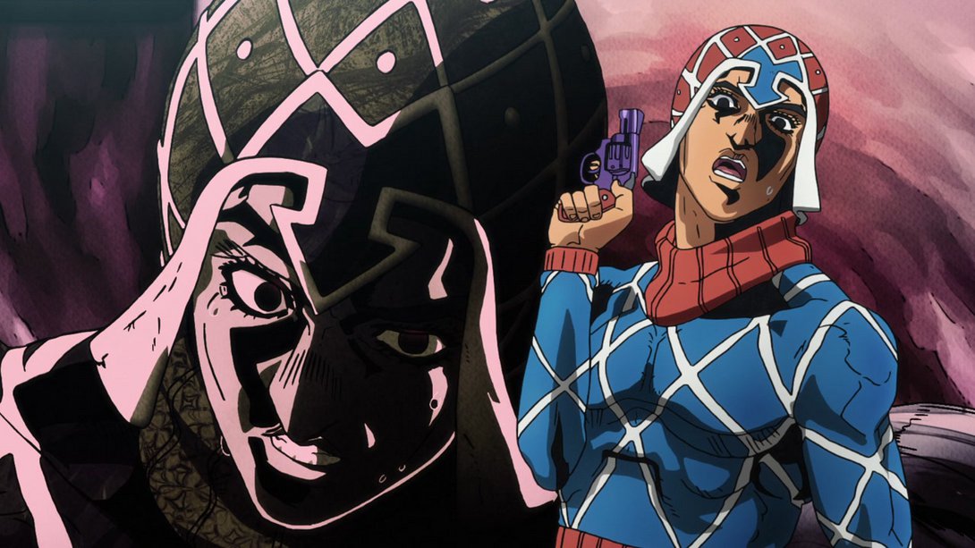
- Scolippi is once again casting a shadow on the elevator wall, here…:
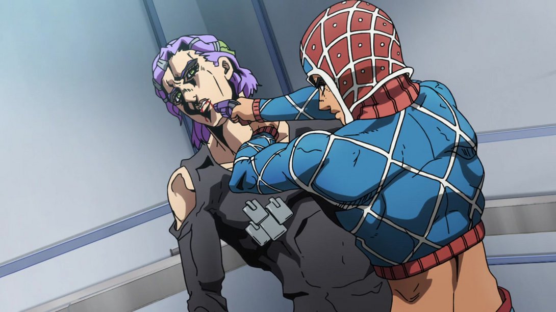
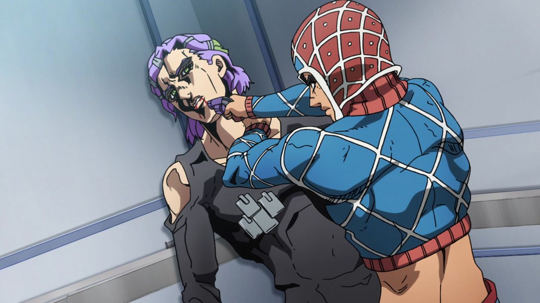
- And, on top of the new cast shadow and a couple of retouched bits here and there, Scolippi has received a new, subtle animation:
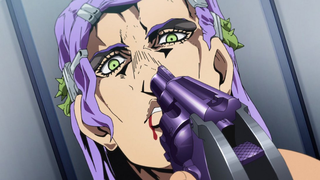
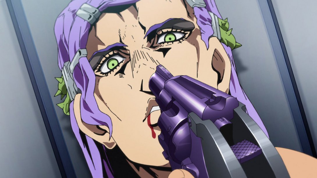
- Mista’s mouthflap has been tweaked here as well, and the background is also slightly darker:
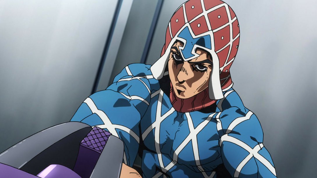

- On top of some lighting differences that make Scolippi stand out more, the usual cast shadow is back on the elevator wall:
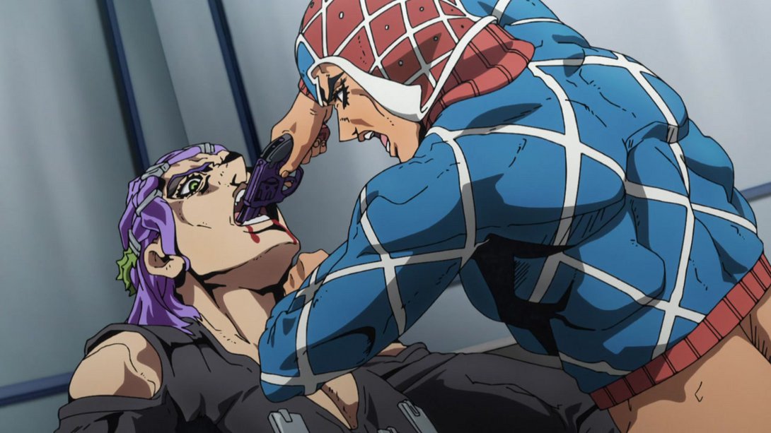
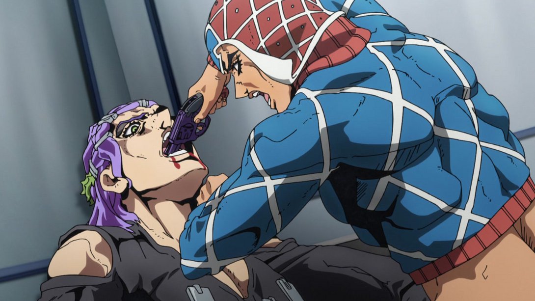
- In this shot which most likely represents somebody’s new fetish, the background is sharper (since Scolippi is standing right against it), the usual cast shadow has been added on the wall and Scolippi’s eye area has been shaded more:
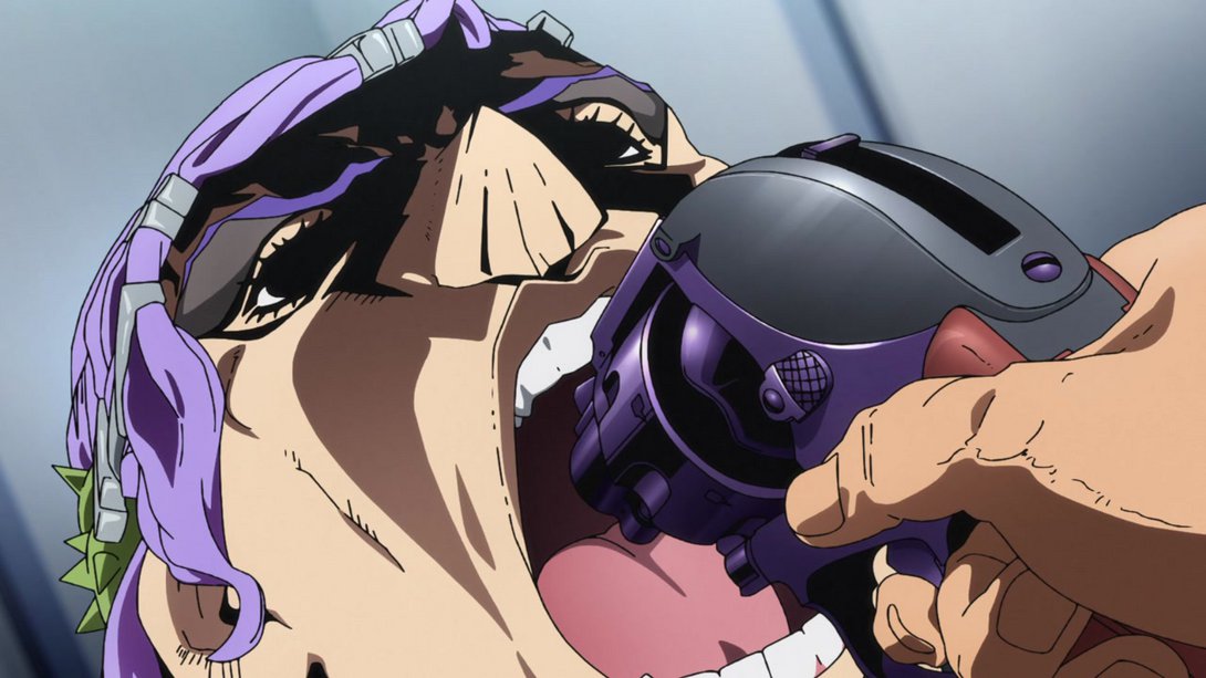
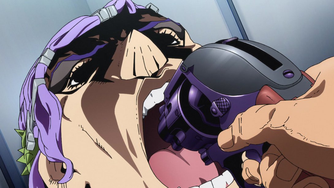
- This animation is brighter and sharper:
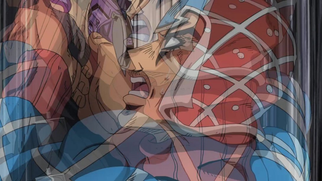
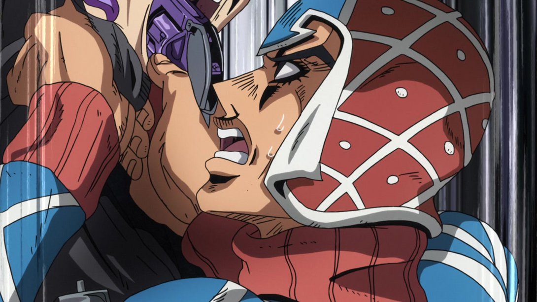
- Here, Scolippi has blood coming out of his mouth…:
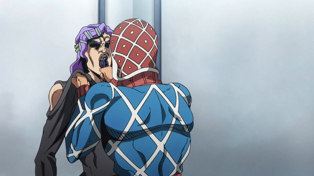

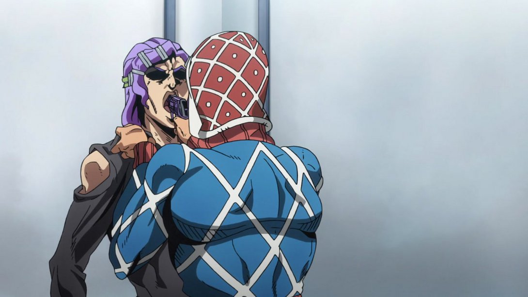

- …later on in the same sequence, his eye area has been retouched…:
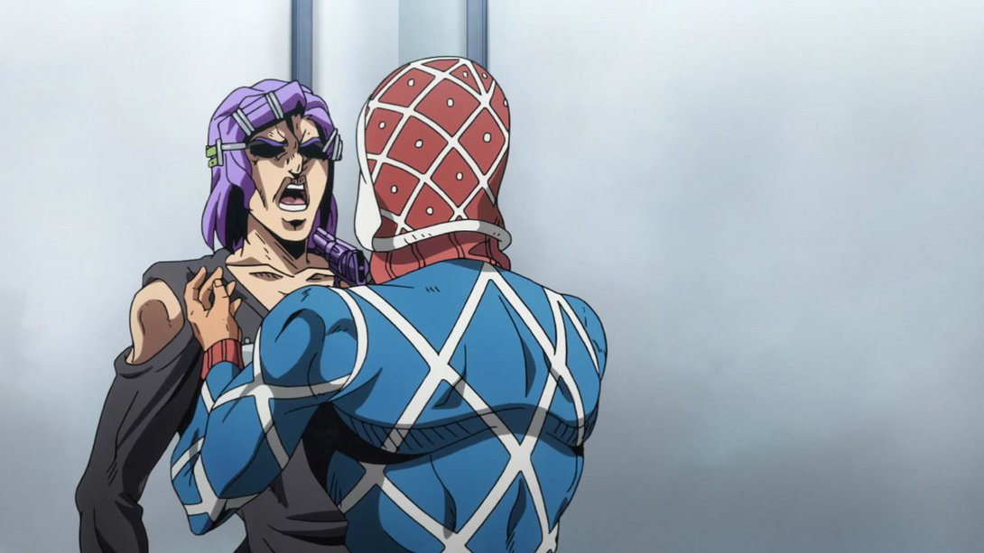

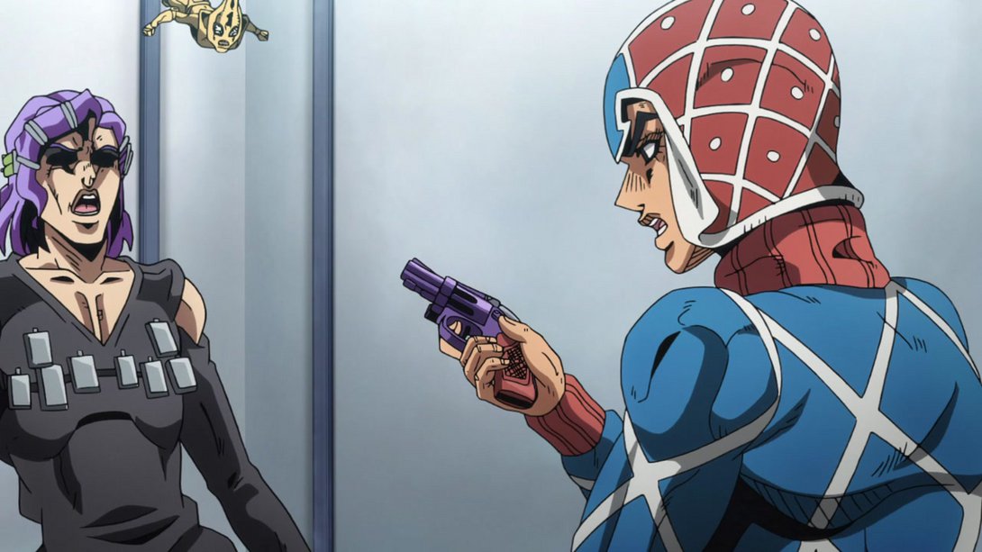
- …and, later on still, the usual cast shadow is back:

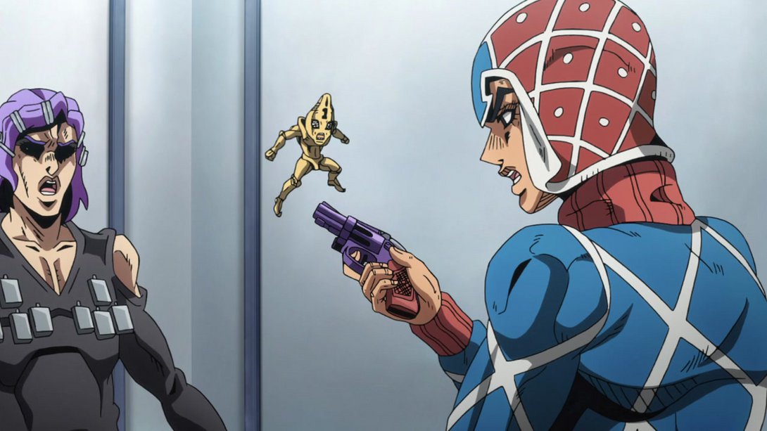
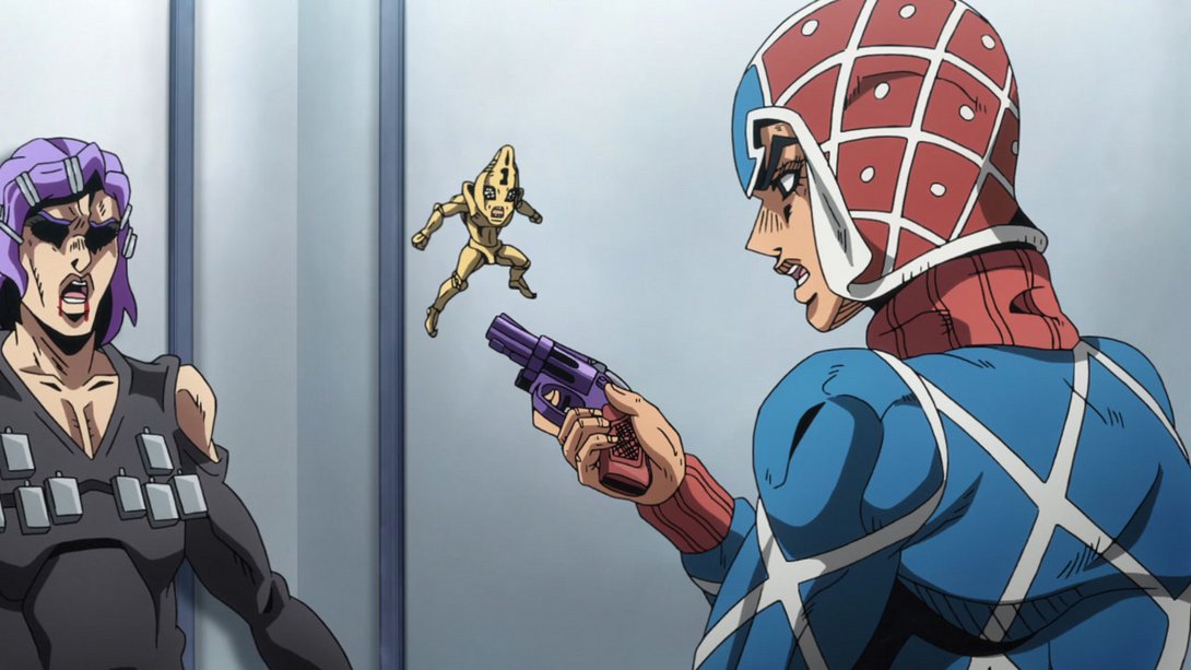
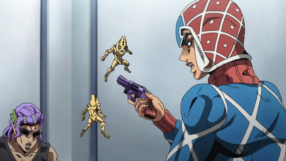
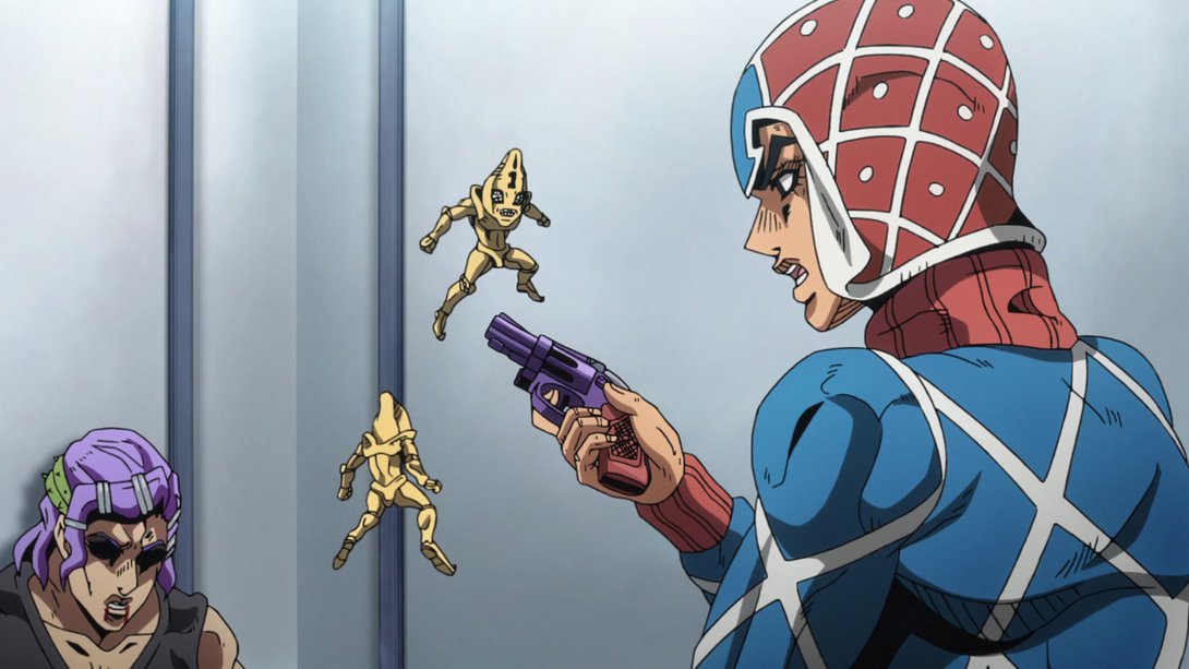
- Here, Scolippi’s face has been retouched and his wildly uneven pupils have been tweaked:
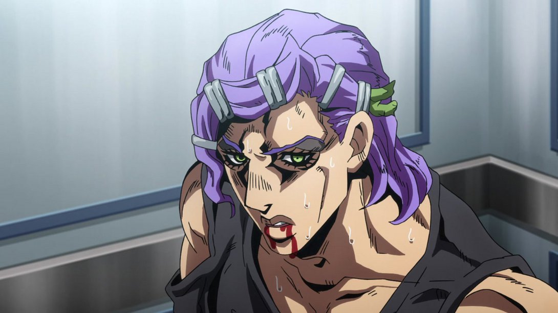
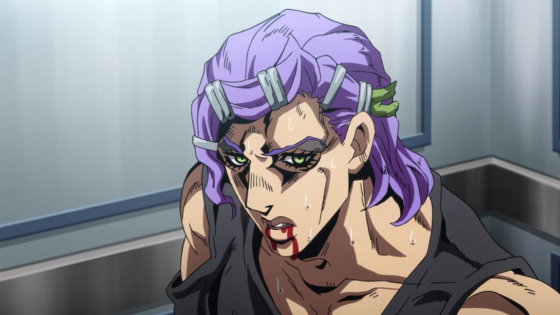
- Here, Mista (and his gun! And all four visible bullets!) have been massively retouched and the Bullets have also been repositioned. In addition to that, all four Bullets slowly move around instead of being completely static:
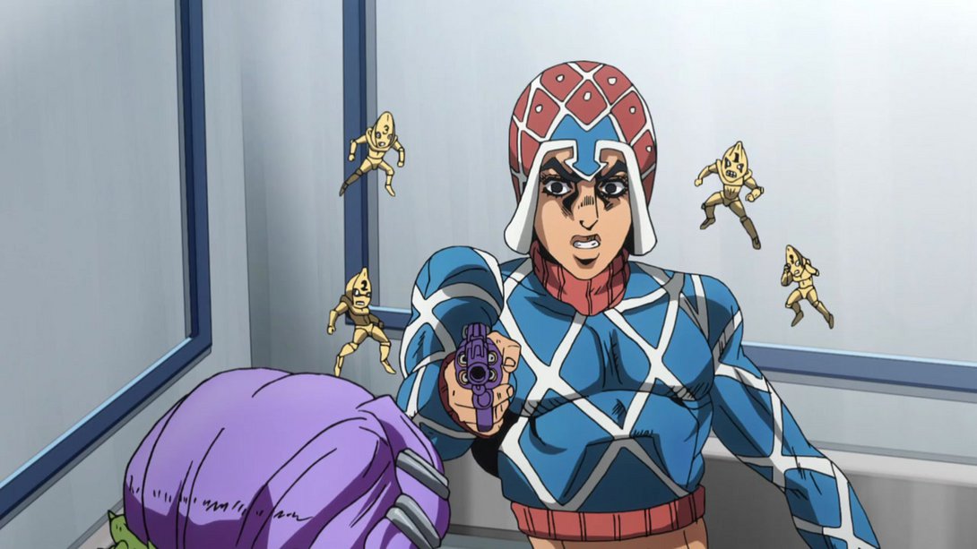
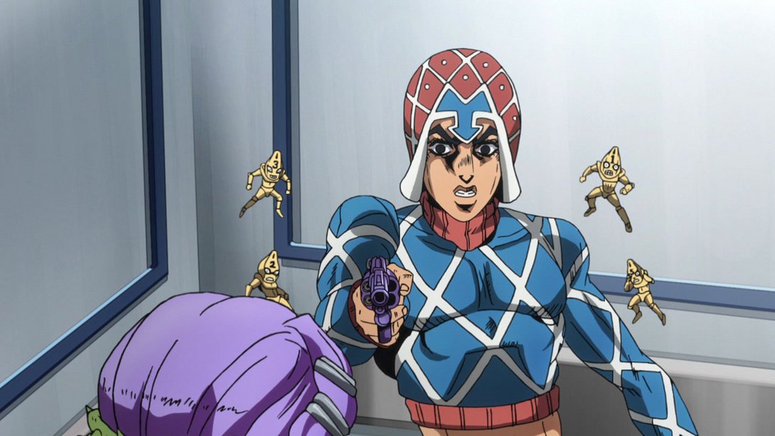
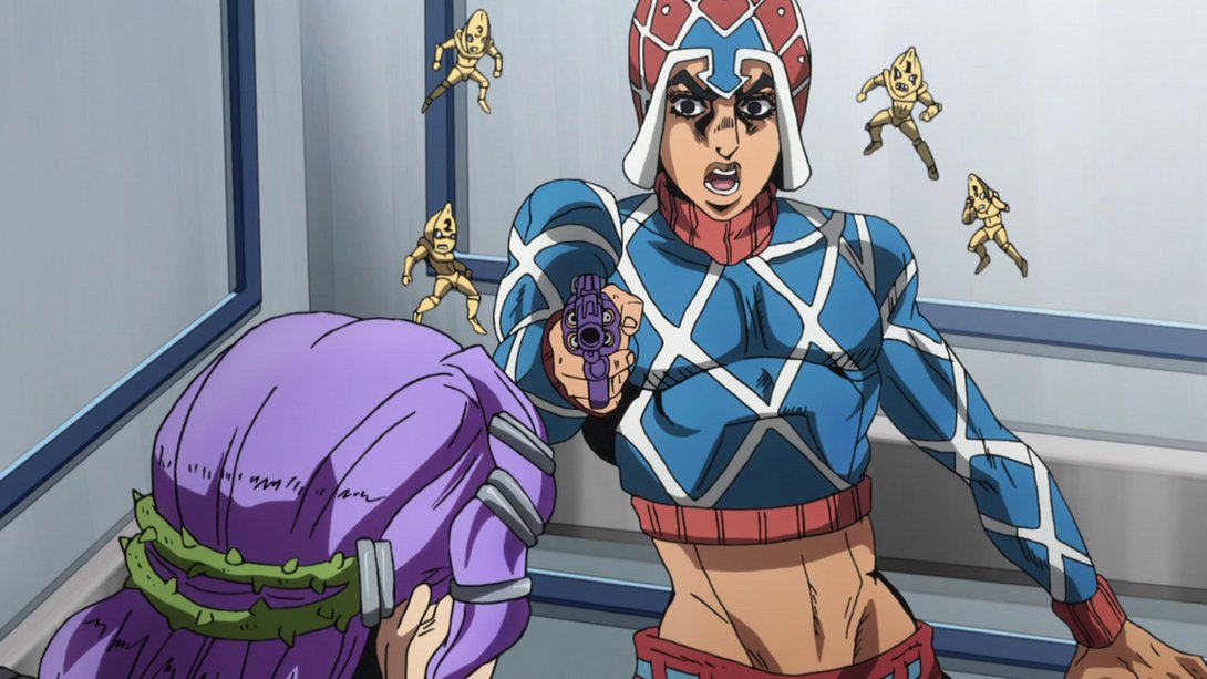
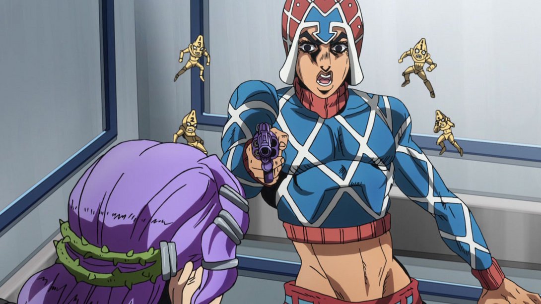
- Here, there is a new distortion along the edges, the dividing line is more… interesting looking, and a small dot on Mista’s nose is no longer there (roughly where his left nostril would be):
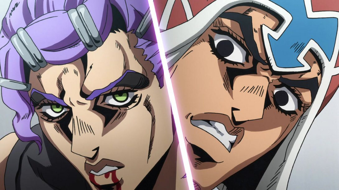
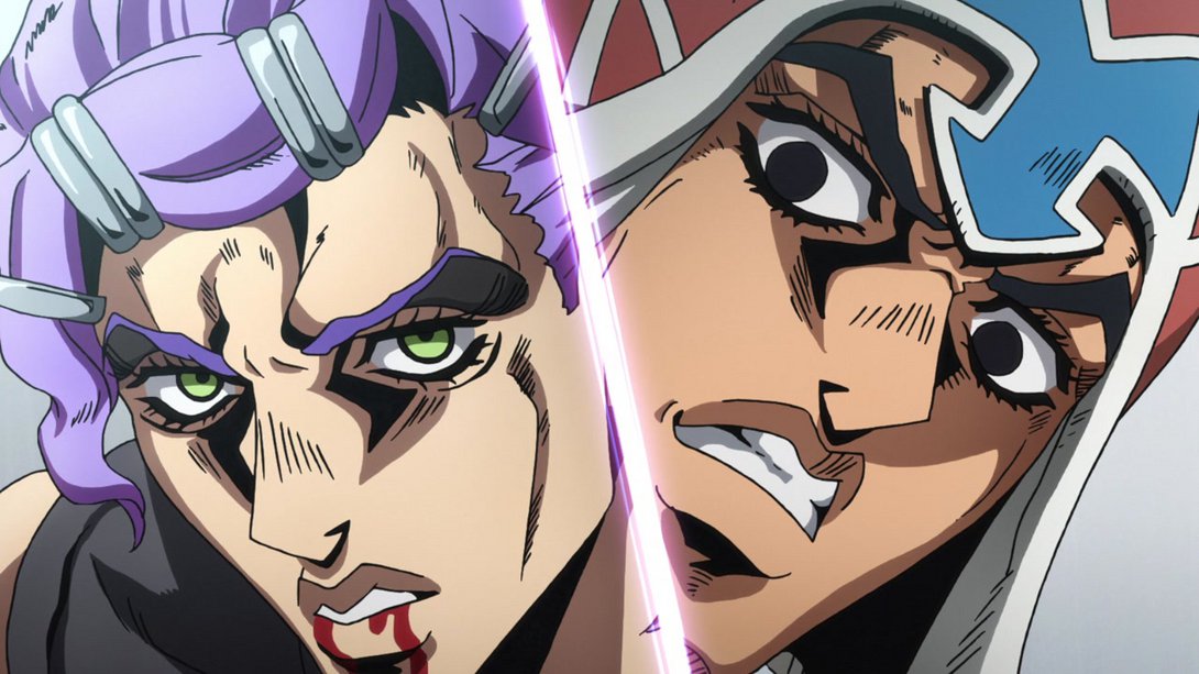
- The mouthflap has been tweaked here once again…:
- …and, as you might have noticed, the shading on Mista’s head and hand is looking a little different too:
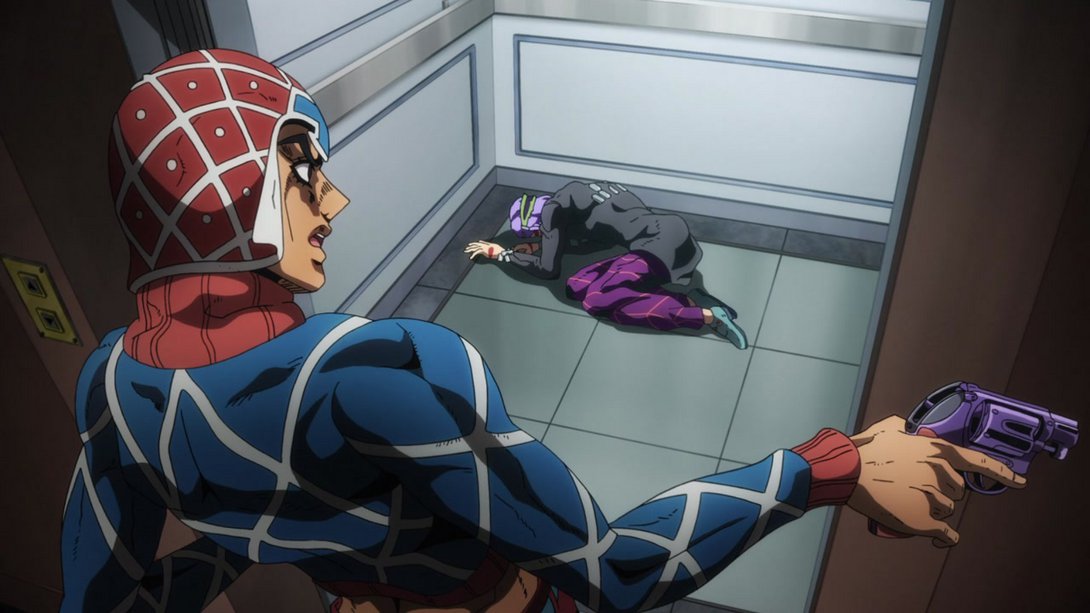
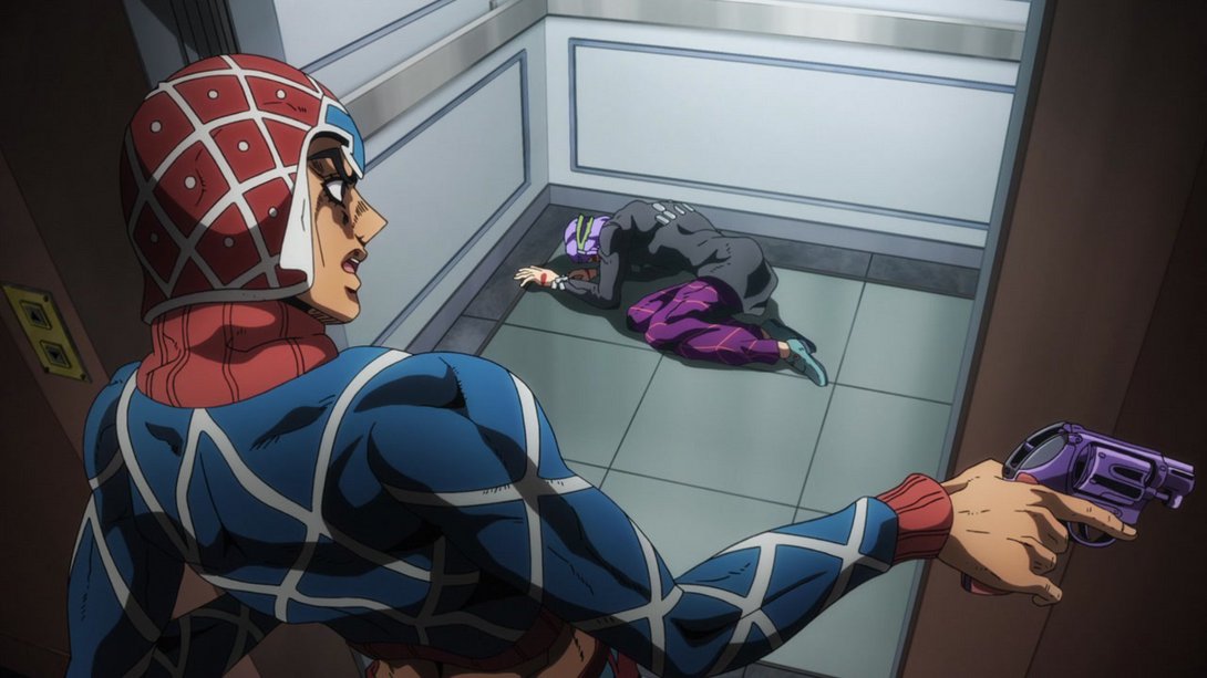
- IIIT’S THE FIIINAL EEEYECAAAATCH [synth solo]:
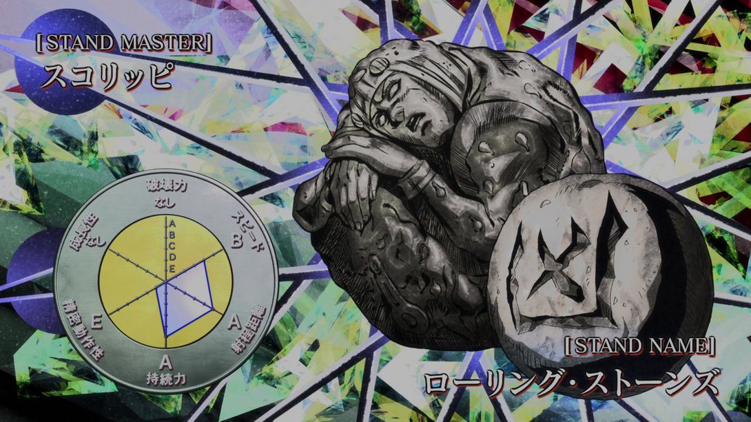
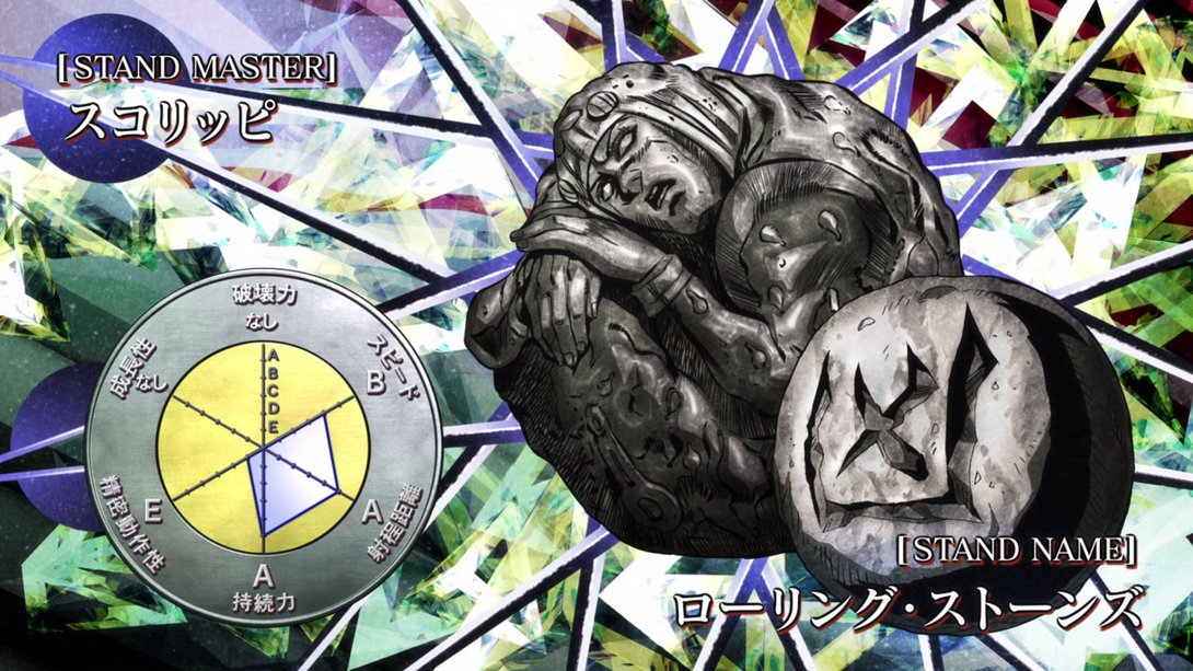
- Moving on… In the initial frames of this animation, Scolippi is bloodier, his green brooch has been correctly recoloured, Mista’s right arm no longer has that little speck of blood on it and one of Scolippi’s lines no longer goes over the outline in Mista’s left shoulder…:
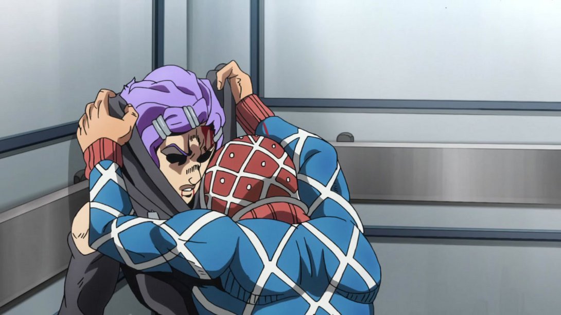

- …in later frames, Scolippi is still looking bloodier and, in addition, both his and Mista’s faces have been retouched:
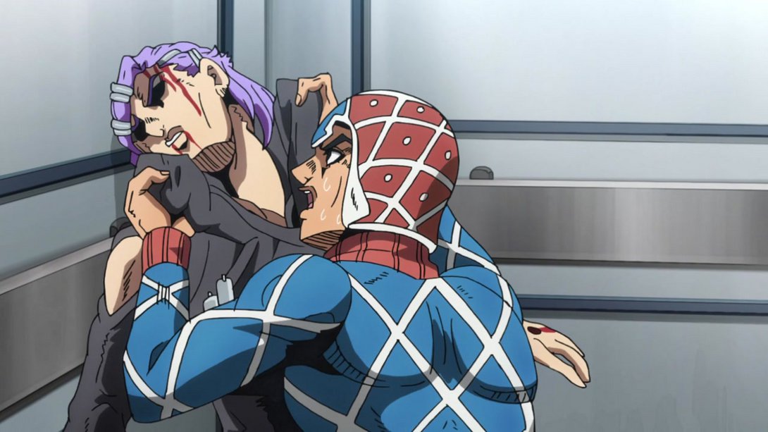
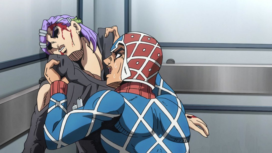

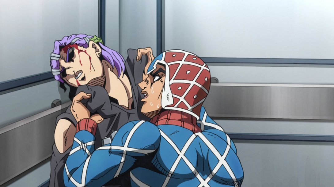
- Scolippi has been completely redrawn here! In addition, the background is sharper and the usual cast shadow is back:
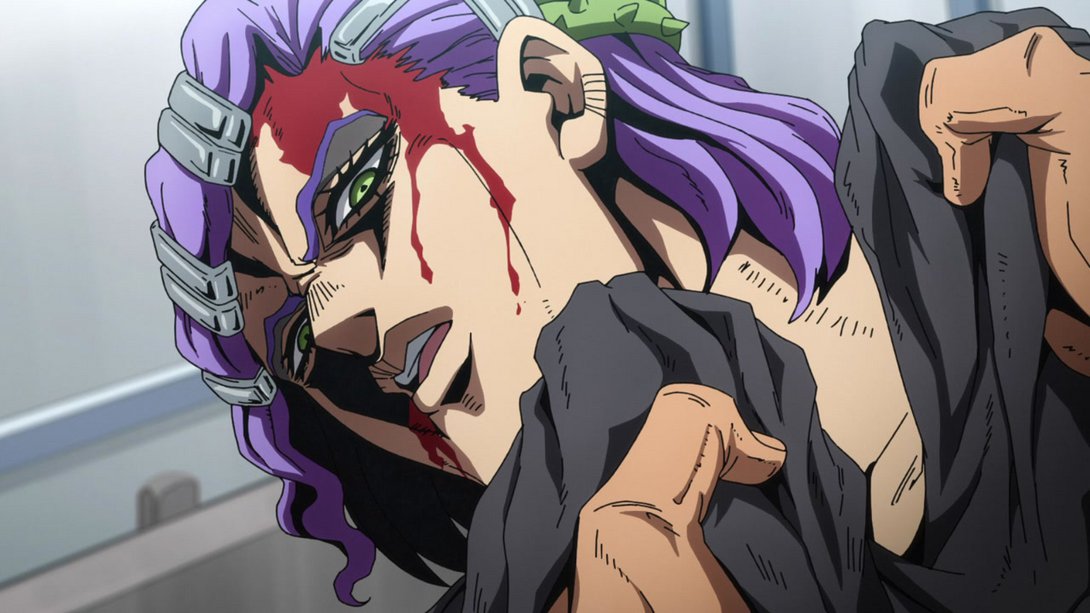
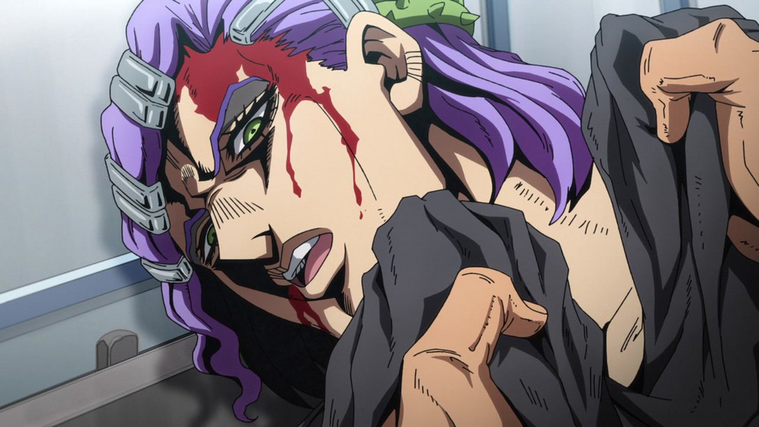
- There is a different distortion along the edges here, and Mista’s right eye area has been retouched. In addition, one side of his hat now has a white edge at the bottom:
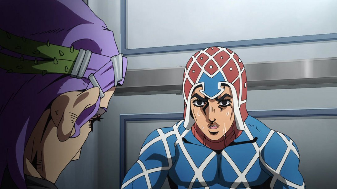
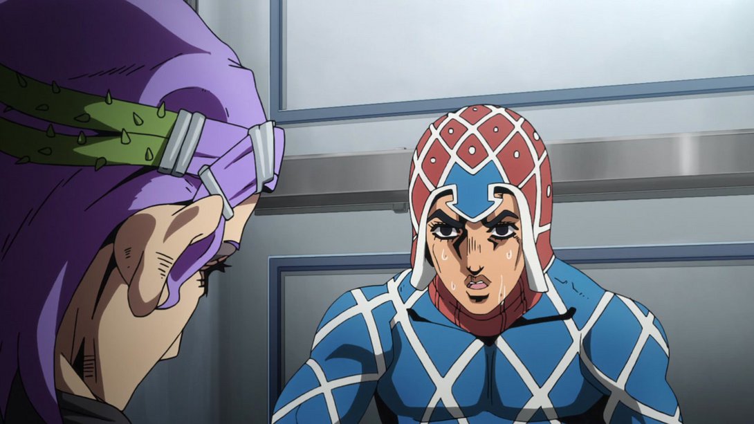
- This glorious series of frames is brighter…:
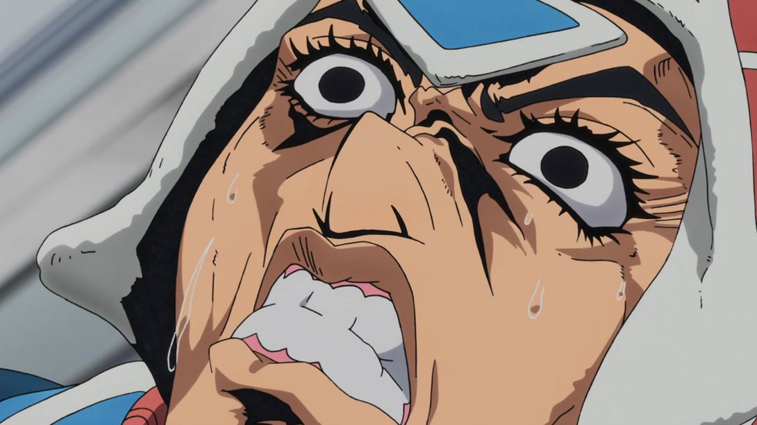
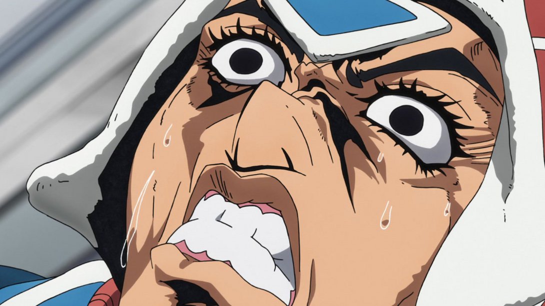
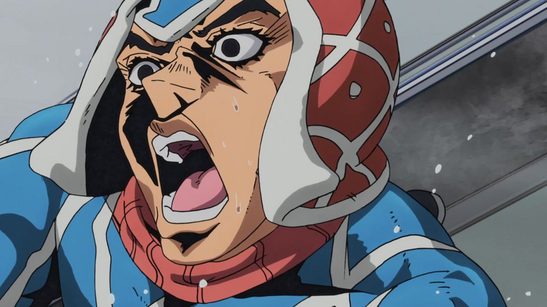
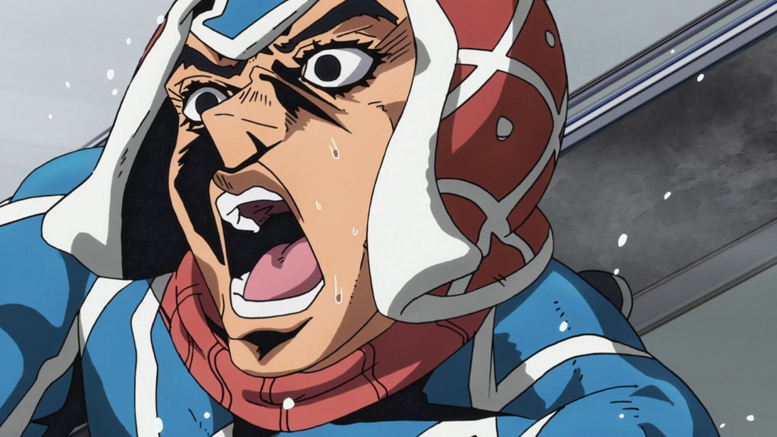
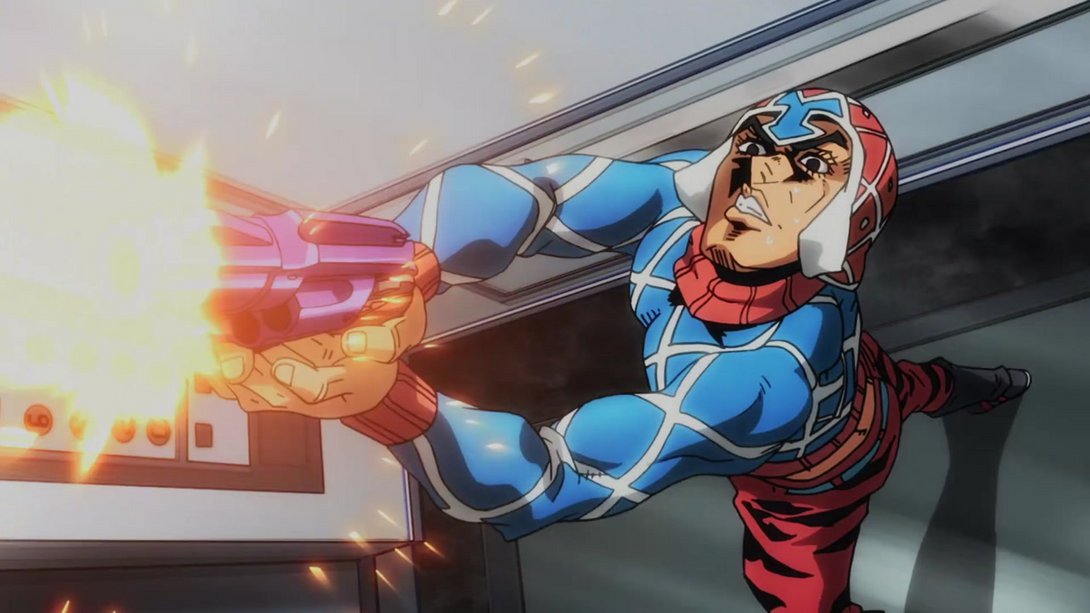
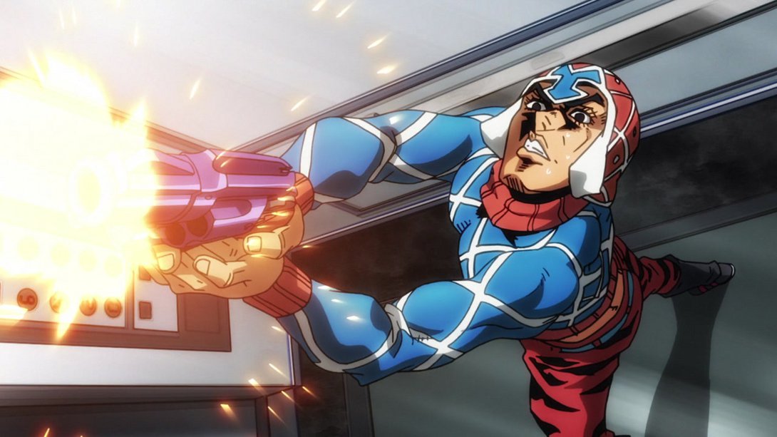
- The Bullets have been moved, here…:
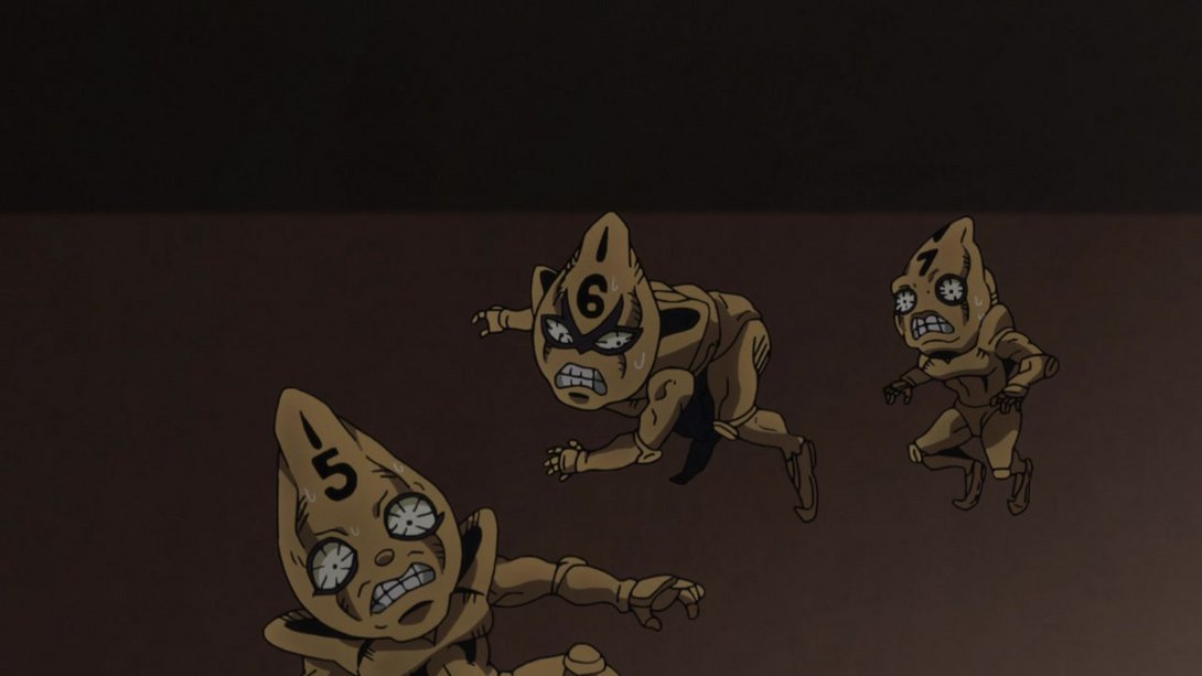
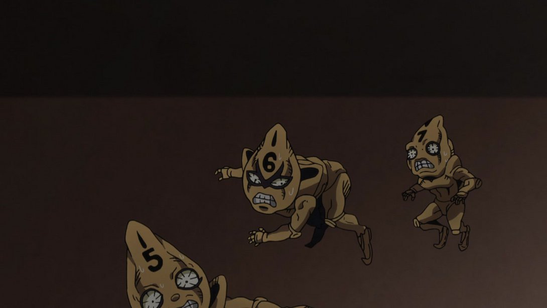
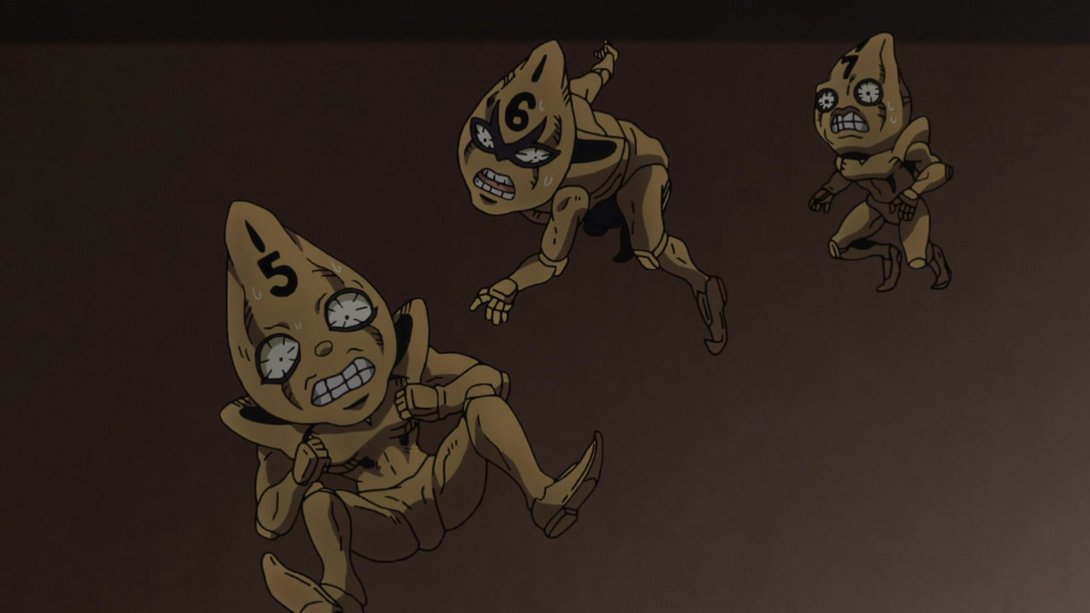
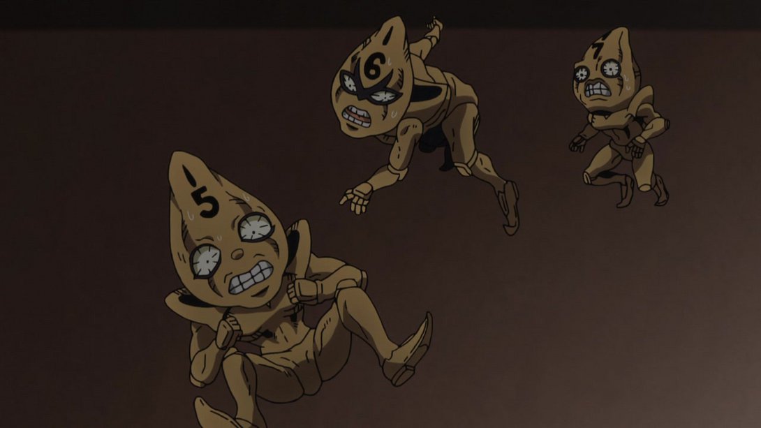
- …and, later on, Buccellati’s chest area has been sliiightly retouched as well:
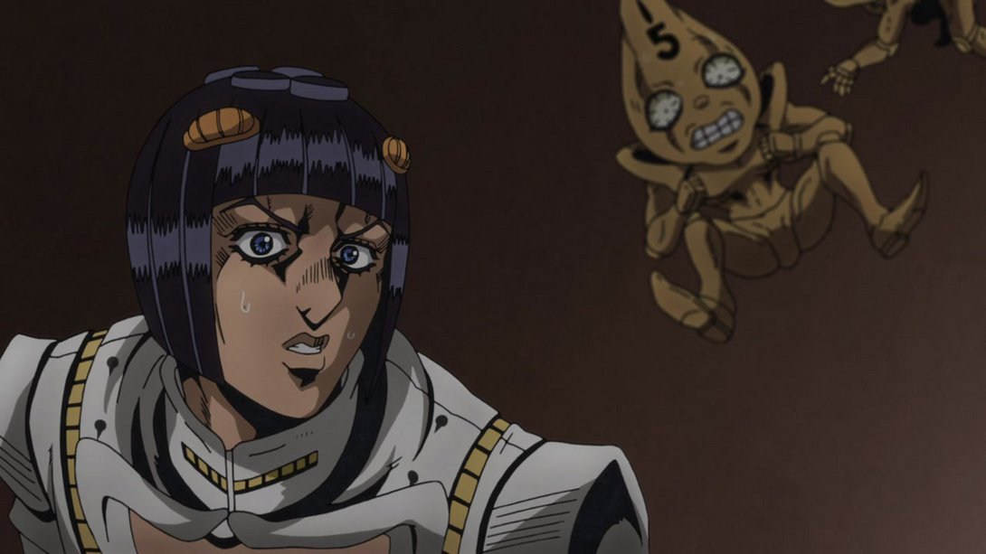
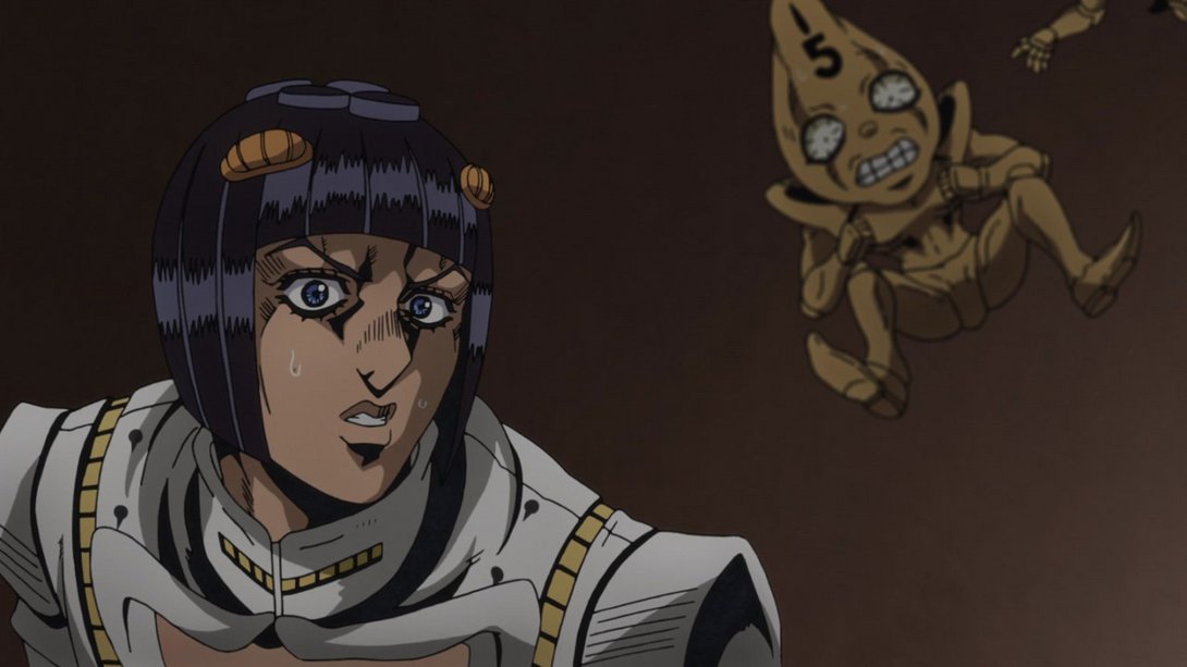
- The background is slightly darker here; in addition, some details on Mista have been retouched as well, here and there:
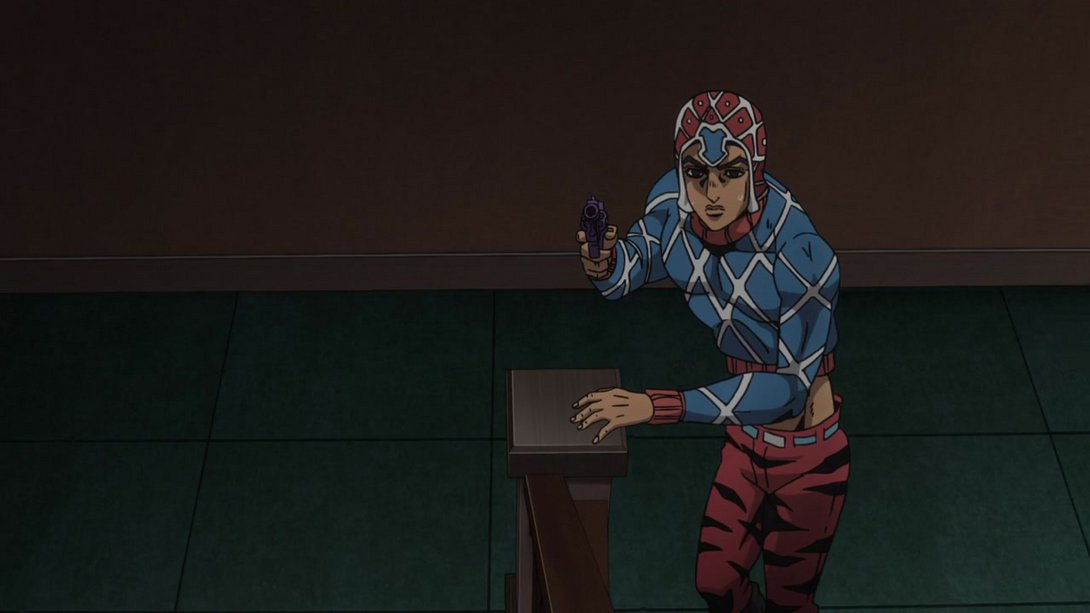
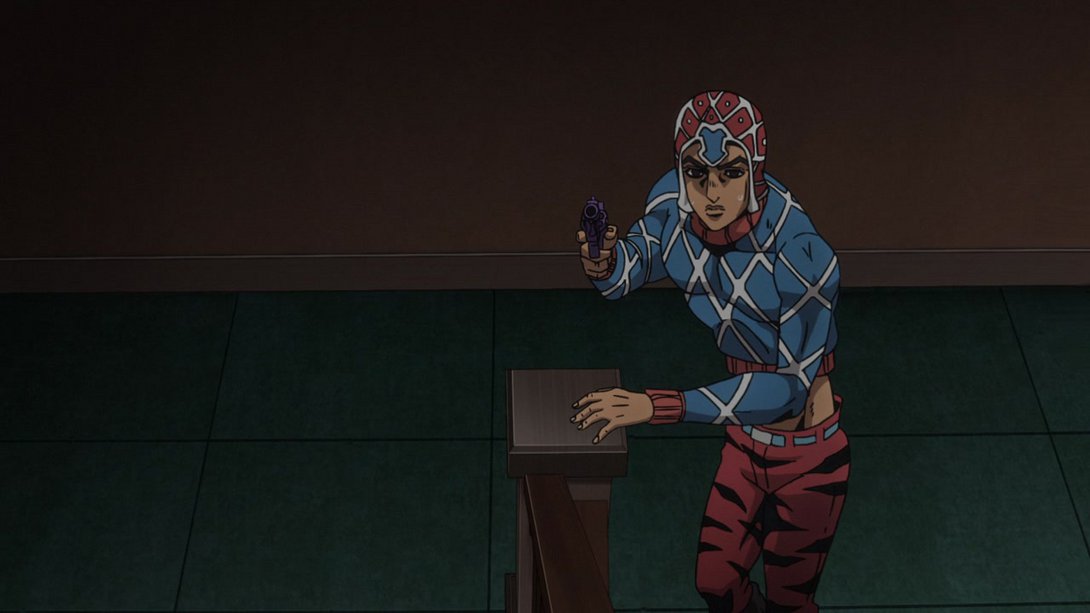
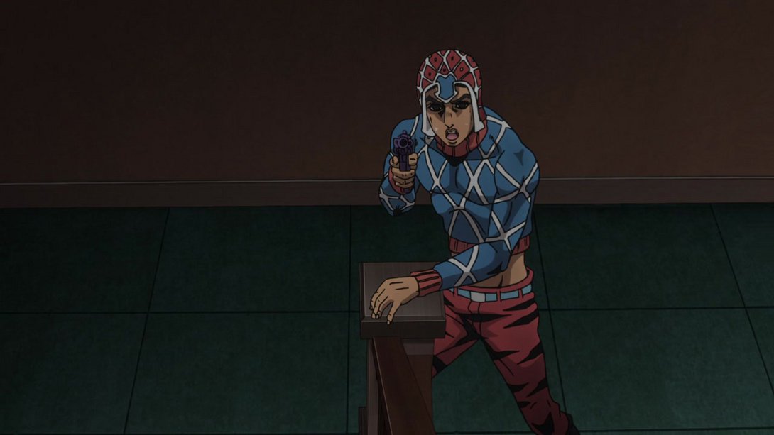
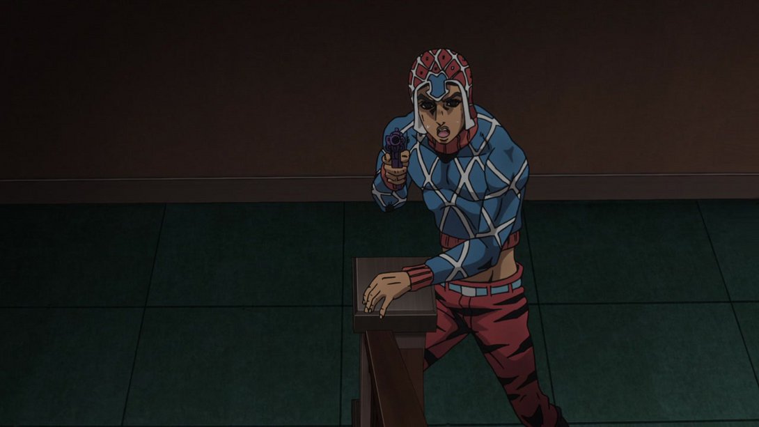
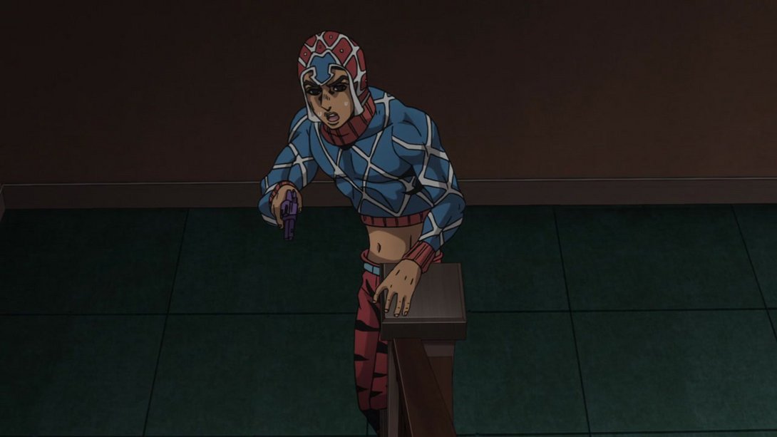
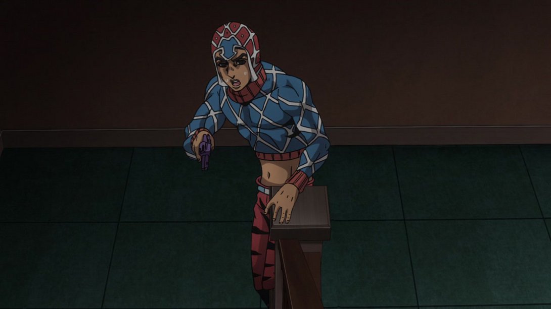
- Here, the background has been moved by a few pixels, Mista and his shadow have been retouched…:
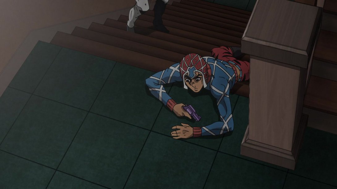
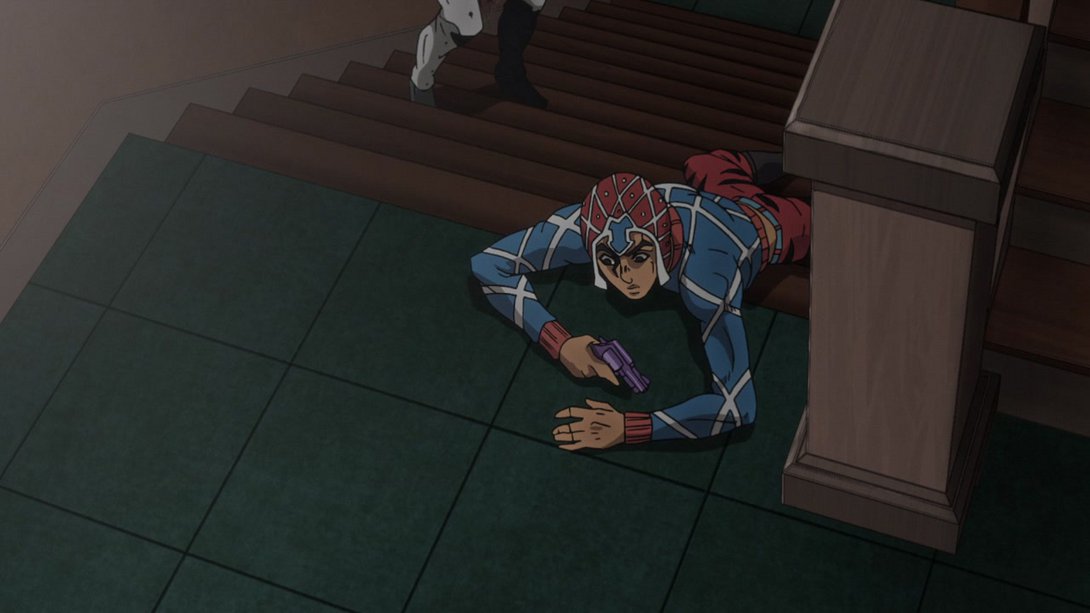

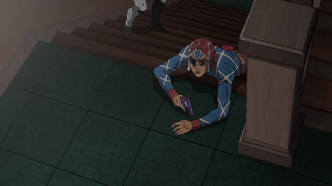
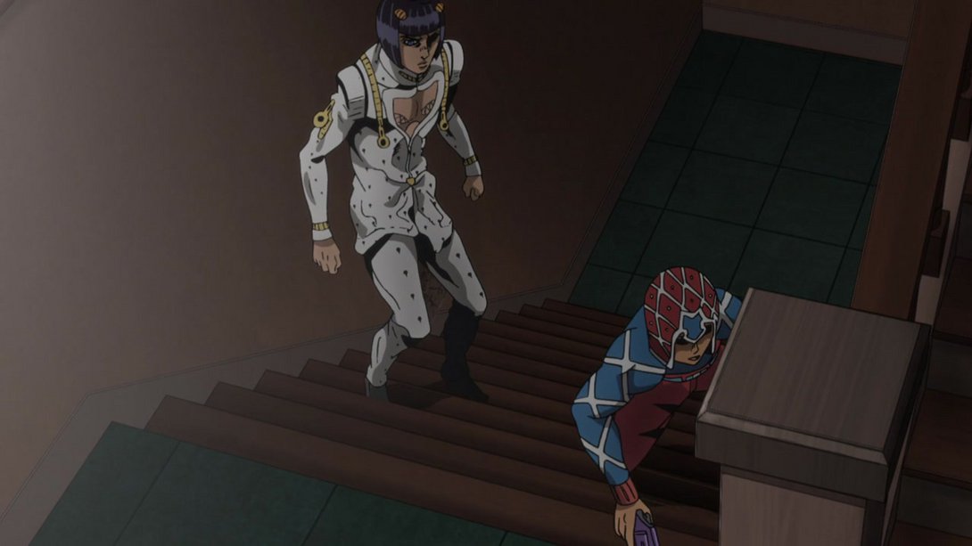
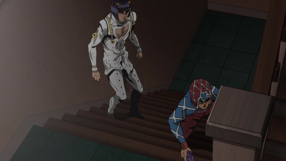

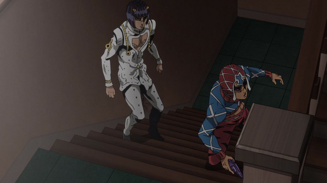

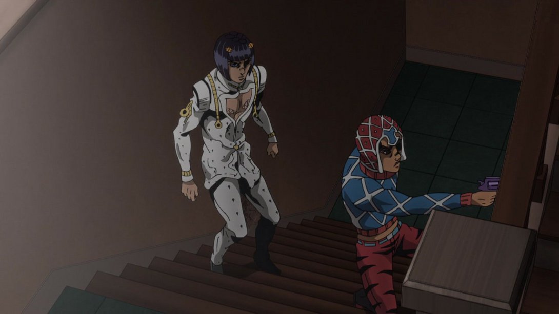

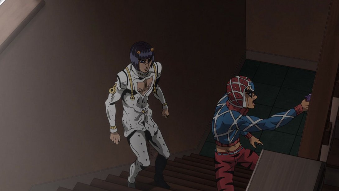
- …and, in the last bunch of frames, Mista has also been moved by a handful of pixels:
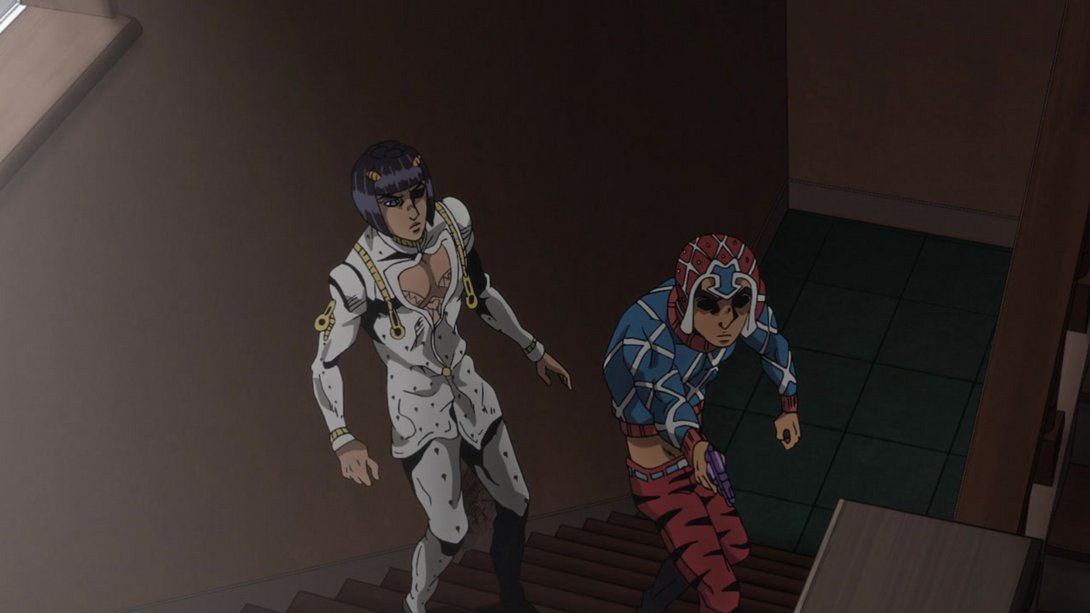
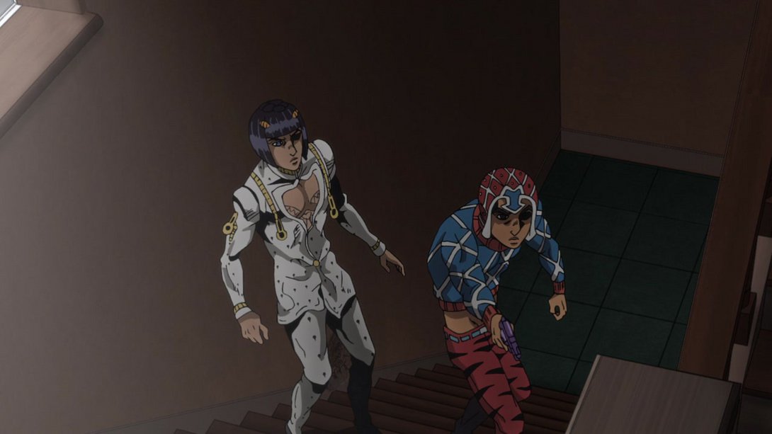

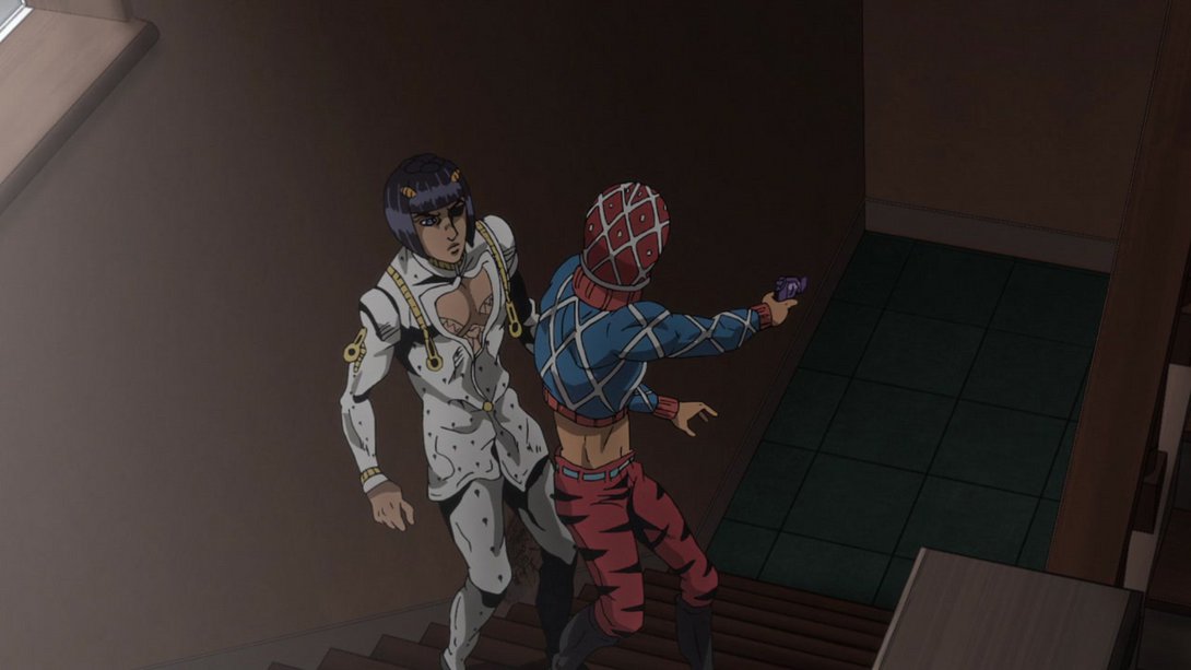
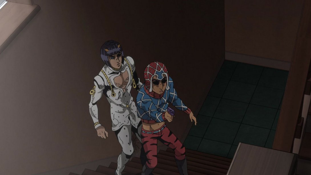

- Mista, Buccellati and Mista’s gun have all been retouched, here…:
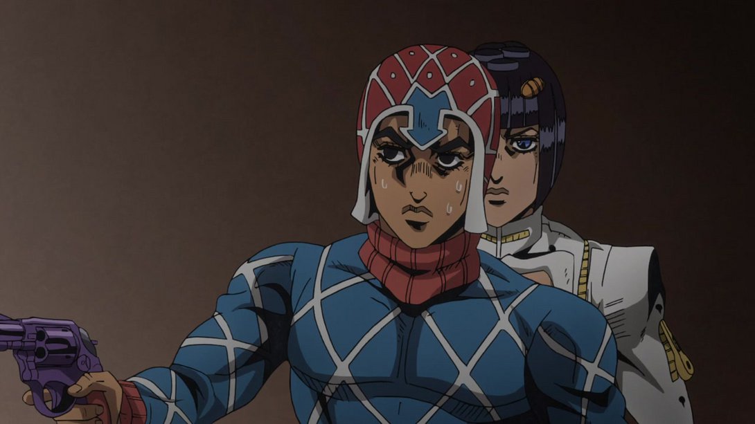
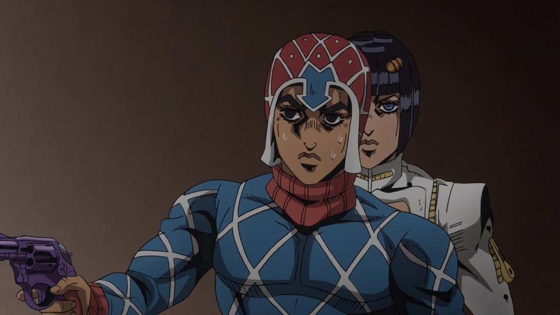
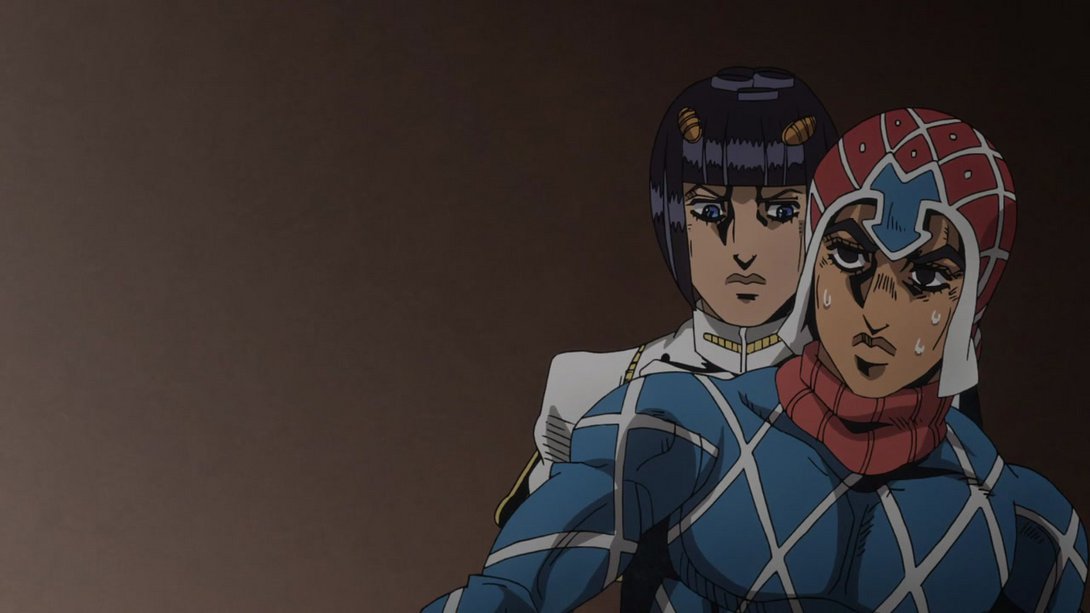

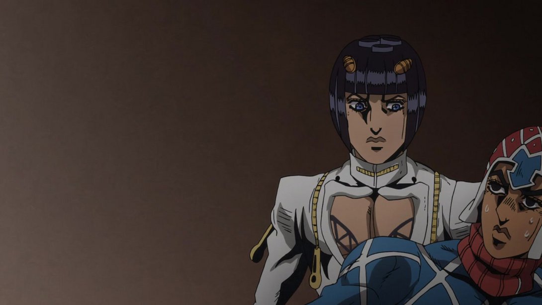

- The molten (?) Rolling Stone has a darker outline, here…:
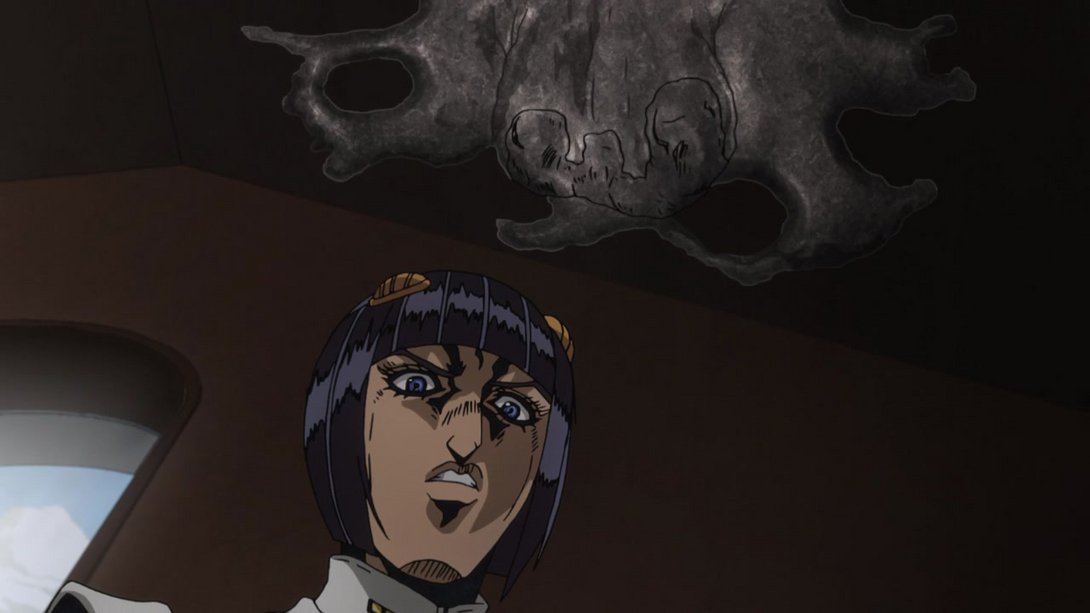
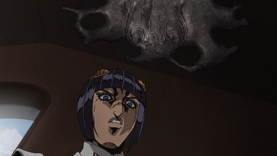
- Everything has been recoloured here! On top of that, the background is different, there’s a whole new texture overlay…:
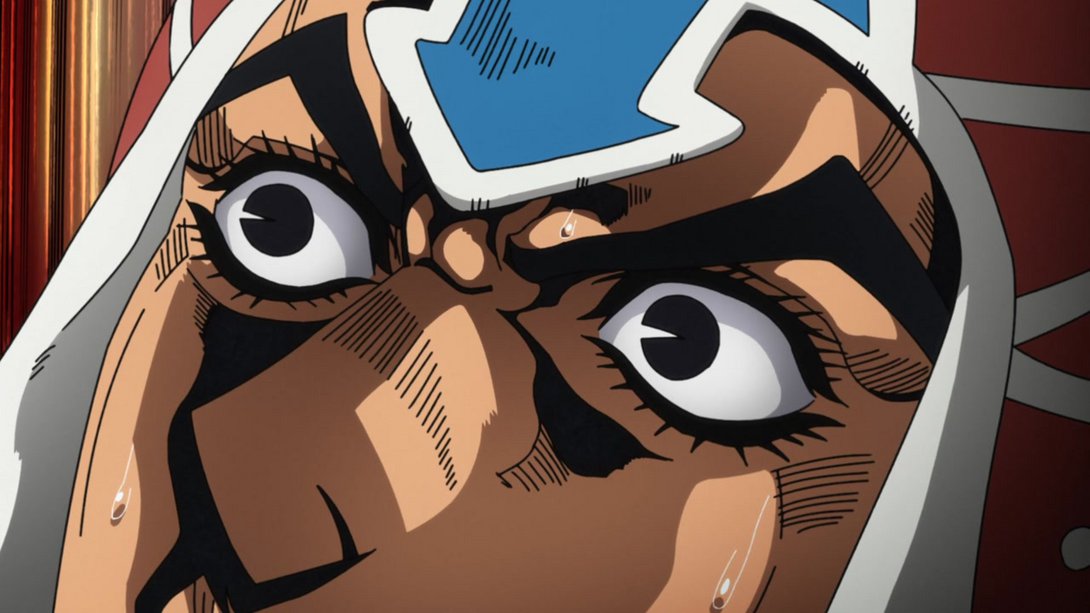
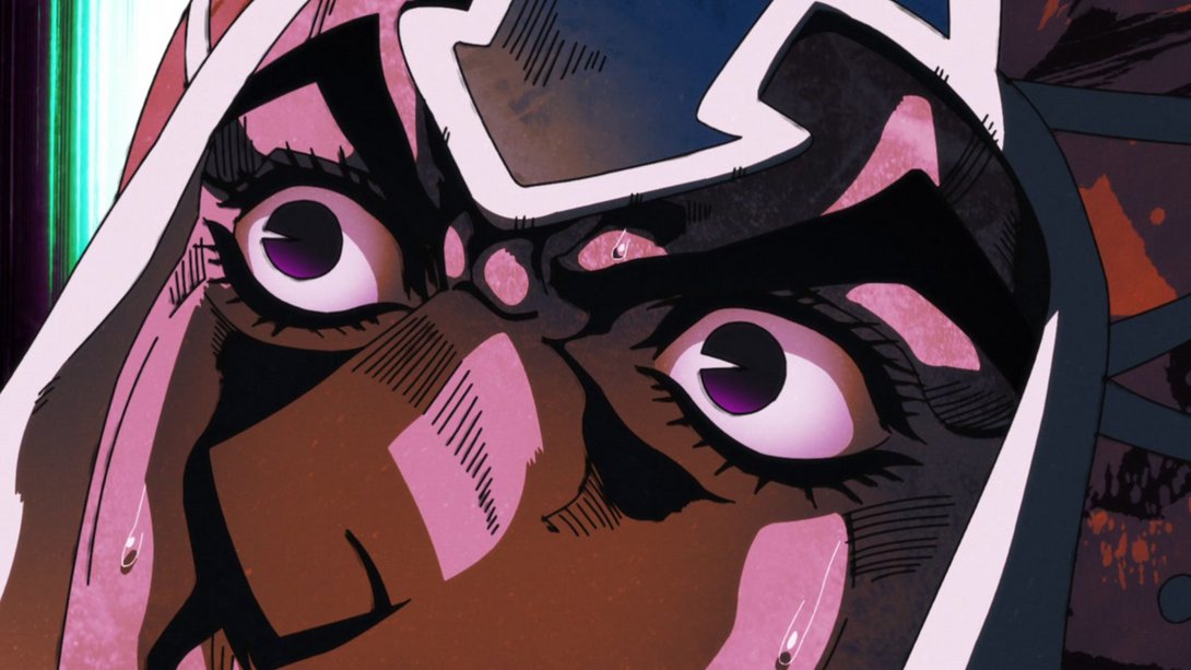
- …and the camera shakes harder as well, at the beginning of the scene:
- There are a whole bunch of differences in this very confusing frame, friends! In no particular order: there’s a new, beautiful comic book-style texture over Mista, the frame has a different distortion, the background is darker (so much so that you can actually see the window’s… handles?), Buccellati’s casting a shadow on the wall and Rolling Stone has a different texture:
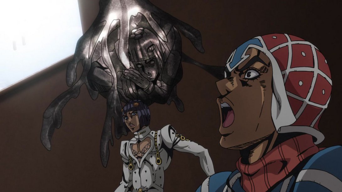
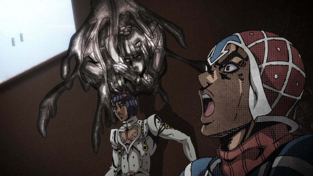
- Here, most things are blurrier, there is a new vignette along the edges, Buccellati’s shadow is darker but has smoother edges and the camera shakes around more:
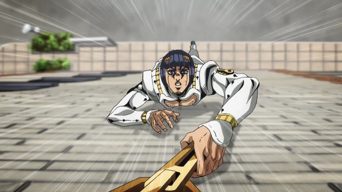
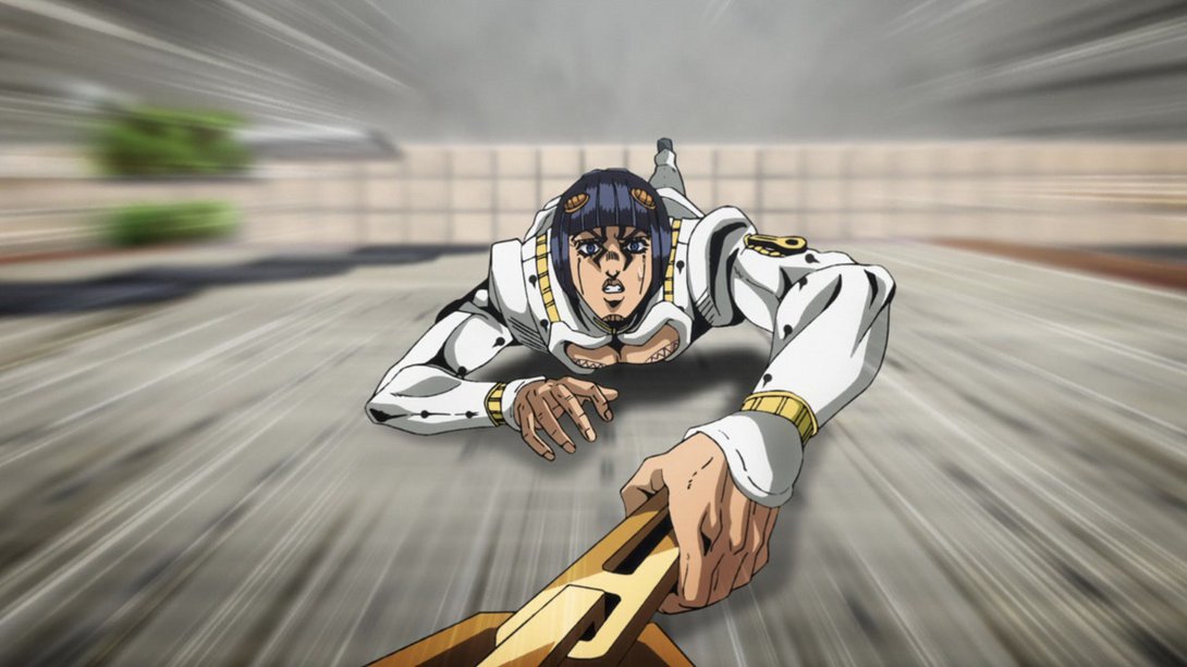
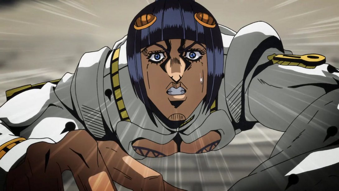
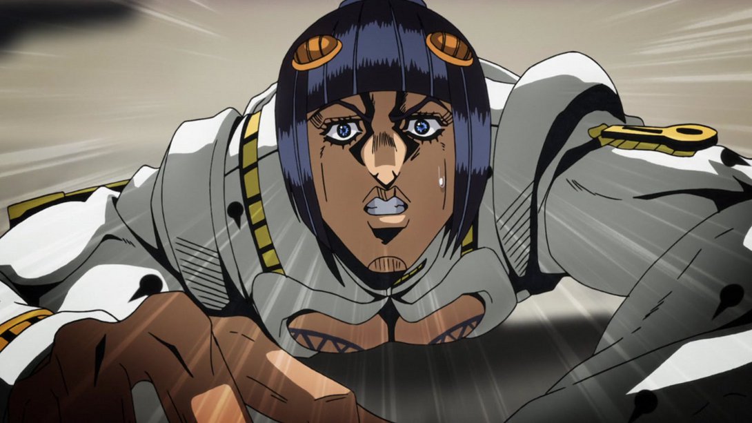
- Here, Mista’s head and shoulders have been completely redrawn and his midriff area is slightly brighter; in addition, most of the stronger wind effects are gone:
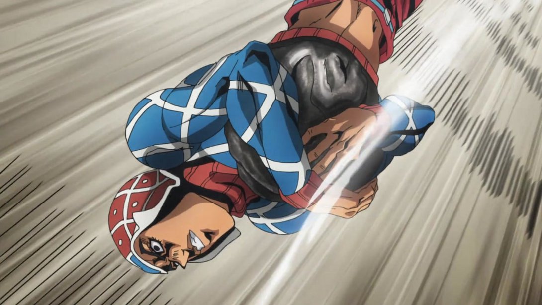
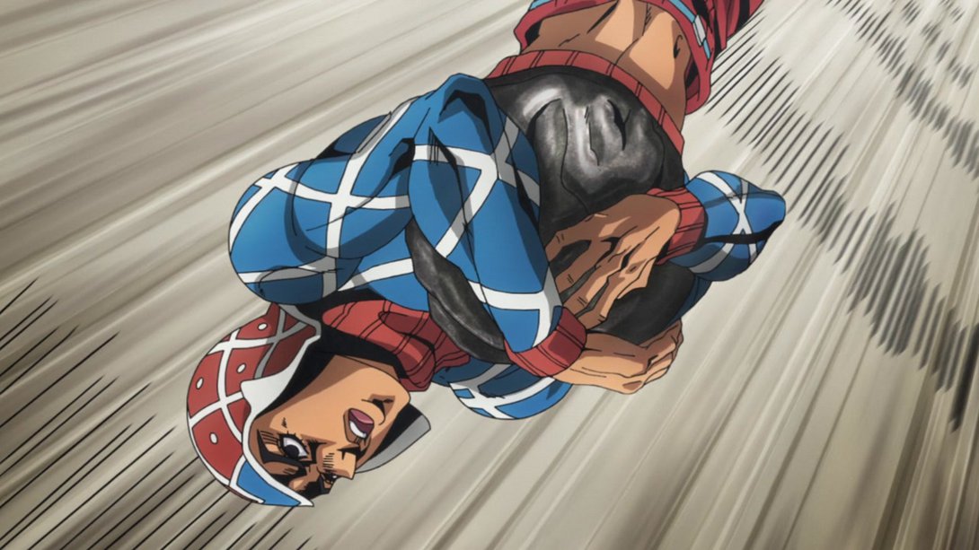
- Here, the black motion lines at the edge of the frame have been angled differently, the background is different, there’s a stronger distortion along the edges and a bunch of dust coming off of Rolling Stone…:
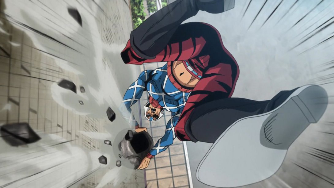
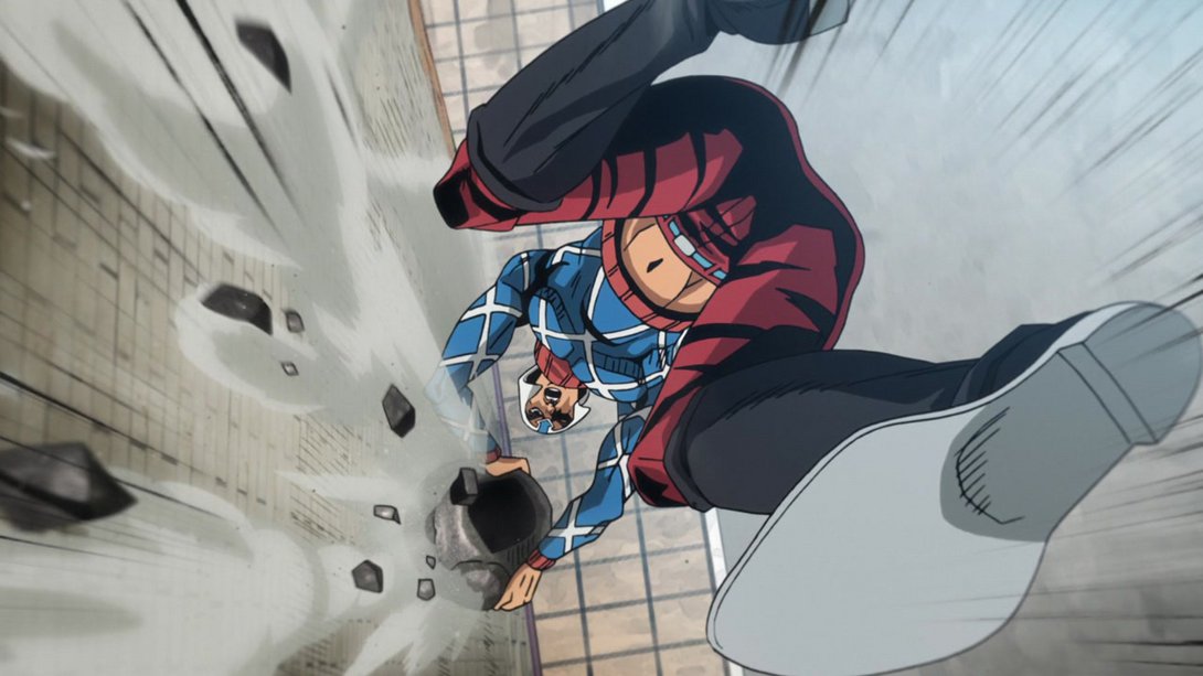
- …and, in addition to that, the animation starts more zoomed in and zooms out more quickly:
- Here, in addition to the usual different distortion, the car has been slightly moved and retouched, its shadow is brighter and has smoother edges and the smoke coming off of it is also different:
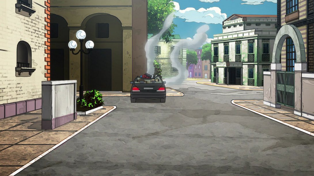

- The lighting is different on most things, here:
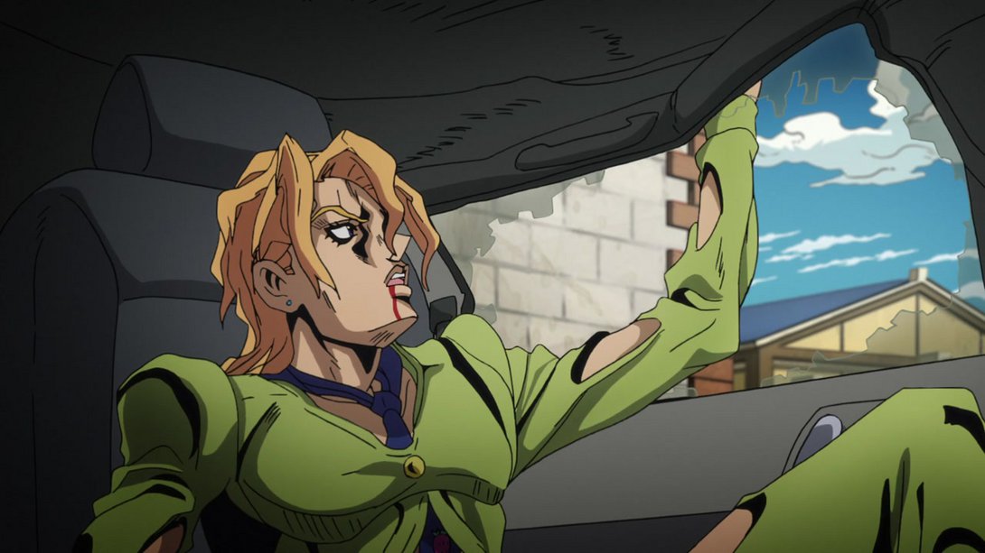
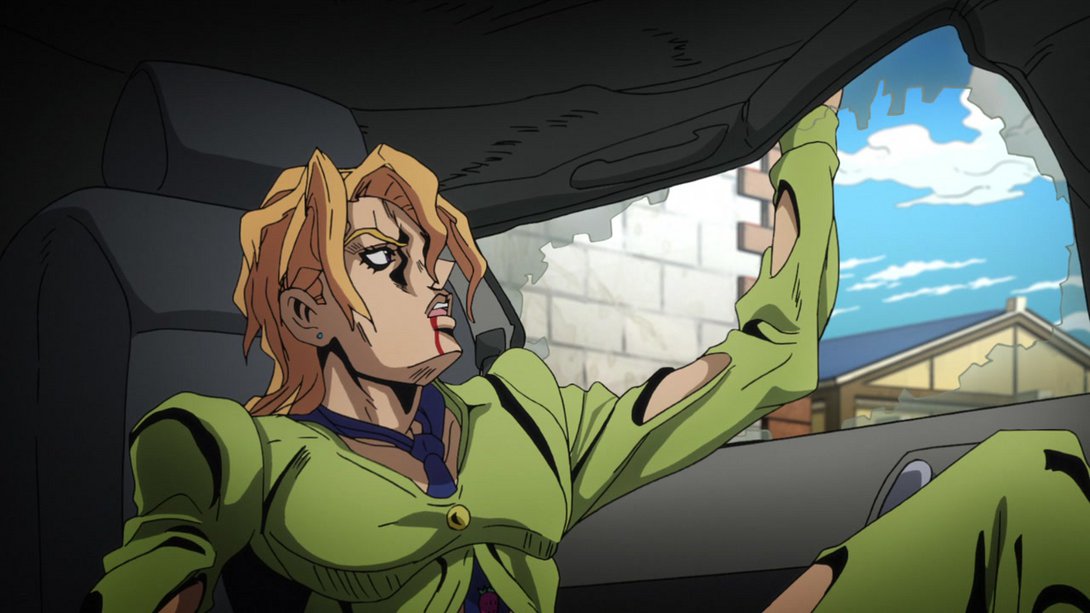
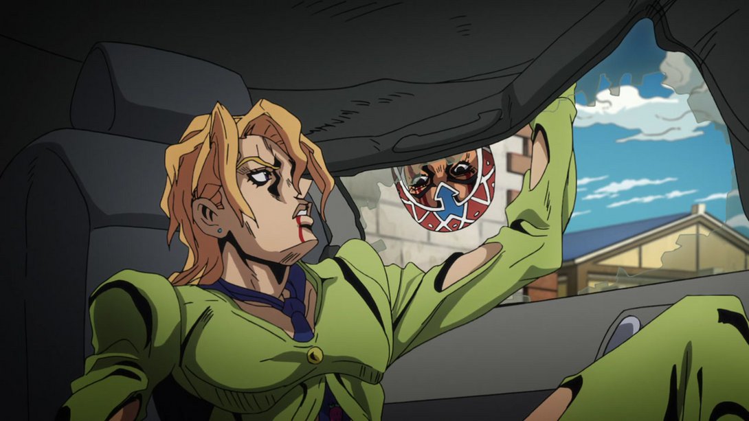
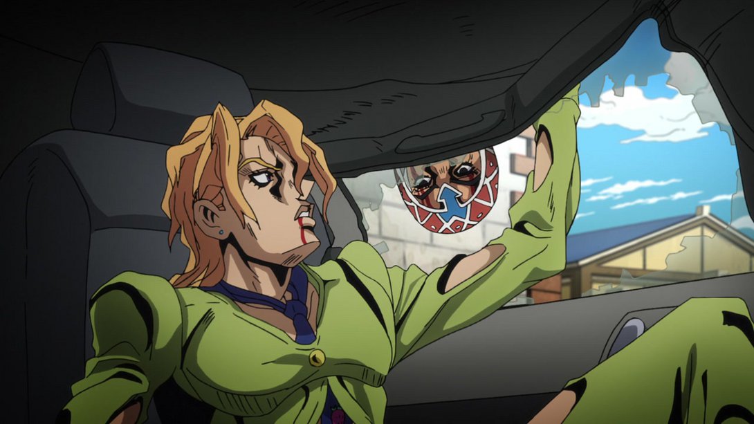
- Here, the background is blurrier…:
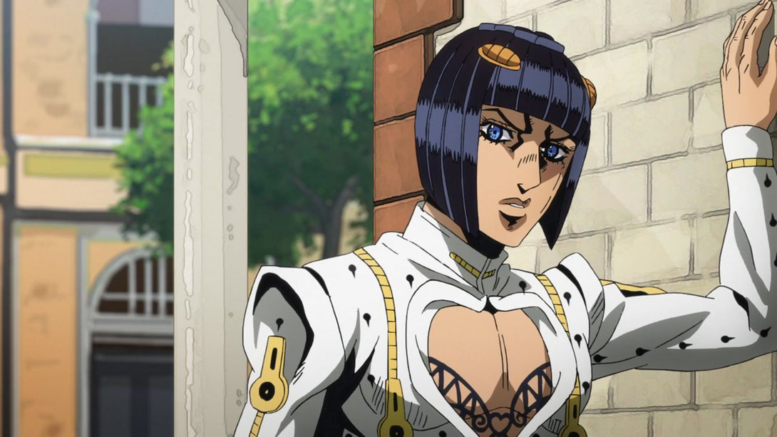
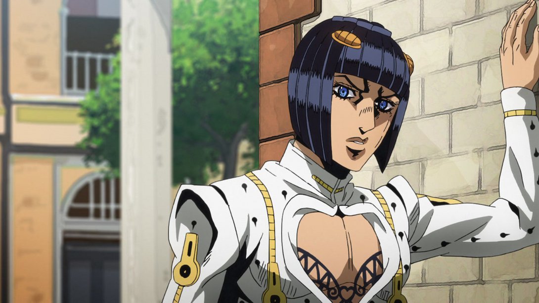
- And here… Well, almost everything is different, and Mista has received a brand new walk cycle! And it’s looking much better too:
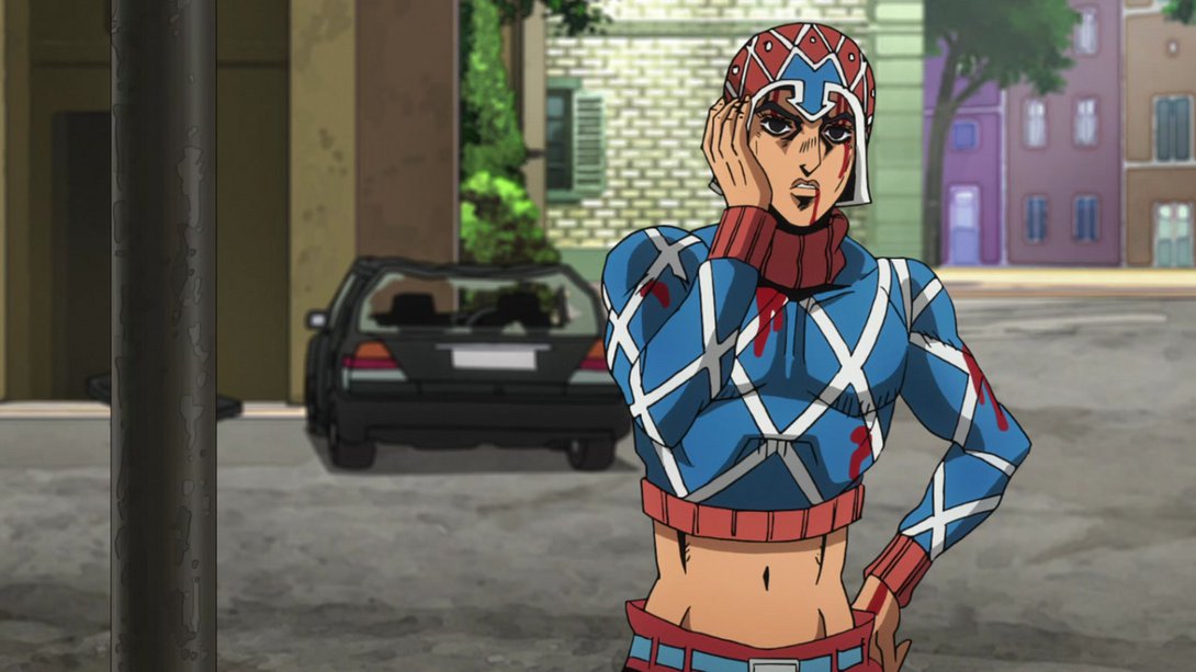
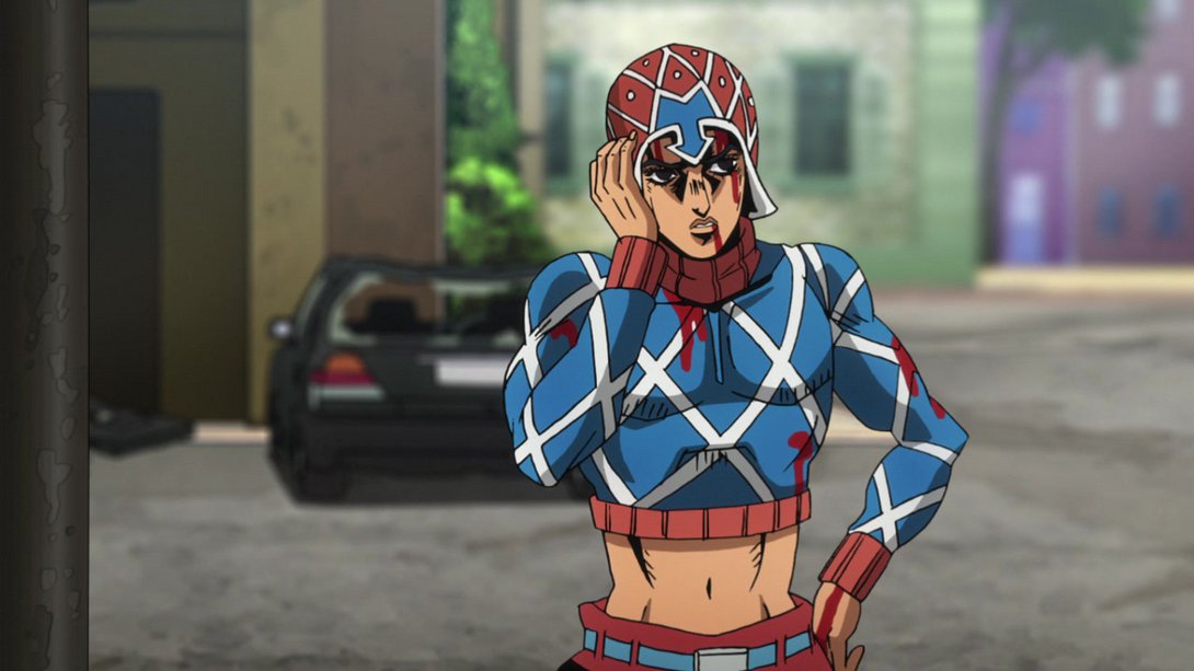
- Mama Buccellati has been retouched, here…:
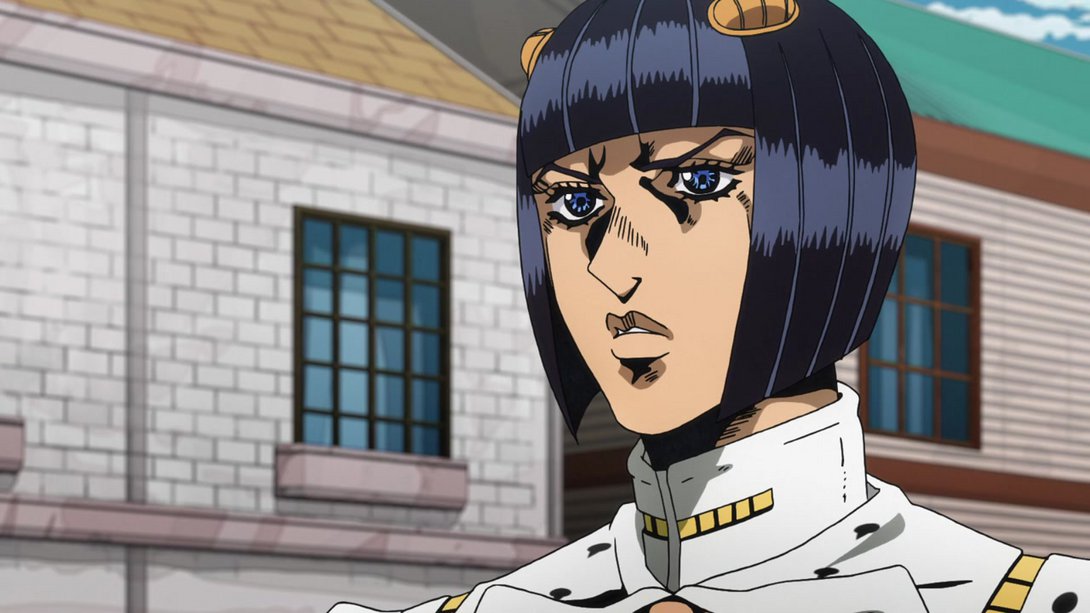

- Fugo has been very slightly tweaked too, here…:
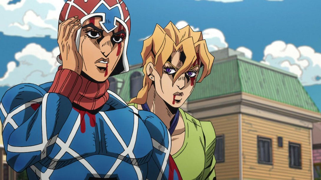
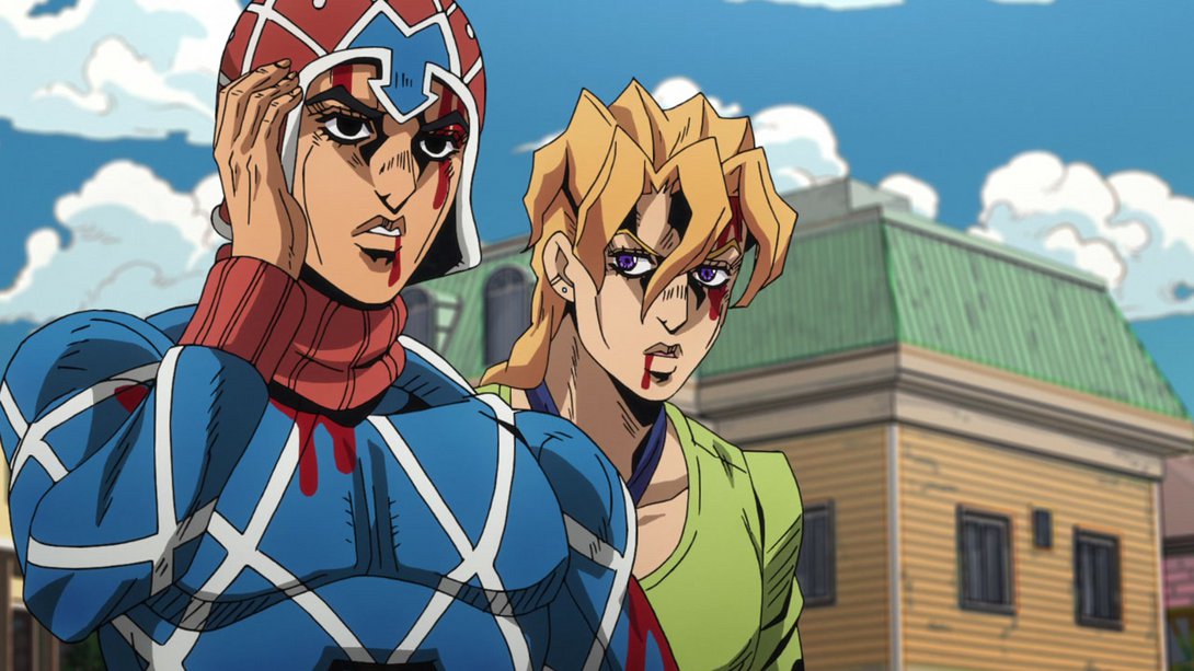
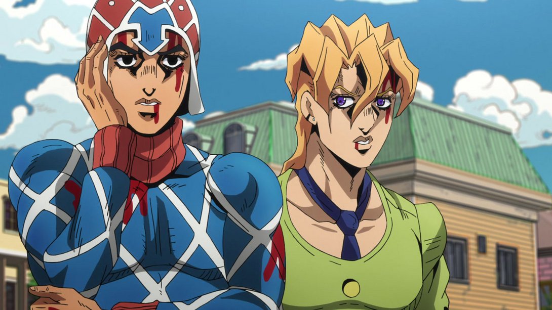
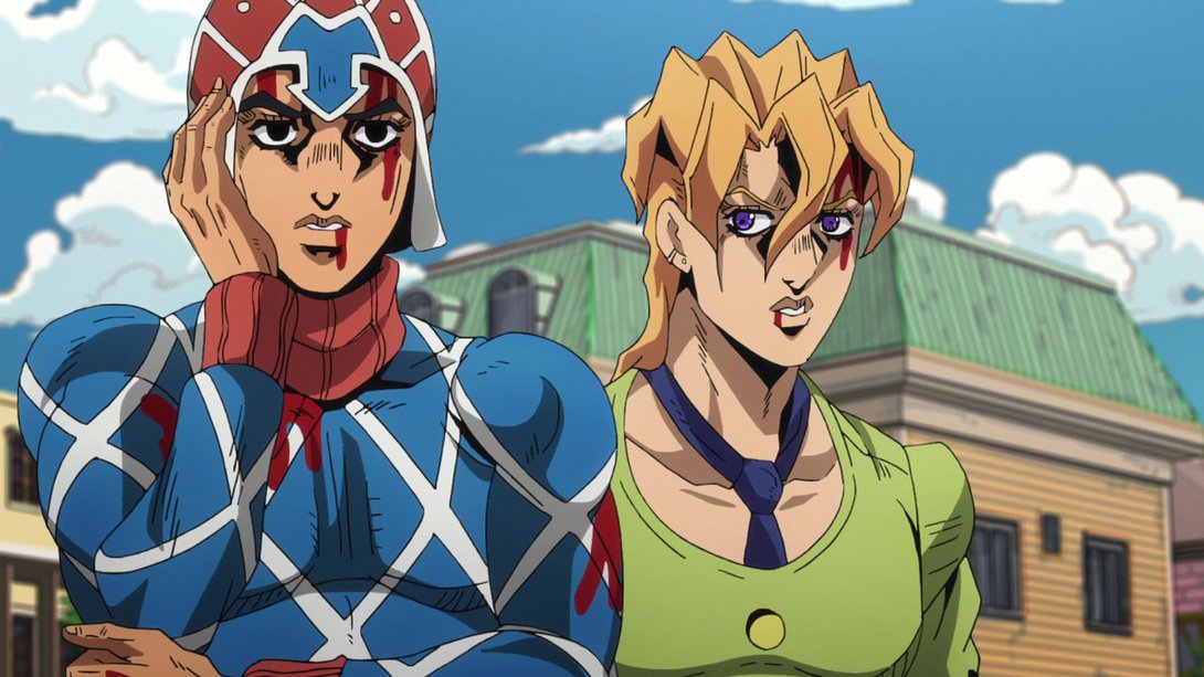
- In addition to the same retouches as before, Buccellati now makes a slightly different expression, at the end of this animation (the TV version is basically a still frame):

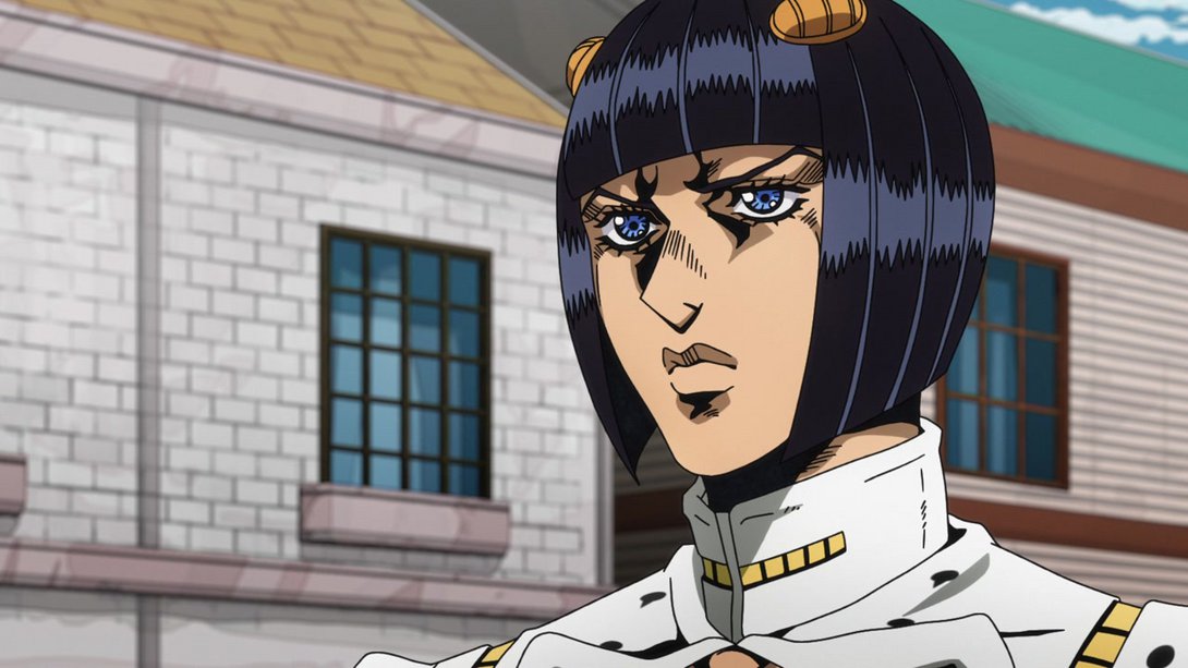
- A corner of Mista’s hat has been recoloured here…:

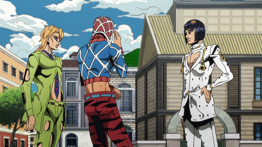
- …and, later on, Mista’s right shoulder and Buccellati’s pants have been slightly retouched:

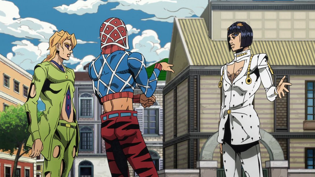
- …and, in addition, his walking away animation is also looking better:
- Here, in addition to a brighter background and some new distortion along the edges, Buccellati’s face and, later, the zippers on his back, have also been retouched a little:
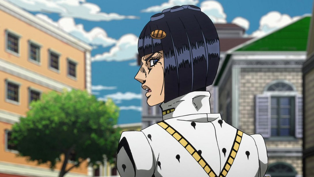
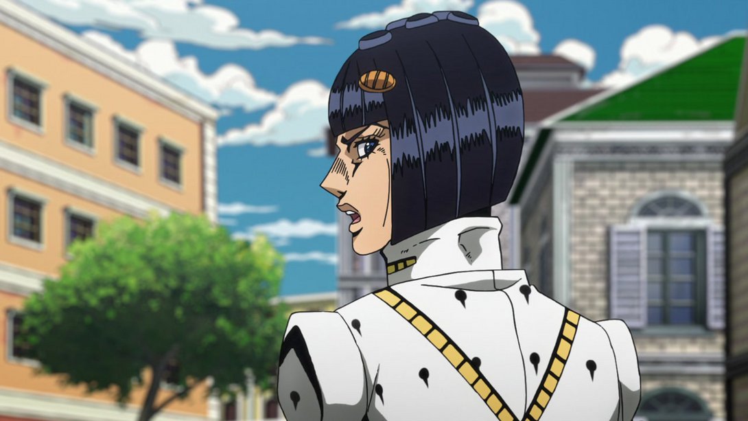
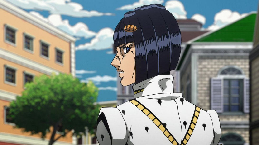
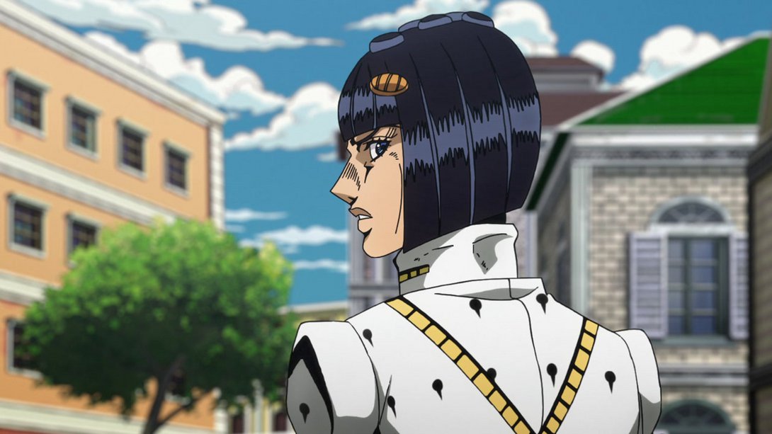
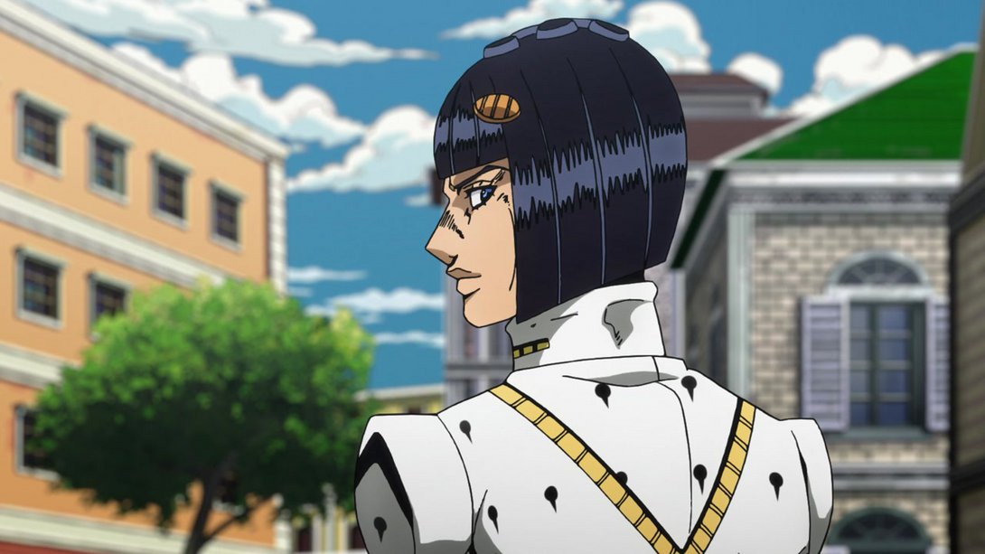
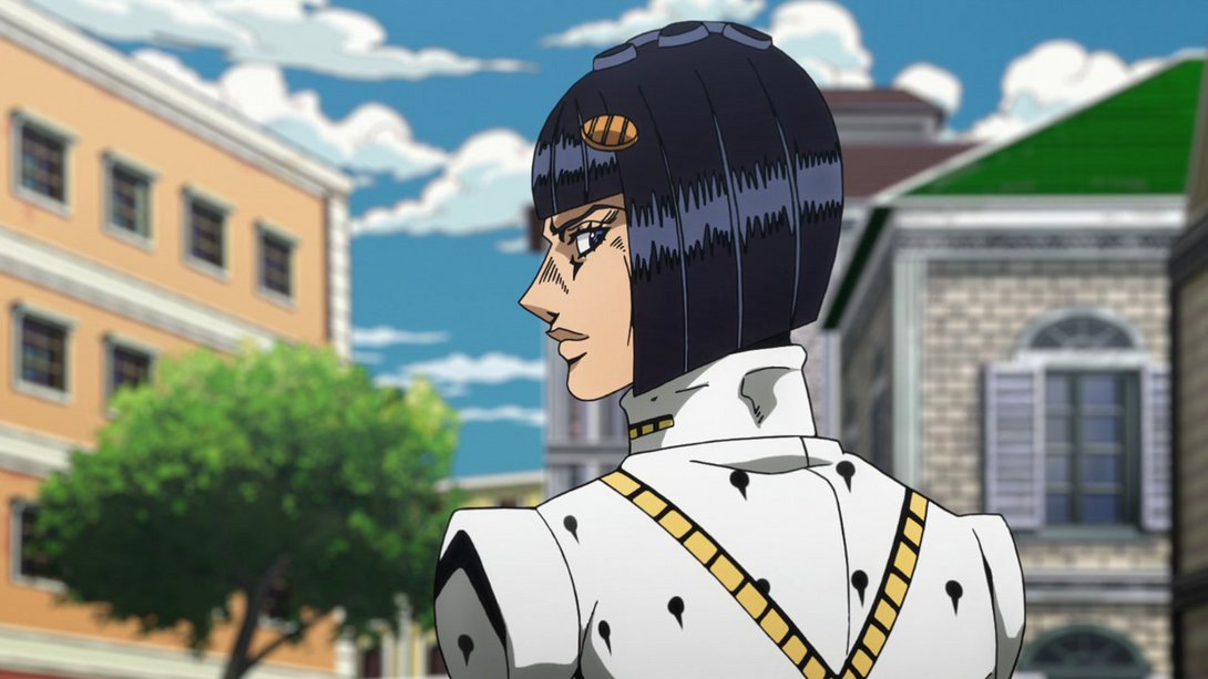
- And, here, Mista’s patterns are looking much better and Buccellati has been moved a little:
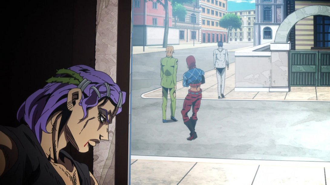
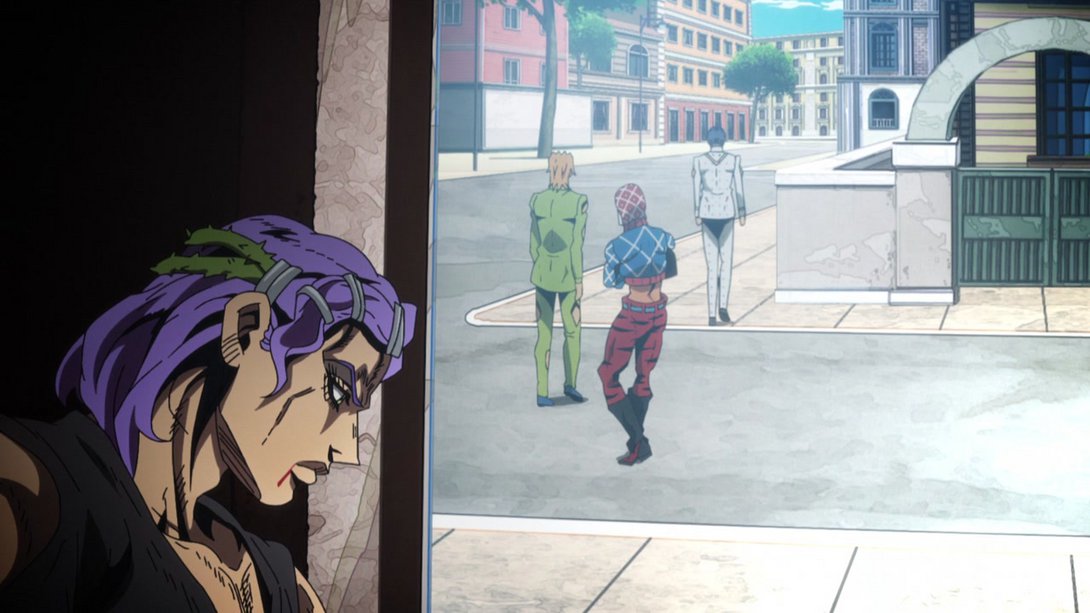
- Aaand this final scene from the flashback has a new vignette and a new distortion along the edges; in addition, both Fugo and Buccellati have been moved up and slightly retouched (at least, Buccellati has); Mista has been tweaked here and there too, in most of these frames:
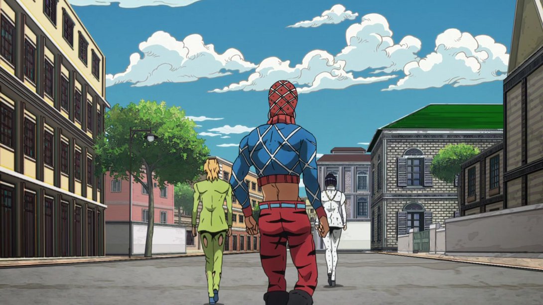
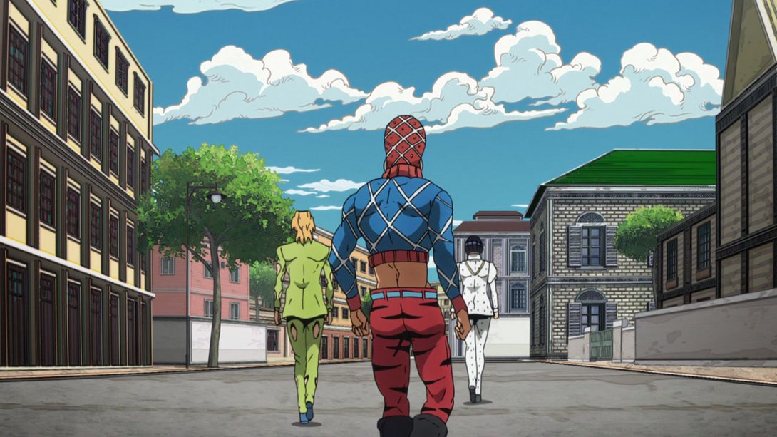
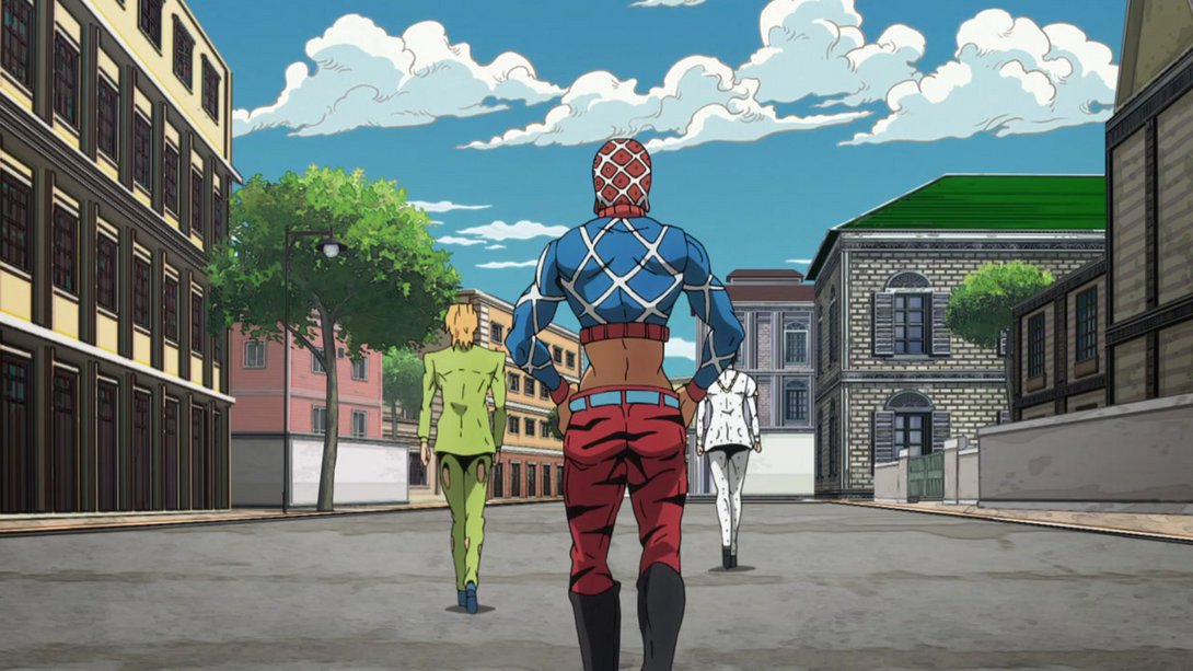
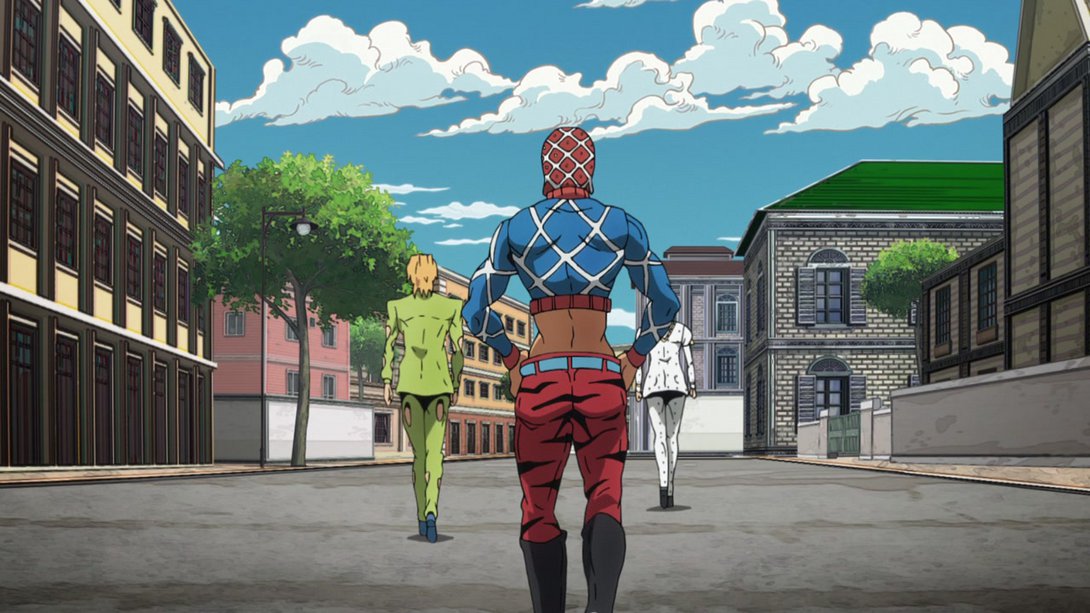
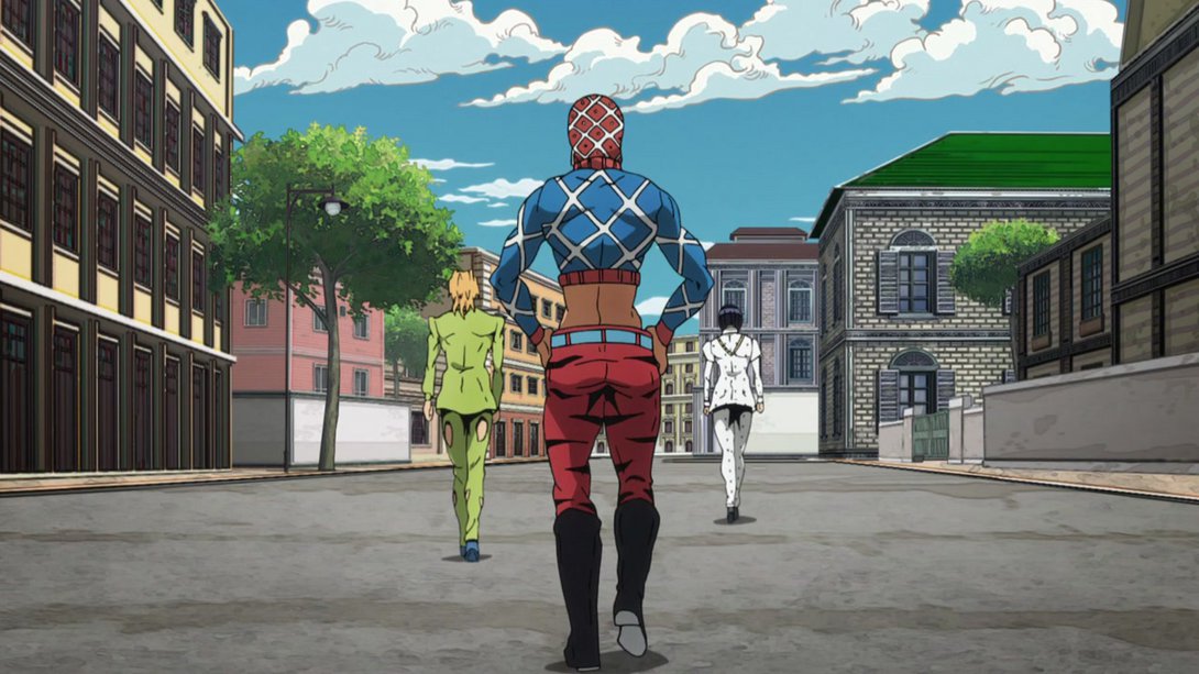
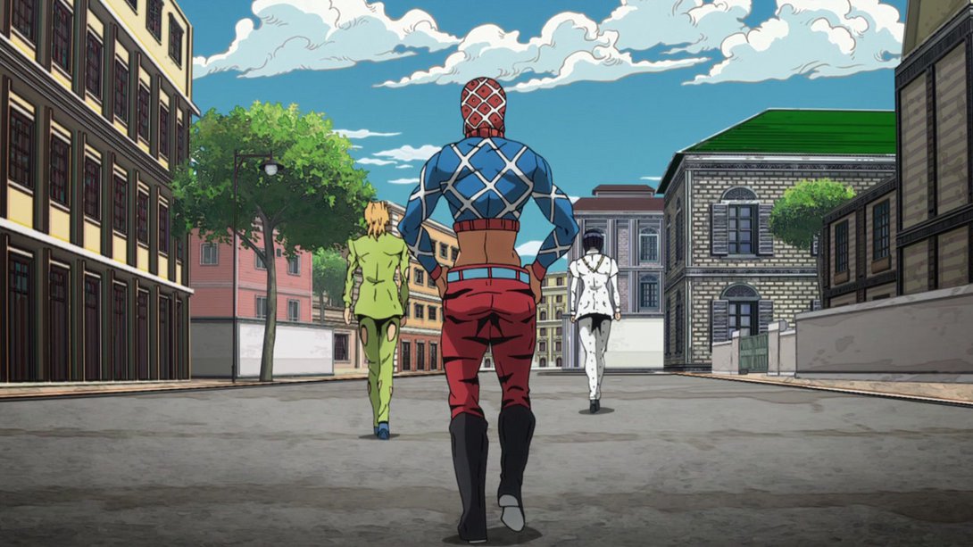
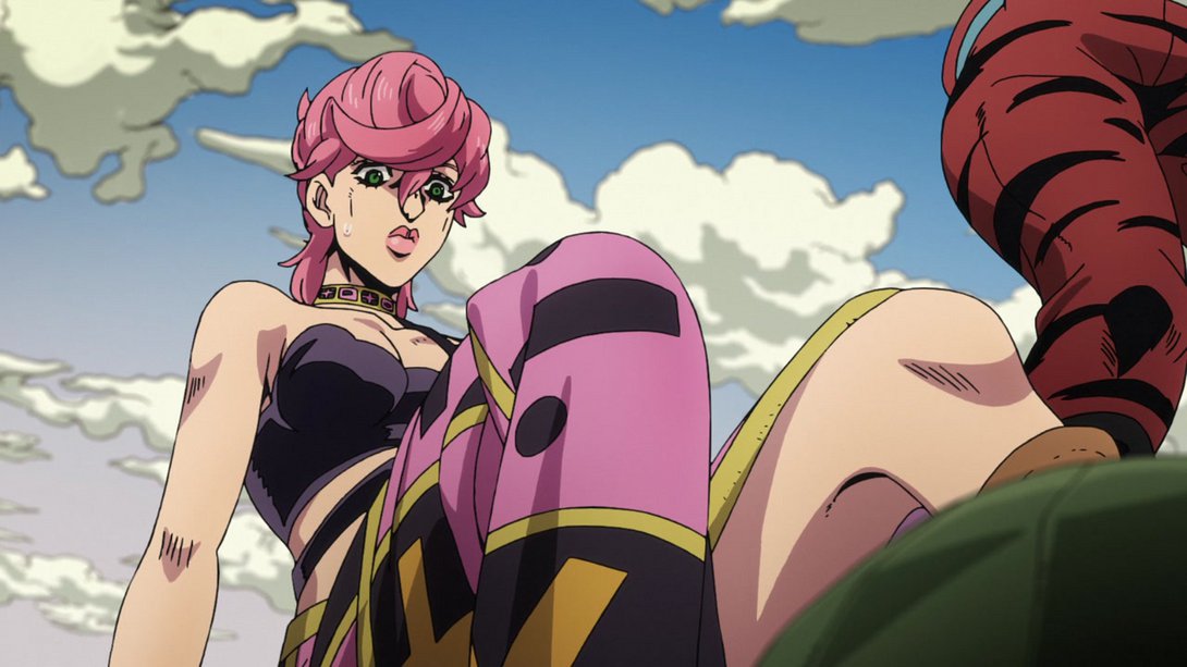
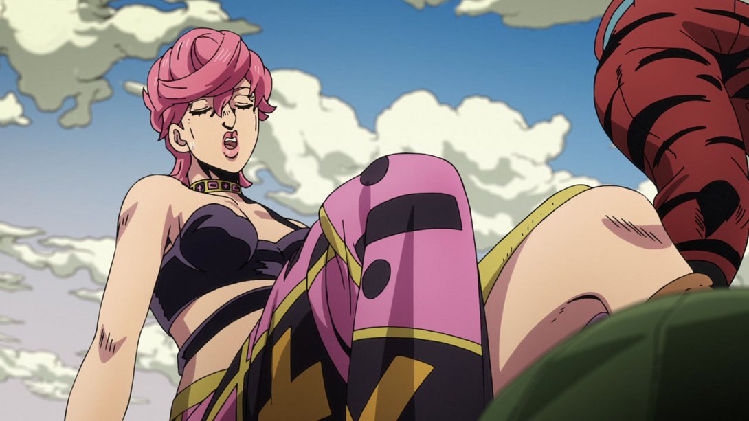
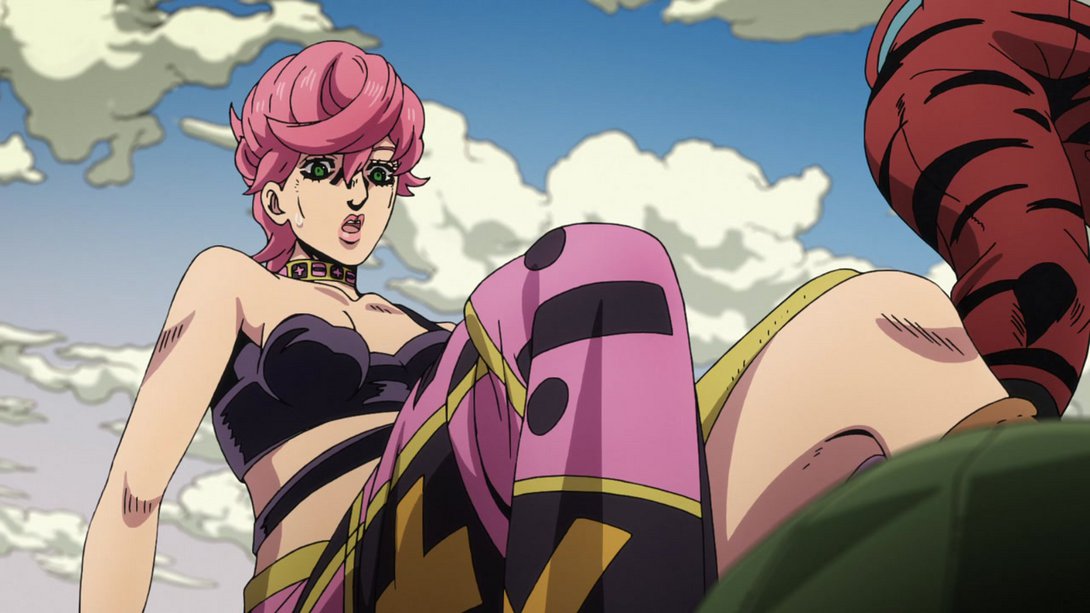
- Phew! Back to the present… Here, a few bits on Trish have been retouched…:
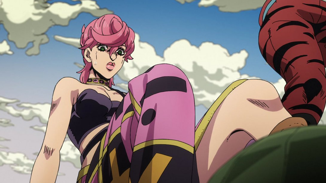


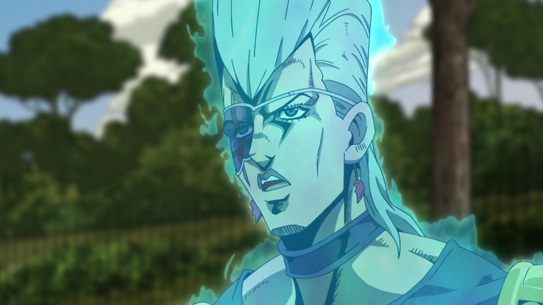
- Here, ghost Polnareff’s eye and mouth areas have been slightly retouched…:

- “Buff Giorno isn’t real and cannot hurt you”:
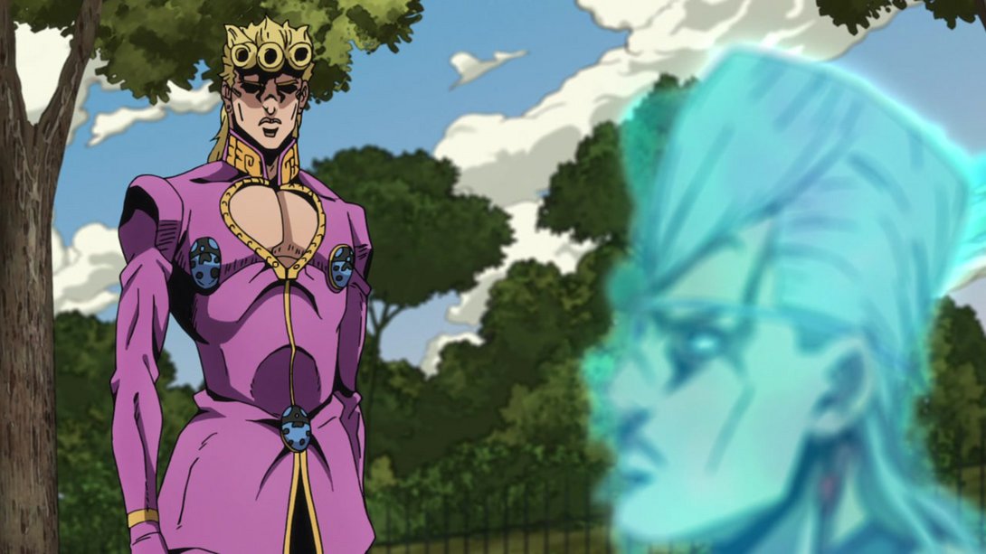
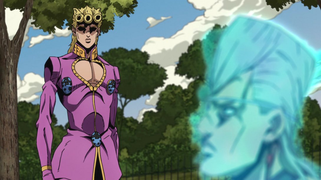
- This series of frames has the usual shading/colouring differences you all surely know by now:
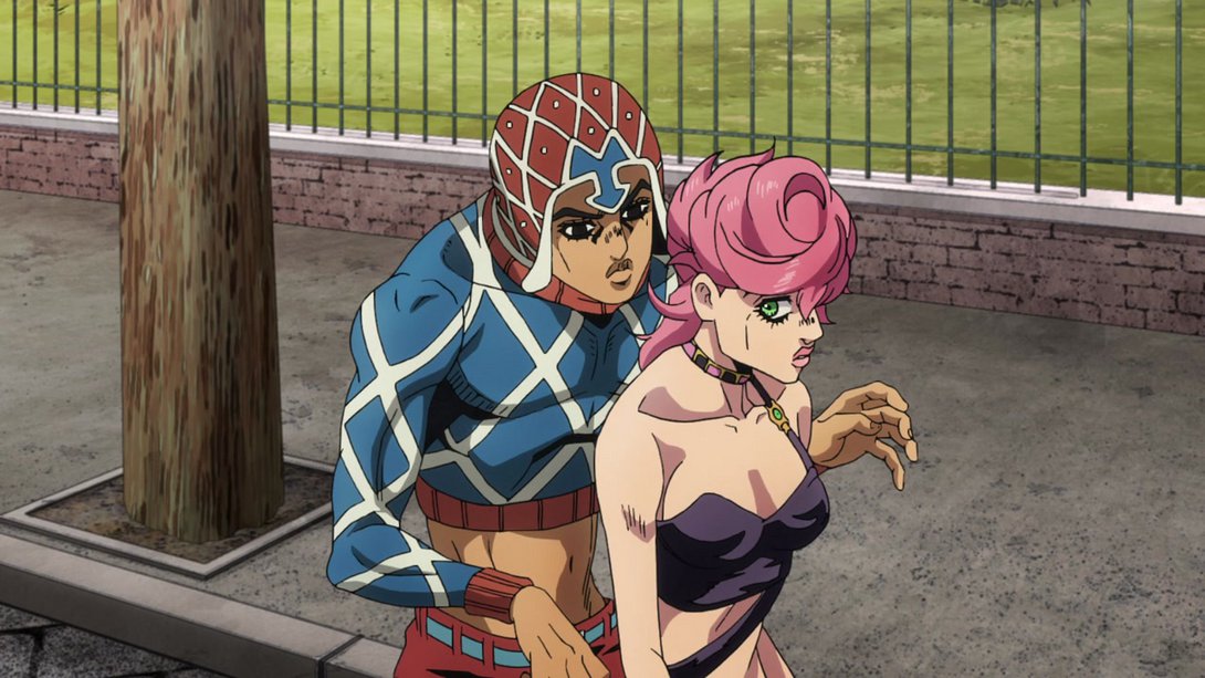
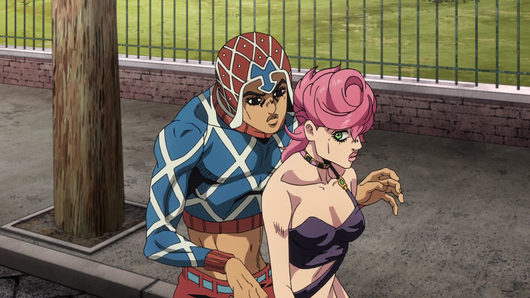
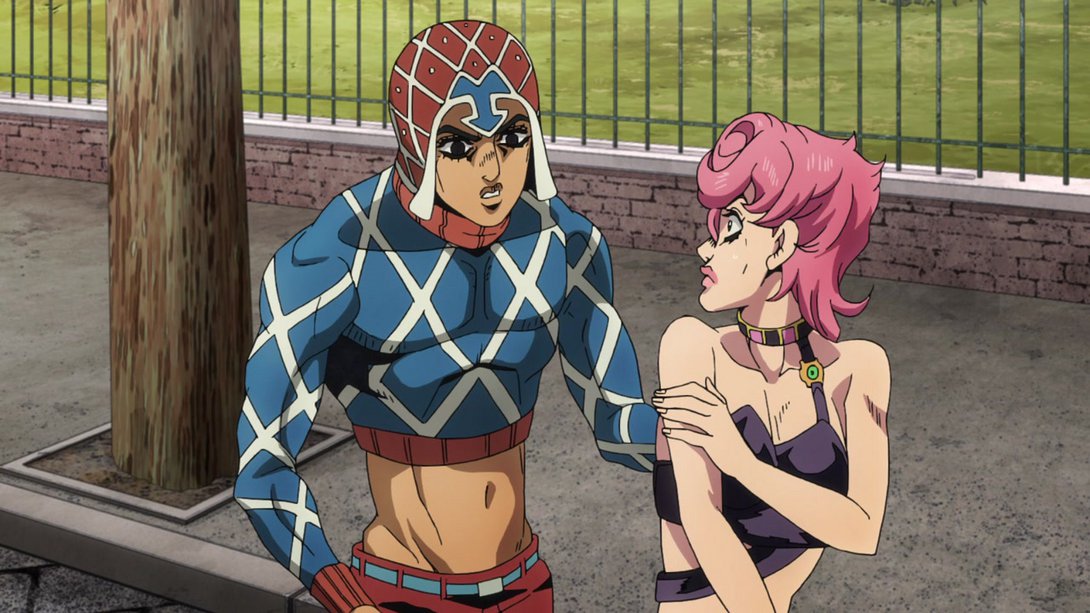
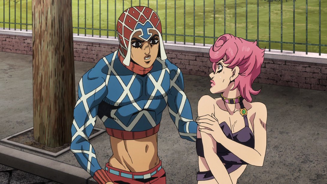

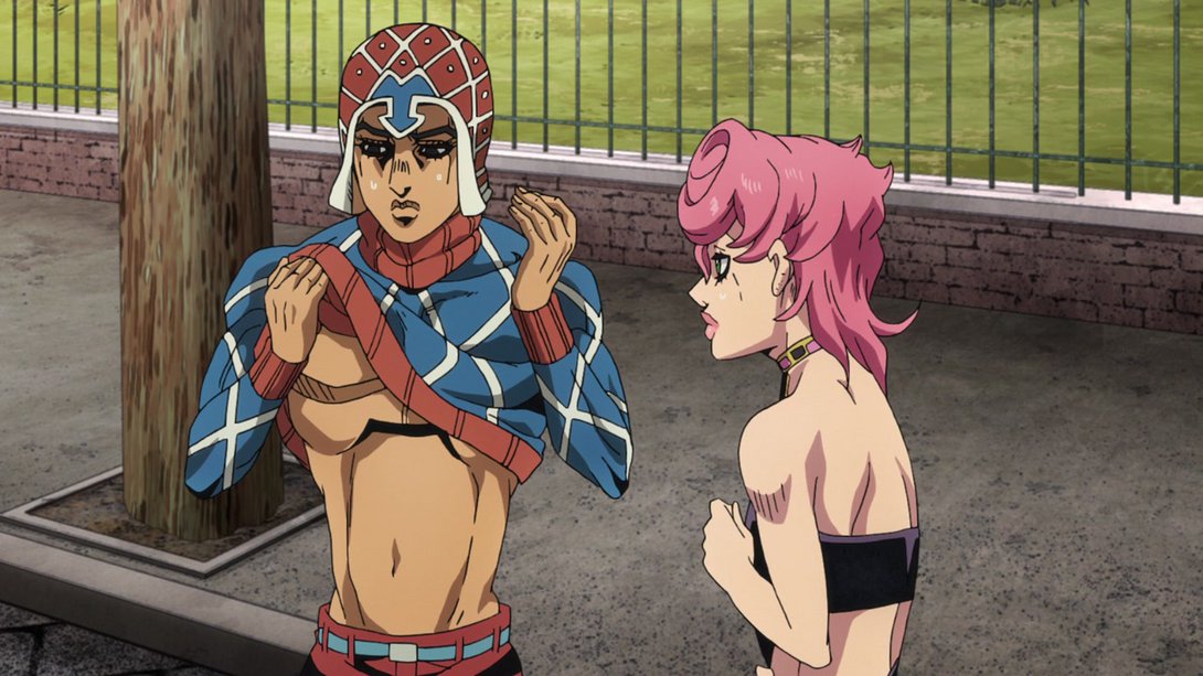
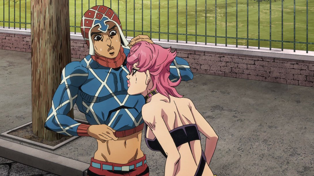
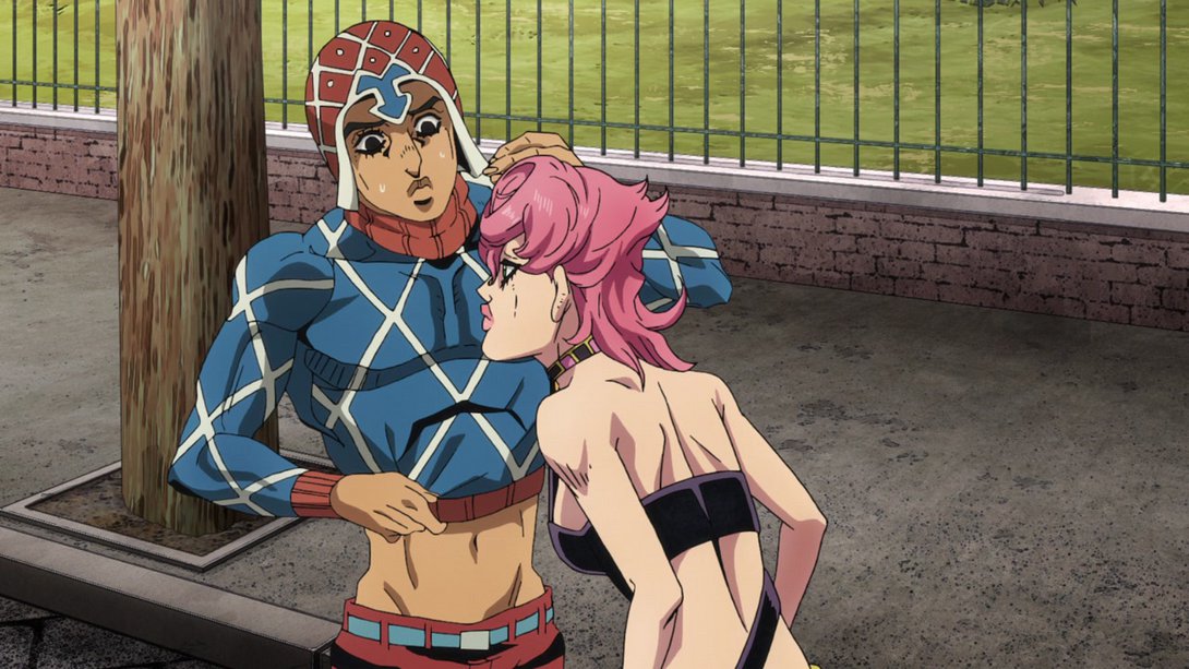
- The background in this scene is different…:
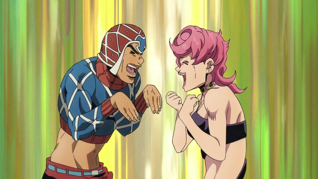
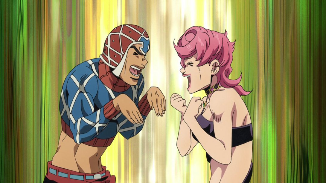
- While here it’s instead much brighter…:
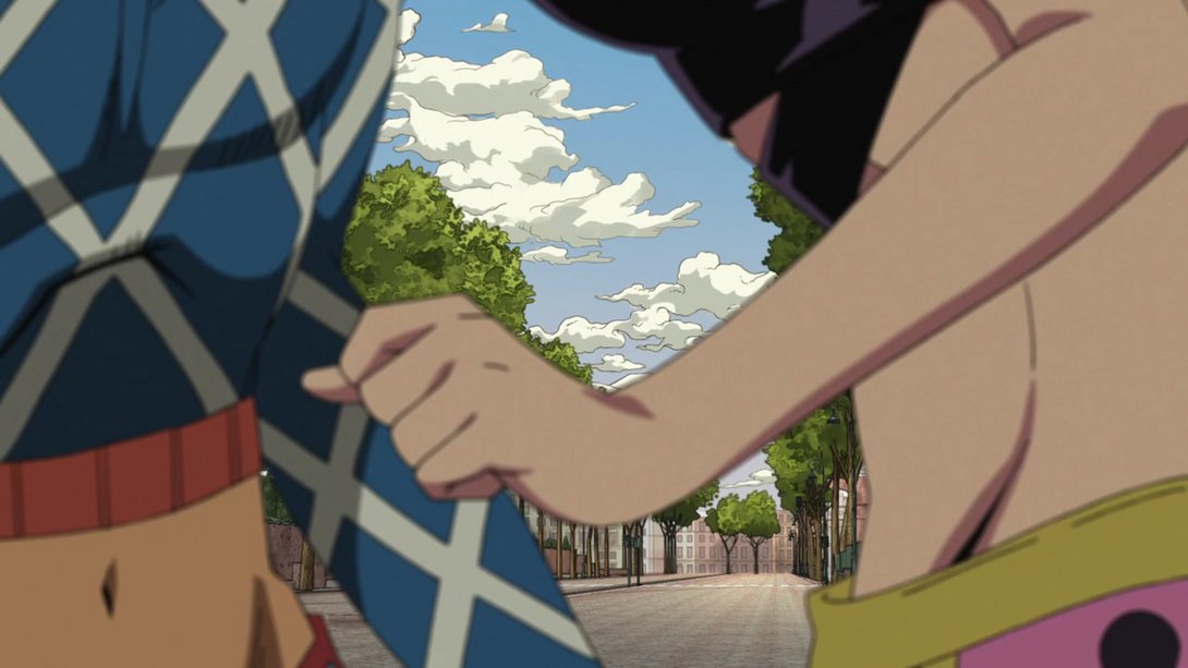
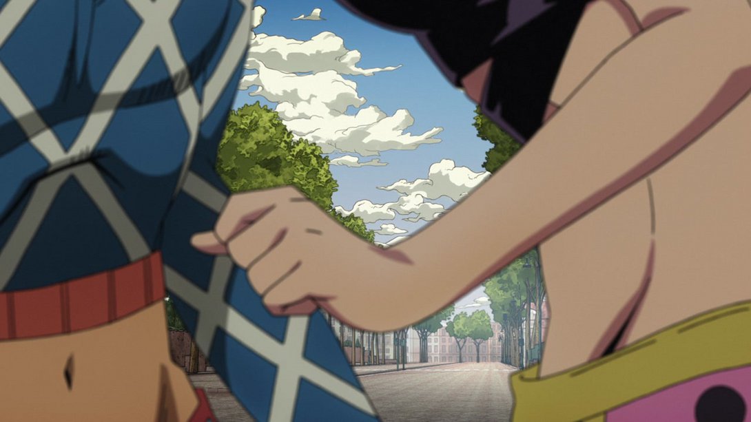
- …and tiny Polnareff now has an aura:
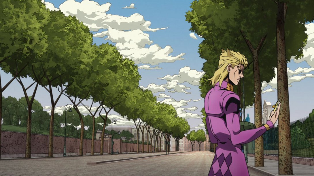
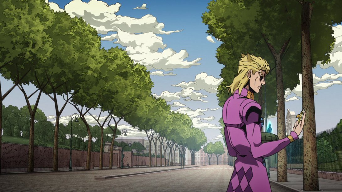
- Here the top-left and top-right corners are both blurrier, Polnareff’s face and right shoulder pauldron have been retouched and Coco Jumbo’s key slot is darker:
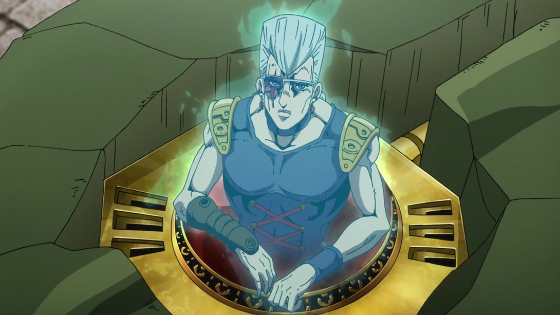
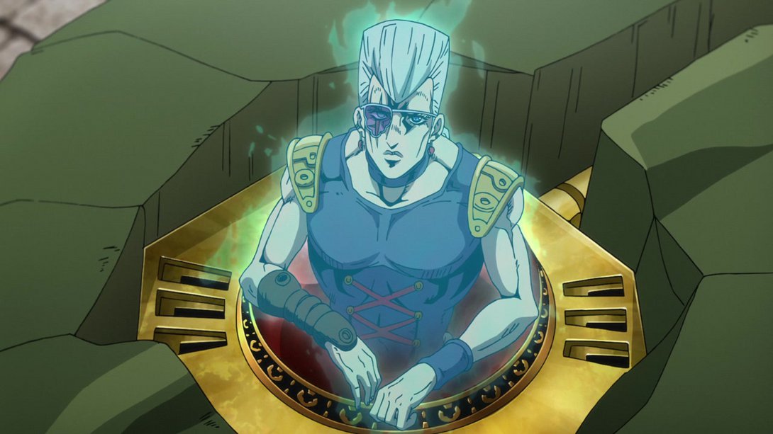
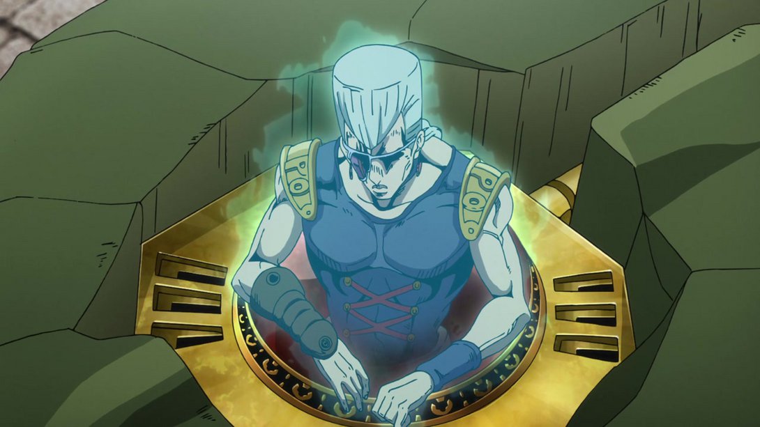
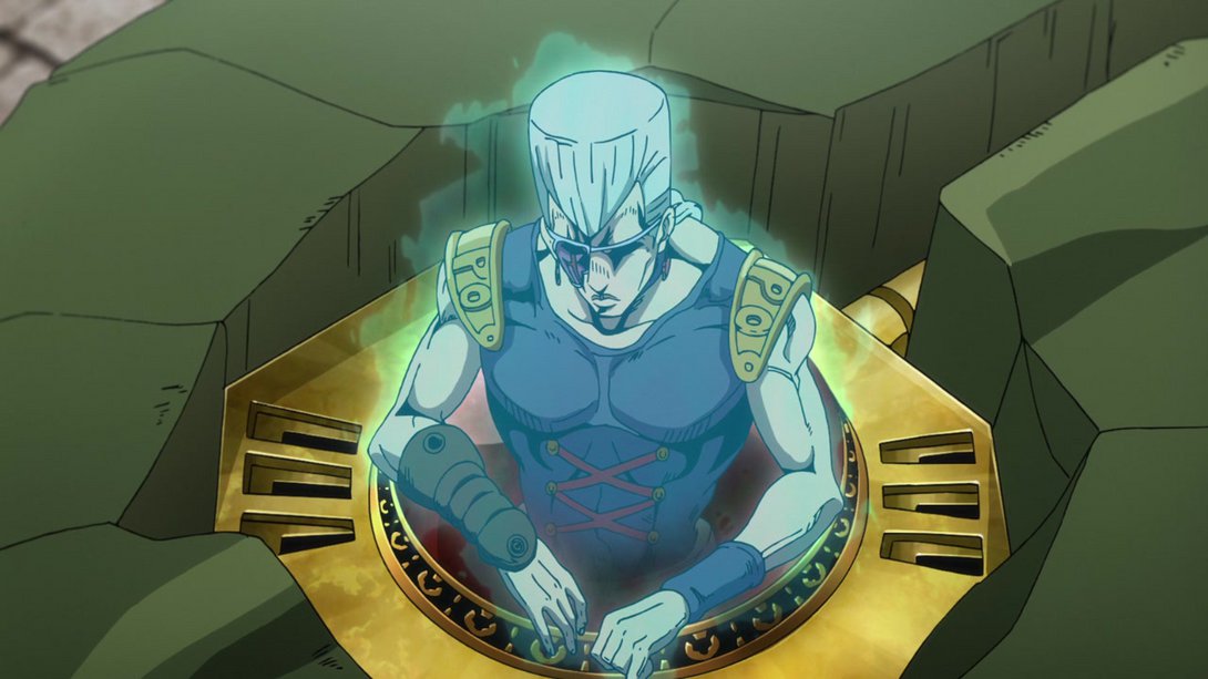
- This scene has a slightly different background and distortion! Trish has also been retouched…:
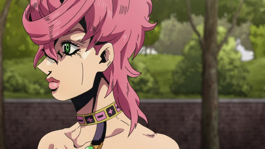
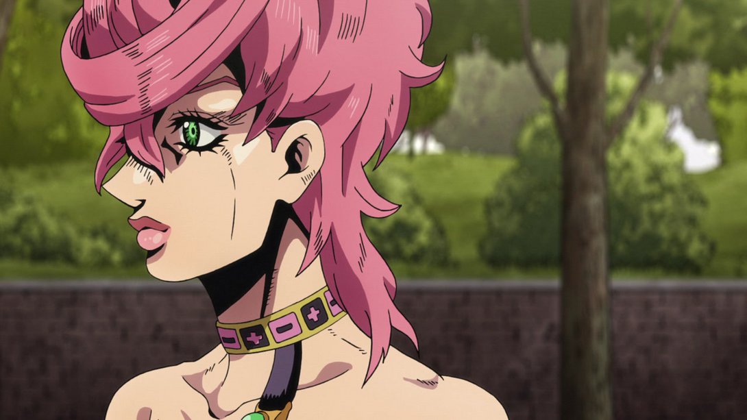
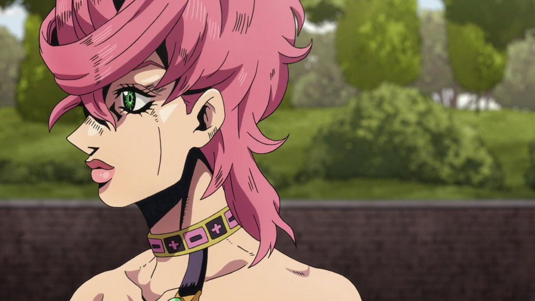
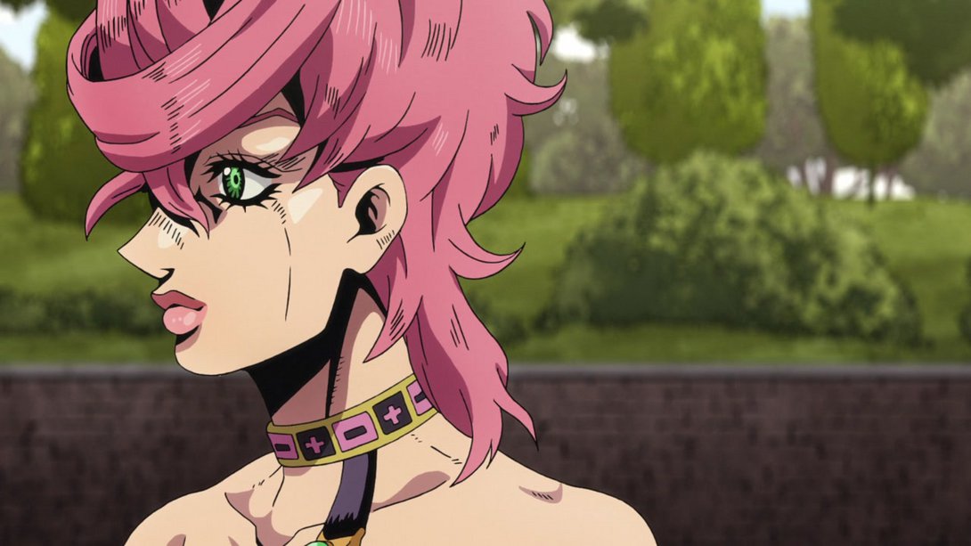
- Here, some details on Giorno have been retouched, the background has been moved and it’s now also darker on the bottom…:
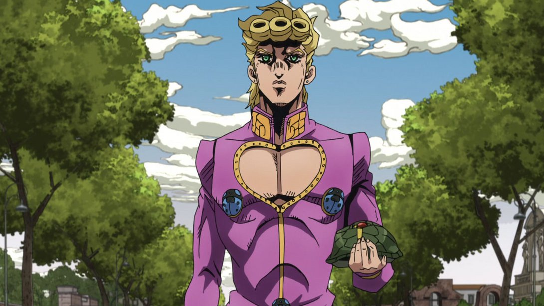
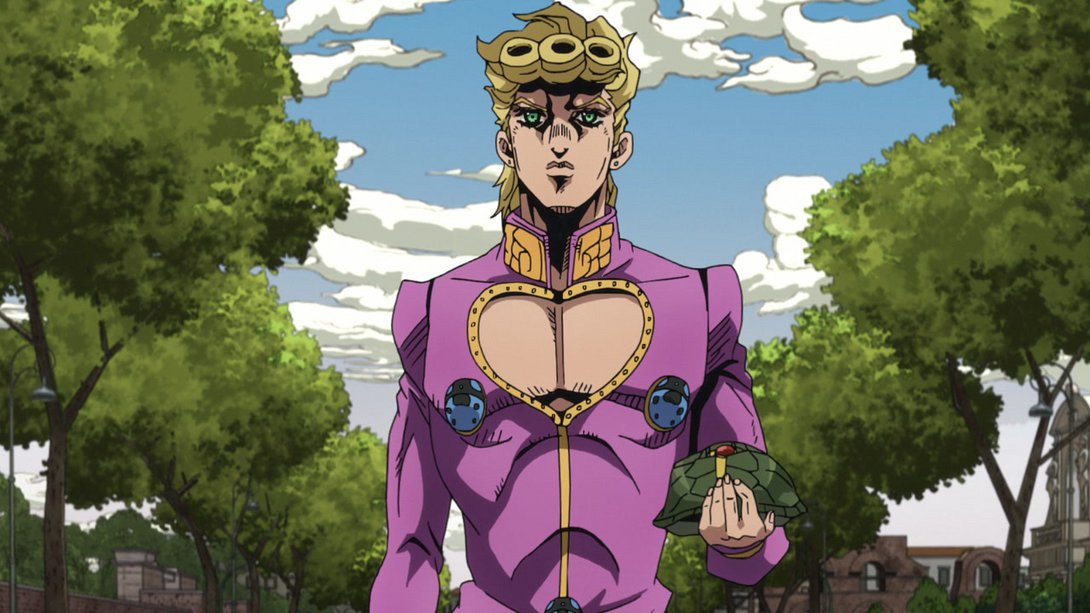
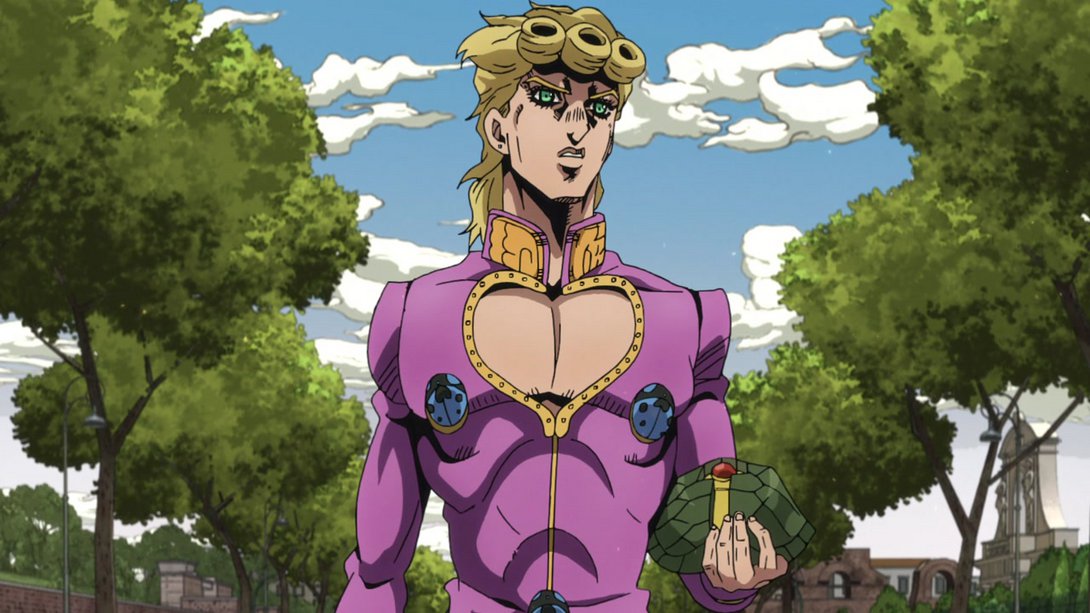
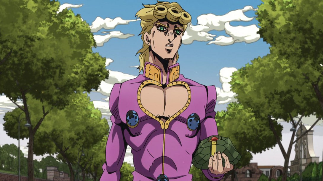
- Giorno’s hair has been slightly tweaked here…:

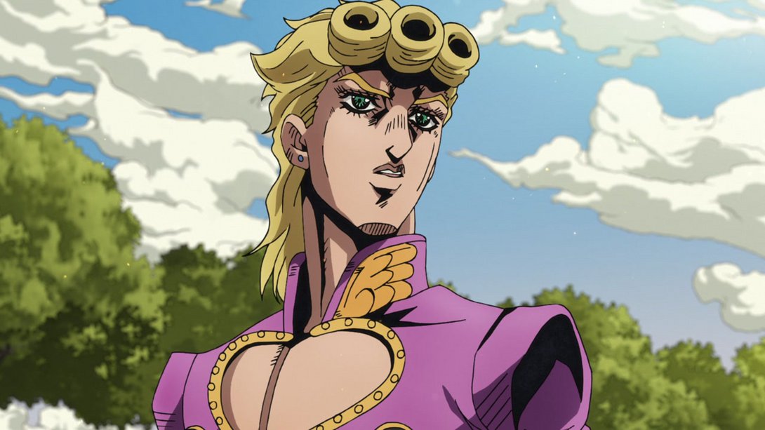

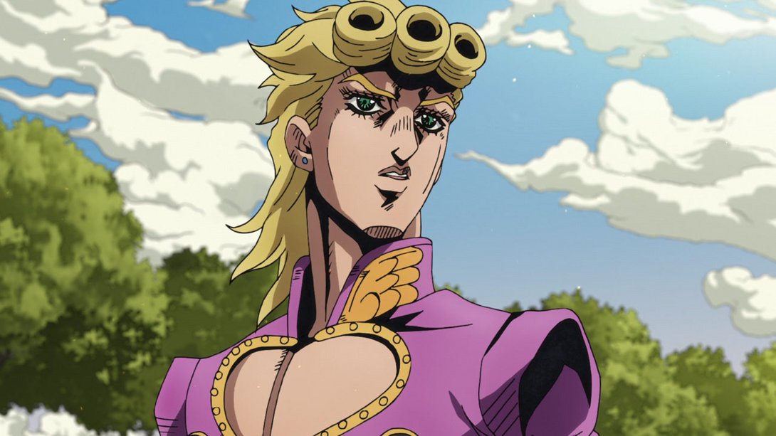
- …later on, his right eye has been retouched instead…:


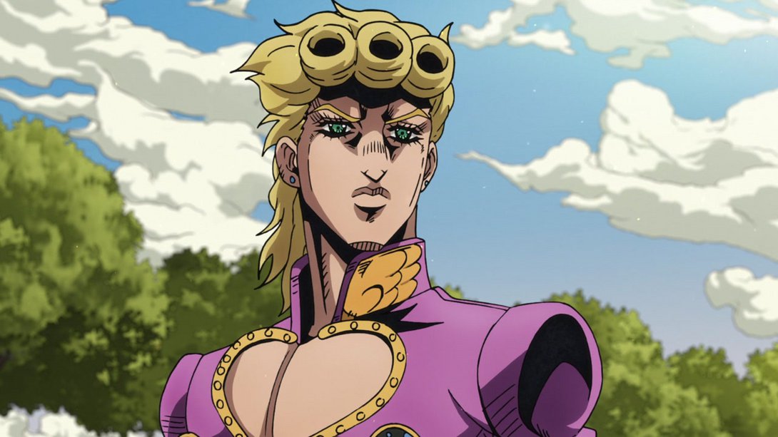
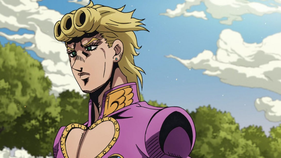
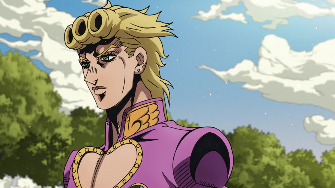
- …and Giorno’s face has been thankfully redrawn in these frames:


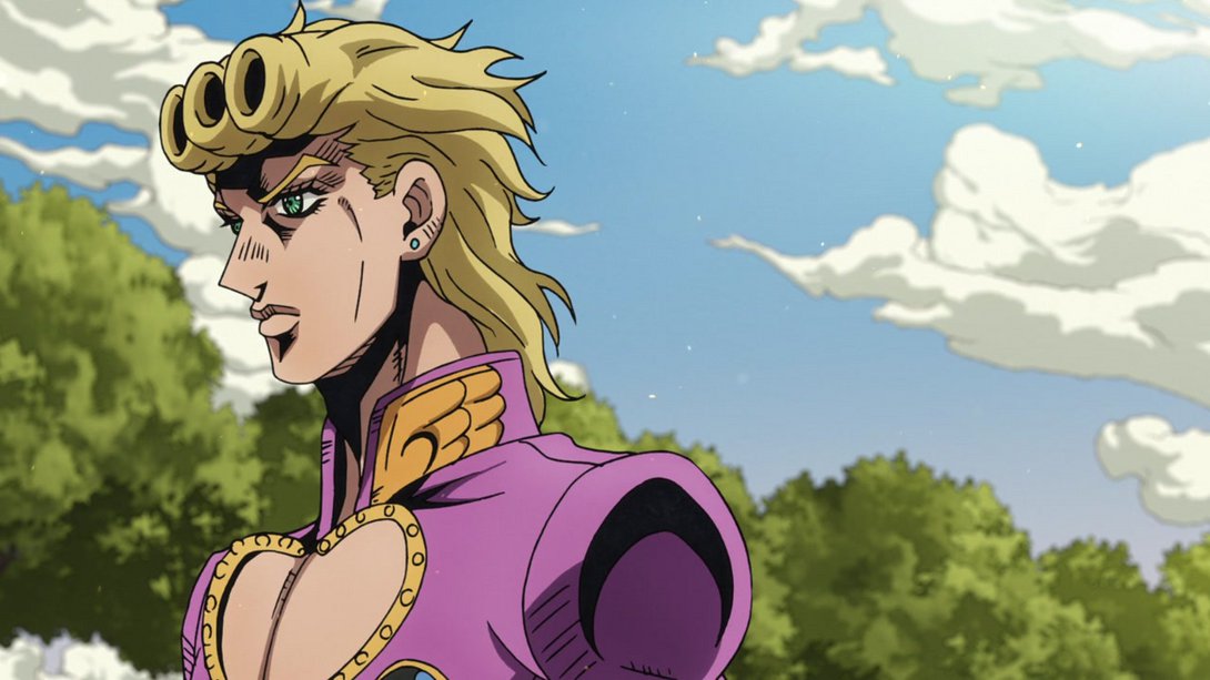
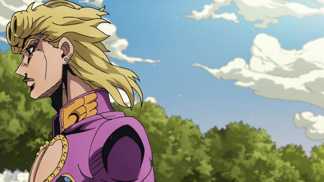
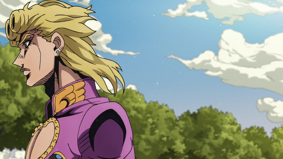
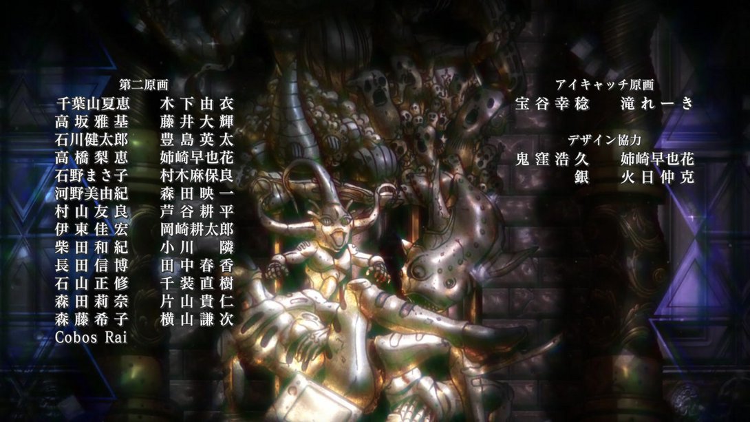
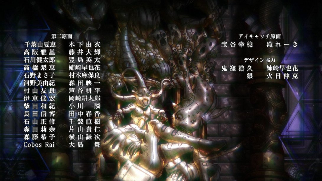
- Let’s (temporarily) move to the credits, good folks! Here, the second kanji in 高阪雅基 (“Takasaka Masaki”)’s name has been changed from 坂 to 阪, on the right (both pronounced “saka”):
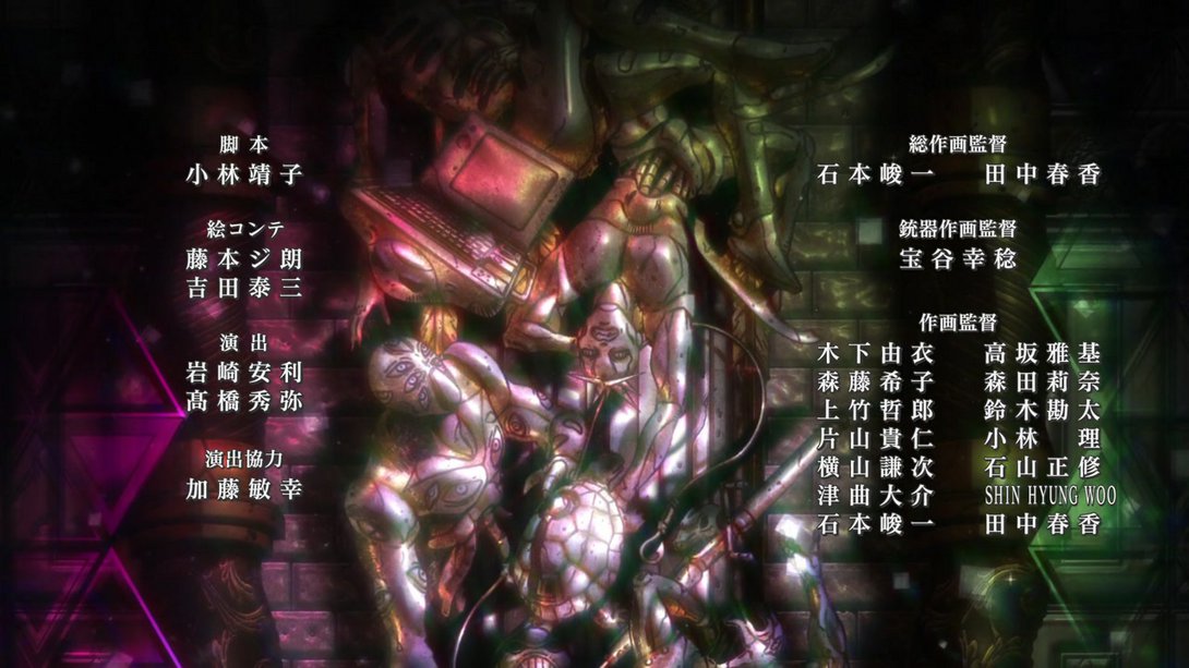

- Here, 藤井大輝 (“Fujii Daiki”)’s name has been added to the list, and all the rest have been moved around accordingly (and the whole credit section has also been moved a tad):
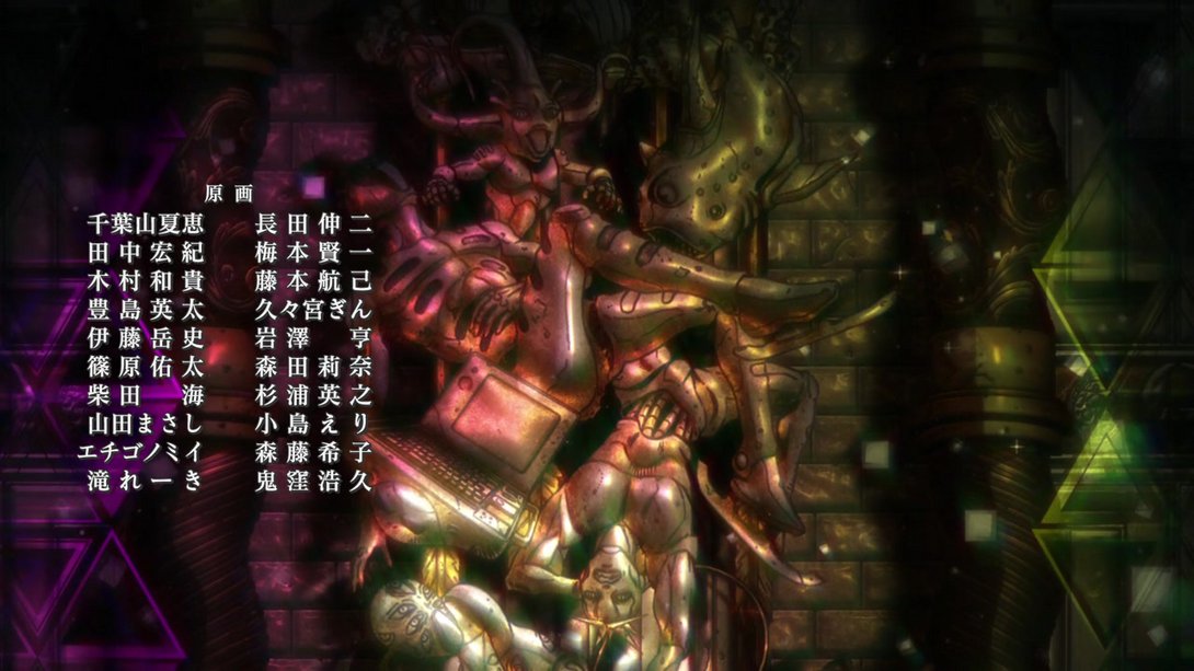
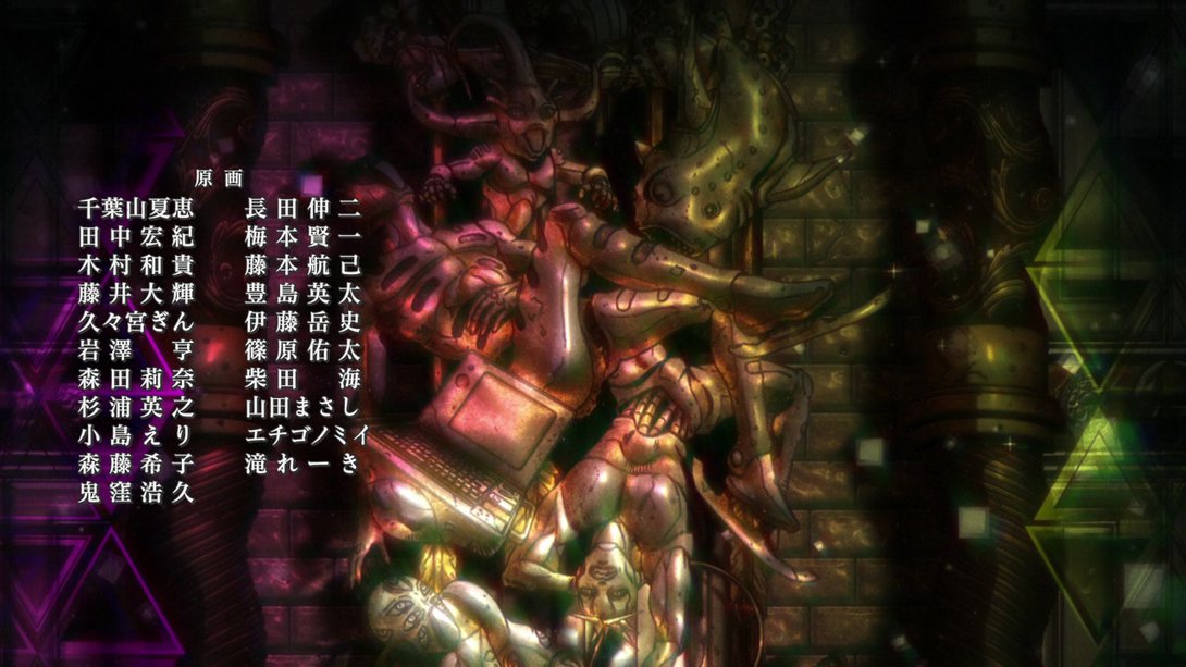
- Here, in addition to 高阪雅基 (“Takasaka Masaki”)’s name being re-written correctly once more, 大島舞 (“Ōshima Mai”)’s name has also been added at the end of the leftmost list:
- Let’s move to the final scene, fellas! This is it! And, yes, of course… The ending scene has also been improved upon! Let’s take a look: here, the camera starts lower, the windowpanes have a beautiful new texture and the background outside the window is also looking different:
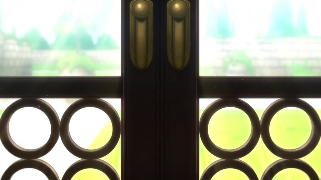
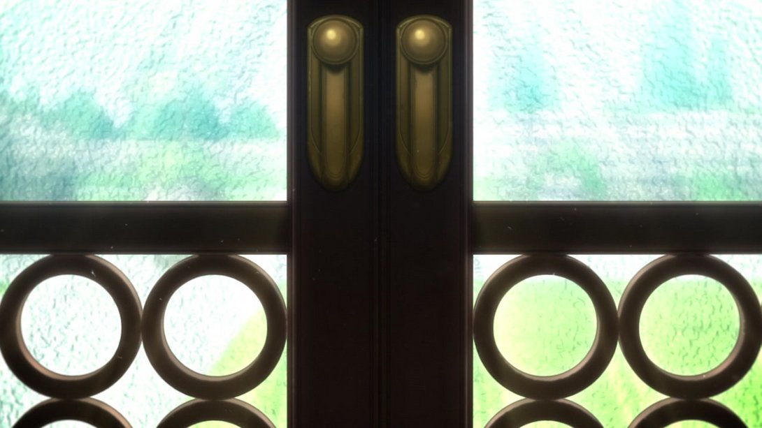
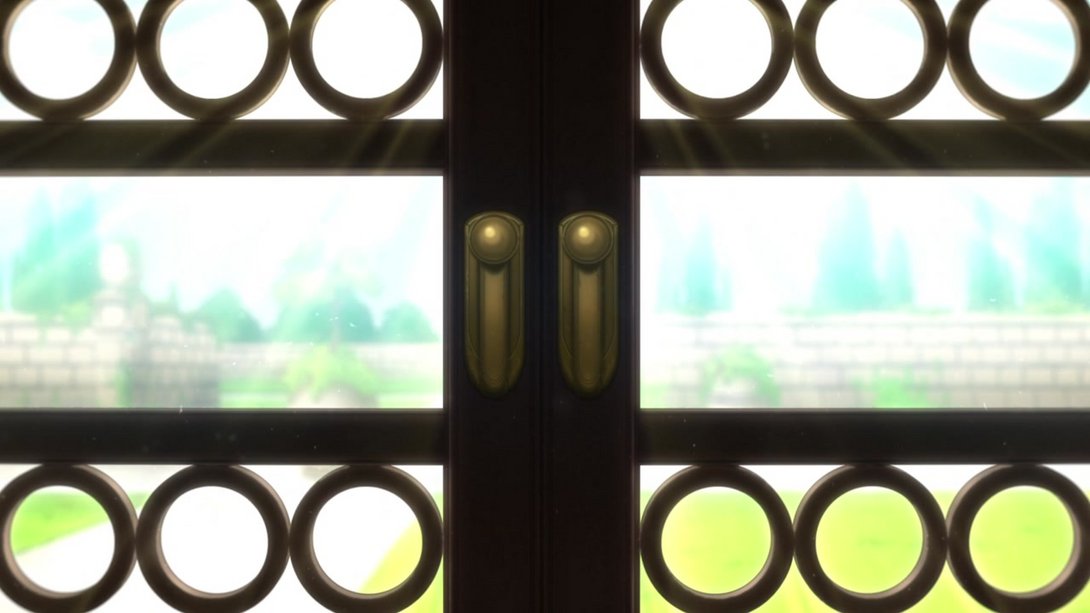
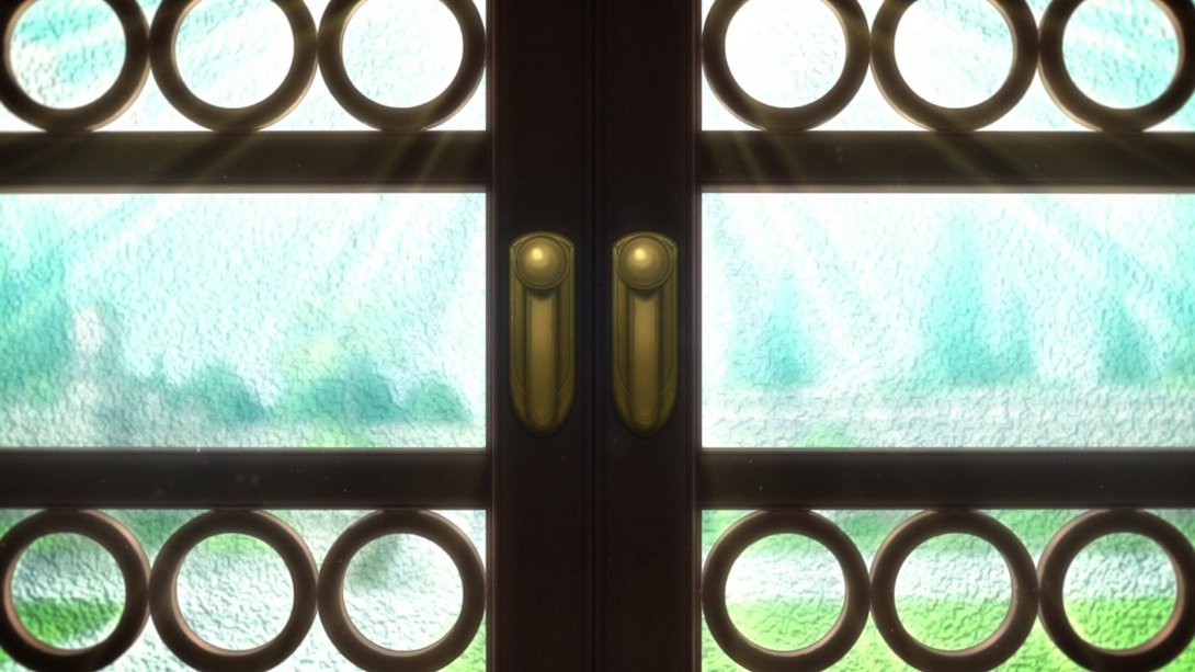
- The window has been pretty massively retouched, here! In addition, the glass vase is also looking better:
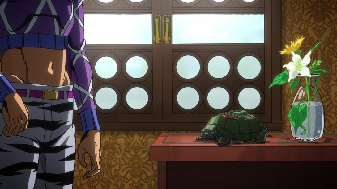
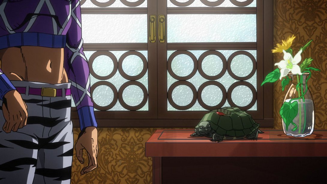
- But back to the main attraction… The window! Here it has, once again, received a new glass texture…:
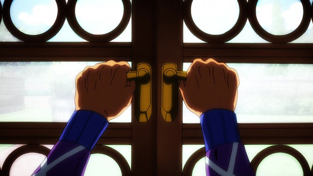
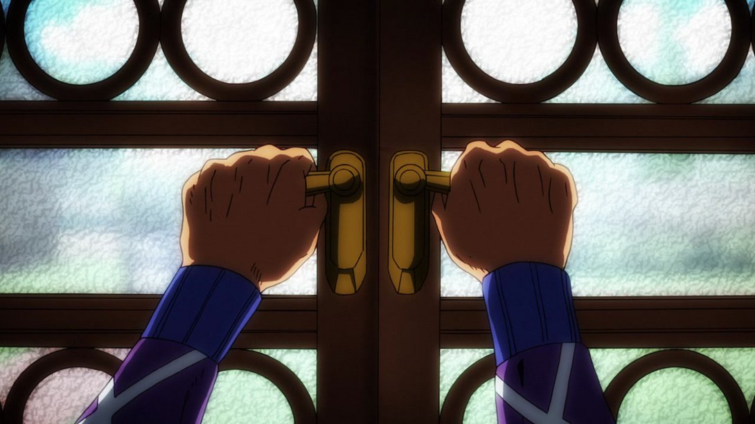
- …when Mista opens the window, the light from outside is brighter…:
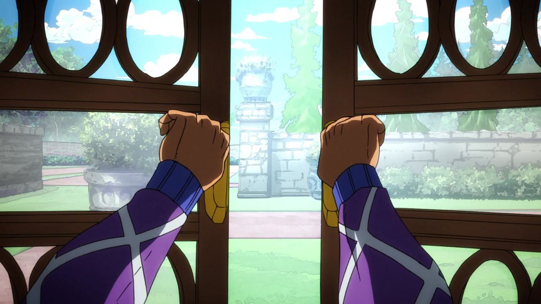
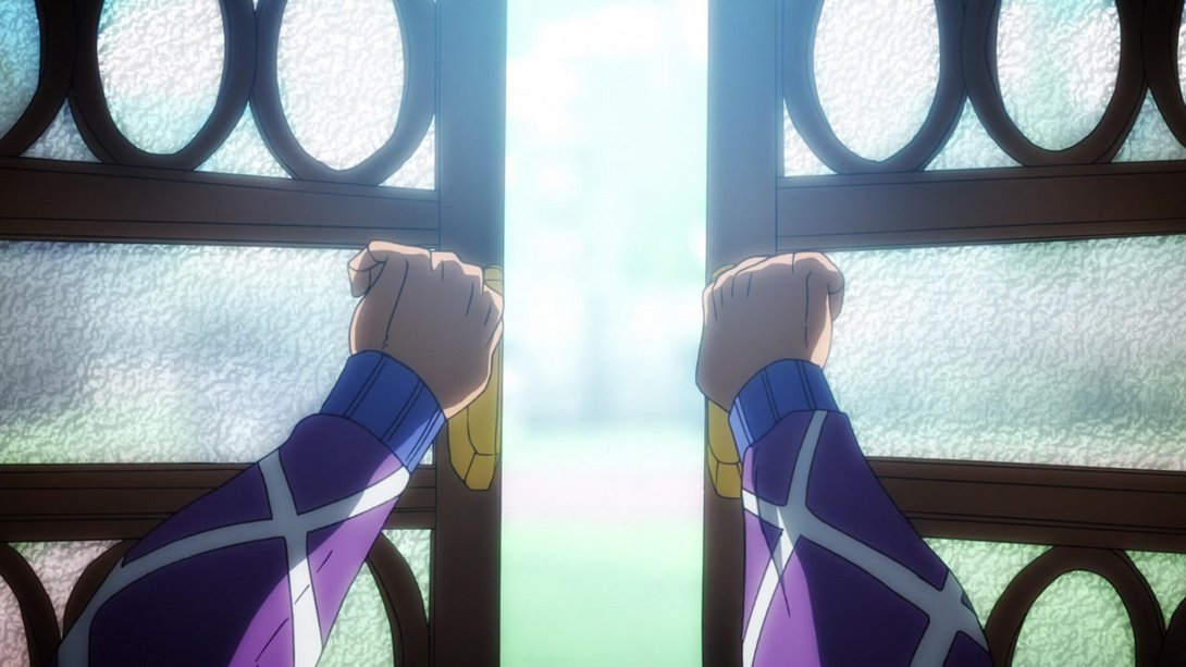
- …and, at the end, you can see that the background is slightly blurrier as well:
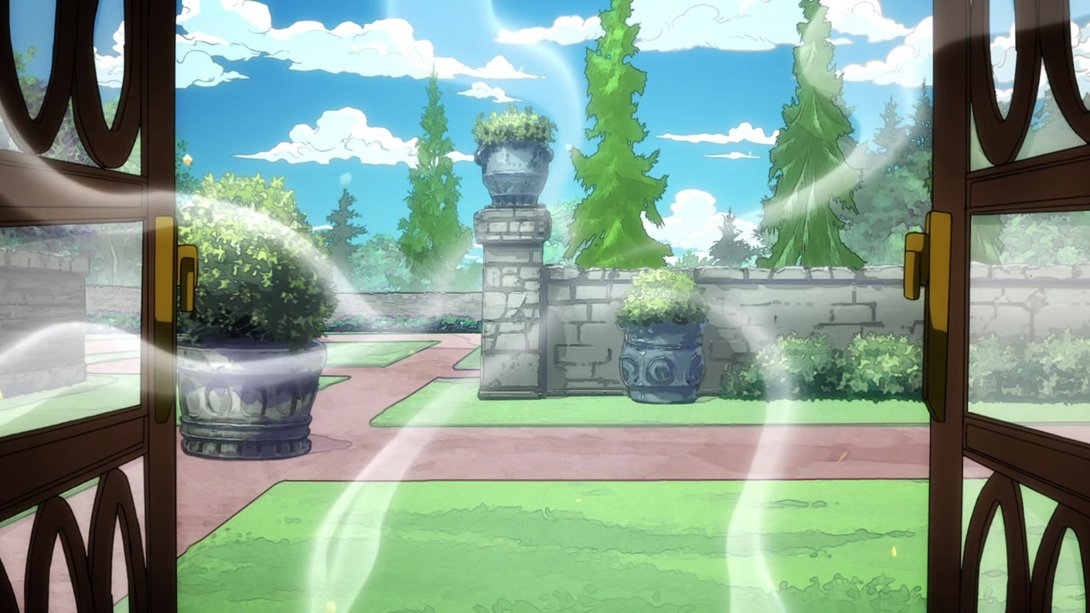
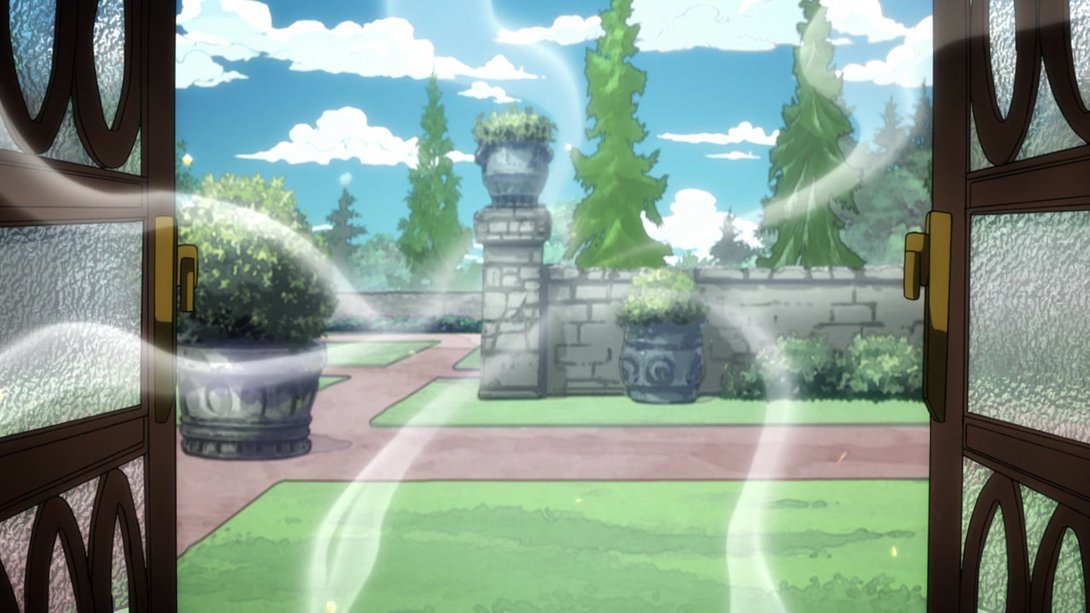
- And blurrier it remains here! In addition, the one visible window hinge is also blurrier and the glass texture is back:
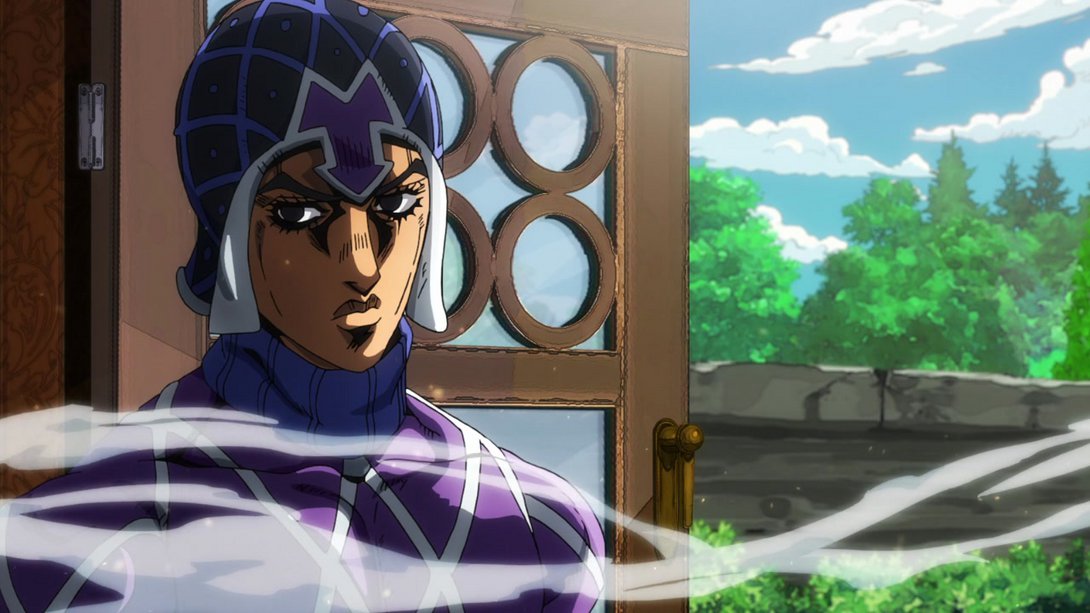
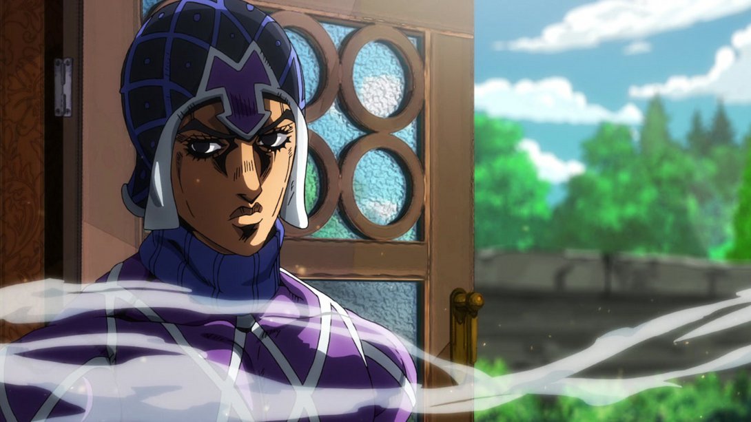
- Here, almost everything is looking just… better:
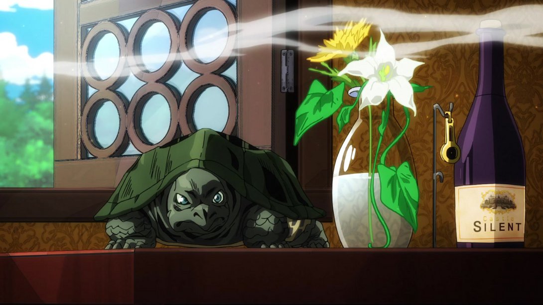
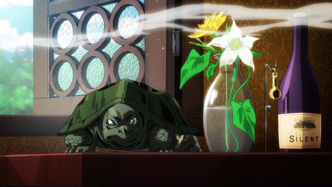
- On this most beautiful Giorno shot, two veeeeeeery tiny details on his collar wing have been sliiiiiiiightly retouched:

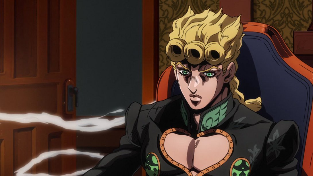
- And here, in addition to the now-familiar glass texture, one of the wind “tendrils” is more transparent, when it gets over Giorno:
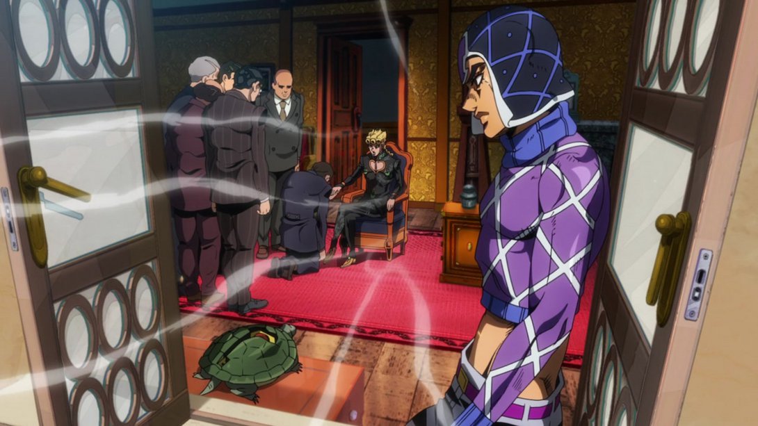
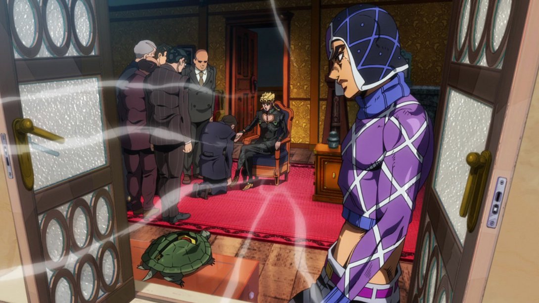
- And finally, here, the two final writings have been scaled up/moved around slightly…:

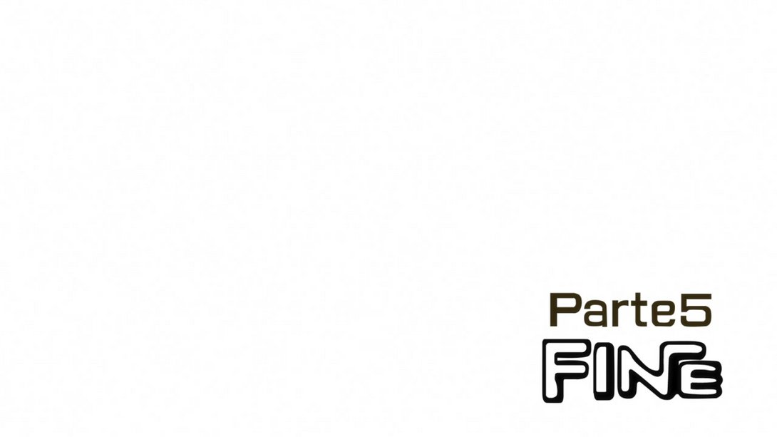
- …and “Fine” shows up a little earlier too:
Pheeeew! Oh, man oh man was that long. The second-longest comparison to date, to be precise - the prize of “longest comparison” still goes to DIU#27, and deservedly so. Which is even more impressive when you realize that this episode wasn’t nearly as big of a trainwreck as that one! I hope you had fun on this trip through Italy with me, friends - it was fun and there were many more differences than I honestly thought I would have to compare. Well, now that this glorious chapter is over, you and I will take a nice vacation to Egypt instead… I’ll see you next time for Stardust Crusaders #18, “The Sun”!
Addio, amici…

