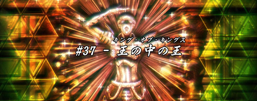
Happy new years, folks from far across the lands! I hope you had a good one - welcome back! New year, new comparisons… Today we’ll be taking an in-depth look at Vento Aureo #37, “King of Kings”!
Let’s cut to the chase, shall we?
- Today’s first difference is this scene of Trish ascending to another plane of existence - the aura surrounding her soul is slightly different, both in outline and texture:
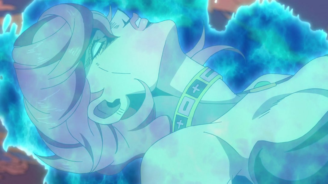
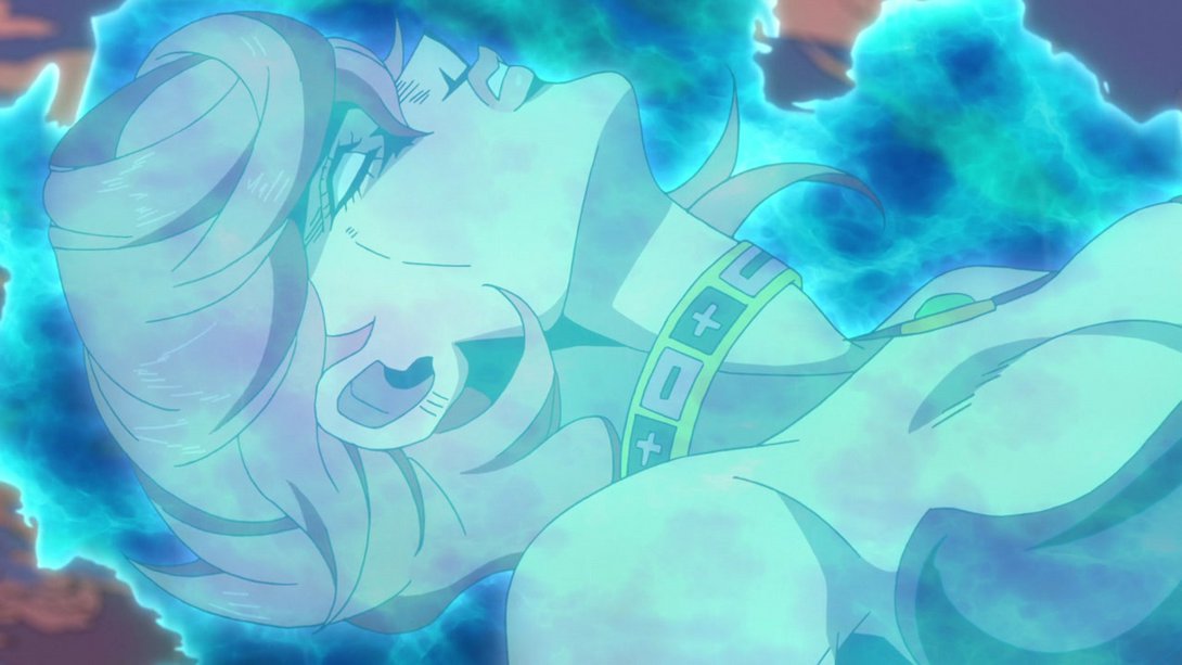
- Here, the background is blurrier and the top of Number 1’s head is slightly brighter…:
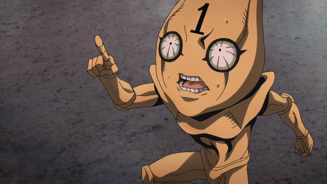
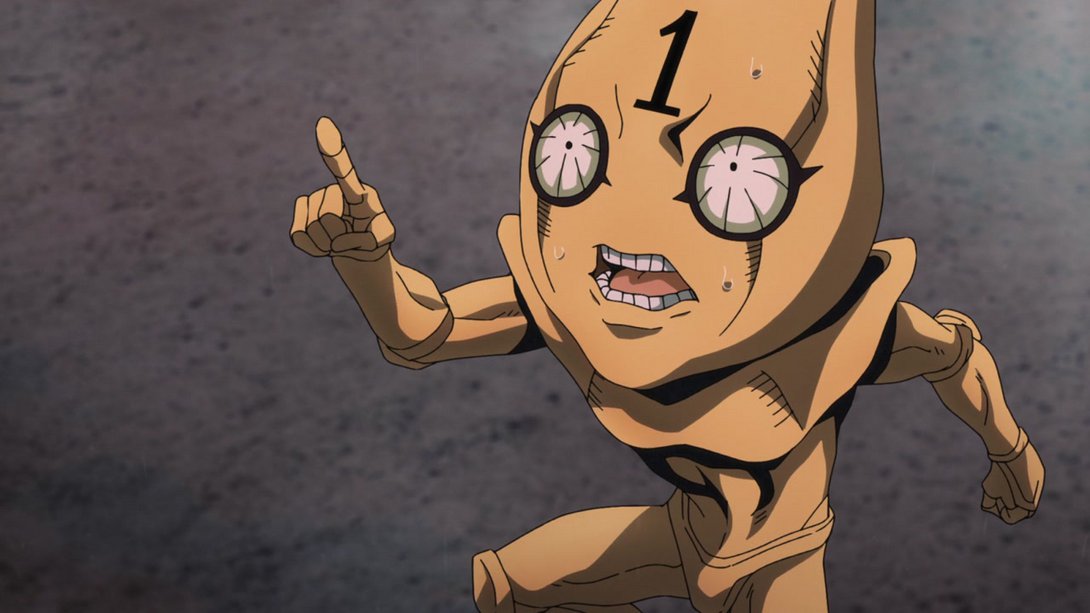
- …and, in addition, Trish slides into frame instead of just appearing there, Number 1’s half slides along with it and the shading in Trish’s half is also slightly darker:
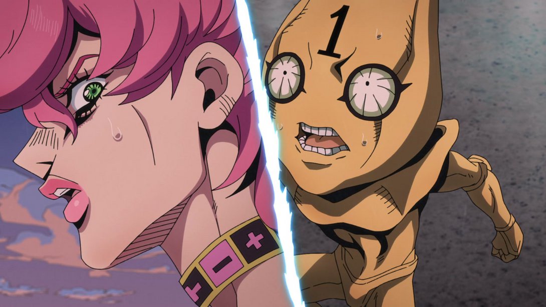
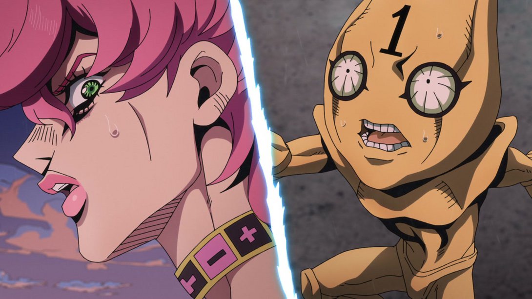
- The top of the background is darker, here…:
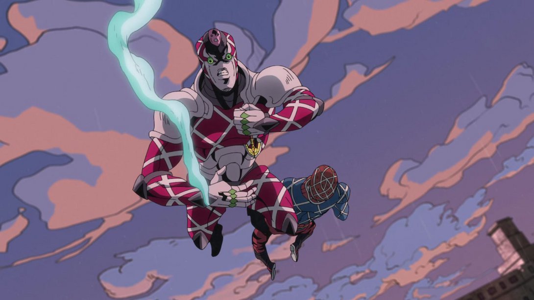
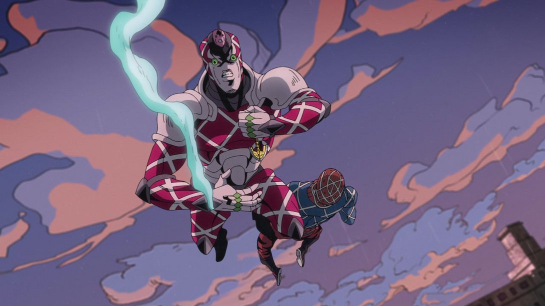
- And here… Well, uh. It’s probably easier to just look for yourselves, huh? What an improvement:
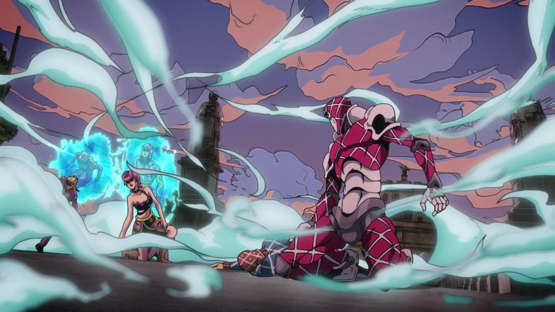
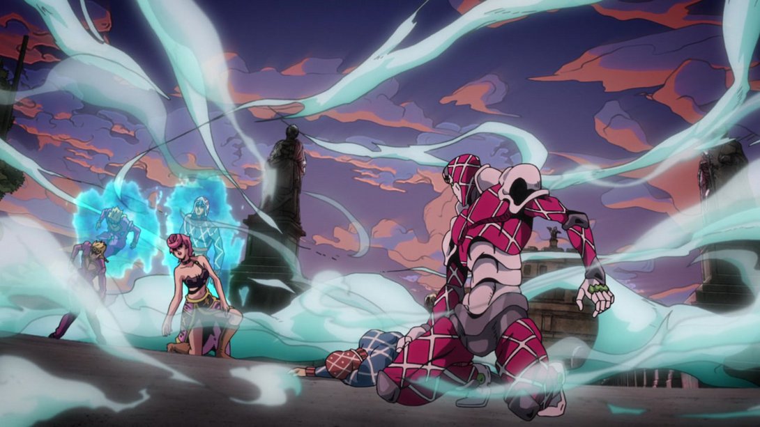
- Most of the clouds of smoke in this scene are more transparent and are sporting a slight white aura:
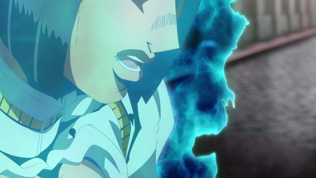
- Buccellati’s massive teeth have been filed here, and his colouring has been made slightly flatter:

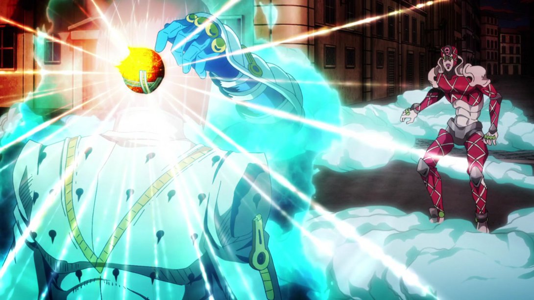
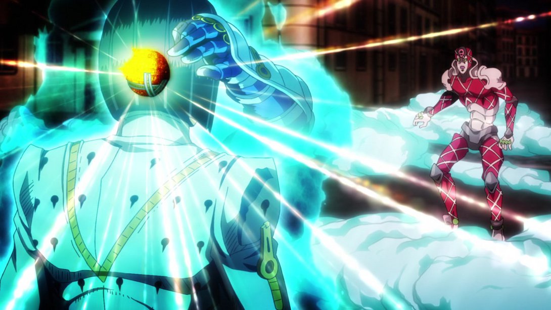
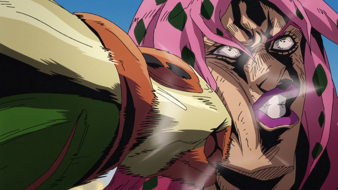
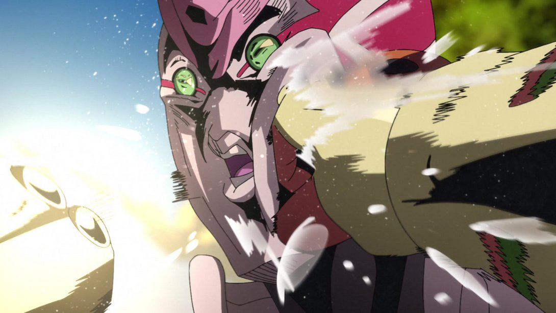
- The lighting is completely different in this scene! In addition, Sticky Fingers’ hand has been correctly redrawn, the background is blurrier, the sun-thingy’s light rays are different and King Crimson has been retouched as well (particularly where the white lines meet):
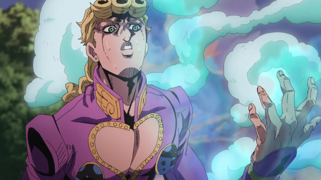
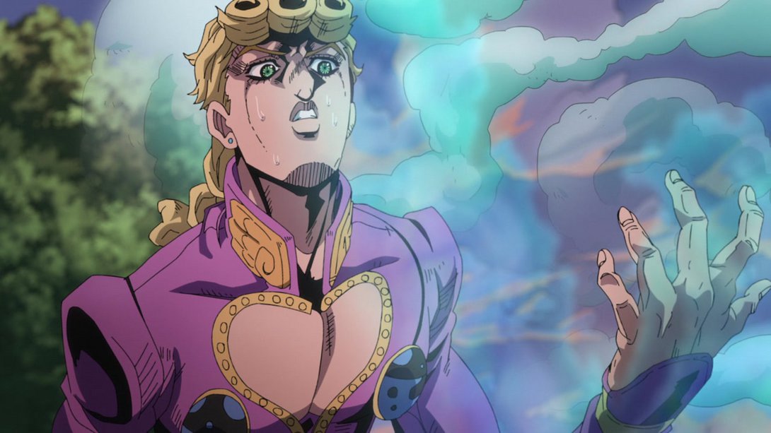
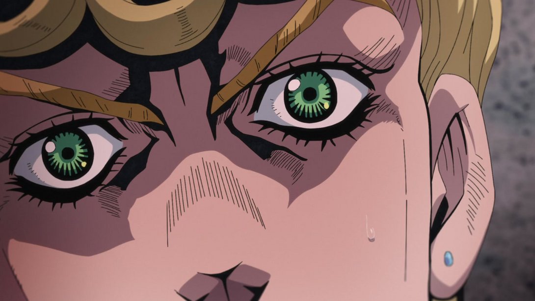
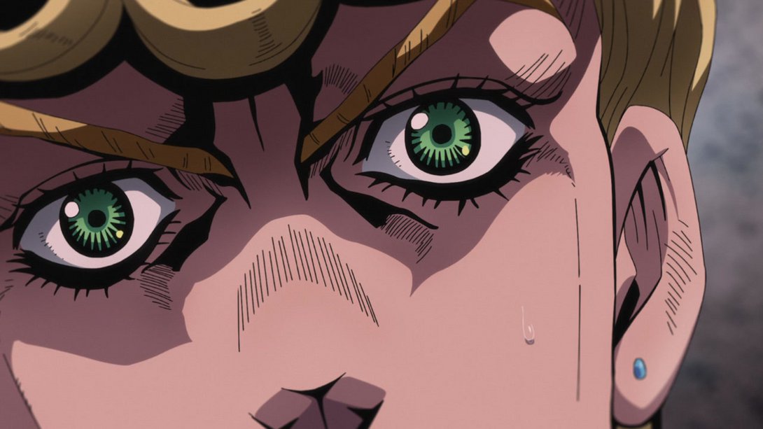
- Here, in addition to a much blurrier background, the shading on Giorno is much more interesting as well, lending some more depth to the whole scene. If I’m not mistaken, I think the top of the frame is also slightly blurrier… But I’m not 100% sure:
- Here, in this beautifully solemn scene of our beautiful mama Buccellati ascending to Heaven, he’s been drawn with some slightly thicker lines, and the sky in the background is also darker:
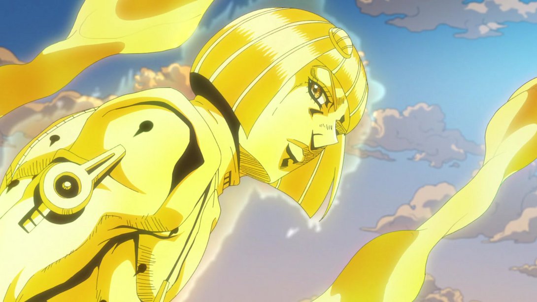
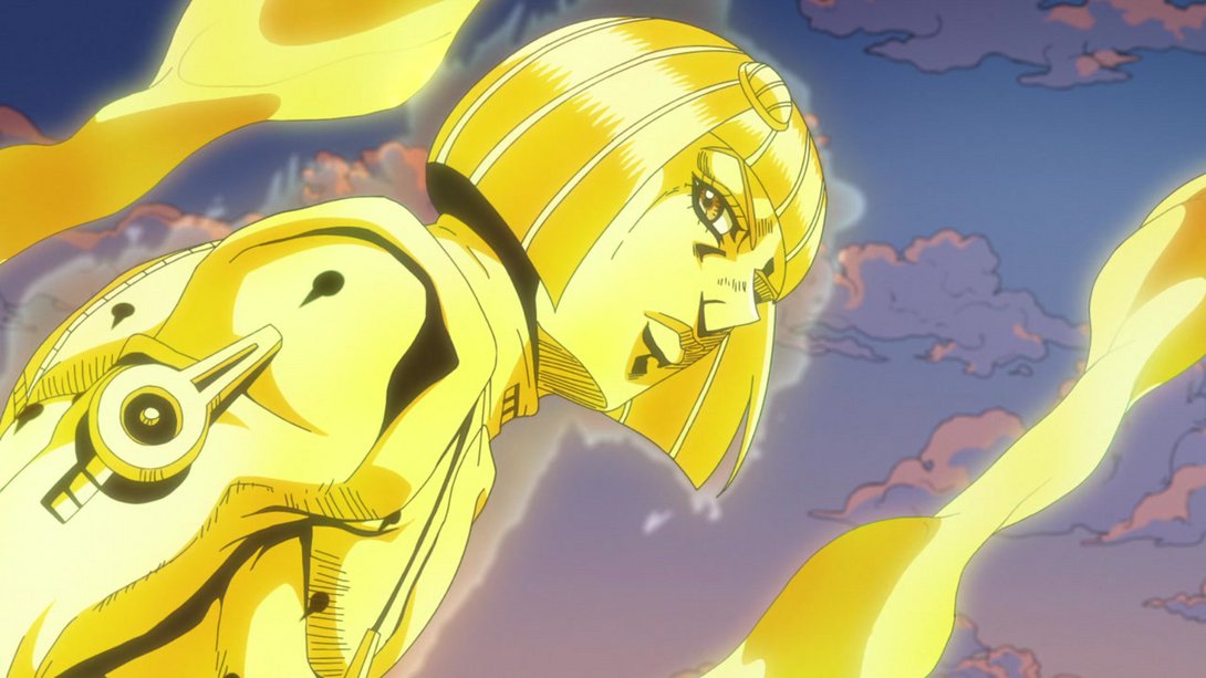
- And here, on top of his neck area having been correctly shaded, the colouring on some of the yellow bits has also been slightly tweaked:

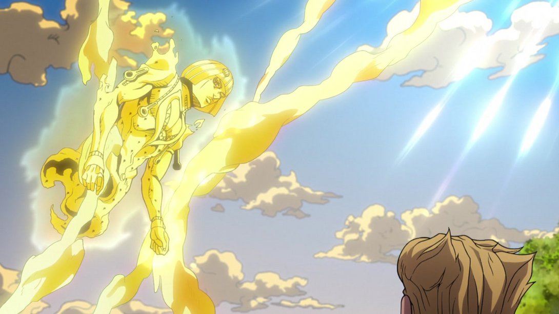
- Here, once again, the general shading and colouring combine to make this scene more interesting-looking, in my opinion! Moreover, the texture for the background has also been stretched differently:
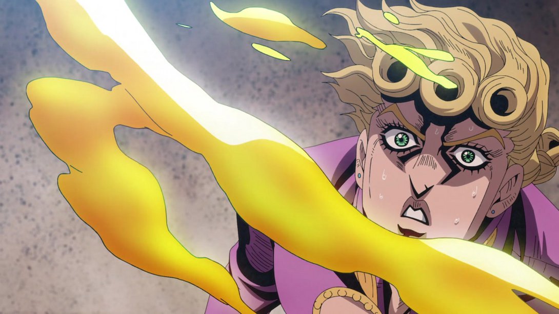
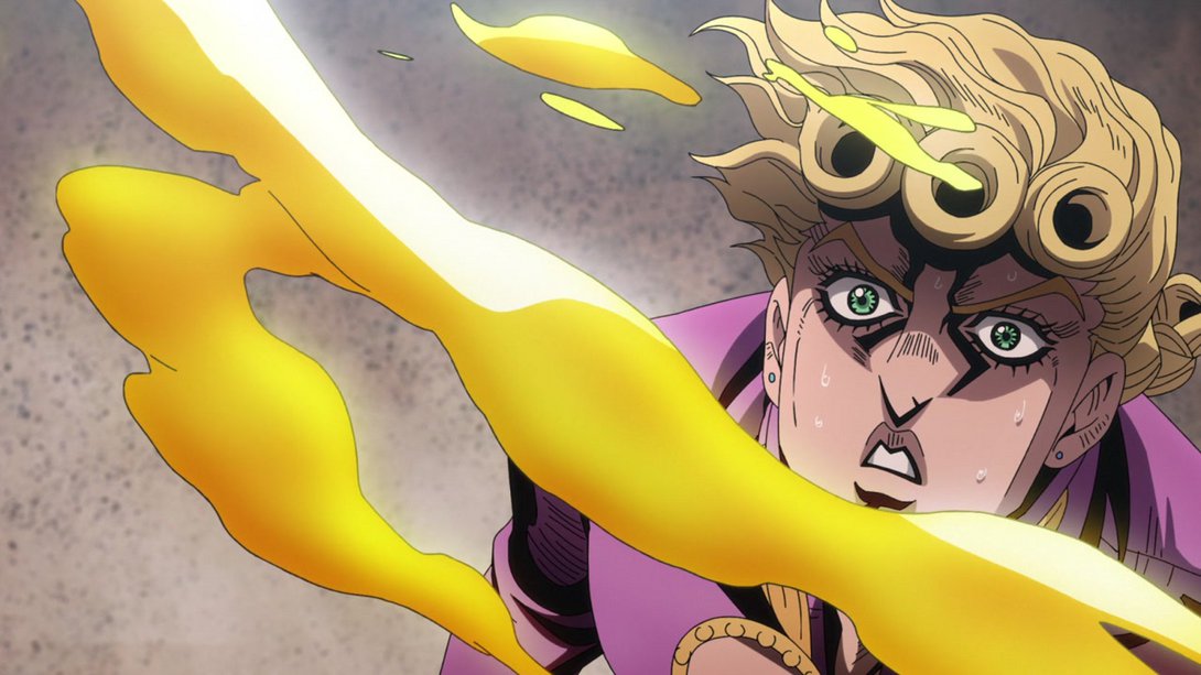
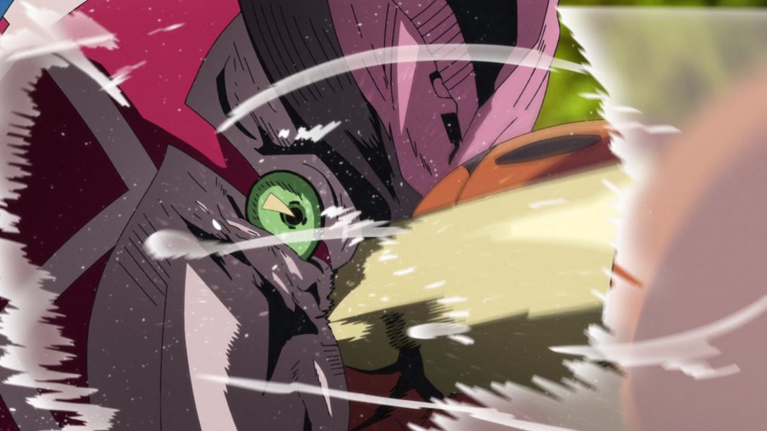
- King Crimson is sporting a different aura, here:
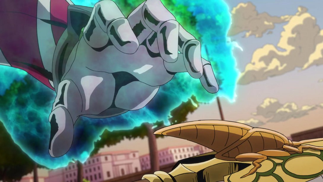
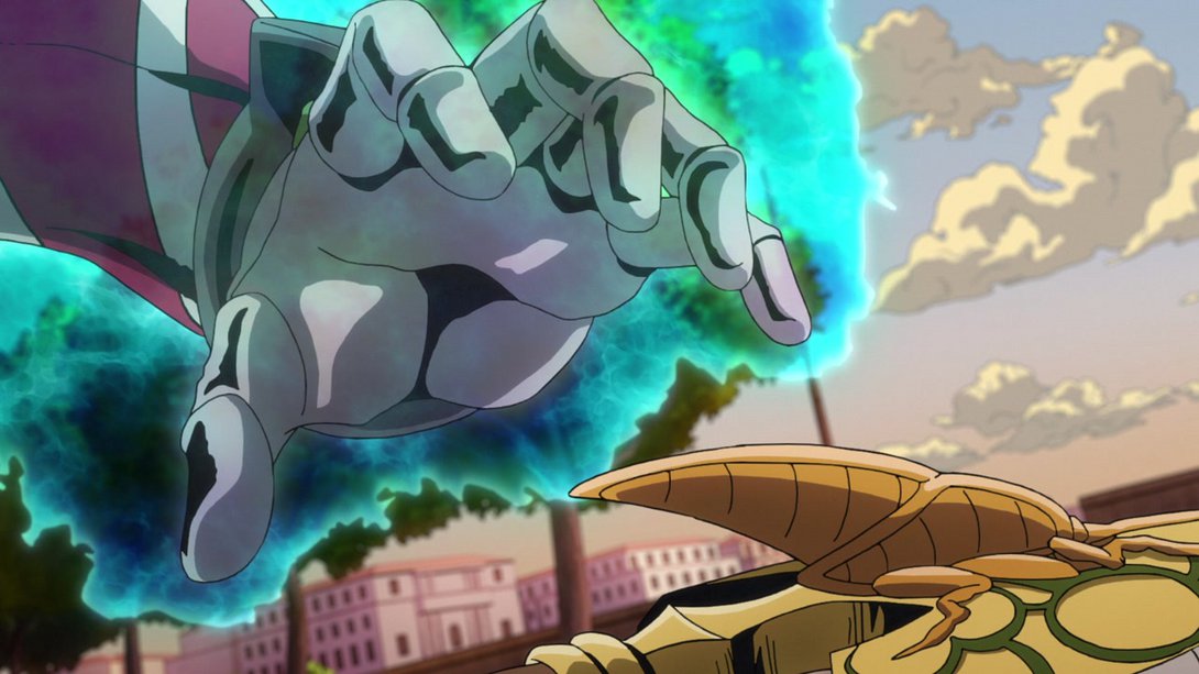
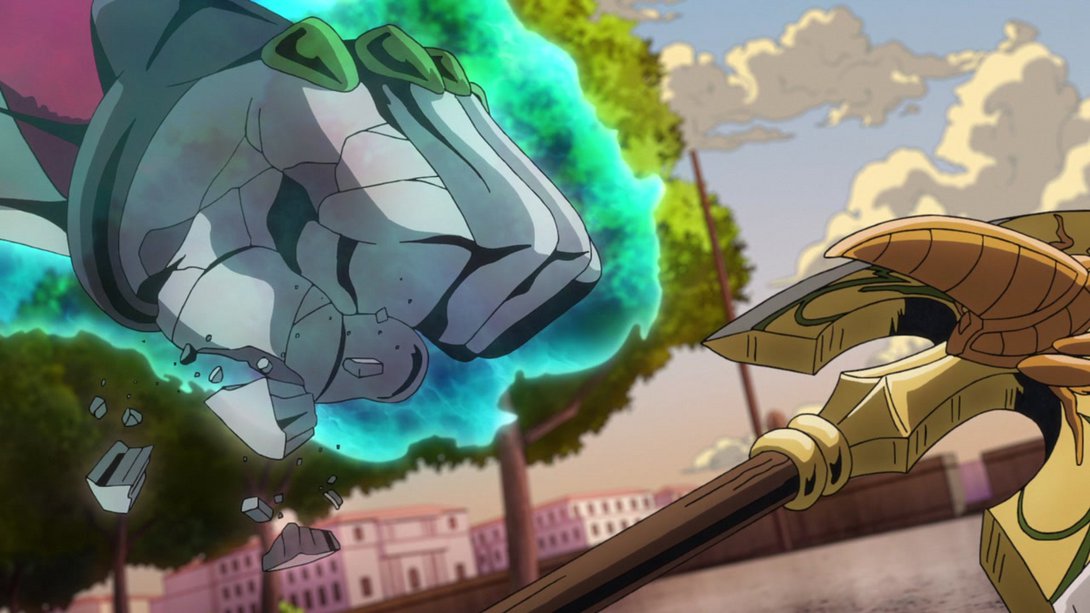
- And once again here; in addition, the bits that crumbled away from his hand have also been slightly recoloured:

- Mista has been drawn with thicker lines here…:
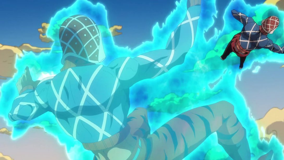
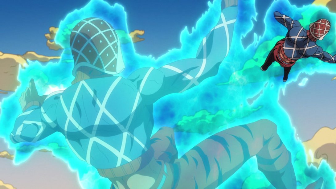
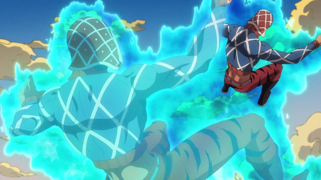
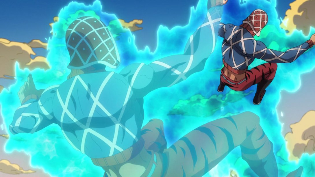

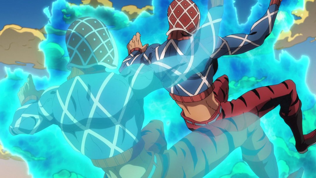
- …and he has been graced with a new animation, when he “falls into” his soul:
- Here we have another series of scenes which are now looking much better thanks to some tweaks in the lighting, in the shading and (sometimes) a different distortion along the edges:
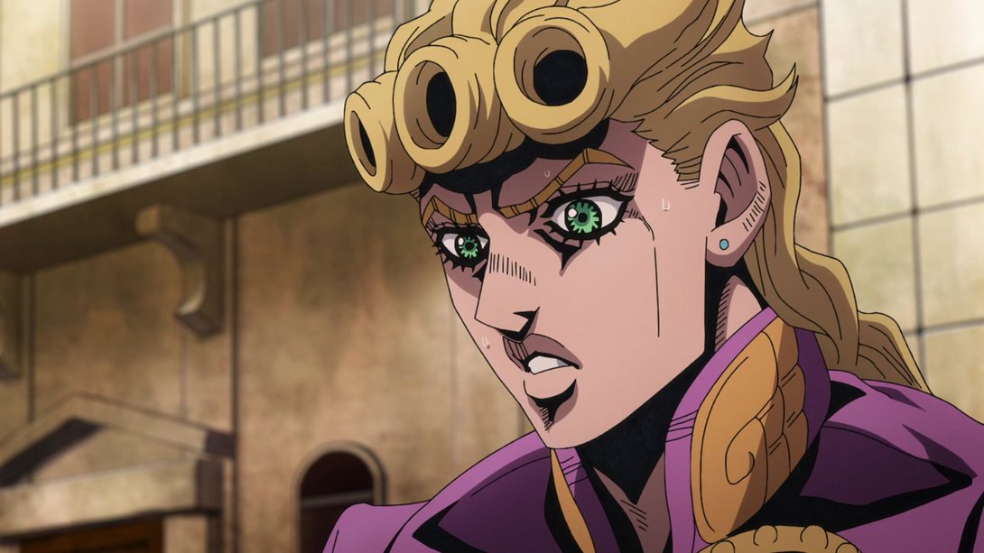
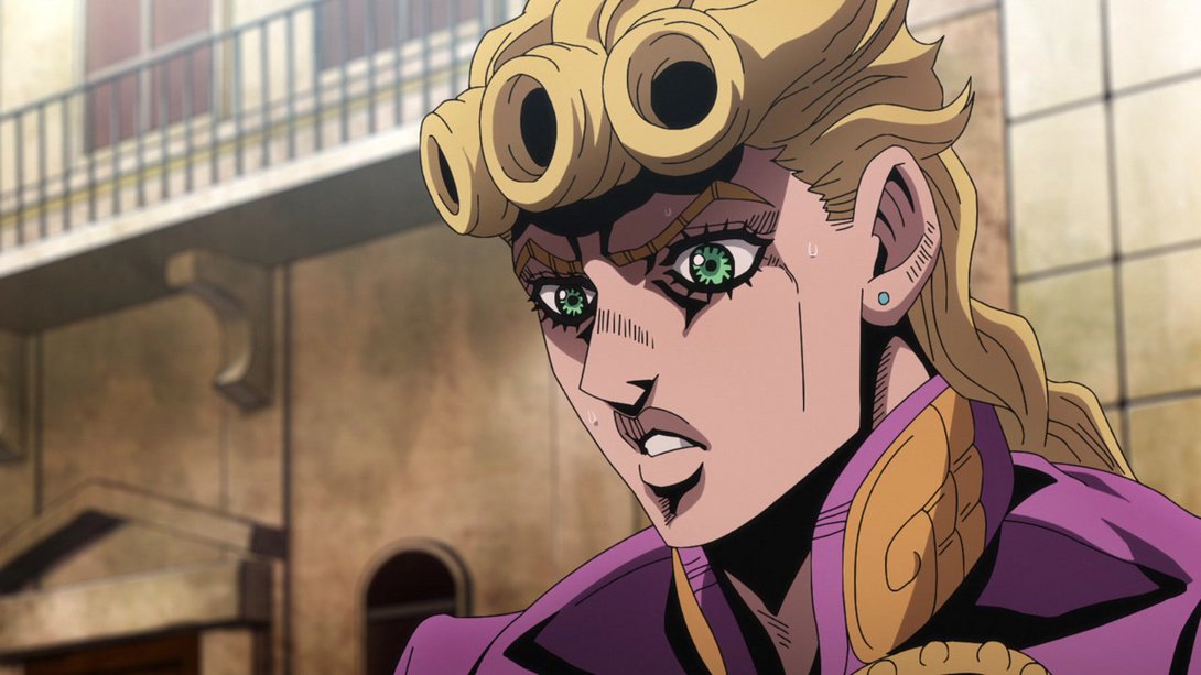
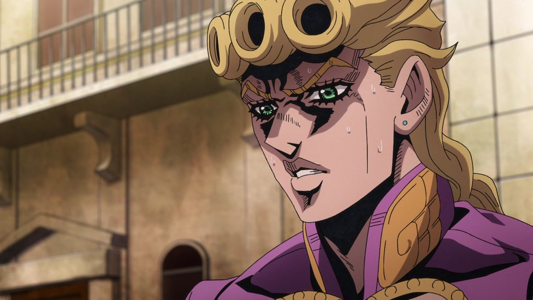
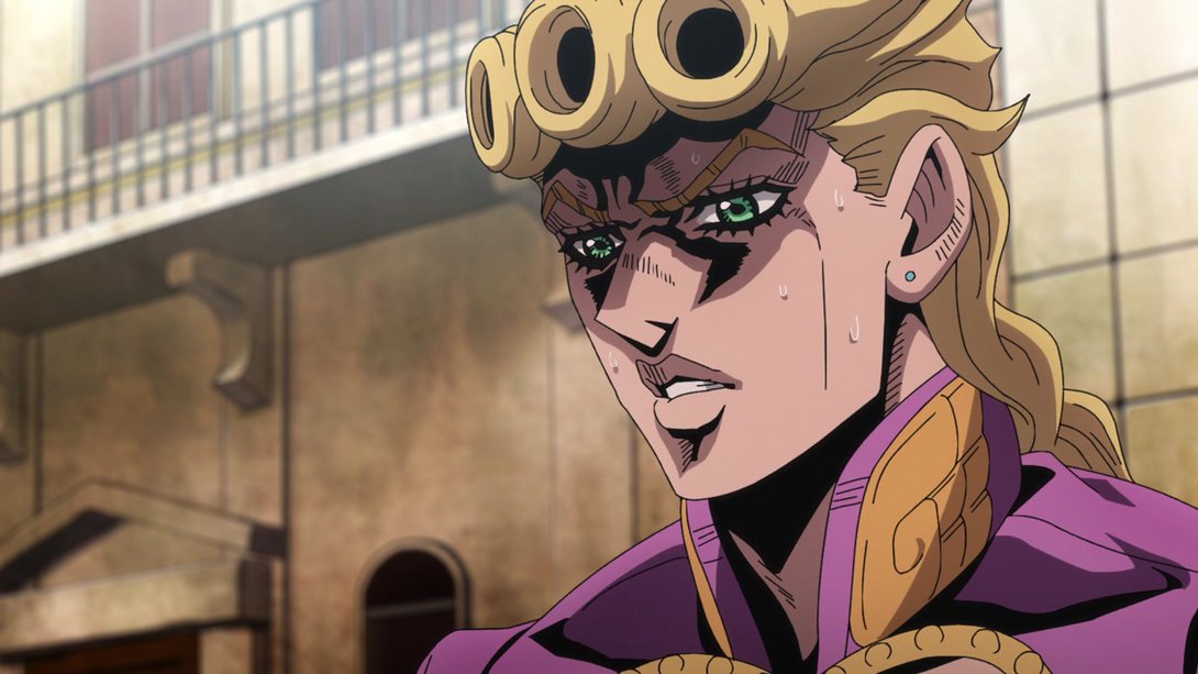
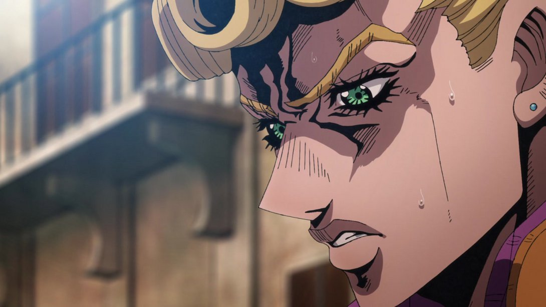
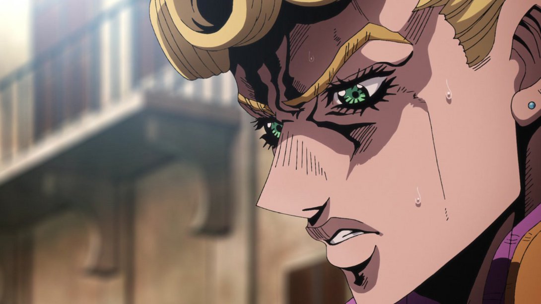
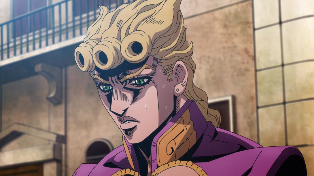
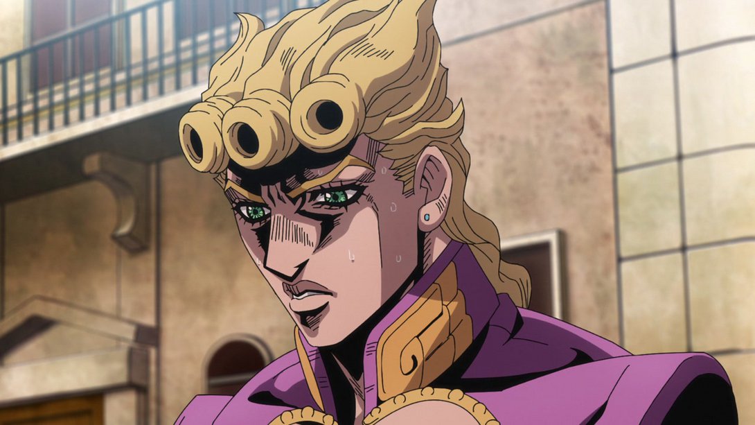
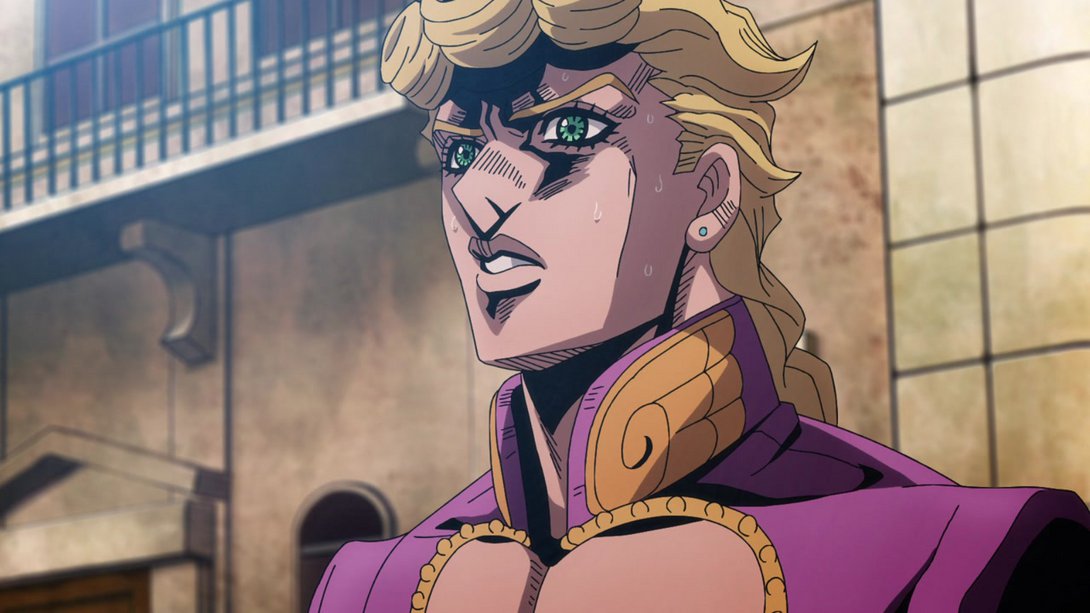
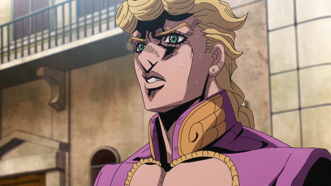
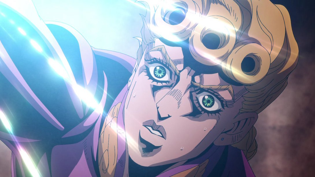
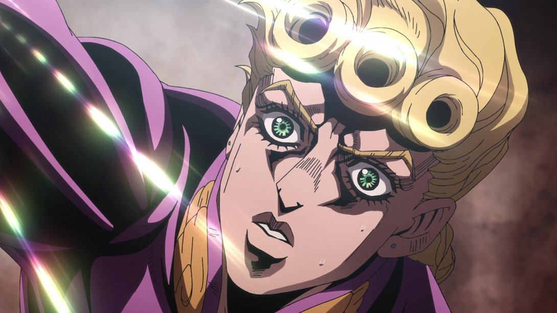
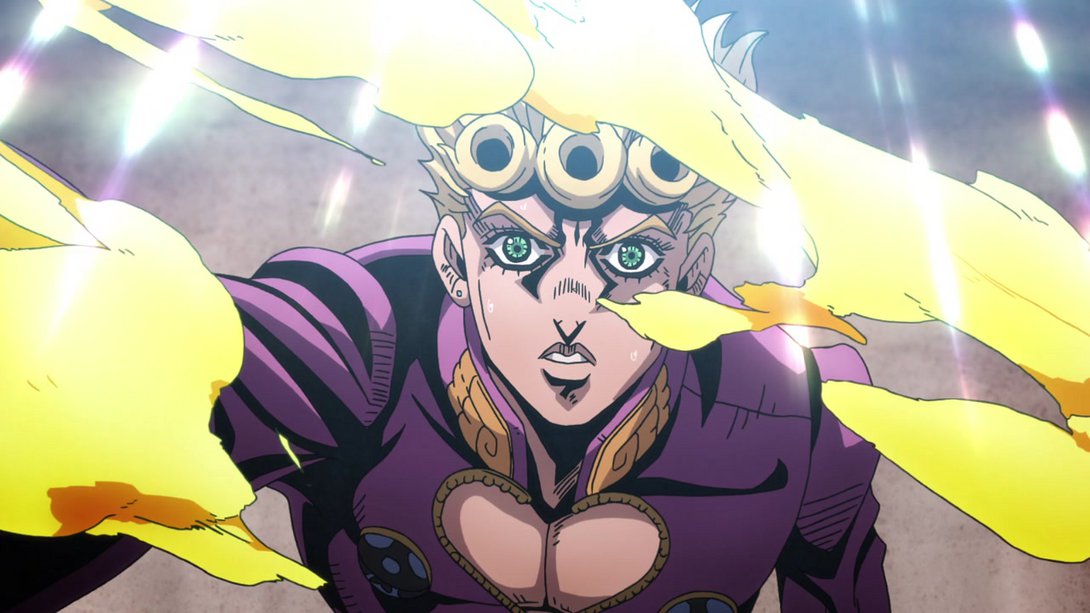
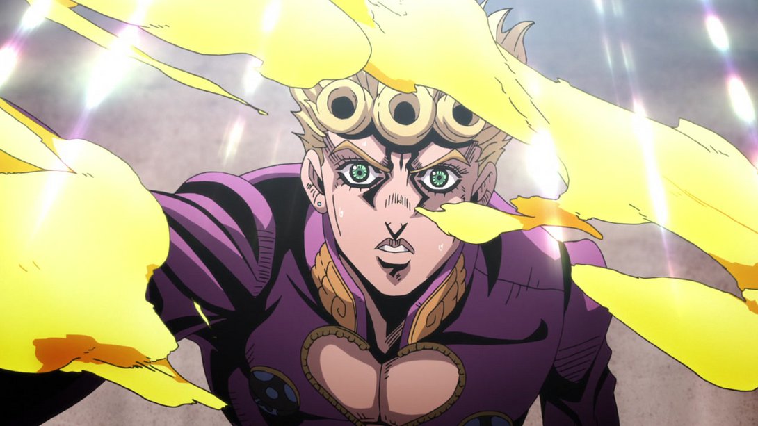
- Look at my eyecatch. This… may be our last chance:
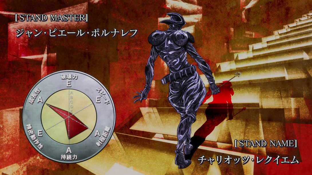
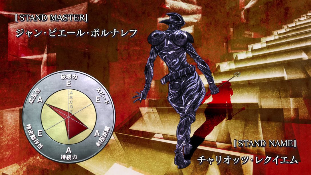
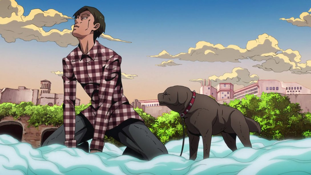
- In this very weird frame, the background is blurrier and darker towards the top; moreover, the colouring on that frankly weird dog is a little flatter:

- Here, the colouring is a little softer and blurrier, and there is a different distortion along the edges:

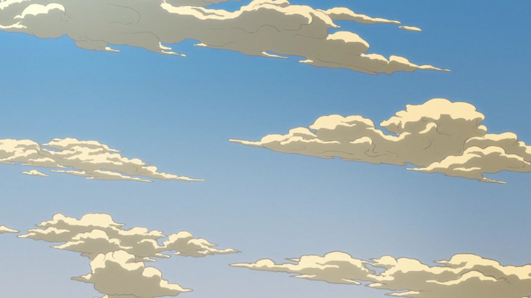
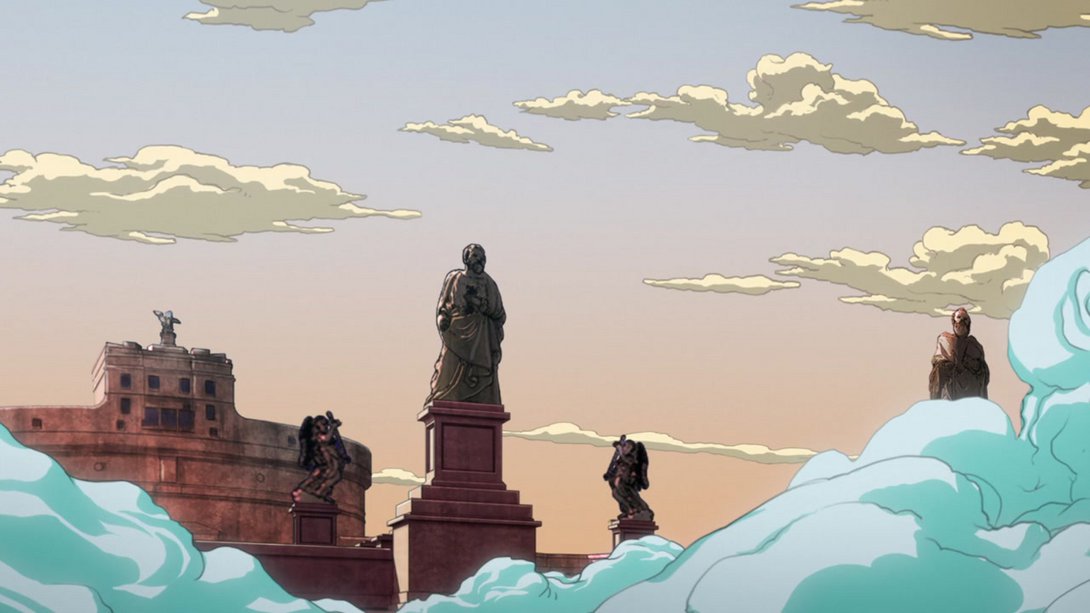
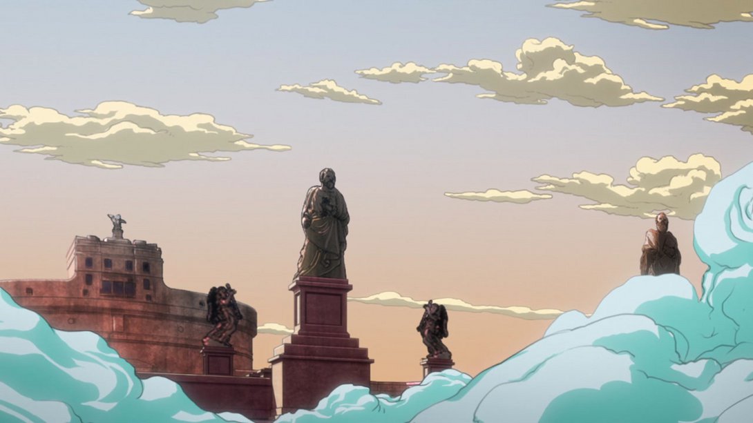
- Moving on… Here, most colours are slightly different, the ground is slightly darker towards the bottom, the background is brighter and slightly blurrier… and Giorno’s no longer there!:
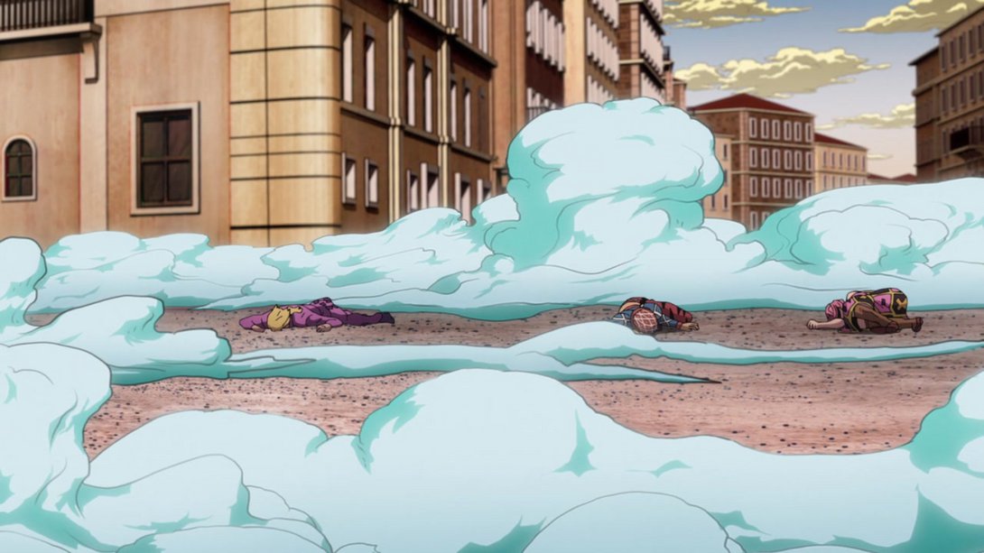
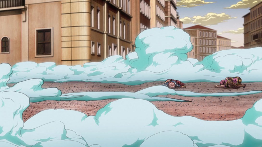
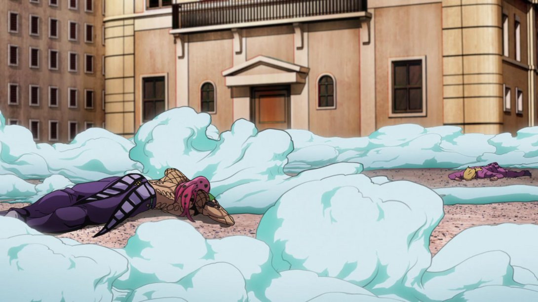
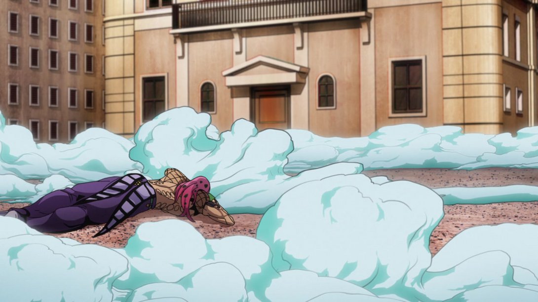
- Here the ground texture is sharper! Now that’s a change! In addition, most clouds have been tweaked in regards to brightness, transparency, colouring… and, at least for the clouds placed on the bottom of the frame, positioning too! In addition, there is a more noticeable smoky-haze effect coming off of Silver Chariot Requiem’s head:
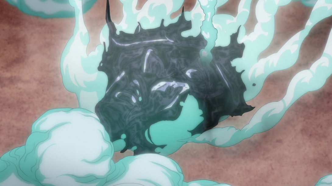
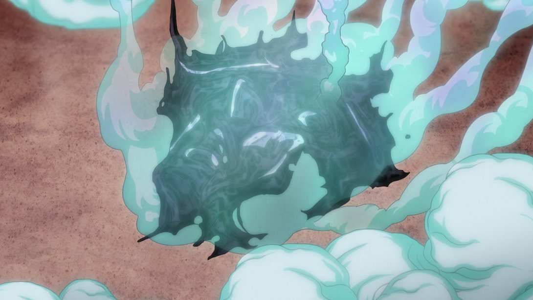
- Once poor Silver Chariot Requiem’s head fades out of existence, the clouds on the top of the frame are still brighter, and the ones on the bottom have instead been moved a little up (or down):
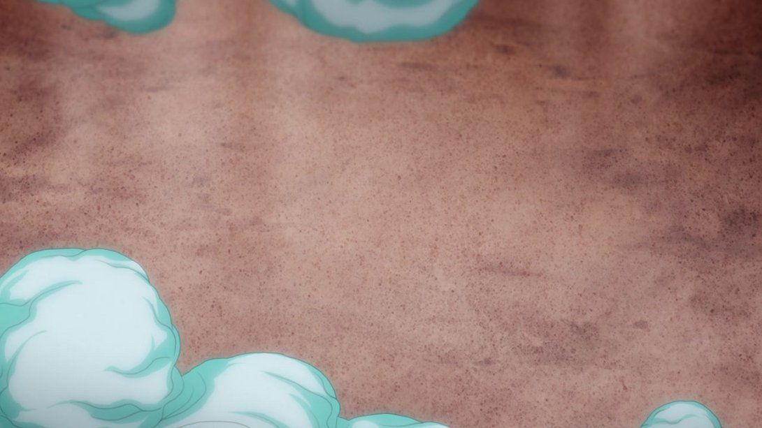
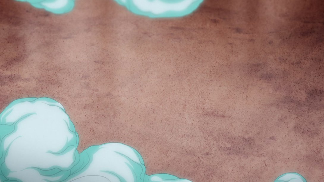
- Here, once again, Giorno has been taken out of the equation! In addition, the shading on Diavolo is slightly darker, Trish and Mista have been drawn with sliiiiiiiiightly thicker lines and the foremost part of the ground texture has been coloured slightly different:
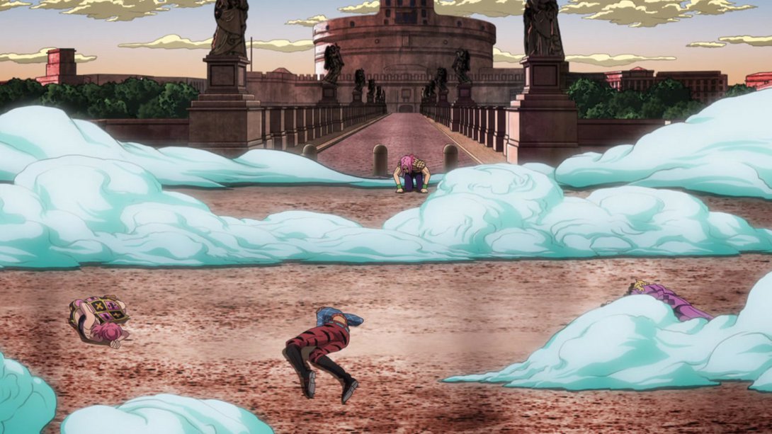
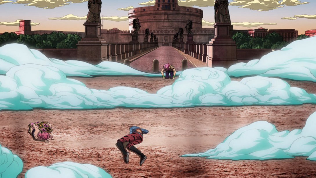
- Here, Diavolo and most of the clouds have been moved and the shading on Mista is slightly darker…:
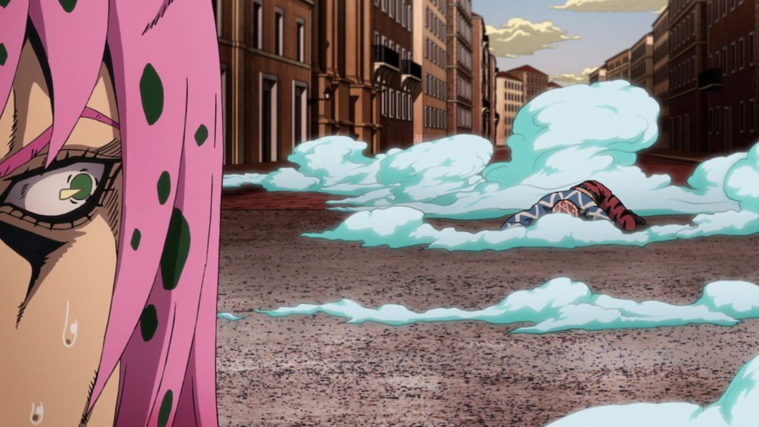

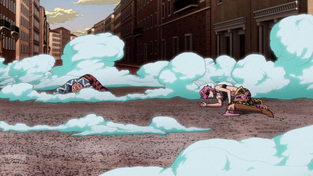
- …and, when the camera pans completely right, we can see that Trish has been moved as well:
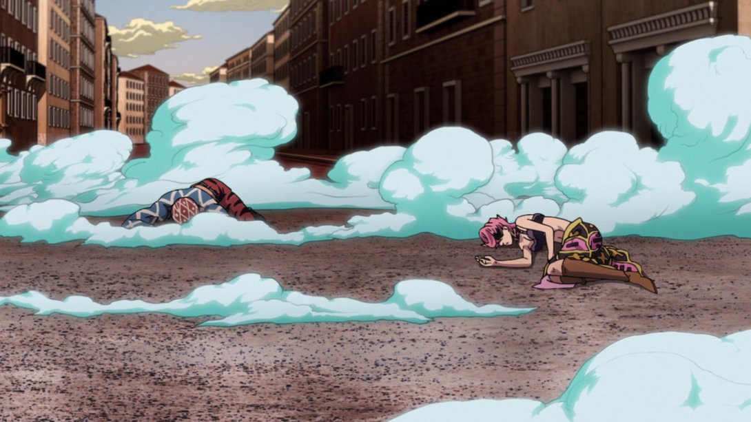
- Here, the top of the sky background is slightly brighter, most lines on Giorno’s arm are thicker and the shading is sharper and slightly different:
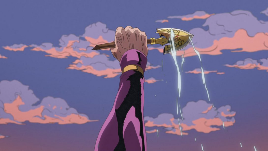
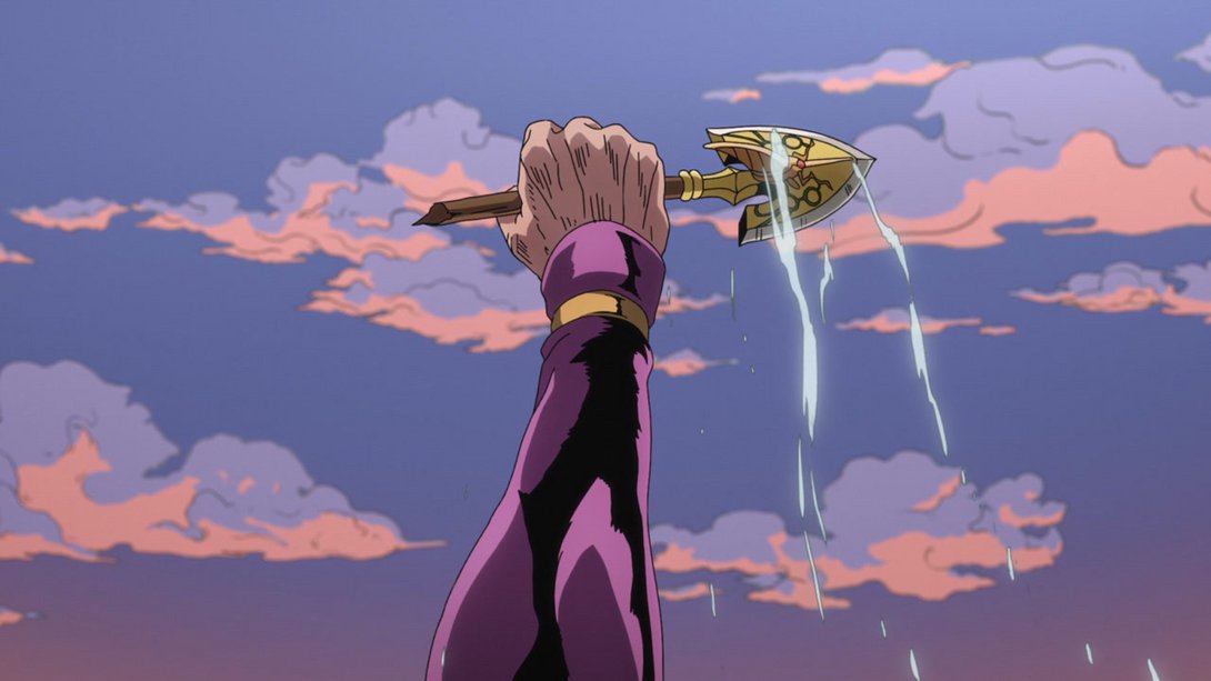
- Here we have another less flat shot thanks to a few choice changes, friends! In addition to the usual suspects, Giorno’s eyes are also brighter:
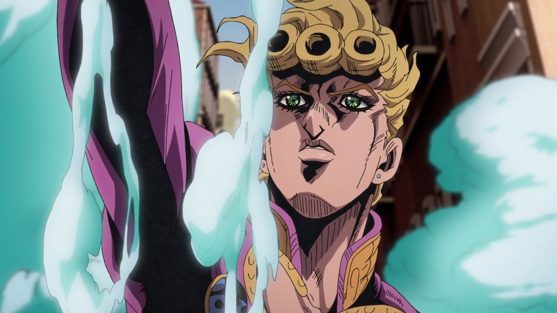
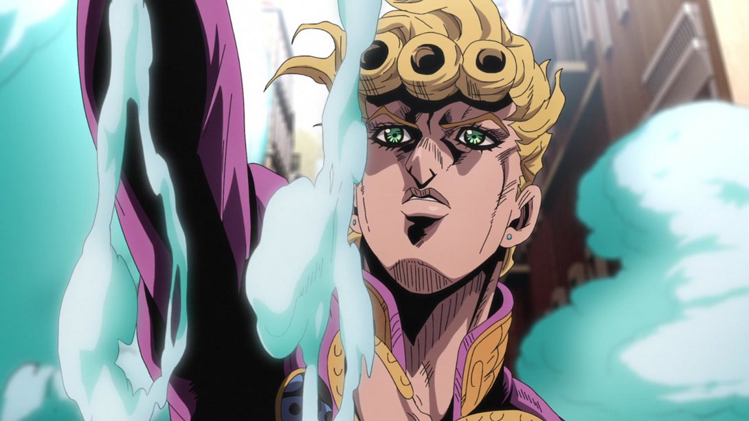
- And another one here! You’ll forgive me if I don’t list these changes time and again - they’re pretty much always the same anyway:
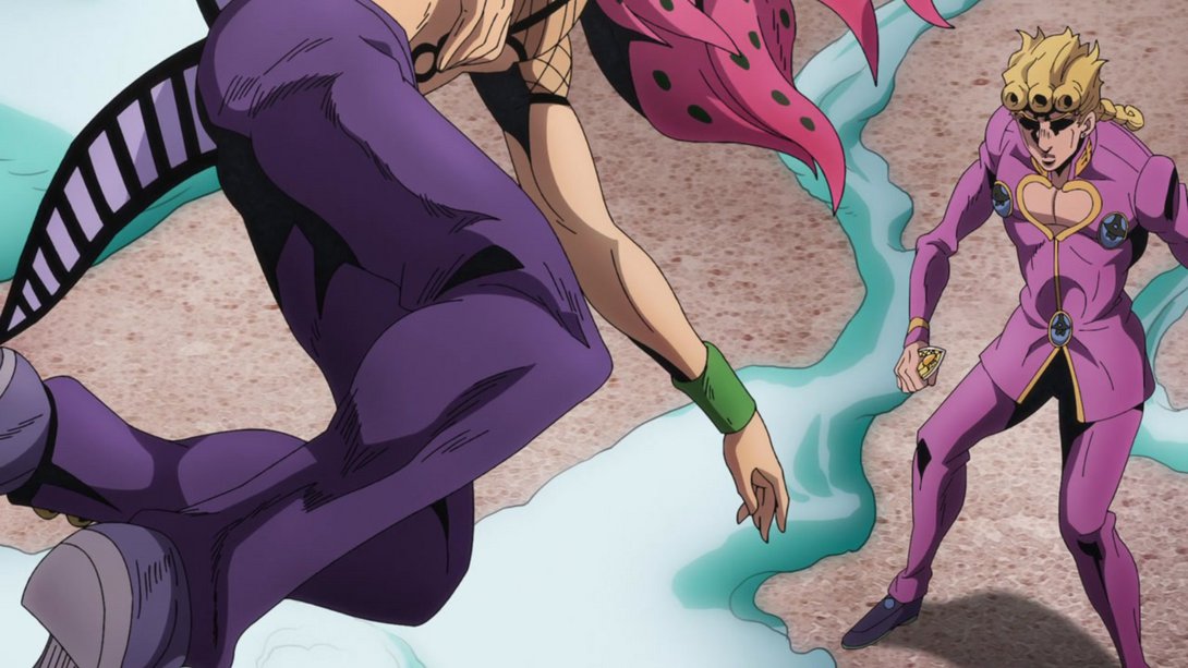
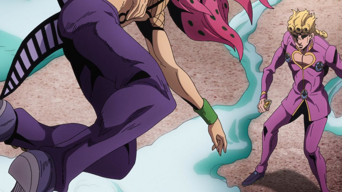
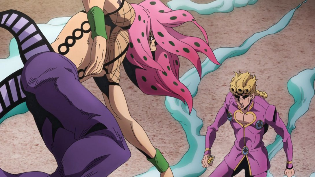
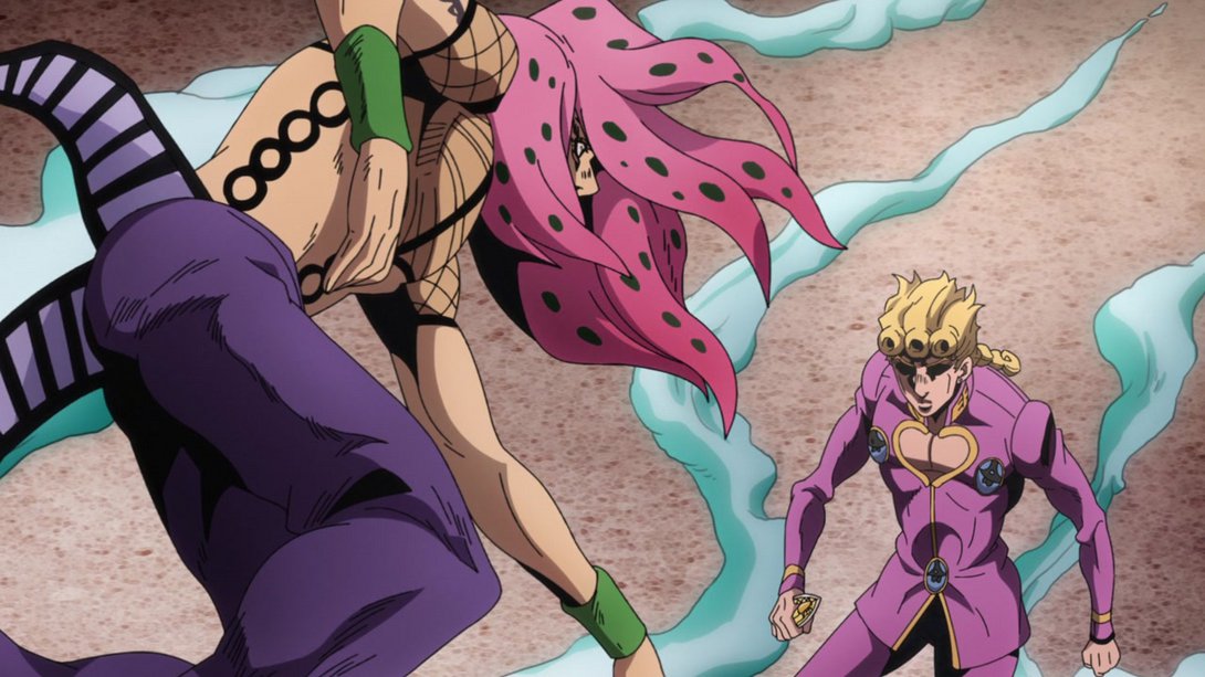
- Ok, moving on to something slightly more interesting - here, on top of the usual different distortion and the darker shading on Diavolo, the camera shakes more…:
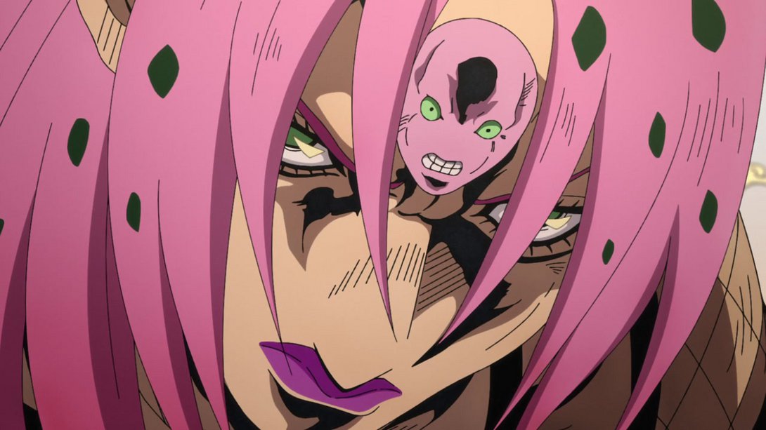
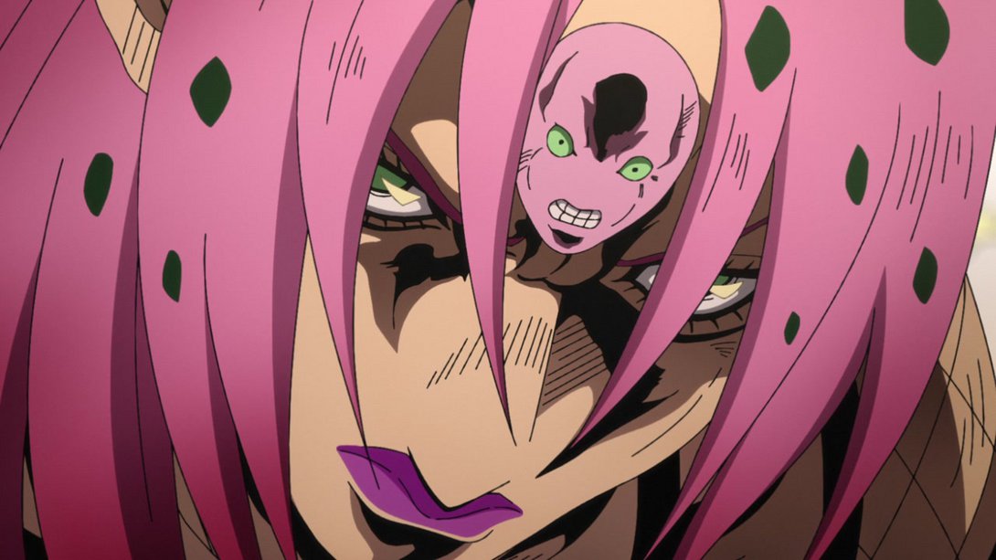
- …but, if I may draw your attention at the much blurrier background behind Diavolo, you’ll see that it’s also much more sparsely populated by clouds! In fact, in some frames it’s completely white. I’m not sure whether that’s intentional or not, but in any case it’s not very noticeable:
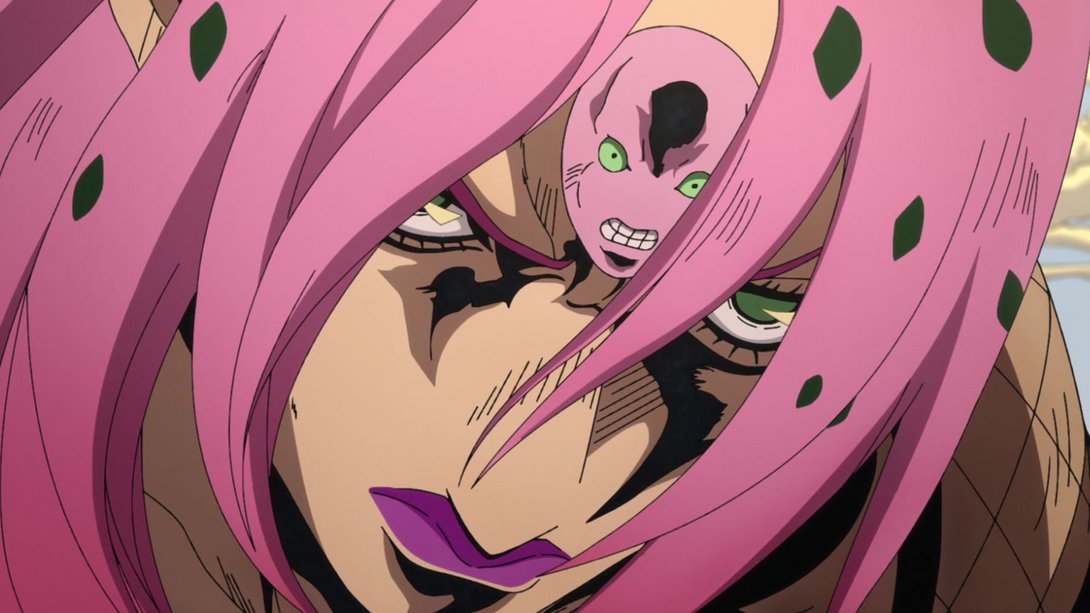
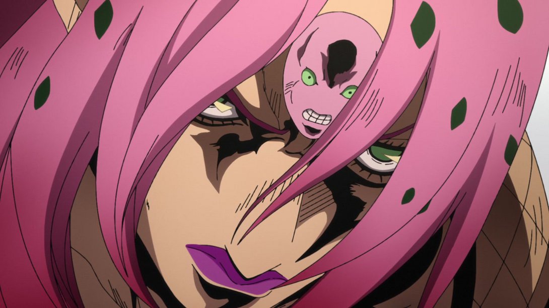
- Here, on top of the much better lighting and shading, the clouds in the background have been moved and are now blurrier, and there is a new vignette along the bottom of the frame:

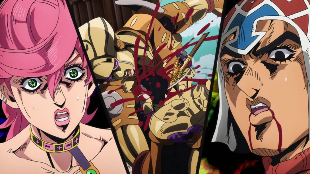
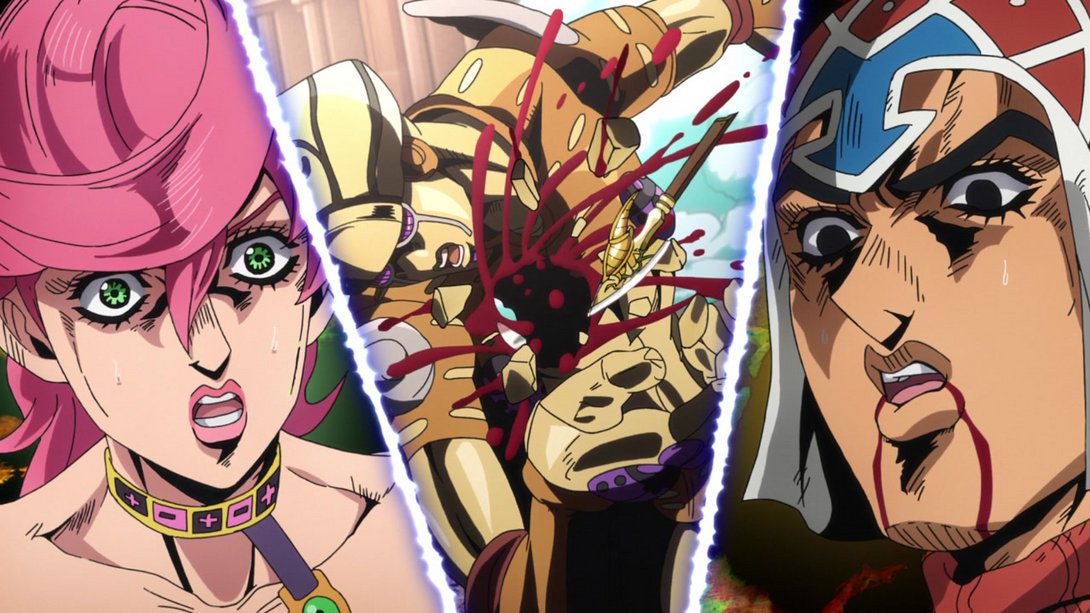
- On top of that, when Mista and Trish show up, their respective backgrounds are different! The dividing lines have also been redrawn, the shadows in both of their portraits are darker and one stray purple line on Trish’s face has been, for some mysterious reason, recoloured yellow. Check it out:
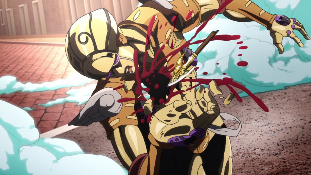
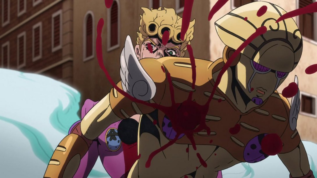
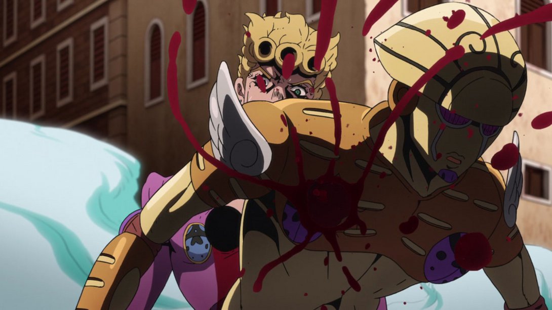
- Here, on top of the usual differences, there are many more blood specks spewing from Gold Experience’s wound when it staggers into frame:
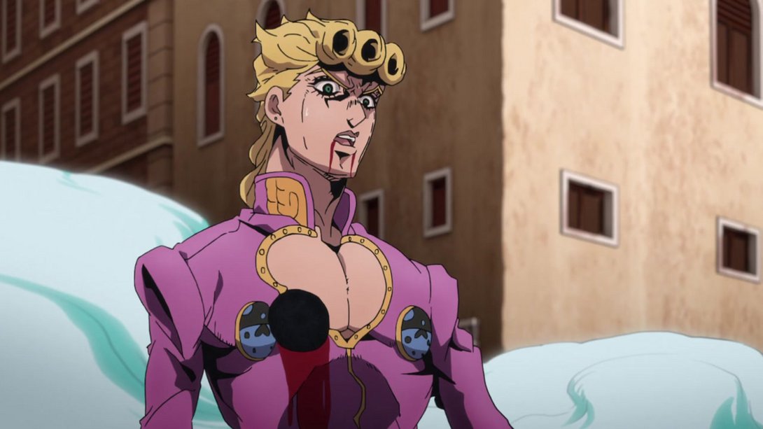
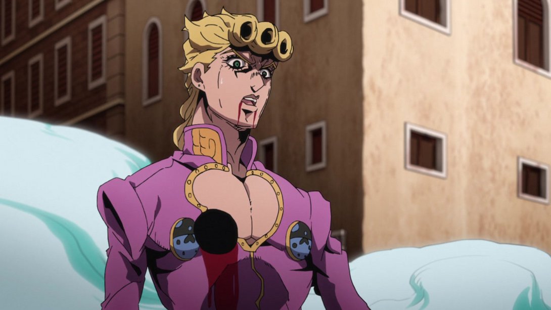
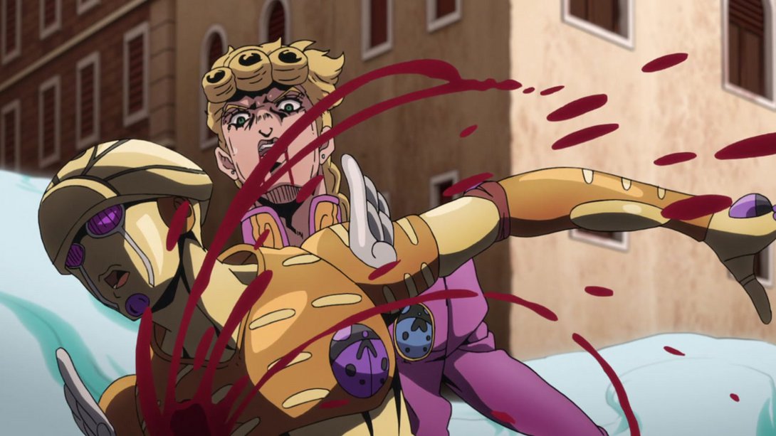
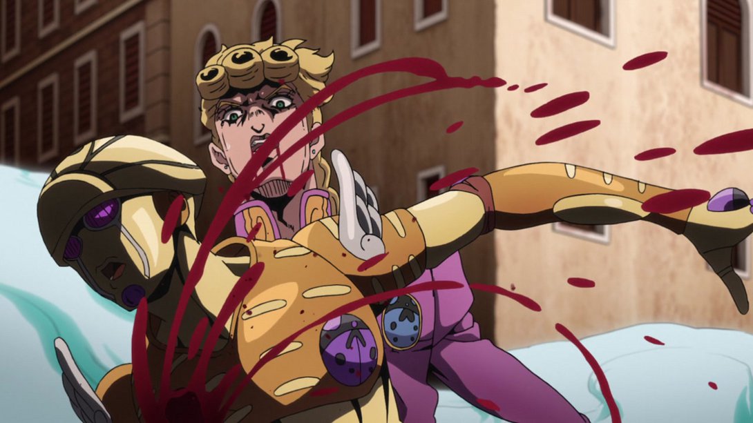
- The hole in Giorno’s chest was mistakenly coloured gray in a couple of frames of the TV version; this has been fixed:

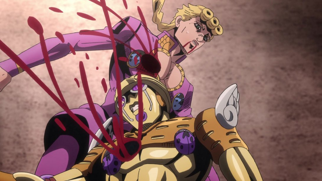
- This animation is not even nearly as blurry and, in addition, the background and most shadows are darker and some of the motion lines at the edges have been recoloured black:
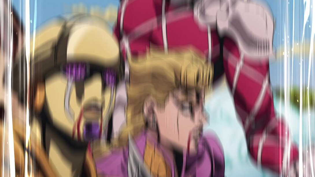
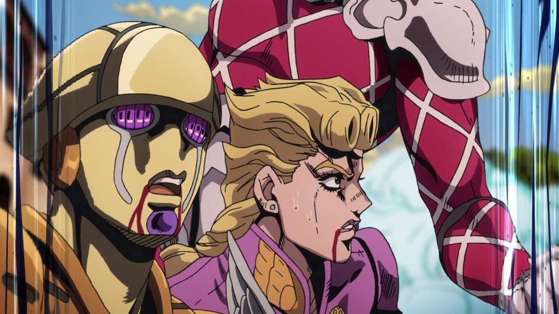
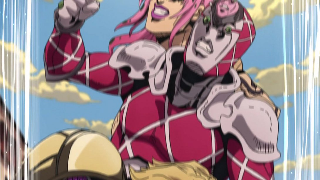
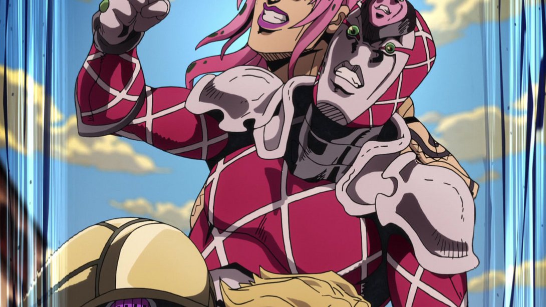
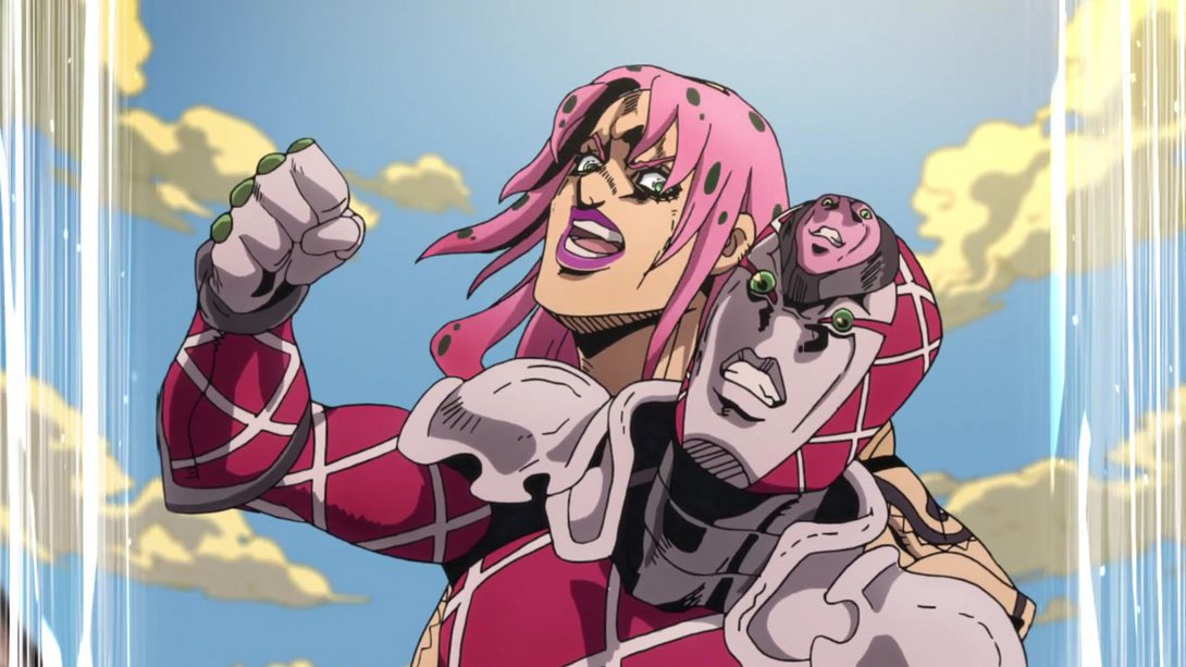
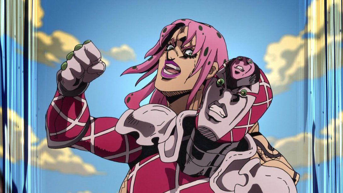
- Here we have a big serving of the usual, plus a dollop of distortion and a smattering of tasty blood droplets as garnish:
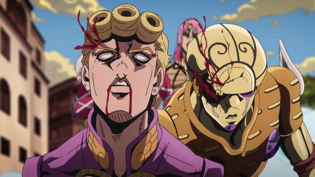

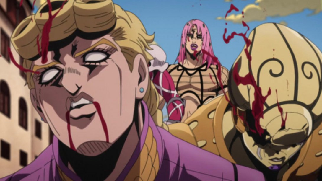
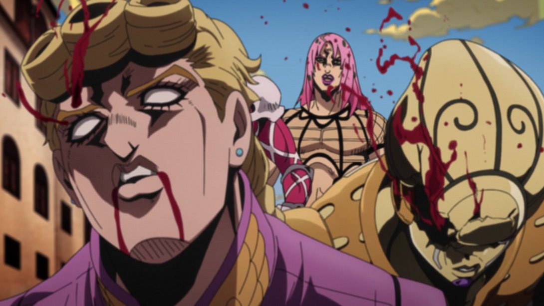
- Here, the sides of this frame are much blurrier and the central pupil-cross-thing has received some new, brighter highlights as well:
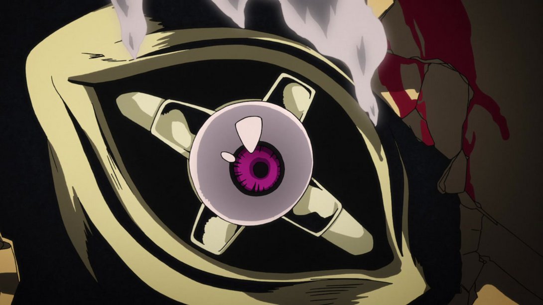
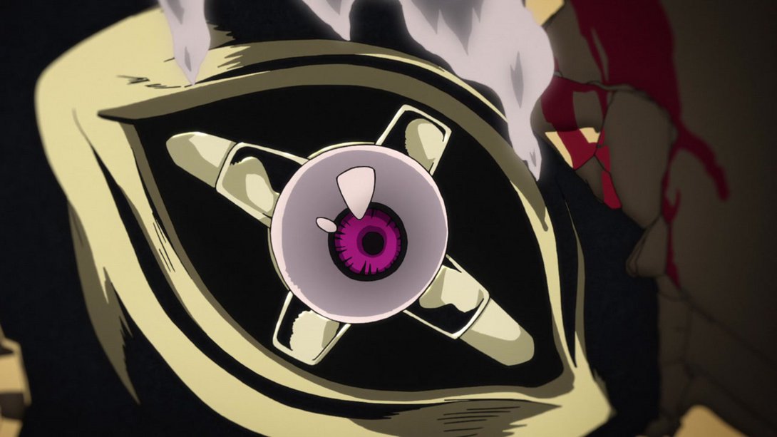
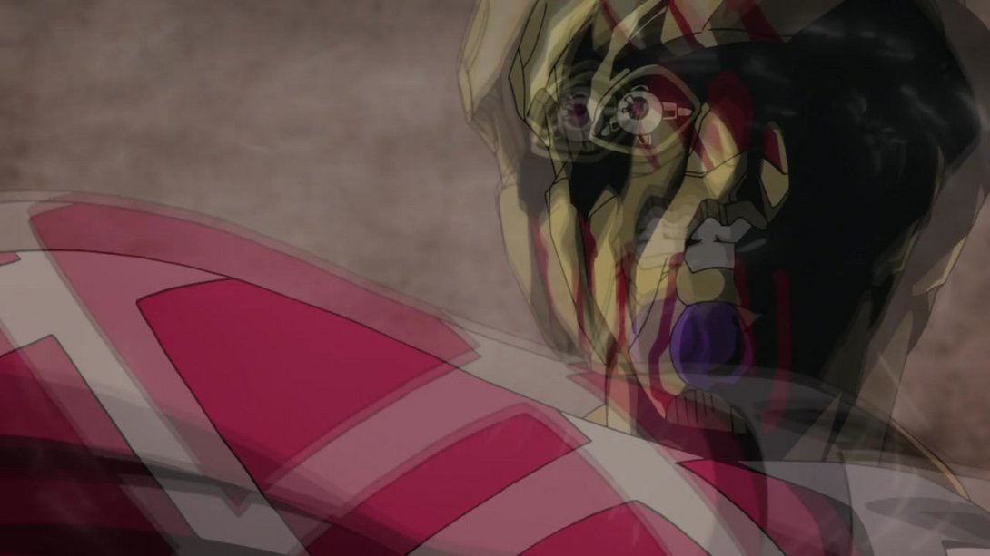
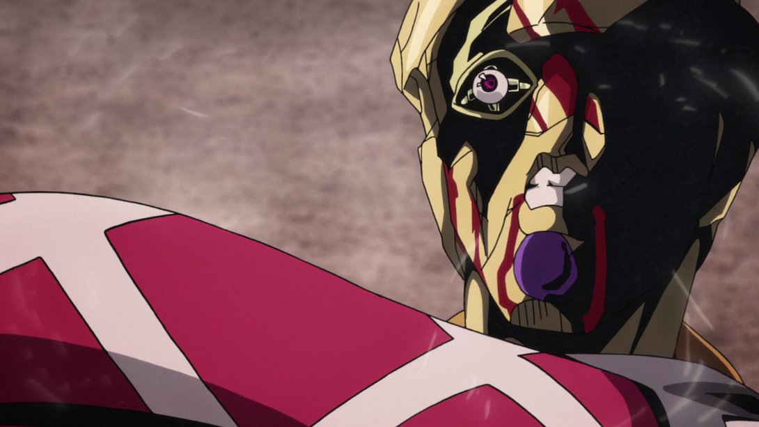
- It’s time to take a look at a couple of brighter and sharper animations, friends:
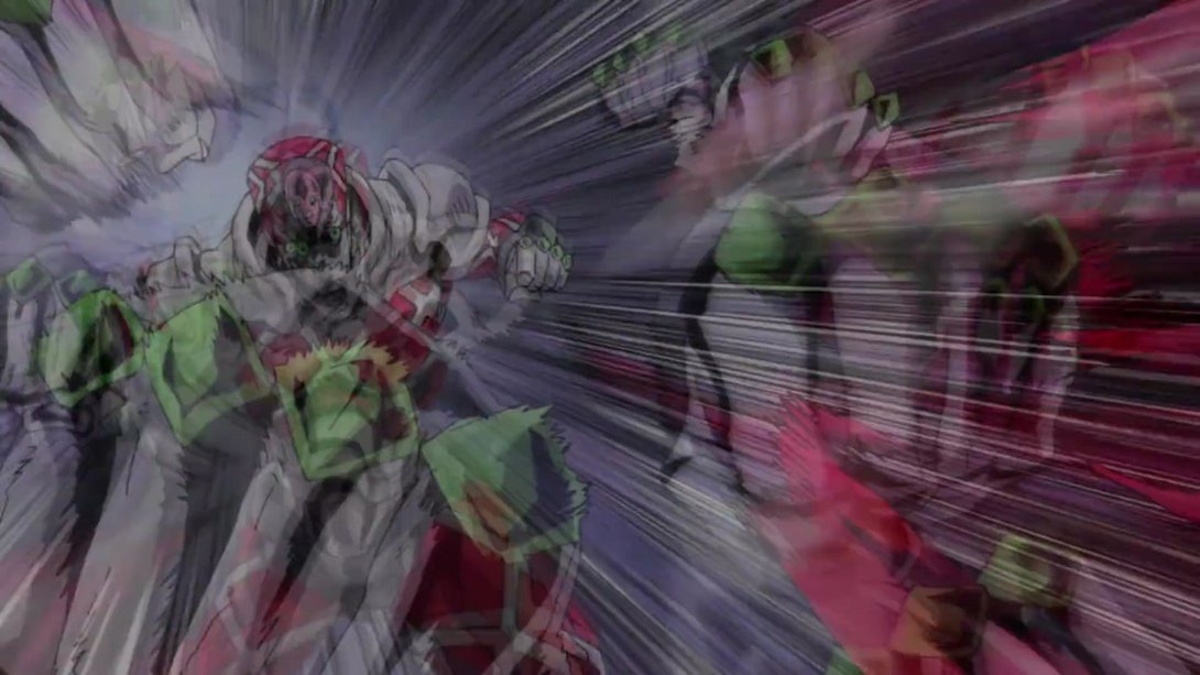
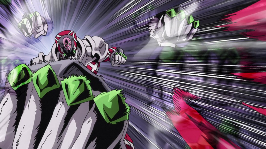
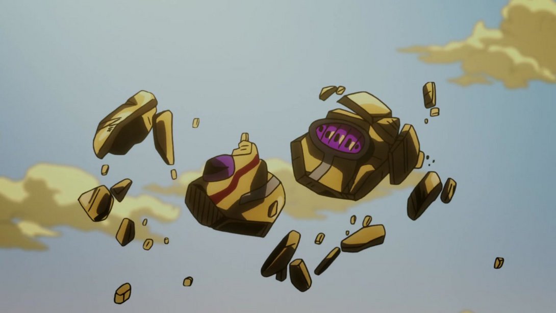
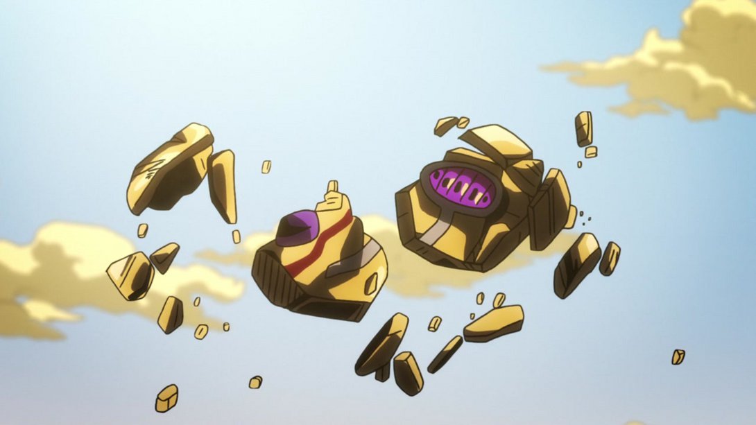
- And one which is, instead, just brighter:
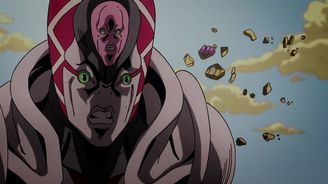
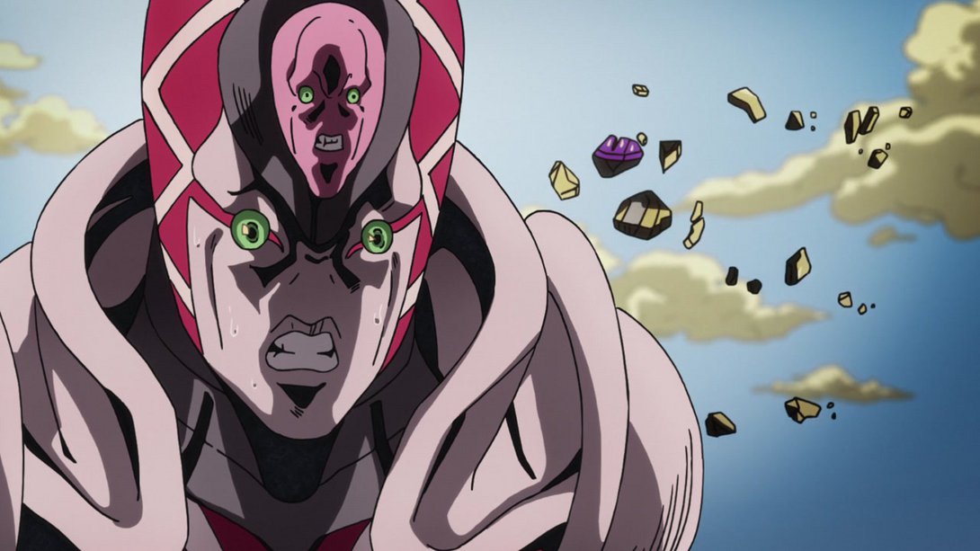
- Here, most elements of the background have been moved and most lines in the foreground are thicker:
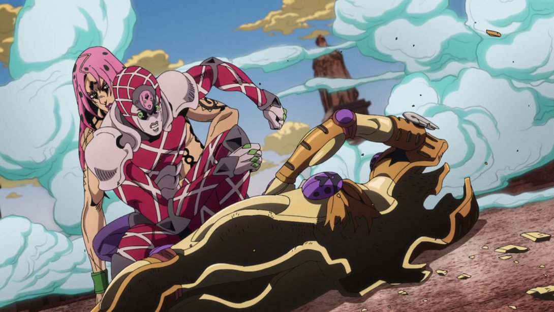
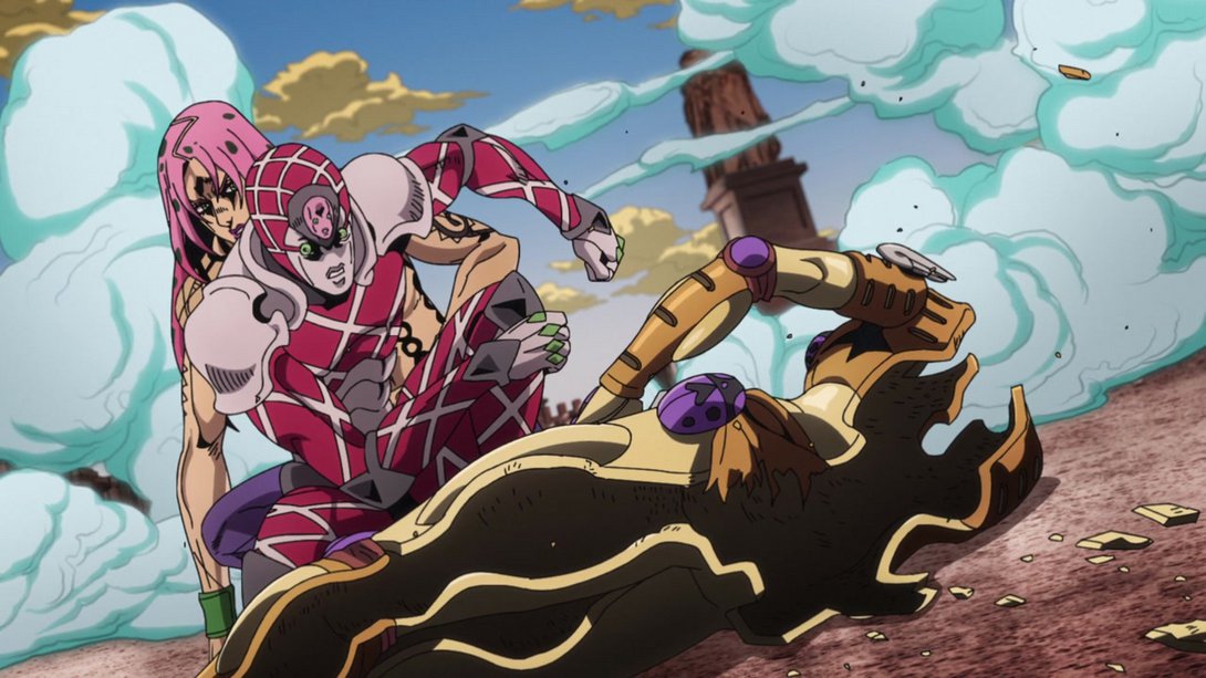
- In this scene, Giorno has been moved, there’s a new distortion along the edges, the shading on Diavolo’s head is slightly brighter and most of the scattered bits from Gold Experience’s “shell” are brighter and are now casting shadows:
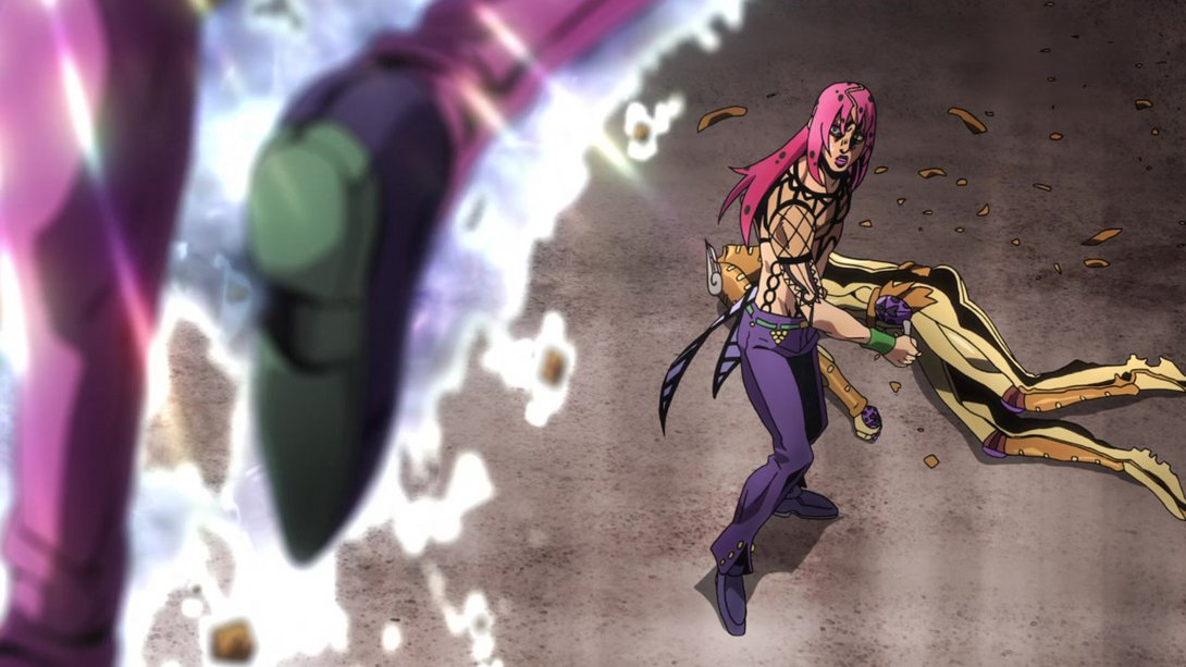
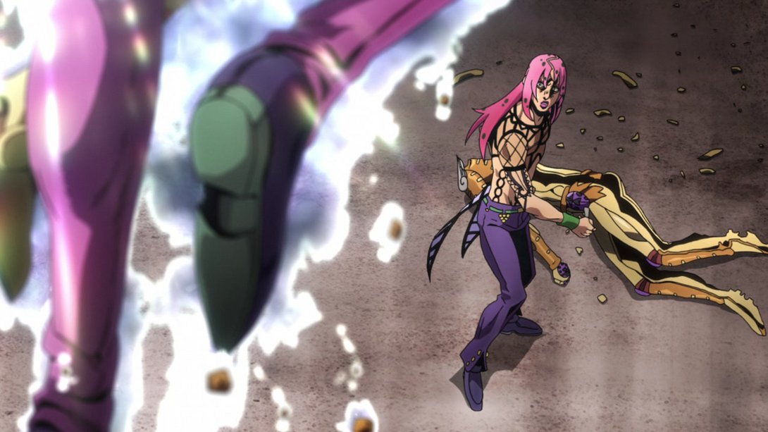
- This scene starts out with a different level of zoom on most elements…:
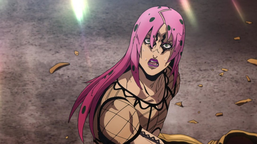
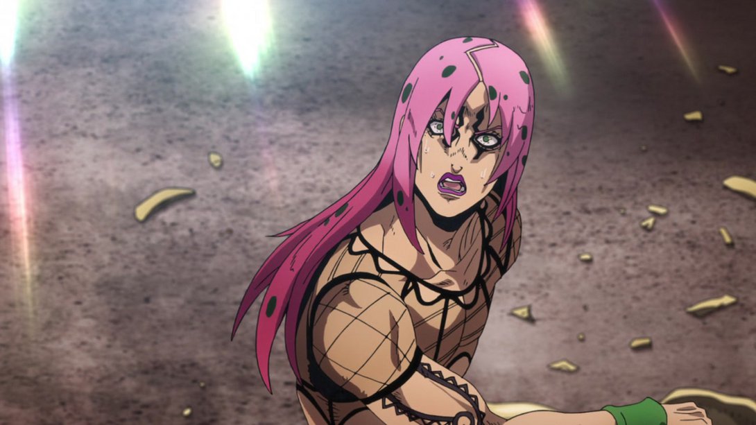
- …but, as time goes on, the two versions align pretty much perfectly! The only differences are a blurrier background, a different distortion along the edges and the aforementioned recoloured, now-casting-shadows bits from the old Gold Experience shell:
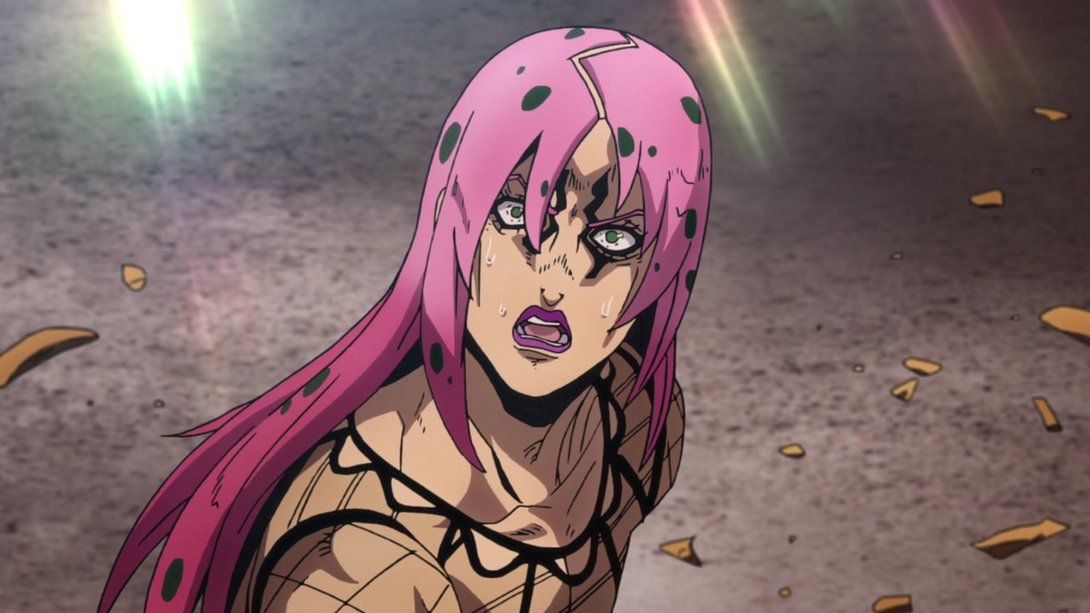
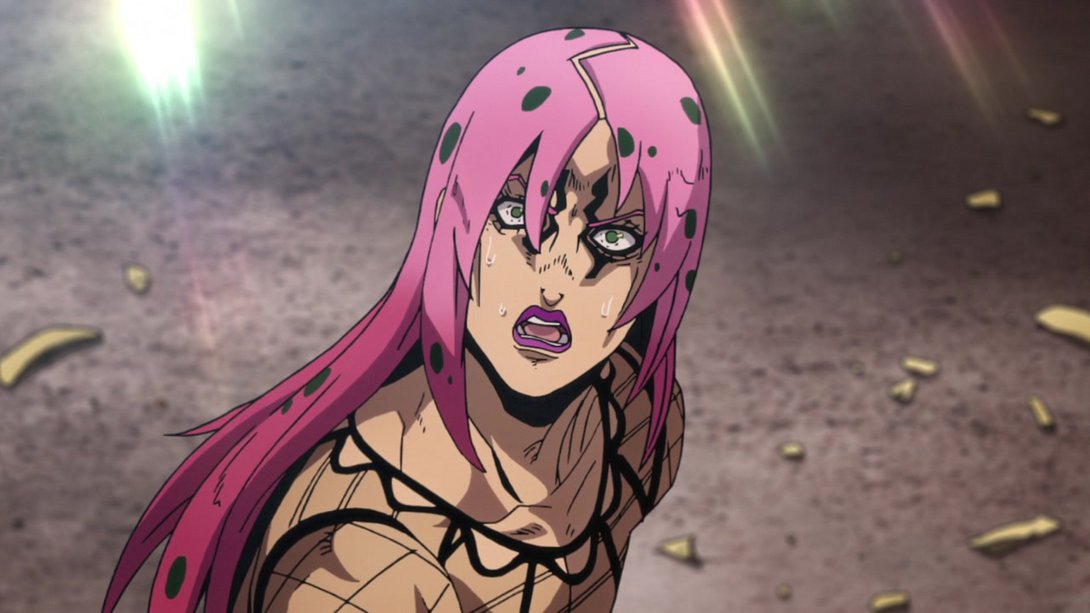
- Here, on top of some tweaked shading, we can see that the rock also has an aura…:
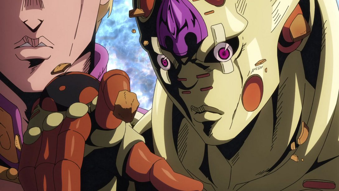
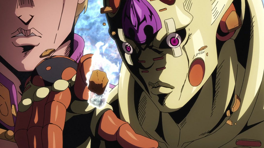
- …And, when King Crimson shows up, the dividing line is looking much better, most lines on him are thicker, the shading is also darker and the very tiny bit of background we can see in the top-right corner is a little brighter too:
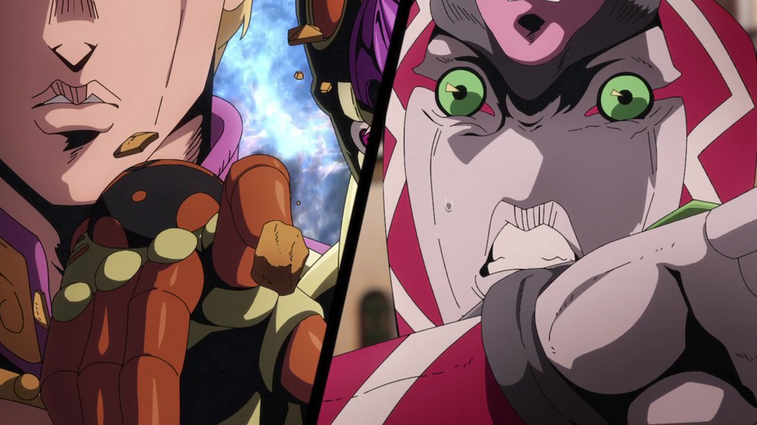
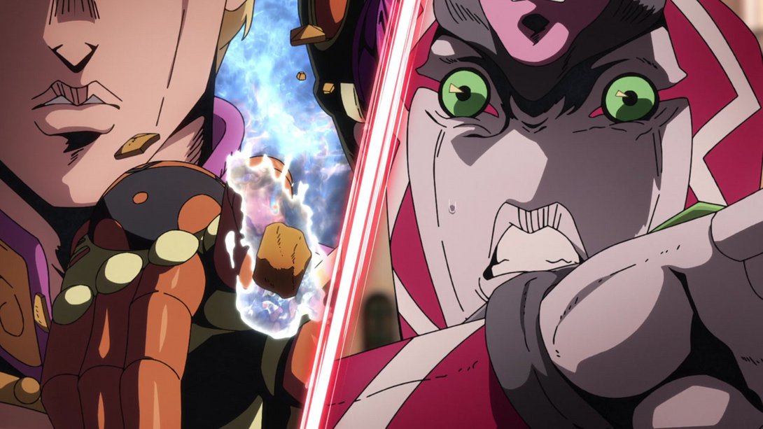
- Here we have another brighter and sharper animation, friends:
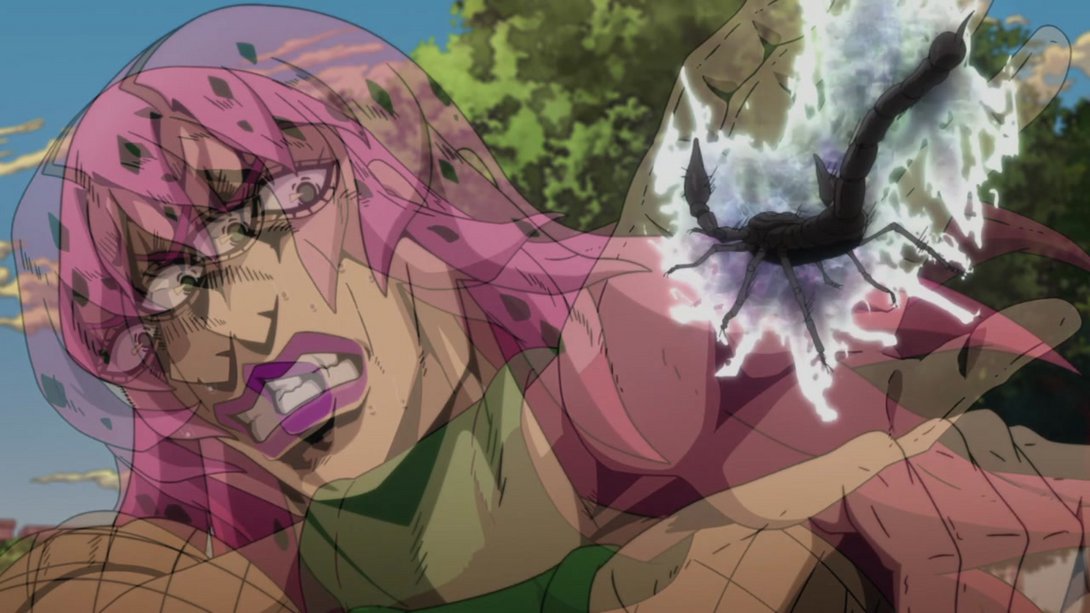
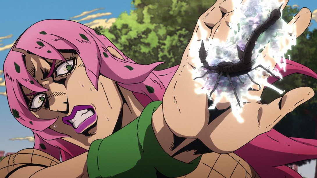
- Some of the lines on Giorno’s face are thicker, here…:

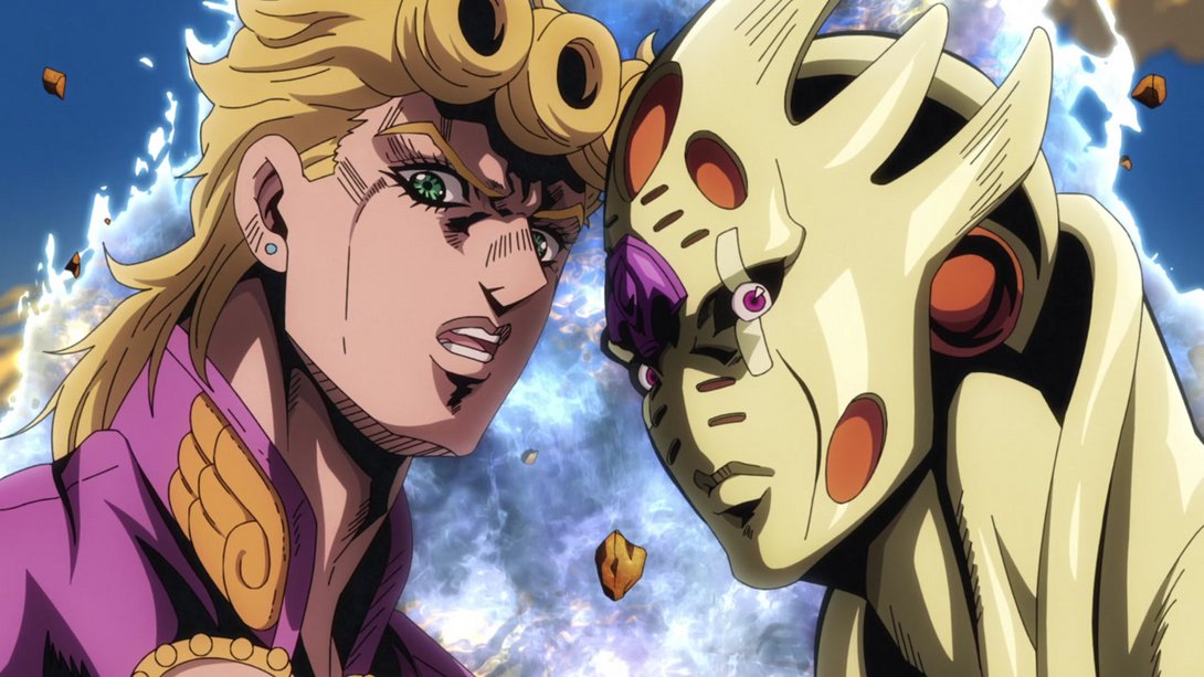
- This is a big one! So… in addition to the background being moved up significantly and being recoloured with slightly colder colours, Mista’s hat has been retouched (specifically the bits where the white lines cross), and Giorno, Gold Experience Requiem and Diavolo are all looking better as well:
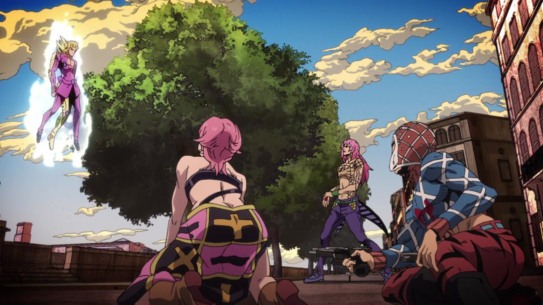
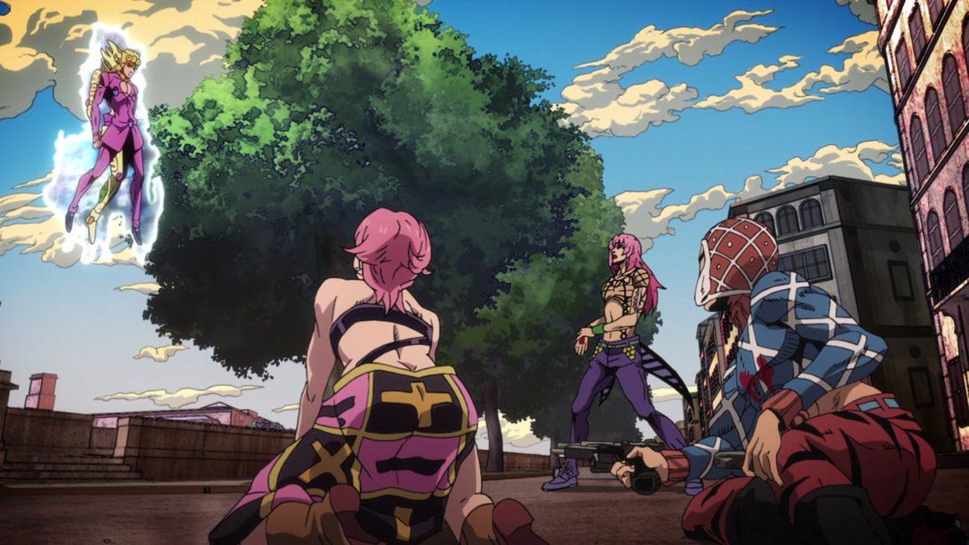
- Here, the top-left corner is blurrier, the shading on Diavolo is slightly brighter and most lines on him are thicker…:
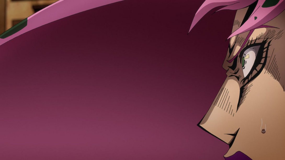
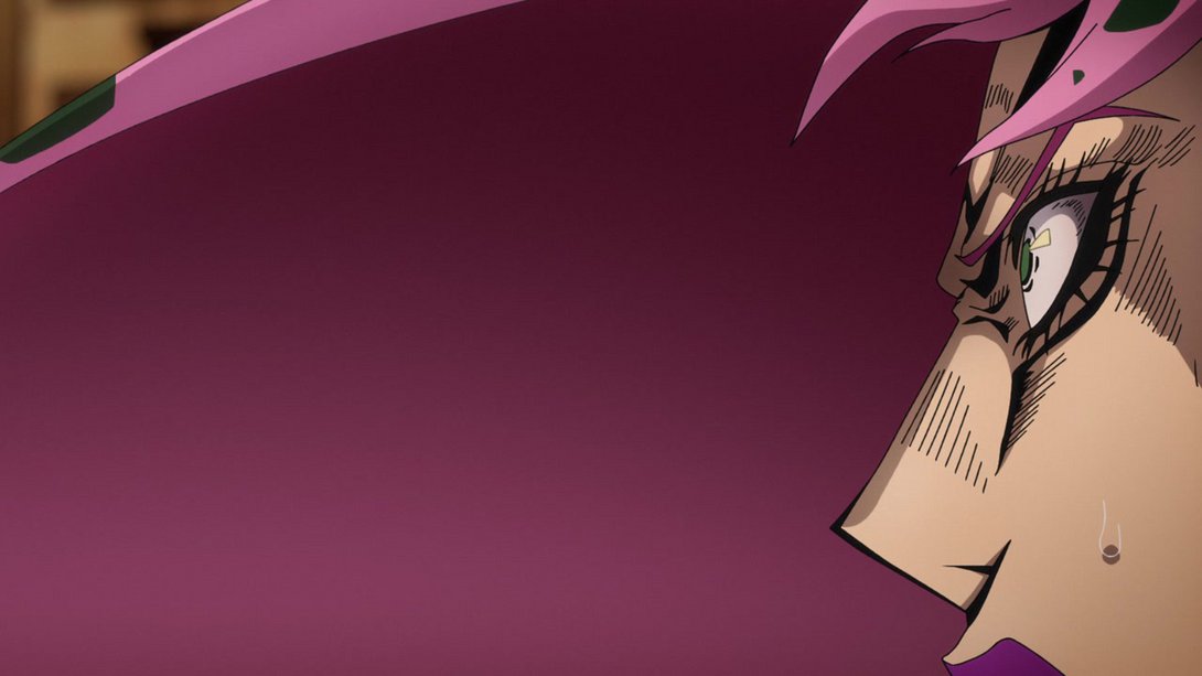
- And, on top of all that, the preview scene has been completely redrawn, and it animates too! AND NOT ONLY THAT… The scene is also reflected into Diavolo’s pupil! Neat, no?:
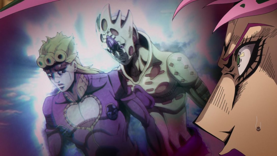
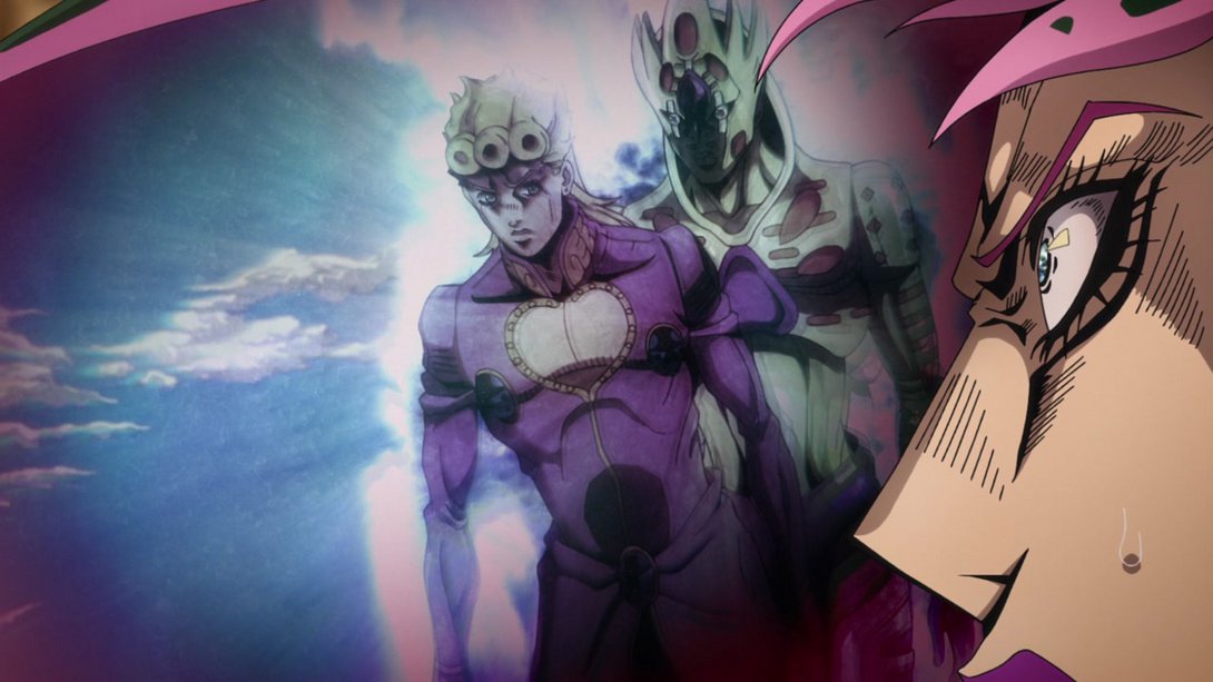
- Right on the tail of the previous difference, here we have the scene in question, now in full motion video™:
- This scene has less of a motion blur-like effect… I’m not sure how to explain it, but it no longer looks like a neon light seen through a curtain of fog:
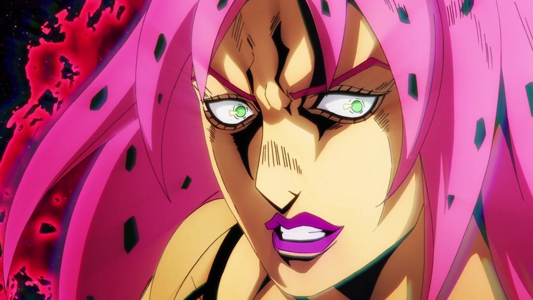
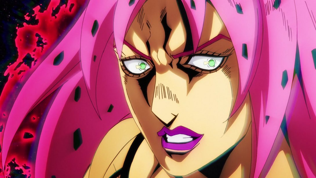
- And again here! In addition, the background in Epitaph’s preview is much brighter, and there are way more blood specks flying about:
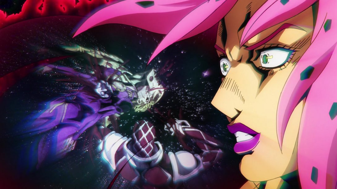
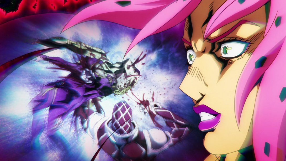
- The background continues to be much brighter here as well:
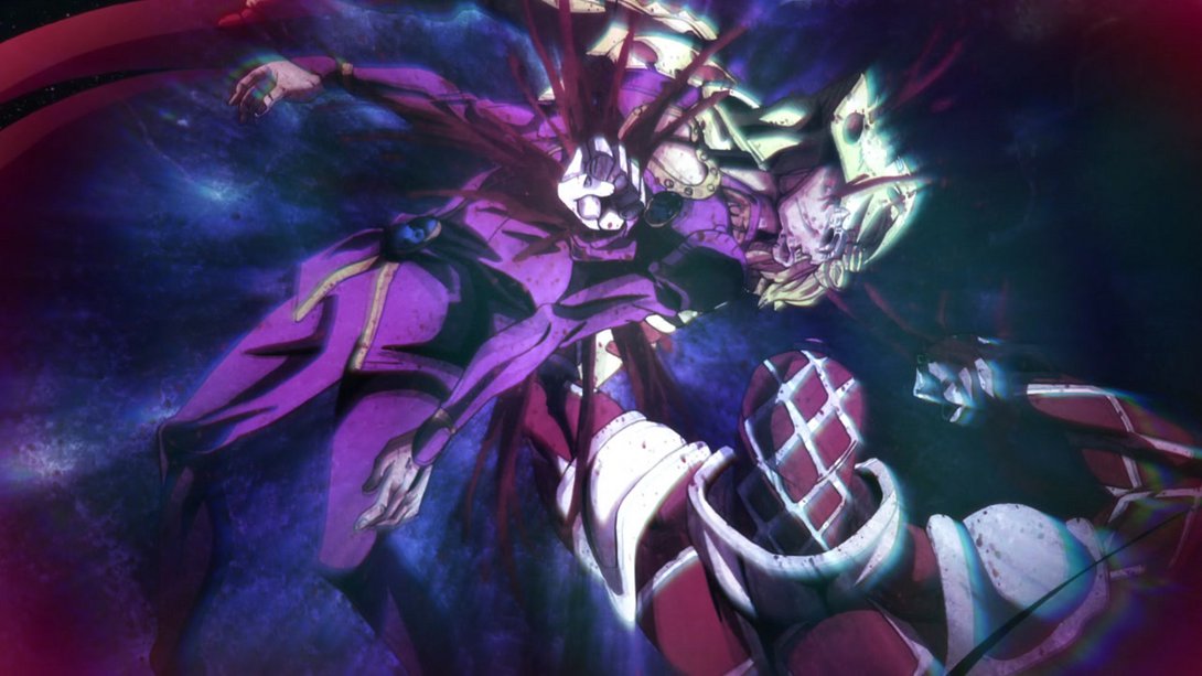
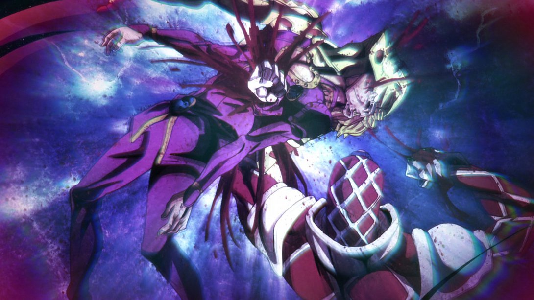
- This scene has a new glitchy/scratchy texture overlay:
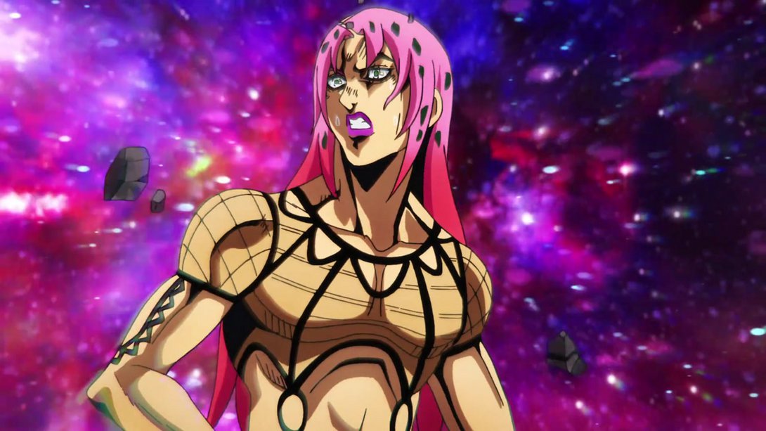
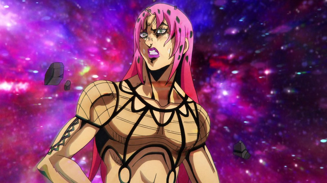
- Here, the background looks more like one of those trippy star time-lapse videos you’ve seen so often; there’s a different distortion, the overlay effect is a little different…:
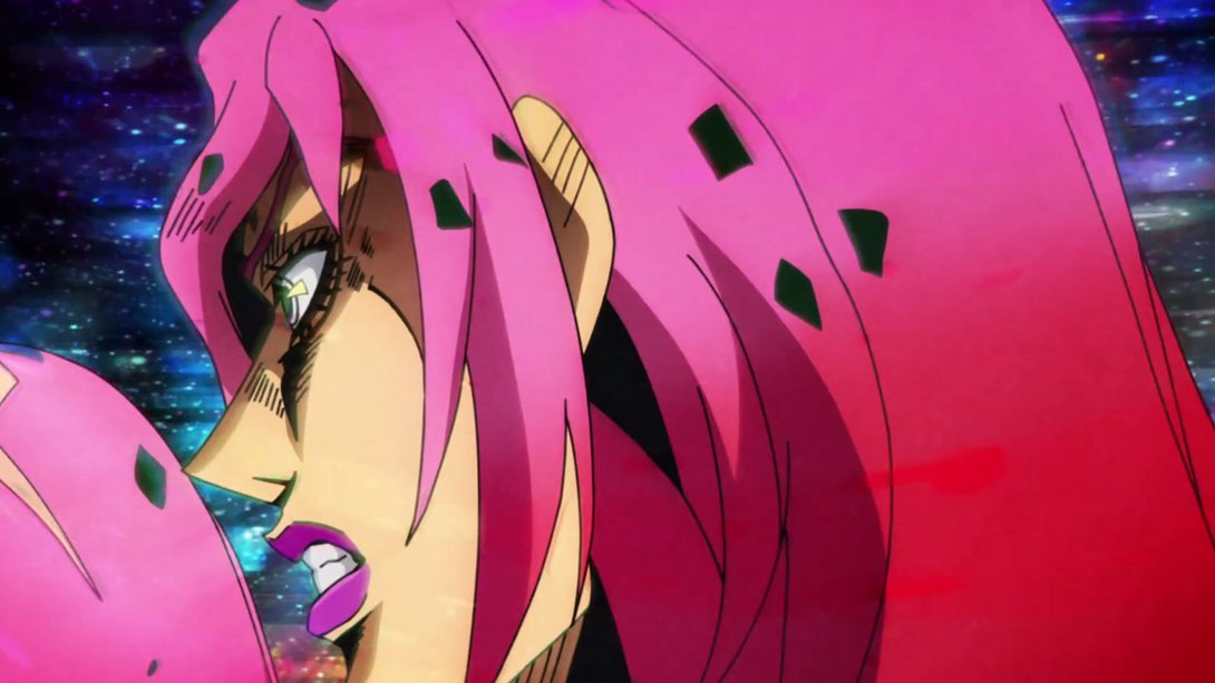
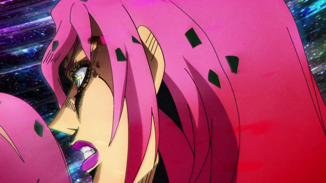
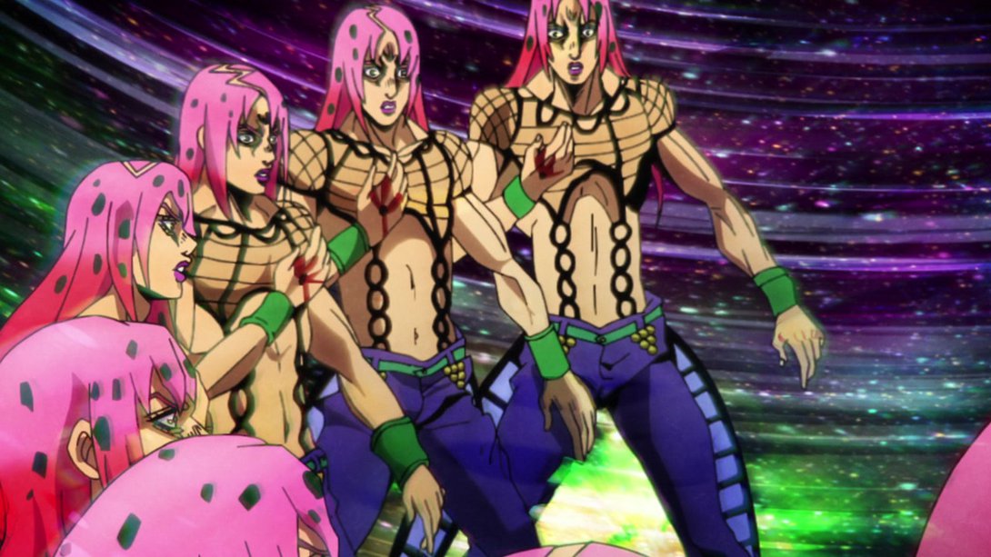
- The shading on some of the subsequent Diavolos is also a little different…:
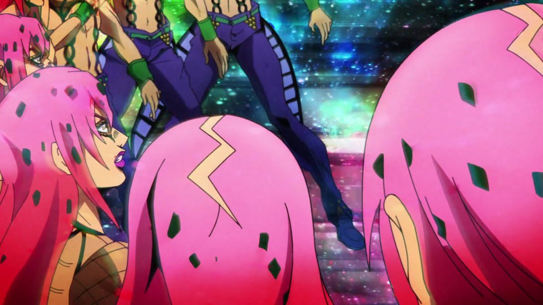
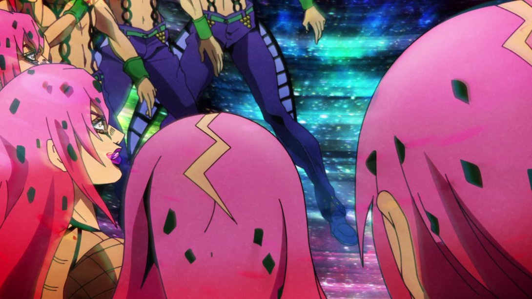
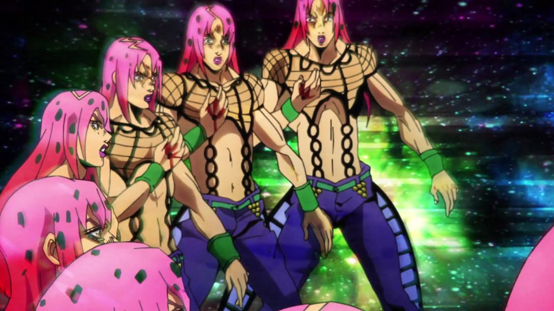
- …and most of the other Diavolos have also been retouched:
- Here, GER’s aura is looking slightly different and GER himself is MUCH, MUCH BETTER! Giorno has also received a bunch of new shadows, so check it out:
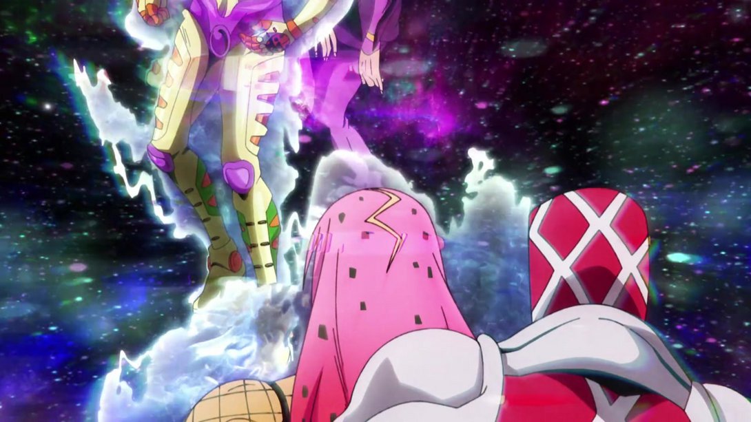
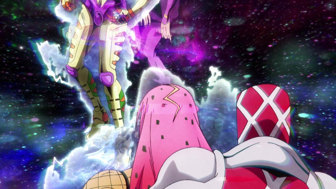
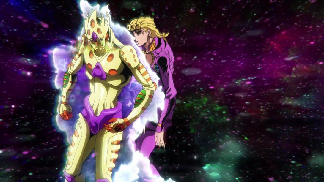
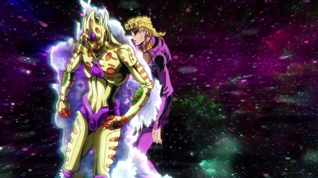
- Fantastic stuff! GER is moving alongside Giorno once again, here …:
- And here… Here is the magnum opus, the main dish, the pièce de résistance for this comparison! Feast your eyes on this… this thing, friends! I honestly cannot believe I didn’t even notice it when I watched the episode, considering it stays on screen for approximately four seconds:
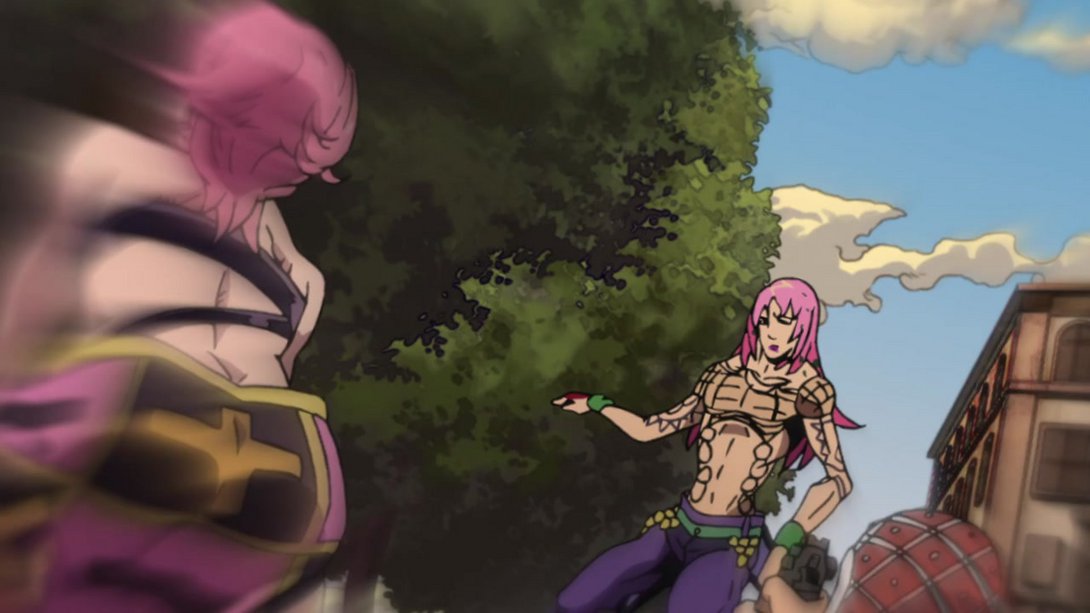
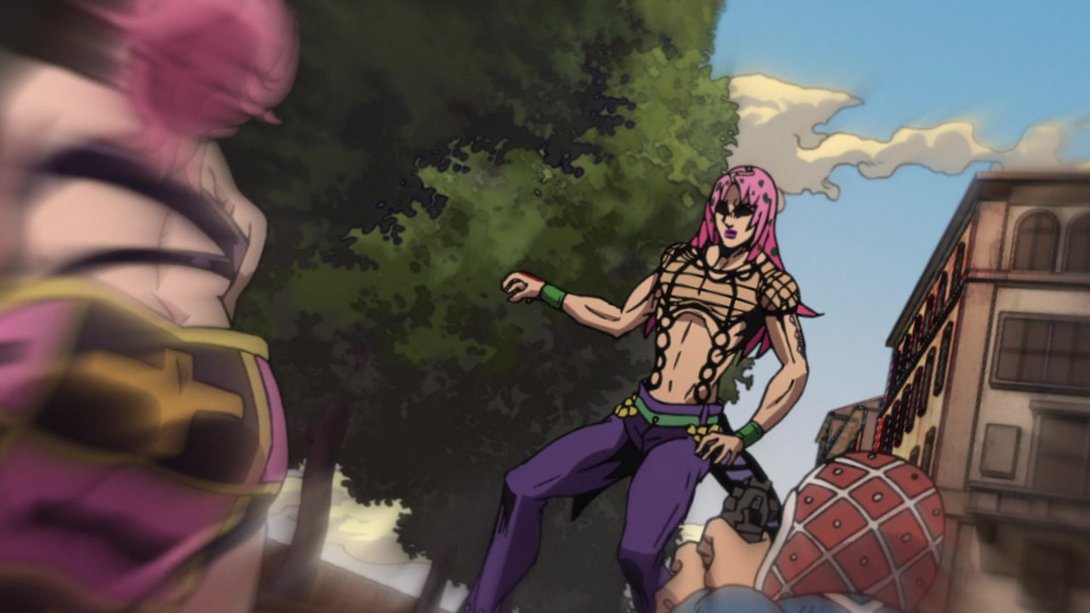
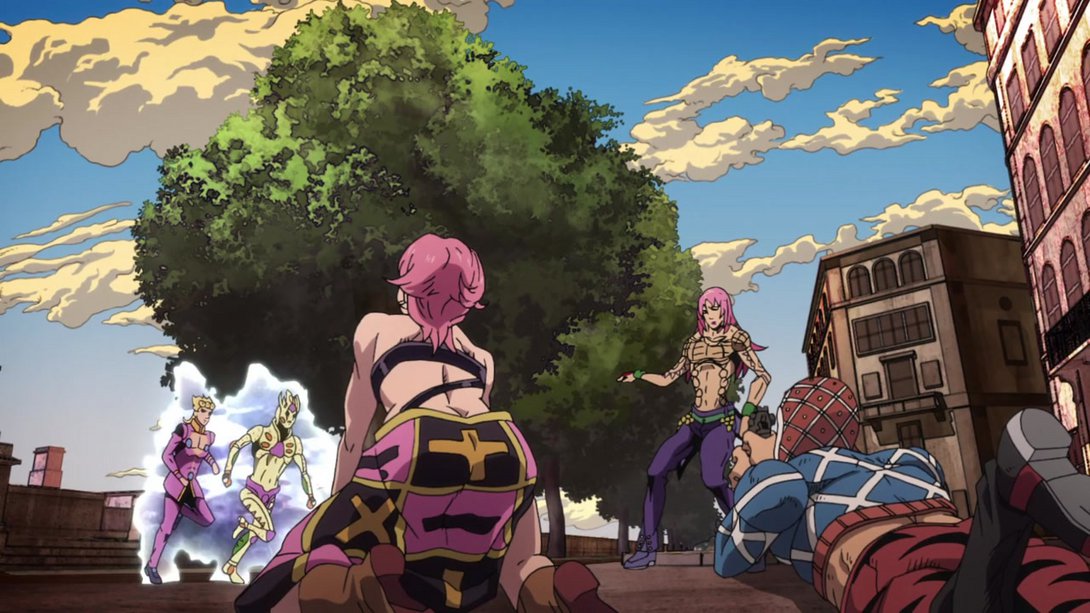
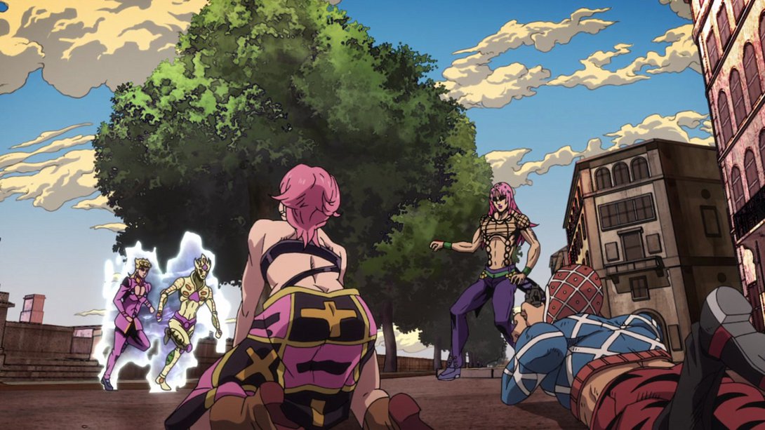
- Whew! Fantastic stuff. Moving on… GER has been massively retouched here as well, and Giorno has also been tweaked here and there:
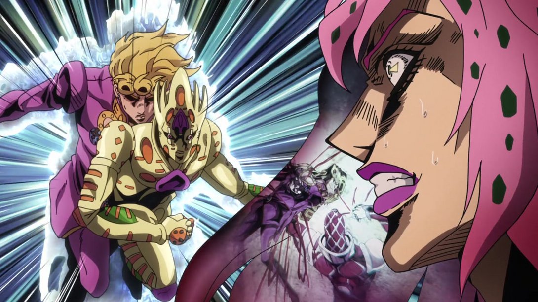
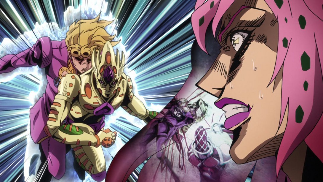
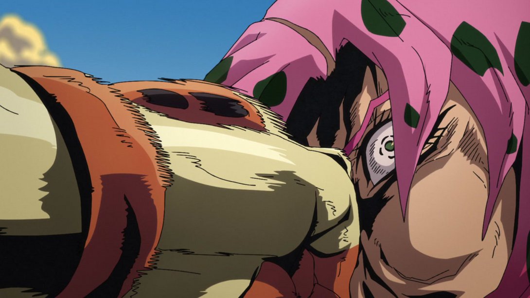
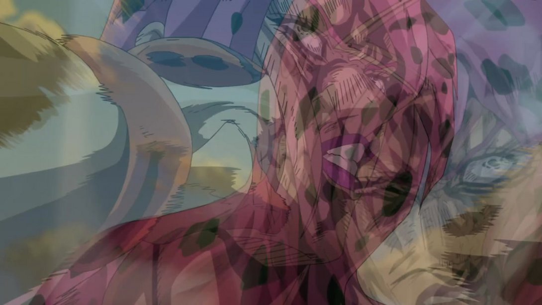
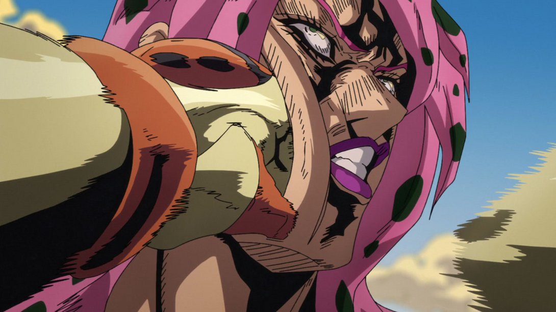
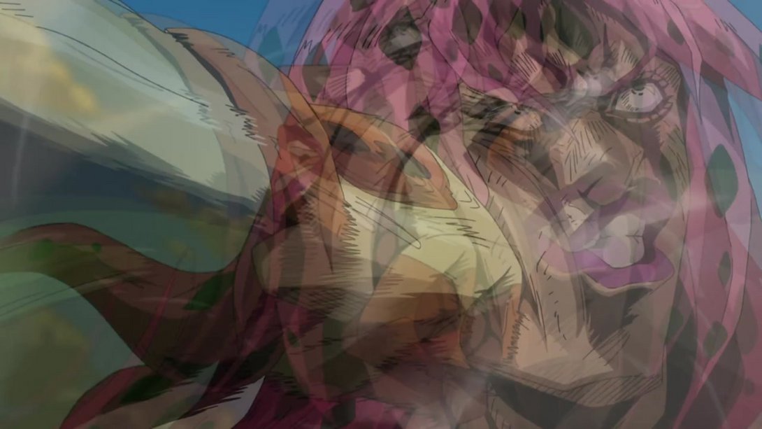
- Let’s have one last, satisfying brighter and sharper beatdown for the road, amigos! Plus a collection of very juicy frames:
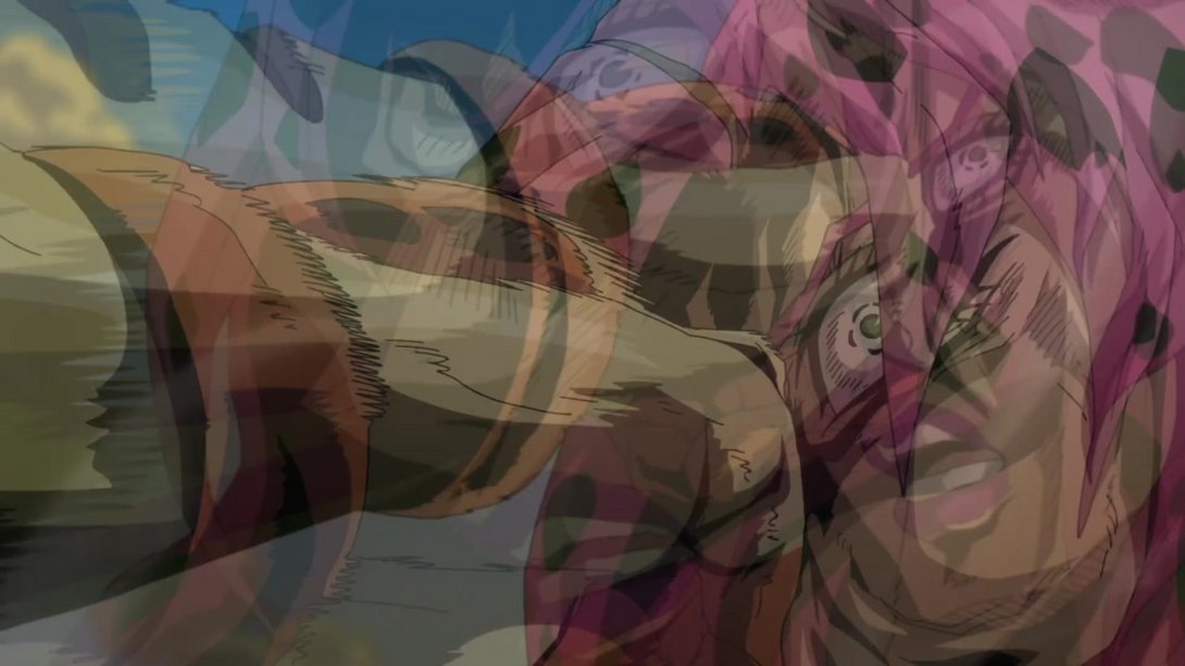
And that concludes it for this week, dear readers! Another long list of (mostly) small tweaks that end up making this extremely solid episode even better, in my opinion. We’re almost at the end of this road… Only two episodes to go! Well, there’s no way but up, is there? And up we shall continue next week, with another in-depth look at Vento Aureo #38, “Gold Experience Requiem”!
Ciao!

