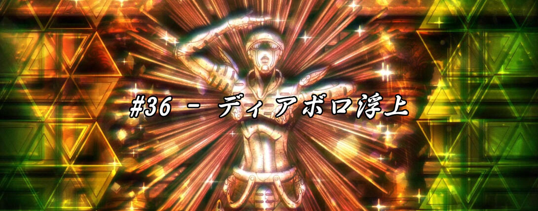
Good morning/afternoon/whatever else time you’re living in, people! Welcome back, welcome back. I hope you’ve been spending some quality holidays, and if you’re stuck working - you have my sympathies. Be strong, and we’ll get through this! Today we’ll be taking a look at Vento Aureo #36, “Diavolo Emerges”! We’re fully into the final stretch now, and the improvements keep coming…
So let’s dive in!
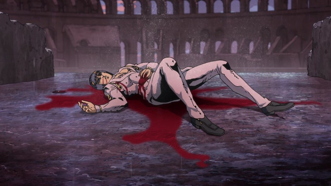
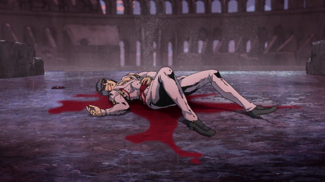
- Today’s first difference is this shot of Buccellati/Doppio dying in the Colosseum. Almost everything has been moved around or scaled/stretched! Check it out:
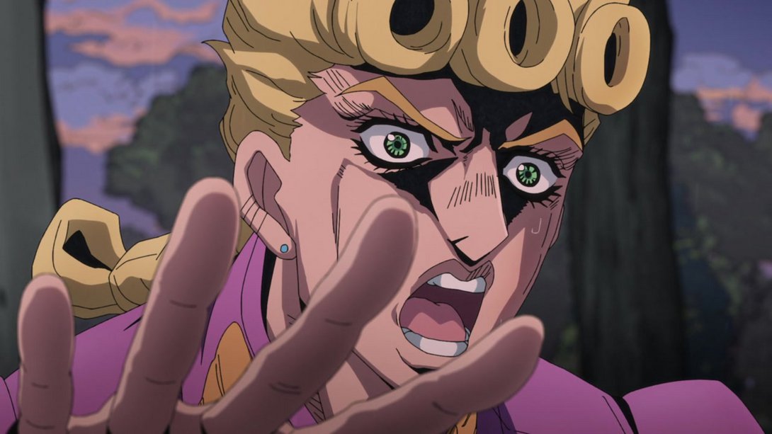
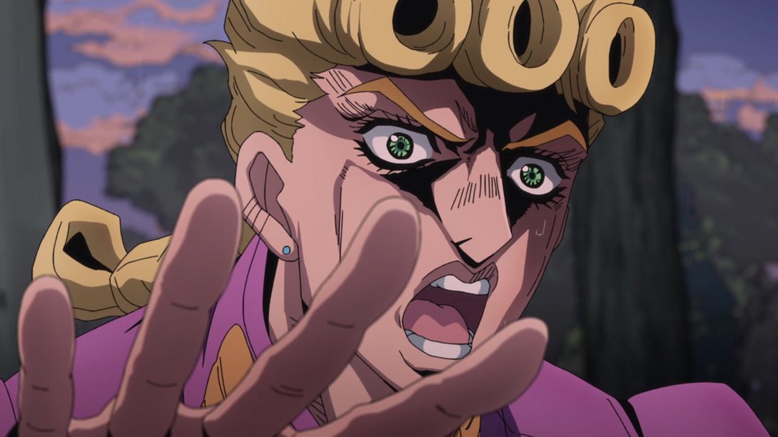
- The shading on Giorno has been improved somewhat, here:
- The pan up camera motion in this scene is different, and doesn’t go as high up:
- This brief shot is now brighter:
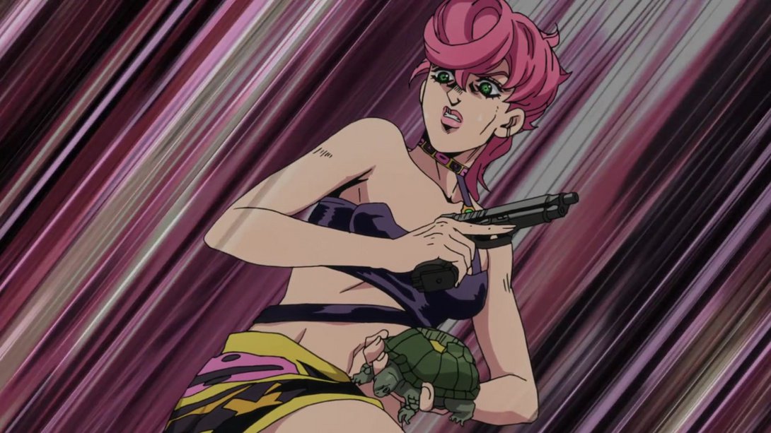
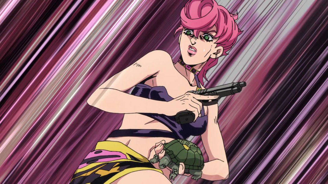
- A bunch of animations throughout the episode had a weird shadow in the corners, in addition to being duller and blurrier, as usual; thankfully this has been fixed in our beloved BDs. The difference is enormous:
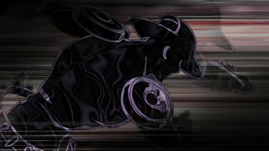
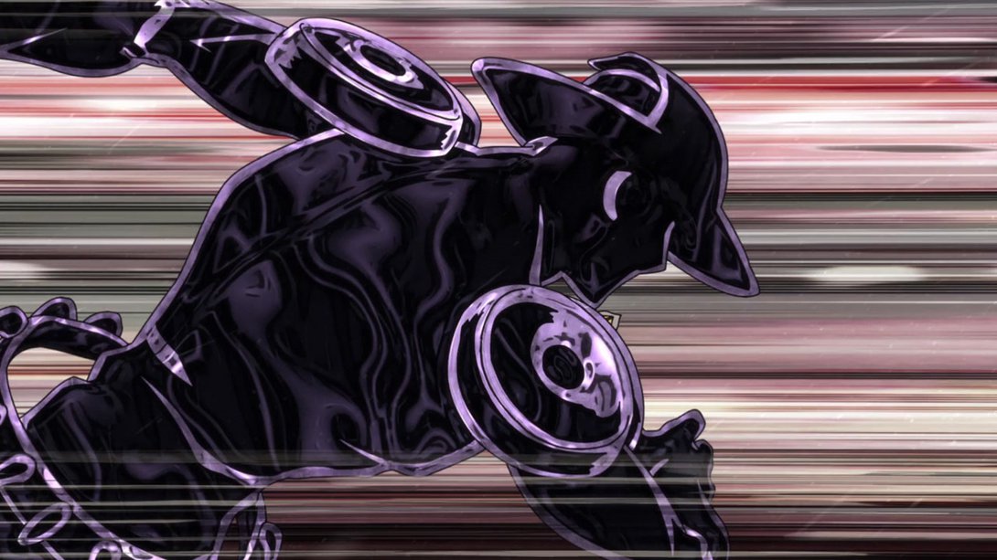
- A very very brief punching animation is much brighter and sharper, here! Too brief to show in an actual video, so have a couple of snaps instead:
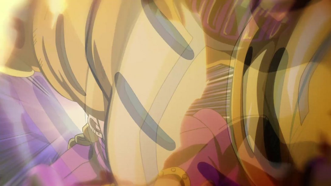
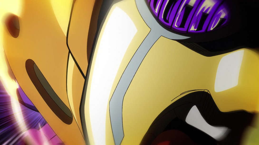
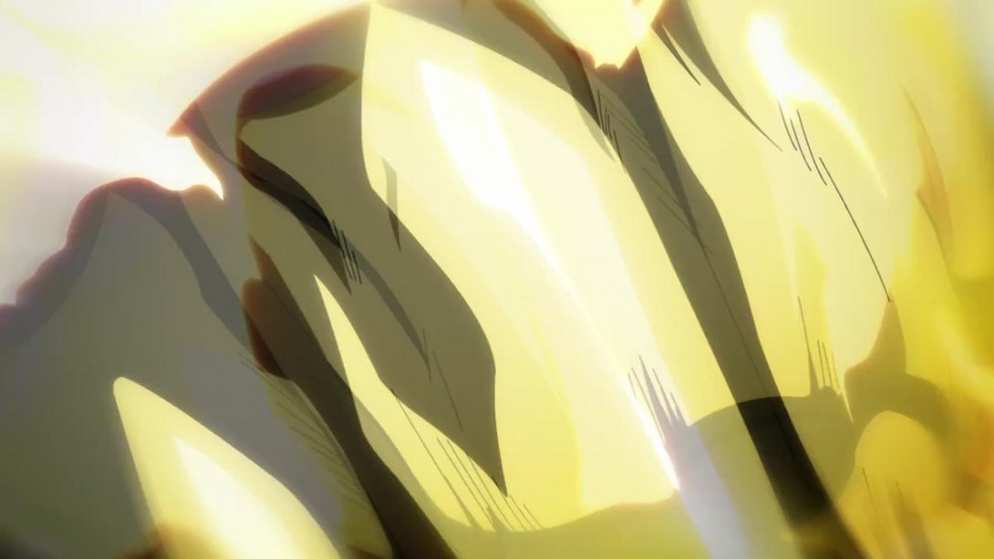
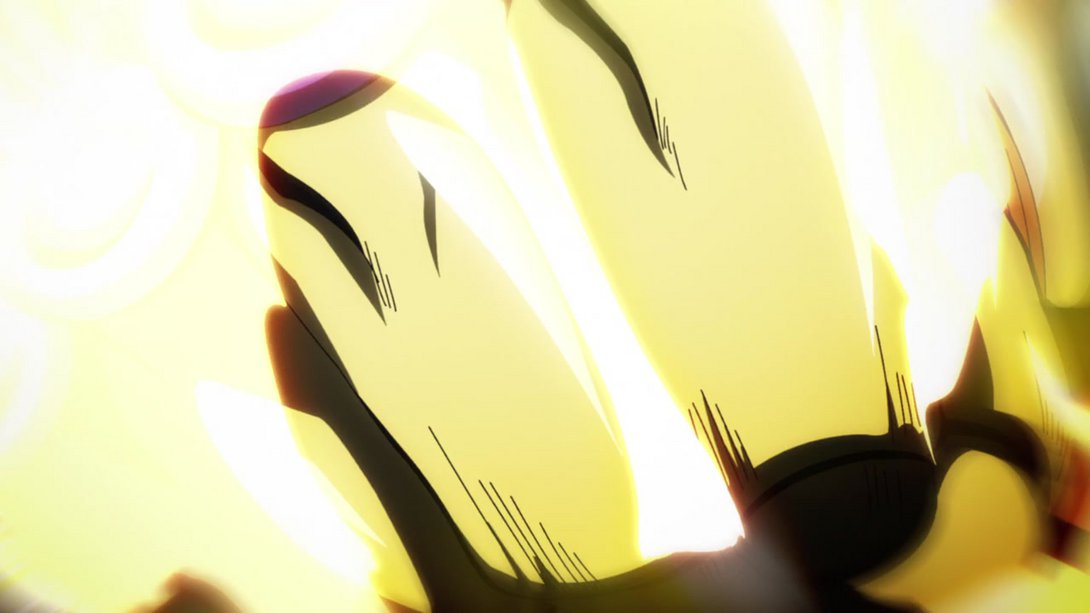
- Here we have another spot-the-difference kind of comparison! Take a long, hard look, friends, because there are a few different things going on:
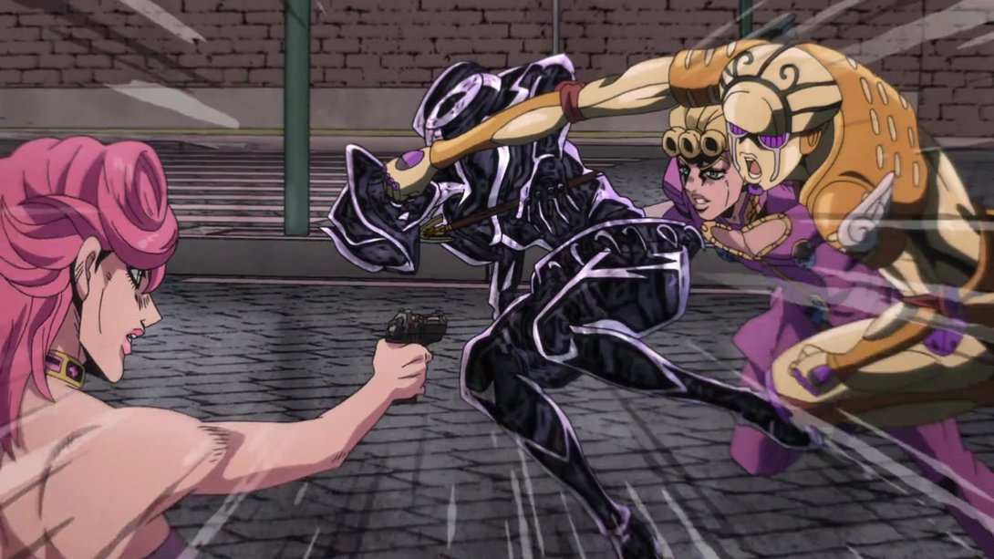
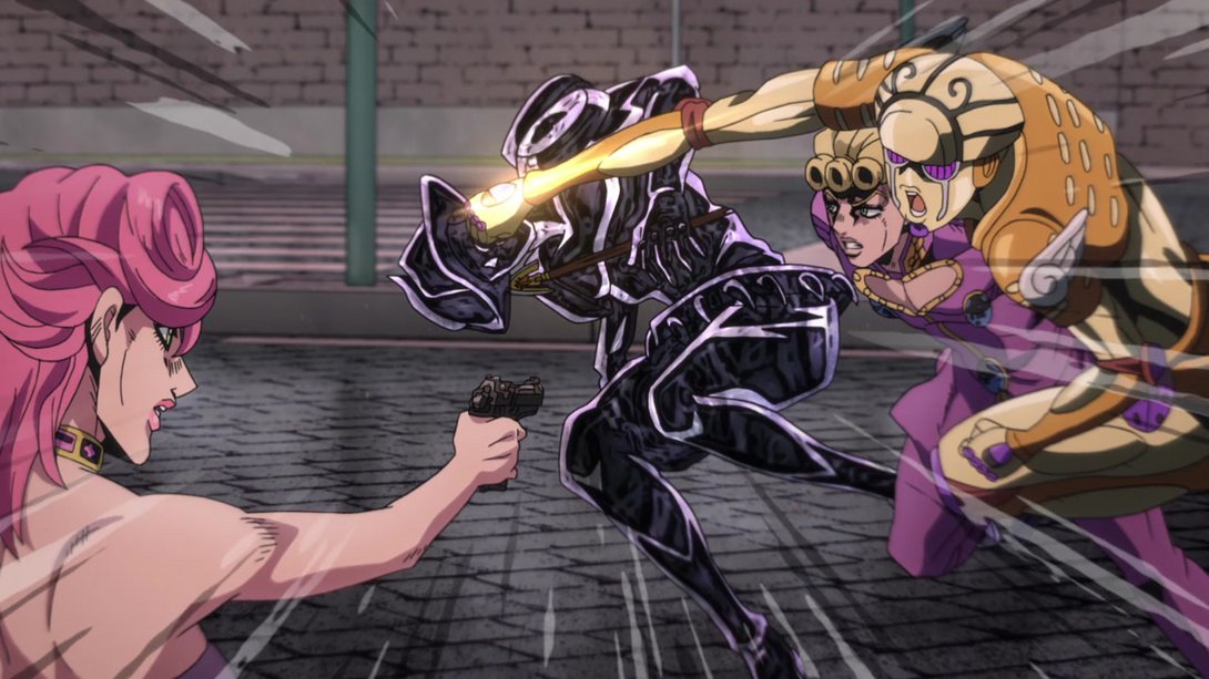
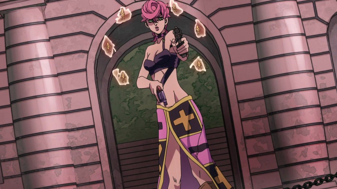
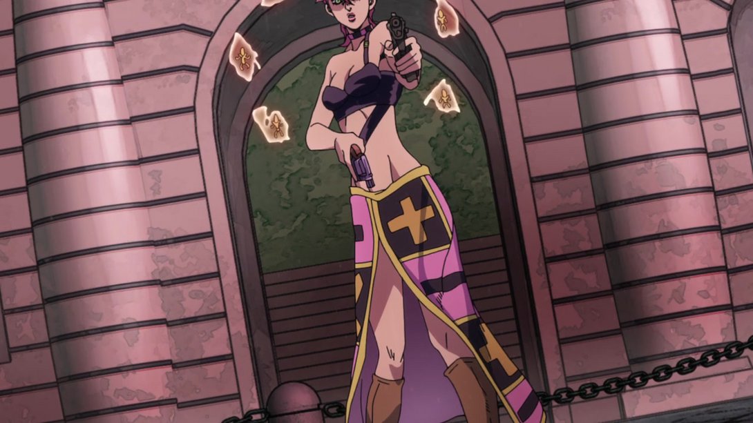
- In addition, when Trish shoots her gun, the muzzle flash is bigger and warmer and, like the famous Mista + Giorno shooting sequence in VA #30, most of the scene gets darker…:
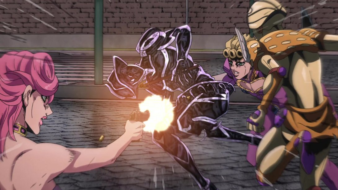
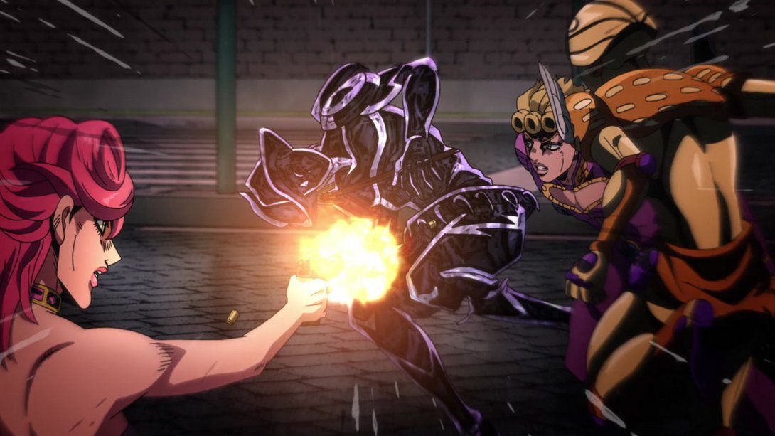
- …the sparks generated by the gun are sharper too…:
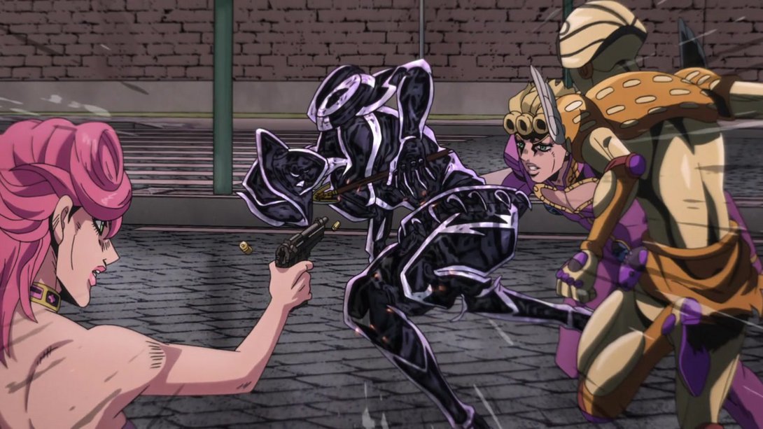
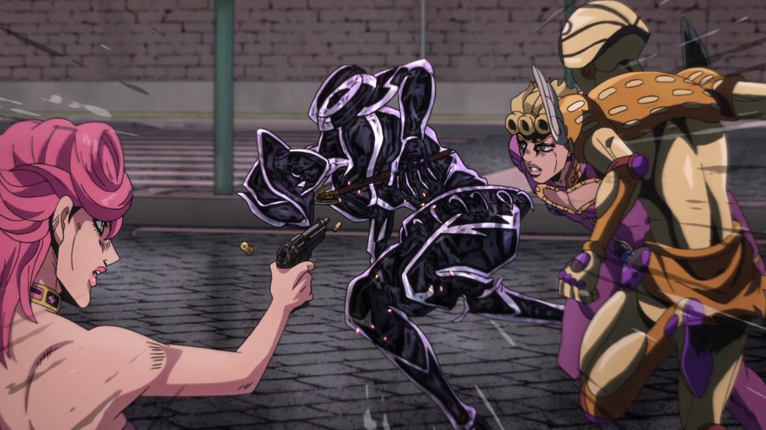
- …and, to conclude this particular sequence, Silver Chariot Requiem no longer moves his legs at the end of the scene (which did look a little weird, honestly):
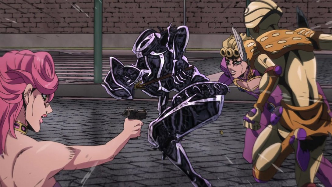
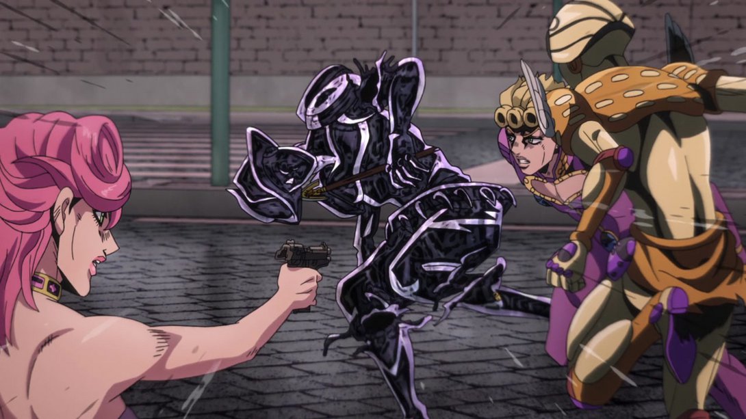
- Let’s take a look at everything in a neat little video, shall we?
- HE YELL:
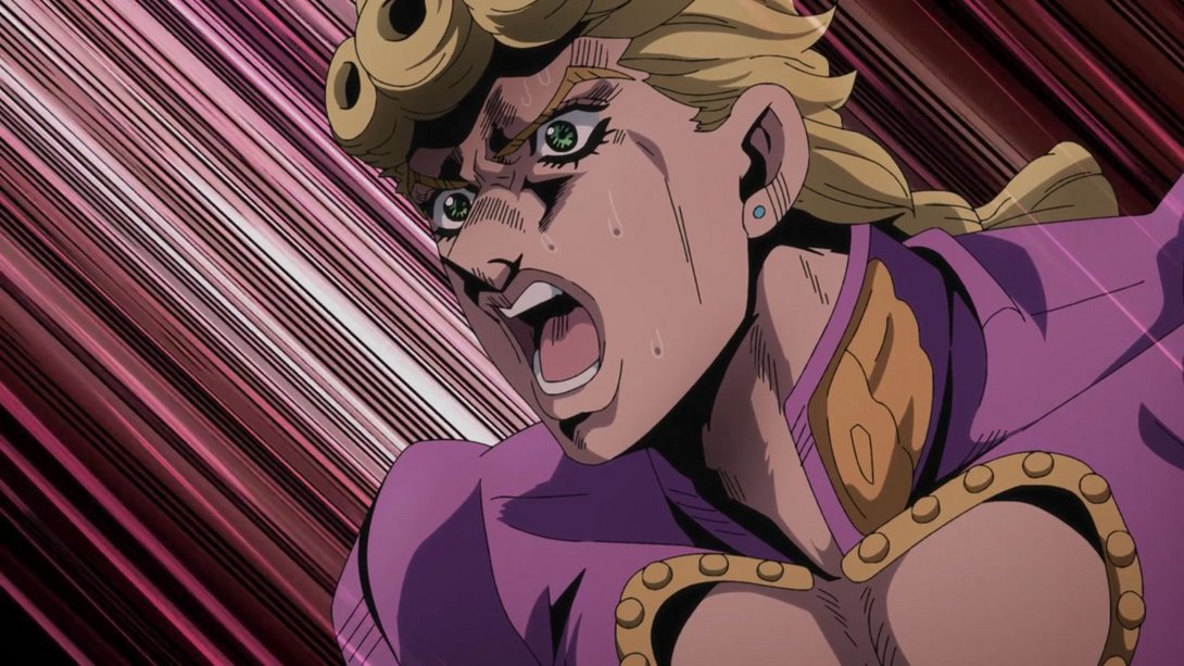
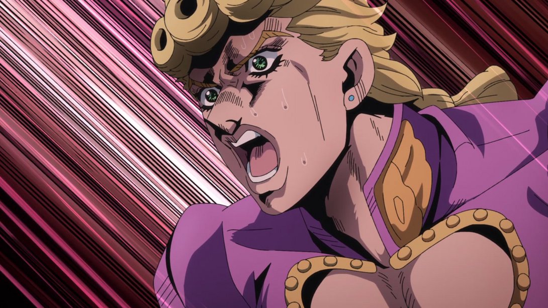
- Have another couple of brighter, sharper and un-vignetted animations (in the first one, the bullets have also been moved around):
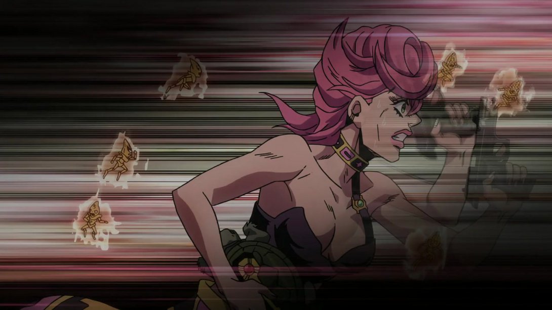
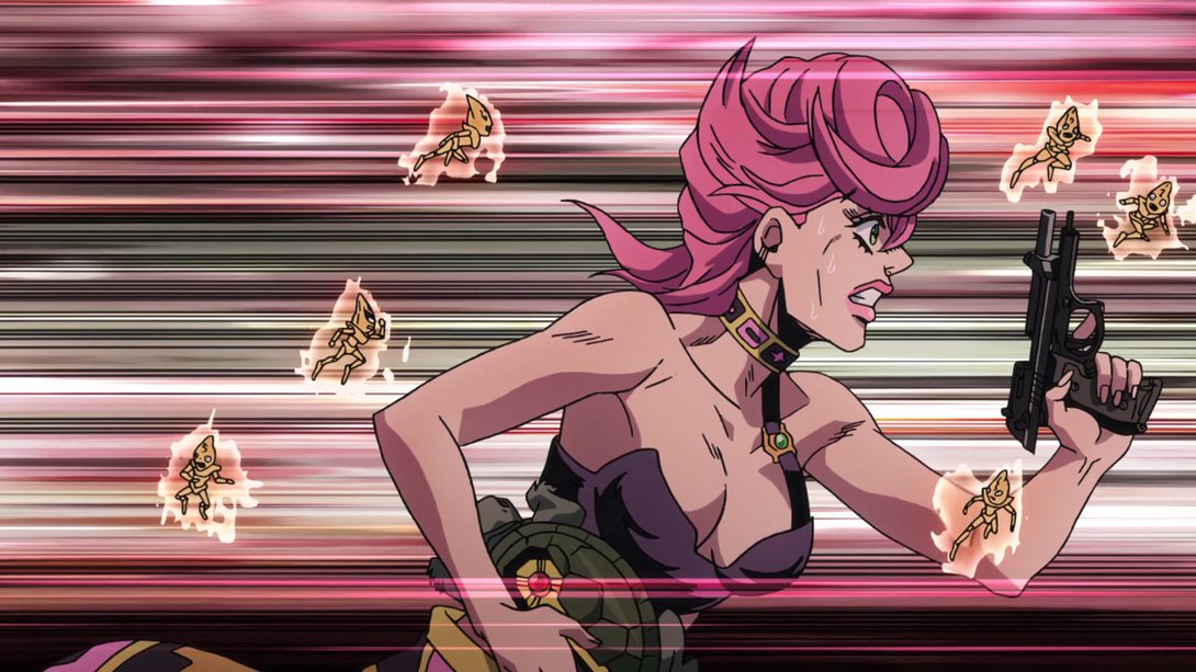
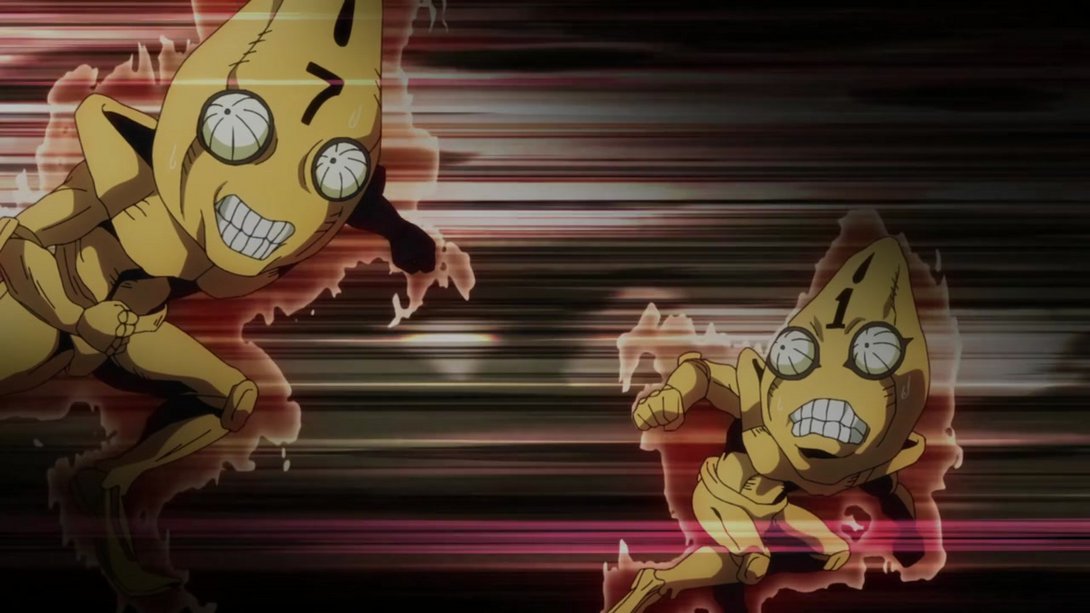
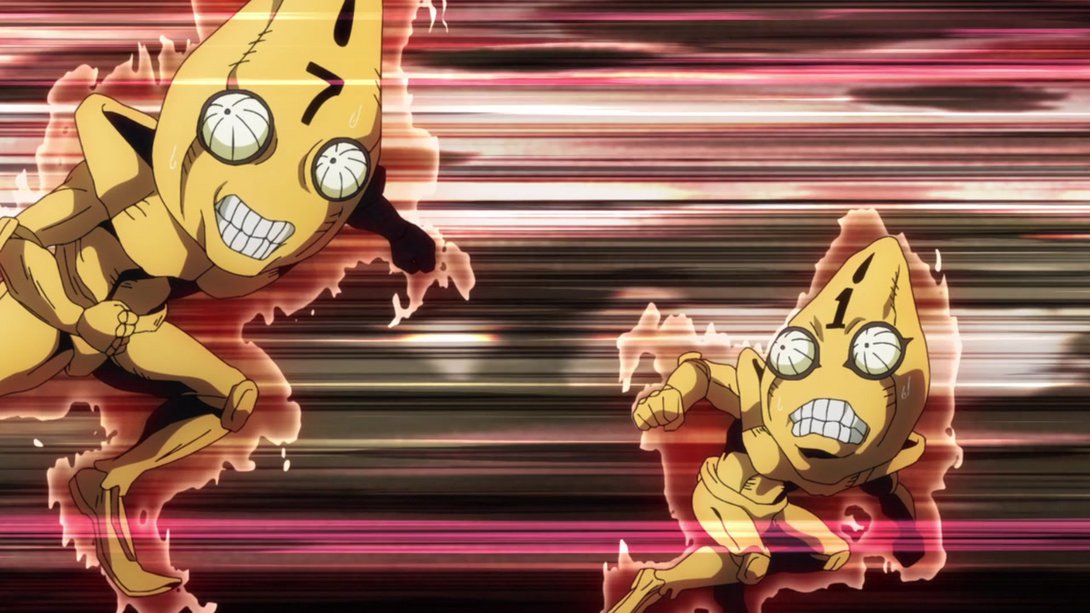
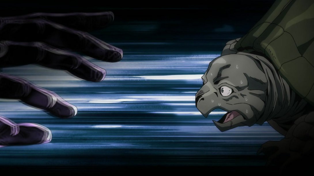
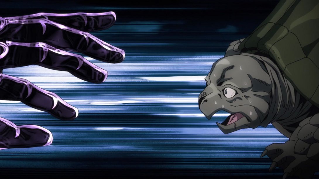
- Here, the bottom of the frame is slightly brighter…:
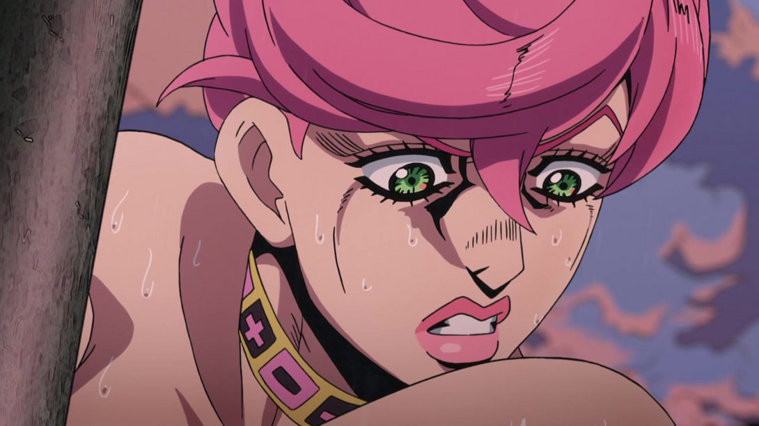
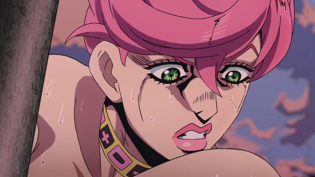
- Here basically everyone has been retouched, there is a different distortion along the edges, some new clouds in the sky and Coco Jumbo has been drawn with slightly thicker lines. Moreover, the shading/colouring on most elements of these frames is also a little different:
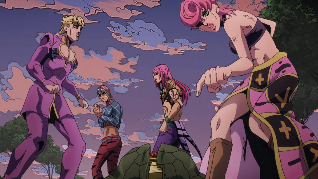
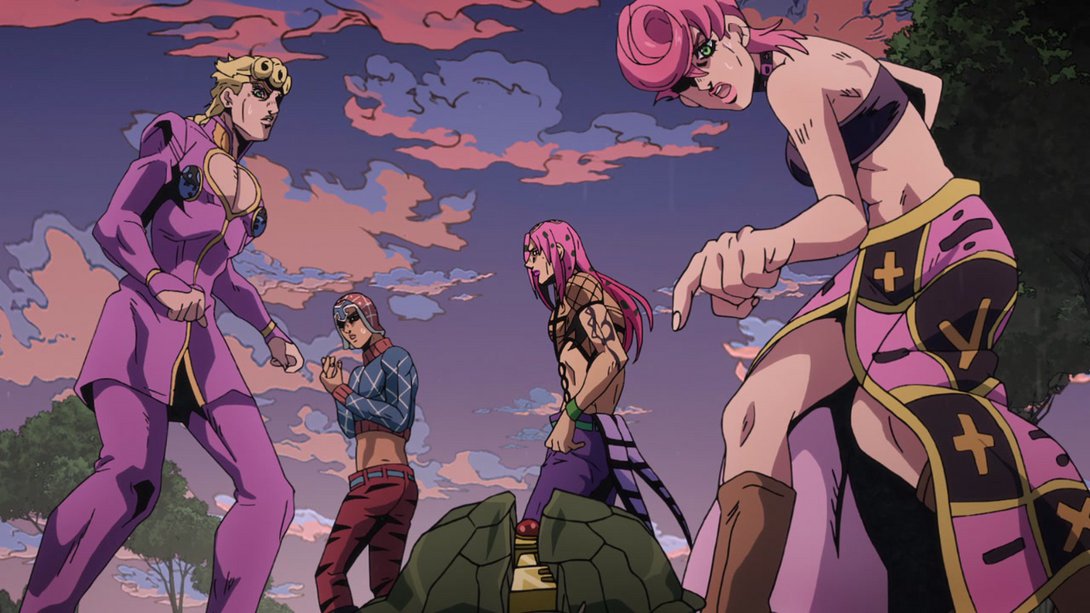
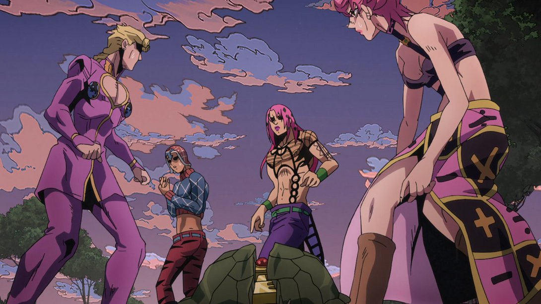
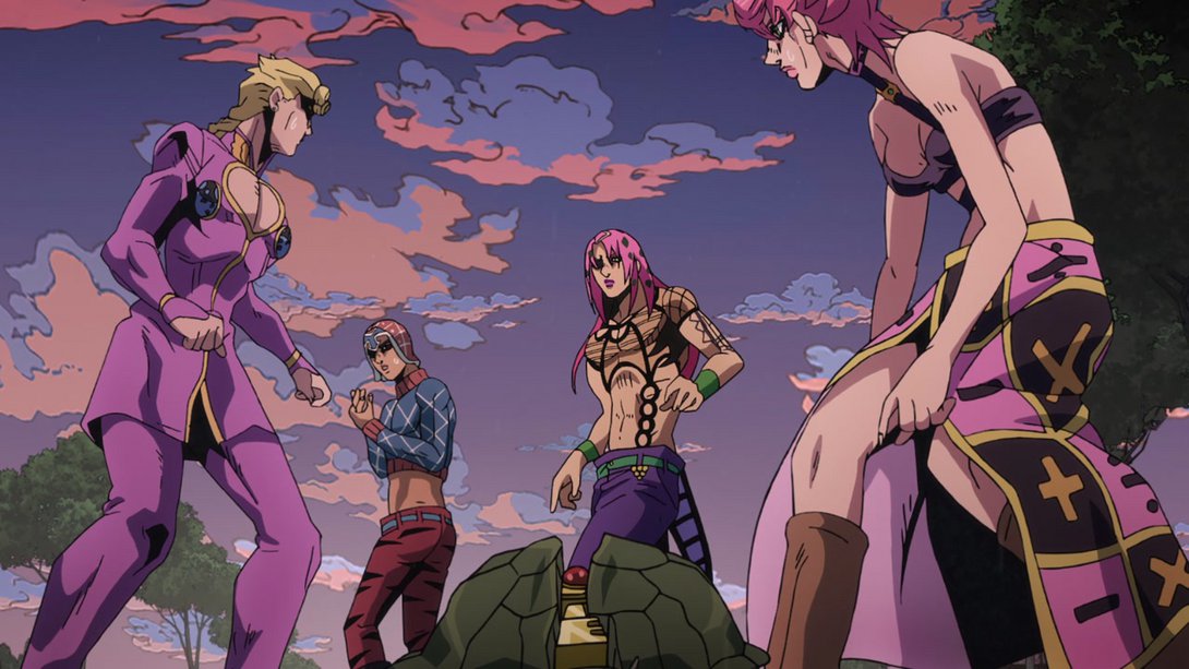
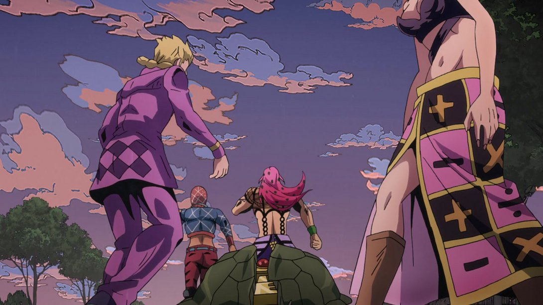
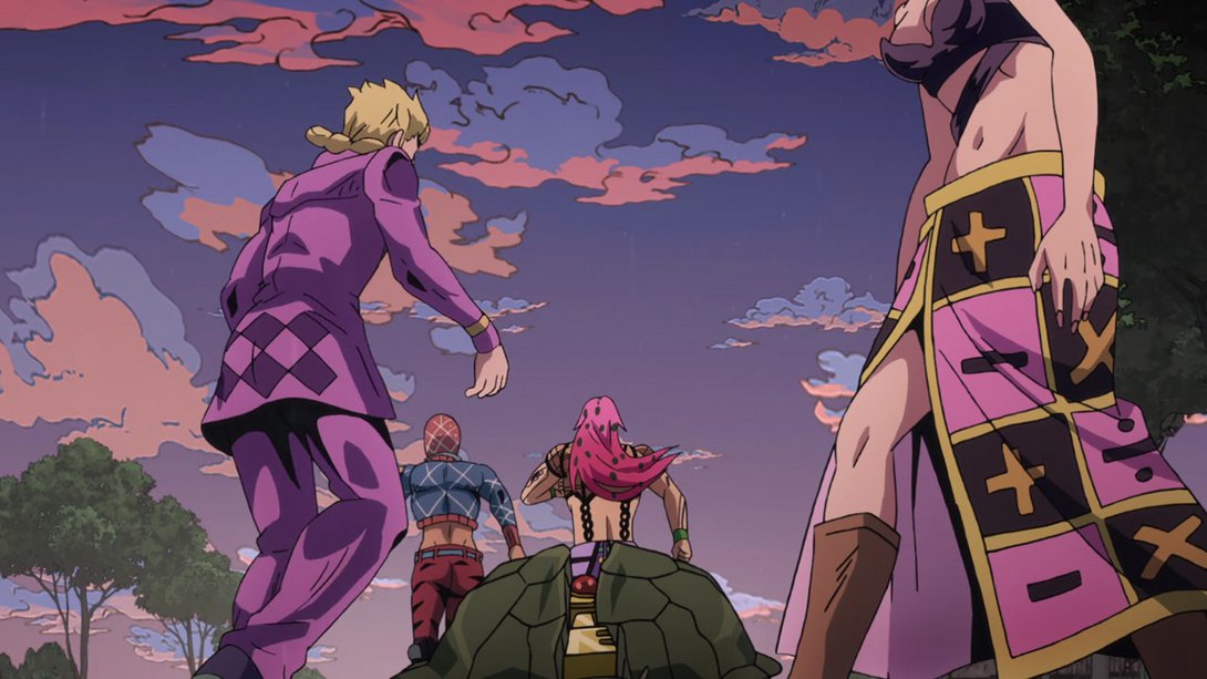
- Here, some elements of the frame have been blurred in order to convey a more pronounced sense of motion; in addition, Mista is no longer on a different layer from Trish and Diavolo, which means that there no longer is a parallax effect going on between the three characters. Moreover, the way King Crimson slides in frame is also quicker and more sudden:
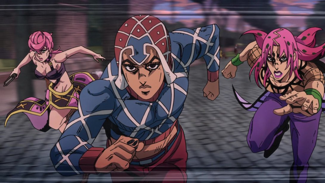
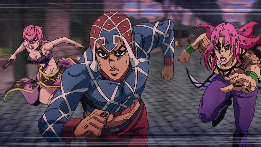
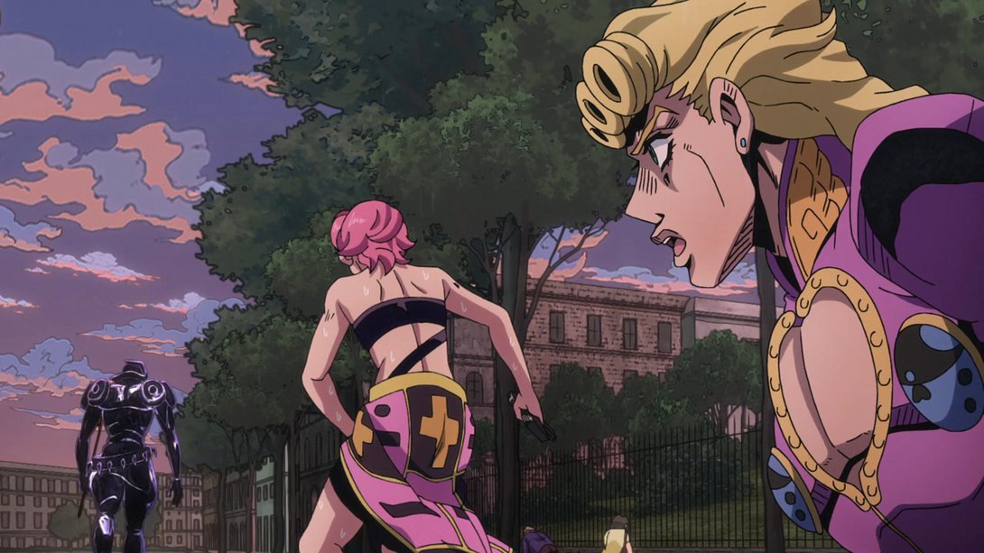
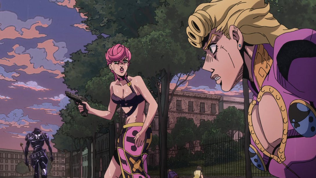
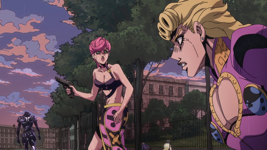
- Here, once again, Giorno and Trish are looking thankfully better! Moreover, there’s our familiar different distortion along the edges, Silver Chariot Requiem has been moved slightly down and the colouring/shading on Giorno is different as well. Strangely enough, though, the bit right under Giorno’s pecs is still coloured purple:
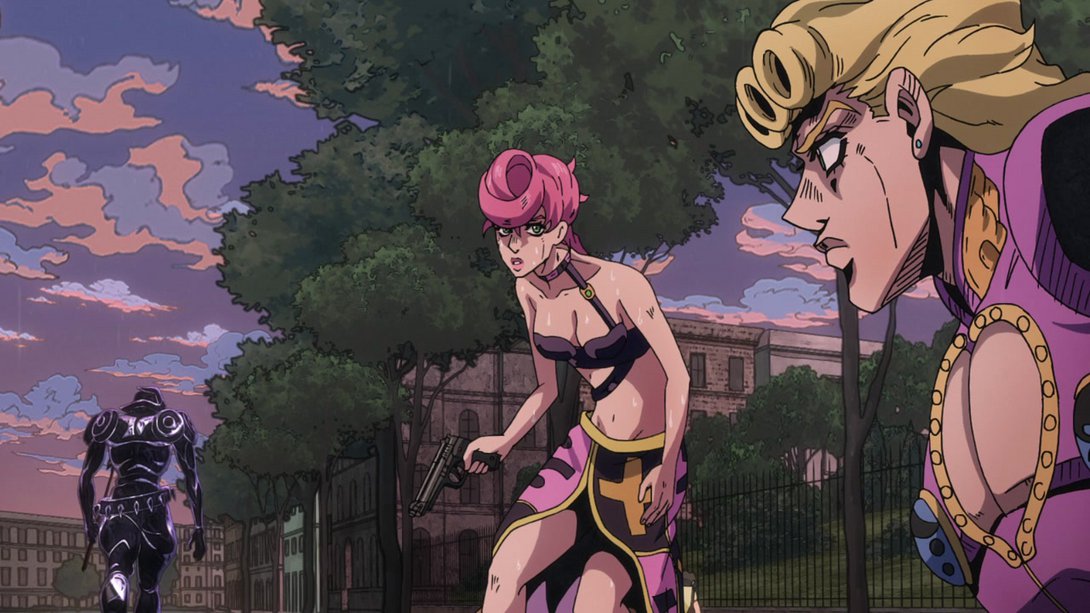
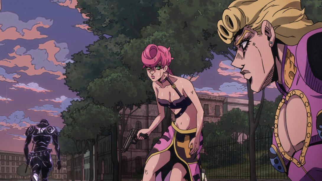

- These incredibly low-res shots of Giorno have all been massively upgraded! In addition, there is a darker shading on him, and the shadows he and Coco Jumbo cast are less sharp:
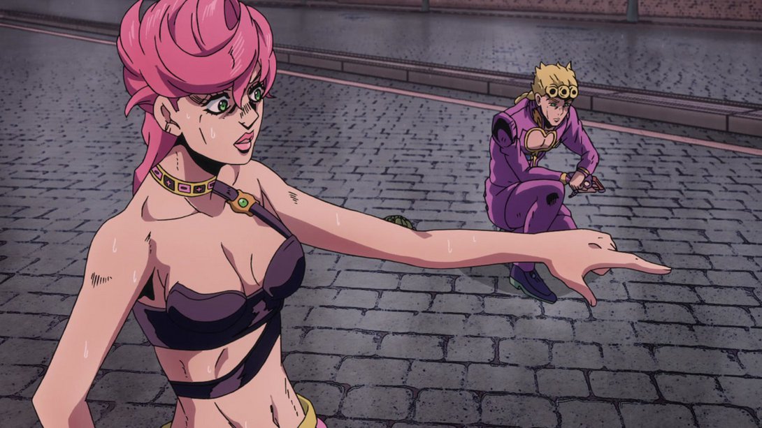
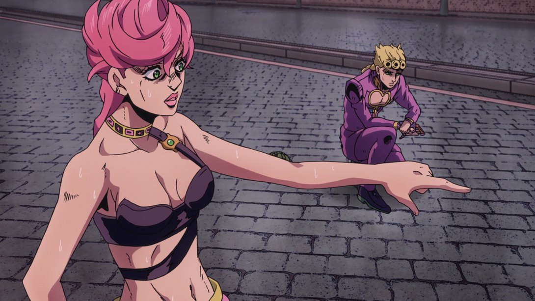
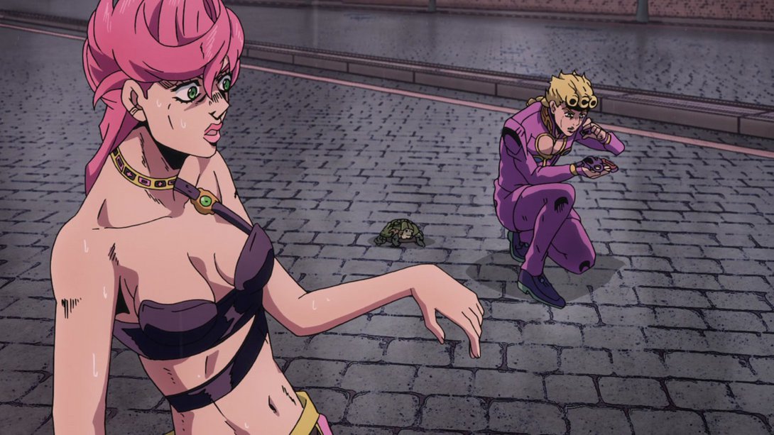
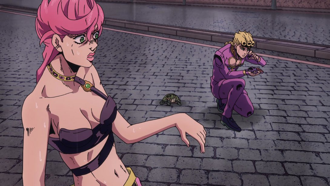
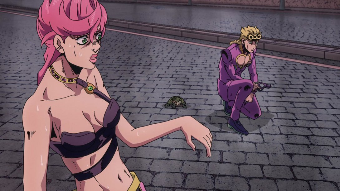
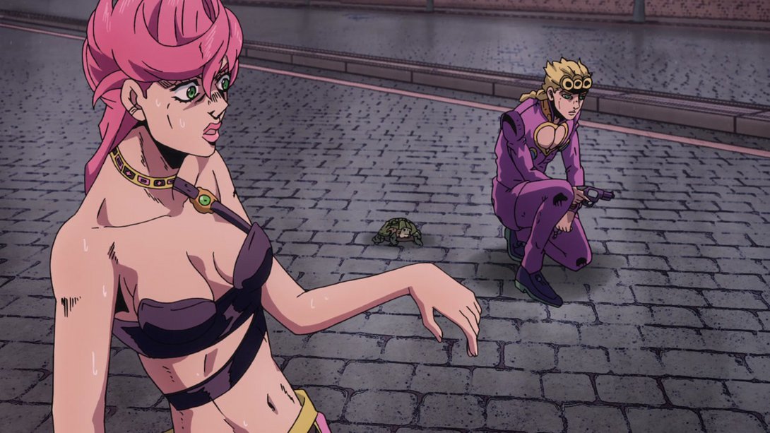
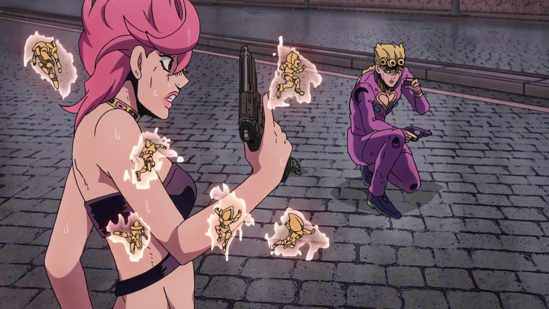
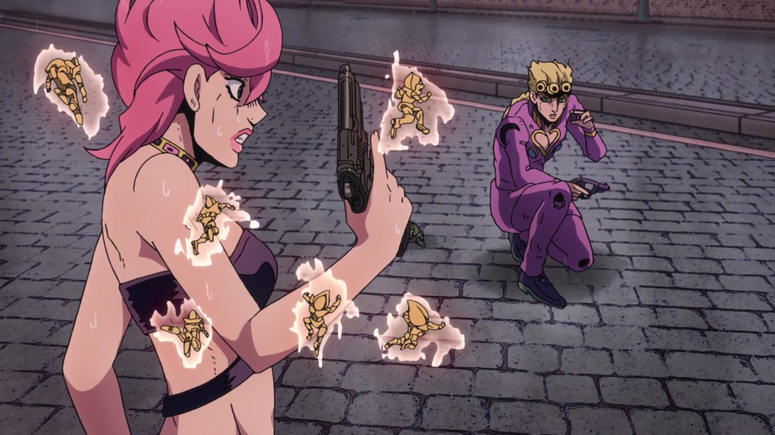
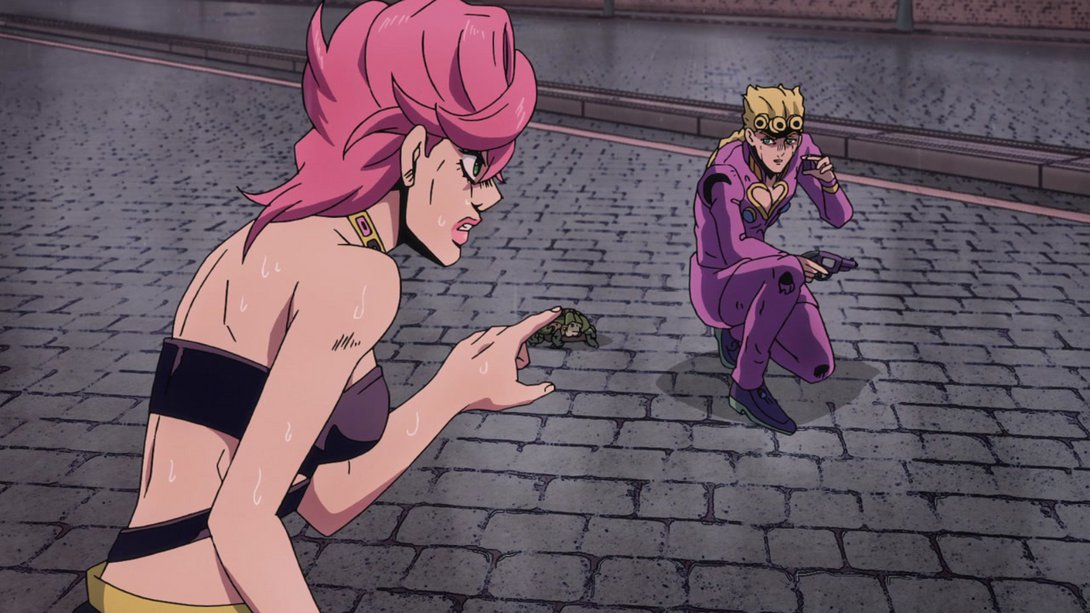
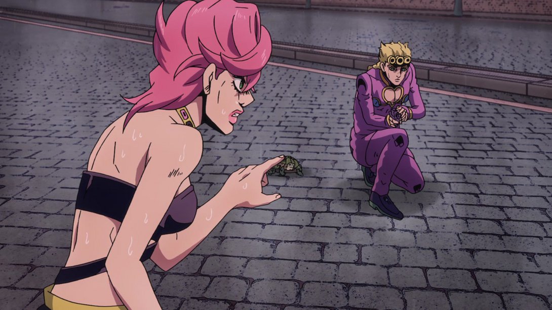
- Magnificent. Moving on… Here, the shading on the mole is a little flatter, and the reflections on Mista’s gun have been retouched as well, making it look less like it’s made of glass:
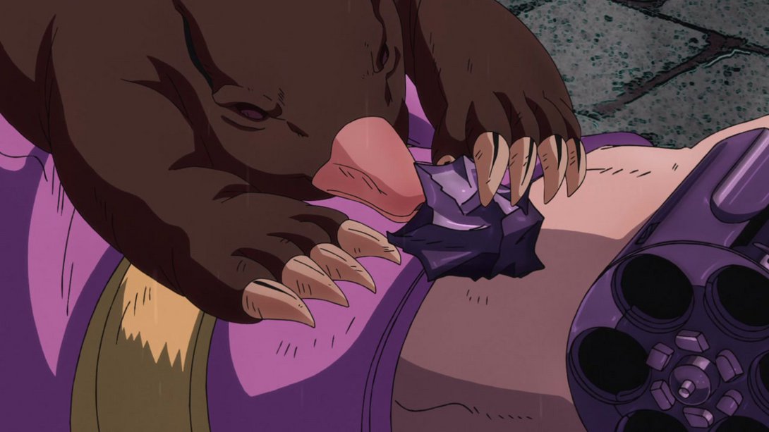
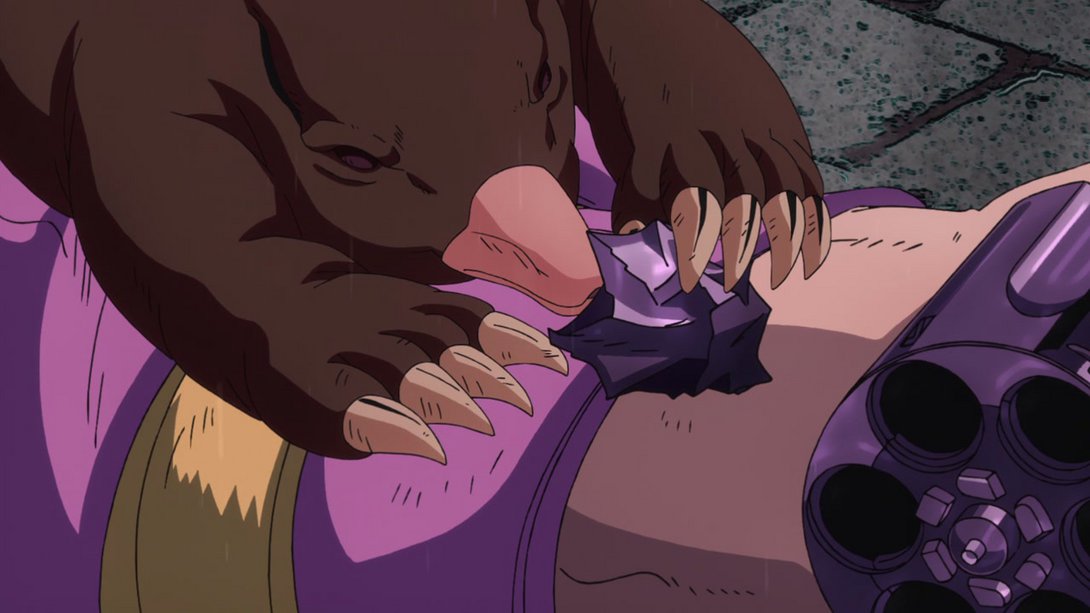
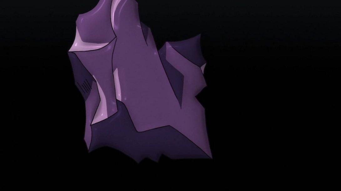
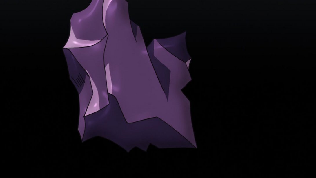
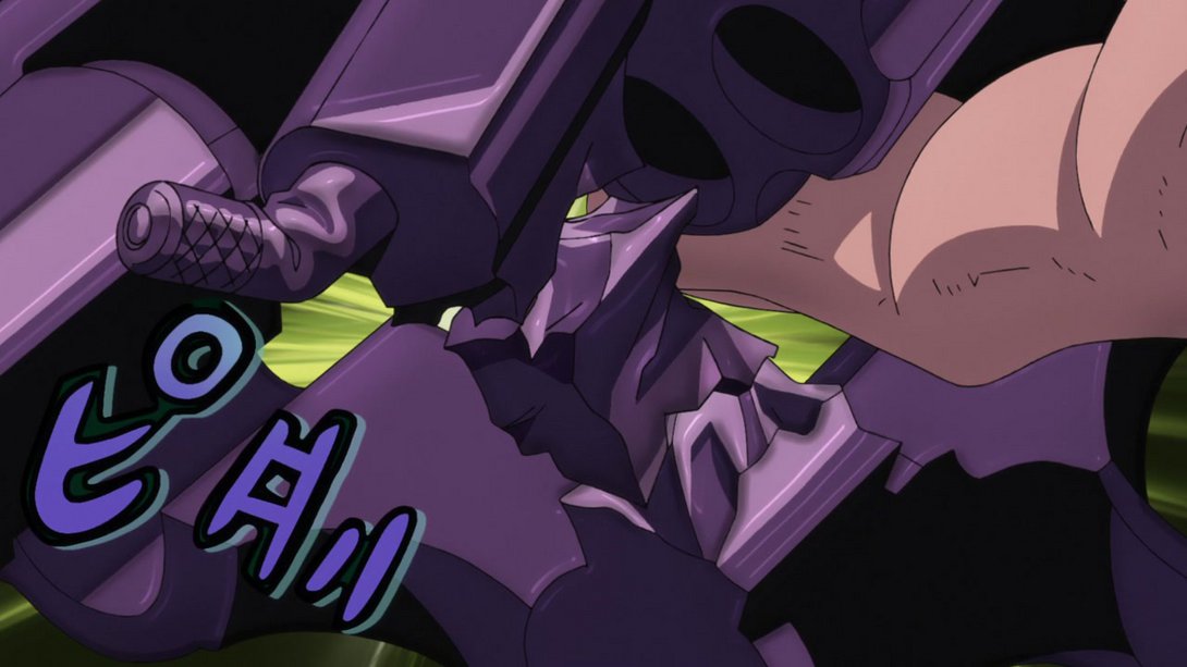
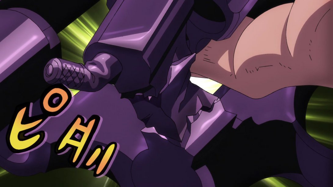
- The gun’s material has been once again retouched here! In addition, all the pieces have been slightly moved around, the background is brighter and the onomatopoeia has been recoloured too:
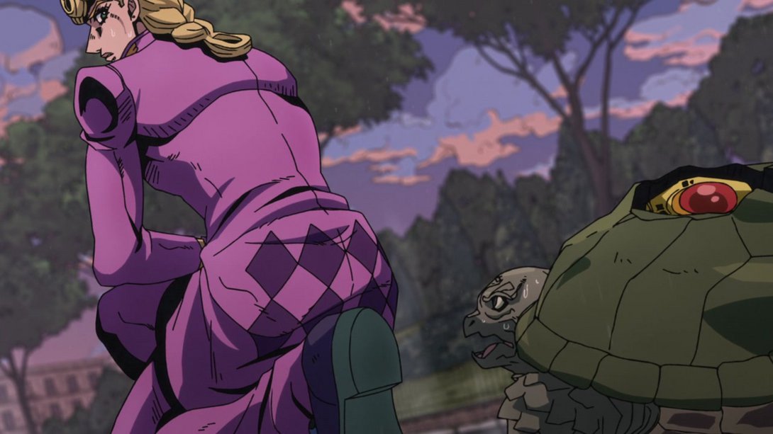
- Here, the background looks sharper and less washed-out, Giorno and Coco Jumbo have both been retouched and the shading on them is also slightly different:
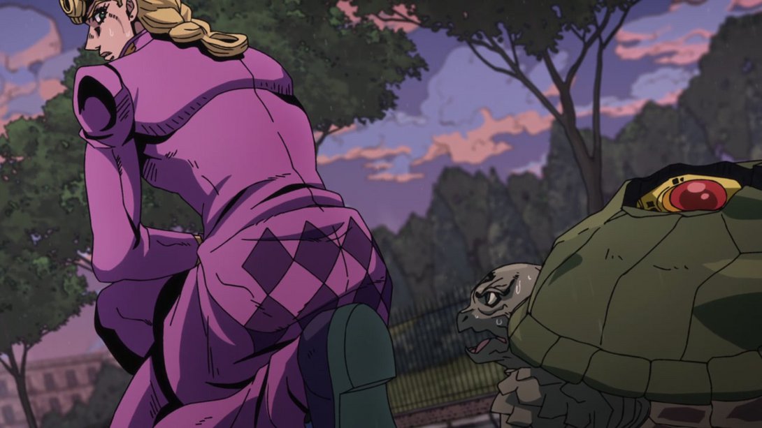
- Here, once again, there’s a different distortion along the edges of the frame, alongside a new darker vignette! Moreover, both Trish and Giorno have been retouched and their shading is, as usual, a little different too:
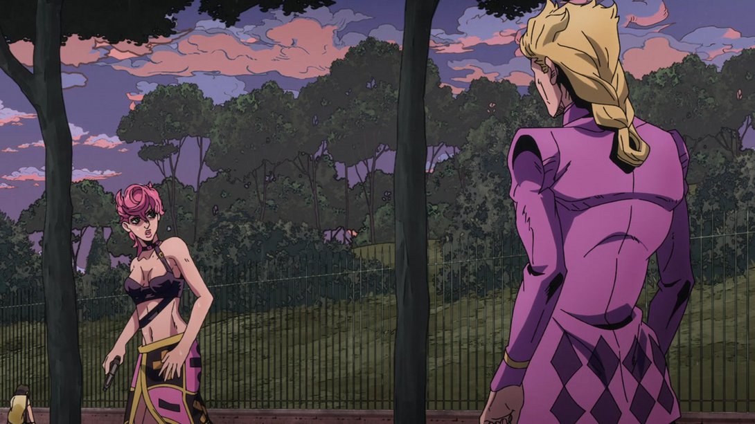
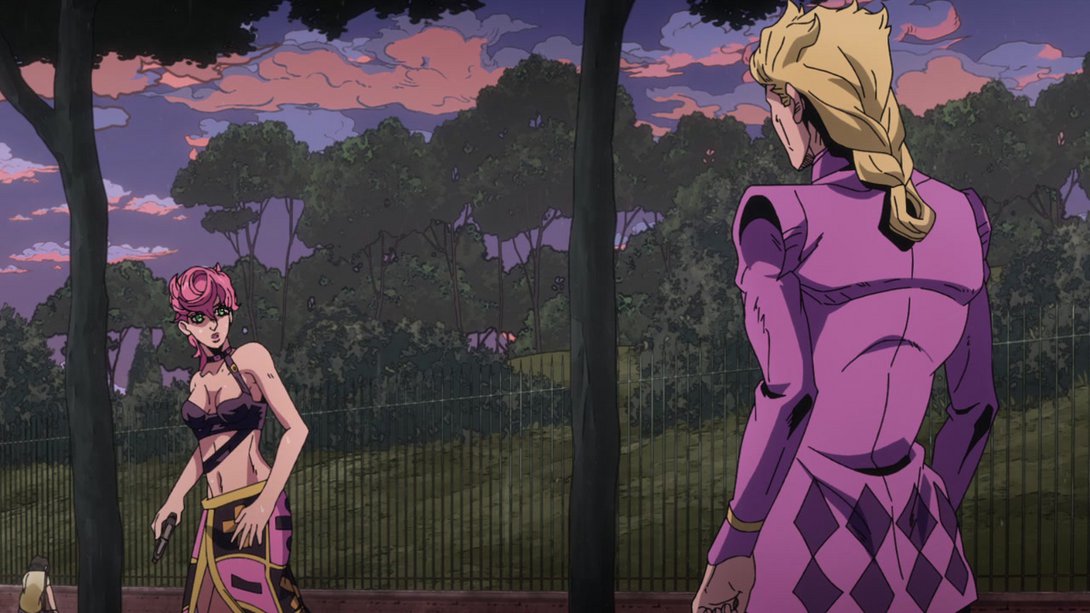
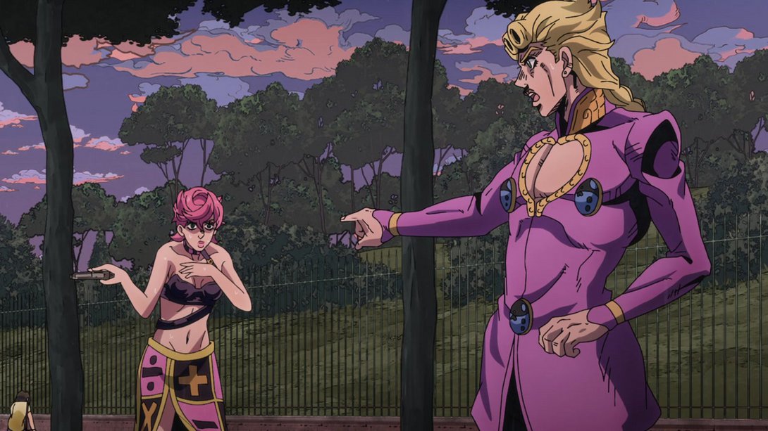
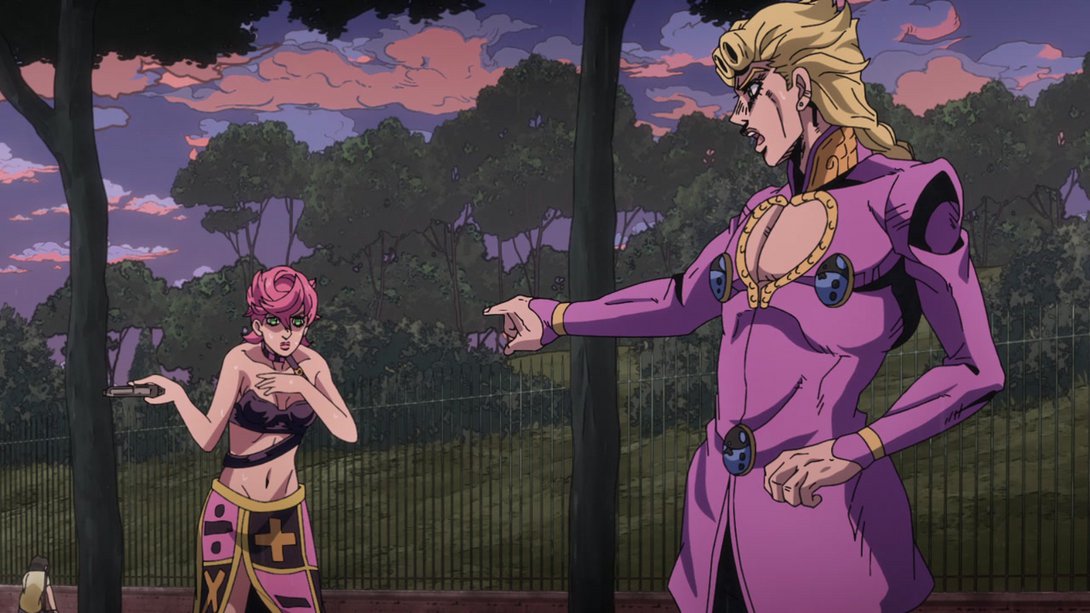

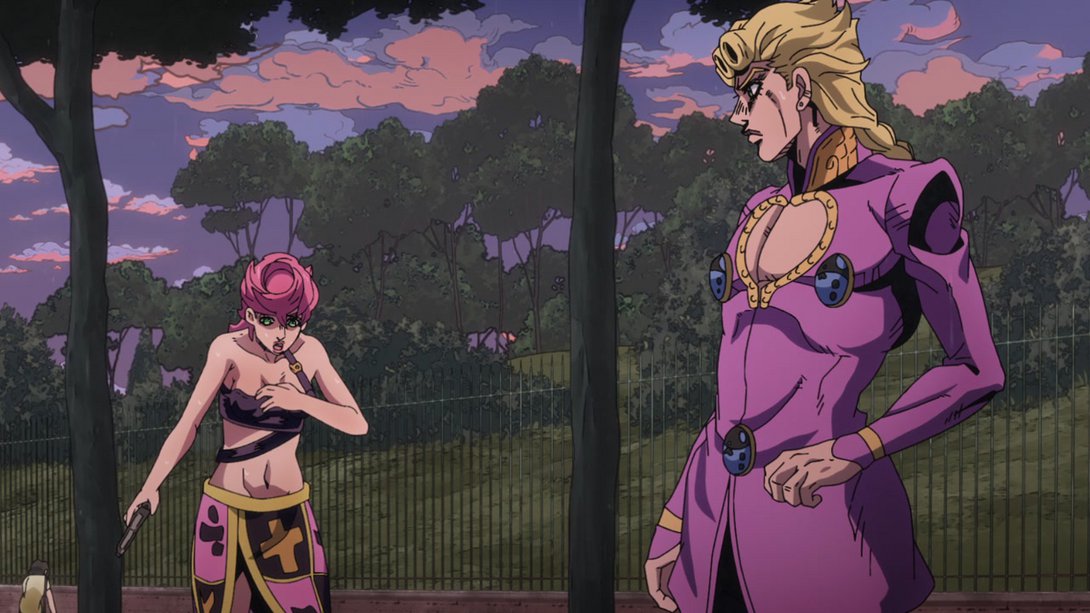
- Trish has a new, better-looking face, here (and, in the second frame, Giorno’s left ear area has also been tweaked):
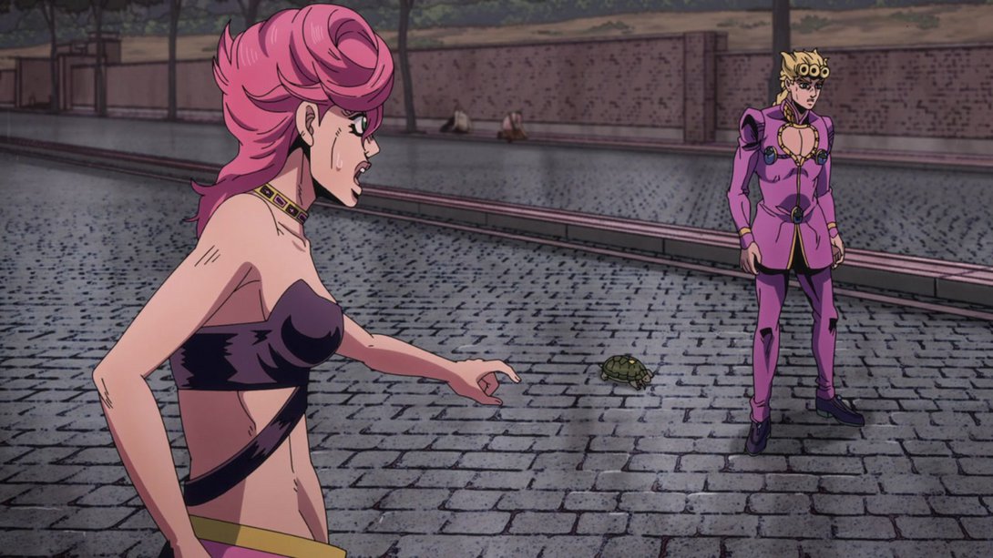
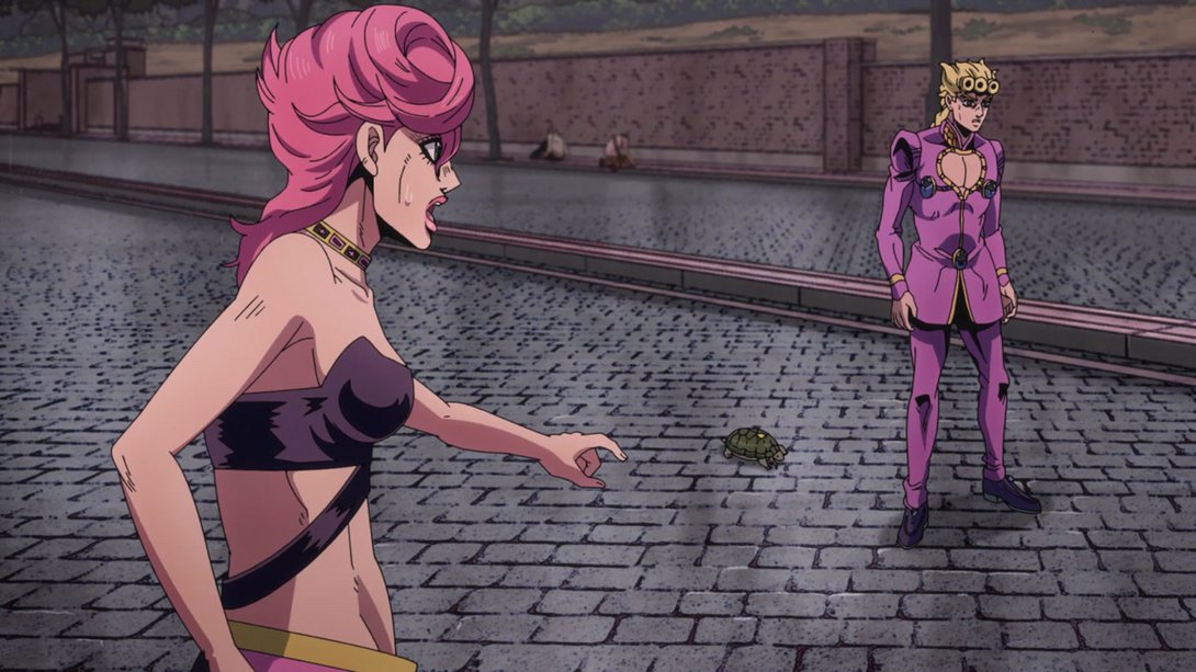

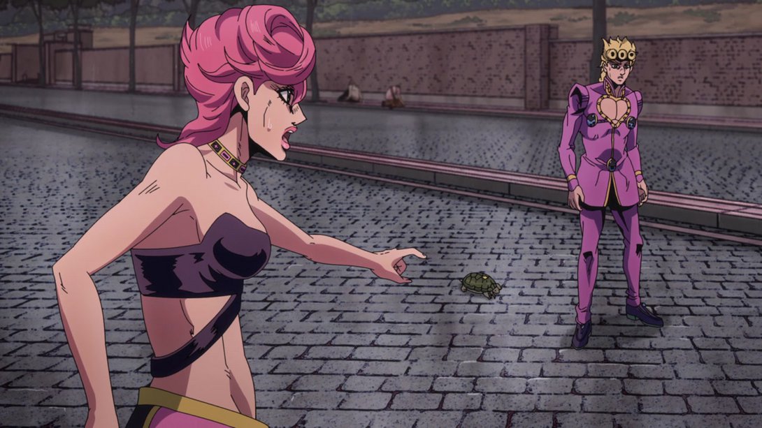
- Things have been moved around a little in this bit here, and the camera movement is also different:
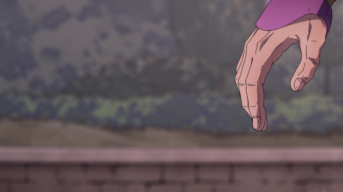
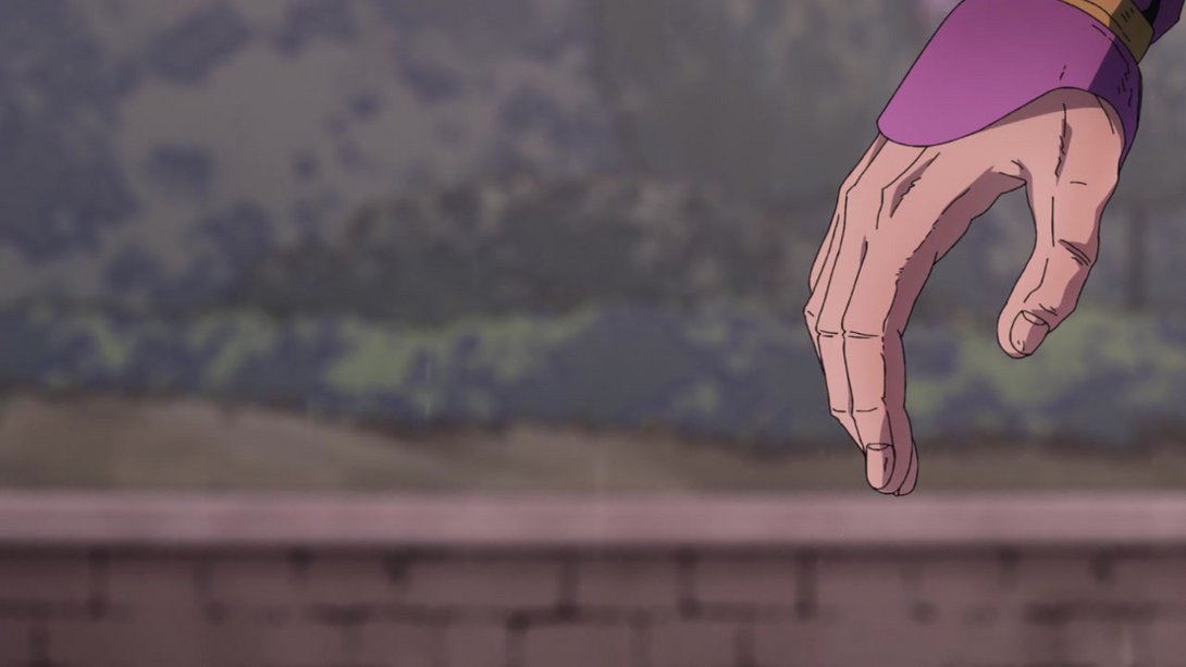
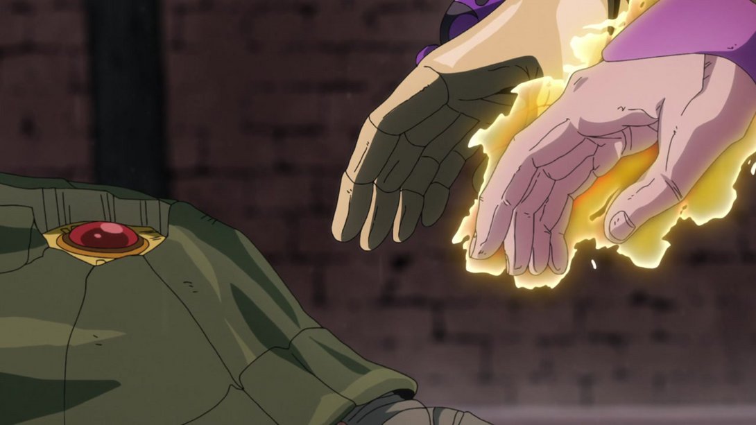
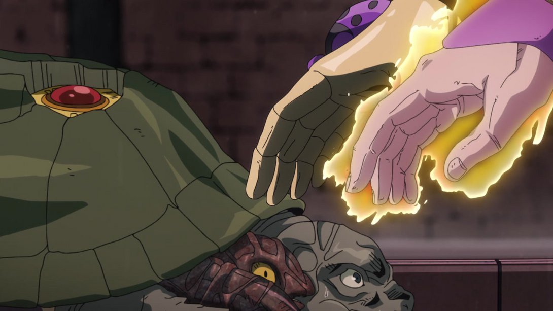
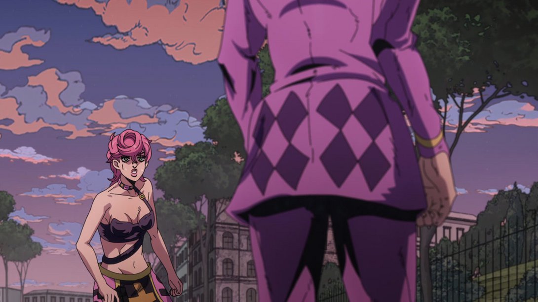
- Trish has been retouched, here (most notably, they added her missing choker strap thingy), and Giorno is slightly less shaded:
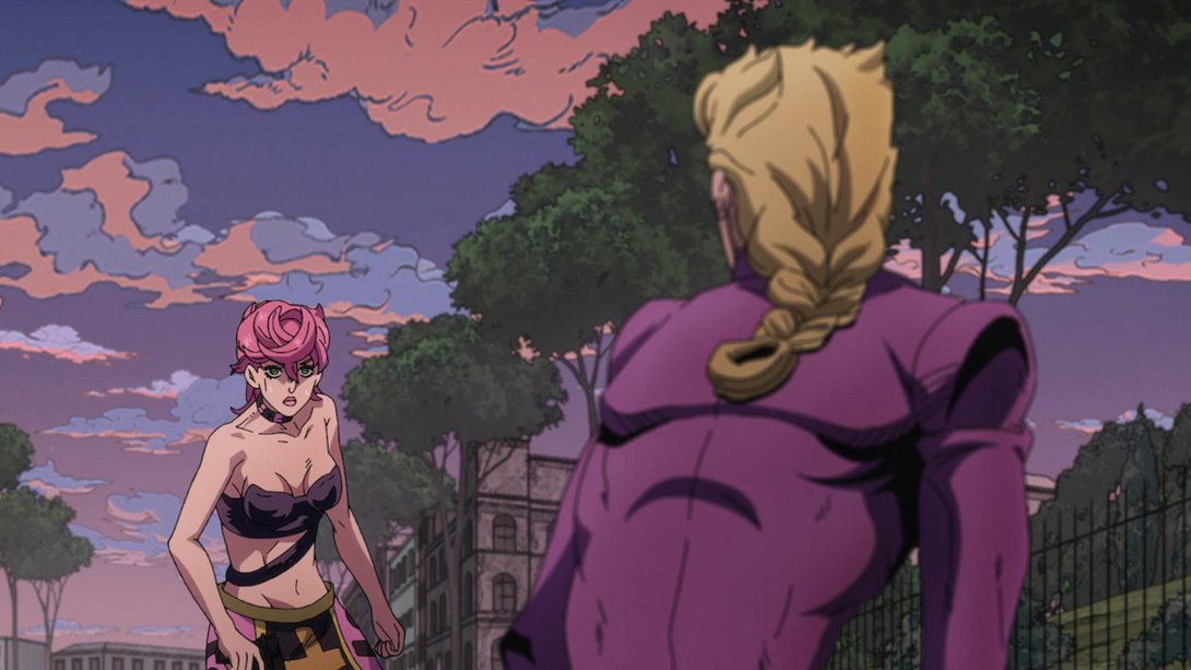
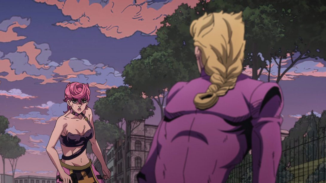
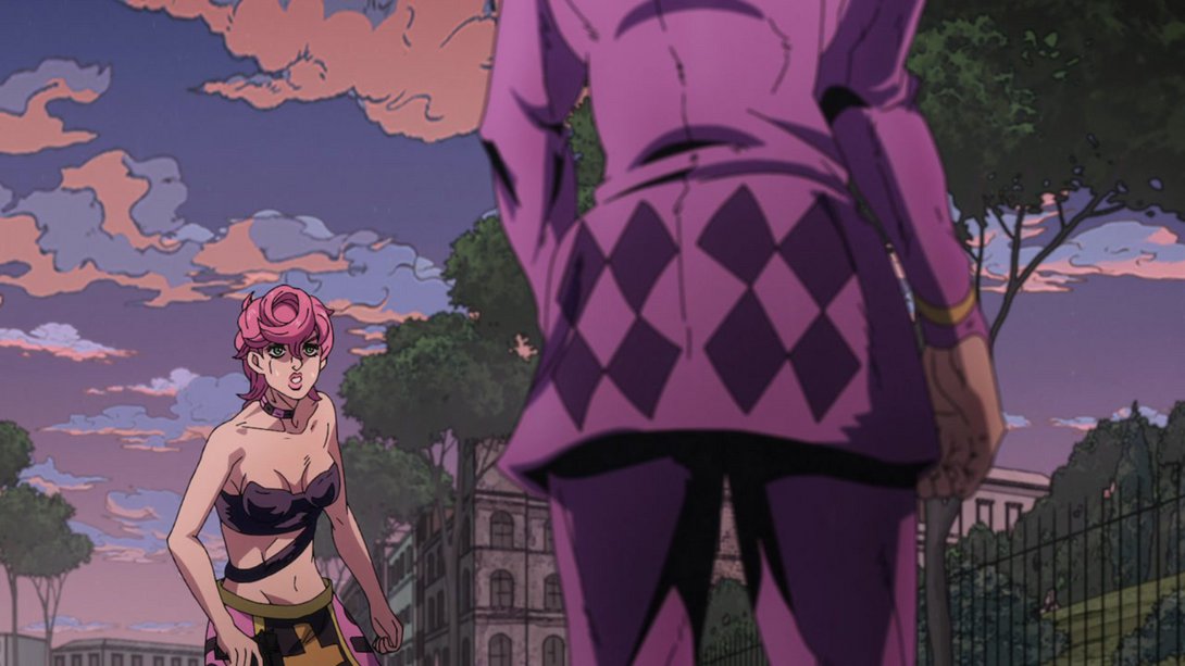
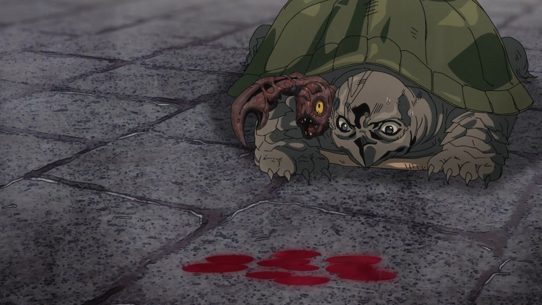
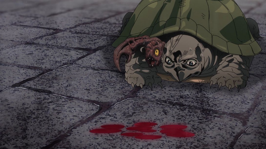
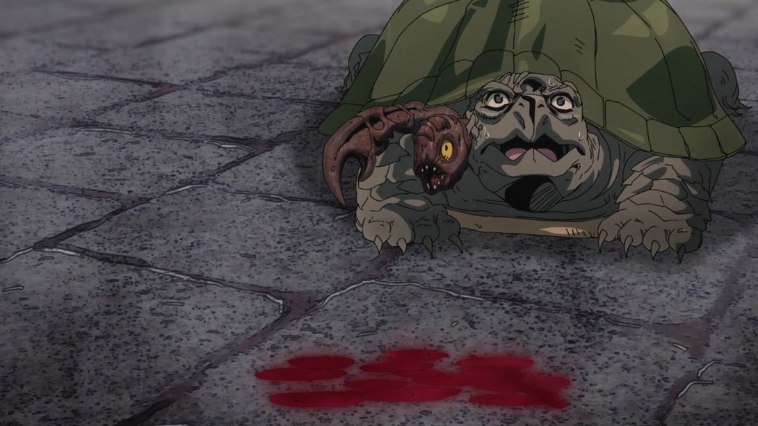
- Everything has been shaded much better, here! The blood texture is also looking a little different:
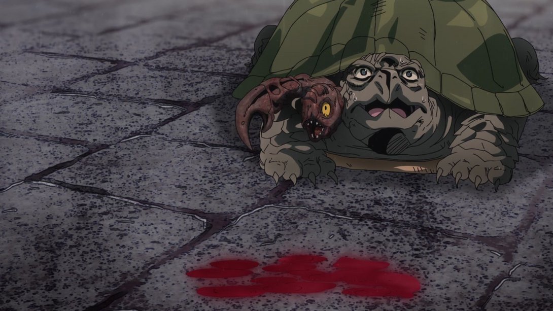
- Most lines are a liiittle thicker here, and the colouring/shading on Trish has been tweaked a little too:
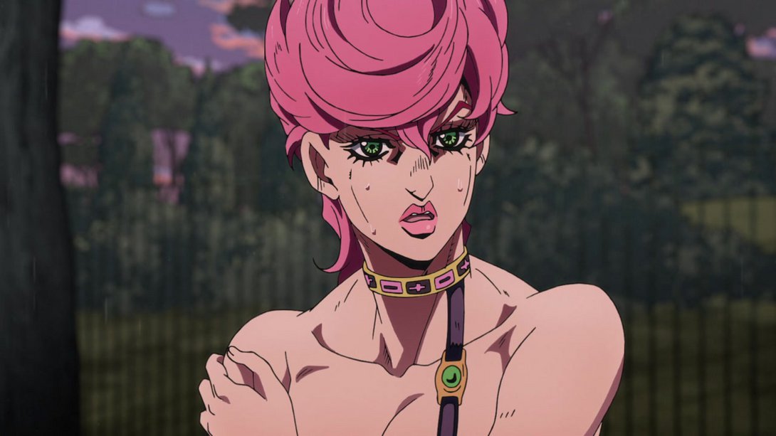

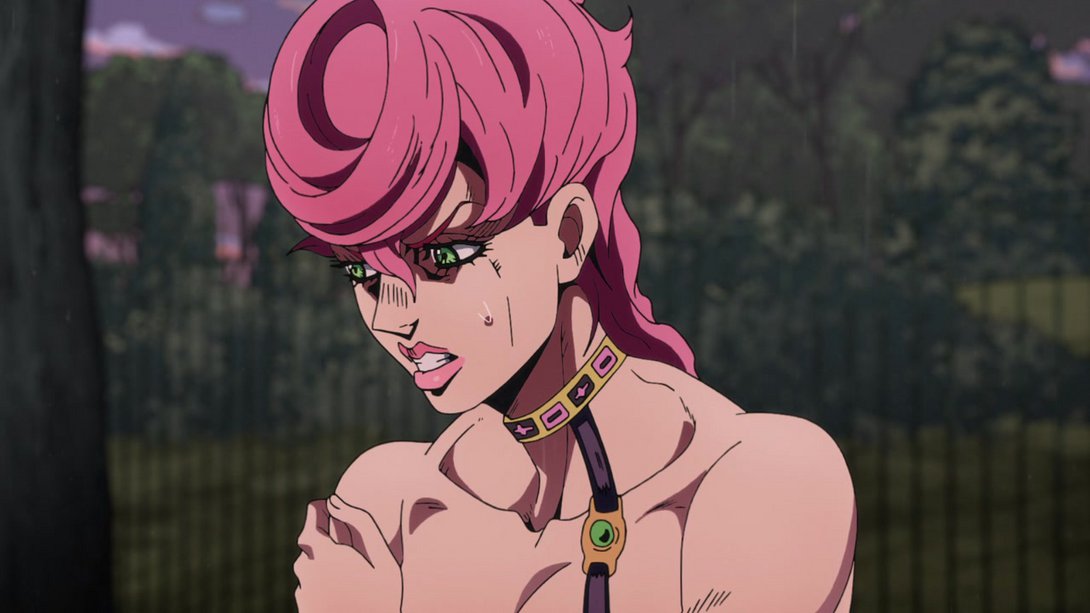
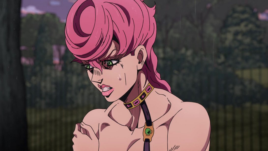
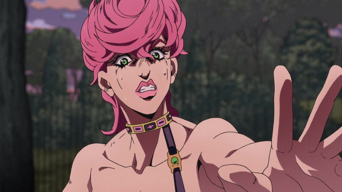

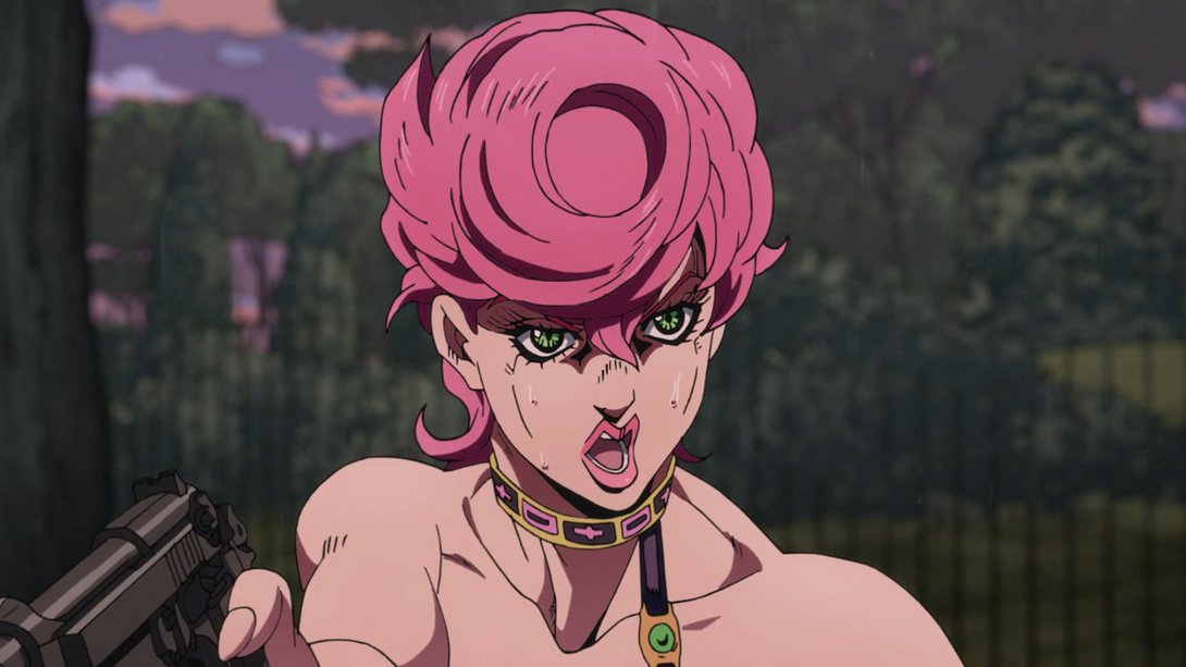
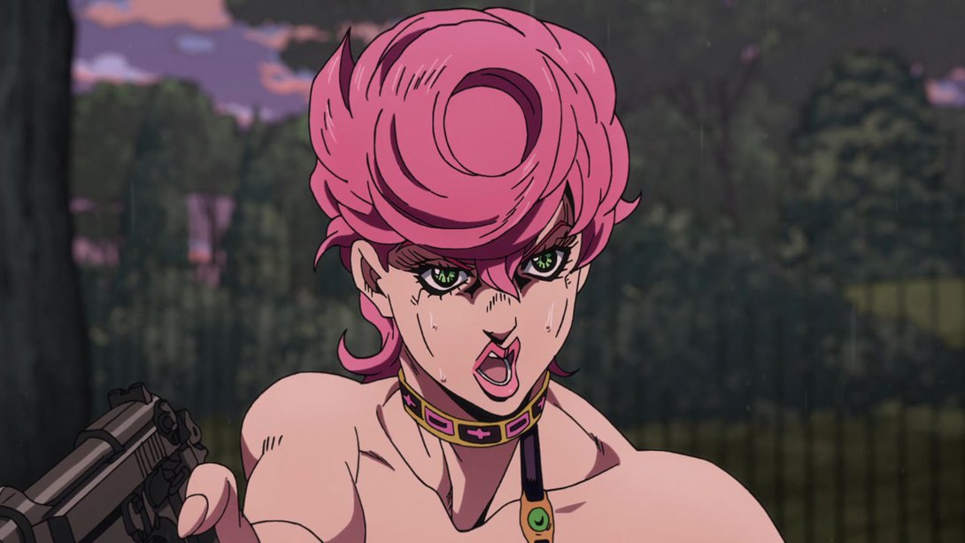

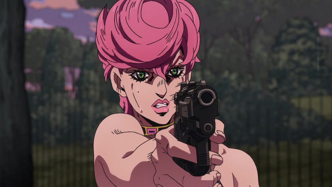
- This animation has been completely recoloured! The background is also looking better and it rotates too, at the end; moreover, the motion lines on King Crimson’s punch are less pronounced:
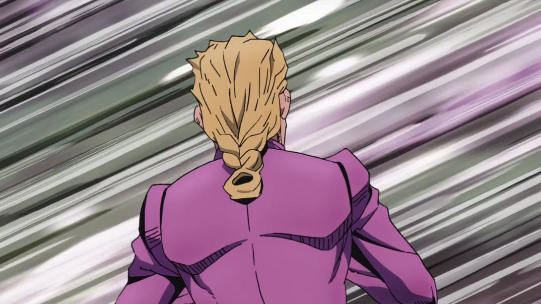
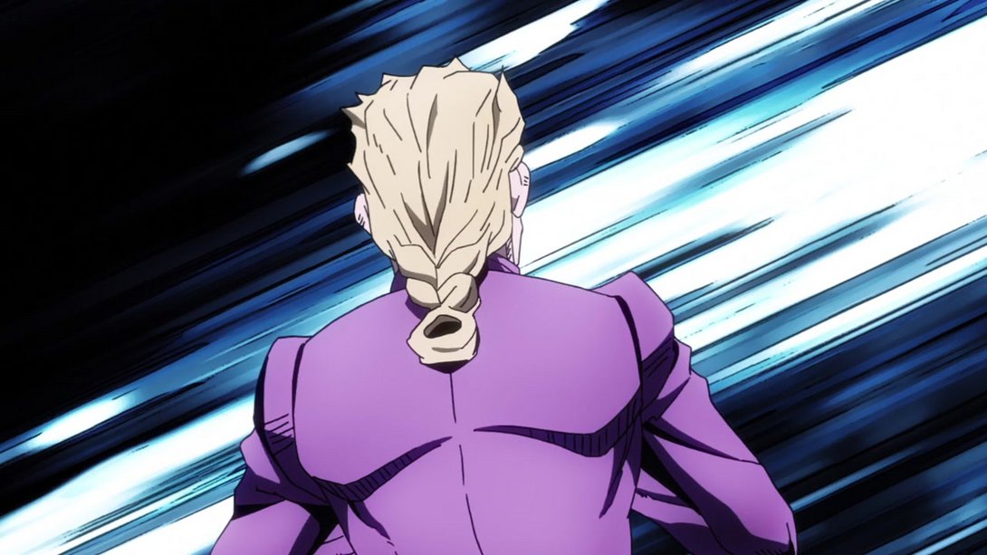
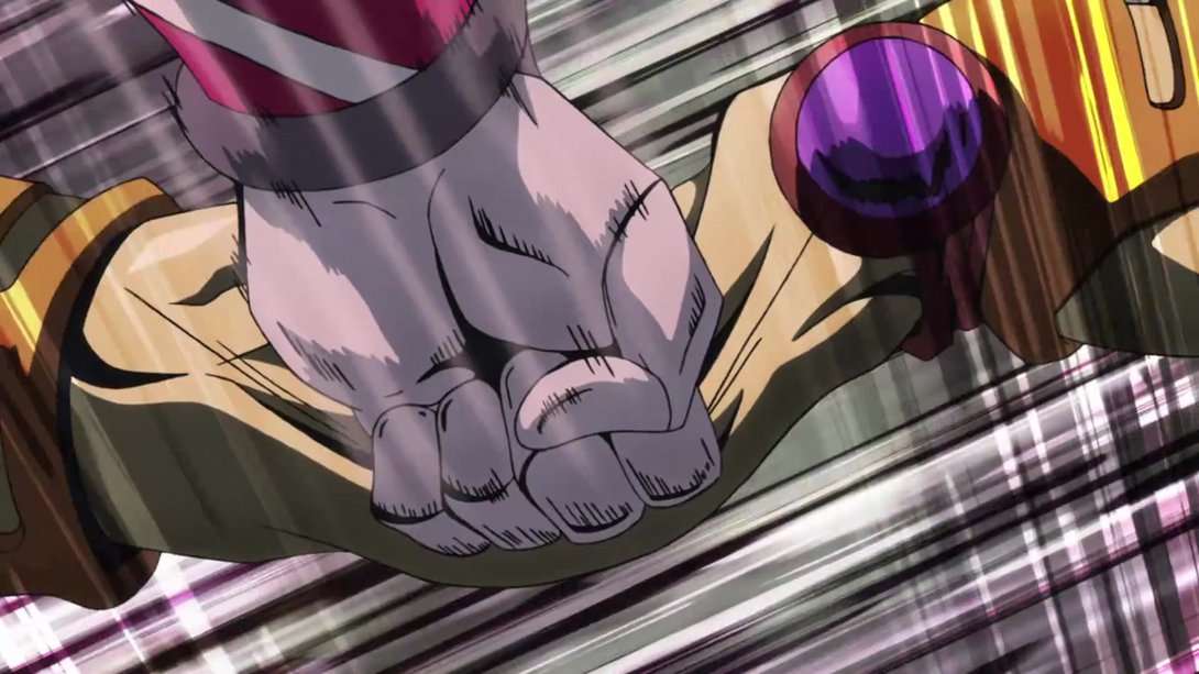
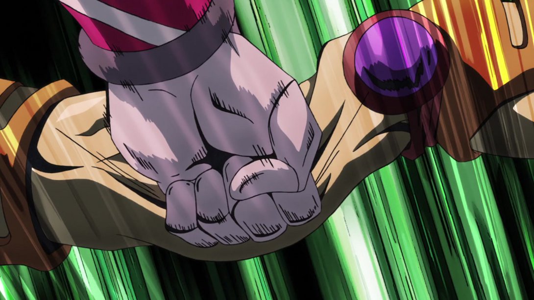
- King Crimson’s aura has been retouched, here! In addition, Trish is also looking better:
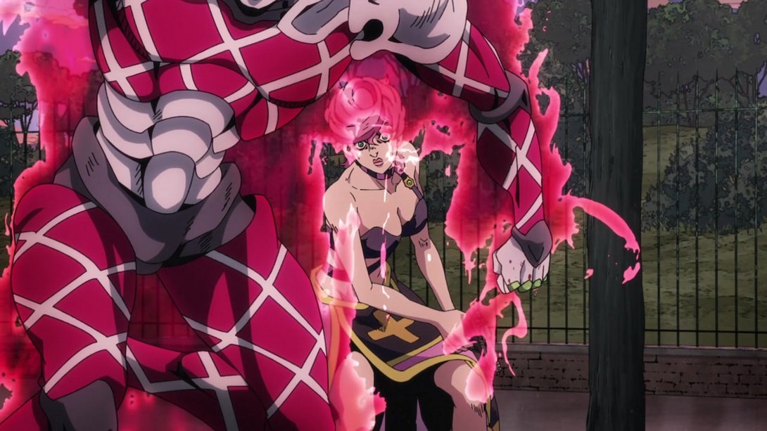
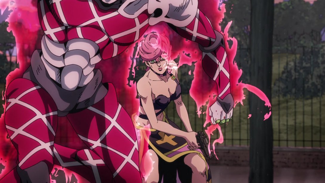
- Here everyone is looking better! In addition to this general change, King Crimson itself has been shaded a tiiiny bit differently, and the two dudes in the background have been moved and scaled up:
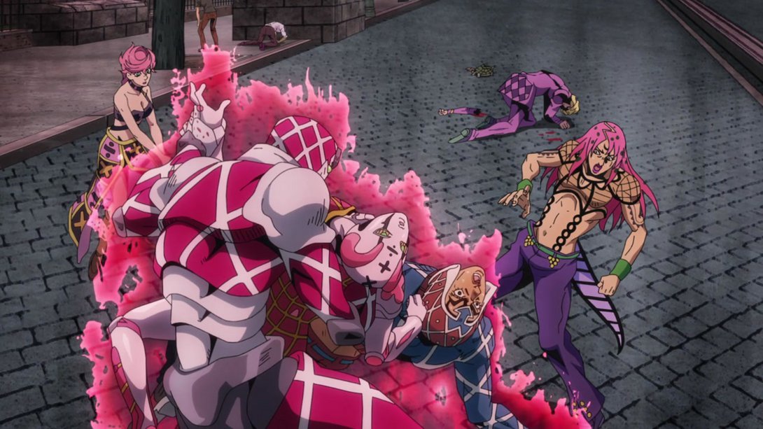
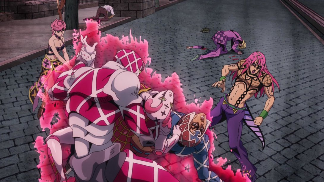
- This whiteout scene is sliiiiightly brighter (but it’s too brief to show in a video):
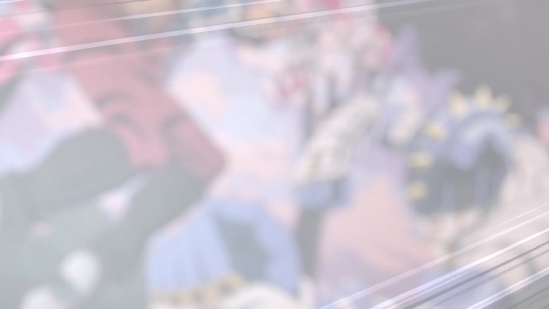
- All the shadows are darker here, Spice Girl’s eye has been retouched and Mista’s left arm no longer looks bloody…:
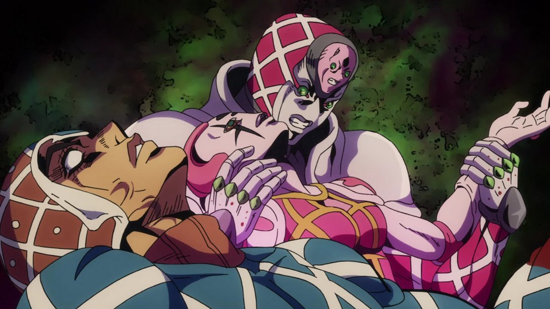
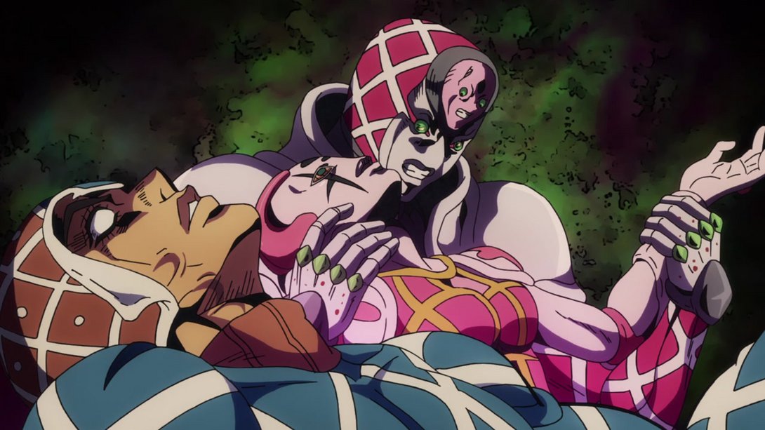
- …and, later on, the cuffs of his sweater have been recoloured:
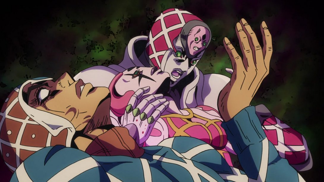
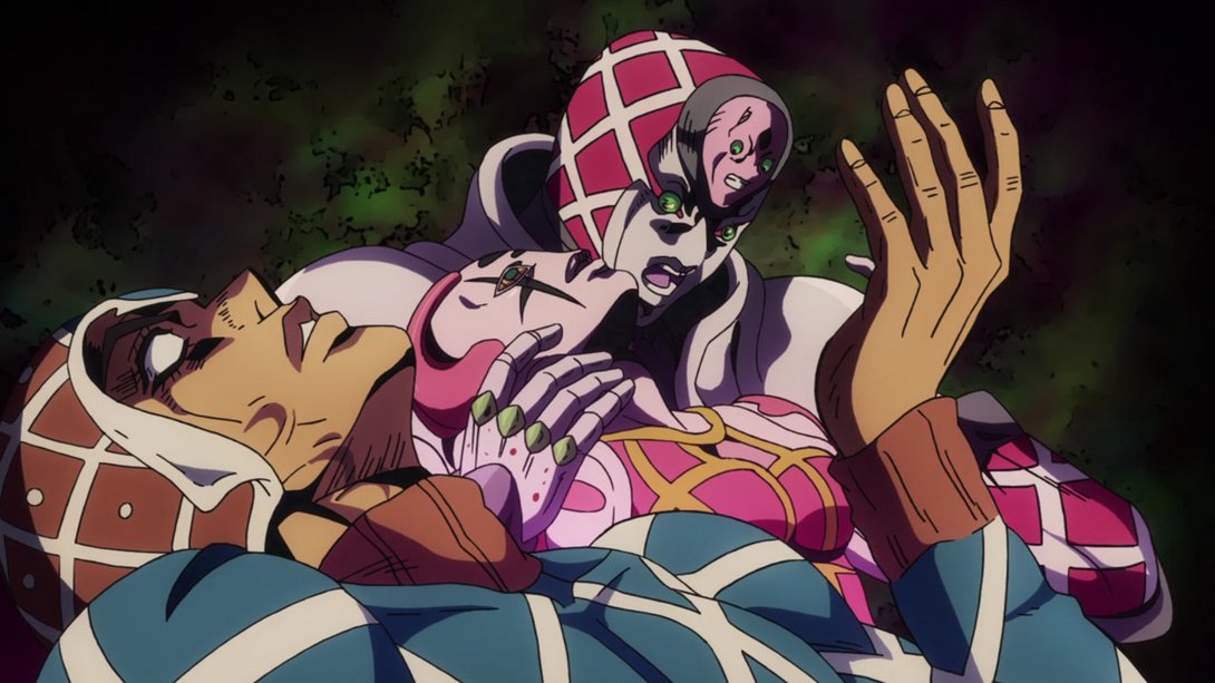
- Here we have the same differences as above, except this time Mista has been slightly re-shaded instead of King Crimson:
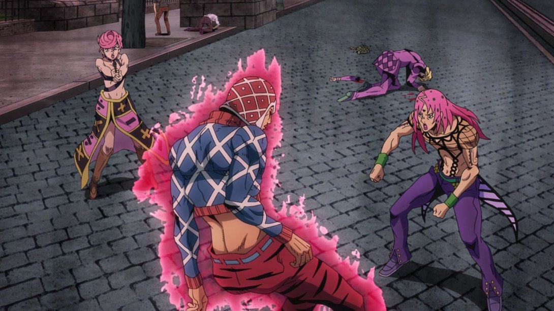
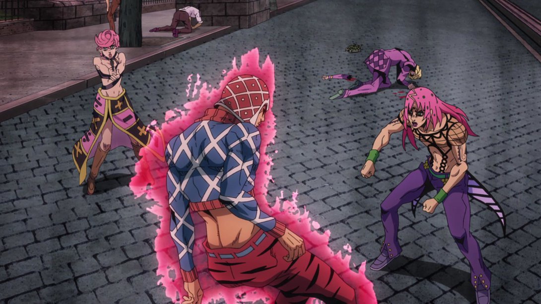
- Mista’s bullets are brighter, here…:
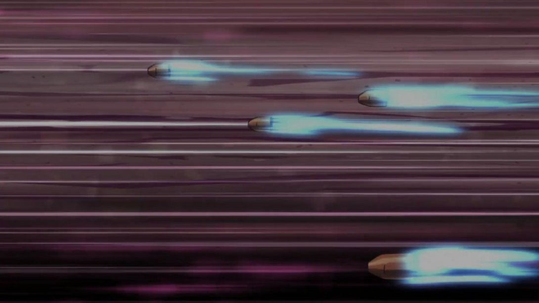
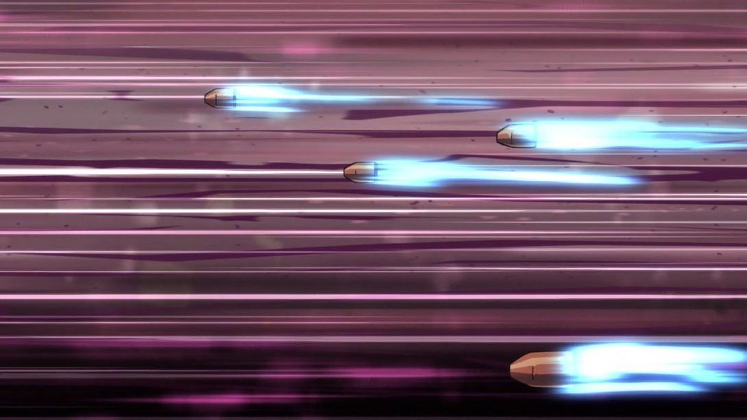
- Here, Mista’s eyes have been shaded over, and there’s a line in the middle of the frame indicating the direction of one of his bullets:
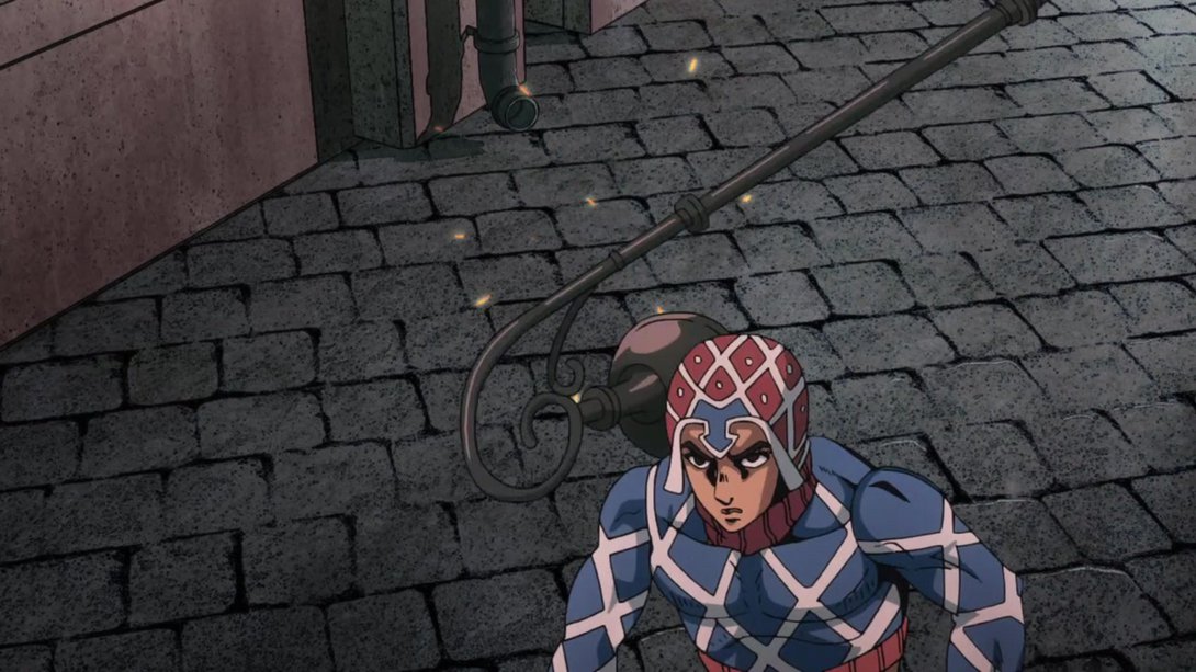
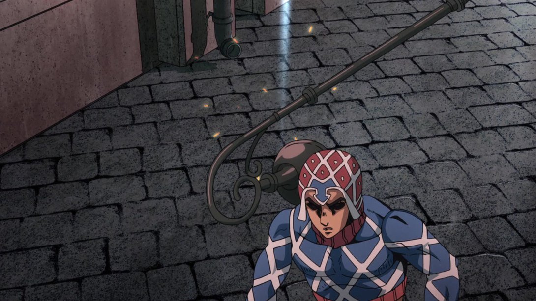
- Diavolo/Buccellati’s shadow has been fixed, here…:
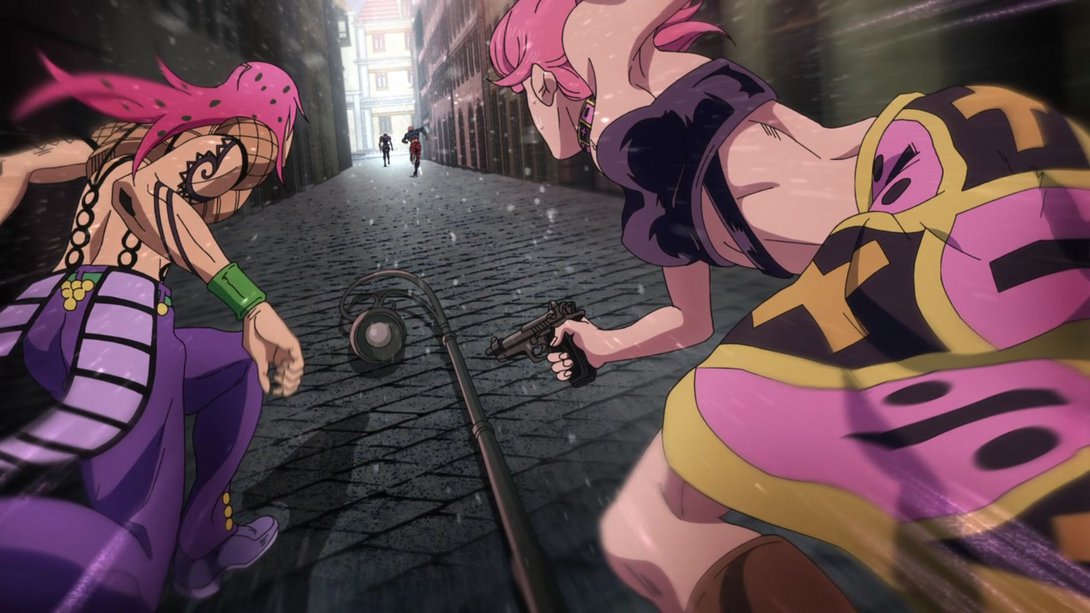

- Mista’s face has been retouched, here! Moreover, most things have been moved and/or resized, and the background scrolls more slowly:
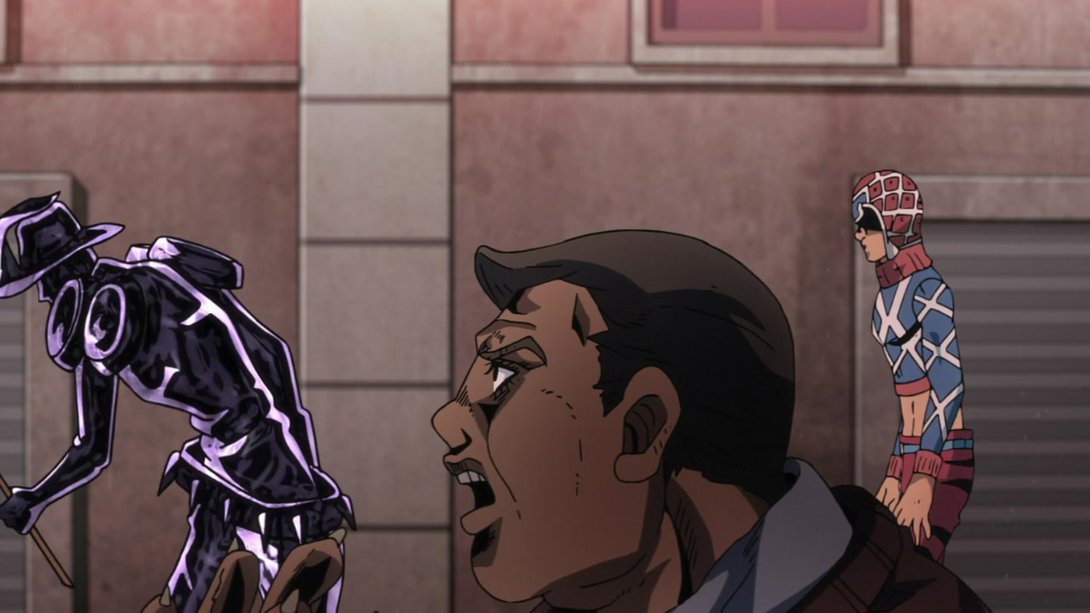
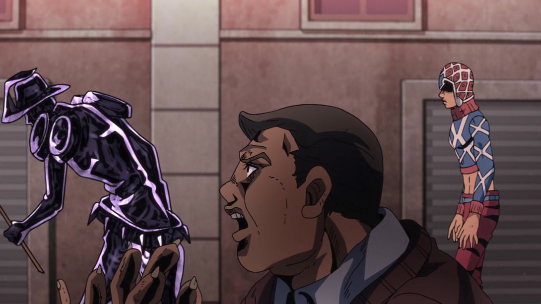
- This frame looks much more interesting thanks to a healthy recolour! In addition, there is a different distortion along the edges and the shadow cast by Mista is darker:
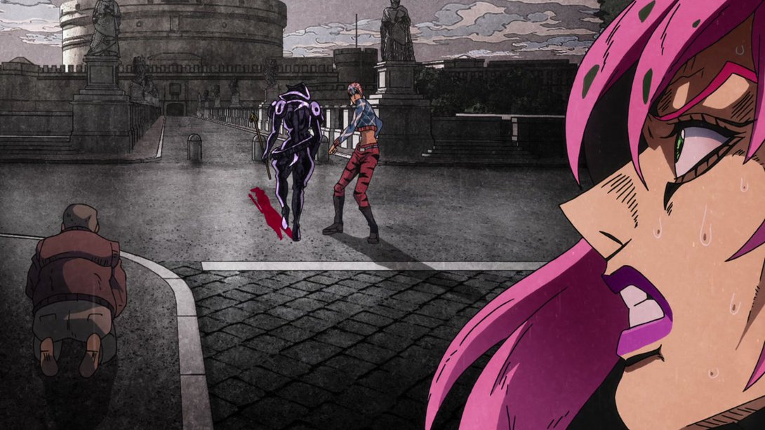
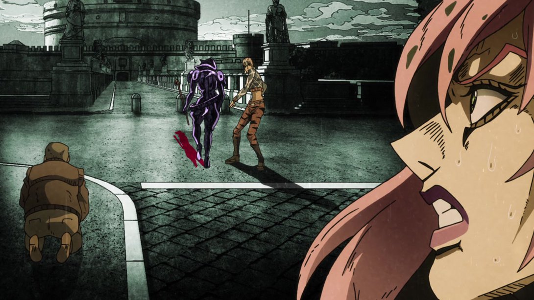
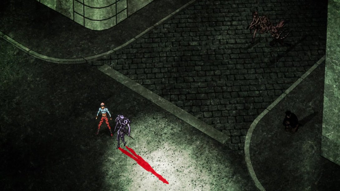
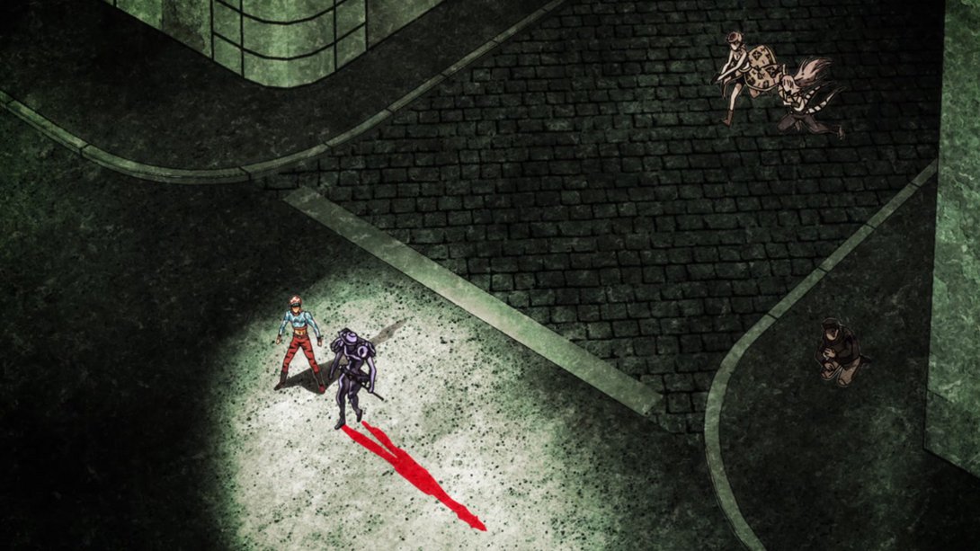
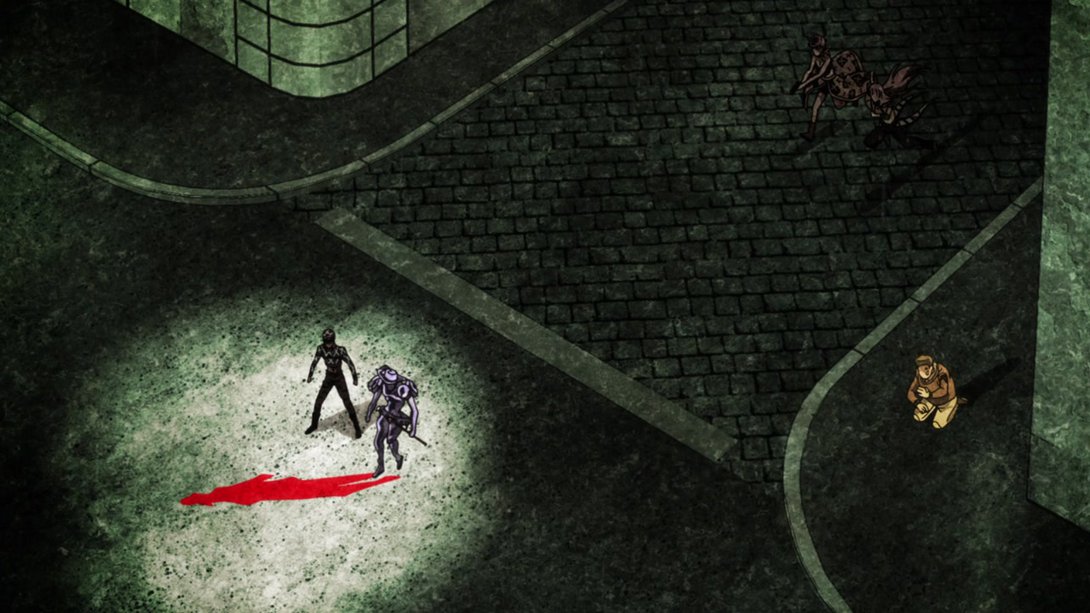
- The spotlights are different in this series of frames; moreover, the people outside the spotlight are brighter and they no longer cast shadows (which makes sense, considering that the shadows are exactly what’s being highlighted here). Mista is also brighter in a couple of these frames:
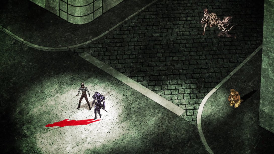
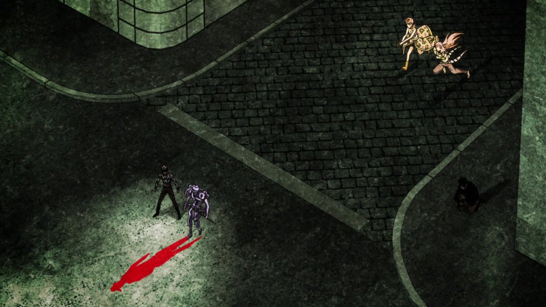
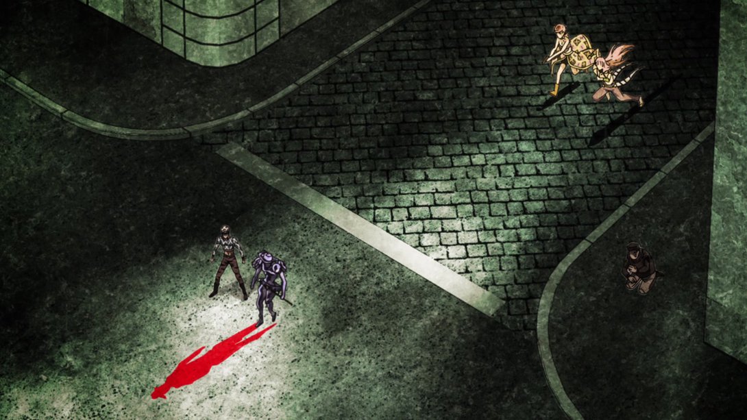
- Here’s another frame which has been made (in my opinion) much more interesting by using different colours! In addition, Mista’s eyes have been shaded over and the soles of his boots are now white:
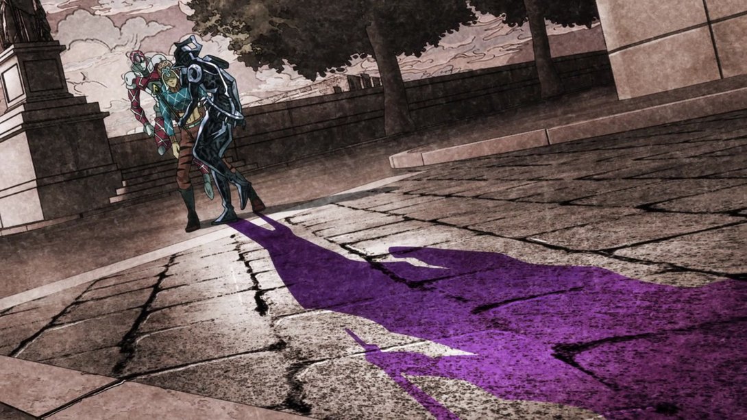
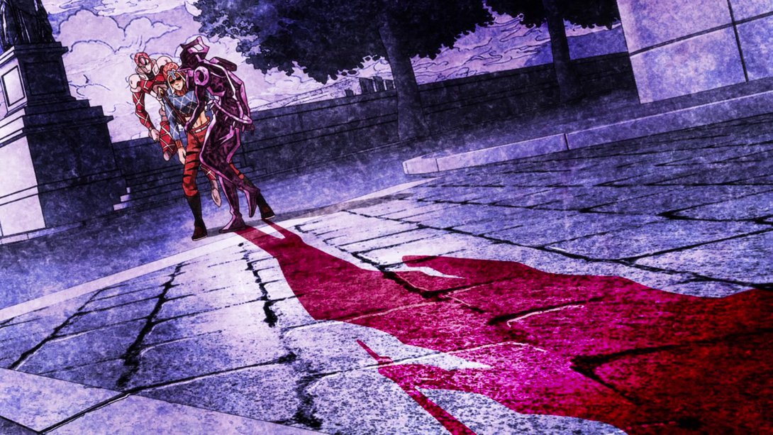
- Moving on… There are so many things different about this particular upcoming bit that I’m going to split the description in two! First off, King Crimson has been retouched, the background has been recoloured, the texture on Silver Chariot Requiem is different and Silver Chariot Requiem moves in the opposite direction…:
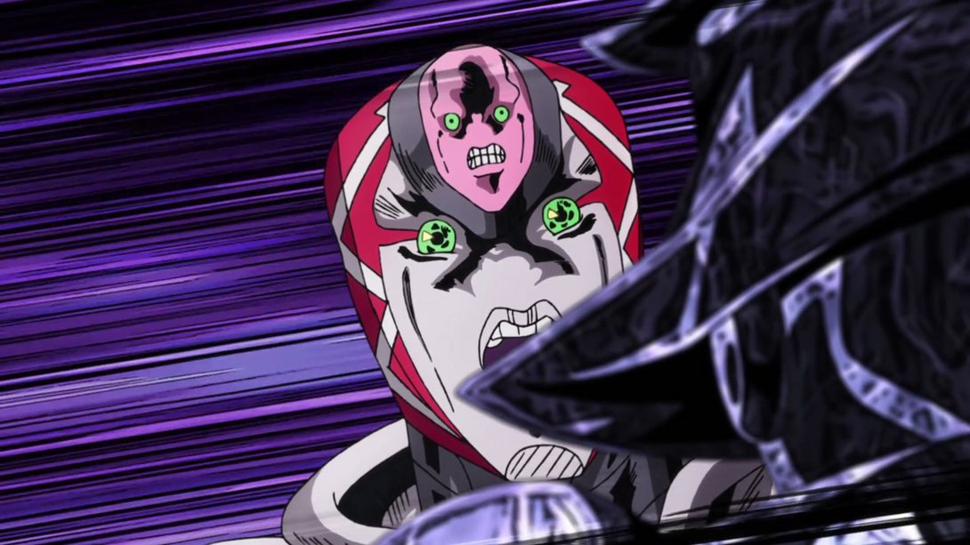
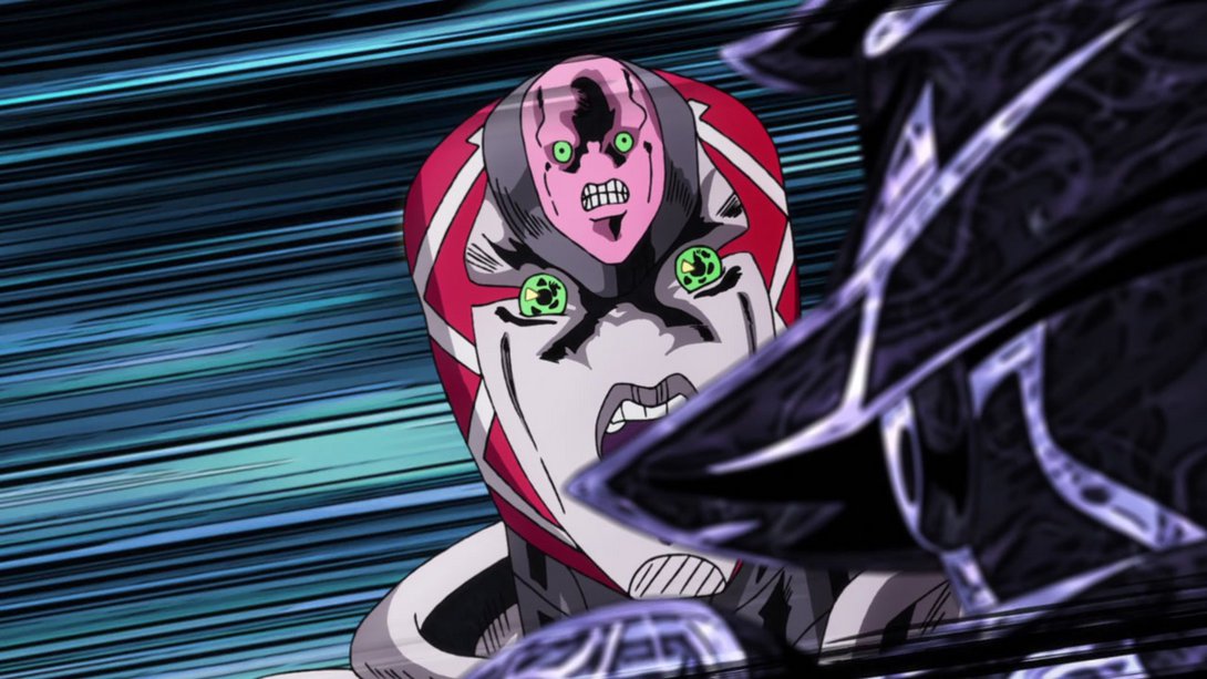
- …in addition to all that you might have noticed that the first glare has been moved and retouched a little bit, the sun behind King Crimson’s head starts up brighter, and the final glare has also been rotated and retouched:
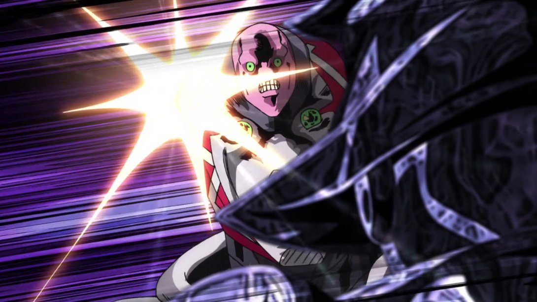
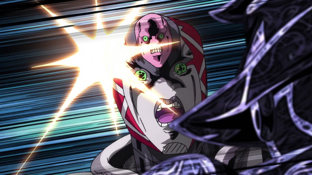
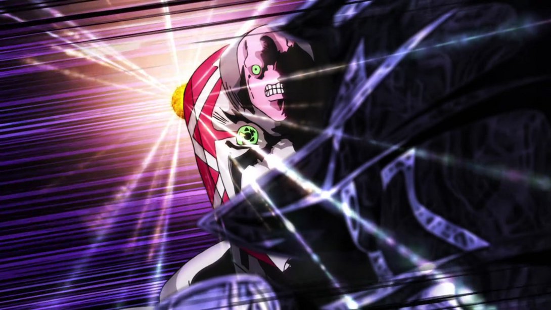
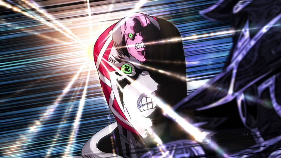
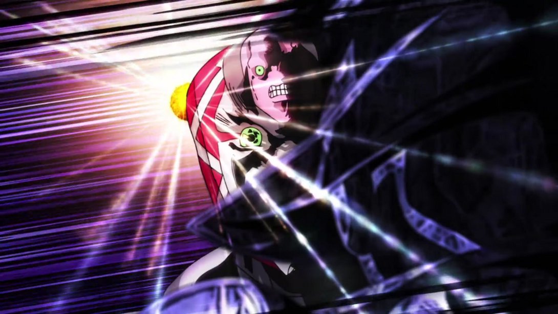
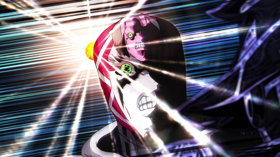
- This animation is also brighter…:
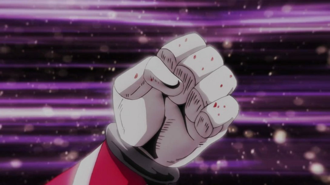
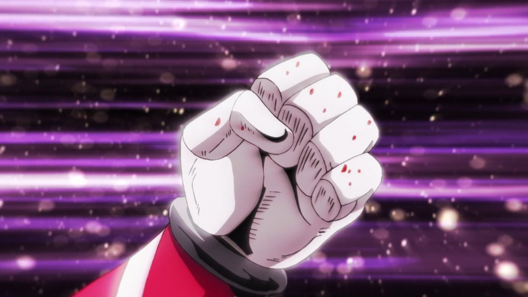
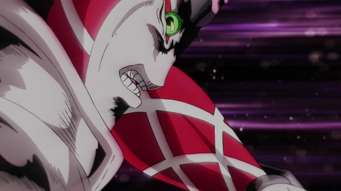
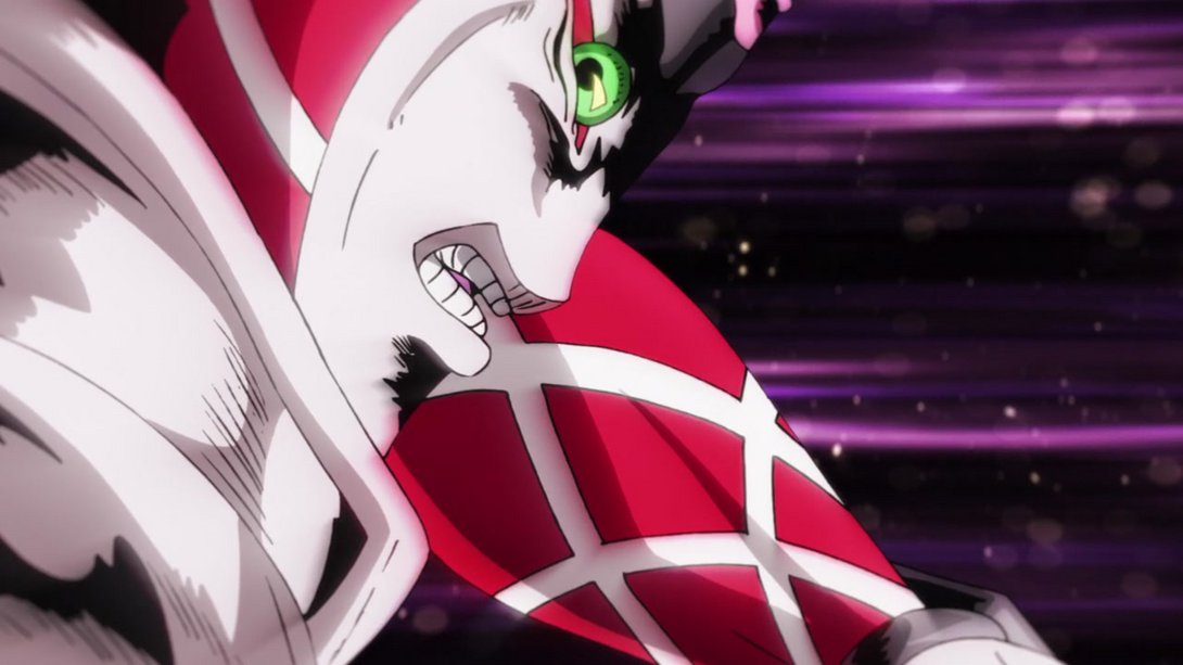
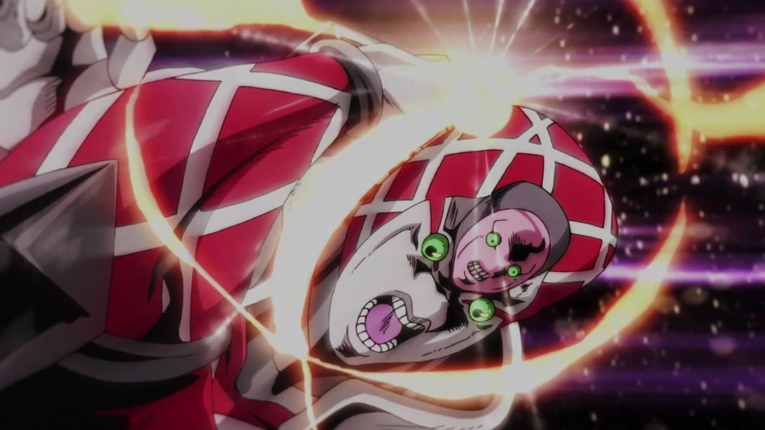
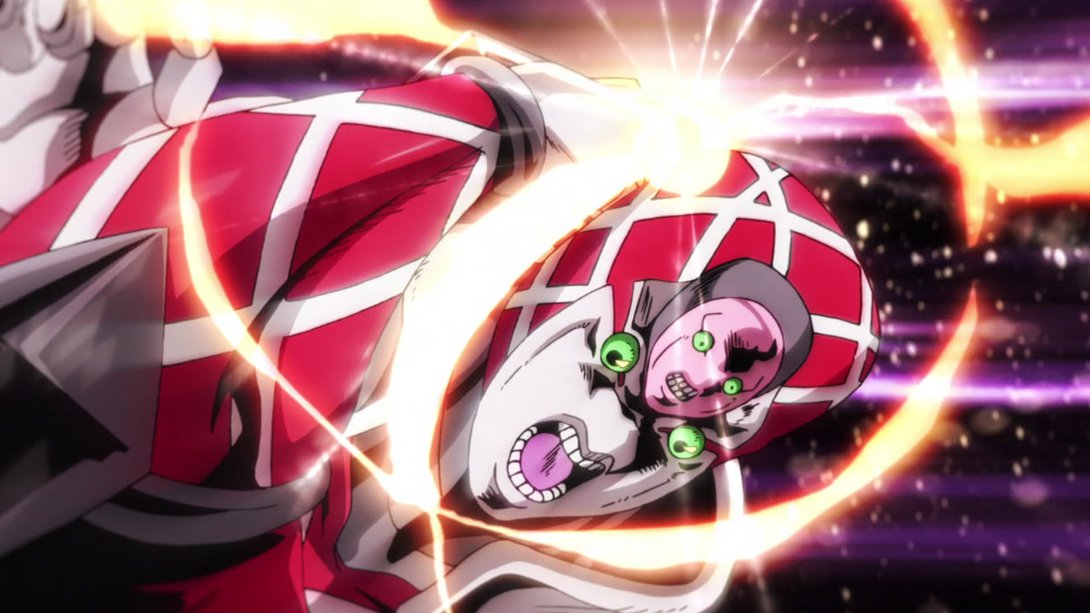
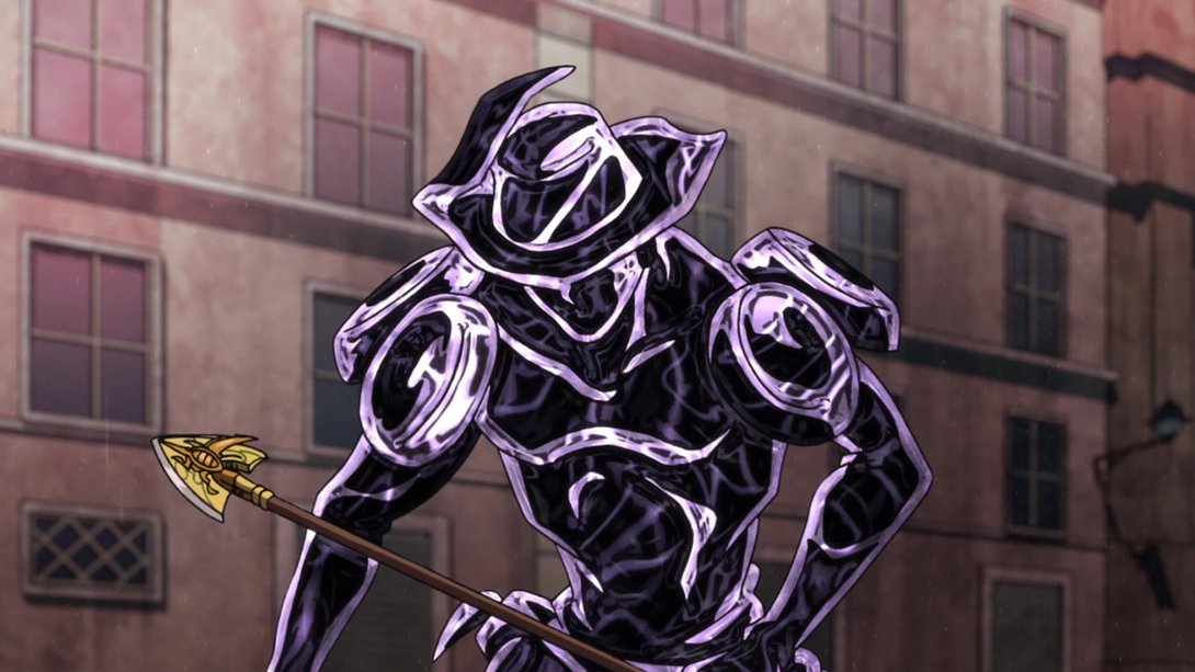
- Here, the middle of the arrowhead has been recoloured, Silver Chariot Requiem has a slightly different texture…:
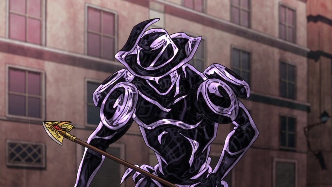
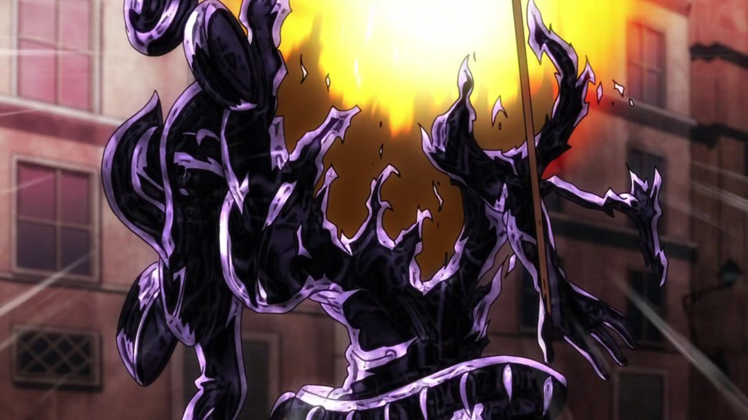
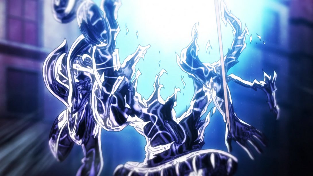
- …and when it explodes, the explosion has been recoloured and is now also much brighter, the motion lines on the edges of the frame are different and the background becomes blurrier:
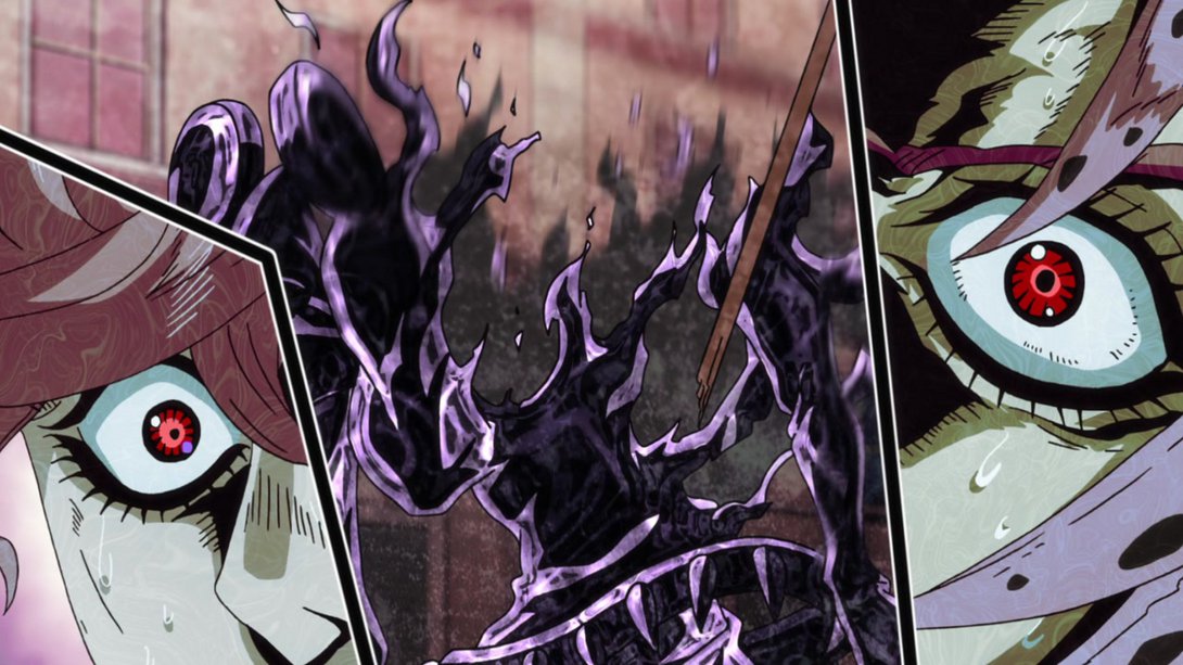
- When Trish and Diavolo show up, the texture overlay looks more prominent, Trish’s part of the frame has a different background and the dividers look much better and much more stylized:
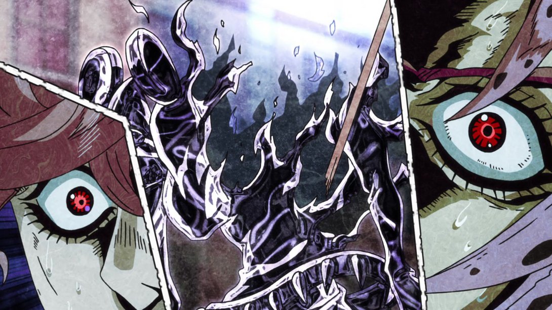
- The shading on Giorno is a little darker, here…:
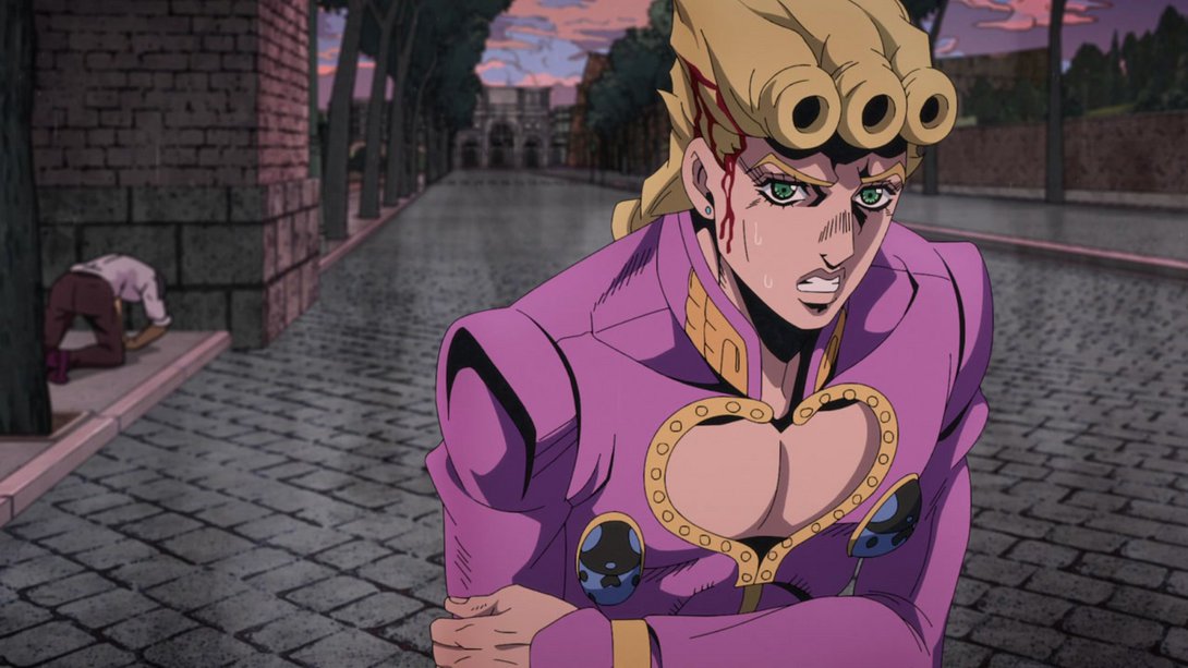
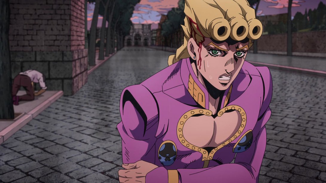
- The beginning of this animation is looking super different! Most colours have been changed, there is a slight bloom effect, the background is much blurrier, the bullet leave a much brighter trail and have been moved to the correct layer…:
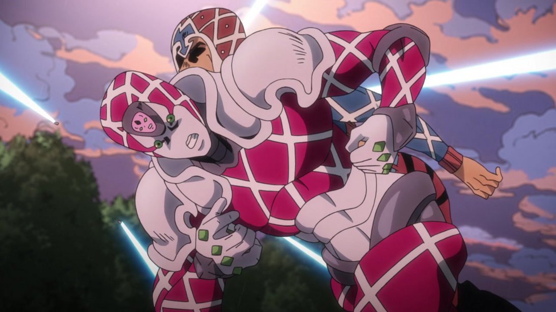
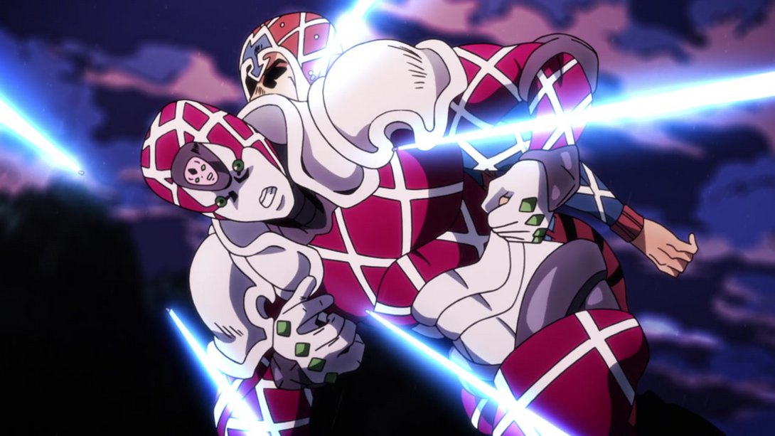
- …Later on, King Crimson’s punches are slightly blurrier and whenever they hit the bullets, some glittering particles are scattered all over the screen…:
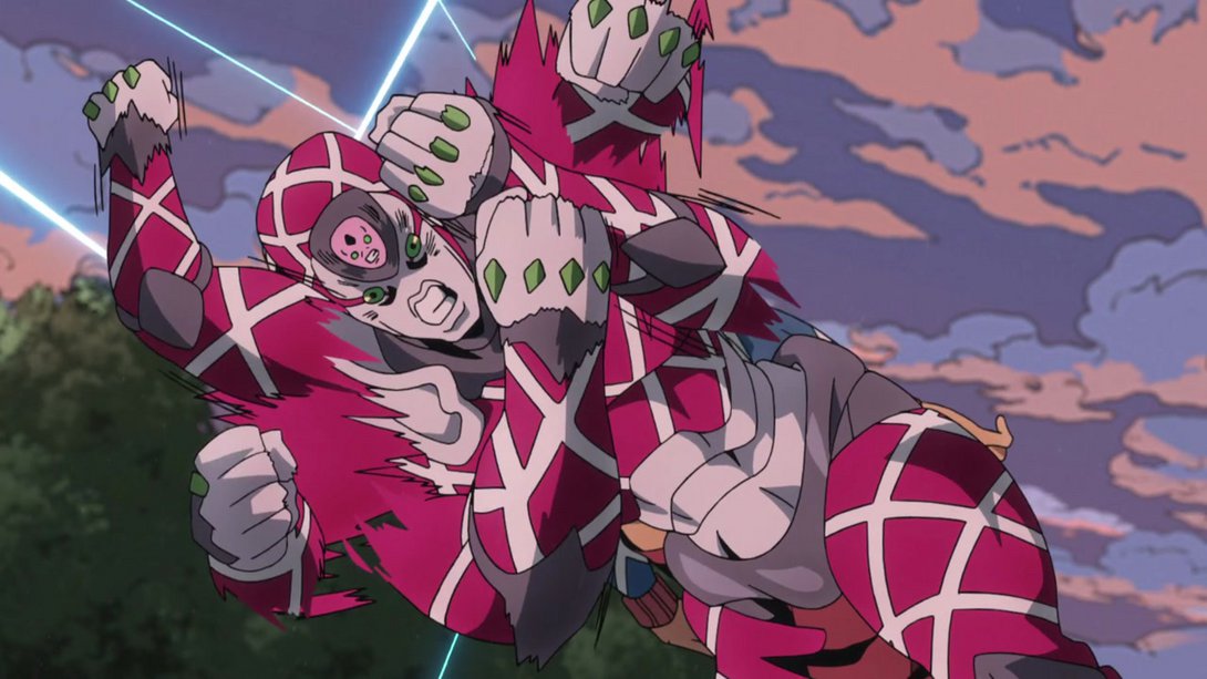
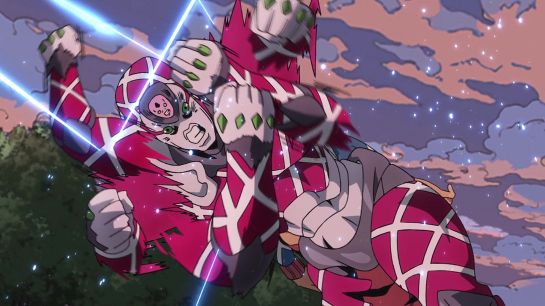
- …And later on still, Trish is brighter and less transparent, and there are way more prominent movement lines all over the screen:
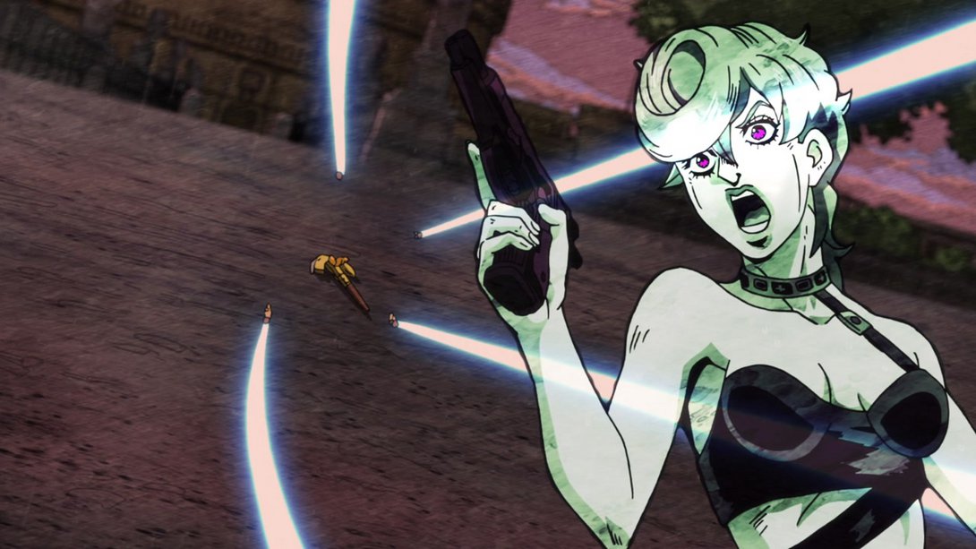
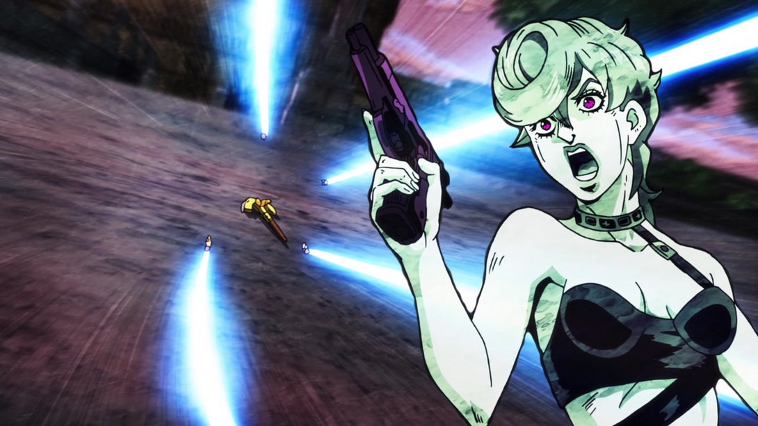
- Let’s watch the whole thing in motion, shall we?:
- Some bits here have been shaded more, most lines on Diavolo are thicker and the camera no longer shakes around:
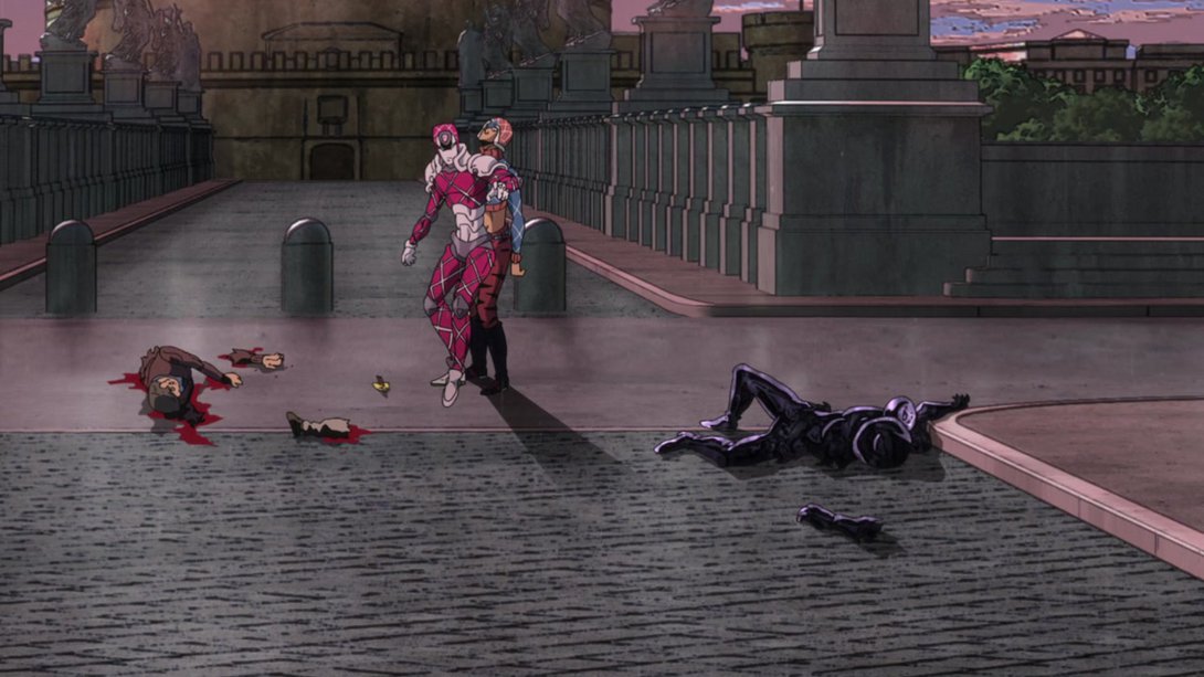
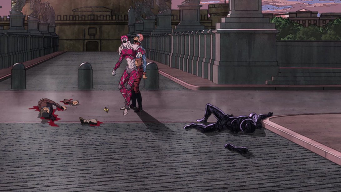
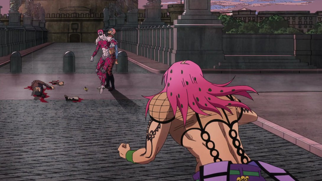
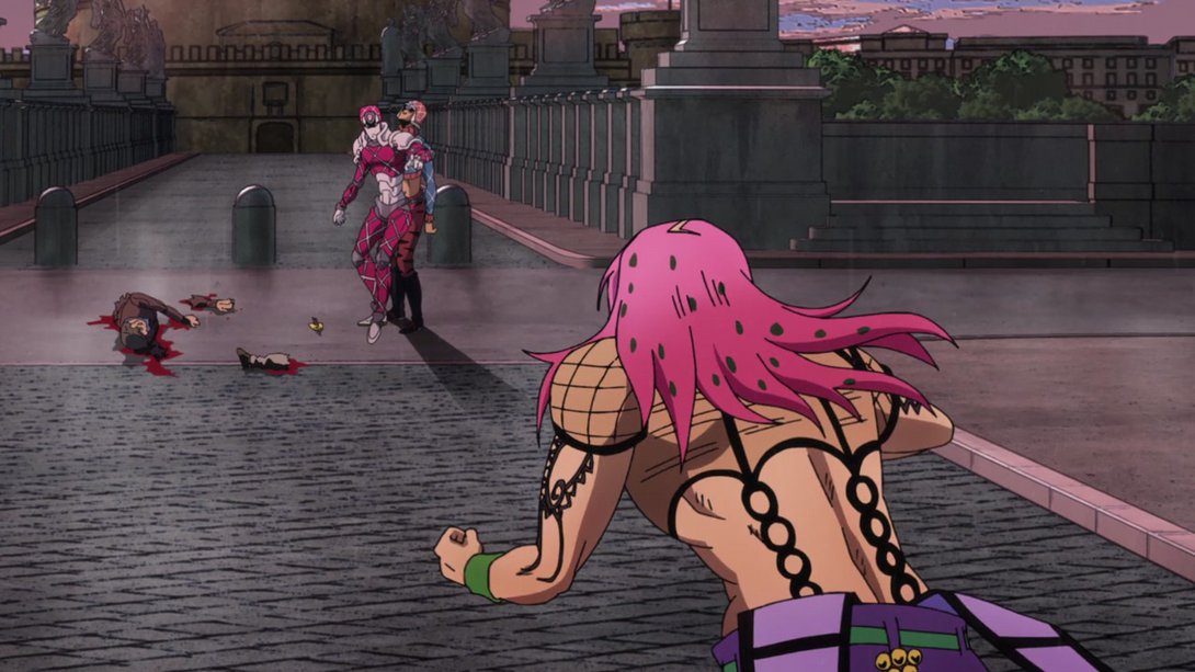
- By contrast, later on the camera is shaking where it was still in the TV version! In addition, the way King Crimson shows up is also different, the background is looking a little more interesting, there are many more motion lines all over the place and the shot has been rotated very slightly:
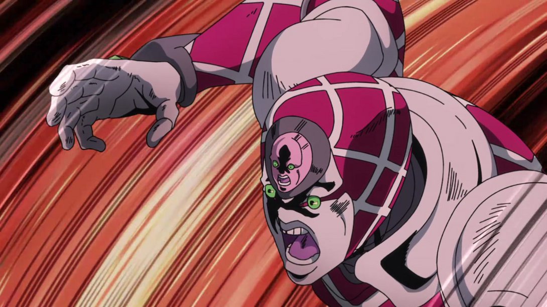
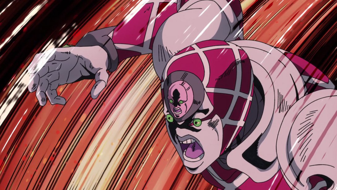
- Hwere we have another scene with a whole bunch of differences! In no particular order: the motion lines at the edges of the frame have been recoloured black, the background has been shaded differently, King Crimson is sporting some new shadows and highlights and Giorno has been lit better, so that he no longer looks like he’s part of the background:
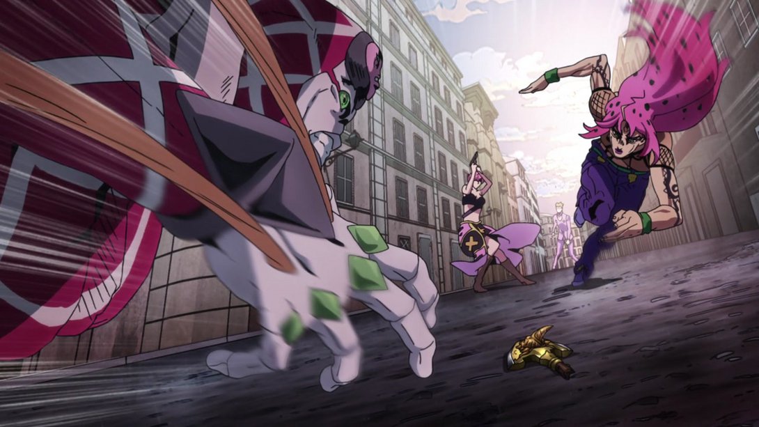
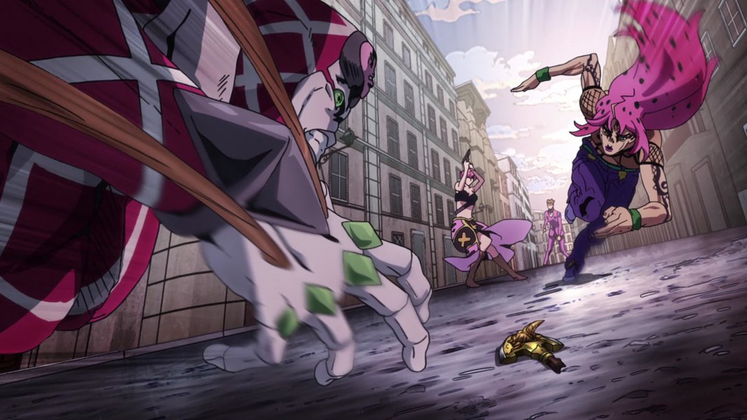
- Here, most things have been moved around, and two holes have been added in the ground, next to the arrowhead:
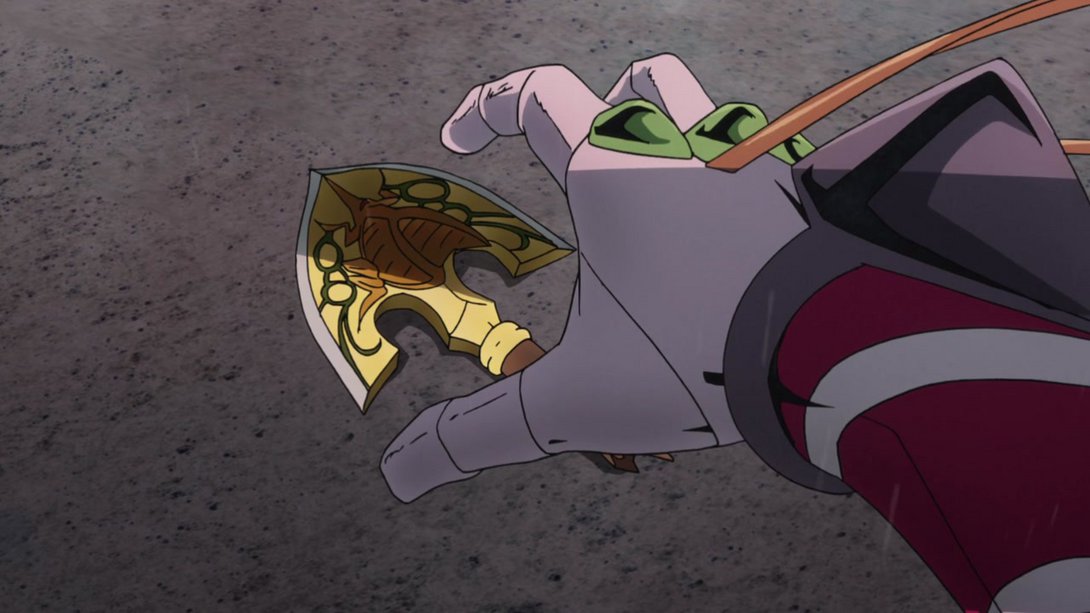
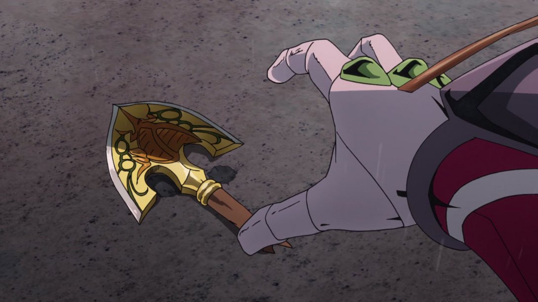
- The bottom of the frame is slightly brighter here, and some details have been retouched on King Crimson (although, alas, some mistakes have been introduced in a couple of these frames - thanks, justacer!):
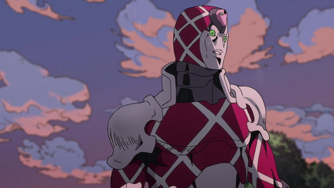
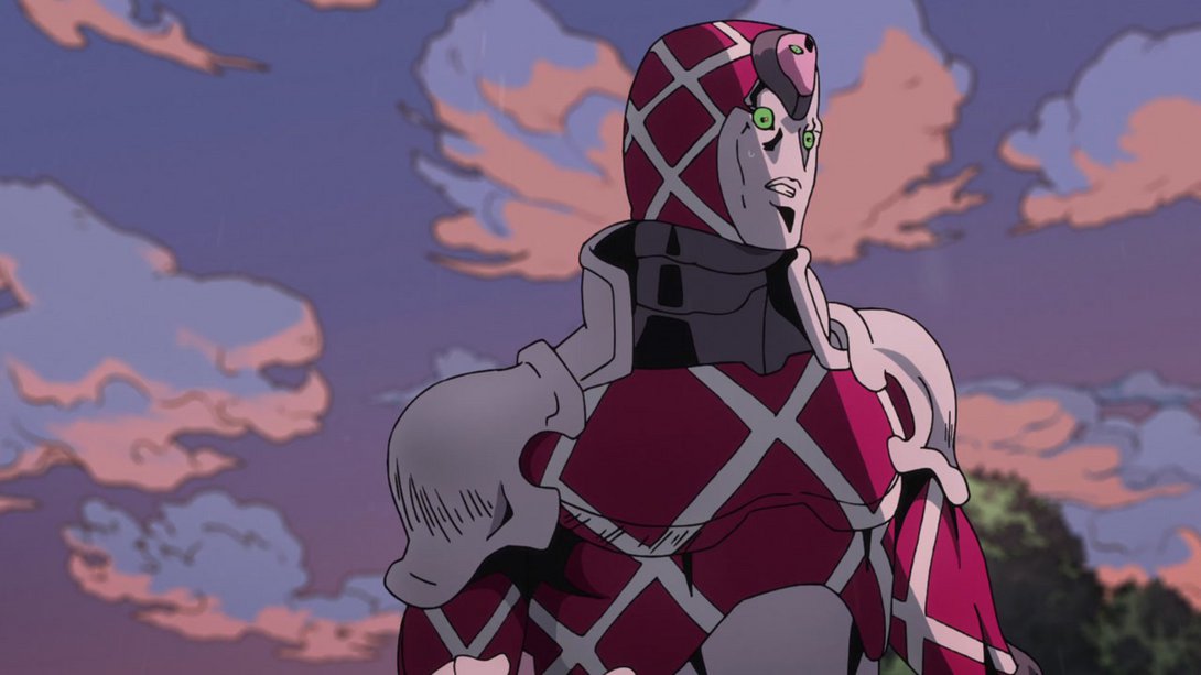

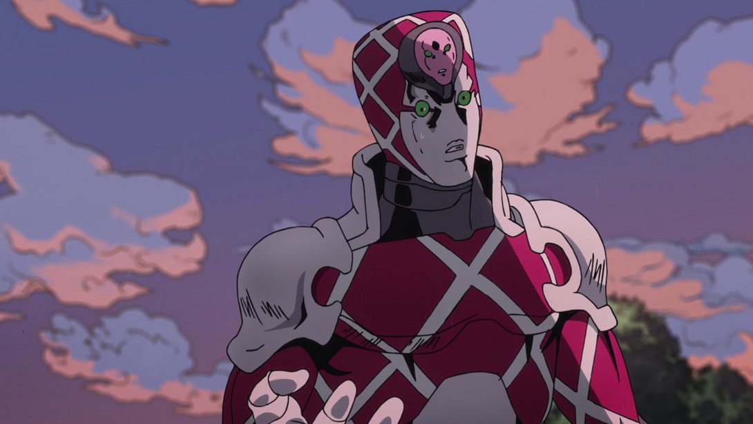
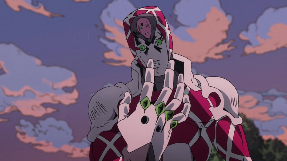
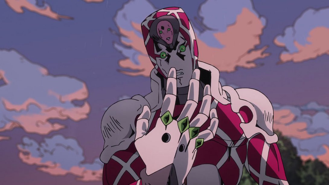
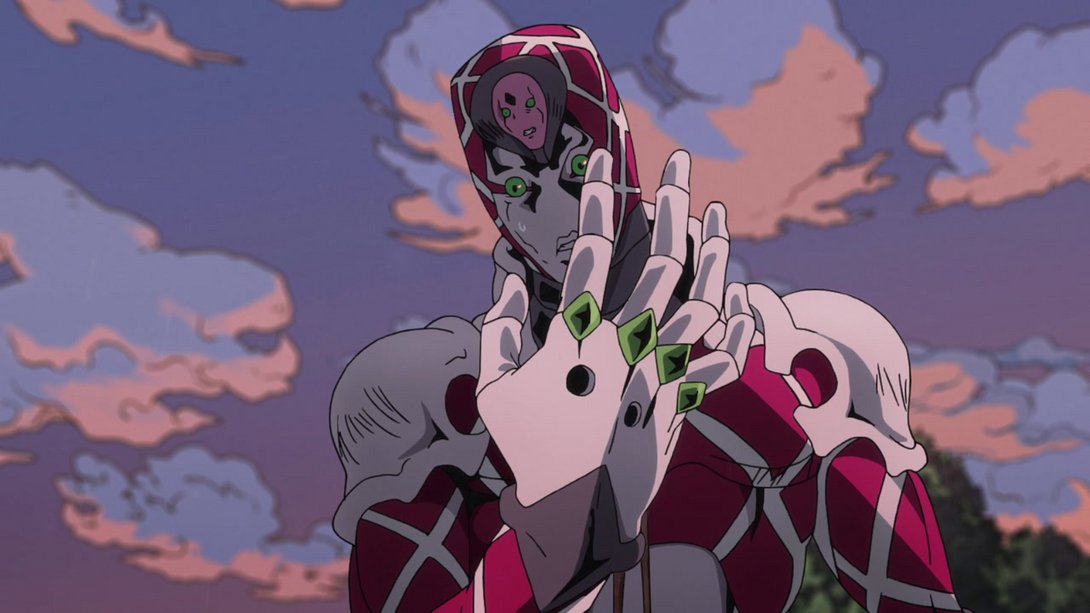
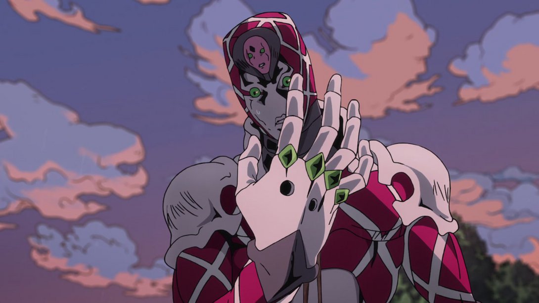
- King Crimson is looking MASSIVELY better here, thanks to a whole bunch of extra shades and highlights all over the place:
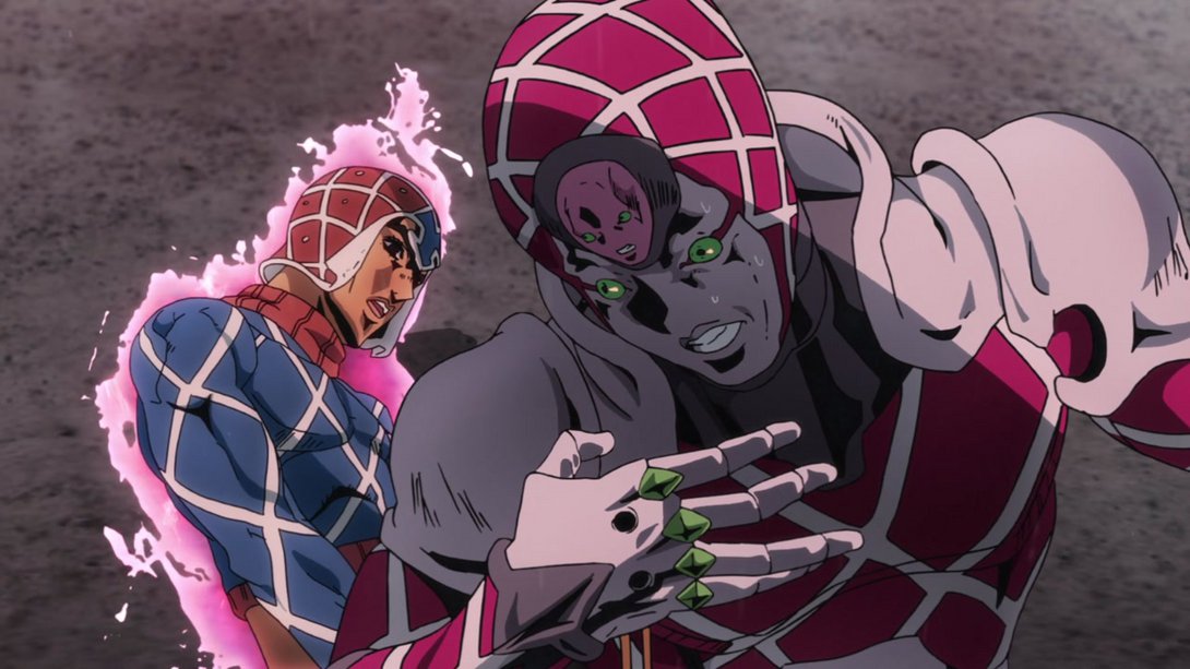
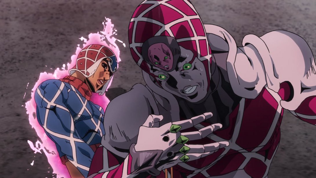
- The same treatment has been given to Spice Girl: a bunch of new shadows contribute to making her look better and more three-dimensional here. In addition, there is a different distortion along the edges, and Mista is also slightly brighter, in the foreground:
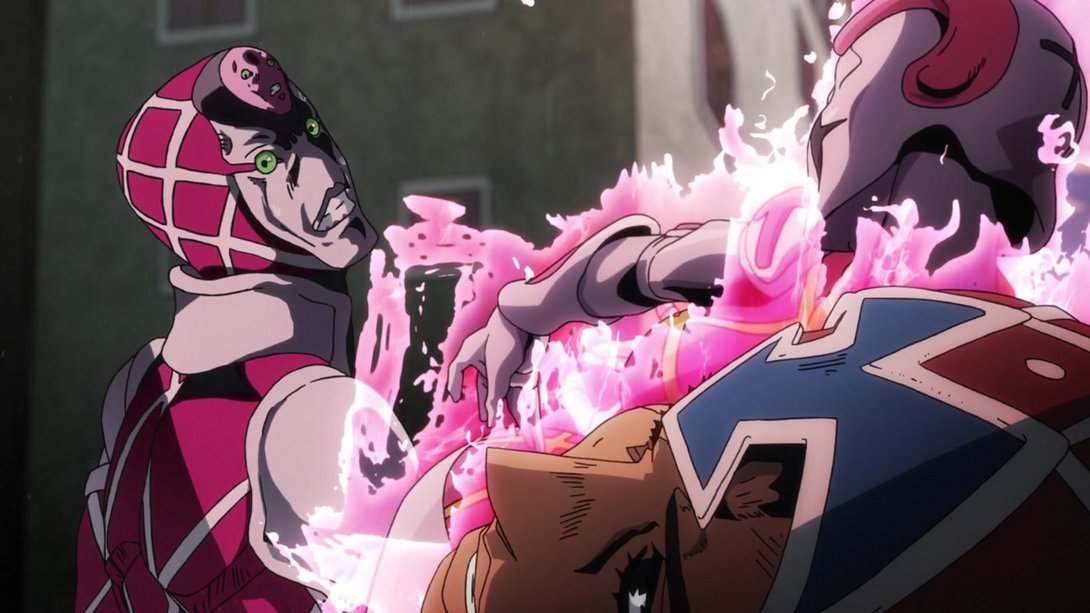
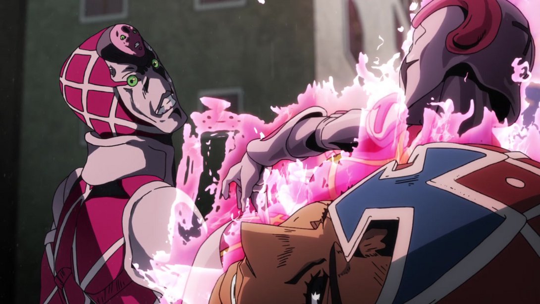
- Spice Girls has a new highlight on her lower lip here, and Mista’s eye area has also been retouched:

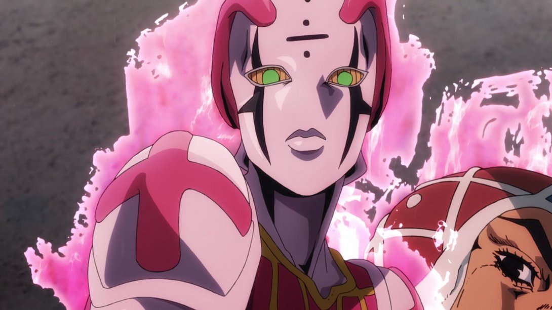
- The arrow has also received a handful of new shadows and highlights here, making it look immensely better, in my opinion! Moreover, Trish has also been coloured a little flatter:
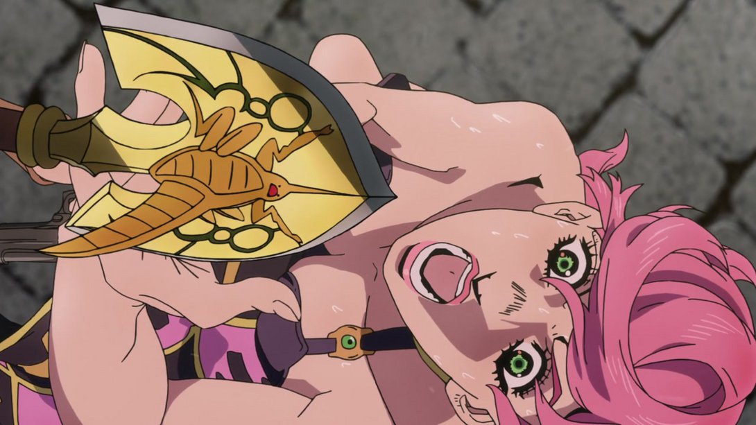
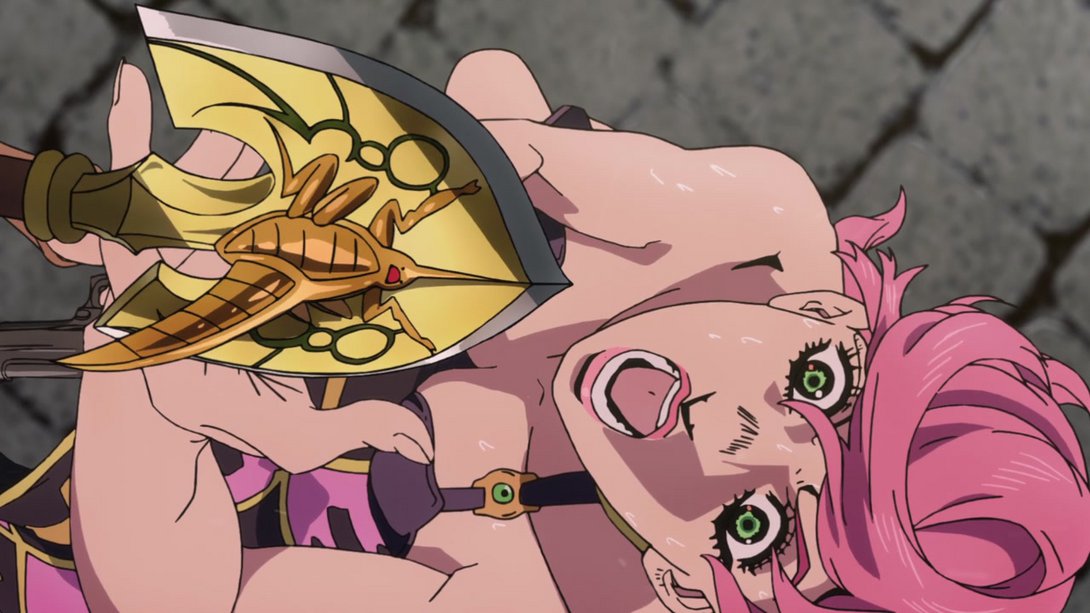
- A whole bunch of things are better, here! Like, a whole bunch! As a result, the shot looks less flat, much more interesting, and the tiny arrowhead flying around in the sky is much more noticeable. Check it out for yourselves:
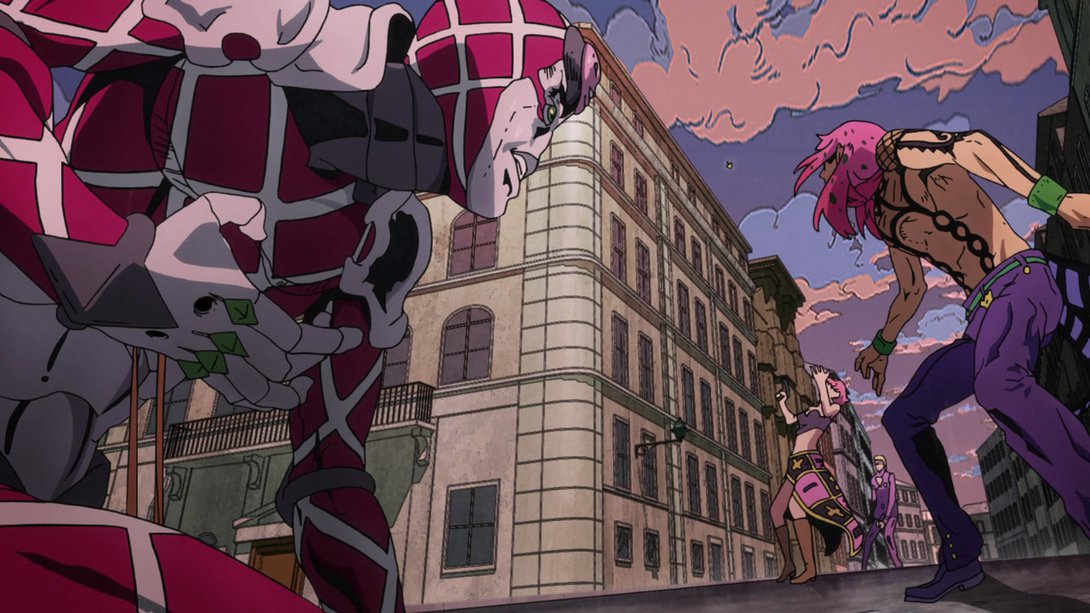
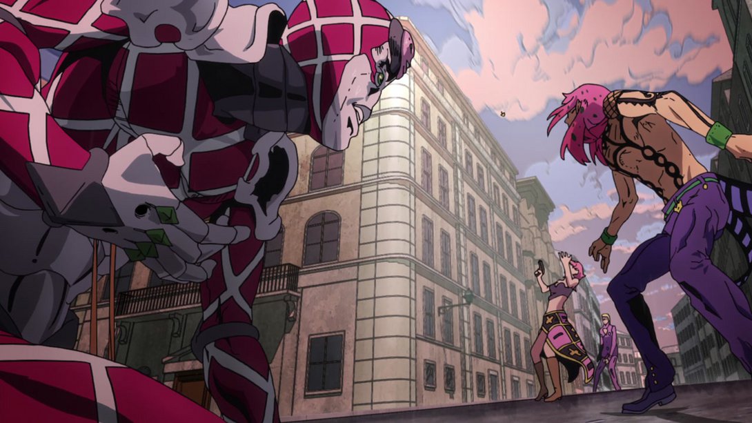
- Mista, King Crimson and Spice Girl have all been retouched here:
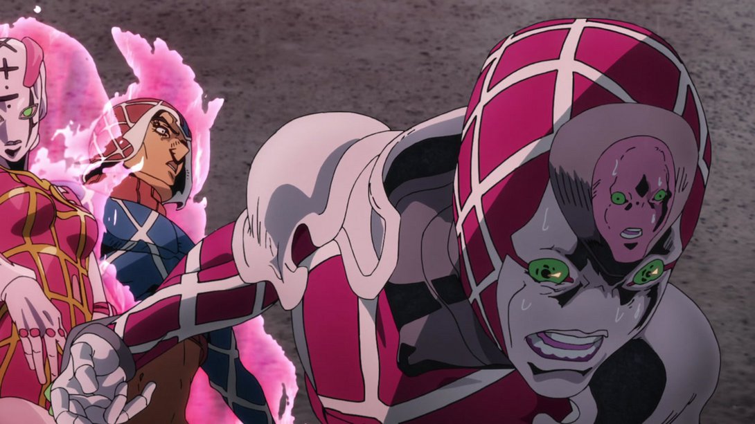
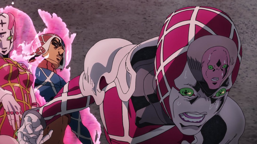
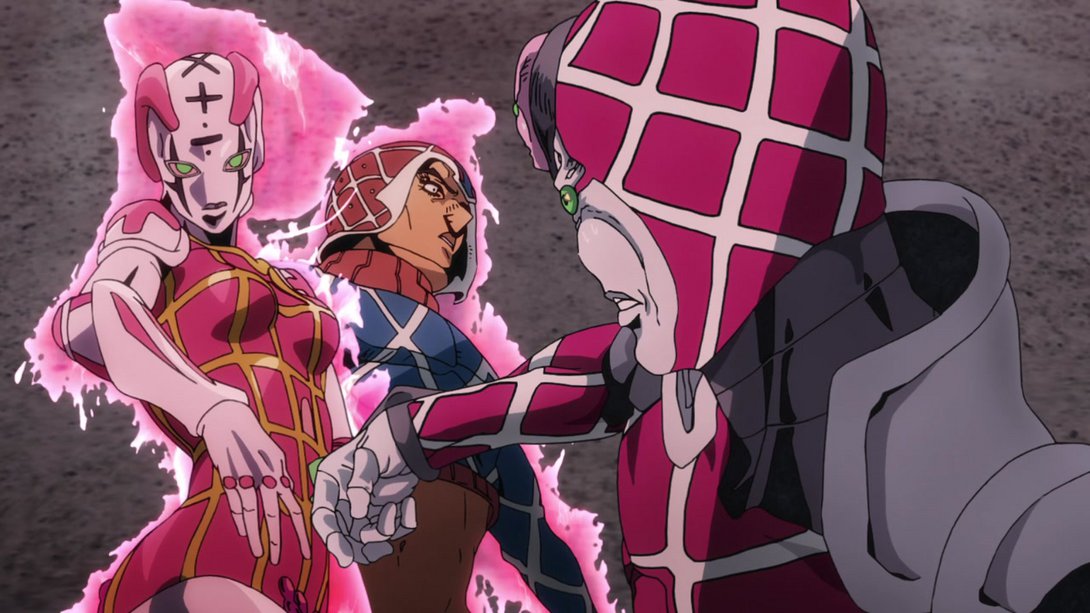
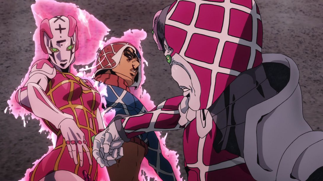
- That pink bit on Spice Girl’s chest has been added here, and Mista’s eye area has been retouched as well:
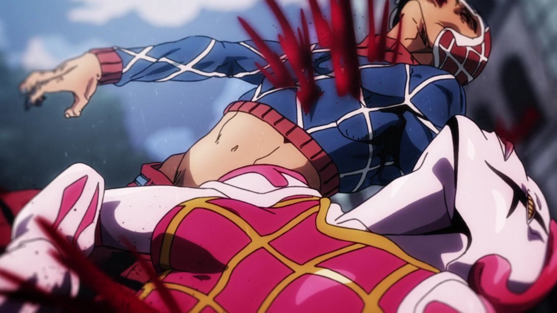
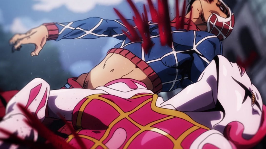
- Mista, King Crimson and Spice Girl are all brighter here, and the two stands have been separated more clearly and moved further to the left:
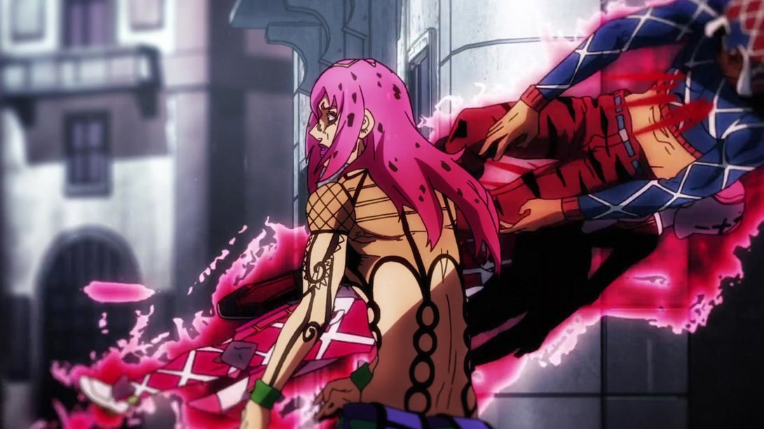
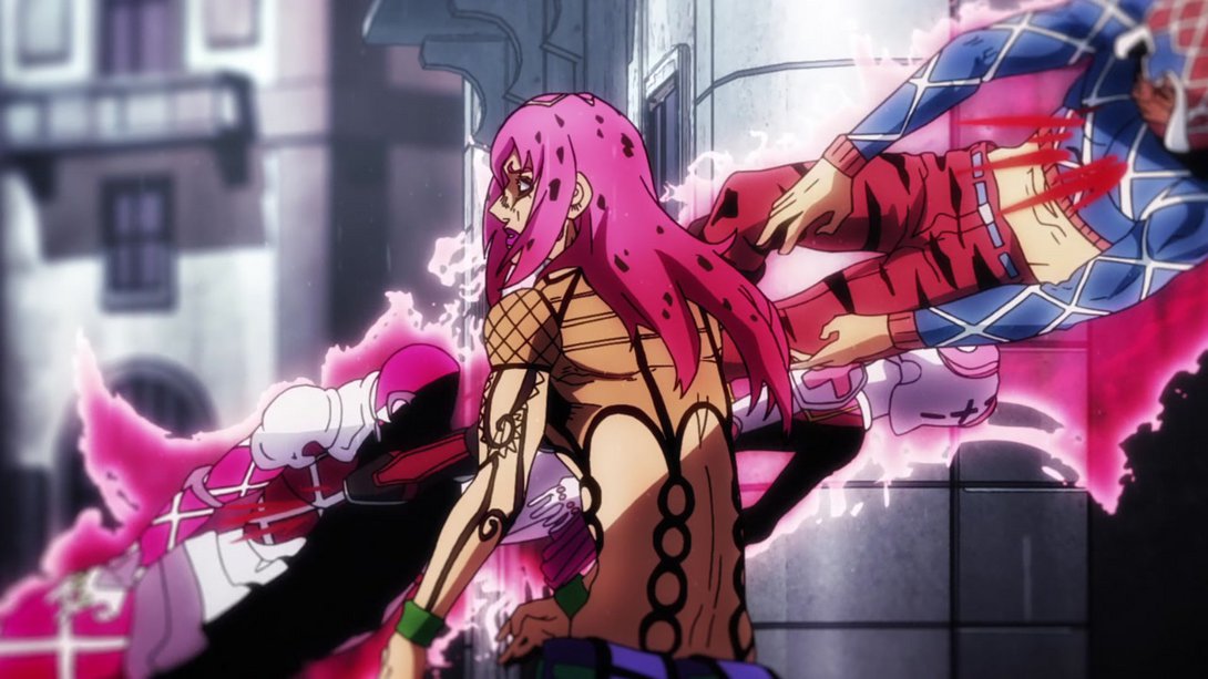
- Here, in addition to the usual different distortion along the edges, the background texture has been stretched differently and there are some new highlights on Spice Girl, making her look more plasticky. Nice! Check it out:
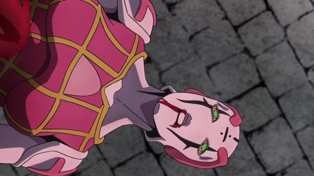
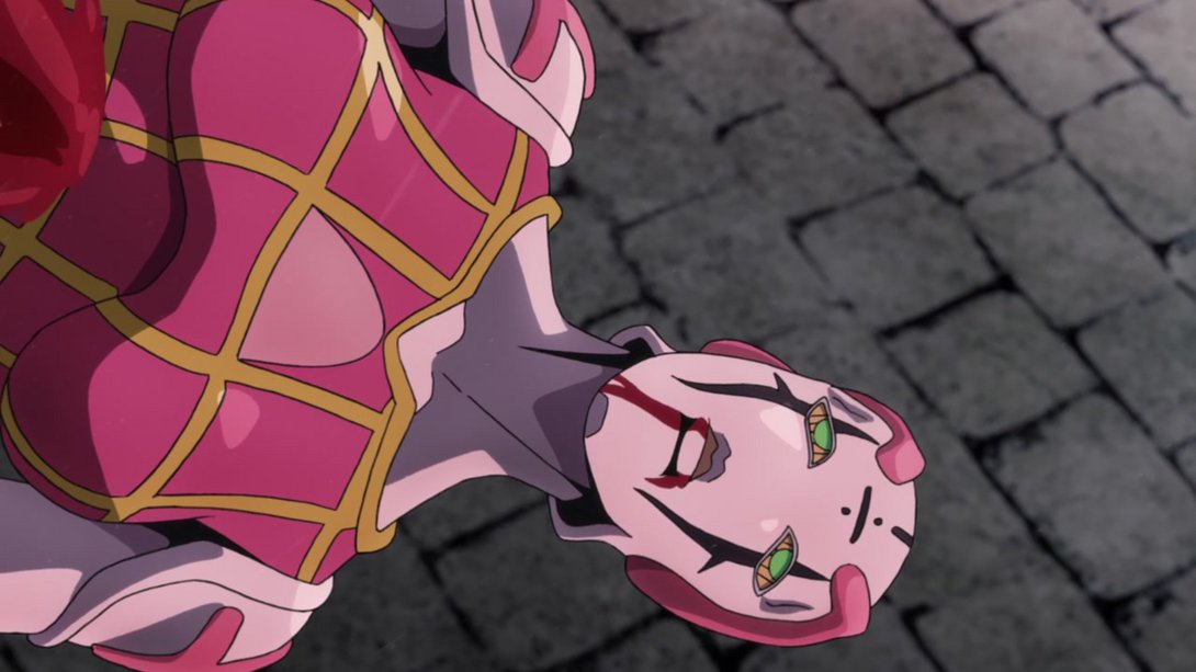
- In addition, Spice Girl is now sporting a blue aura later in the same scene…:
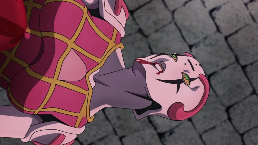
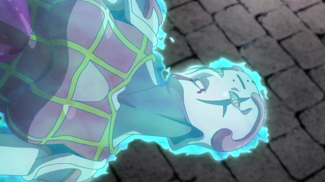
- …and, when Trish’s soul (?) shows up, both her and her stand are moved down slightly, in order to center them better in the frame:
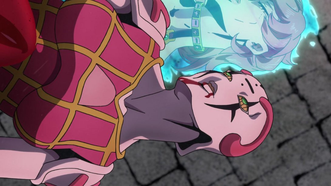
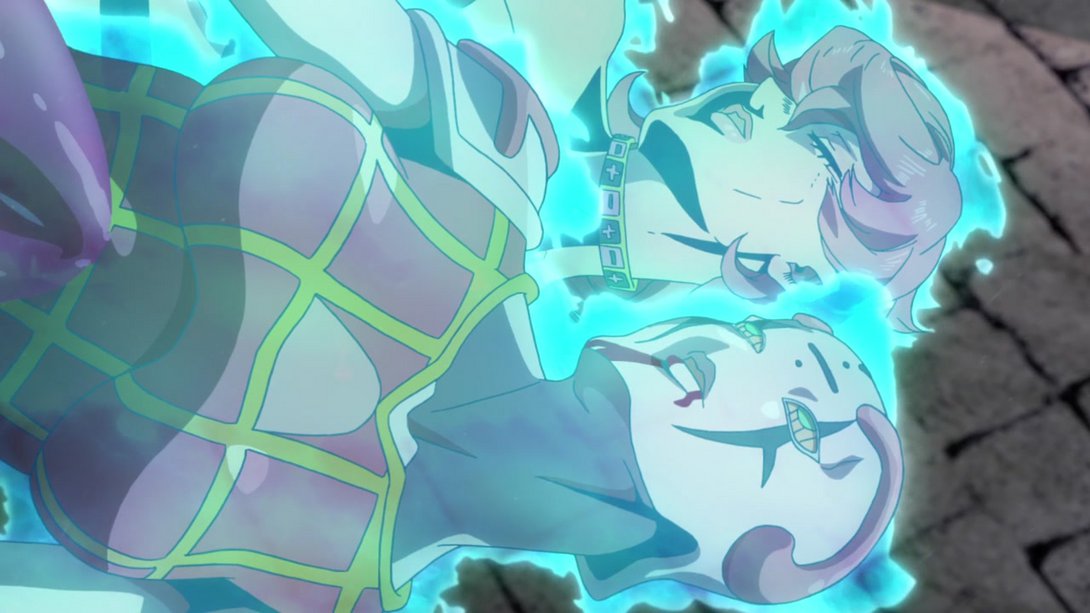
- Here, Diavolo’s eye is looking brighter and a little more vivid, and Buccellati’s soul has been recoloured and is now sporting a thicker outline and a slight whitish aura:
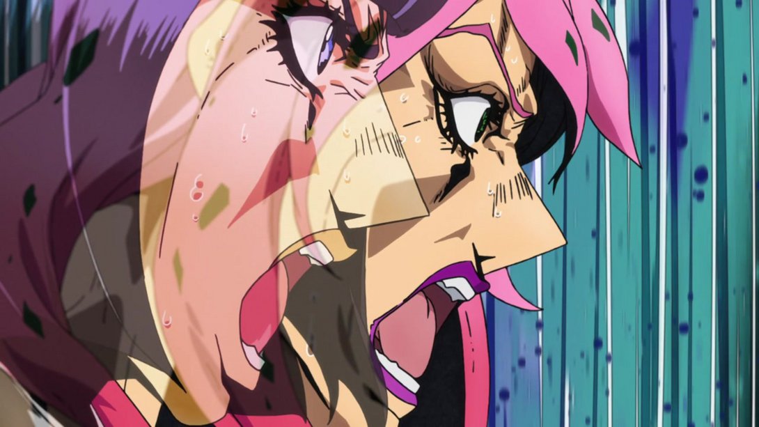
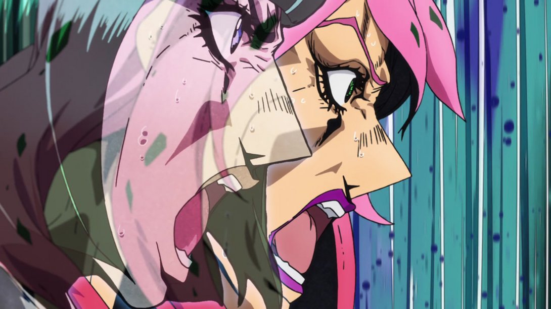
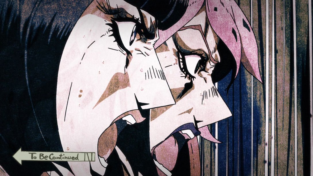
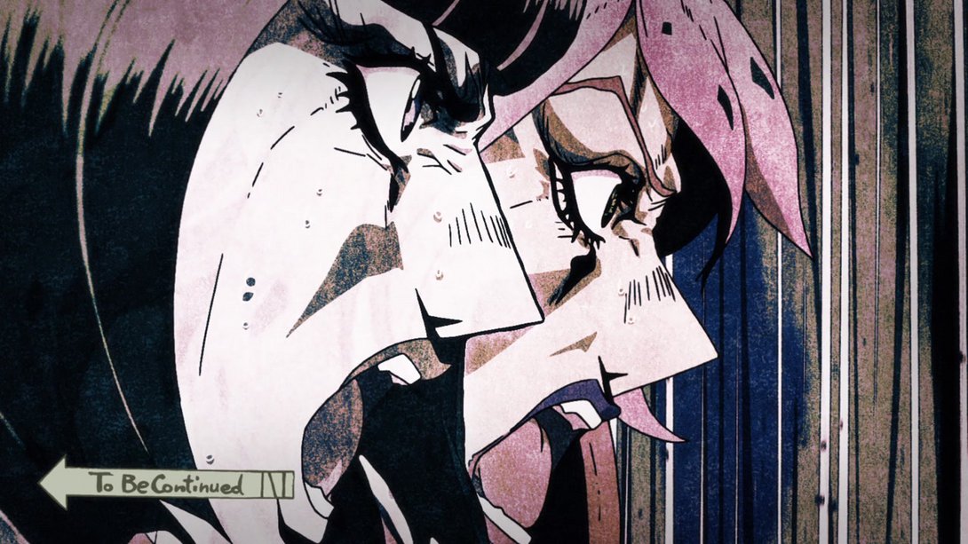
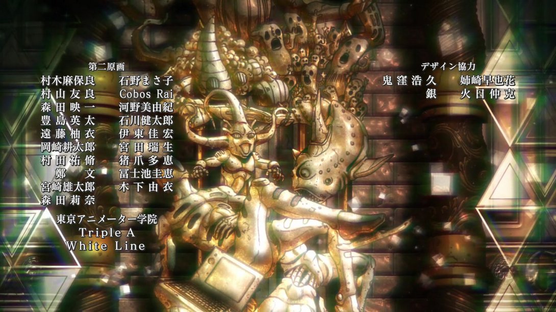
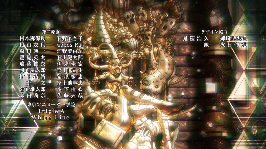
- Phew! We finally reached the credits of this humongous comparison, friends! Let’s have one last credit difference for the road… Here, animator 佐藤天哉 (“Satō Ten’ya”, I believe) has been added to the list, at the bottom-right of the first group:
And here we have it, folks! The stakes are getting higher and higher, the fights are getting more and more confusing, and the comparisons follow suit, growing ever longer! I hope you had a good time, and forgive me if I was a day late - I underestimated how long this comparison would take me. My bad! But I’ll see you next time for Vento Aureo #37, “King of Kings”!
Take care!

