Hello again, good people who have so kindly decided to invest some of your precious time on this site! Welcome back! How was your week? Did you accomplish what you wanted to do? If not - that’s cool too. Relaxing is important as well! Today we’ll take a look at Vento Aureo #34, “The Requiem Quietly Plays - Part 1”! It’s going to be another lengthy comparison, so sit back and enjoy!
Shall we?
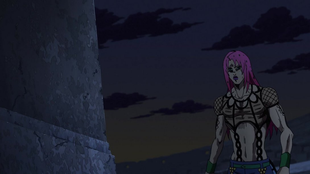
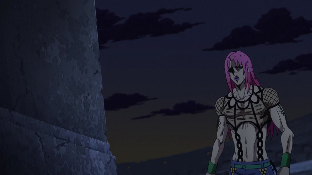
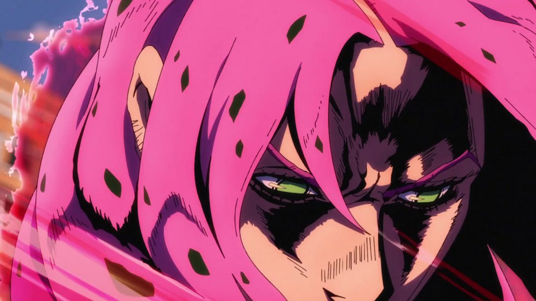
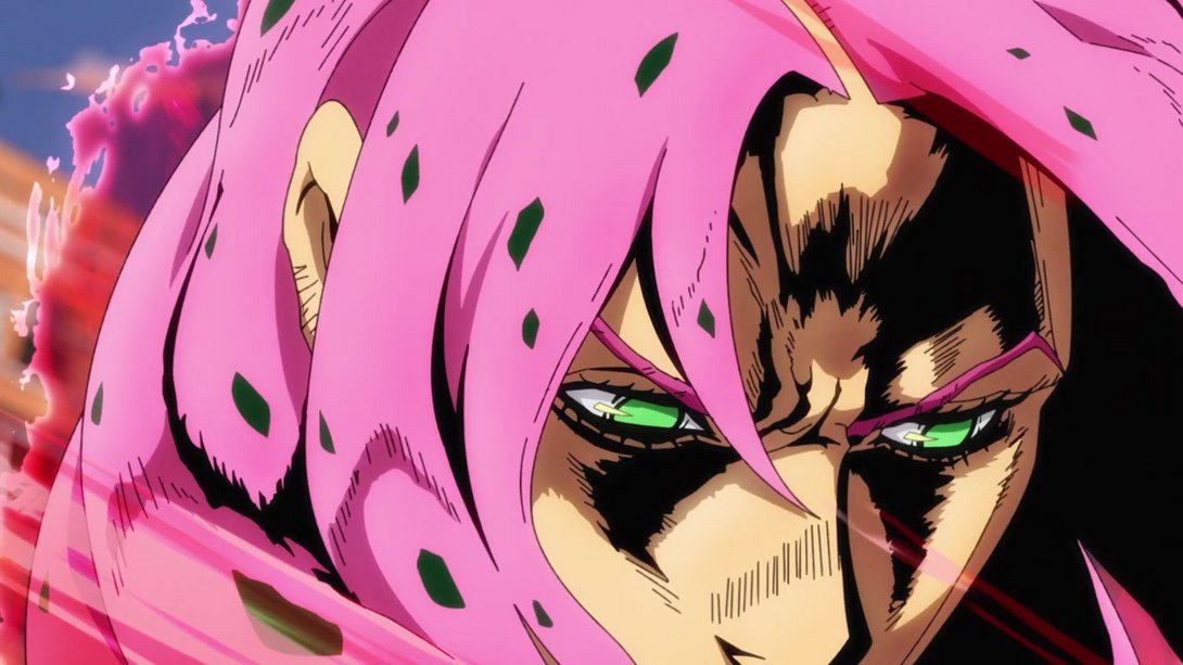
- Let’s start strong with this series of frames, friends! Here, Diavolo’s face has been thankfully redrawn, the lighting on him is much brighter, there’s a different distortion around the edges and a slightly darker vignette on the bottom-left corner. Let’s take a deep dive:
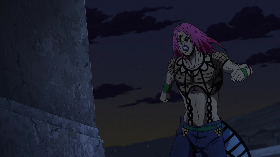
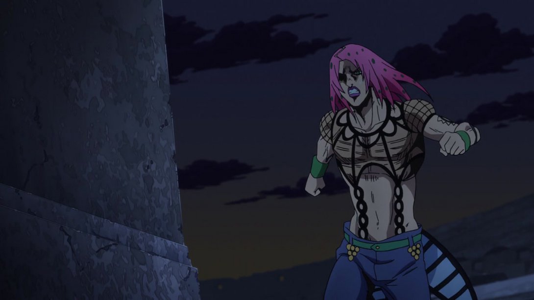
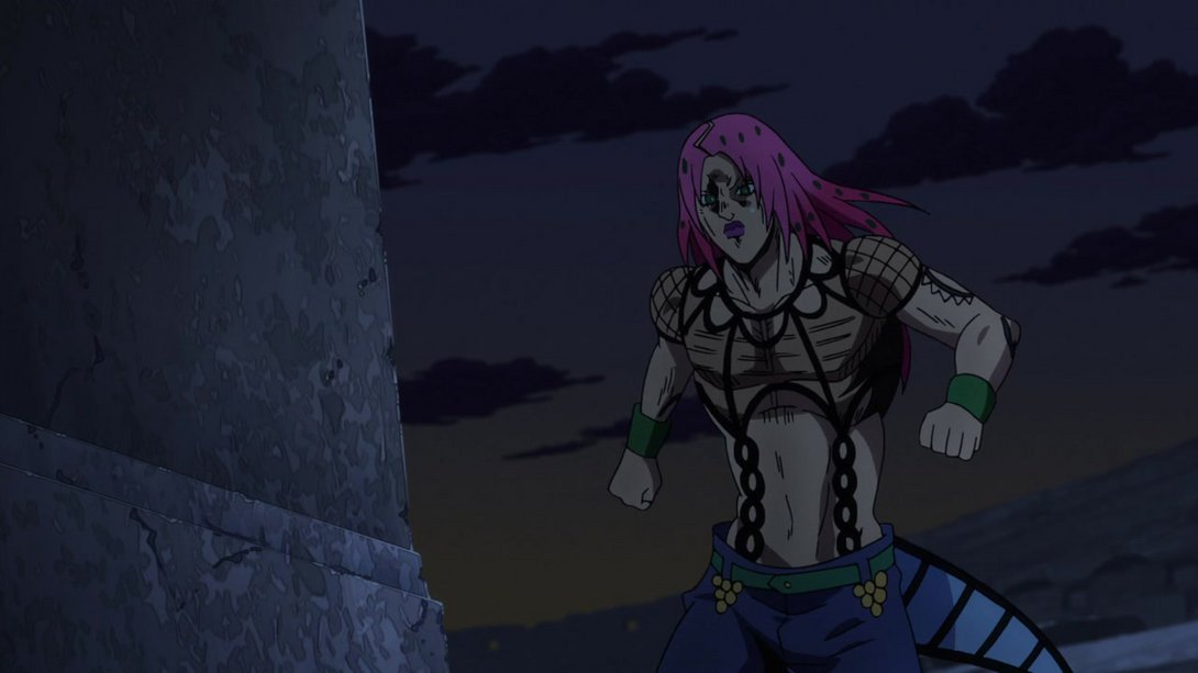
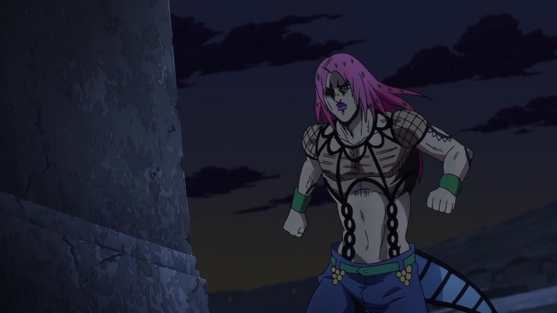
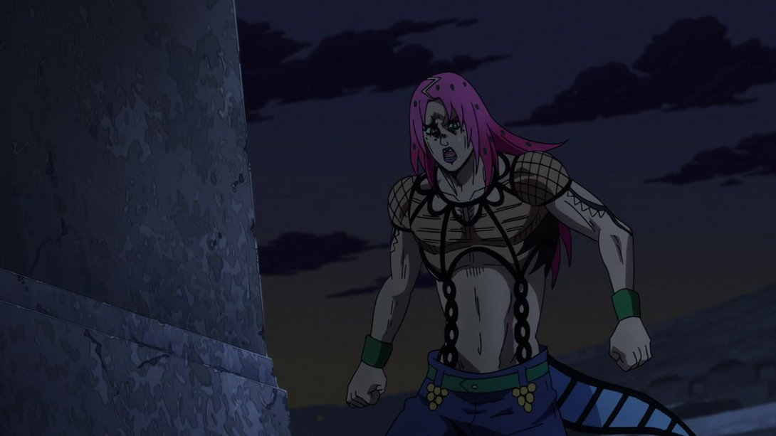
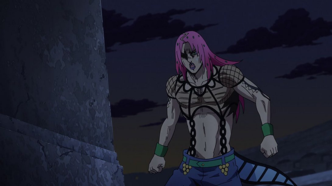
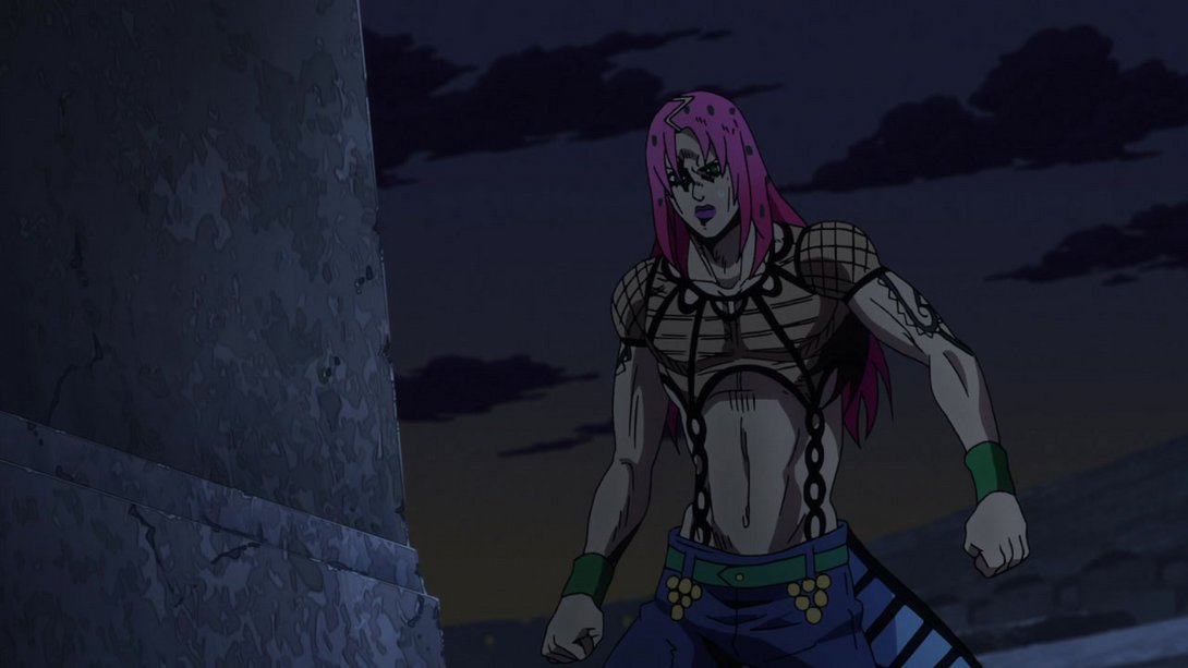
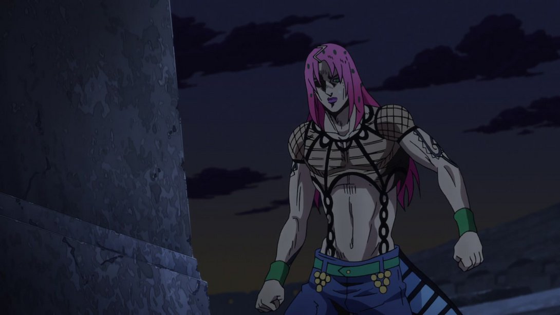
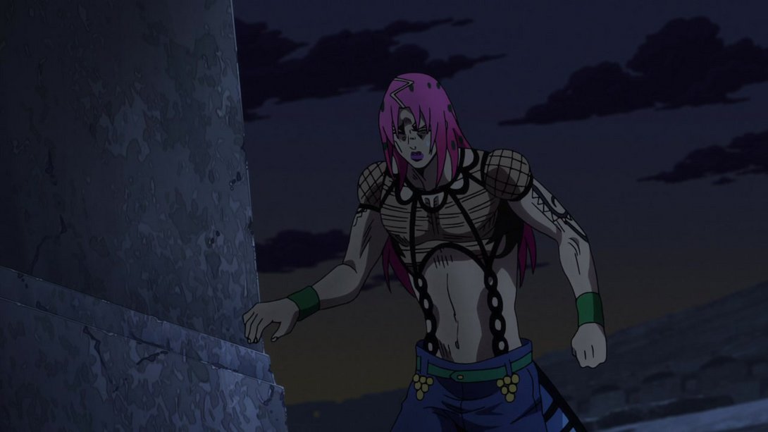
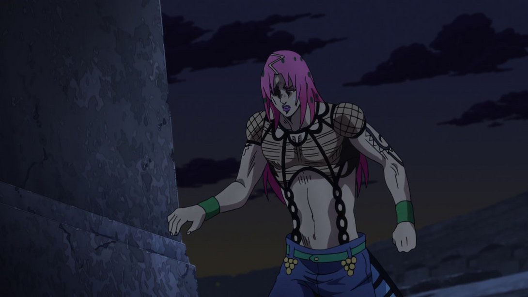
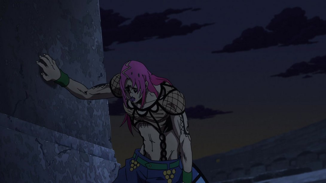
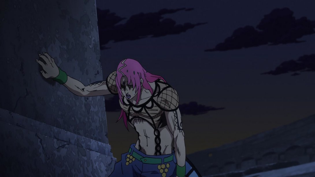
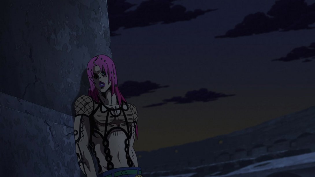
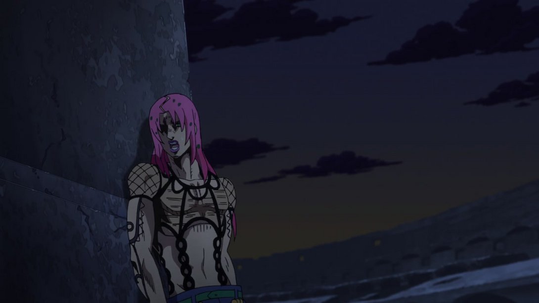
- Whew! Now, moving on… We have another series of differences in the opening! Since from this episode onwards the black shadow that was the boss has been changed into the now-revealed Diavolo, we have a new series of things to compare! And compare we shall since, like usual, this is but an alpha version of this opening. These differences were implemented in the broadcast version from Episode #35 onwards, but in the BDs we obviously have the definitive version from the get-go. Let’s take a look at this retouched man, then! Here we go:
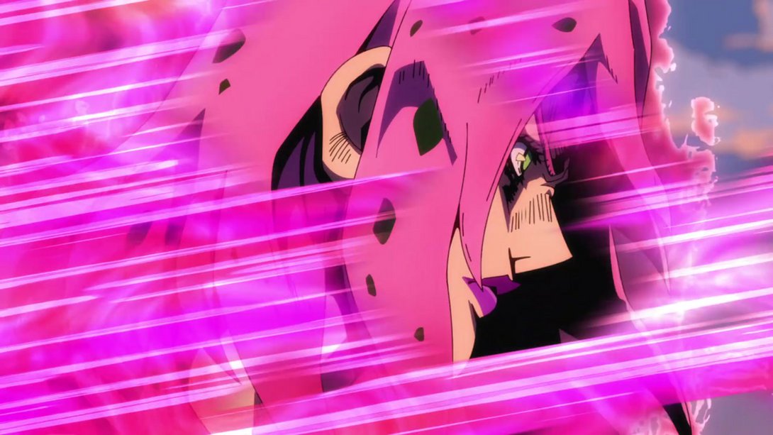
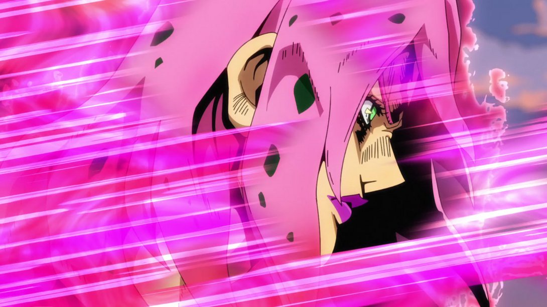
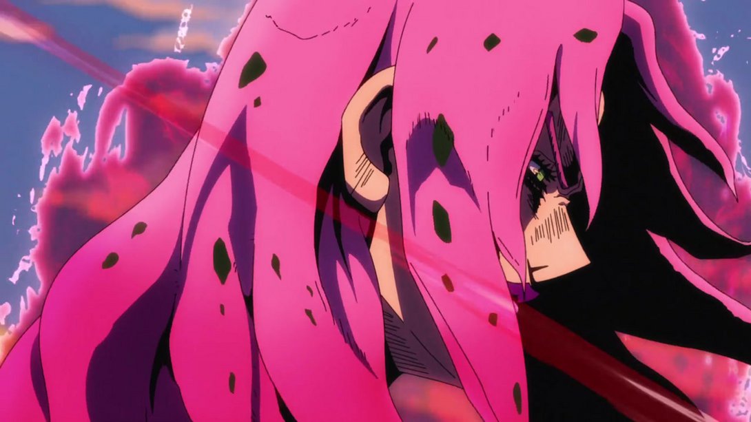
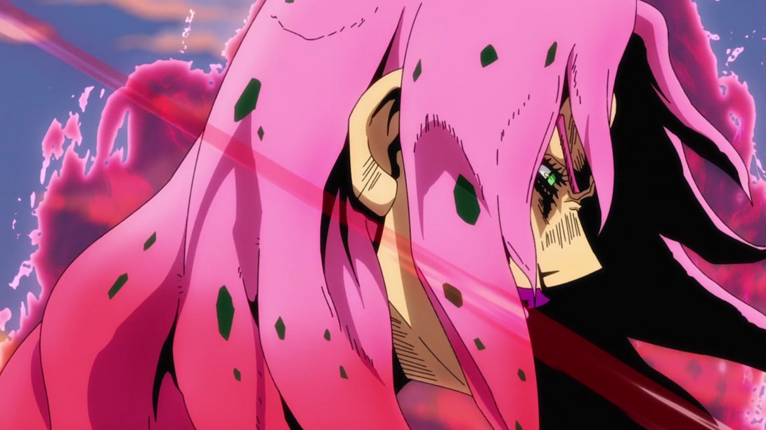
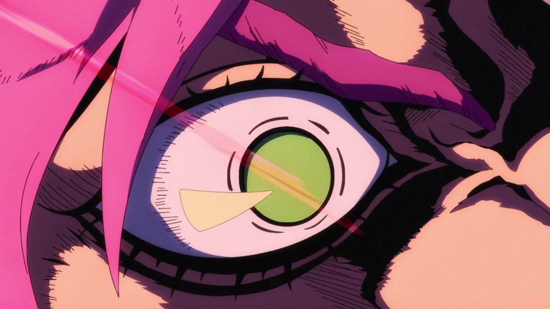
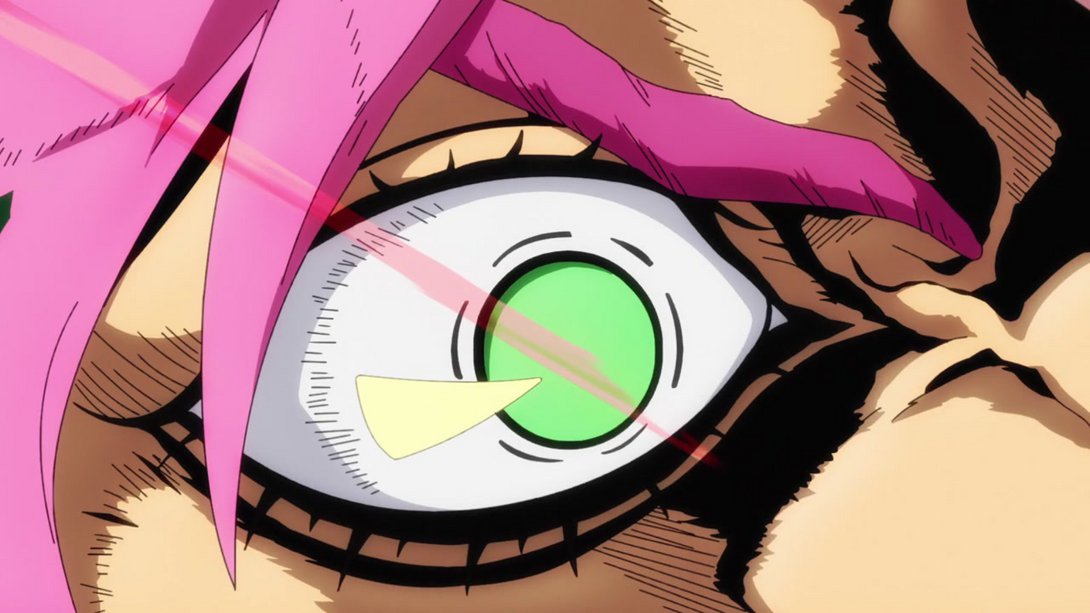
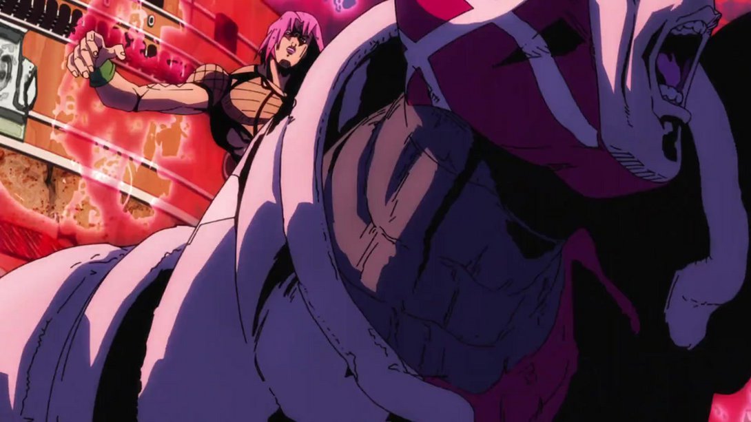
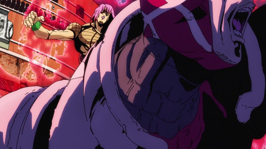
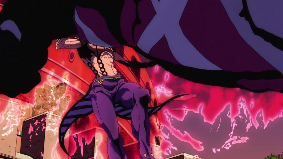
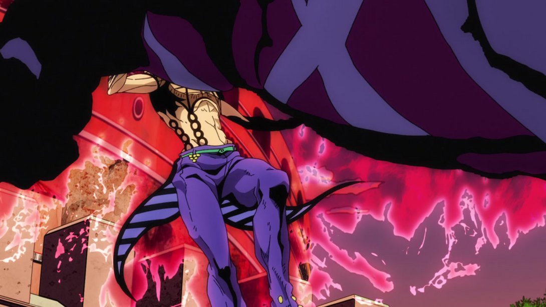
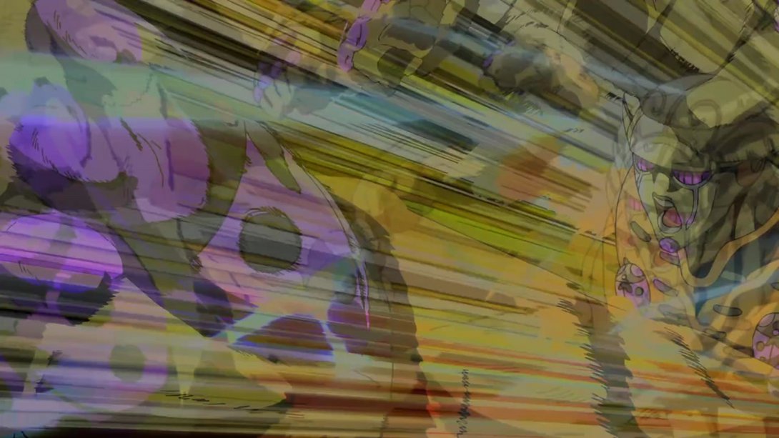
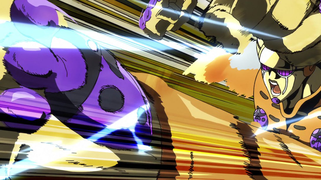
- As some people have mentioned (Thanks, MrMiguel211 and Brainulator9!), Gold Experience’s punch rush has been made brighter and sharper here as well - the rush itself is the same as in the old version of this same opening, but the background is different! Which means… Here you go, take a look at this beauty:
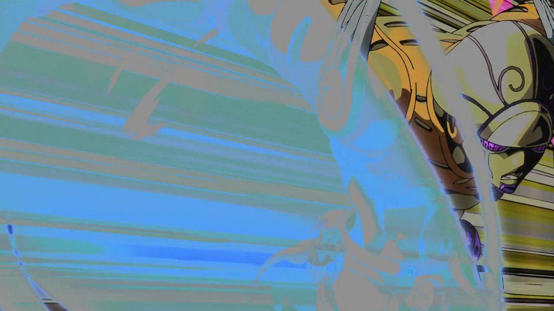
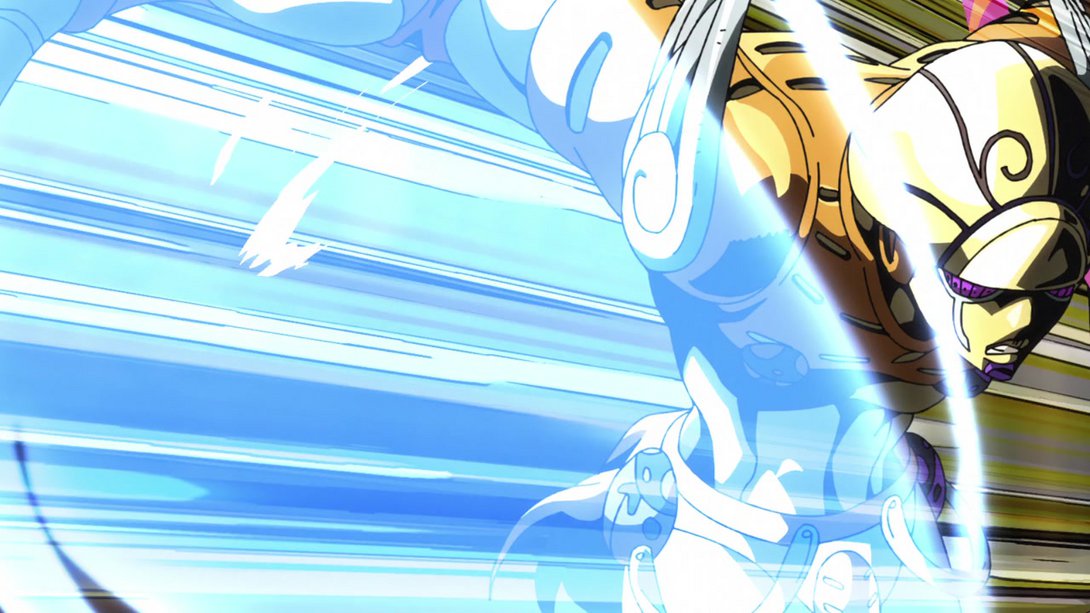
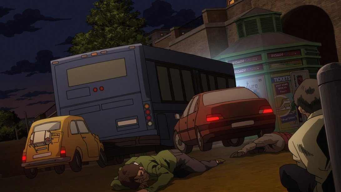
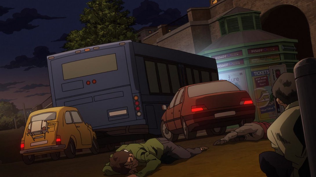
- Let’s move on by looking instead at a bunch of cars in the center of Rome. Here, the background is brighter and the dude in the foreground is, instead, darker; in addition, all the vehicles in this scene now cast shadows:
- Meanwhile, inside the Colosseum, everything is blurrier except for a tiny speck in the top-left of the image, which is still sharp and now has a slight aura around it…:
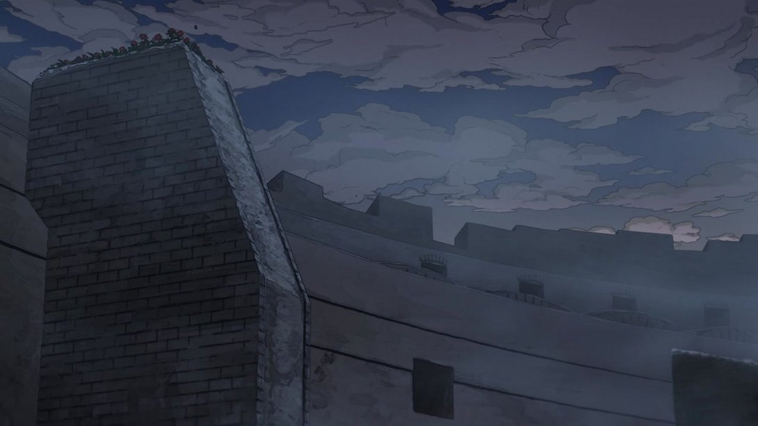
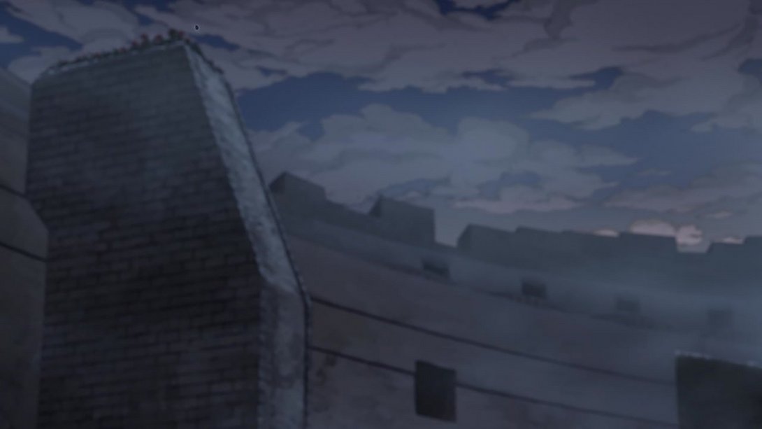
- That’s right! It’s a bee! And here, in addition, the bottom of the frame is also darker:
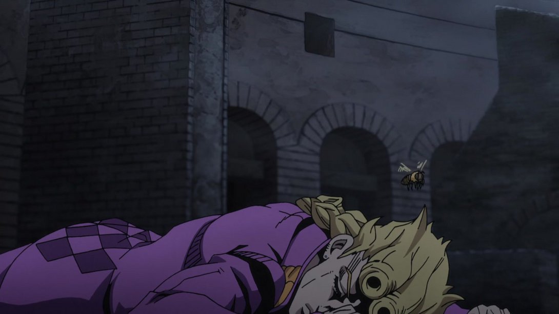
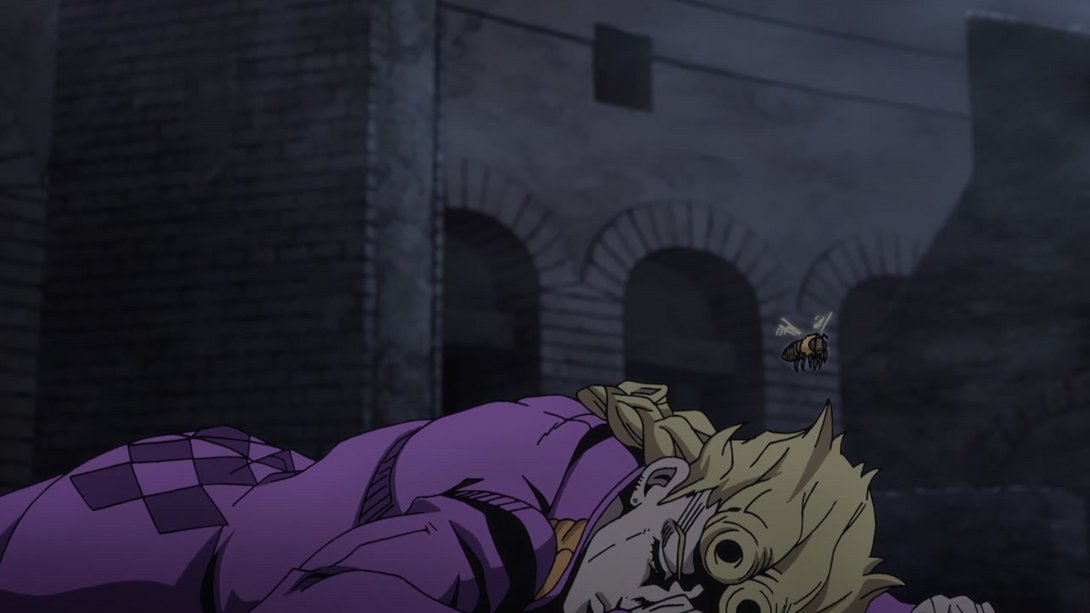
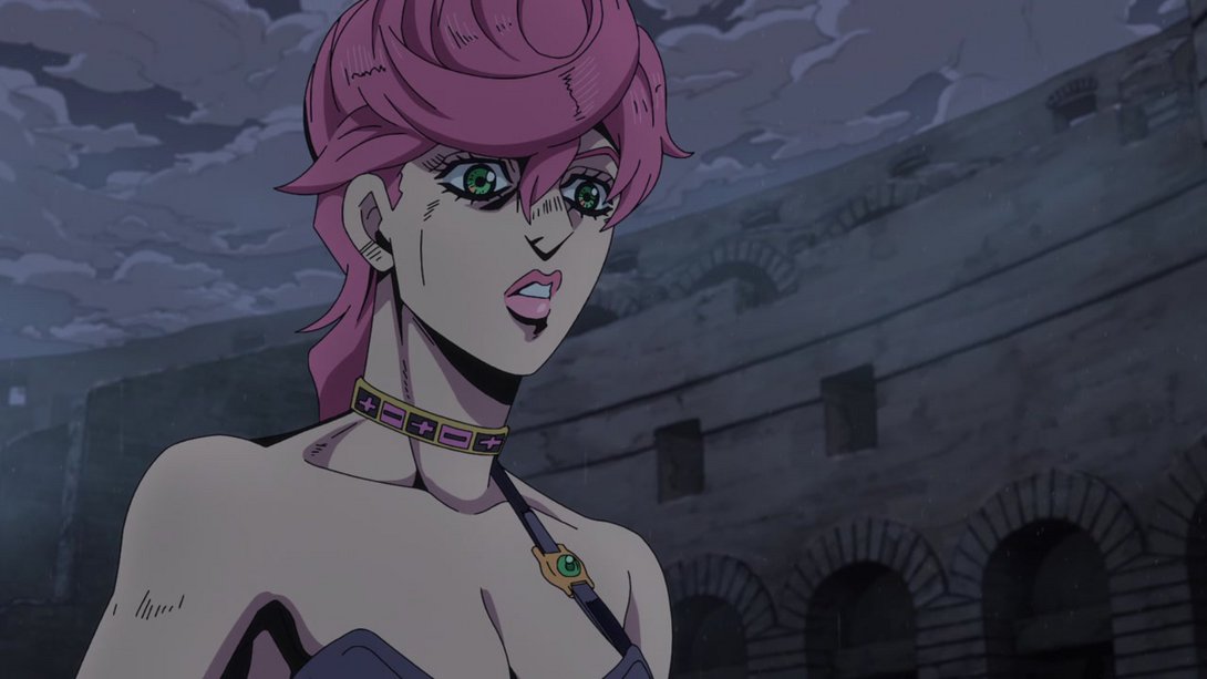
- Here, the background is darker, the various raindrops have been sliiiightly moved around and Trish has undergone significant facial surgery:

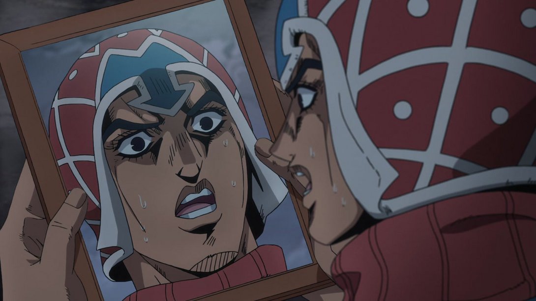
- In this frame of Mista reenacting that meme of Wolverine looking at a picture of himself, the surface of the mirror is sliiiiiiiightly brighter and most lines (except the blurry ones) are sliiiiiiightly thicker:
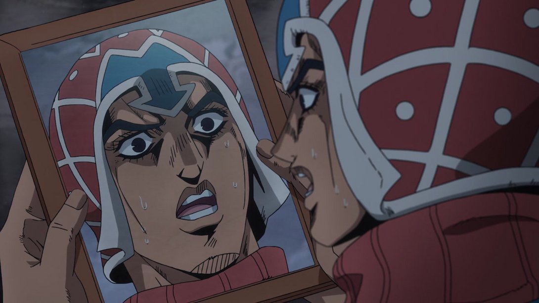
- Here, once again, the mirror looks more reflective, there is a different distortion along the edges of the frame, the background is much darker (resulting in a less flat picture) and the inside of Trish’s skirt has been shaded more…:
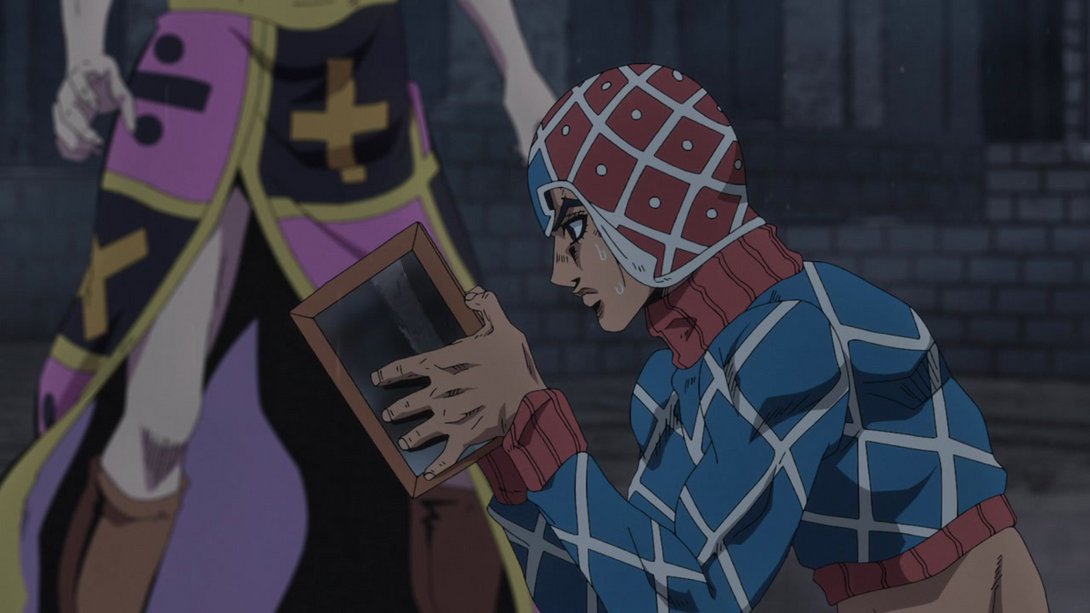
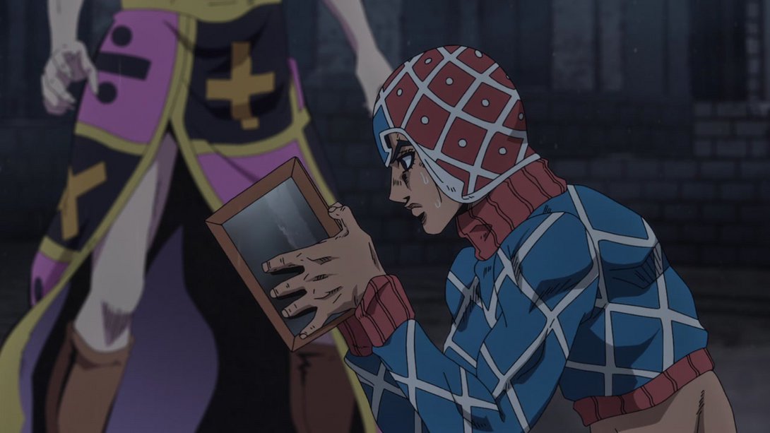
- And later on, Mista’s face has been retouched as well:
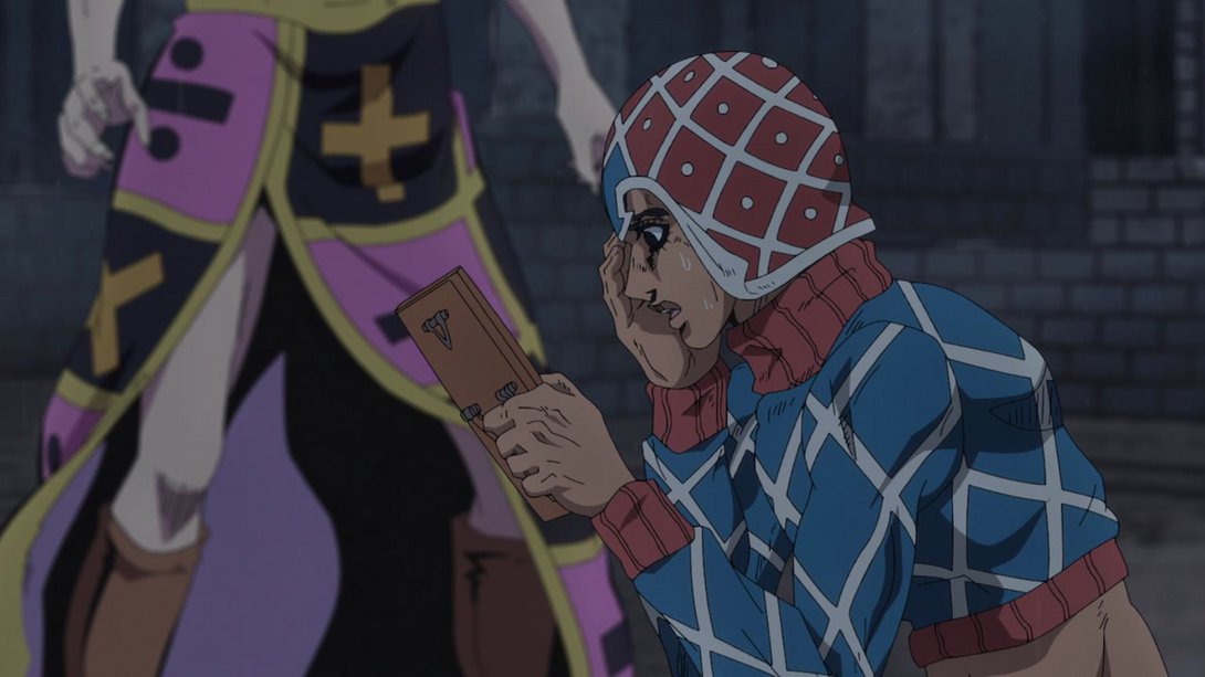
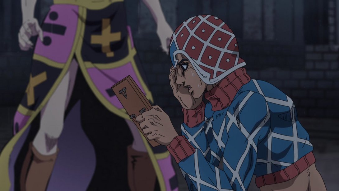
- When the camera pans up to Trish/Mista, we can see that the shading on her is sliiightly different, and her left eyebrow is now a few pixels longer:
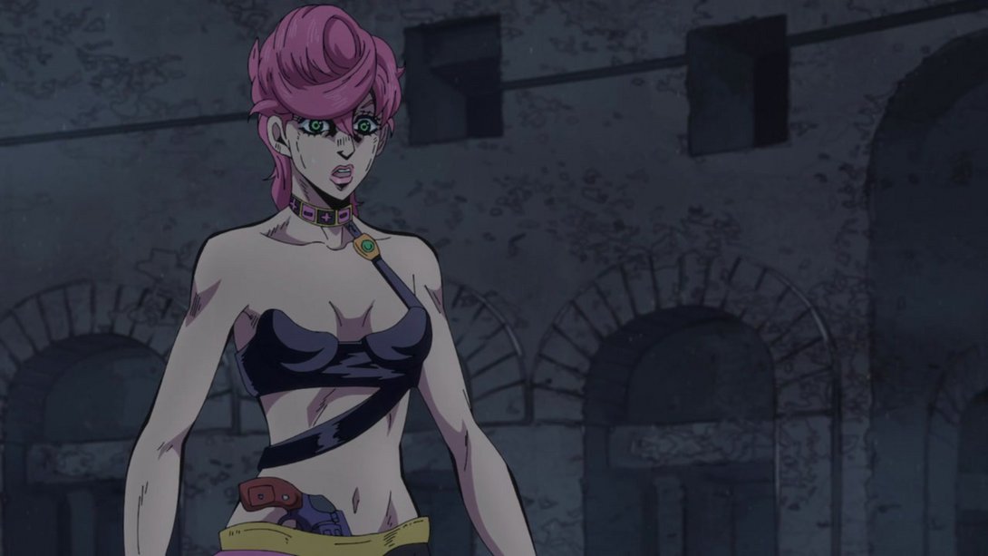
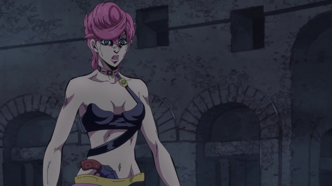
- Once again, the BDs give us a less flat picture here! The edges of the frame have been distorted differently, Trish’s face has been retouched and the shading on her is much stronger and much more contrasted:
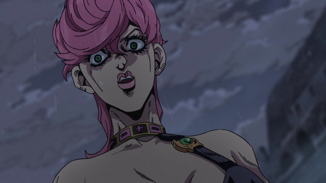
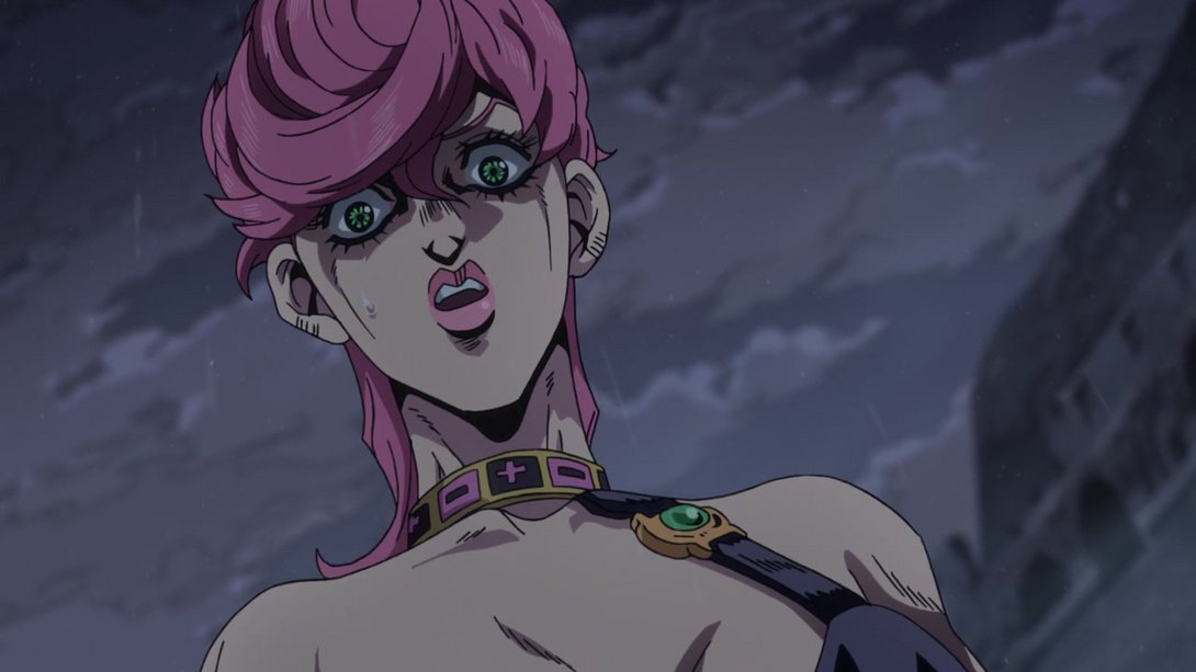
- And, in addition, the camera shakes a little less:
- Here, the shading on Trish is a little flatter, the bottom of the background is darker and her face has been retouched as well:
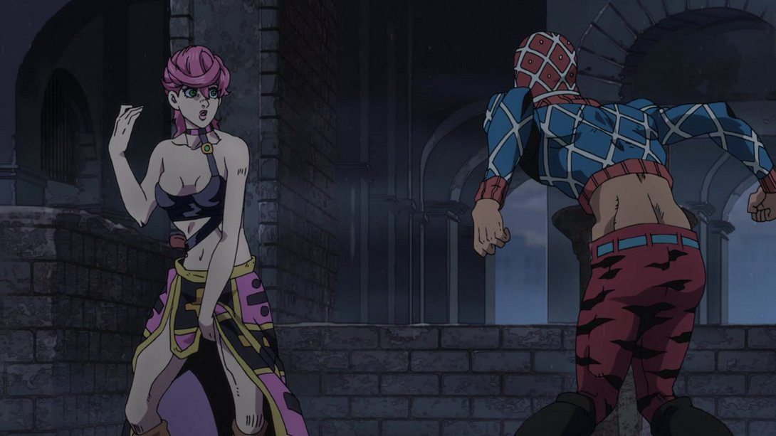
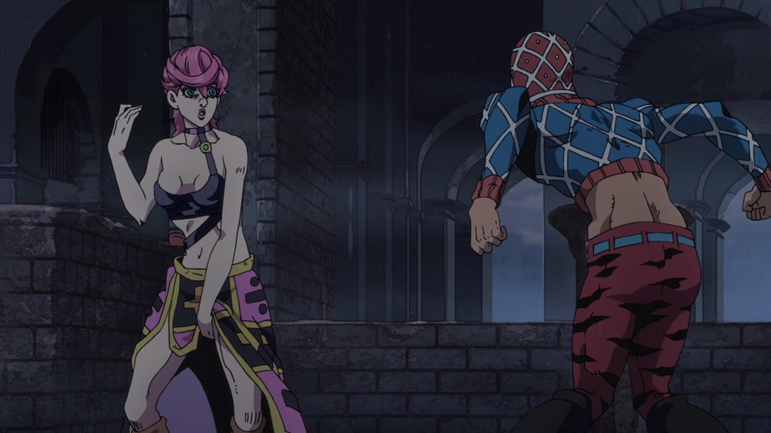
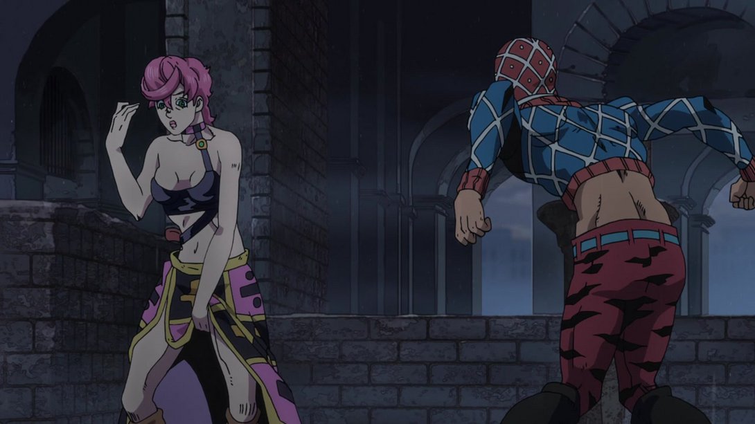
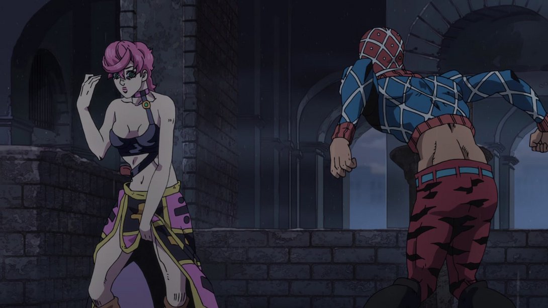
- Here, a shading gradient has been applied on Trish, going darker towards the wall, and a bit of Mista’s missing shading near his nose has been filled in…:
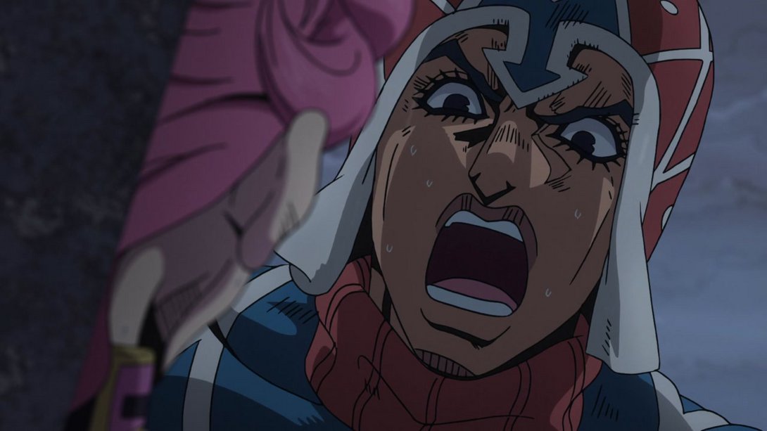
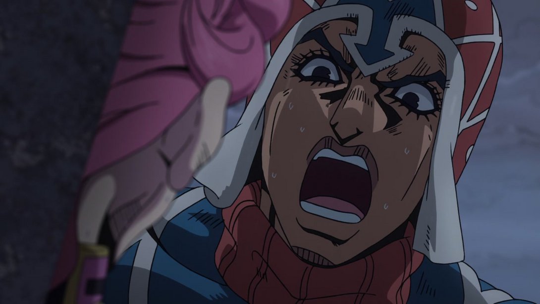
- …and, later on, the shading on Mista is much darker near his forehead and brighter near his mouth, like so…:
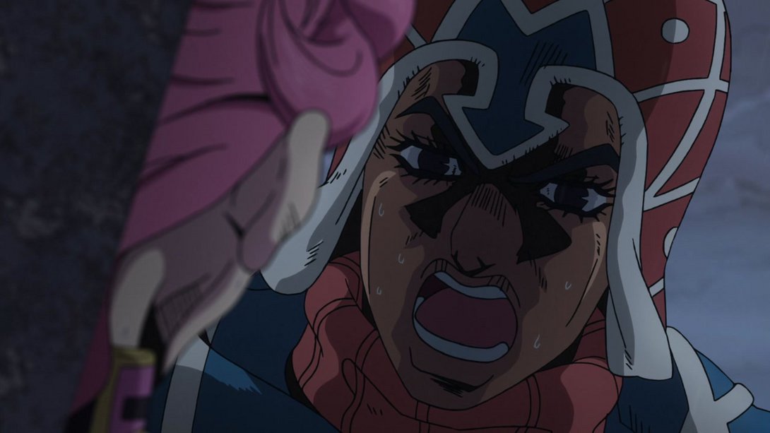
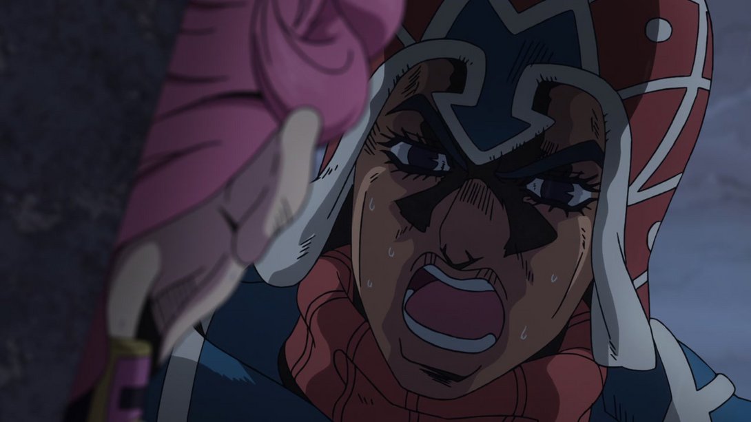
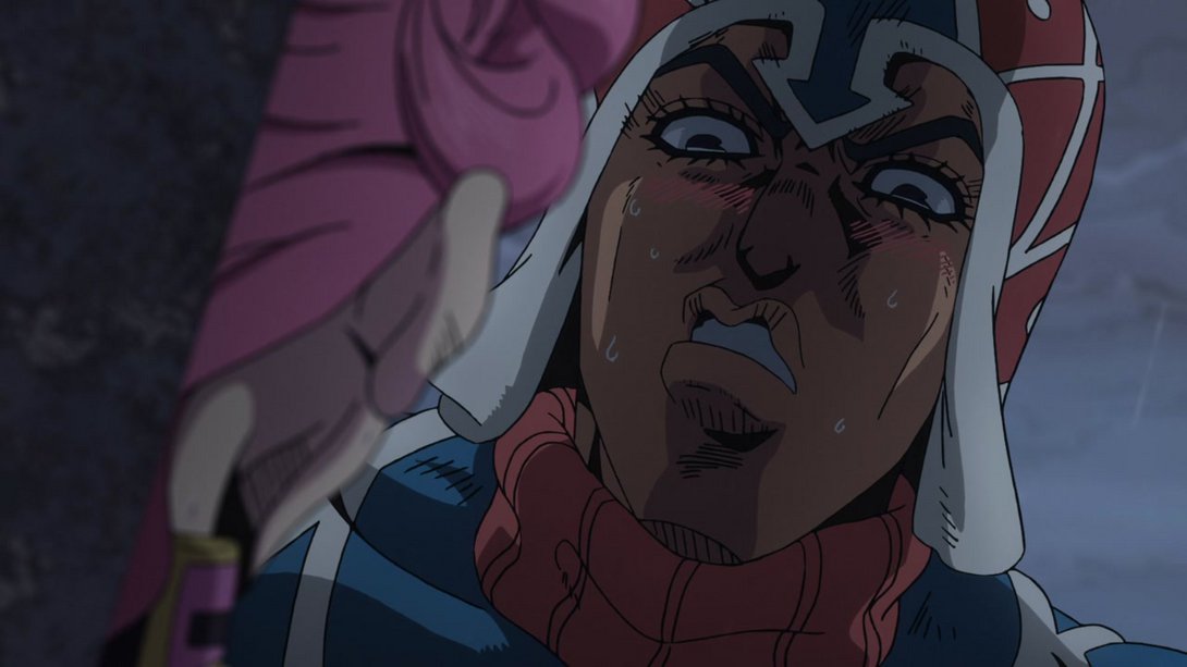
- …and, when he blushes, the red lines have been blended in more with his skin and are now on a layer below the nose shading:
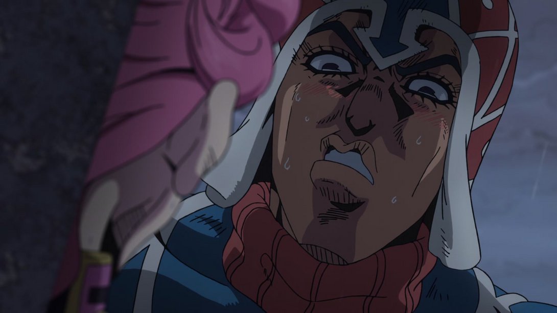
- Here, once again, the background is darker towards the bottom, our boy Giorny has been retouched and the dots on Buccellati’s suit are slightly bigger (Thanks, Brainulator9!):
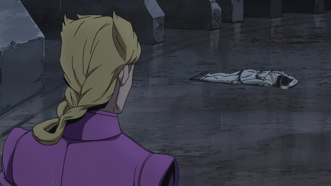
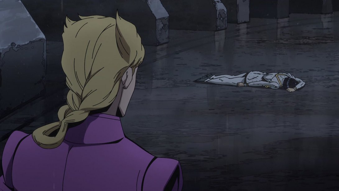
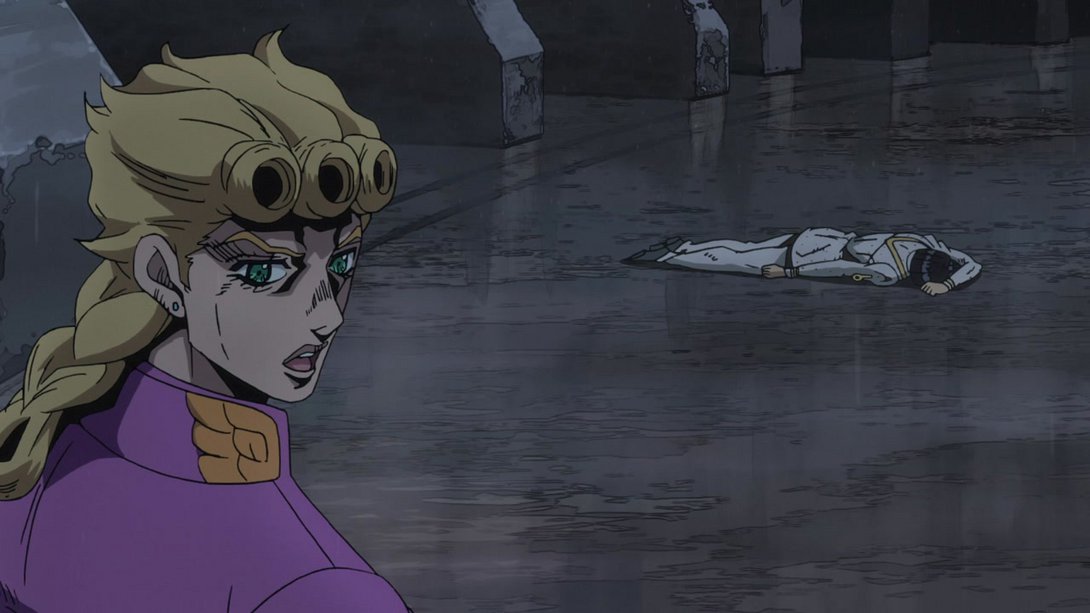
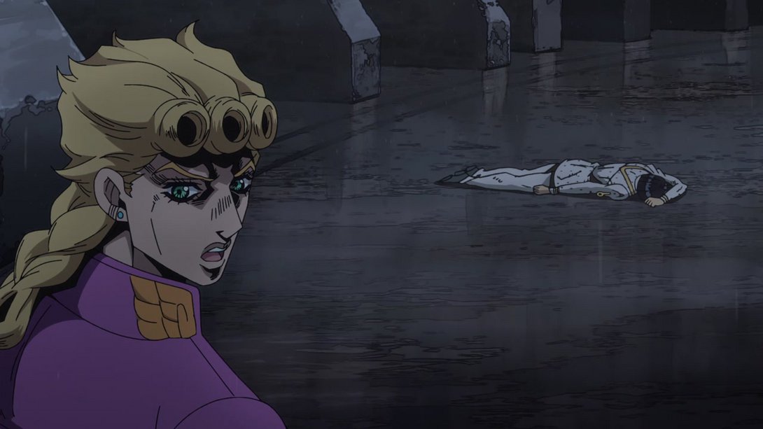
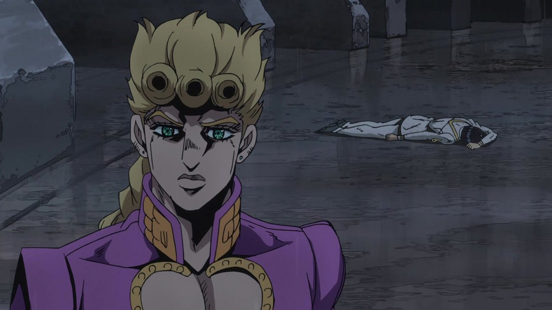
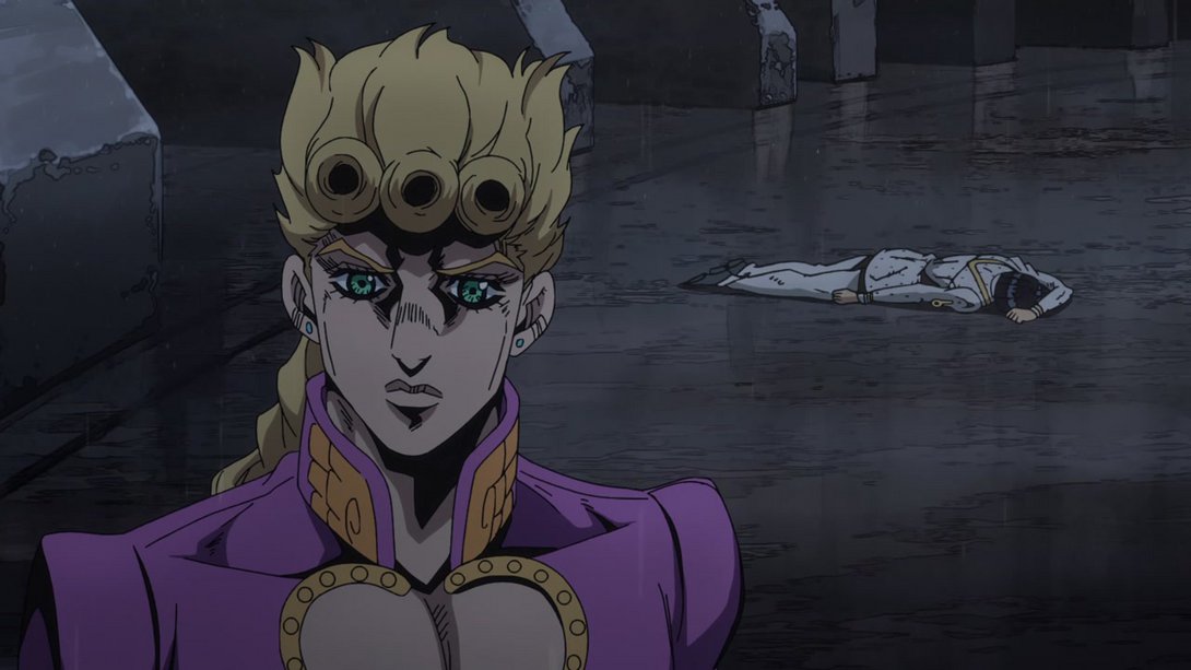
- His turning animations are also a little more fluid, due to some extra in-between frames:
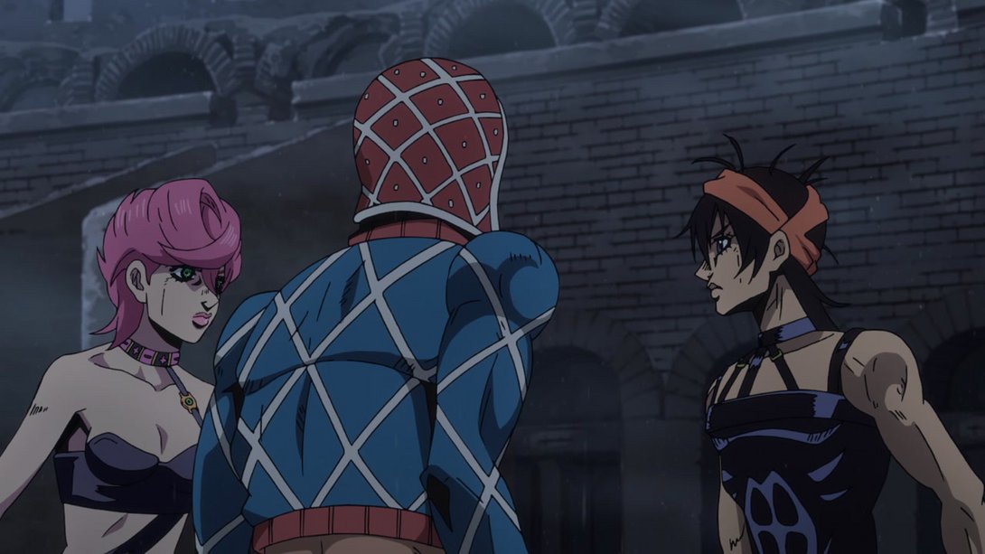
- Here, all three have a slightly different shading, Trish and Narancia have been moved a little and the two dividers are different:
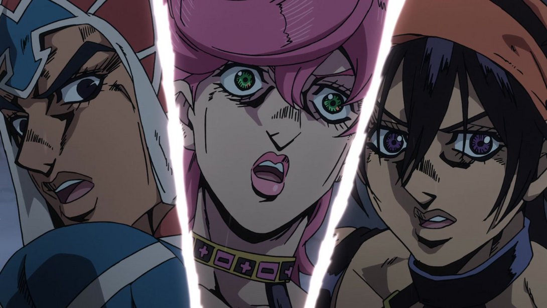
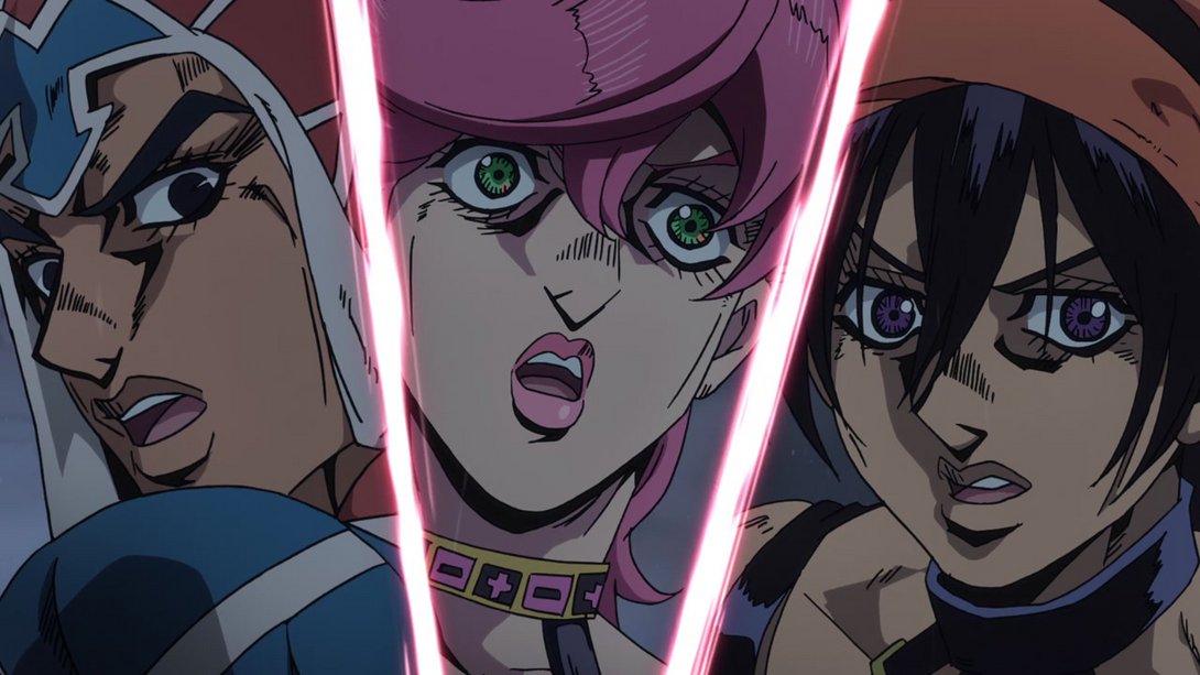
- Here, in addition to a different distortion along the edges and a different shading on all three, Trish has been massively retouched as well. In addition, both Trish and Narancia are on a parallax with the background, meaning they move indipendently from it (but the difference is so subtle that a video would be probably meaningless):
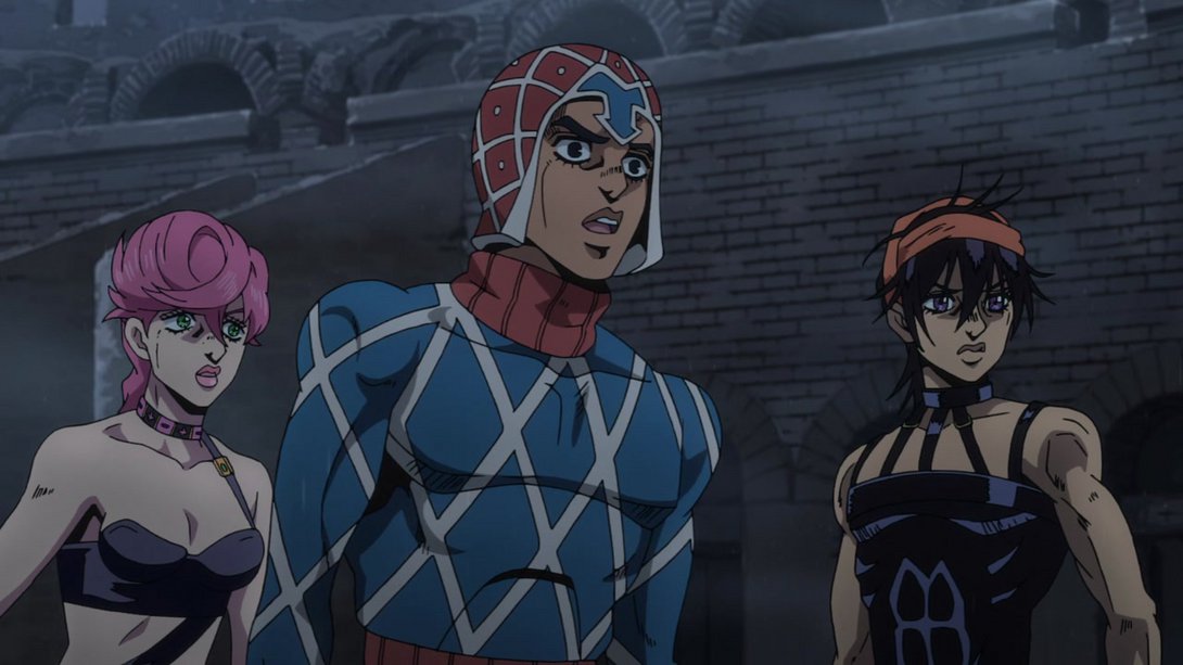
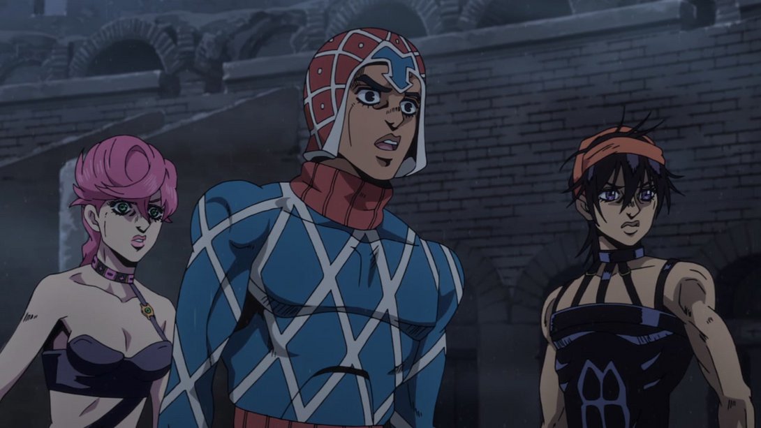
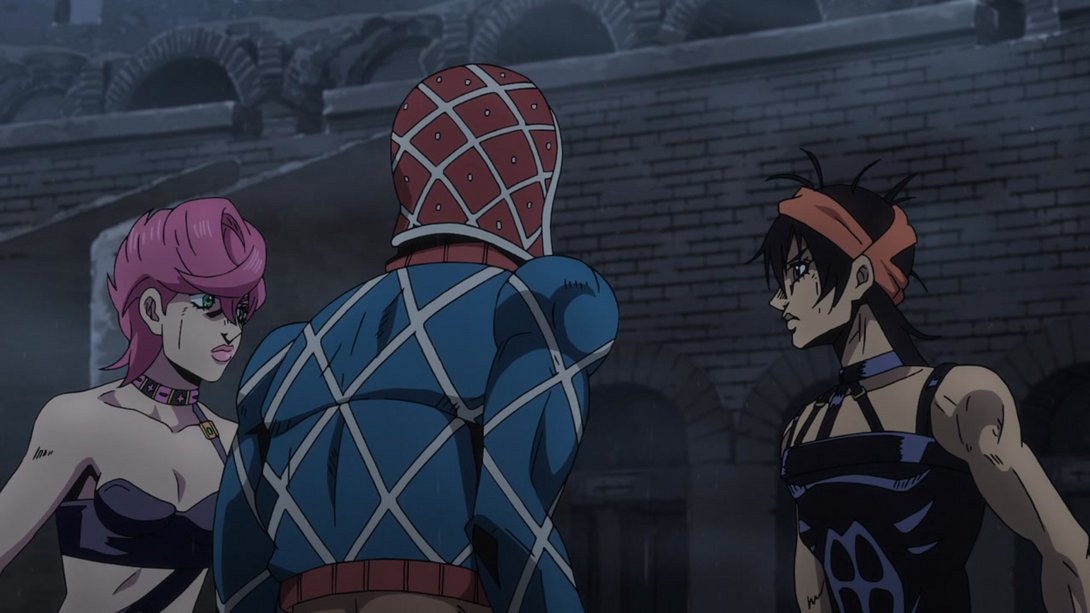
- The background in the first frames of this animation is much blurrier…:
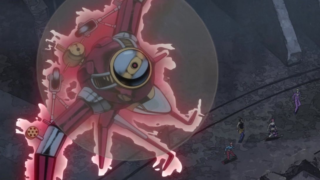
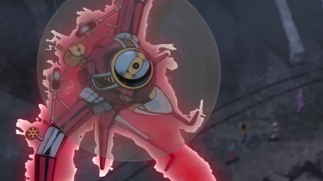
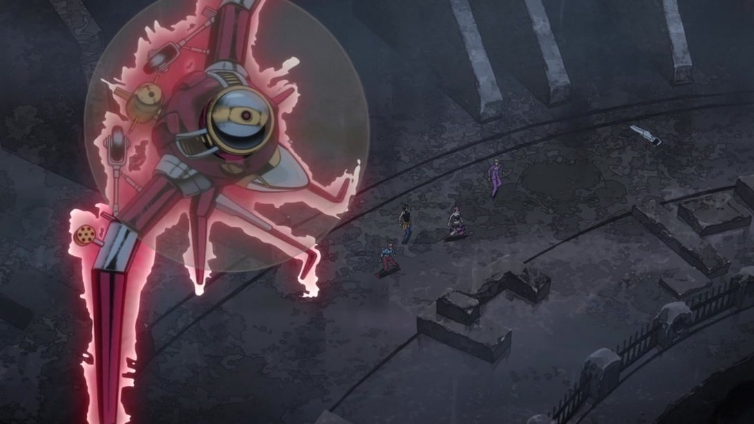
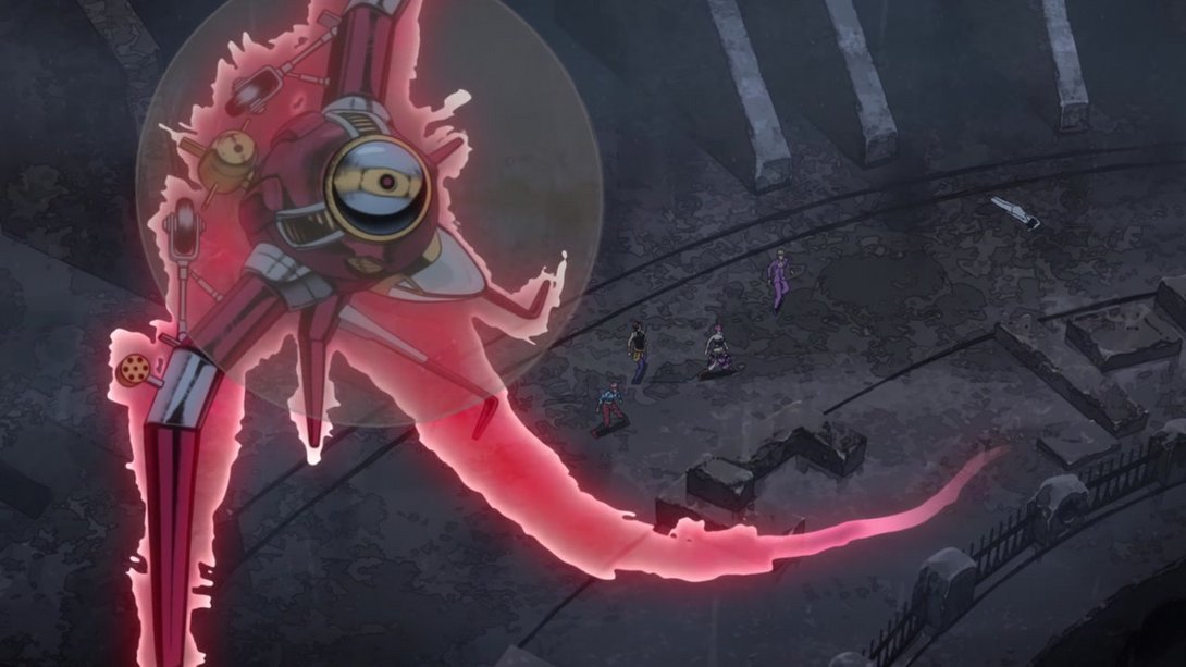
- And, as you saw before, the aura around Aerosmith is different and even has a trail! In addition, just like in Vento Aureo #28, its propeller did not follow the plane’s main body; this has been fixed in the BD:
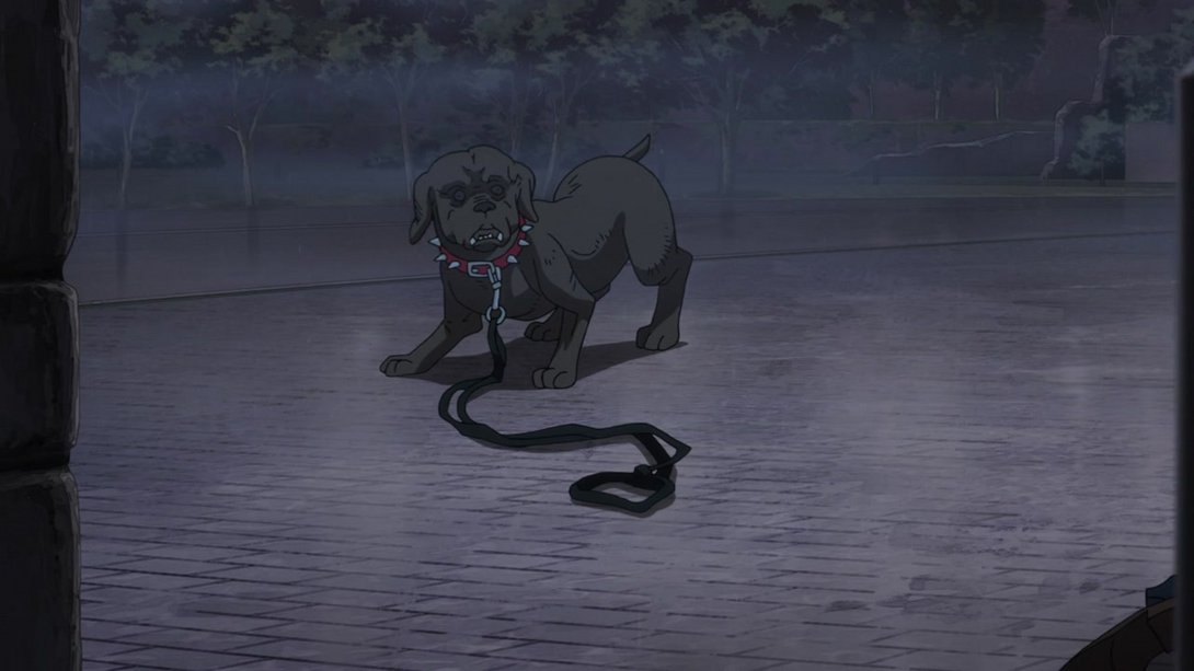
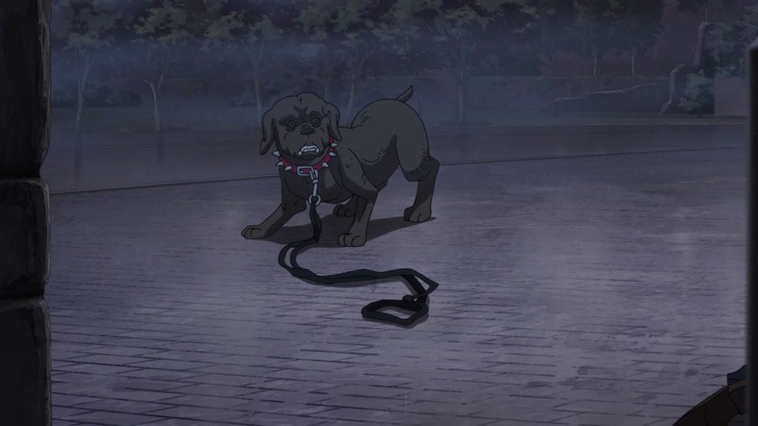
- This dog now has all its teeth:
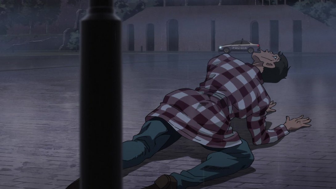
- The police car has been moved and slightly recoloured, here…:
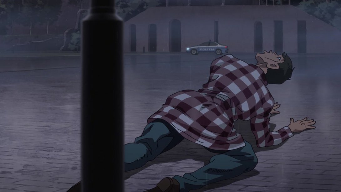
- Here, the background is slightly brighter while the bottom of the characters in the foreground is slightly darker; in addition, Aerosmith’s visor is now emitting a green light:
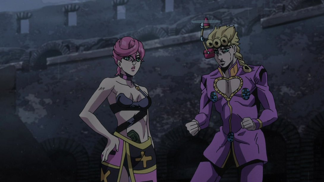

- Here, in addition to the usual blurrier background, Mista’s face and shading have been retouched and his teeth are slightly more prominent:
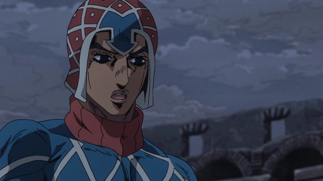

- Here, Narancia has got a brand new face and his left side has been slightly recoloured:
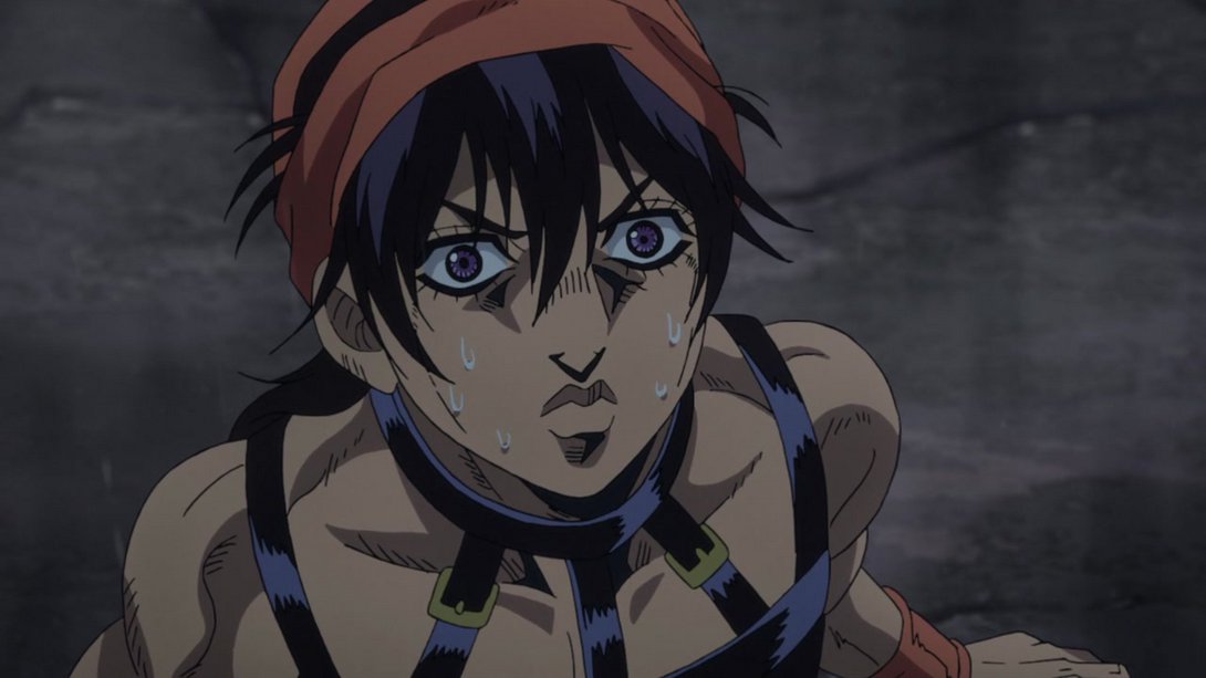
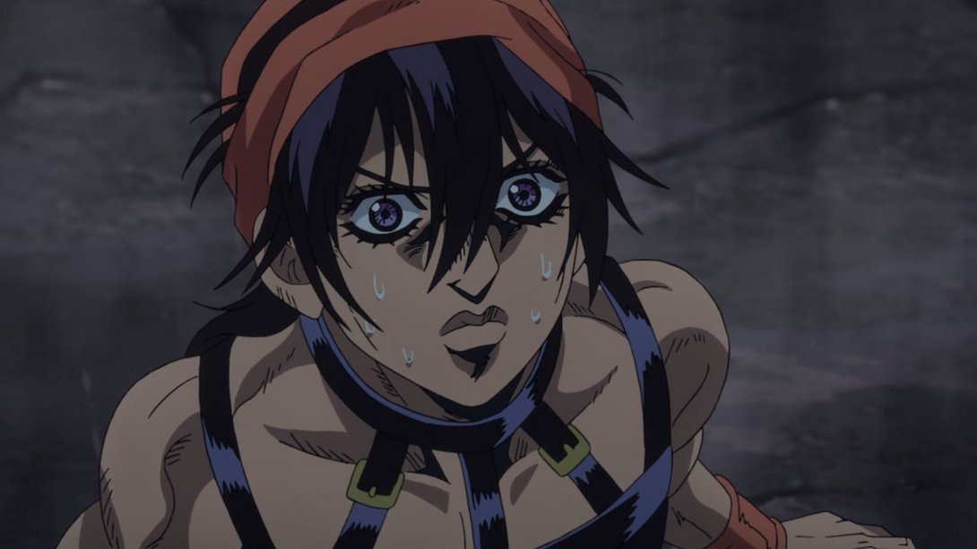
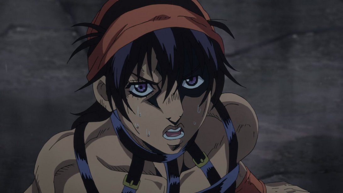
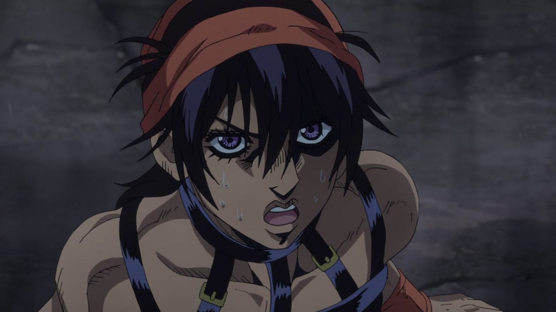
- In this shot, Giorno’s neck is sporting one more line…:
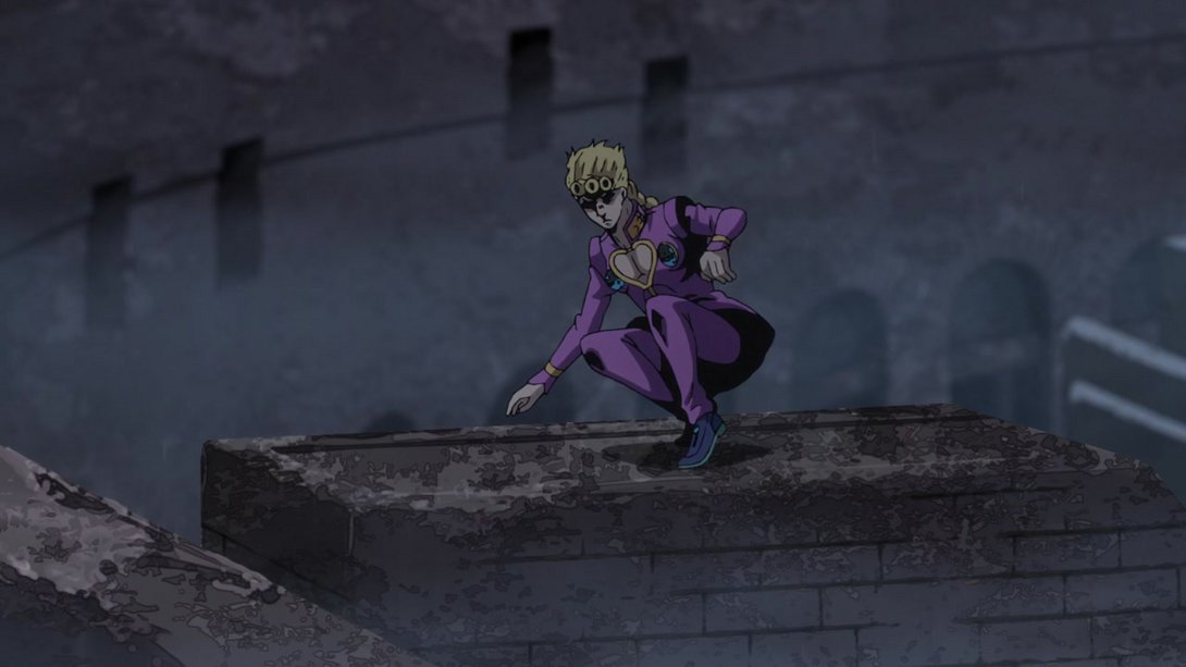
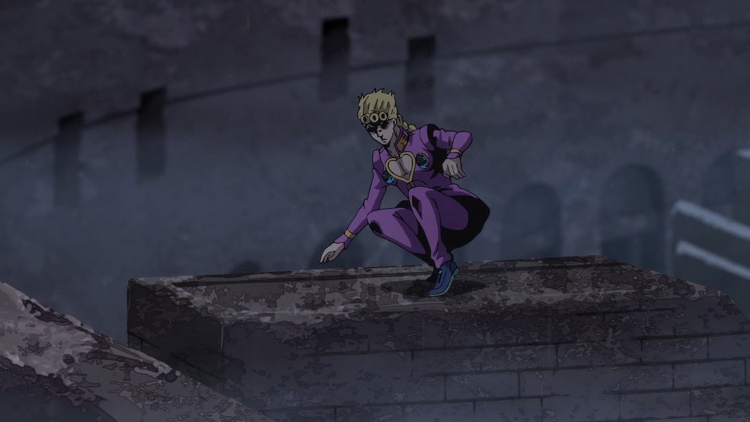
- And, later on, his right hand has been retouched as well:

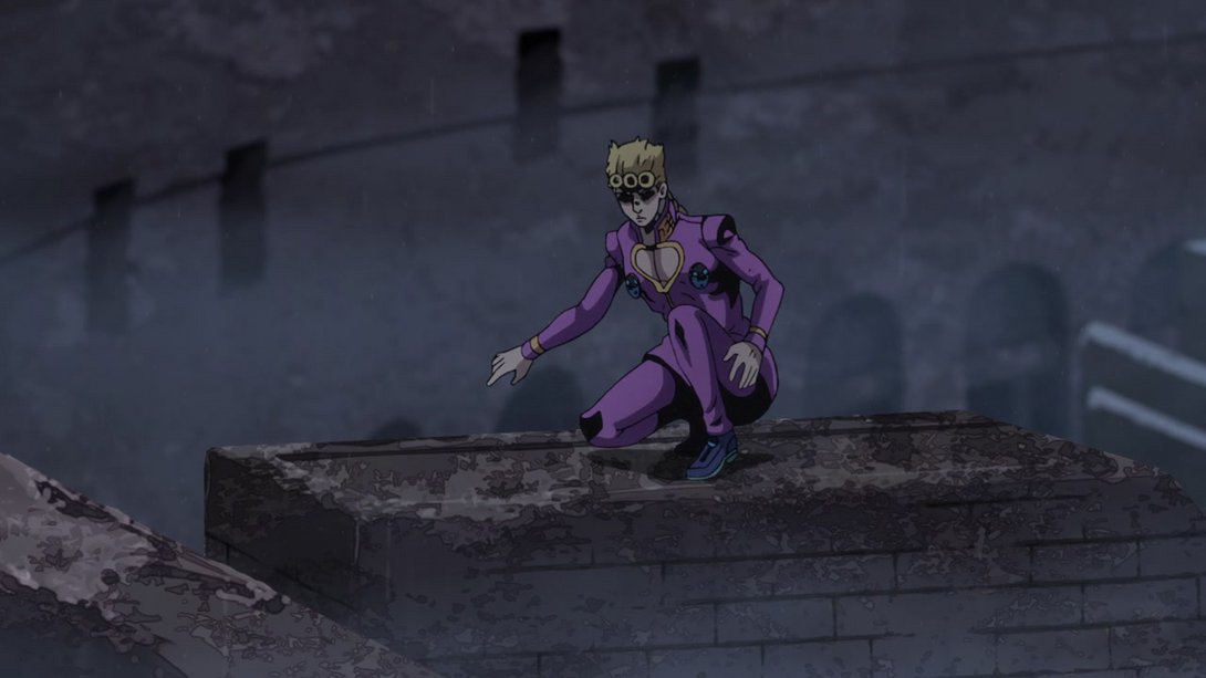

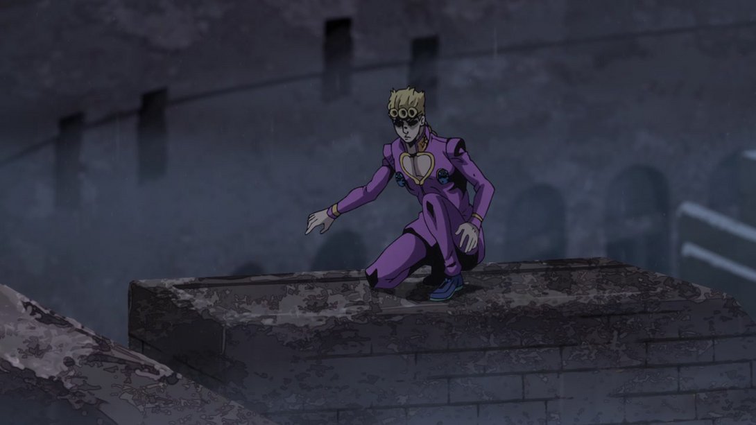
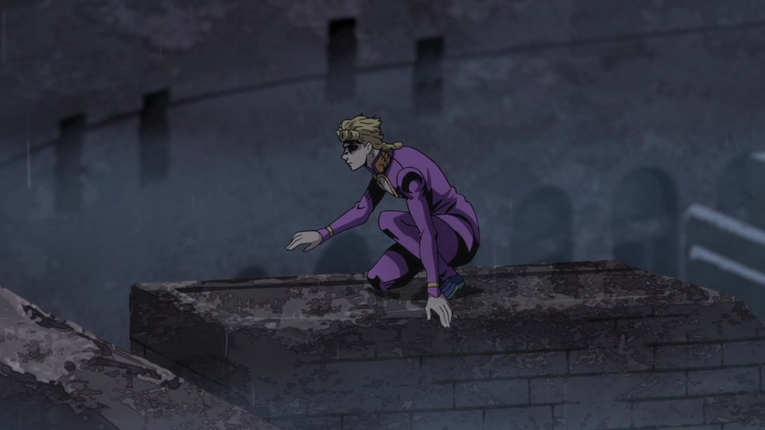
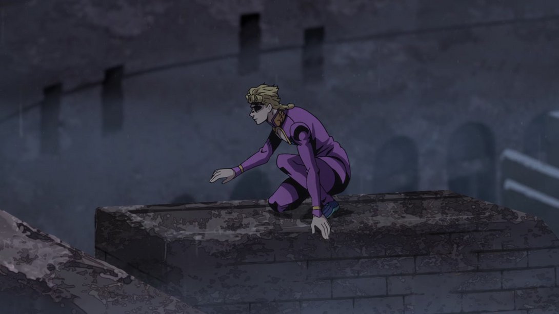
- Here EVERYONE has been retouched! In addition, the shading on the background and on the foreground rock and turtle are also different:
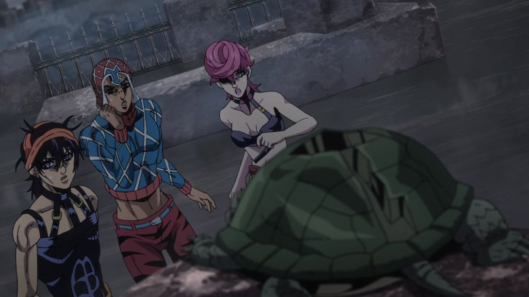
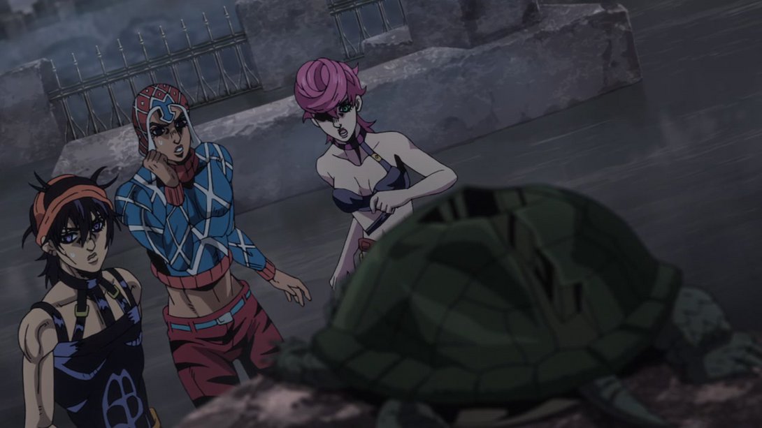
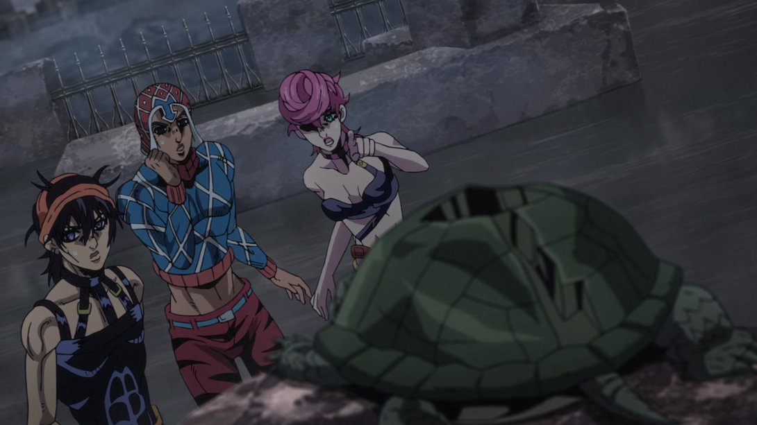
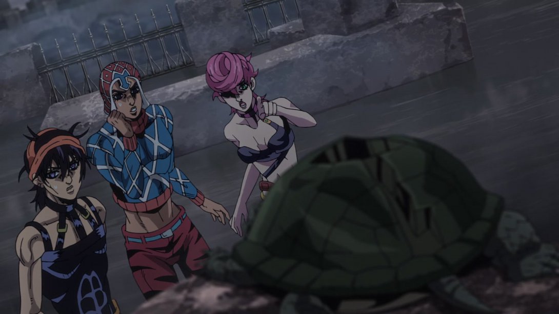
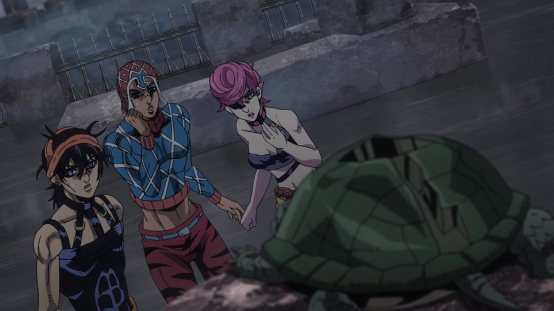
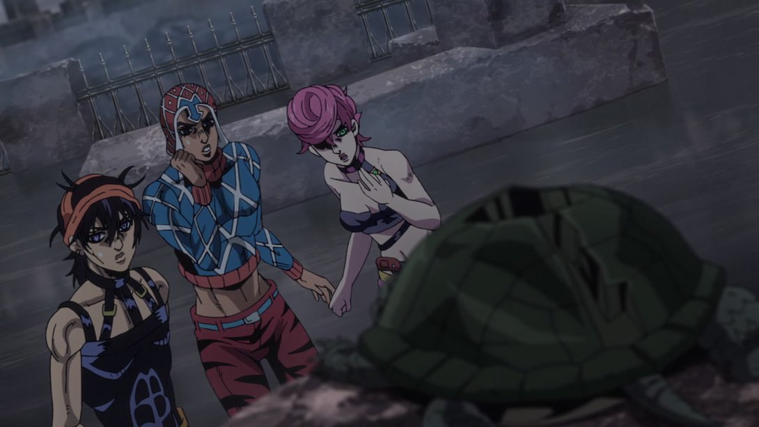
- Narancia and Mista have been shaded slightly differently, here…:
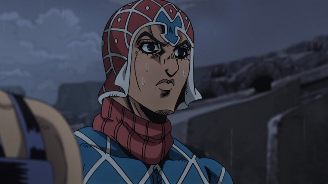
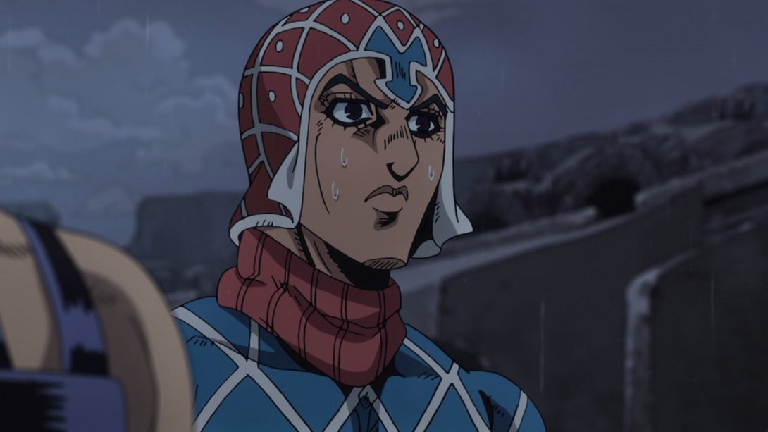
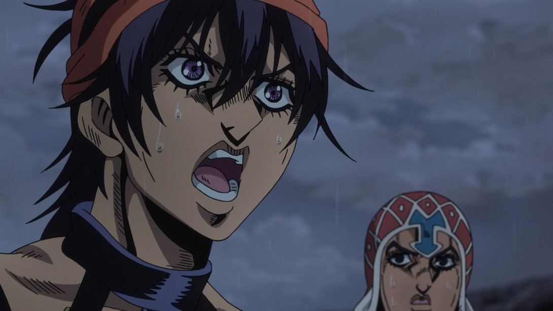
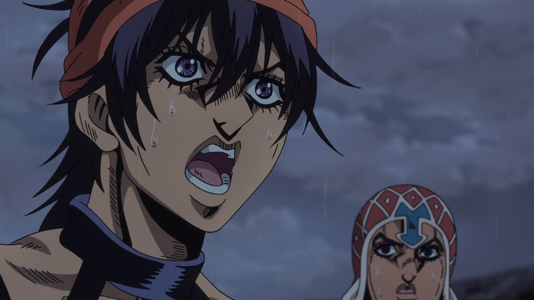
- Here the usual distortion is back, the background is brighter at the center, making Coco Jumbo stand out even more, the thing Giorno is sitting on now has an outline and Giorno himself has been moved down slightly:
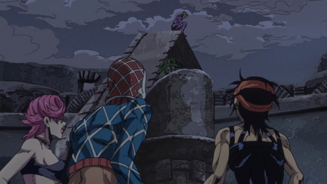
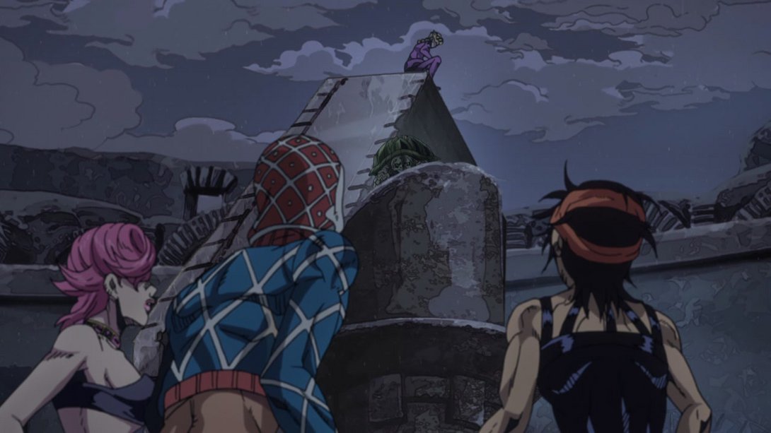
- The lighting on both Narancia and the background is different, here…:
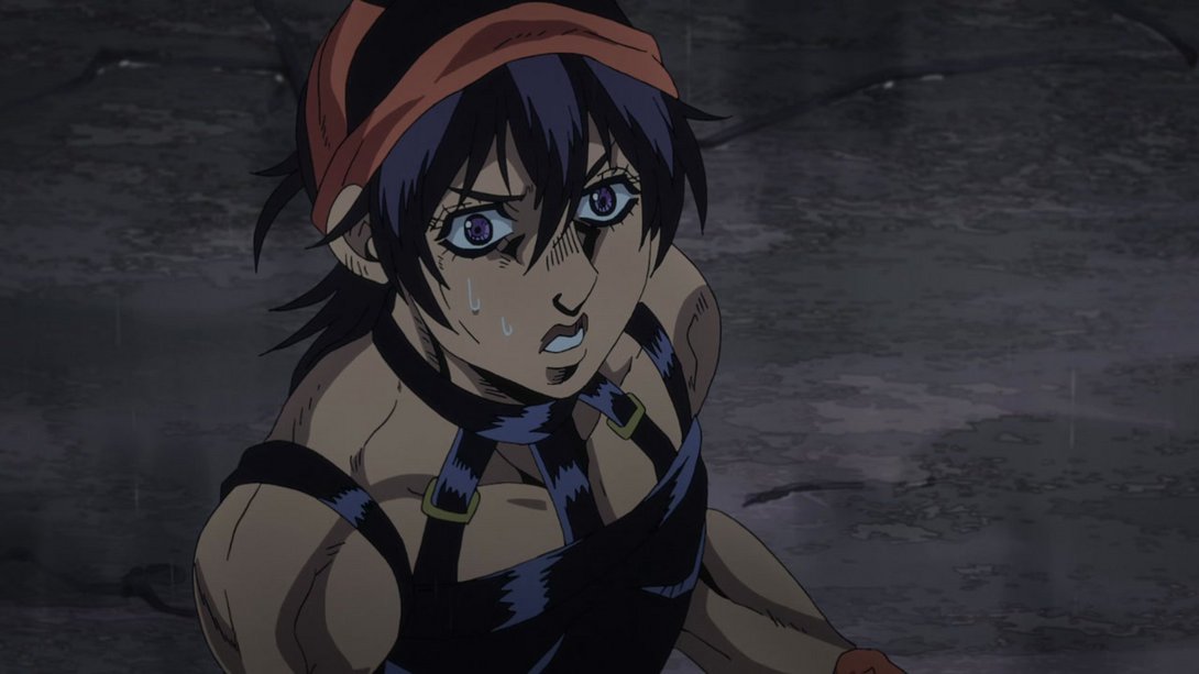
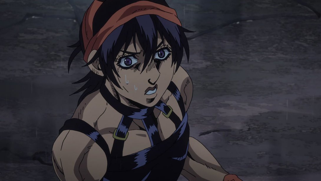
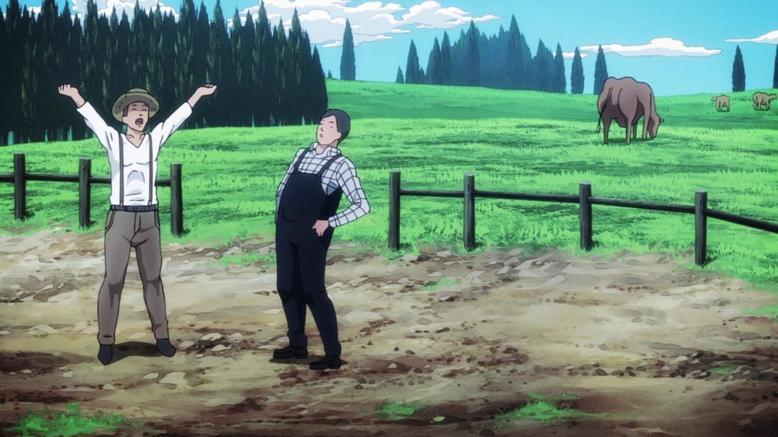
- In this flashback, the dude on the right has a brighter shadow:
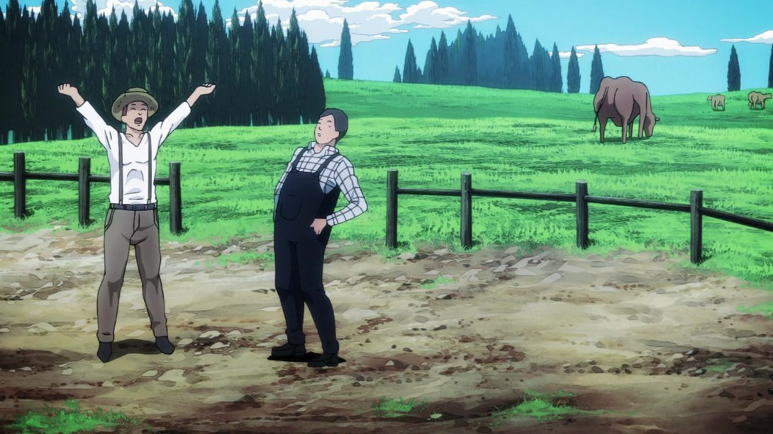
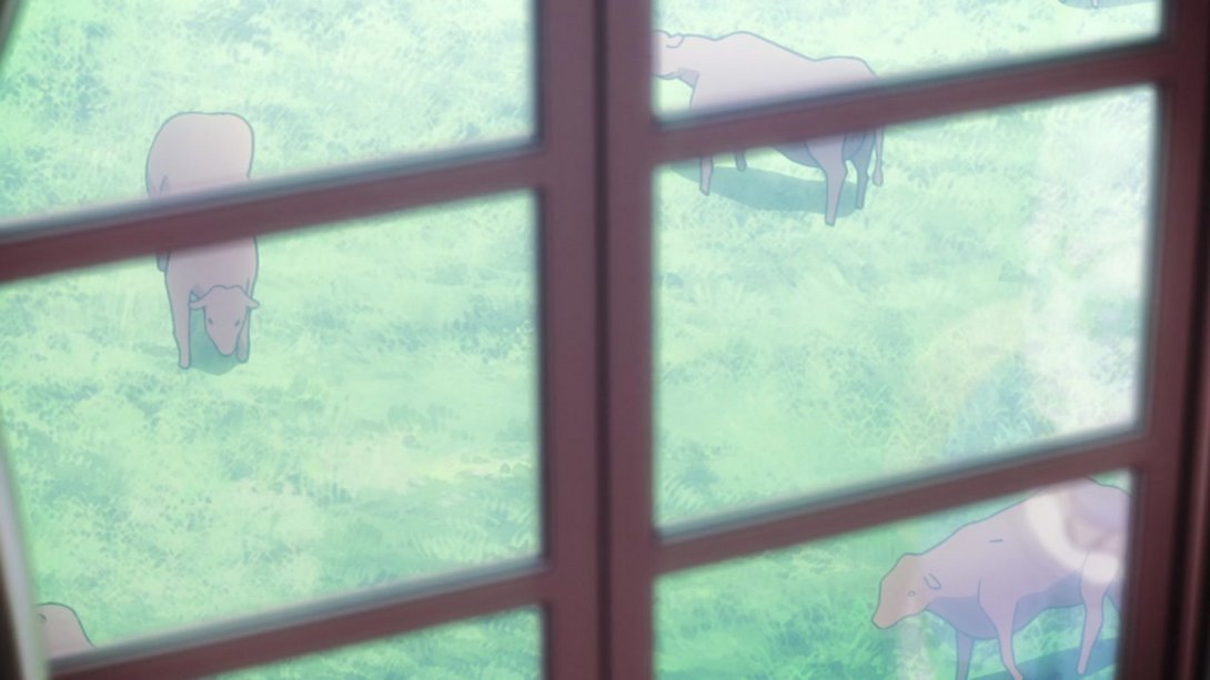
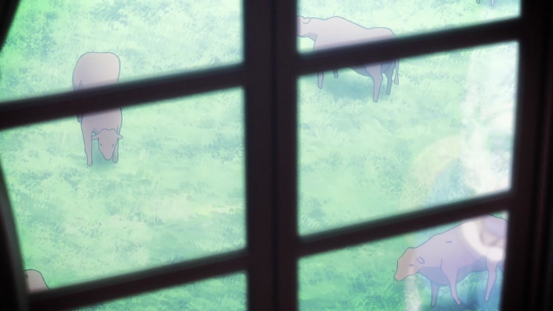
- The window frame is much darker in the first… frames… of this scene, and the cows cast blurrier shadows…:
- And, later on, Polnareff has received a substantial makeover! In addition, there is a new darker vignette along the edges of the frame and Polnareff’s reflection in the mirror is less transparent:
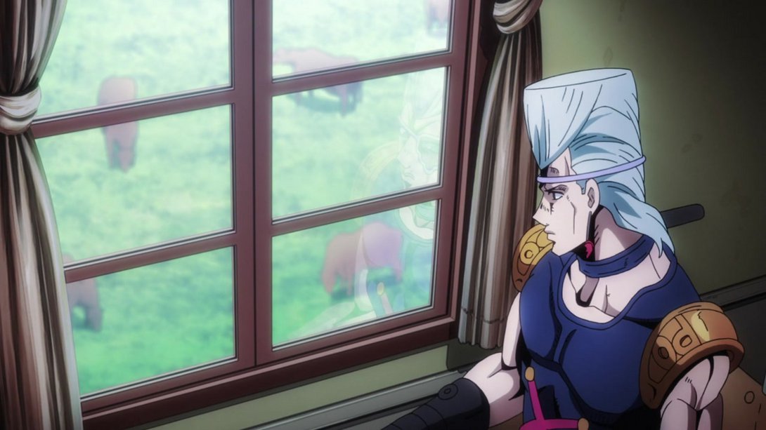
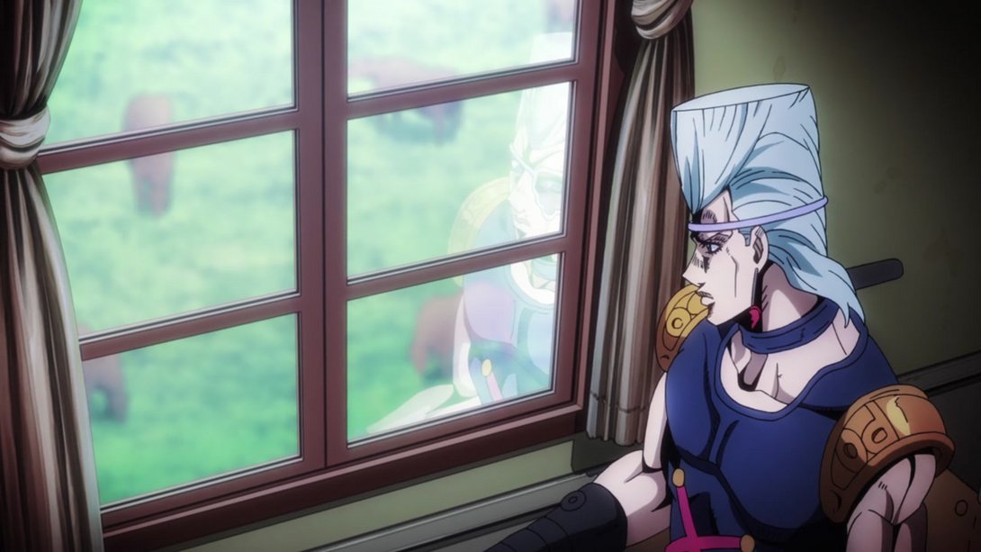
- Here, once again, our precious Frenchman is looking even more handsome! The background is also less blurry…:
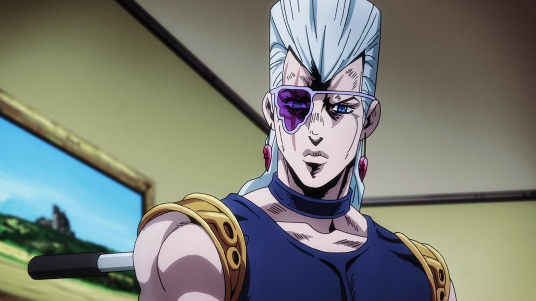
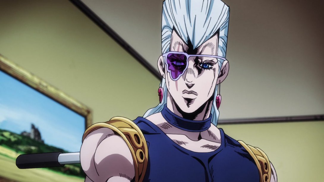
- …and the scene blurs away in a different fashion:
- Here, in addition to the usual slight difference in lighting, all three have been retouched, but… Let’s just say I don’t think they’re 100% there yet:
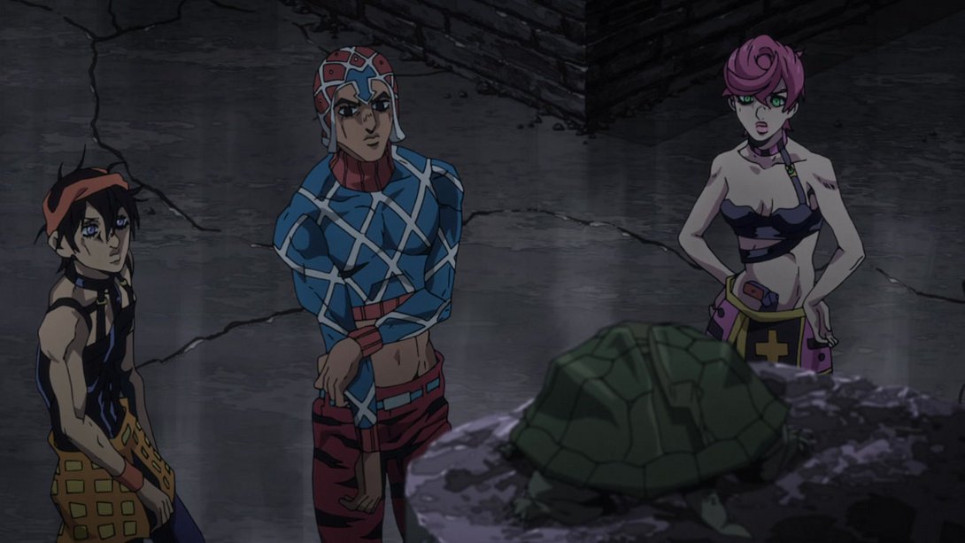
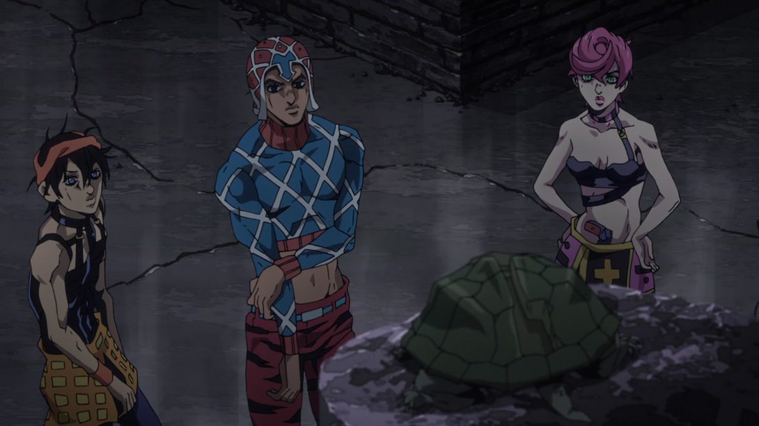
- In a couple of frames, the lines used to draw Trish’s right armpit were just missing; they’re now back:
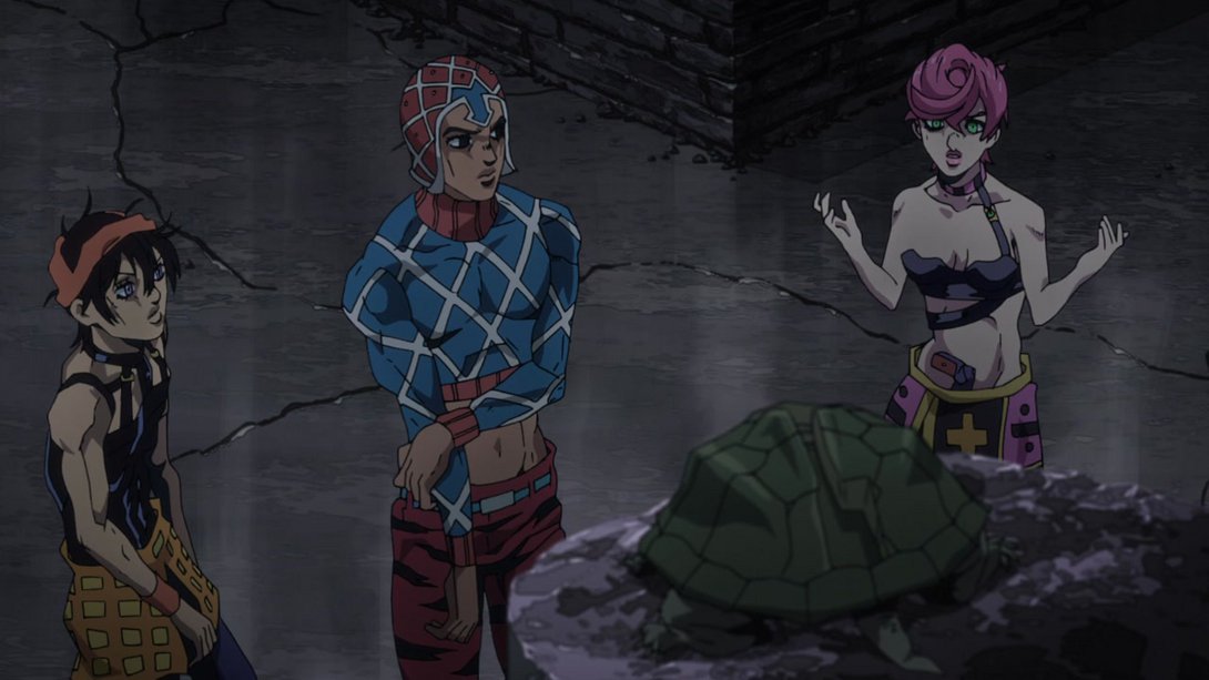
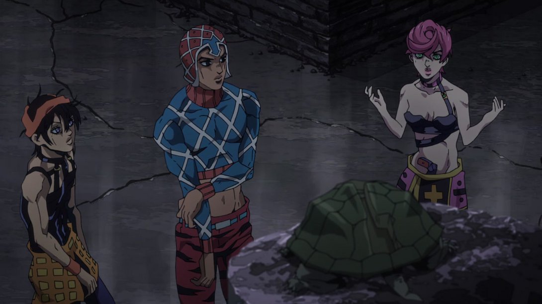
- Trish’s arm movements have been animated sliiightly differently here… It’s not super noticeable, but they move slightly more fluidly and naturally:
- The background is way blurrier, here…:
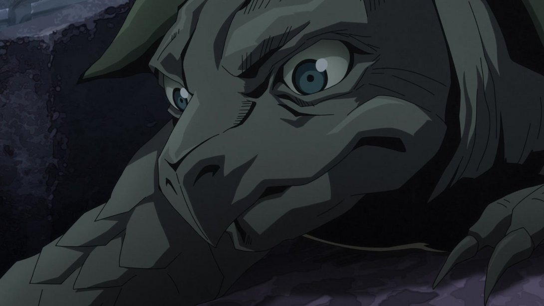
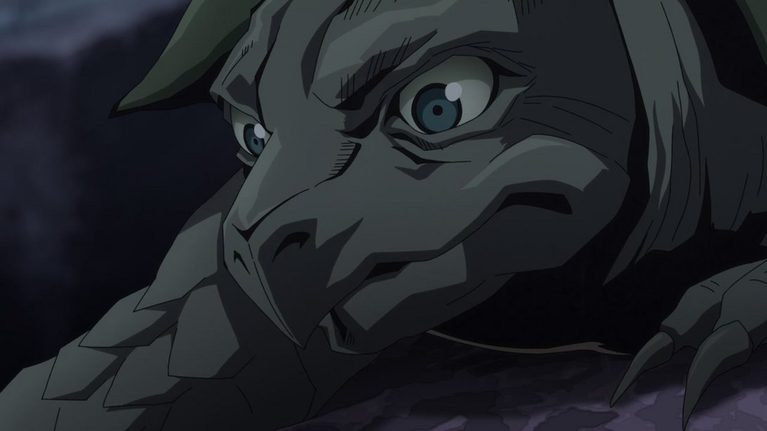
- Have another batch of retouched people, people (this difference is functionally the same as the one before, but there’s a couple more expressions):
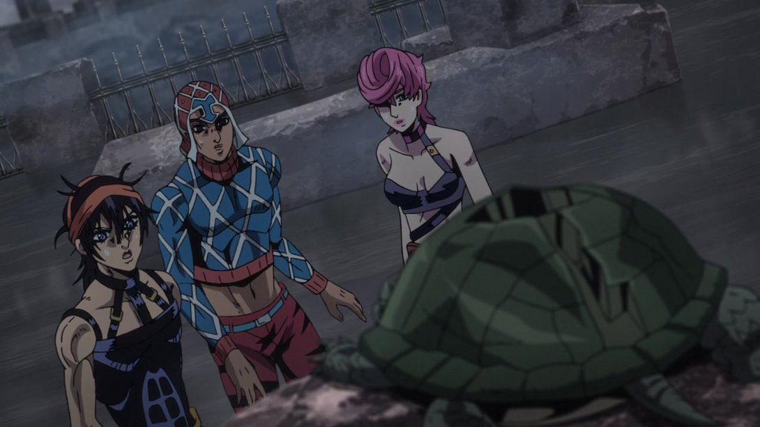
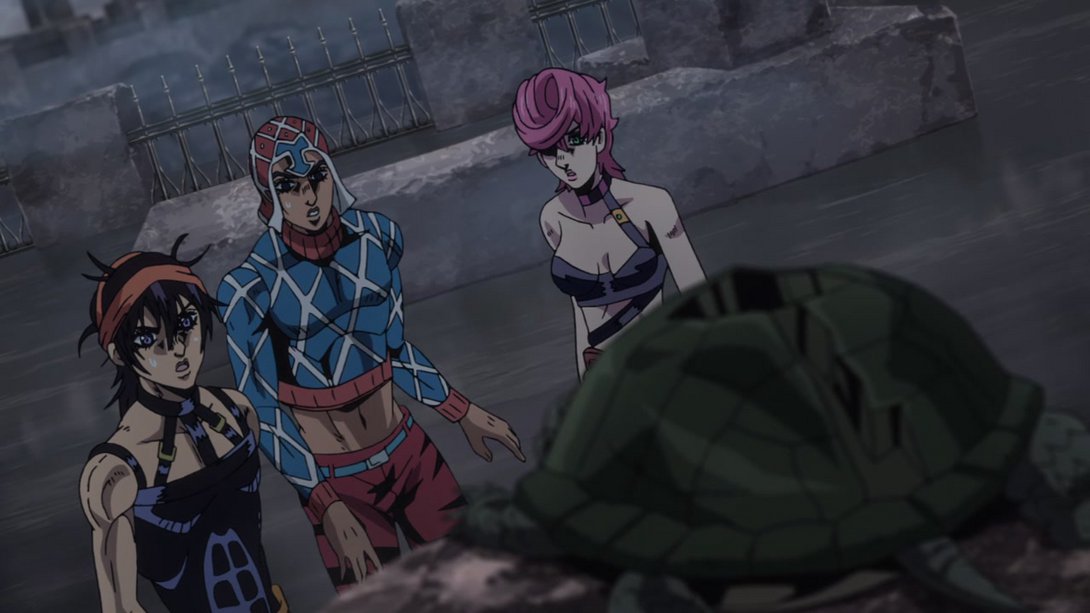
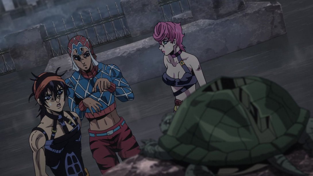
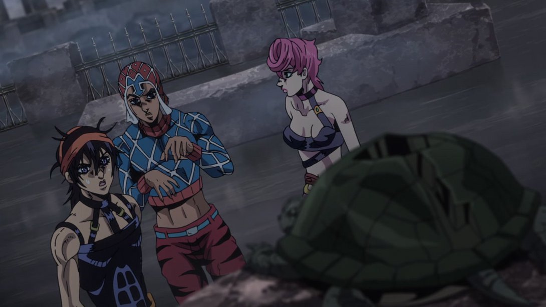
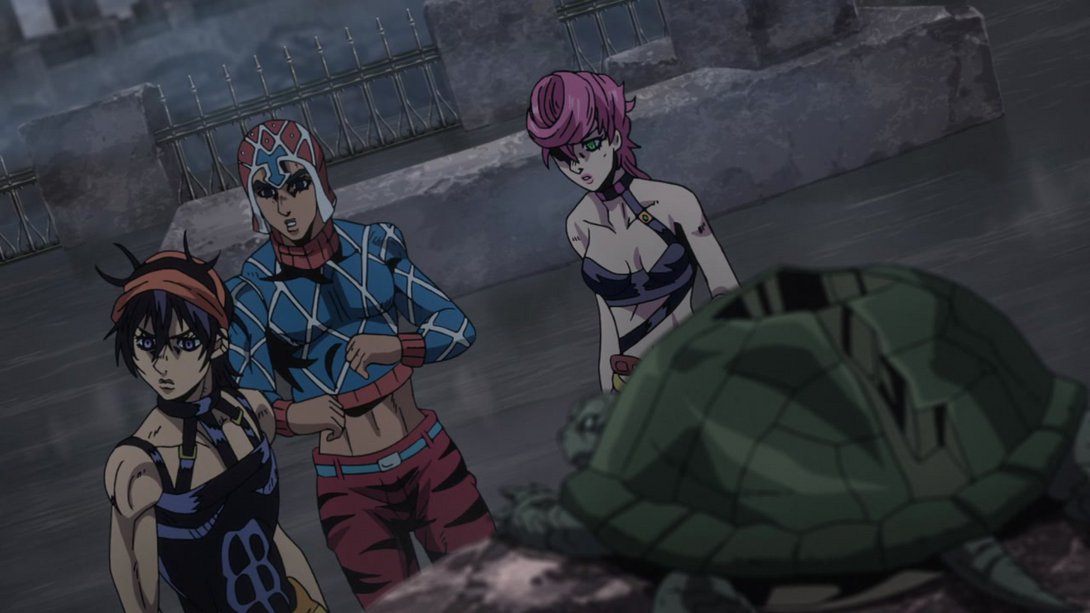
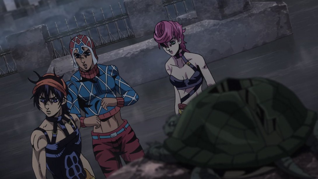
- In addition, Trish keeps looking at Coco Jumbo instead of just staring into emptiness, at the beginning of the same scene:
- Oh boy, this one is just… Yeah:
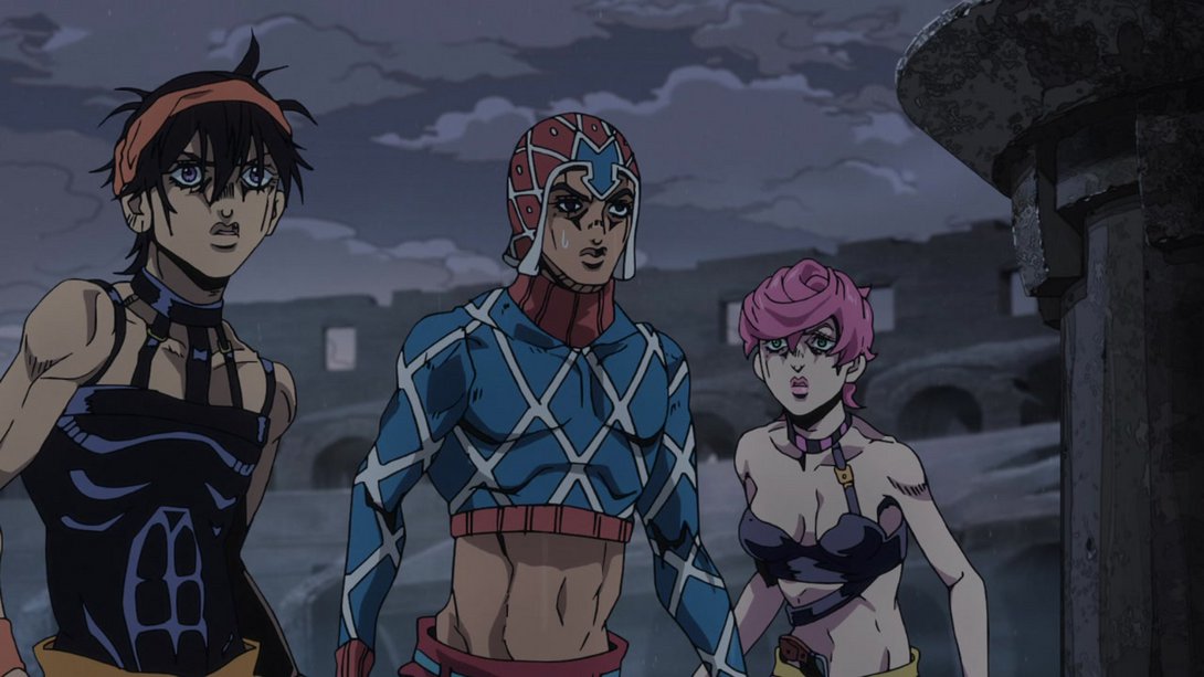
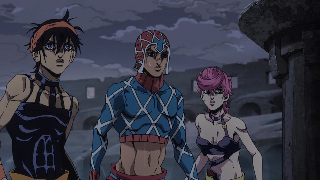
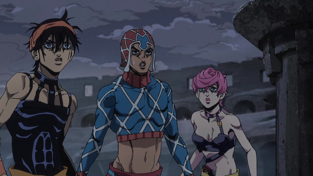

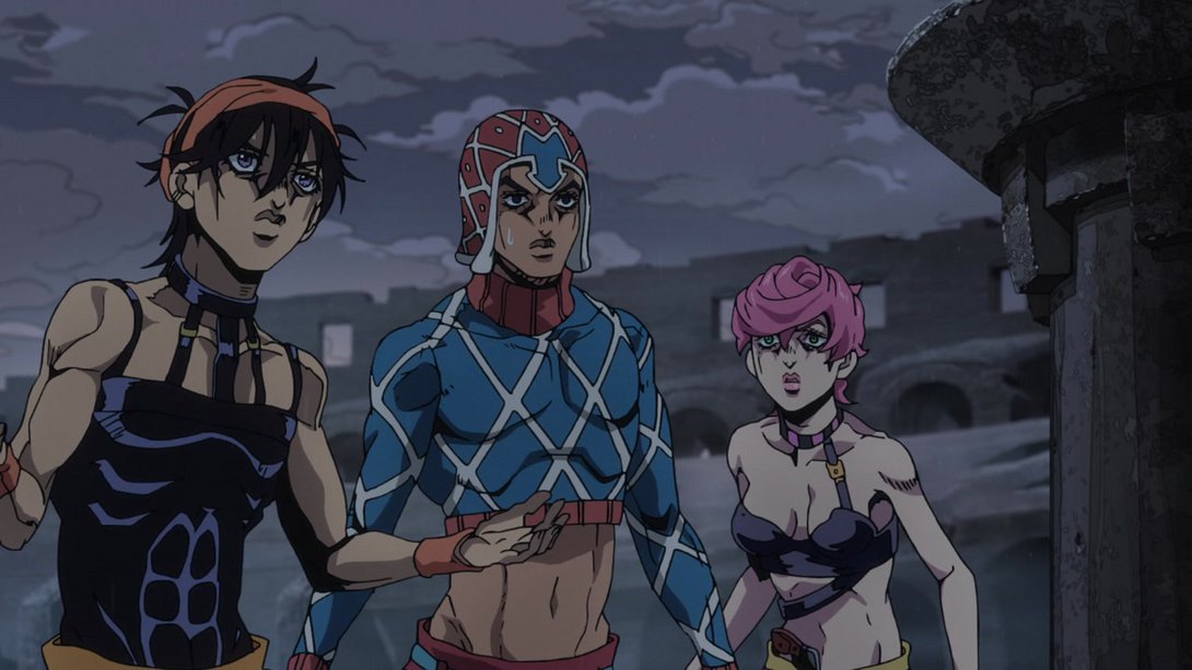
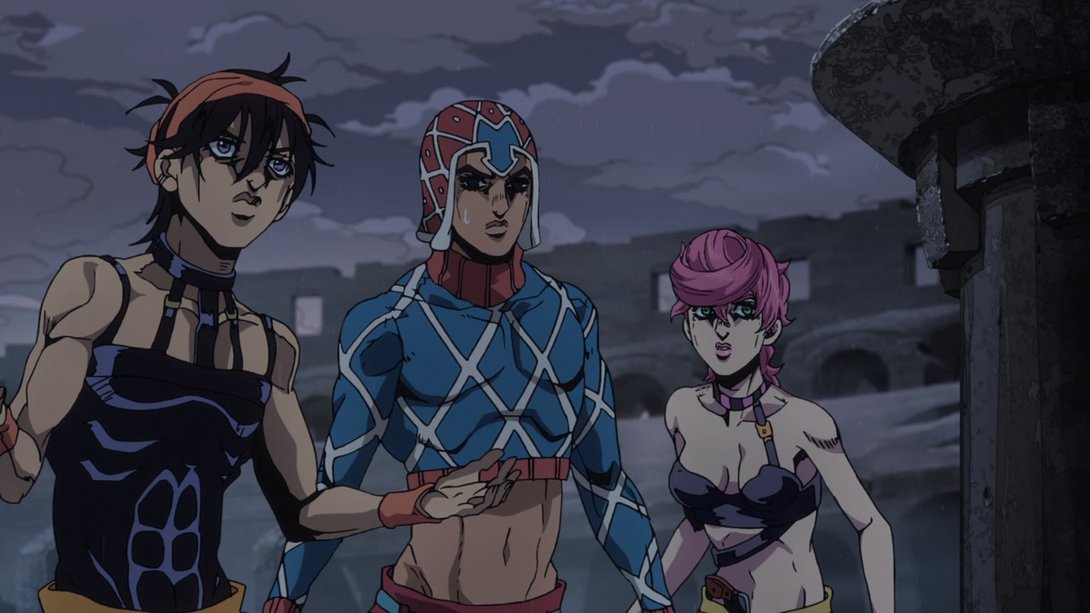
- In this shot of Narancia doing Leon’s Charizard Pose, most lines are slightly thicker…:
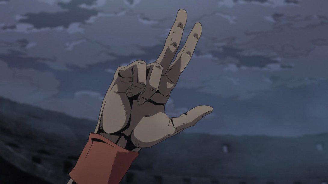
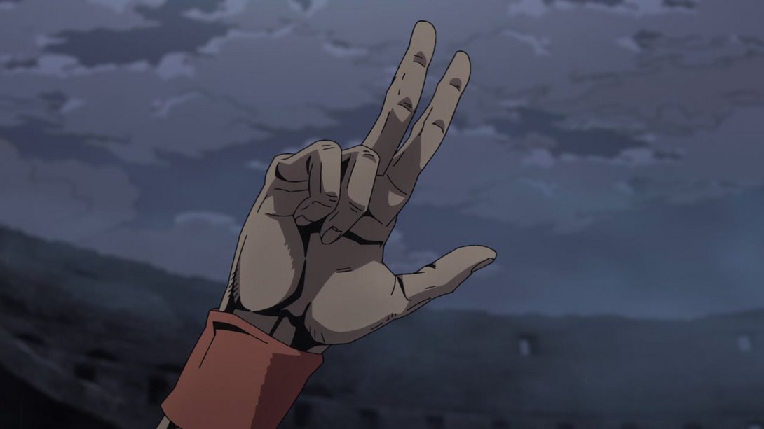
- Here the sky is darker, the shading on Trish is a touch flatter and her face has been thankfully retouched:
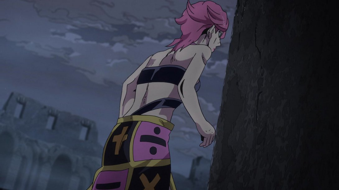
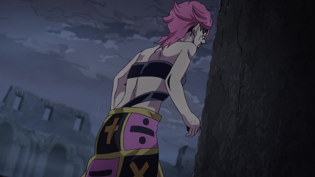
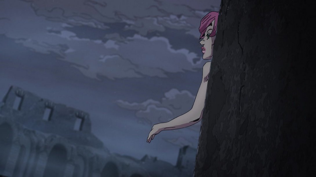
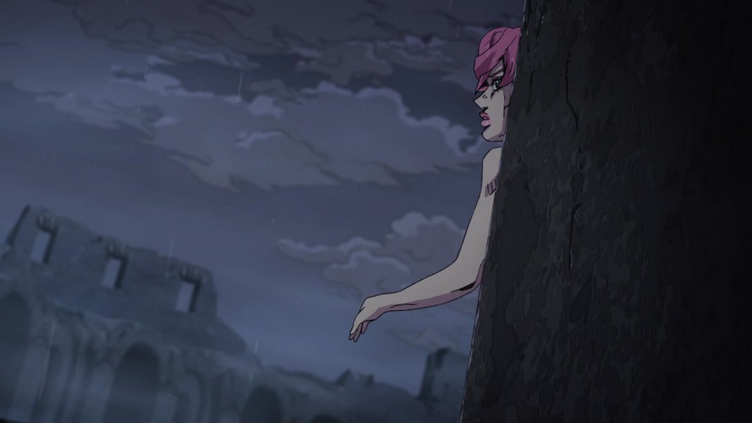
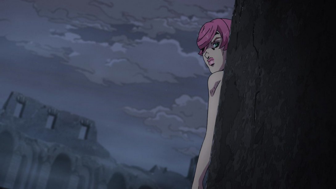
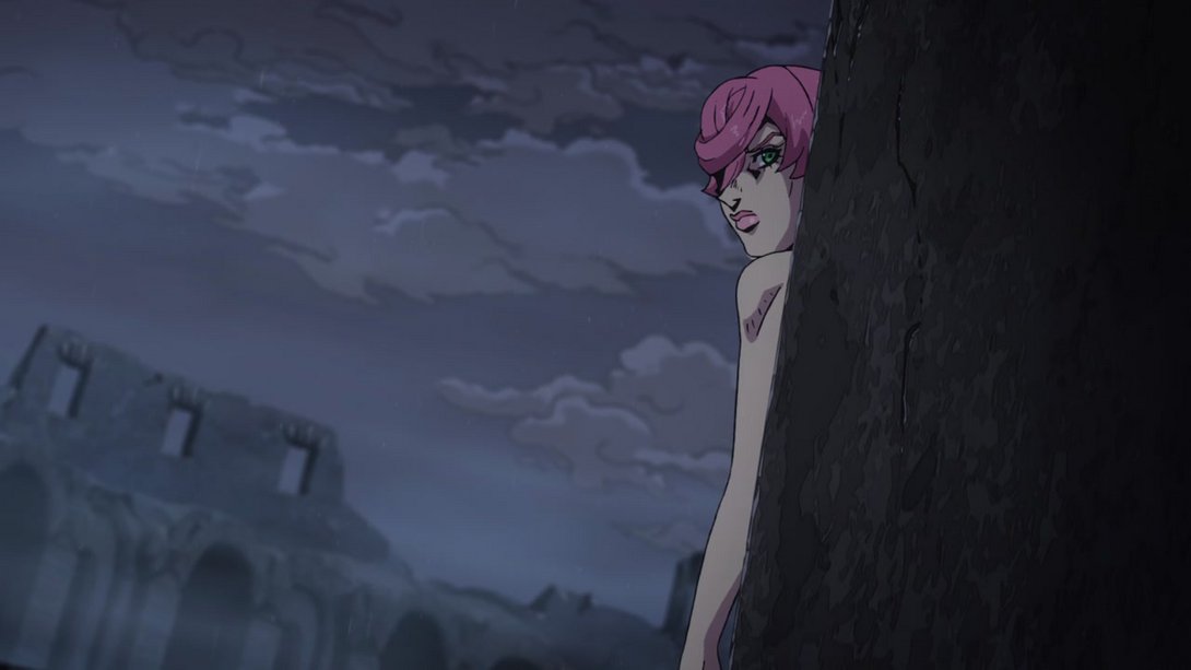
- In this shot of Diavolo/Buccellati, most lines are thicker, the background is different and the whole thing is slightly more distorted…:
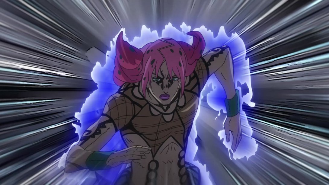
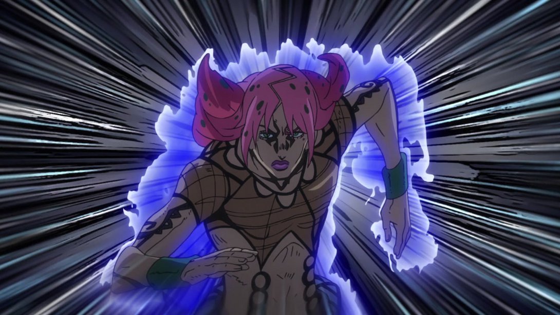
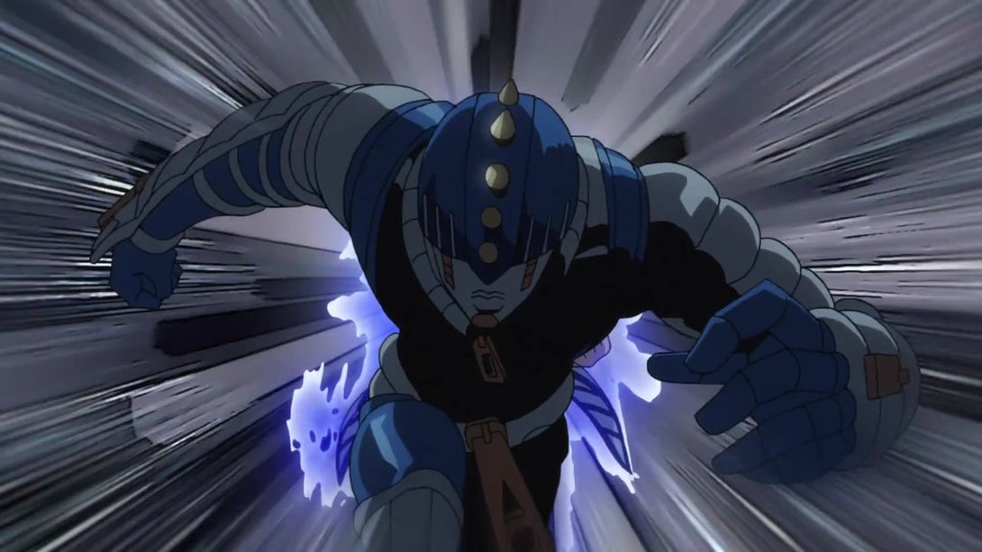
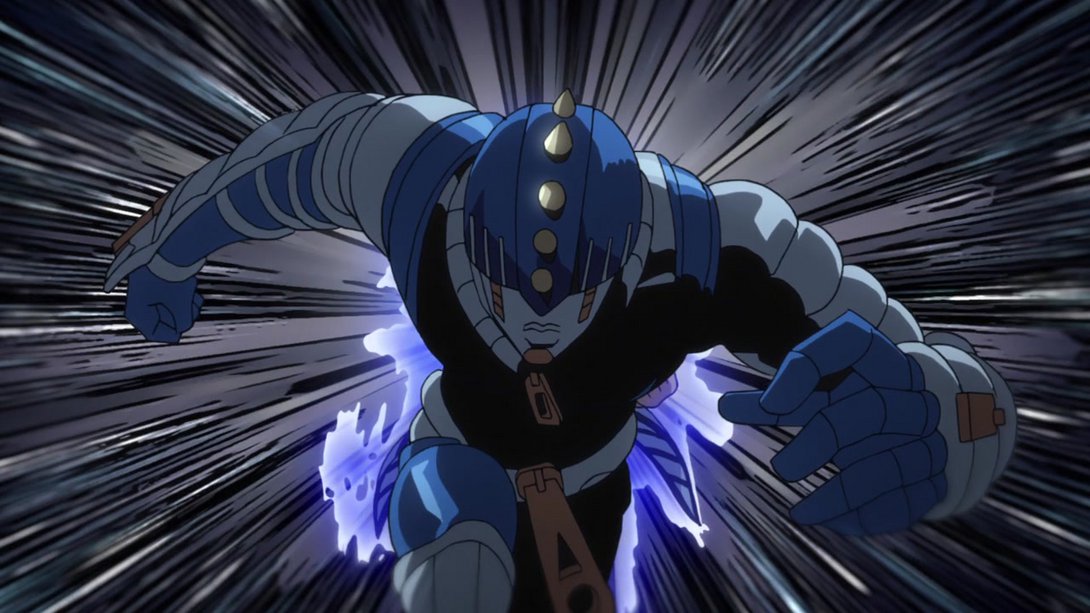
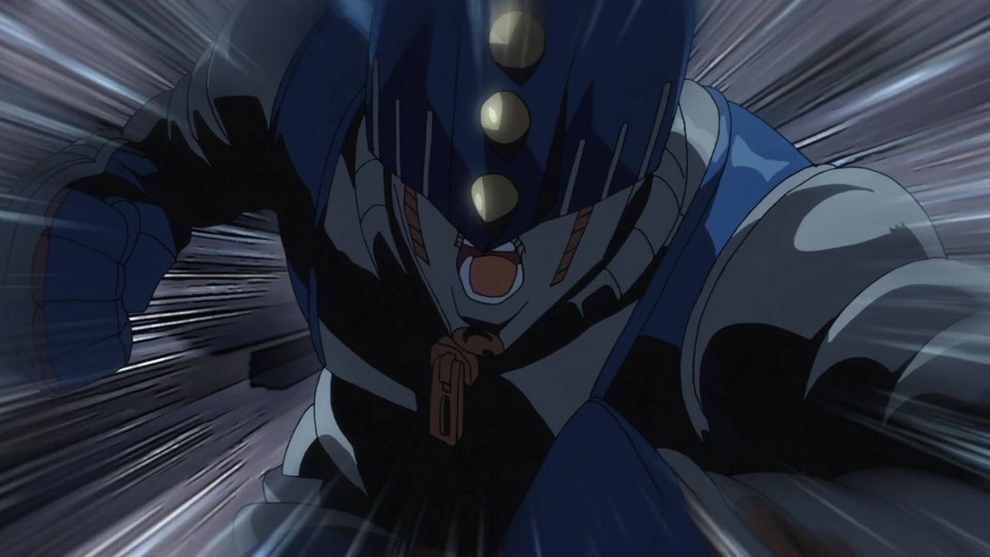
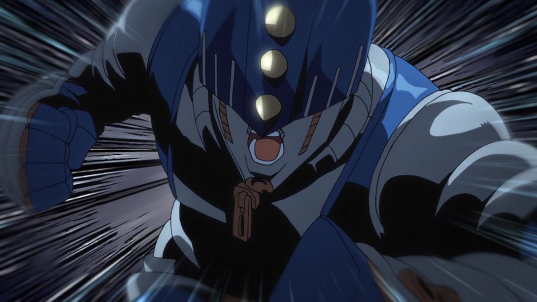
- And, in addition, Sticky Fingers’ appearance is way sparklier, and he even has a new outline while manifesting:
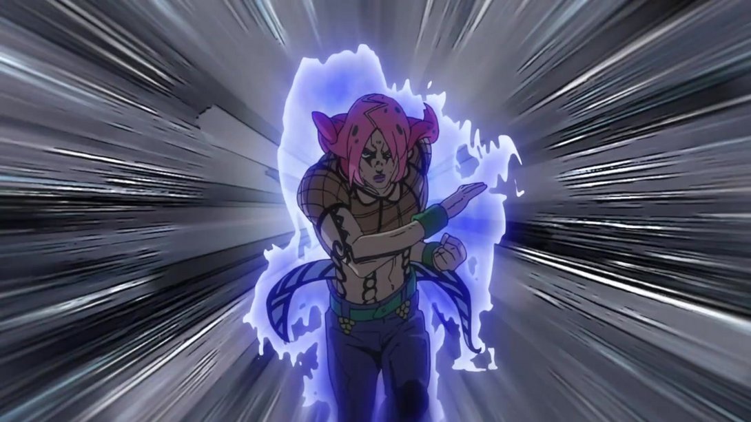
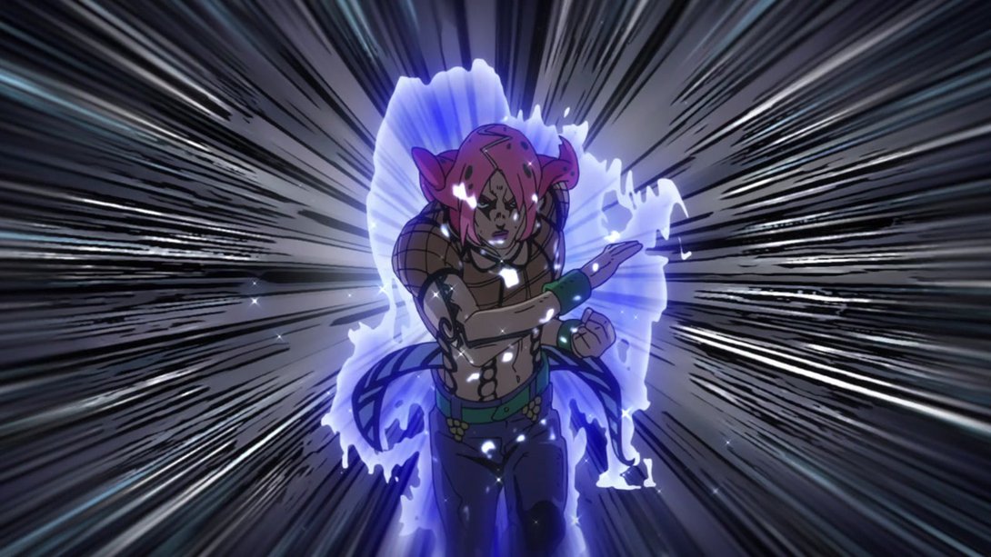
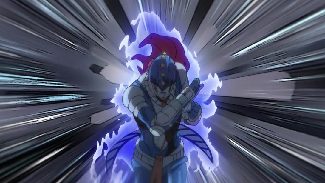
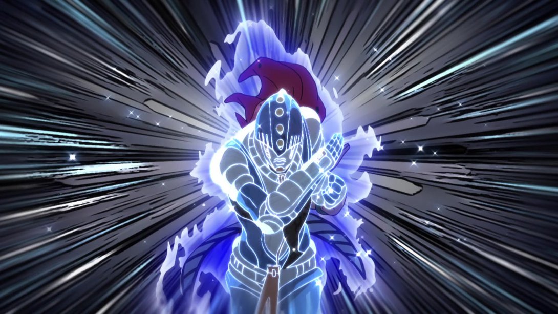
- And, once fully manifested, Sticky Fingers is brighter:
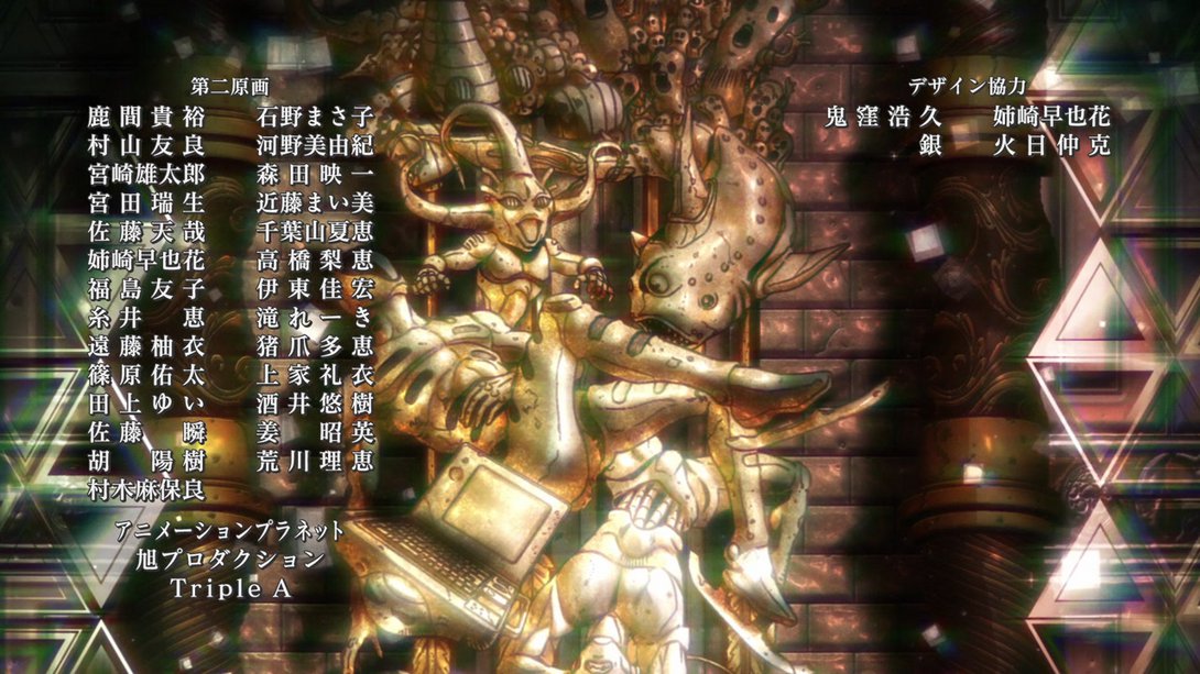
- Moving on to the credits, Animator 遠藤柚衣 (“Endō Yui”, I believe, although I’m not 100% sure)’s name has been fixed (the second-to-last kanji has been changed from 由 to 柚 - both pronounced “yu” or “yū”):

And that concludes today’s lengthy comparison, fellas! I hope you had a good time here, and I’ll see you next week-ish for Vento Aureo #35, “The Requiem Quietly Plays - Part 2”!
See ya!

