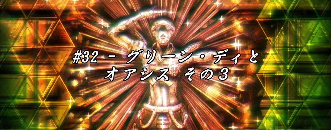
Hello again, friends! Sorry ‘bout the short delay - it was a busy week, and I also spent a couple of days revising the way I compress videos. The good news is that I found a way to compress them better while still keeping a small size (and you should see that starting from this comparison), but the bad news is that this new compression won’t be applied instantly to all the other comparisons too, but it will most likely require me going back one by one. Ah well! We’ll cross that bridge when we come to it, eh? But anyway, that’s not why you’re here today, is it? Let’s cut to the chase and take a look at Vento Aureo #32 “Green Day and Oasis - Part 3”, shall we? I’ve written quite a lot of sentences like this in a row, haven’t I?
- Let’s begin this uncharacteristically meaty episode with a simple difference! Here, Buccellati’s no longer looking directly at Secco:
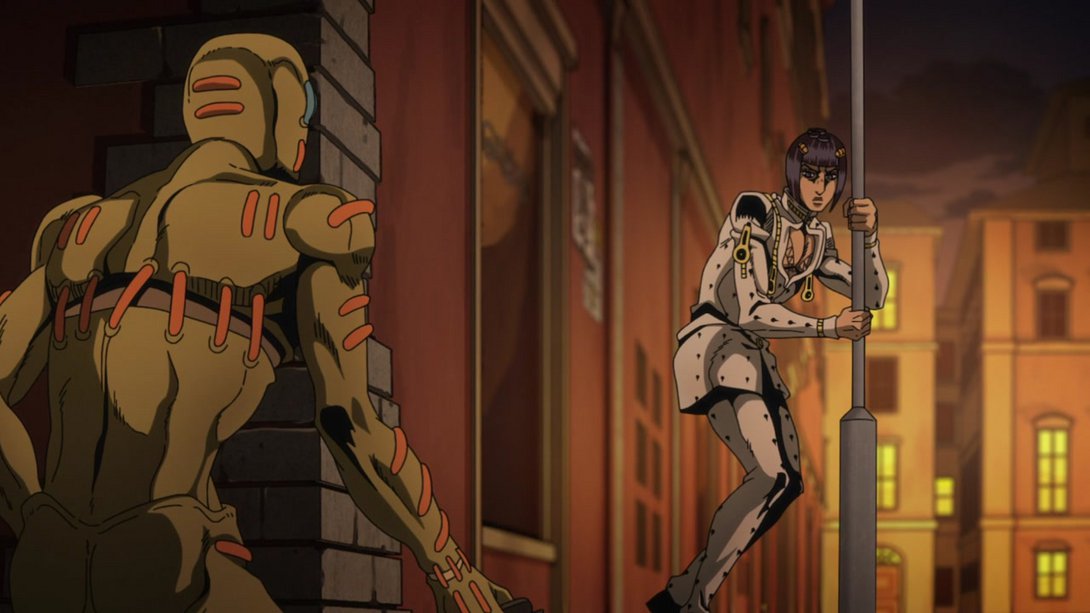
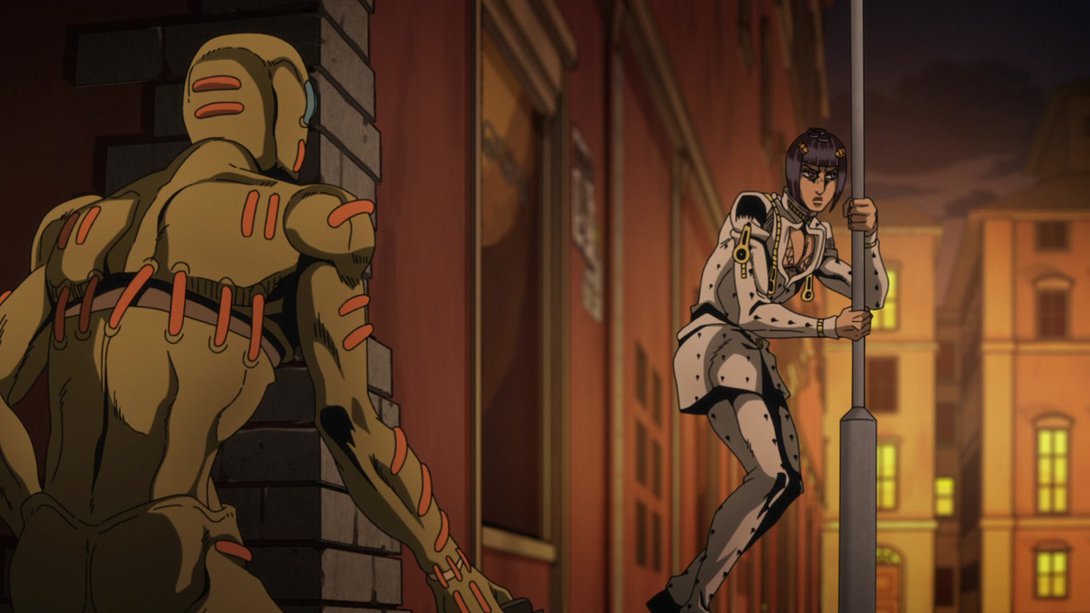
- In the BD version of this animation, the camera movement is less static! In addition, most lines on our sweet boy are thinner, the shading is softer and the background is a little brighter and blurrier:
- Moving on, here’s our poor Mama Buccellati, now sporting a brand new zipper on his shoulder and several (3) shards of glass embedded in his poor body:
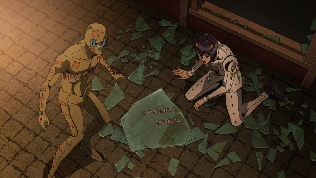
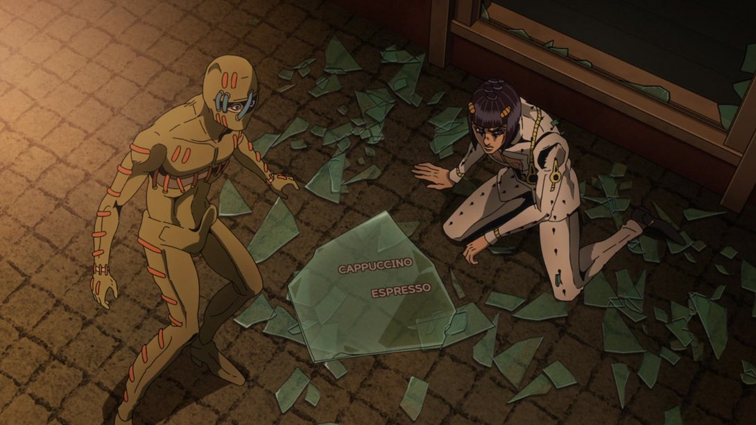
- In this BEAUTIFUL frame, our boy has once again been adorned with two (2) additional zippers and an additional shard; the background is also blurrier:
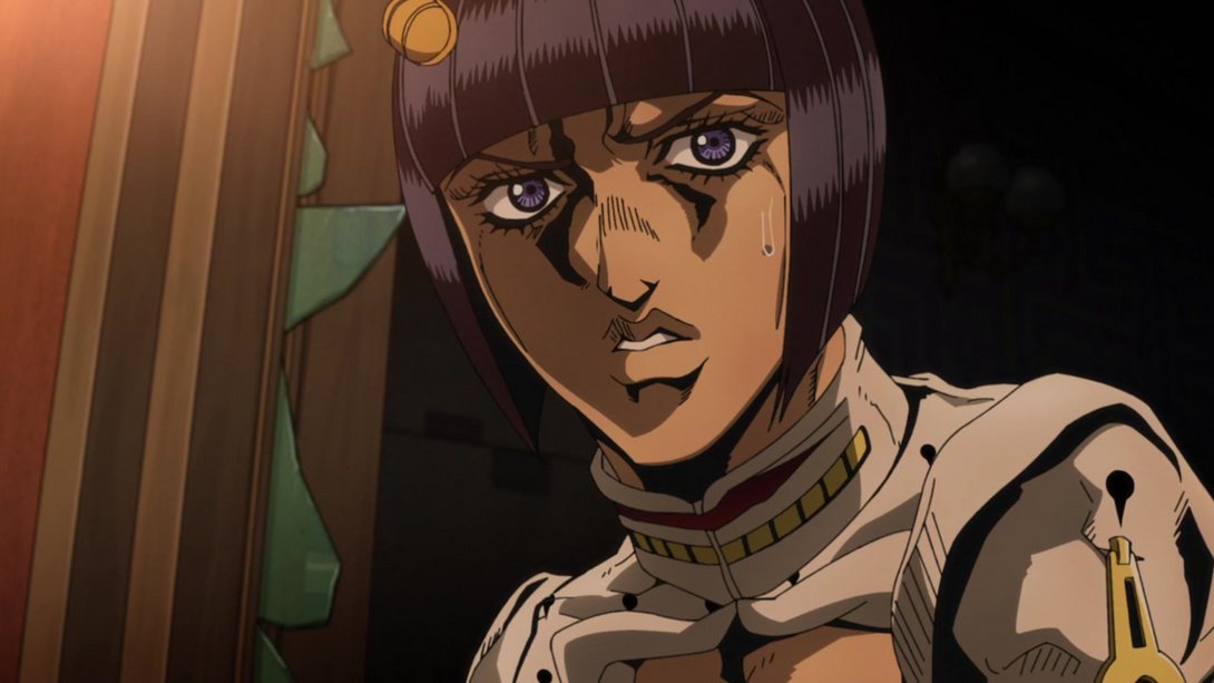
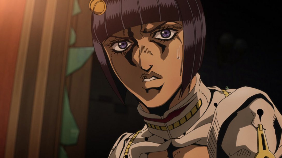
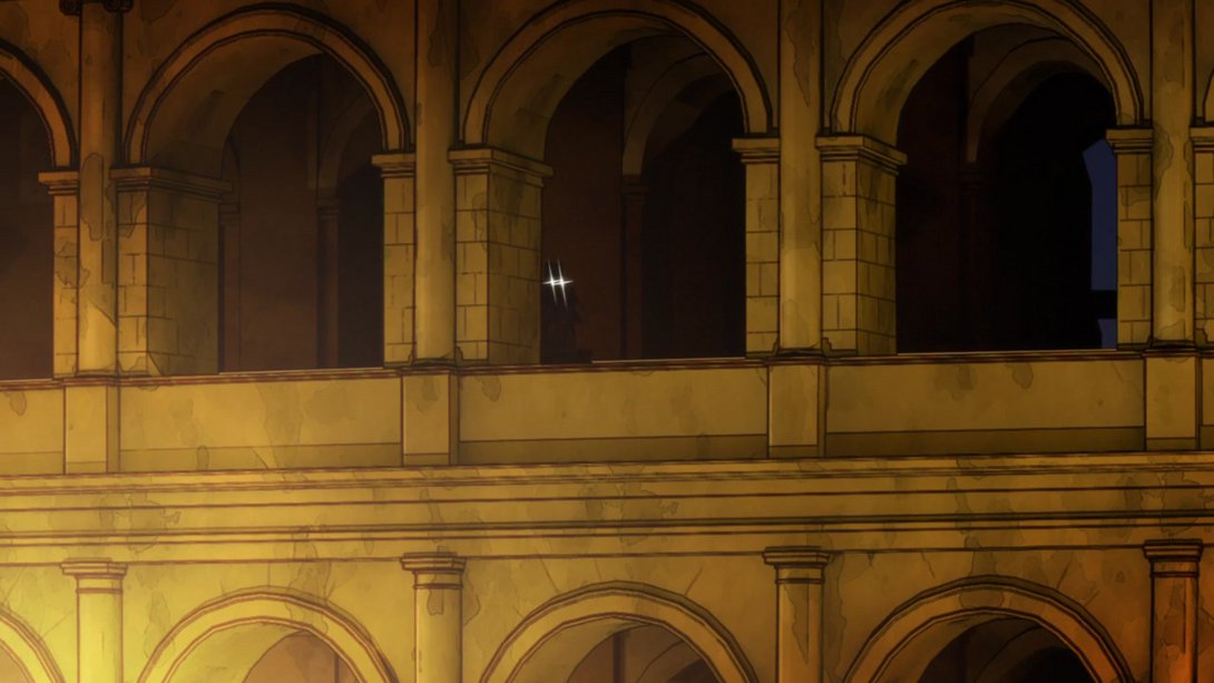
- Polnareff’s binoculars cast a brighter gleam, here:

- Buccellati has once again been pierced with one more shard of glass here, and the general lighting is different on the background and on Secco:
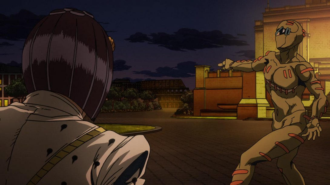
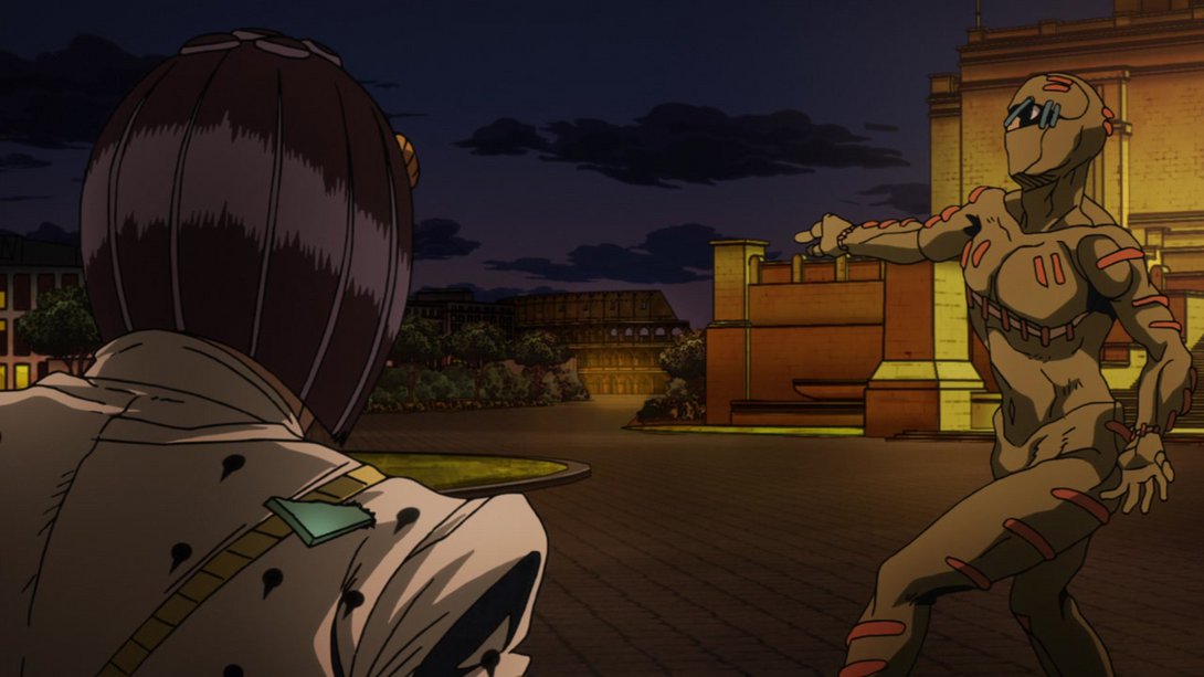
- STOP STABBING MY MOM:

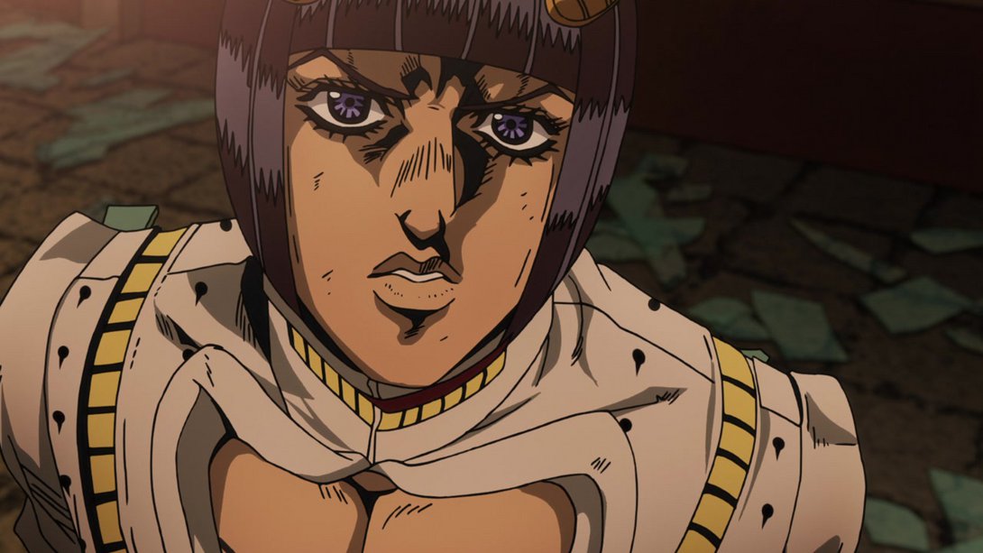
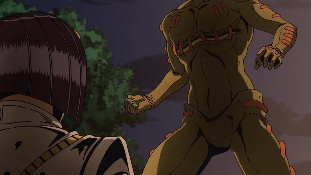
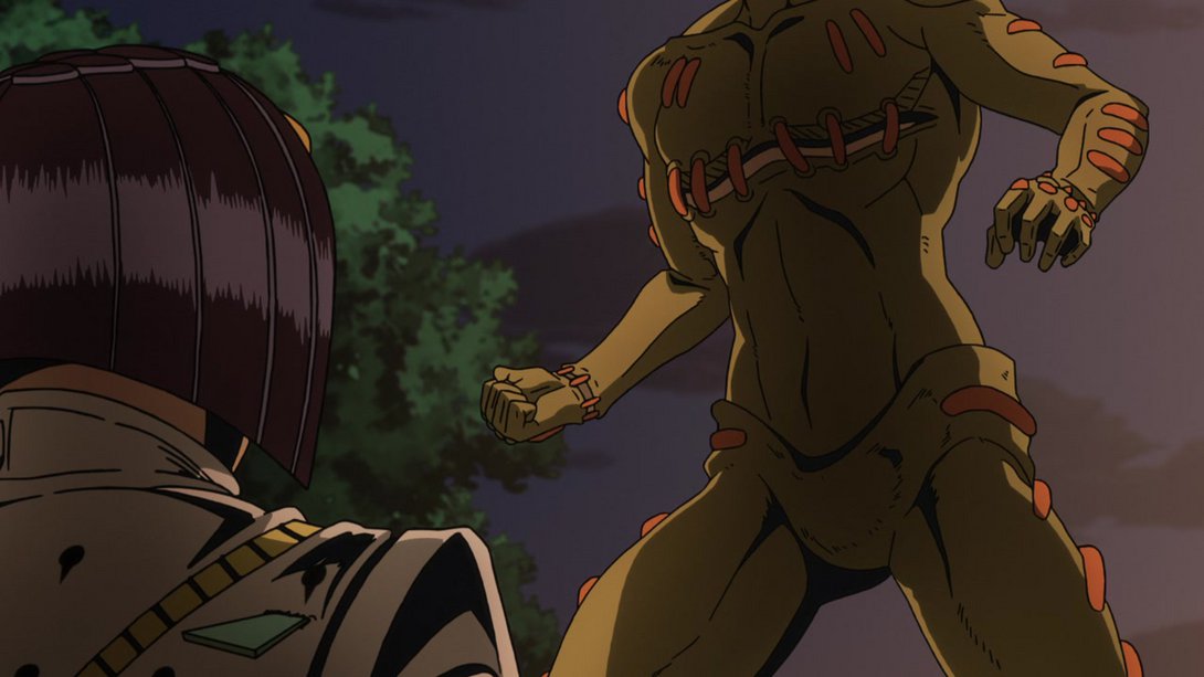
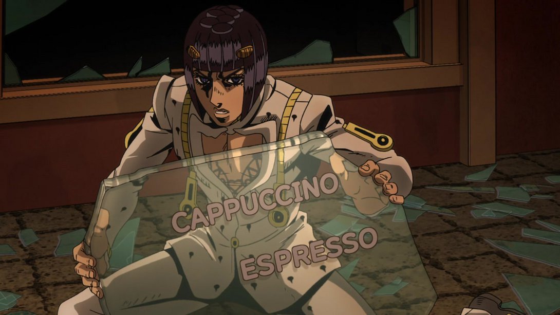

- This animation is, hm… A little different, but not very noticeably so. For starters, Secco is drawn with thinner lines in all frames; in addition, for the duration of the first two frames he’s also been moved to the left…:
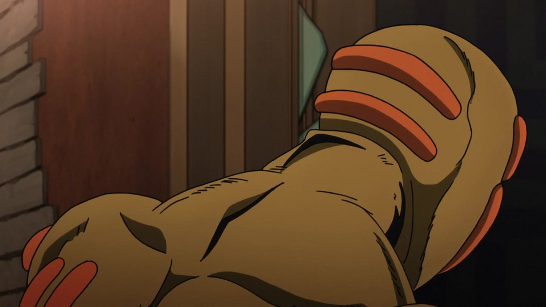
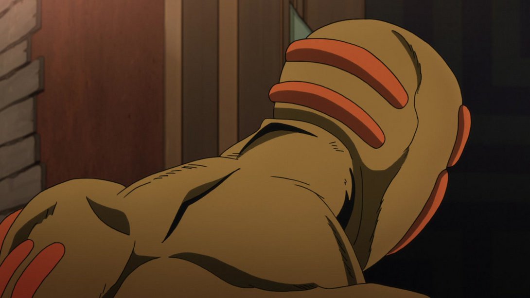
- …and the animation itself is a tad smoother, too. Check it out:
- The camera has been moved down in this scene, and it no longer looks like the lens has been smeared with vaseline:
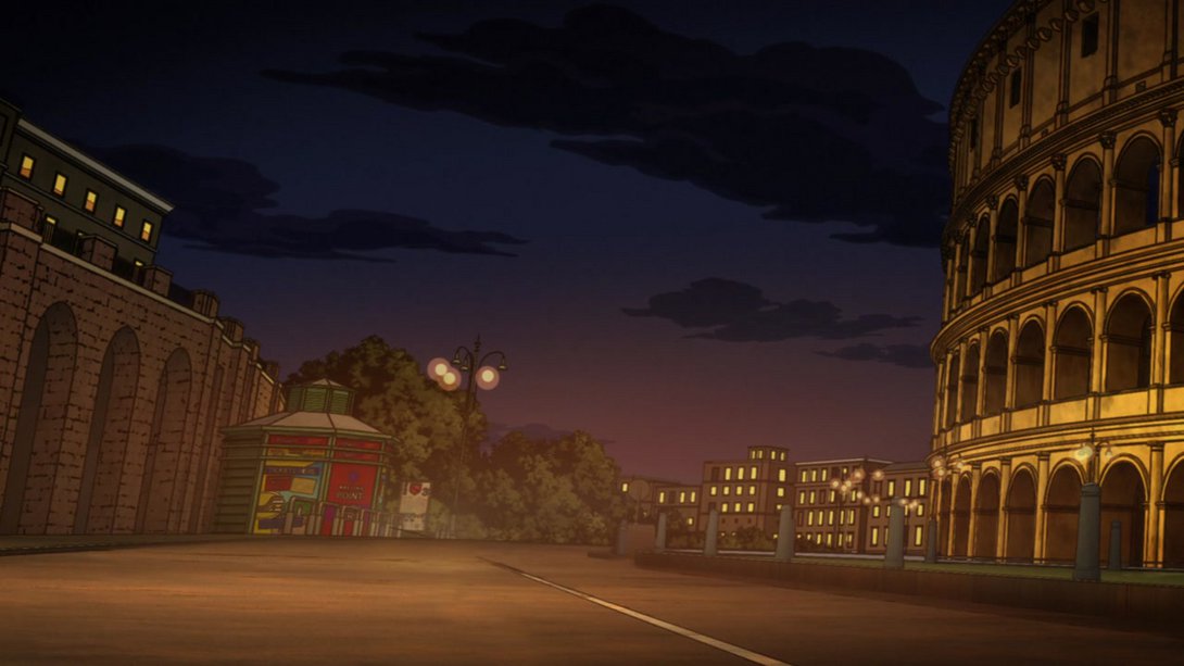
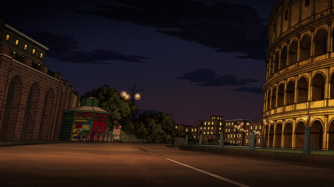
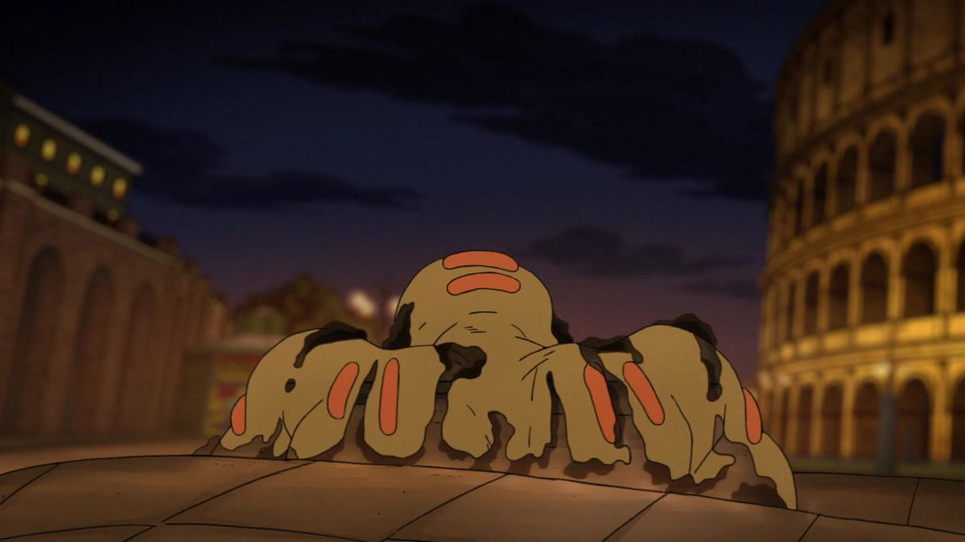
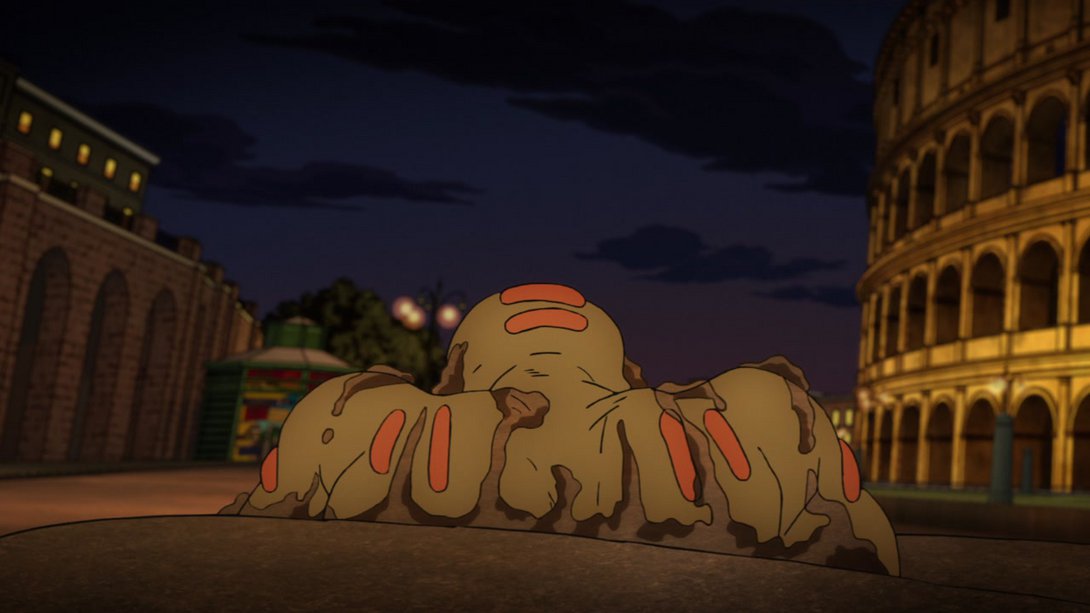
- In addition, when Secco shows up, the background is less blurry, there’s a new darker vignette along the edges, the dirt in the foreground has been completely re-textured, the mud on him is looking different and Secco himself has been slightly re-coloured so as to look less flat:
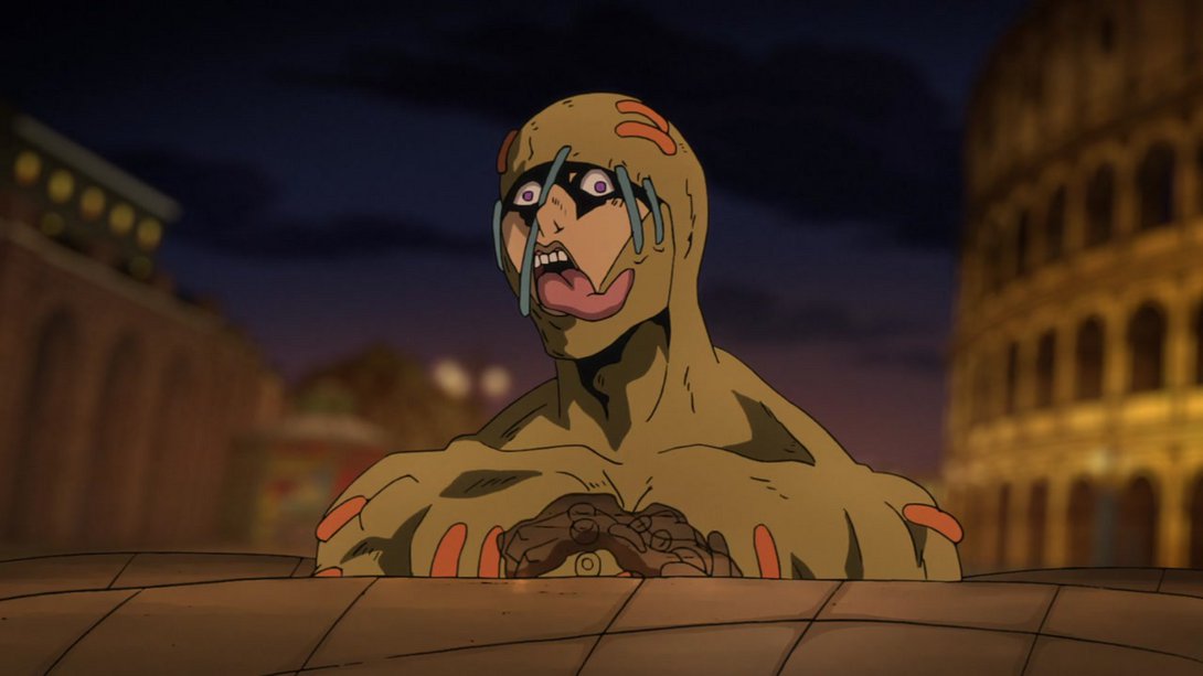
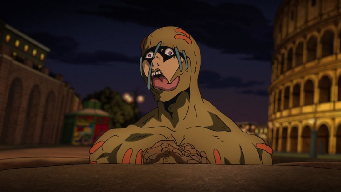
- Buccellati’s mouth has been moved down a few pixels, here:
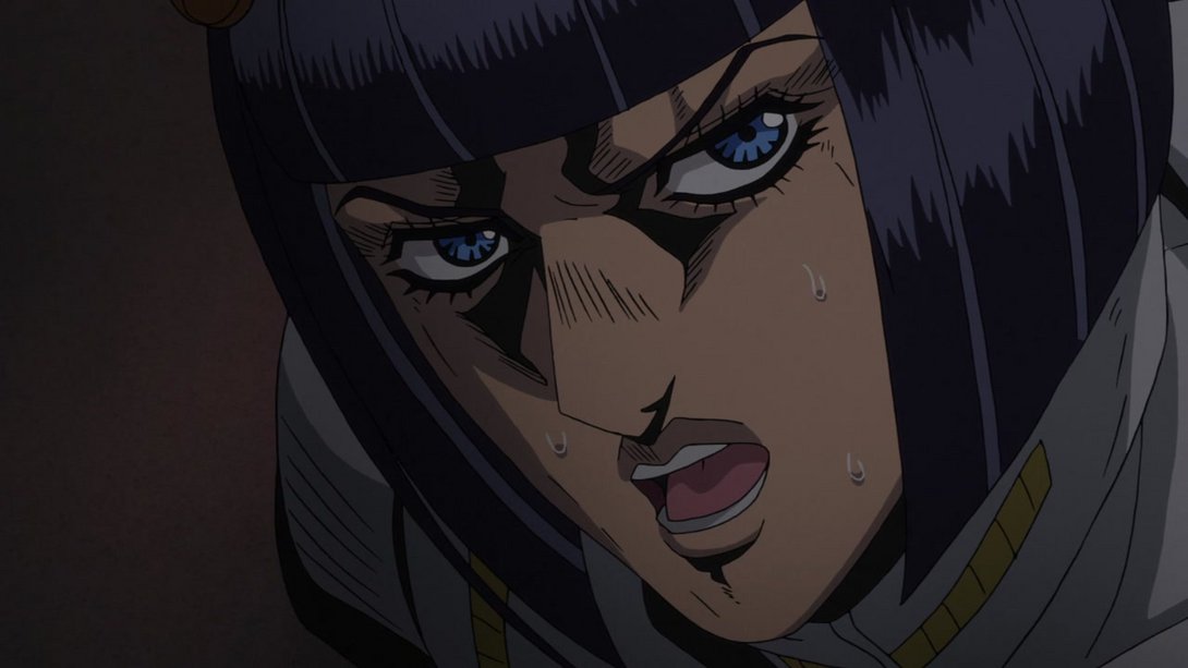
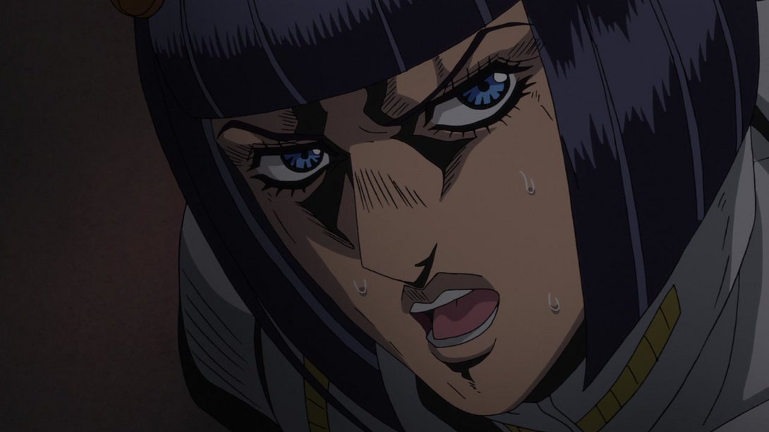
- All the portraits of our precious boys have been completely redrawn here, for some reason, and there’s a new textbox under Buccellati’s:
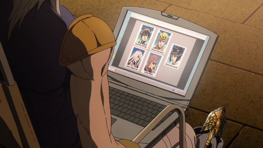

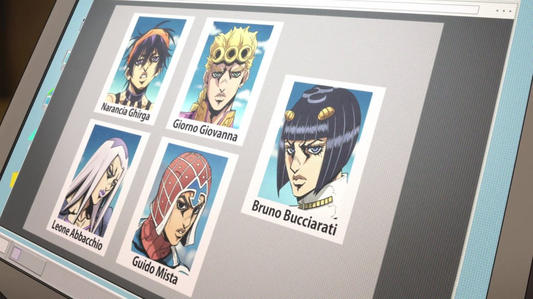
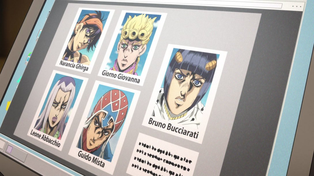
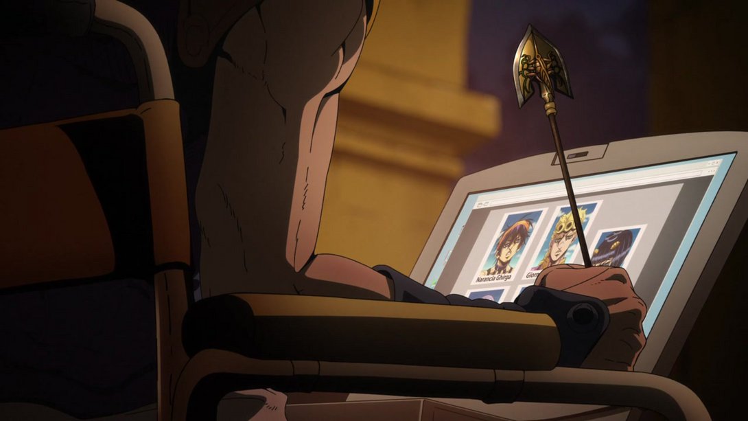
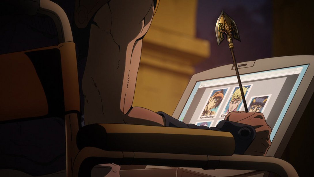
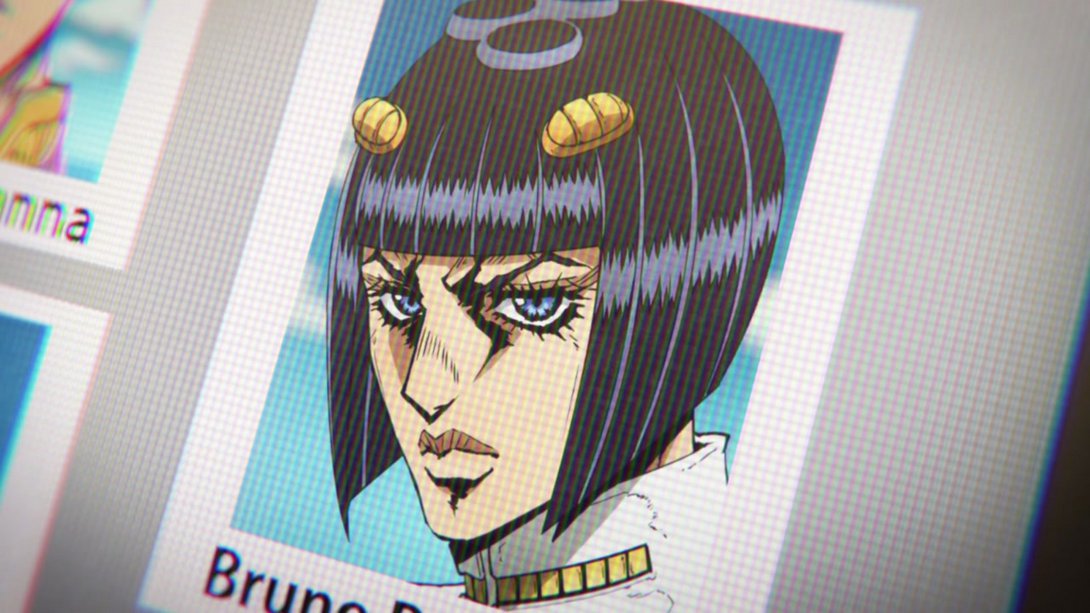
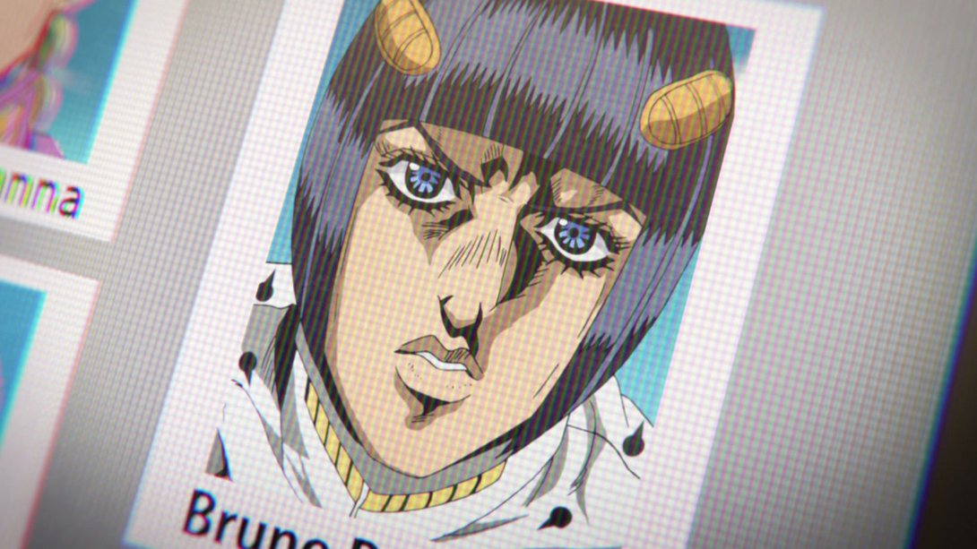
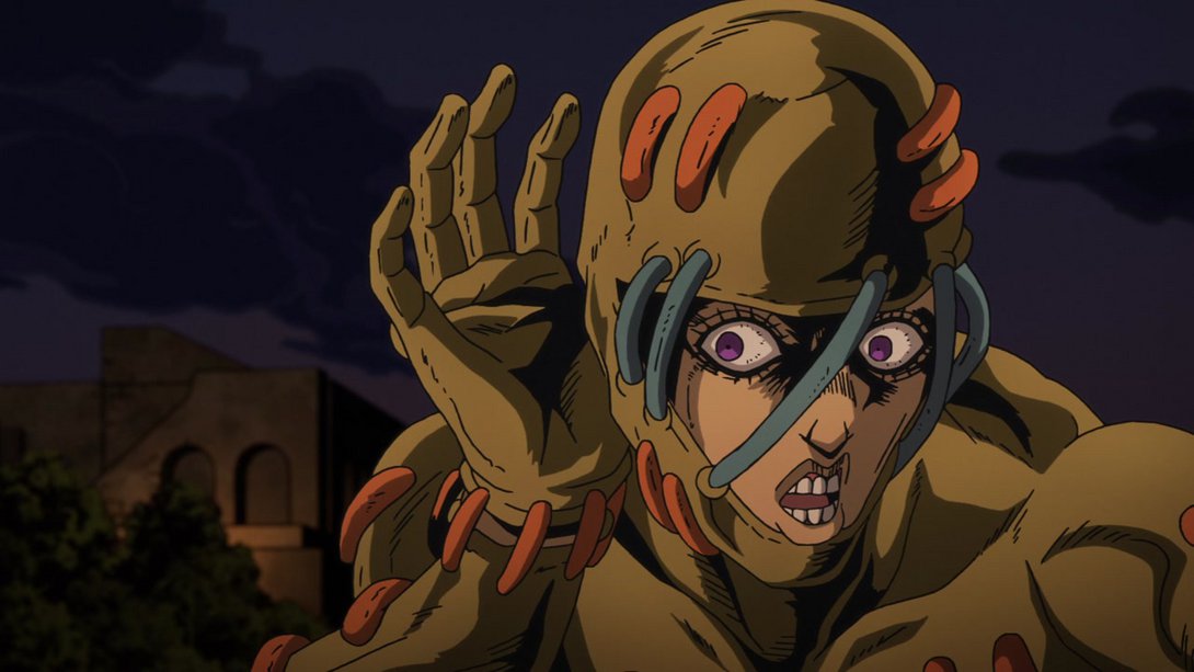
- The lines on Secco are sliiiiiiiiiiightly thicker, here…:

- Here’s an interesting change! In this scene of Secco diving deep below Rome (AND WHERE ARE THE ANCIENT ROMAN RUINS, HUH ARAKI??? HUH???), the camera has been moved a little, most things are blurrier and slightly more muted and there’s a new vignette along the edges:
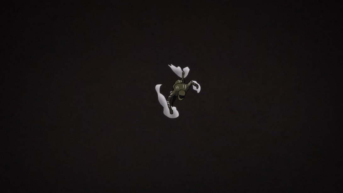
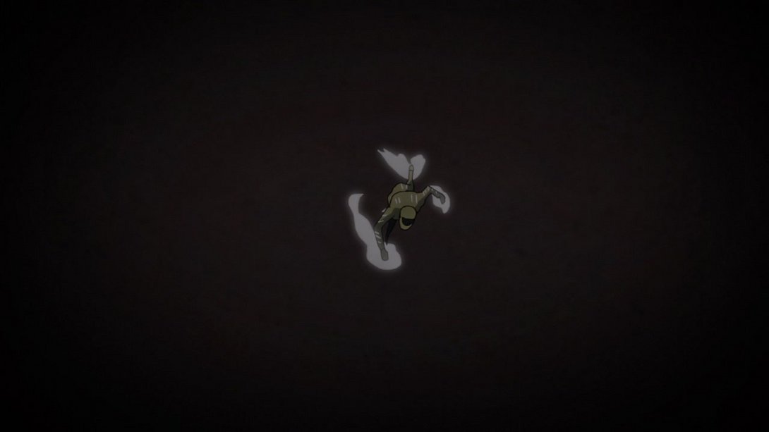
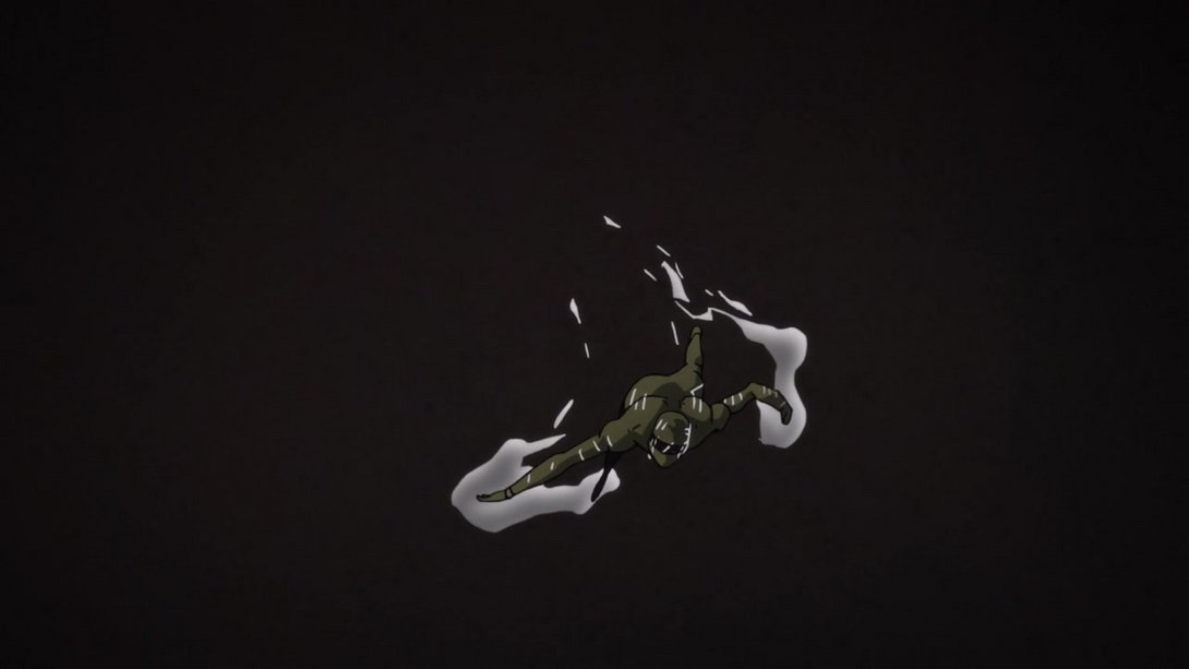
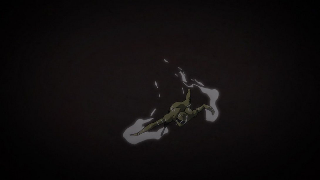
- In addition, Secco has pulled down his mask…:
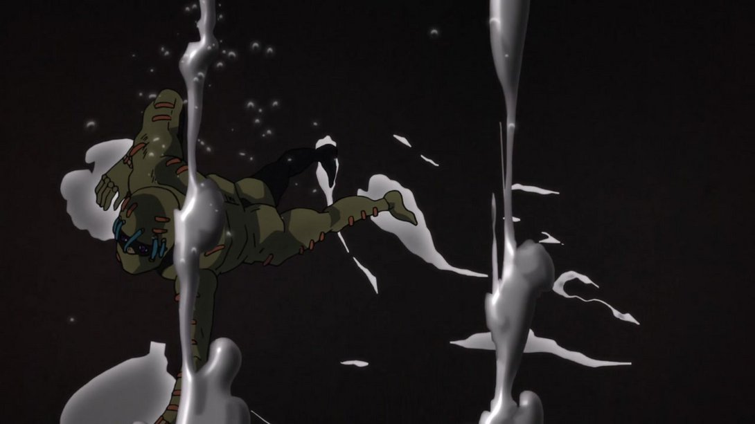
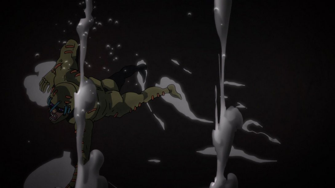
- …And the underground bubbles are different, too:
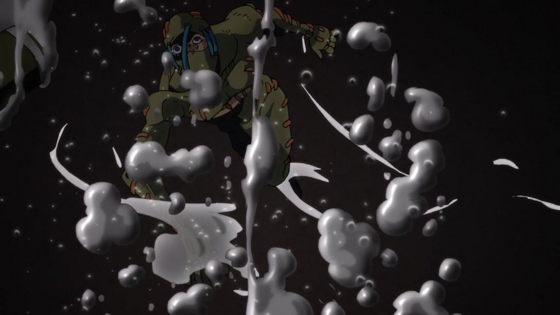
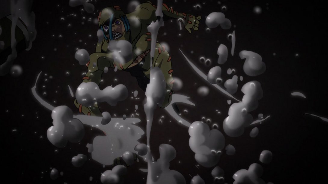
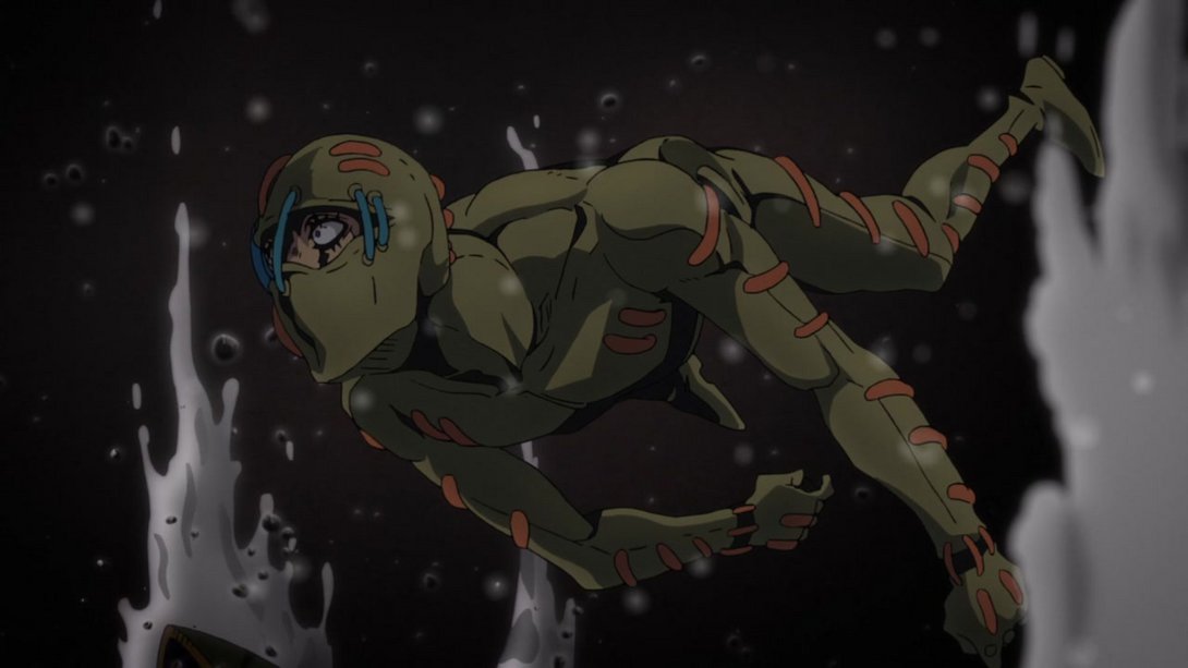
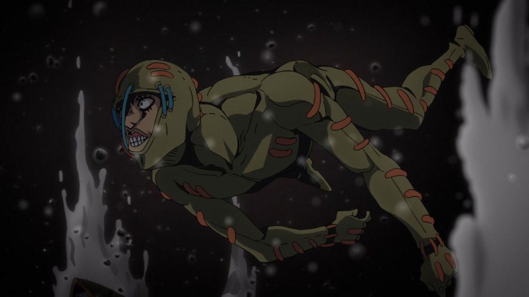
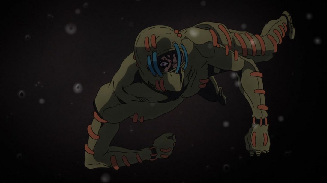
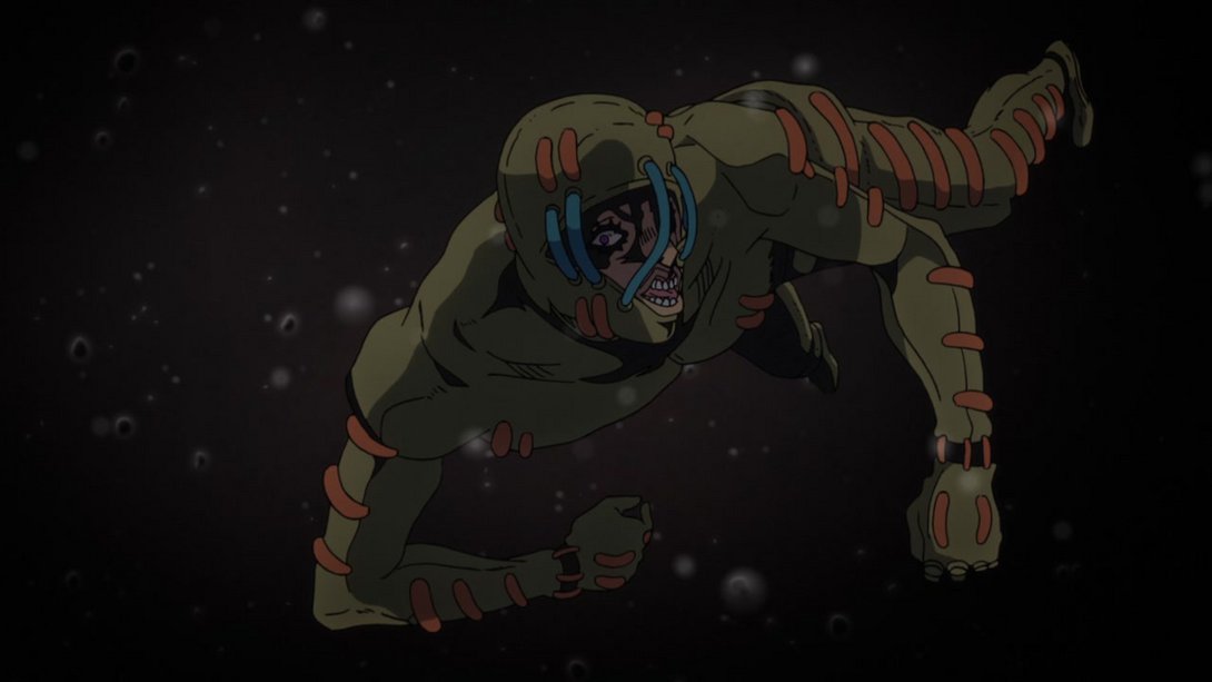
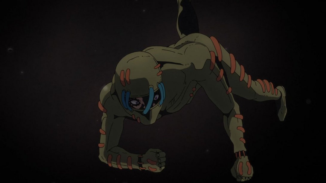
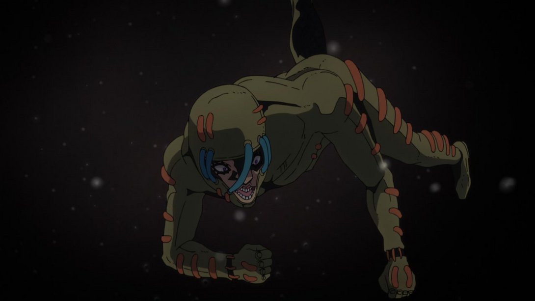
- In addition, he moves slightly later in the last part of the animation:
- The timing in this very cursed animation are also slightly different:
- The lighting is much better in this pretty shot, and there are more rocks floating about:
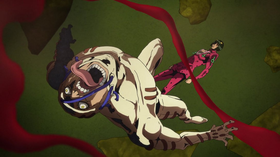
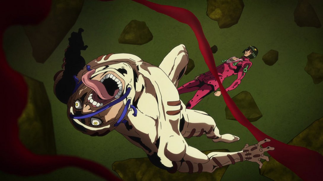
- Here, the car has been retouched and repositioned, and there are new, darker effects where Secco melts into the ground:
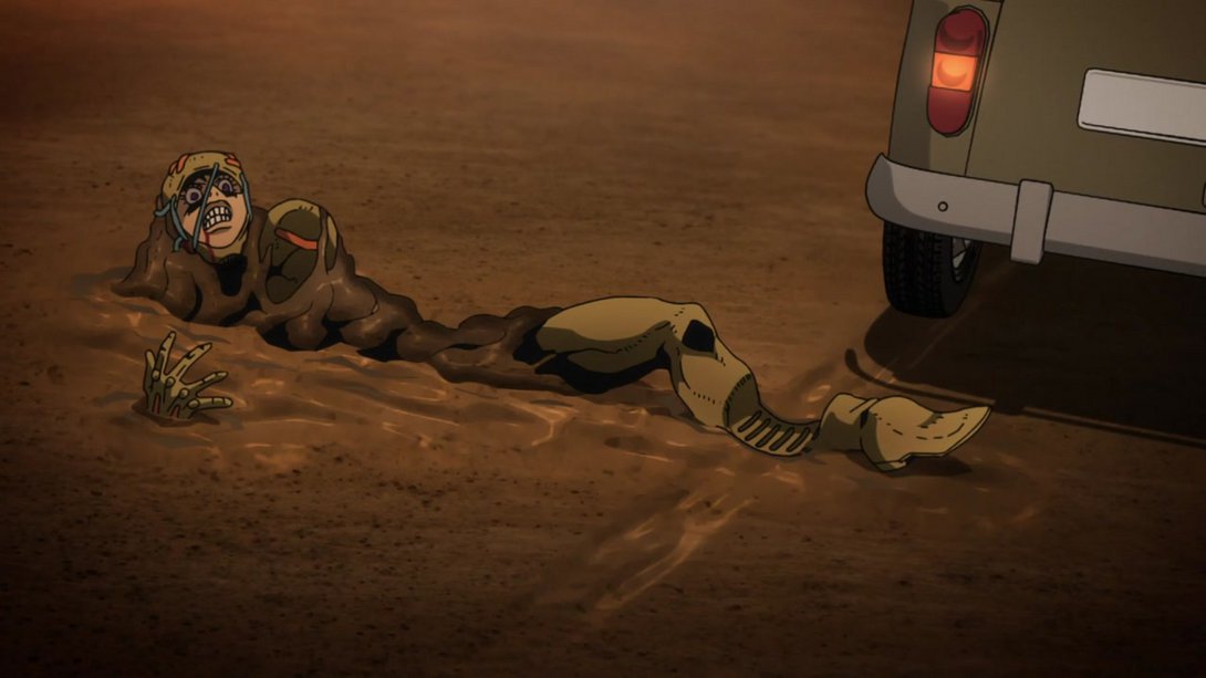
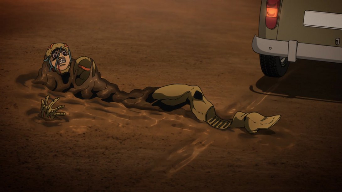
- Here, the ground and sky textures are both different:
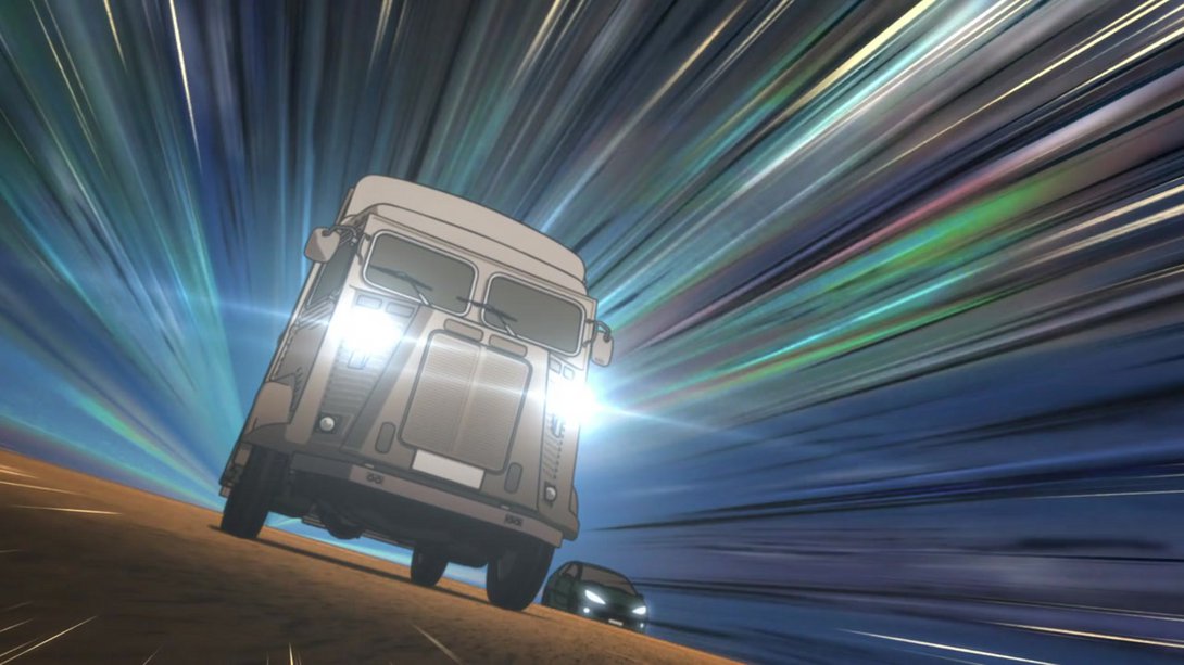
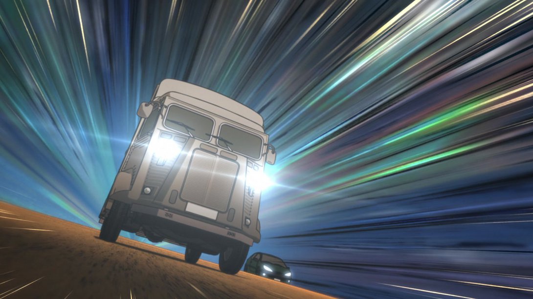
- In this scene of Secco just yelling at a random dog, the background has been moved and its lighting/shading tweaked, and there’s a different distortion along the edges of the frame:
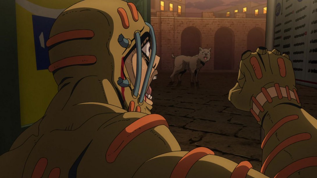
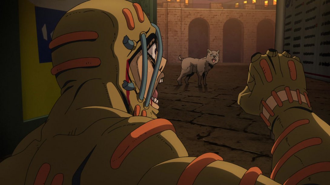
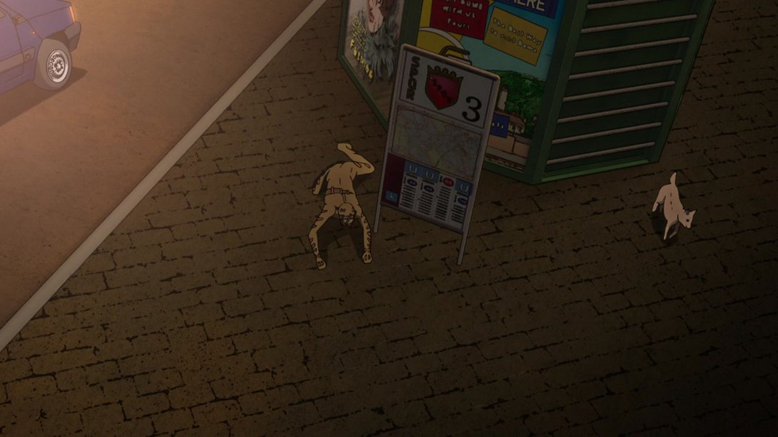
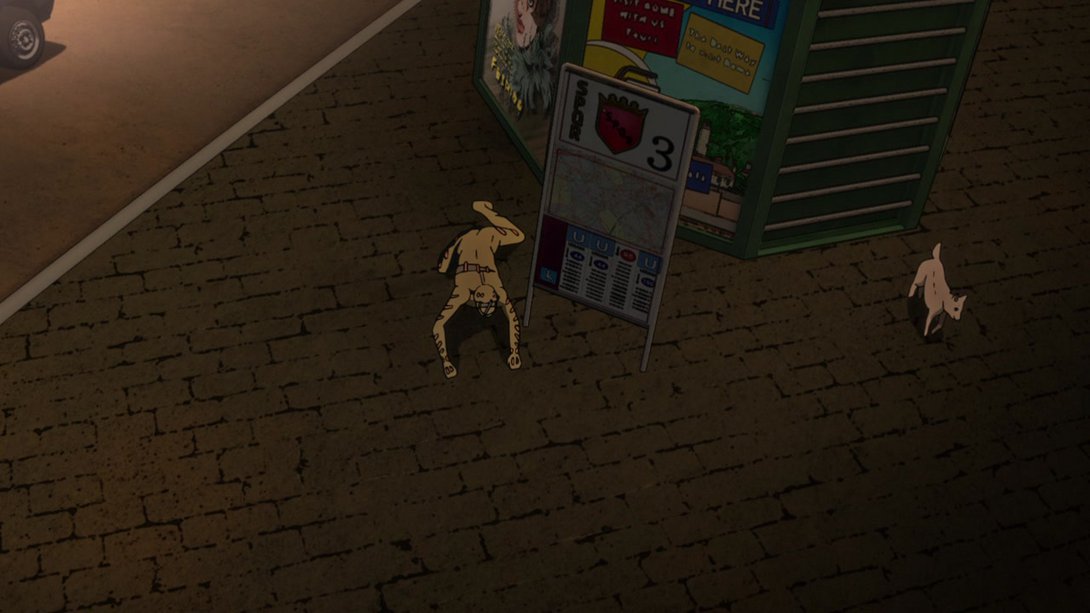
- Most things have been moved around here:
- In this extremely cool shot of Buccellati, there is a new distortion effect around the zipper, there’s a different lighting on Buccellati and on some elements of the background, and he has A MOUTH:
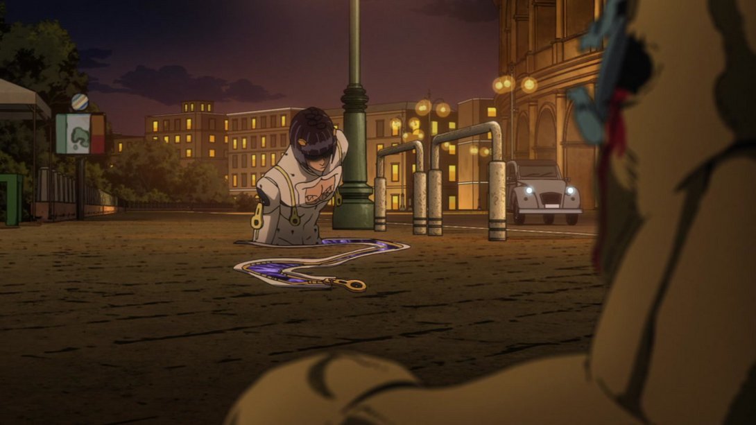
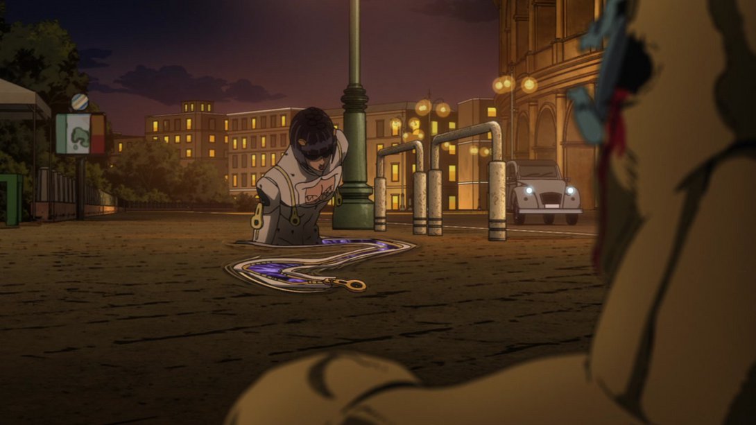
- …which he actually uses to actually talk:
- The zipper distortion is back here, and both Buccellati and the background have a slightly different lighting once more, here:
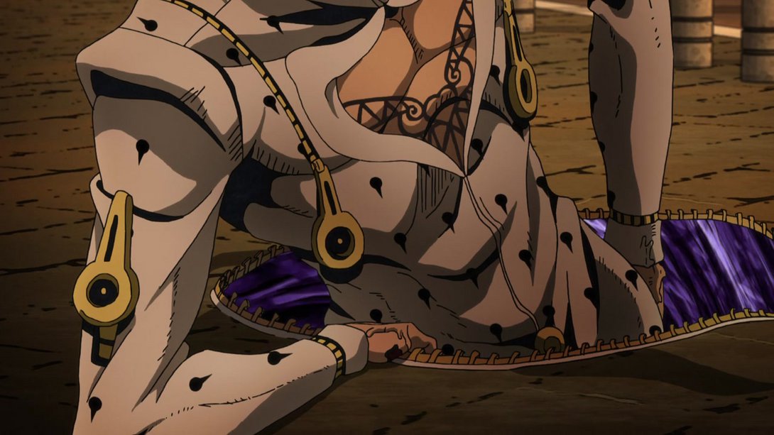
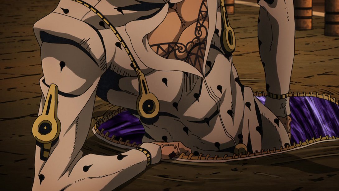
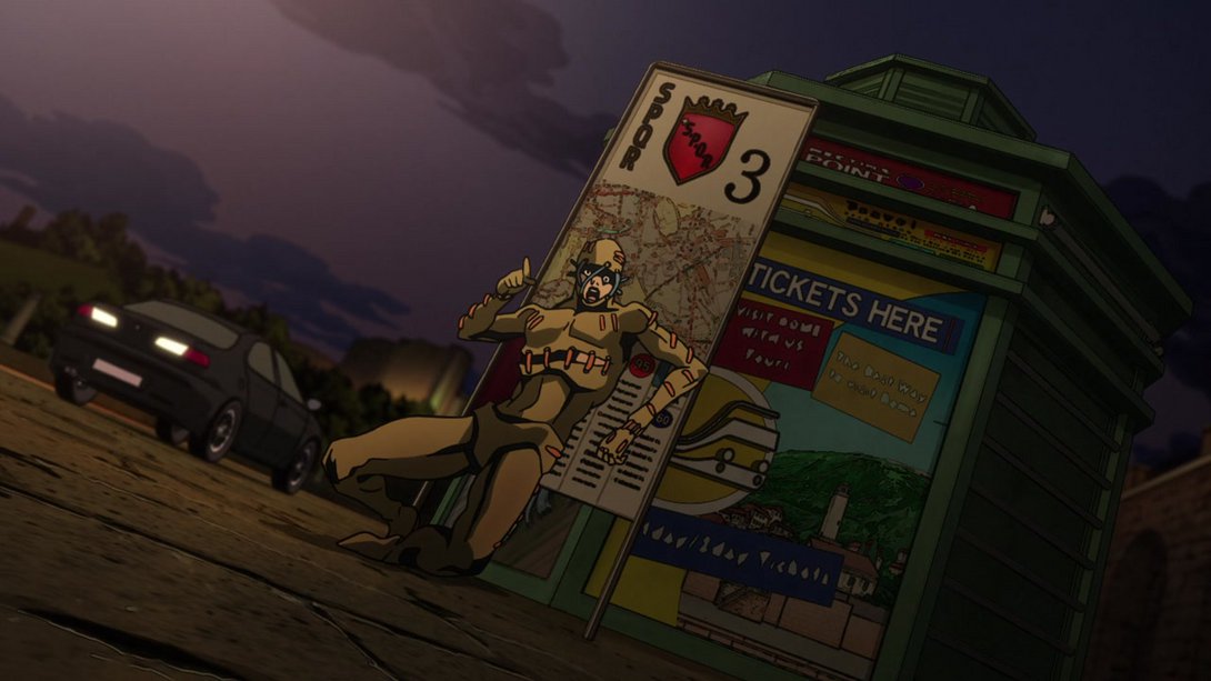
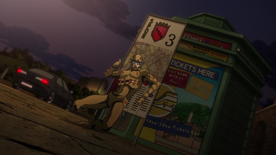
- Secco, the signs and the kiosk in the background are looking a little blurrier and brighter, here; in addition, the car on the left has been moved on the appropriate layer, and its taillights have been retouched:
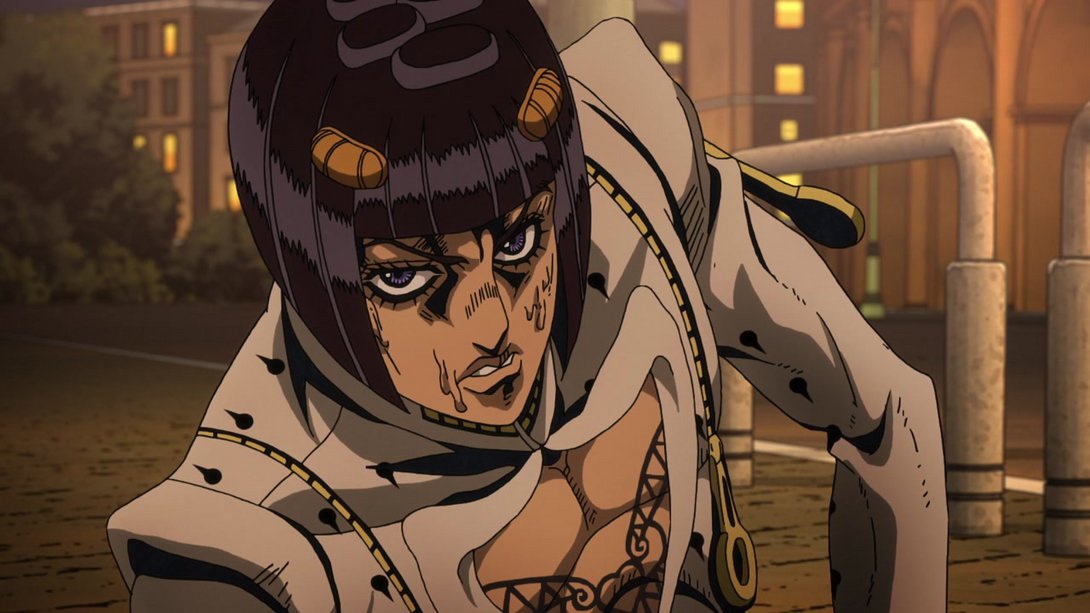
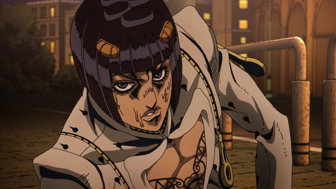
- Most lines are thinner on Buccellati here, and a couple of shadows have also been retouched:
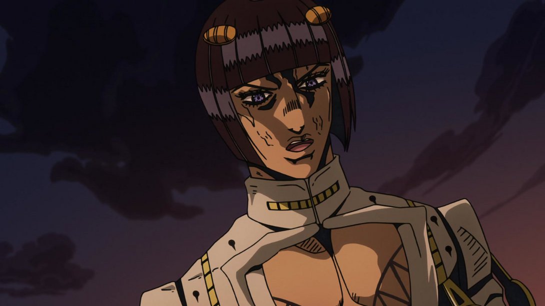
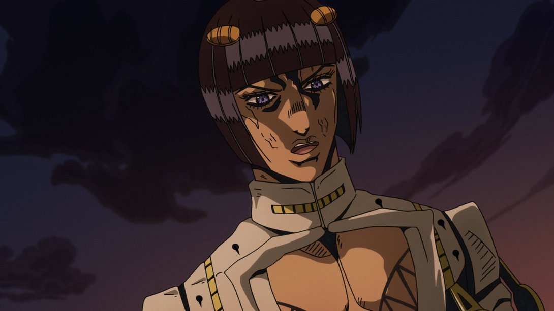
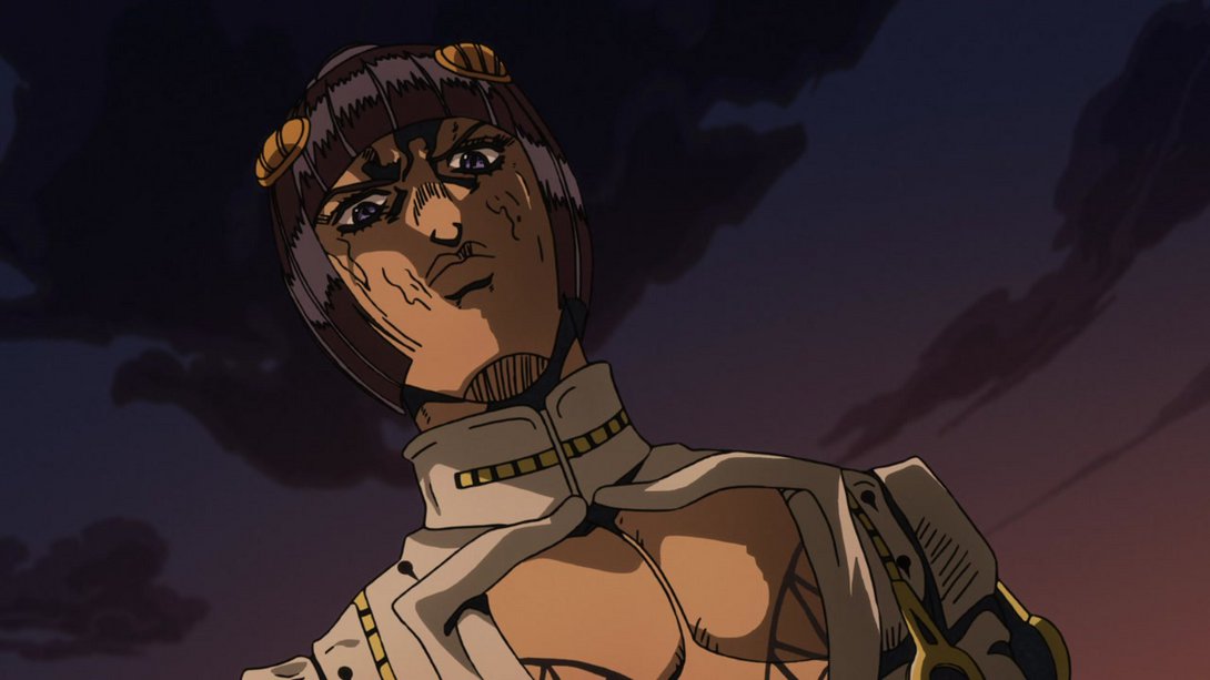
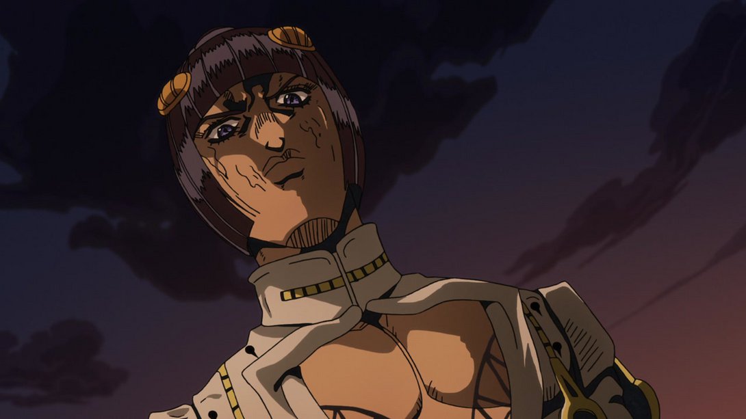
- Most lines are, once again, thinner here; in addition, the background has been moved…:
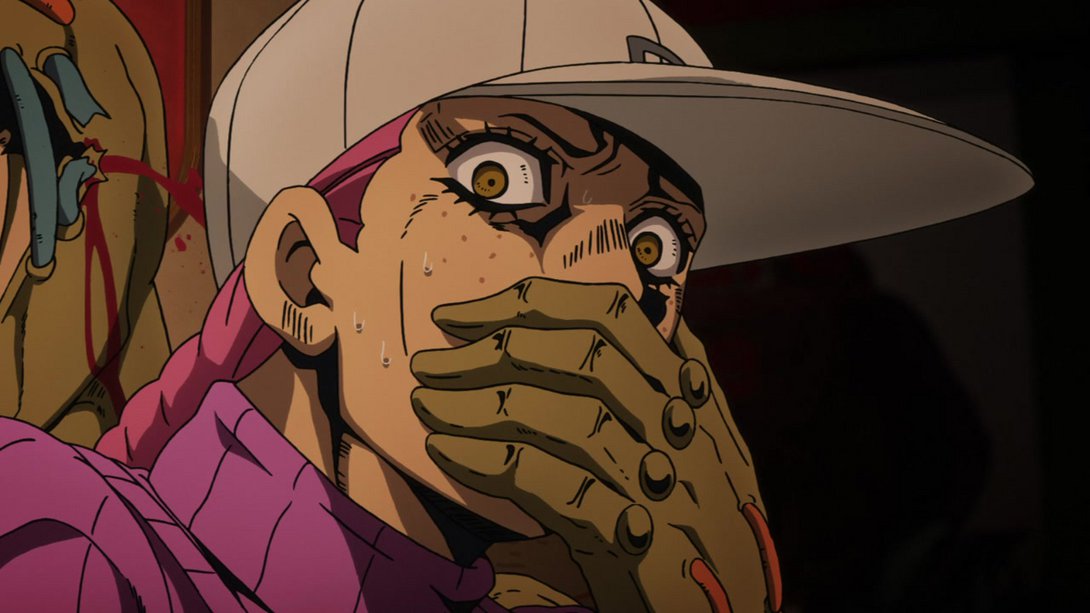
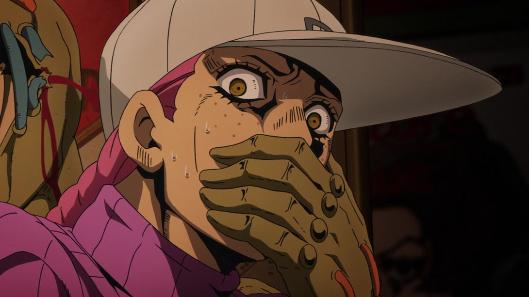

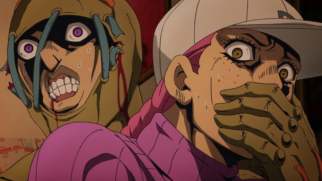
- …and the aforementioned background also moves less (since, you know, it’s right behind them):
- Woo, this one’s got a bunch of different things! The background has been moved, Buccellati’s blurrier, there’s a different distortion along the edge and all three characters haave a slightly different lighting/shading:
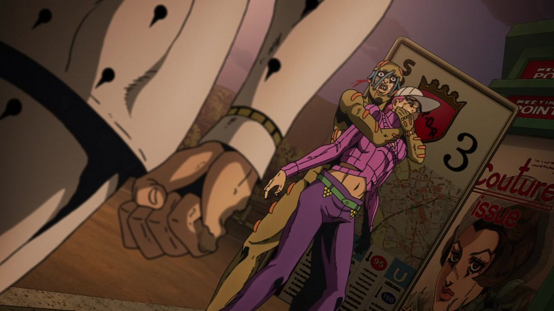
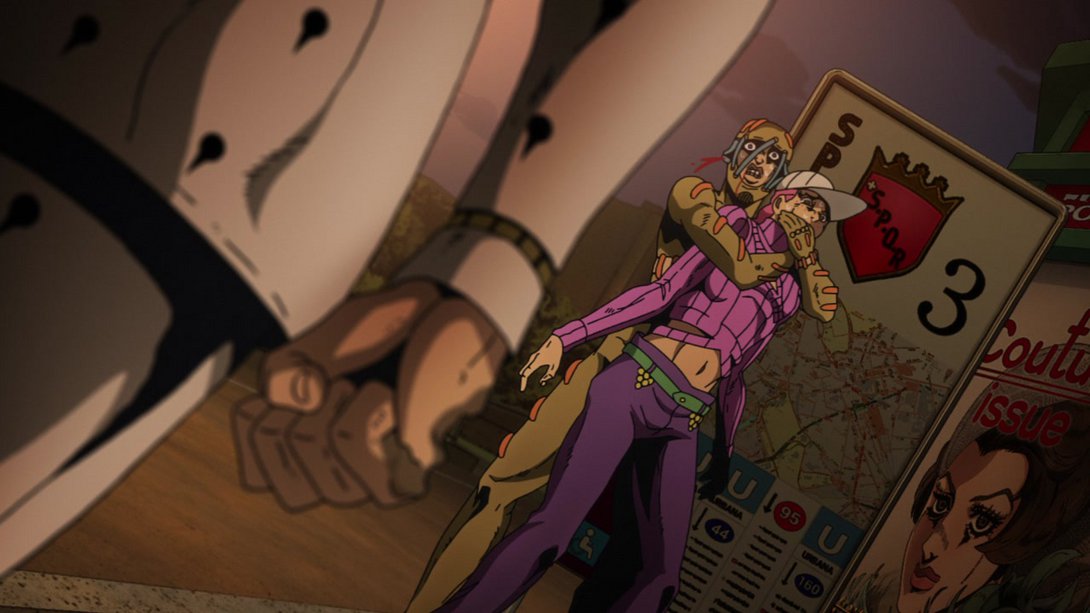
- The lines! They’re thinner again:
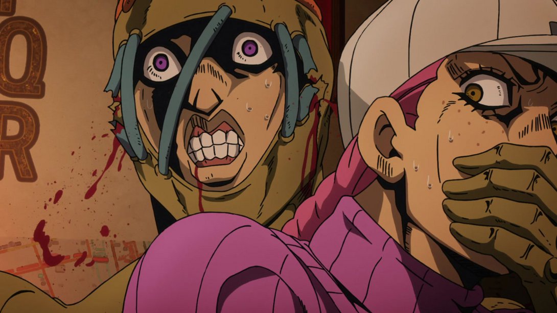
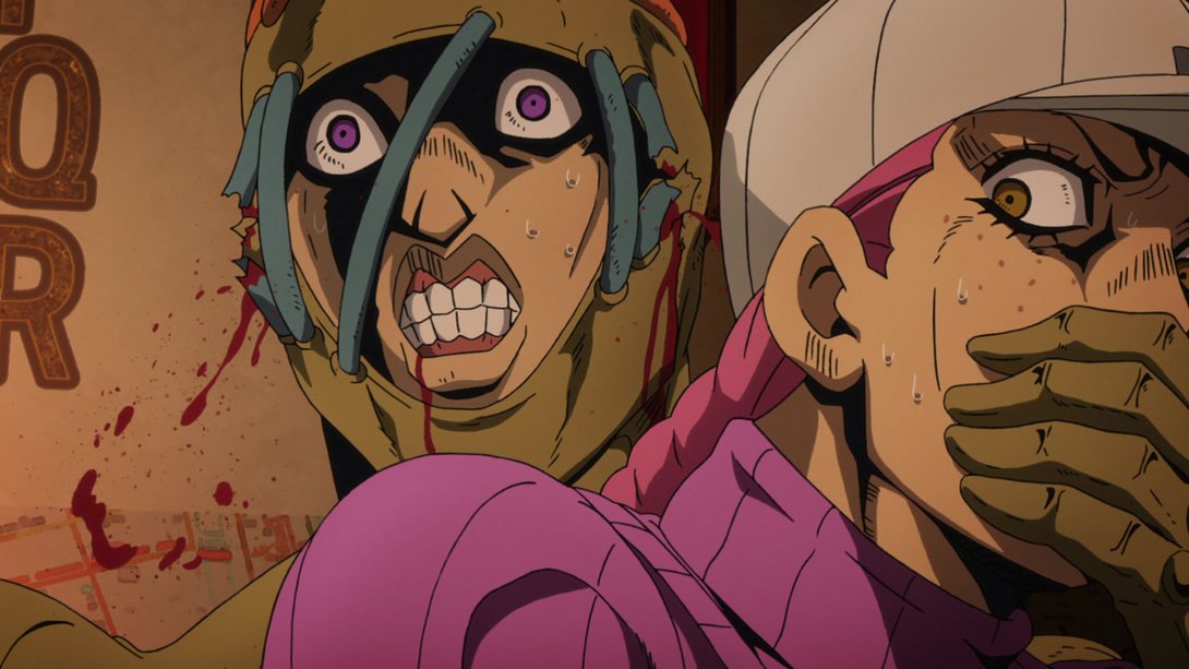
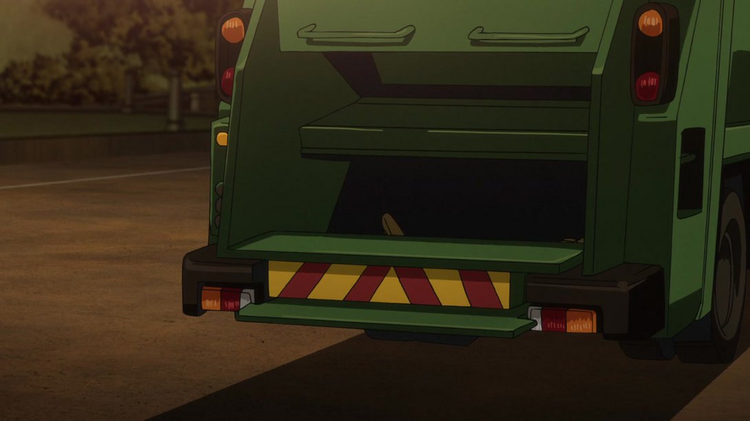
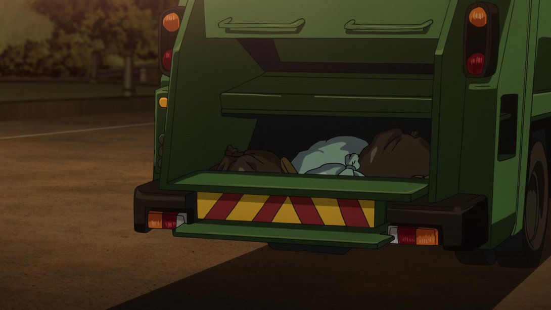
- In the TV version, the trash mysteriously disappeared for the last 5 frames of this animation; this is no longer the case in the BDs (although, as we all know, the real trash is there in both versions). A line on Secco’s foot has also been slightly retouched:
- Doppio no longer looks like he’s wearing some very low-rise pants, here:
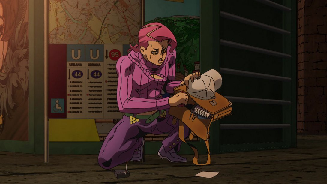
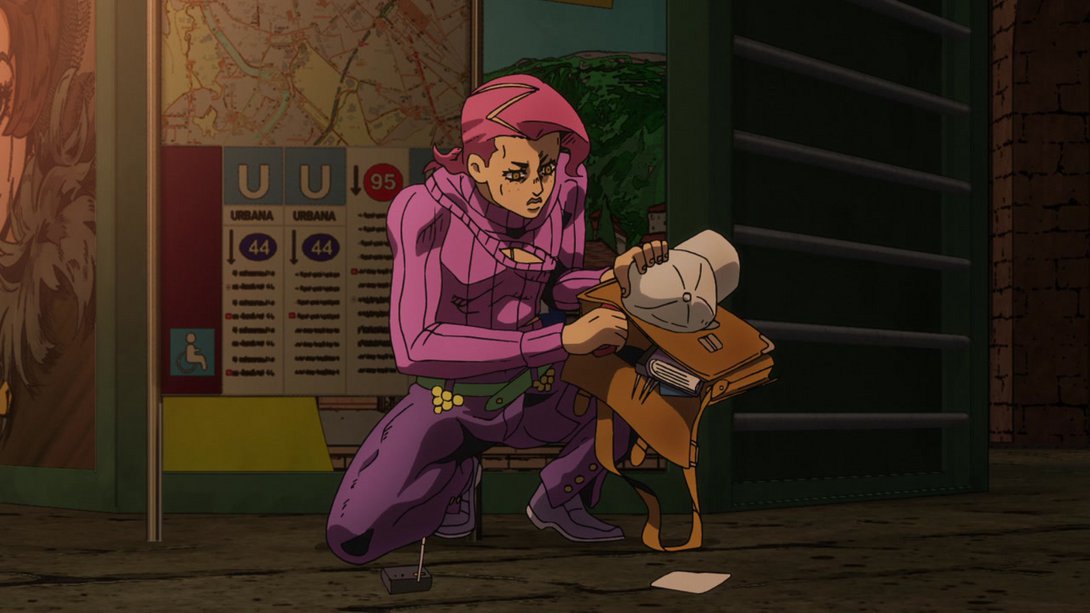
- DOPPIO! YOU FORGOT YOUR BAG! Also, your right shoulder has been slightly retouched. Did you notice, my dear Doppio?:
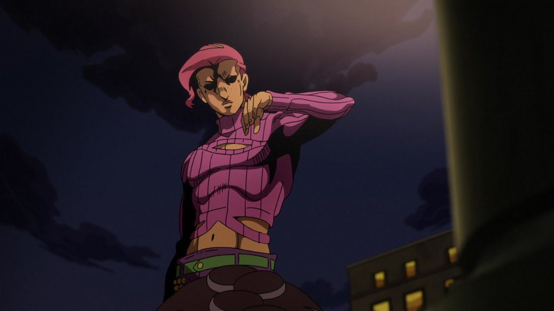
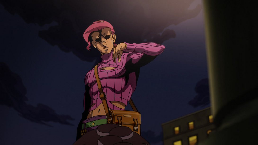
- The bag has reappeared here as well:
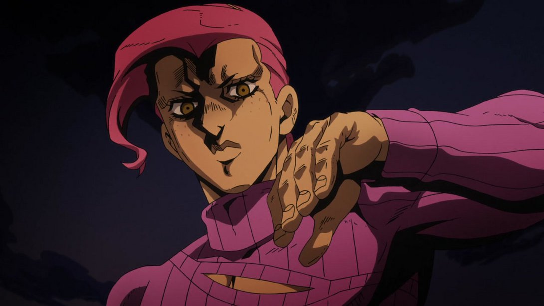
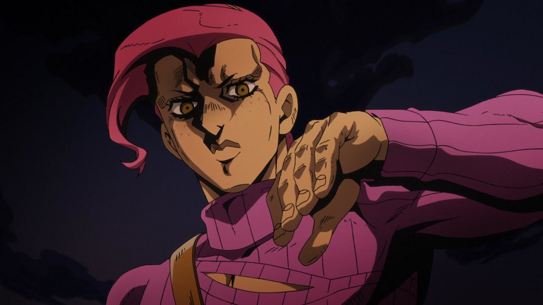
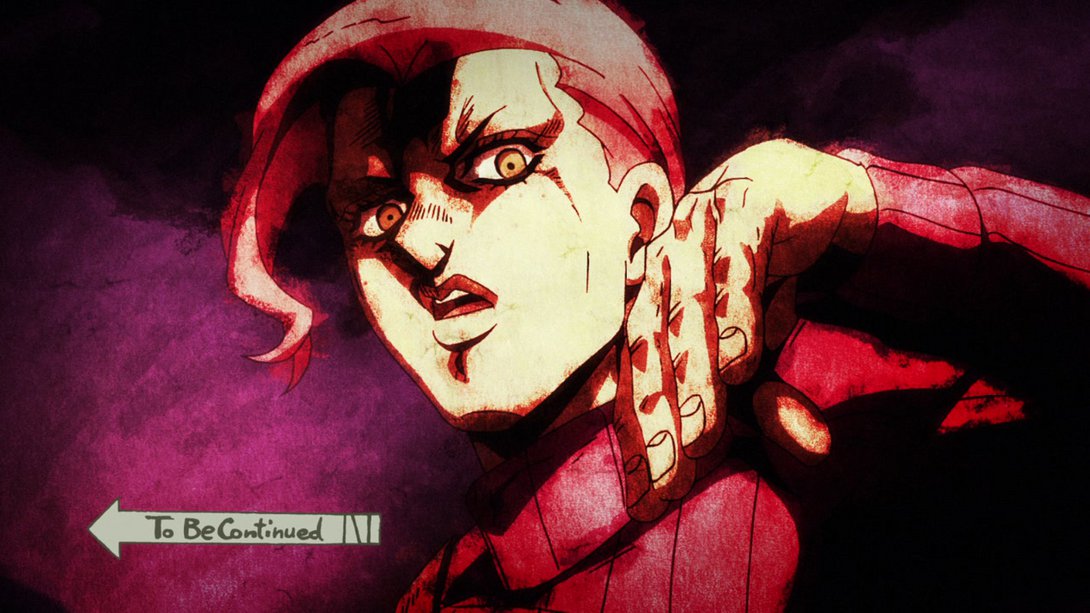
- And, in addition, our beloved “To Be Continued” arrow comes later:
- Moreover! The texture at the end is looking a little different too:
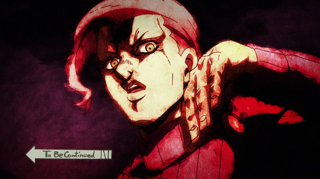
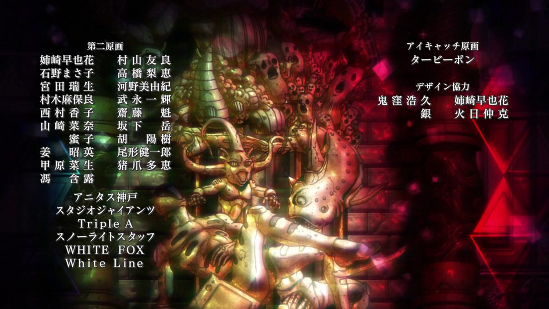
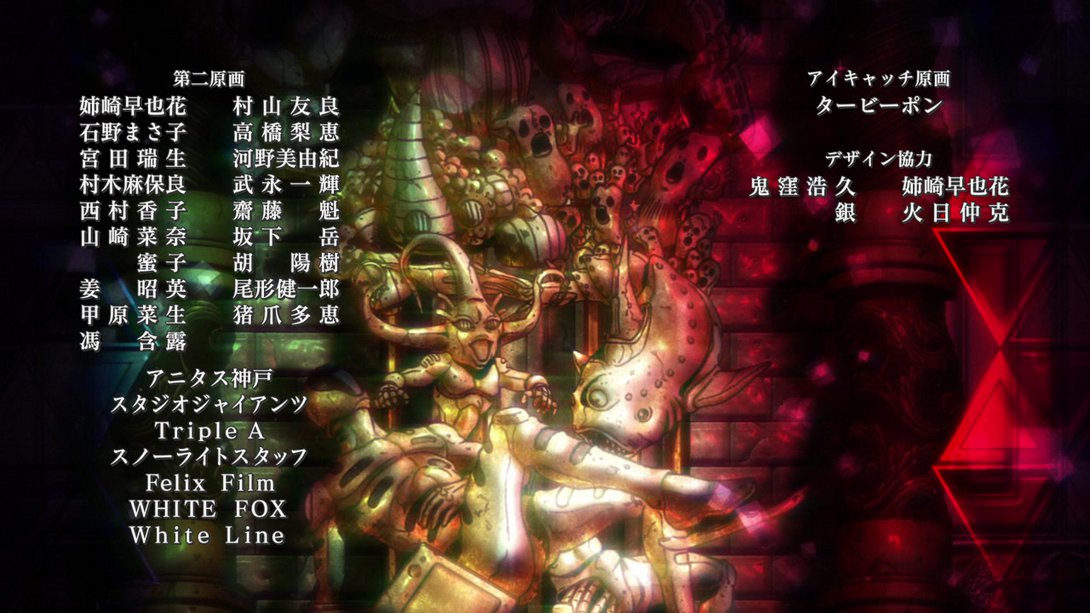
- What’s this? A credit difference! We haven’t had one of these in a bit, huh? In any case, Felix Film has been added to the credits, here:
And that concludes today’s in-depth look at Vento Aureo! Finally something a little juicier, huh? I hope the videos are looking better for you too, and do let me know if anything’s looking weird! I’ll see you next time for Vento Aureo #33, “His Name is Diavolo”! Same place, same time! Maybe it’ll be on schedule next week, though…
Well, see ya!

