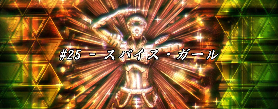
Here we are, good folks! It’s time to take a (rather quick) look at Episode #25 of Vento Aureo, “Spice Girl”! As with the last episode, this one was looking pretty good in the broadcast version too, so don’t expect to see many differences.
Alright, let’s begin!
- The first difference here is yet another brighter and sharper animation:
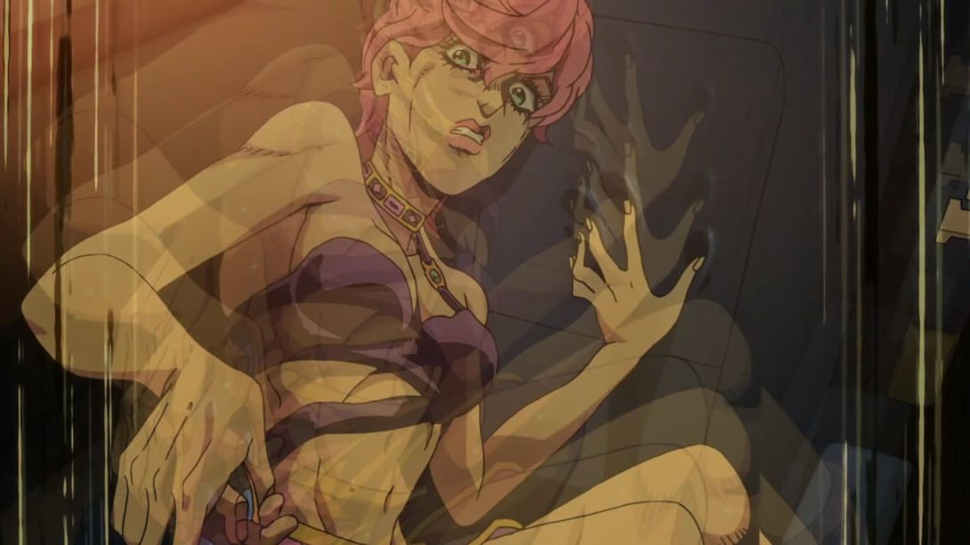

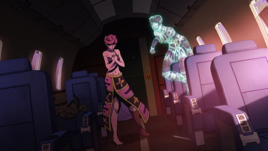
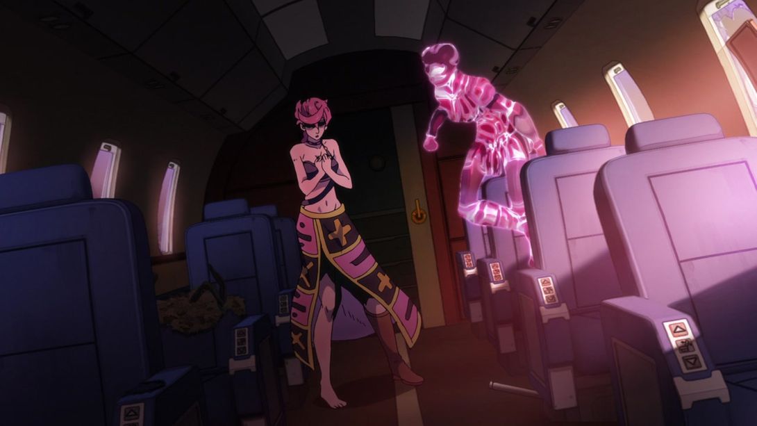
- When Spice Girl appears, the light effects behind Trish have been recoloured pink, to match the stand’s colour scheme:
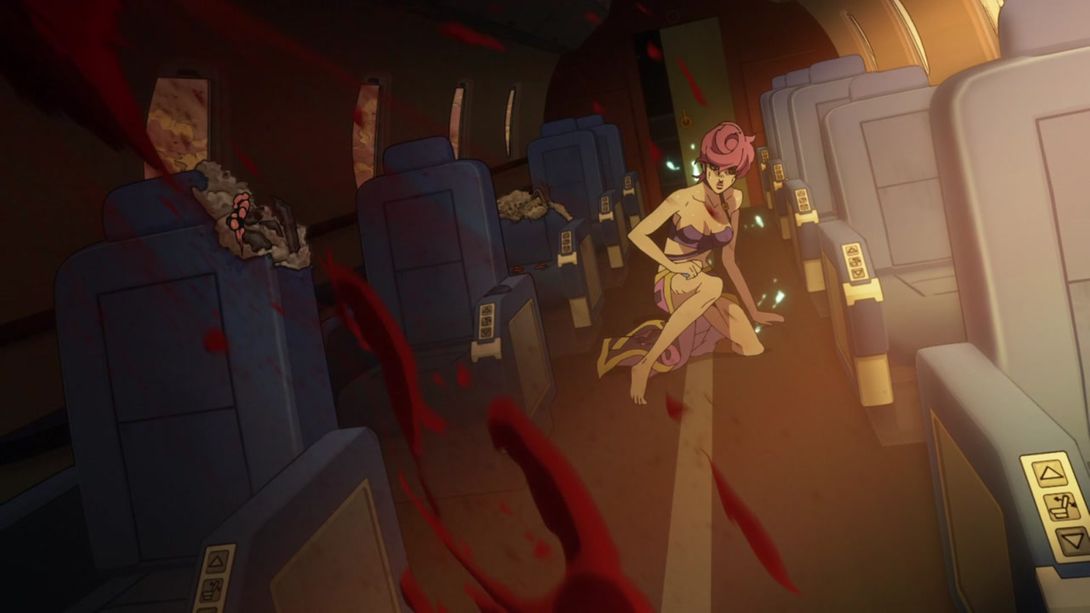

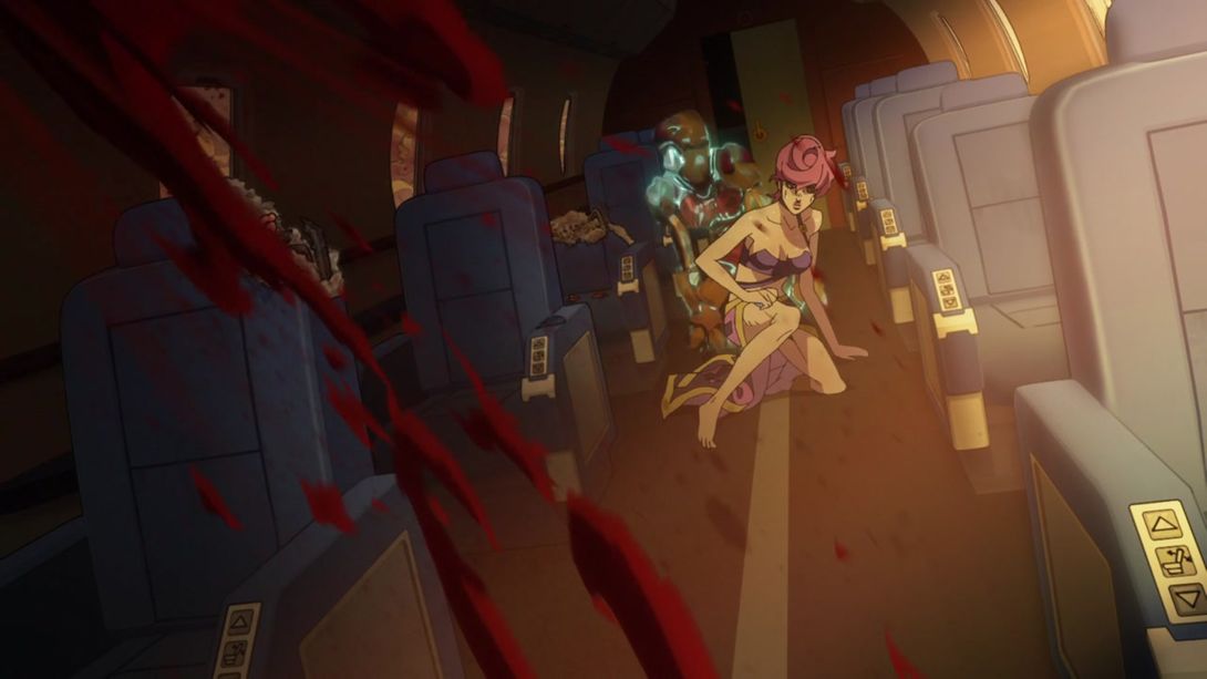
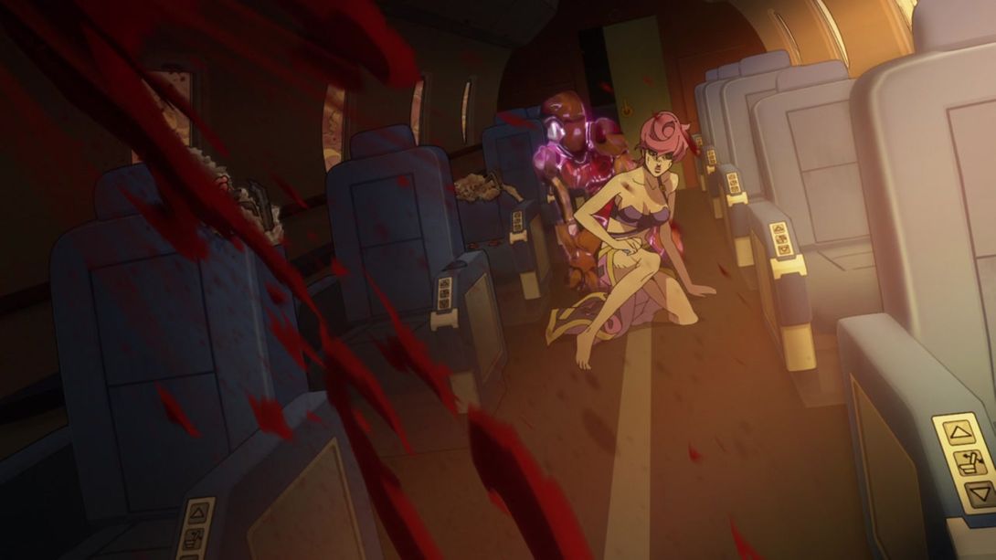
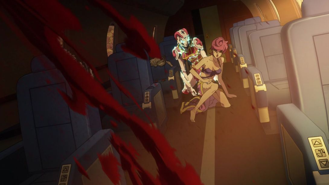
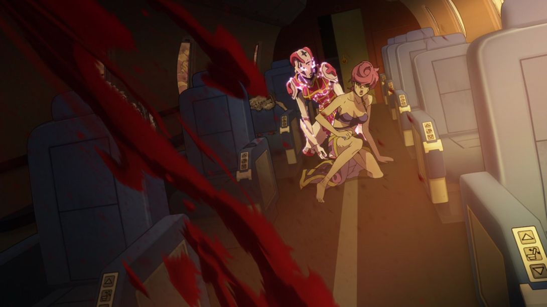
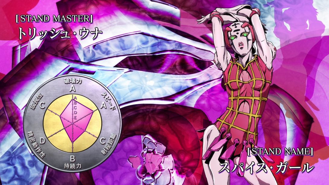
- Let’s take a quick look at the usual brighter and sharper eyecatch for this episode:
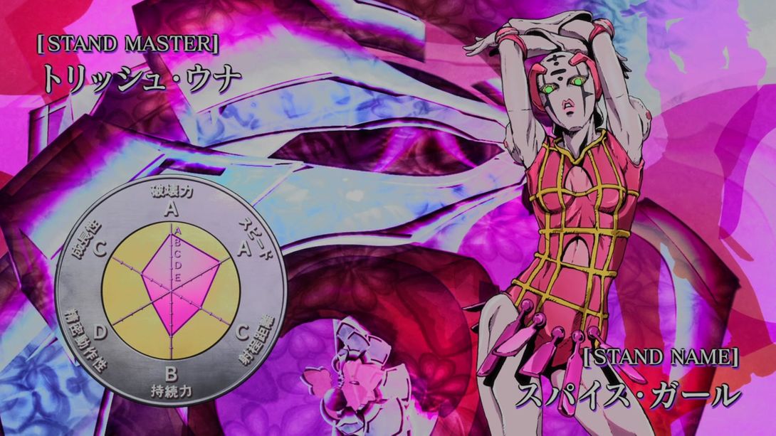
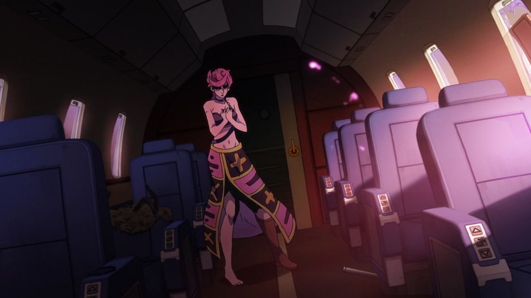
- This shot is more distorted along the edges, and the lights formed when Spice Girl appears have, once again, been recoloured:

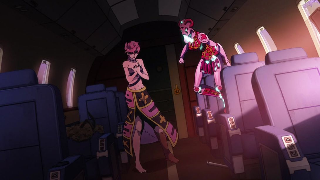
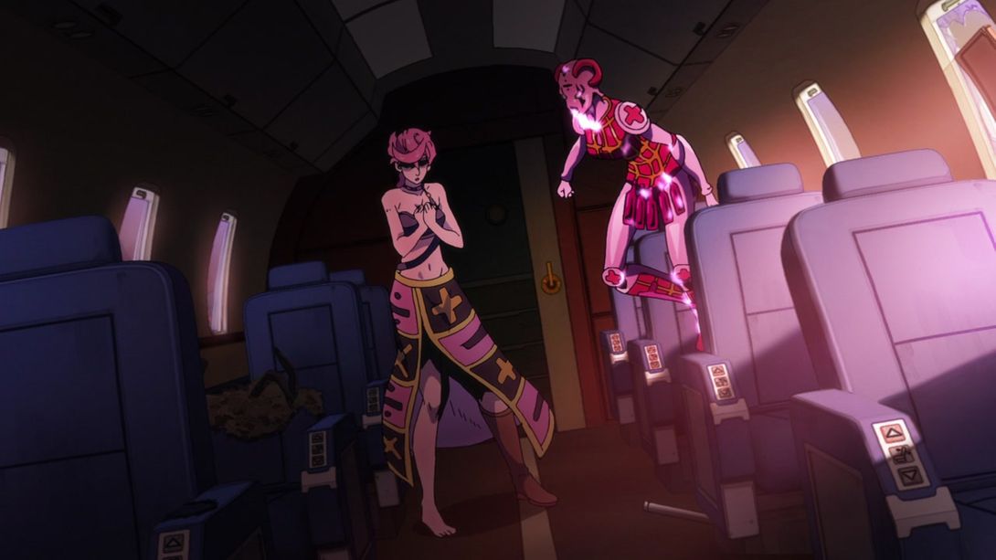
- This animation of the gang mom yelling at her gang children is now slightly brighter:


- The white-out at the end of this (very pretty) animation is brighter:


- Have a couple of nice brighter and sharper animation, fellas:


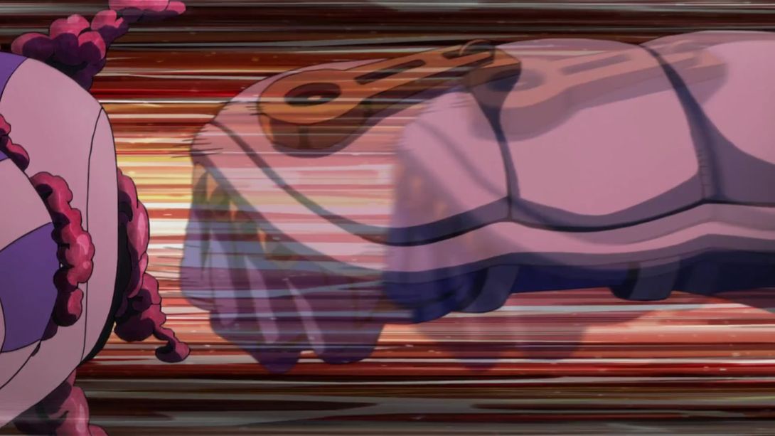
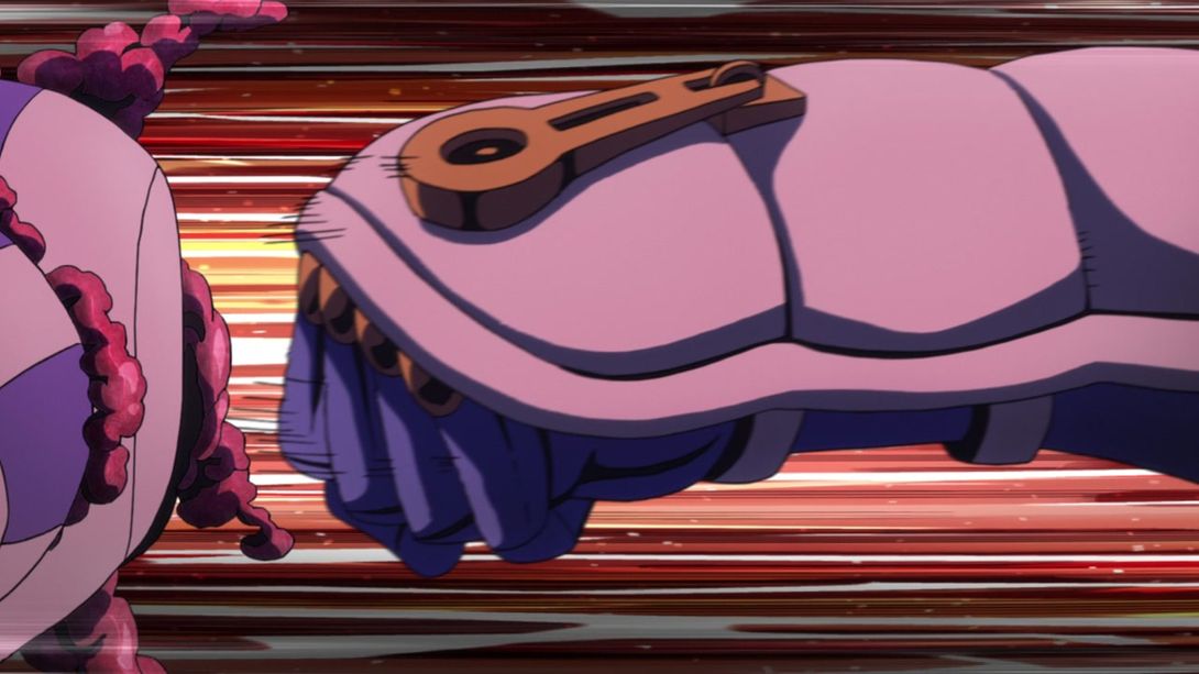
- Trish is also brighter and sharper, when she transitions into the frame at the end of the previous animation:
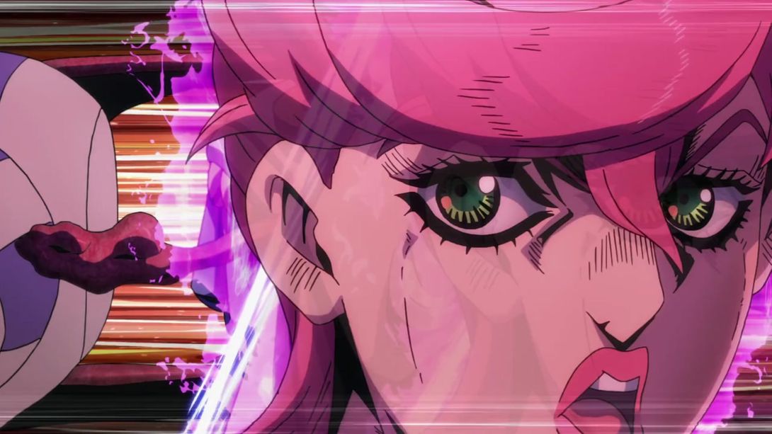
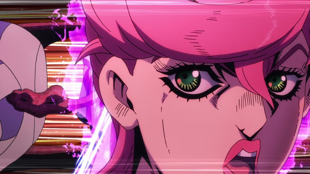
- Aaaand here we have some slashes with better contrast:
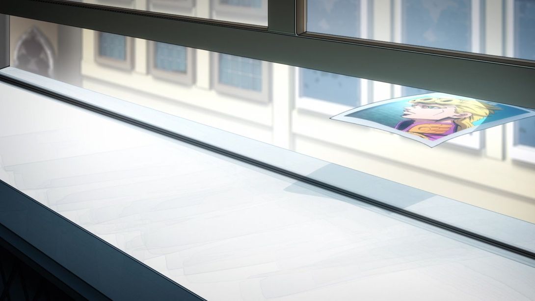
- And that’s it for the gang, this time around! But let’s go take a look at what the boss is doing, shall we? Here, Abbacchio’s picture is slightly darker, and Giorno’s has been flipped (for consistency with other scenes):
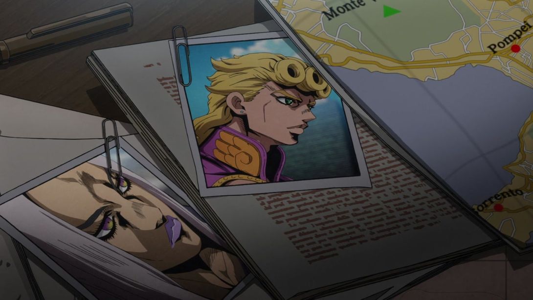
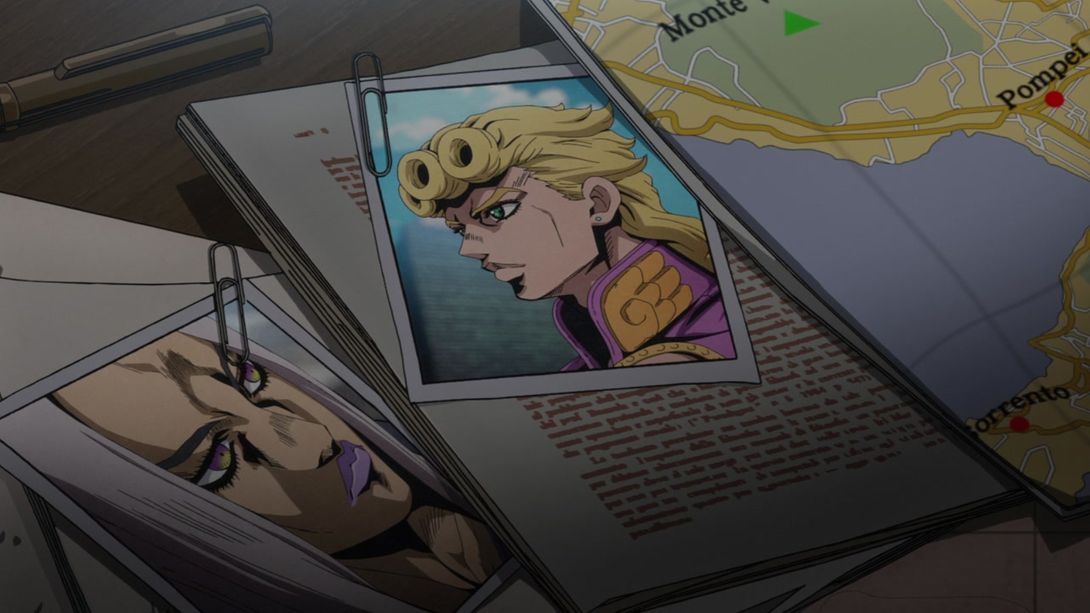
- Here, the text on that yellow paper on the floor has been resized to better fit the borders, and the map (of, presumably, Sardinia) has also been resized a little:
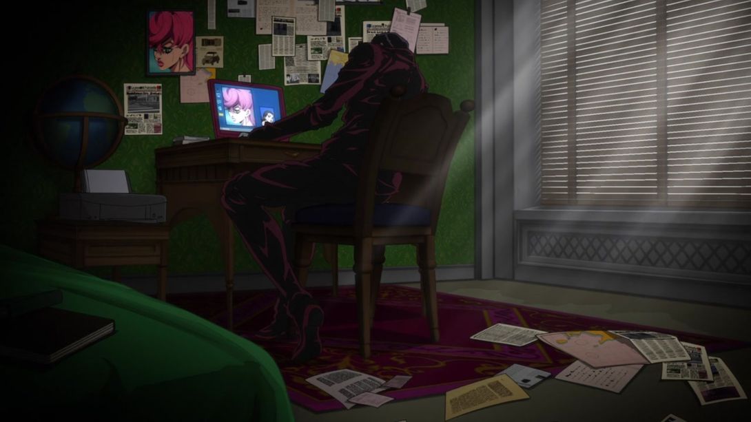
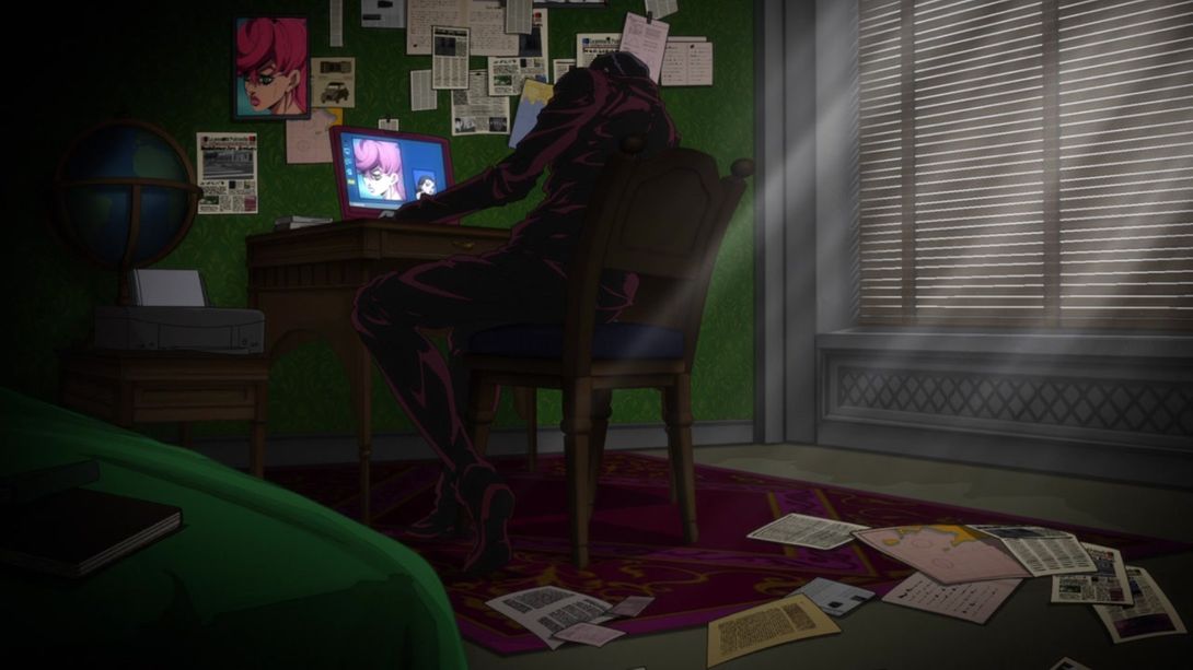
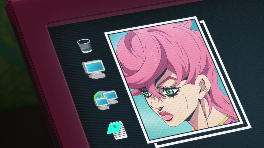
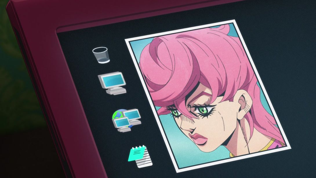
- Here, there is no longer a second “frame” on the right of Trish’s picture, the corner of that second picture you can see in the bottom-right is different, and the rightmost edge of Trish’s picture is slightly darker:
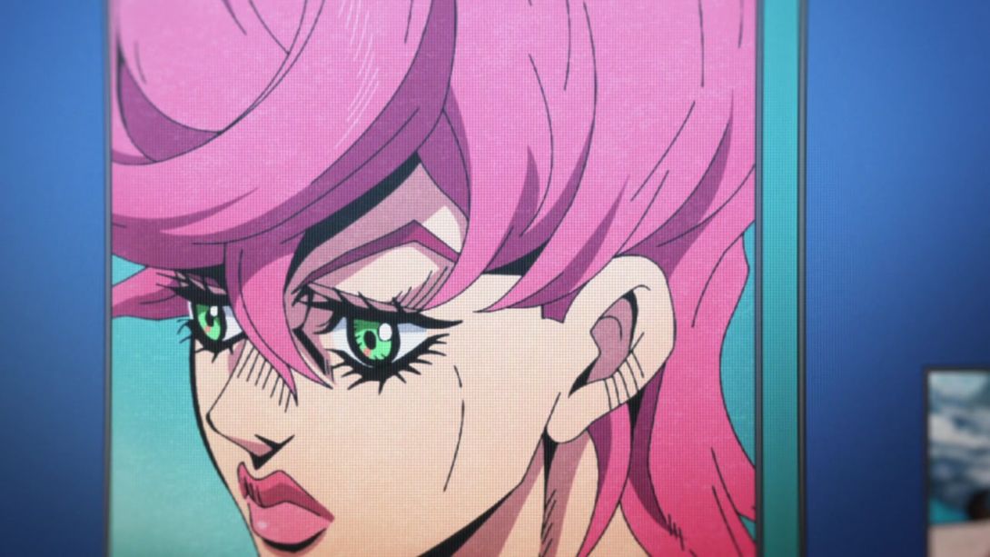
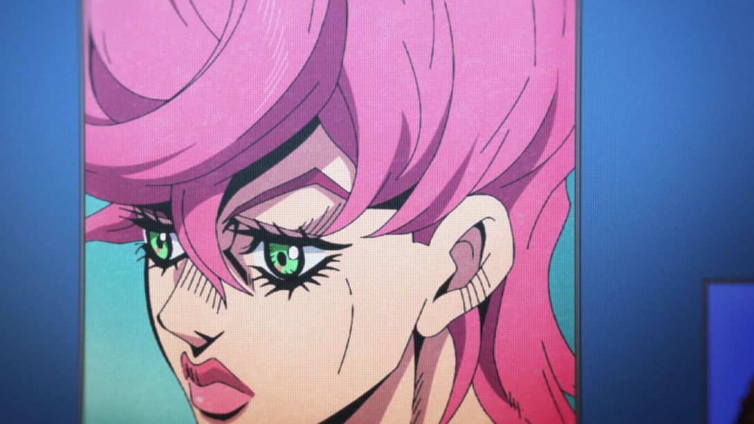
- Like before, there is no “second frame” below Trish’s picture, here:
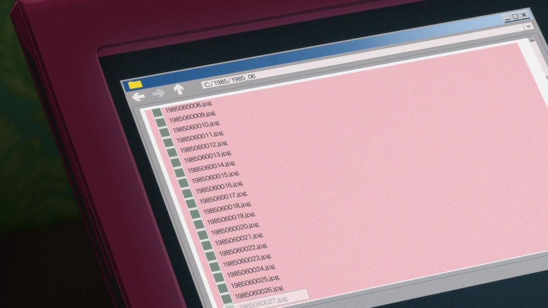
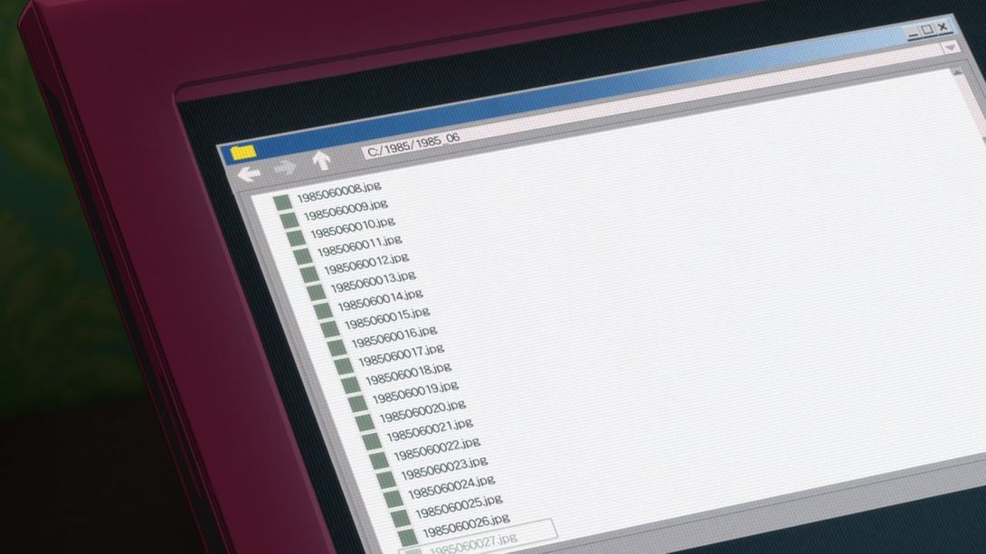
- The background of this very old Windows 95-like UI is no longer pink, here:
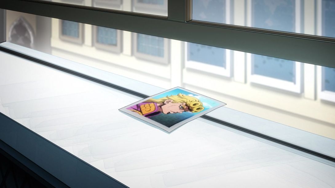
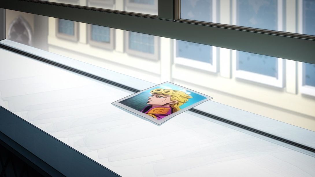
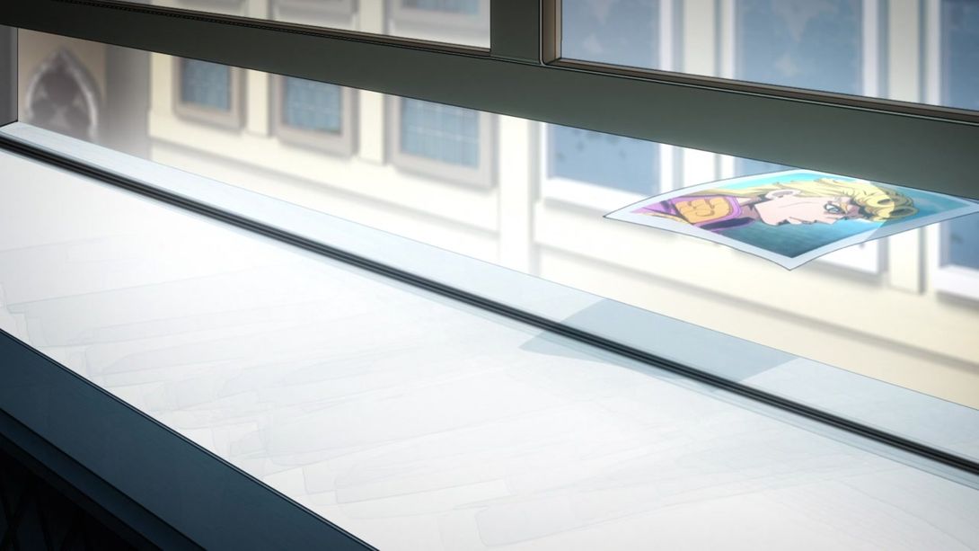
- And, once again, Giorno’s picture has been flipped around in these shots:

And that concludes today’s second comparison! You can probably see why I decided to bundle them up and release them at the same time, as both of them didn’t offer that much material to talk about.
Before you go, however, I’d like to ask you all a question! I’m considering implementing AdSense on this site, to get a little bit of revenue from these comparisons I do. What do you, as readers, think of that? Would you be opposed to having (non-intrusive) ads, would you be for it, would you not care in the least? Would you stop visiting altogether? Please, do let me know in the comments below or on this handy Twitter poll I just posted! Don’t be shy, I value your opinion - that’s why I’m asking for it in the first place, you know!
I look forward to hearing from you, and in the meantime… See you soon!

