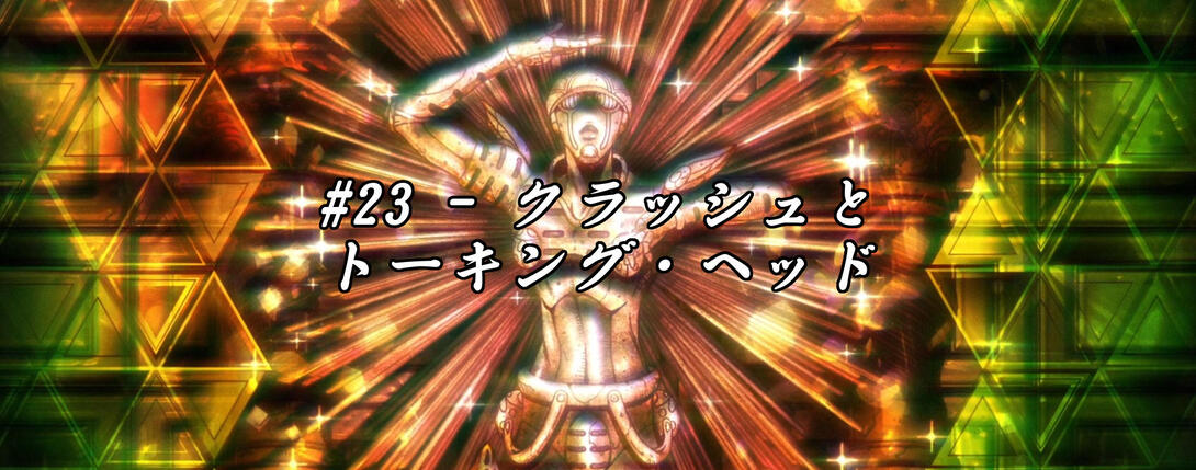
Hello again, good peeps! How’s it going? I hope you’ll forgive me for the faster rate at which I’m publishing these comparisons, but I found myself with a couple of free weeks and decided to make the best of ‘em. So, without further ado… let’s take a look at Episode #23, “Clash and Talking Head”! The episode in question was much more polished than #22 in the TV version, so today’s comparison will be significantly shorter than last time’s.
Well, let’s begin!
- As I anticipated last time, the “beta version” of the opening only lasted one episode; today we’ll take a look at the only difference between the regular TV opening and the BD opening. Namely, this much sharper and brighter punch barrage:
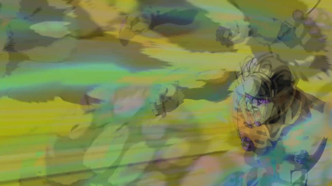
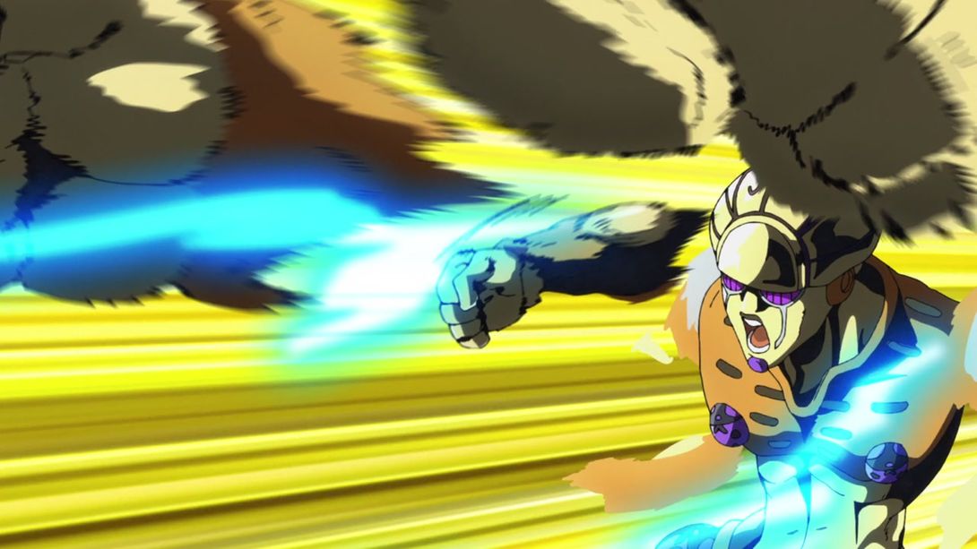
- Moving on to the actual episode, this scene is slightly darker:

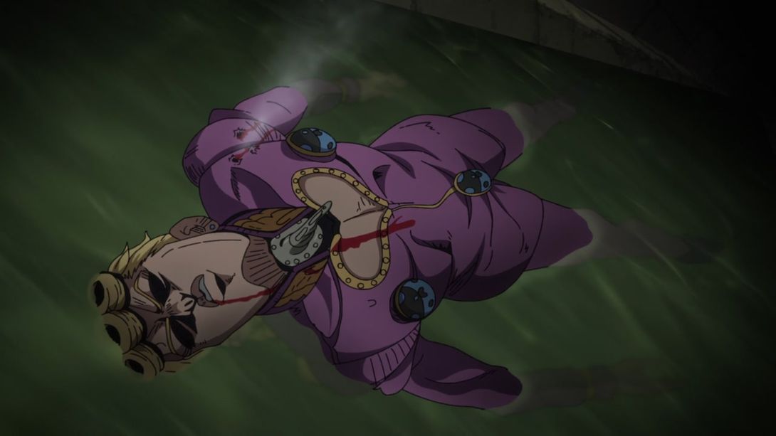
- While this is, instead, brighter:
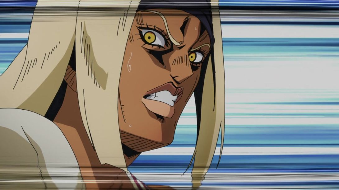
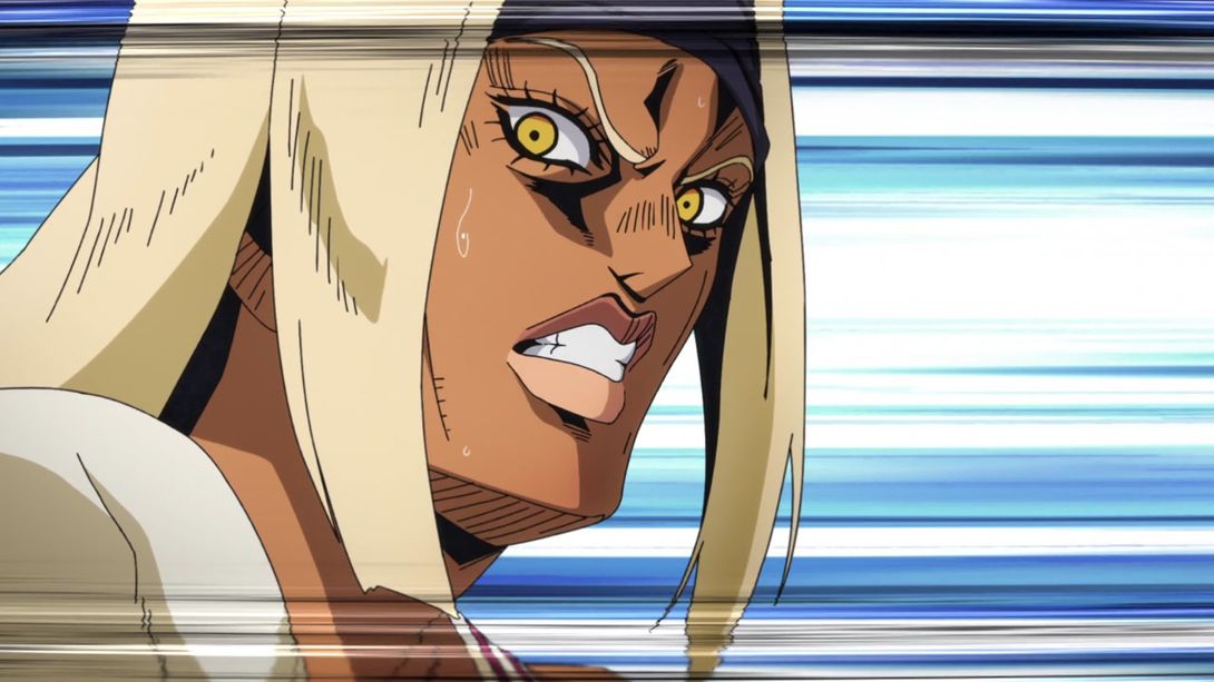
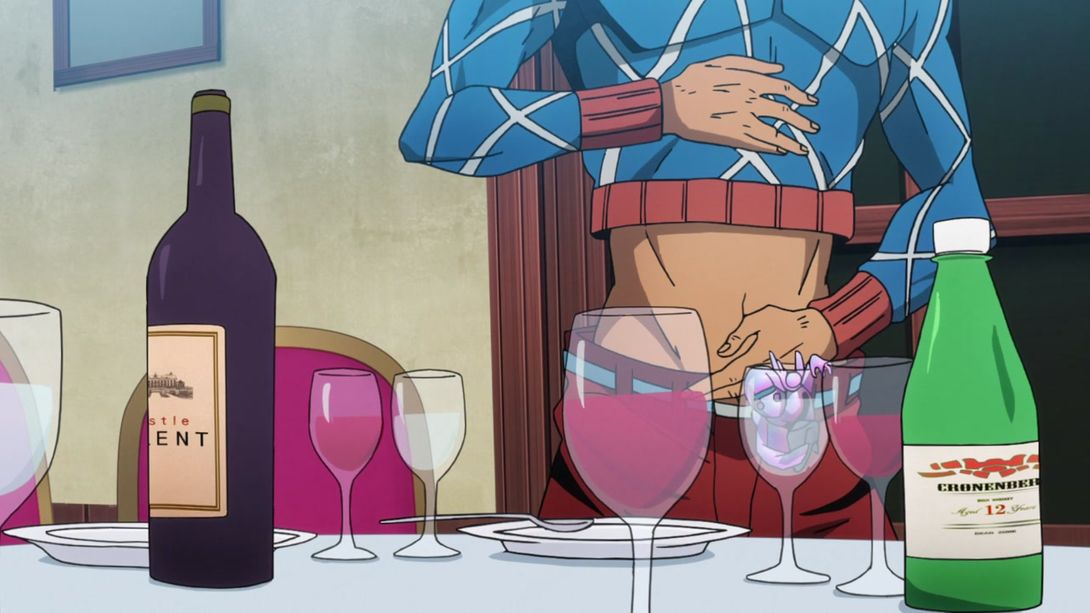
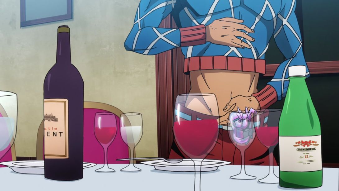
- Here, both background and foreground have been moved, the glasses are slightly more transparent and they look more like glass; also, the Cronenberg label has been resized, resulting in much less stretched out logo and writing (incidentally, this is the same wine Dio drinks in Episode 2 from Phantom Blood, before using the Stone Mask for the first time):
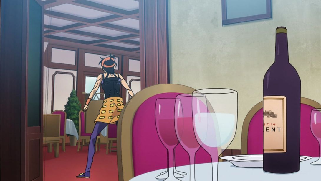
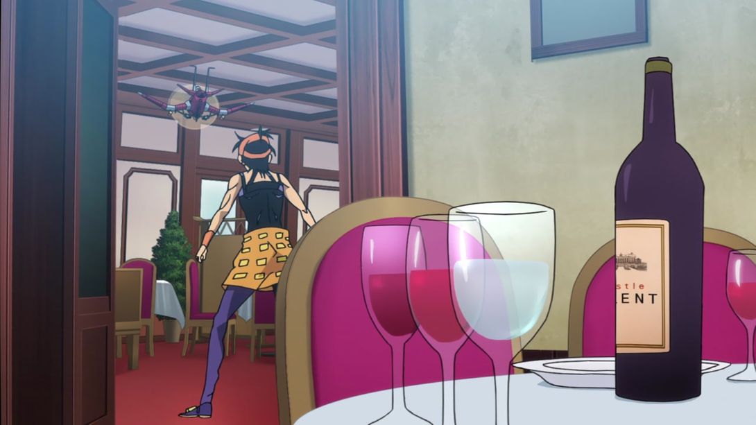
- When the camera moves to the left, we can see that Aerosmith is now accompanying Narancia, the strange half-drawn door on the left is no longer there, the two mysteriously disappearing glass bottoms have disappeared from the table and the interior of the room Narancia’s in has been shaded a little bit, in order to create some depth:
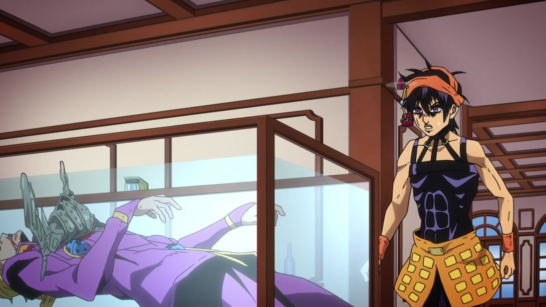
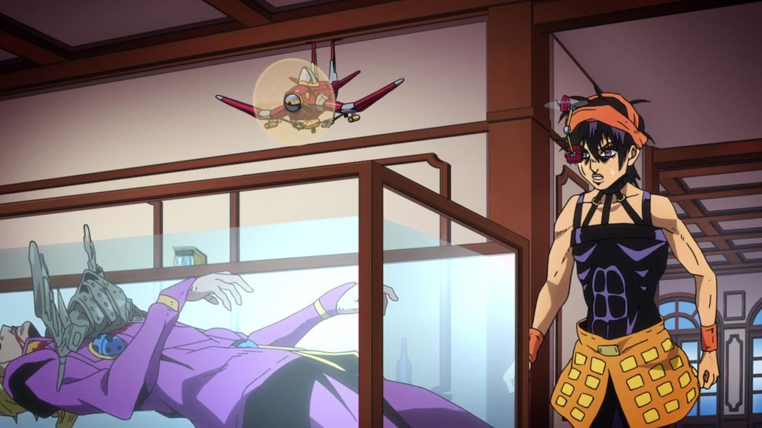
- Here, once again, Aerosmith has been added to the scene; in addition, the visor has been moved, there’s a very strong dark vignette along the top of the frame, the lighting behind Narancia is brighter and the far wall of the glass case Giorno’s trapped in is looking markedly less transparent:
- This brief animation of Mista blowing up all his friends is brighter and much sharper:
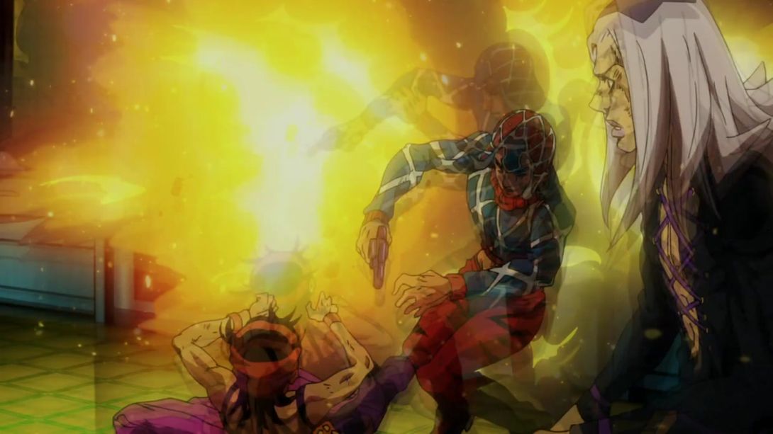
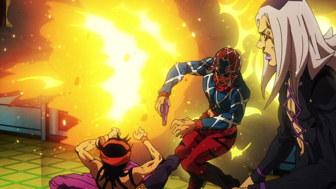
- Here, Mista’s hat pattern is looking better, and the hat itself is no longer MISSING A WHOLE CHUNK! Mista’s face has also been retouched, and there is some new animated smoke drifting from the bottom right corner:
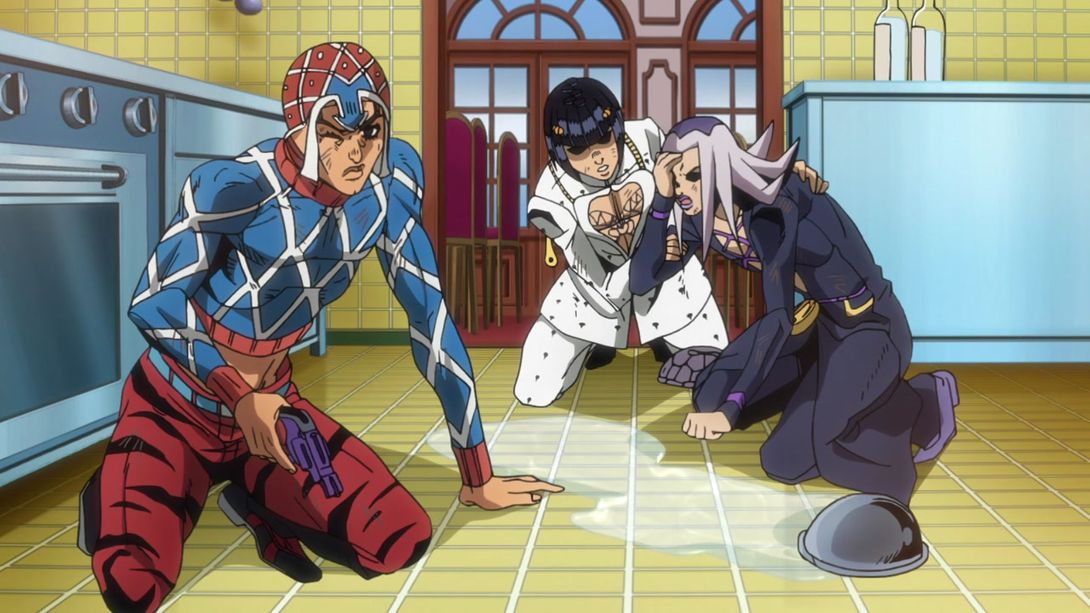
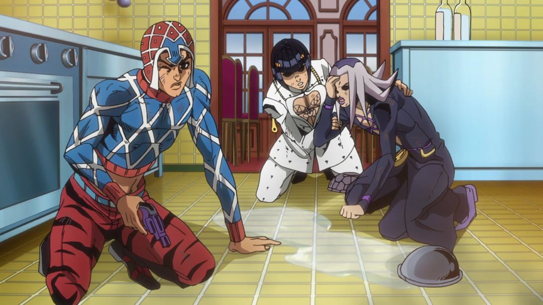
- The background in Narancia’s little slice, here, is purpler:
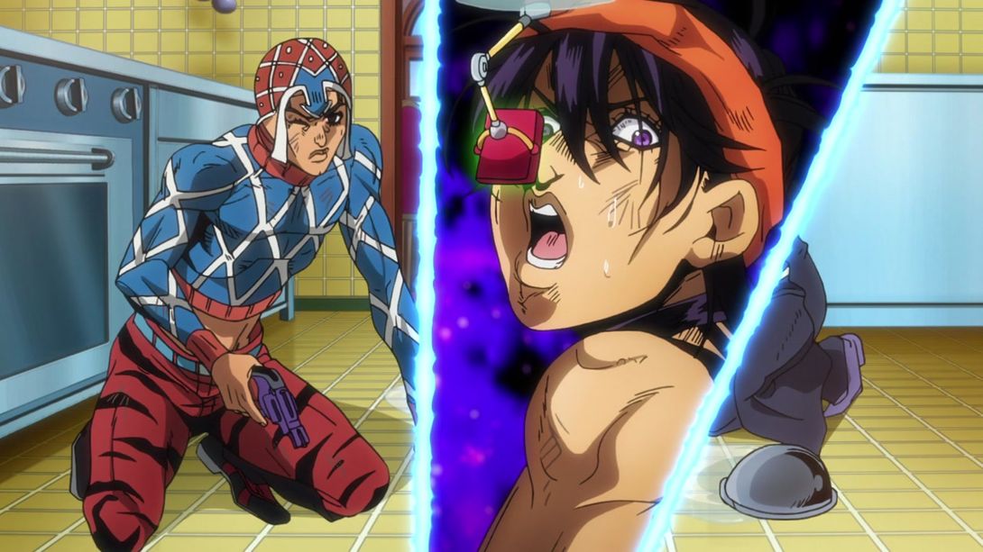
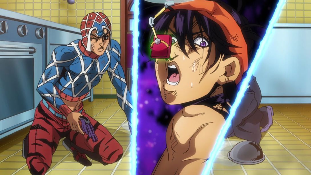
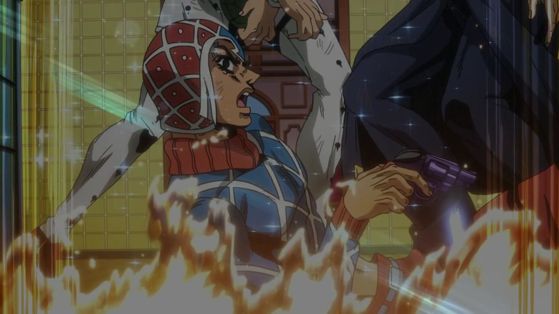
- A very sharp transition between the Talking Head teleporting animation and Mista & the gang wasn’t… exactly super sharp in the TV version; this has been fixed in the BDs, but it’s so short (2 frames) that I can only show you the frame that was bleeding over into the following animation in the TV version:
- Let’s take a look at the usual eyecatch:
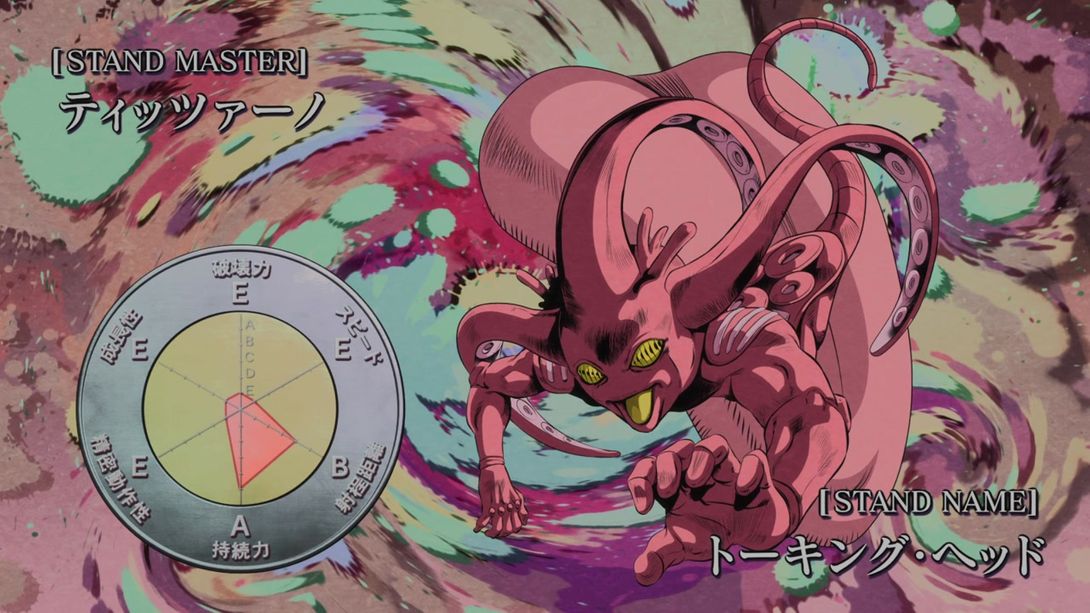
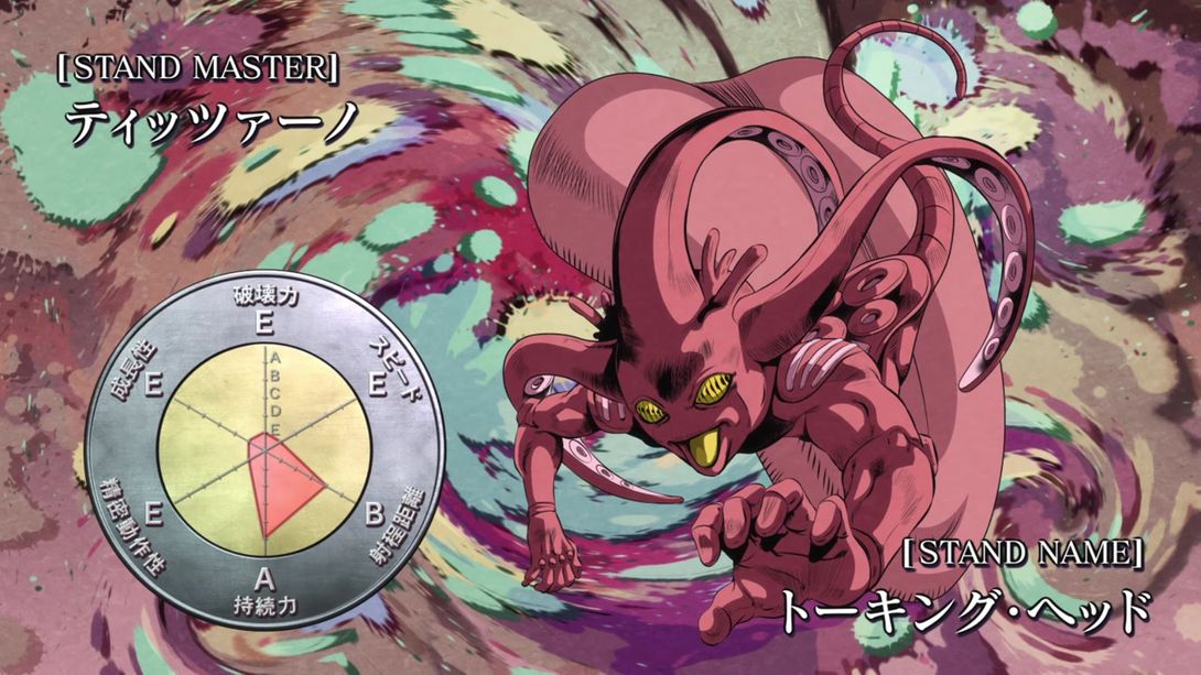
- It’s credits time, friends! Here, “Felix Film” has been squeezed a little bit more:
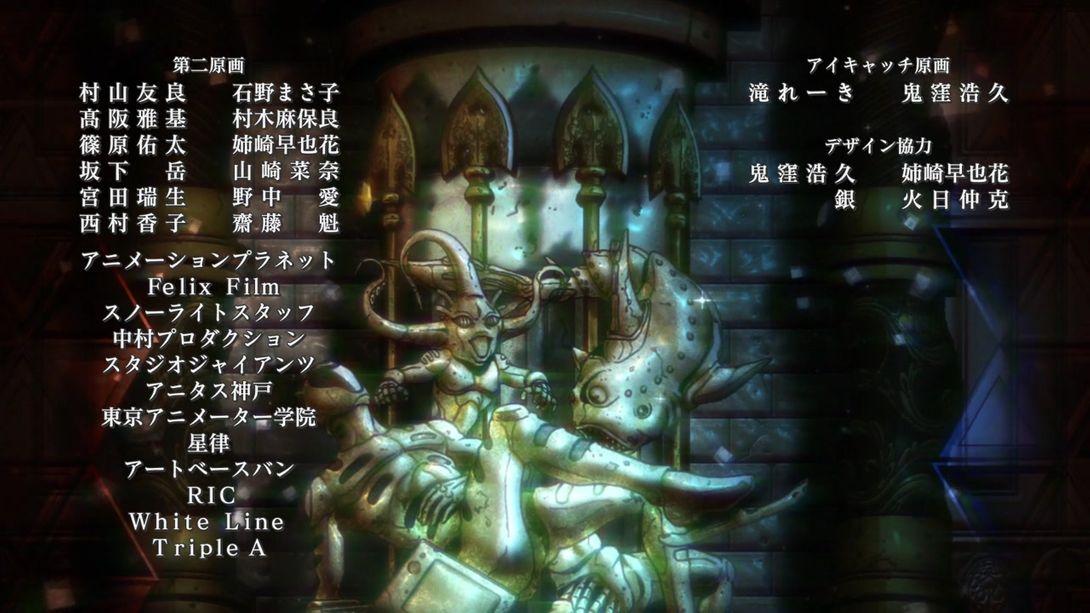
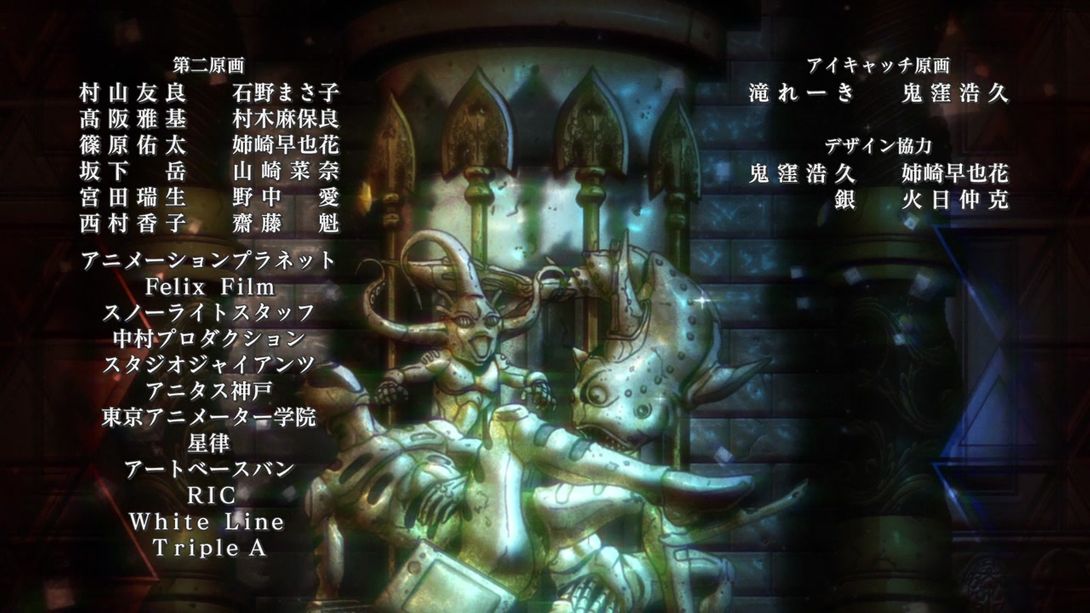
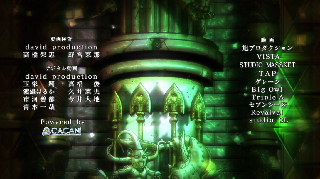
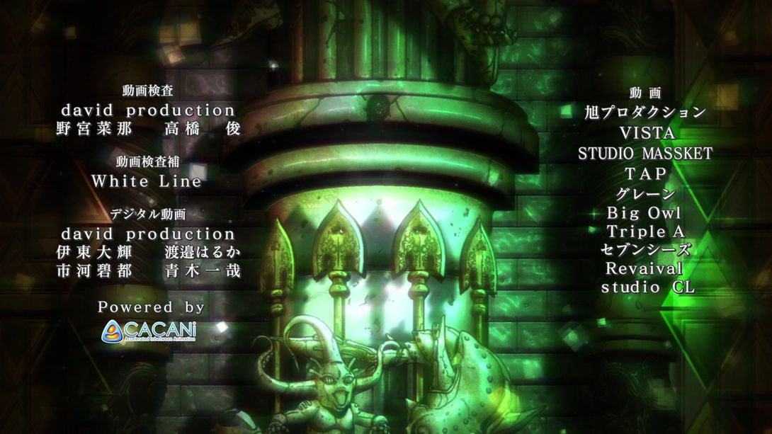
- And here, much like in last time’s comparison, some names have been moved, some added and some removed altogether. From the top: in the first group on the left, 高橋梨恵 (“Takahashi Rie”) has been removed, 野宮奈那 (“Nomiya Nana”) has been moved to the left and 高橋俊 (“Takahashi Shun”) was moved next to it from the third group; “White Line” has been once more added underneath, under the header 動画検索補 (“In-between animation check assistance”); lastly, the following names have been removed from the third group: 玉栄翔 (“Tamae Kakeru”), 久井菜央 (“Hisai Nao”), 今井大地 (“Imai Daichi”). In addition, one new name was also added to this same group: 伊東大輝 (“Itō Daiki”), and the rest of the credits have been moved around to accommodate for the different length. Check all of this out:
Phew! And that is it for this episode, folks! I hope you had another good one in this here fine establishment, and I’ll see you next time for Vento Aureo #24, “Notorious B.I.G”! Be there or… not, your choice really!
Arrivederci!

