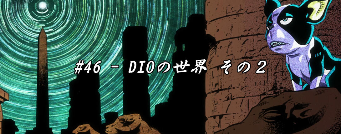
Hey-o, boy-os, welcome back! Today we’re going to tackle a big episode: Stardust Crusaders #46, “Dio’s World - Part 2”! It’s gonna be long, it’s gonna be eventful, it’s gonna be full of differences - in short, strap in, because it’s going to be a ride!
Let’s get to it!
- Today’s first difference is this shot, in which basically every line on Dio is now slightly thinner:
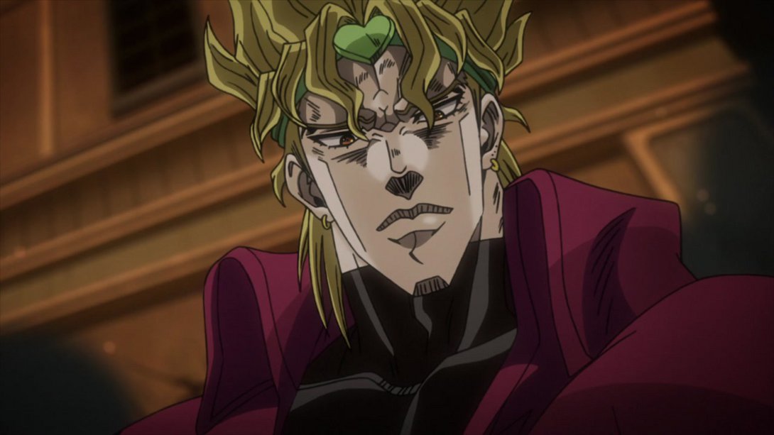
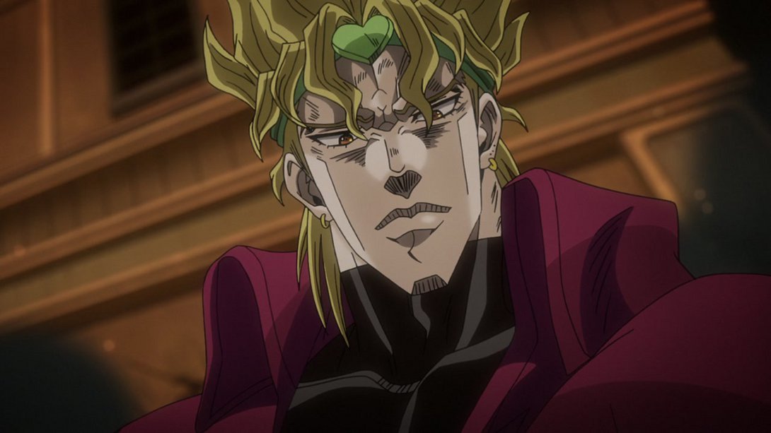

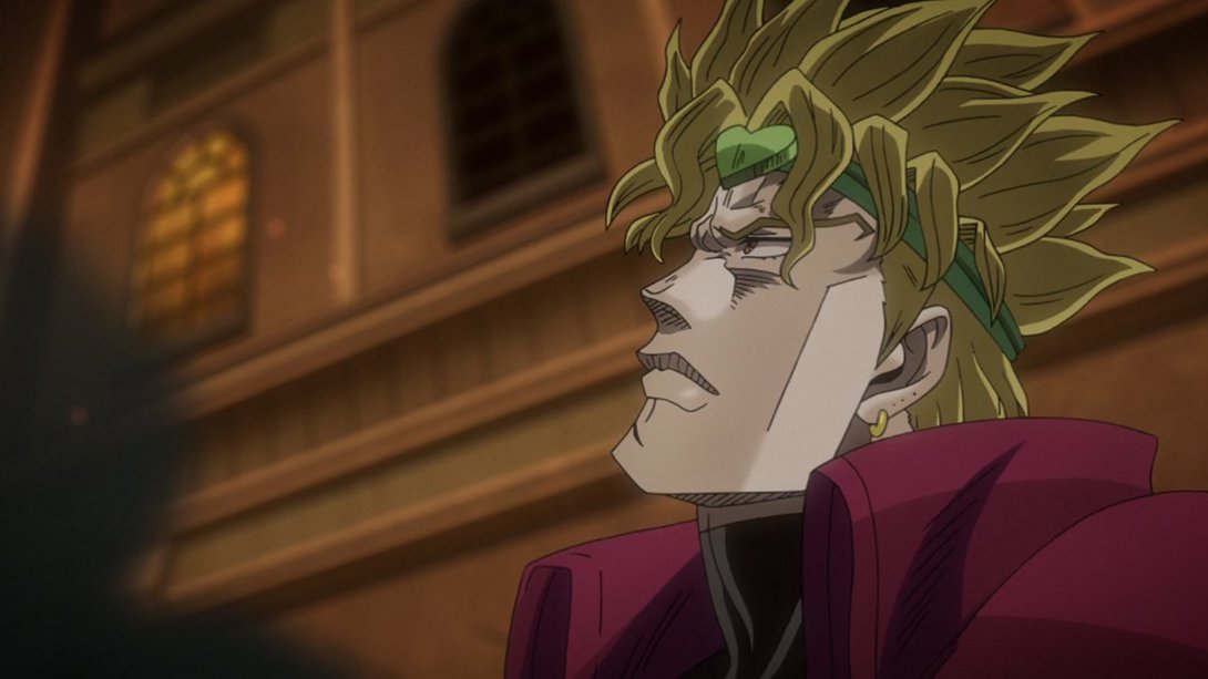
- Here, instead, some lines are thicker and the dots on Dio’s chest are no longer as bright…:
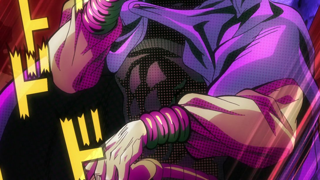
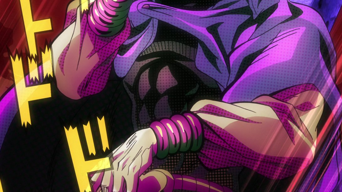
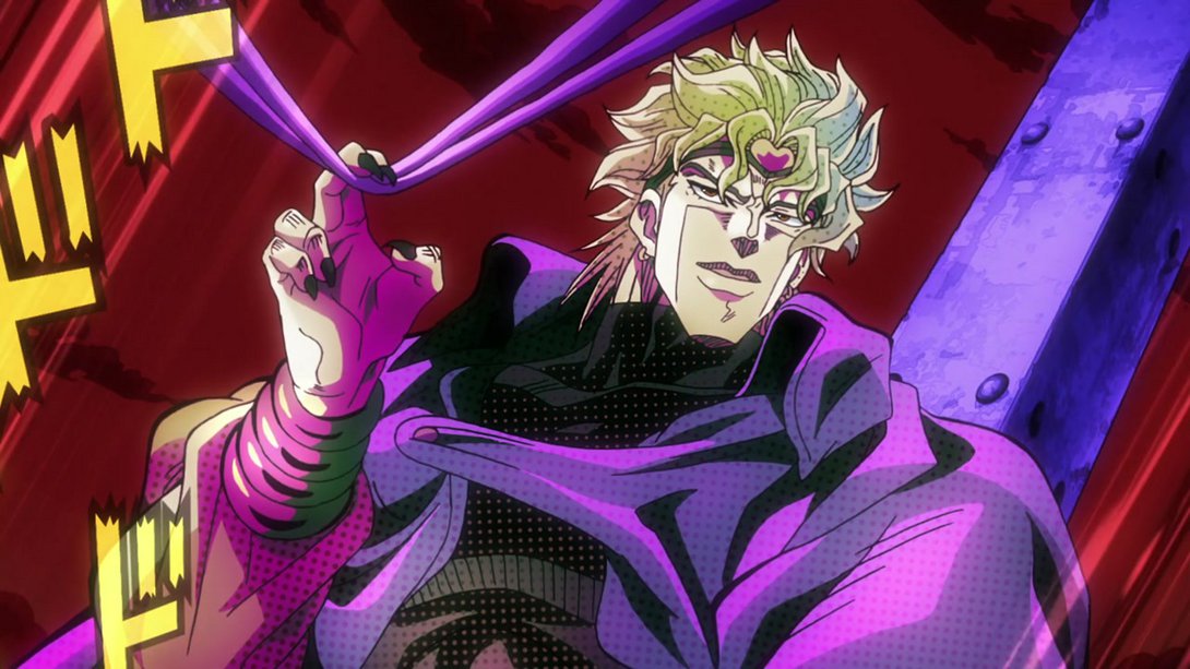
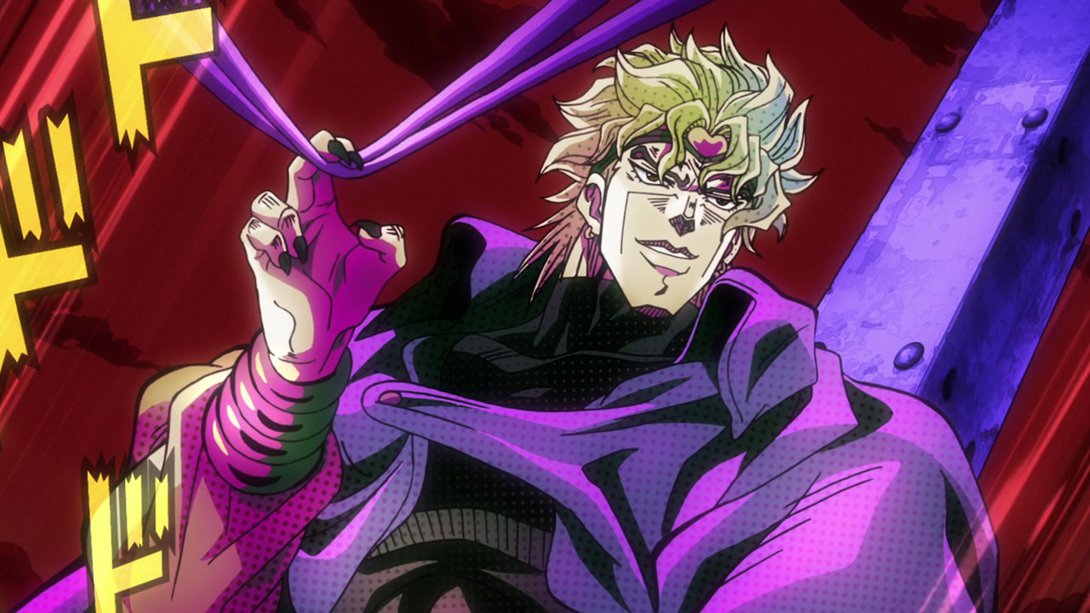
- …and, when the camera pans up, we can see that he’s also received a significant makeover:
- The lighting in this scene is significantly brighter, and Kakyoin’s uniform has been ever so slightly retouched:
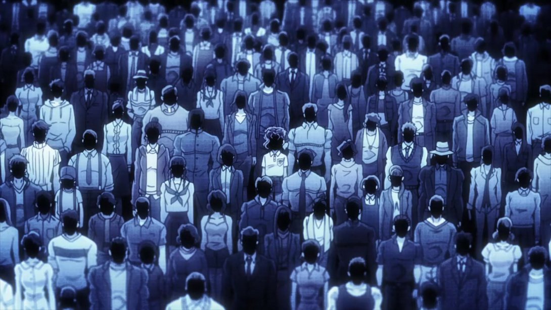
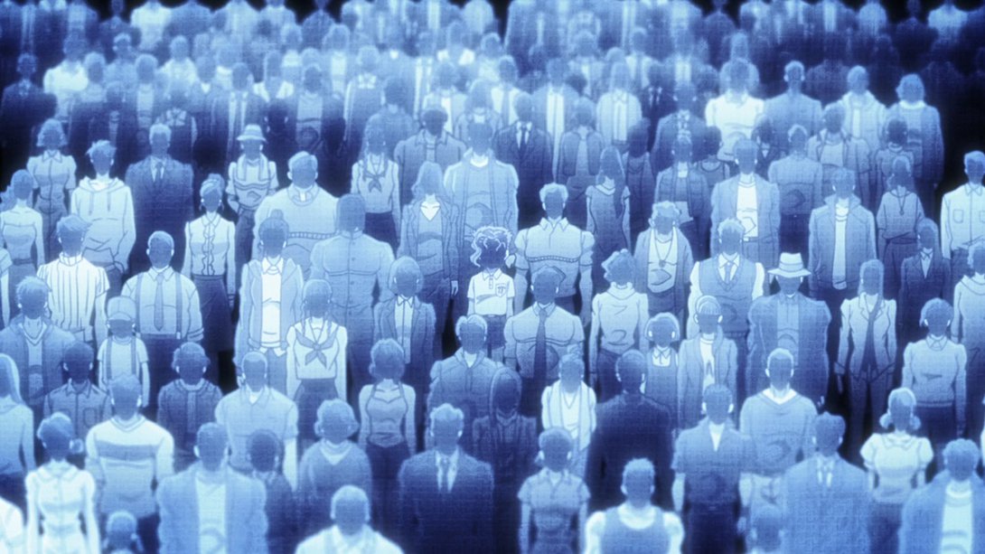

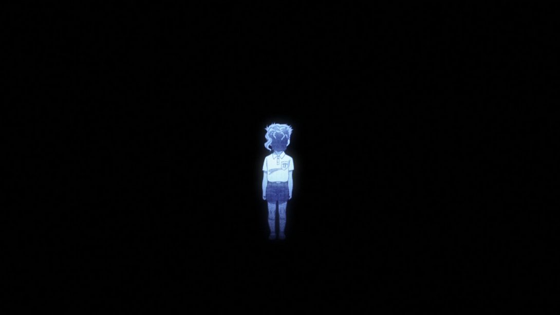
- This shot is much less hazy and Kakyoin’s left foot has been moved to the front layer:
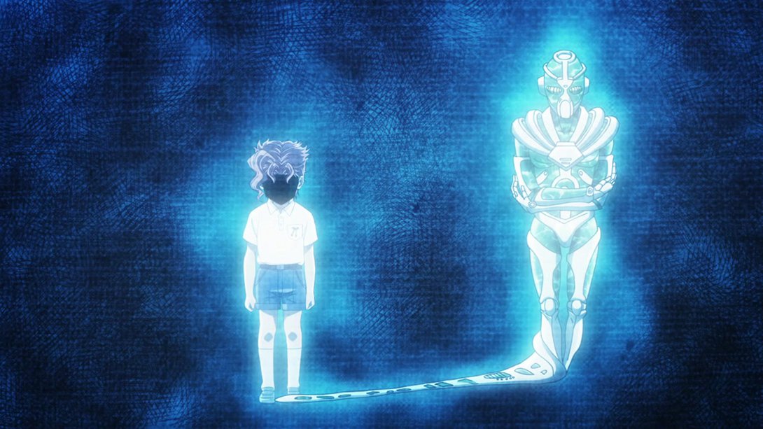
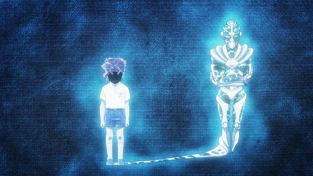
- Hey. Hey. HEY. REMEMBER AVDOL?:
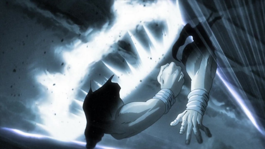
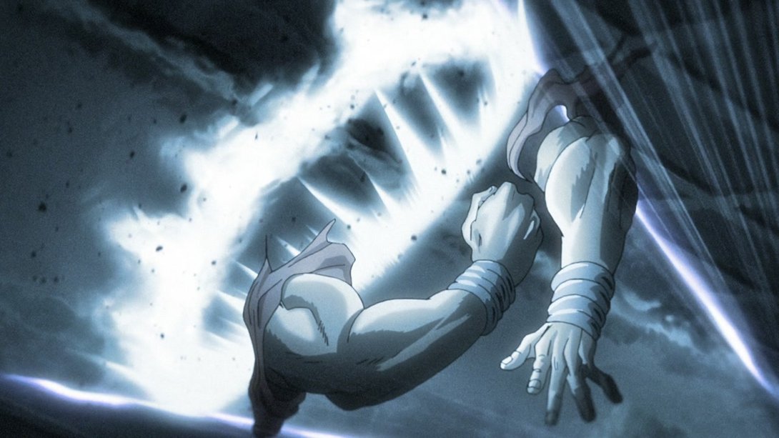
- Kakyoin’s face has been retouched, here, and Hierophant Green has his legs back:
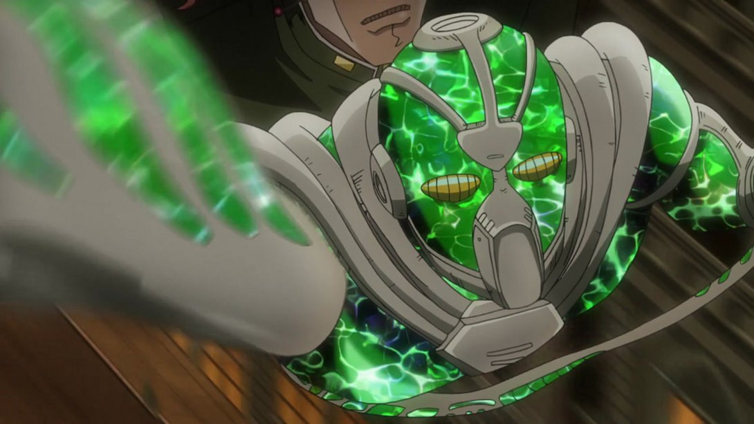
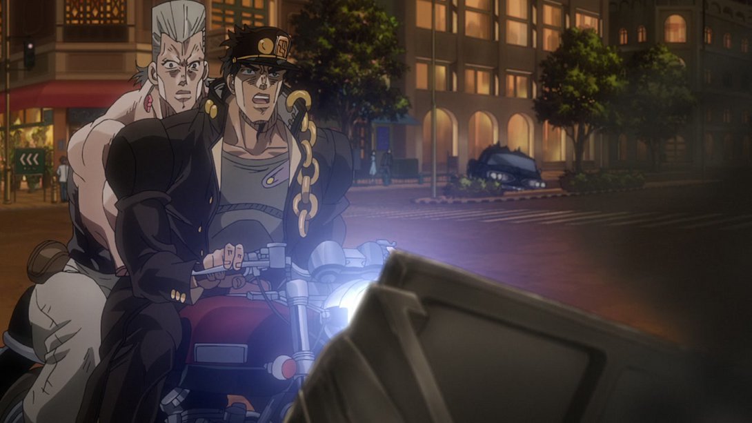
- This scene has a different distortion along the edges alongside with some different lighting. On top of that, the background is looking different and it moves quicker, and basically all textures on the motorbike are looking significantly better:
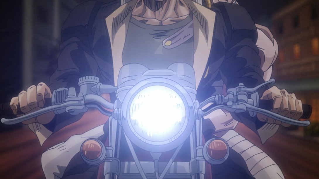
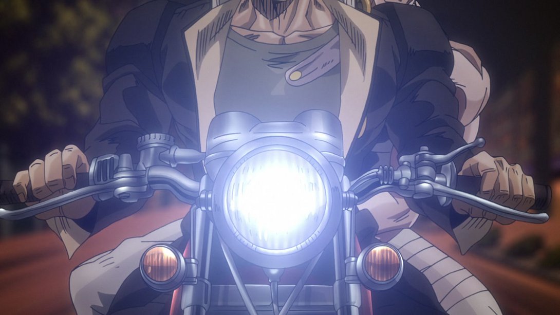
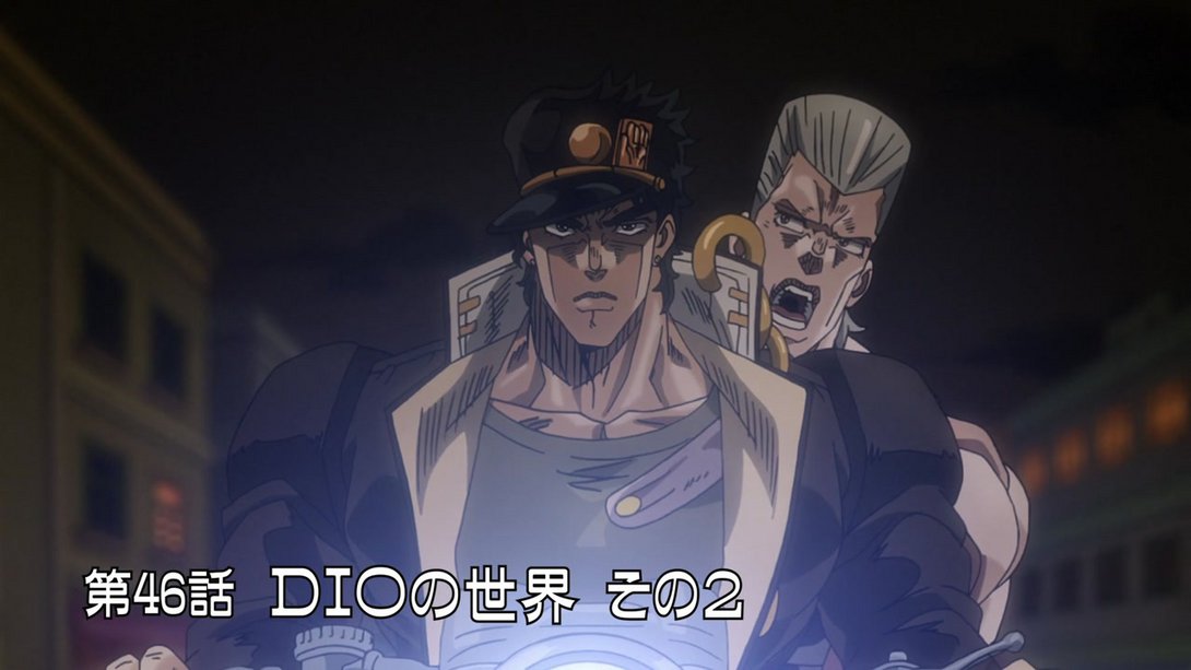
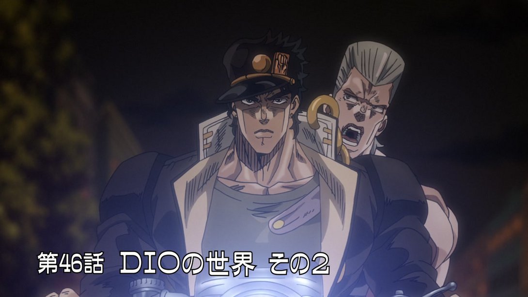
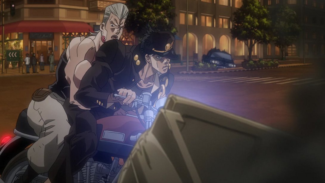
- Here, on top of a more consistent shading on the motorbike, both head and taillight have been significantly toned down (or outright turned off). In addition, the back of the car in front of them has also been retouched to fit better with the lighting of the scene:
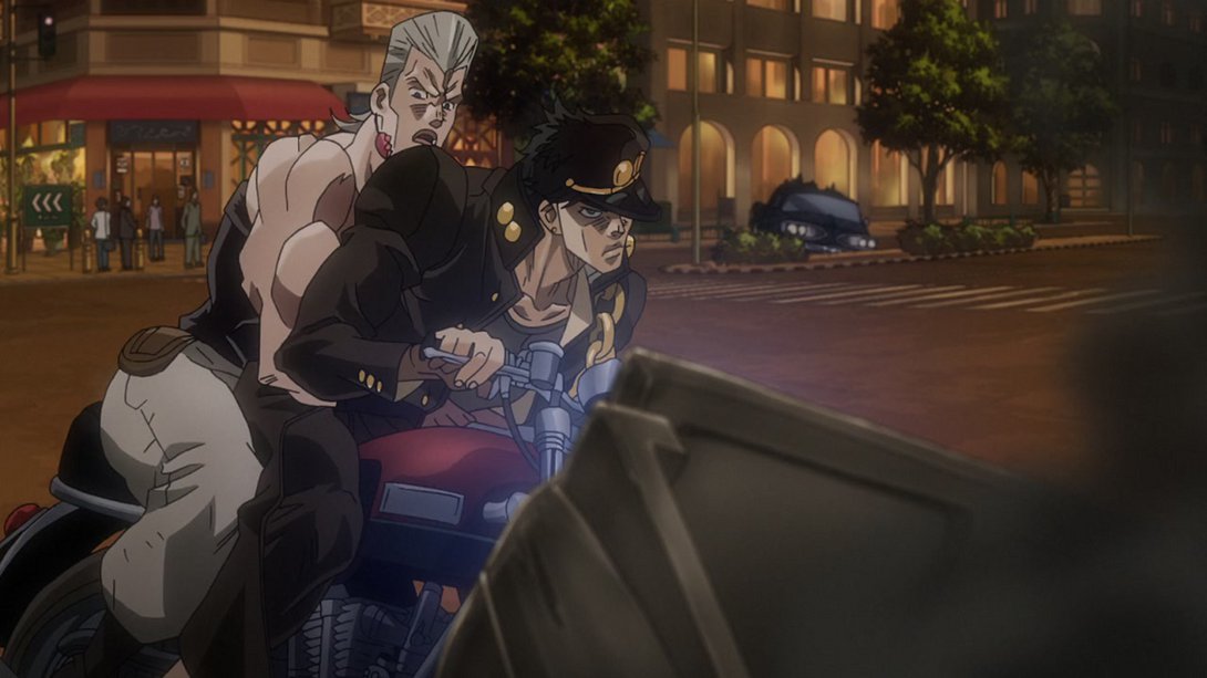
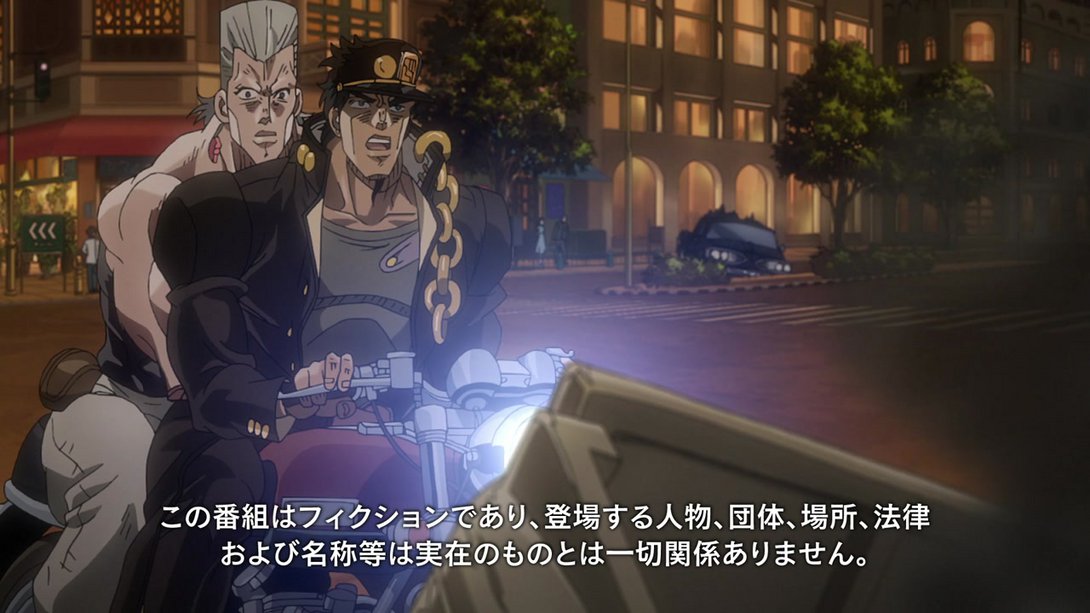
- In this scene, the aura effect is different, and Dio is more obscured…:
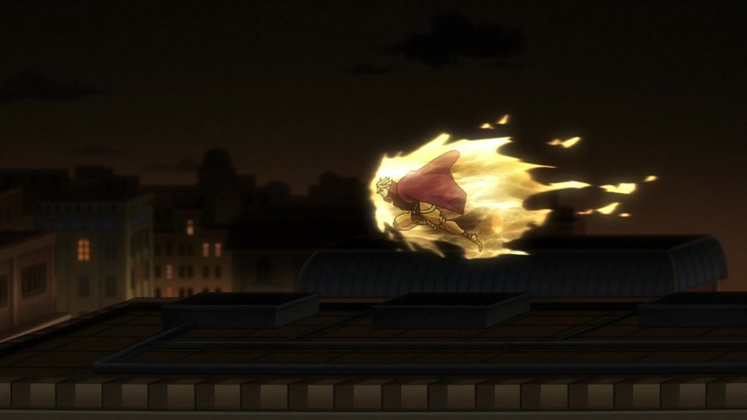
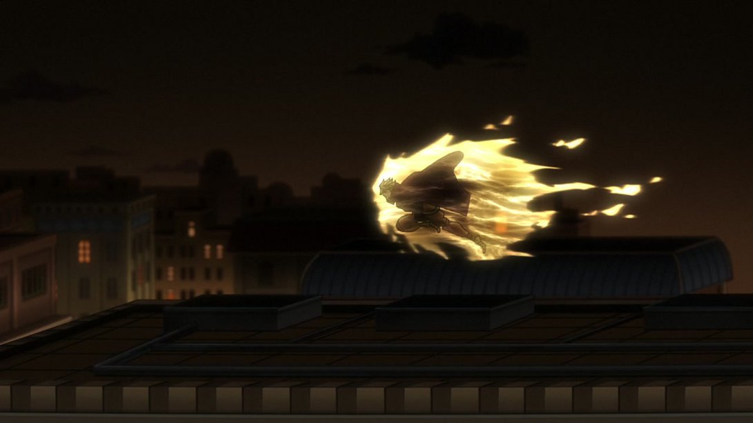
- …and, later on, the movement of the aura itself has been modified as well, so it no longer looks choppy and unnatural:
- The tower on the right of this frame is now sharper:
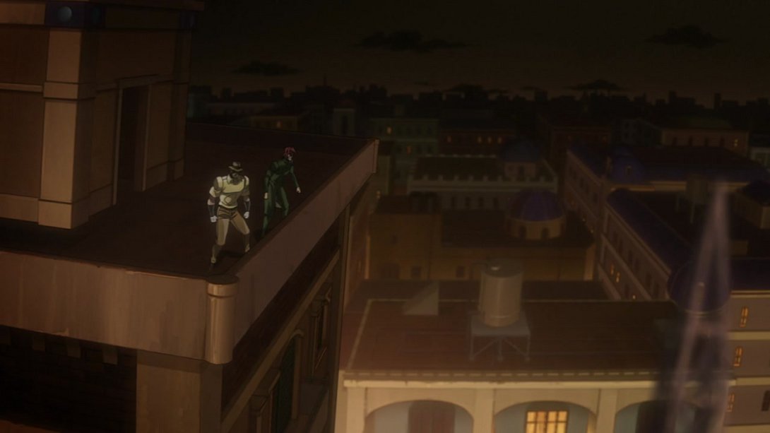
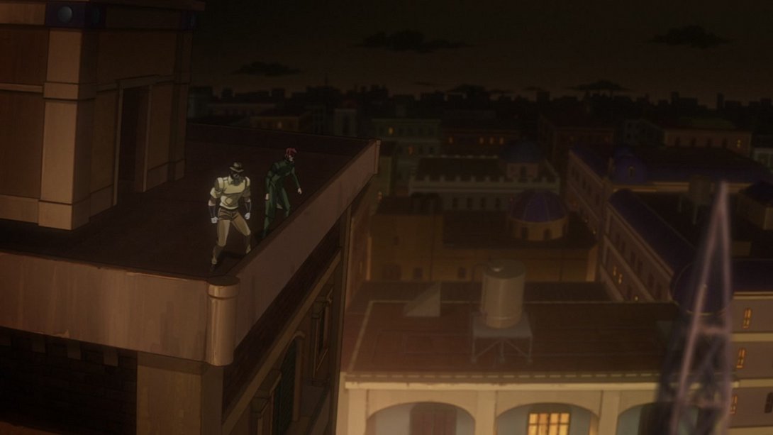
- These three shots are now brighter (or, in the case of the third one, just the first couple of frames are):
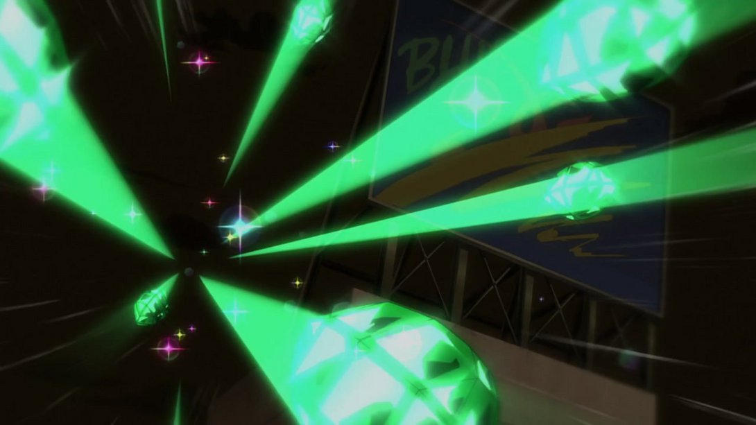
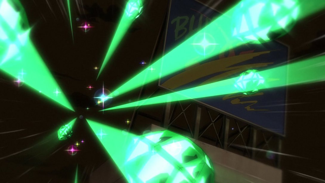
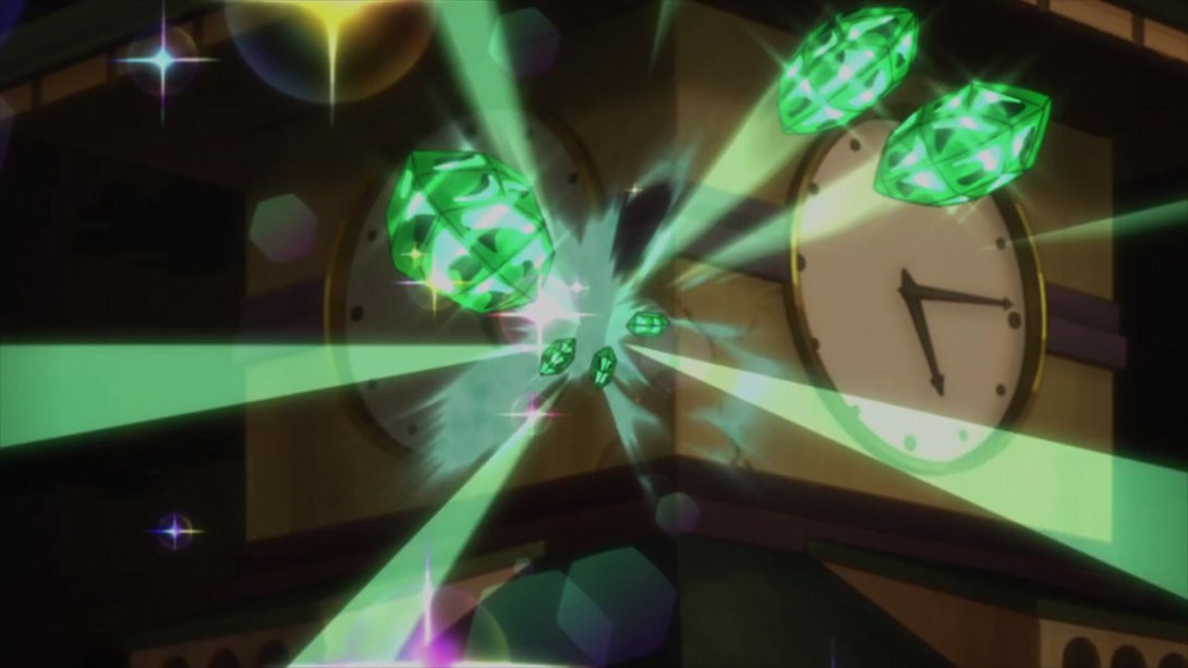
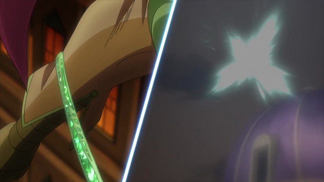
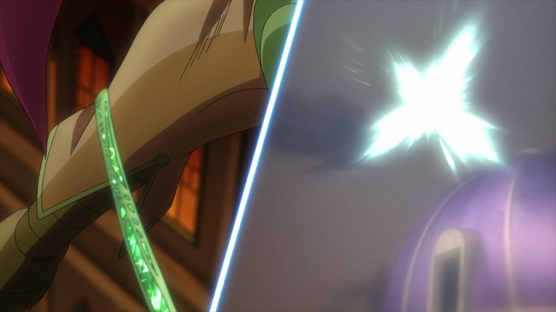
- Dio’s been shaded differently and drawn with thicker lines as well, here:

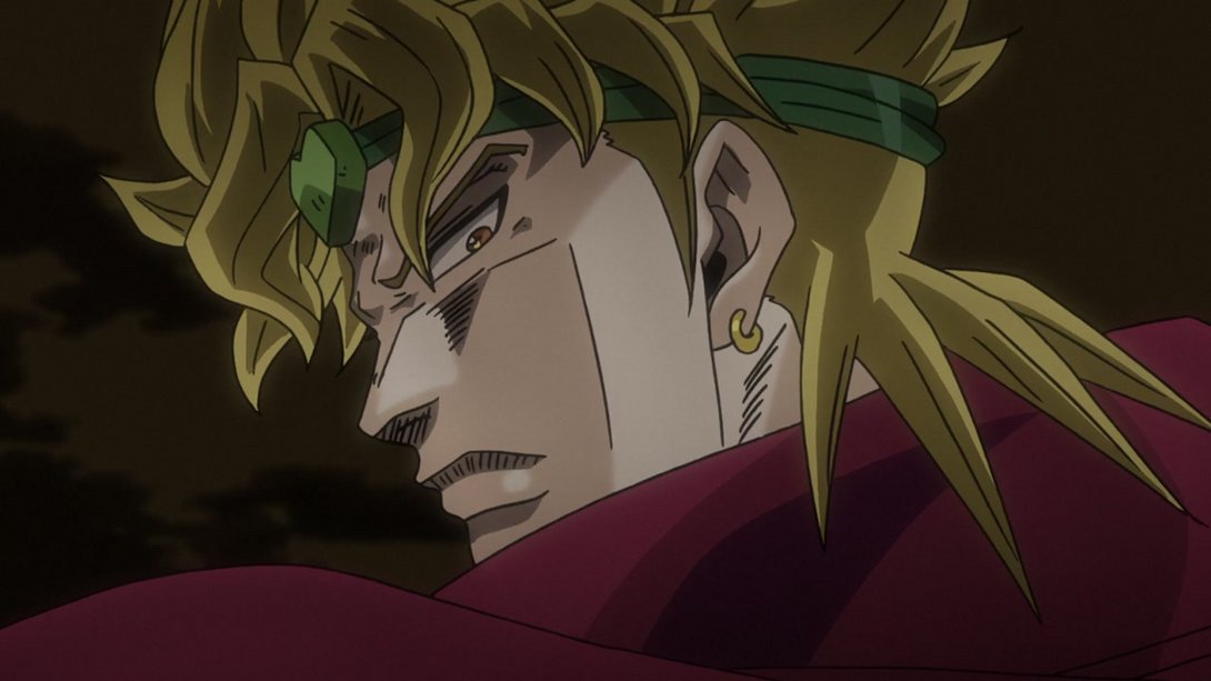
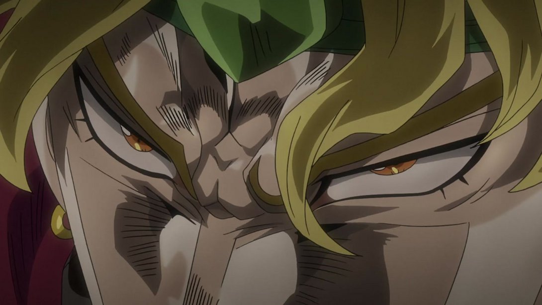
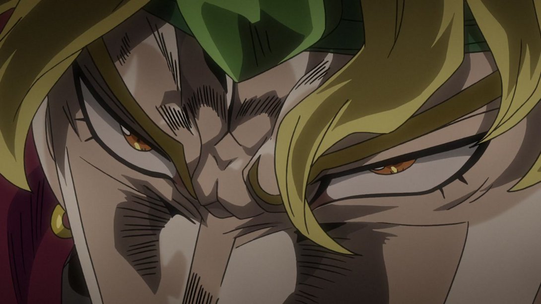
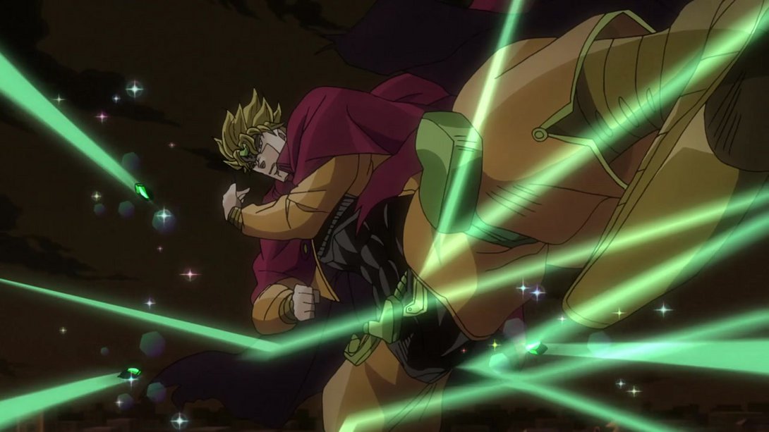

- The Emerald Splash diamonds, their trails and the explosions they cause have all been changed here:
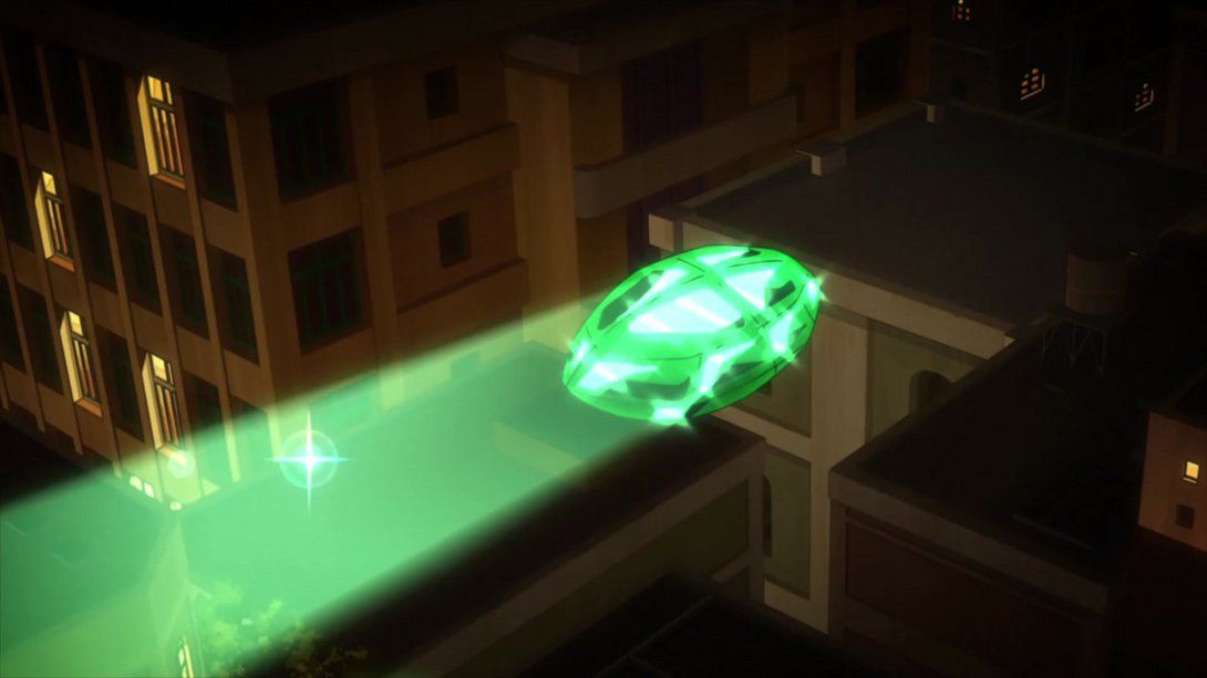
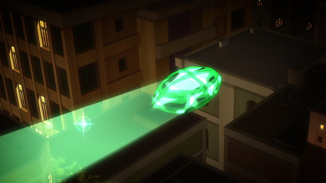
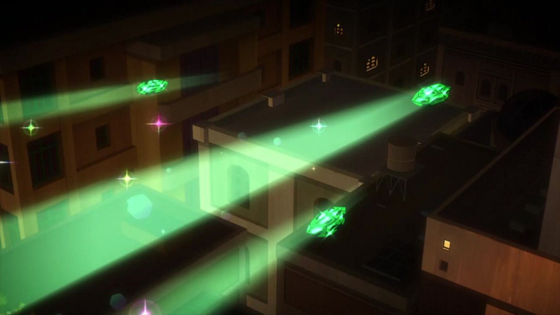
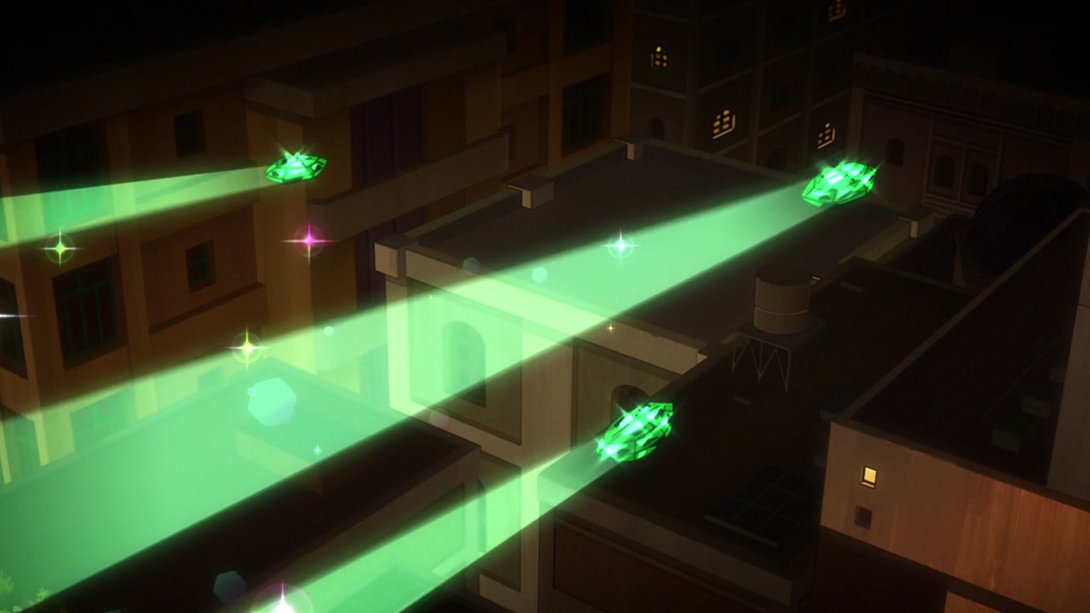
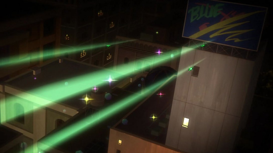

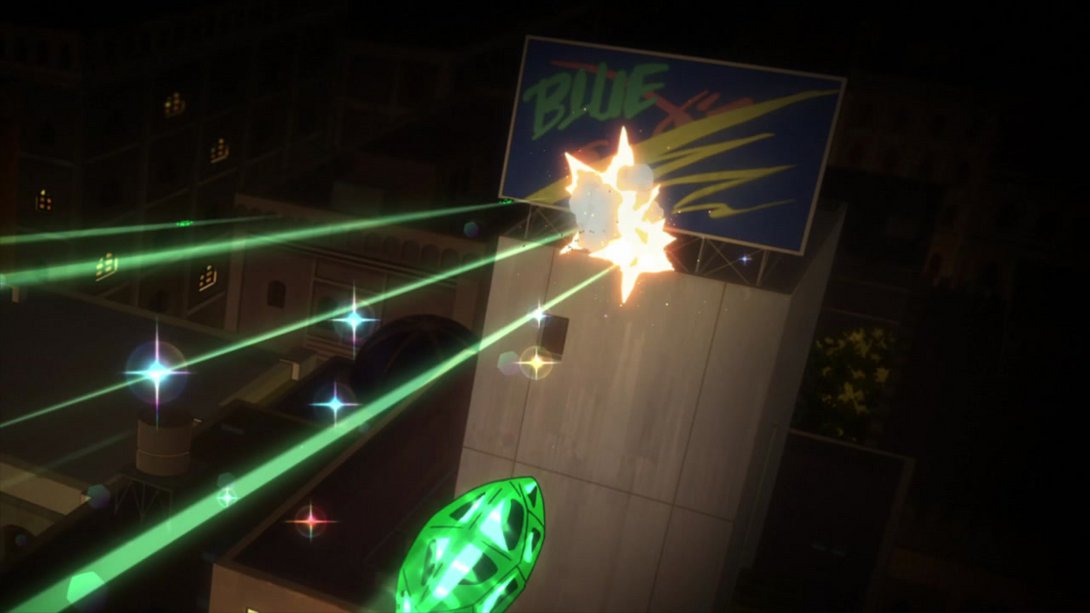
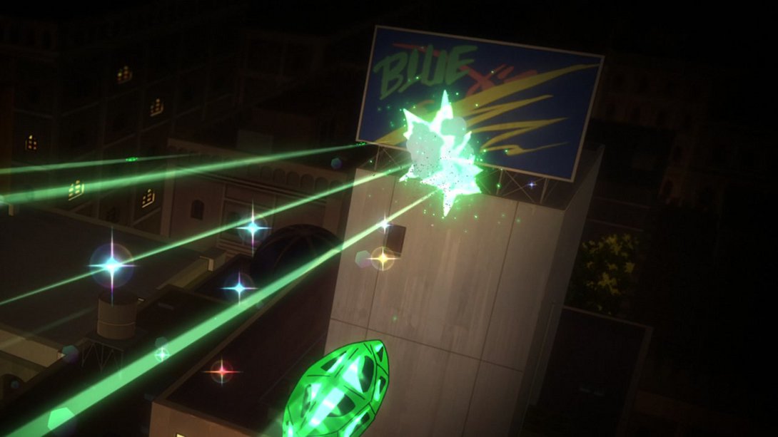
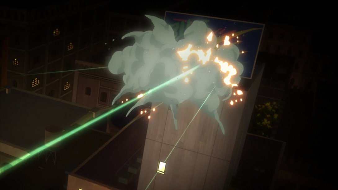
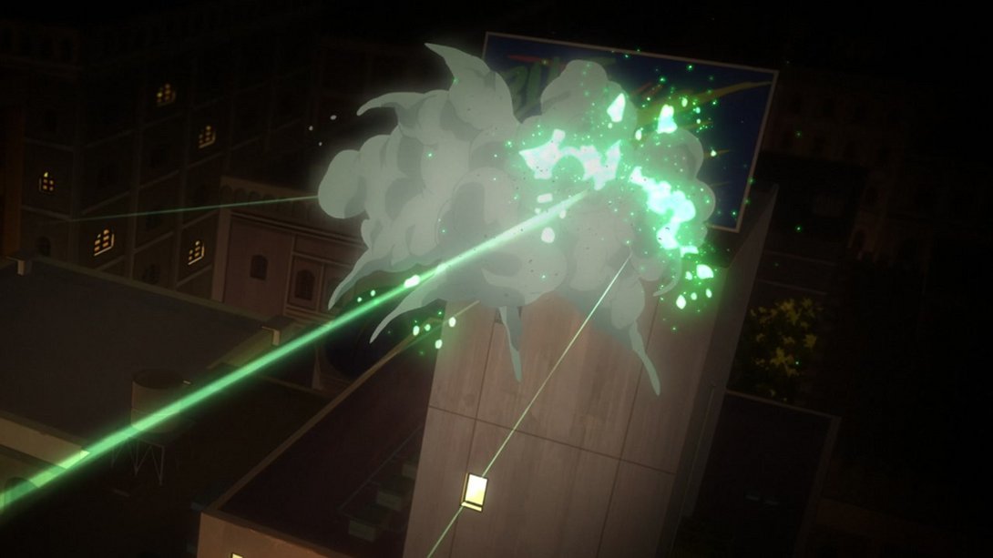
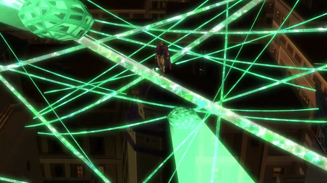
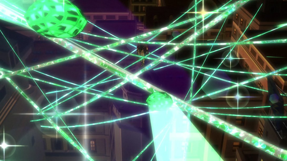
- This shot is way more zoomed out, and the Hierophant Green strands have been retouched and are now (subtly) animated:
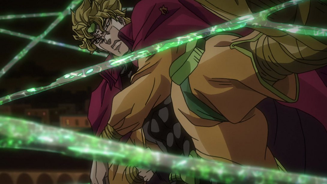
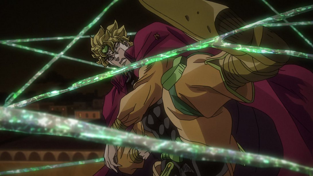
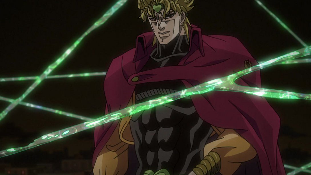
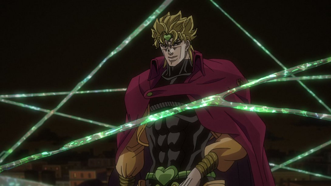
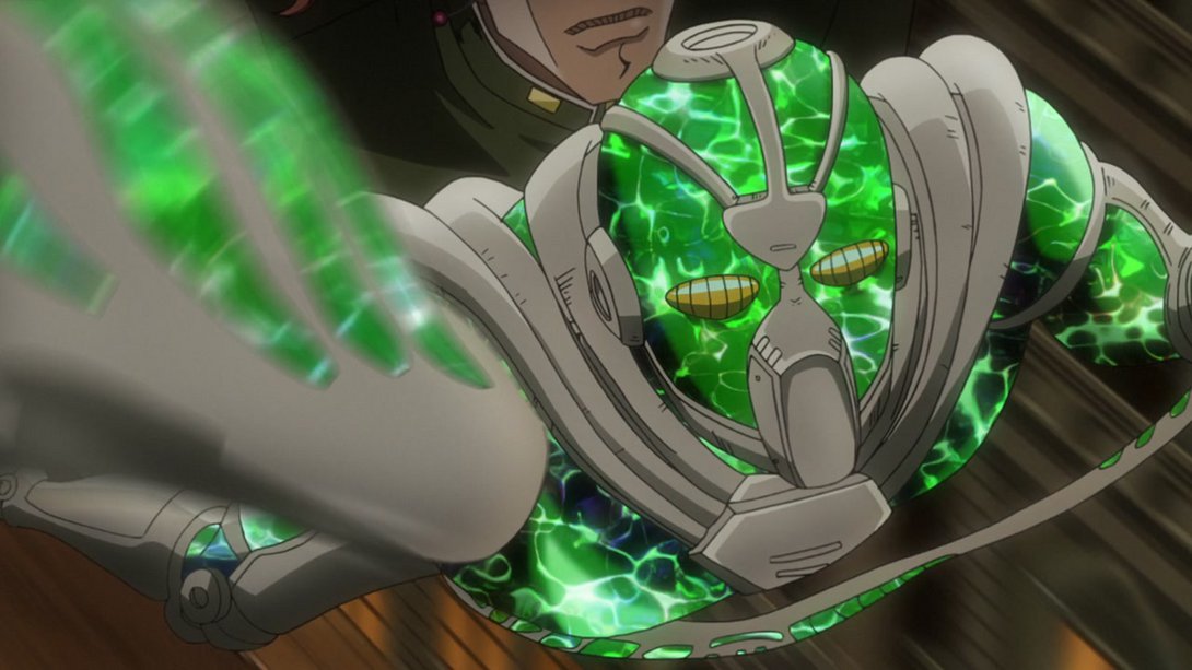
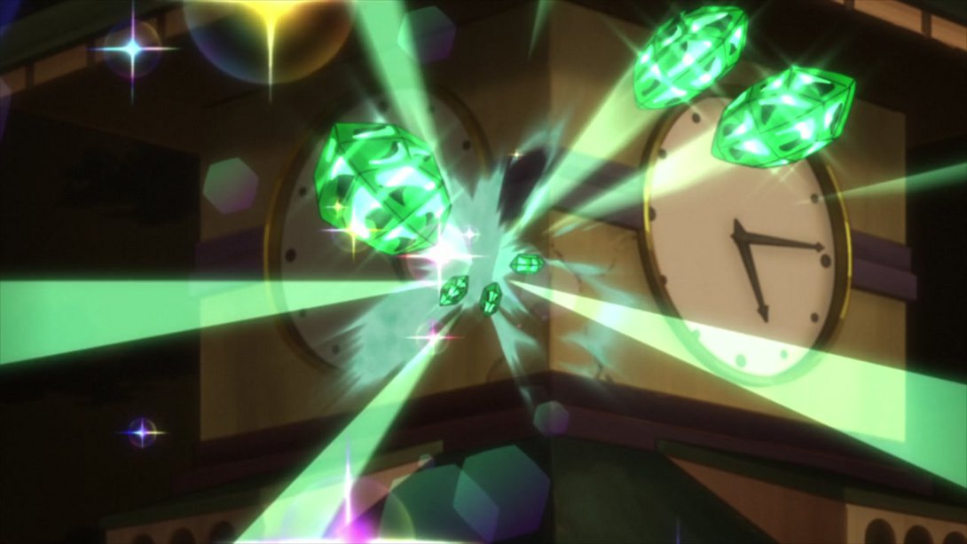
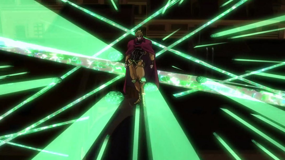
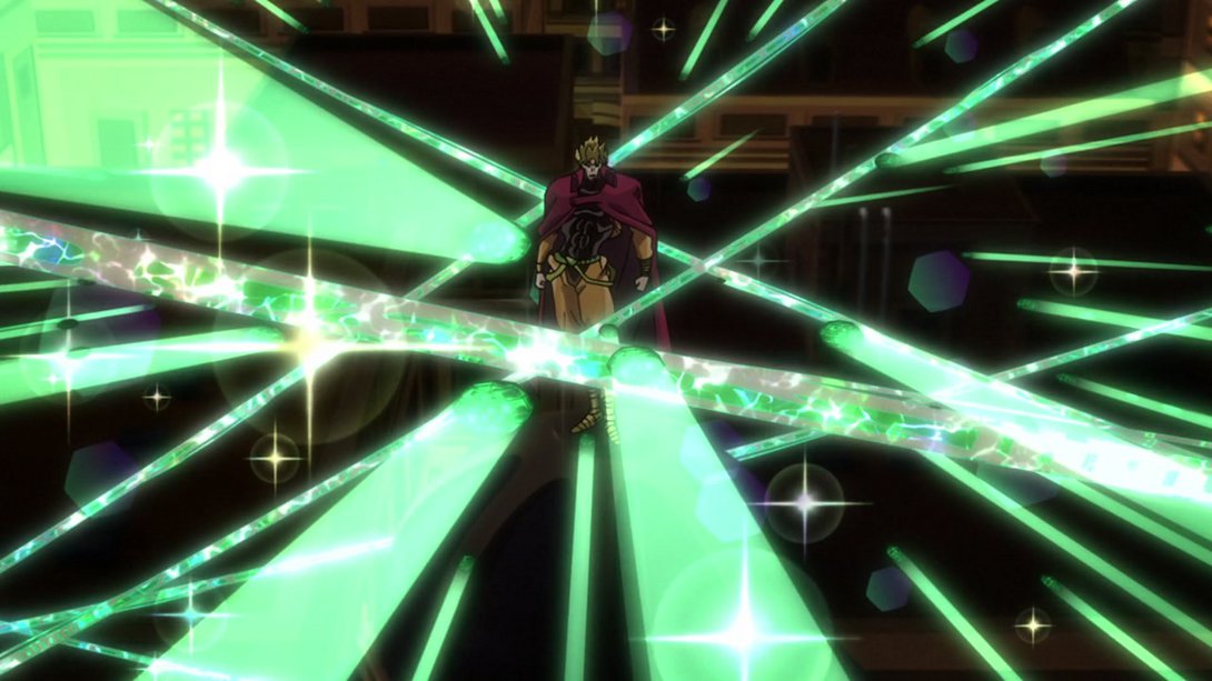
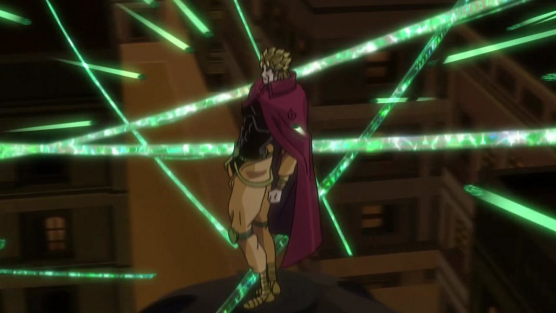
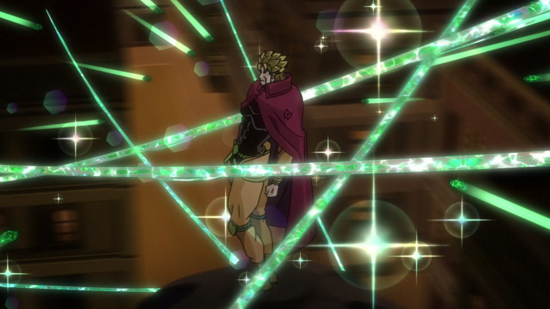
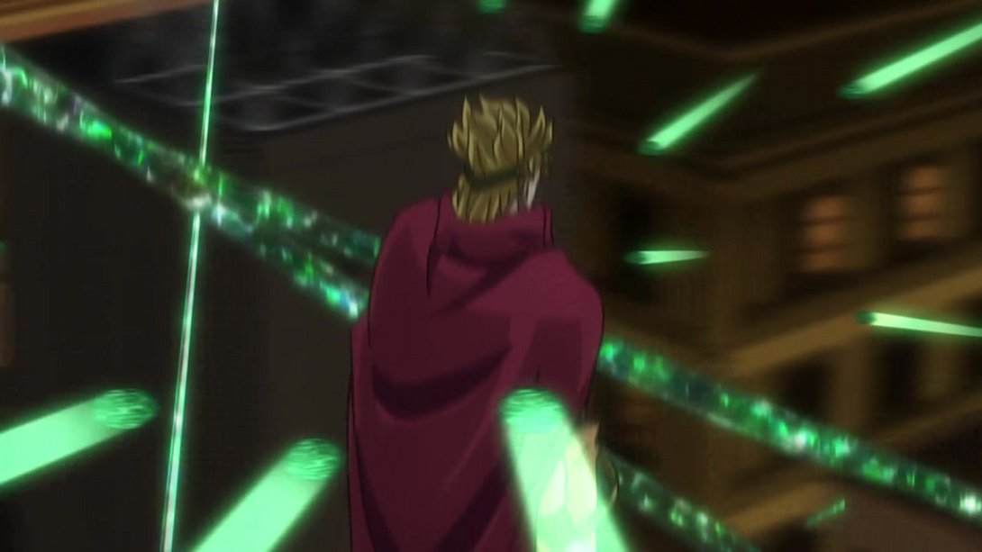
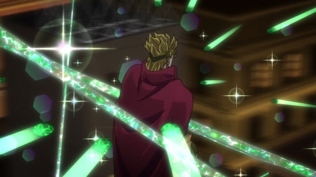
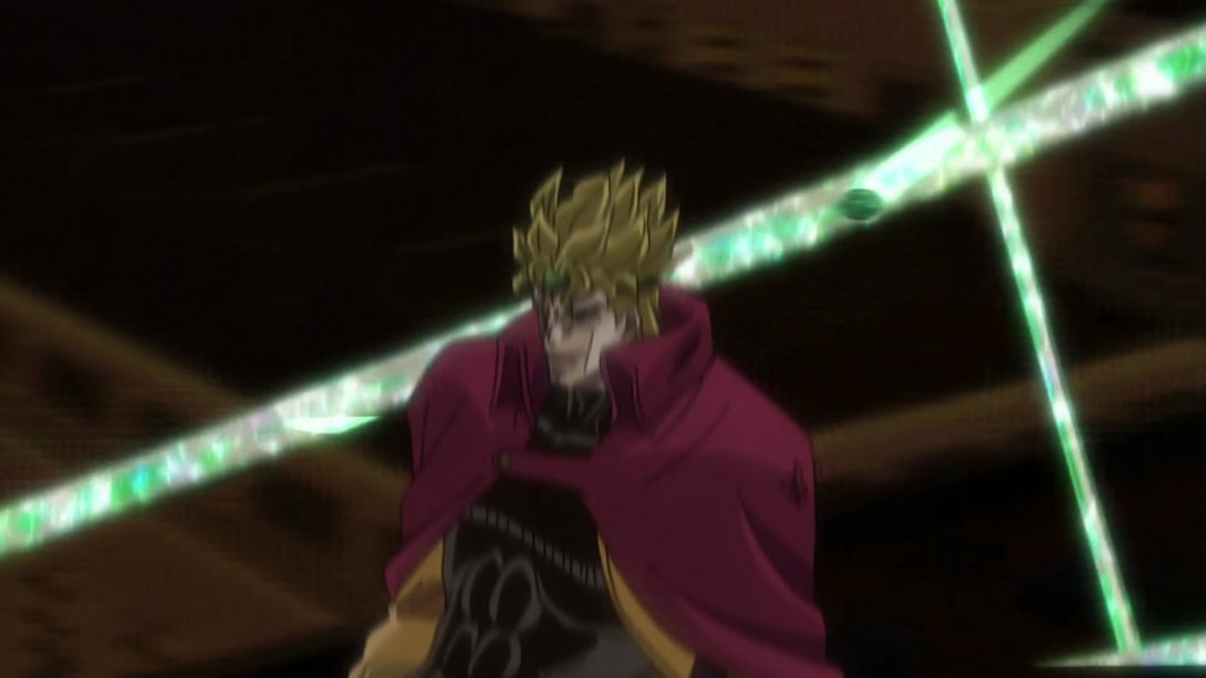
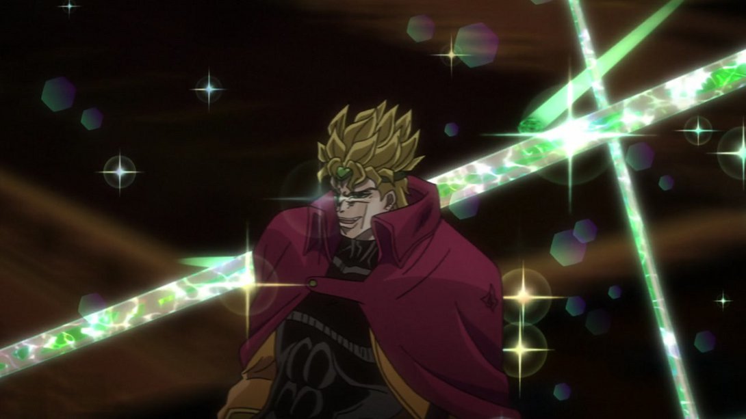
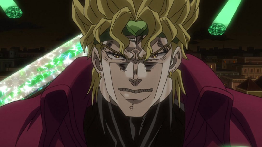
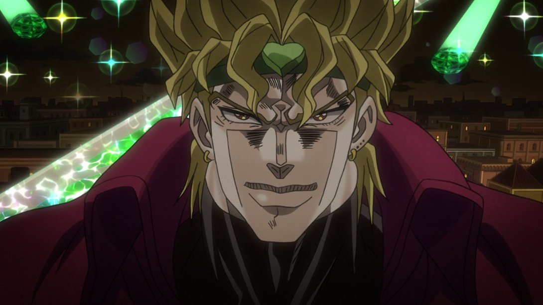
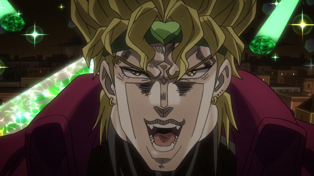
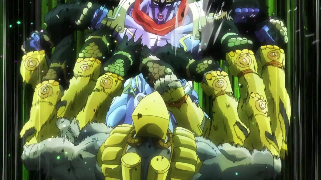
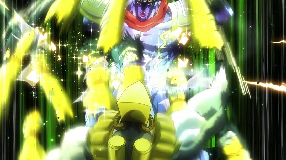
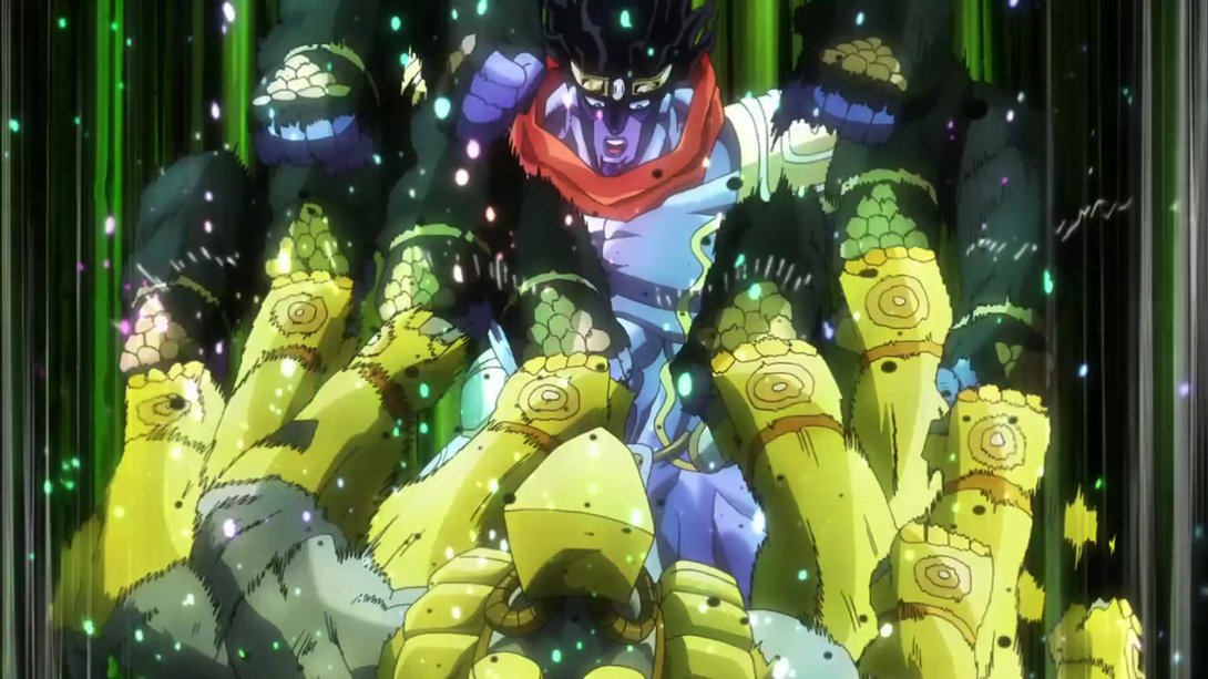
- Here we have a whooole bunch of things which have been changed, friends! In no particular order: both the Hierophant Green diamonds and strands are now brighter, the camera has been moved, there are way more lens-flare-like effects and sparkles all around, Dio has been moved to the correct layer so that he no longer hovers over everything like a weird British ghost, most in-between frames are less blurry, in the final shot of Dio there’s a new vignette and the mouthflap has also been tweaked. Phew! Take a look:

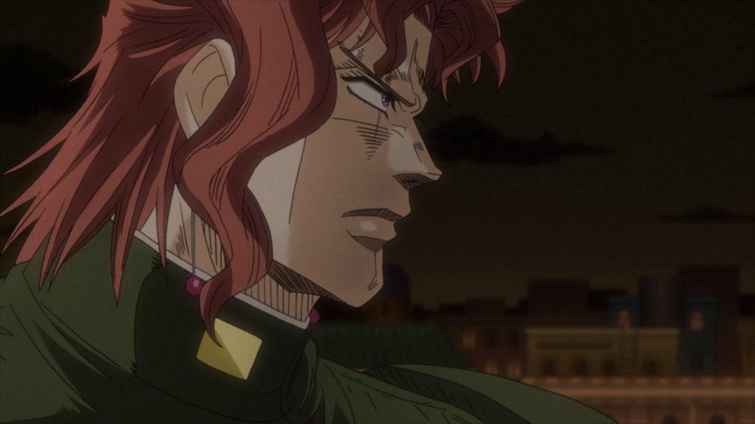
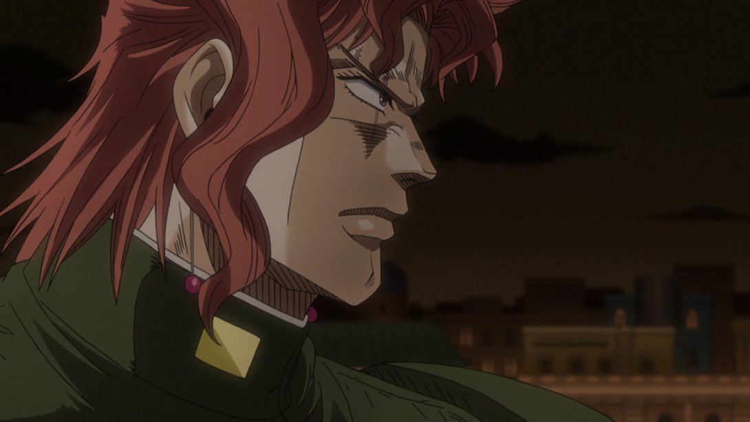
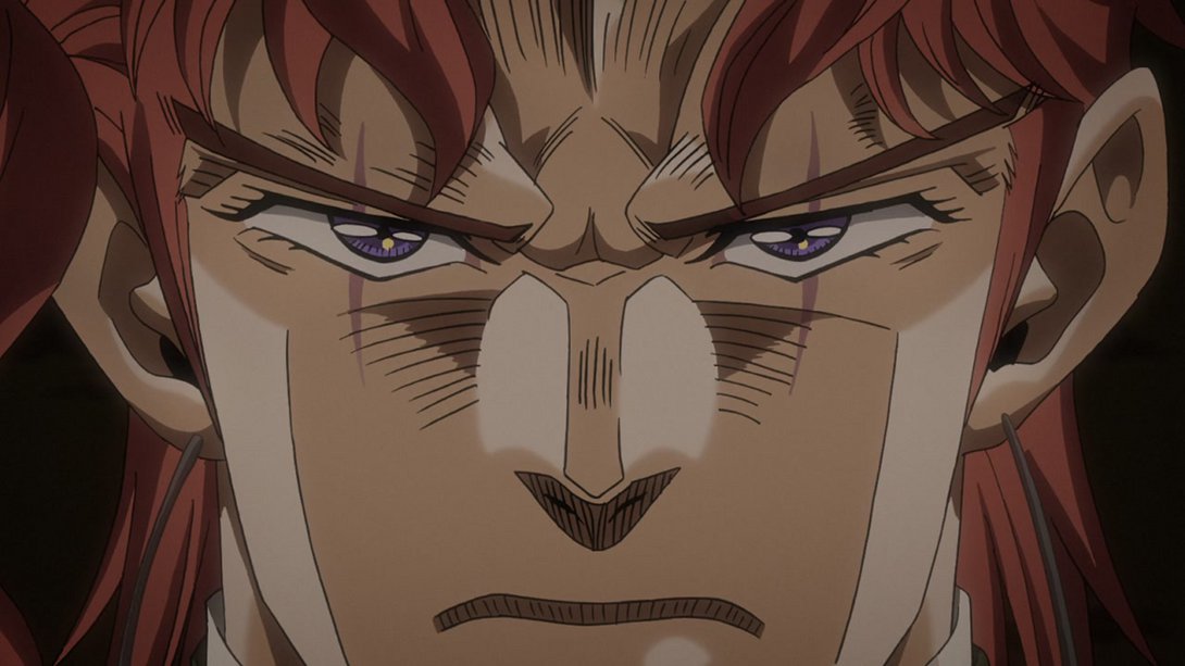
- Let’s take a look at the opponent of this fated clash: Kakyoin’s face has also been retouched! Check this handsome boy:
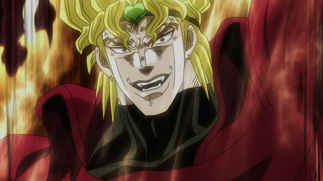
- This shot also has a fair amount of differences! Everything is brighter, Dio’s face has been retouched in most frames, The World’s right arm has been tweaked and the aura on that side of the frame no longer looks as… wild:
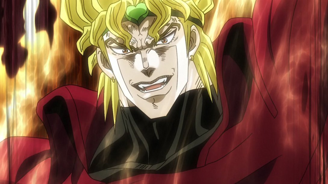
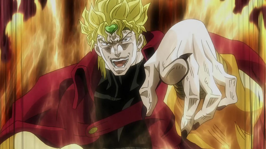
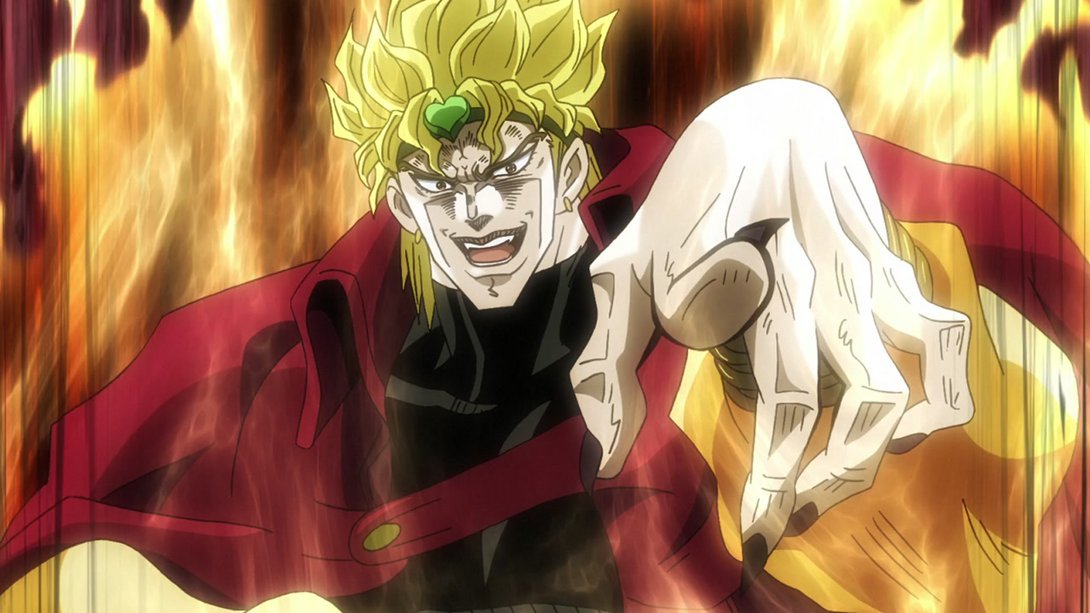
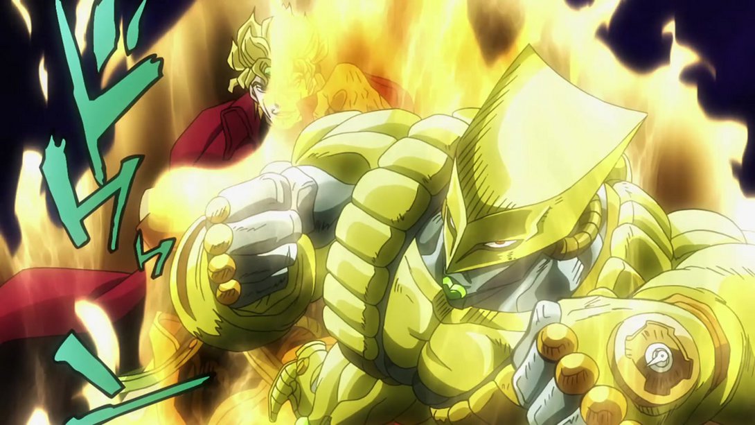
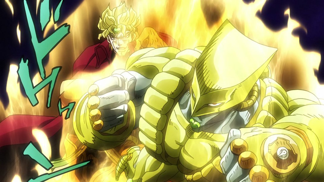
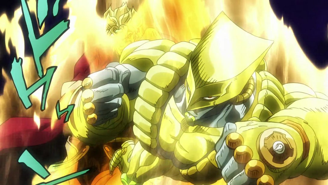
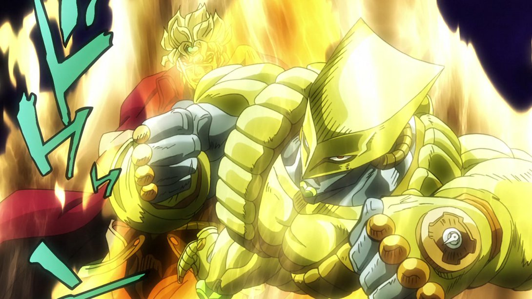
- This shot has no vignette, and the shading on Kakyoin is a little flatter:
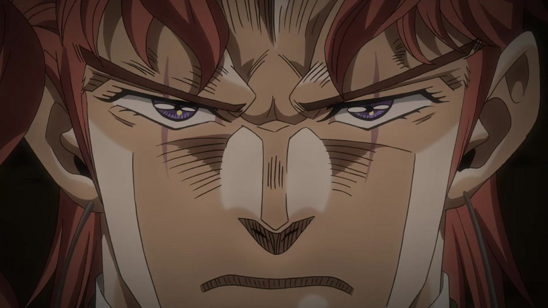
- Here, the usual Hierophant Green effects are back, and all the diamonds and trails are looking a little better:
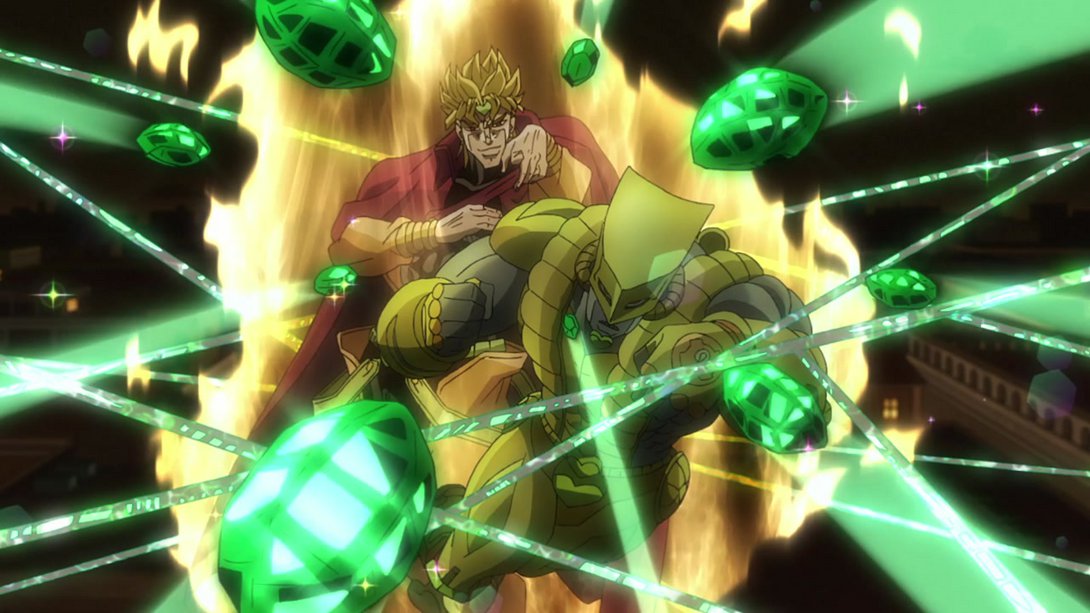
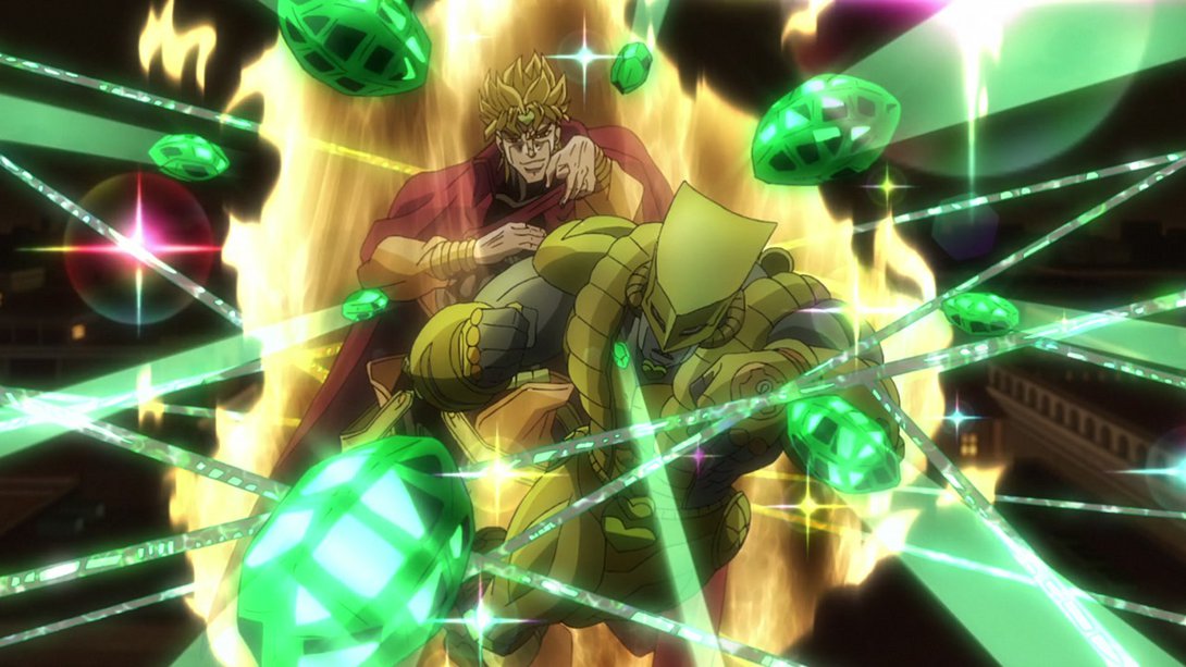
- This scene has the same vignette and shading differences as the previous one, and in addition to that it now ends in a whiteout:
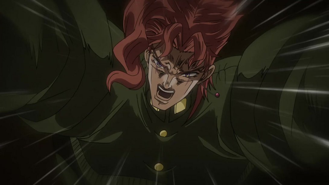
- This animation of poor Kakyoin now sports more impact effects, added here and there, on top of several other changes: the lighting is slightly darker in some frames, the wind effects are blurrier, the motion lines have been moved slightly (and more dramatically towards the end), there are more blood droplets flying around and towards the end the background is brighter, more distorted and has a warmer tint:
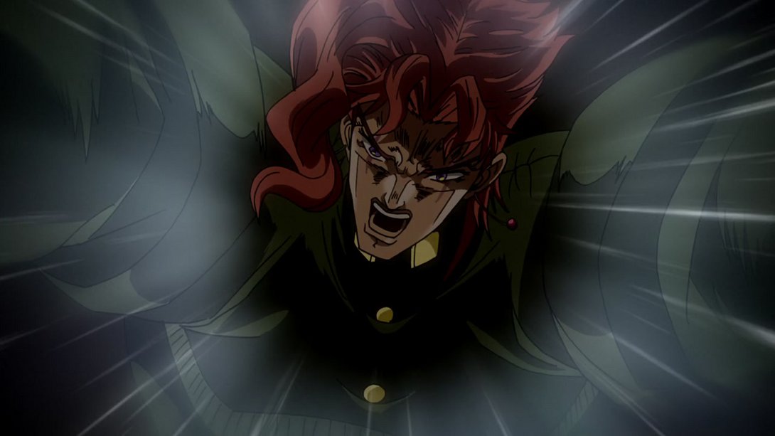
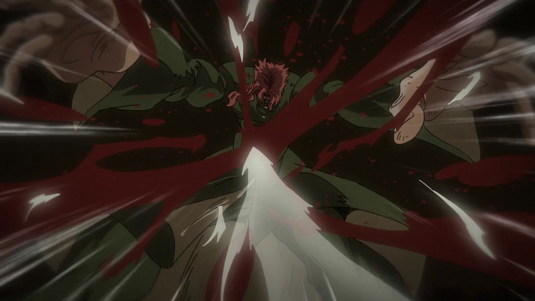
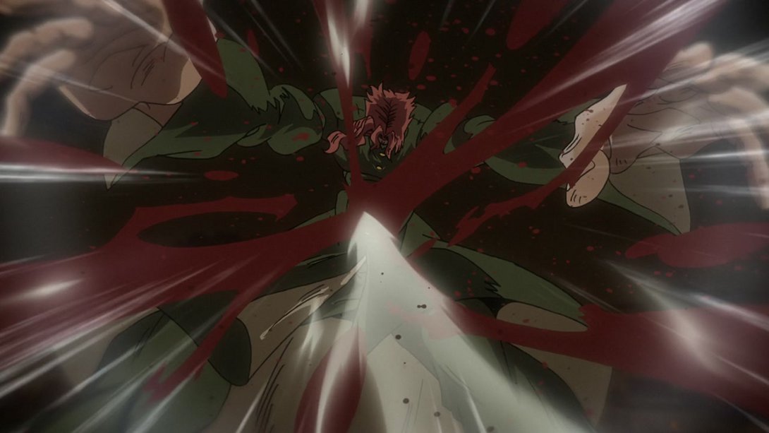
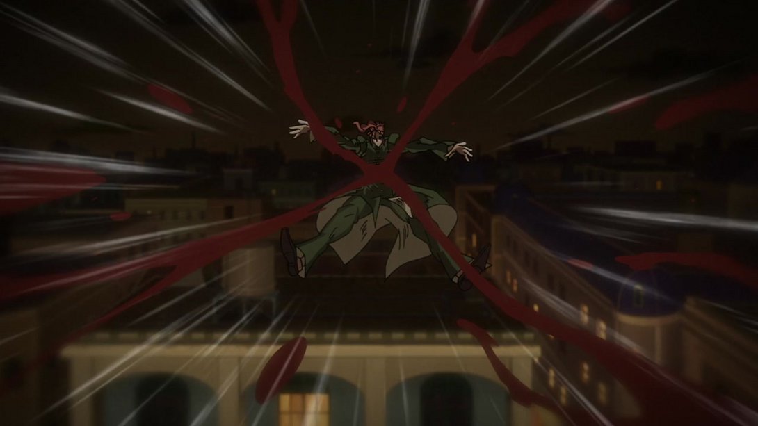
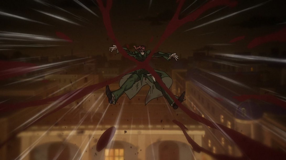
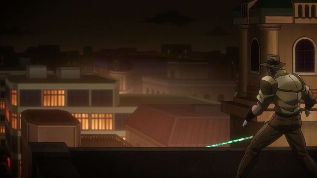
- Here, Joseph’s been shaded a little better, and he now moves towards the end of the shot:
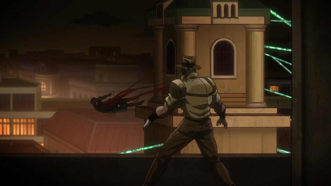
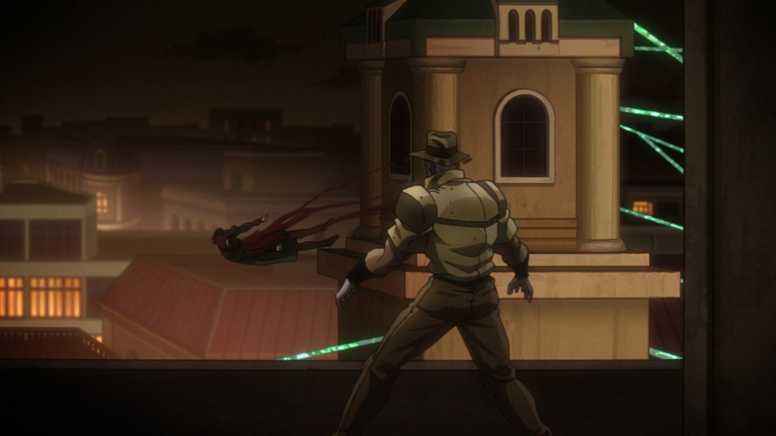
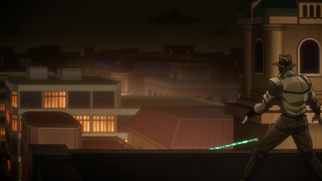
- Poor Kakyoin has been uncensored here, the shading is a little different and there are a few more blood droplets around:
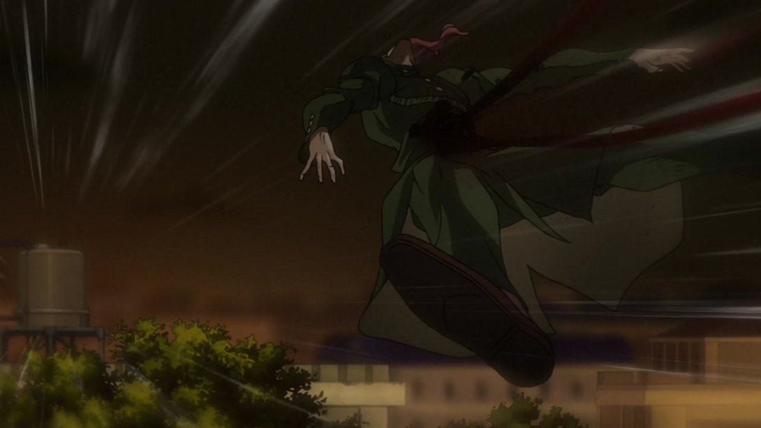
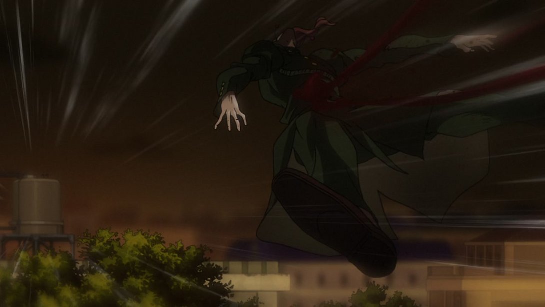
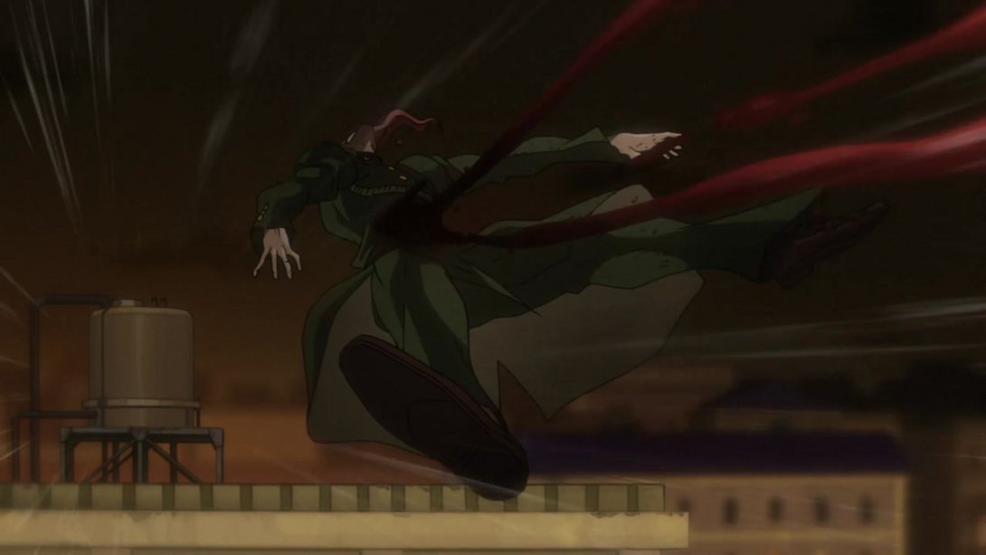
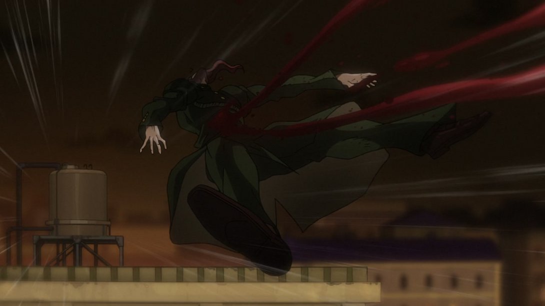
- Ah man, poor dude. Here, Kakyoin’s been uncensored, most things are slightly darker and the water to the right has been moved as well:
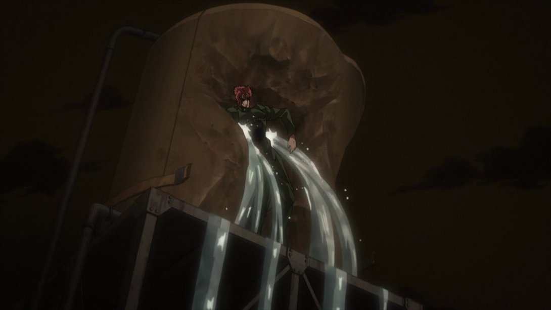
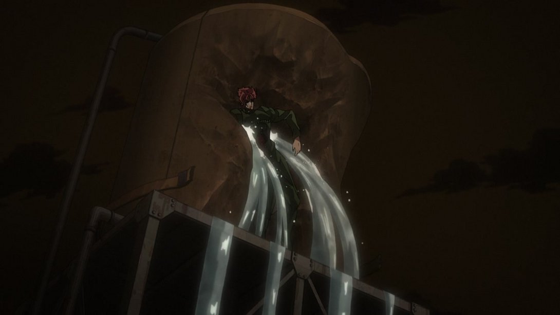
- Yeah, he’s not having a great day. Let’s just agree that Kakyoin’s going to be uncensored in all the frames he’s going to appear in - on top of that, here, there’s a new distortion, the shading on Kakyoin and the water tank has been tweaked slightly and the water texture is looking different:
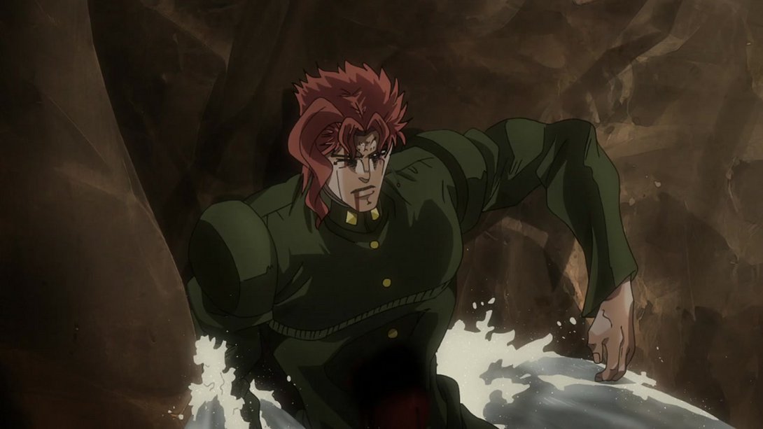
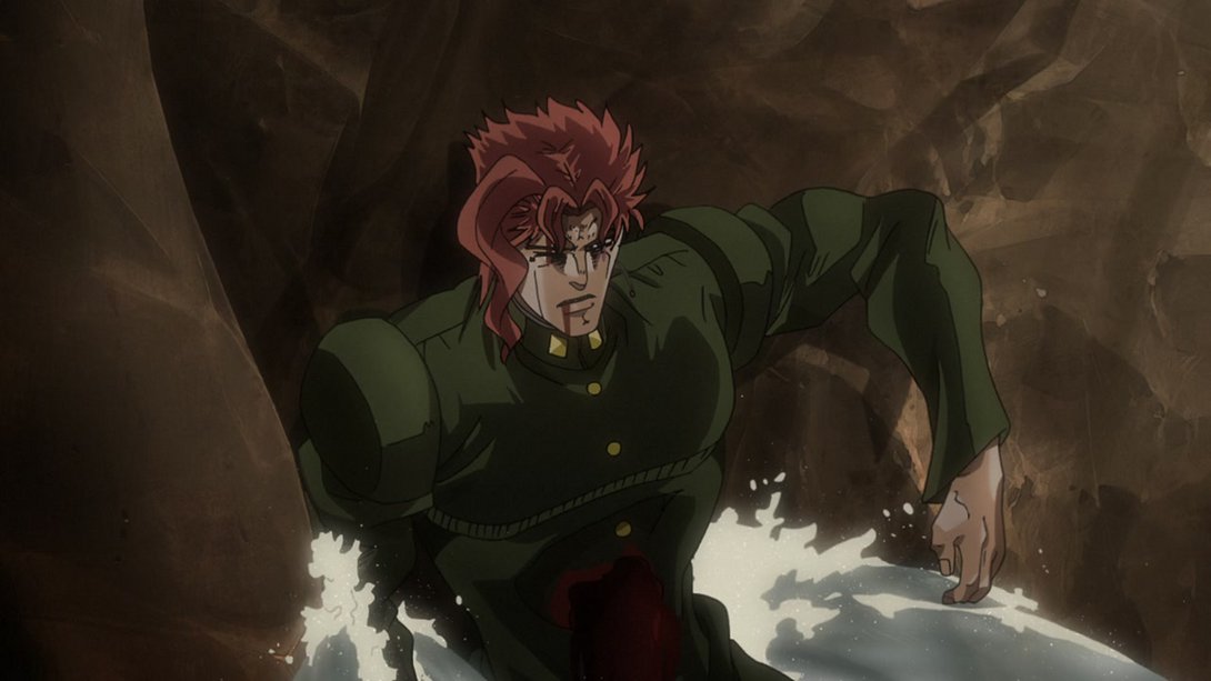
- Hello darkness my old friend:
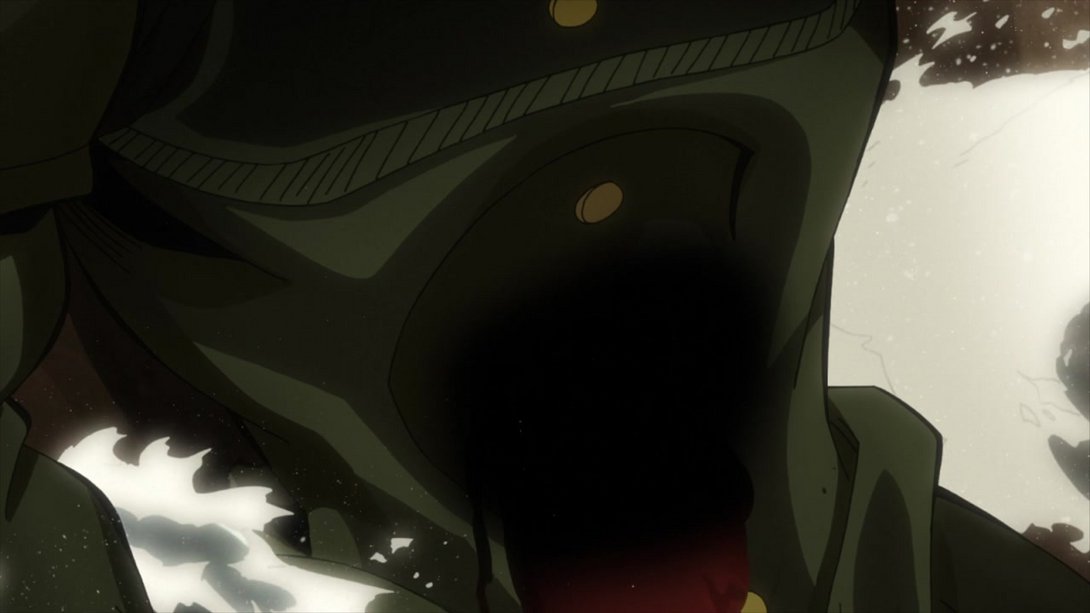
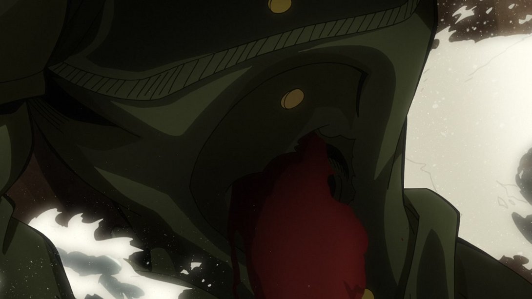
- Kakyoin’s been shaded a little differently here, and the usual distortion’s back:
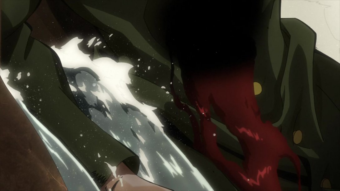
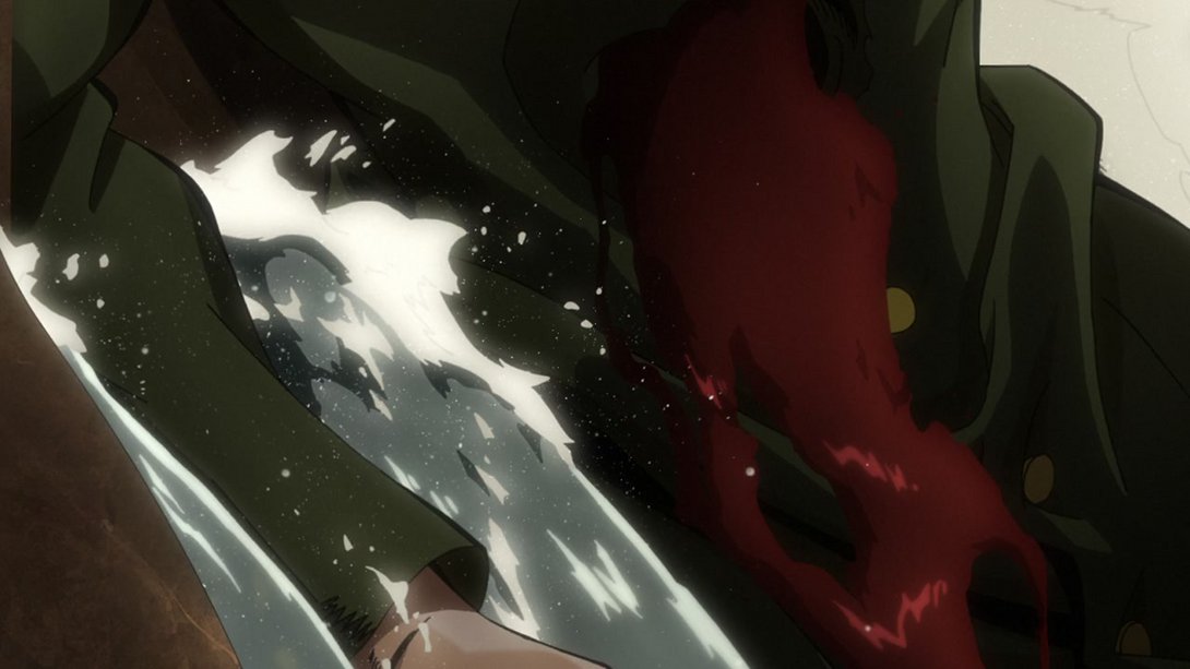
- Most of that’s back here, on top of a slightly darker background, towards the left of the frame and some different-looking blood particles. On top of that, the usual “soul dust” that Jojo uses to signify a character’s death has been removed from this scene:
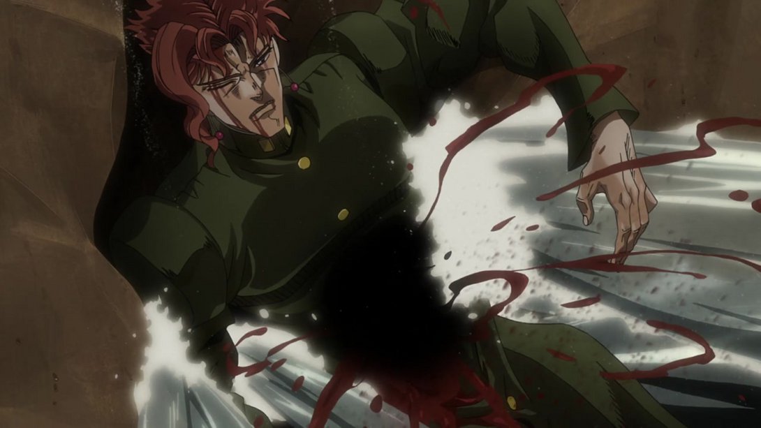
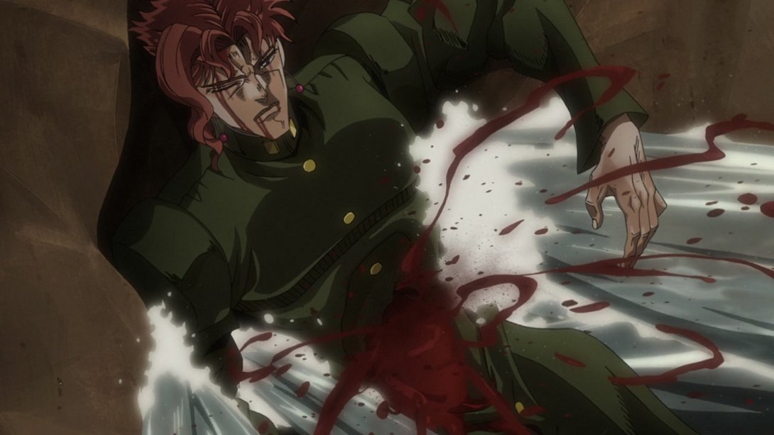
- This flashback scene has the same changes as before, and when we see the scene a second time, Dio and the world disappear much later:
- This flashback of the same scene has been recoloured:
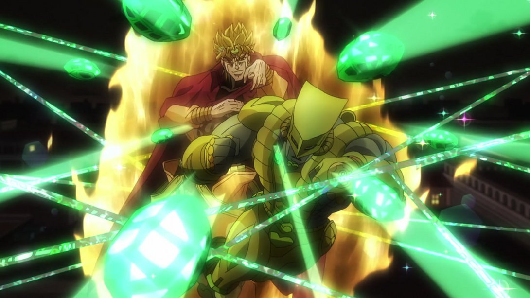
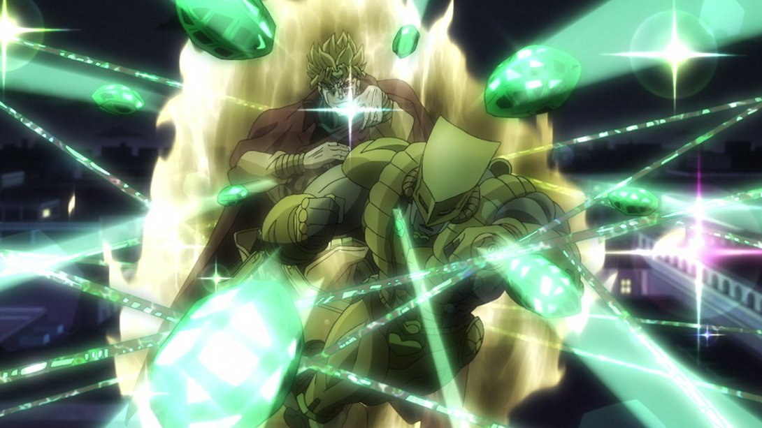
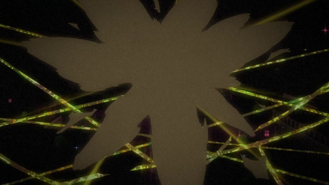
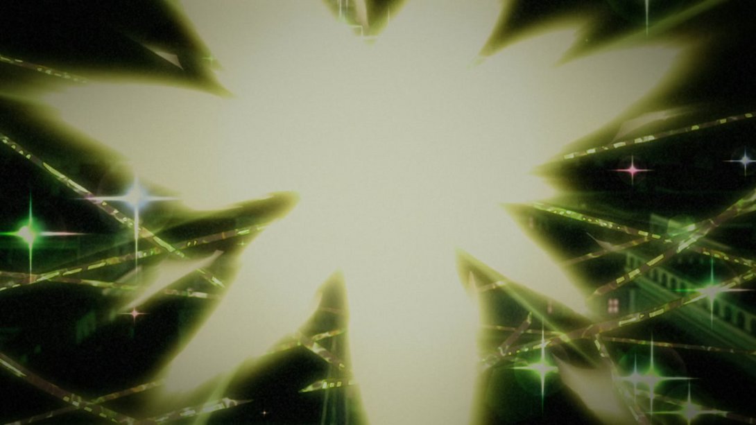
- Here, both the background sky and the Hierophant Green strands are slightly brighter:
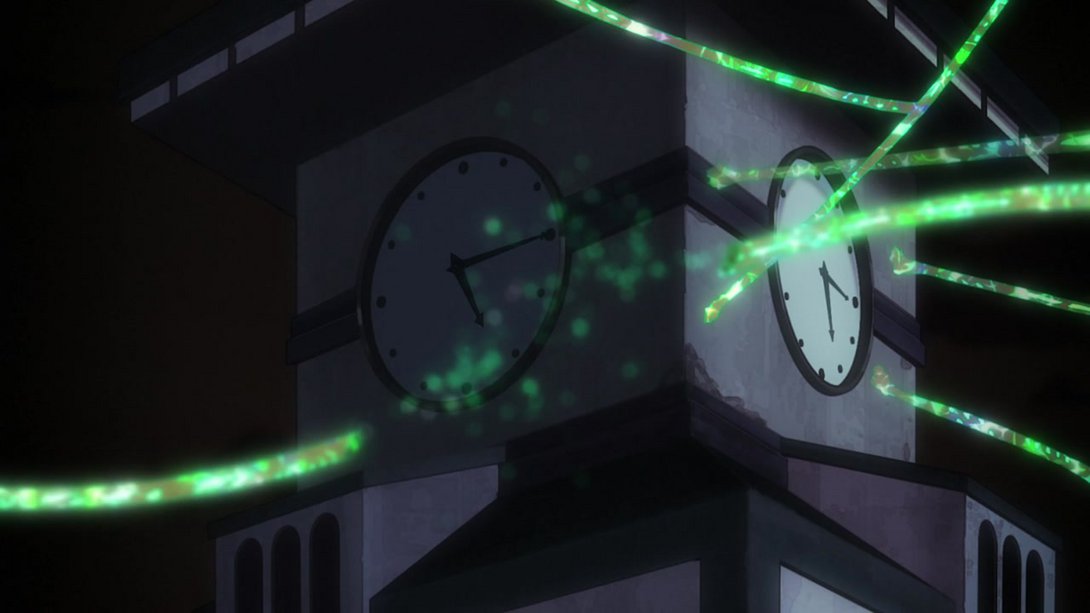
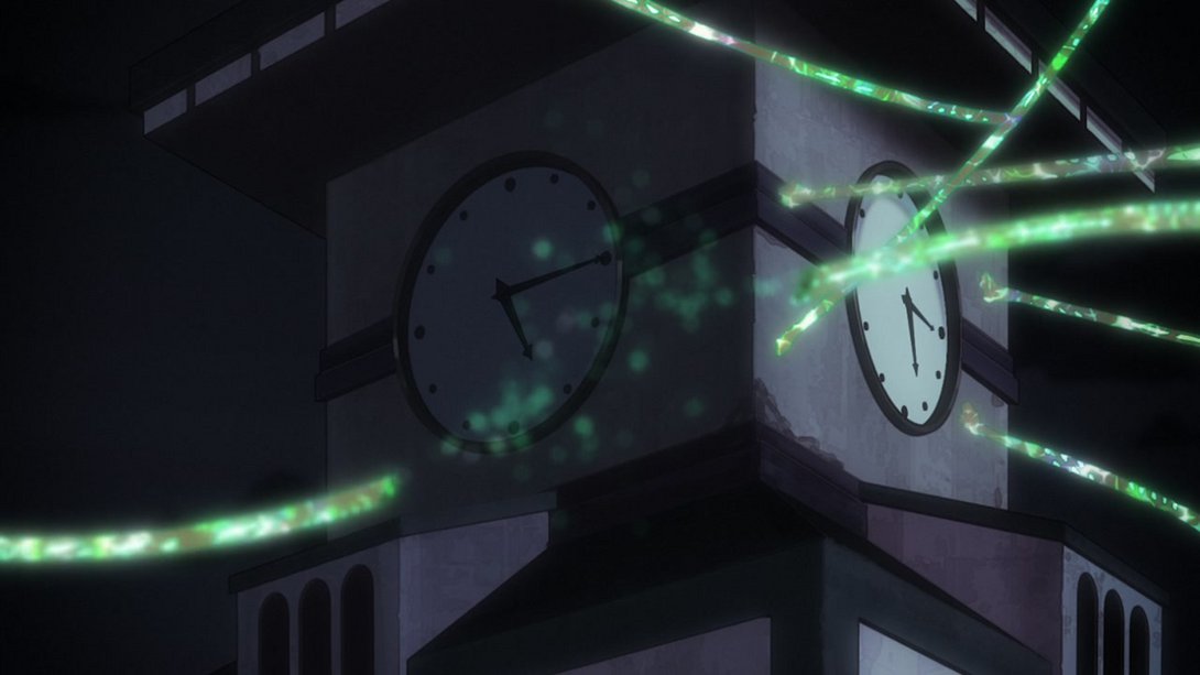
- How about… Tinier Dio:
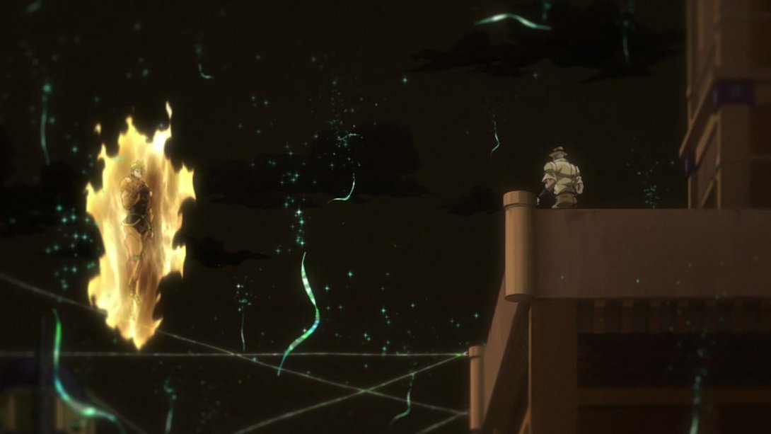
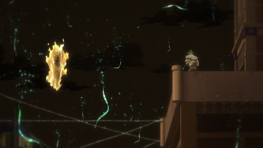
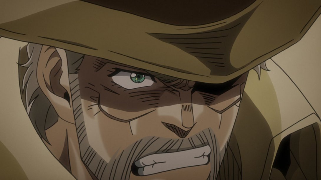
- Here, old man Joseph is looking real nice with his new thicker lines:
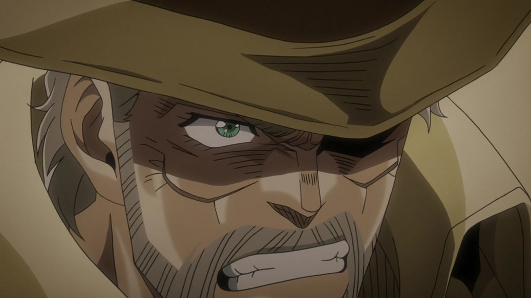
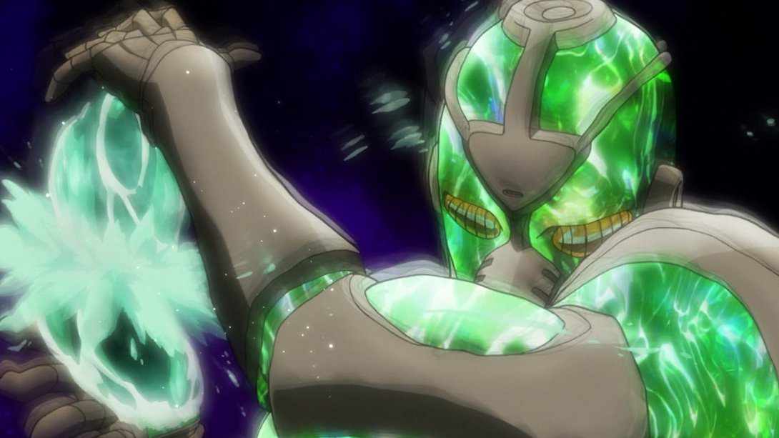
- This animation is slightly sharper and the two final frames are also brighter:

- This scene has better contrast…:
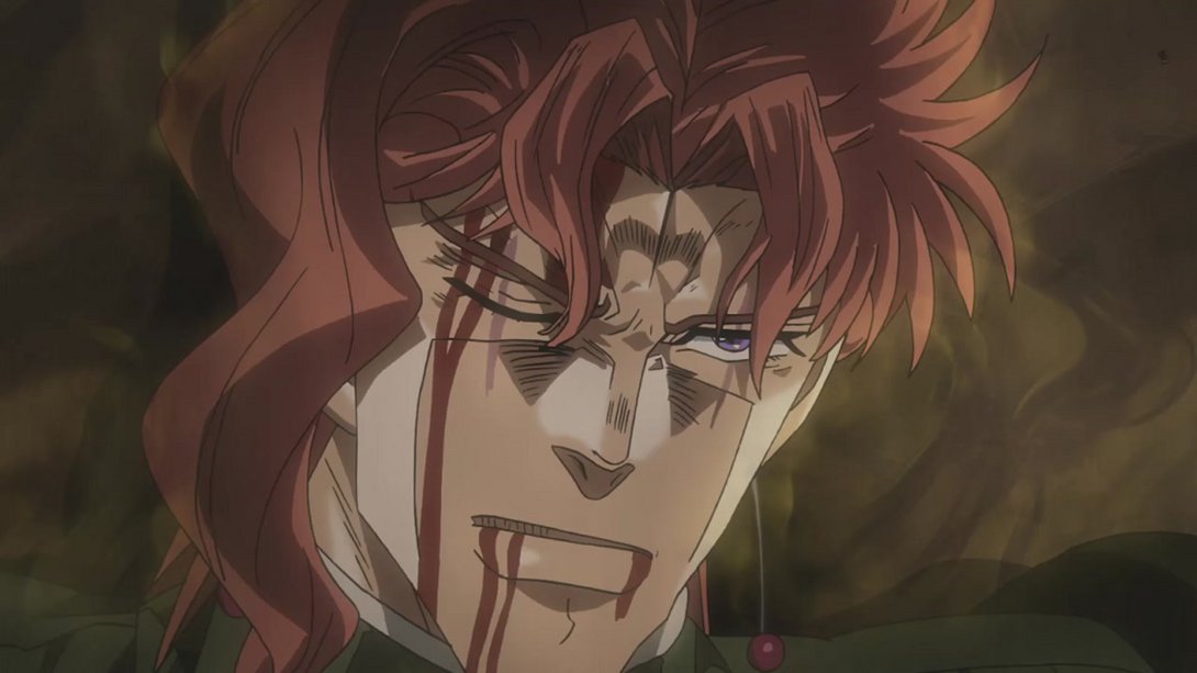
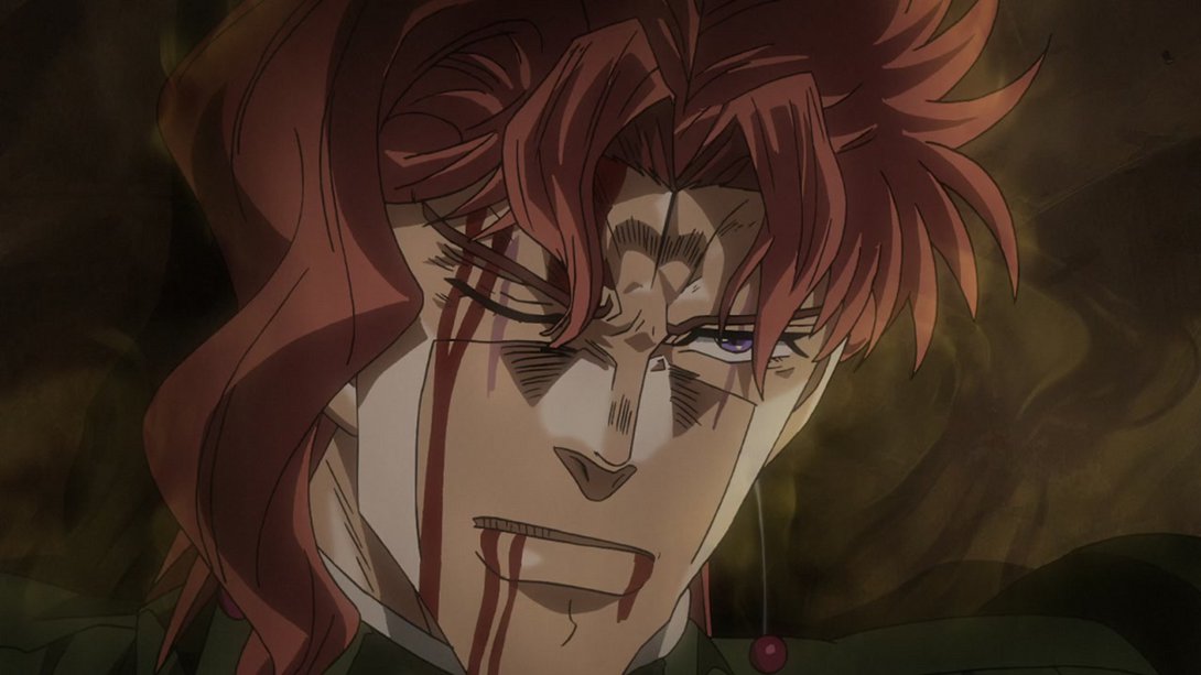
- …and this animation has the same changes as the similar one from before:
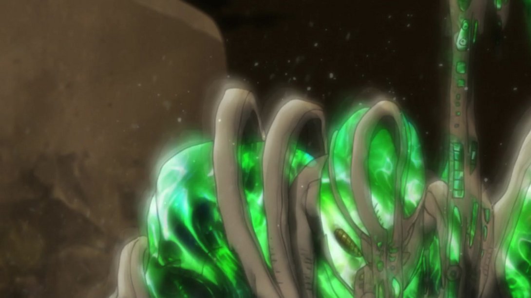

- Ouch:
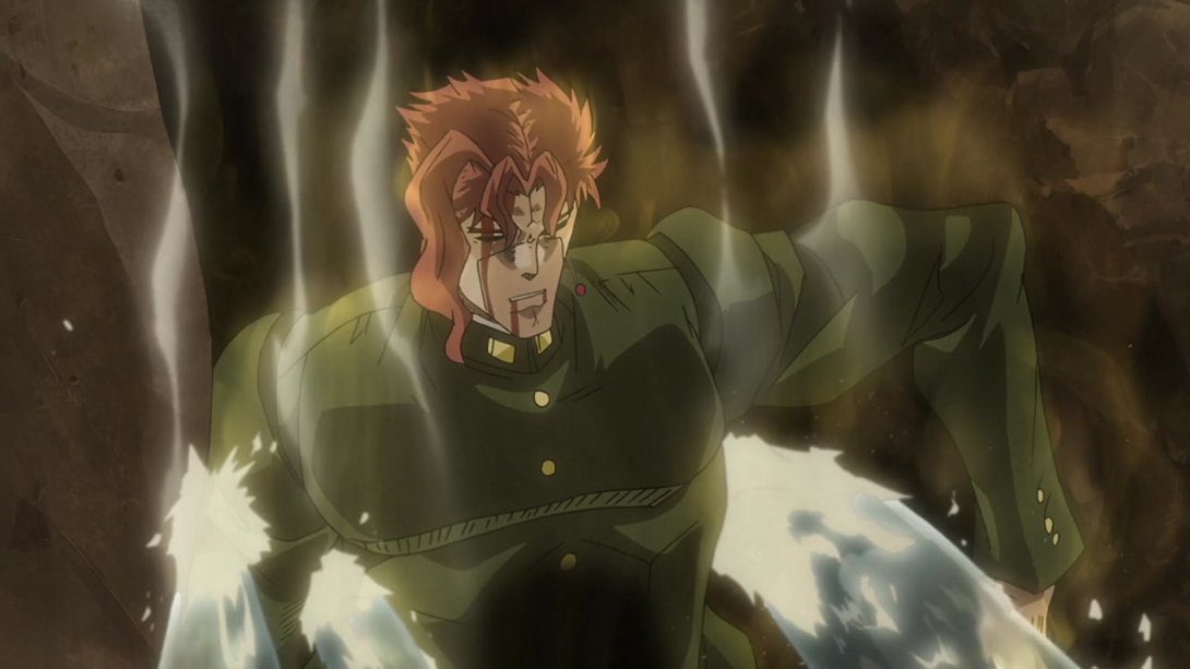
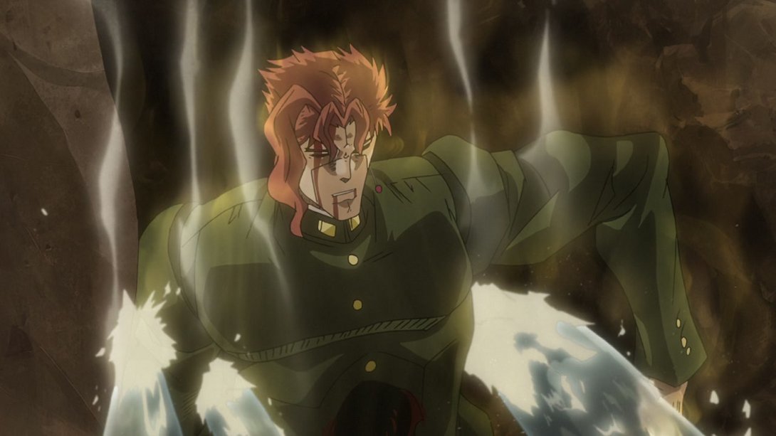
- Here we have another bunch of differences: one of the smoke layers has been moved and there’s a new smoke effect later on; in addition, there’s a new distortion along the edges, and the background also has a slightly different shading:
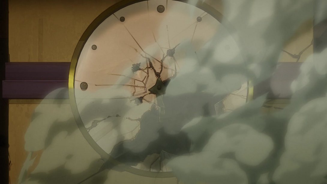
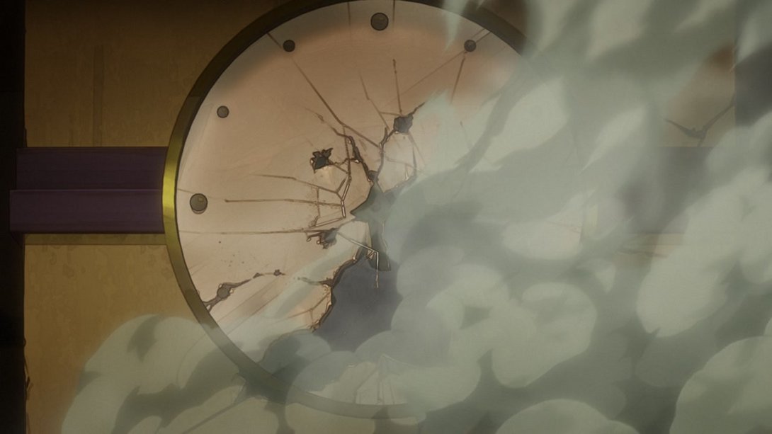
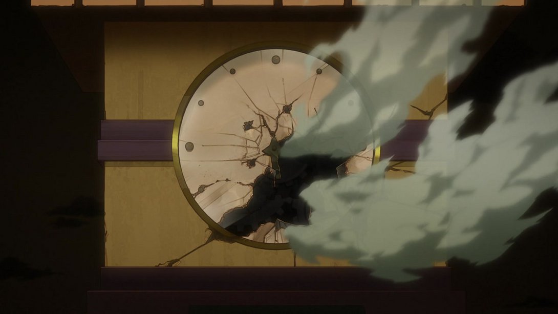
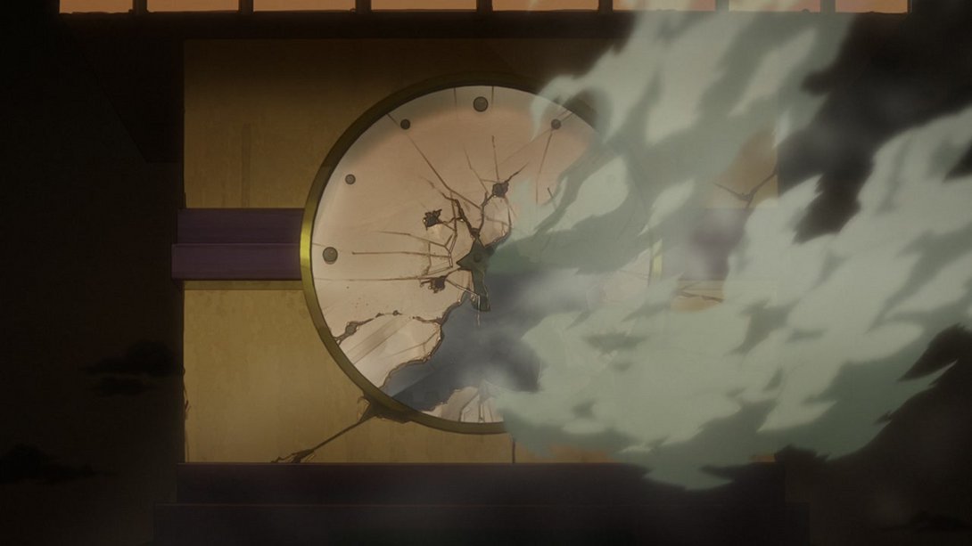
- On top of the usual distortion, we have a slightly darker background in this shot. In addition to that, Kakyoin’s aura has been slightly retouched, the pattern on Hierophant Green is slightly different and the soul dust is much more subtle:
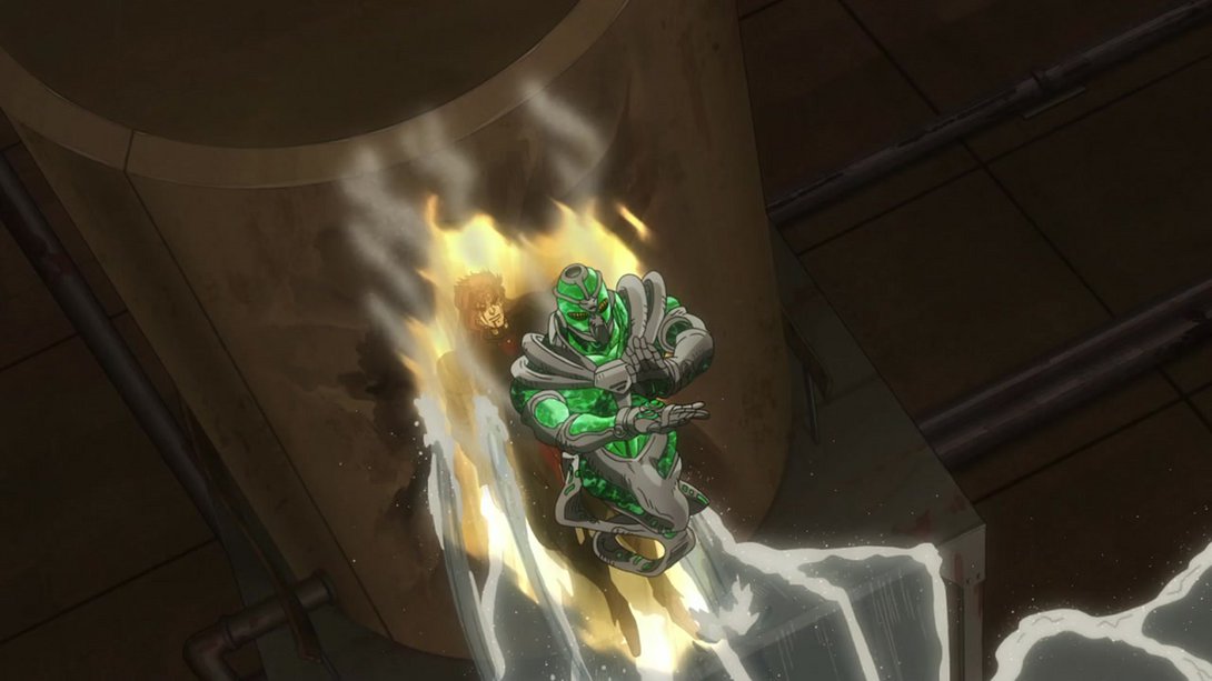
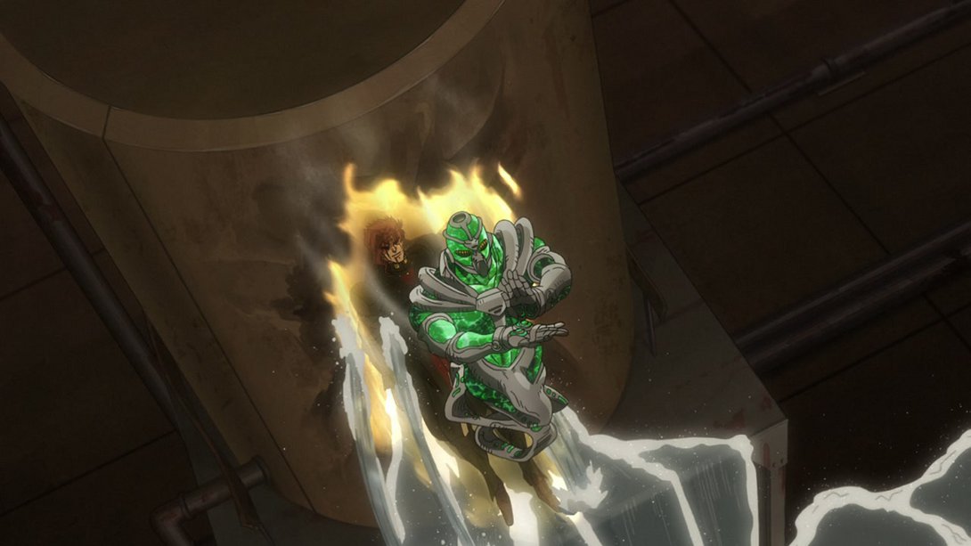
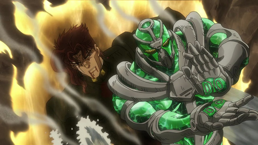
- Here we have a bunch of small differences; honestly I think it’s easier if you look for yourselves:
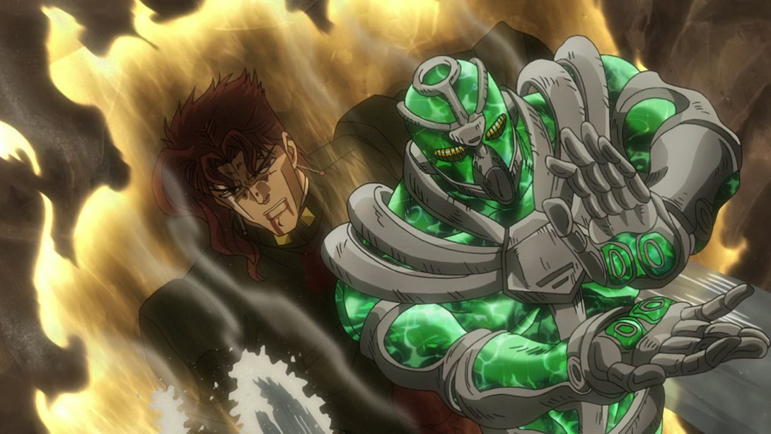
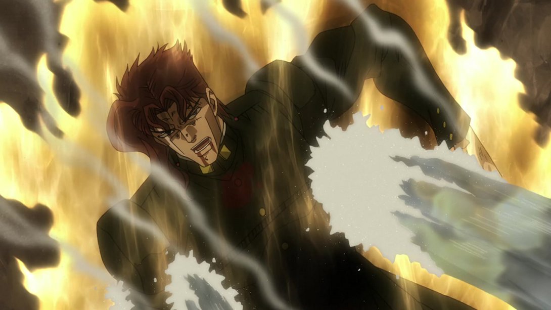
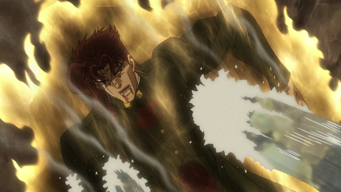
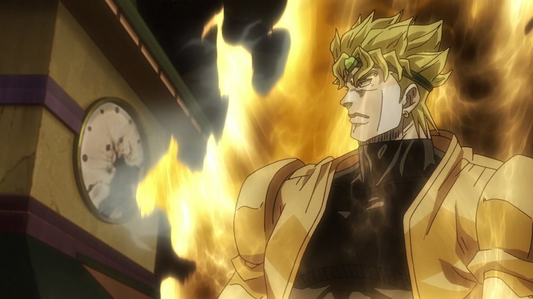
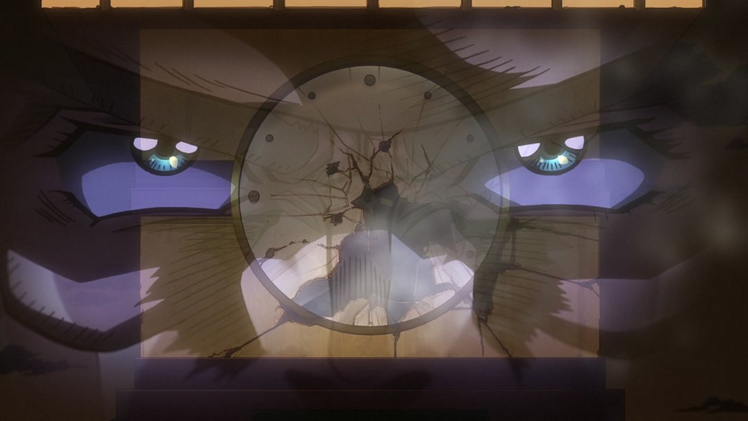
- Here, Dio’s aura is significantly bigger (and the shading on Dio himself has also been tweaked), the smoke effect coming from the clock face is different, and the background itself has been moved:
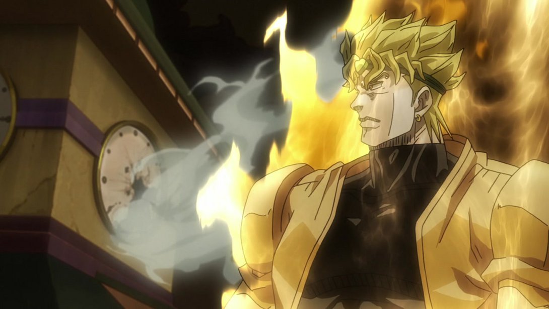
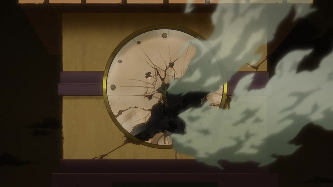
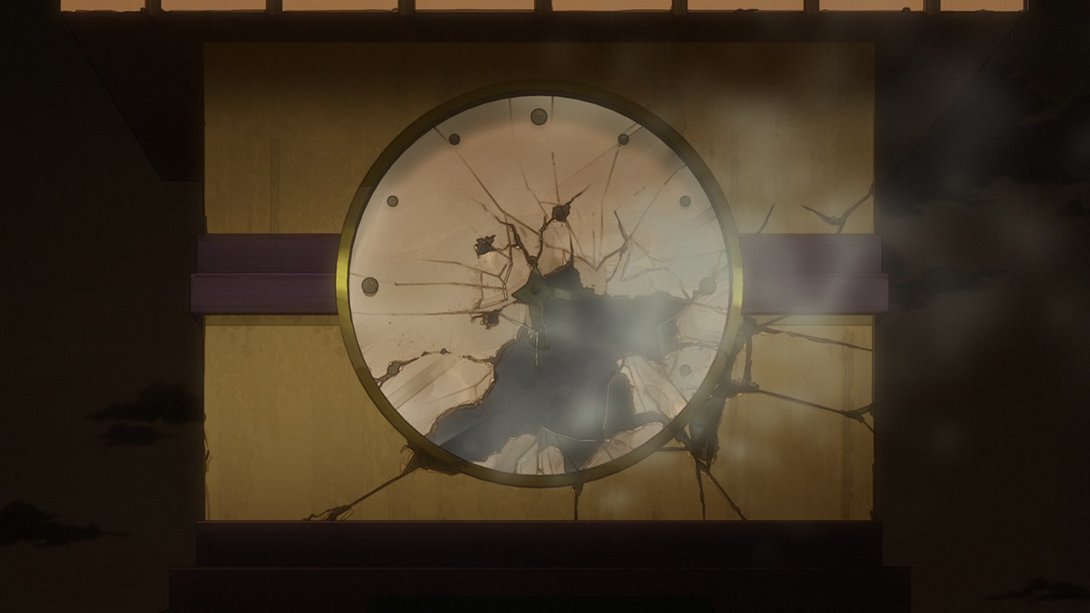
- In this scene, on top of a massively different smoke effect and some different shading on the background, Joseph has also been recoloured:
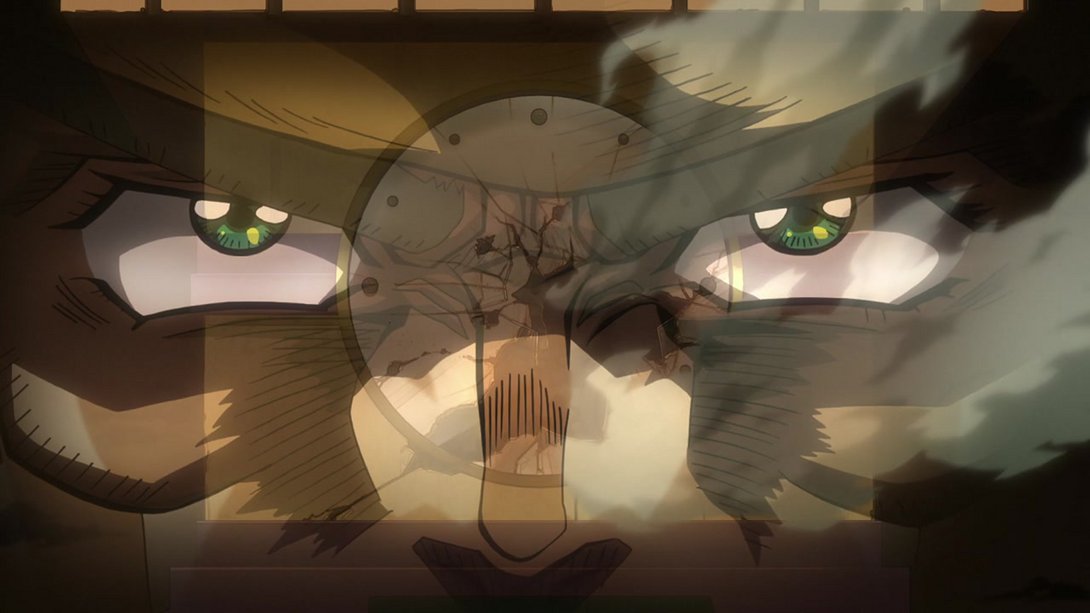
- Here we have a subtle - but nevertheless very nice - series of small tweaks to Joseph’s face…:
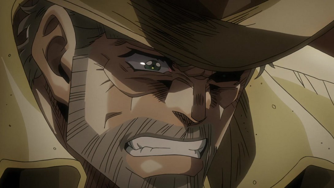
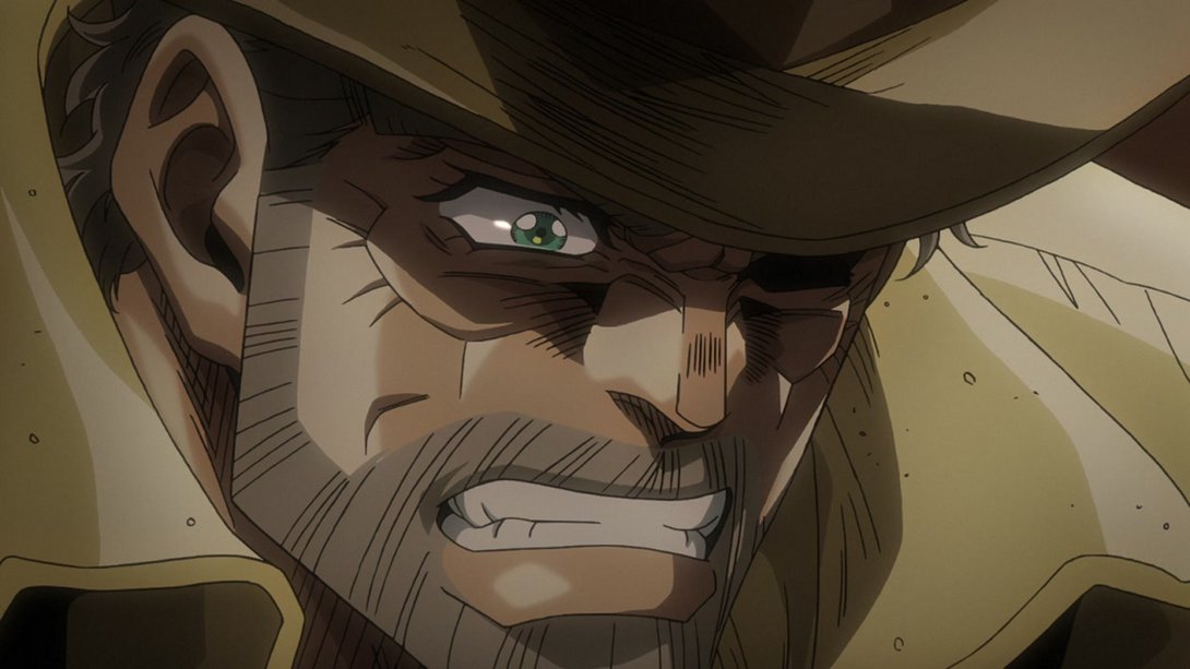
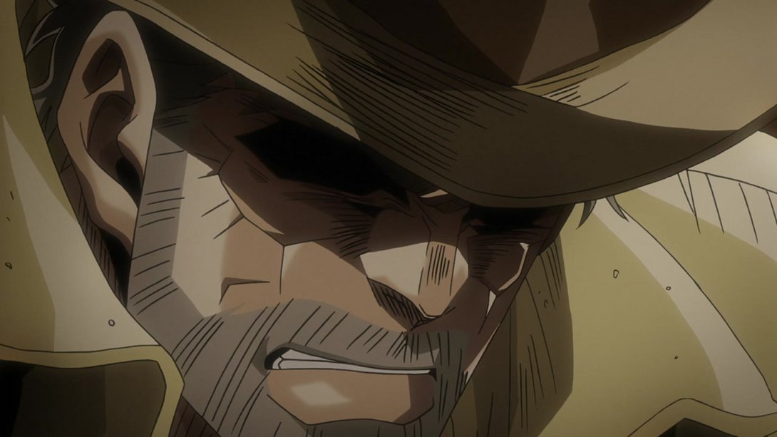
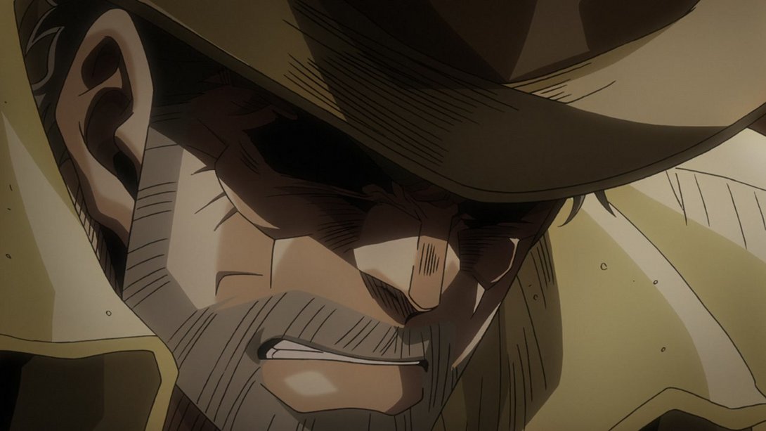
- …and the transition between the two head poses is also more gradual and better-looking in the BDs:
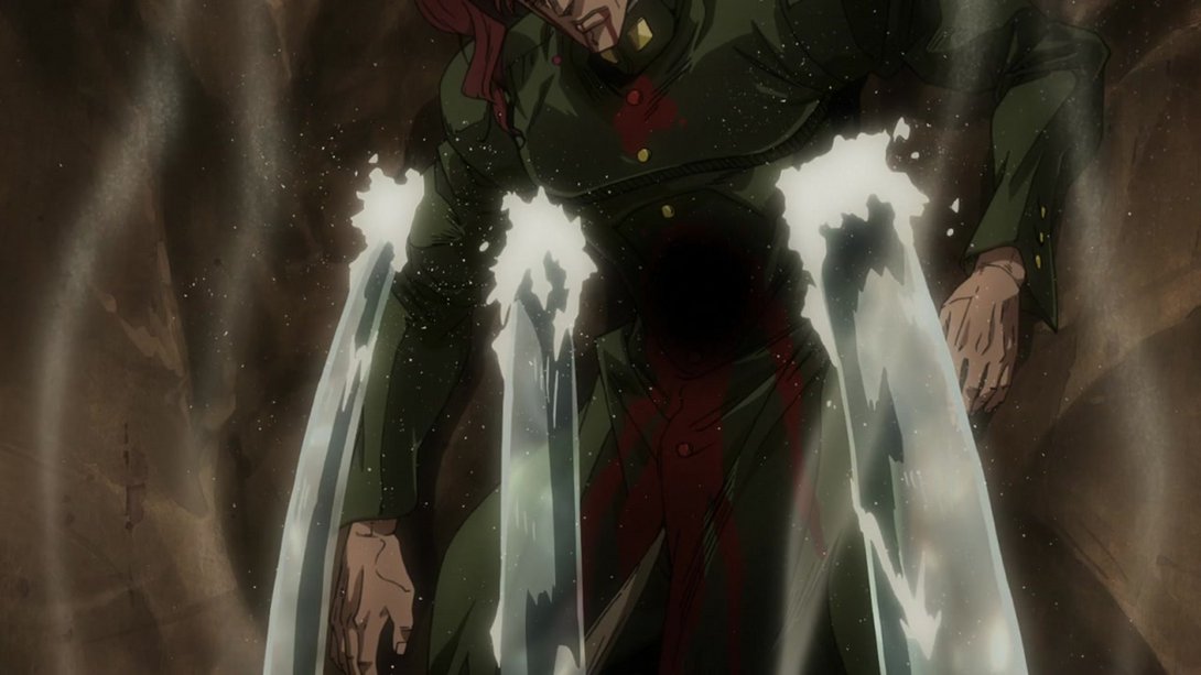
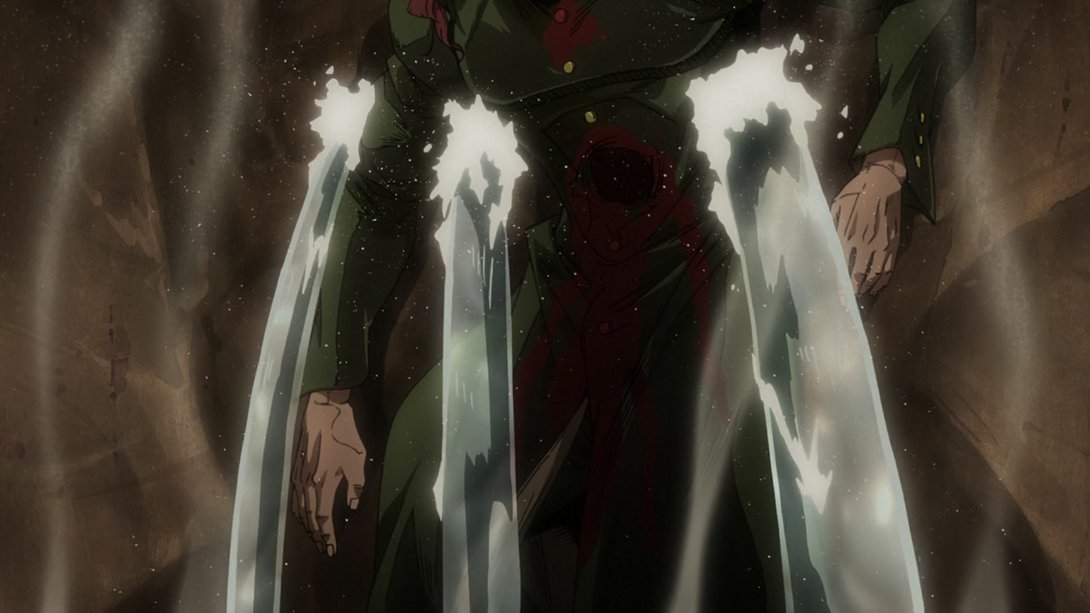
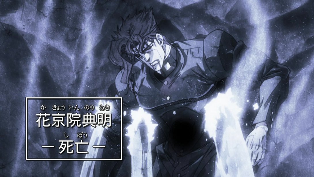
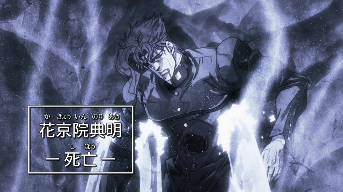
- Here, on top of the usual uncensored hole, we can see that the camera starts out lower down and slightly more zoomed-out; as a result, the pan stops some frames later in the BD version. On top of that, the BD version also has more dust floating through the air. Rest in peace, green prince:
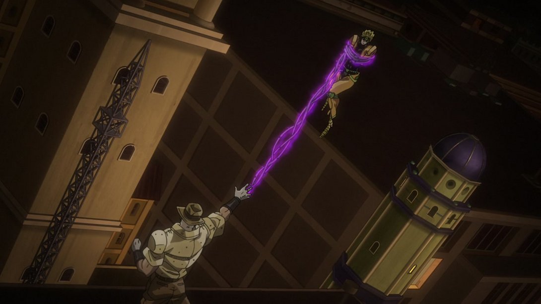
- Joseph’s vines are less neon-like, here…:

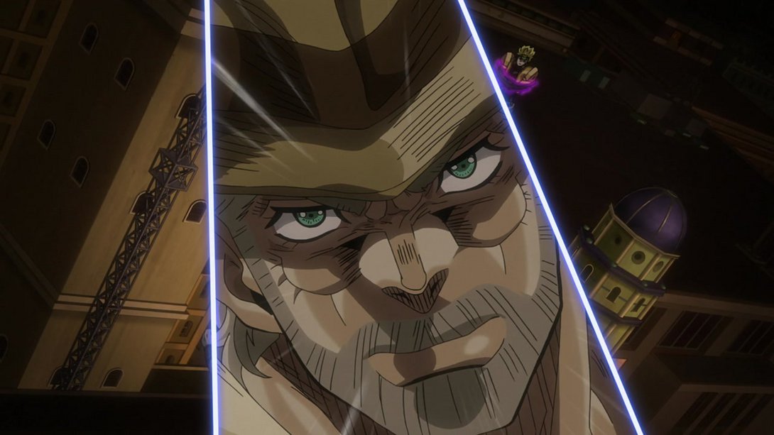
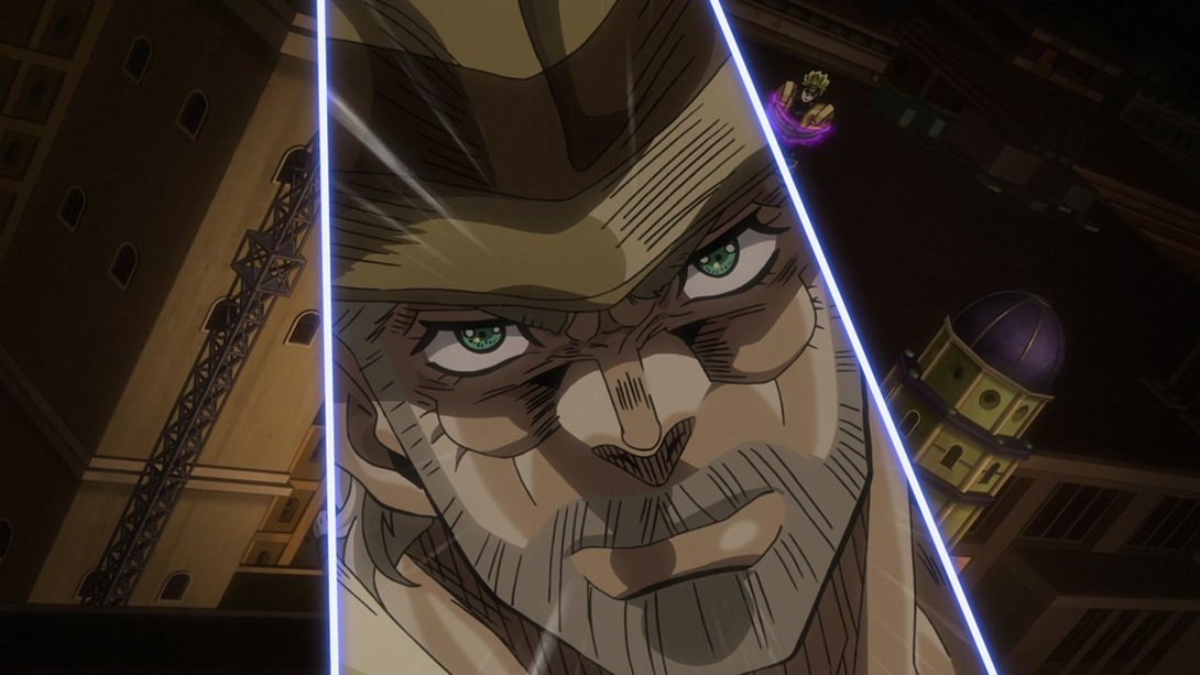
- …and, later on, most lines on his face are now thicker, and there’s a new glint in his eyes:
- Both the vines and the aura have been retouched, here…:
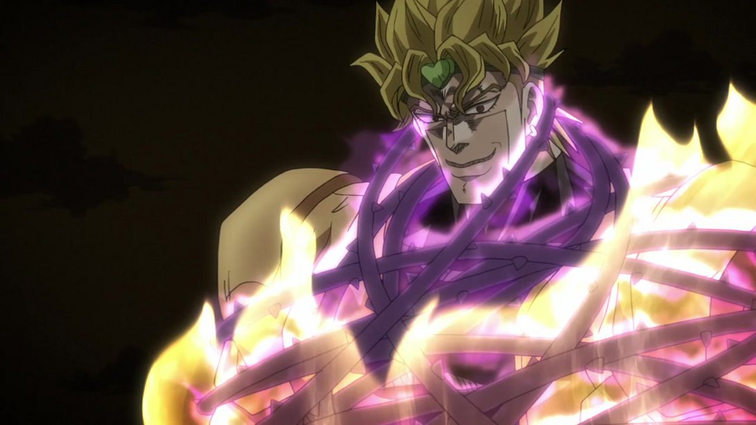
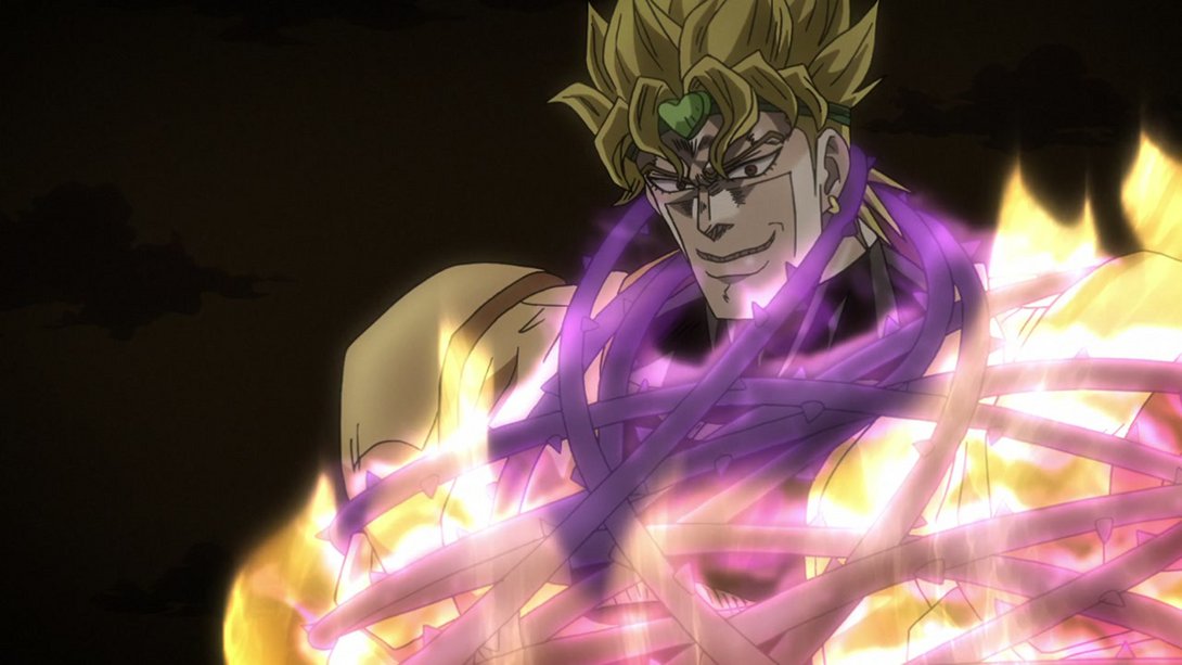
- …and here, on top of a slightly moved camera, we can see that Joseph’s face has some new effects on top:
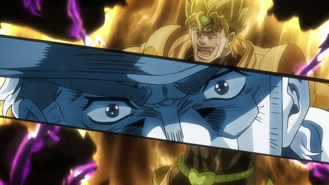
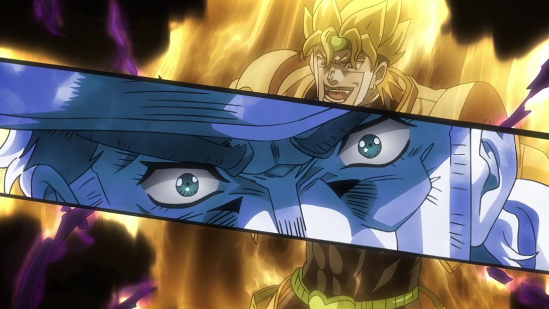
- Here, Joseph’s been shaded a little differently, and the background has a darker tint, creating more contrast with the foreground:
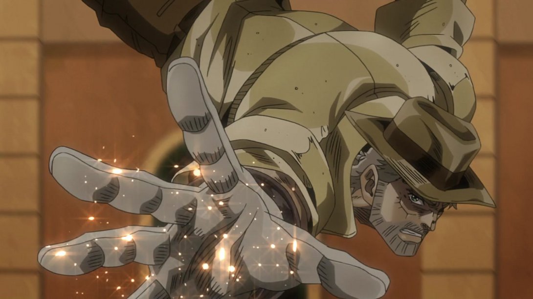
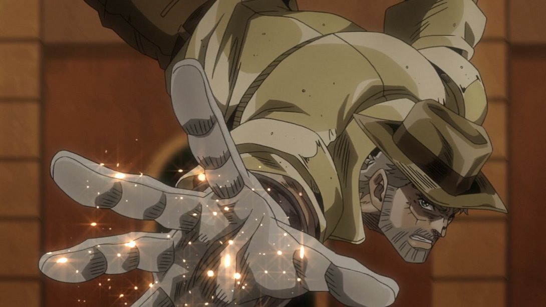
- Both Joseph’s vines and Dio’s aura have received the usual changes, here:
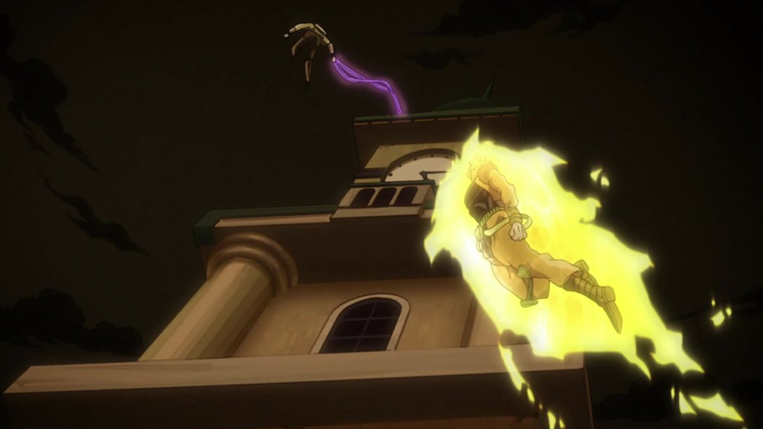
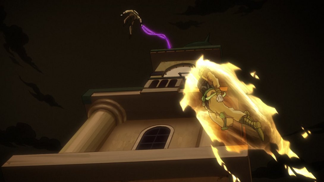
- Here, on top of the usual uncensored wound, both Kakyoin and the background have been shaded slightly differently. The water texture is also different, and the wind effects are less prominent:
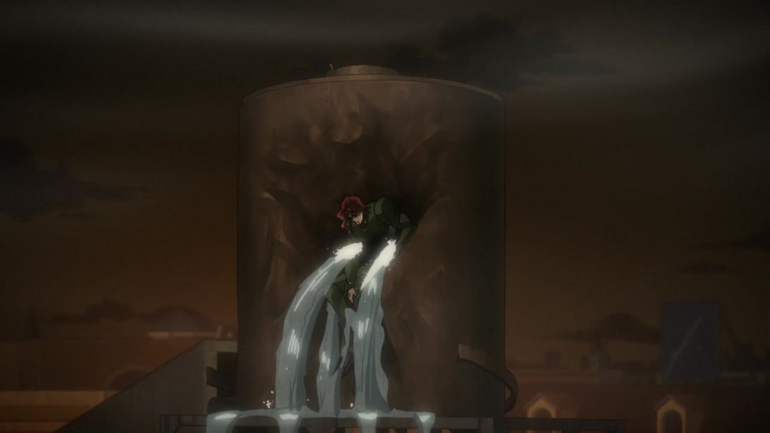
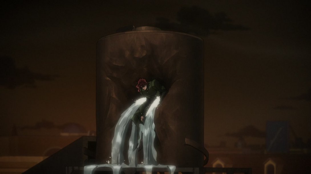
- Here, Joseph has a different expression, a darker forehead and a few thicker lines; on top of that, there’s a new distortion and the first layer in the background flits by slightly differently (this is particularly noticeable at the end of the animation, where in the TV version said layer appeared to be stuck):
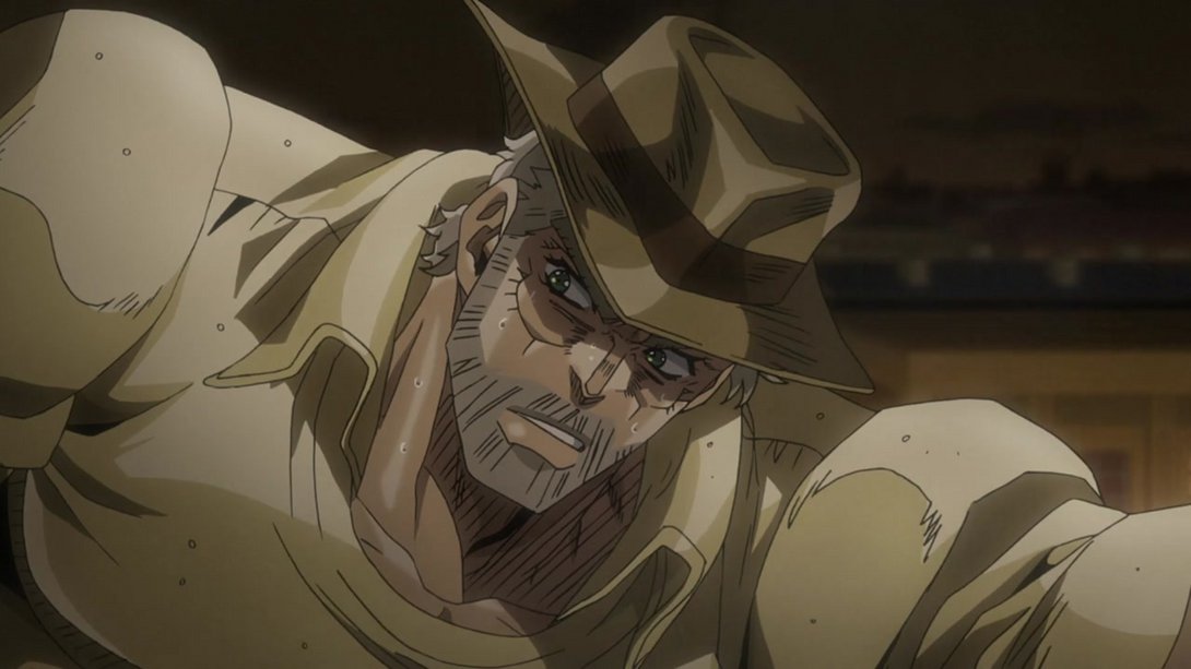
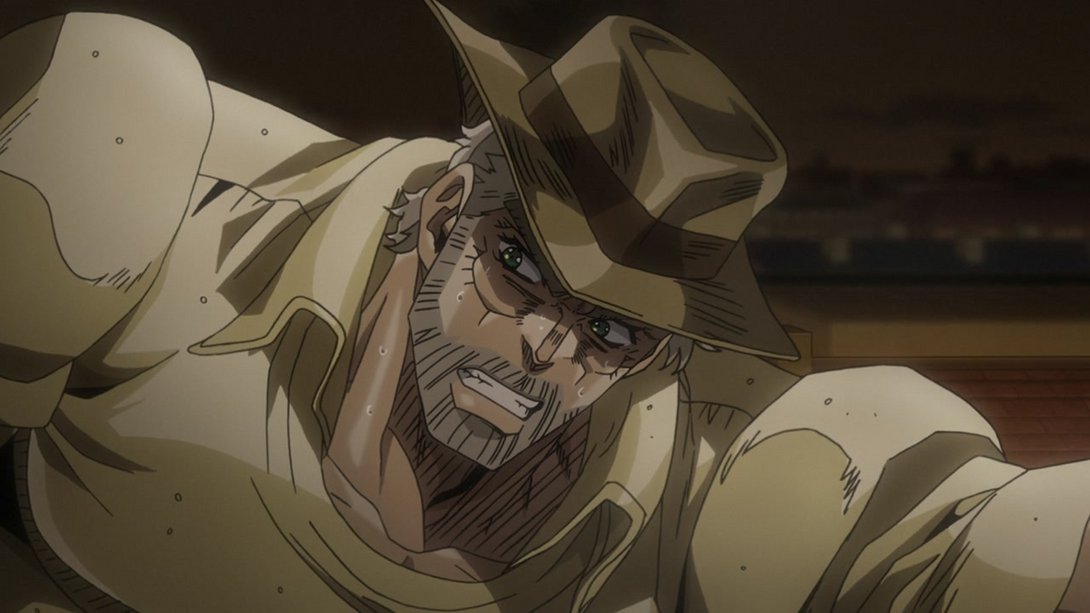
- In this still-frame flashback, all the Hierophant Green diamonds and trails are looking better, there’s more debris and smoke coming out of the clock face and a significant motion blur has been applied to the smoke that was already there:
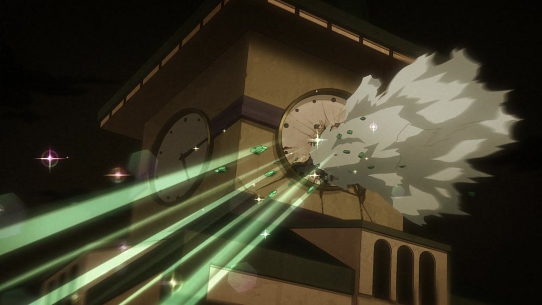
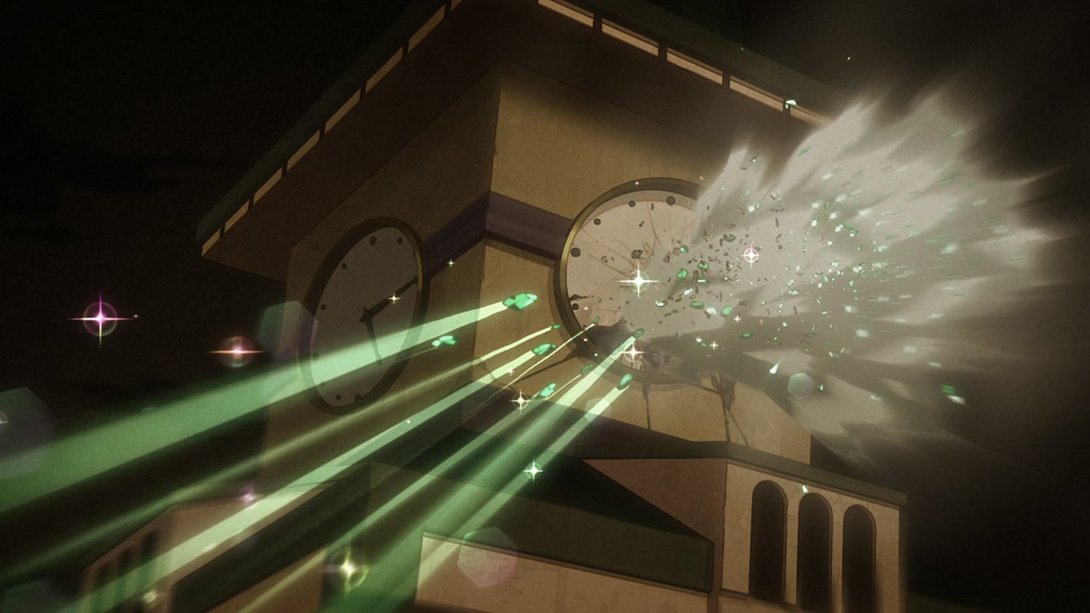
- On top of the changes that already applied to the scene referenced in the flashback, Joseph’s face has also been moved a little more to the left, here:
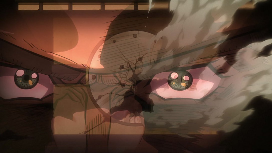
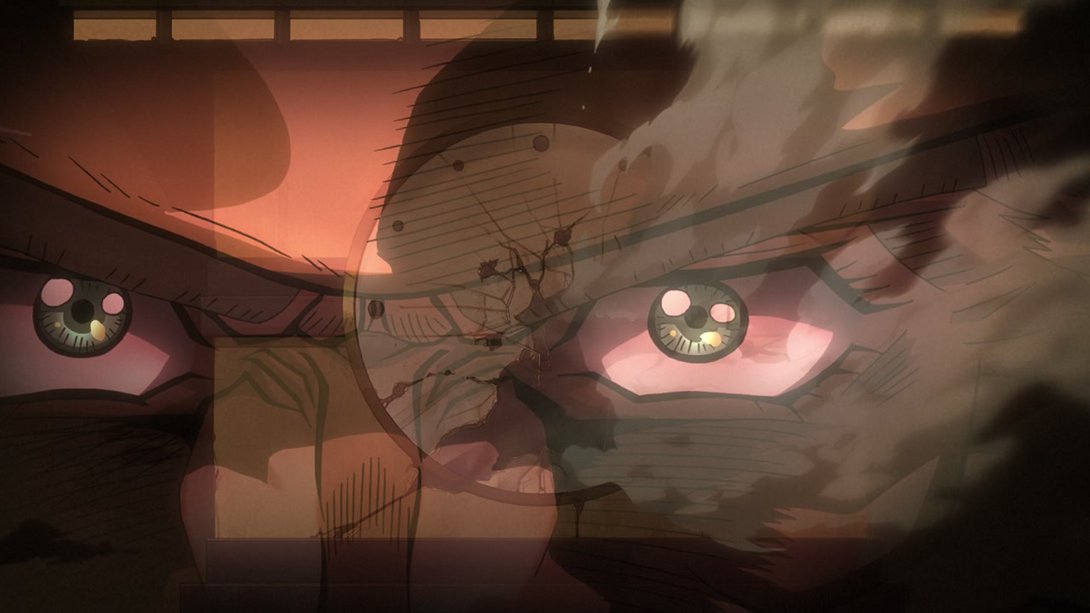
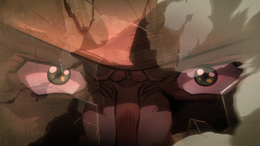
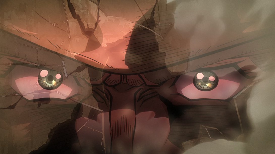
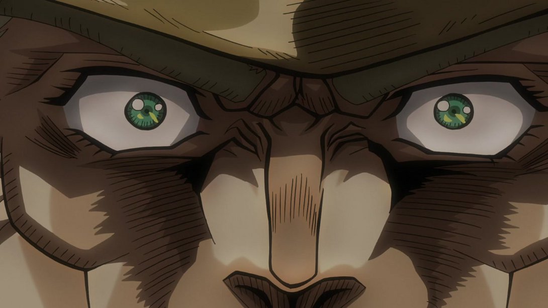
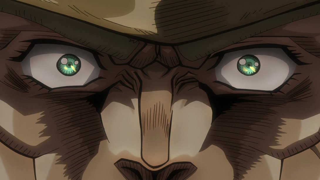
- Here, on top the usual different aura, Dio has also been drawn with thicker lines, and the camera moves around slightly differently:
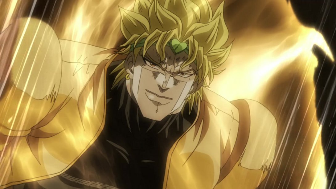
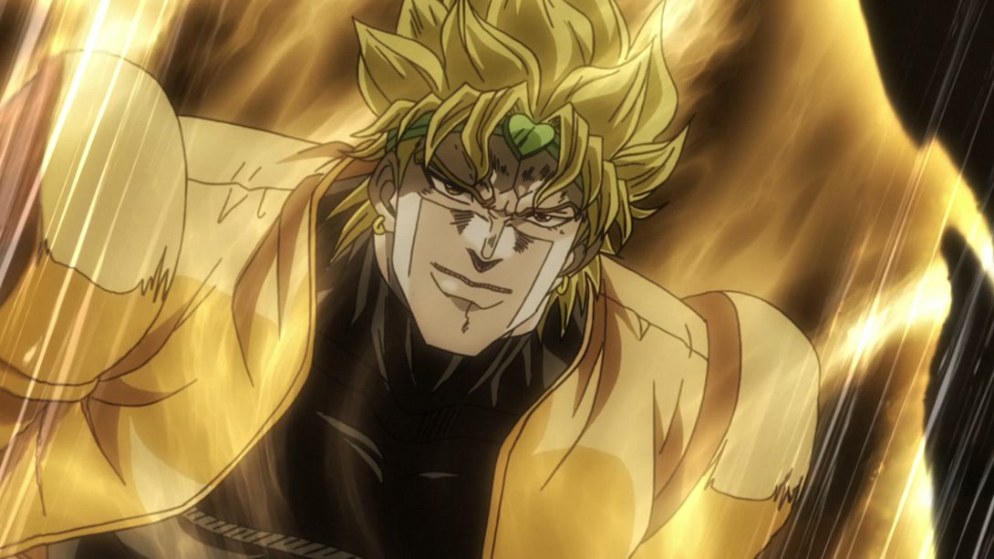
- Thicker Dio makes a comeback here as well:
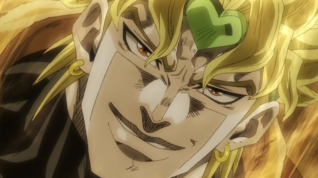
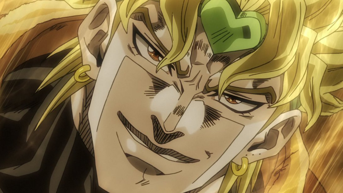
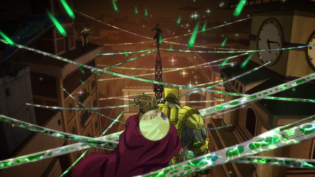
- When we finally get to see The World in action, we can see that the outline of the time stop bubble are not as sharp…:

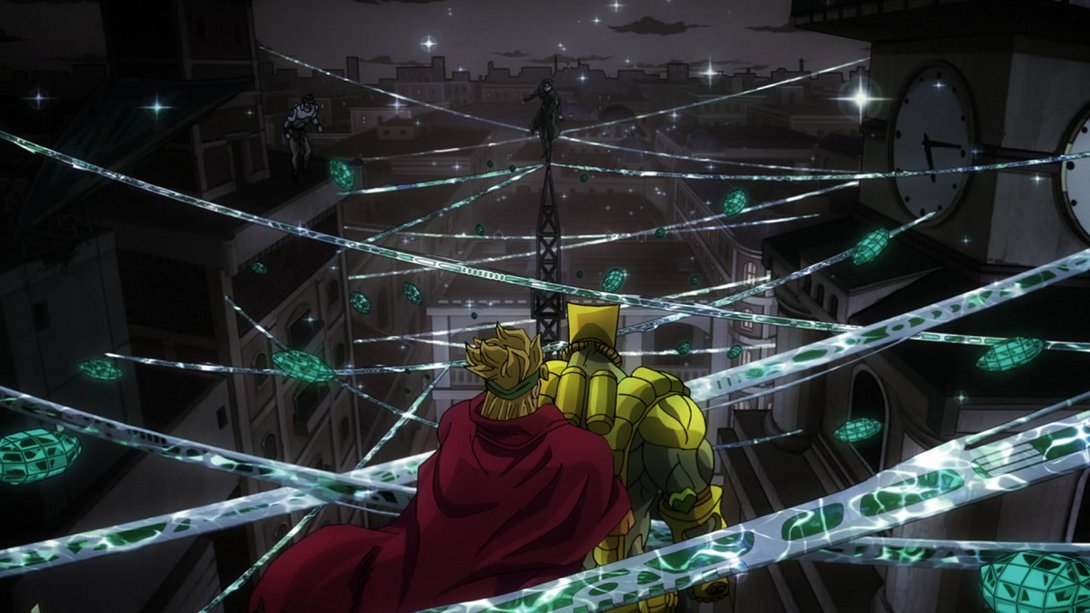
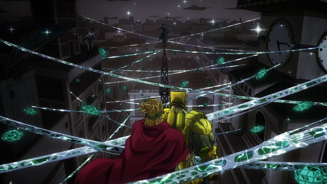
- …and, later on, we see that one of the Hierophant Green crystals on the left is now significantly smaller:
- Here, on top of the usual distortion, Hierophant Green’s crystals are dimmer and The World’s been retouched…:
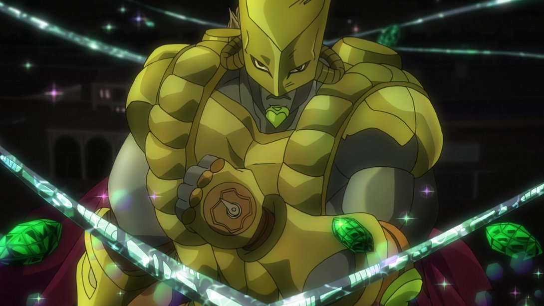
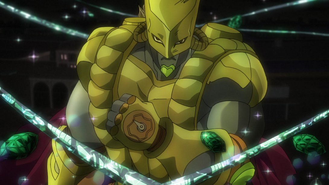
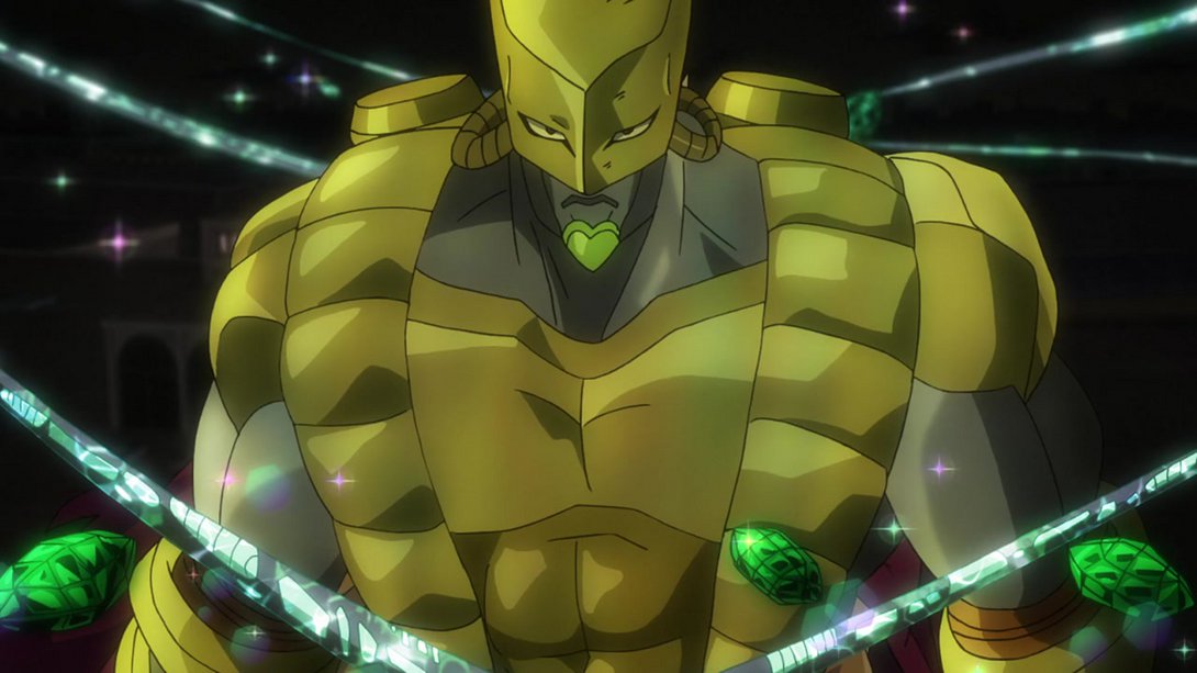
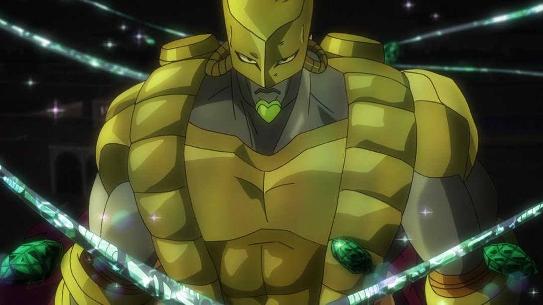
- …on top of that, Dio’s face has also been redrawn, later on…:
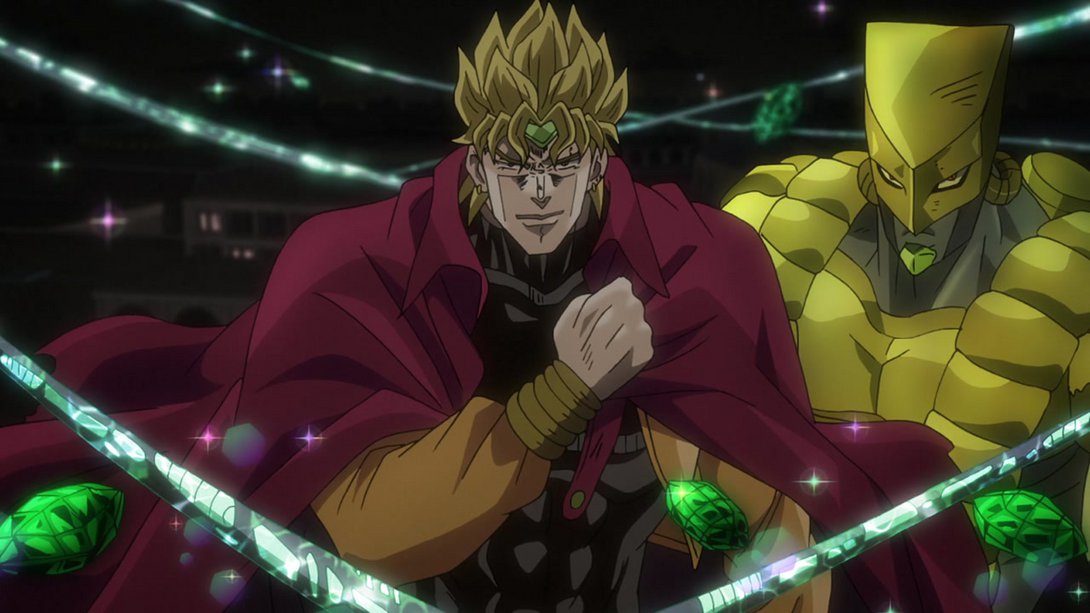
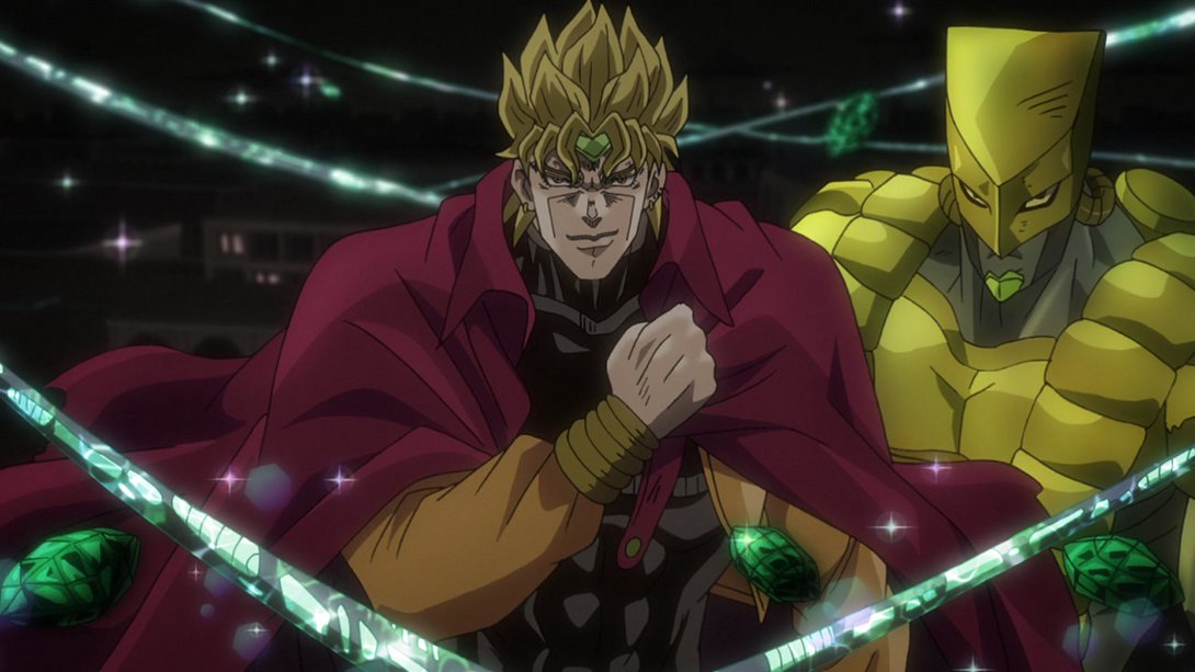
- …and this particular Hierophant Green has also been recoloured:
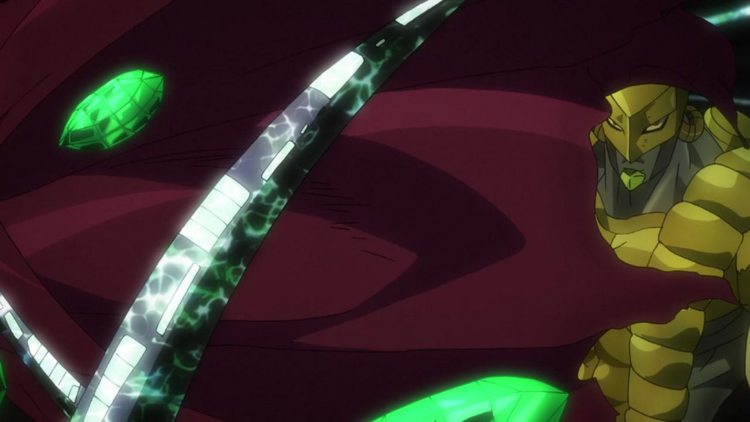
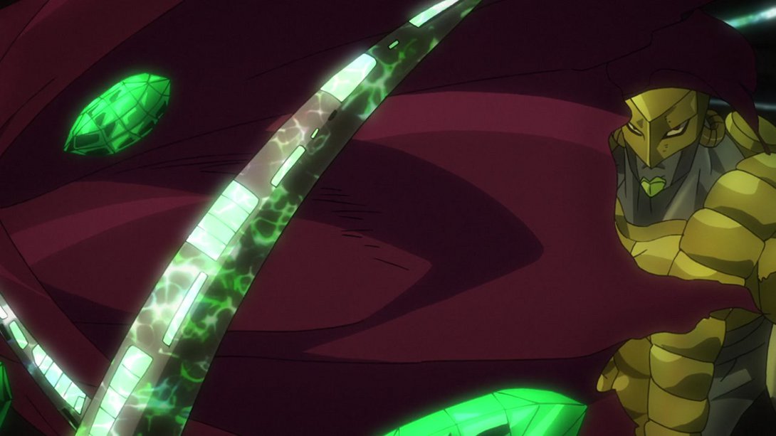
- Look at how much more smug he looks:
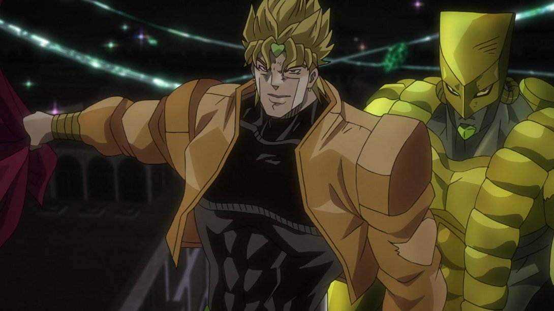
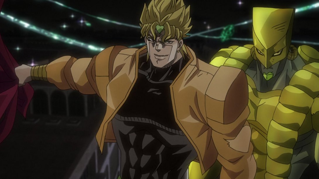
- Back to the previous shot, we can now see that The World’s slashing effects now have slightly blurrier outlines:
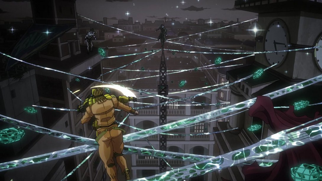

- Here, both Dio and The World have been re-shaded, and the debris is now significantly brighter too:
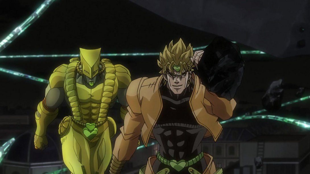
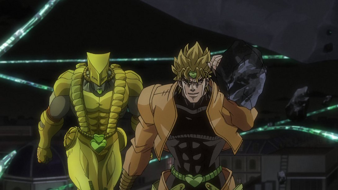
- And here, The World is SIGNIFICANTLY bigger, and its hue slowly shifts, if you pay really close attention:
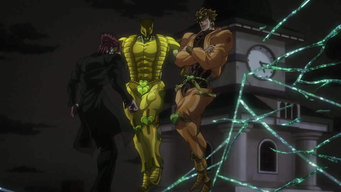
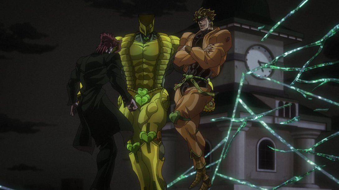
- Here, on top of the usual distortion and uncensored wound (F), the background sky is brighter, Dio and Kakyoin have been shaded a little differently, there are more blood particles in the air and The World’s right fist has also been recoloured:
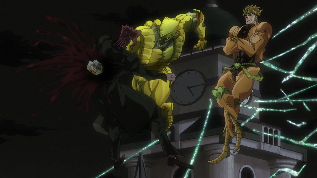
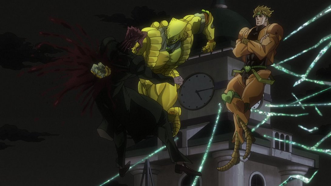
- Kakyoin is now correctly bloody here, and The World’s hue is shifting a little faster in the BD:
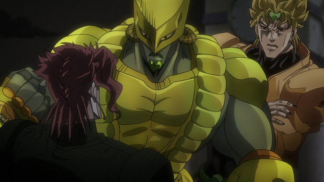
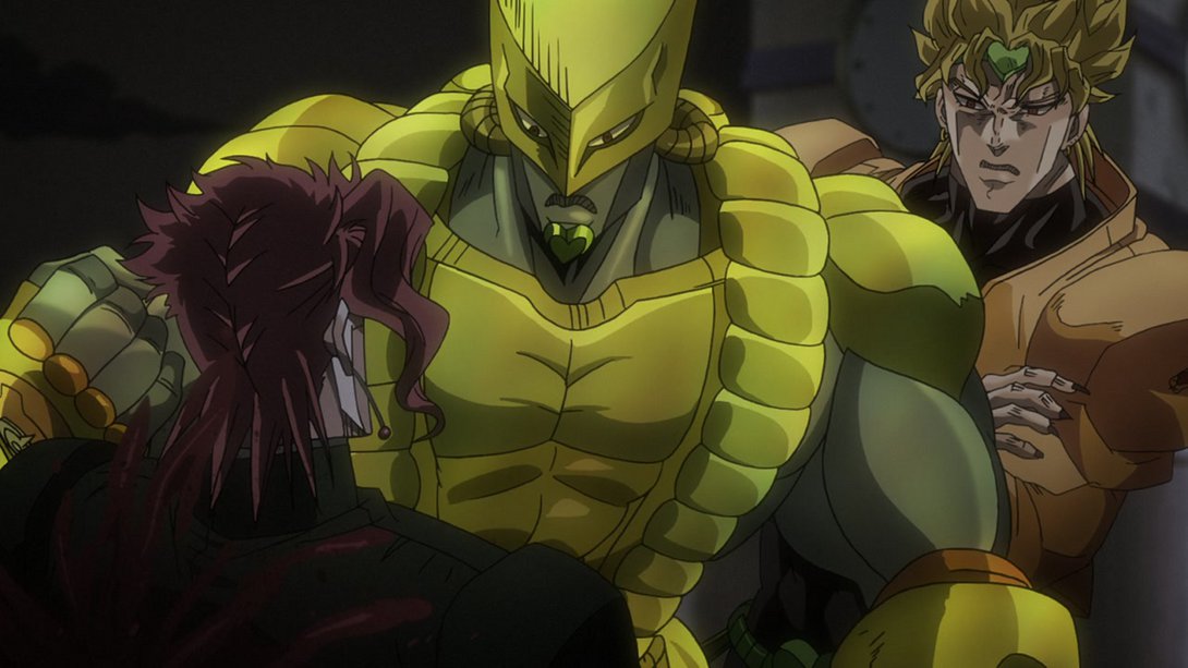
- As usual, our poor boy is now bleeding a little more:
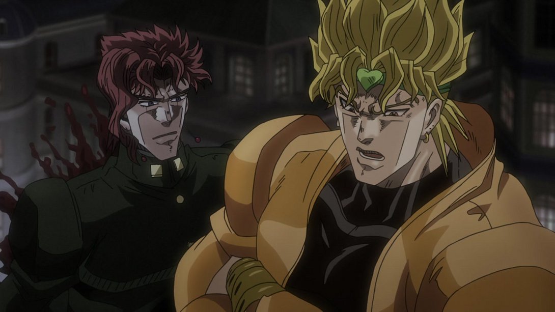

- And, later on, on top of Dio also being shaded a little differently…:

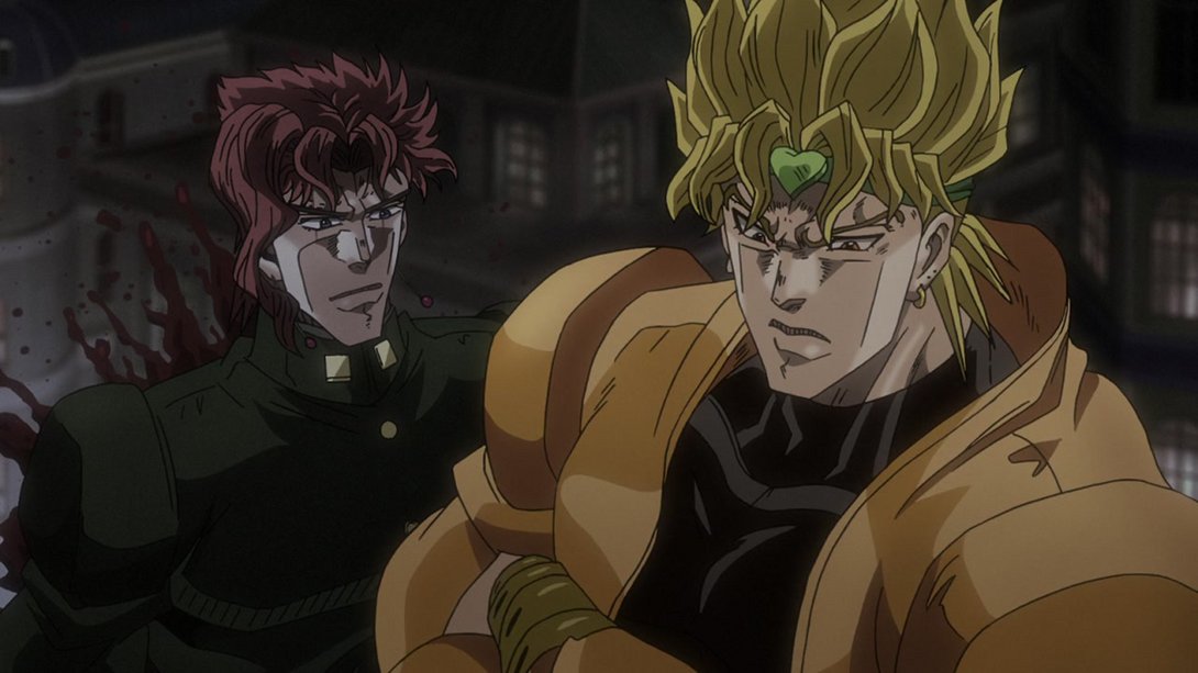
- …he now moves a little bit more before kicking Kakyoin:
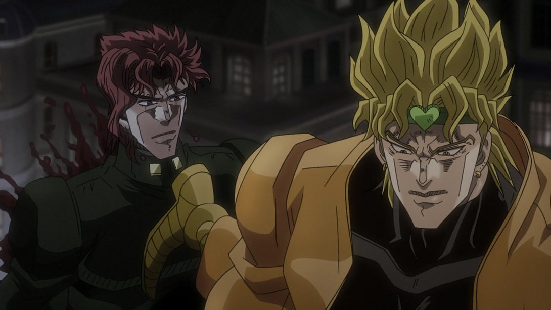
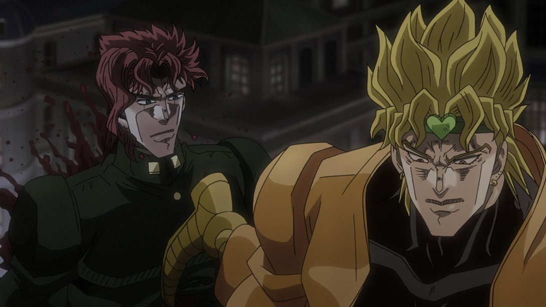
- Here, on top of Dio having a brighter aura, the background… is no longer just a black silhouette! Fantastic:
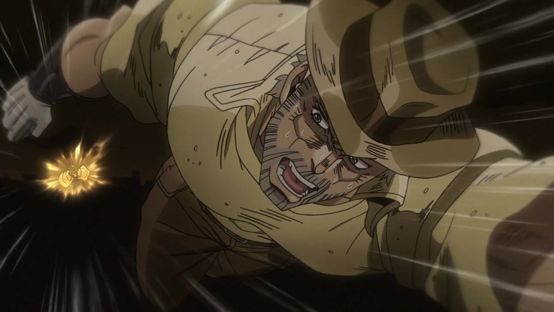
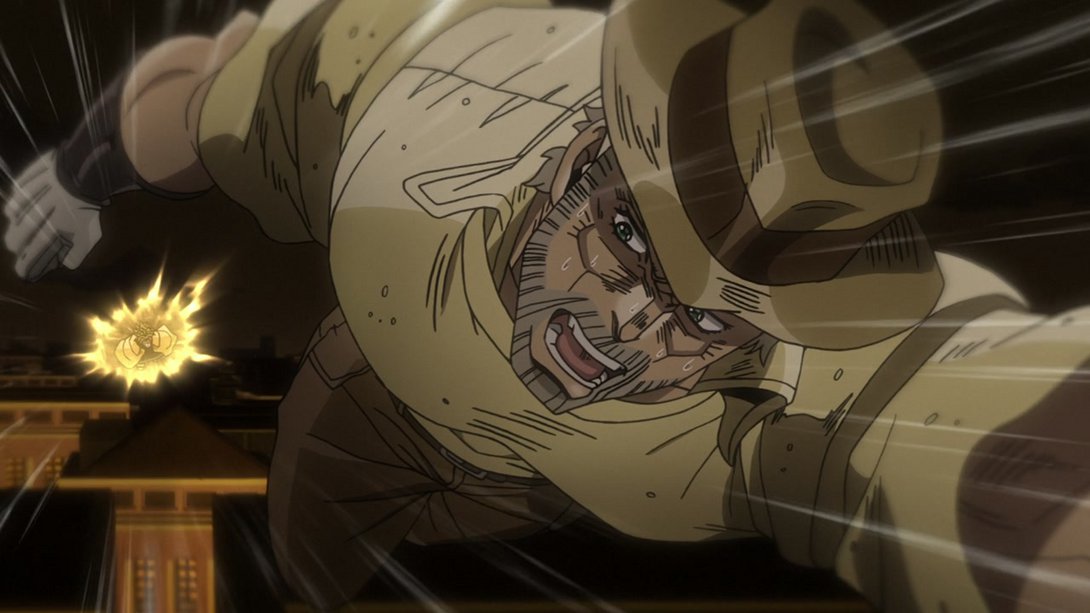
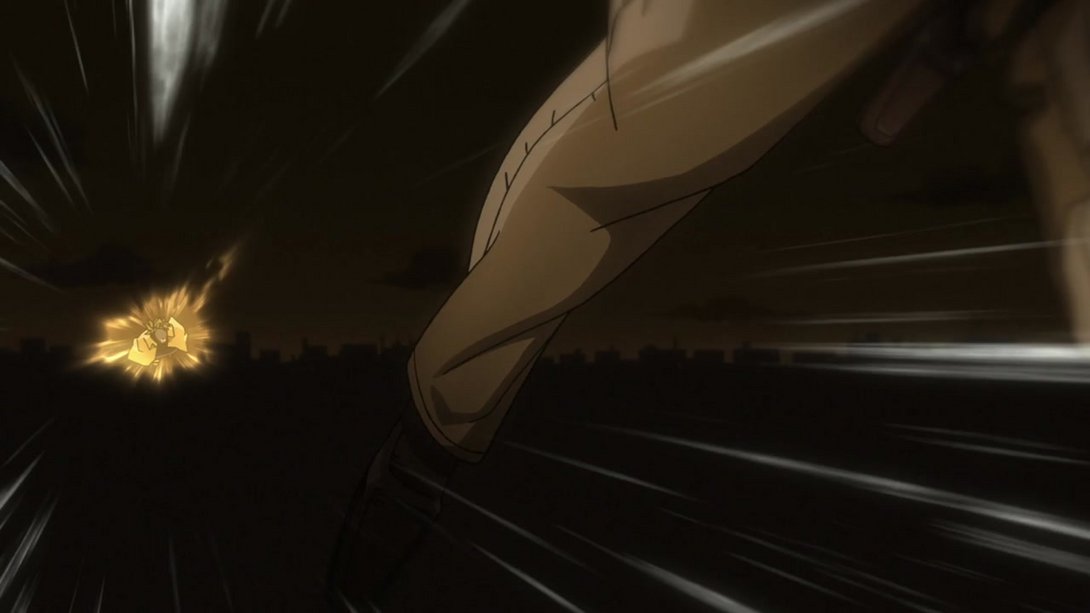
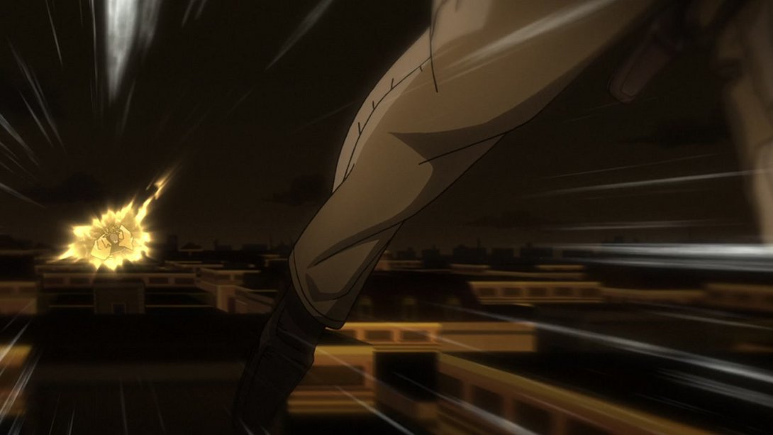
- Here, on top of the usual less neon-like vines, Joseph no longer stands still in the middle of the screen, and Kakyoin’s left shoulder tire-thing has been recoloured:
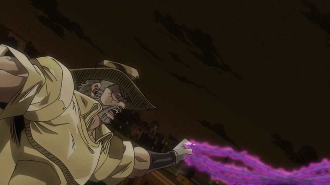
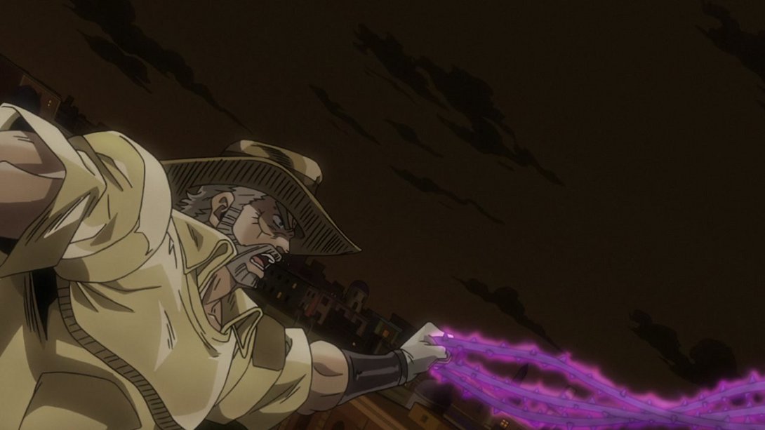
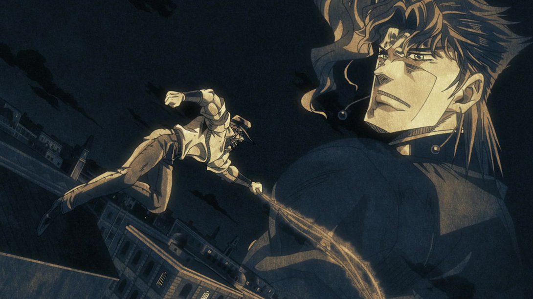
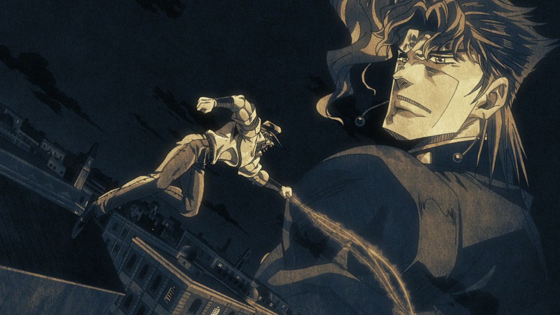
- Here, Dio has been retouched a whole bunch…:
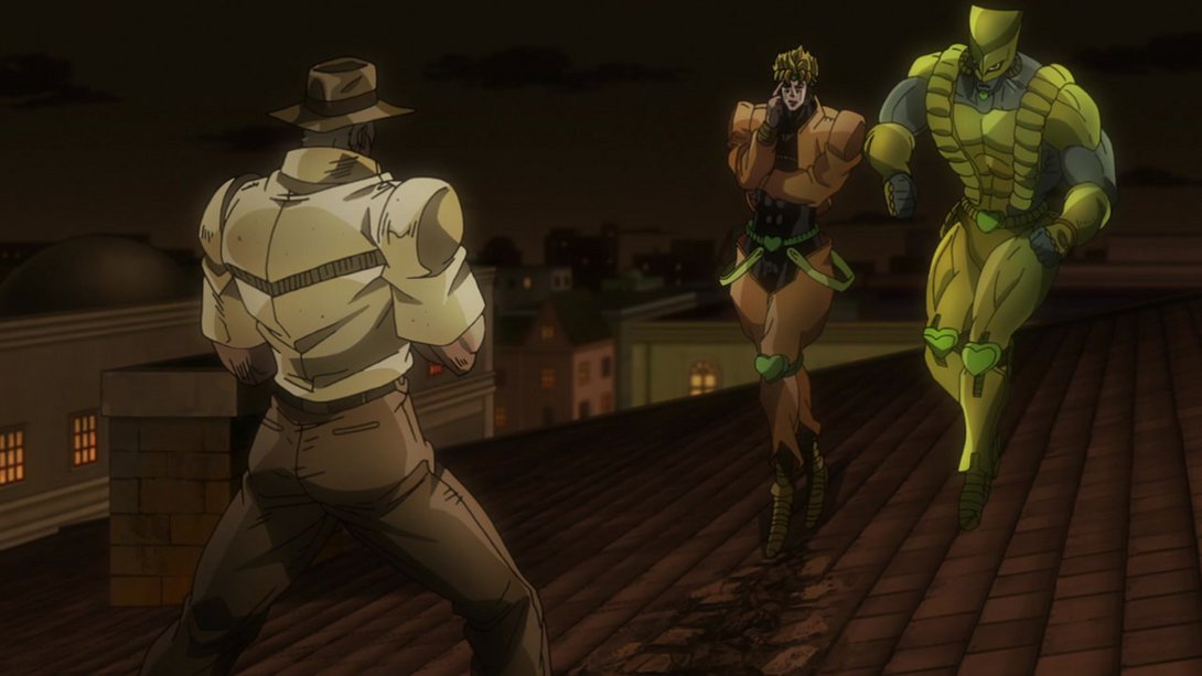

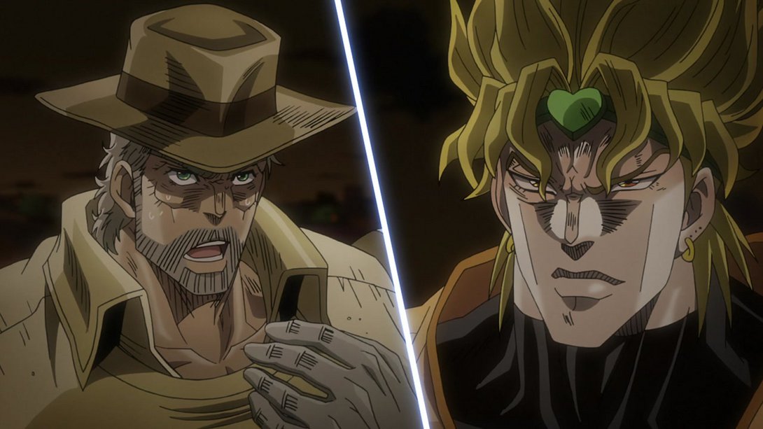
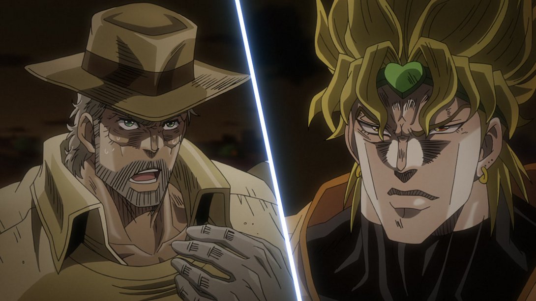
- …as has been Joseph, here! On top of that, both him and Dio have also been reshaded, and the dividing line is slightly brighter as well:
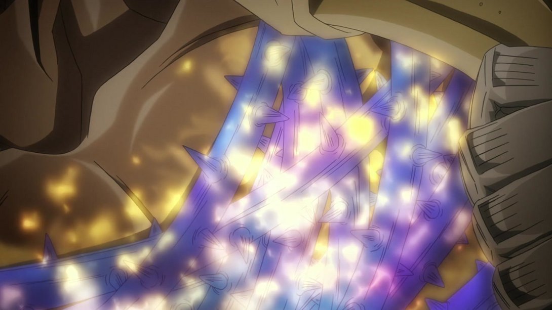
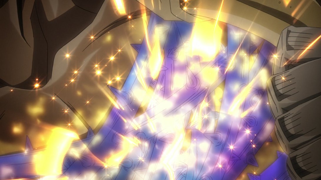
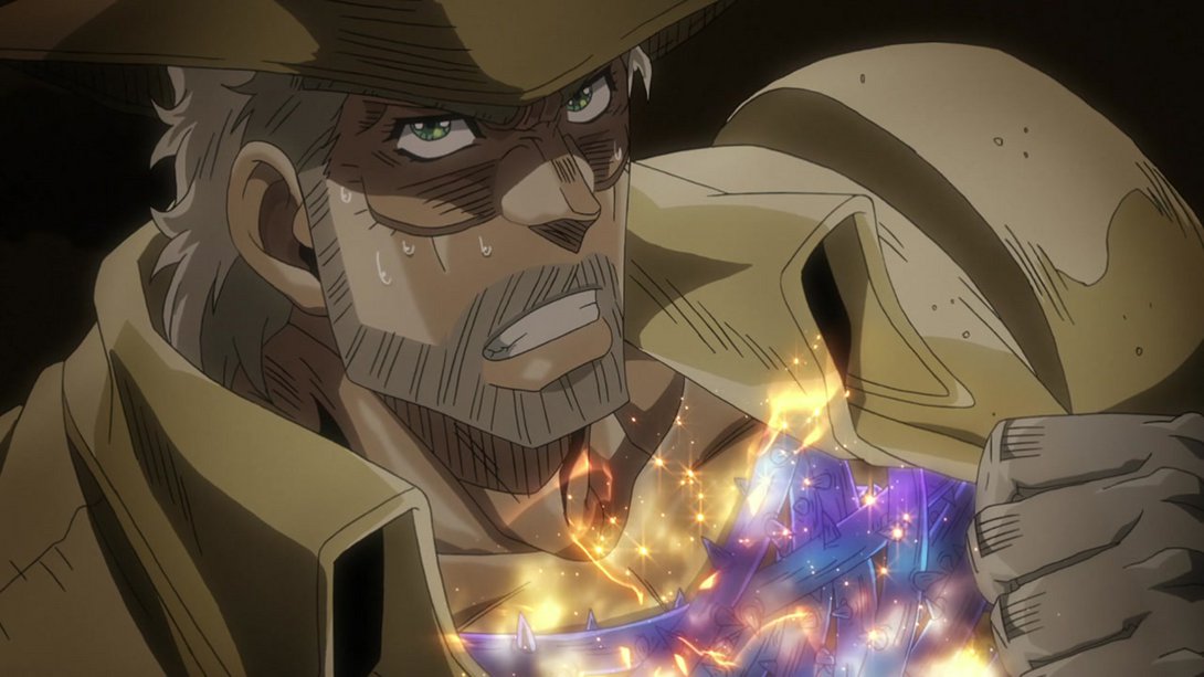
- Here, Joseph’s vines sparkle with hamon at the beginning of the animation, while at the end they just sparkle… brighter:
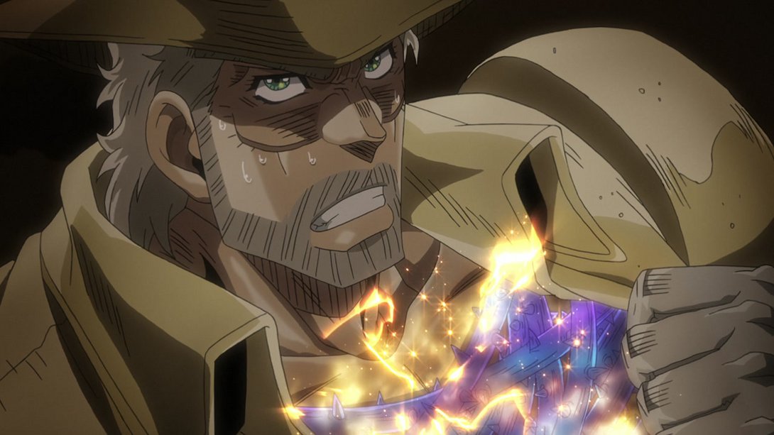
- This scene has more debris flying around, and the pieces of rock that were already there have been moved around as well:
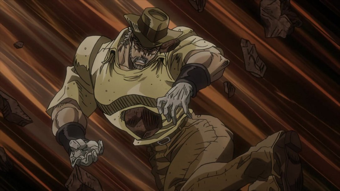
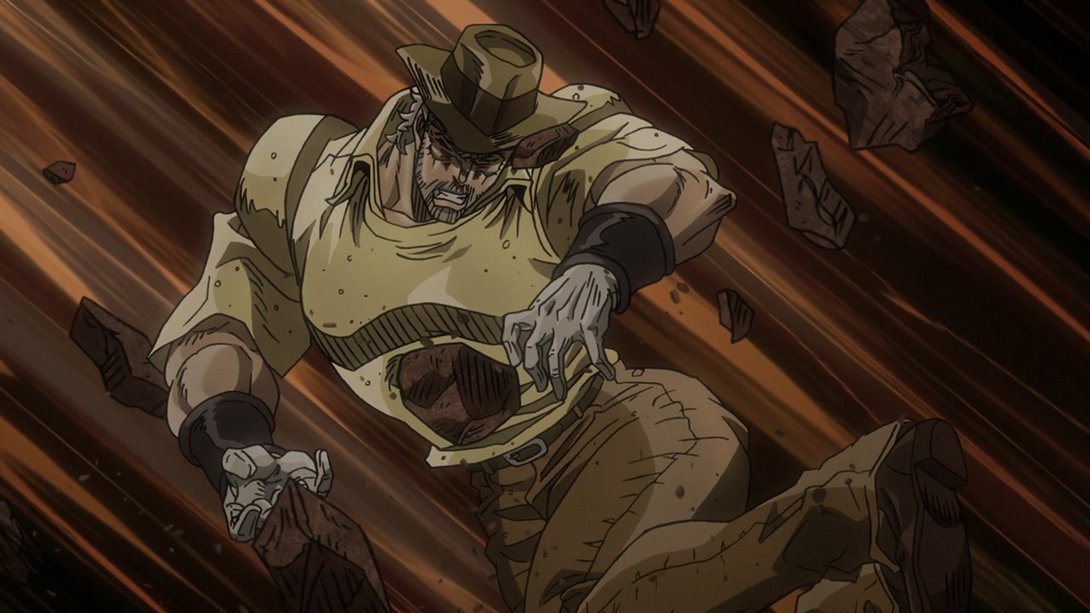
- This shot has been completely redrawn! Let’s go! The background has also been moved down a little bit:
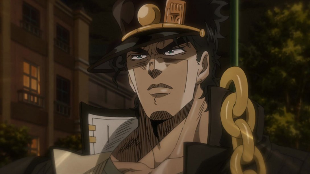
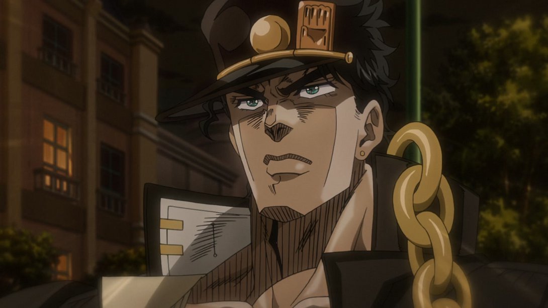
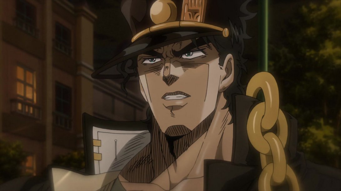
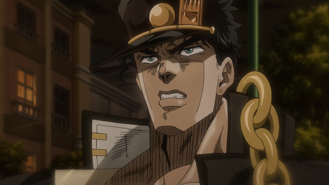
- Joseph’s hand is now bigger and more to the right, here:
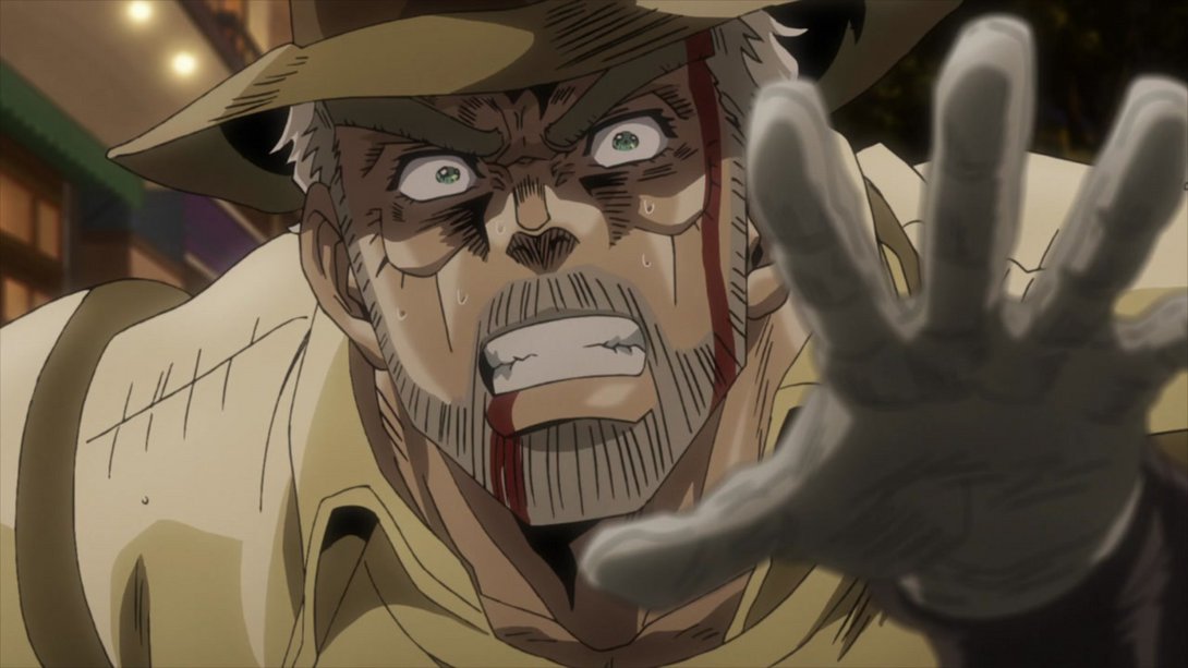
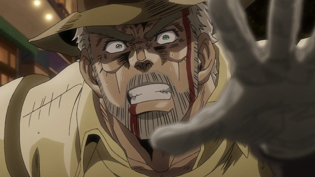
- Jotaro’s looking better, here…:
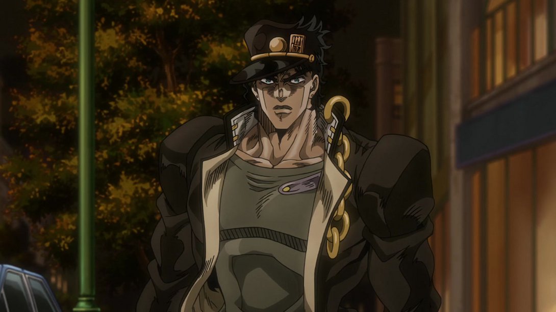
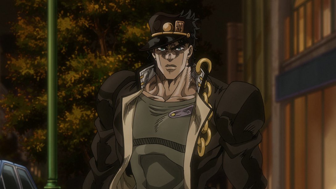
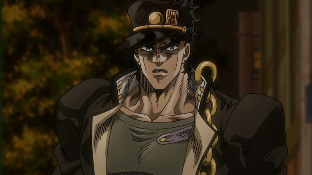
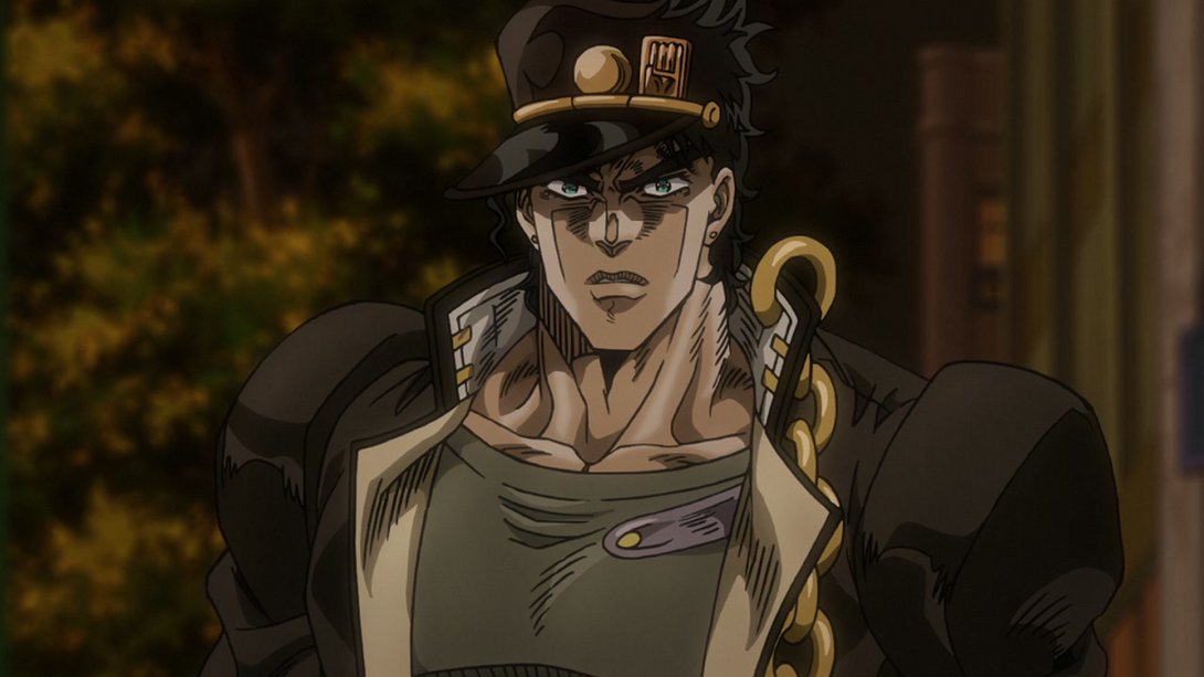
- …as he is here! On top of that, the sky in the background is brighter and the smoke floating around the scene is slightly more transparent:
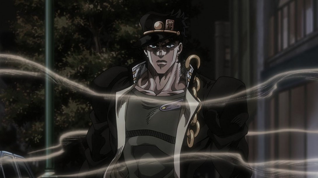
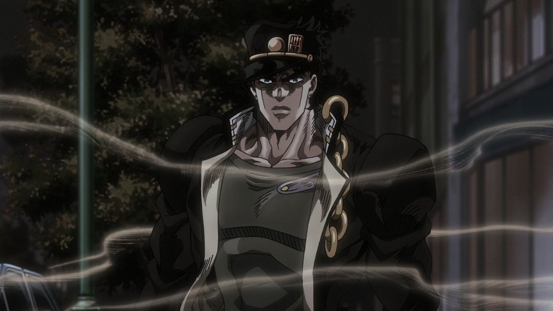
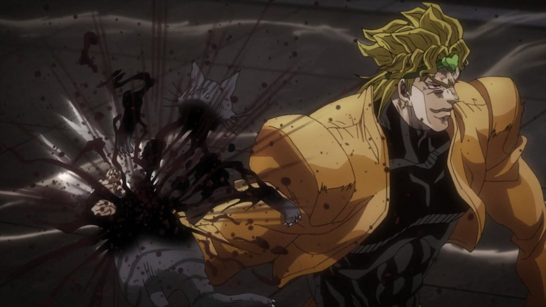
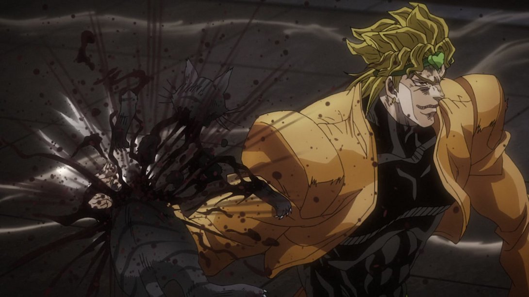
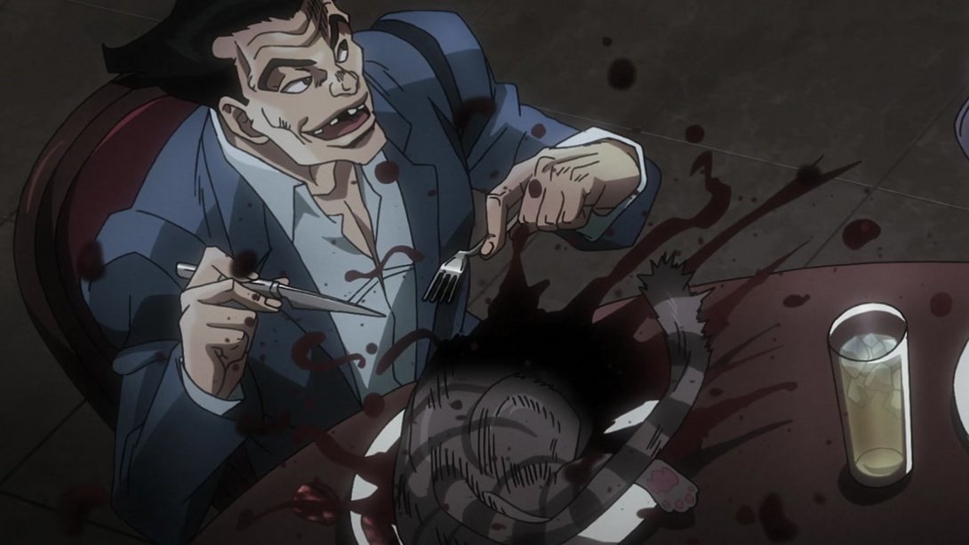
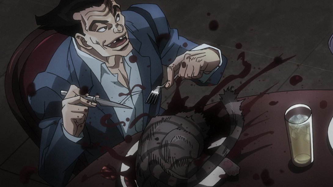
- These scenes of Dio absolutely ruining the day for this cat and these idiot bystanders have all been uncensored:
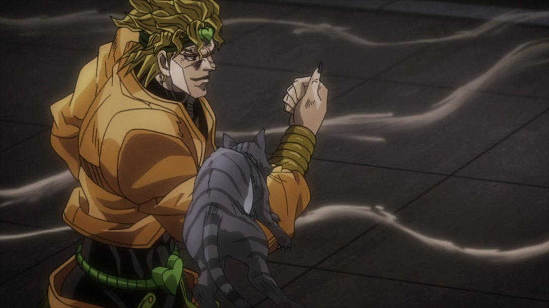

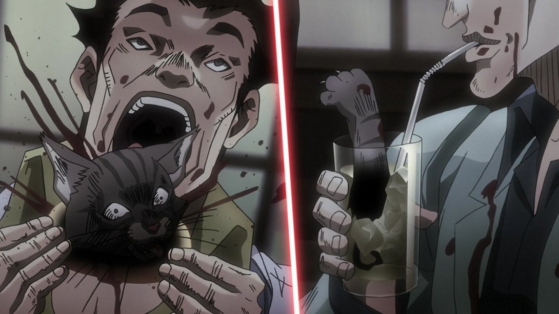

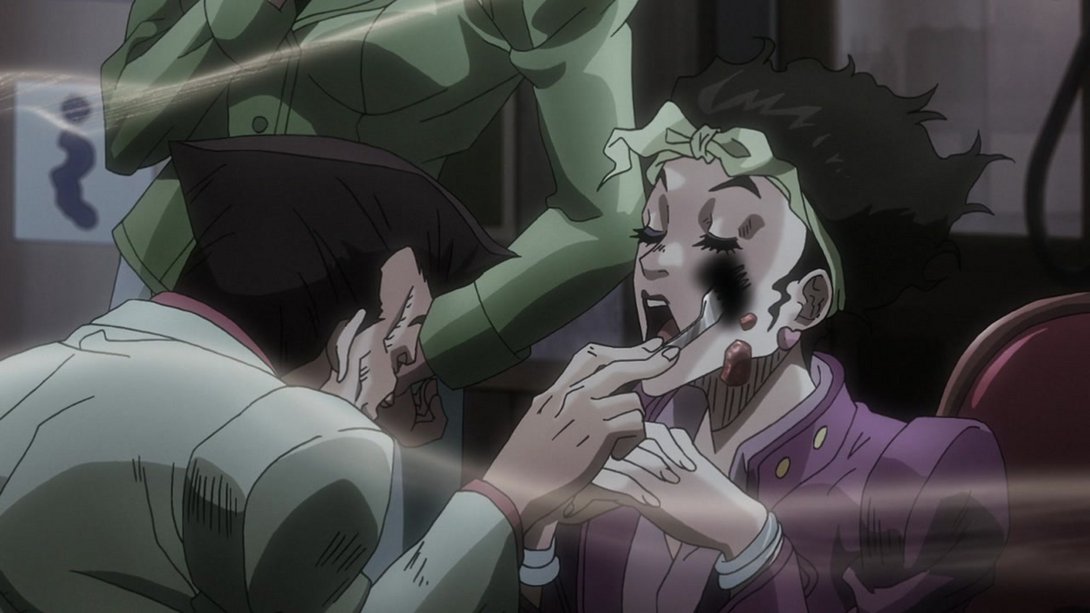
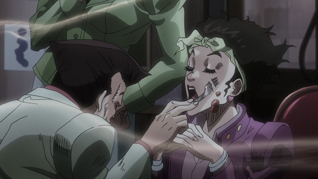
- This scene has less motion lines on the left side of the frame…:
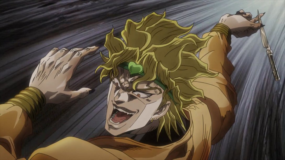
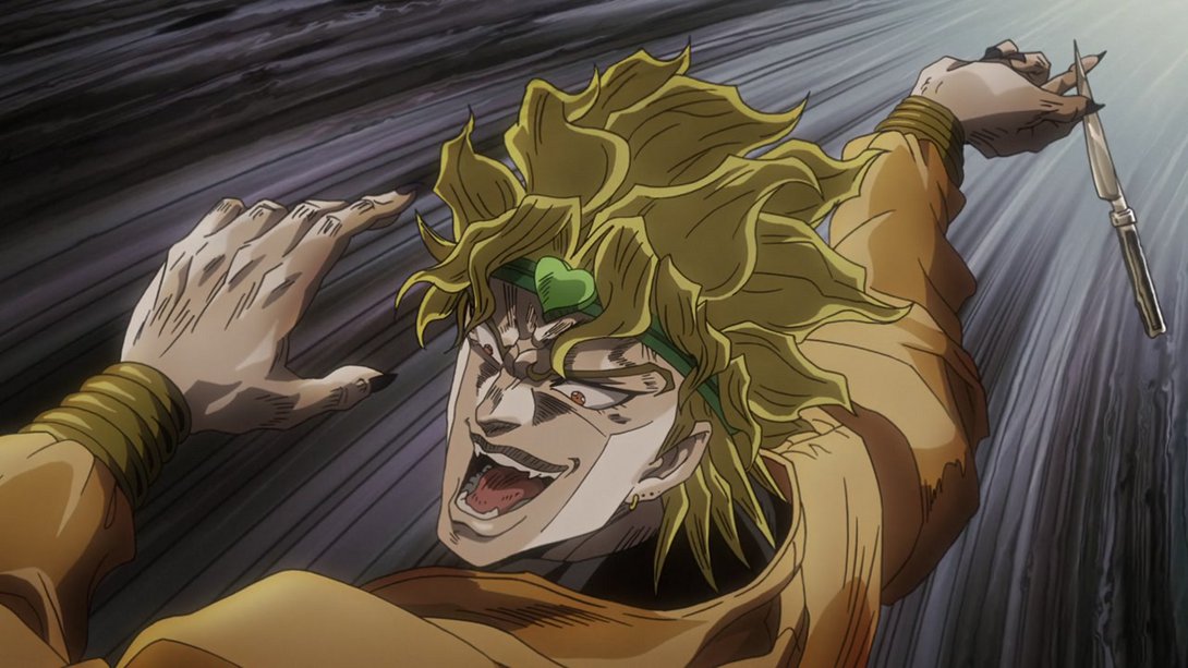
- …as does this one! On top of that, the zoom in most of these cuts is different, and in a couple of them the camera has been just straight up moved:
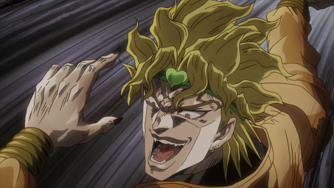
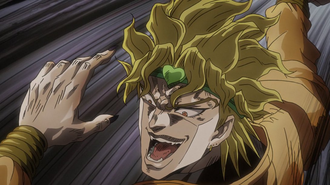
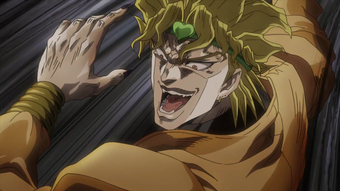
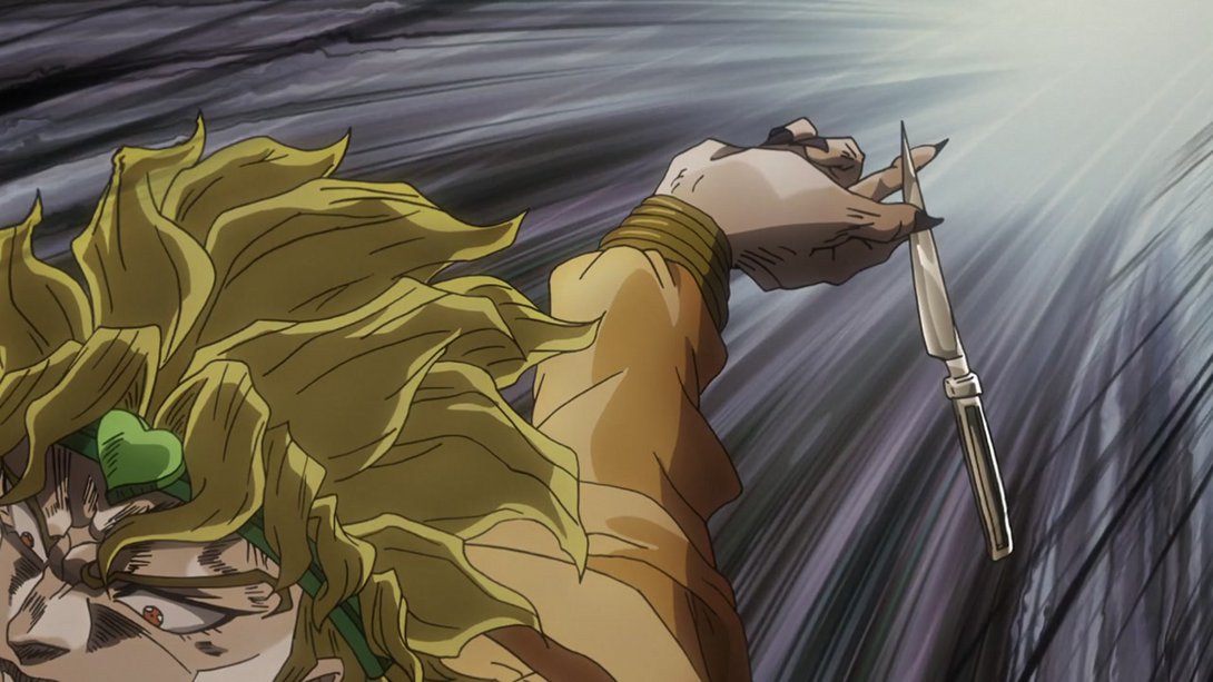
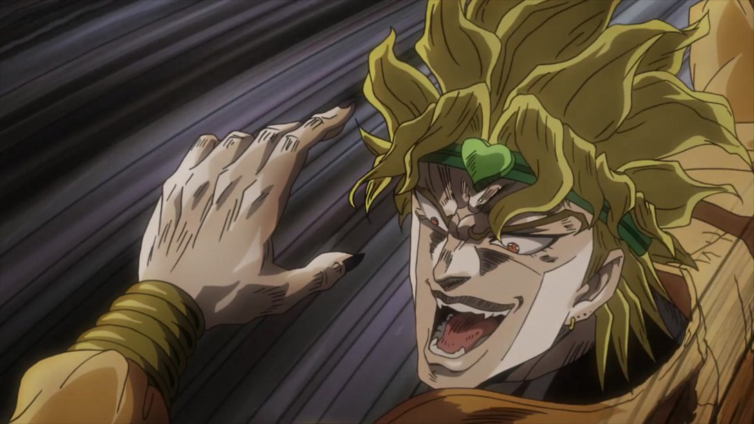
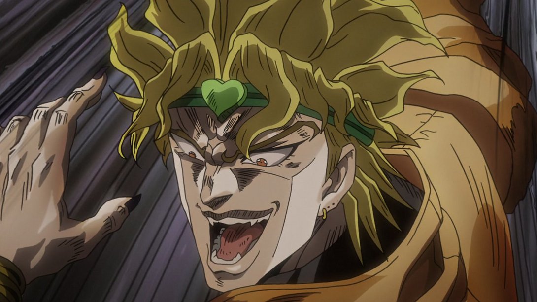
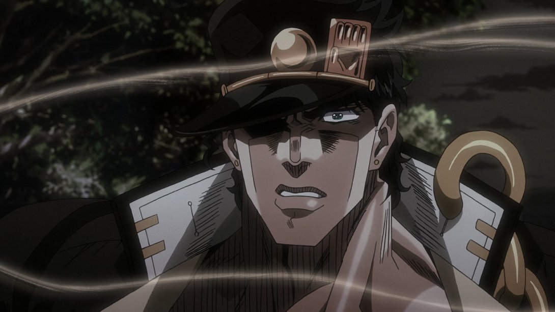
- Oh yeah baby, look at this redrawn hunk! On top of that, the smoke has also been moved, and the background on the left side is slightly brighter as well:
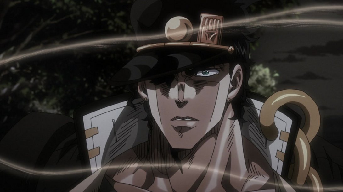
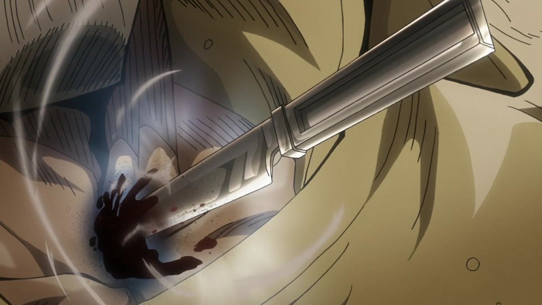
- Here, the wound on Joseph’s neck has been uncensored, and the motion lines around the knife are slightly brighter as well:
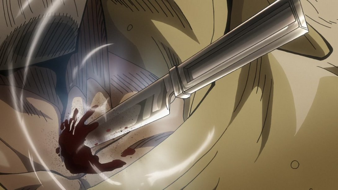
- Have another uncensored Joseph, friends:
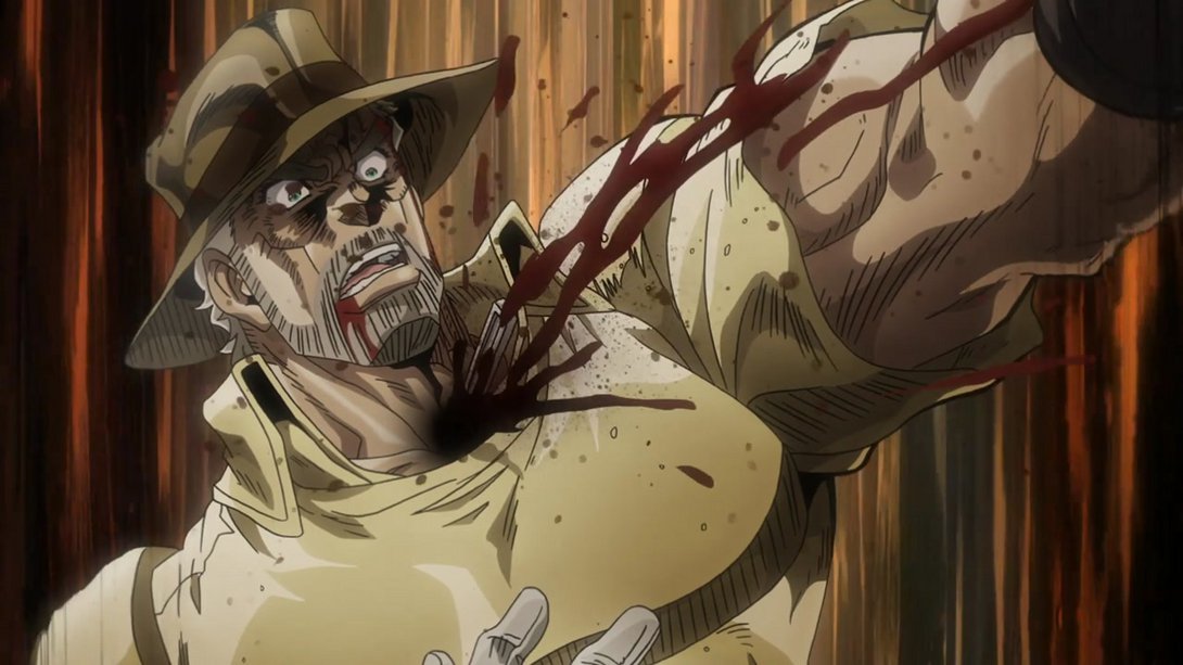
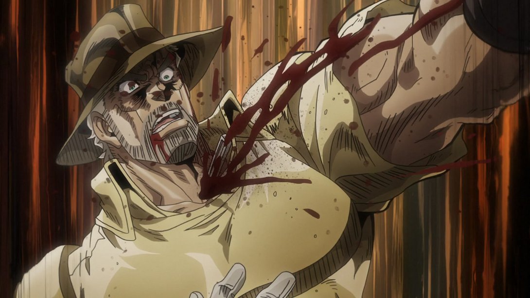
- And here, the smoke is looking a little different…:
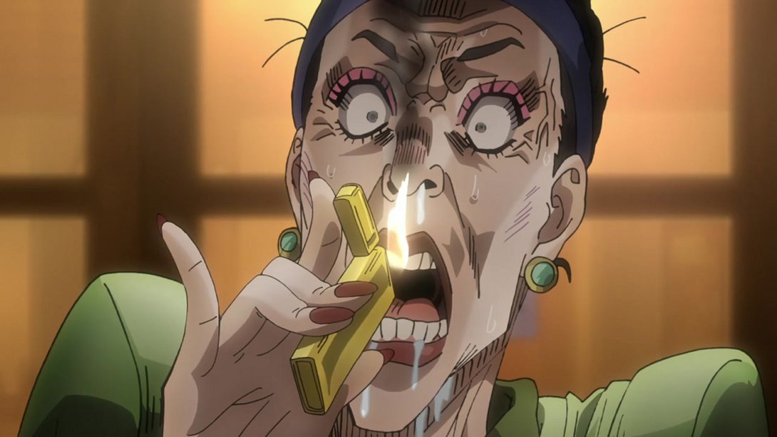
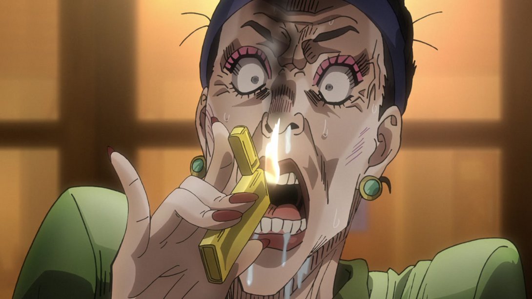
- …and, later on, we can see that lady’s uncensored cheek once again, and the dividing lines are a little less neon-like:
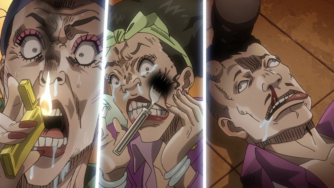
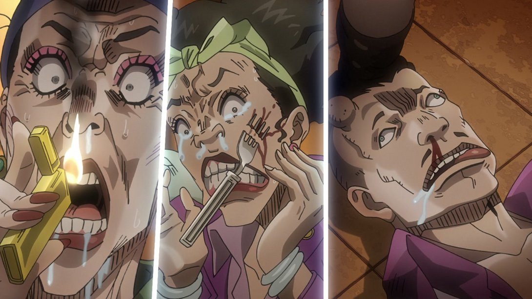
- This grotesque banquet has also been uncensored again:
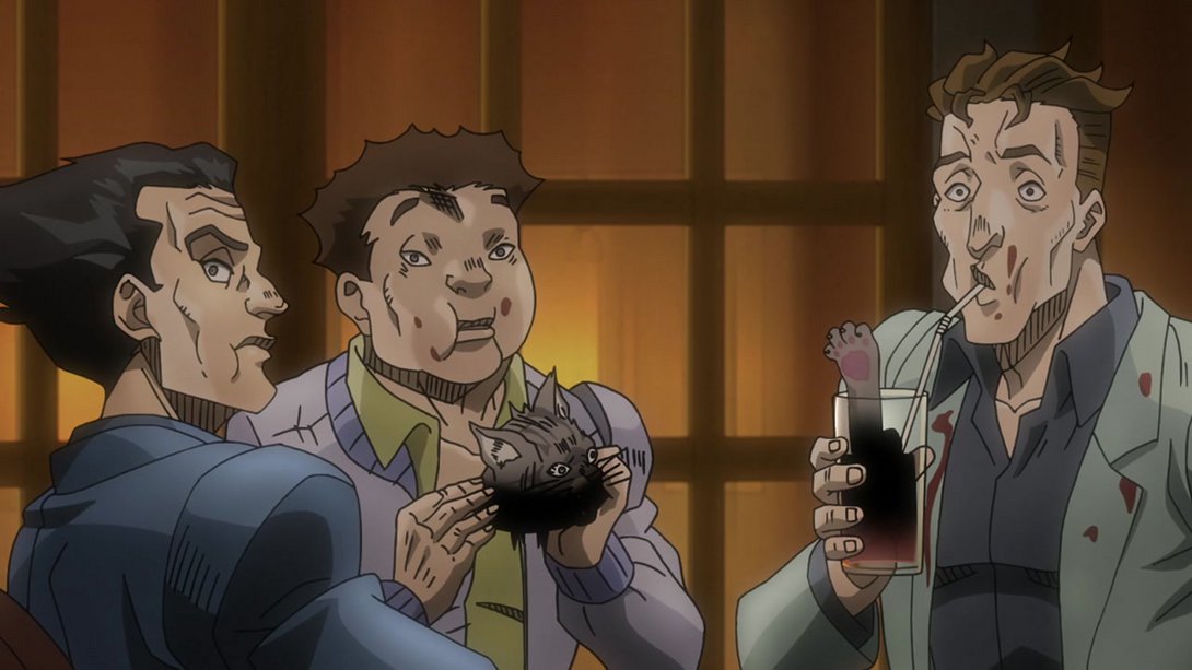
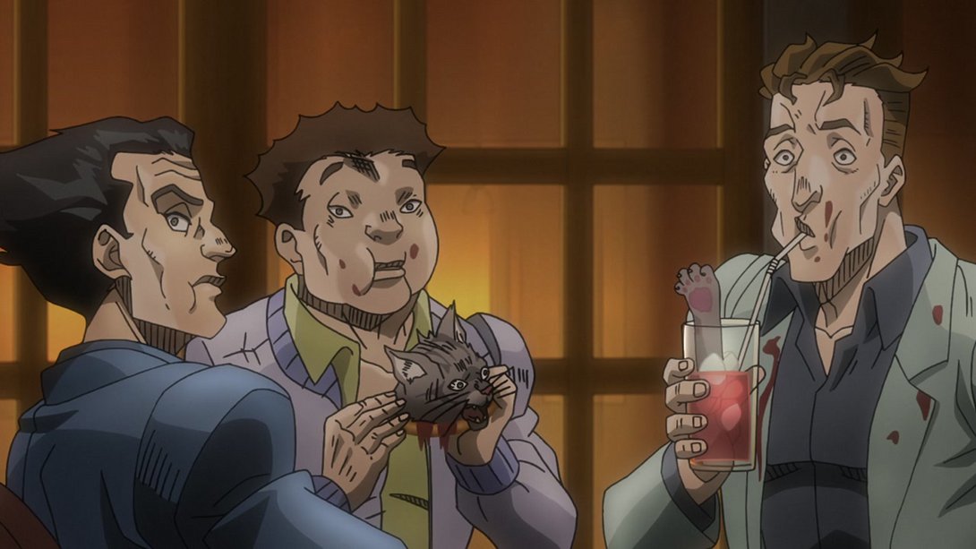
- Here, on top of the usual uncensored wound, the colours are a little brighter towards the bottom of the frame…:
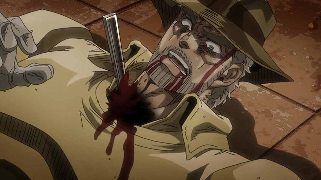
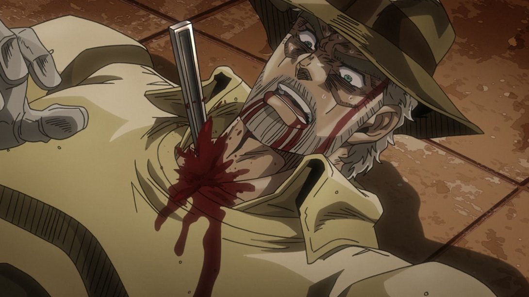
- …and the camera is a little steadier:
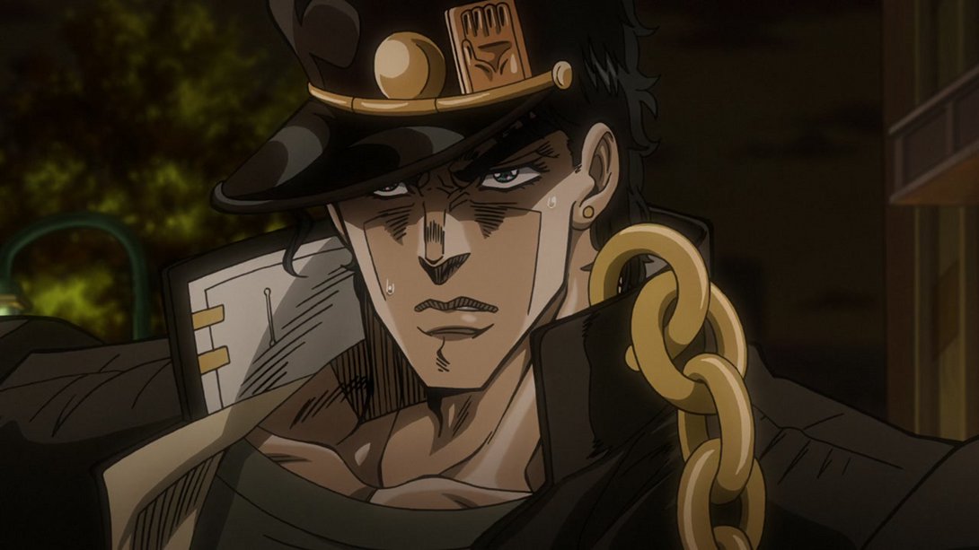
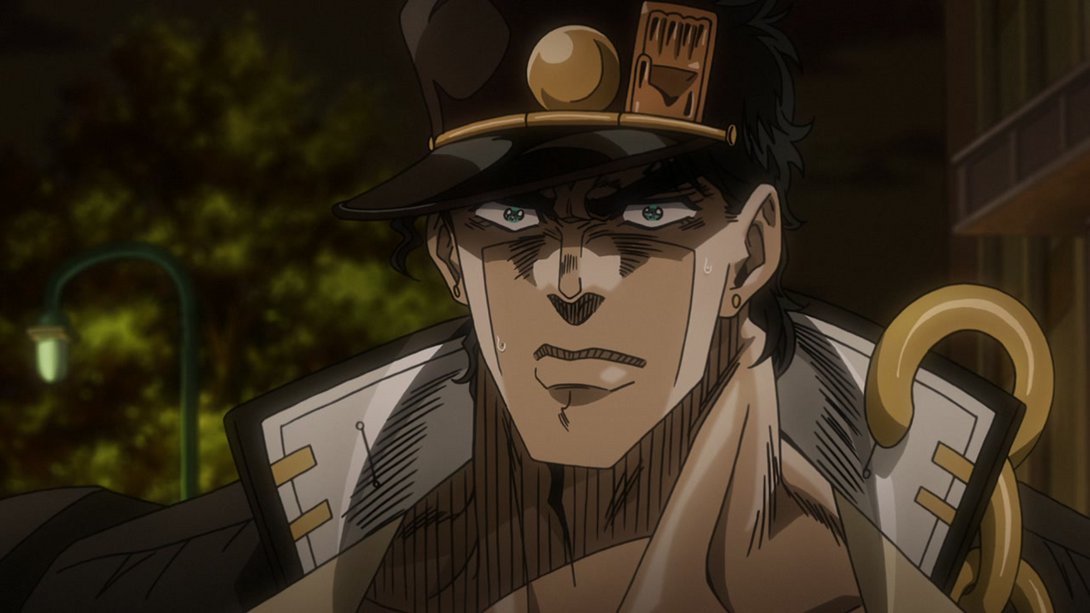
- In this handsome shot, the shading on Jotaro is a little flatter and the sweat drop on the right has been retouched too:

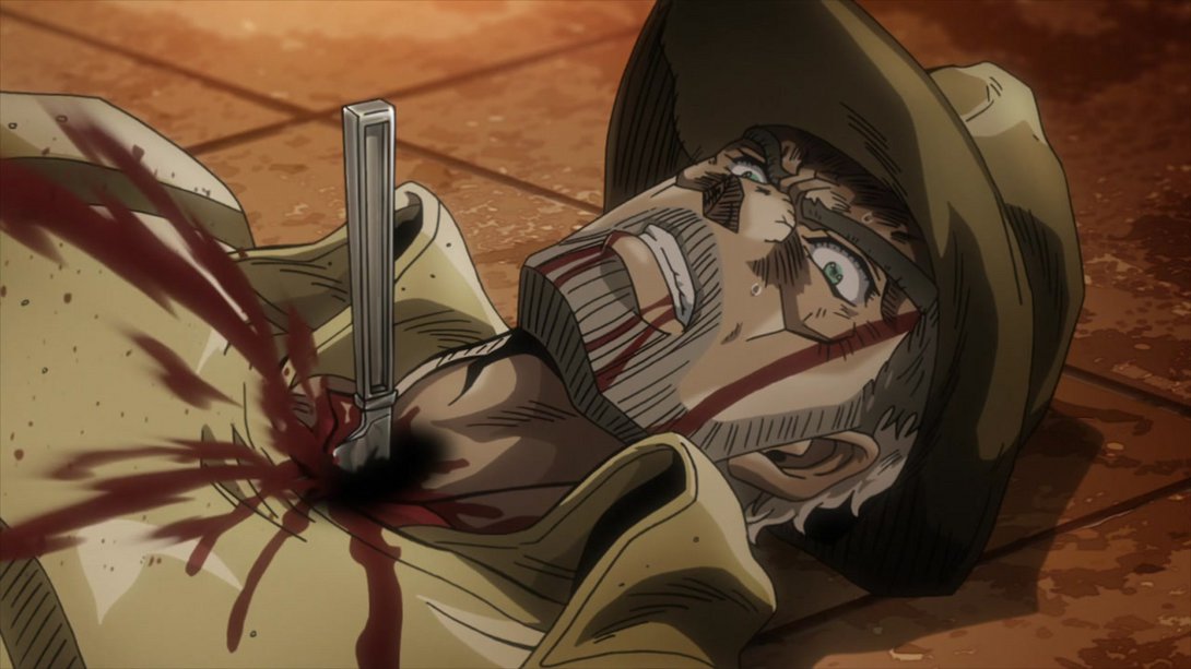
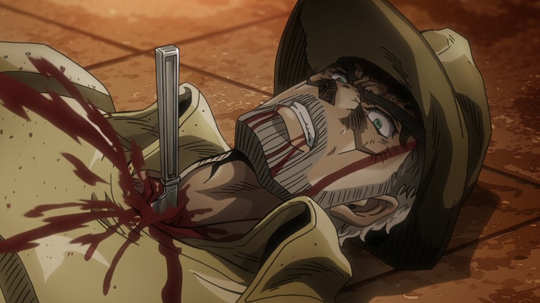
- Here, Joseph’s throat wound has been uncensored, his forehead is darker and the blood spurting from his neck is also sharper:
- Jotaro’s looking BULKIER here:
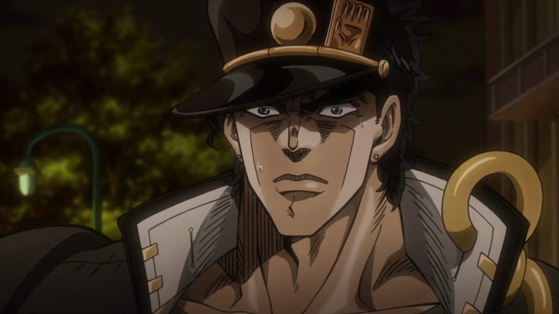
- In this shot, Joseph’s throat wound has been uncensored once more, and his vines are also a little brighter:

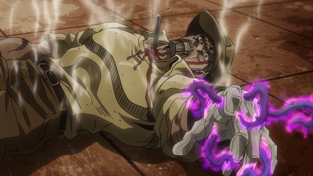
- In this depressing scene of Joseph in his death throes, we can see that his hand goes out of frame a little earlier:
- Joseph’s wound is once again visible, and on top of that there seem to be way fewer lens flares in the background, here:

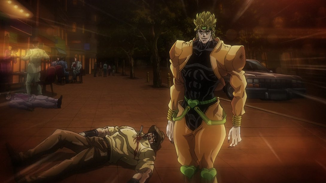
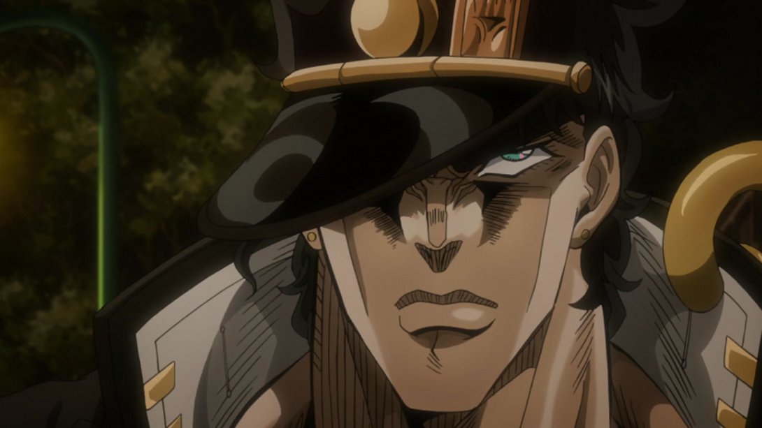
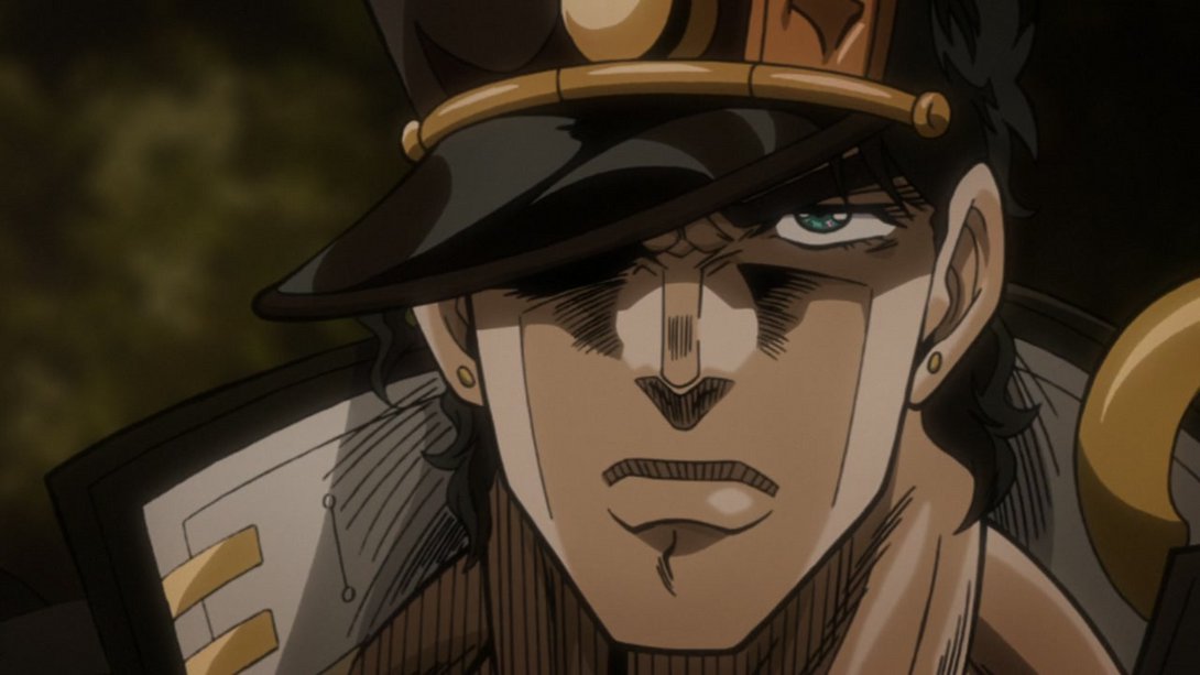
- This scene is just… Yeah. There’s just a whooole bunch of differences! Check it out:
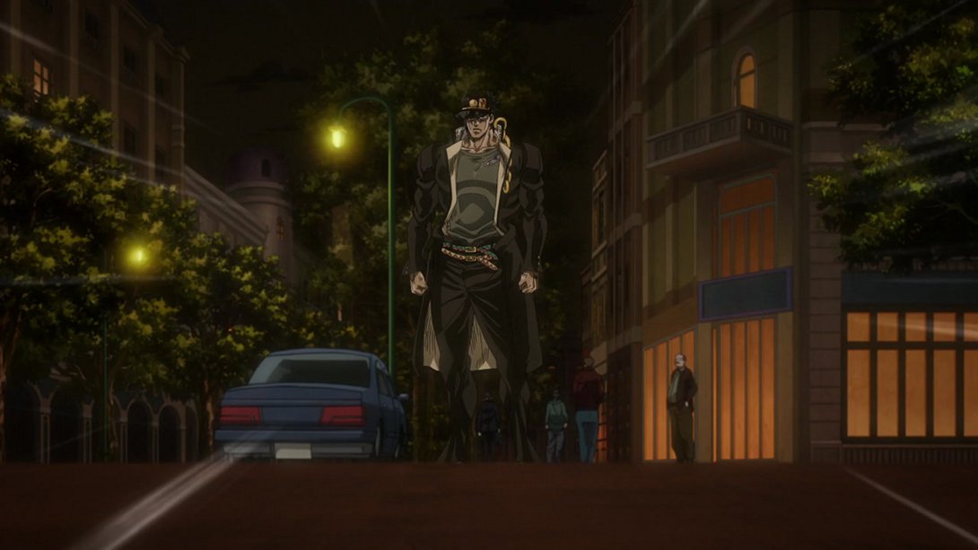
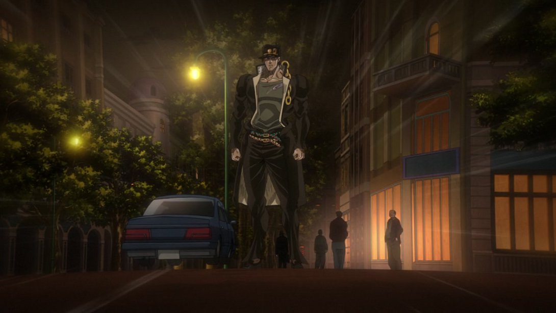
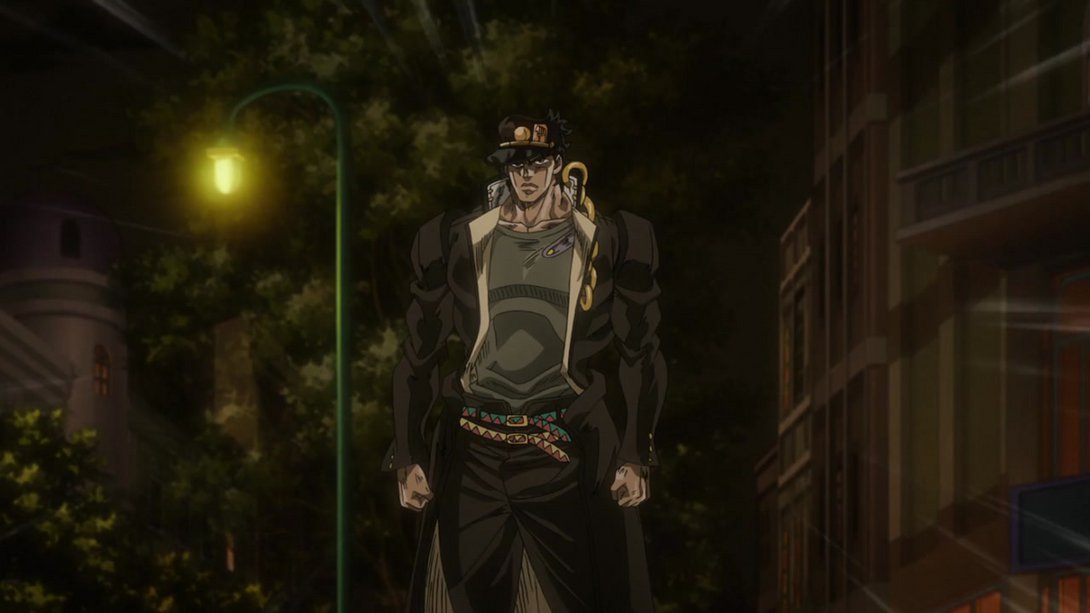
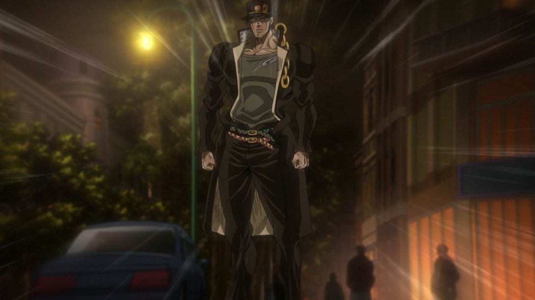
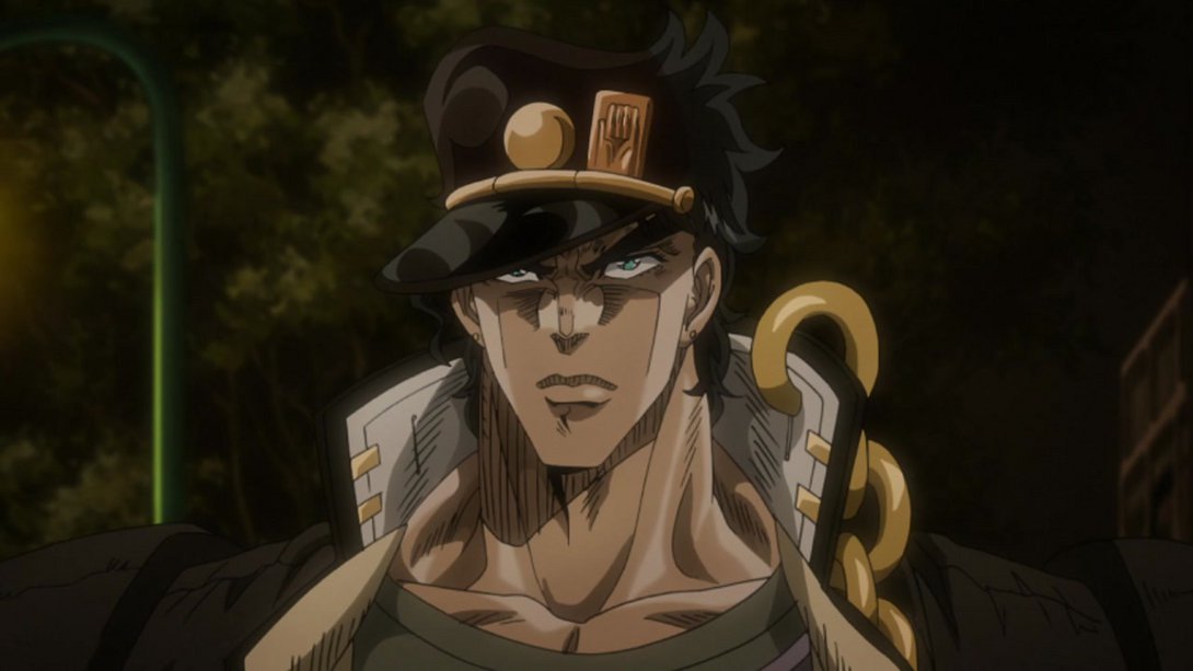
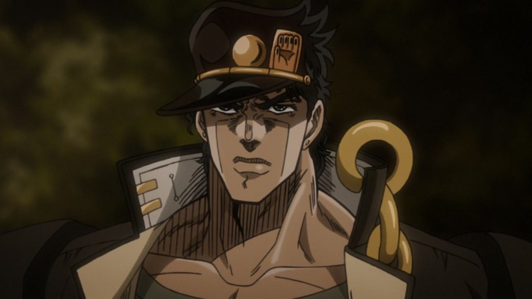
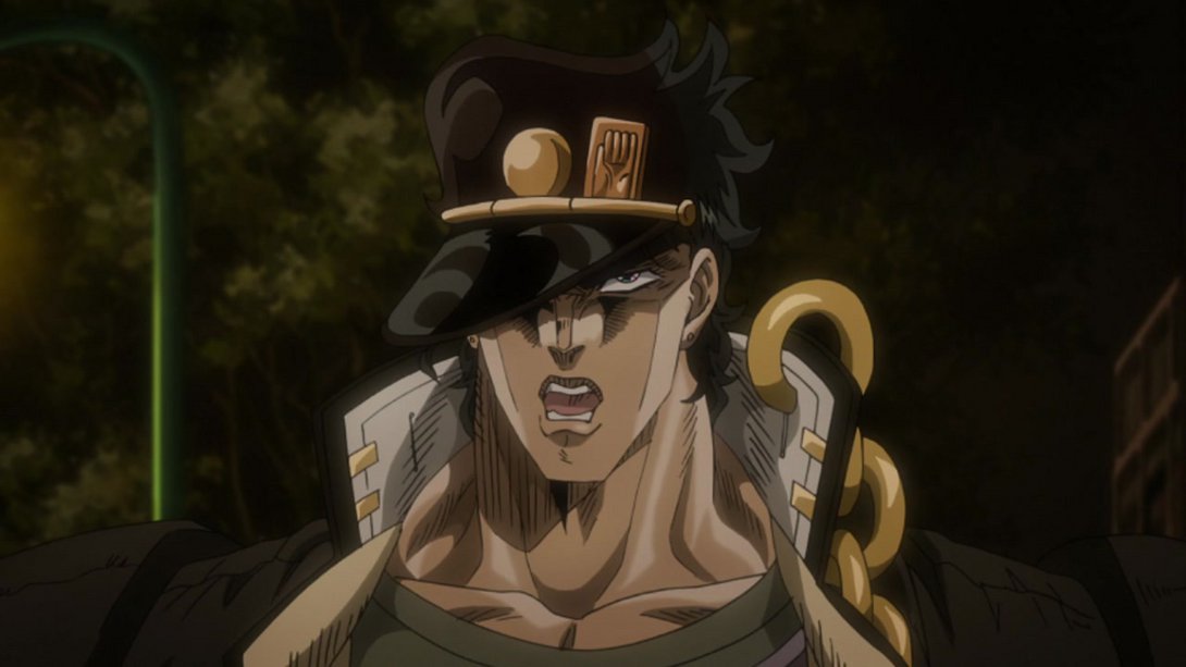
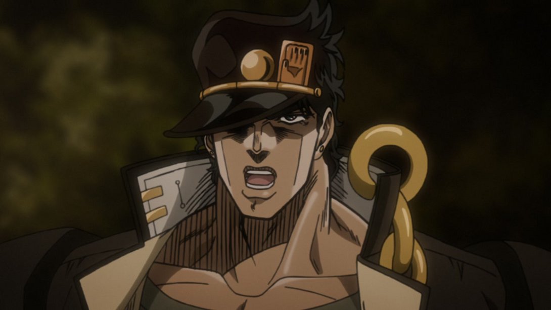
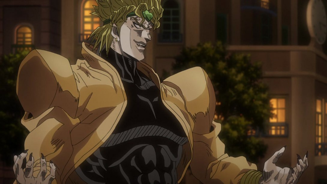
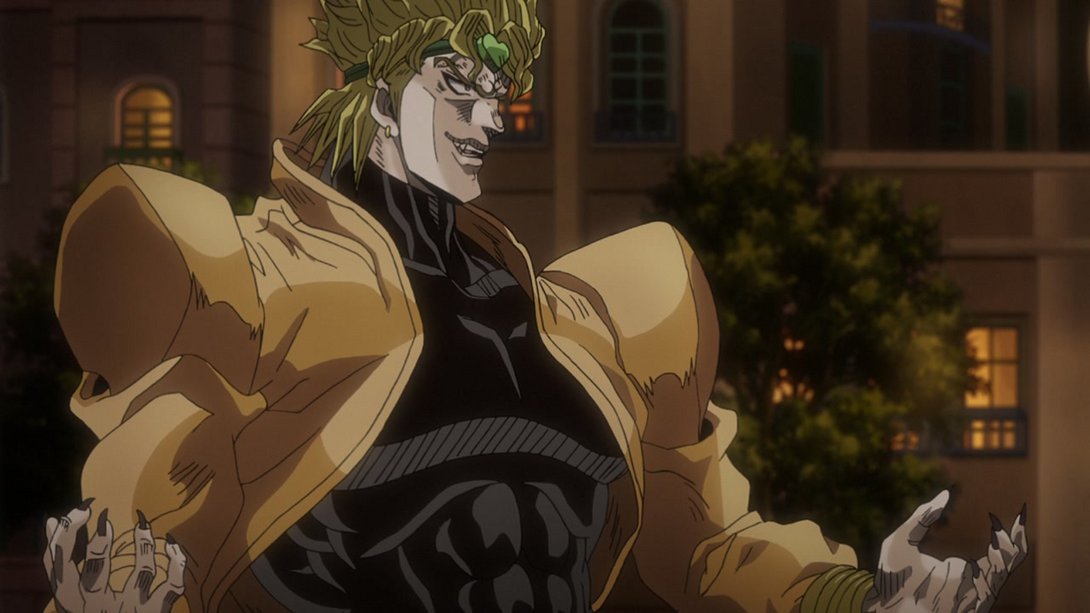
- Here, the background has been moved, and one line on Dio’s neck has also been retouched:
- Good night, old prince:
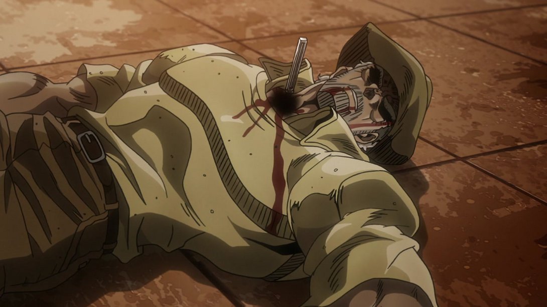
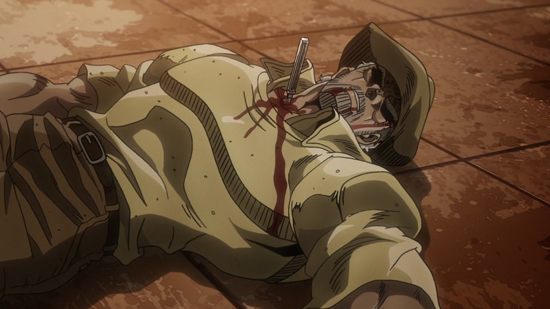
- The background has been moved again, here, and Dio’s eye and upper lip have also been retouched:
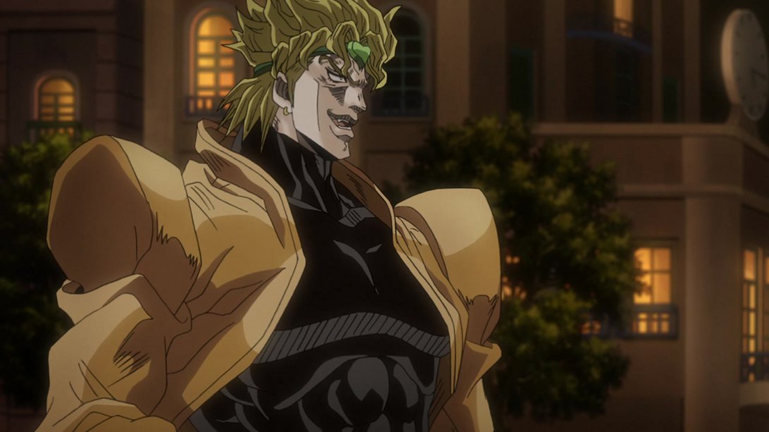
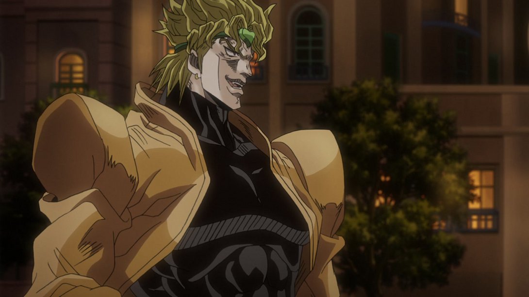
- Dio’s been drawn with thicker lines here, and the overall shading is also a little different:
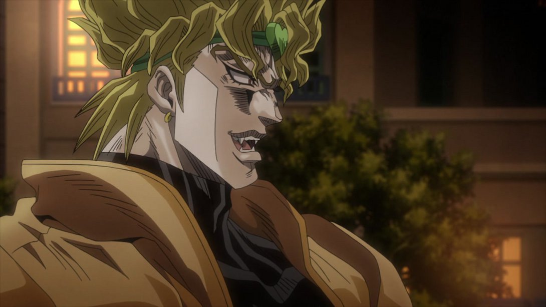
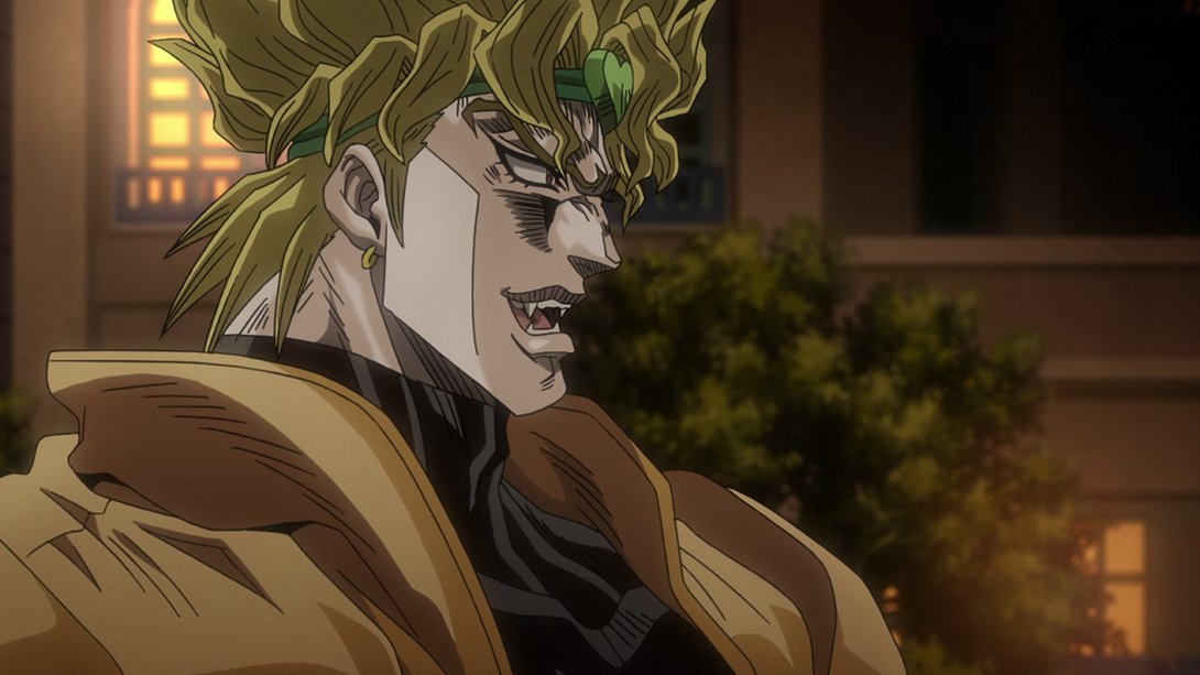
- This scene has different colours, and once again most lines are thicker:
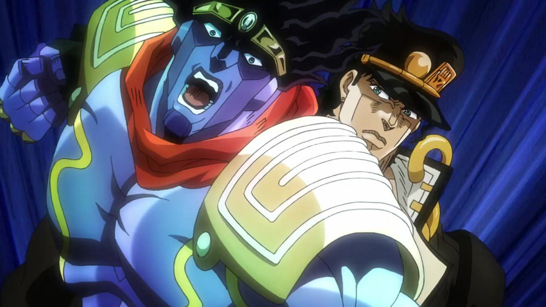
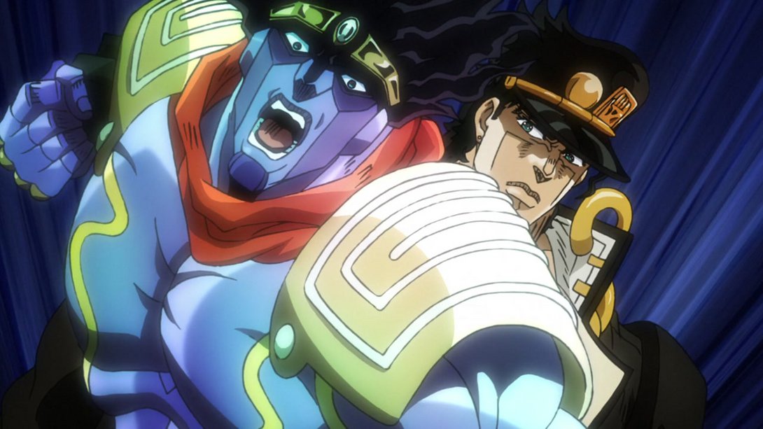
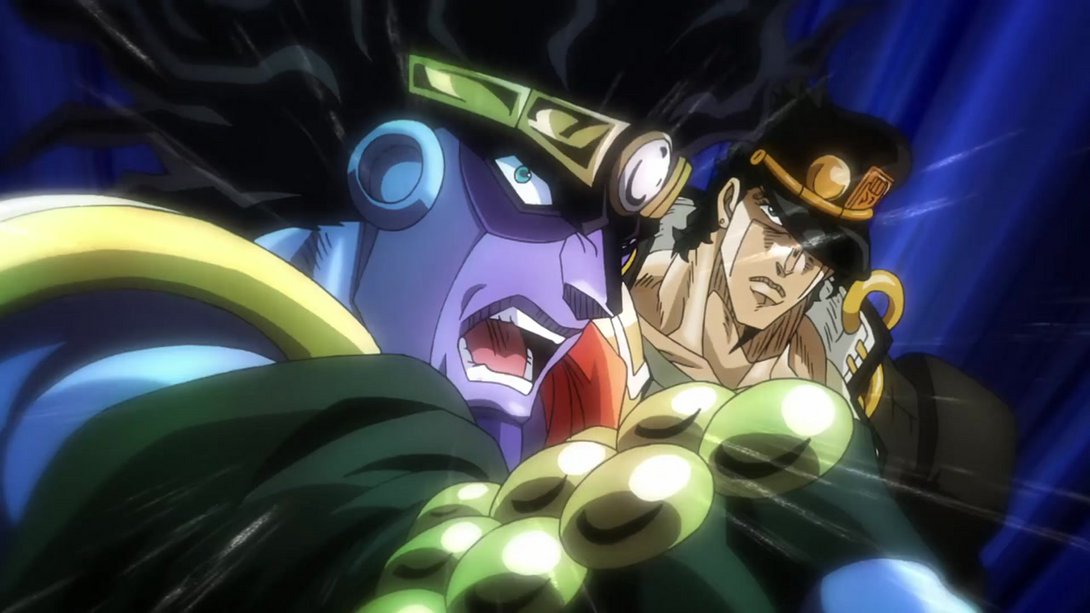

- This incredibly brief animation has better contrast and better motion effects…:
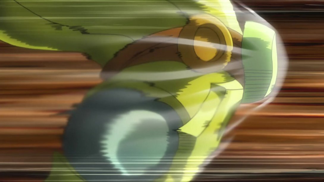
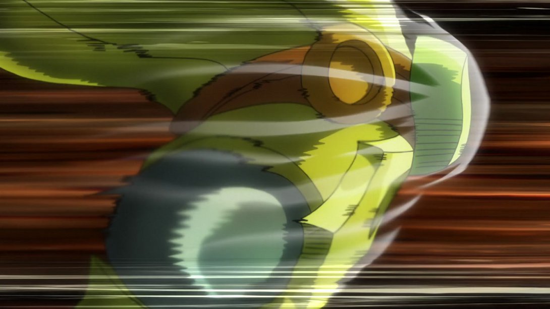
- …while this one (on top of the same better-looking impact effects) is brighter and has a slightly steadier camera:
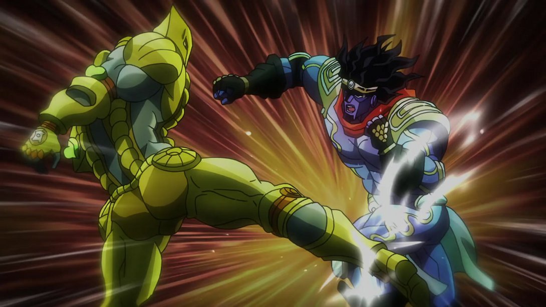

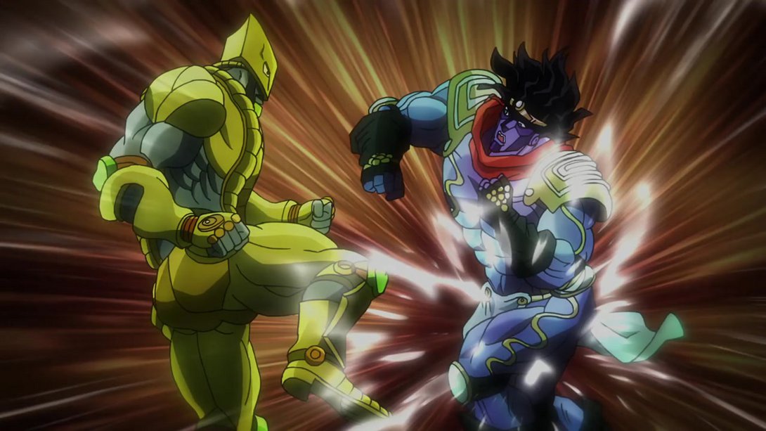
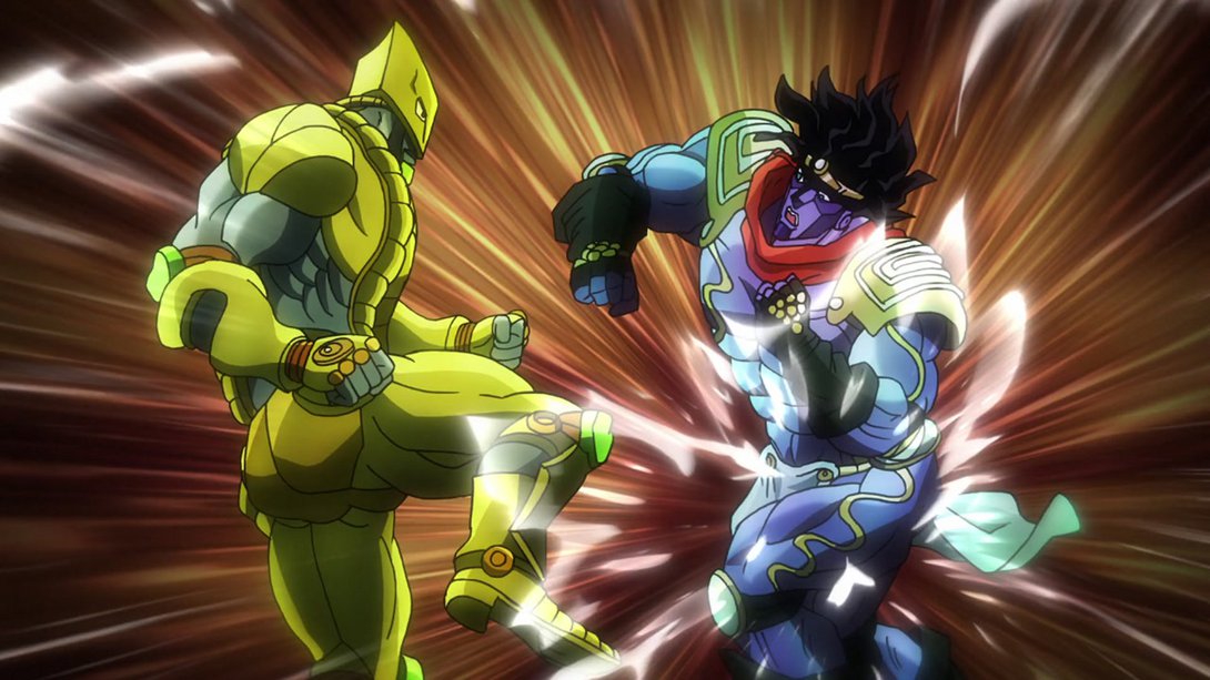
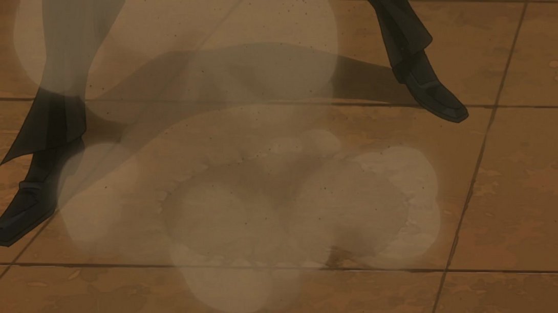
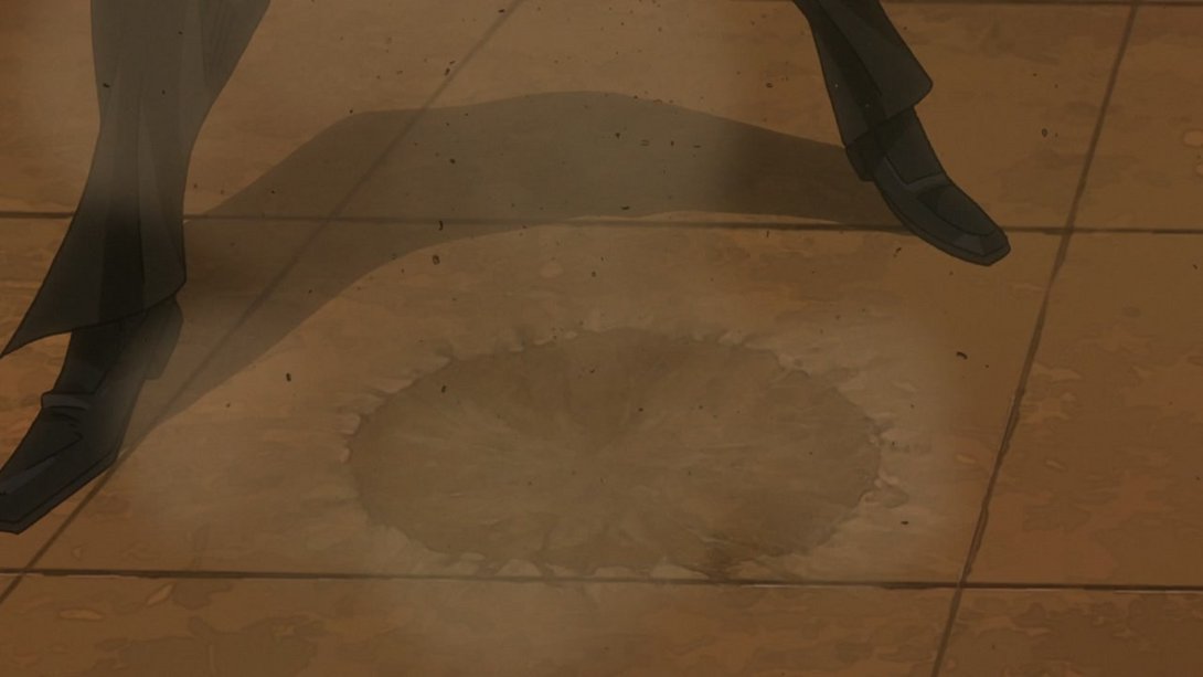
- The dust and debris effects are a little different, here:
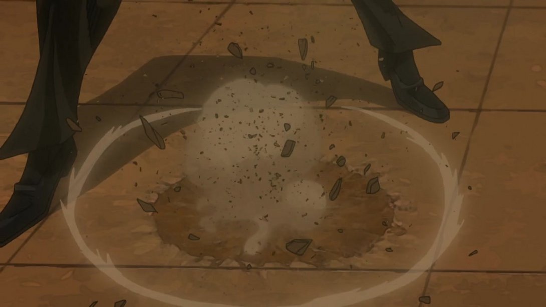
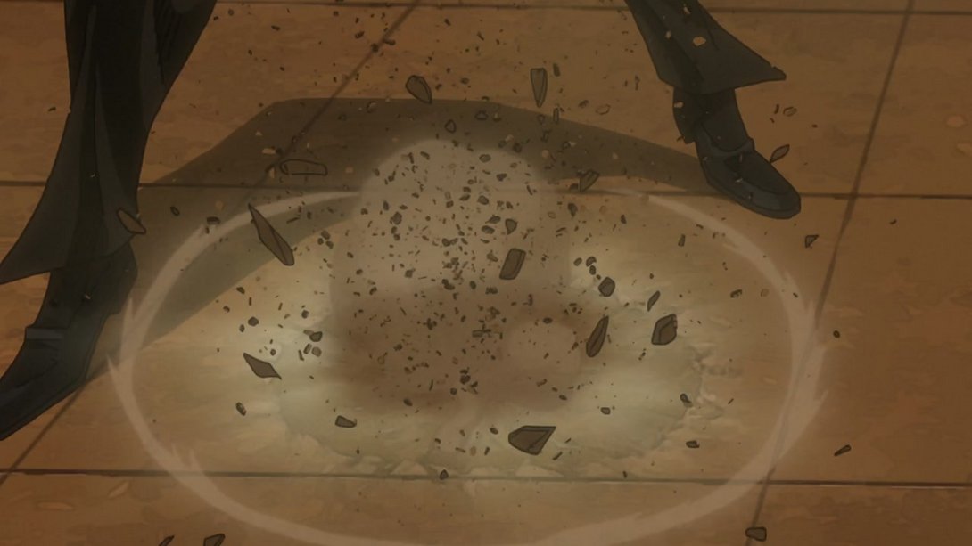
- Dio’s face has been retouched here, and the bottom of the frame is now slightly brighter…:
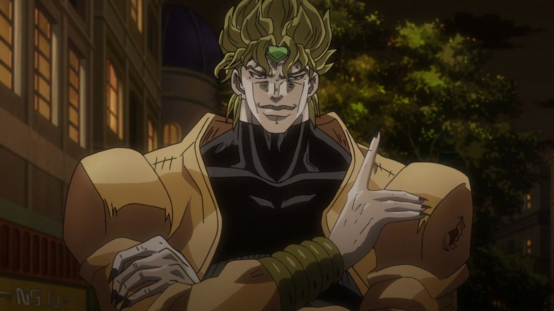
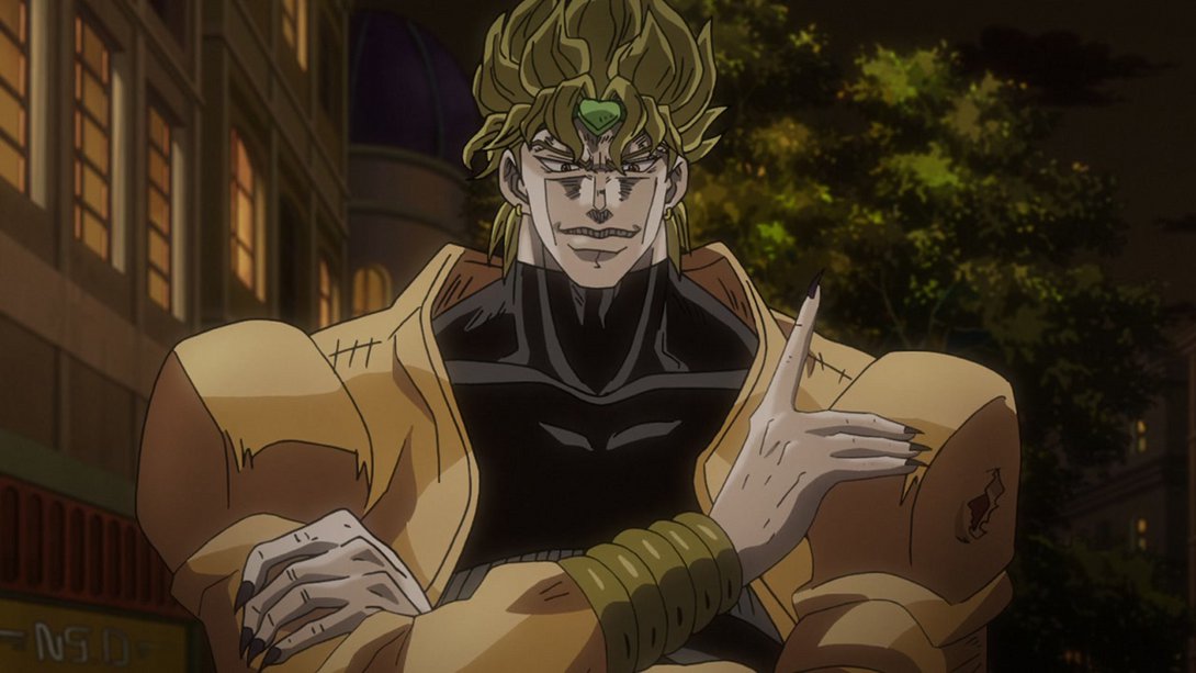
- Here, on top of the usual distortion, the background has a different tint and shading; also, the shading is different on Dio as well, and his face has been slightly retouched too:
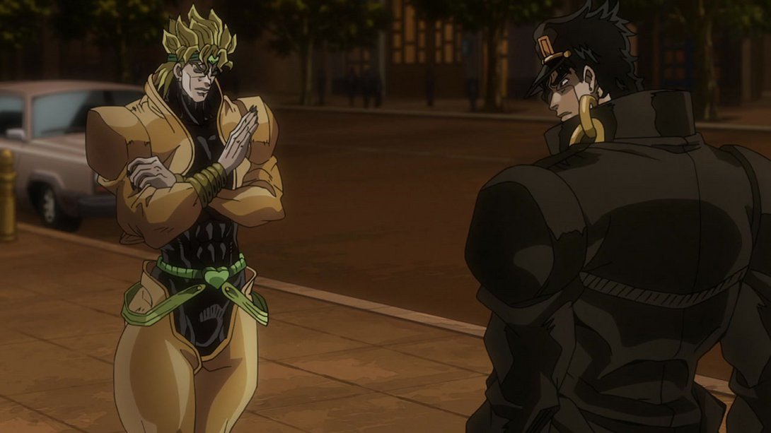
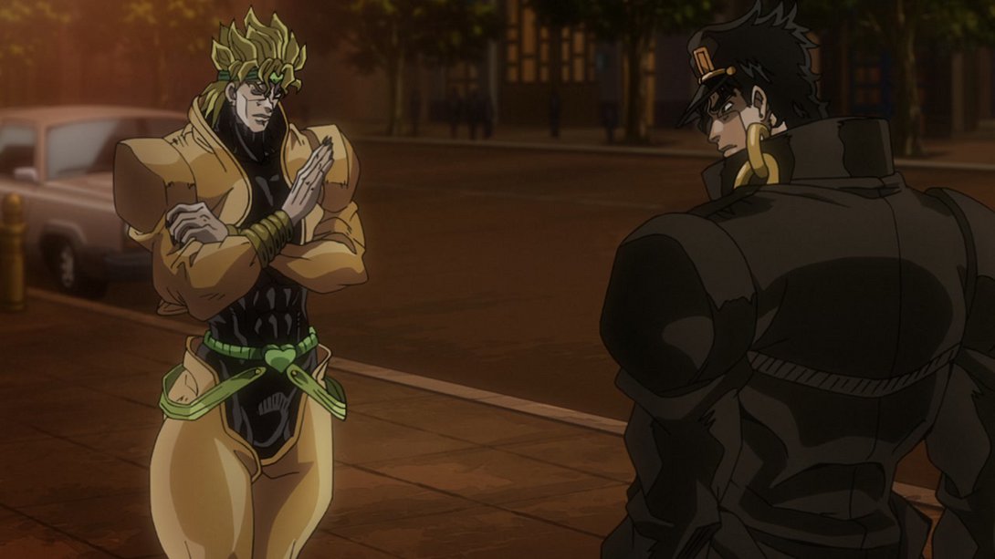
- Later on in the same scene, Dio’s face has been coloured a little more flatly, and the dividing line is brighter:
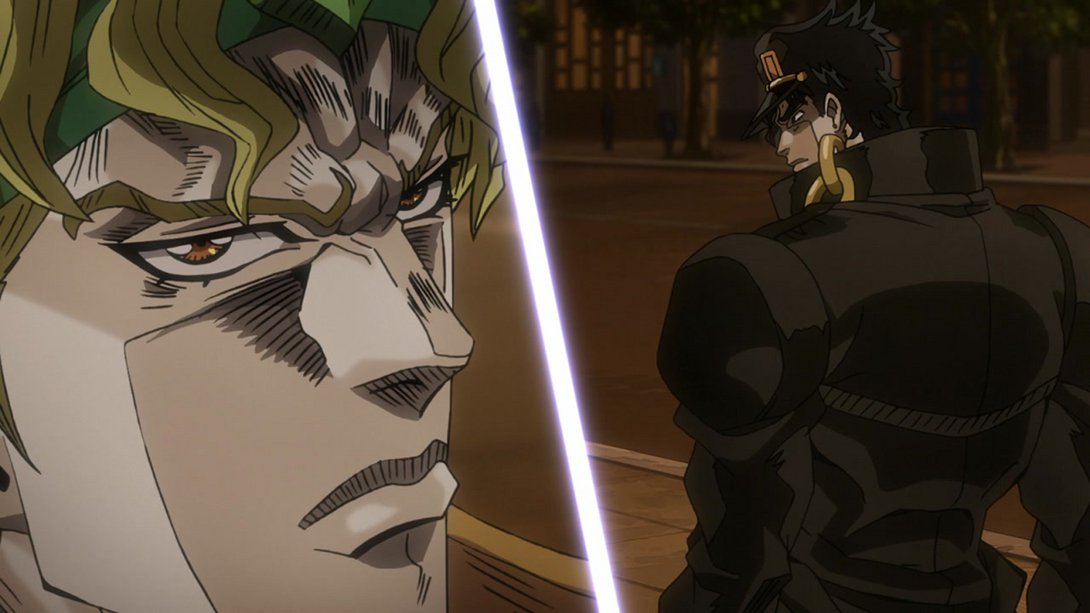
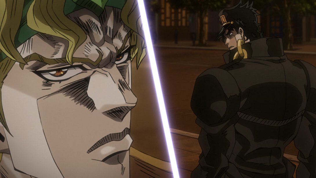
- Here, the bottom of the frame is brighter once again…:
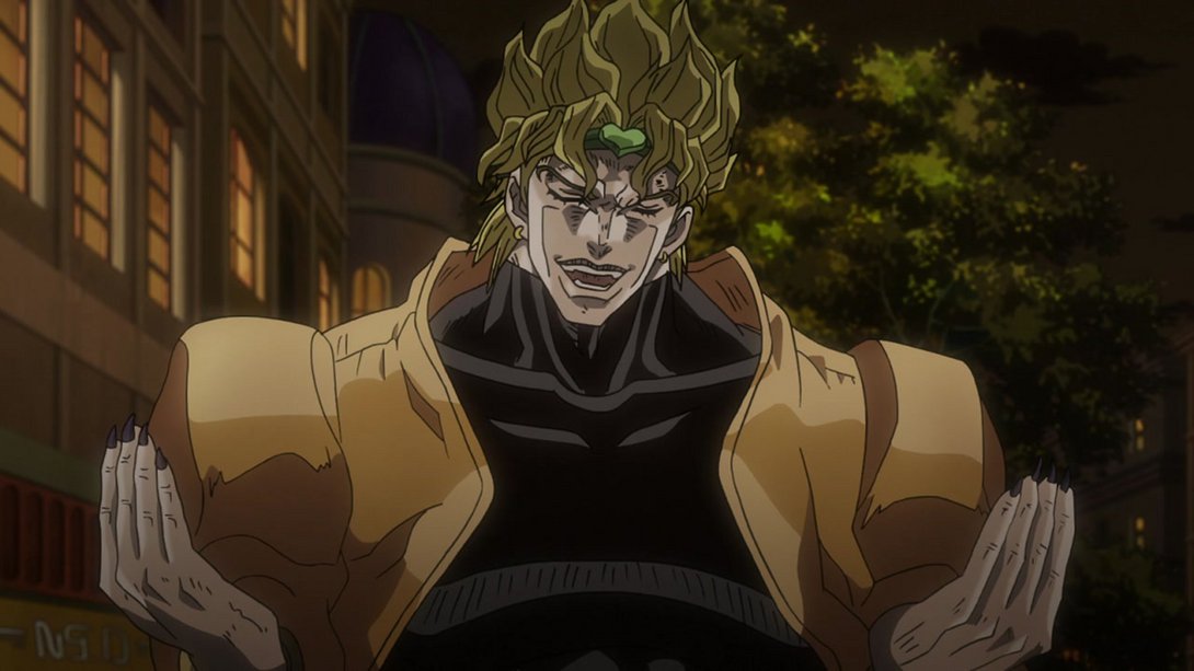
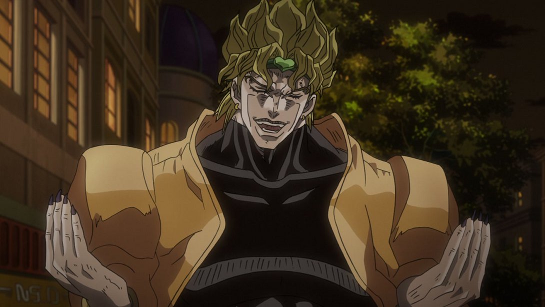
- …and, later on, The World’s colouring has also been slightly tweaked:
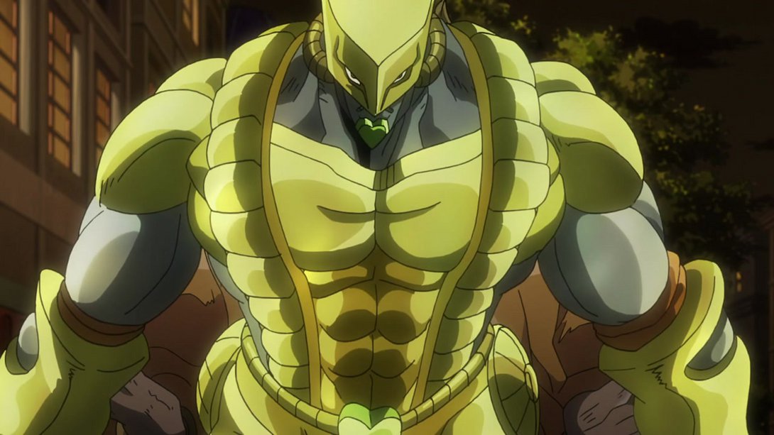
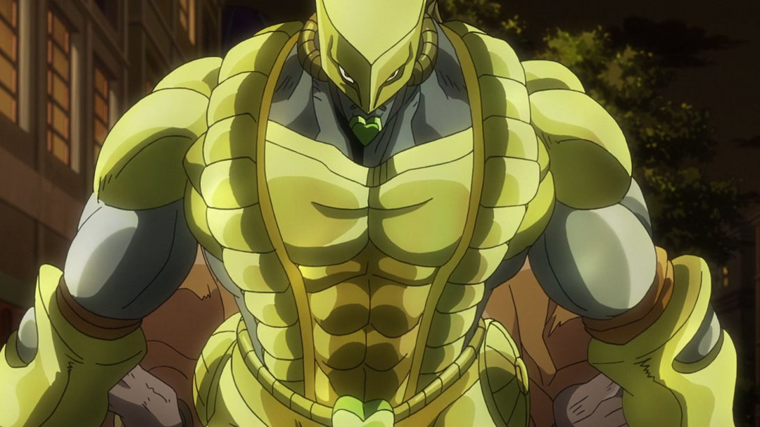
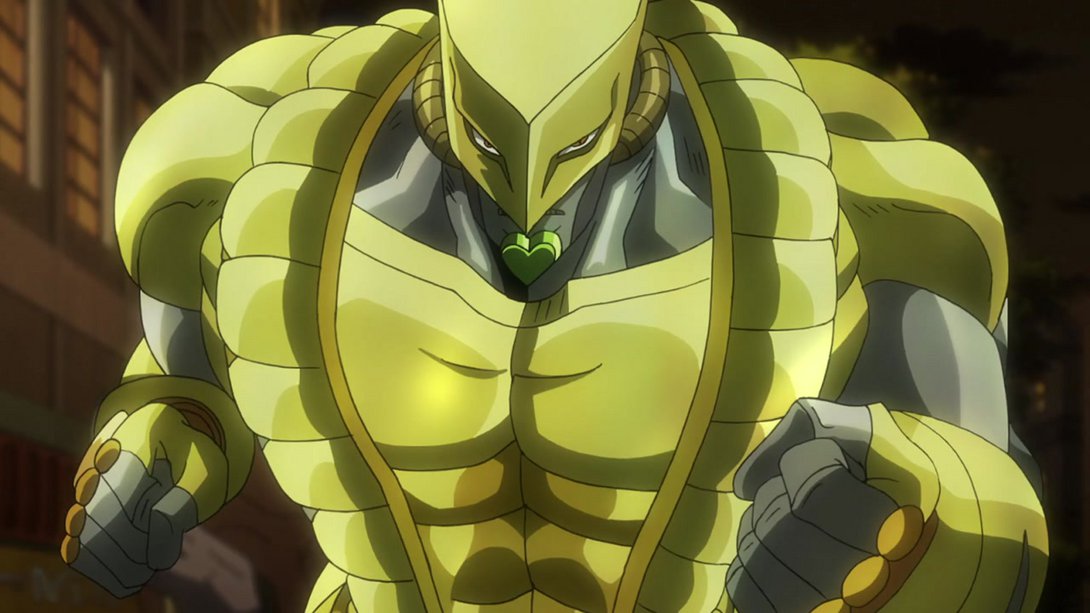
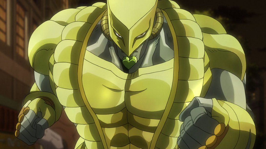
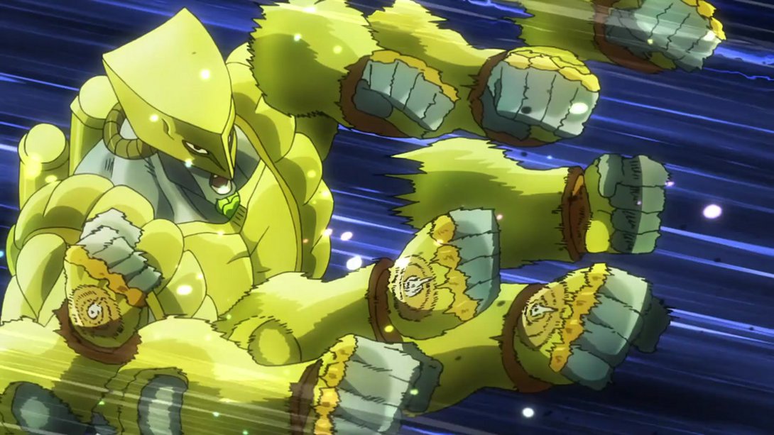
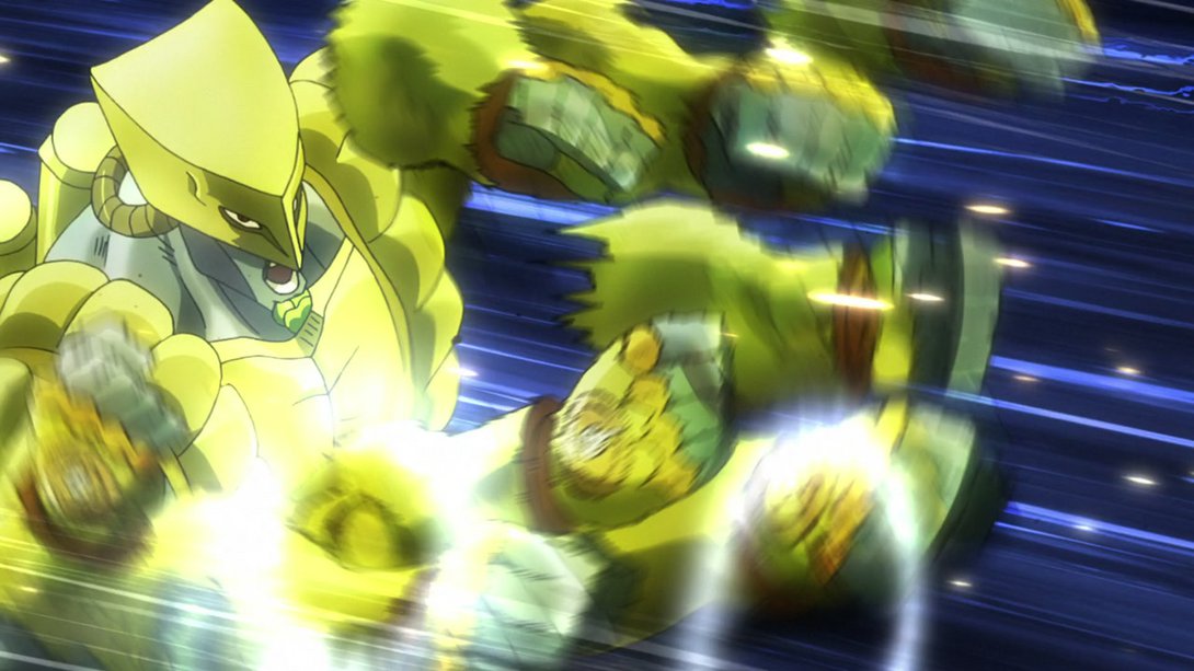
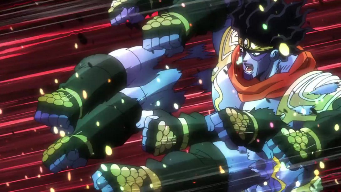
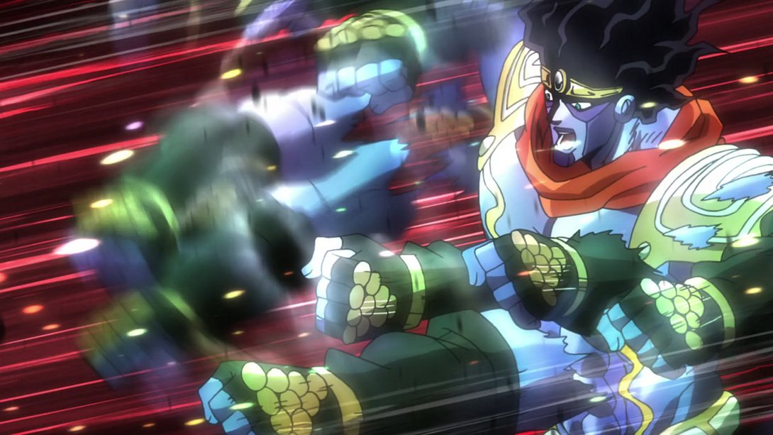
- Here we have a bunch of differences, once again! First off, the camera moves around a tiny bit more, every blow from The World now has a circular impact effect and Star Platinum’s kick barrage is now significantly blurrier. Also, there was a mistake in the TV version of this last bit, you’ll be able to see it in the last image; this has been fixed, thankfully:
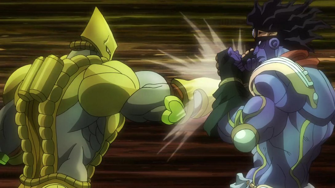
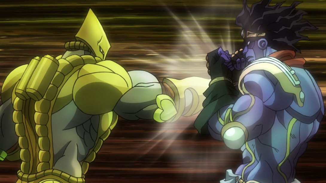
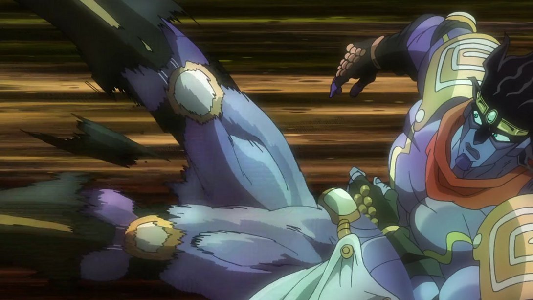
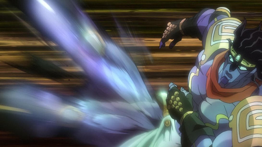
- The same impact from the previous animation is back here, whenever Star Platinum kicks the road sign; in addition, the background is a little more zoomed out, there’s a new texture on the sign pole, most of the particles flying through the air have been recoloured (and some have been removed); also, The World has been shaded a little differently too:
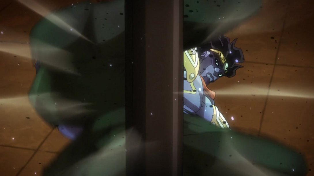
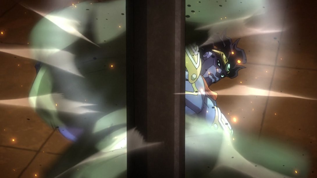
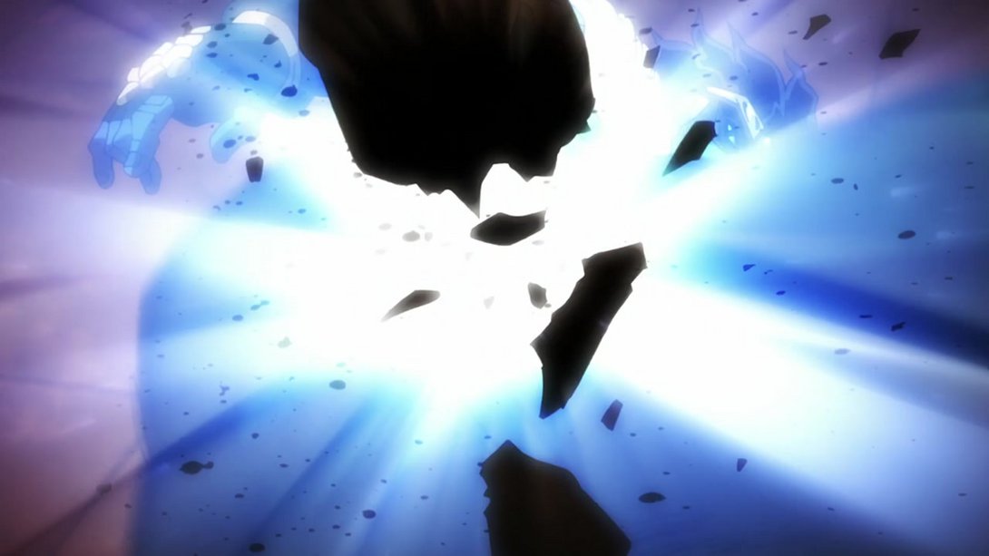
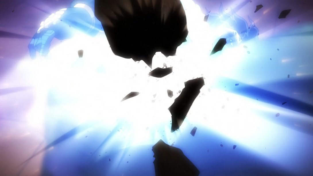

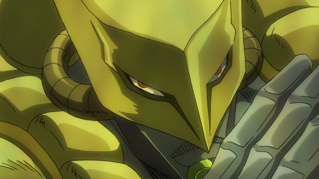
- This stand clash has A LOT more effects going on! On top of that, the background has a warmer tint, most things are a little brighter and a tiny bit blurrier; in addition, the close-up on The World’s hand that shows up later no longer just appears but has a two-frame long transition:
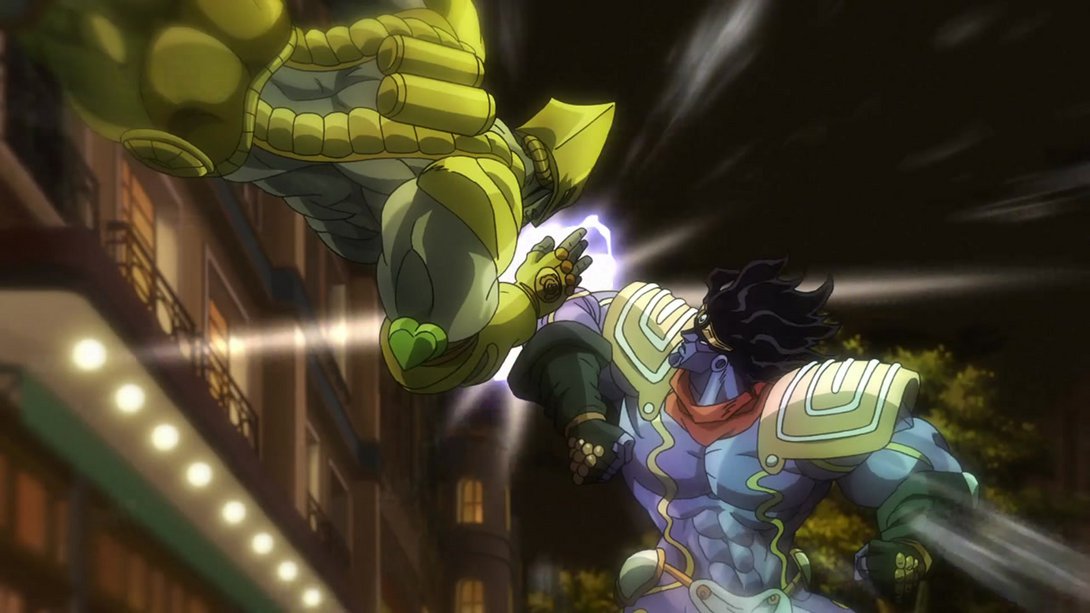
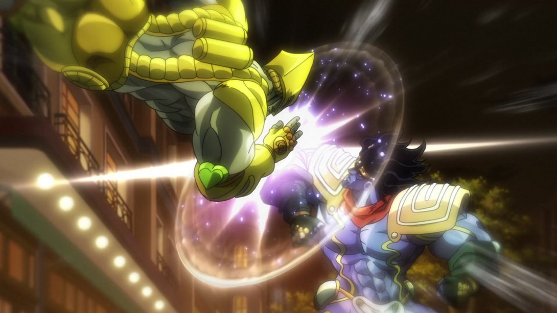
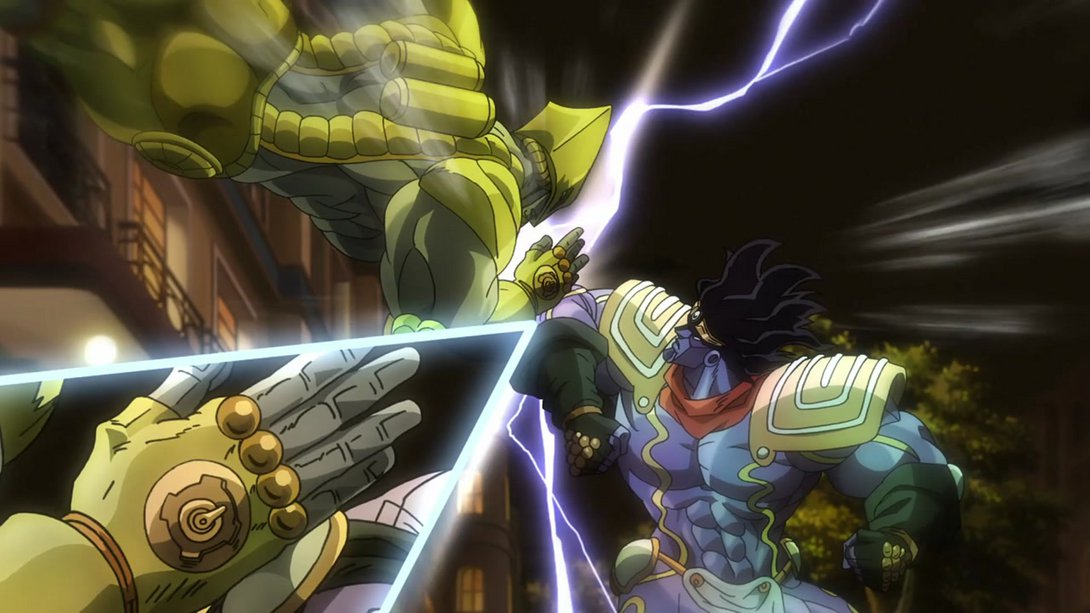
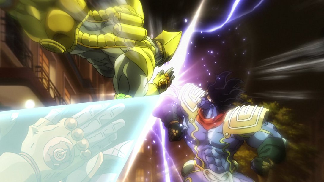
- The usual distortion is back here, people! I do wonder why they do that on some shots, but I’m afraid I don’t have a definitive answer for you. On top of that, most lines are a little thicker and the colouring and shading on most things are also different:
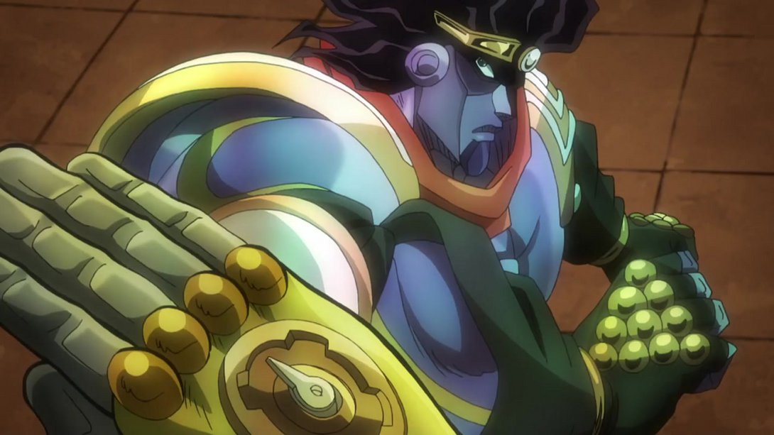
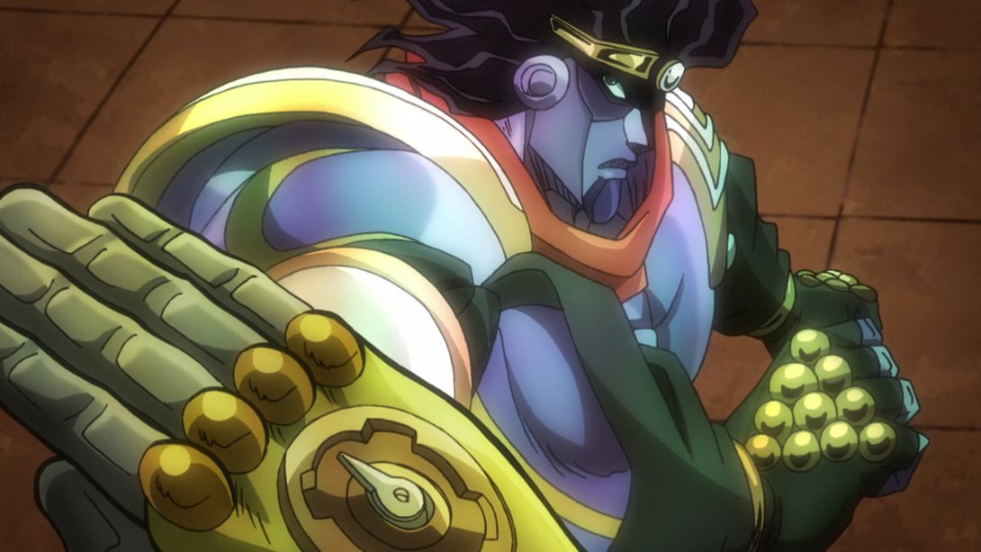
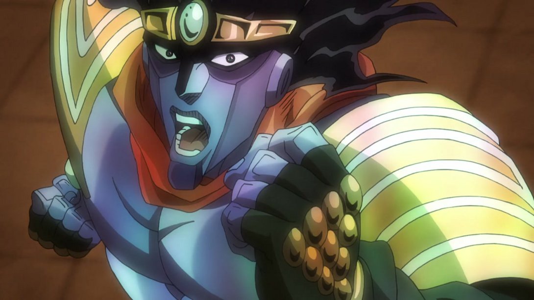
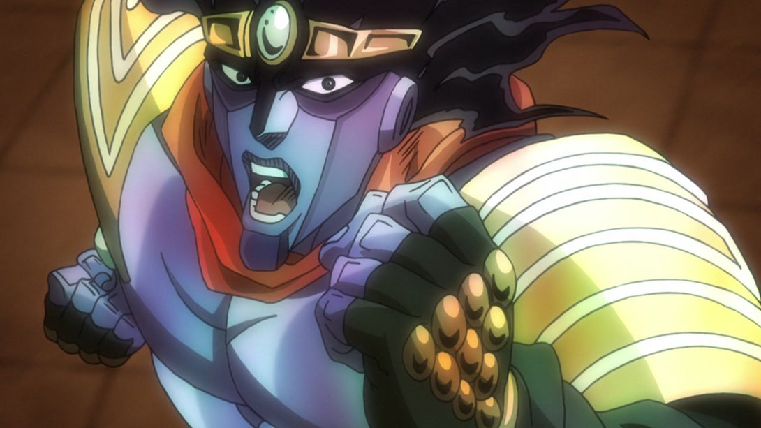
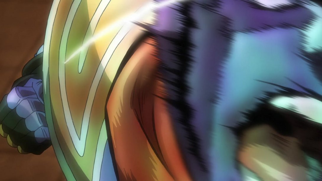
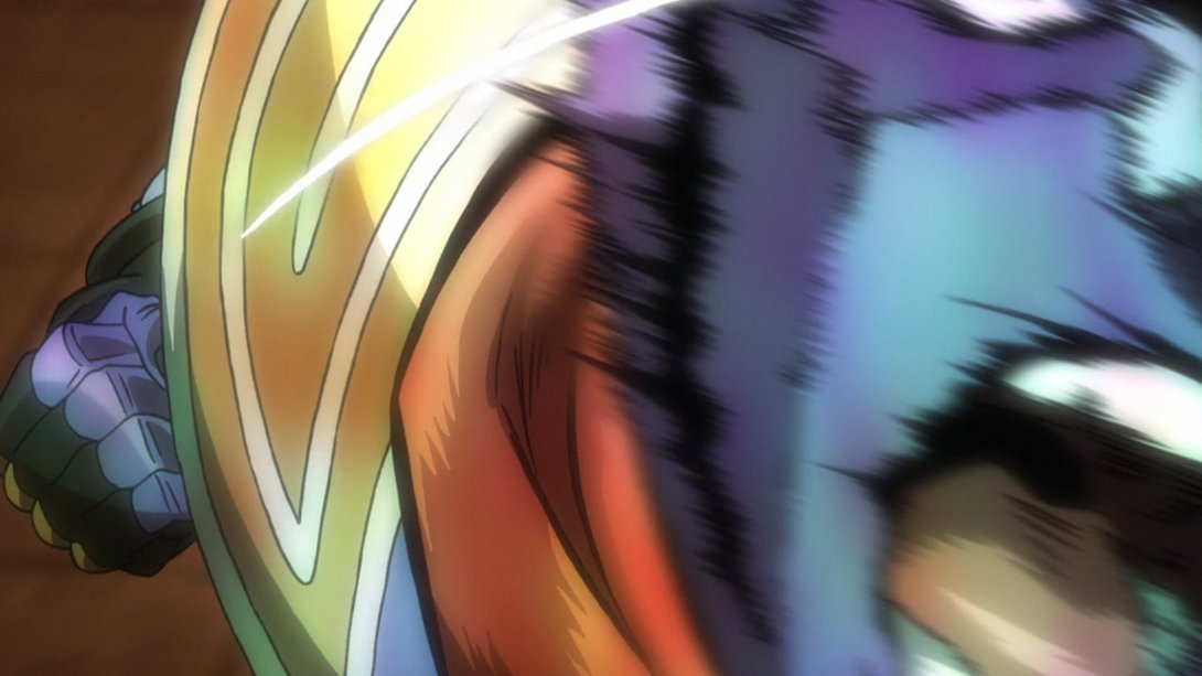
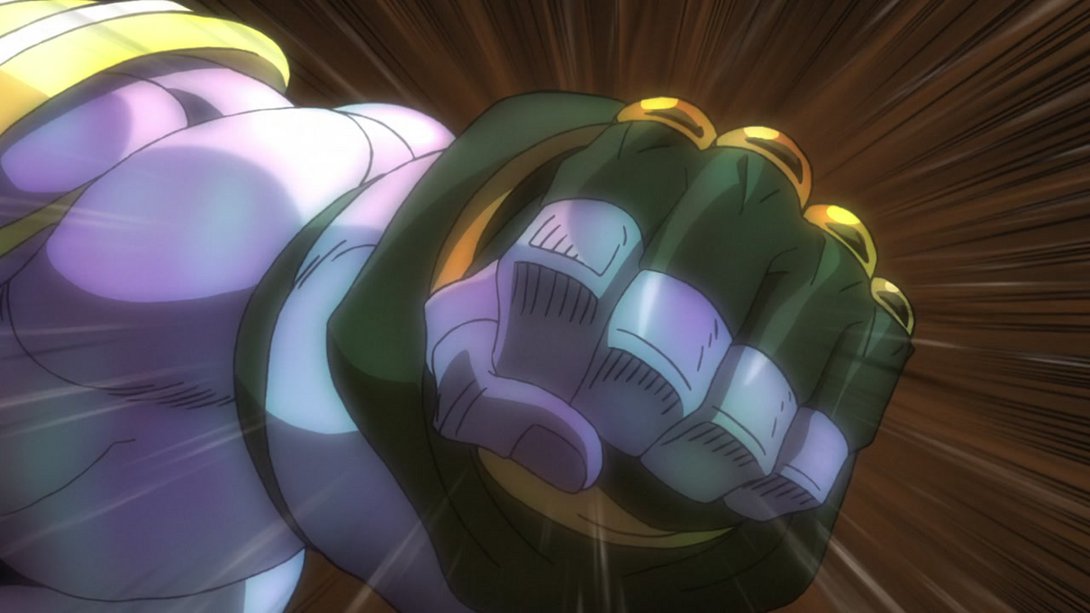
- The camera has been moved here, the shading on The World is a little different and Star Platinum’s punch now has a bright trail:
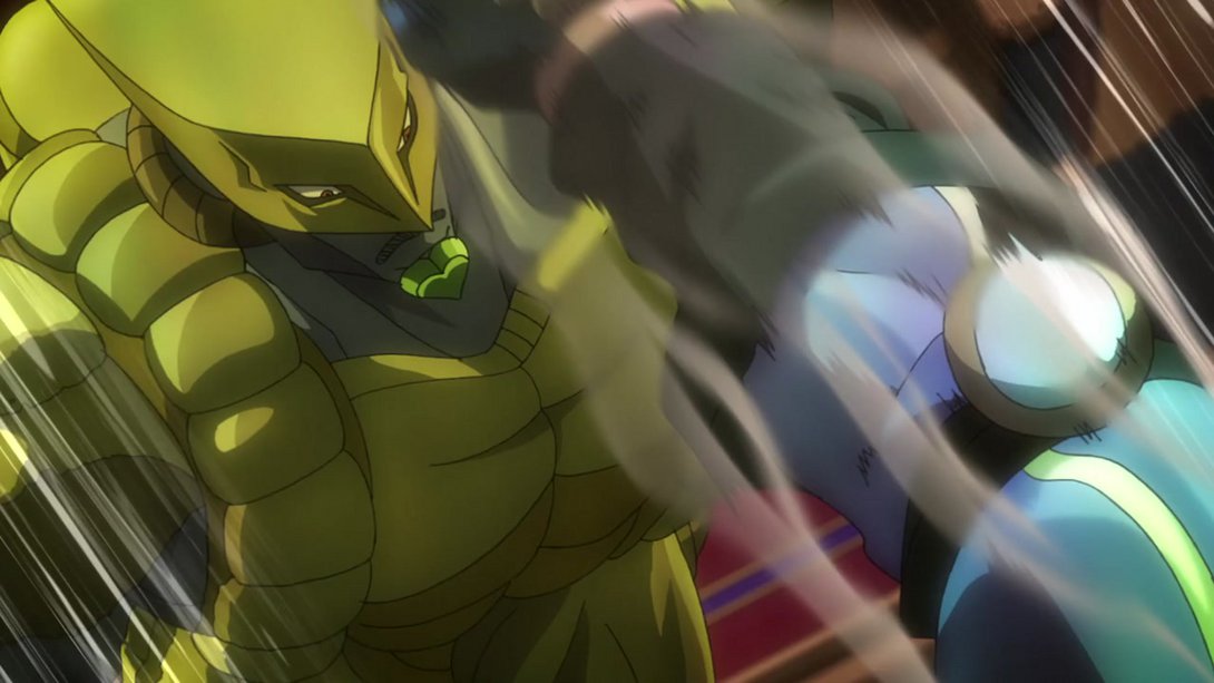
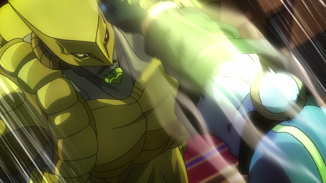
- These two shots have been received the usual treatment - the camera’s been moved, the colours have been tweaked, you know how it goes (the second one also has the new trail-thingie from the last difference):
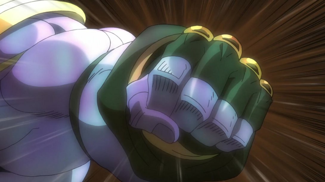
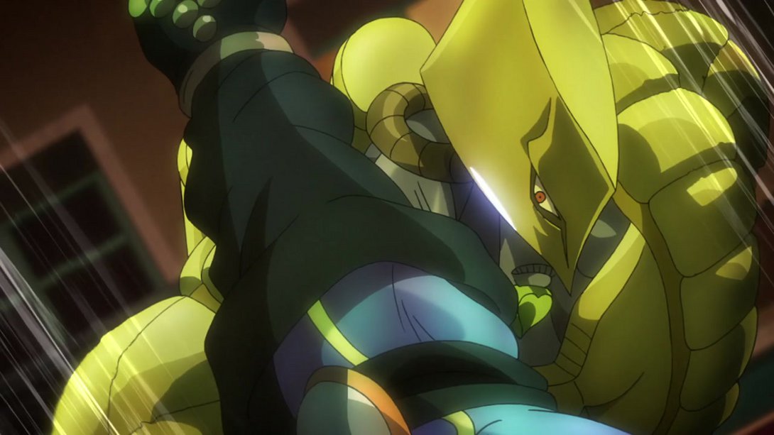
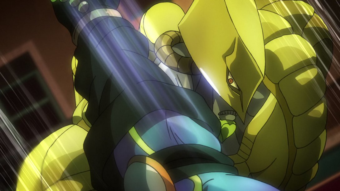
- Here, most lines are thicker, the background has a much warmer tint and Dio’s bleeding more:
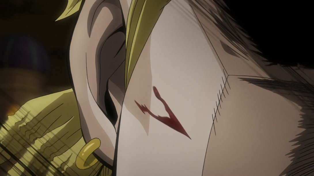
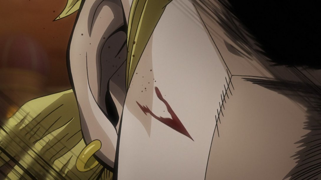
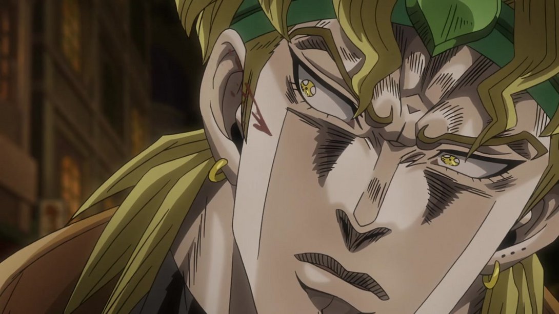
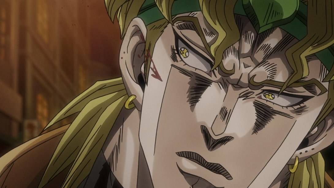
- Here we have a series of animations where my only recourse is: “Hey, there’s a bunch of shit that’s different, please take a look for yourself, it would take me three literal years to describe it all, please, be merciful”:
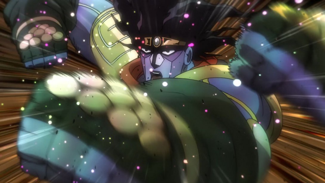
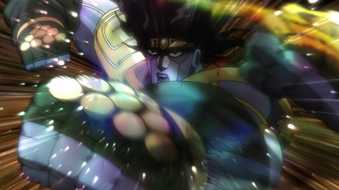
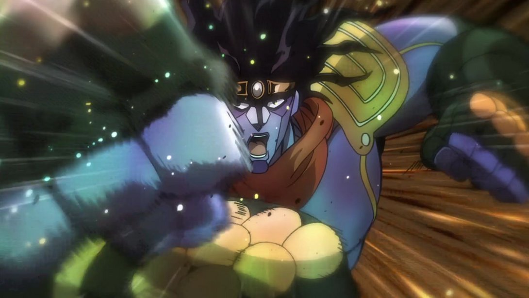
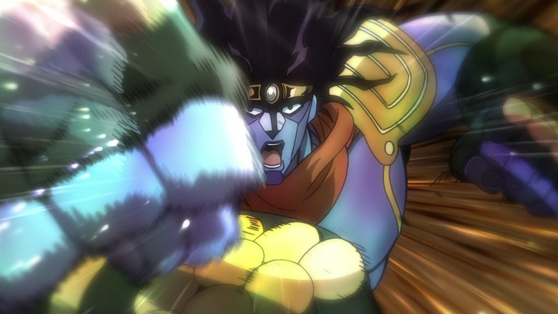
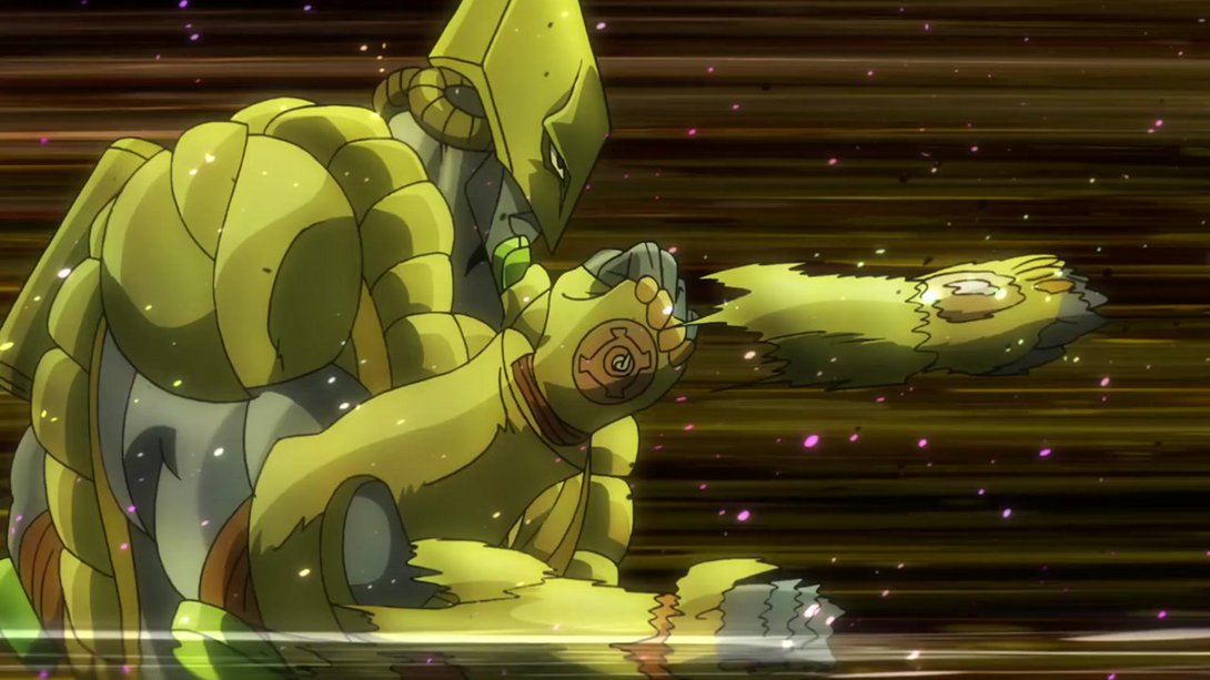
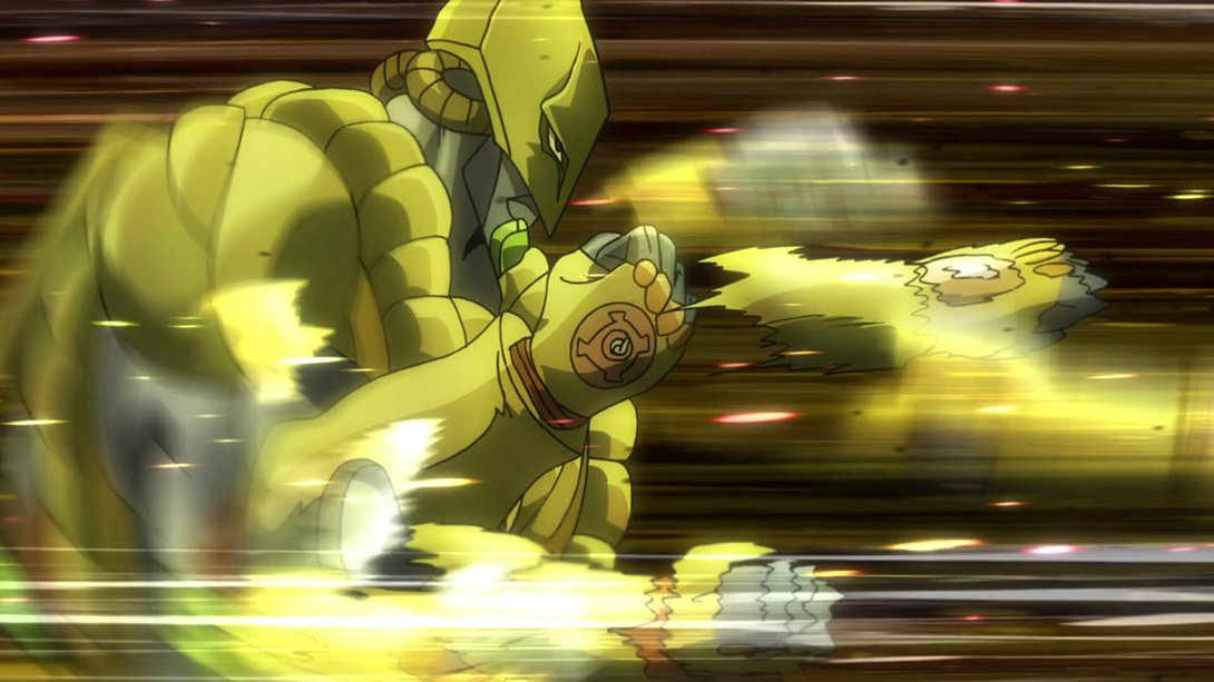
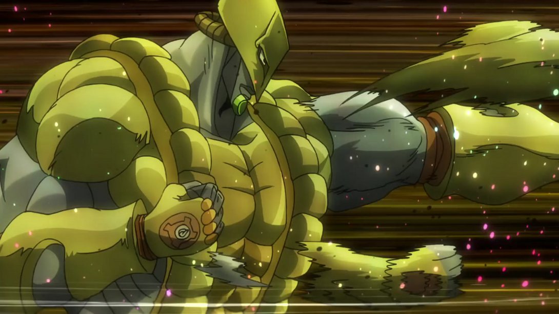
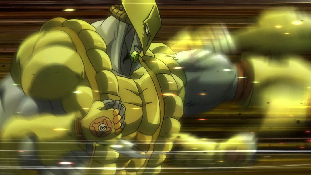
- The impact effect is different in these two scenes:
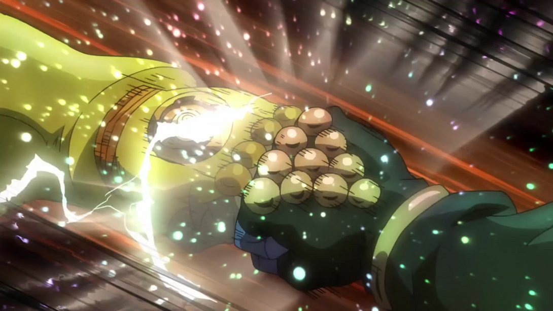
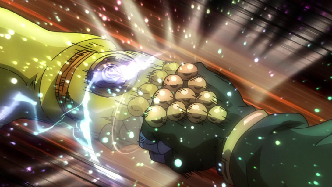
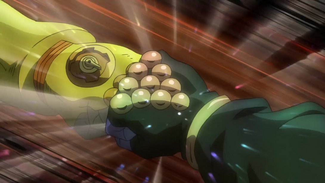
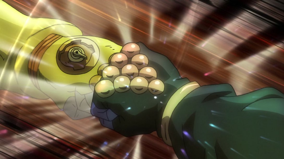
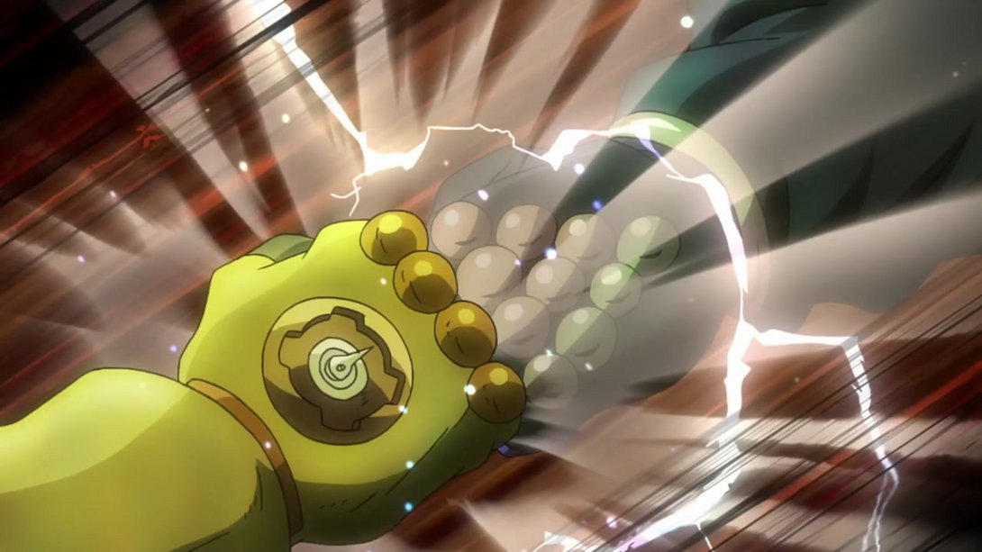
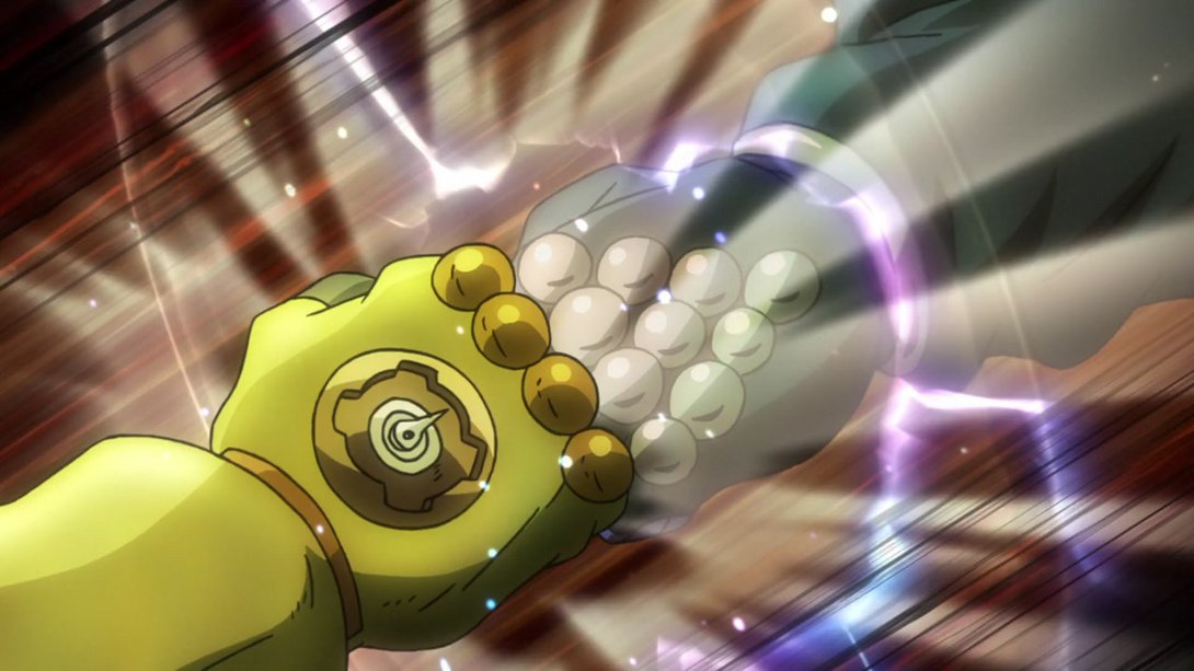
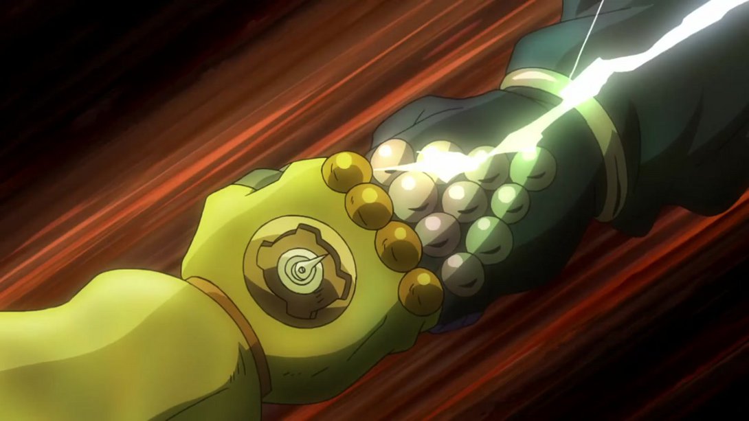
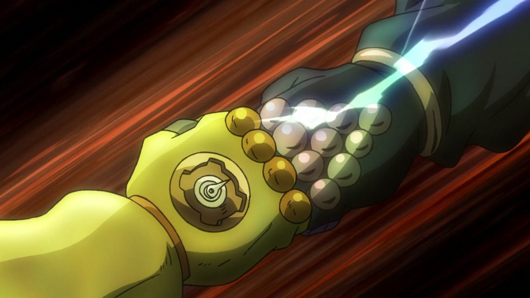
- As it is here! In addition, the background has a warmer tint…:
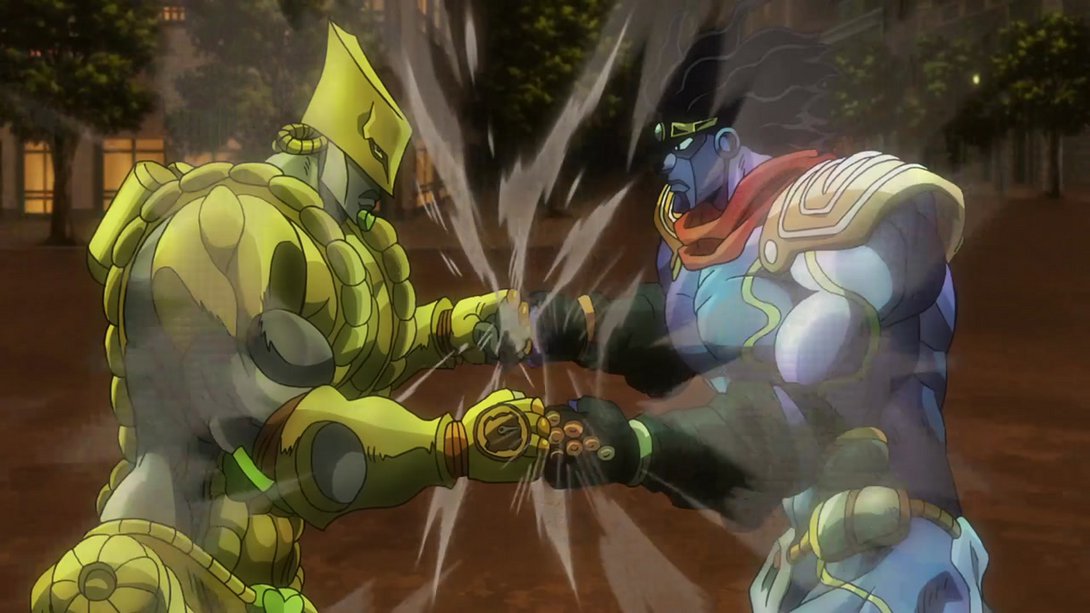
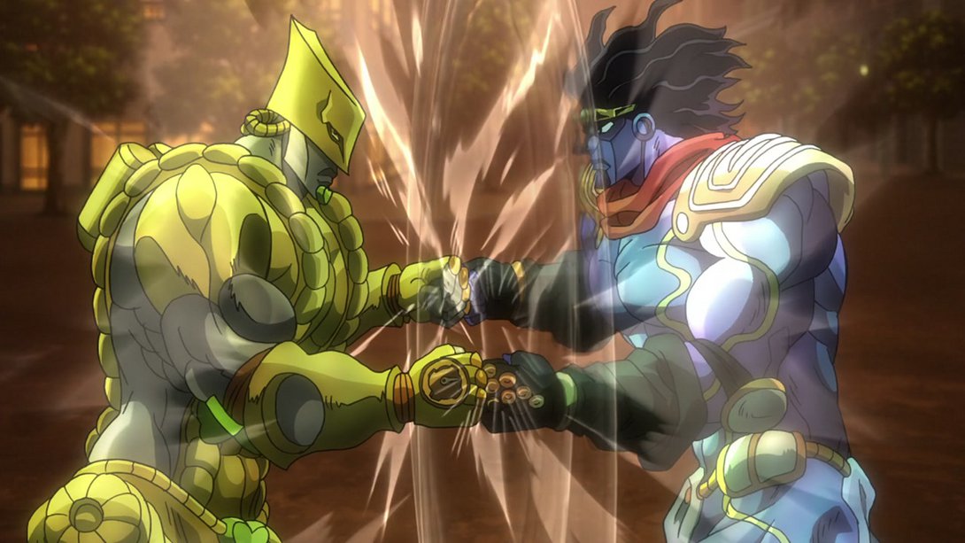
- …and the smoke that rises from their fists in the aftermath is now whiter and less transparent:
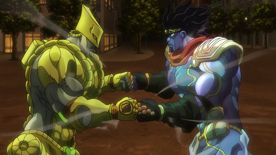
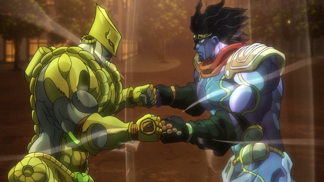
- Here, the background has the same tint as the previous differences; on top of that, both Dio and Jotaro have been shaded in a slightly flatter way, and the inside of Dio’s mouth is also looking significantly better:
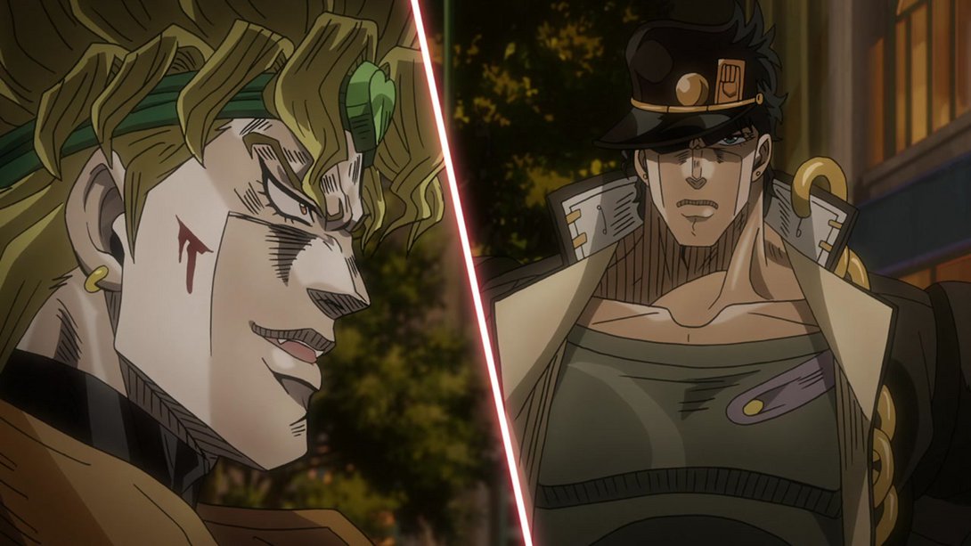
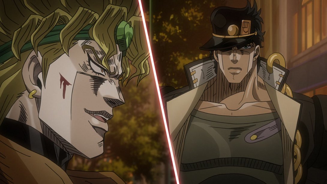
- Let me point you back to the “Whole lotta shit” clause of our mutual contract, friends:
Pheeeew! Goodness gracious was that a LONG one! The longest ever, so far - I was expecting to have a lot of work to do this week, but boy oh boy I didn’t think it’d be such a massive effort… It took me most of two days, but now it’s done, and it’s here for you all to read through! I’m expecting next week’s comparison to also run quite long, but let’s see if it’ll manage to top this one, eh? See you next time for Stardust Crusaders #47, “Dio’s World - Part 3”!
See ya!

