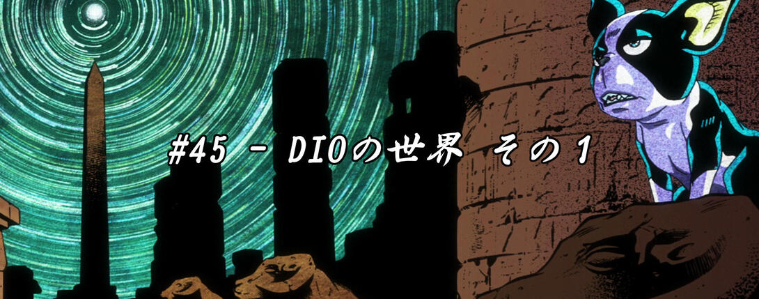
Hello again, good people! It is once again that time of the week wherein we must compare two sets of different images and discuss what has changed and what looks better. In other words, welcome back to Jojo’s Bizarre Comparisons for a healthy dose of differences! It’s time to take a look at Stardust Crusaders #45, “Dio’s World - Part 1”!
Let’s get right to it!
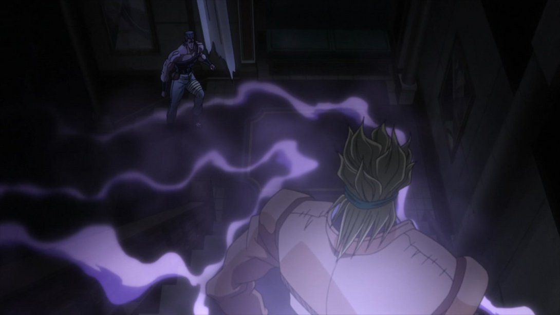
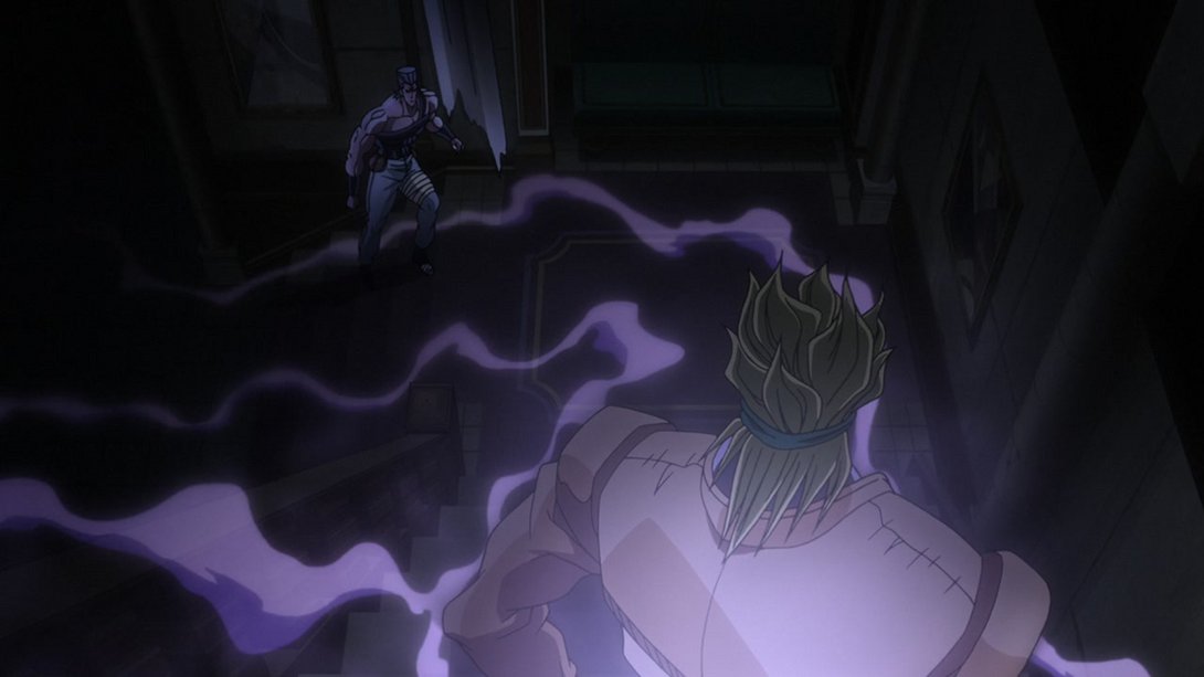
- The first difference comes quite early in the episode: here, the general lighting has been tweaked, and most things are not as hazy as they were in the TV version. Check it out:
- In addition, the zoom-in is slightly different and blurrier and the camera shakes a little bit at the end of the transition:
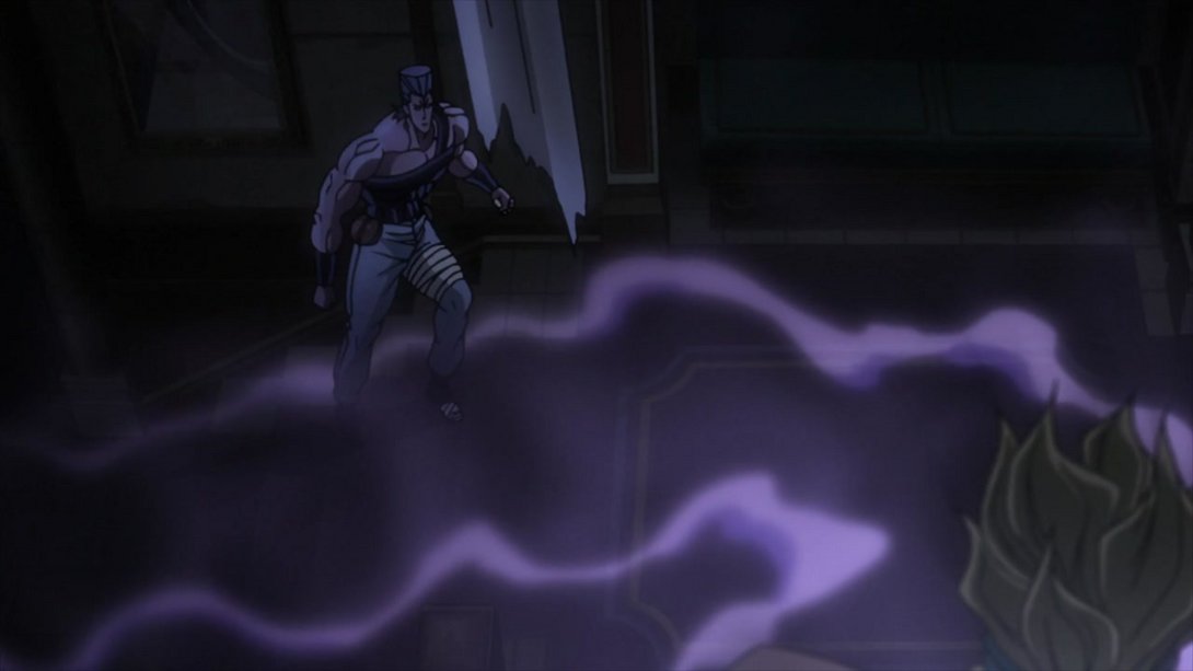
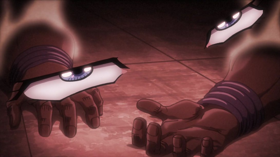
- JUST IN CASE YOU FORGOT ONCE AGAIN WHAT HAPPENED TO AVDOL:
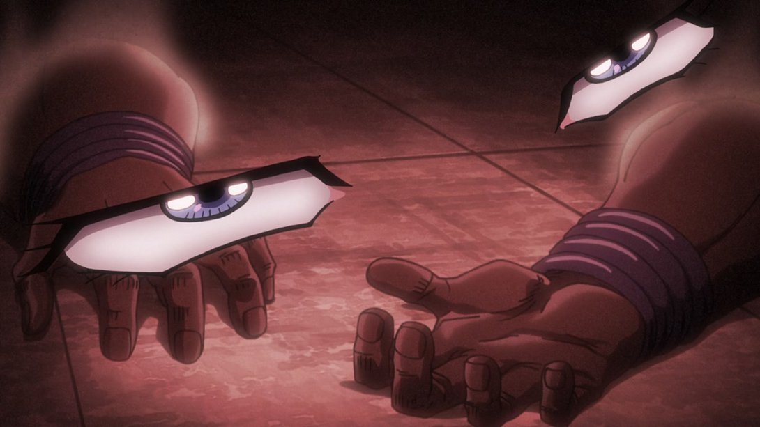
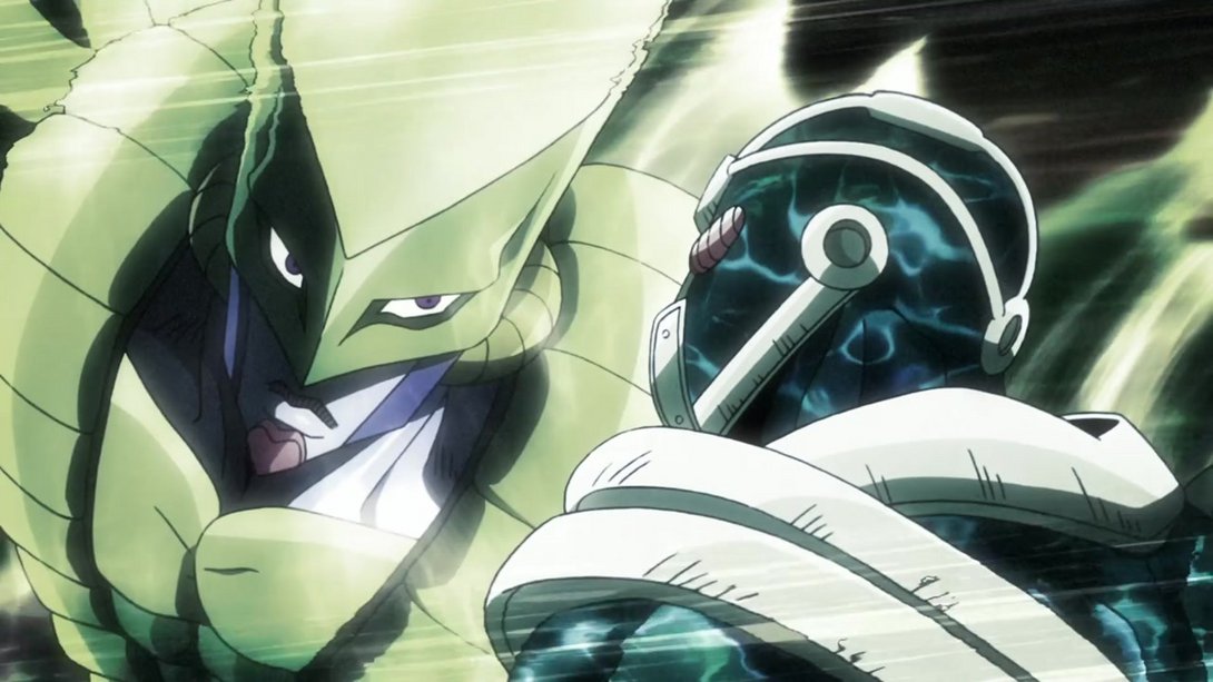
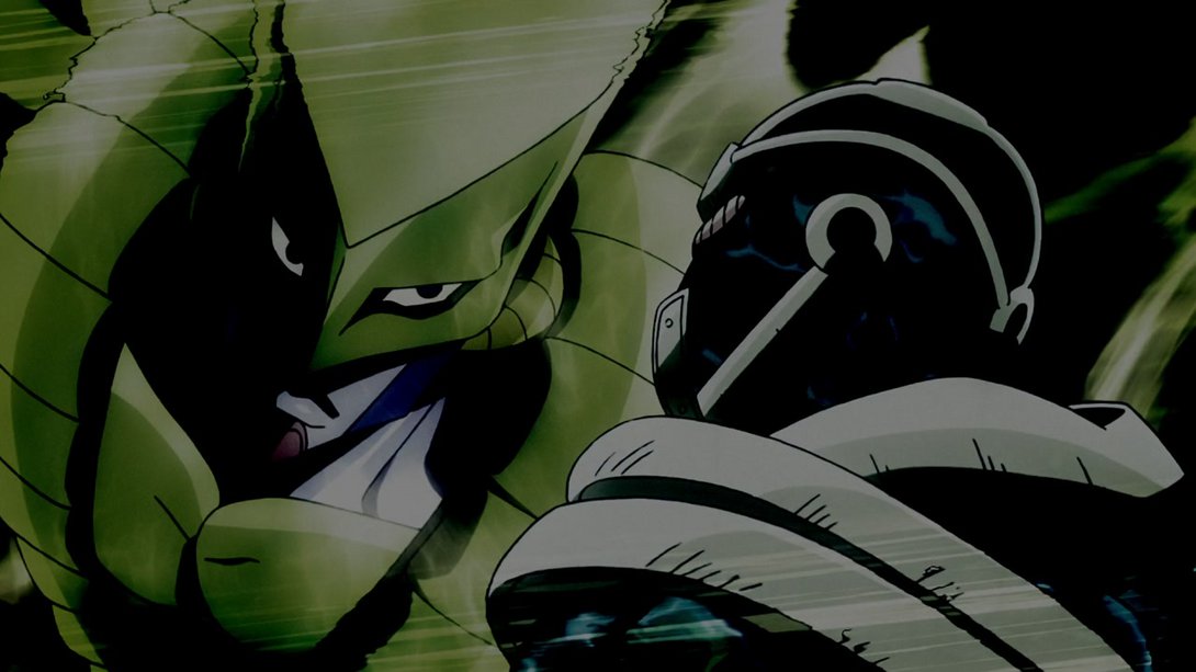
- Throughout the episode, every time Dio uses The World and we see it from an outside point of view, there is a slight contrast change to punctuate the action, like so:
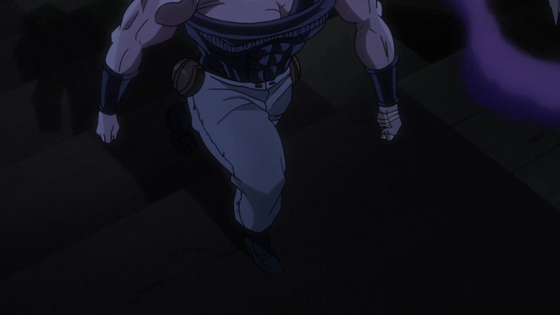
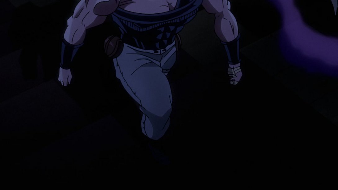
- In addition, the camera ends up slightly more to the right:
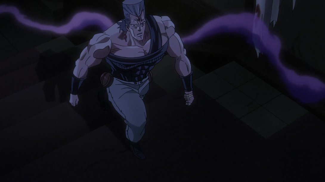
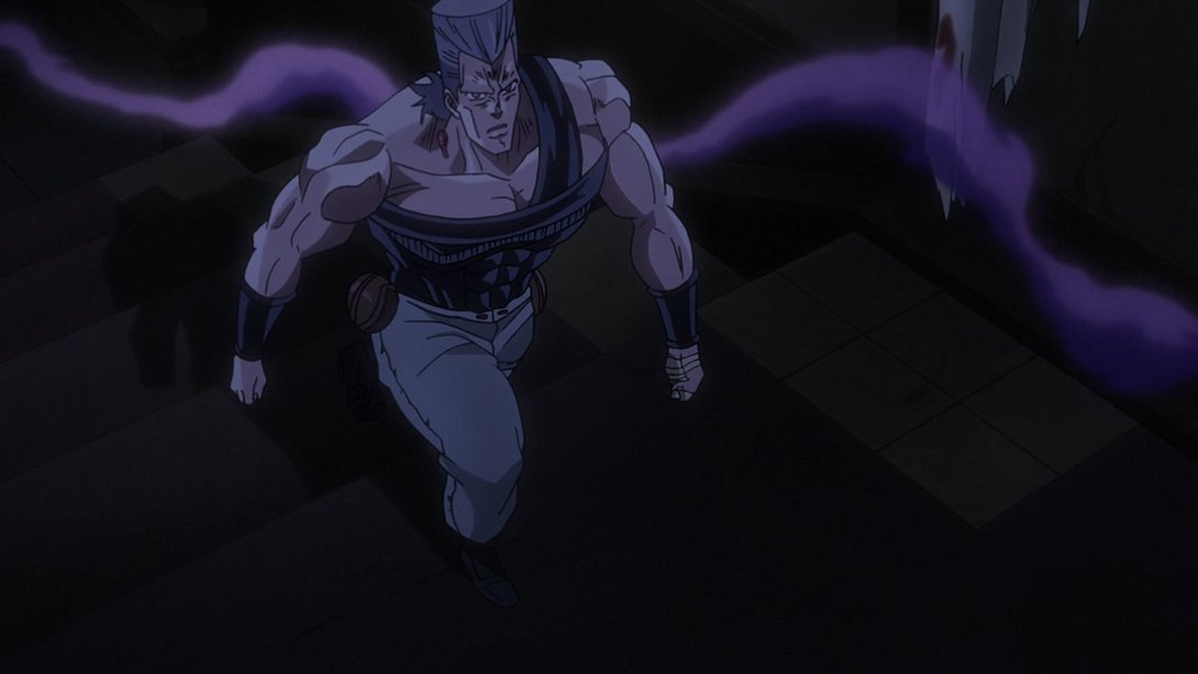
- This other shot is slightly more zoomed-in:
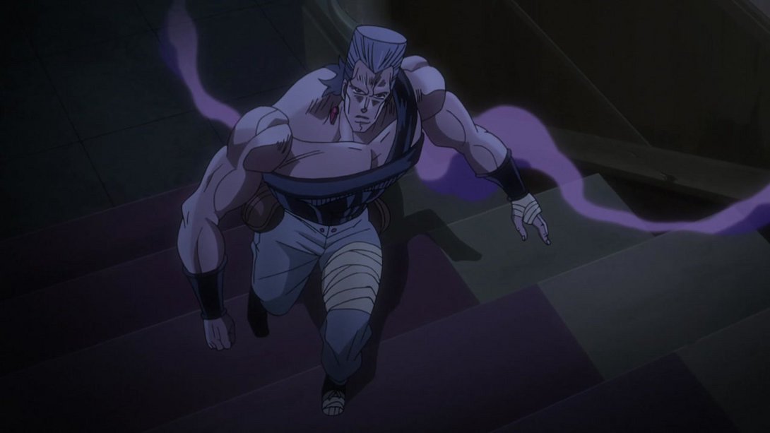
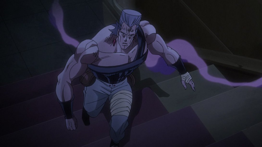
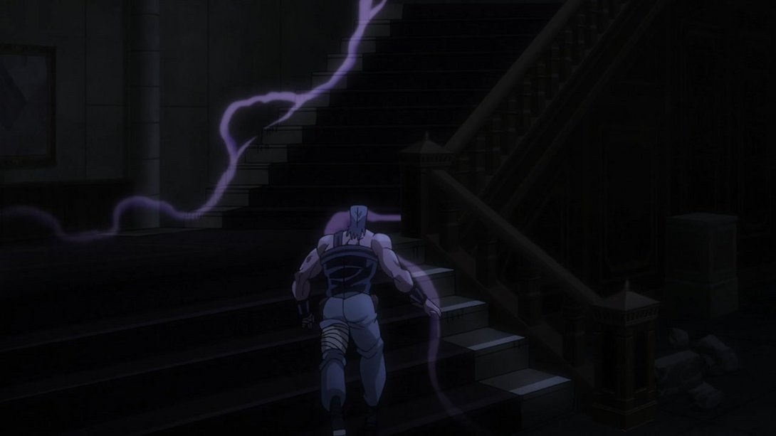
- Here we have another The World-related displacement:
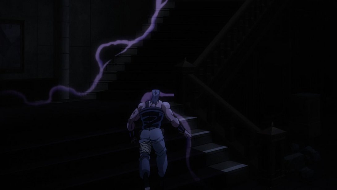
- This scene has received a few key differences: the general lighting is different, the smoke effect is different, the stairs have been shaded much much better, the haze behind Dio’s chair is not so strong as to muddle the outlines, a small bit of the smoke behind Dio has been recoloured and the shadow cast by Dio’s chair on the staircase is much more visible:
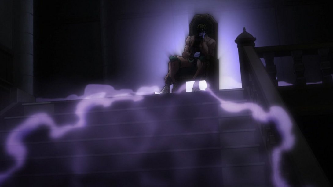
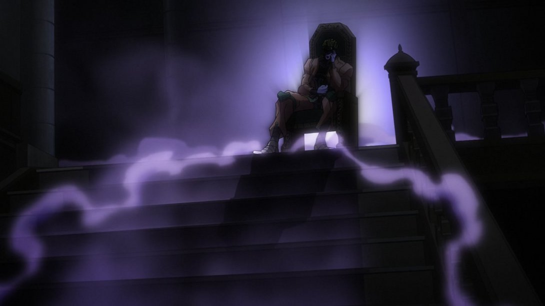
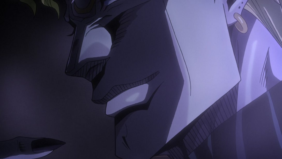
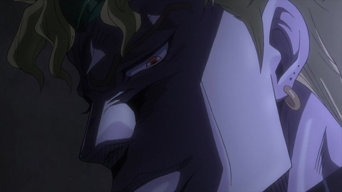
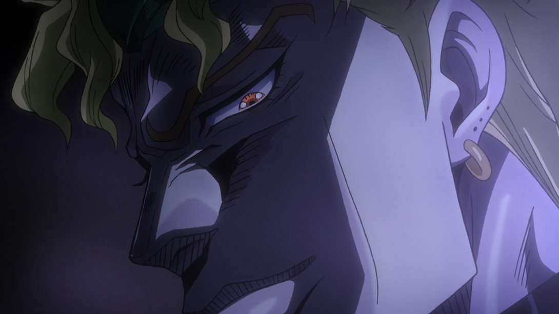
- Here, on top of some new smoke effects, the background and the lighting have been changed so as to make Dio much more clearly visible:
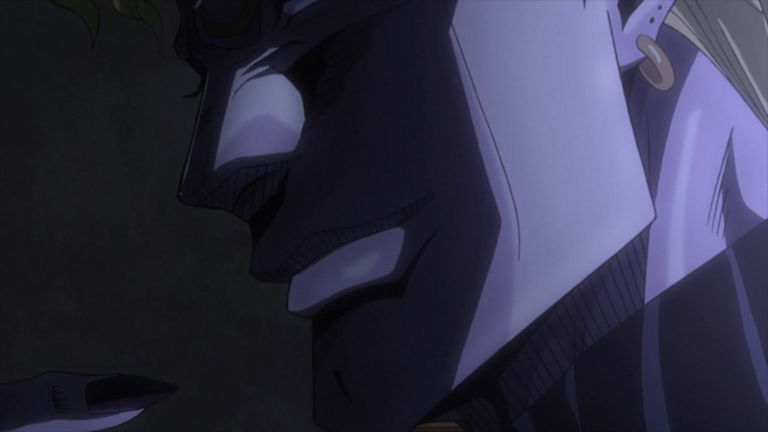
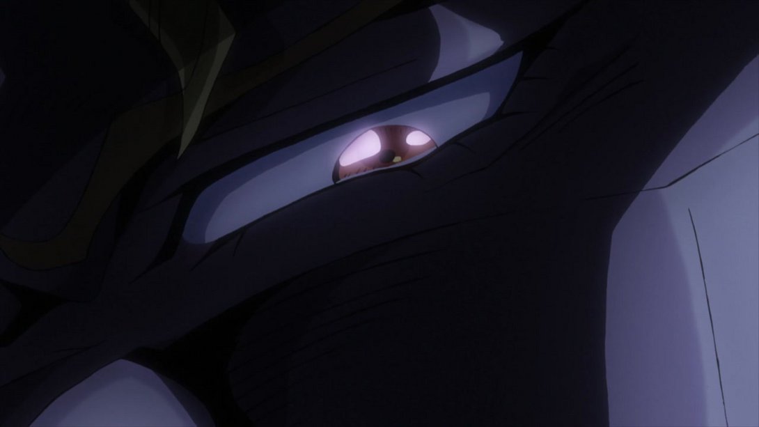
- The same lighting change can be seen in the following shot as well:
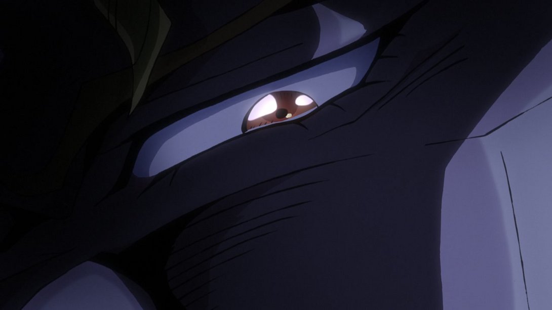
- This shot is slightly sharper, and the lighting has been tweaked as well:
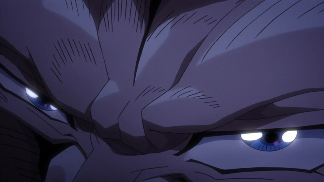
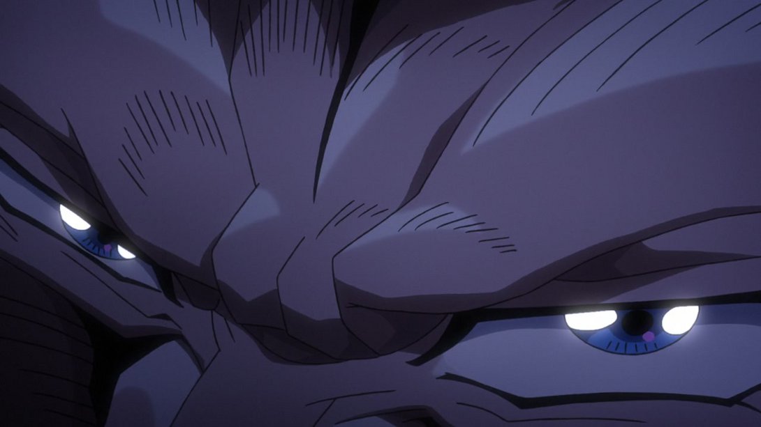
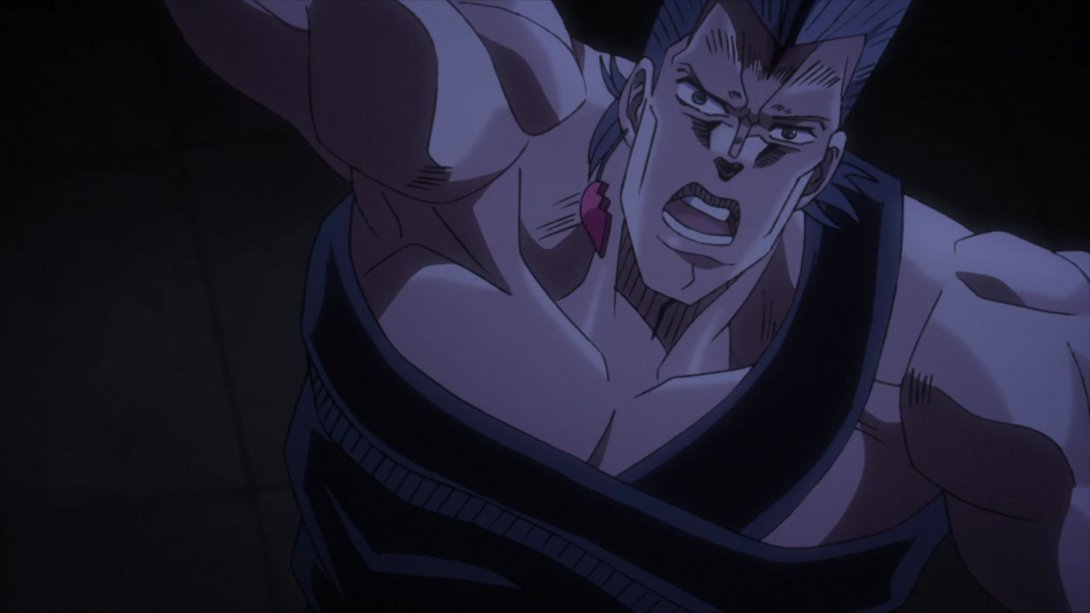
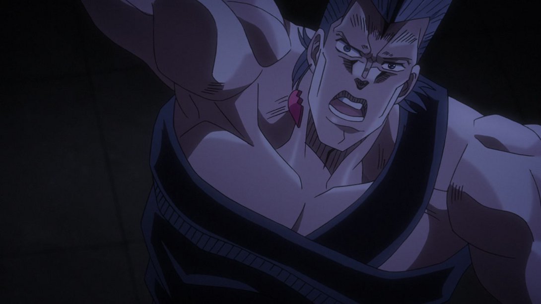
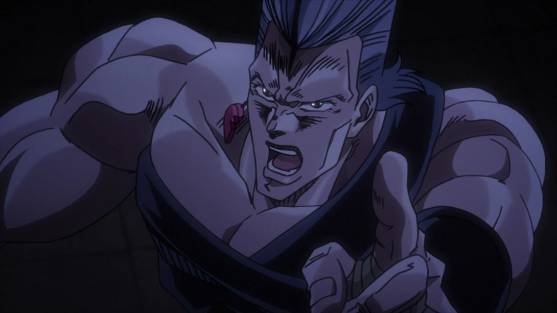
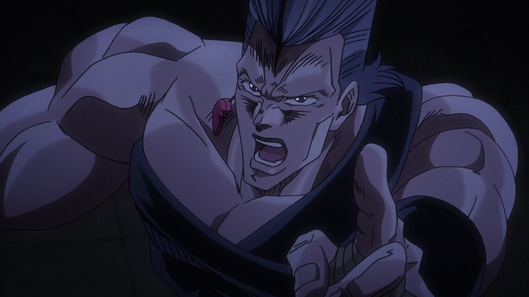
- Have a good old brighter and sharper animation, friends:
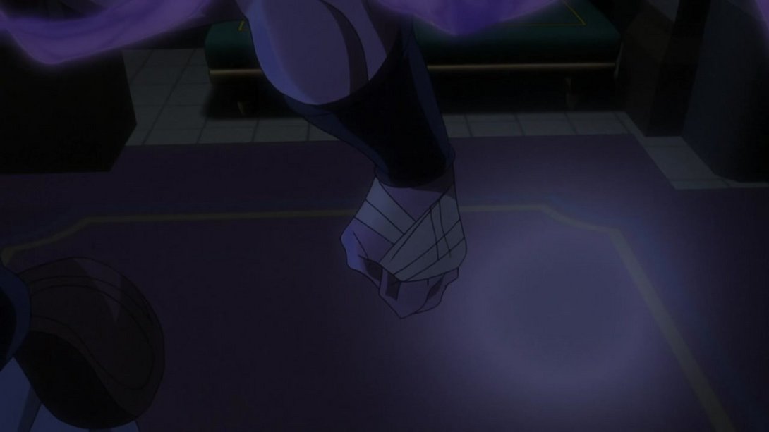
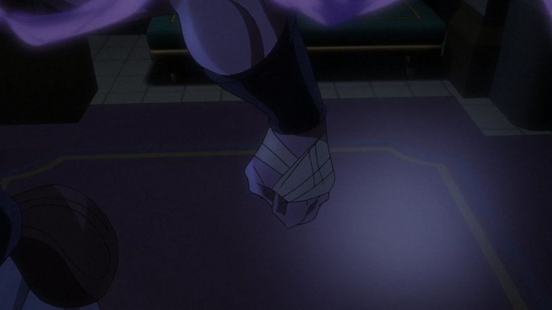
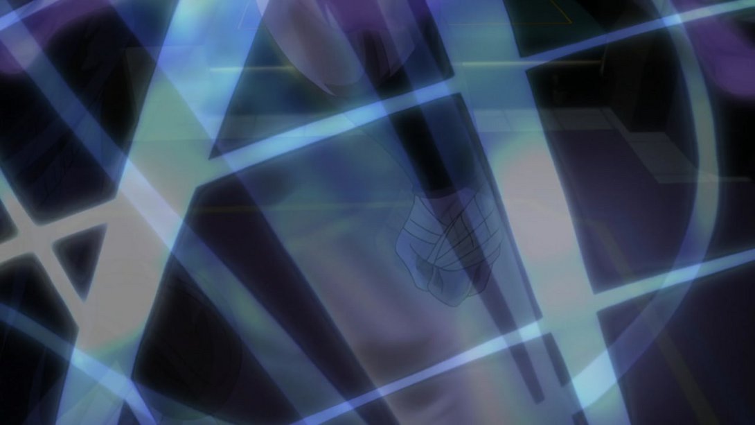
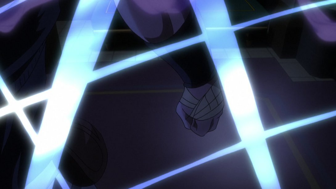
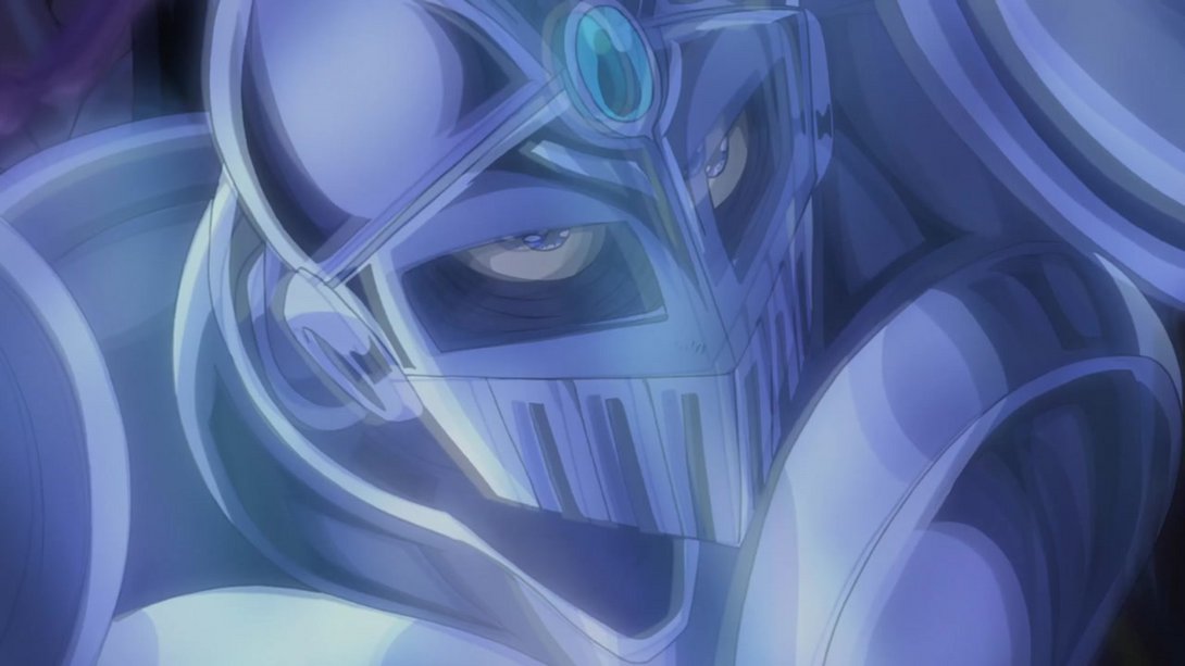
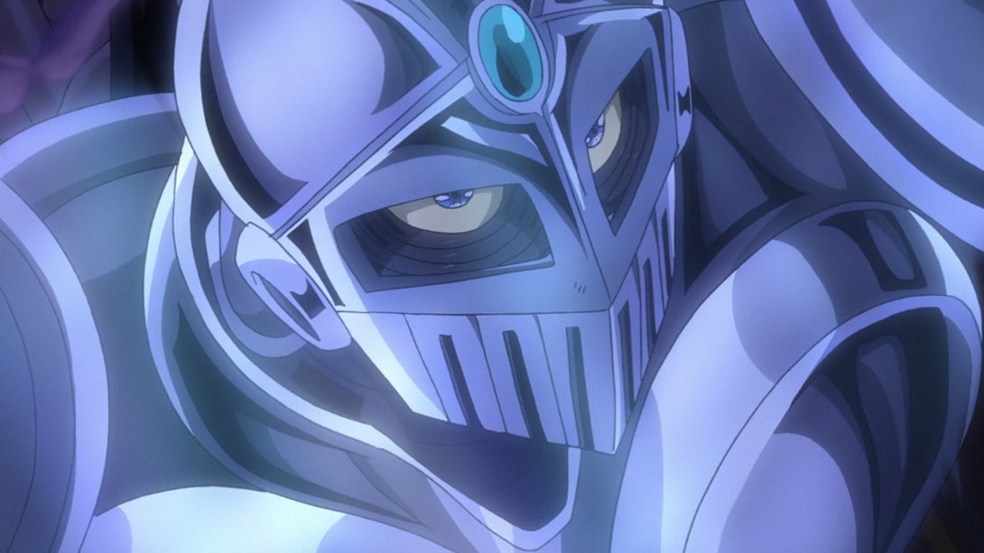
- This scene has now been properly smoked, and the background is also significantly more interesting:
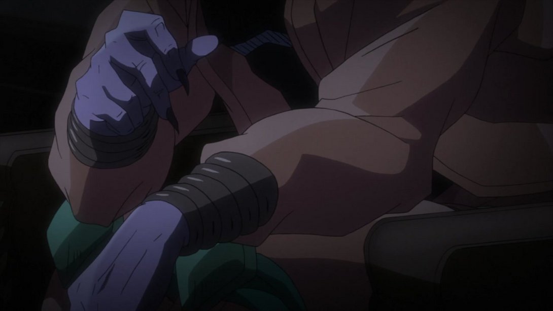
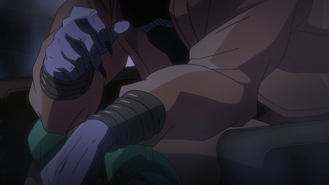
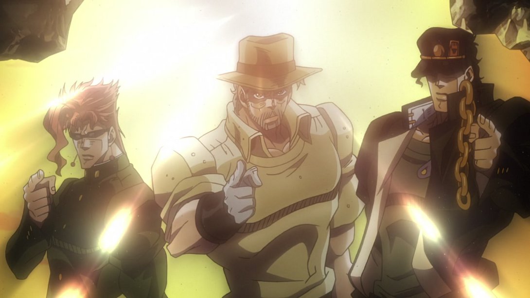
- When the rest of the gang shows up, the background is much brighter and more radiant, the dust effect is looking significantly better and the light rays are brighter as well:
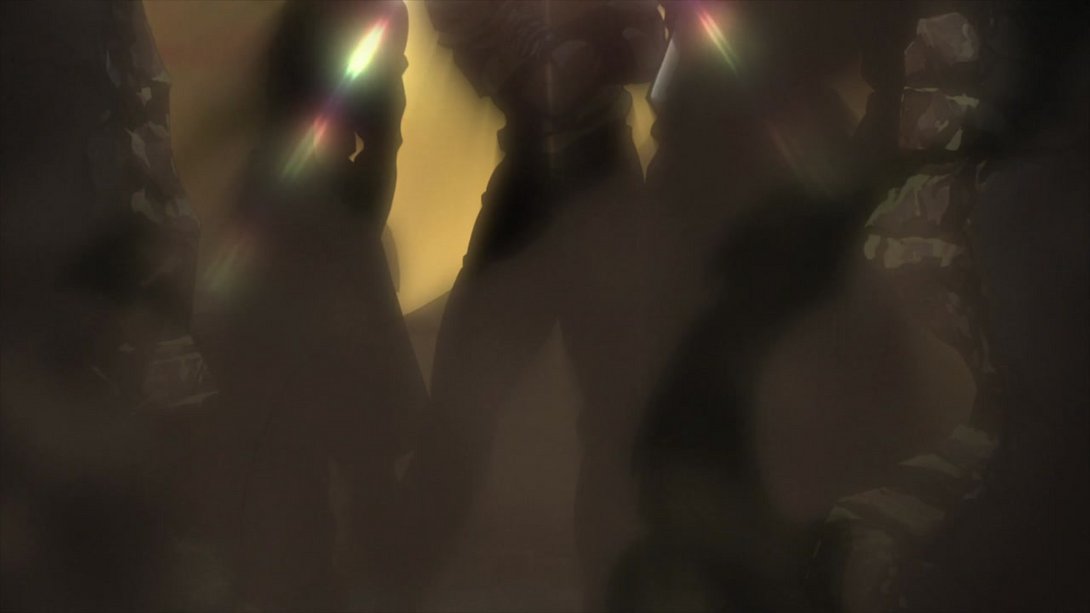
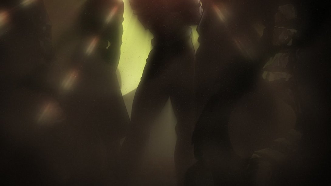
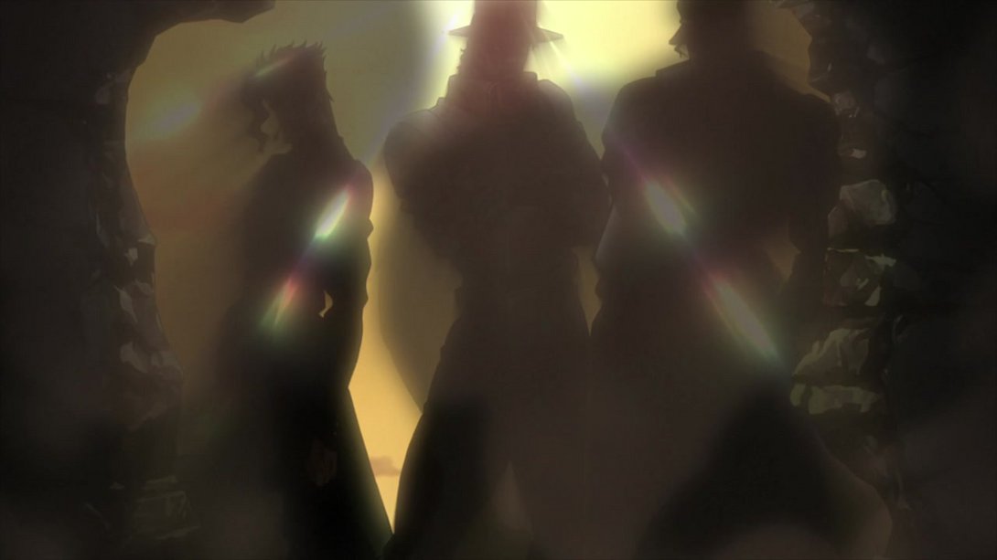
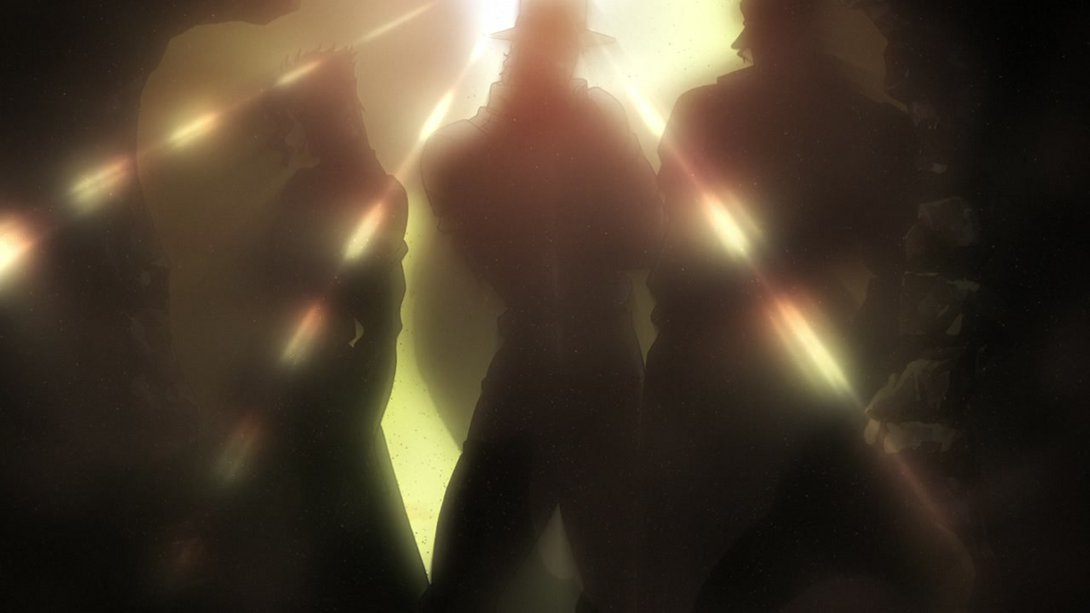
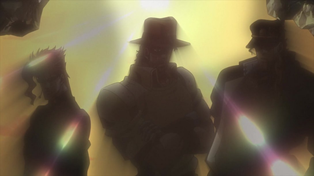
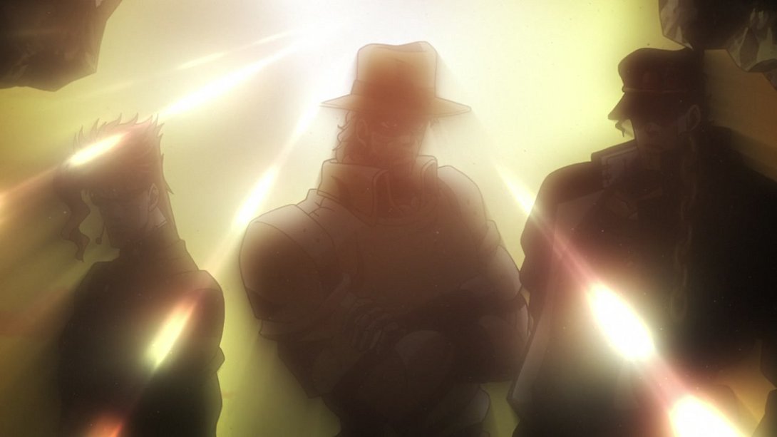
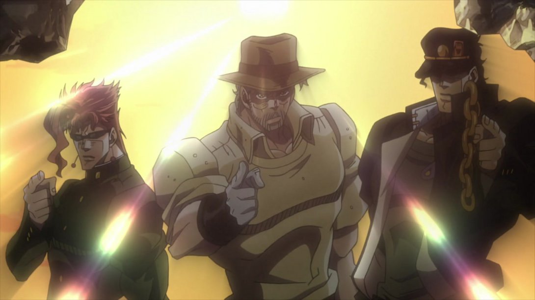
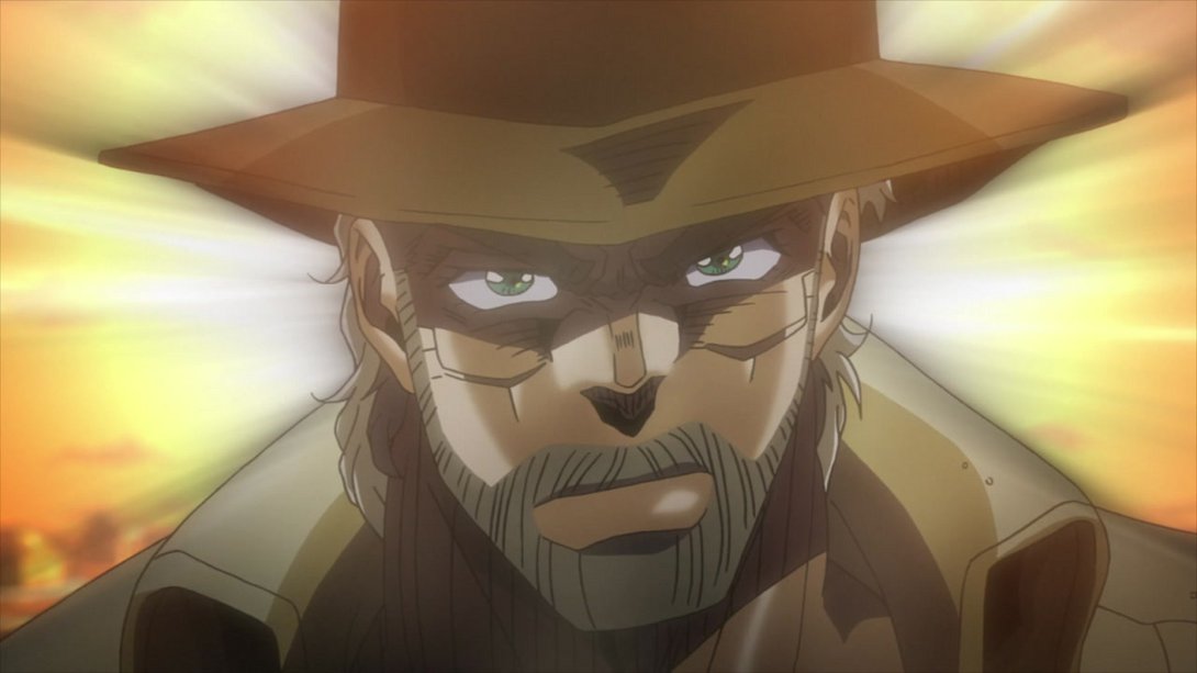
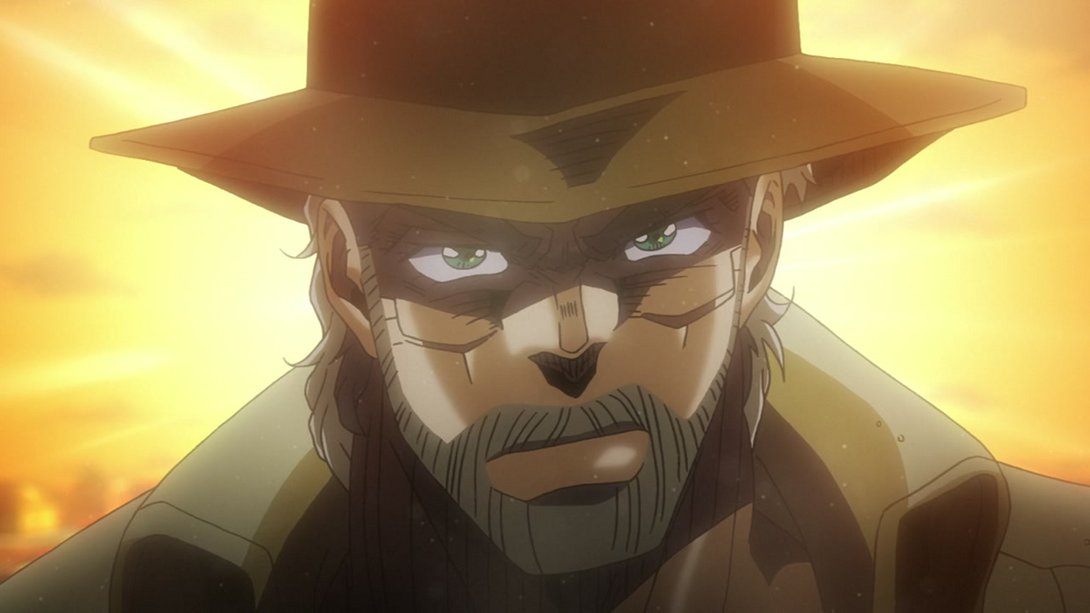
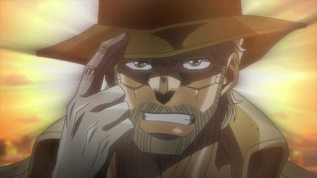
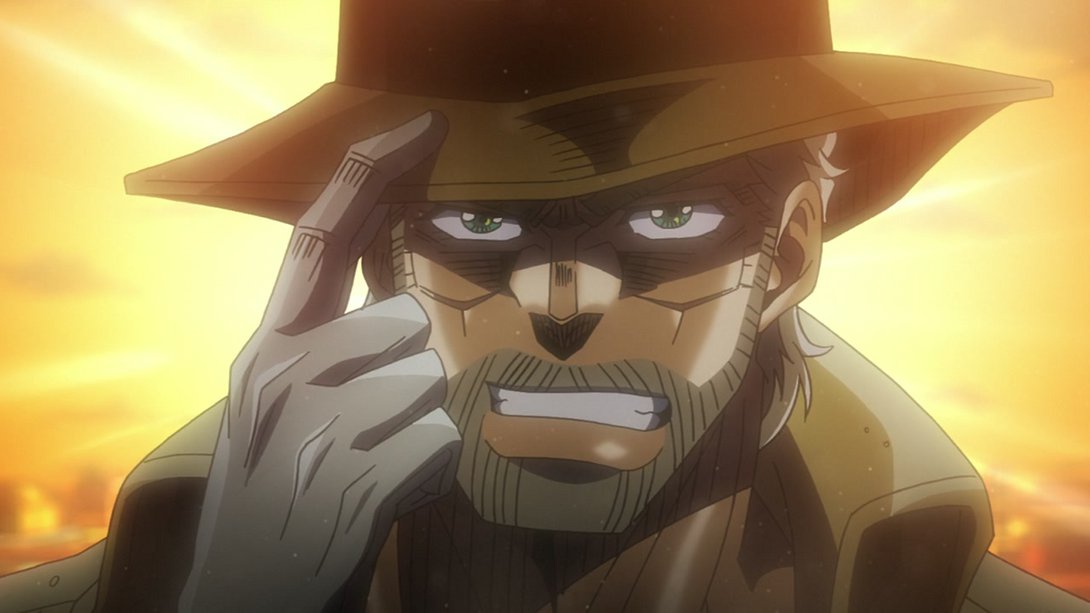
- Wow. Look at that RADIANT Joseph. Incredible. Anyway, moving on… In the first frames of this animation, Dio had a bunch of extraneous lines drawn all over his body - perhaps the result of a layer mishap? Anyway, those have been removed, and the background is significantly brighter as well:
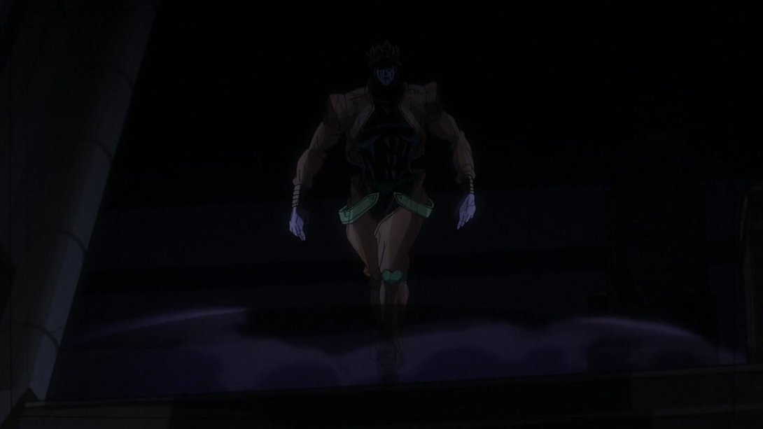
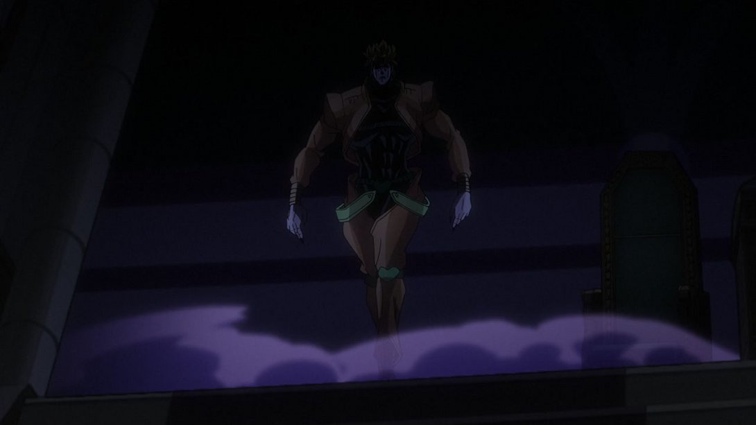
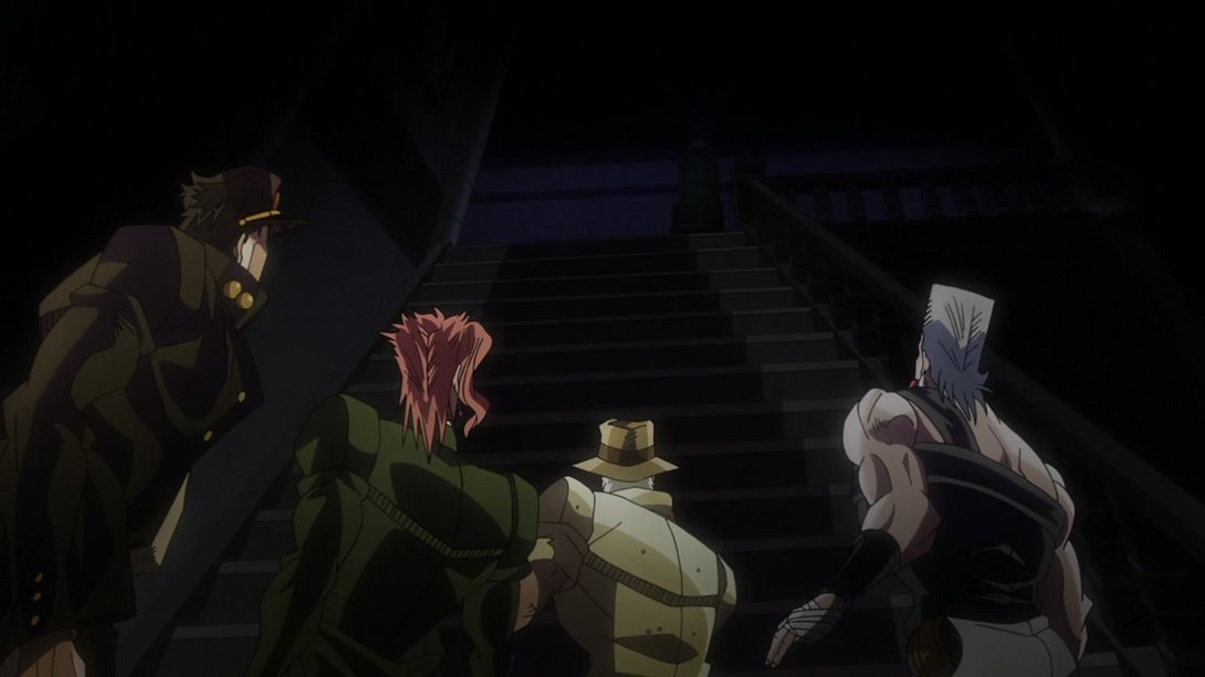
- Later on in the same scene, we can see that Jotaro’s hat is now more shaded, for some reason:
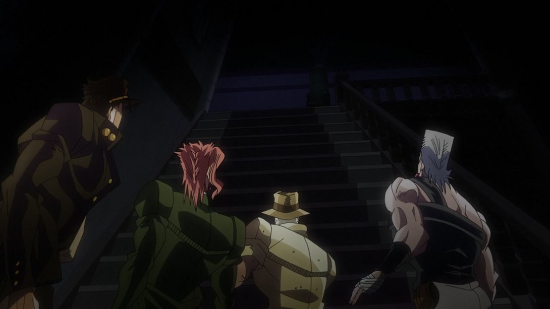
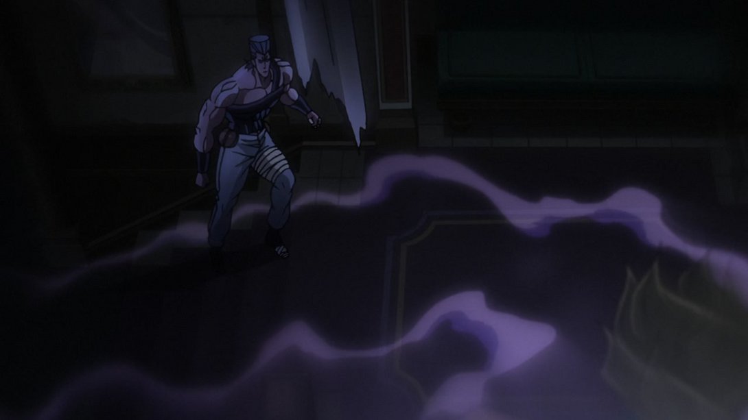
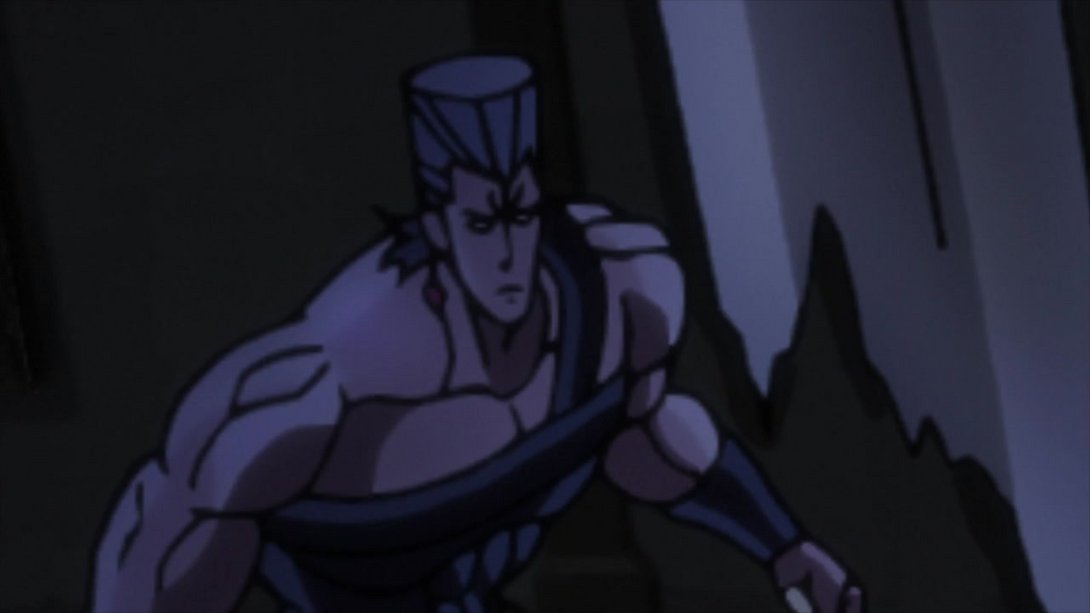
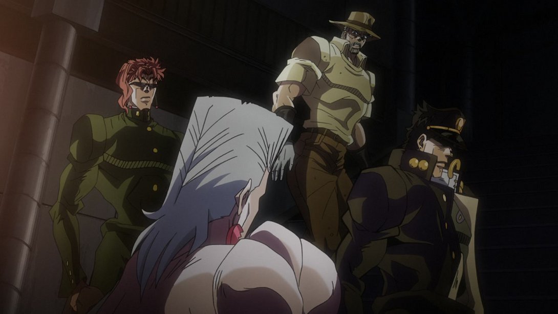
- Moving on, here we have a blurrier Polnareff in the foreground:
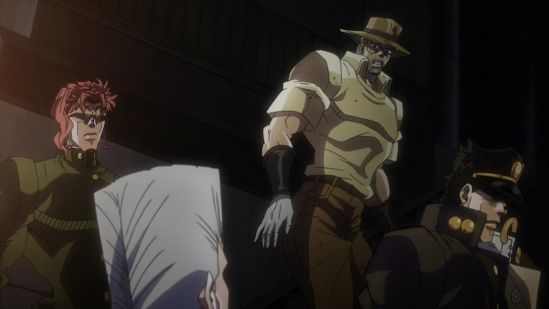
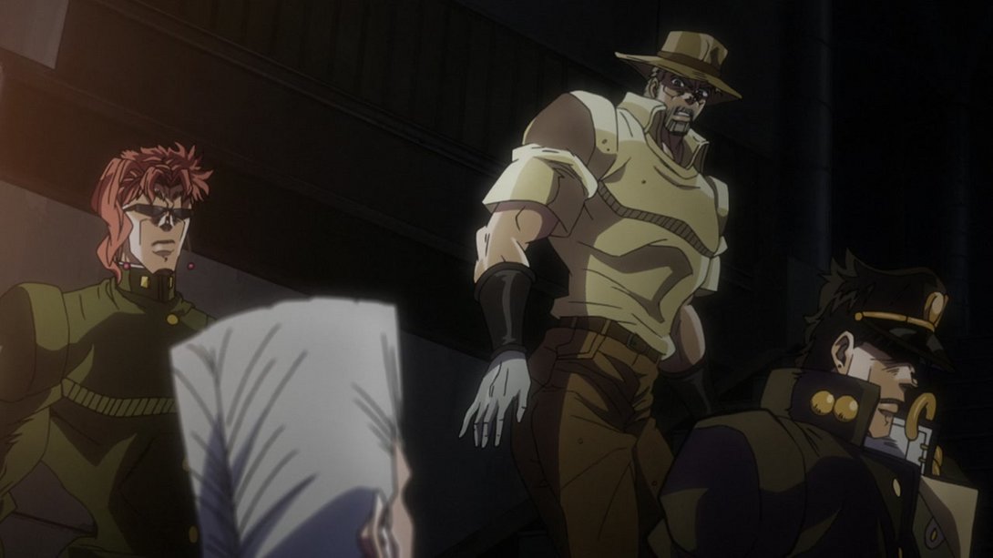
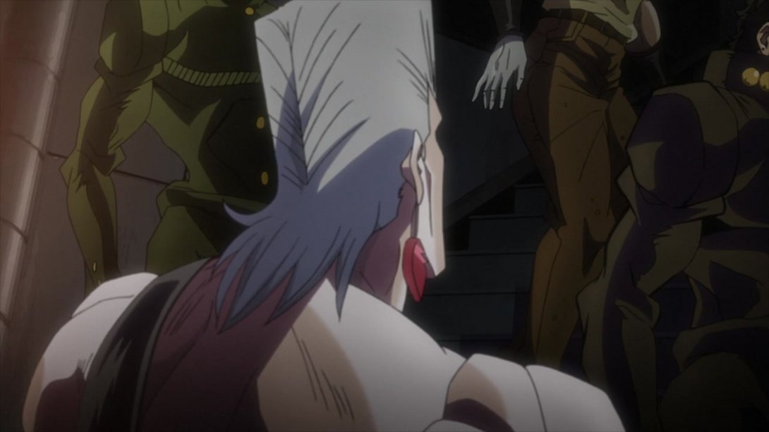

- While here in this very similar shot, everyone is slightly sharper, Polnareff has been shaded in a flatter way and there’s a slight distortion along the edges:

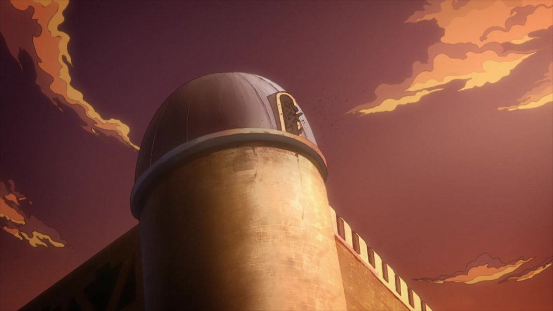
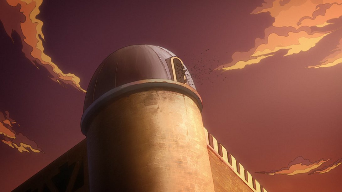
- The bits of glass flying out of the turret now move in a slightly more natural way:
- Here, the godrays are looking different, the general lighting has been tweaked and there is the usual distortion along the edges…:
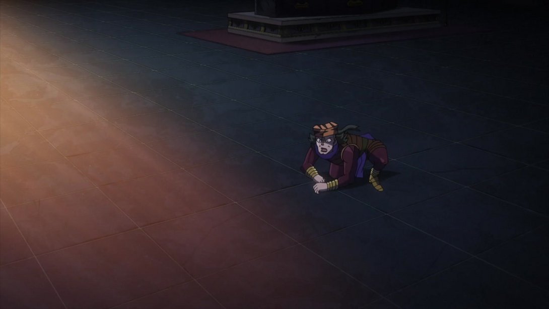
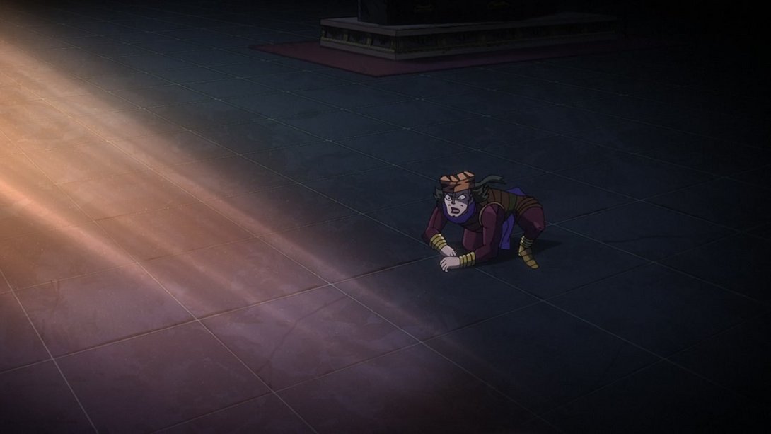
- …the shading on the gang is also significantly different, at the end of the shot…:
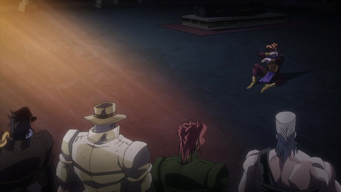
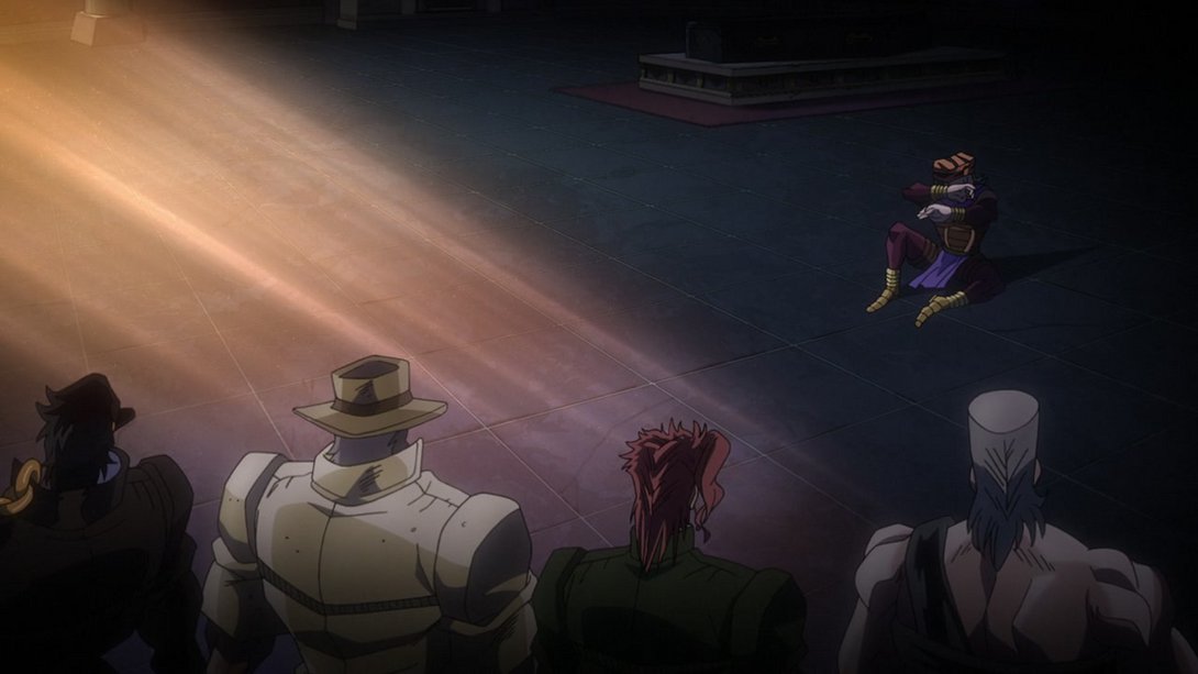
- …and the motion itself of the whole shot is also different! The Joestar group shows up later, is blurrier in their first frames and moves into frame more dramatically:
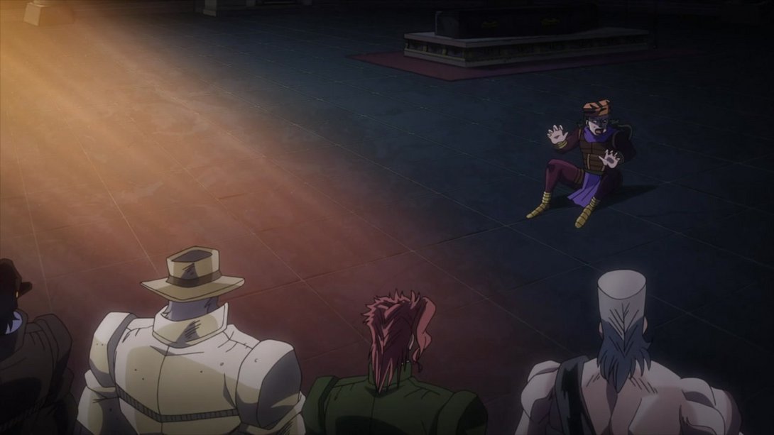
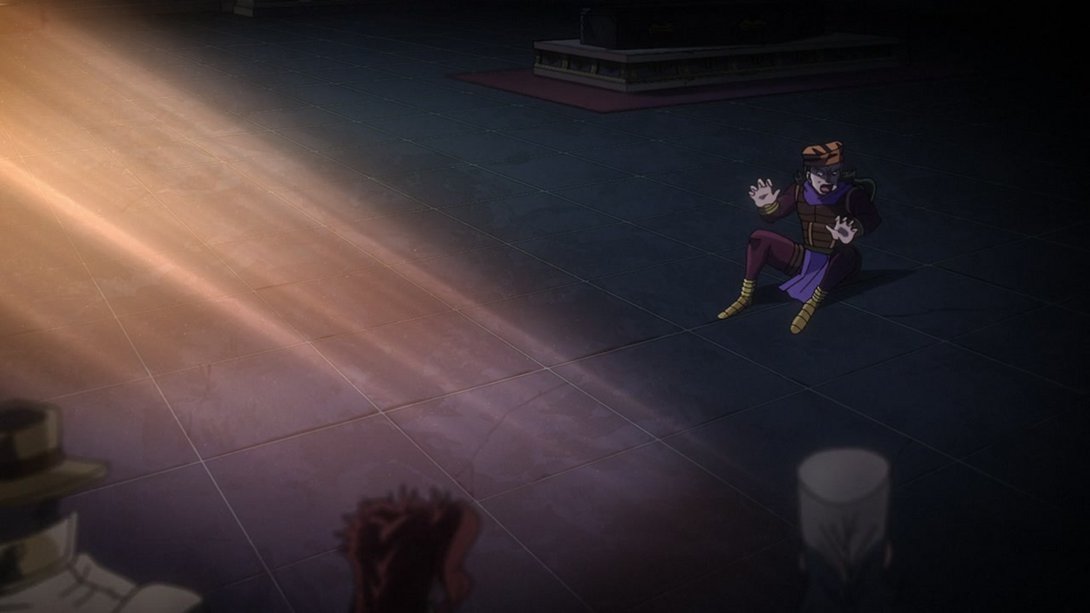
- Here we have a slew of uncensored shots of Nukesaku (the usual lighting changes also apply):
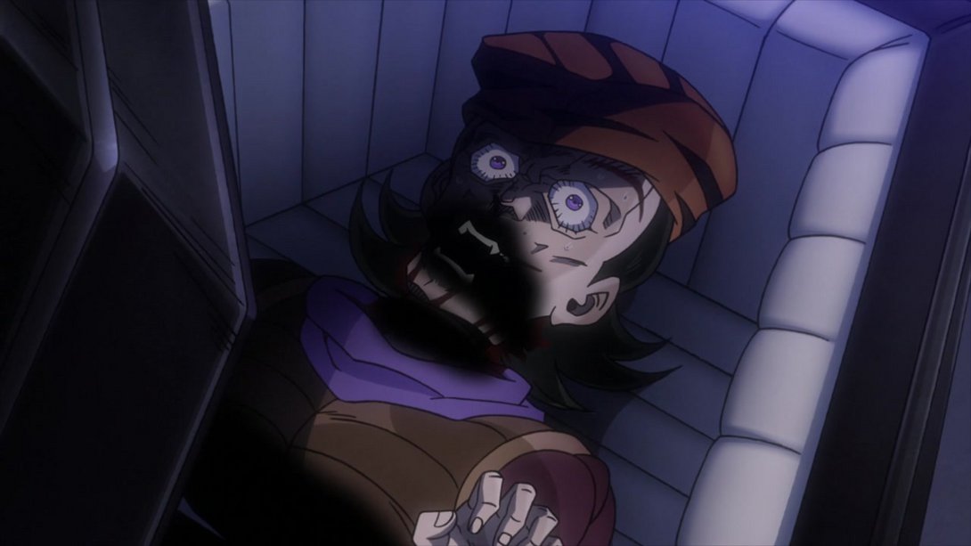
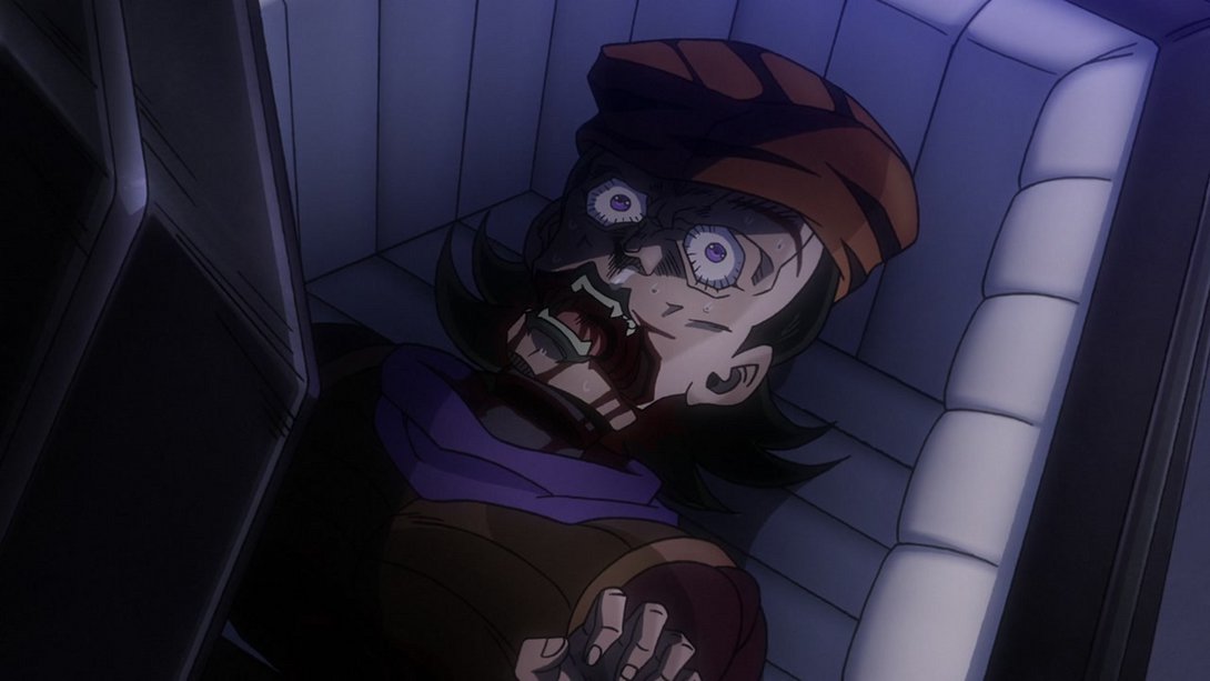
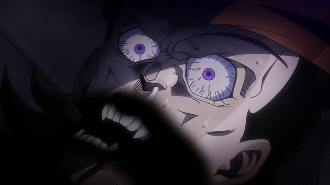
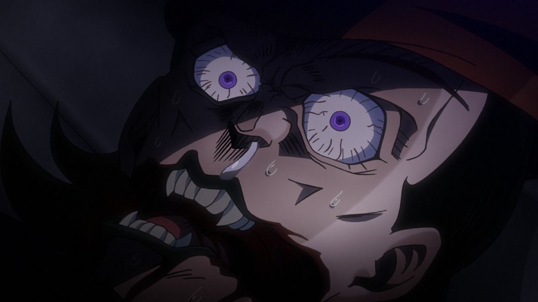
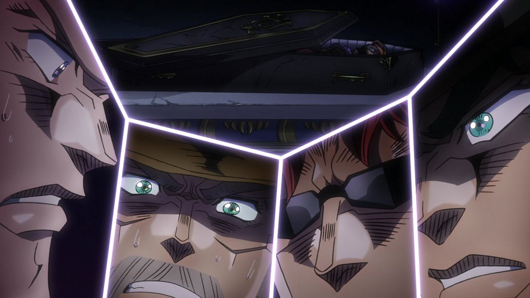

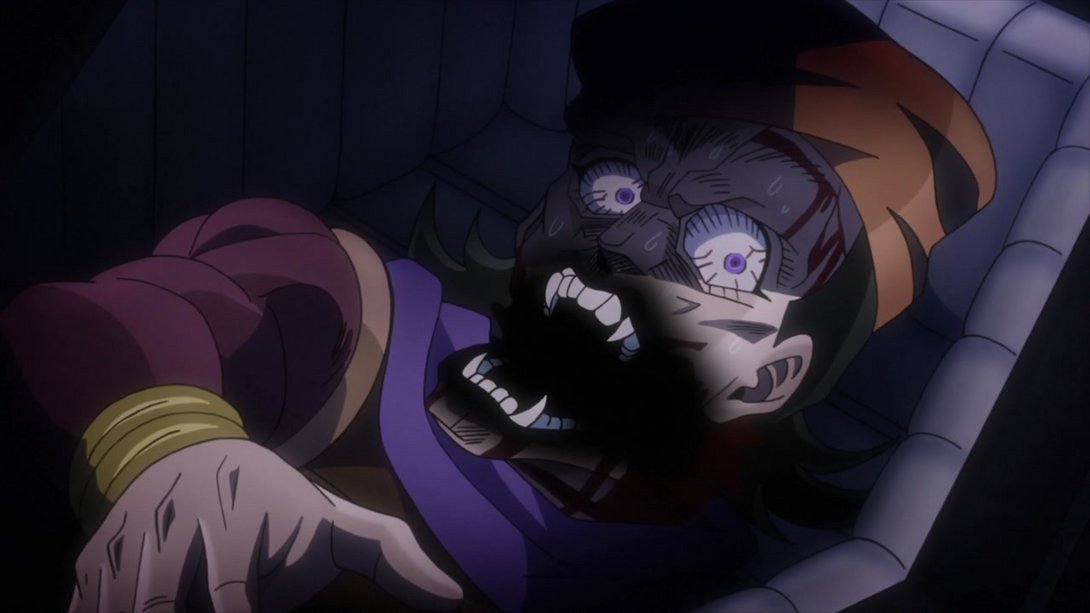
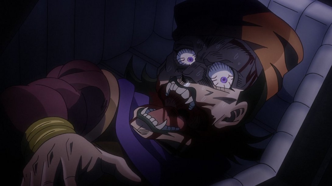
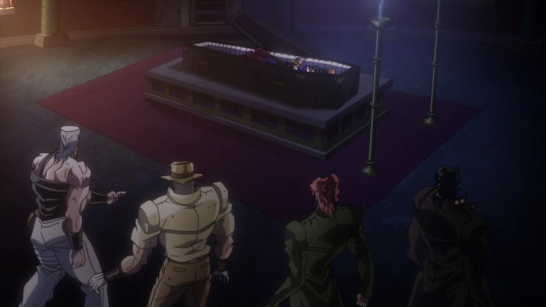
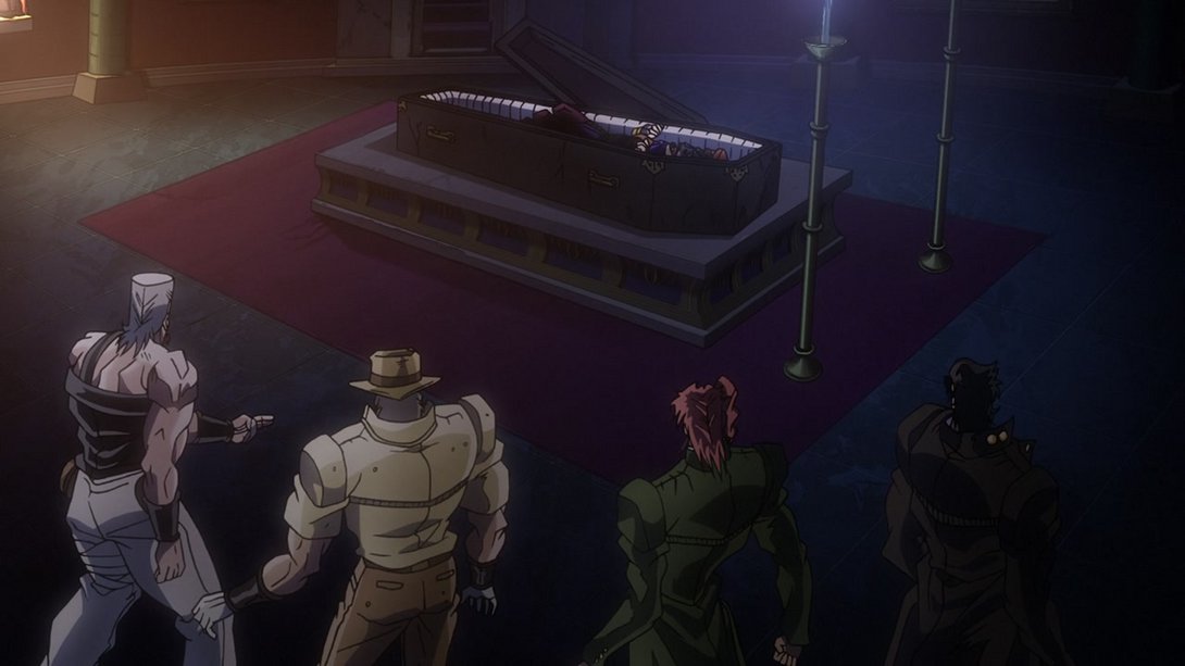
- These three shots are now brighter and sharper…
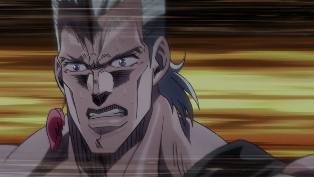
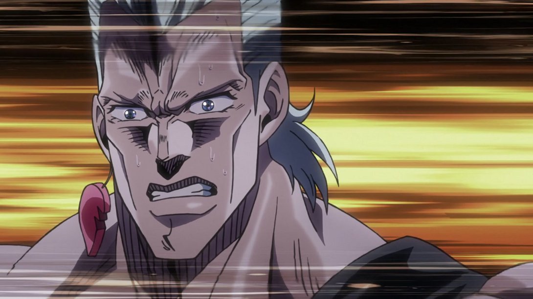
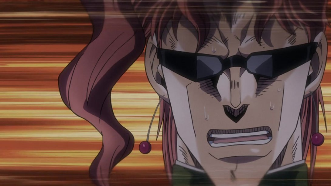
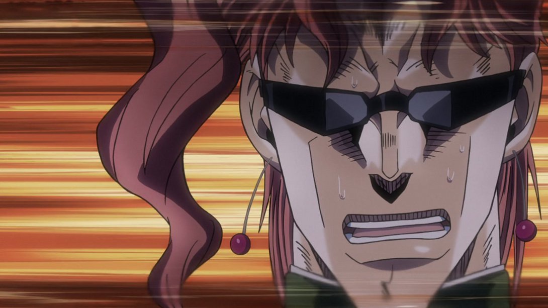

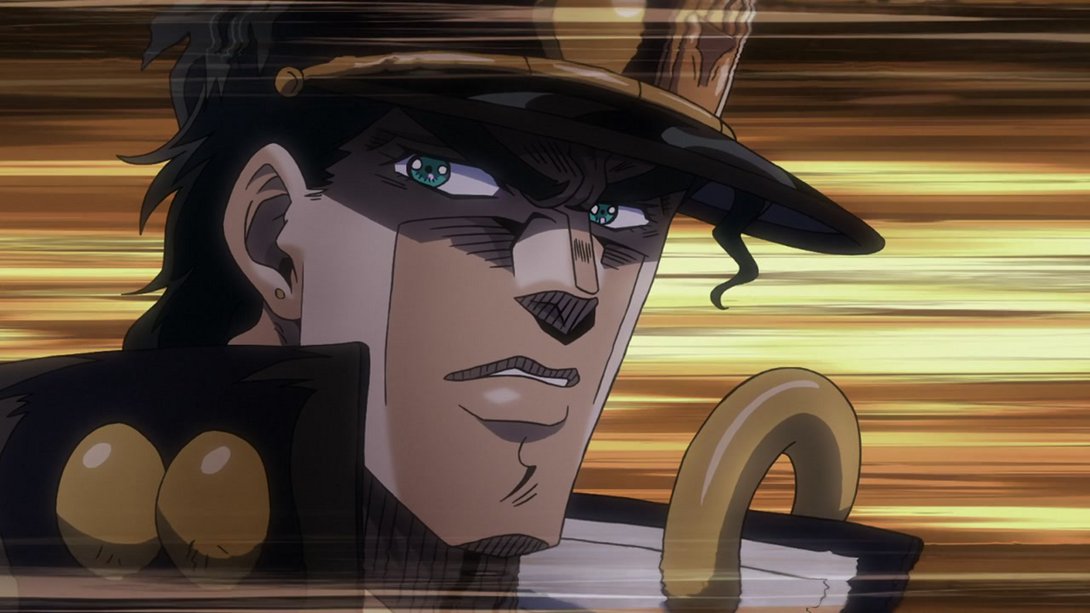
- This shot is split in two, and in both the contrast and brightness have been fixed:
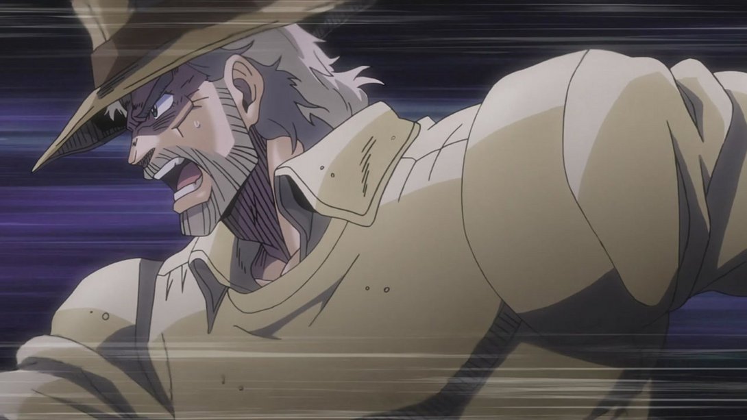
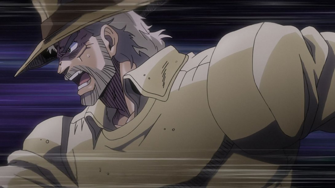
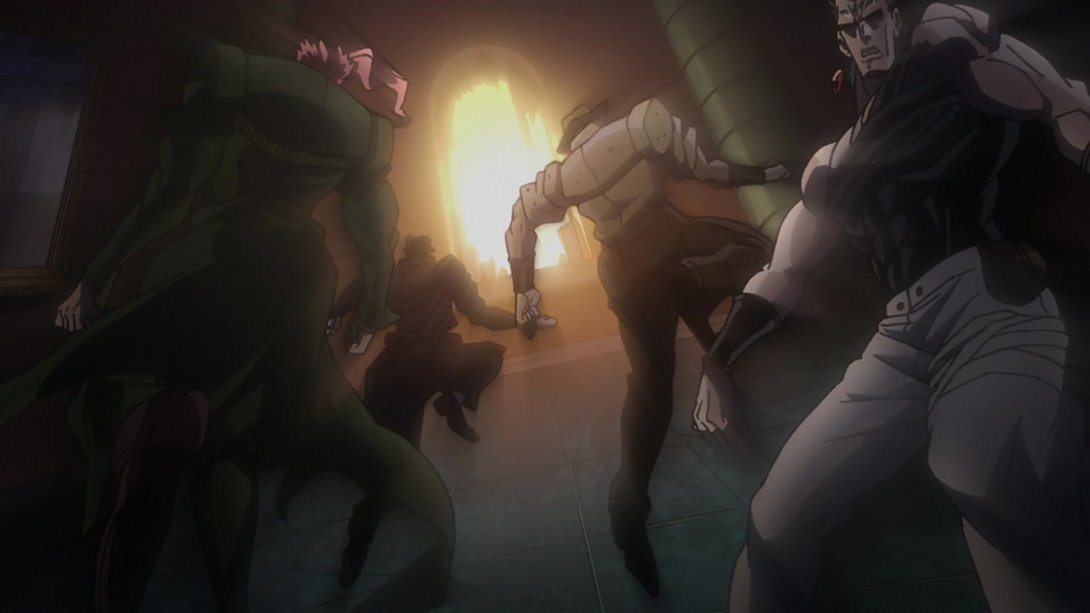

- Here, on top of a new distortion and vignette along the edges of the frame, the car has been scaled down and moved as well:
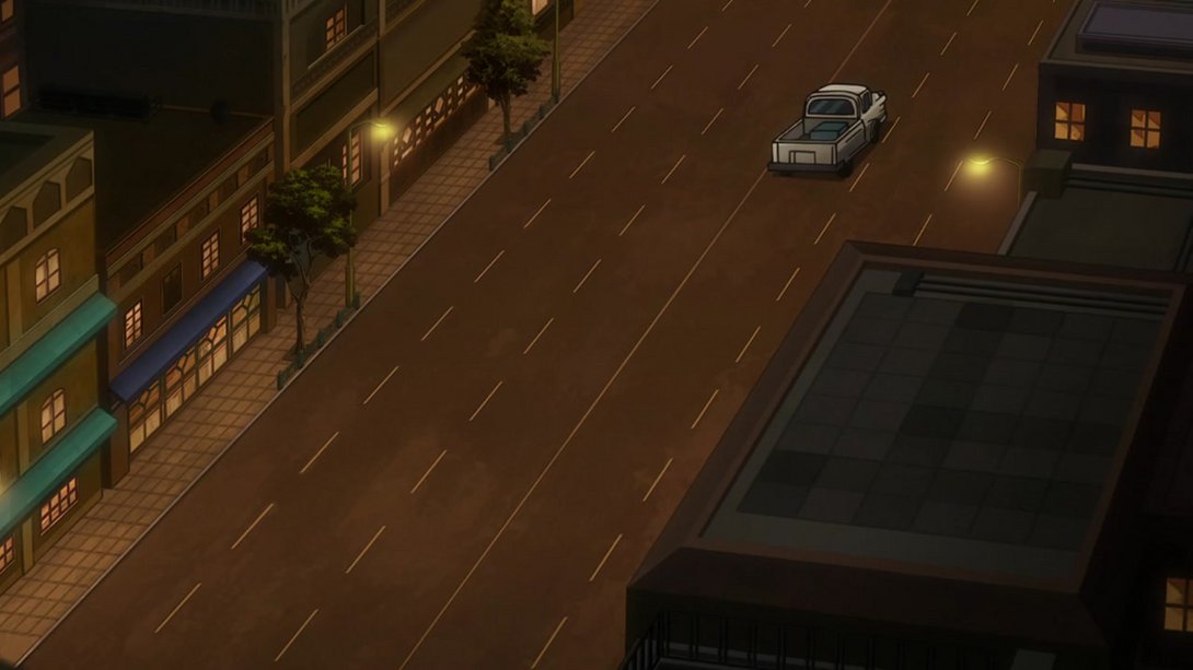
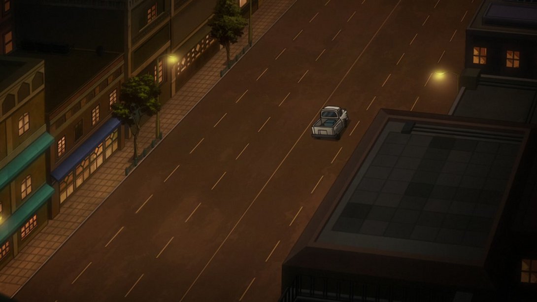
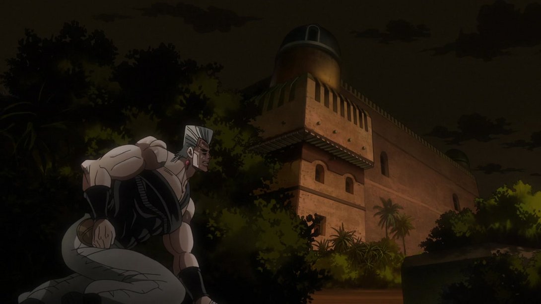
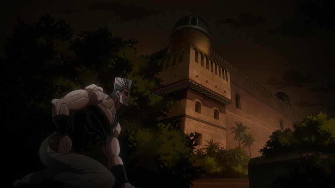
- The same vignette and distortion are back here as well; on top of that, we have some new and better lighting on Polnareff and on the background too:
- Dude I’m so sorry:
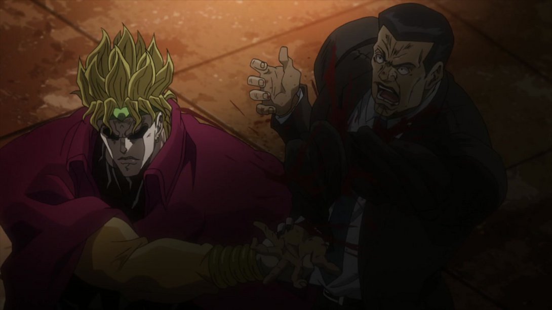
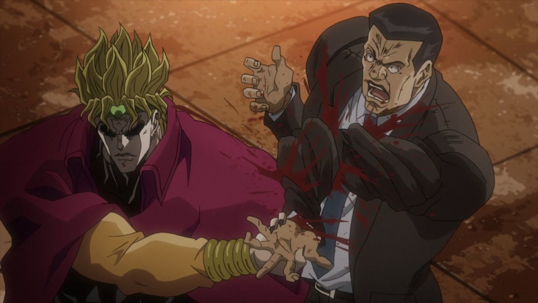
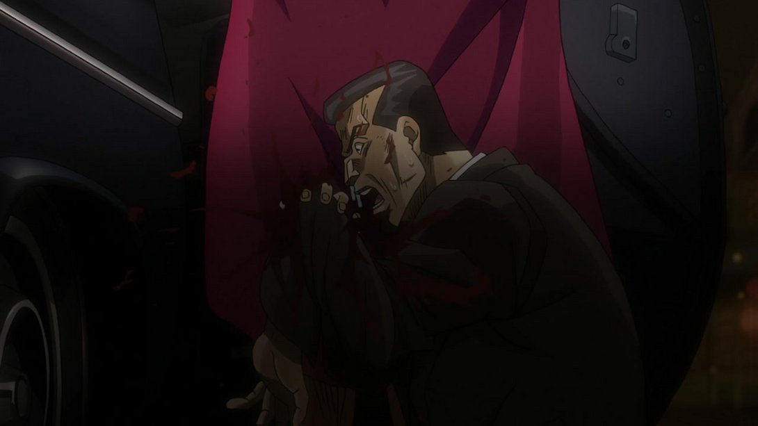
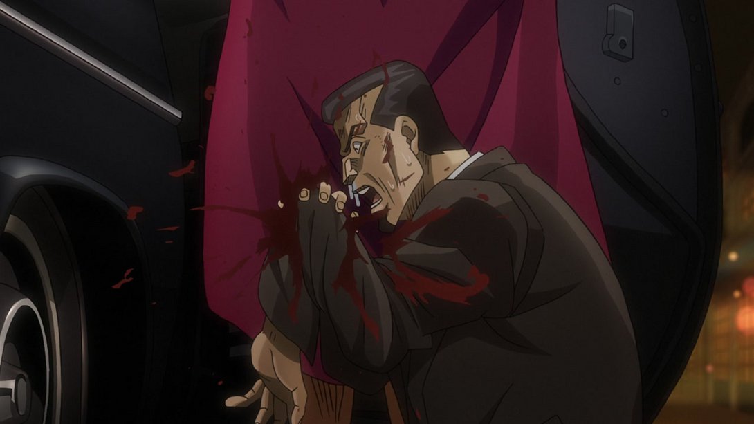
- Here we have another couple of The World-related contrast changes (after the first cut, the camera is also more zoomed-in):
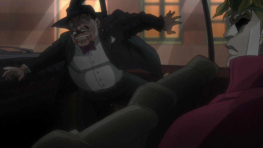
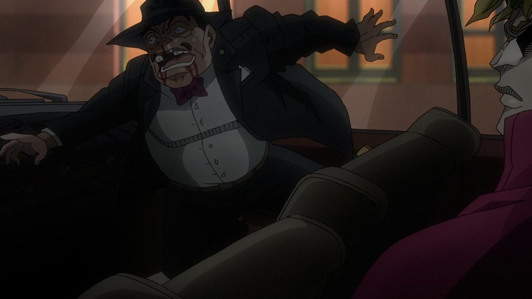
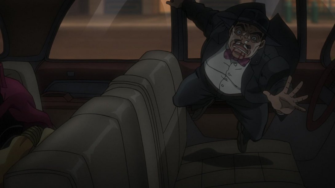
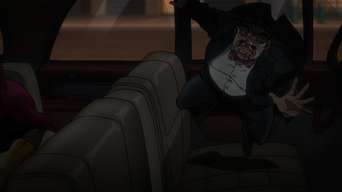
- Here, the lighting and shading inside the car have been tweaked, and the background outside the window has a warmer tint…:
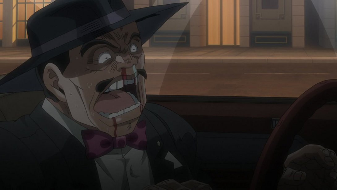
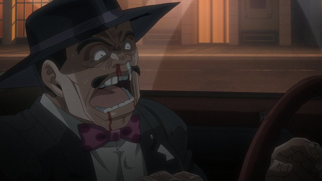
- …and, at the end of the same shot, said background is also blurrier:
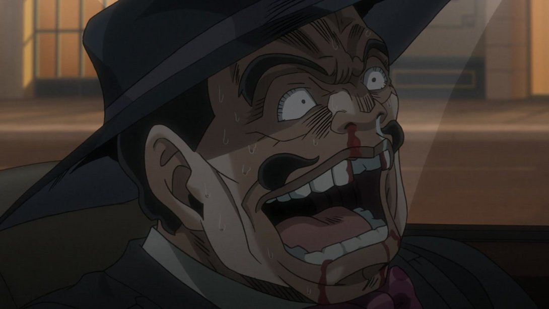
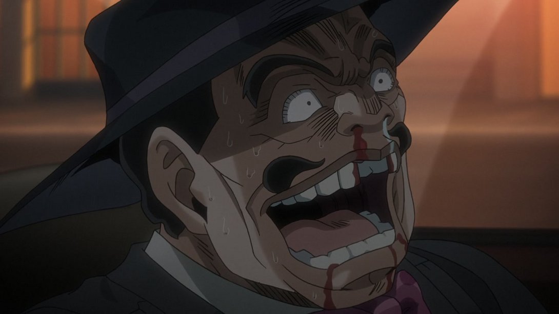
- Here we have a whole bunch of differences! The car windows are more opaque, the background is blurrier, there are many more of those lens flare-like spheres on the sides of the frame, the camera moves slightly more…:
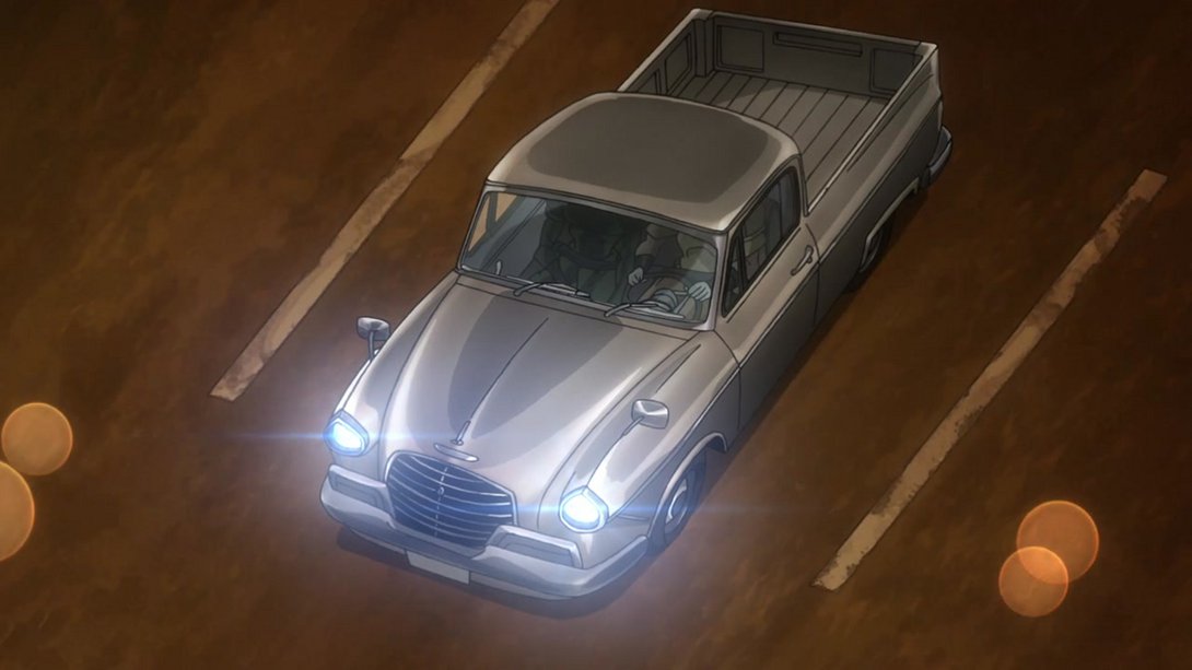
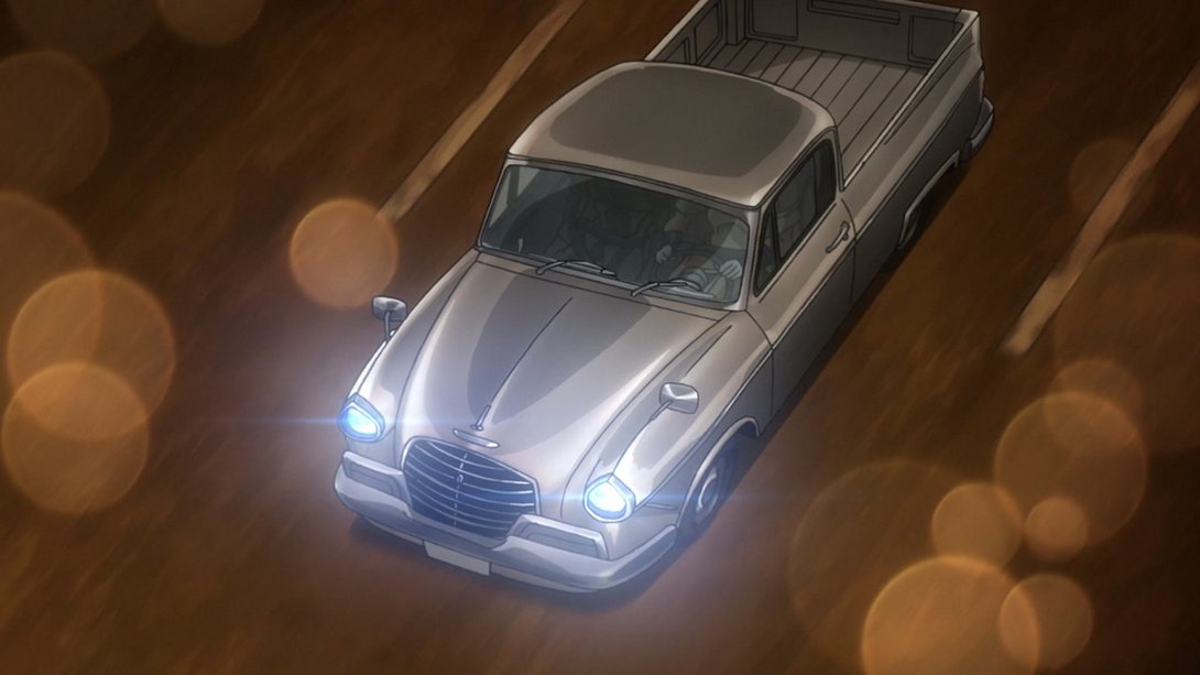
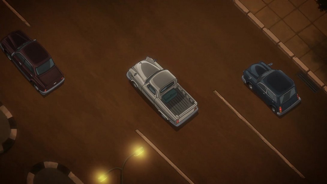
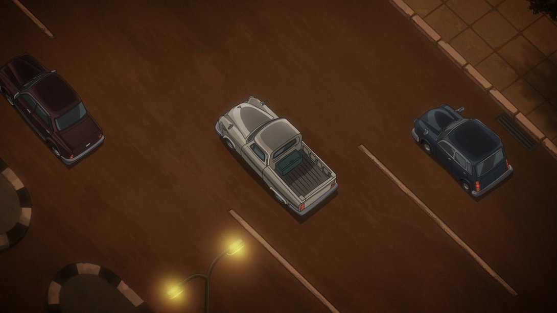
- Here both the background and the car on the left have been moved a little…:
- This shot has a different distortion along the edges, most lines are thinner and the background is blurrier:
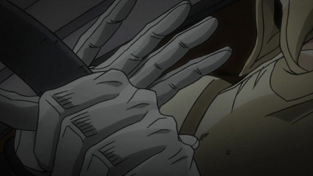
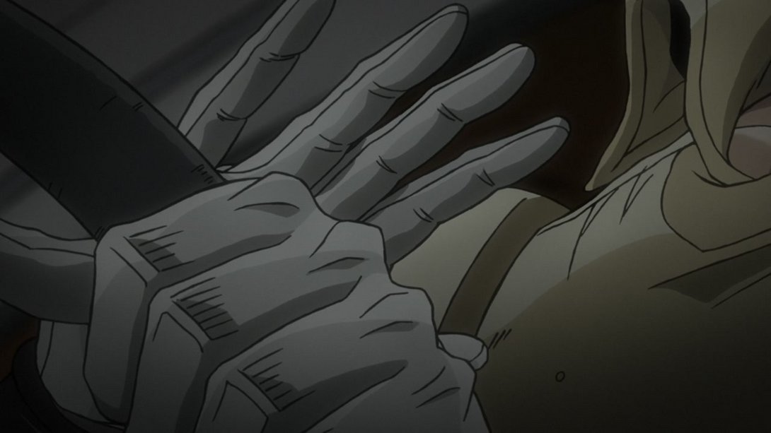
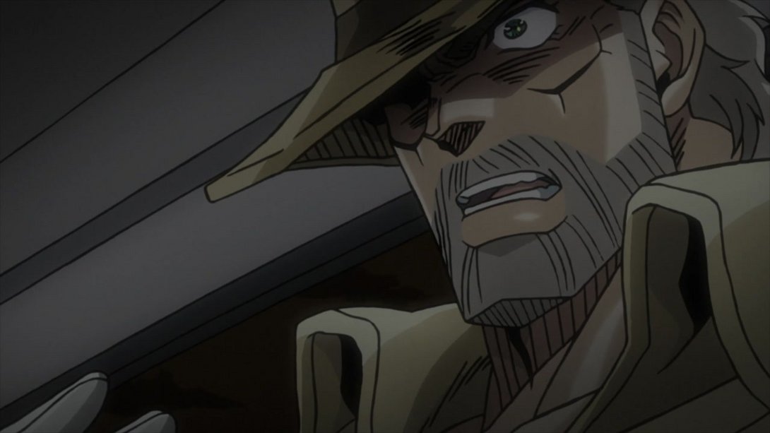
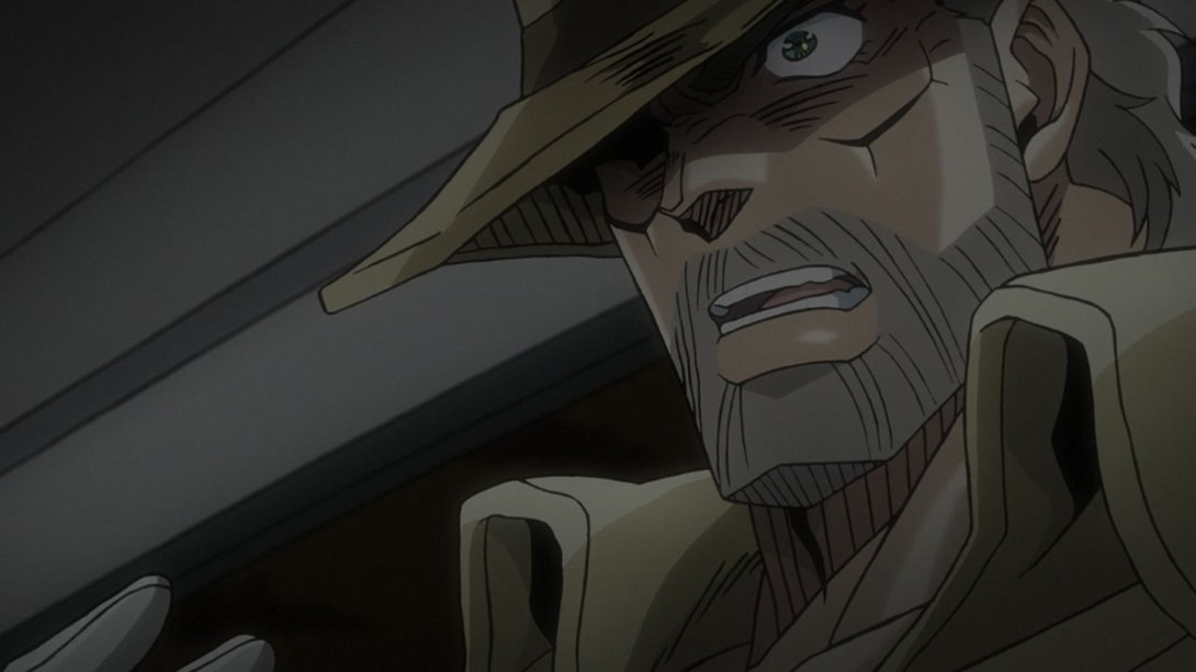
- Most of the differences that applied to the previous car scene are back here:
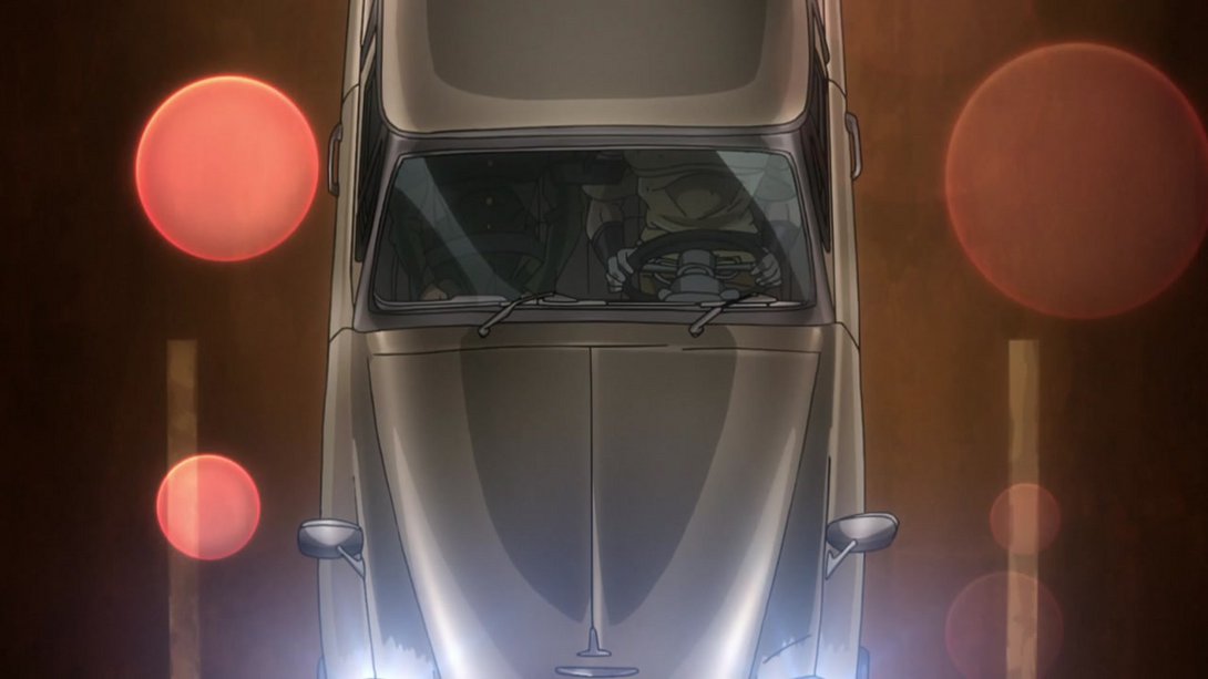
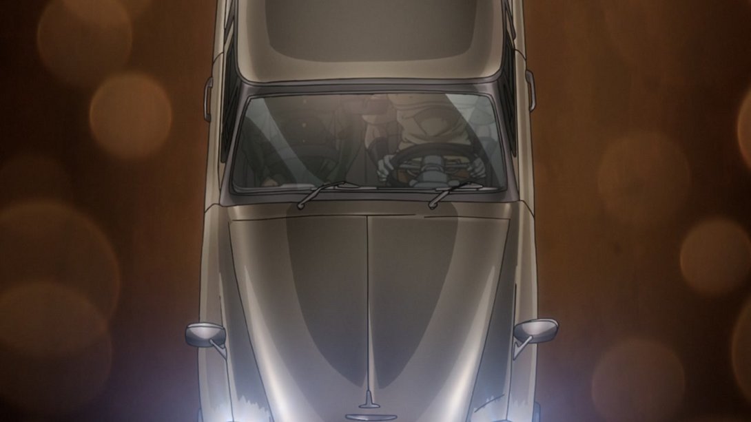
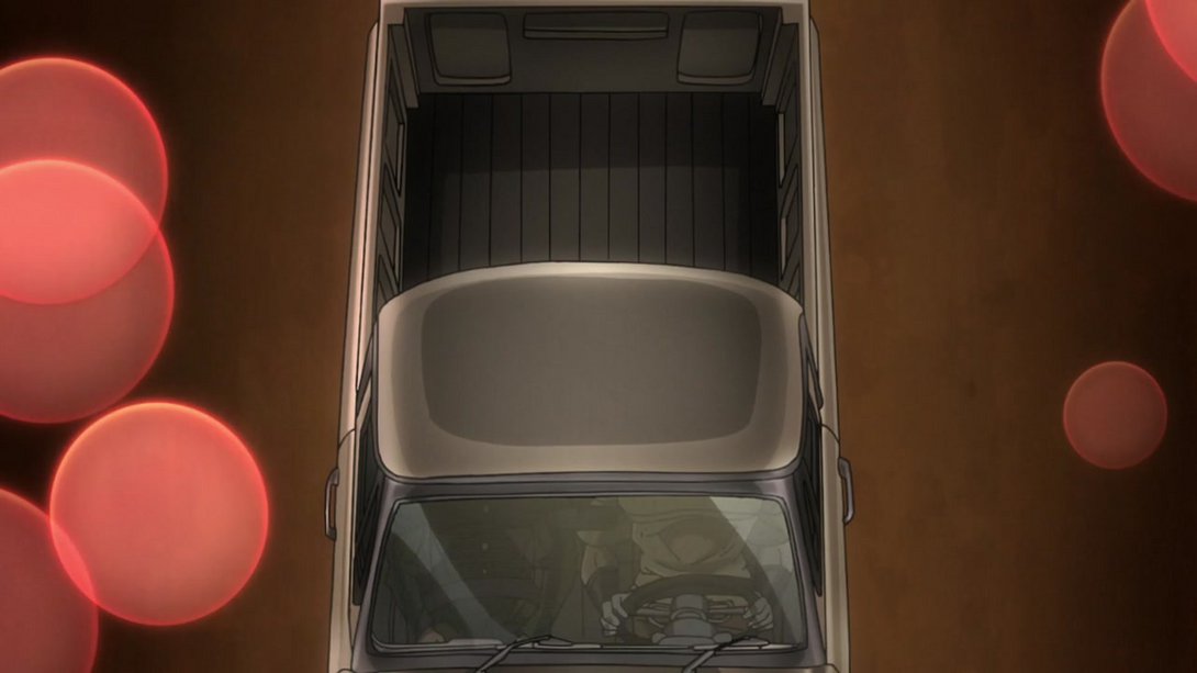
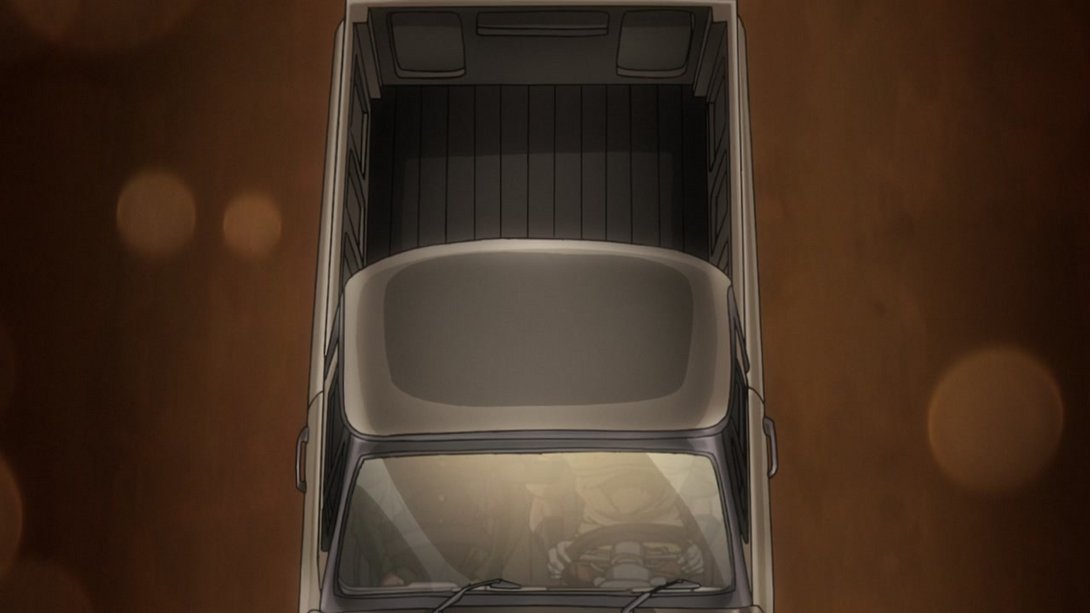
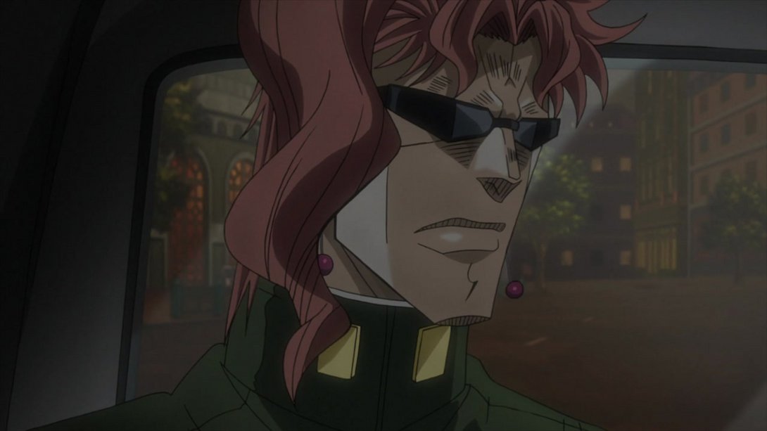
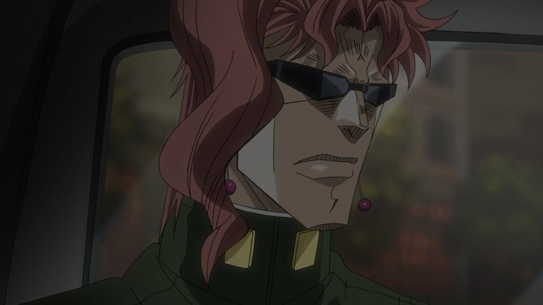
- The background is much more zoomed-in and blurrier, here! In addition to that, the shading on Kakyoin is slightly flatter as well:
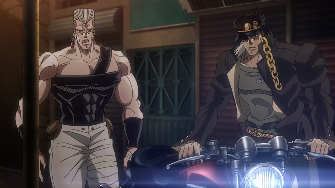
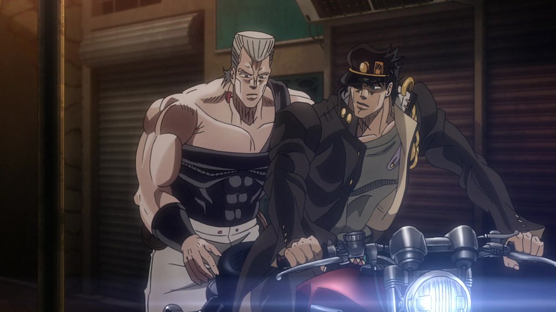
- Here we have some good old redraws! Both Polnareff and Jotaro have been blessed by the generous redrawing pencil, here:

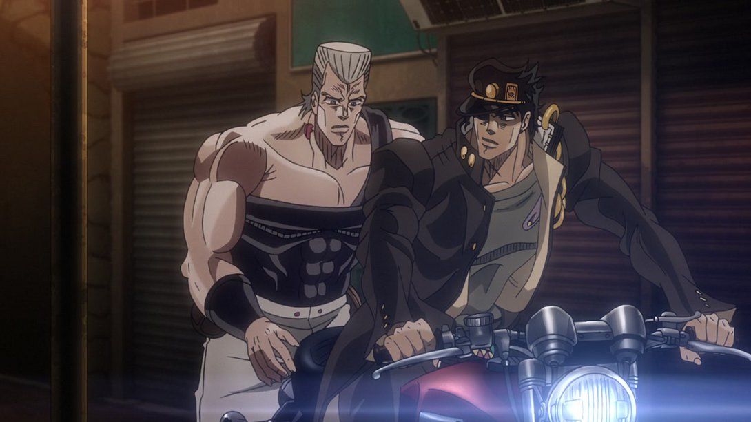
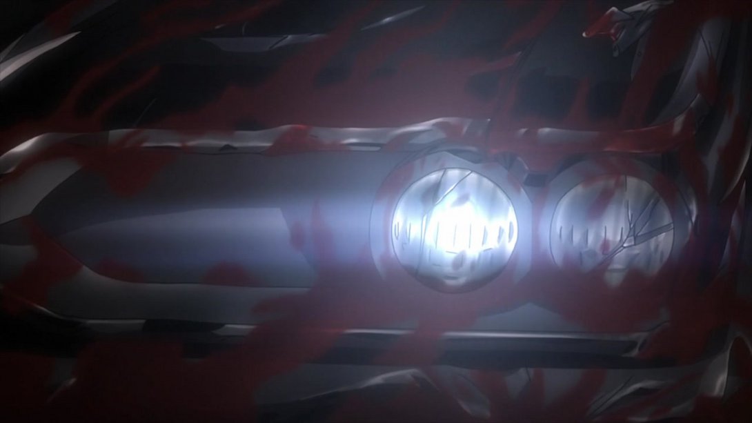
- The blood streaks on the car have been slightly modified and they now animate a little more convincingly:

- This shot is slightly more zoomed in…:
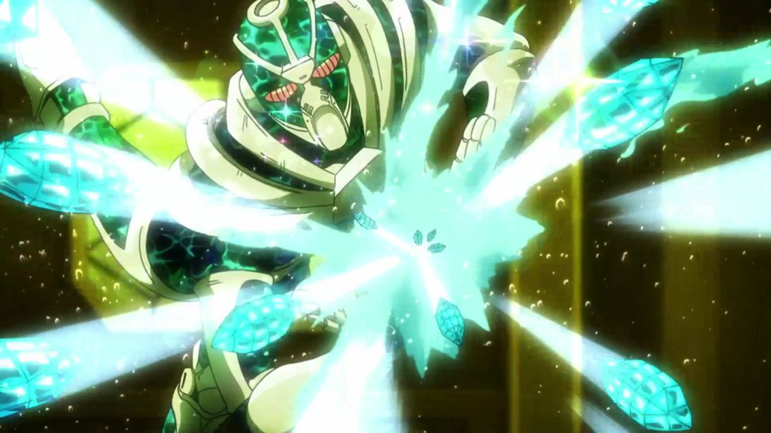
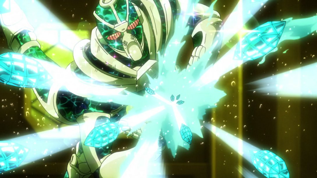
- While this is brighter and sharper:
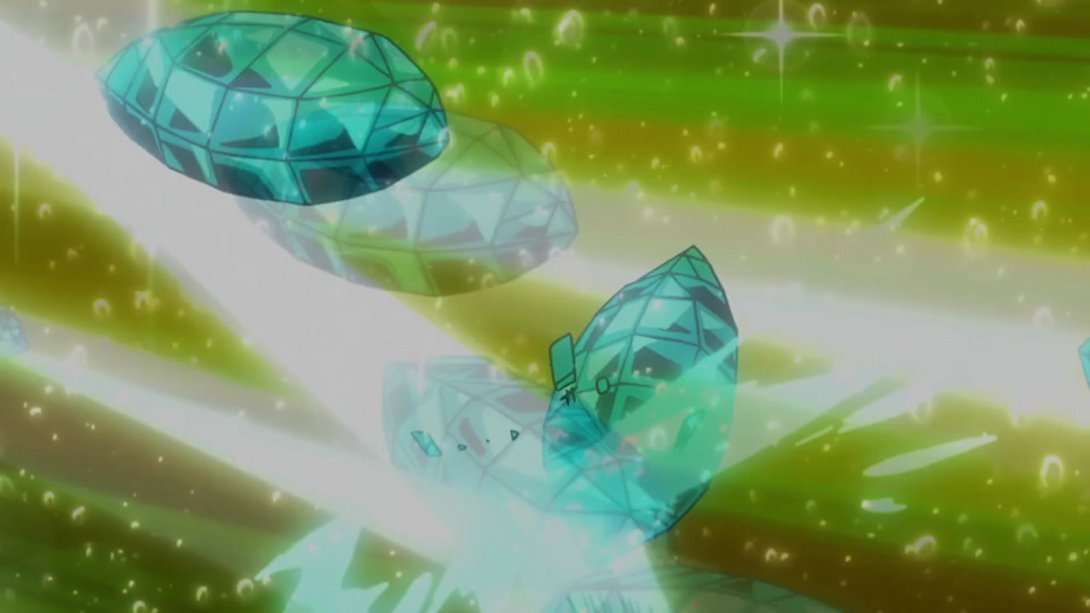
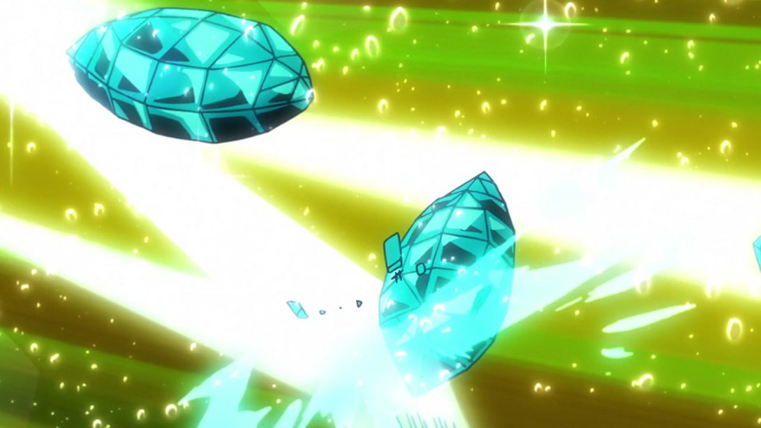
- …while this is, once again, slightly more zoomed in:
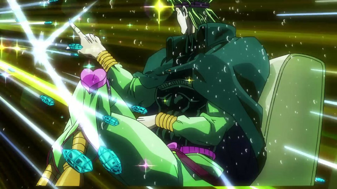
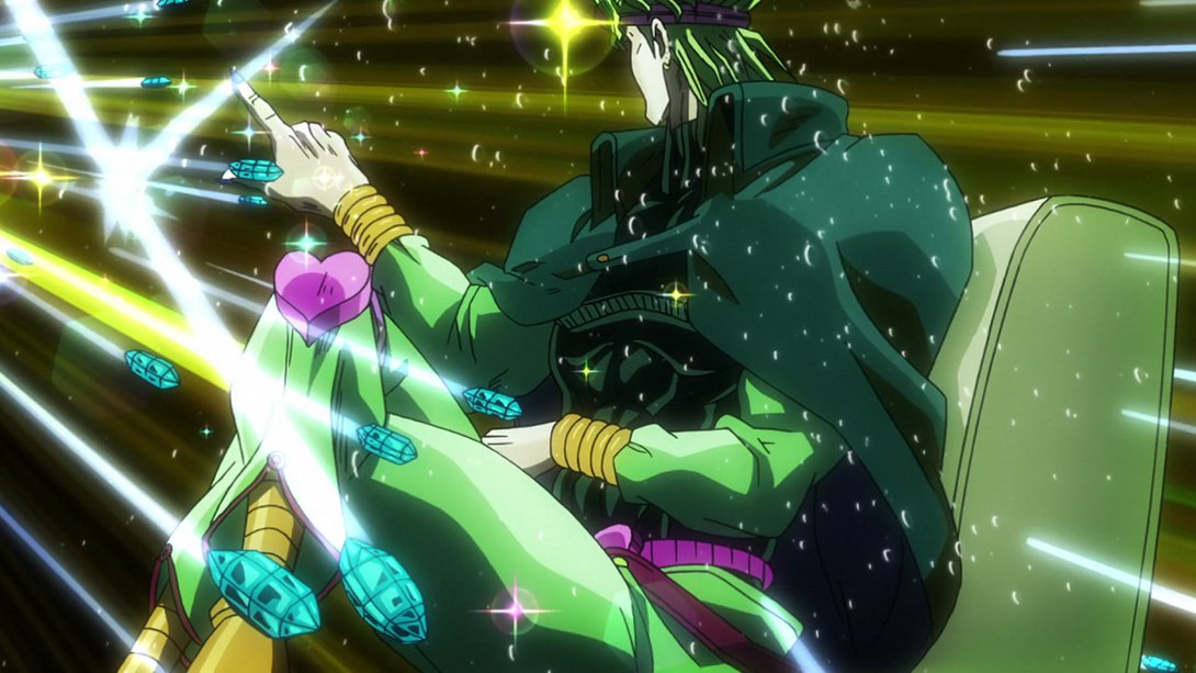
- …and, guess what, this one is again brighter and sharper:
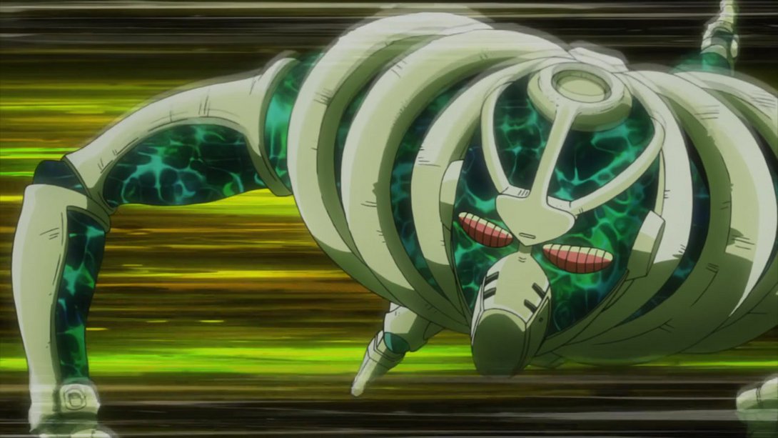
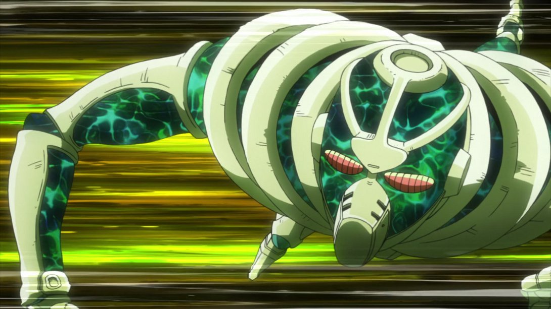
- This scene has been recoloured, and the background animates more as well:
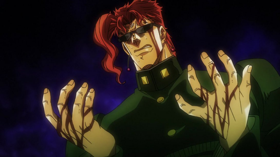
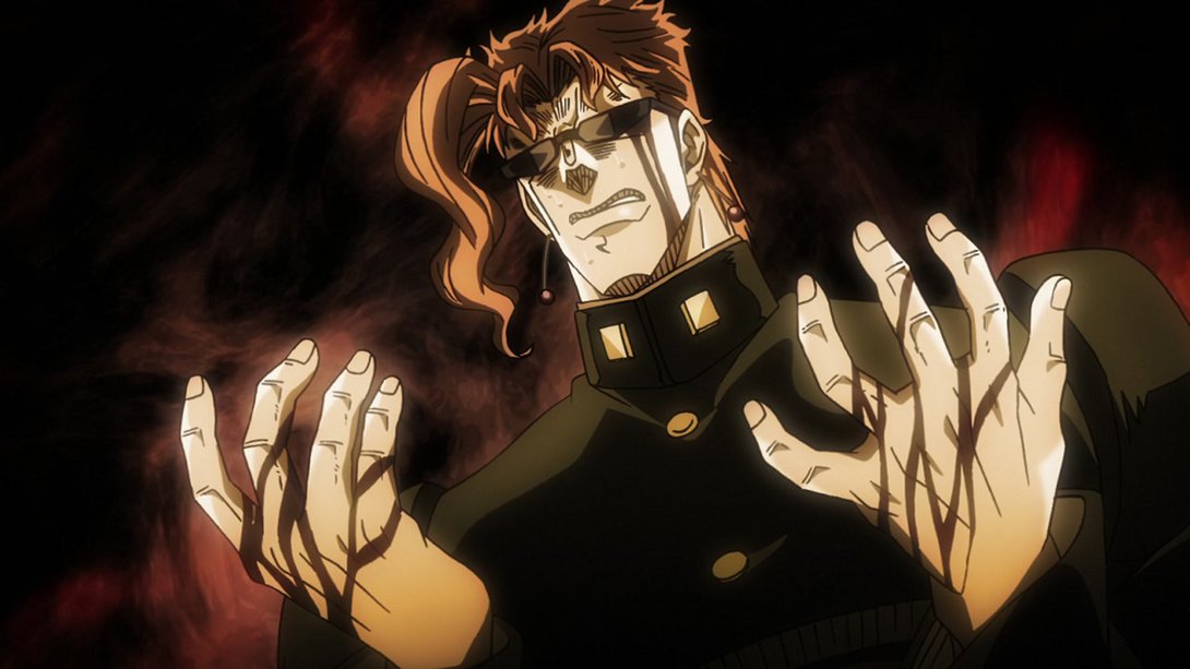
- Let’s have one last The World-related contrast (and camera) difference, shall we:
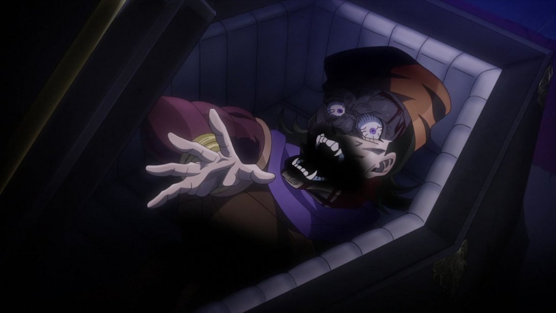
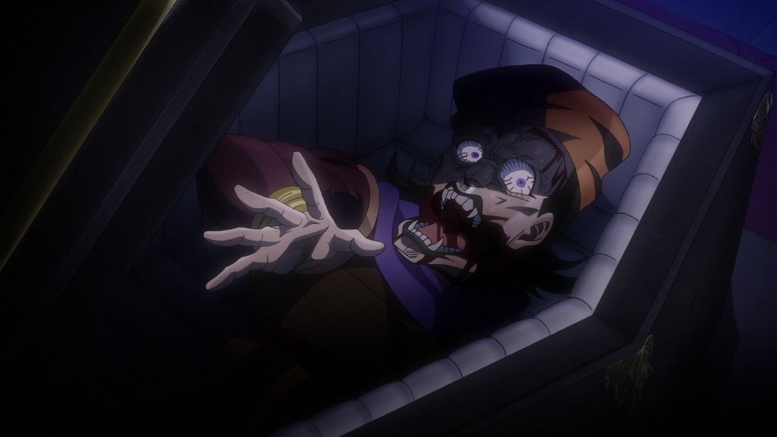
- Senator Phillips’ corpse has been sort-of uncensored, here:
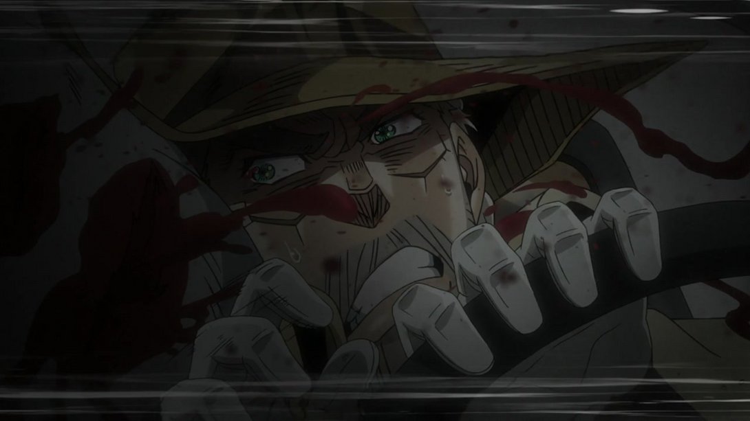
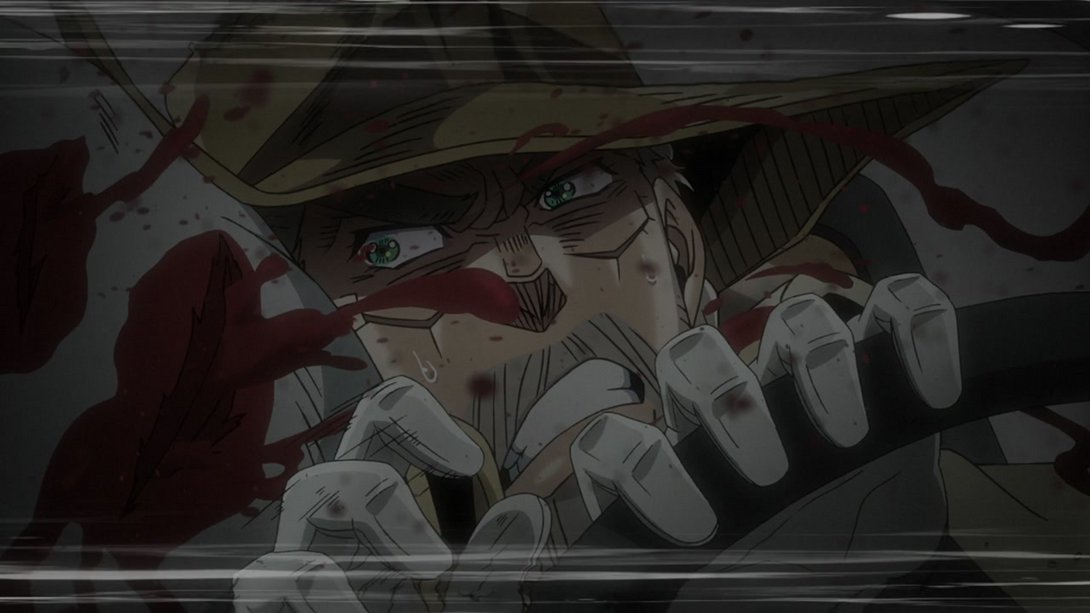
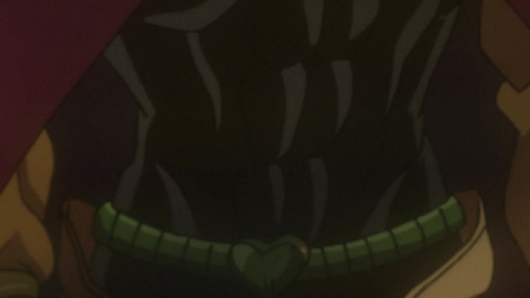
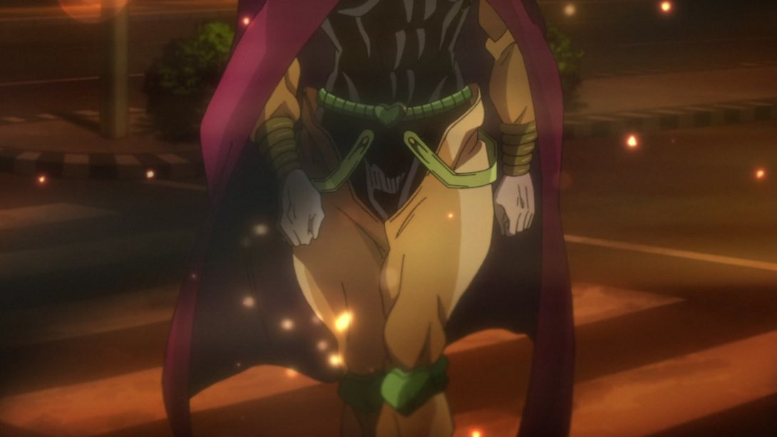
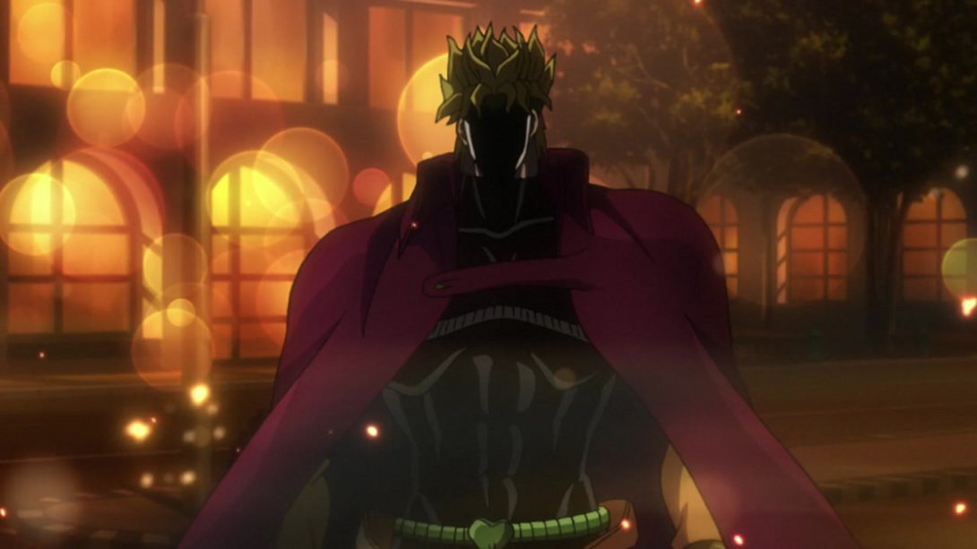
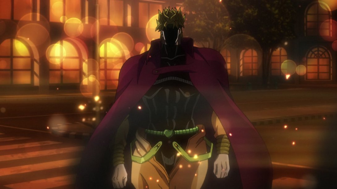
- And let’s conclude with this scene, which now starts MUCH, MUCH less zoomed-in:
And that was the last of the differences for today’s episode, friends! A fair amount of stuff, to be fair, but I have a feeling the best is yet to come… We shall see, we shall see! Tune in next time for Stardust Crusaders #46, “#46 - Dio’s World - Part 2”, why don’t ya?
Well, bye for now!

