
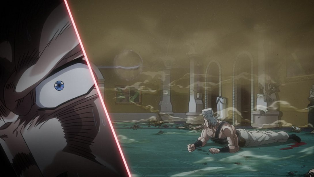
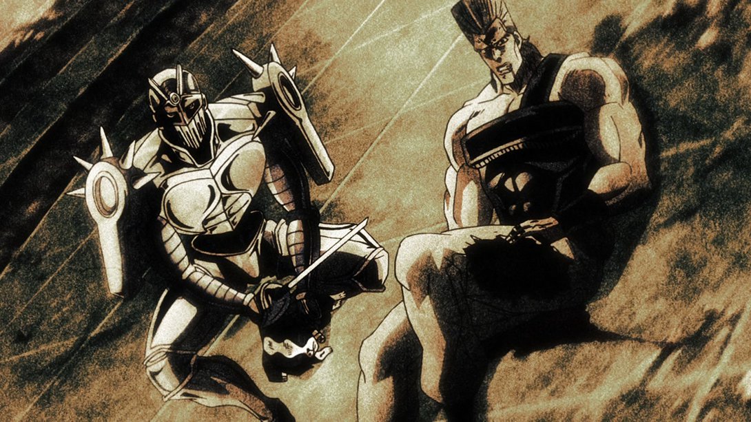
Hello again, friends, and welcome back! I apologize for the absence - it’s been a busy month, and I got a little burned out with the continuous posts. Plus, I knew that this would be a lengthy comparison, which made coming back all the more daunting! But enough dilly-dallying, you’re here for a comparison and a comparison you’ll get! Let’s take a look at Stardust Crusaders #43, “The Miasma of the Void, Vanilla Ice - Part 2”!
- Let’s start things off with an old classic, the brighter and sharper:
- This short video has received the same treatment (although, technically speaking, it’s not brighter but slightly darker - for better contrast), and in addition to that, there are two new bright flashes to accentuate the action. The animation after the second flash is slightly sped up to make up for the two “lost” frames:
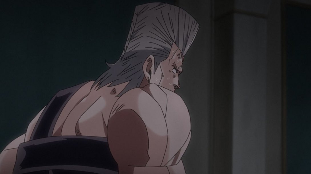
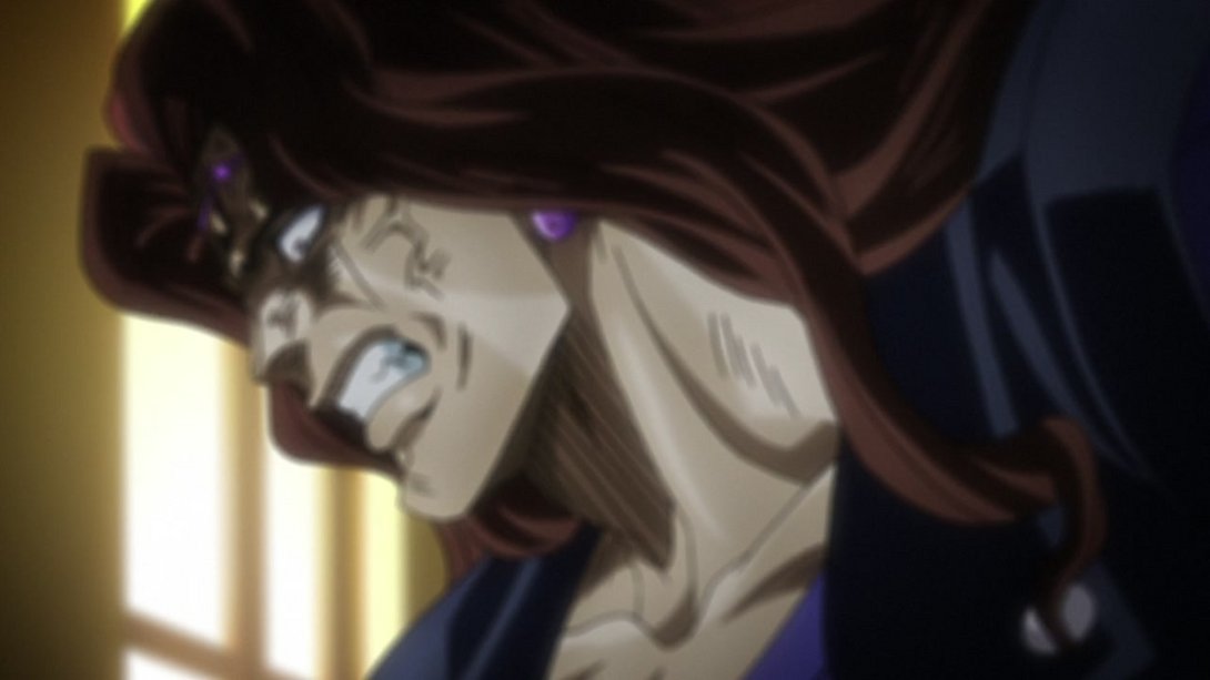
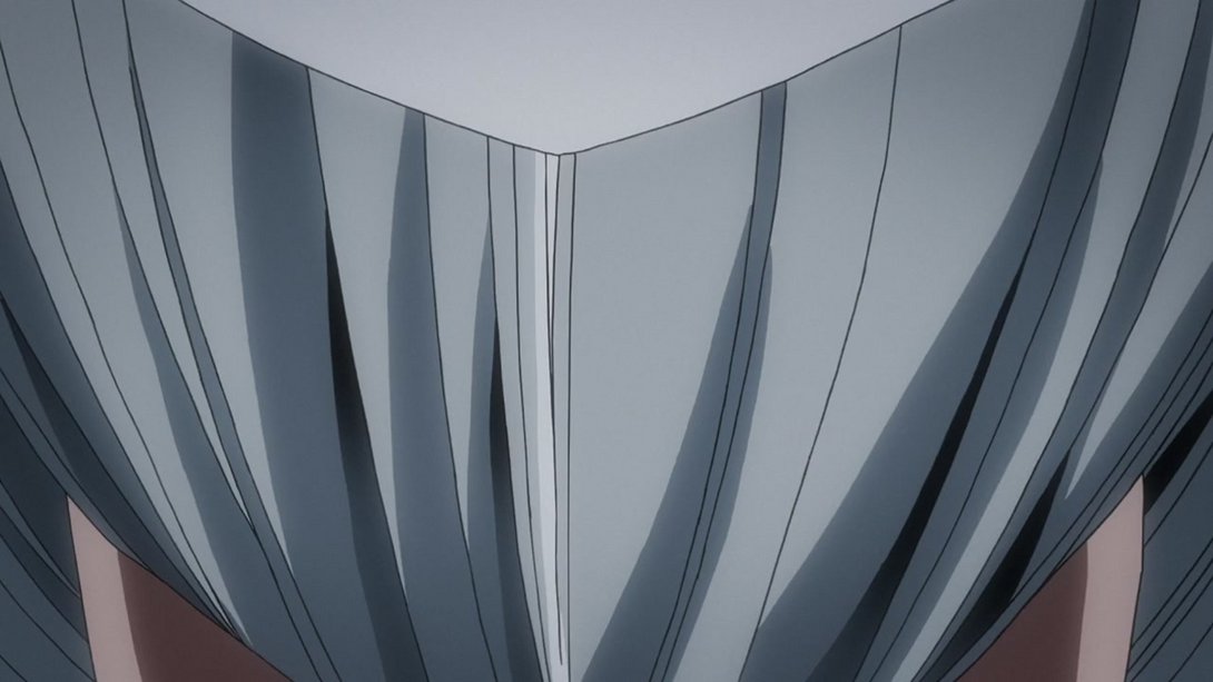
- The shading on Polnareff is slightly different, here:

- This flashback sequence has received the same differences as the actual scenes in the previous episode:

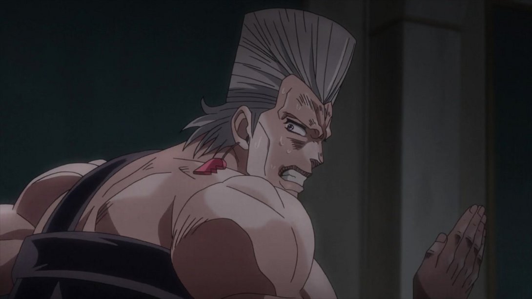
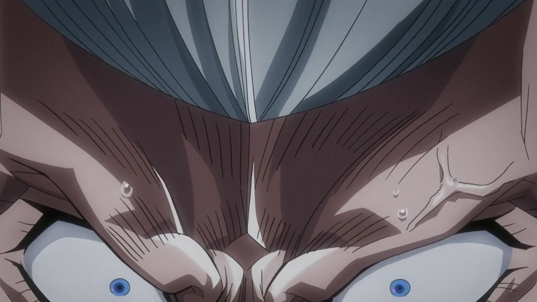
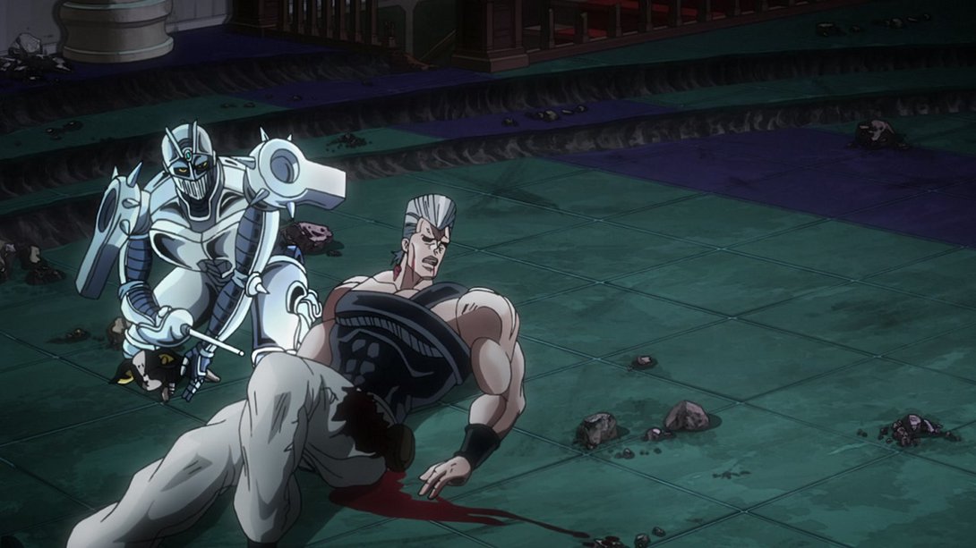
- Polnareff is, once again, shaded slightly differently here…:

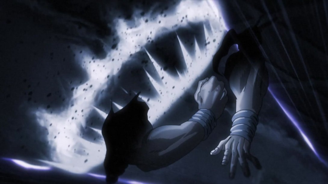
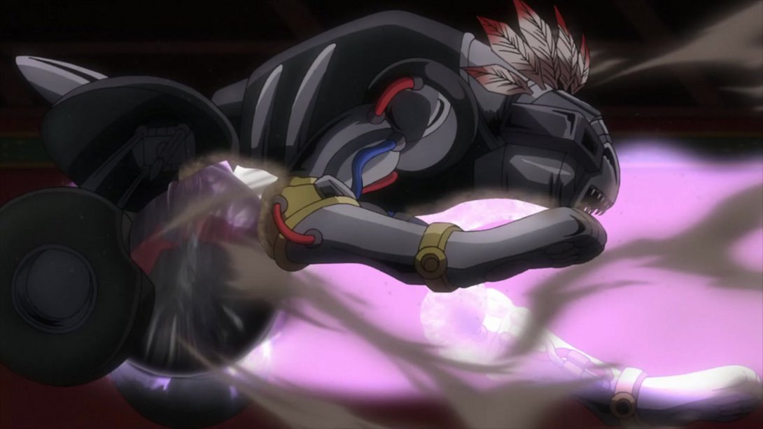
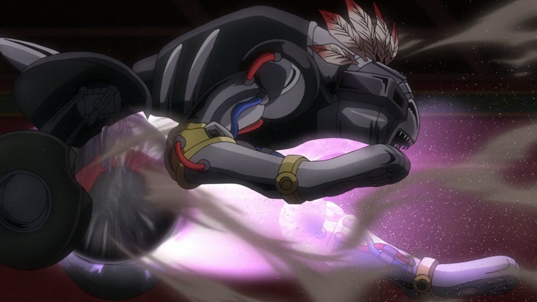
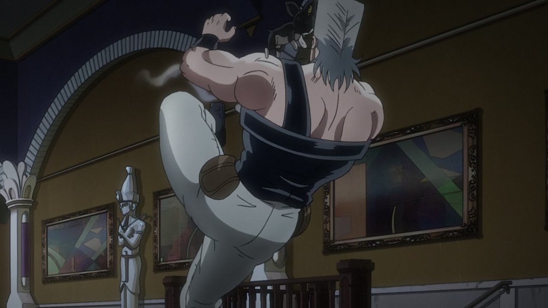
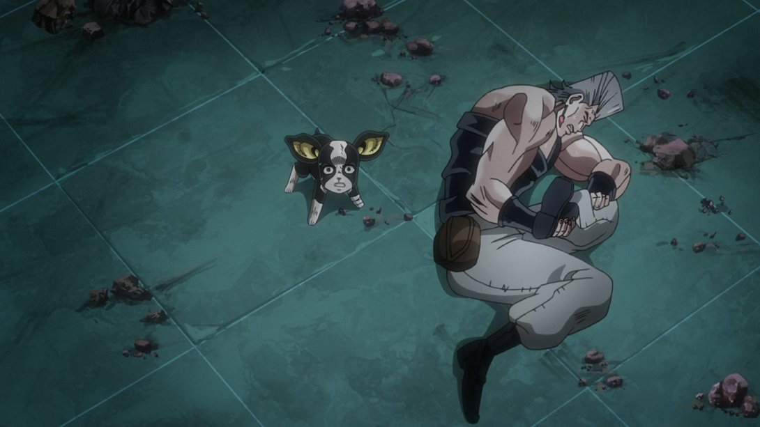
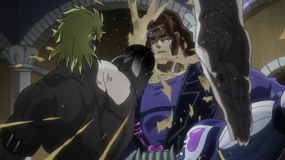
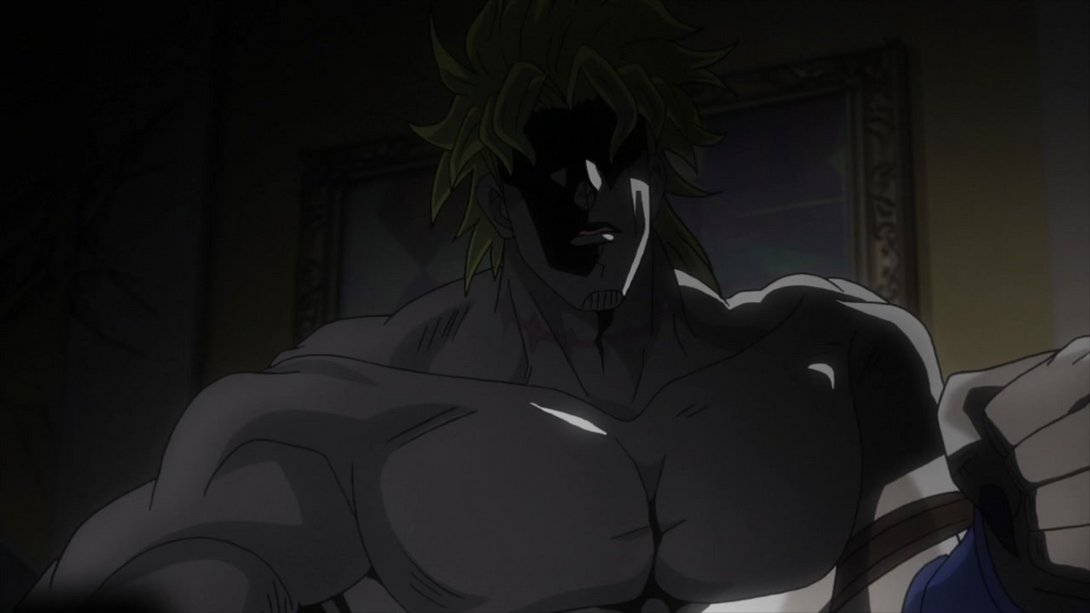
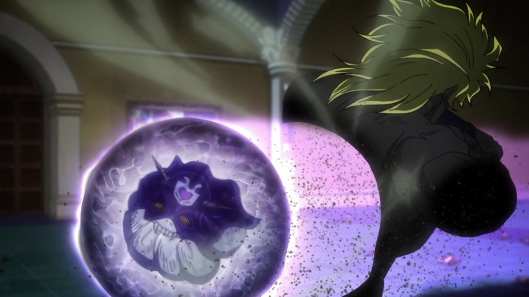
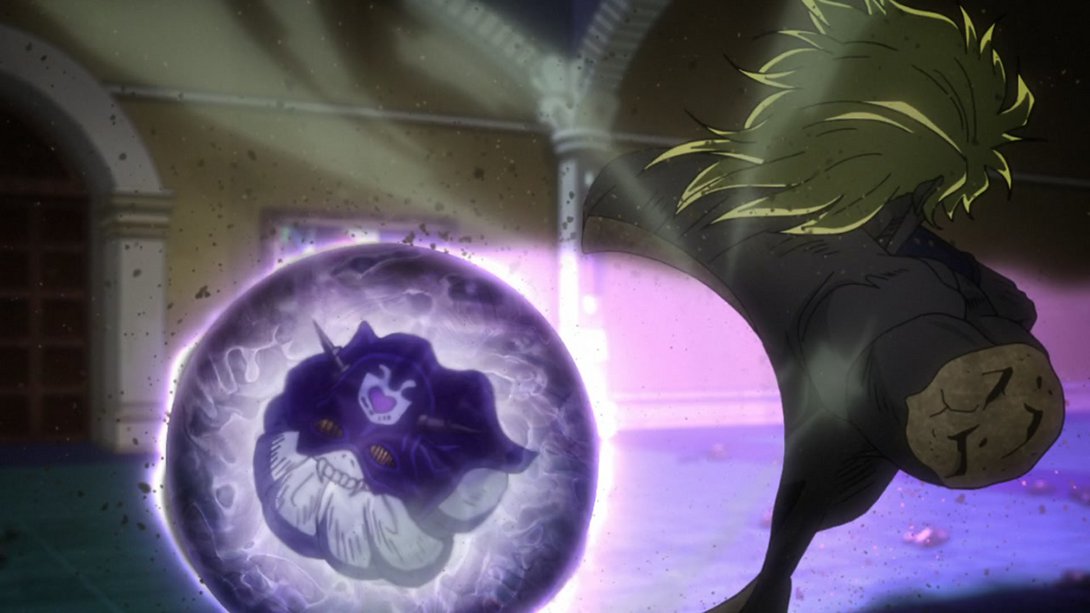
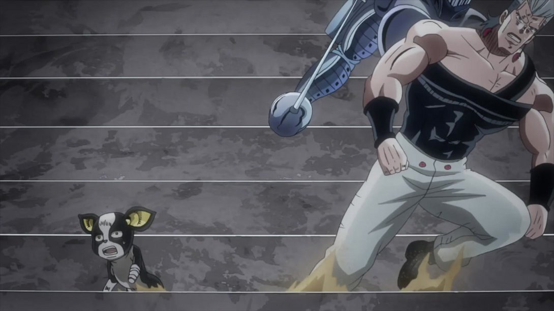
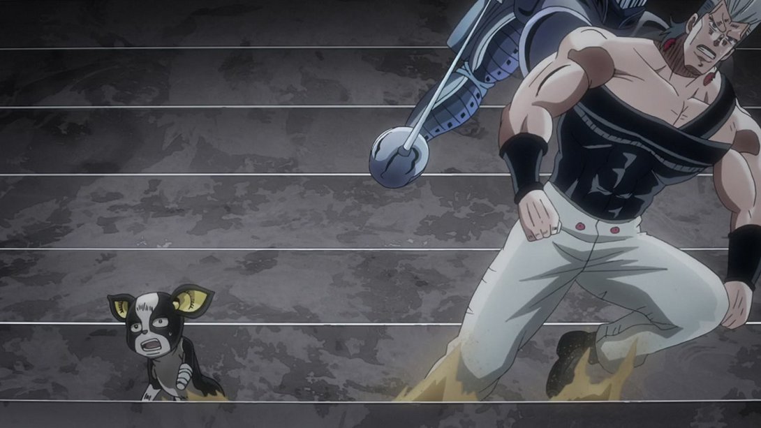
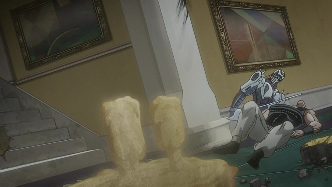
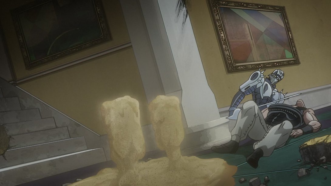
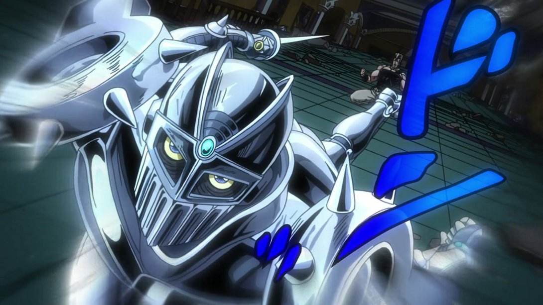
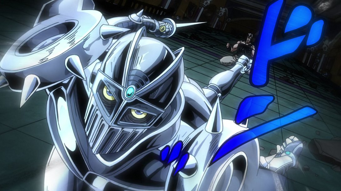
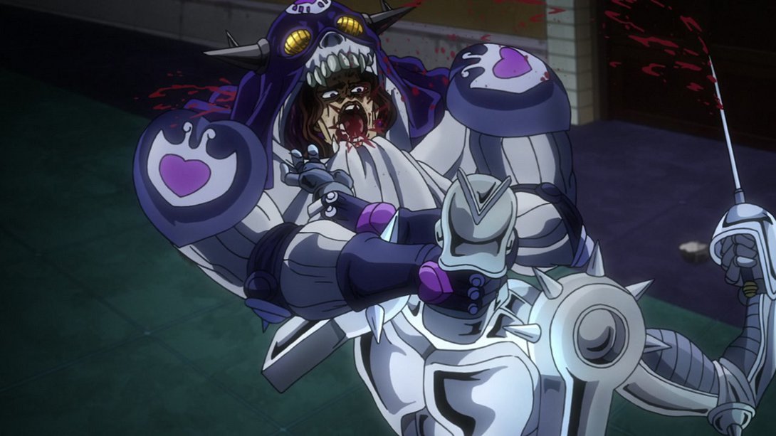
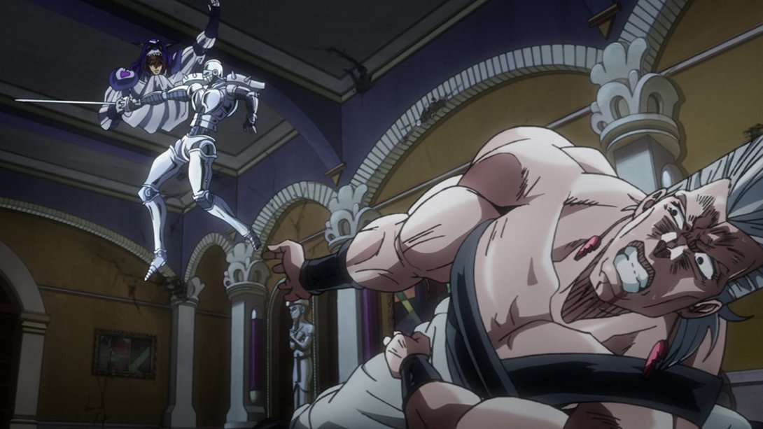
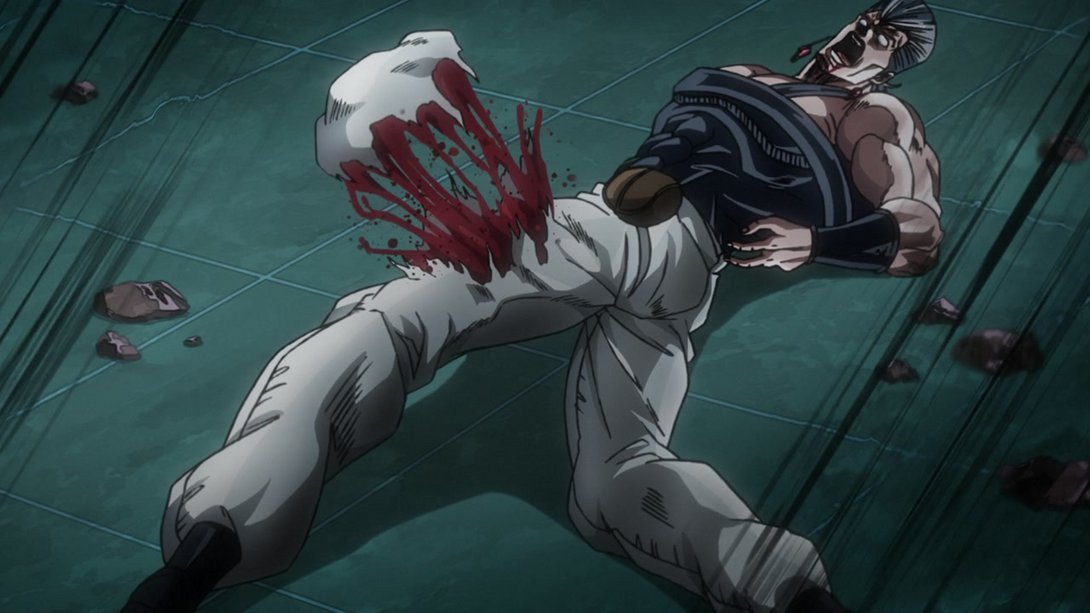
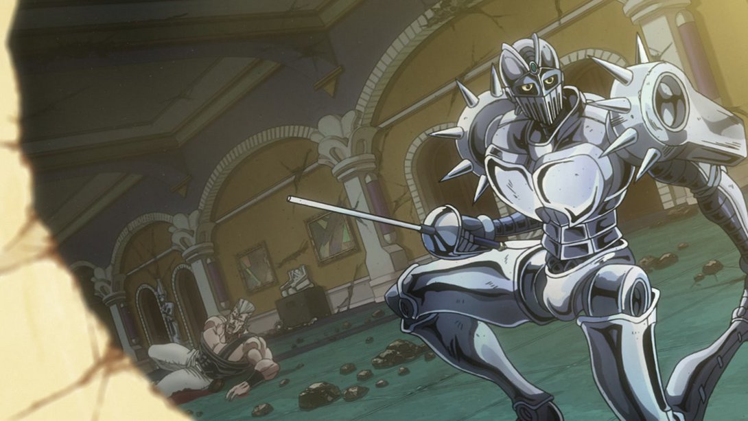
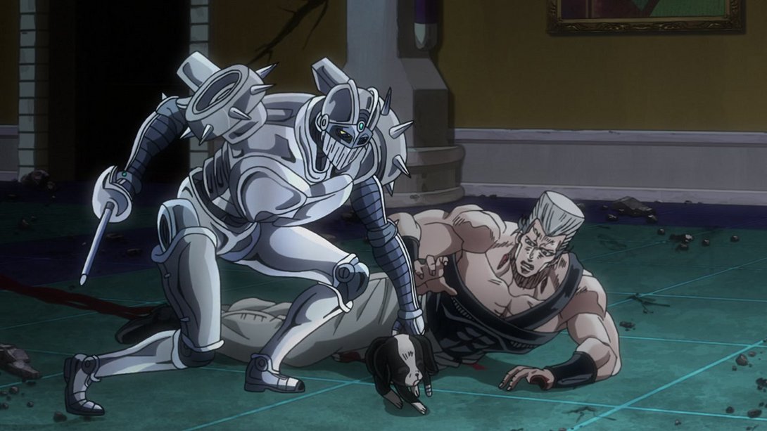
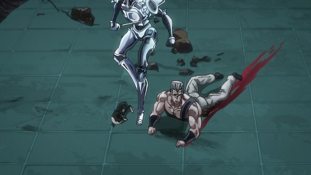
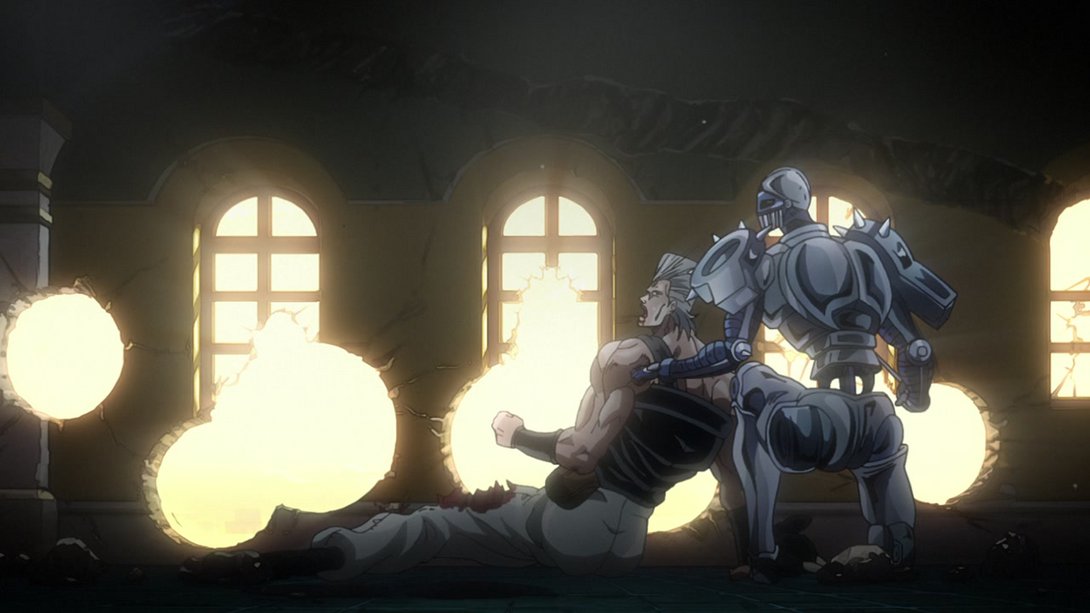
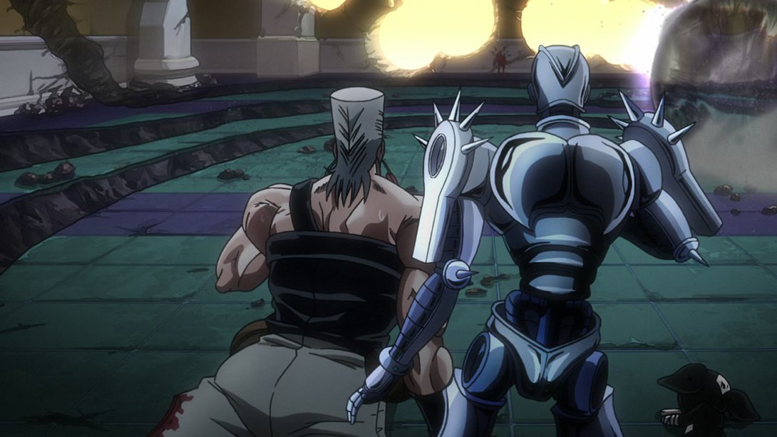
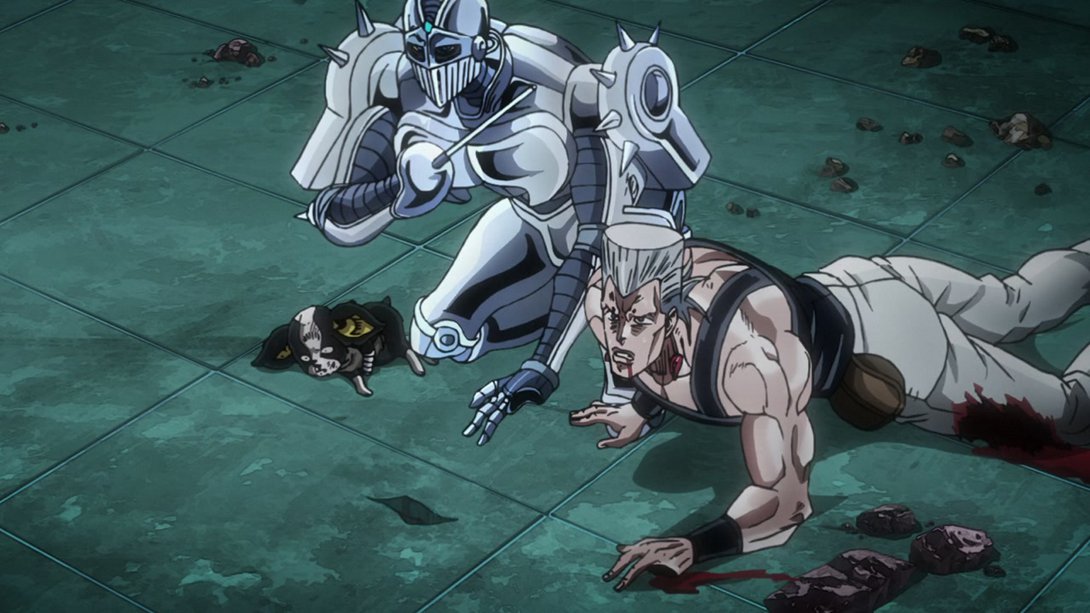
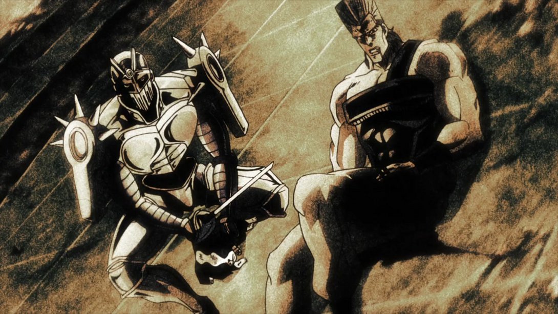
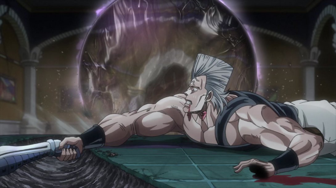
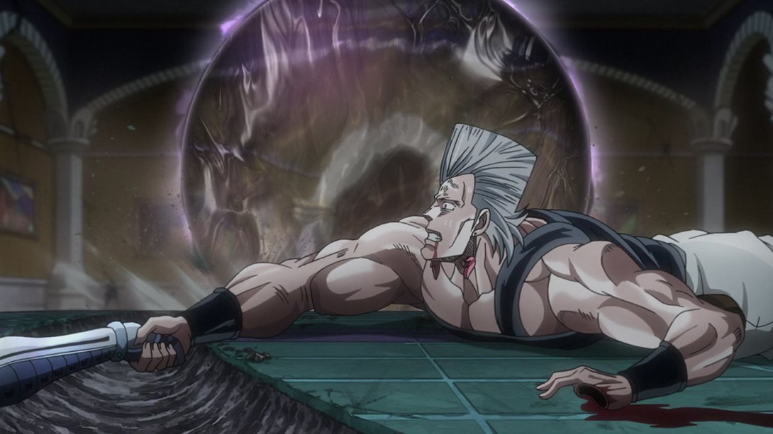
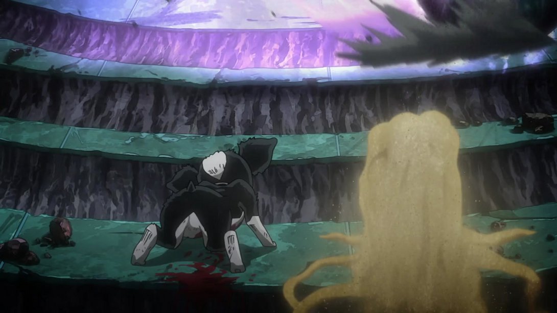
- This sequence of The Fool being hit by Cream has several differences! Let’s look at them in no particular order; first off, the camera has been moved to the right and the shading on The Fool is sliiightly different…:
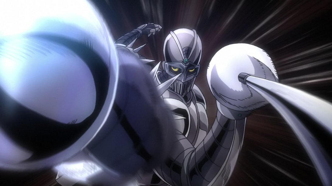
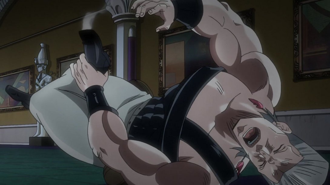
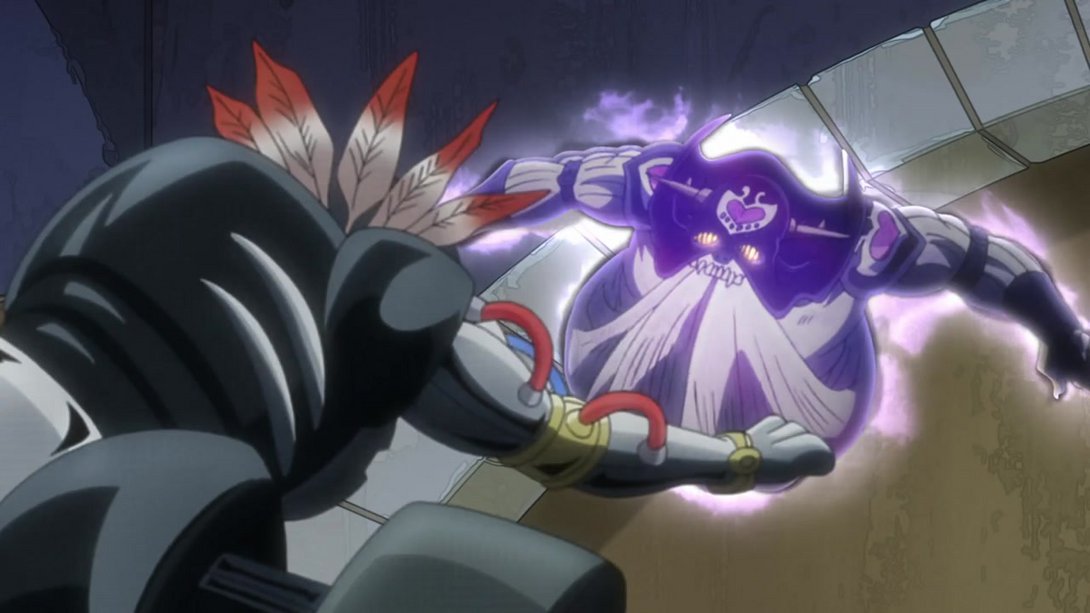
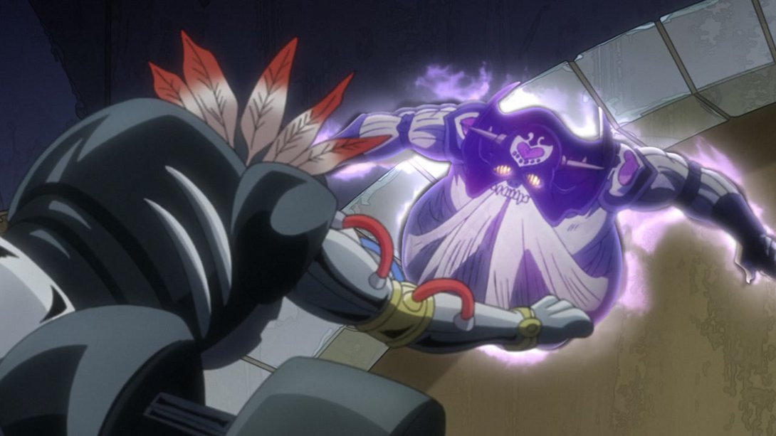
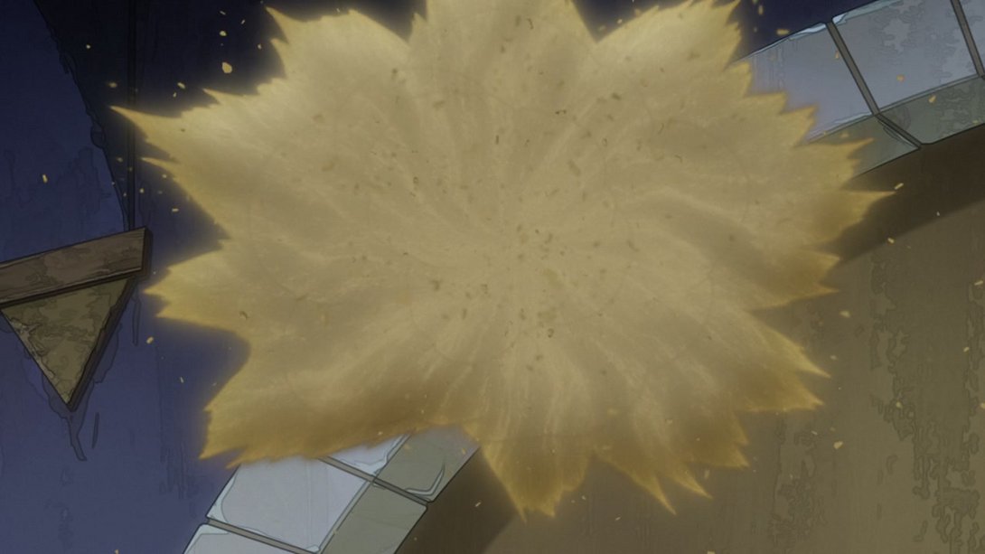
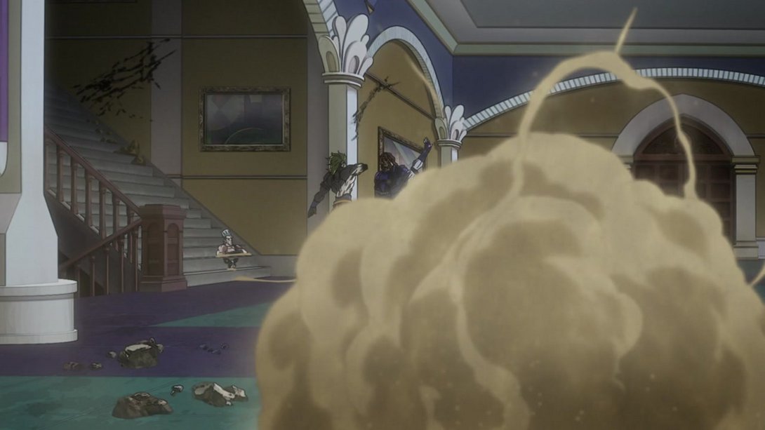
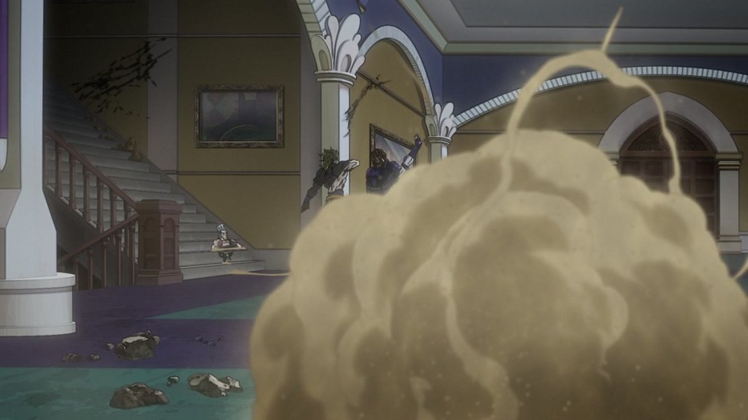
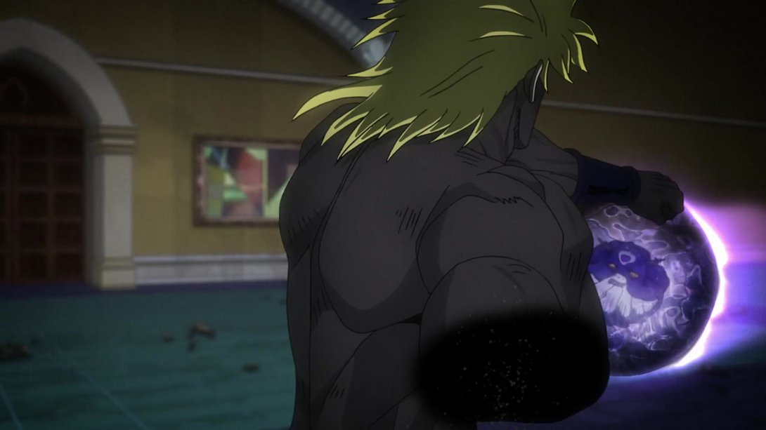
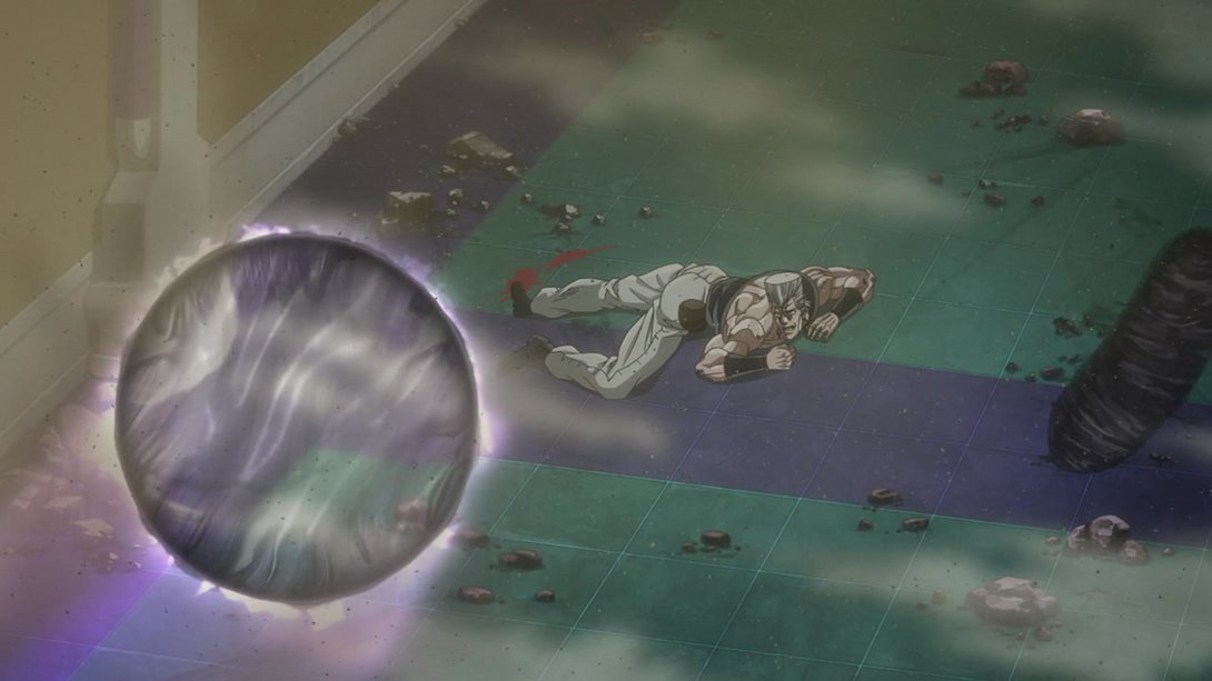
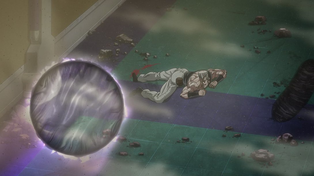
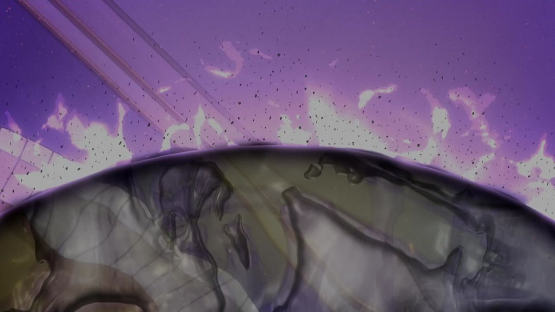
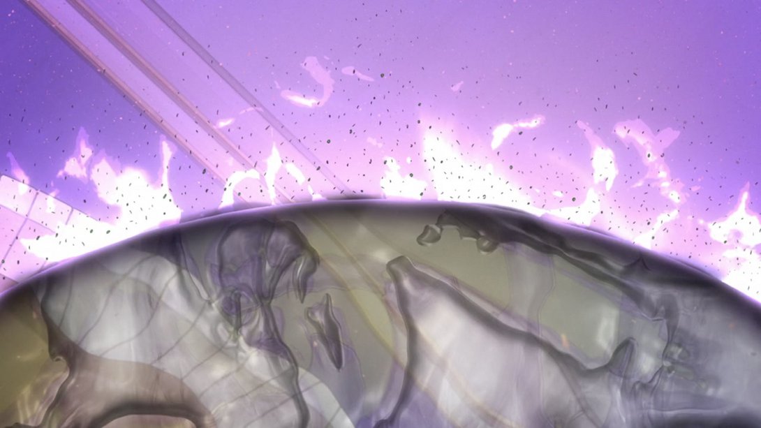
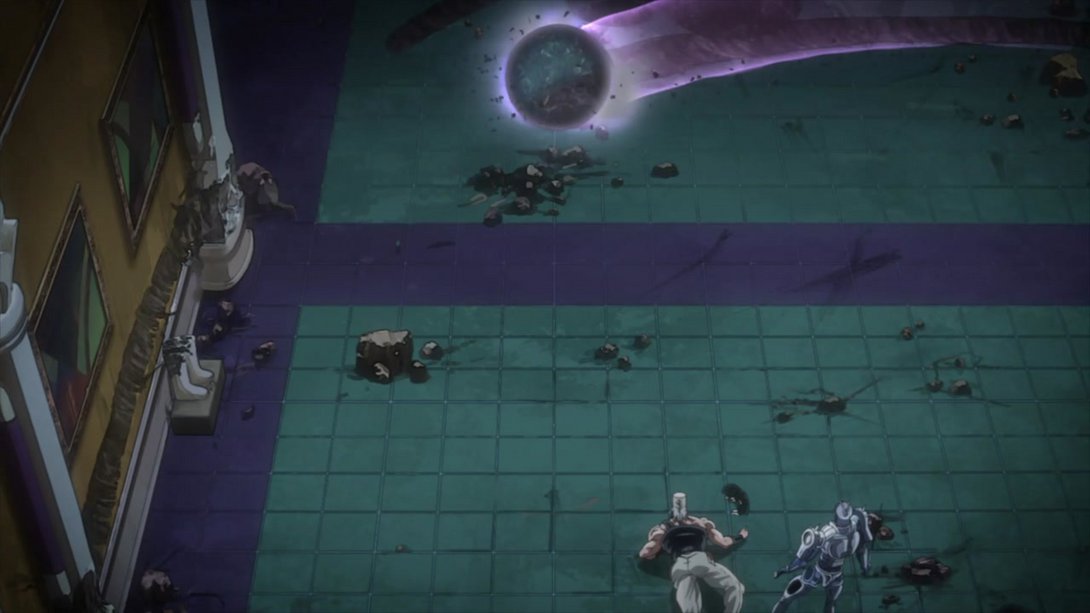
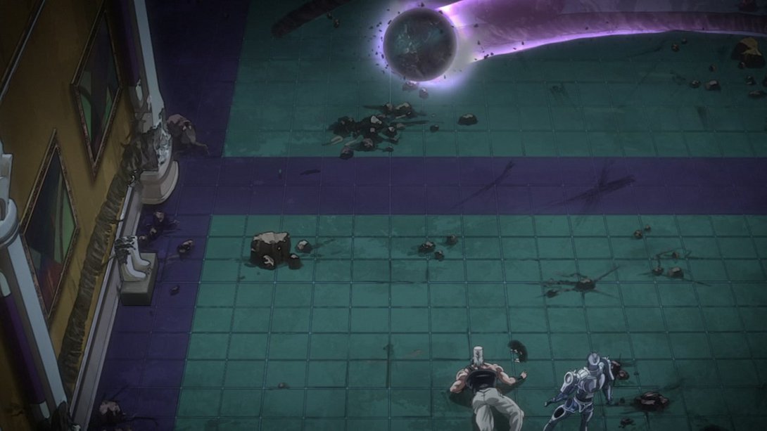
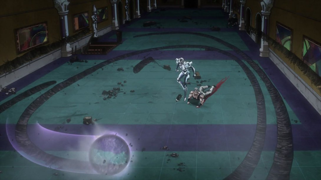
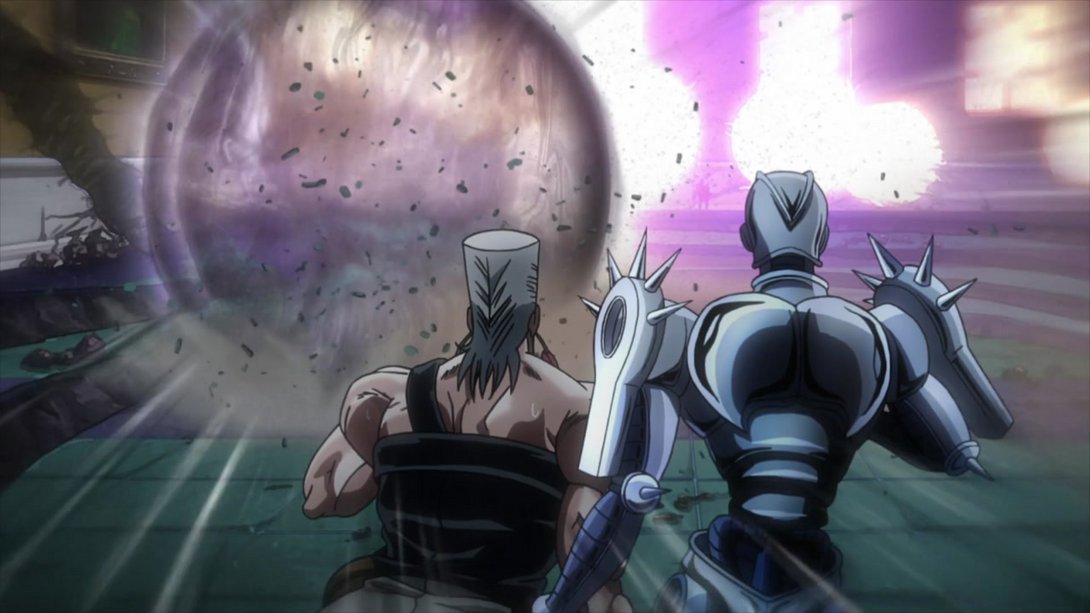
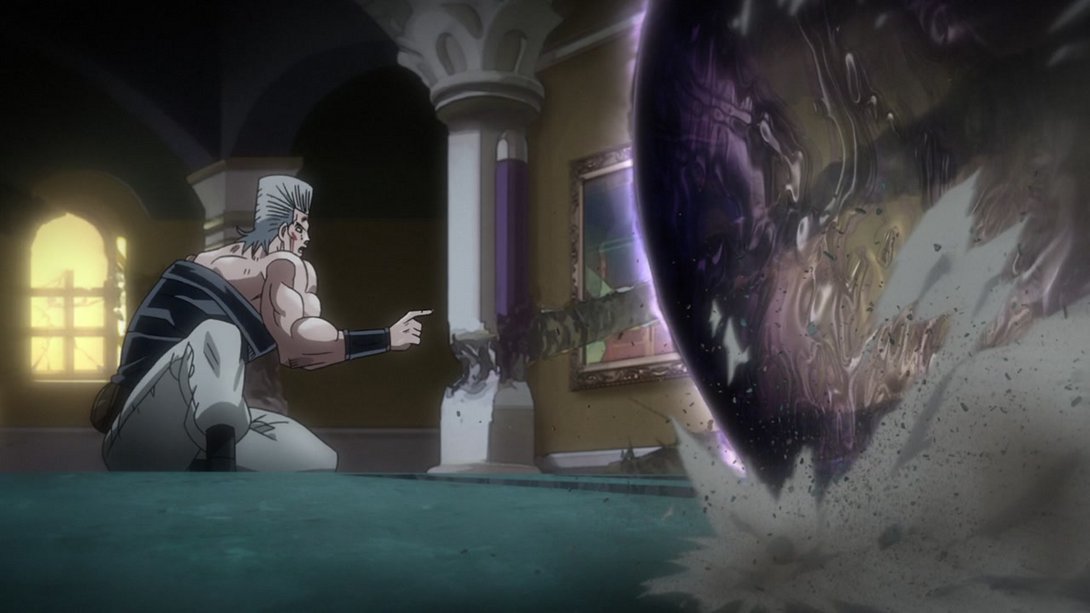
- Then, when Cream shows up, the effect on the “void ball” is a little different, the trail fades off in a more noticeable way and there are a bunch of sand particles floating through the air…:
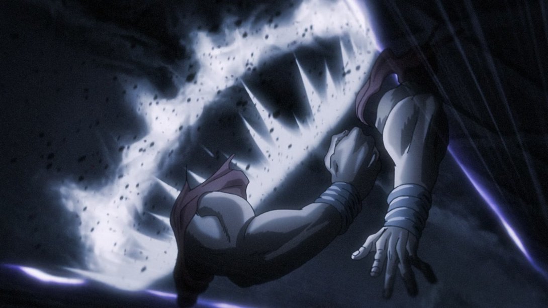
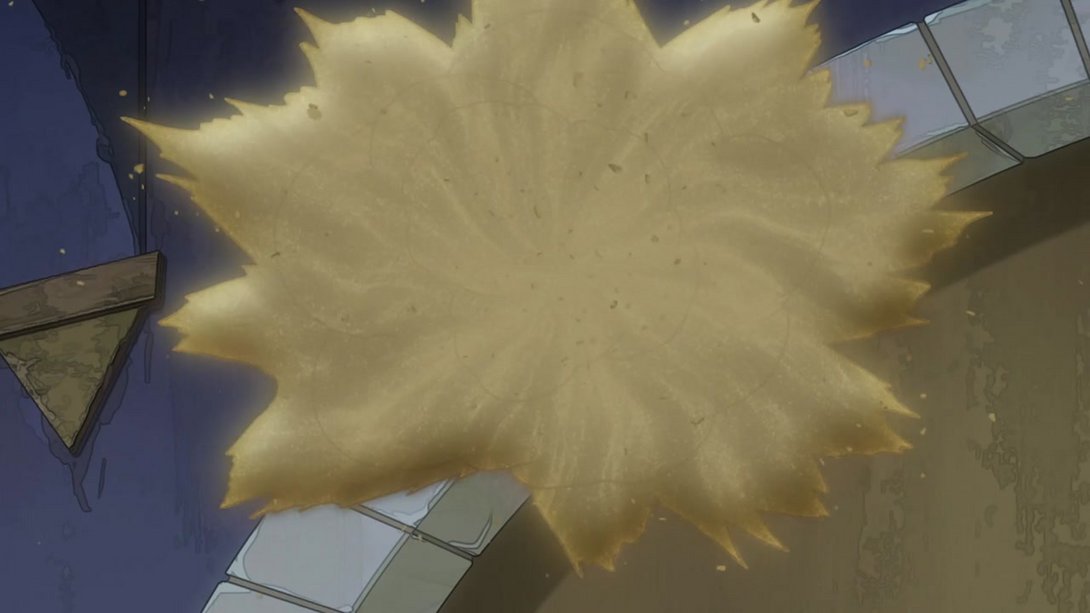
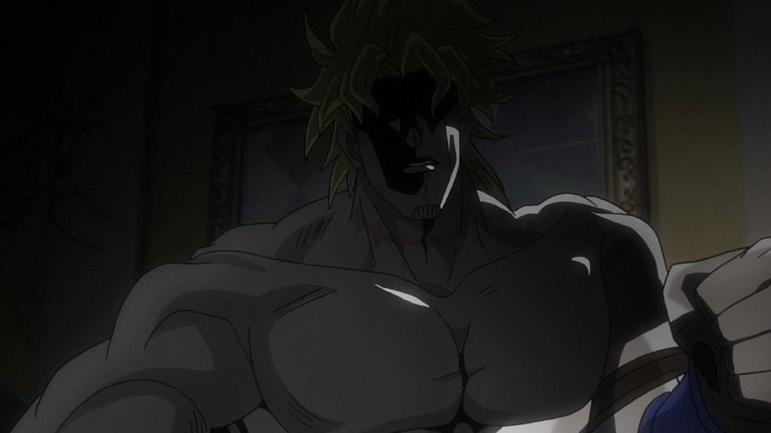
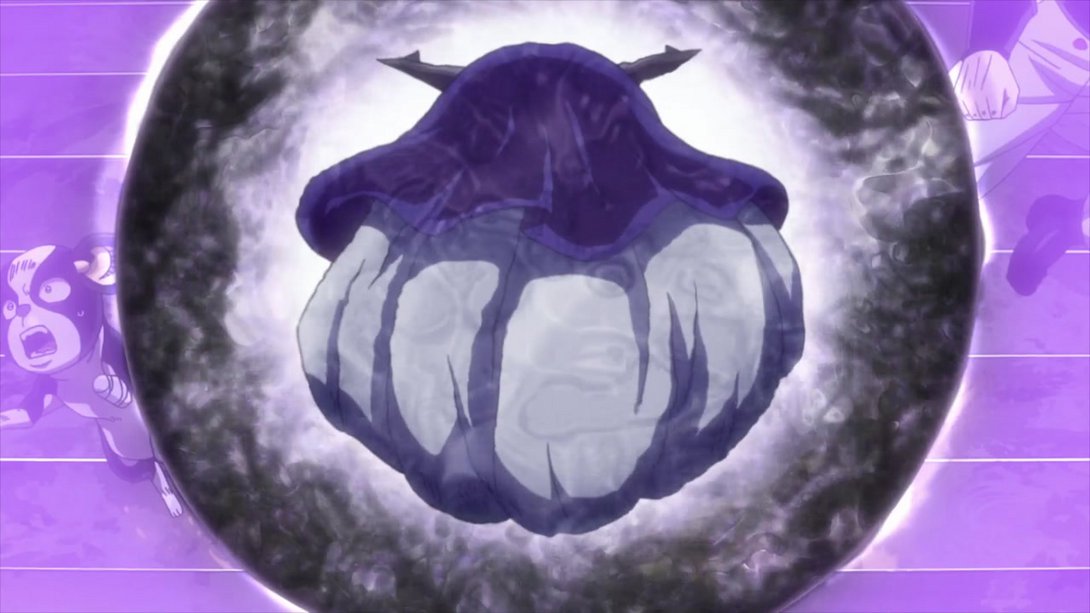
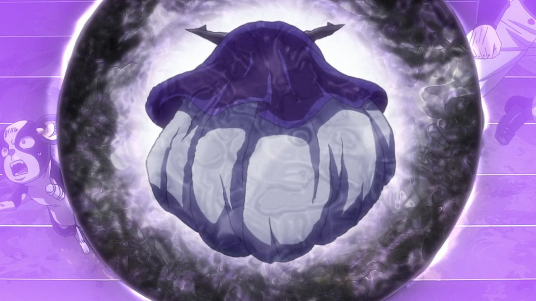
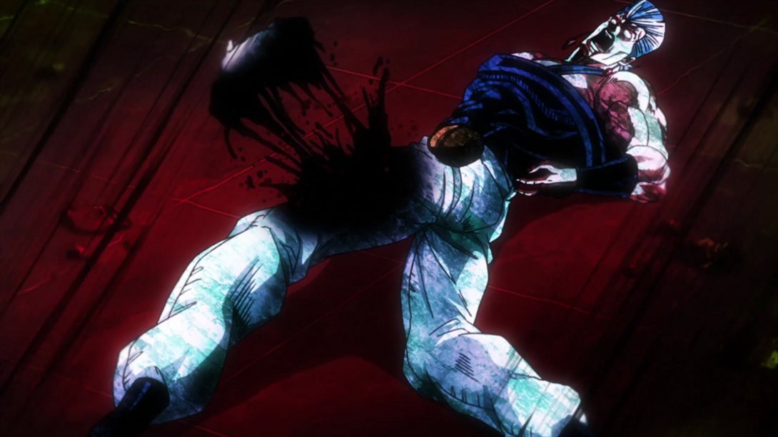
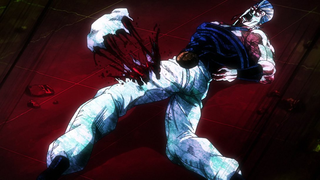
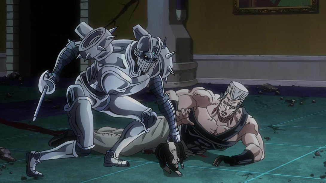
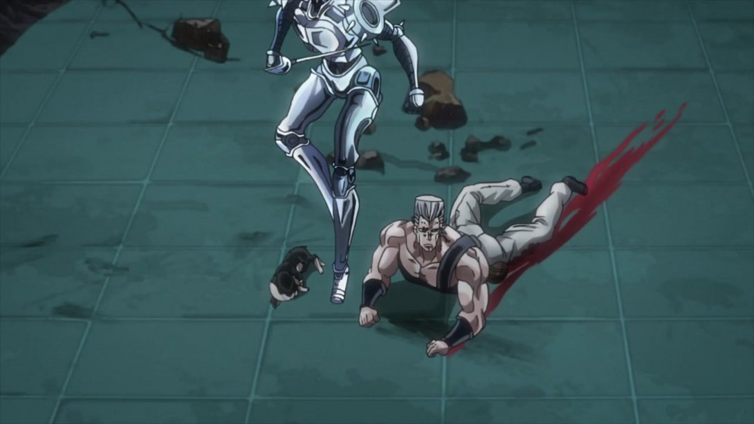
- And then, when The Fool starts melting into sand it still retains a little bit of its outline:
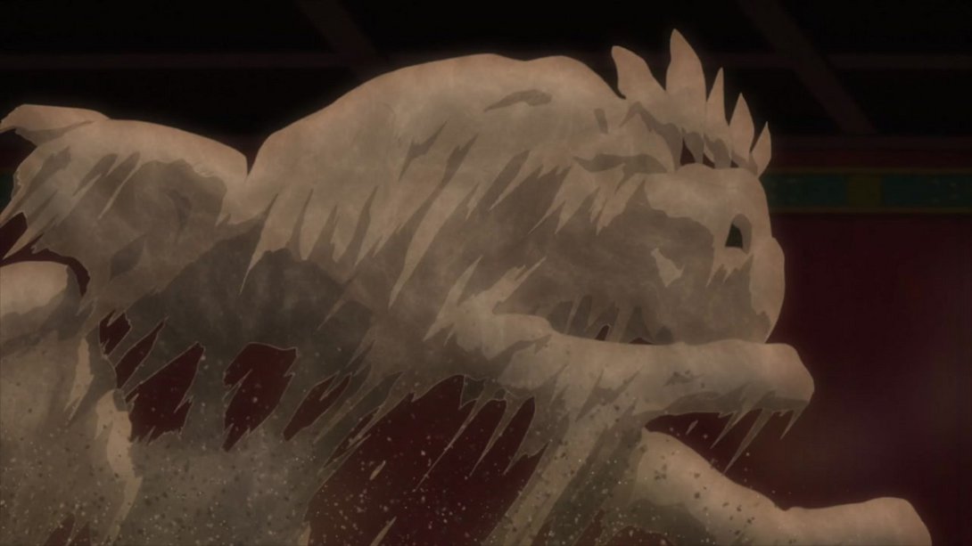
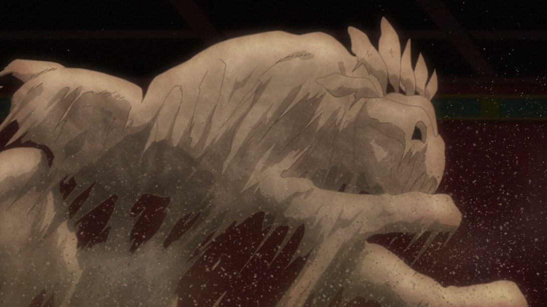
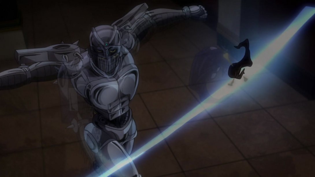
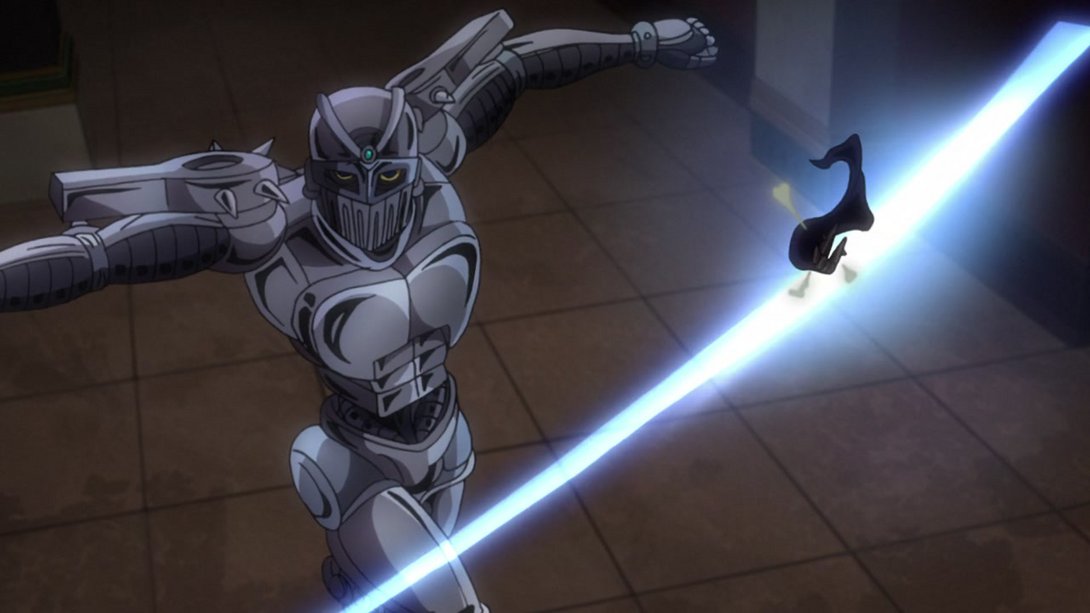
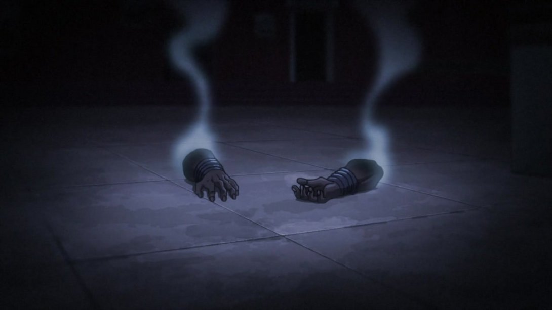
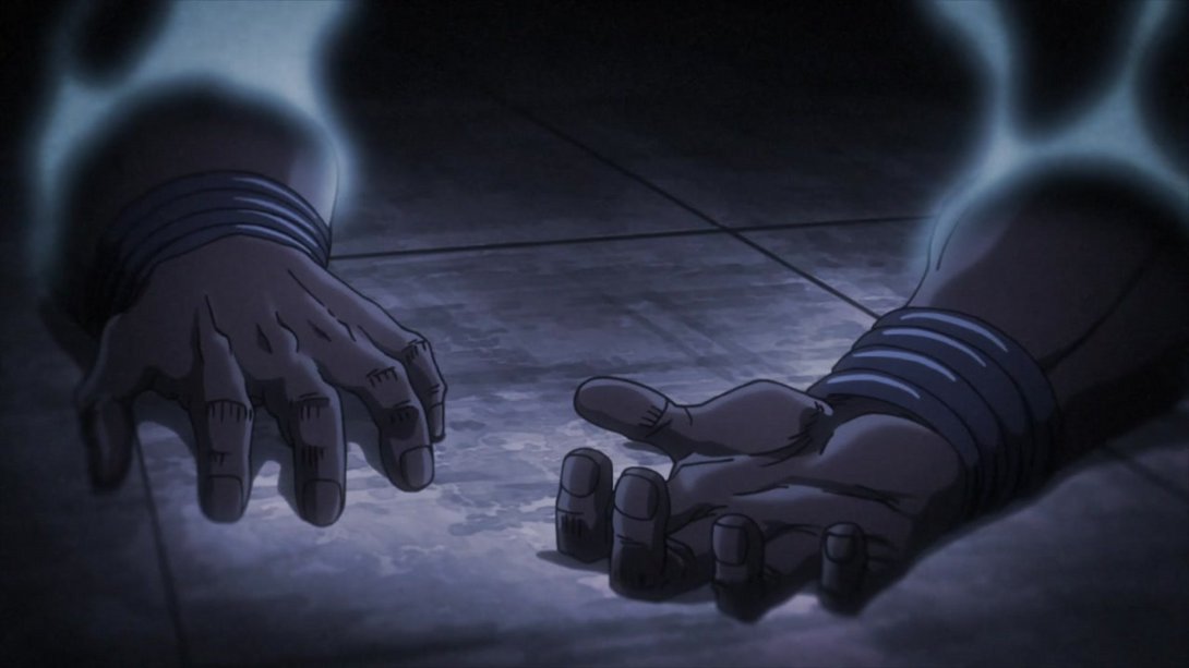
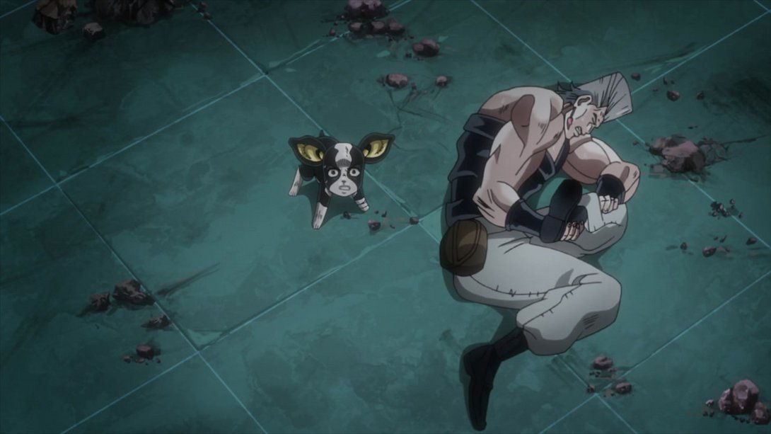
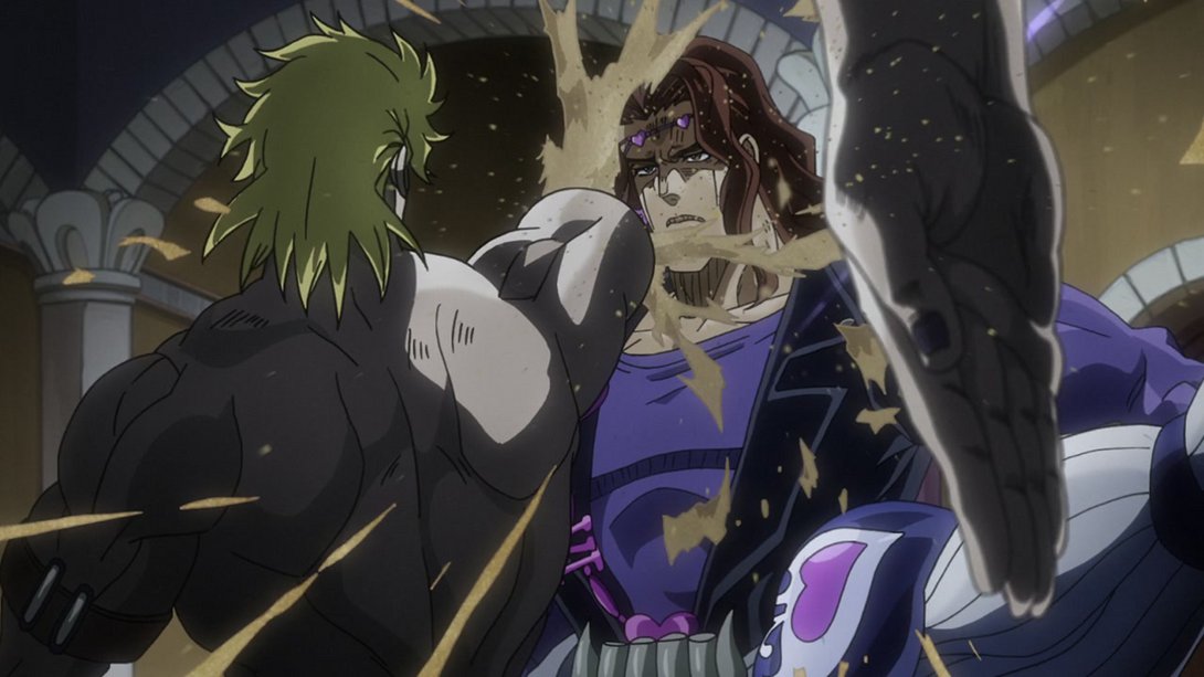
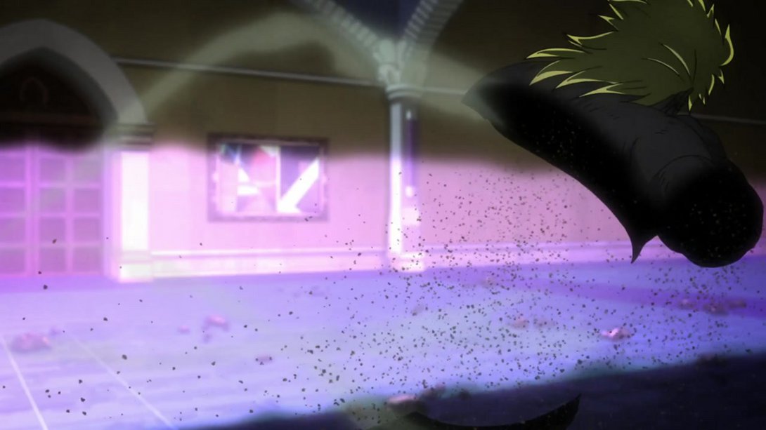
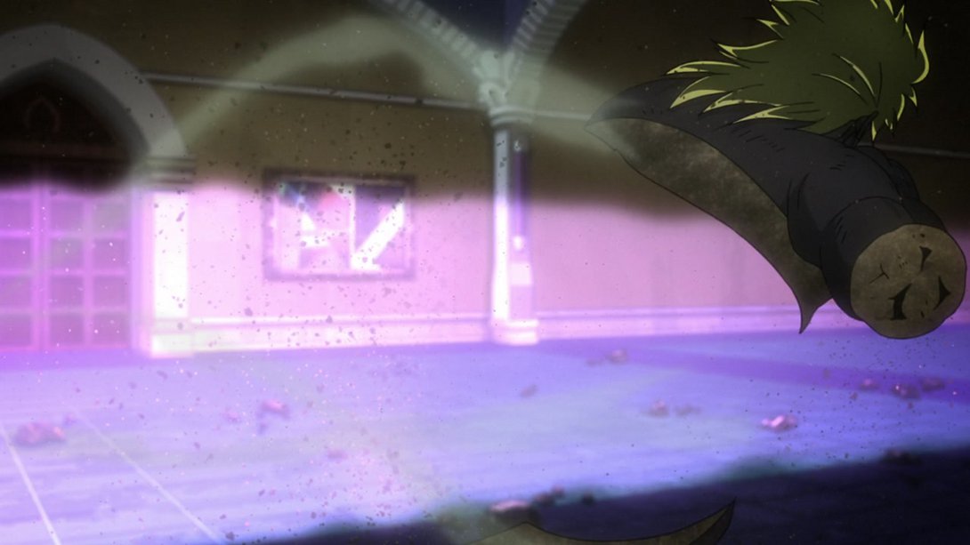
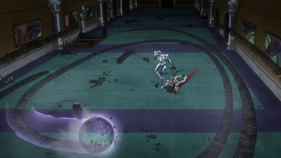
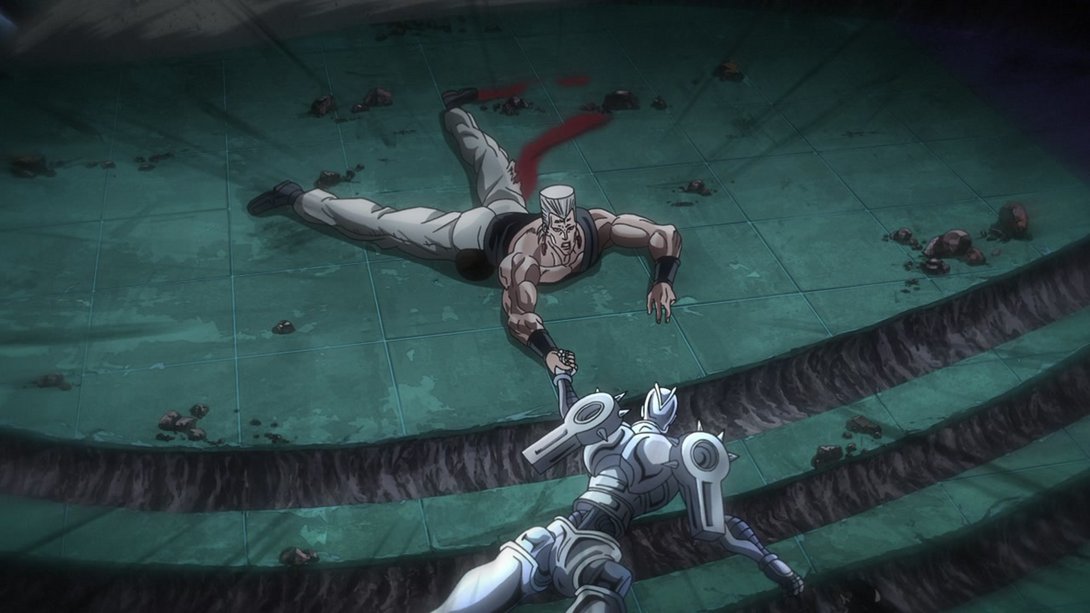
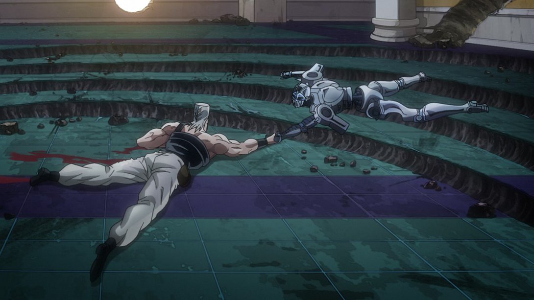
- It’s a brief animation, but let’s still look at it in motion, shall we? You might notice an additional small detail… in the BD version, The Fool keeps moving forward after he’s hit by Cream, while in the TV version he remains still:
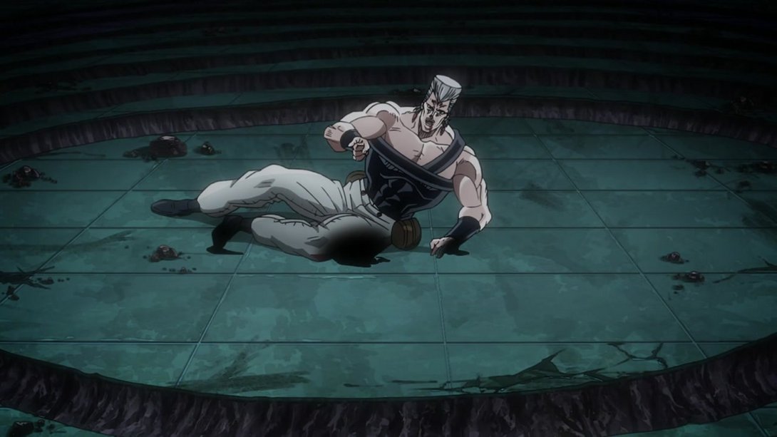
- In this scene, the shading has been retouched in a couple of places and the camera has a different distortion…:
- And, in addition, David Pro did something quite ingenious on the animation side: see, the TV version has Polnareff keep the same pose for two frames at a time, which in turn makes the animation look ever so slightly choppy; in order to mask the effect, the BD revision moves the camera up or down slightly on the second of those frames, so that the scene looks a little more dynamic! Check it out:
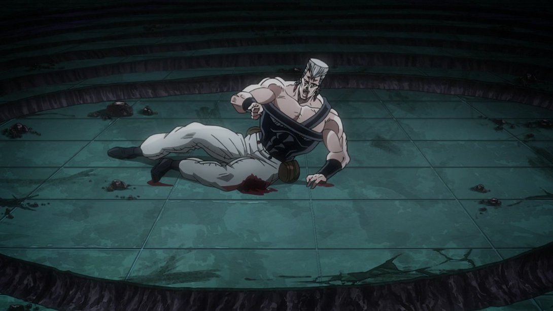
- In addition, you might have noticed that the last frame is different as well! In the BD version, Polnareff no longer turns back towards Iggy:
- This other running sequence is now much less washed out:
- Avdol makes another brief appearance in this flashback which, once again, received all changes already documented in the previous comparison:
- Moving on, the background is darker in this scene, especially on the top (and very slightly on the bottom as well):
- It’s time for U N C E N S O R E D F O O T:

- Here, on top of the uncensored foot, we also have some slightly different shading:
- Here we have another scene with a bunch of differences! Let’s see… The top of the background is darker, the shading on The Fool is a little different and there’s a more prominent distortion along the edges…:
- In addition, the shading on the sand is flatter and there are more particles flying through the air:
- Let’s have a handful of nice, uncomplicated Brighter ‘n’ Sharper animations, friends:

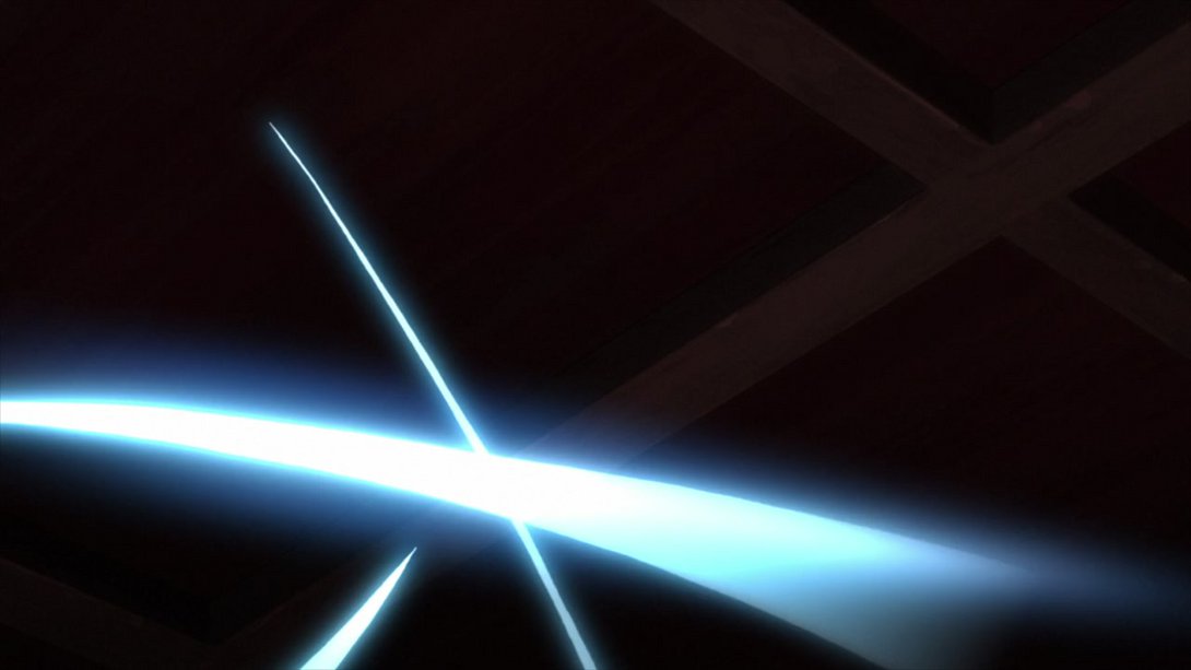
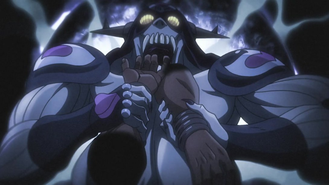
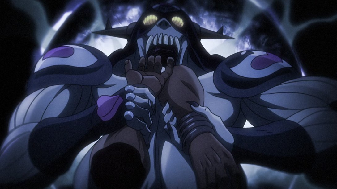
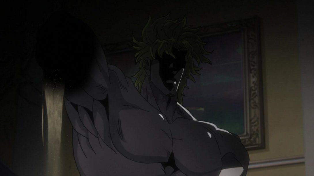
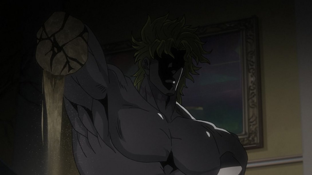
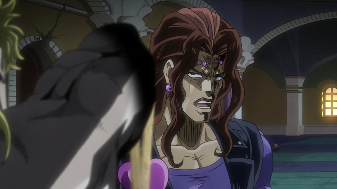
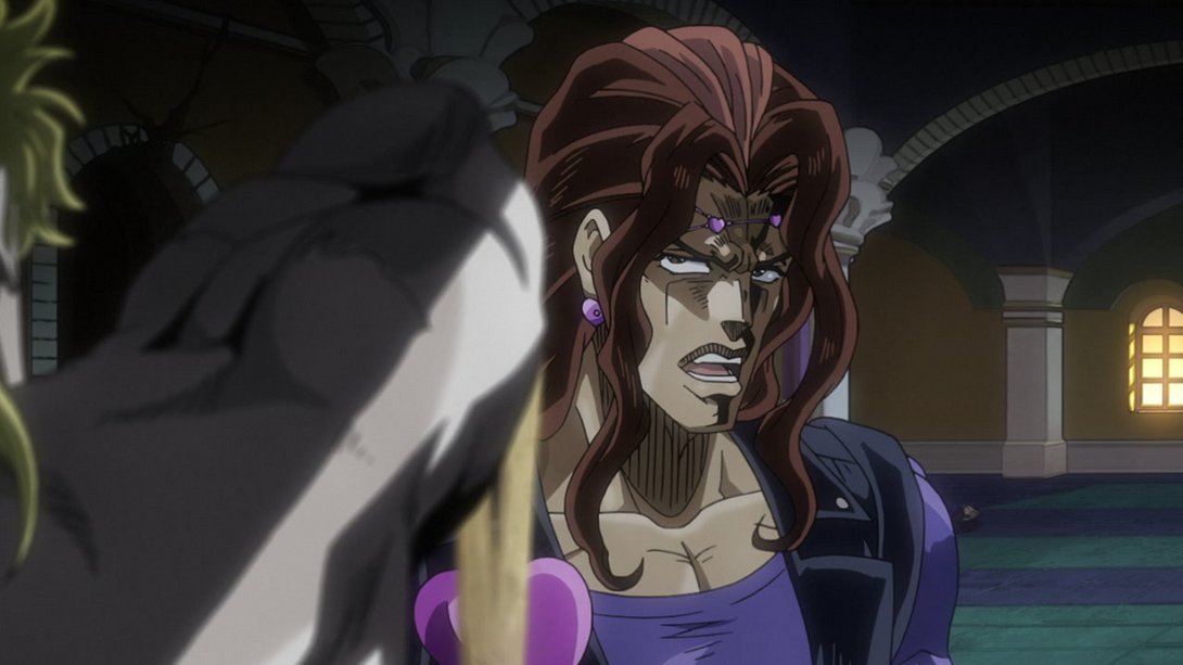
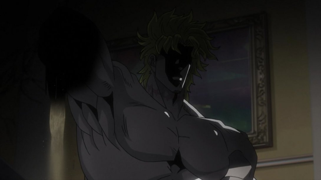
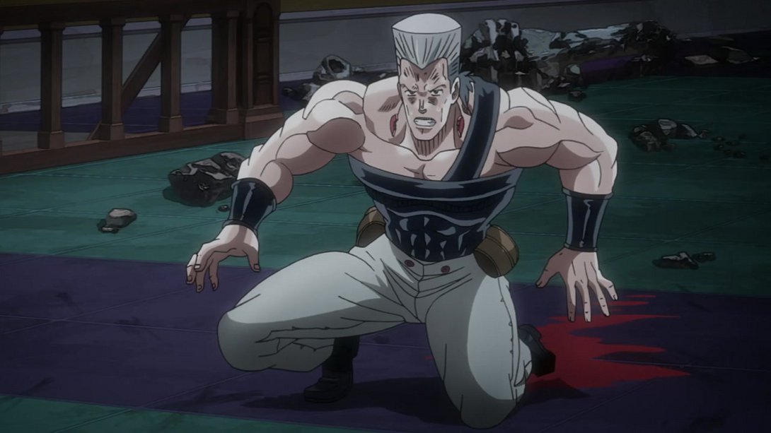
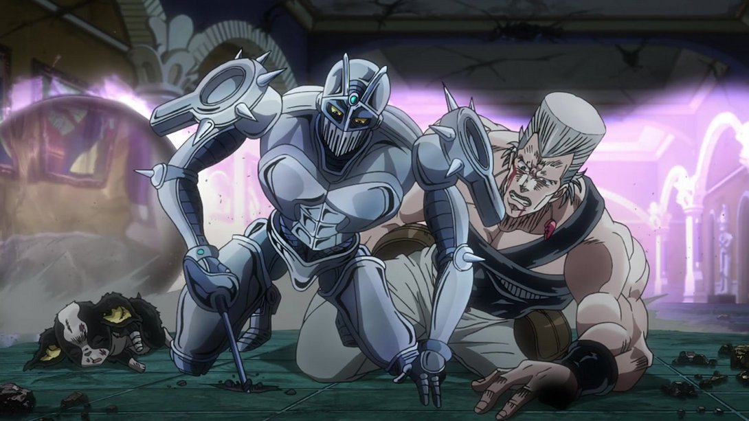
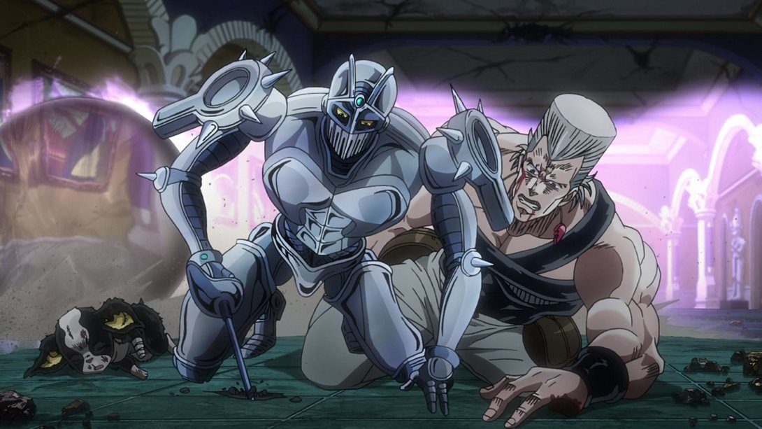
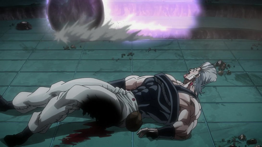
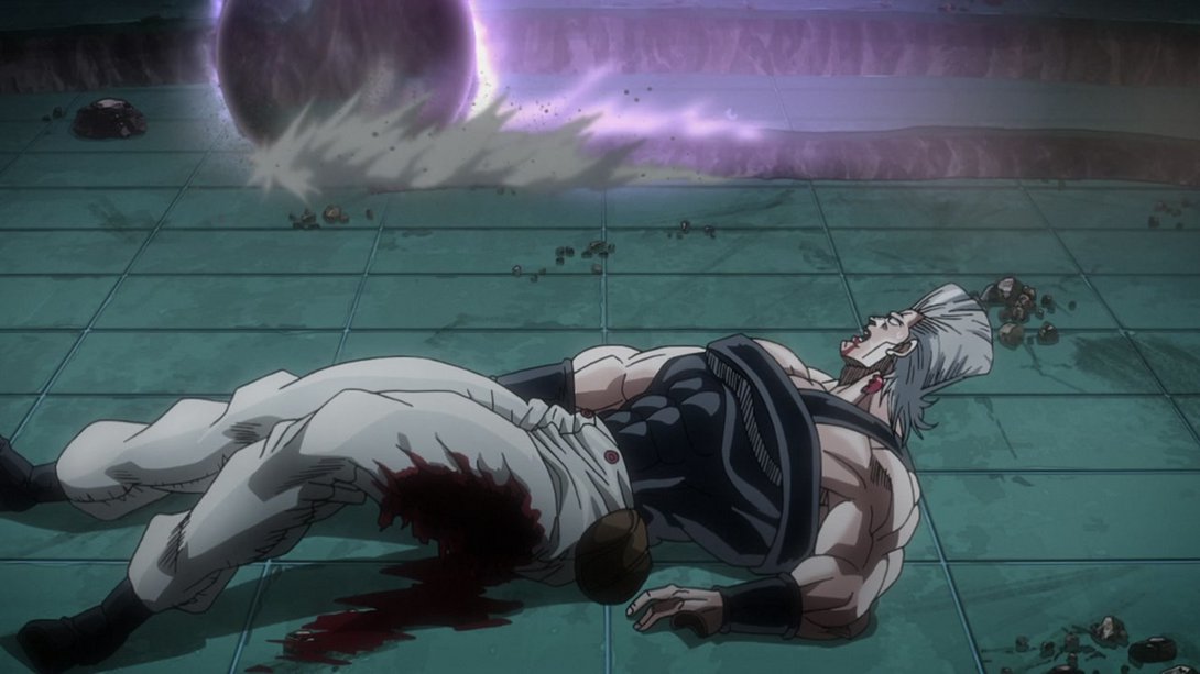
- Alright, it’s sandy Dio time, friends! Here we see some slightly different shading… What could that mean? What could be about to happen?:
- OH NO:
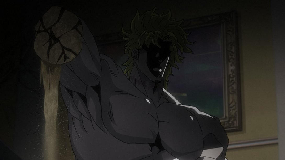
- OH NO AGAIN (with a darker background this time, and some slightly different effect on the sand “thread”:
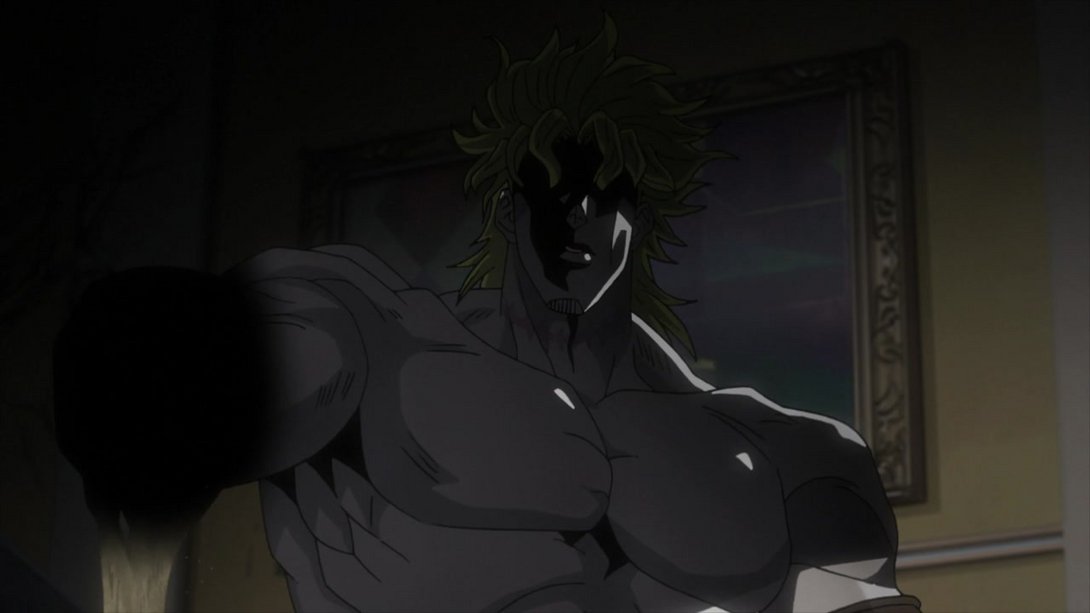
- OH NO!!!:
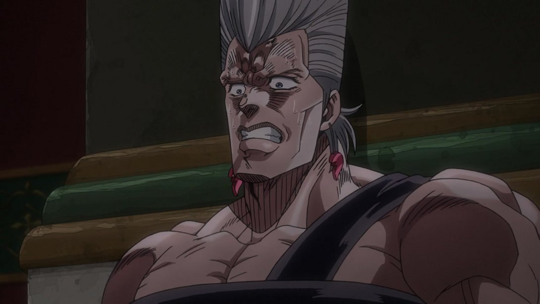
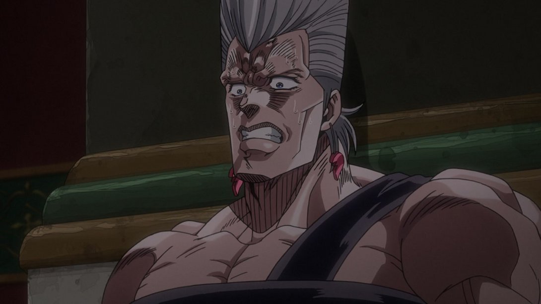
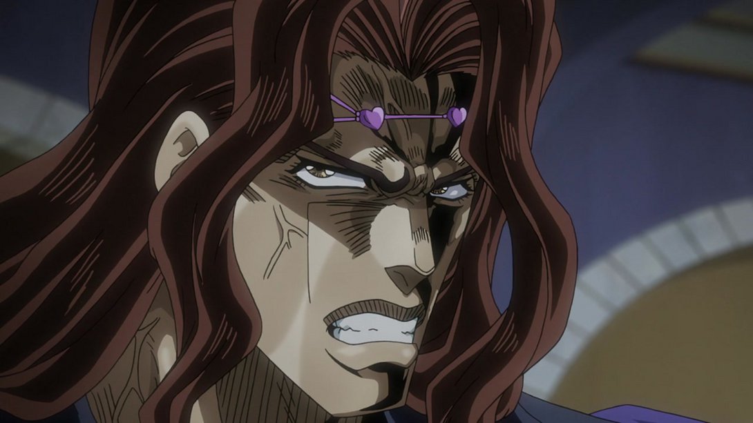
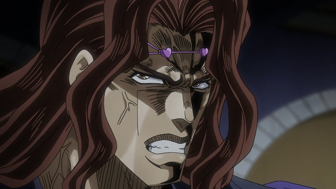
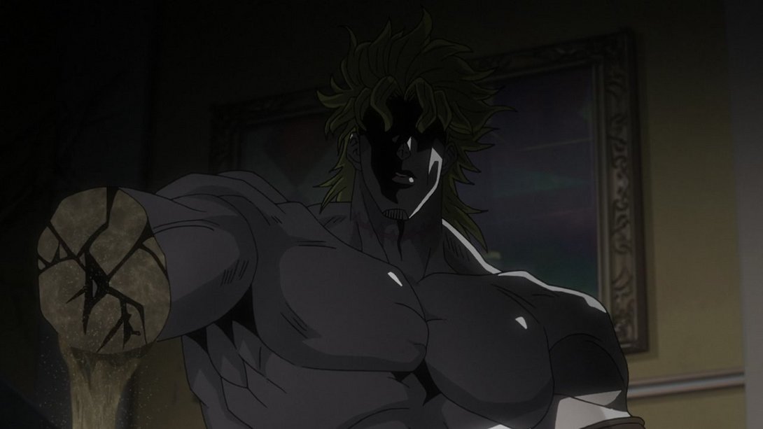
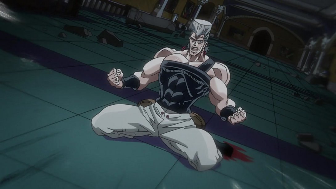
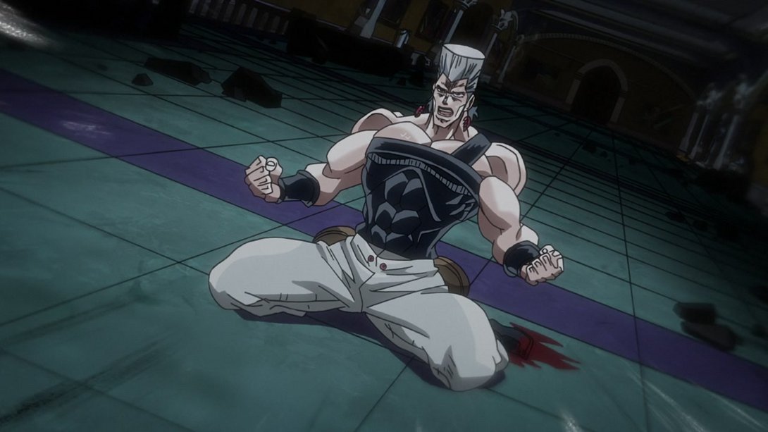
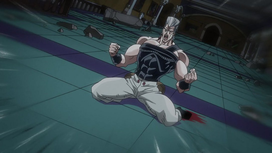
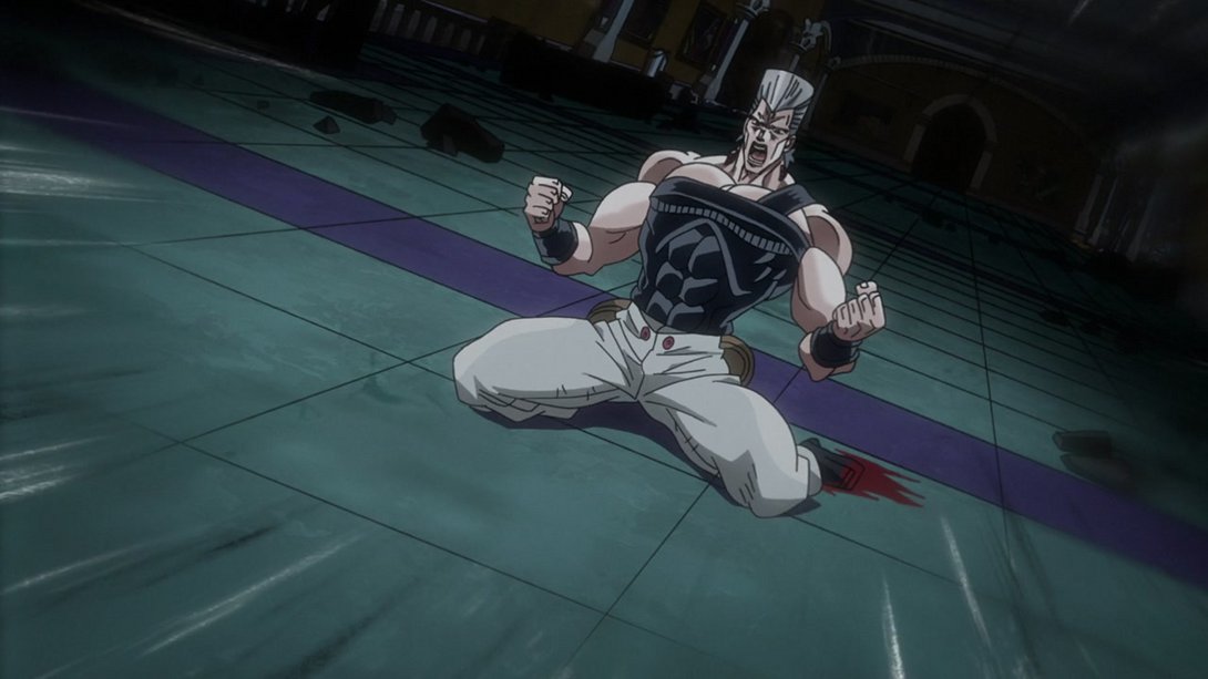
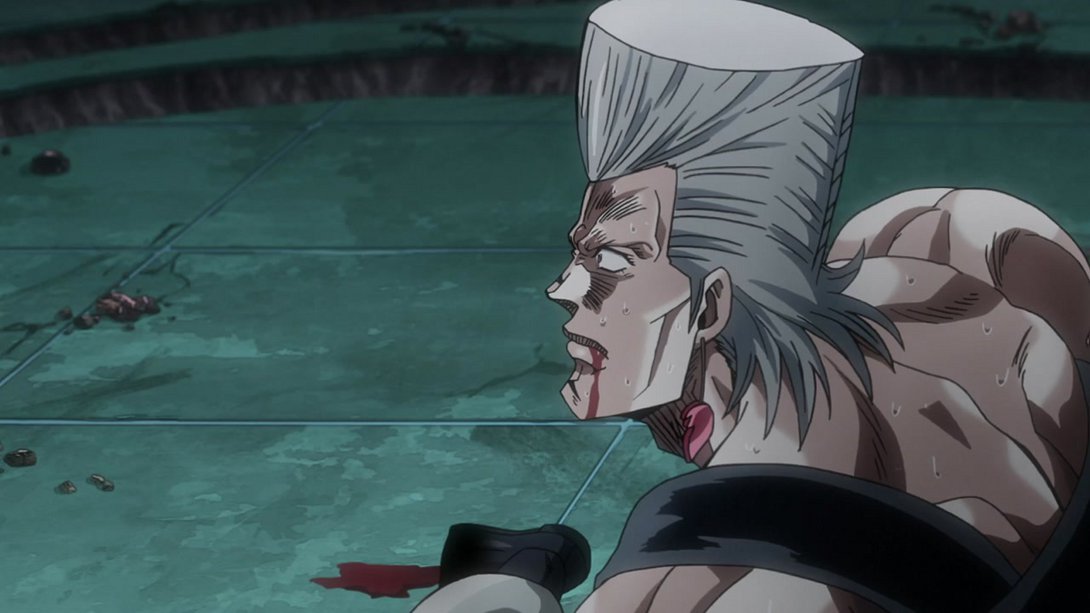
- Somebody’s looking upset (and the background is looking much darker):
- The same applies here, on top of some slightly thicker lines on this angry boy:
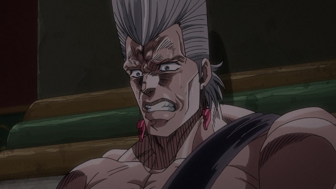
- DUDE ARE YOU OK:
- The side of his nose is no longer illuminated by the moonlight, here…:
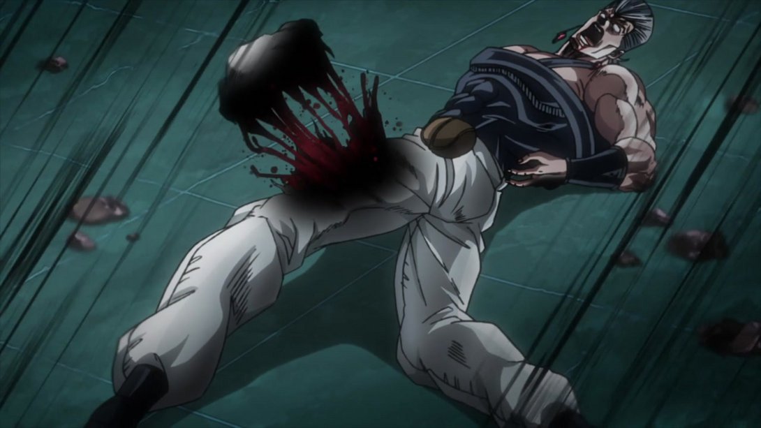
- GOODBYE, DIO! (also, the sand particles make a lot more sense in the BD version, considering they’ve been blown aside by Cream’s void ball:
- The shading on the background is darker here, and Polnareff’s foot has once again been uncensored…:
- The background seems to have the same kind of vignette going on here as well; on top of that, sandy Dio’s legs (R.I.P.) are looking a little different and Polnareff’s now casting a shadow:
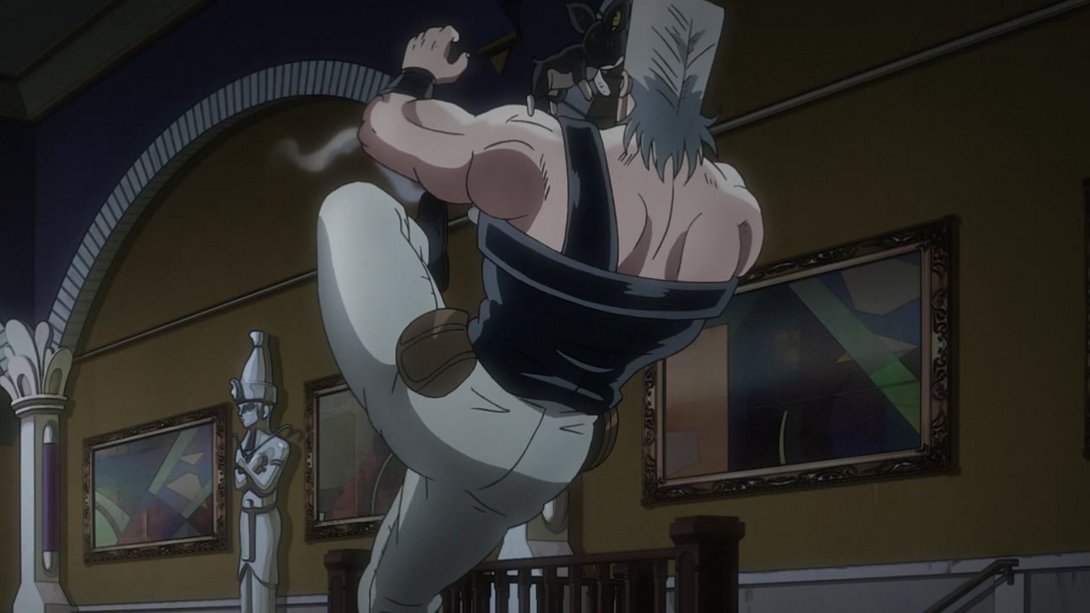
- This absolutely gut-wrenching scene has a darker background as well (but I stopped it a couple of frames before he could kick Iggy! He’s fine, look! I swear!):
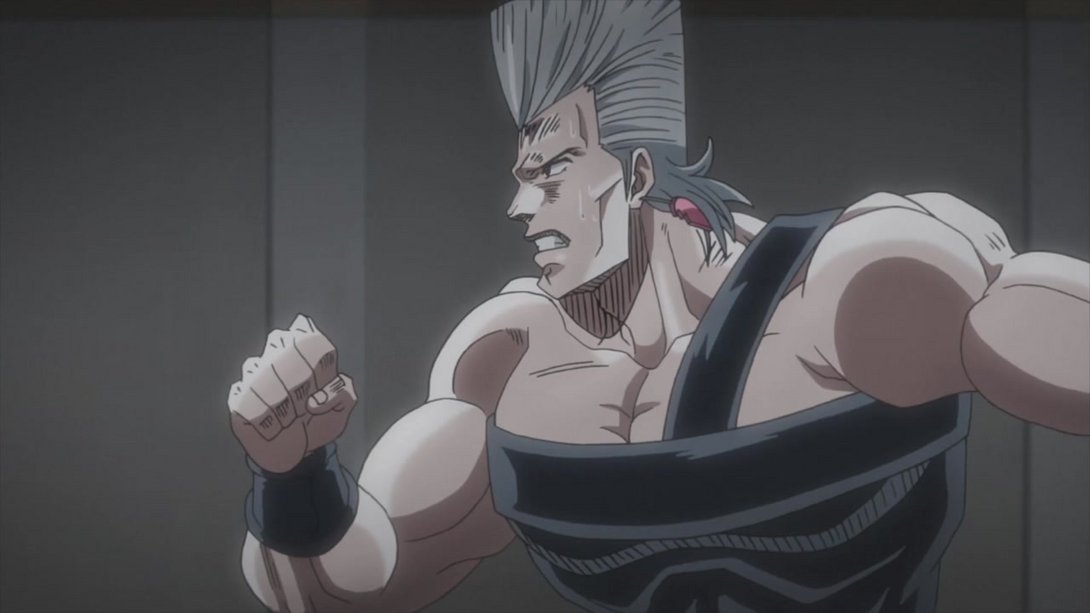
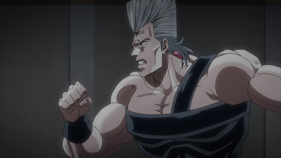
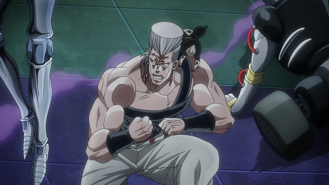
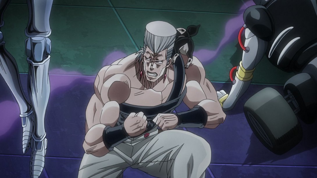
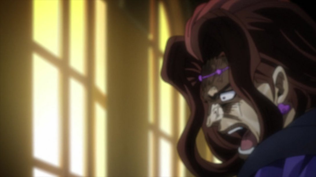
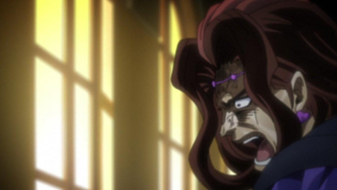
- This bastard of a man’s been drawn with some slightly thicker lines once again, here:

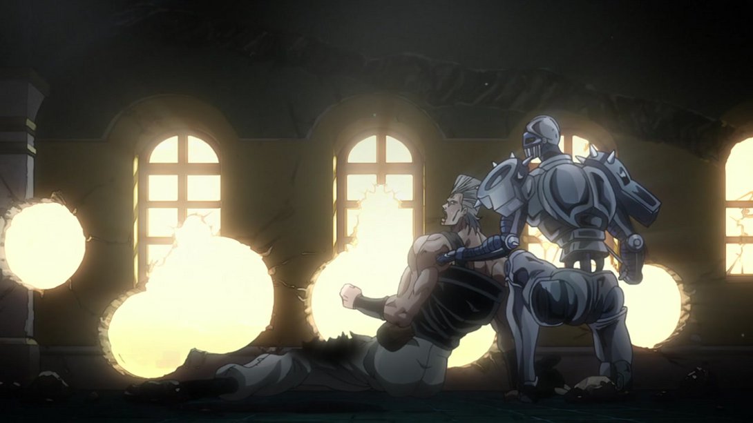
- This scene plays a lot with moving Vanilla Ice in and out of focus, but the extent of the effect has been slightly reduced in the BD making for a slightly sharper image here and there; in addition, a bunch of small details were also correctly recoloured:
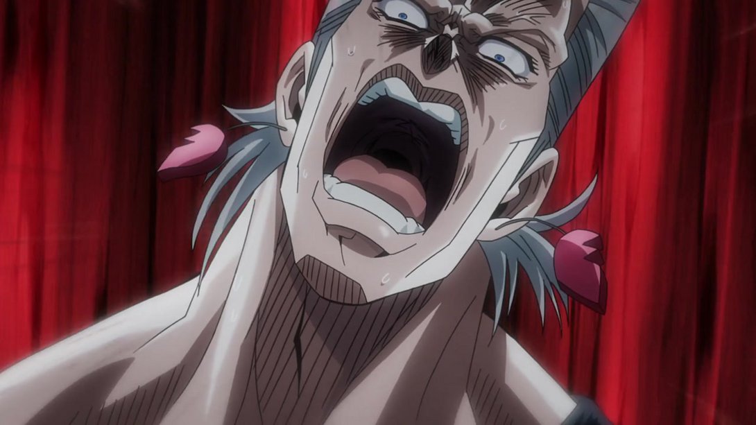
- Jesus christ dude you should get that looked at, it doesn’t look normal to me:
- This happy scene of Iggy eating some nice strawberry jam also has a darker background:
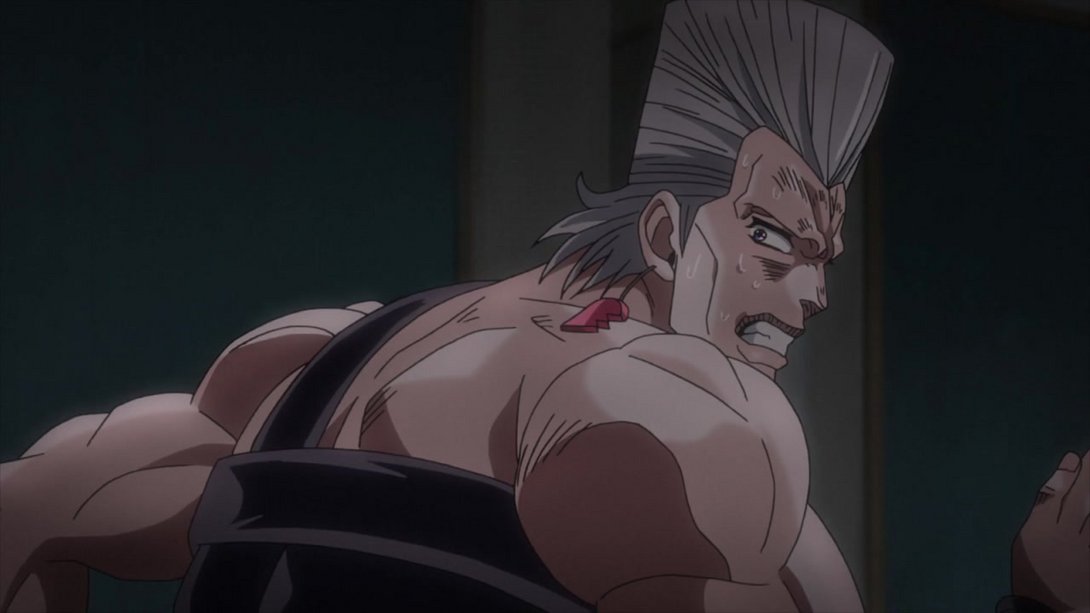
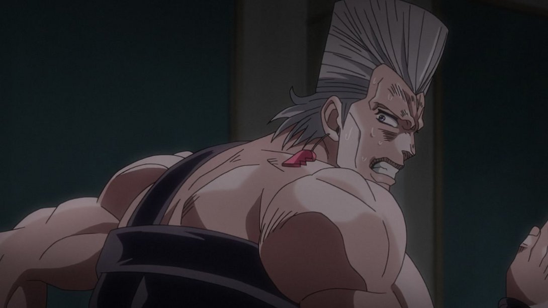
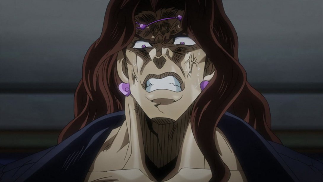
- There are some darker shadows in Polnareff’s hair here…:
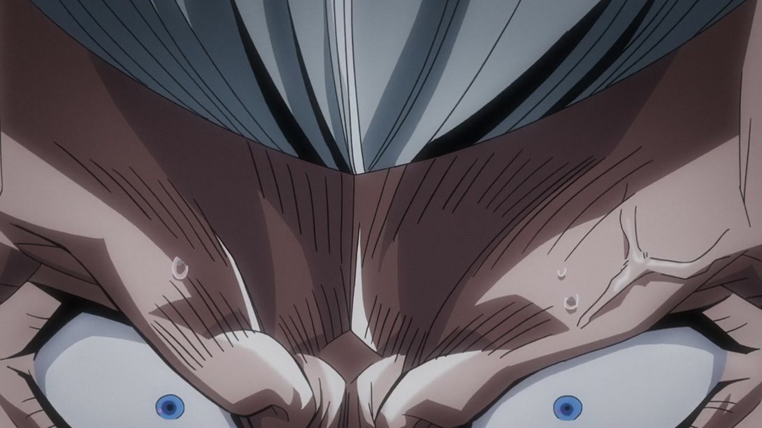
- …also, a couple of the sweat drops on his forehead have been retouched and the small pink circle in his left eye is slightly less pink:
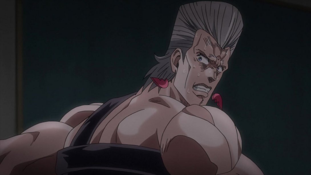
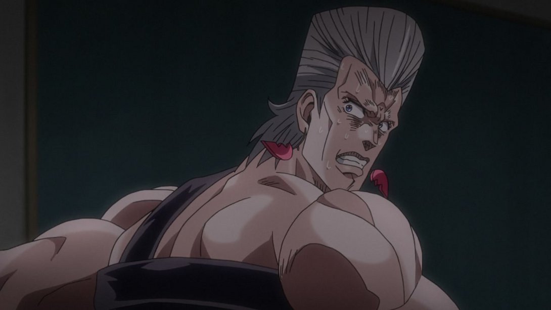
- Here, the sweat drops on Polnareff’s neck have been recoloured, and if I’m not mistaken, some of the lines towards the top of the frame are a liiittle thicker as well:

- Here we have a bunch of differences: the lighting in the background is VASTLY improved (and the farthest layer has also been moved slightly), Polnareff’s foot has been uncensored once again, the motion lines along the edges are different…:
- …the camera moves slightly more in the BD version…:
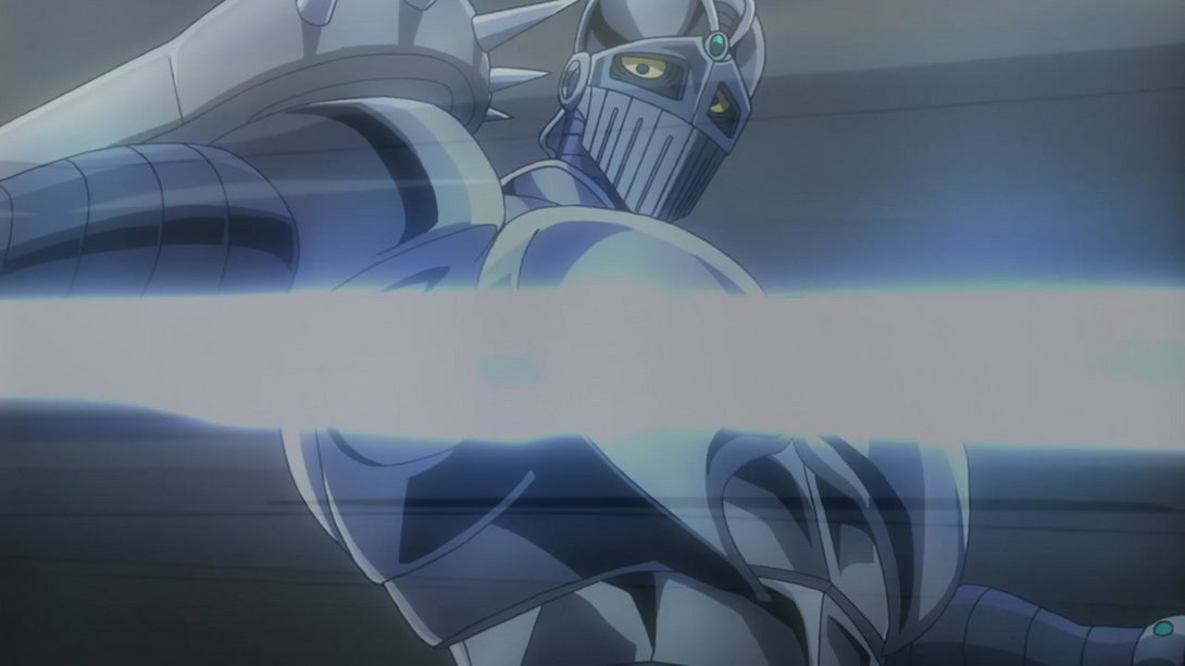
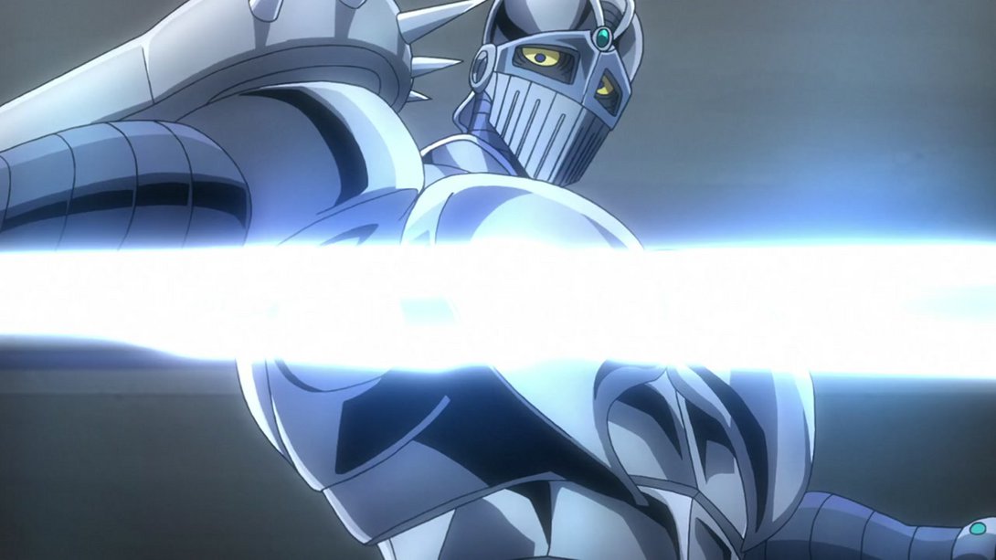
- …and, when this beautiful shot resolves in Silver Chariot, the edges of the frame are less blurry too:
- Let’s look at it all in motion:
- Here we have another brief brighter and sharper animation…:
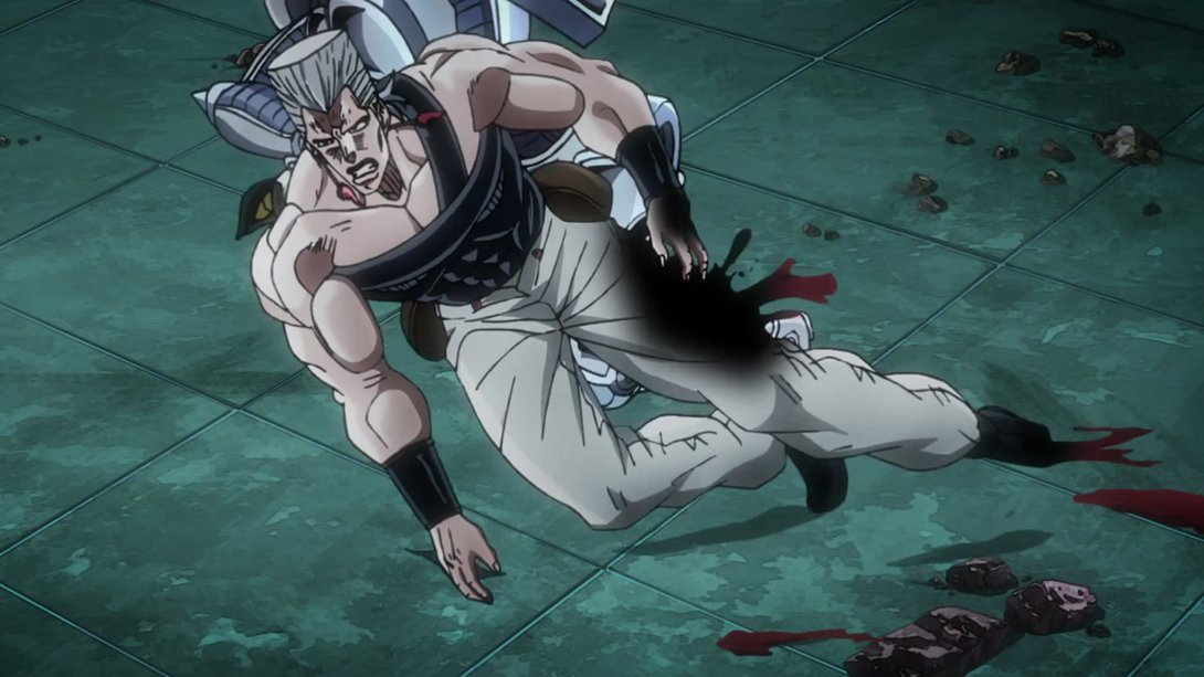
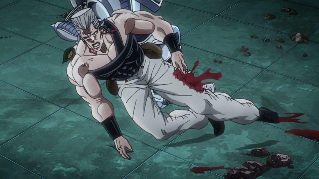
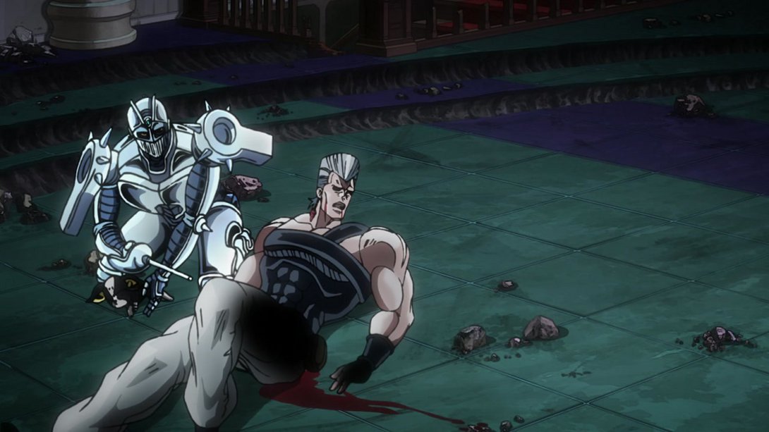
- Here, on top of an uncensored foot, Polnareff’s blood is now slightly darker and his cast shadow is no longer drawn over it:

- Here we have a bunch of differences, including one of the most bizarre things I’ve seen on here: for some mysterious reason, the piece of furniture on the left of the frame was… weirdly transparent in the TV version; this puzzling element of untapped Jojo lore has been fixed in the BDs! On top of that, the dust clouds in the bottom of the frame are now slightly blurrier, the left side of the frame is darker, Polnareff has been shaded more…:
- …In addition to all that, the left slice of the frame is darker, the puddle of blood slightly brighter and the void ball has also been shaded a little more:
- This scene has a darker vignette along the edges…:
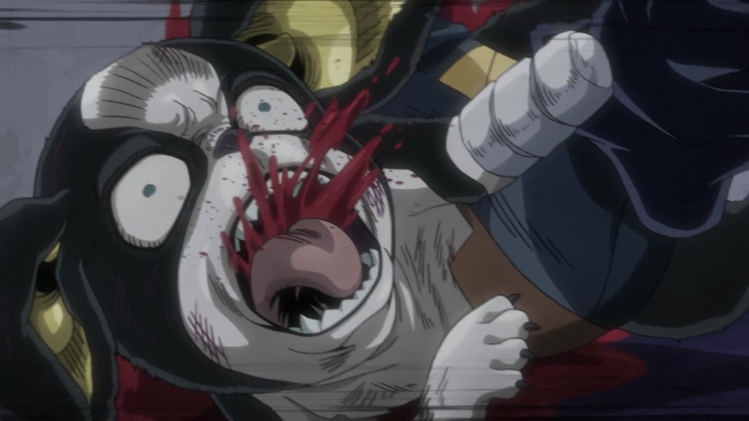
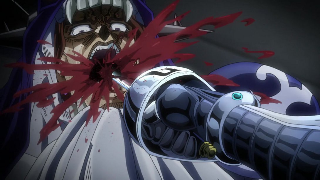
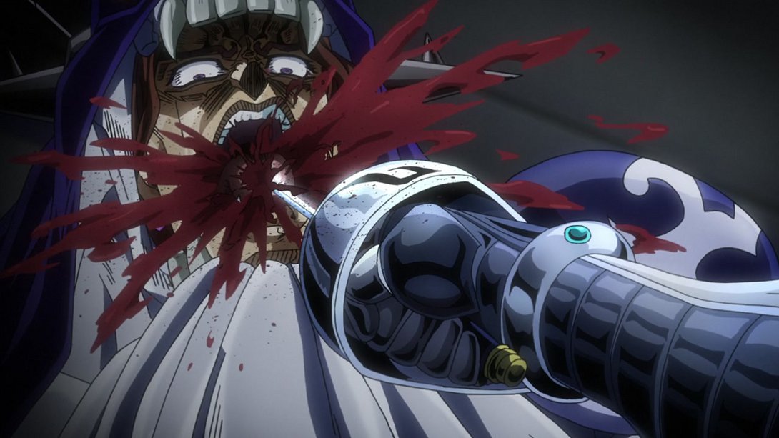
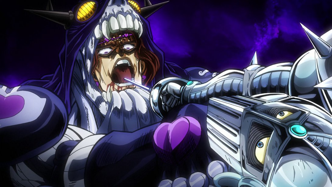
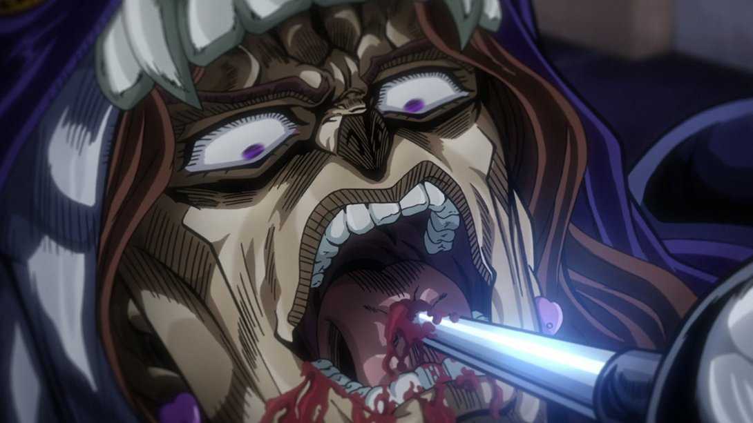
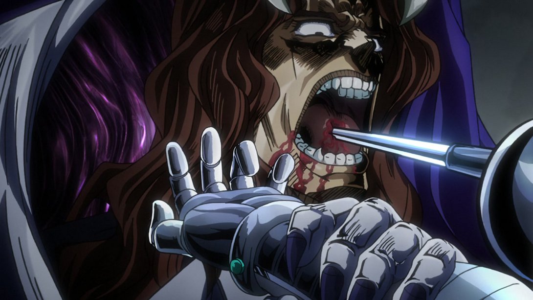
- In this well-deserved payoff, Vanilla Ice’s tongue has been uncensored and the blood effects are looking better:
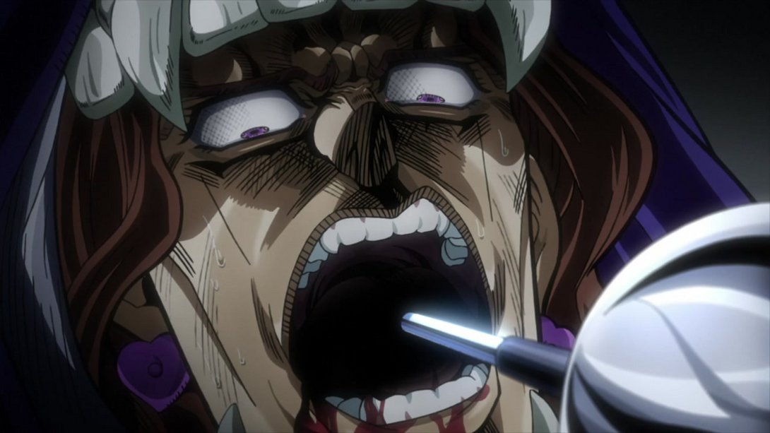
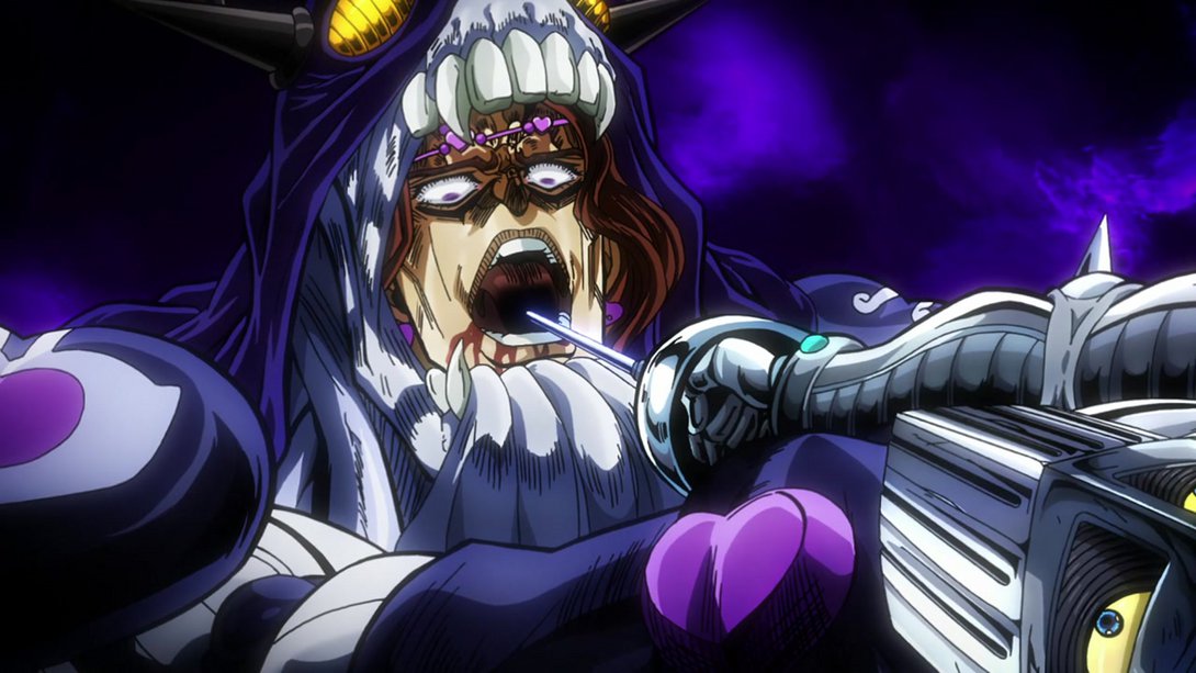
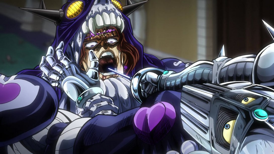
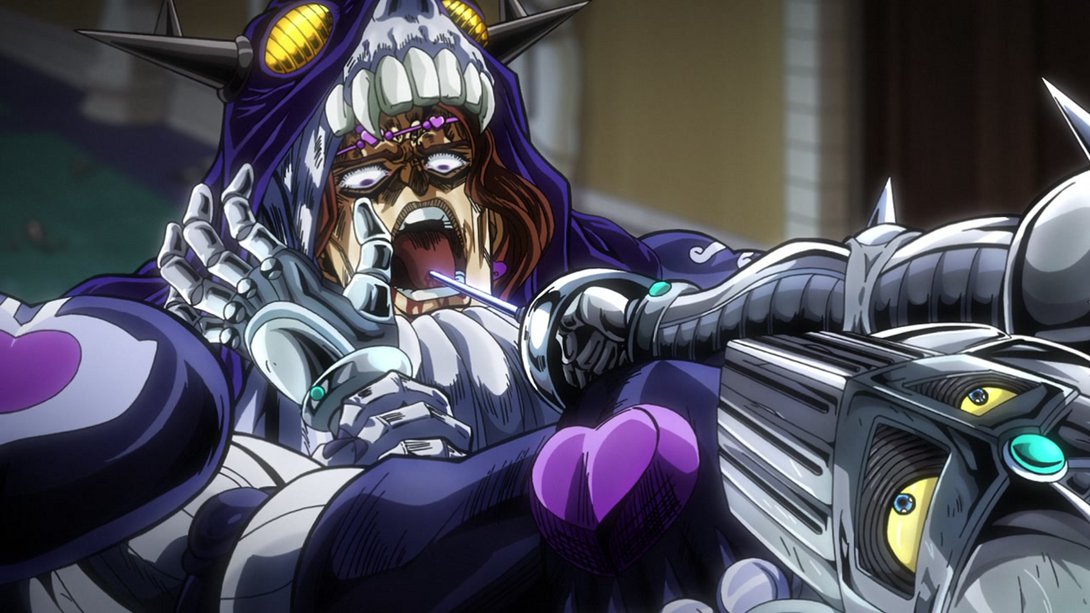
- Here, on top of his tongue being uncensored once more, his forehead is significantly darker…:
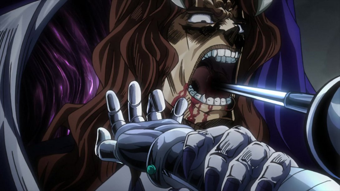
- …and, in the TV version, Silver Chariot’s hue started shifting weirdly towards the end of the scene (I’m assuming it was due to the effect on the background); this has been fixed in the BD:
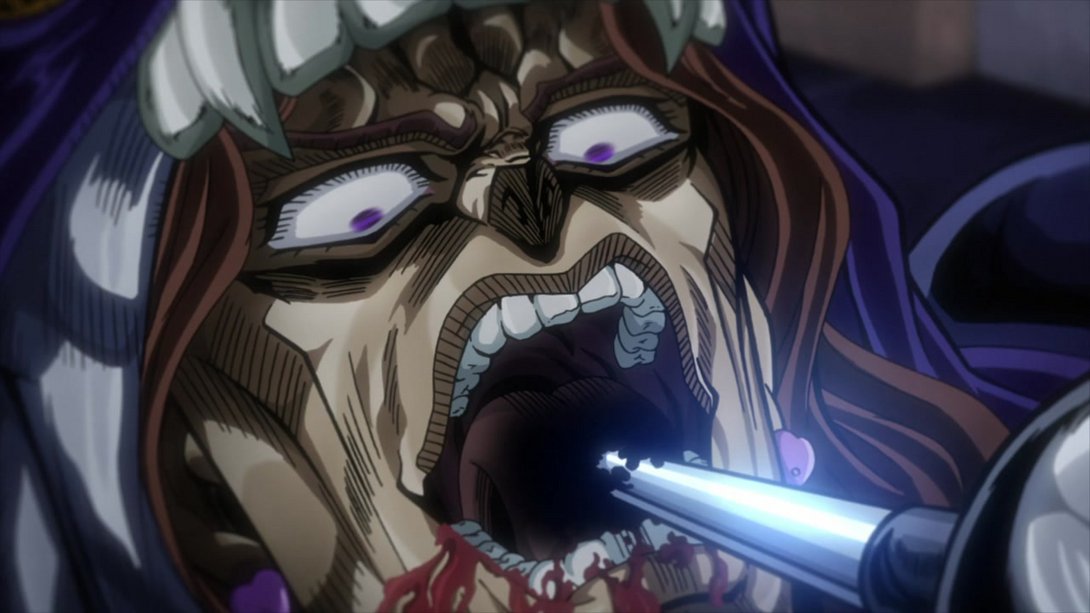
- Ew:
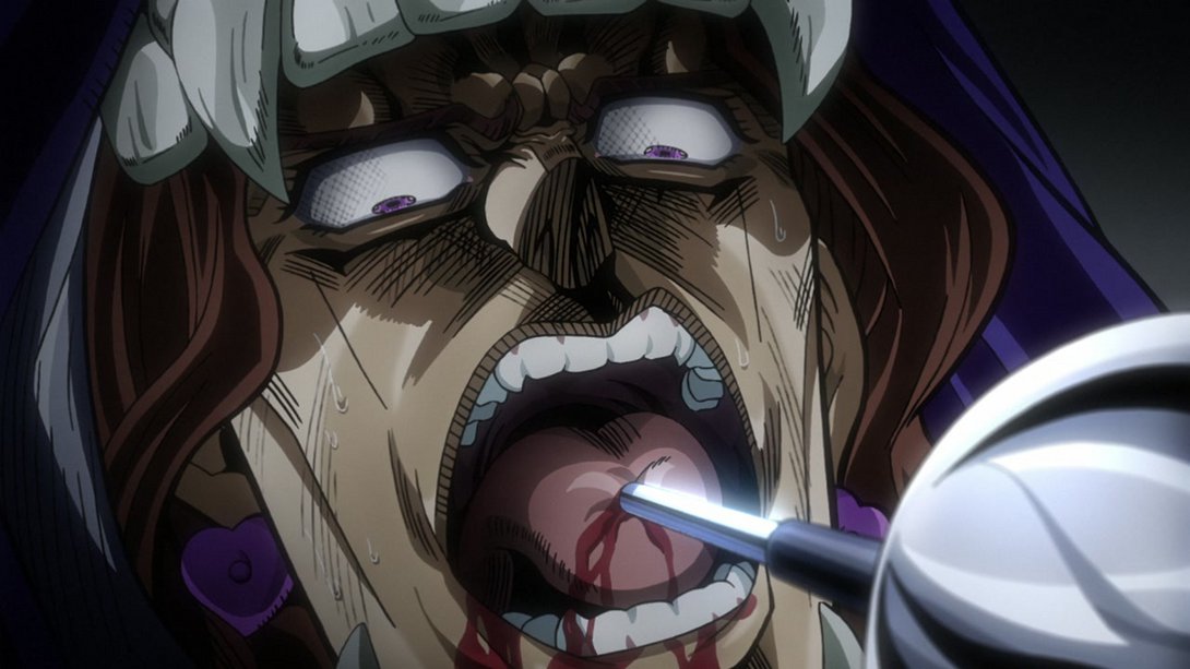
- Here we have basically the same scene as before, and even though the background is not as trippy, we can see that Silver Chariot’s hue was still a little messed up:
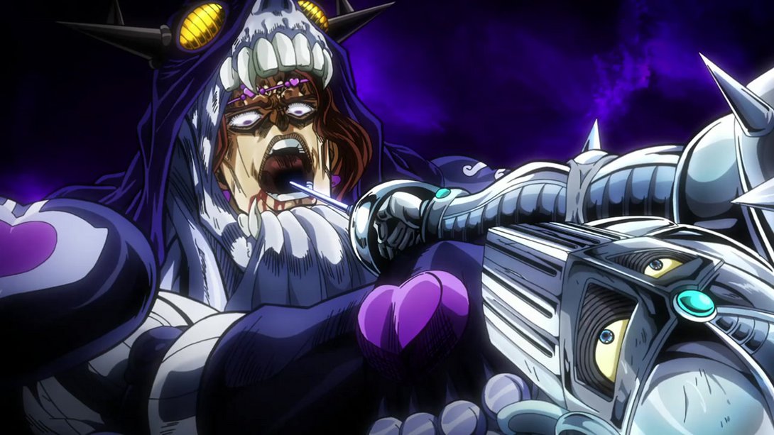
- Here, on top of the usual uncensored wound, the back of Vanilla Ice’s hair has been shaded more:
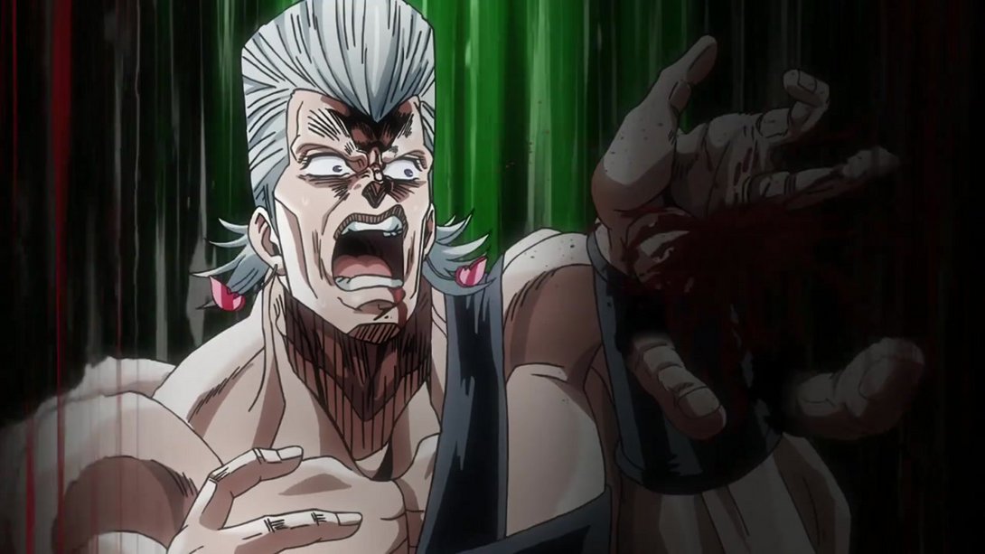
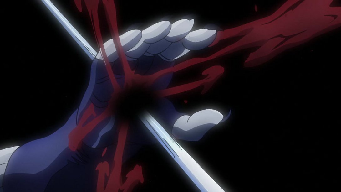
- Oh boy, poor Polnareff - here his hand has been uncensored and the whole right side of the frame (once he shows up) is much brighter; in addition, you might notice that the motion of the severed fingers is also slightly different (in the TV version they sort of… float around, while in the BD version they look like they’re falling, which makes more sense):
- Here, on top of the usual uncensored mouth, the background is darker and there are more blood particles flying around:
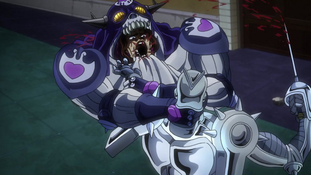
- Most of that applies here as well…:
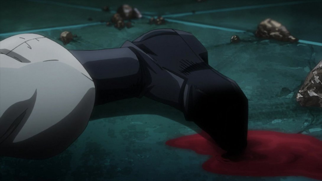
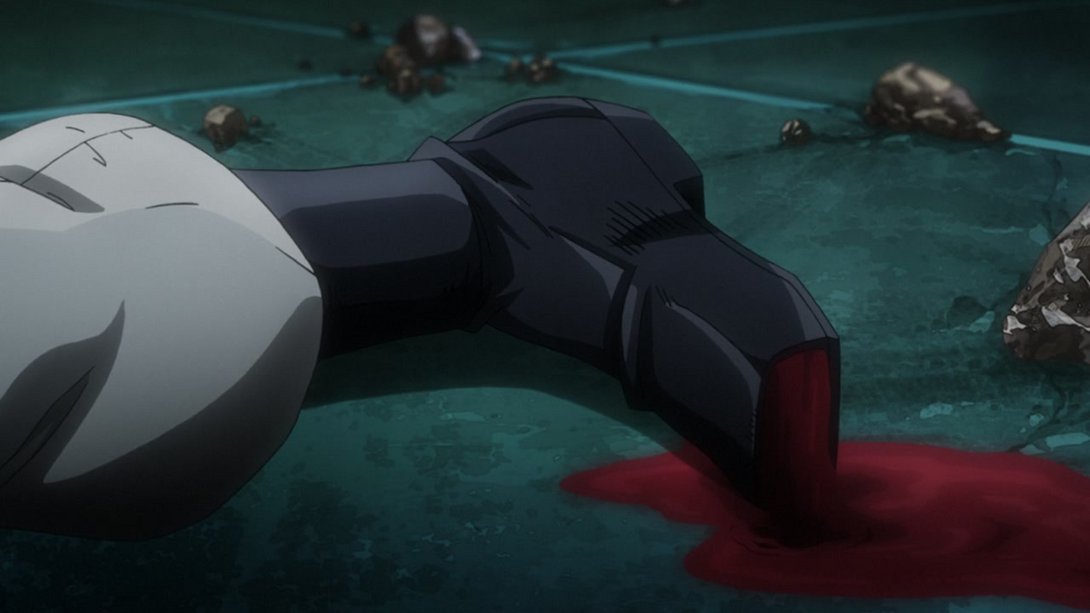
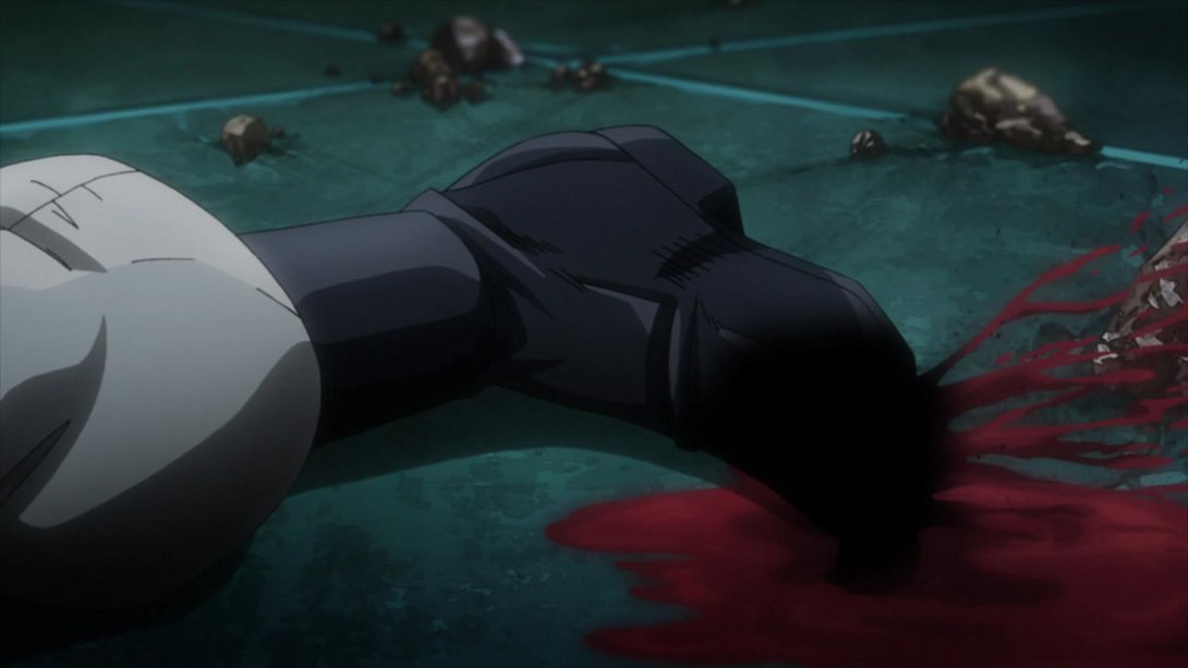
- Poor Polnareff’s hand has been uncensored again, here:
- Silver Chariot is looking a little less glossy and a little more reflective, here:
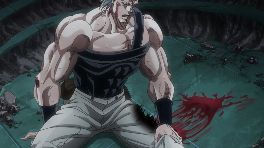
- Oh boy, he’s not having a good day, huh? On top of the obvious uncensored wounds, the motion effects on the sides of the frame no longer blur the background and Polnareff himself has also been shaded more heavily:
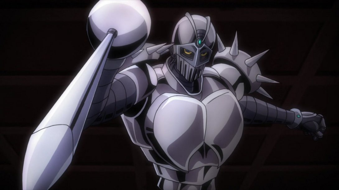
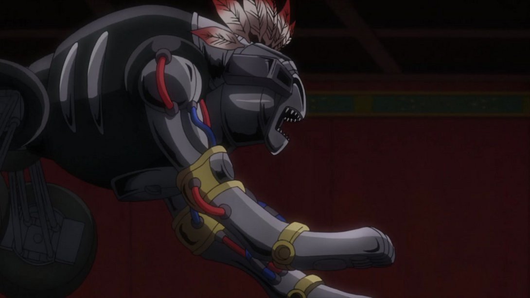
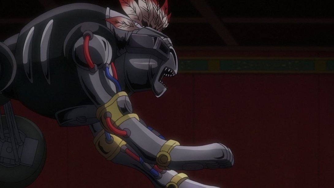
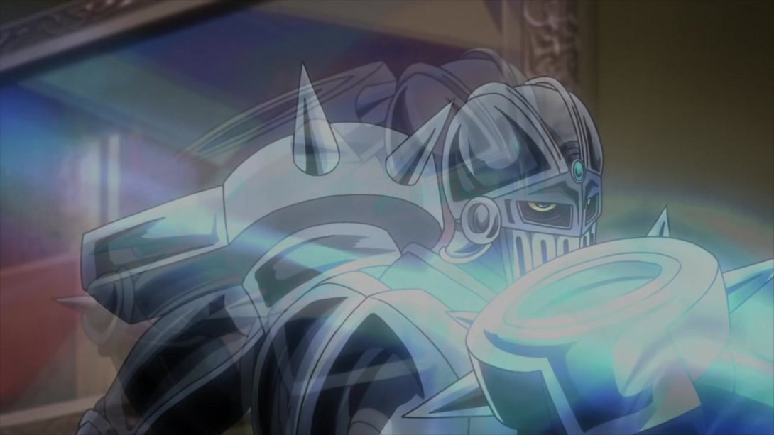
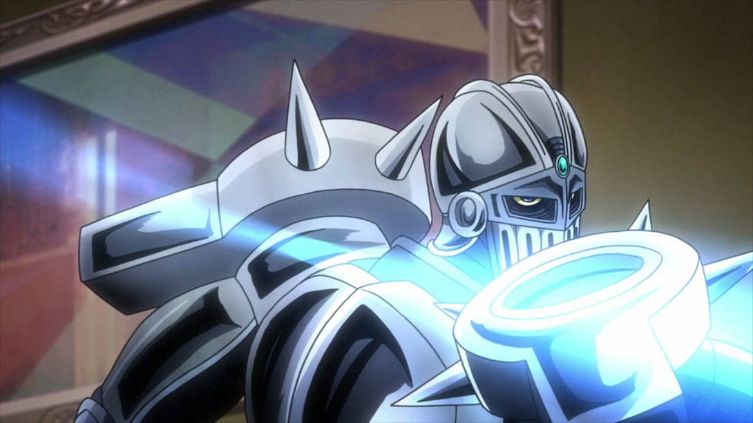
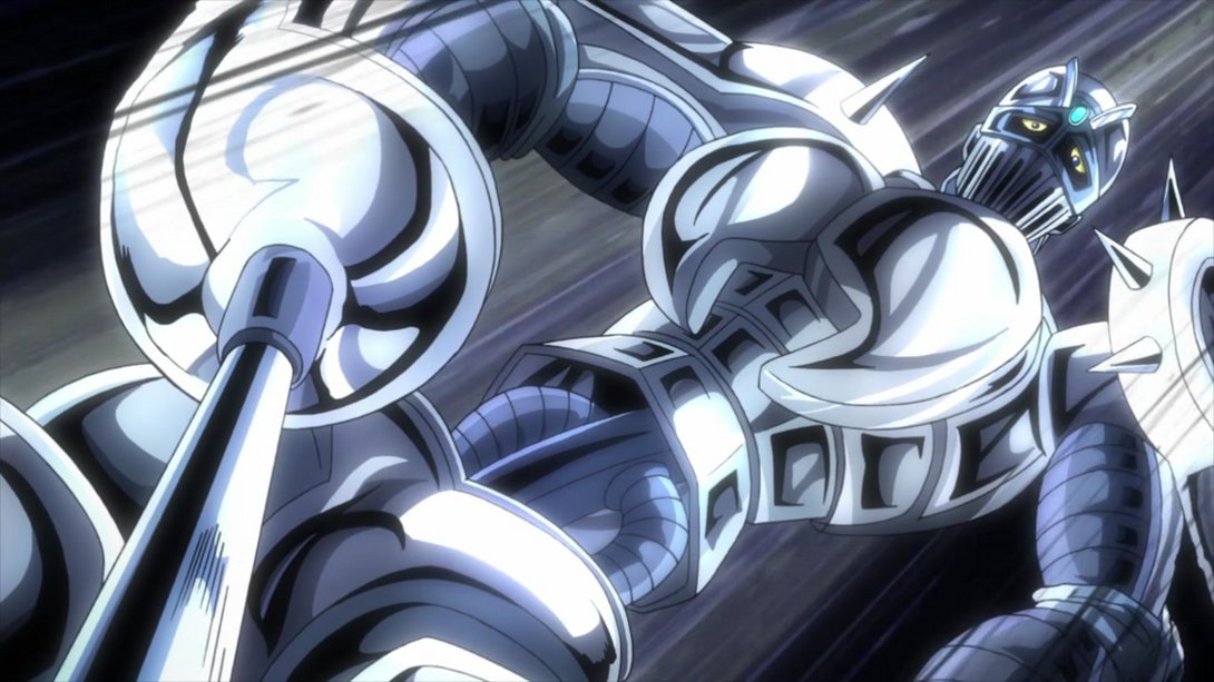
- This scene has a different distortion along the edges, Polnareff’s wounds have been uncensored once more, and there’s a tiny, little difference on Silver Chariot’s right shoulder wheel-thingy:
- The last three frames of this brief animation are now brighter:
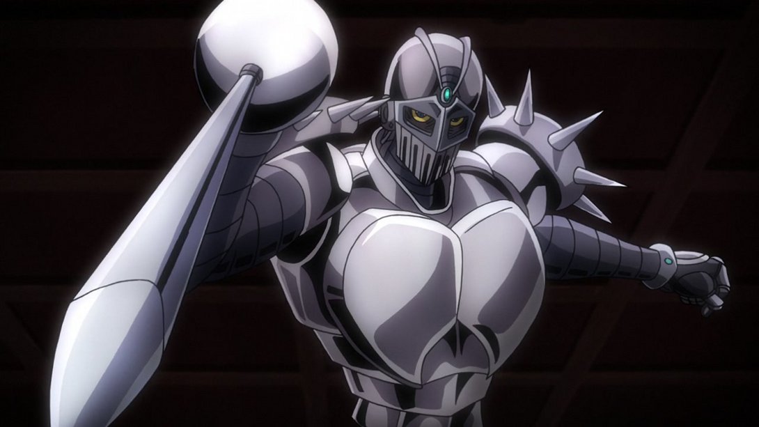
- Here, the usual distortion is back, the usual wounds are uncensored and Silver Chariot’s shading is a little different once again:
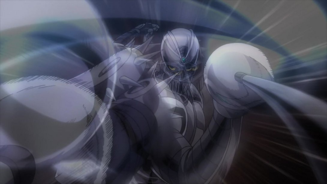
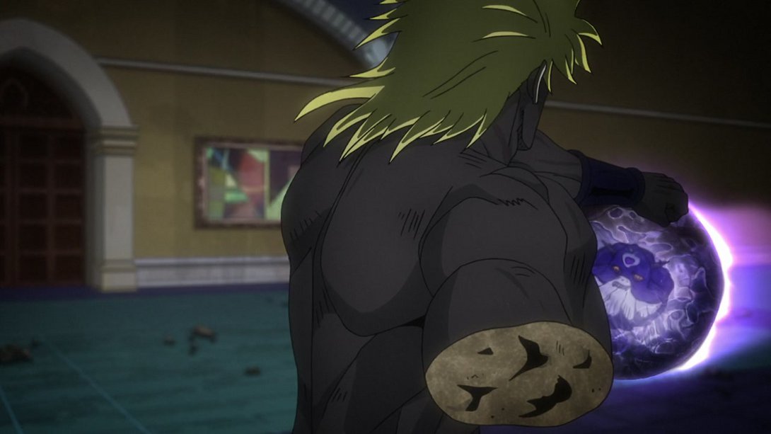
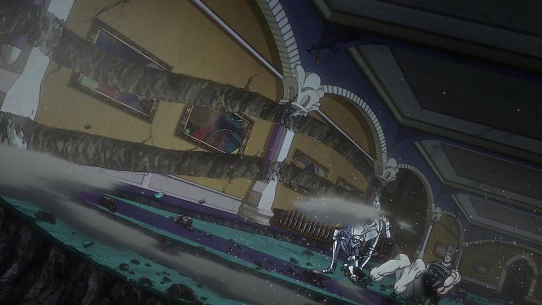
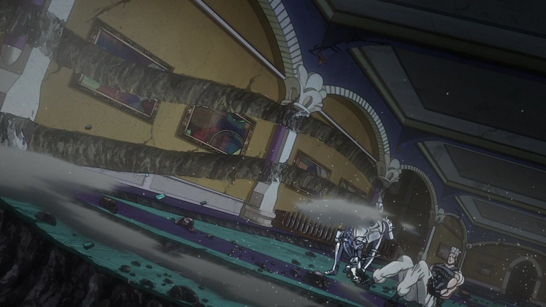
- Here, the motion of the void ball is slightly choppier for some reason (it now moves every two frames instead of one) and its trail is a little brighter:
- Here, most lines are slightly thicker…:
- …and, as the camera zooms out, we can see that the void ball now has a wobblier trail and the smoke effect on the floor is slightly different, towards the bottom of the frame:
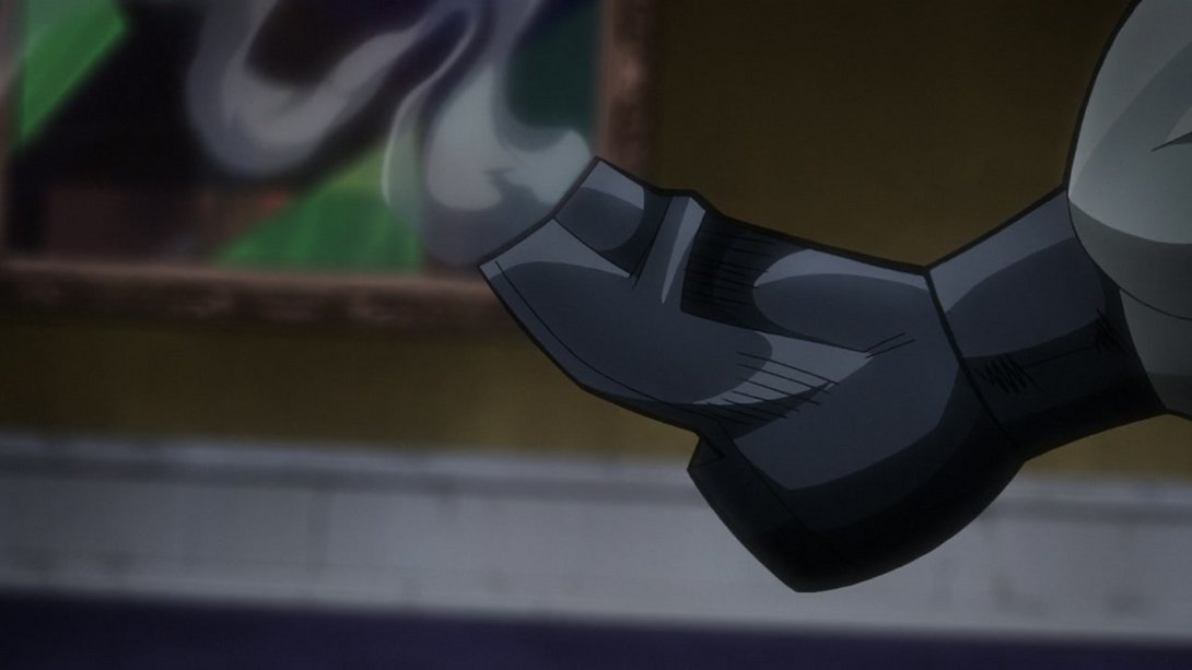
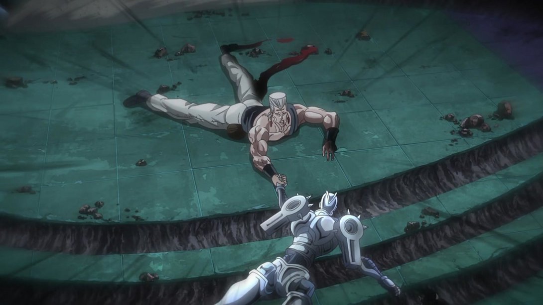
- Polnareff’s leg has been uncensored once more here (do not, I repeat, do not look at the phallic windows):
- Here, Polnareff has been shaded in a slightly different way, his hand is uncensored once more and the dust effect accompanying the void ball is also a little better-looking:
- The same basically applies here, on top of a slightly darker background at the bottom of the frame…:
- …and, later on in the same scene, we can see that the debris scattered by the void ball has also been recoloured here and there:
- Ow ow ow:
- Most lines here are thinner, Polnareff’s wounds are looking as nasty as ever and most of the shading has been tweaked:
- Have a couple of uncensored and tweaked frames, buddies:
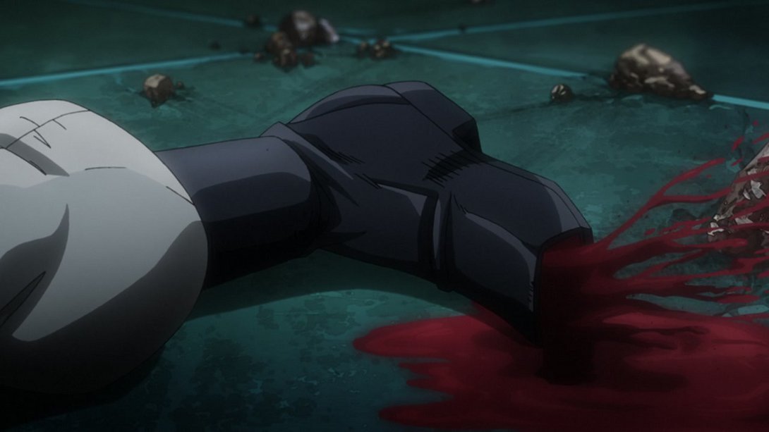
- Here we have another bunch of differences! In random order: most lines are thicker, Polnareff’s wounds have been uncensored and the shading is different on him, there’s a darker vignette along the top of the frame, the blood is slightly blurrier and the stream oozing out of his leg wound no longer miraculously climbs a rock:
- Here, once again, the top of the frame is darker and Polnareff’s wounds have been uncensored…:
- Silver Chariot’s hand no longer casts a shadow, here:

- Here, on top of the usual uncensored wound and different shading, the dust/debris scattered around by the void ball is also different…:
- …and the camera shakes a little more as well:
- Ow, your leg:
- Here we have our usual suspects: Polnareff’s uncensored wounds, a better transparency effect on the void ball trail, some different debris effects, and in addition the rightmost side of the void ball itself is more purple:
- Here, on top of the two usual differences…:
- …the camera shakes less! Check it:
- While here it shakes differently…:
- And, on top of that, The Fool’s sand is looking a little different…:

- …and Polnareff’s wounds are, obviously, uncensored:
- Here, there is more dust and debris in the foreground, underneath the void ball; in addition, the background looks slightly brighter and less hazy:
- Let’s have one last uncensored leg, friends! In addition, the torso and crotch areas are also looking more heavily shaded:
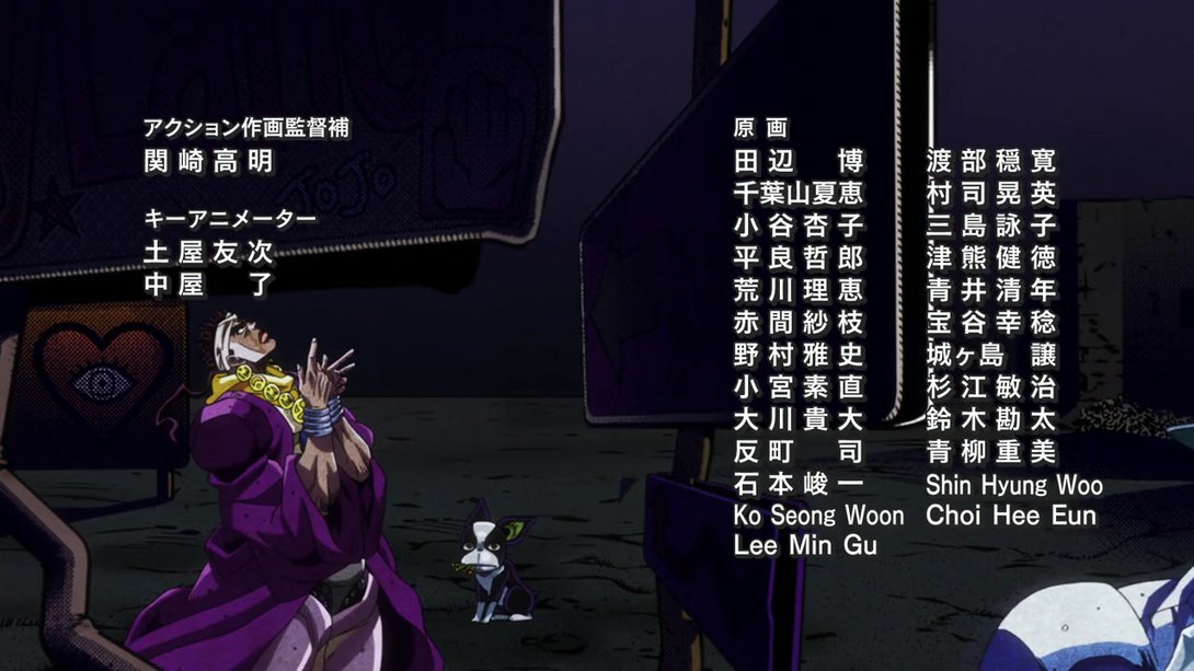
- Let’s move on to the credits for a quick last difference! Here, the last kanji in animator 平良哲朗 (Taira Tetsurō)’s name was mistakenly written as 郎 instead; this has been corrected in the BDs:

And that concludes this very long (and very late!) comparison - a healthy dose of gore and some nice tweaked shading here and there make for a very nice rounded package indeed. I’ll see you next time (hopefully in a more timely fashion) for Stardust Crusaders #44, “The Miasma of the Void, Vanilla Ice - Part 3”!
Cheers!