Well hello, friends, and well met! Fancy meeting you here… I see you’ve caught the scent of a huge catch, a humongous buffet, a plentiful feast! Well, let me tell you, your senses haven’t led you astray, for what I am presenting to you today is definitely all that and more! It’s Episode #35, “D’Arby the Gambler - Part 2”, friends, and it’s a doozy!
Let’s not belabor the point, then, and let’s dive right in!
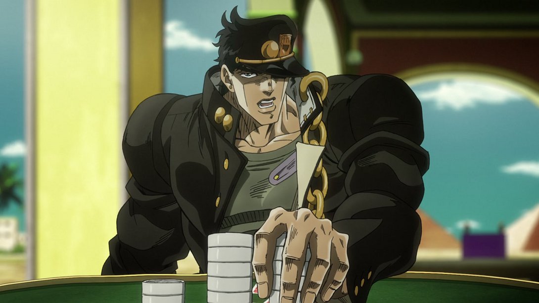
- This episode starts strong: the very first sequence is different in the BDs, as will be many more throughout the episode. Take a look:
- Moving on, Jotaro’s mouthflap has been slightly tweaked in this brief scene, and for some reason the credits on the left no longer fade out but simply disappear:
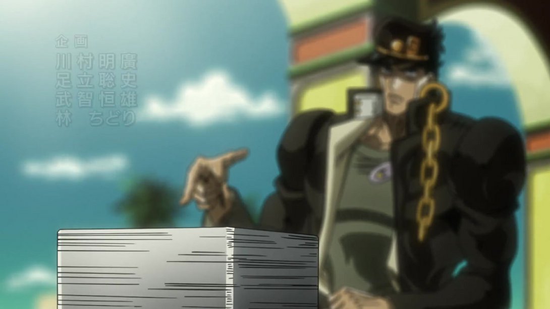
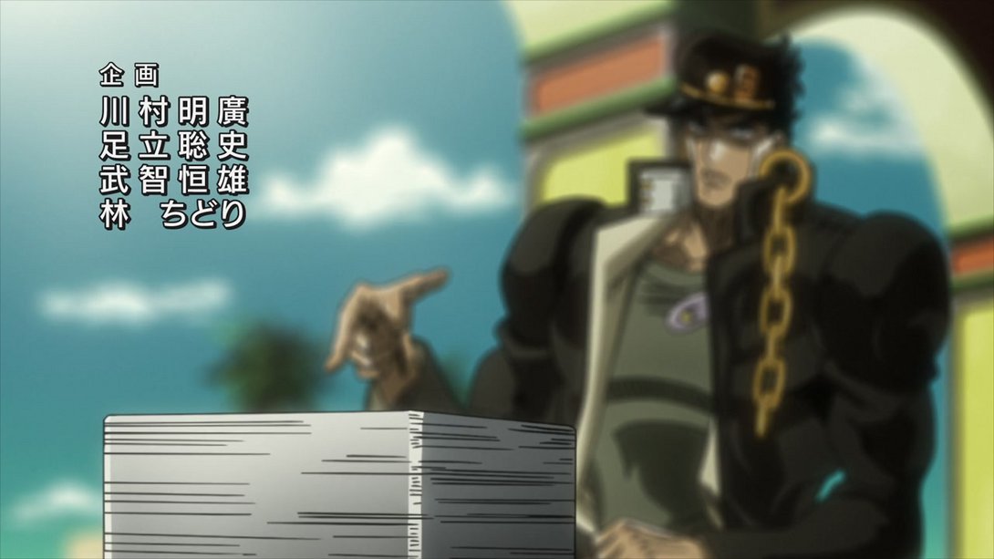
- Here, D’Arby’s left hand has been moved to the correct layer:

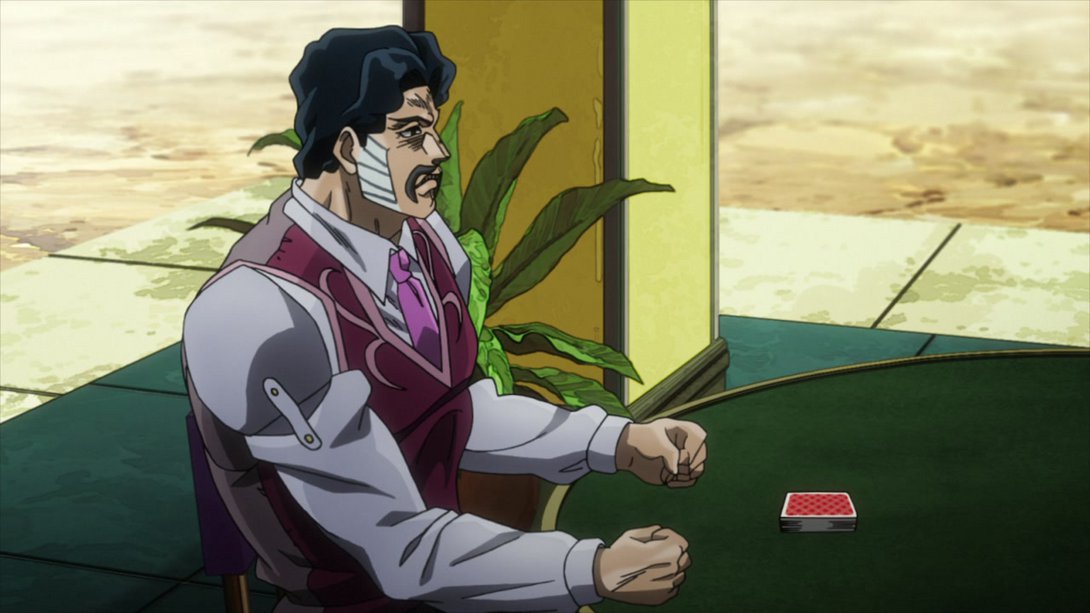
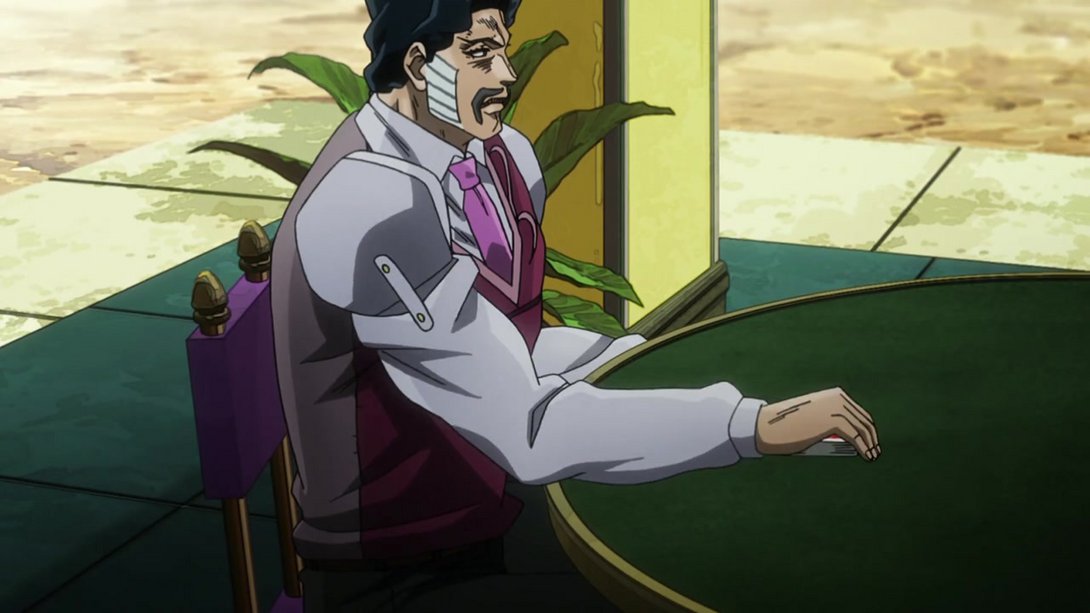
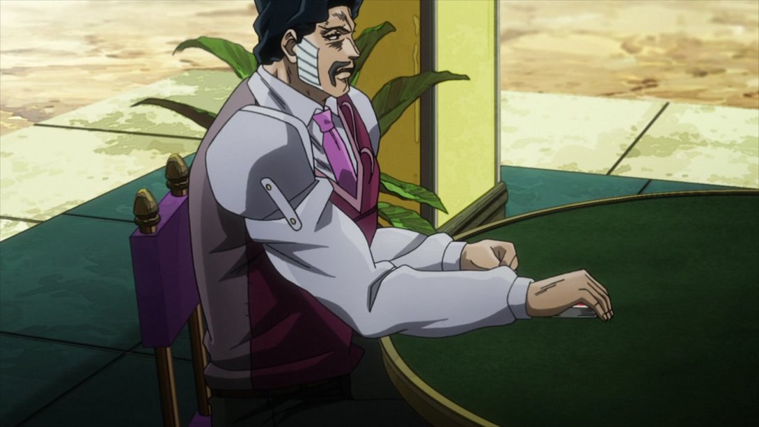
- The BDs introduce a new shot in this scene:
- Both Jotaro and Avdol’s faces have been retouched, here:
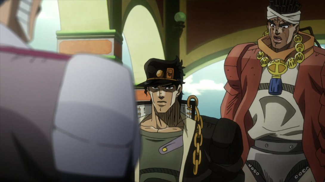

- Two shots have been scrapped in favour of a different one, here:
- A bunch of details have been tweaked in this scene here! In no particular order: the general shading has been tweaked, Jotaro’s mouth is looking different, the left part of his collar has been recoloured and a couple of lines in the same area have been retouched:
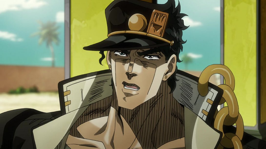
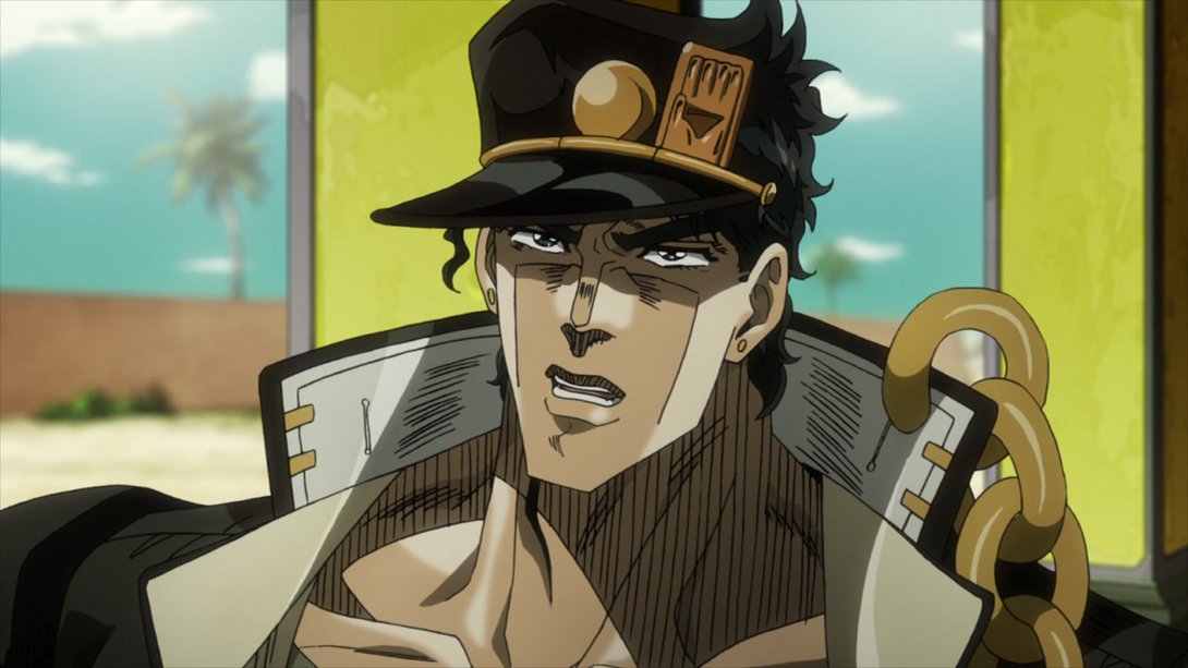
- Both Jotaro and Avdol have been veeeery slightly retouched, here:

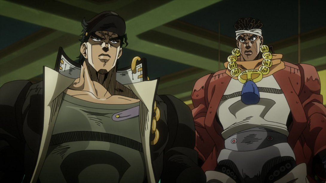
- Here, D’Arby and Avdol’s faces no longer disappear, at the end:
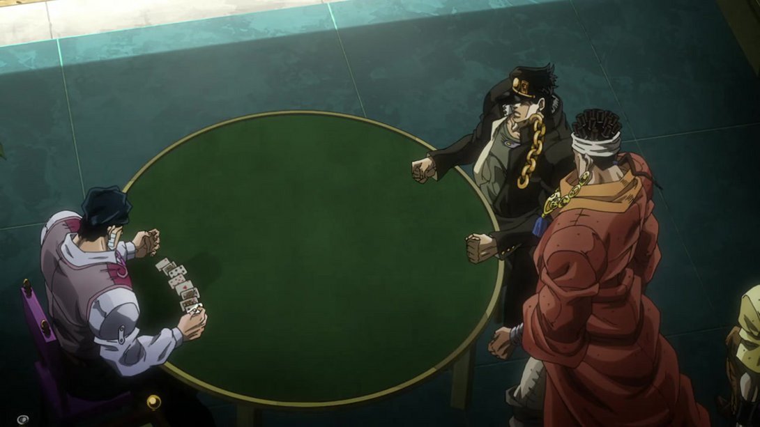
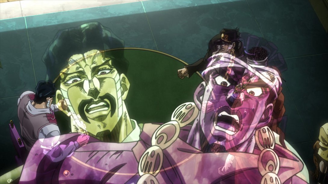
- And, right after the previous difference, the BDs introduce a completely different shot, accompanied by a slightly smoother card shuffling animation (thanks, Brainulator9!):
- The sequence riiight after that is also completely different, and the credits have also been moved to better fit the new shots:
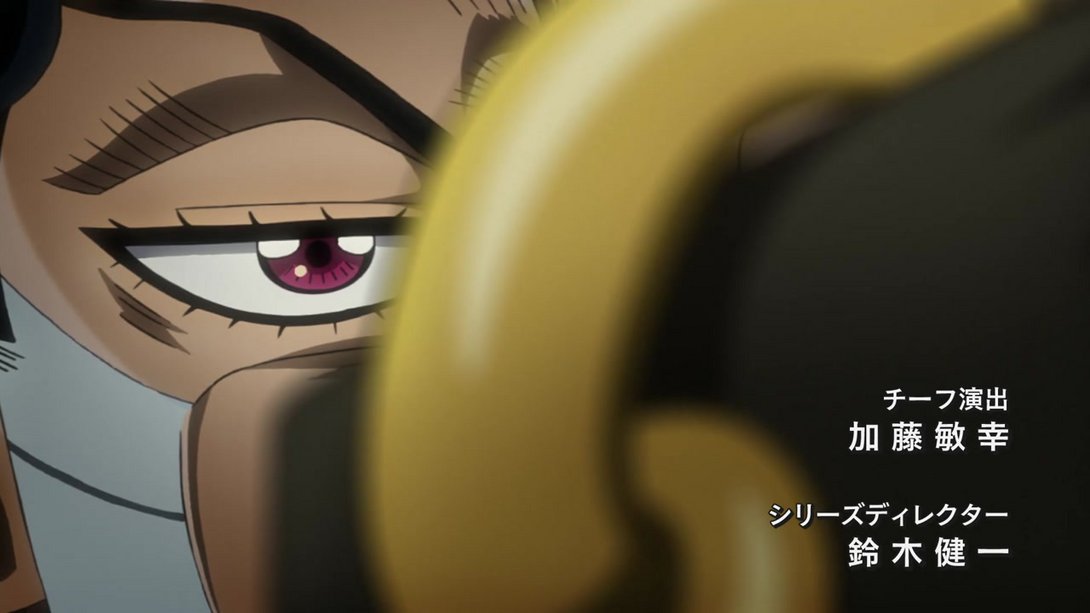
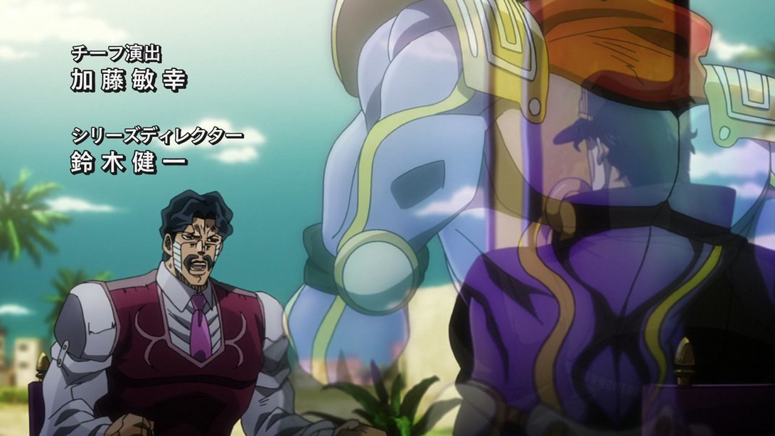
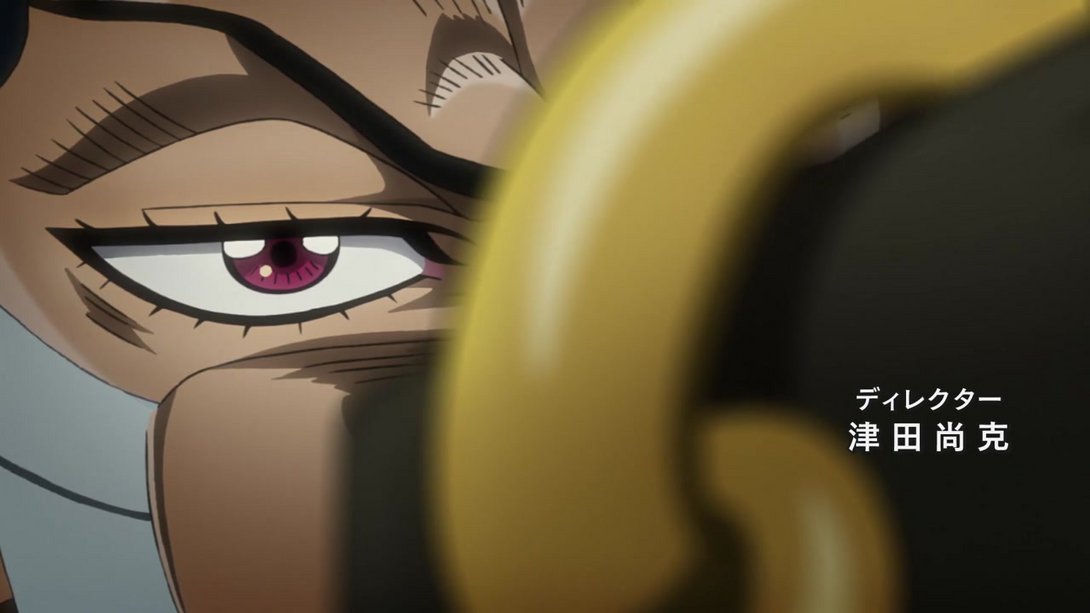
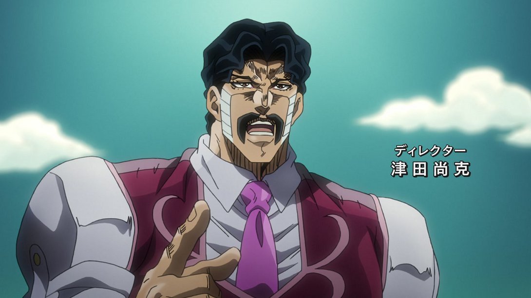
- D’Arby! Stop clipping through the table with your left hand, man:

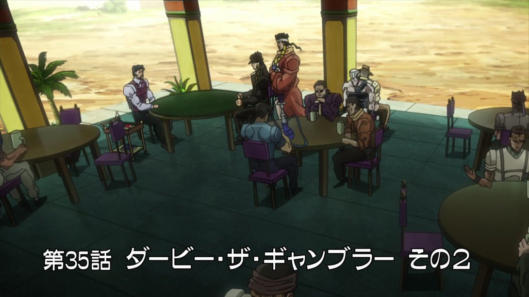
- Here, Jotaro’s face has been retouched, and in a couple of frames the background is now visible through the top link of his chain:
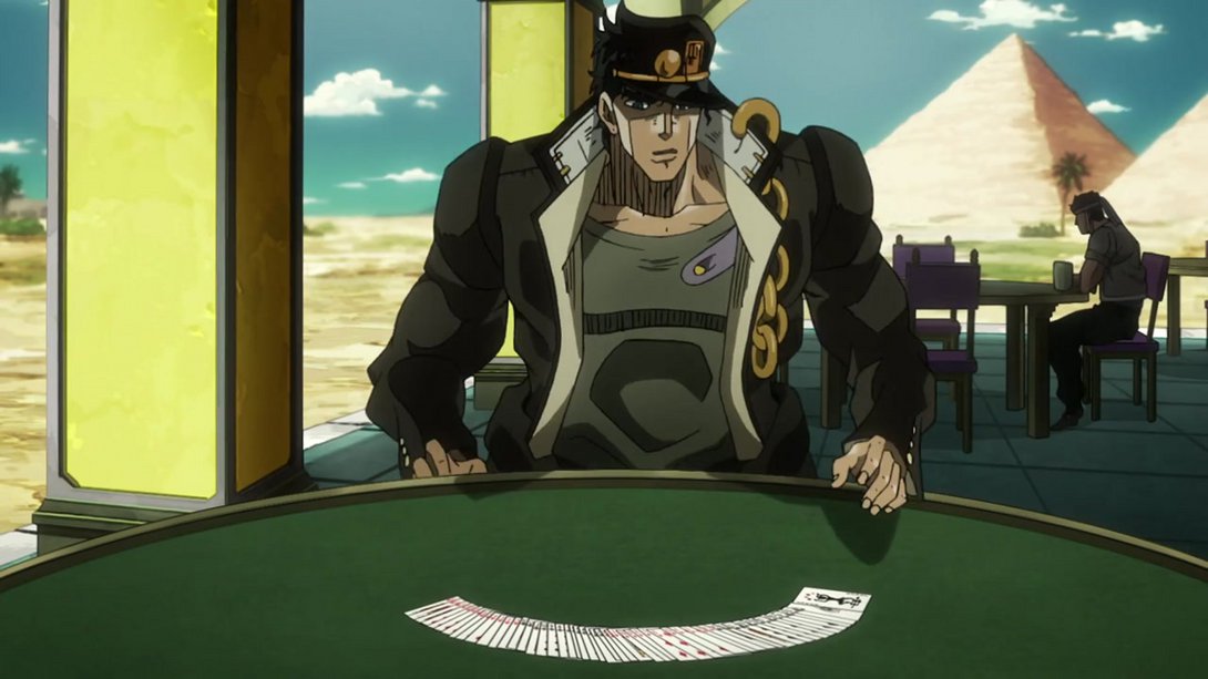
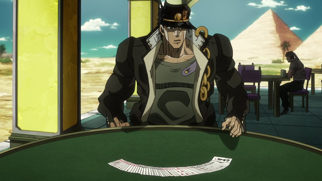

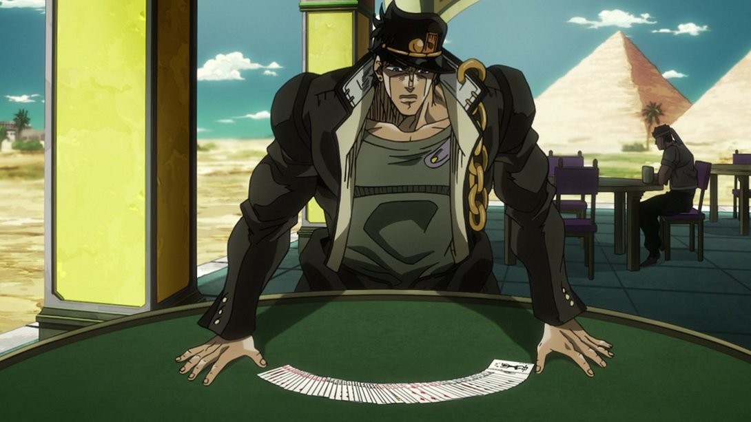
- D’Arby! You forgot your chips:
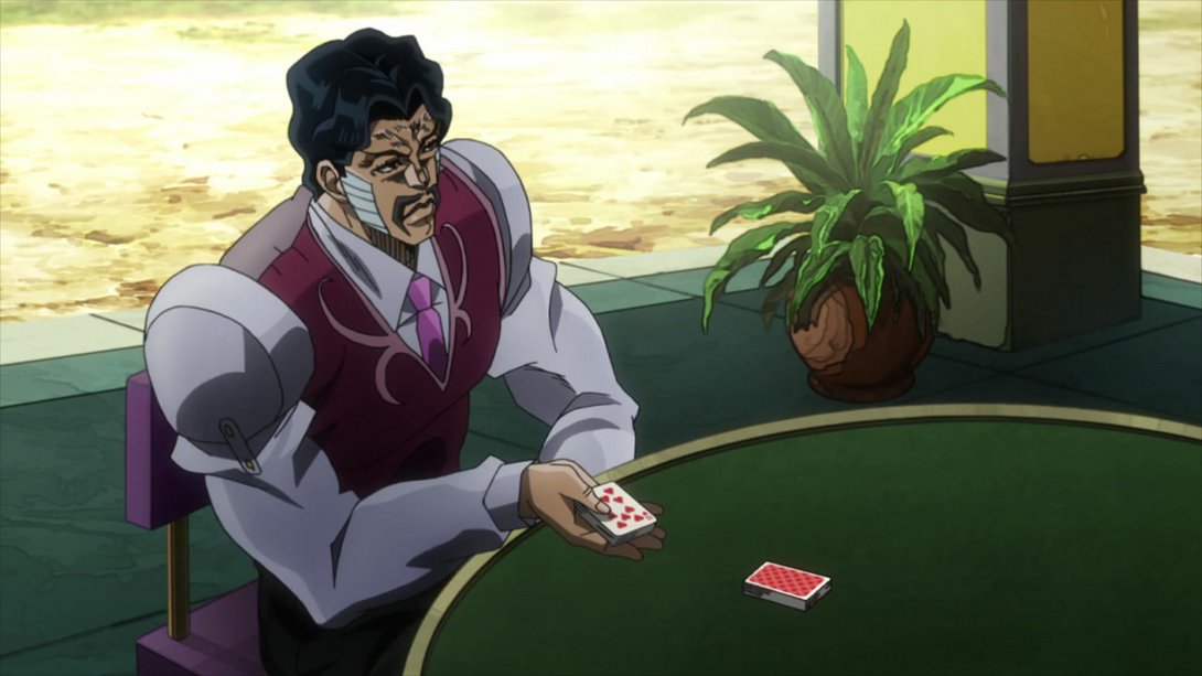
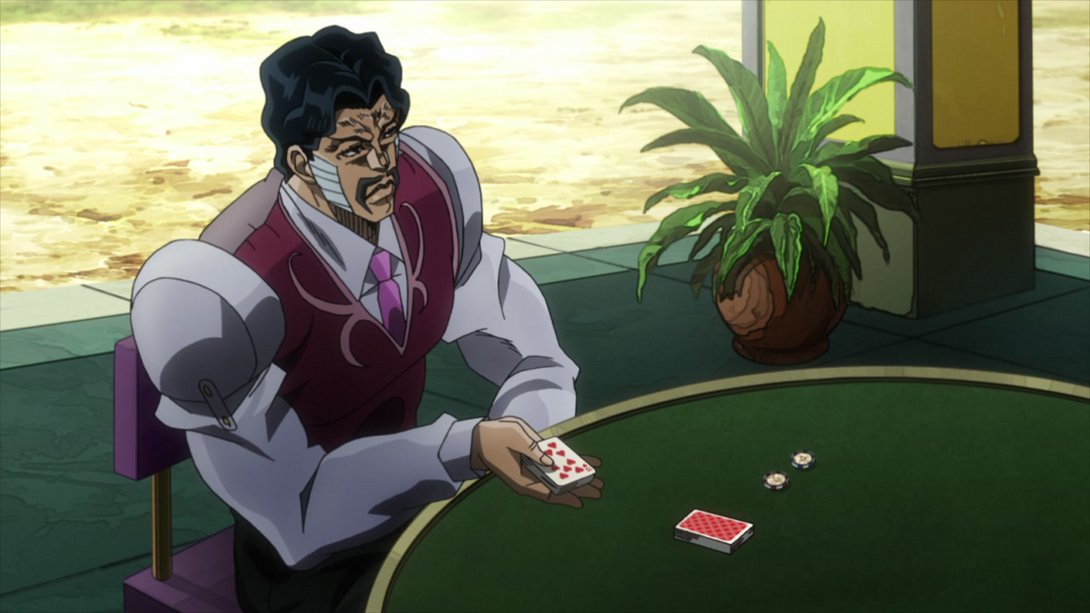
- Here we have a whole bunch of different shots, friends:
- Very minor difference, but for some reason the last four frames of this animation freeze in the BD version (not that it’s very noticeable, mind you, but if you pay reeeeally close attention you might see that it doesn’t loop as smoothly as the TV version - those are the “frozen” frames):
- Here, the chips and cards on D’Arby’s side have been slightly retouched…:
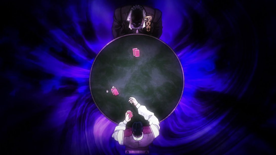
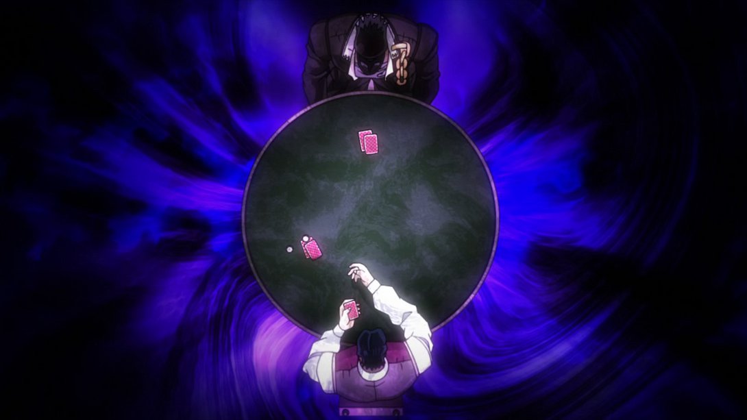
- Have another two completely different scenes (the first of which has replaced a flashback):
- This scene is slightly more zoomed out…:
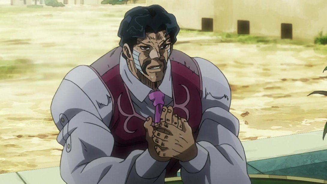
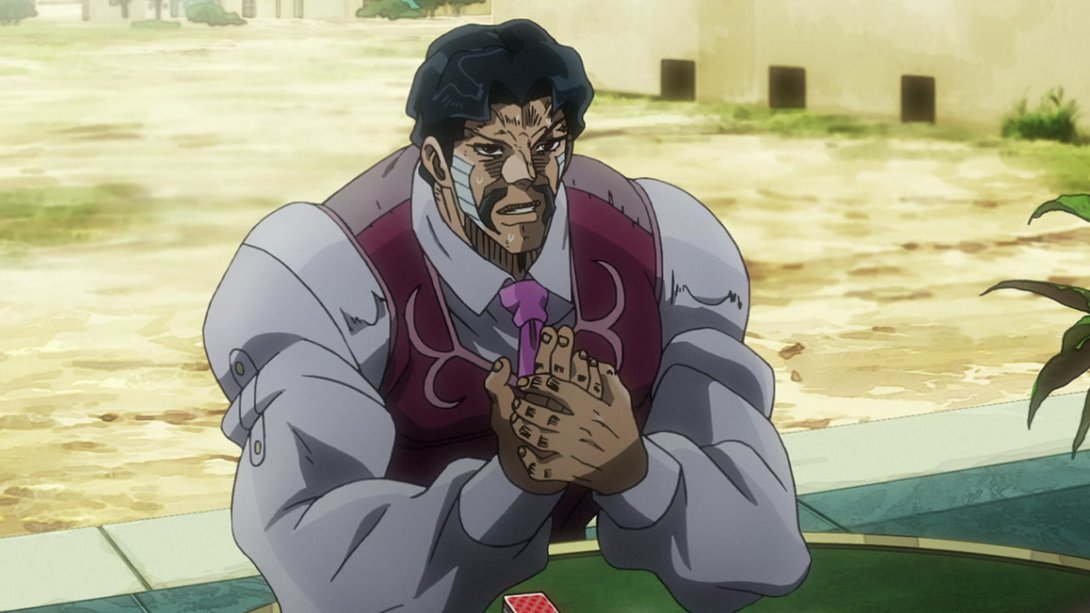
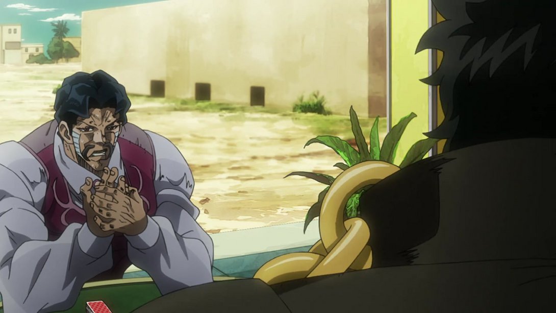
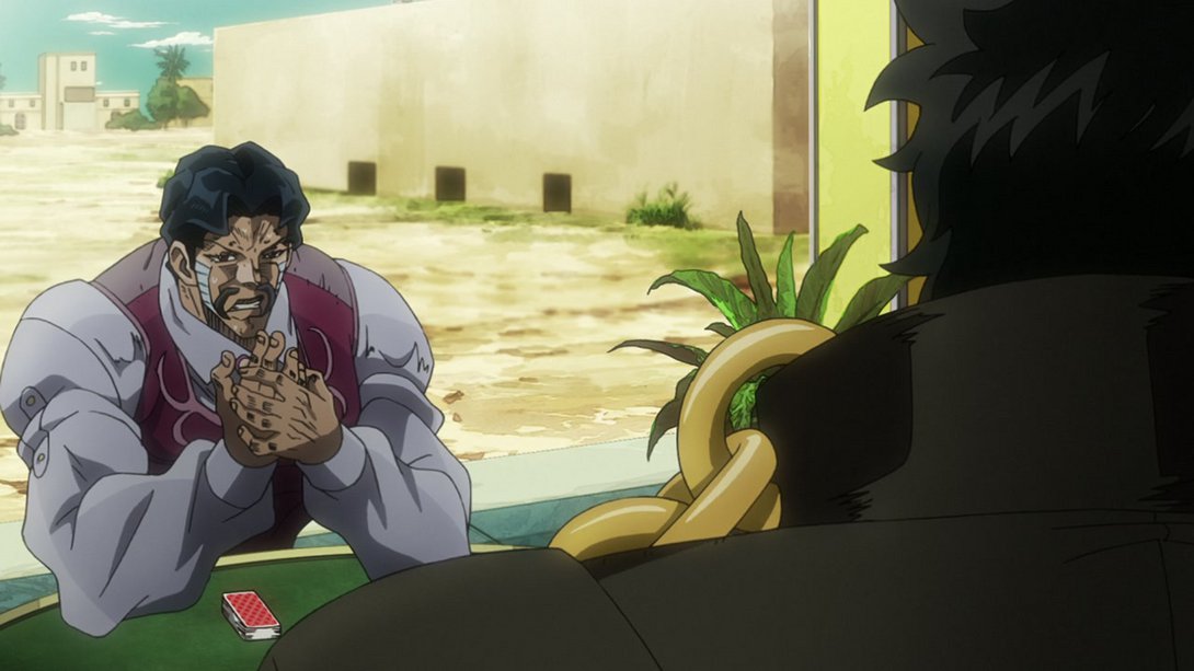
- D’Arby’s hands have been correctly un-bandaged and retouched, here:

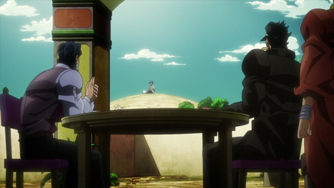
- Another different scene, baby:
- Here D’Arby’s face has been retouched, there are more cards on the table and the table itself has a more vibrant colour:
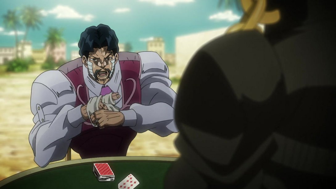
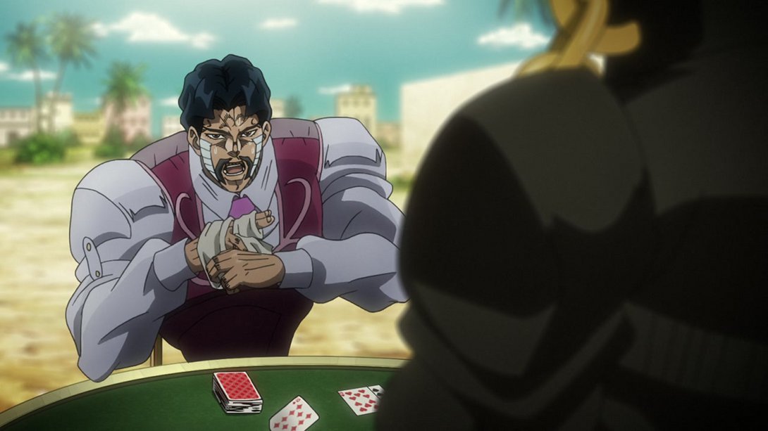
- And here, once again, some more cards have been added to the table! In addition, D’Arby is now correctly holding the chips with his ring and pinky fingers, as shown in other shots:
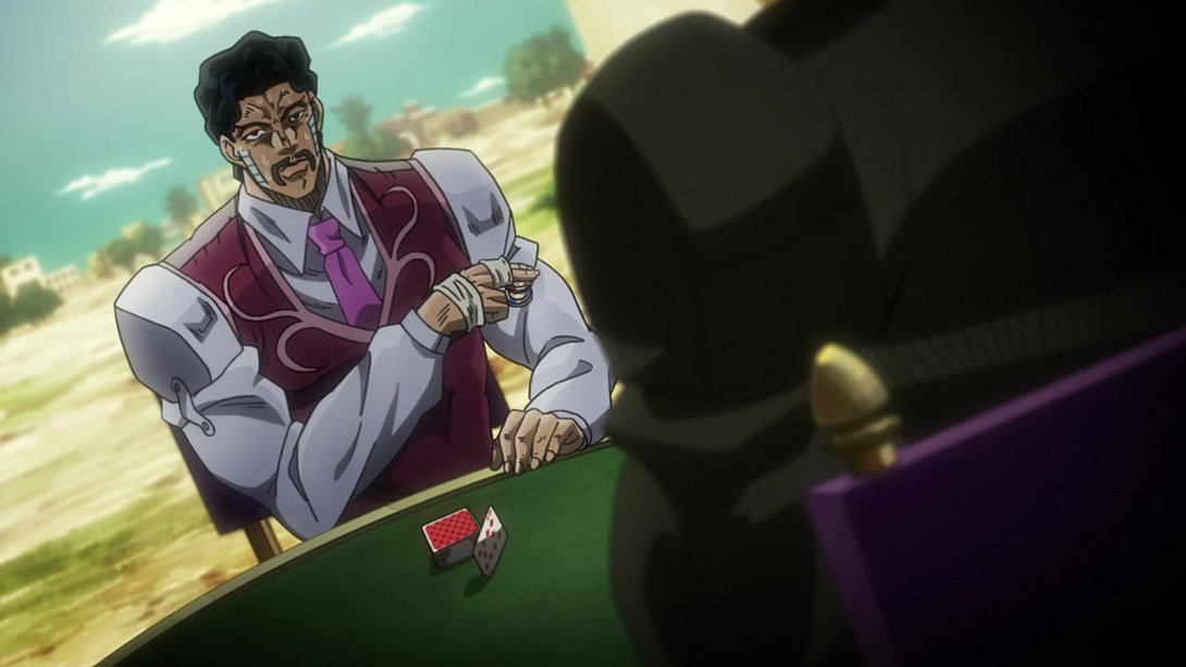
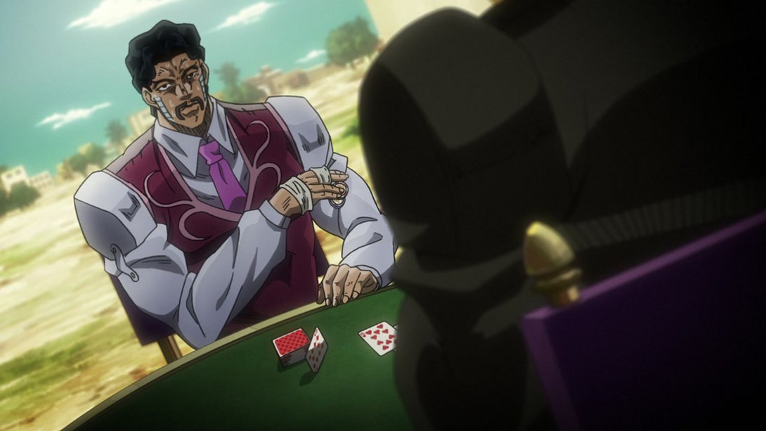
- Moving on… Here, our dear pal D’Arby has been shaded differently, his upper teeth are back and he’s actually holding the chips:
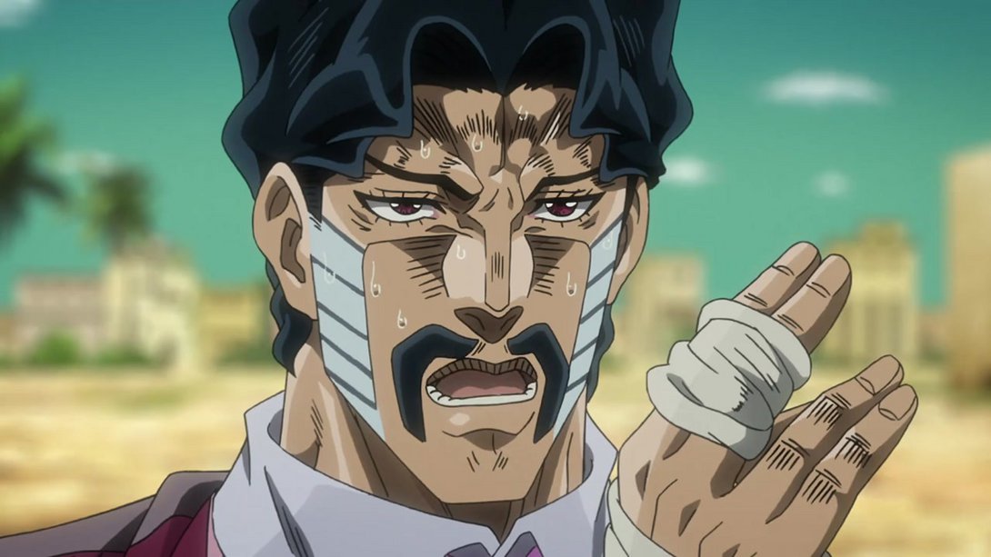
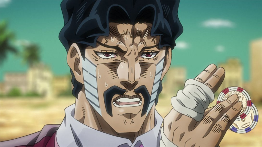
- Chips which were, by the way, invisible for the duration of the previous sequence, creating a… strange shot in the TV version:
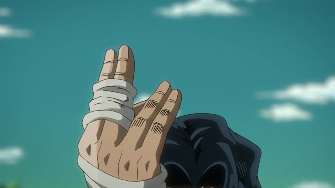
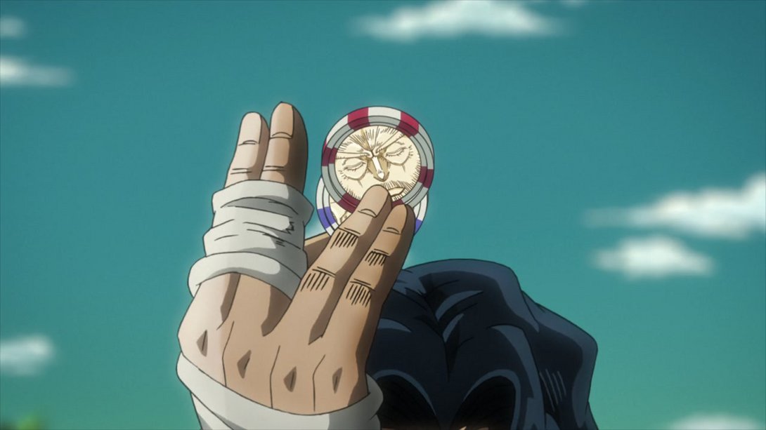
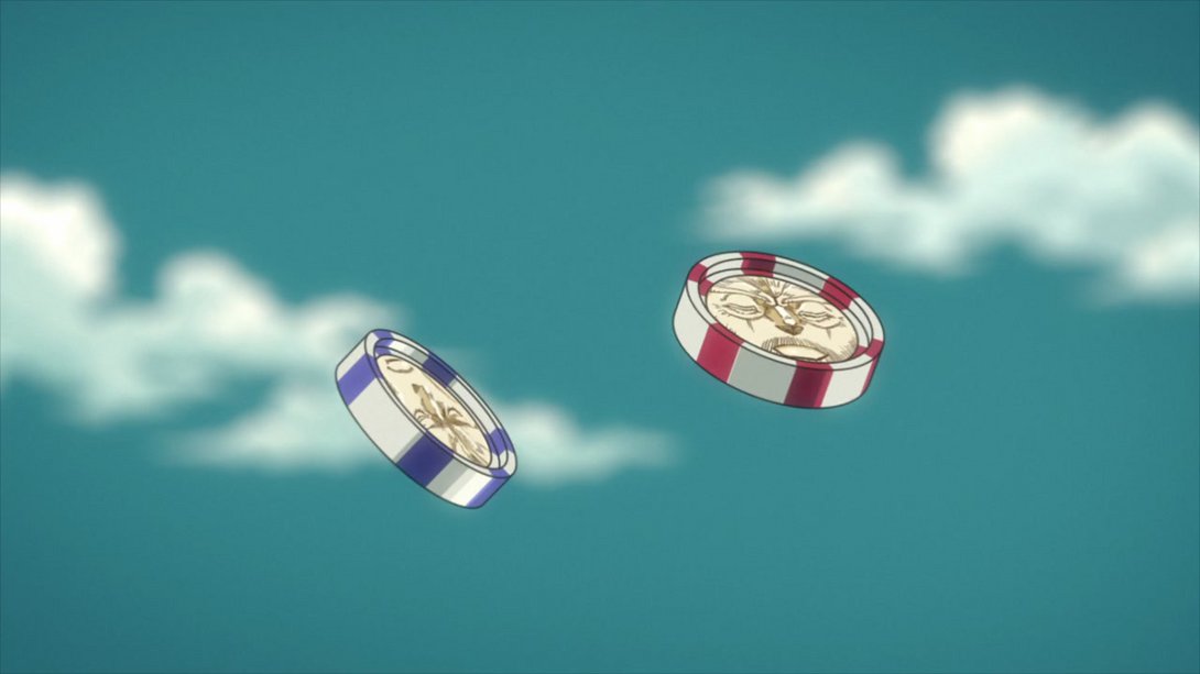
- This shot is COMPLETELY DIFFERENT! I love it:
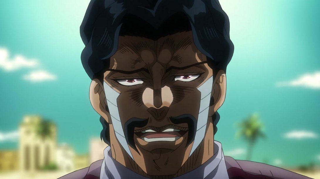
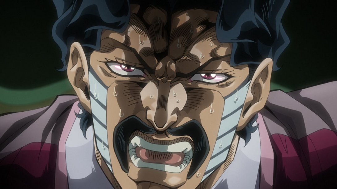
- Here, Jotaro has been retouched, and Avdol keeps his mouth closed in the last two frames of the shot:
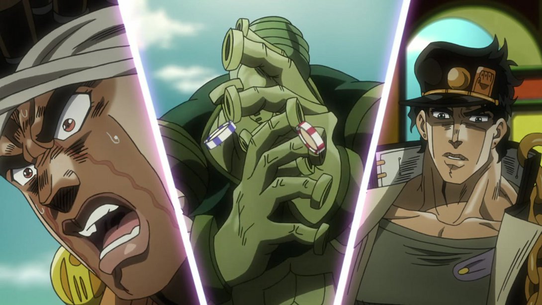
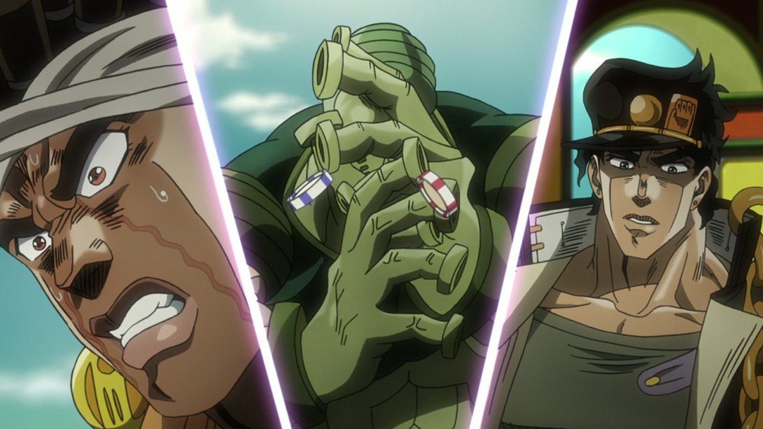
- In this animation, Osiris’ first chop is more instantaneous, and the resulting five extra frames just have a little more of a… slice rush at the end:
- In addition, the slice rush part of the animation has a new distortion + blur around the edges, and there are some neat white motion lines as well, to convey the action even more:
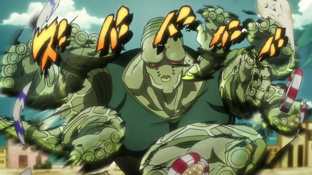
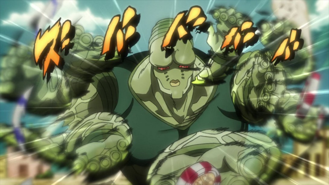
- Move those chip stacks closer together, man:
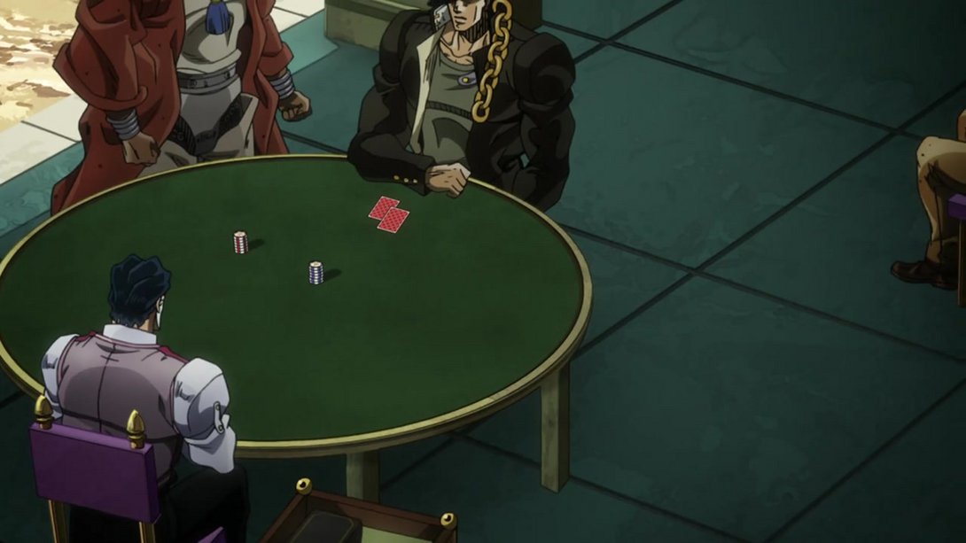

- This shot is, once again, all different! I love these:
- Here, D’Arby’s face has been retouched, and his right hand is correctly bandaged:

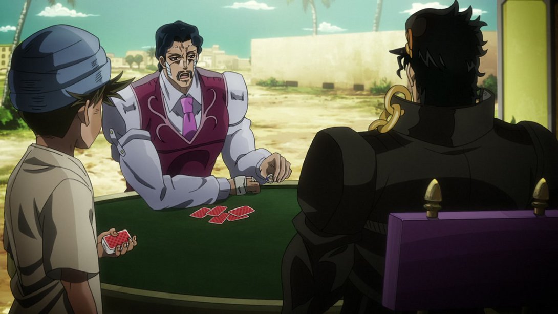
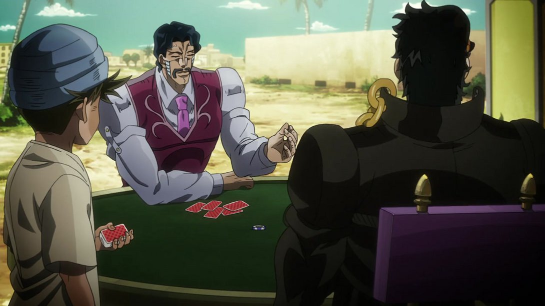
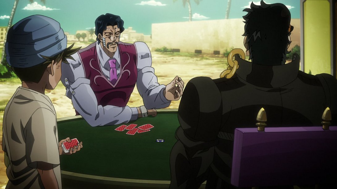
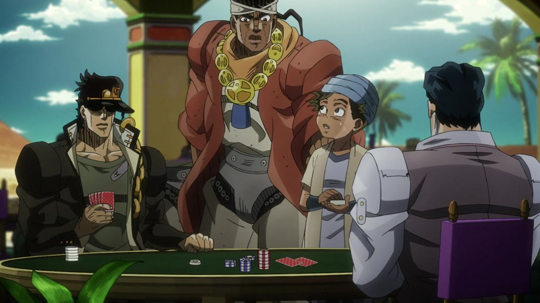
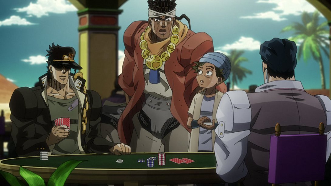
- Moving on… In this scene, Avdol and the boy are no longer humongous, the shading on the background and on Jotaro (especially his forehead) is different, the stack of white chips near Jotaro is slightly darker, there’s one less blue/white chip and D’Arby’s left hand has been recoloured white, for some unknown reason (perhaps it was supposed to be part of the sleeve instead?):
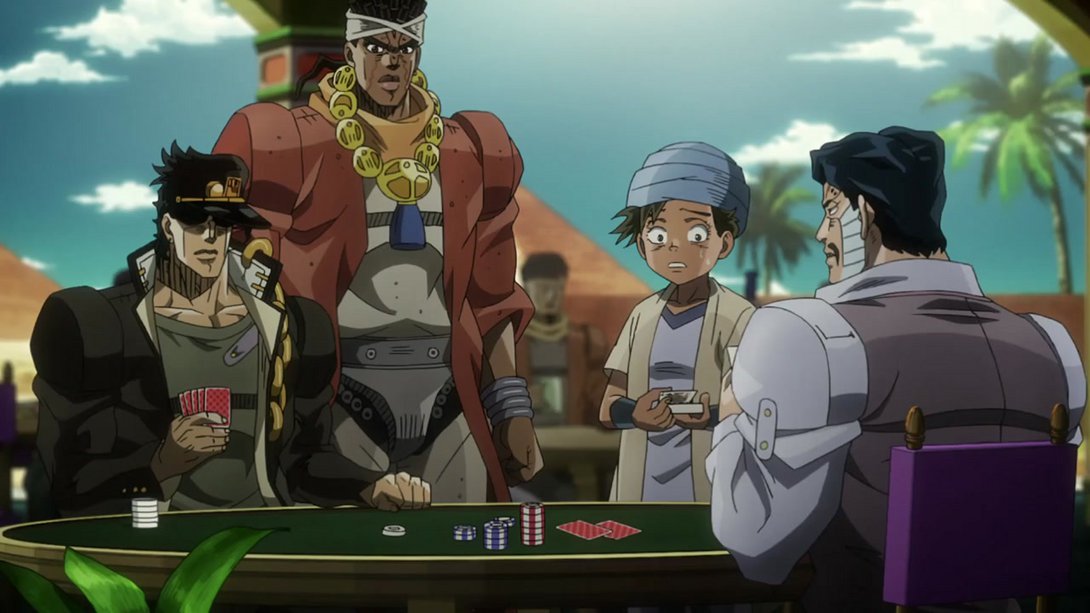
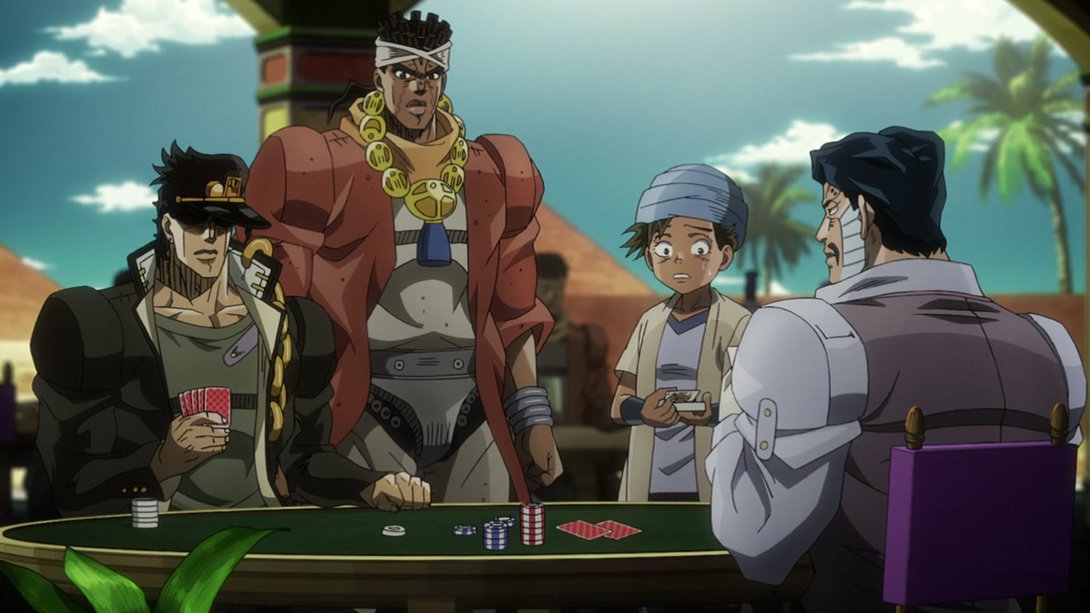
- Bizarrely enough, however, a glaring mistake has been left in from the TV version! When Avdol moves, a copy of his lower body remains behind him, and it’s even more visible now that it’s been scaled down with the rest! This remains on screen for a whopping 12 frames, so I’m really surprised David Pro did not spot it. A shame:
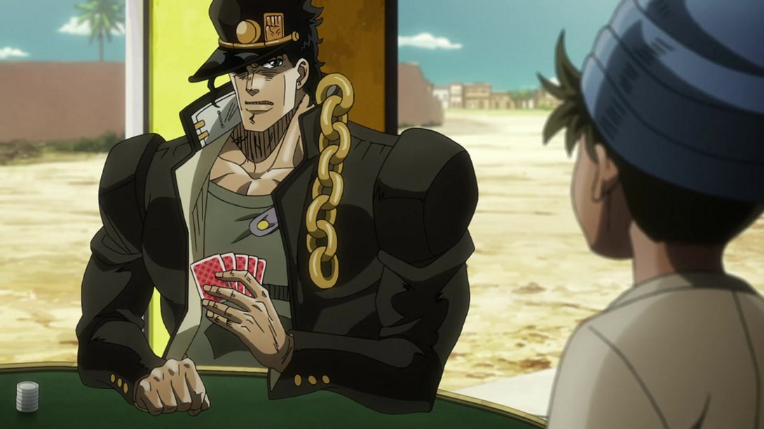
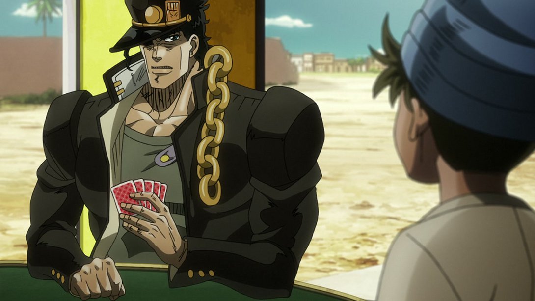
- This scene is slightly more zoomed in:
- Here, the weird lines on the sides of D’Arby’s face no longer move while he’s talking:
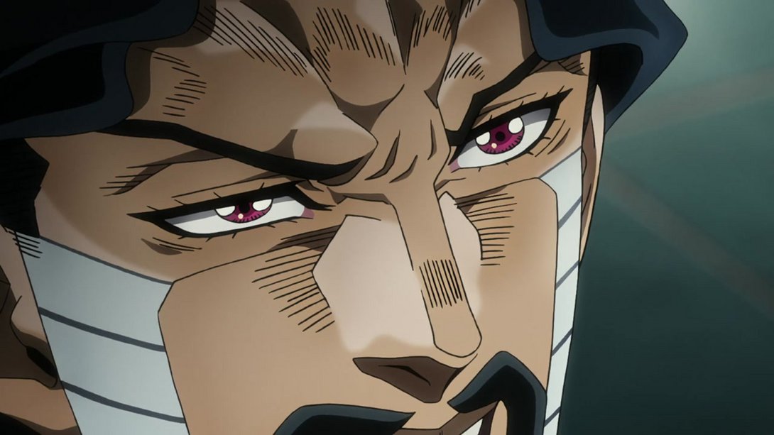
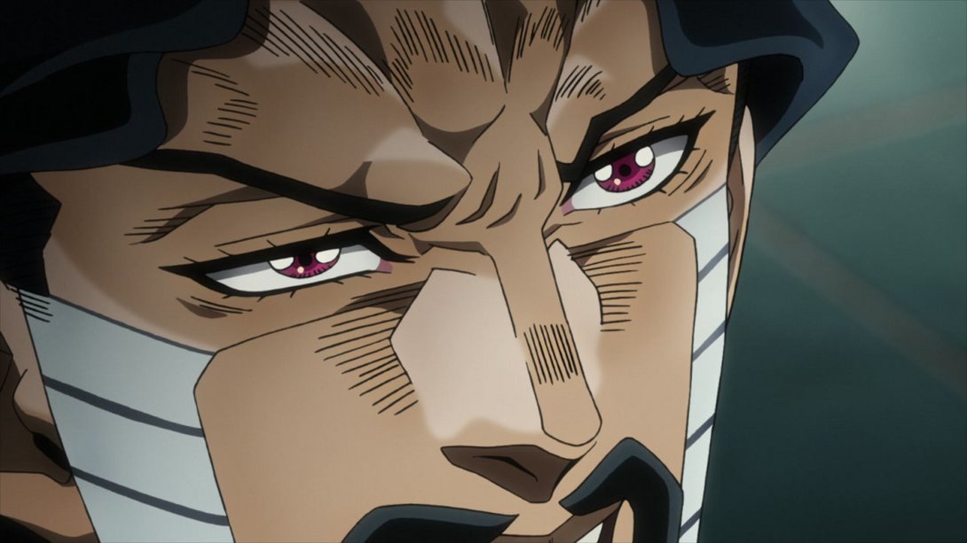
- Another different shot, woo:
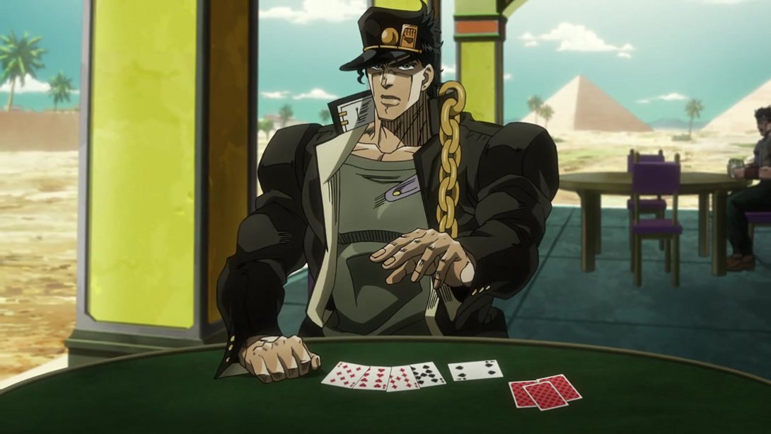
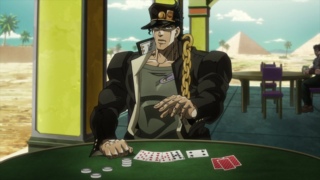
- Here, the table is brighter and the chips are back:
- Here, D’Arby’s eyes have been retouched, and one of the lines in his left moustache is slightly thicker:
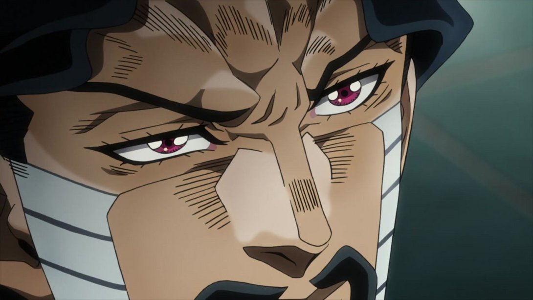
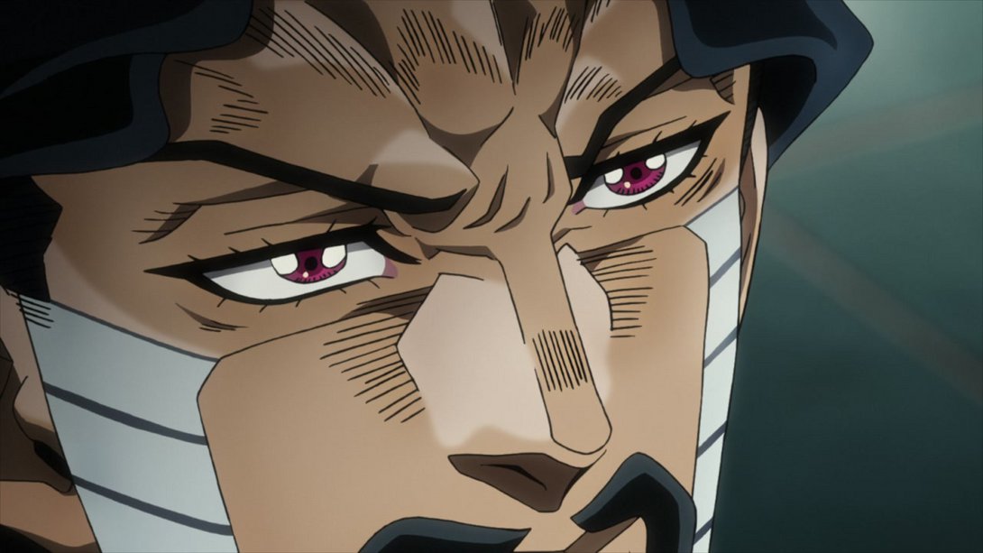
- This scene is actually animated:
- While this is straight up different (and slightly more dynamic):
- There’s an extra white chip, here:
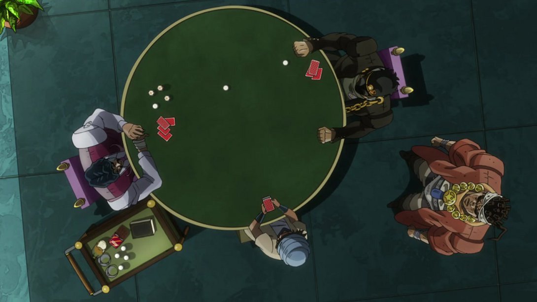

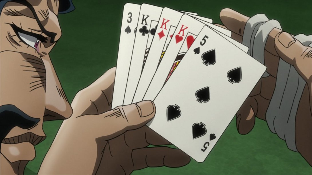
- Here, the cards and D’Arby’s hands have been shaded slightly differently, and the King of Diamonds now has a proper top-right corner:

- A brand new animation is exactly what we need to forget this old mopey D’Arby:
- Once again, there is an extra chip on the table, here:

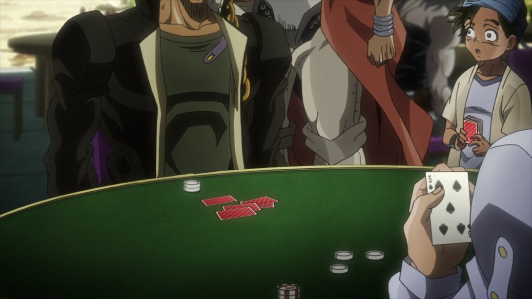
- The cards and the chips have all been moved, here…:
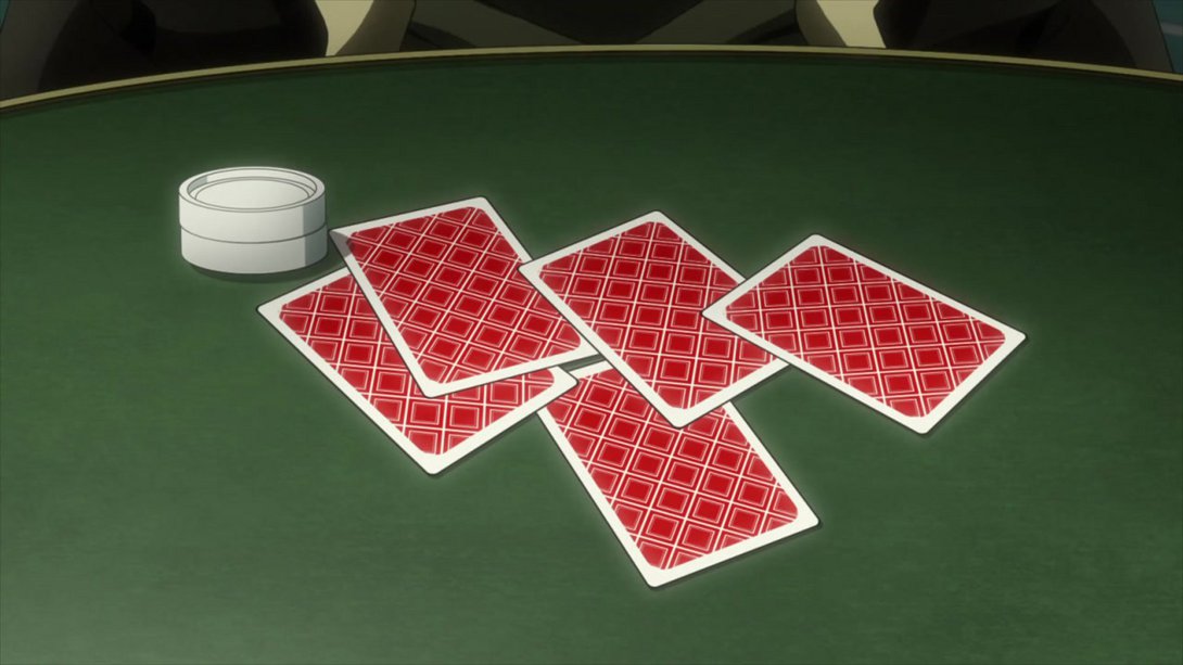
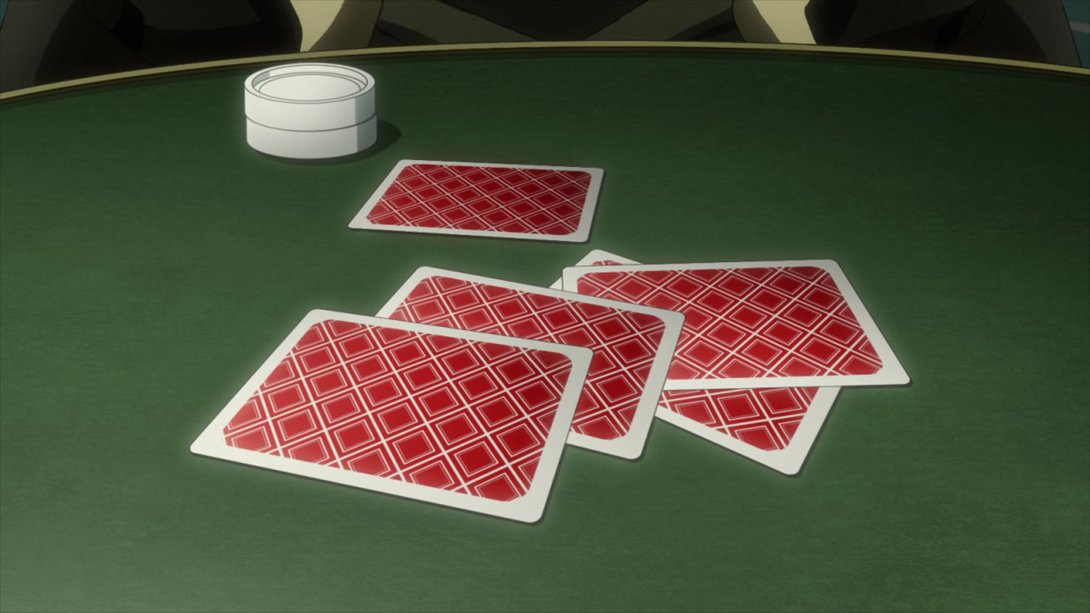
- Go away, mopey D’Arby! You and your weird eyes:
- These two shots are, once again, different (And oh boy, is the first one an improvement! Do you prefer an animation or a single still frame?):
- Here, on top of a slightly different shading on the background, D’Arby has been turned into a baby, the table is brighter and the chips/cards on it have all been rearranged:
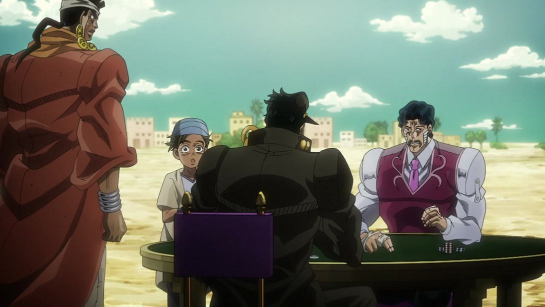
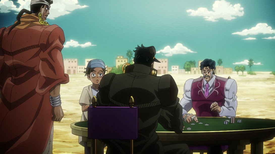
- Straight after the previous difference, the BD inserts one additional shot…:
- …and, straight after the previous one, another different shot:
- Just for fun, let’s also take a look at the final face mosaic:
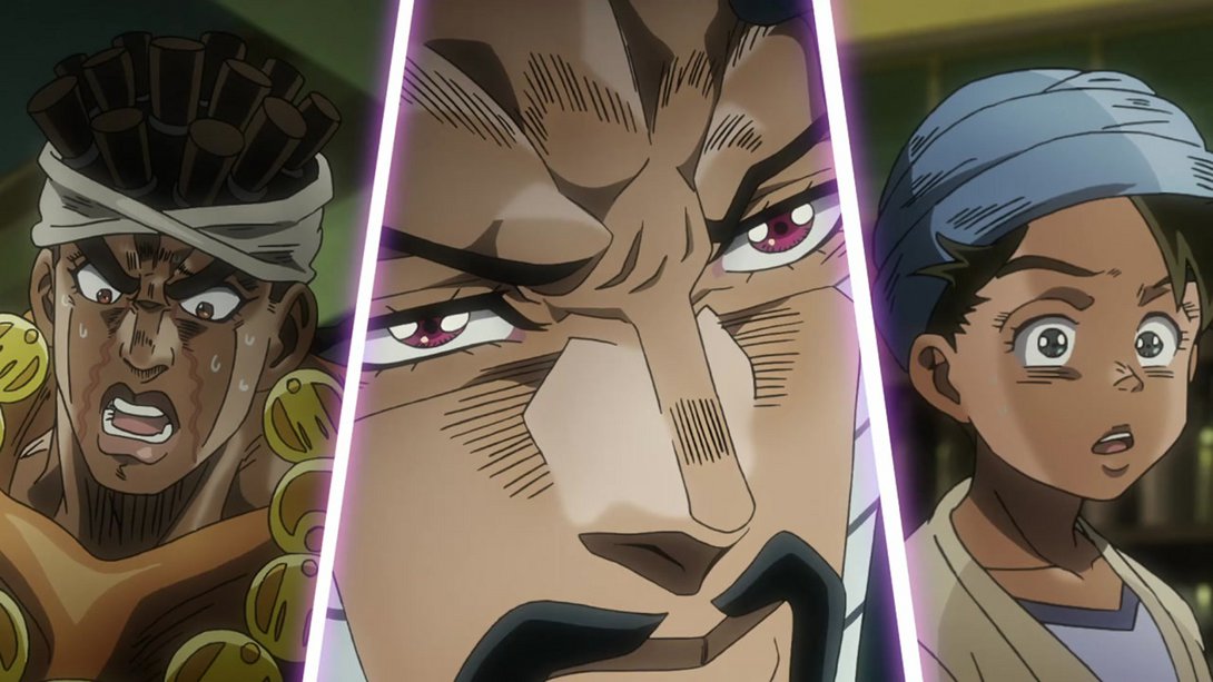
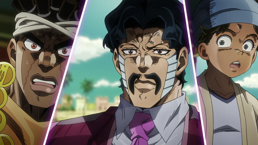
- Looking fresh! Moving on… Here, once again, the table is slightly brighter, and there are three more white chips as well:
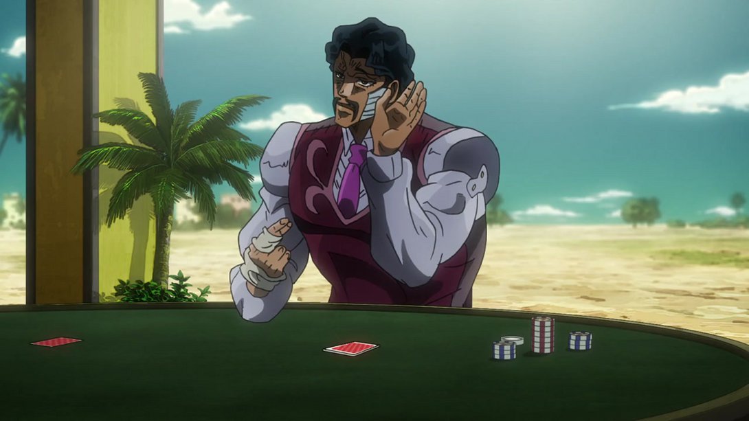
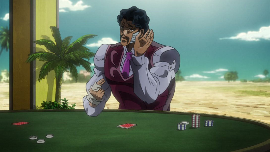
- This scene is just shot differently, in the BDs:
- The tip of Jotaro’s nose has been recoloured, here:

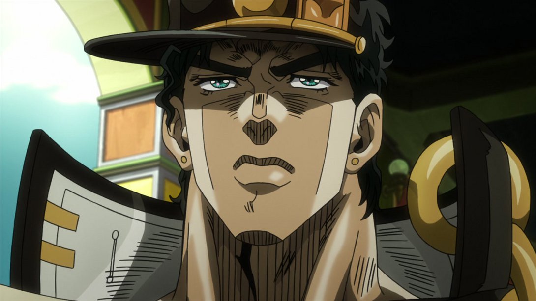
- A whole bunch of details are different here! I think it’d take me longer to list them than it would take you to just see ‘em, so here ya go! Some of these frames are golden:
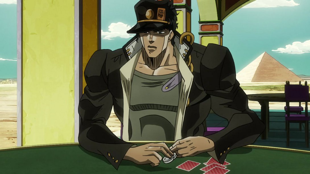
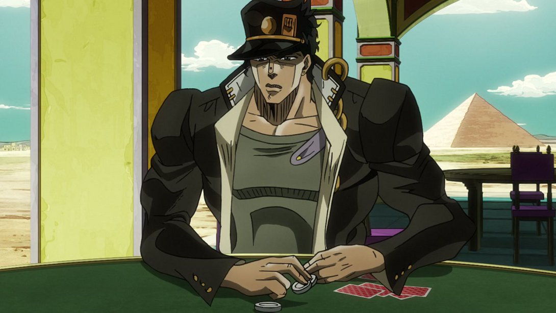
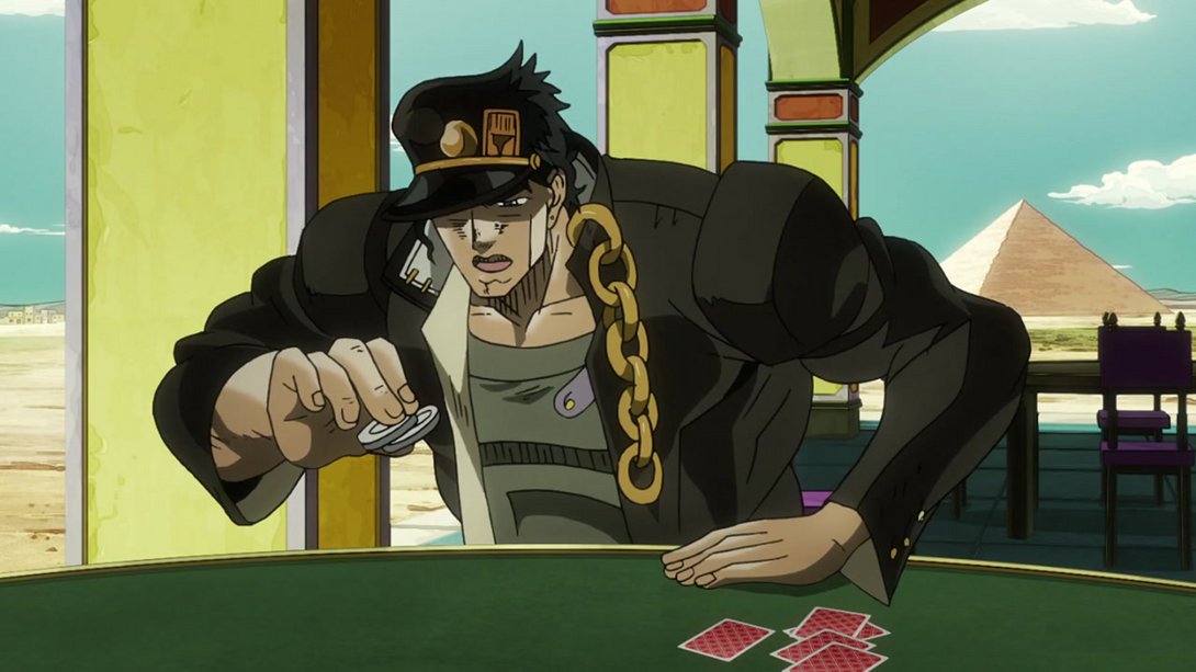
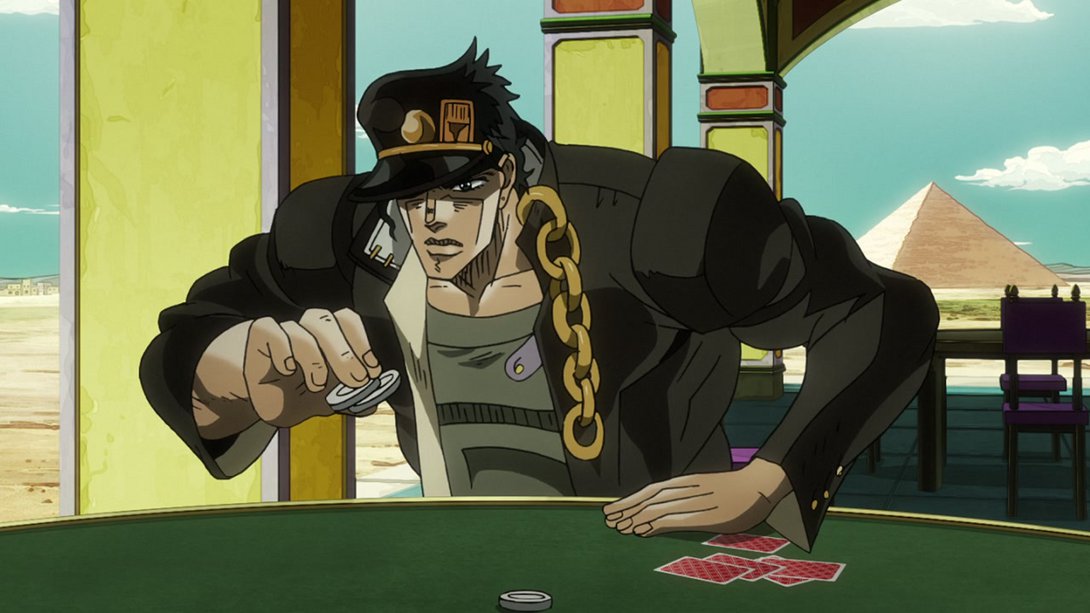
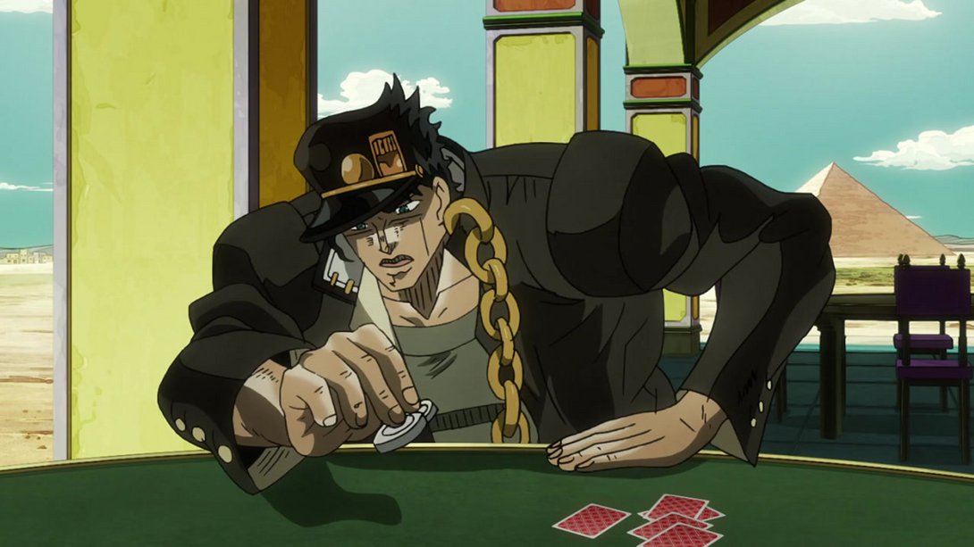
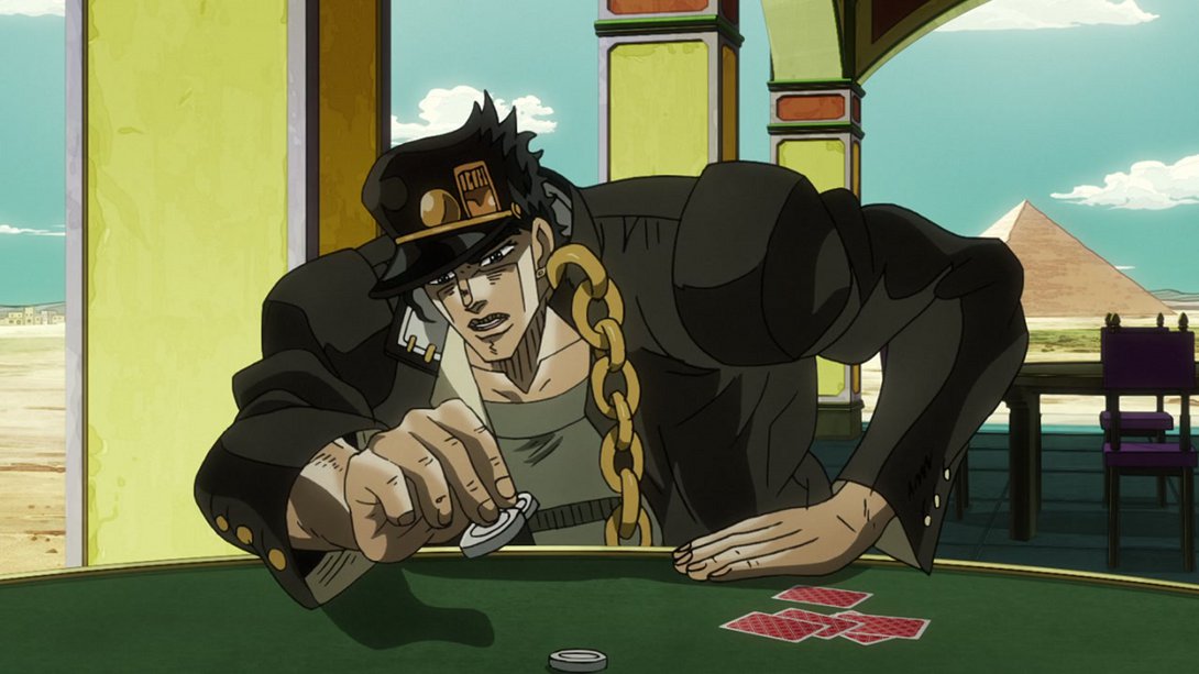
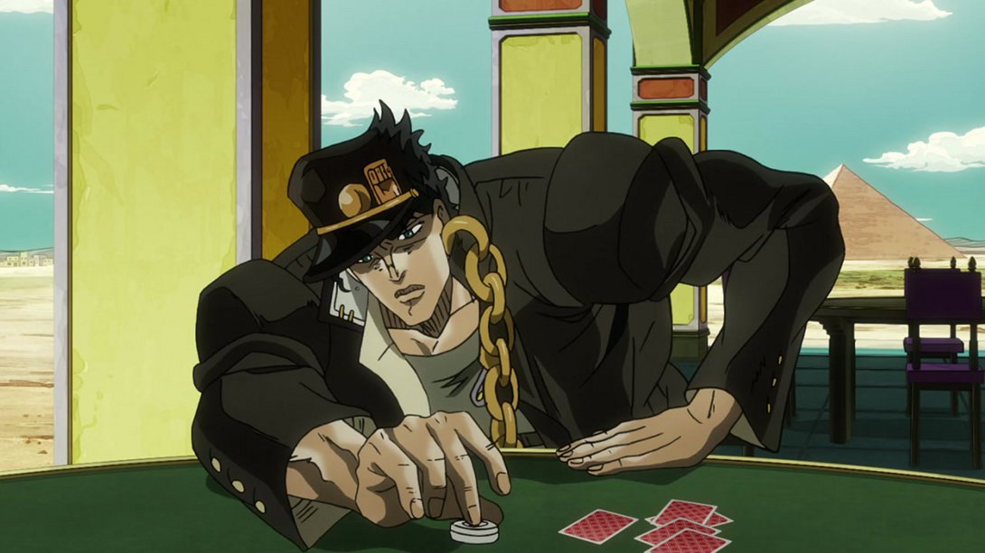
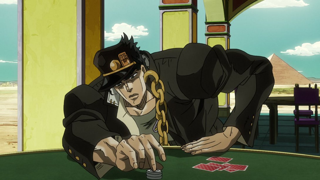
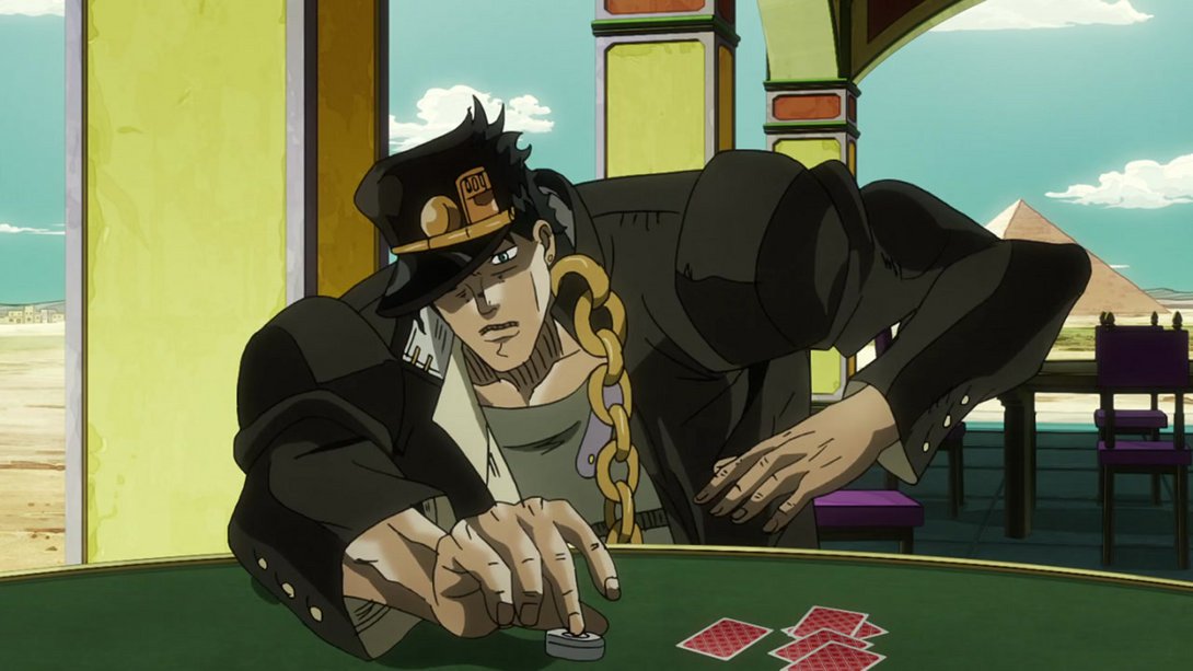
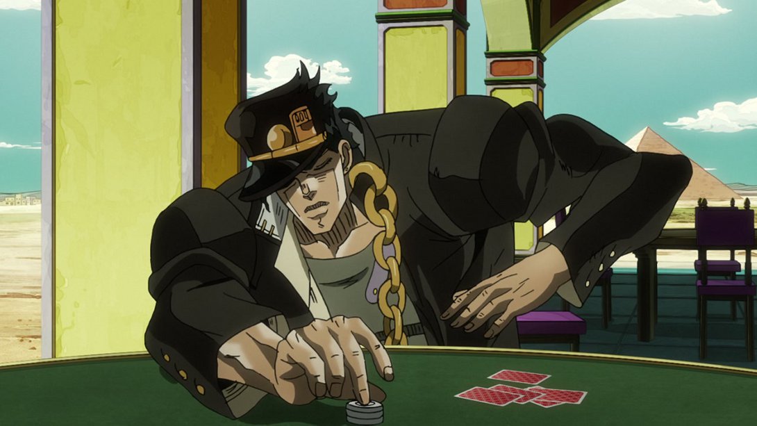
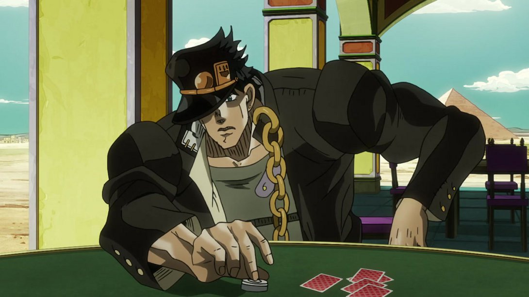

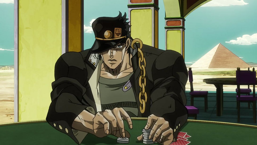
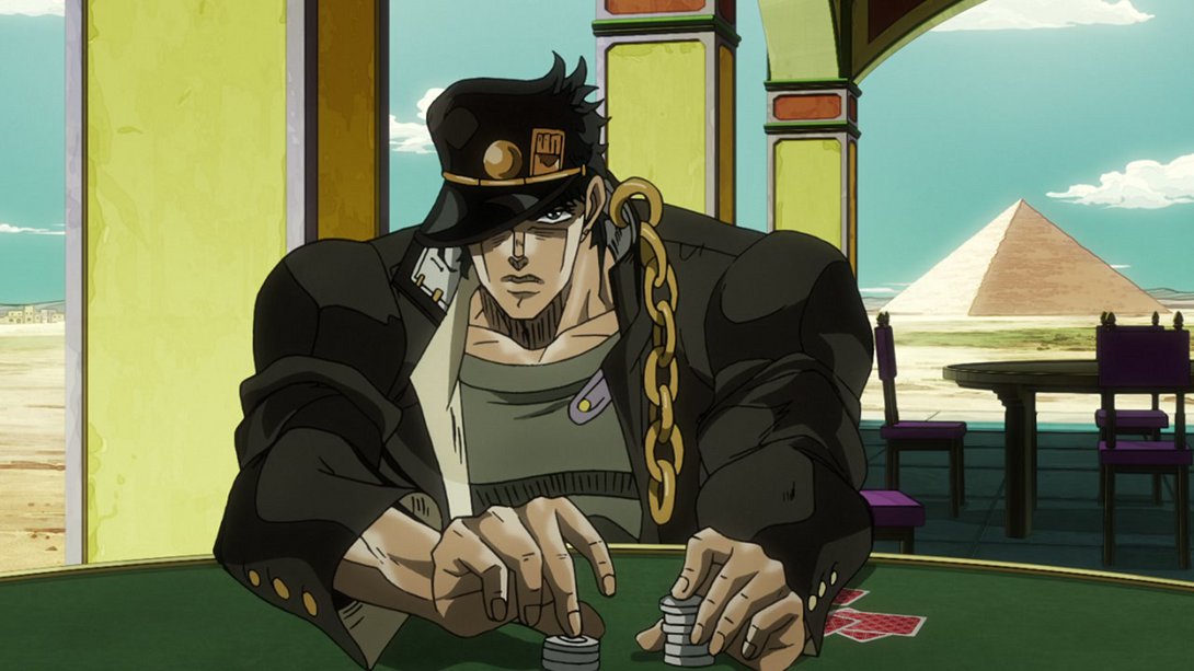
- Here, the inside of Jotaro’s sleeves has been recoloured and the chips have been retouched as well (and there’s also one more, on top of the right stack):
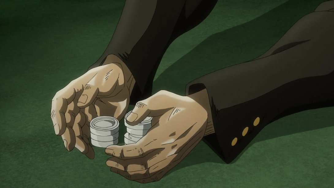
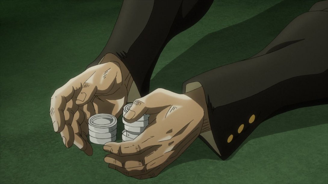
- Here the background is slightly brighter and Jotaro’s face has been slightly retouched…:
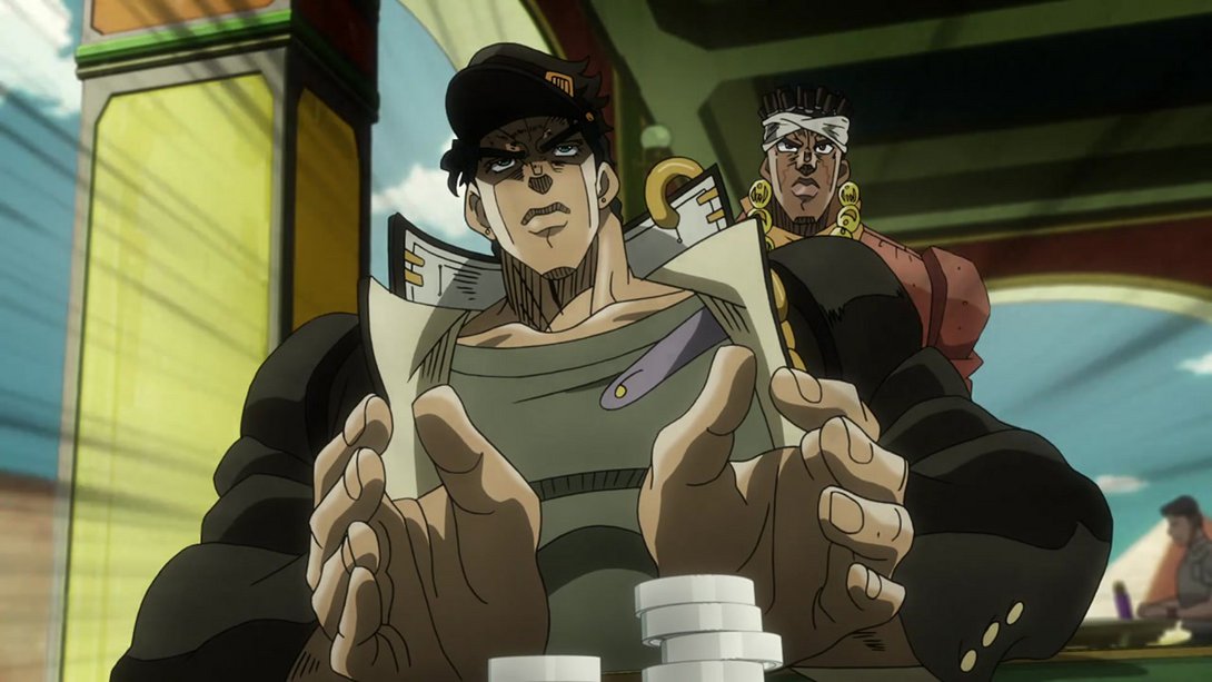

- …and D’Arby’s has been recoloured too:
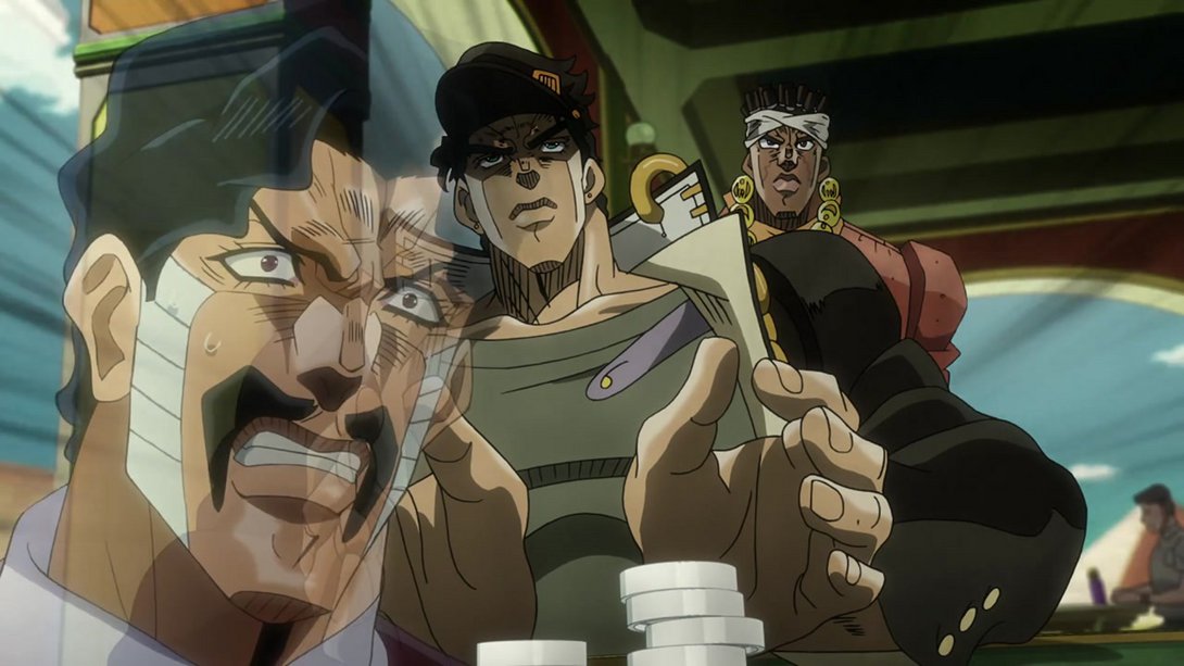
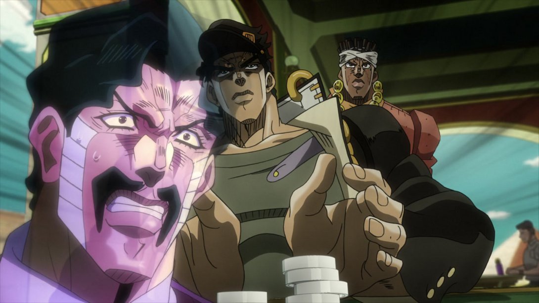
- In addition, the shading on the chips no longer shifts as D’Arby shows up:
- One of the cards has been moved, here…:
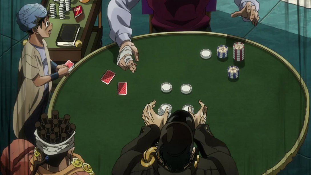
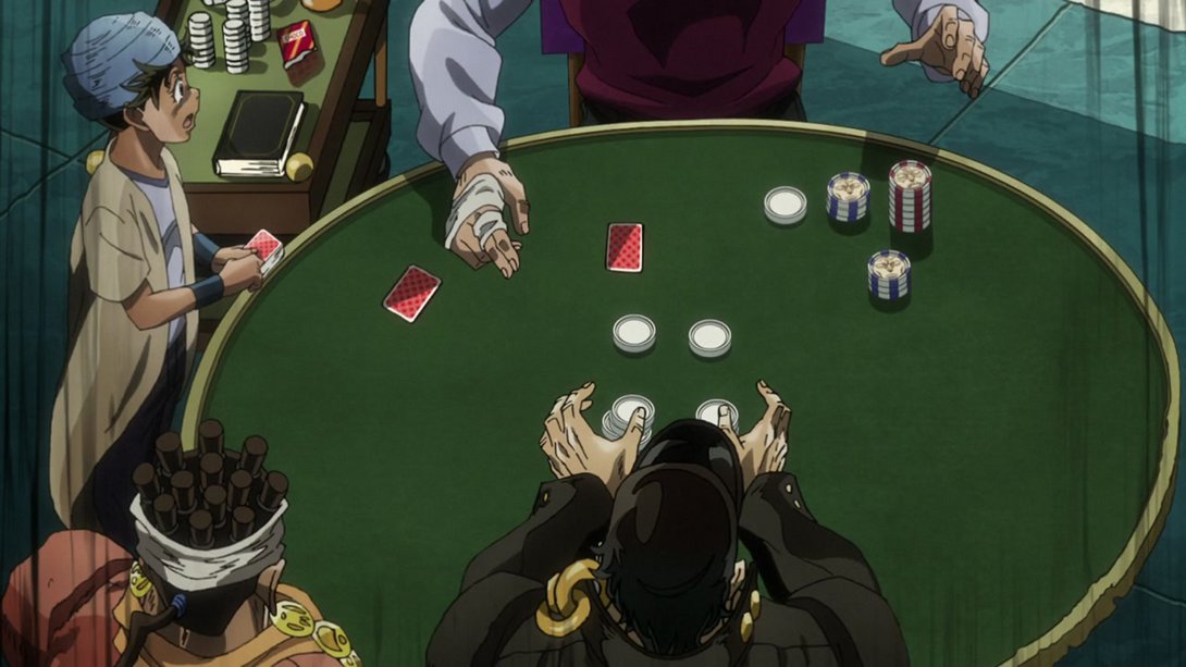
- …as have all of them, here:
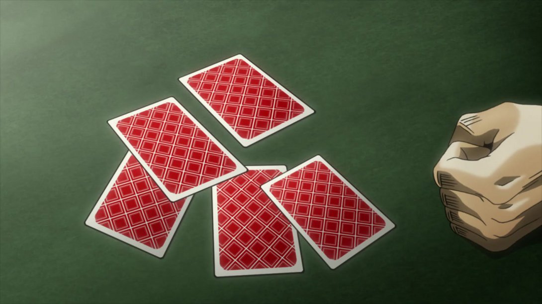
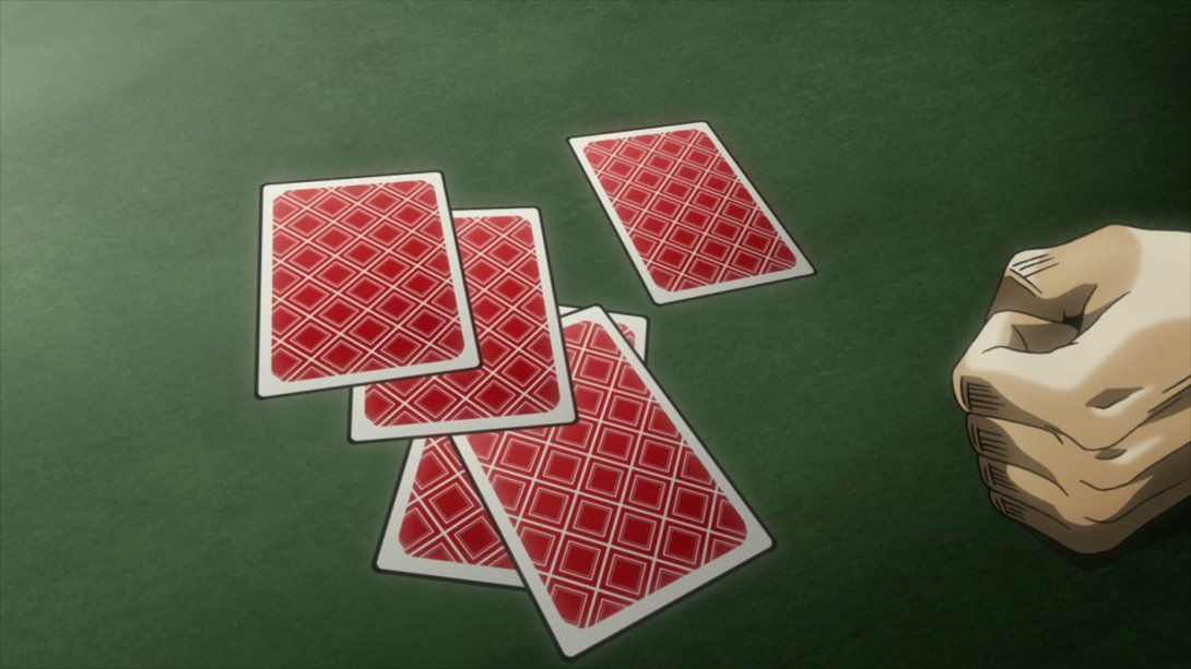
- But back to the different bits! This is probably as different as it could be:
- The table is much less empty, here:
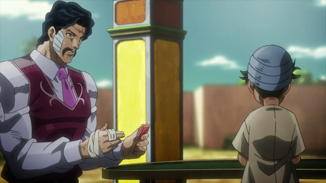
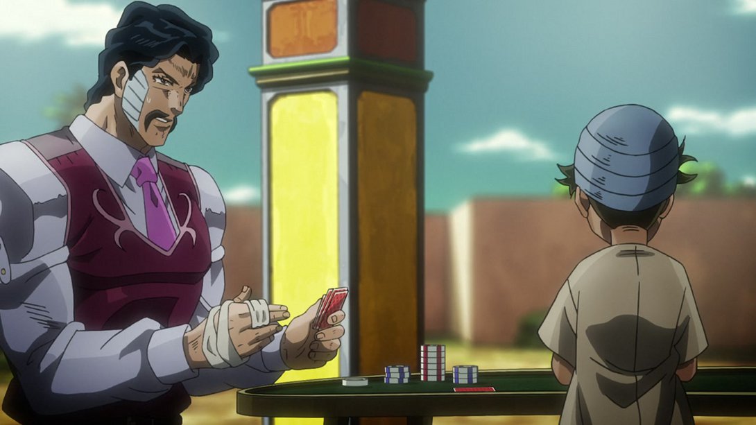
- The card in the top-left corner of the frame has been correctly removed, here:
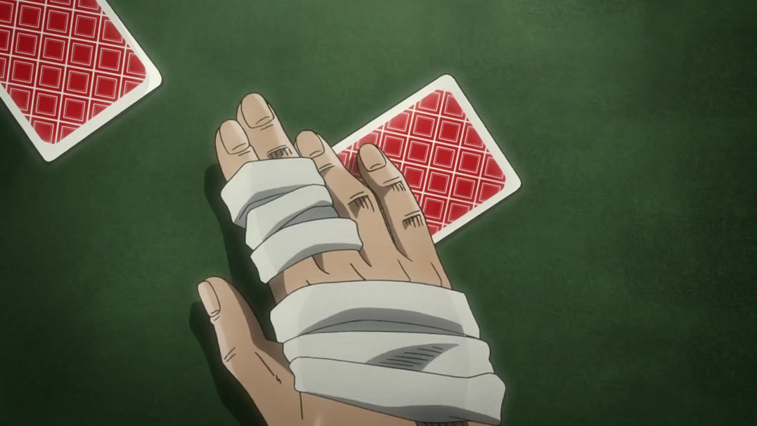
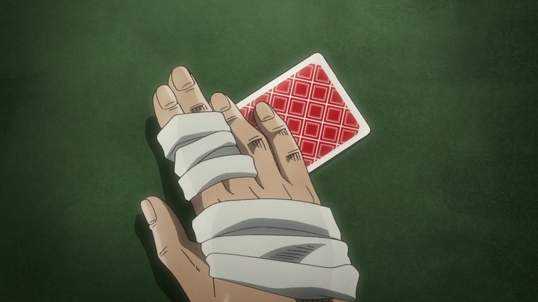
- Here, some elements of the background appear a little darker, and the shadow between the kid’s eyes is no longer there:

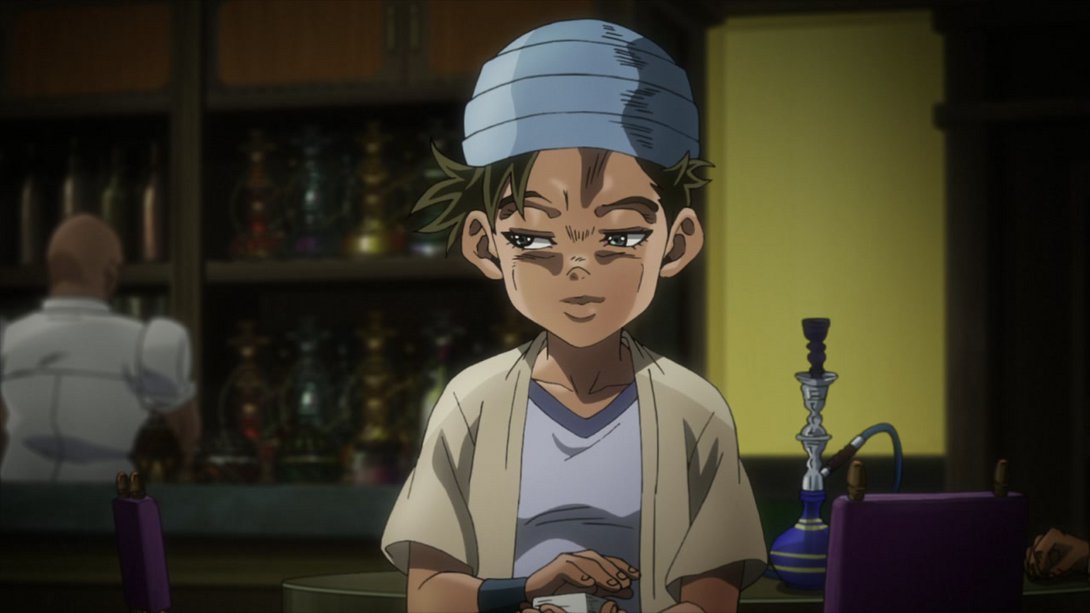
- Here, instead, the background is significantly brighter, and the insides of Jotaro’s sleeves have been once again recoloured:
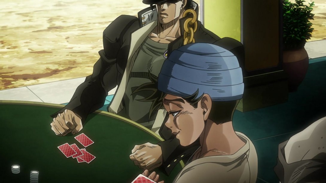
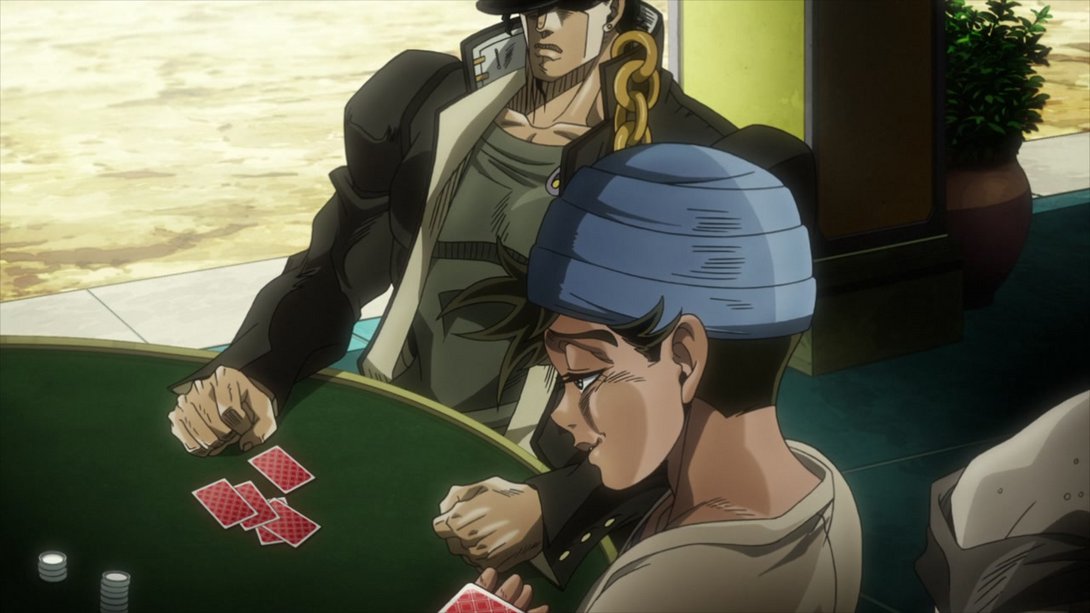
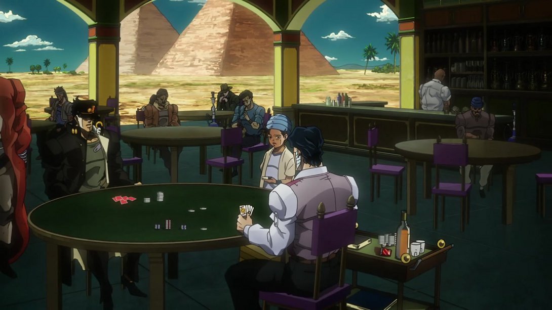
- Here, all cards in the frame have been retouched, the table has its usual brighter green and… if you look at the tray on the right side, you’ll see that there were three random stacks of white chips weirdly floating on top of the other stacks! They’ve been thankfully removed in the BD version:

- It’s all different, babe:
- The middle shot is completely different, here:
- There are more cards in this shot, and the card on the left has been retouched as well:
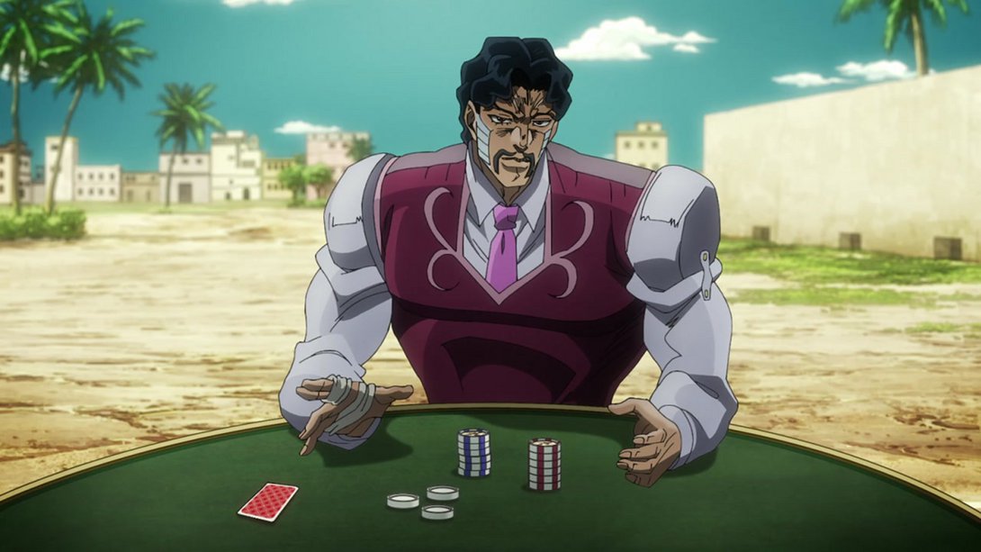

- And, later on in the same shot, Jotaro’s portion of the frame is more zoomed-in (perhaps to hide the error at the top of that section), and its background is also darker. Interestingly enough, it also seems that the relative dividing line has also been resized slightly:
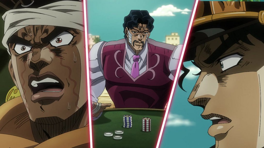
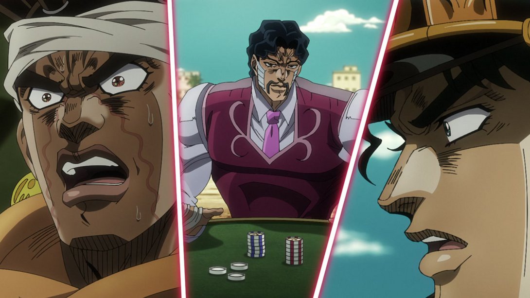
- Here, the background is slightly brighter, there’s a line less on D’Arby’s shirt and his lower teeth are also back in some frames:
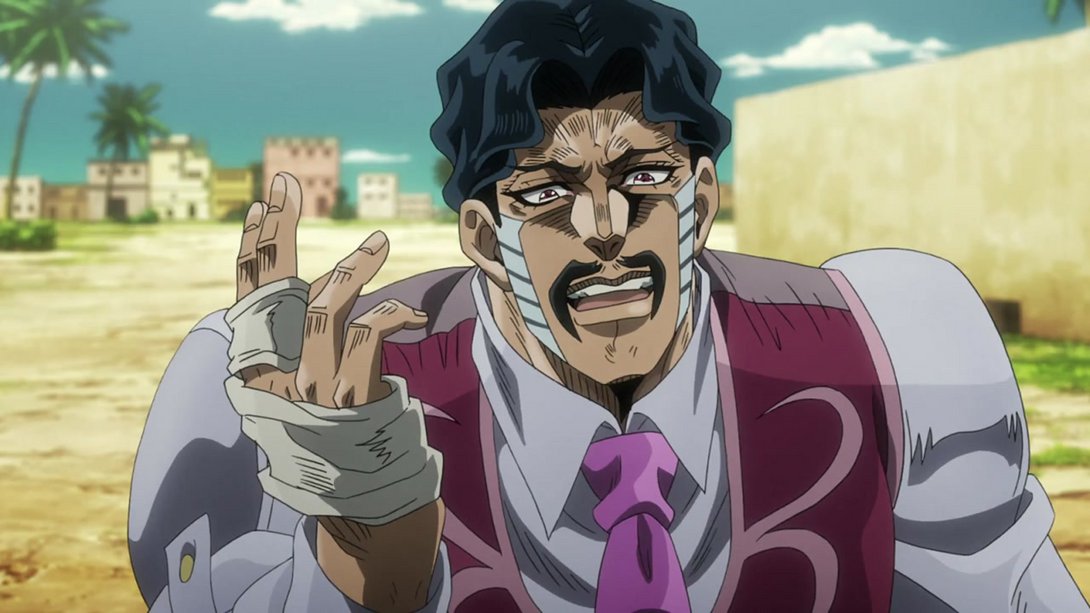
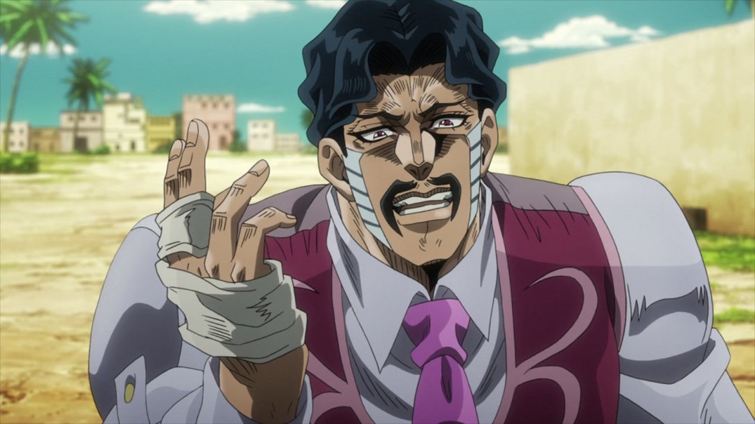
- Later on in the same scene, a section of his shirt has also been shaded slightly differently:
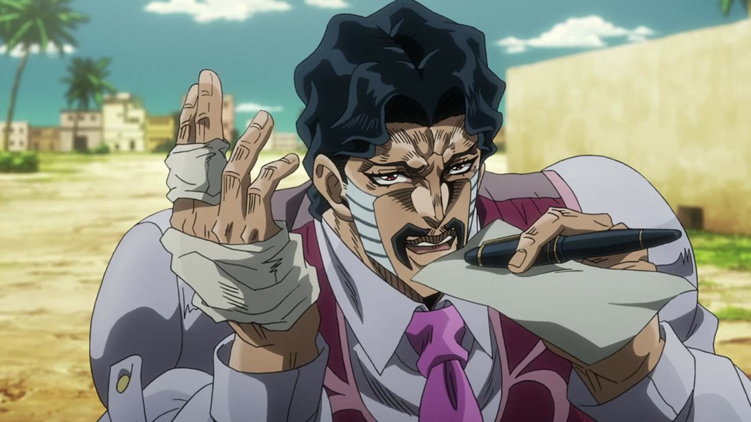
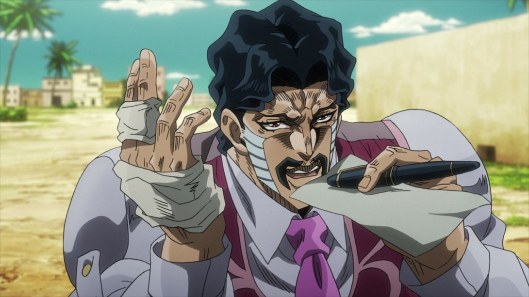
- Here, the cut between shots has been moved by 6 frames forwards:
- D’Arby’s weird side-lines are thicker, here…:
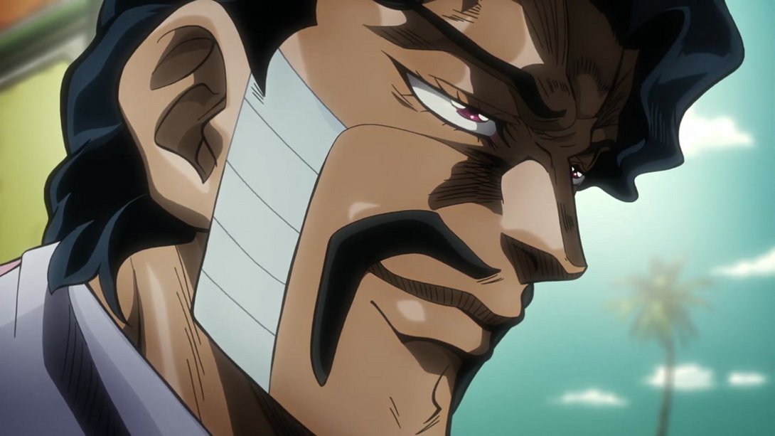

- The table is once again slightly brighter here, and the cards have all been moved around (also, why does that table look so wonky in this shot?):

- The lighting in the background and foreground is more dynamic, and results in a way more dramatic shot, in my opinion:
- Taking a look at some details, we can see that the camera has been slightly moved in some frames, the details are sliiightly brighter and there’s a new darker vignette along the edges…:
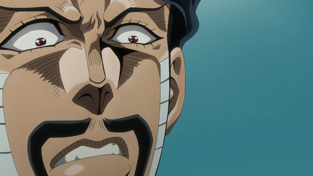
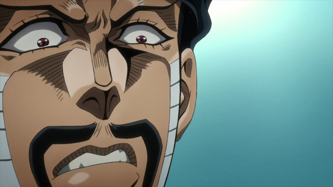
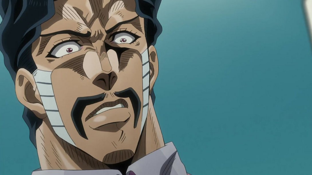
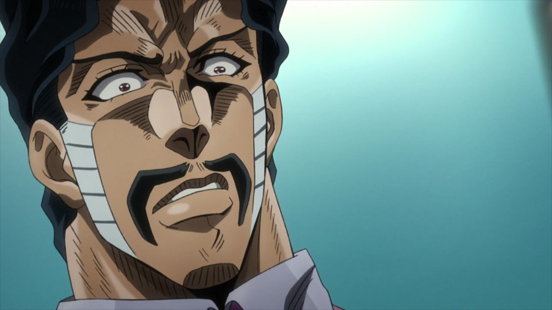
- Here we can see the different lighting in all its glory:
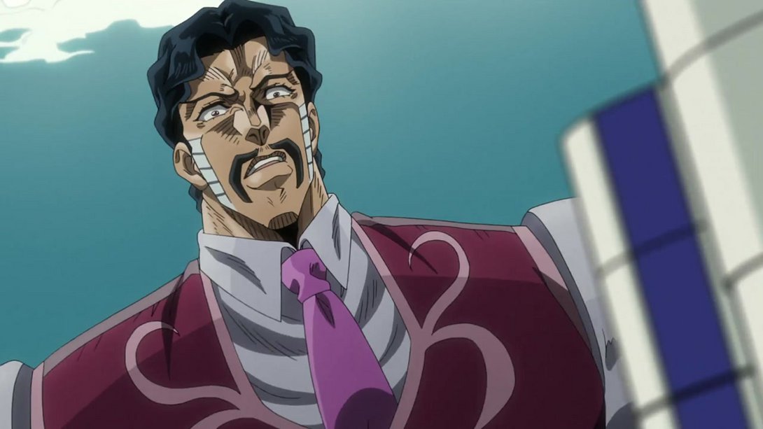
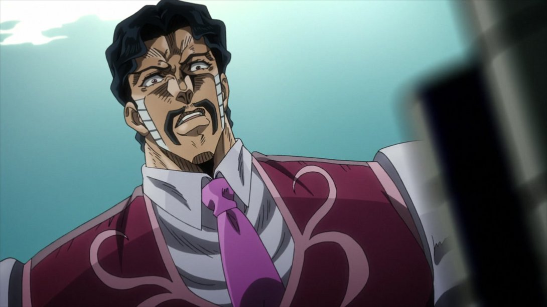
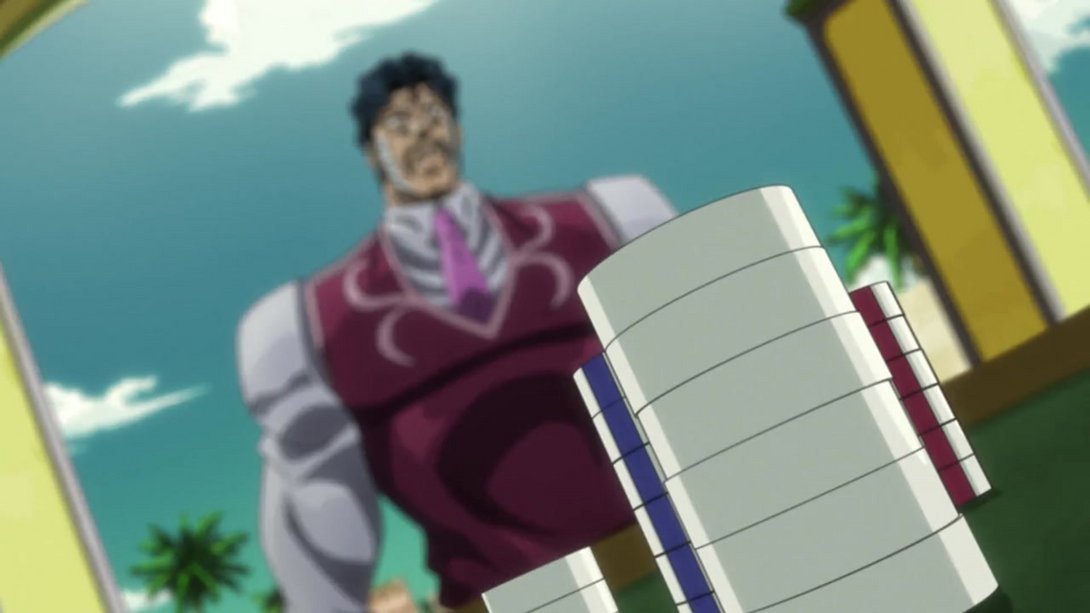
- In addition, there’s an extra stack of white chips on the table:
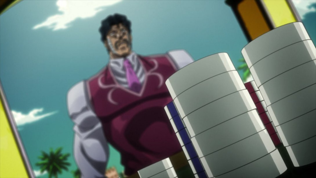
- Moving on, here we get a painful reminder of the fact that Jotaro is actually underage! In addition, the table is way less empty:
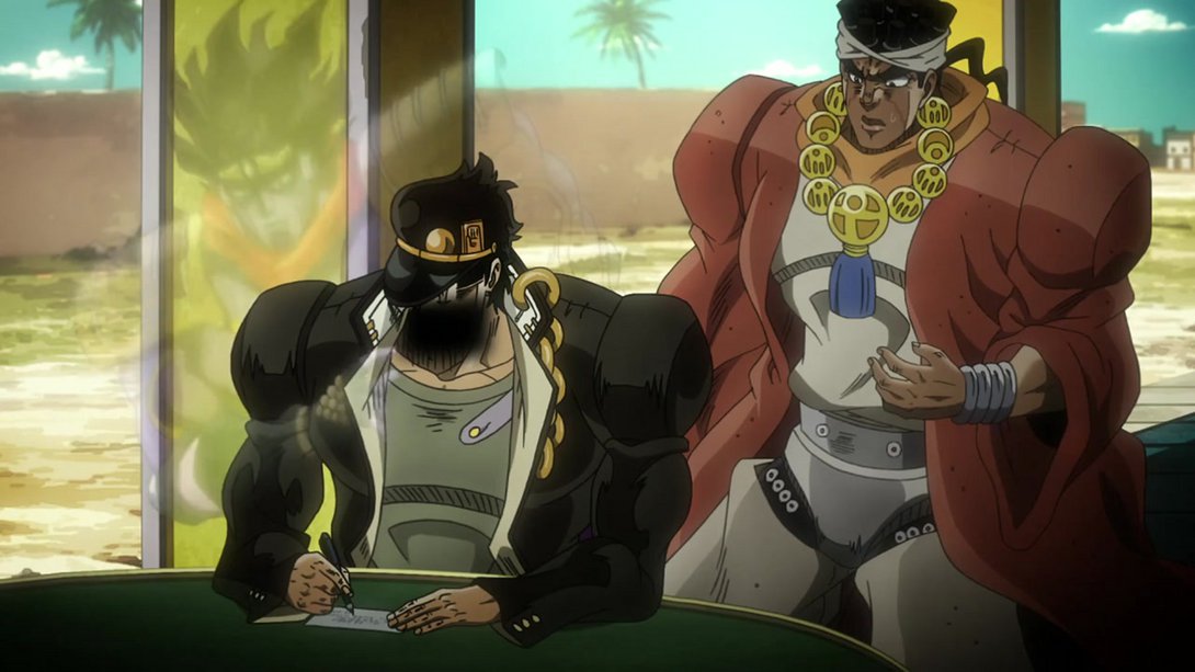
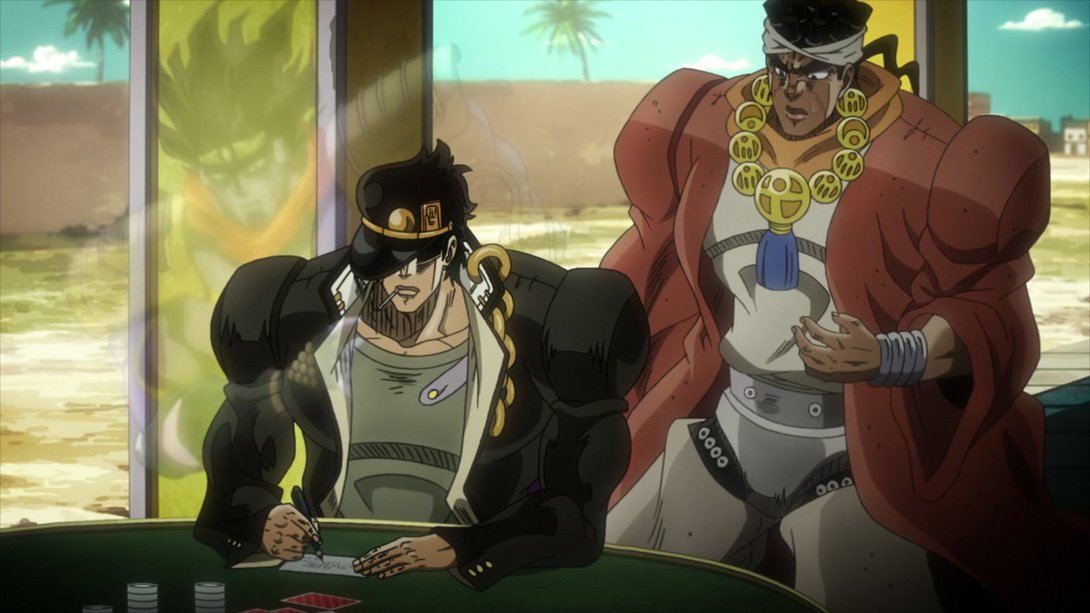
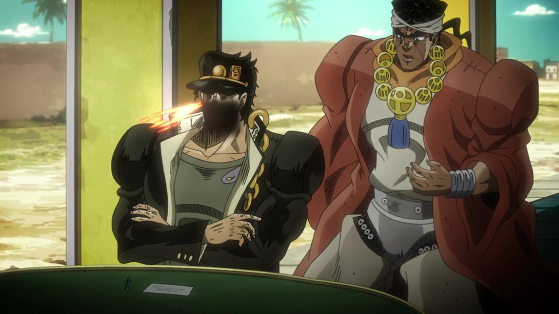
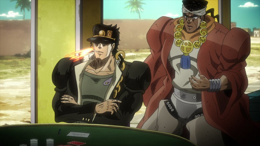
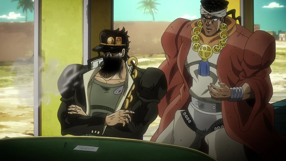
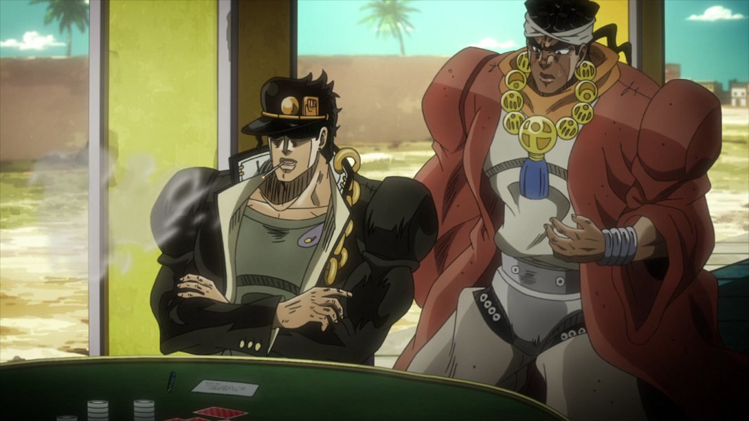
- In addition to the same uncensored cigarette, D’Arby’s forehead and hair area has also been shaded a little differently:
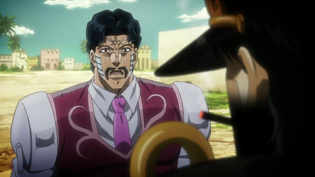
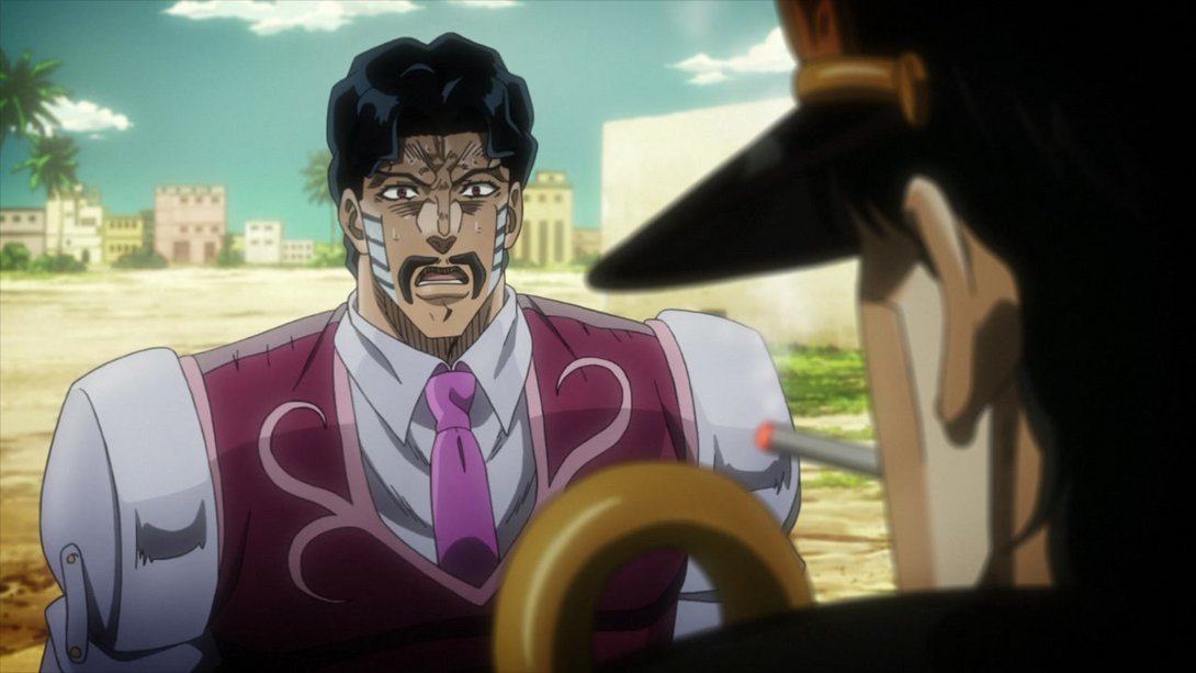
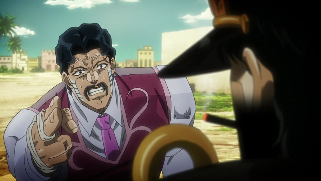
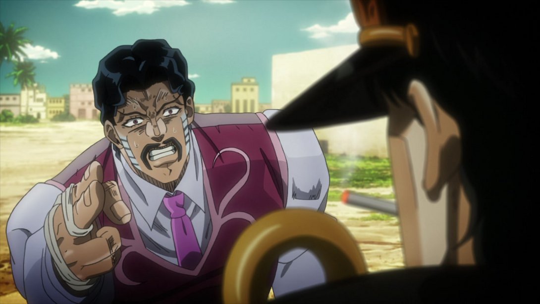
- Straight after the last difference we have a new shot, courtesy of the BDs:
- This shot is uncensored…:
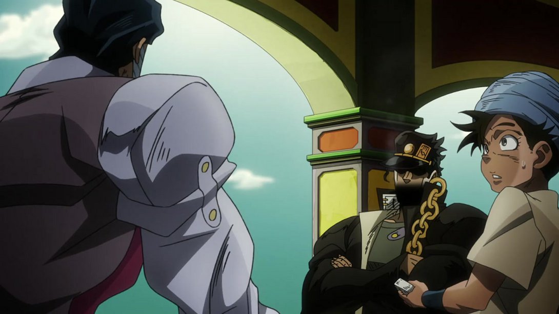
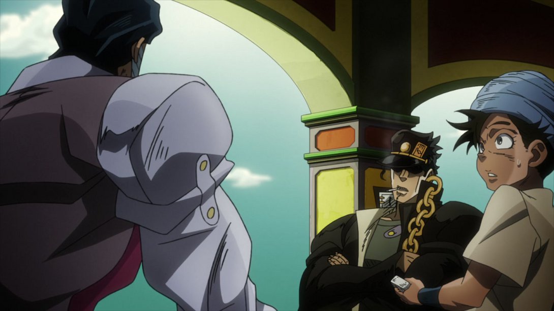
- As is this one, on top of being more zoomed out and having a less empty table:
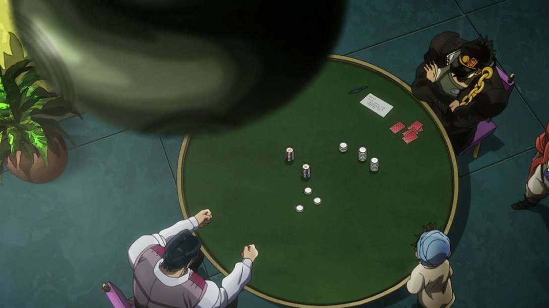
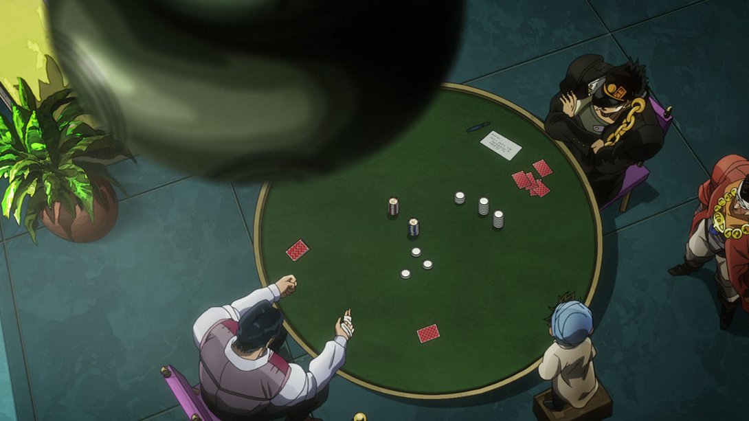
- This handsome uncensored boy has also been drawn with slightly thicker lines…:
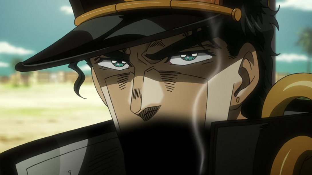
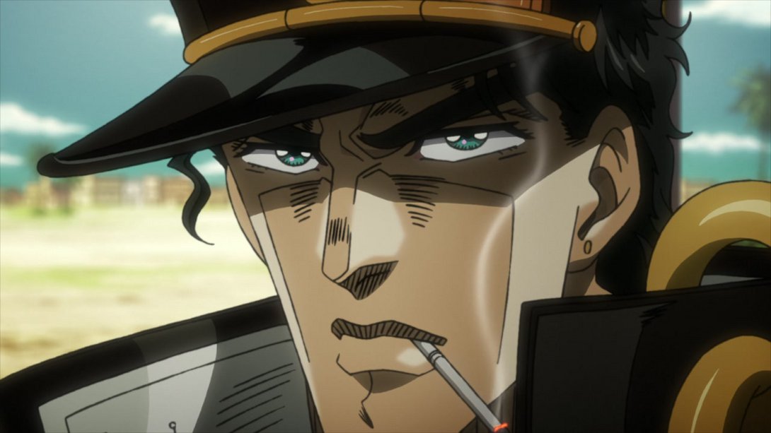
- The BDs introduce two new shots, here:
- In addition, this part has also been retouched a whole bunch! Check it out:
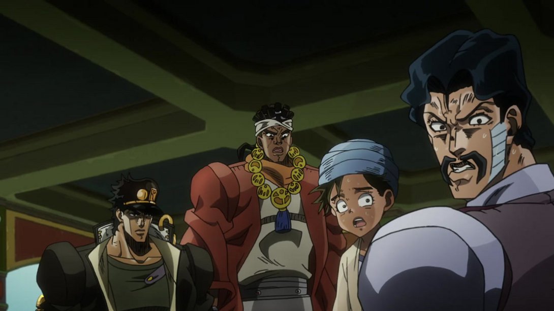
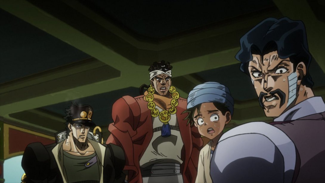
- Jotaro is now truly a delinquent here, and the cards on the table have been, once again, moved…:
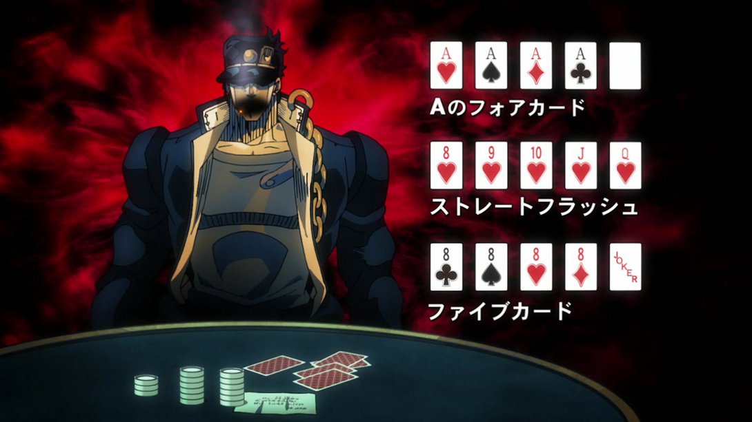
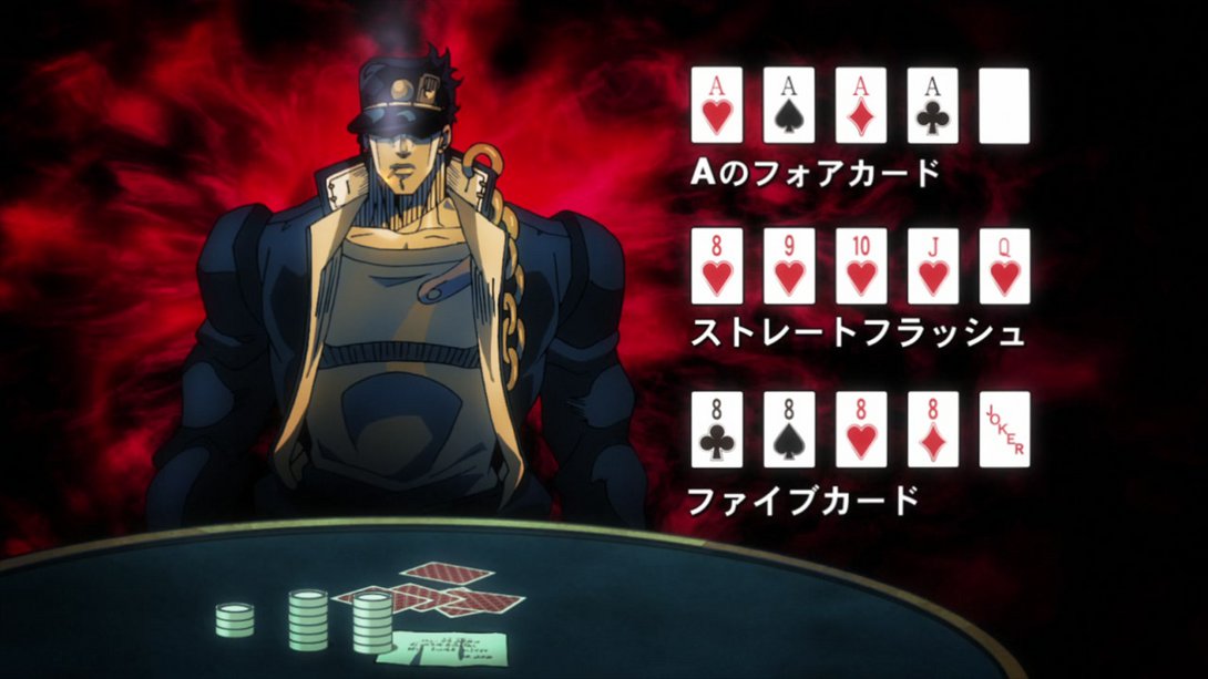
- As have they here:
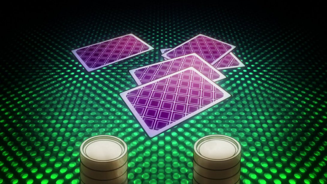
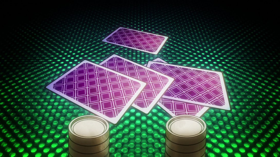
- Here we have another of those “it’s better if you look for yourself” kinda scenarios here, folks:
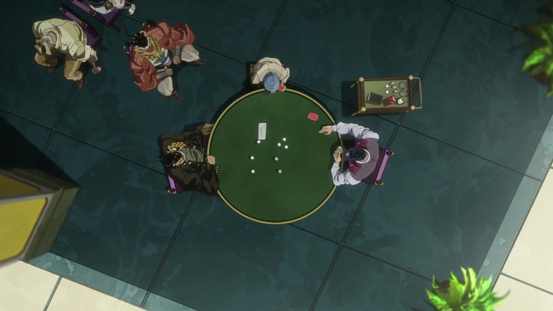
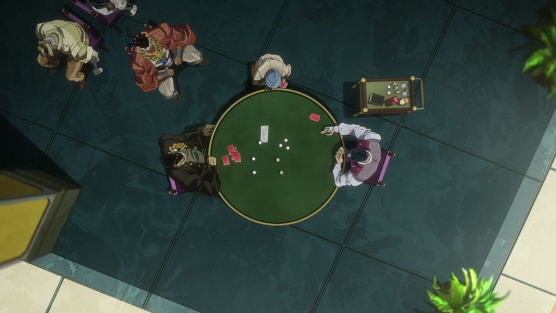
- Here, the background has been moved down a notch, and most of the stuff on the table has been shuffled around. In addition, the table is slightly brighter, and the shading on D’Arby’s teeth has been inverted:
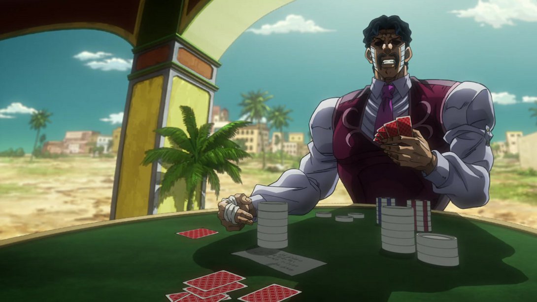
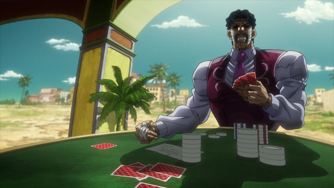
- The BDs once again shuffle things around, here…:
- While here, the smoke has been retouched…:
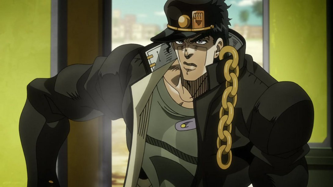
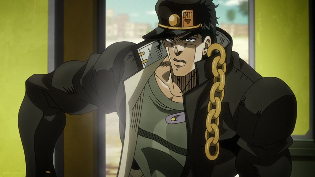
- …as has been, once again, the positioning of the cards and the brightness of the table texture:
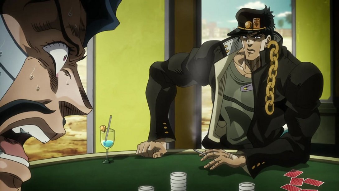
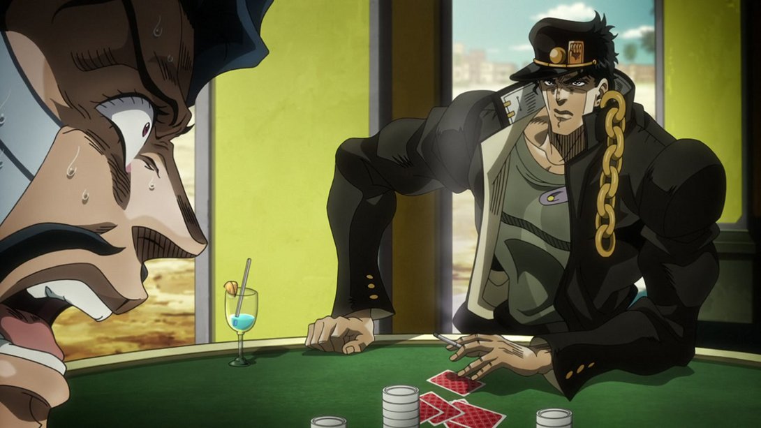
- The shading/colouring is very different here, both in the foreground and background! The latter is also blurrier:
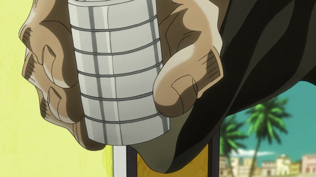
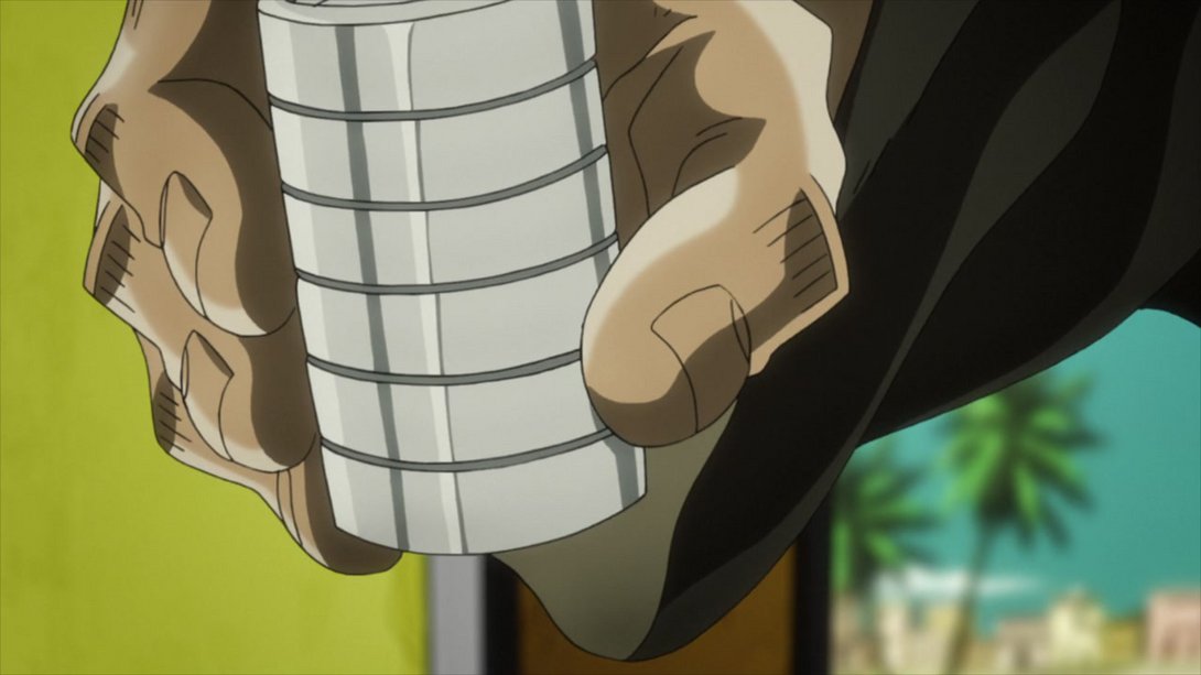
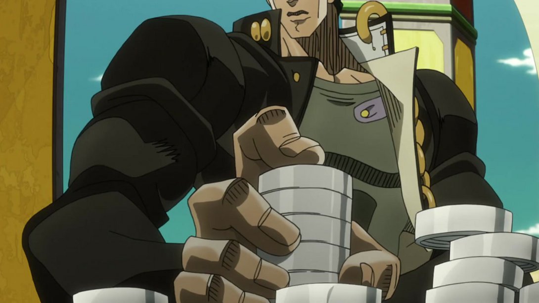
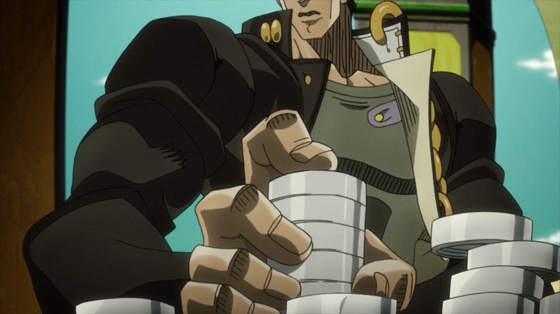
- Go ahead and smoke that cigarette, young man (the smoke has also been slightly retouched):
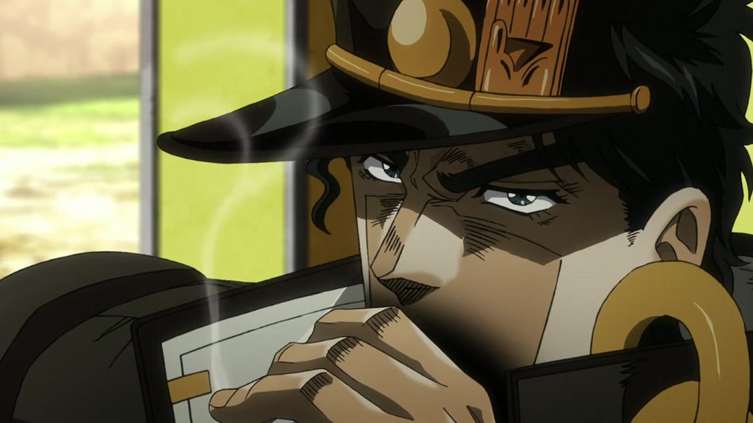
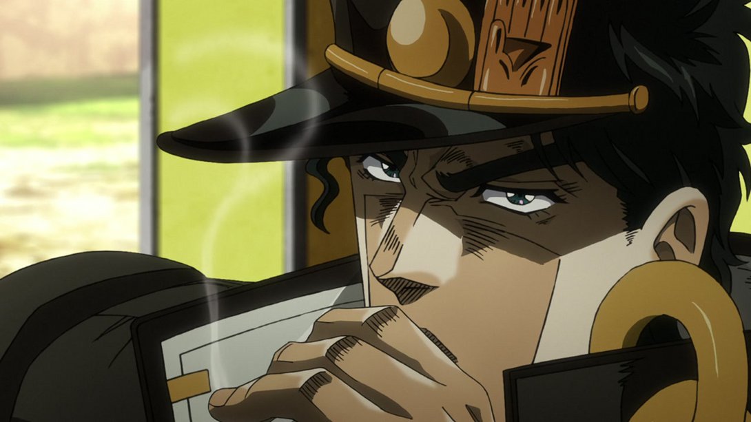
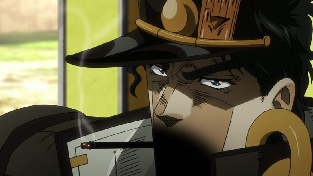
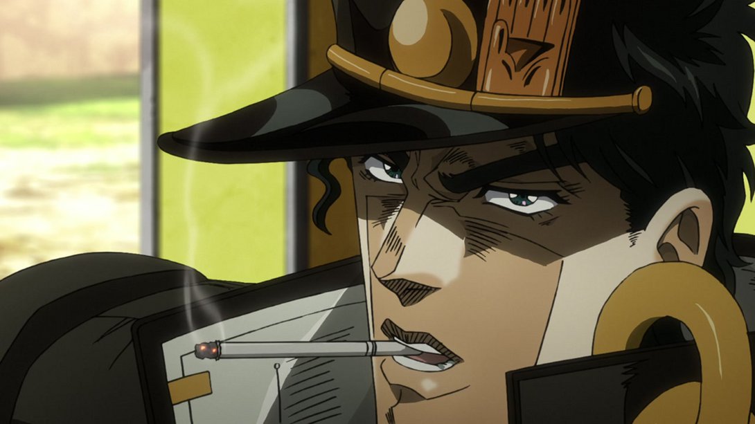
- Here, on top of the now-familiar uncensored cigarette, Jotaro has also received a minor make-over…:
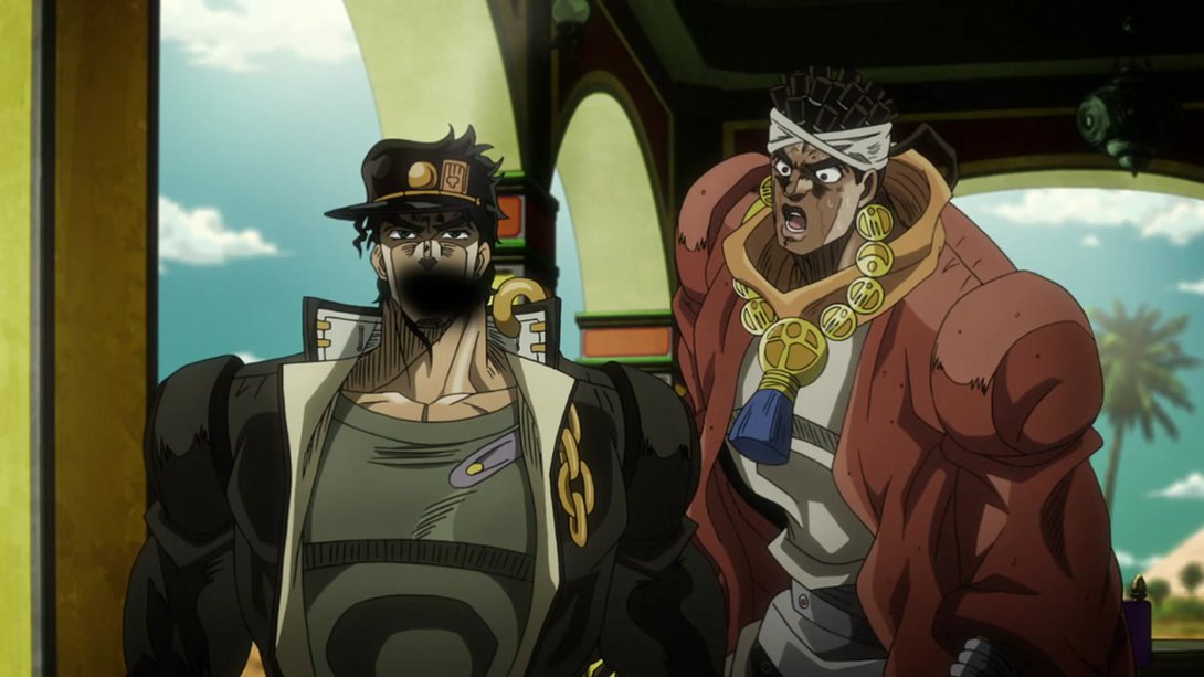
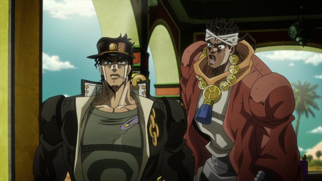
- …the transition into the following scene happens a little later and a little more abruptly…:
- …and, taking a look at the latter part of the previous video, we can see that Jotaro’s school uniform now has buttons…:
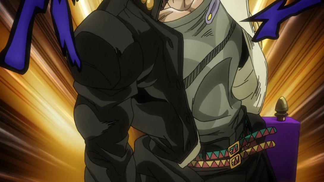
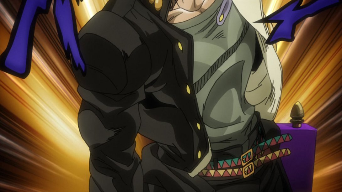
- …and his hat-hair has also been shaded a little better:
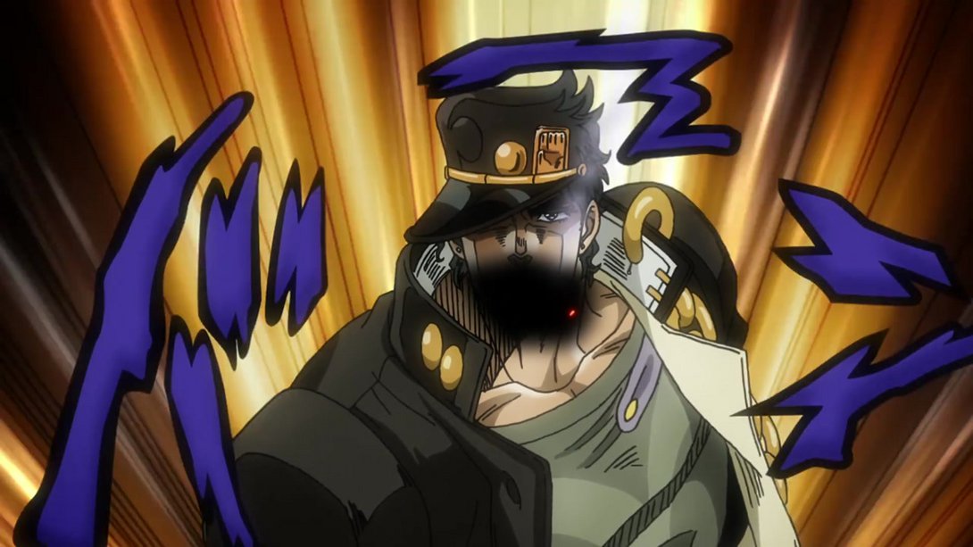
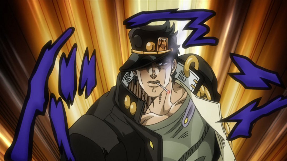
- Here we have a new shot, instead of a recycled one from earlier in the episode:
- And here, on top of the usual, Holly’s shoulder area has also been tweaked:

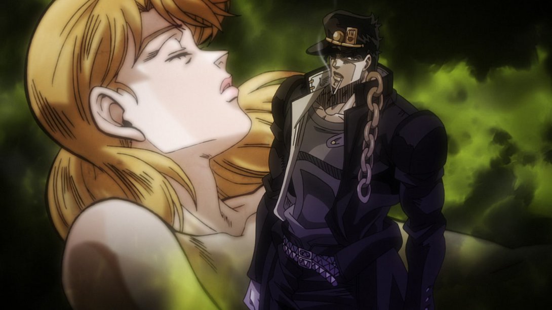
- Another different shot, David! You shouldn’t have:
- Here Jotaro has his cigarette back and he’s been shaded slightly differently, but more importantly… Please. Take a look at how huge that kid’s head was:
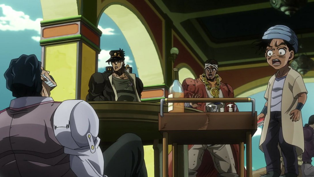
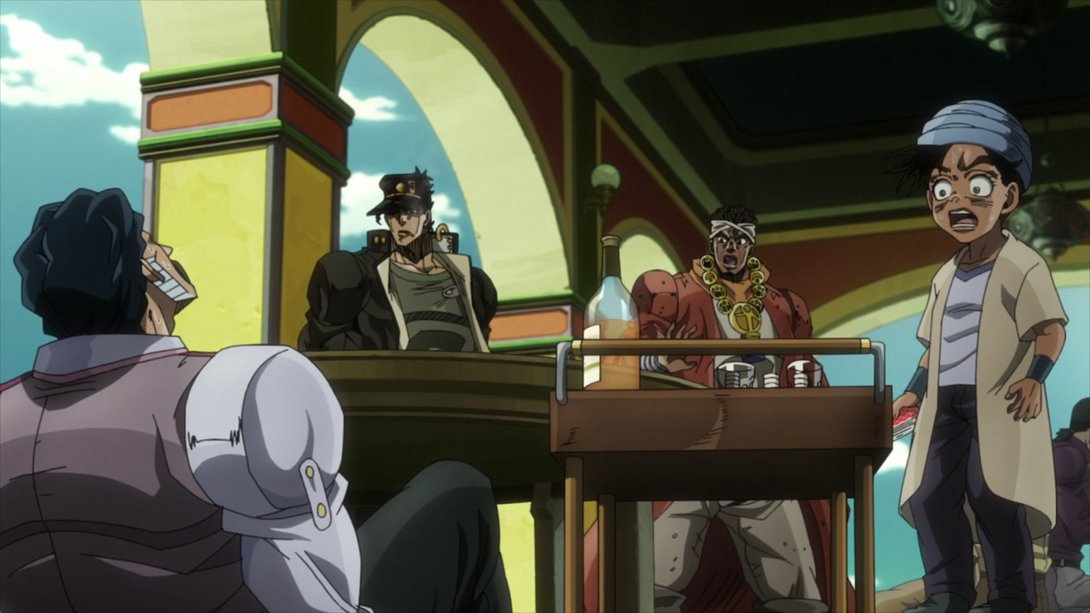
- This trippy shot is now also sporting a dark vignette and a new distortion along the edges; on top of that, the spiral pattern overlay seems to be spiraling a little faster too:
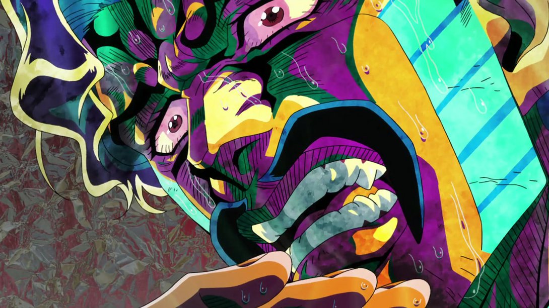
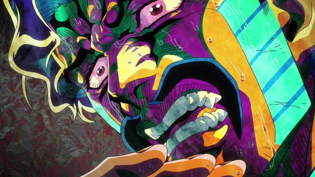
- Here, on top of the usual, both instances of the cards have been changed and the camera has been moved down a tad:
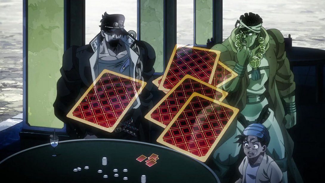
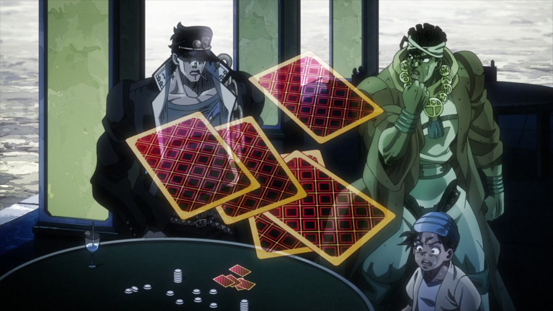
- Hell yeah man, that’s what people in the 90s thought was cool, right:
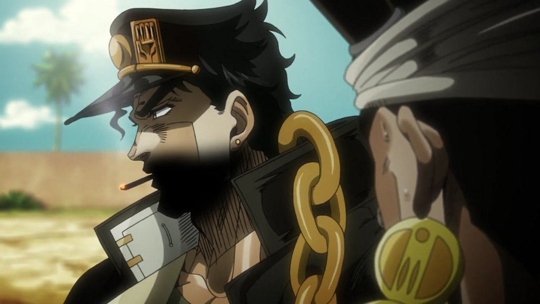
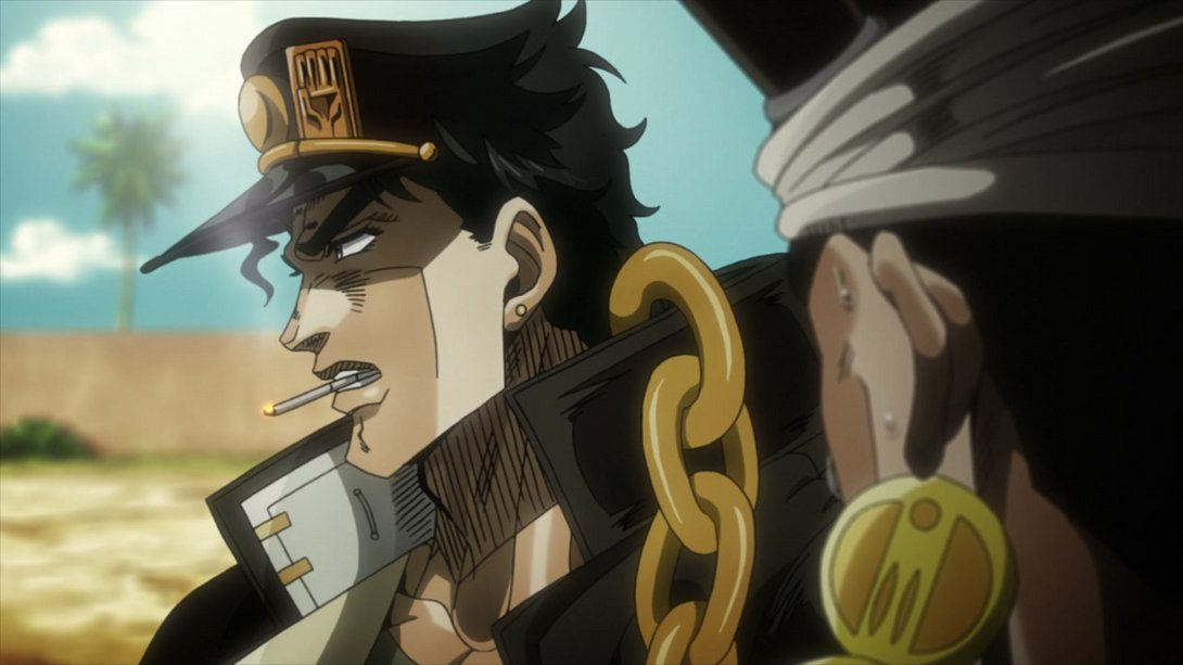
- This scene is way more zoomed-out…:
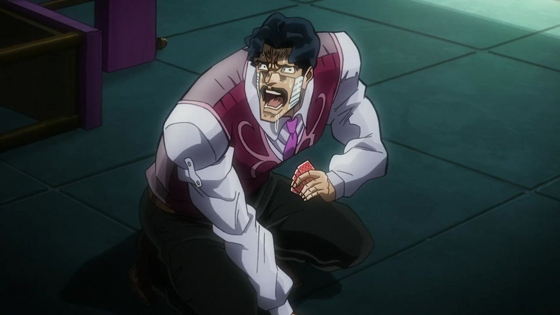
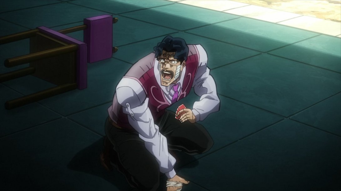
- Alright now THAT’S some cool shit right there (also, they fixed the missing smoke from the TV version):
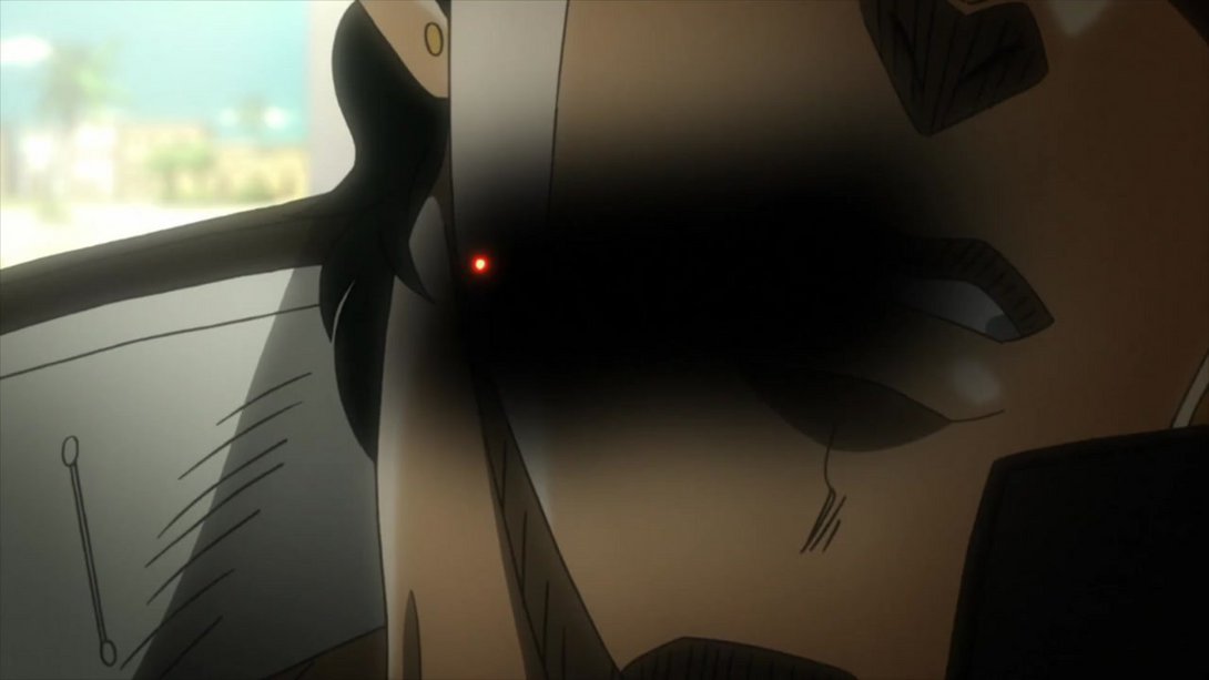
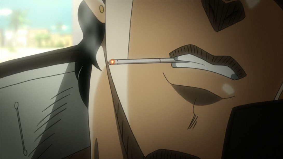
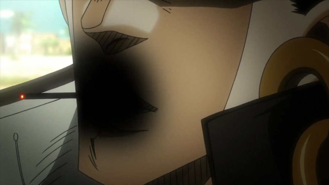
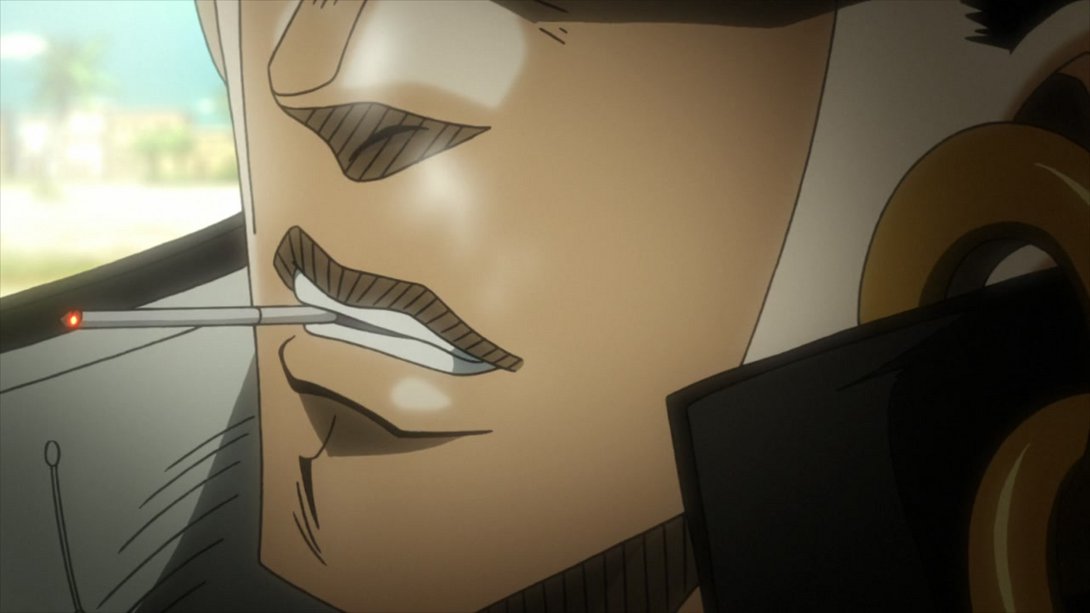
- Jotaro’s eyebrow has been coloured in, in a couple of frames…:
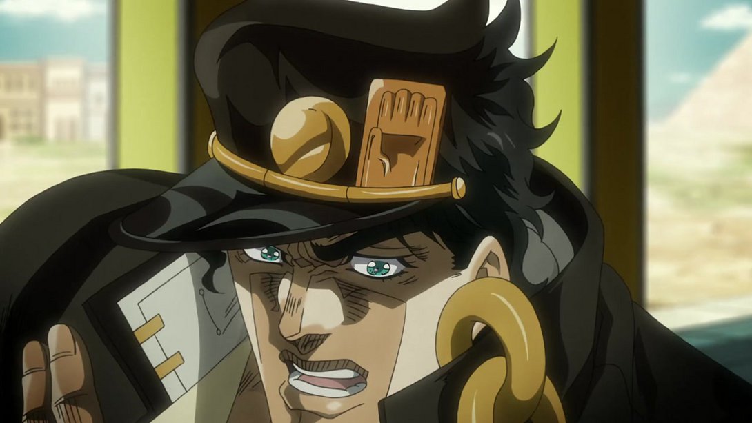

- This shot starts out much more zoomed-out…:
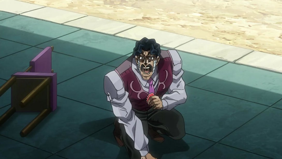
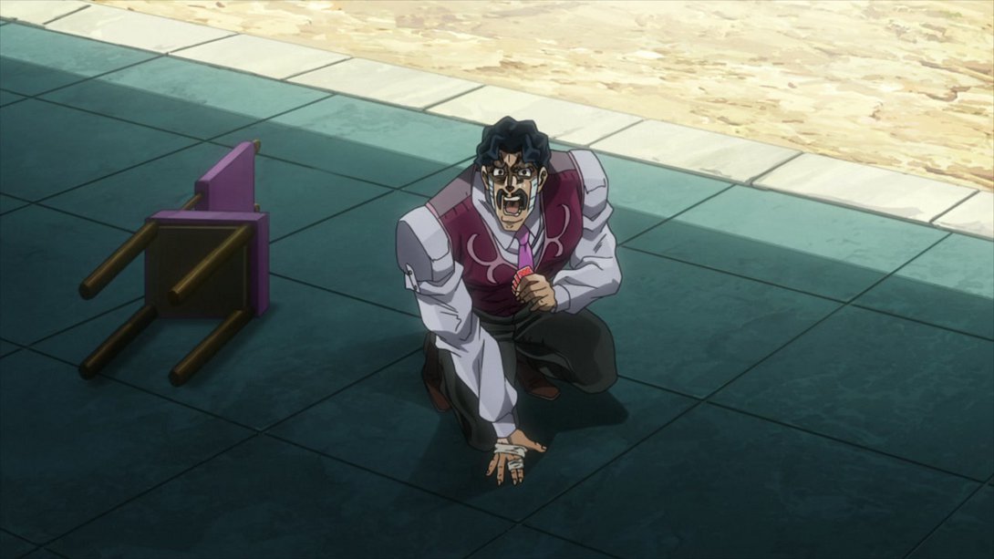
- …and, a few frames in, we can see that the background is also more zoomed out in relation to D’Arby…:
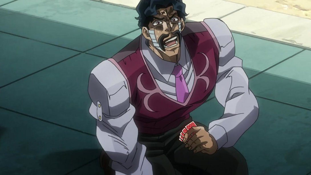
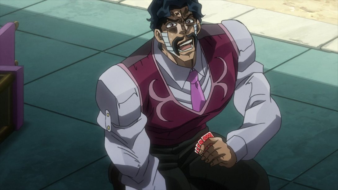
- …and, in the end, you can see that they added some motion lines too:
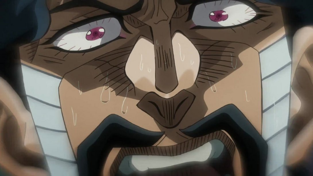
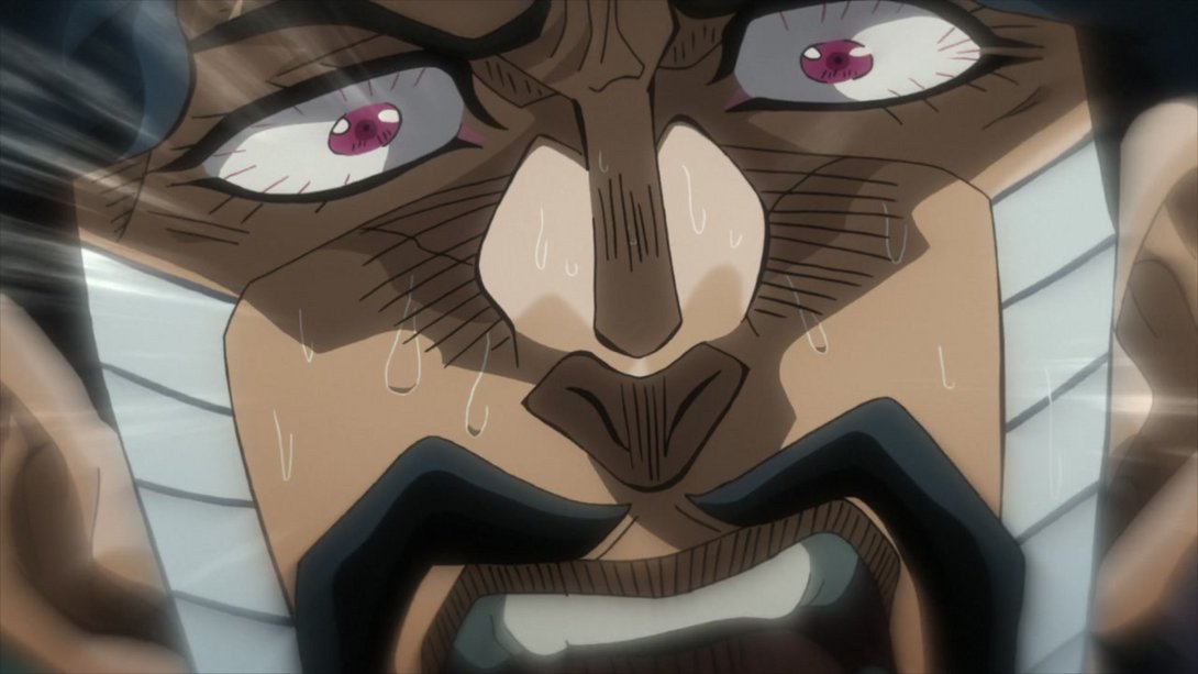
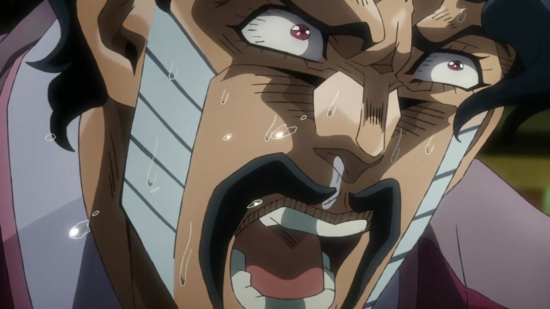
- Here, D’Arby’s snot is no longer see-through…:

- Here, basically EVERYTHING has been tilted and/or moved! I wonder if this shot was meant to be a table slam from the beginning, of if it was repurposed as such when they touched up the episode for the BDs… Anyway! Jotaro’s face has also been retouched, and the chips are visible on the table:
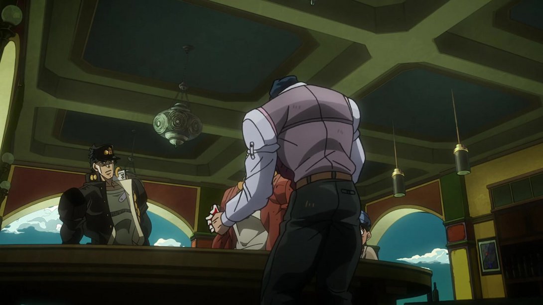
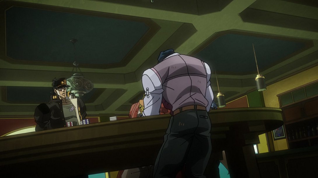
- Poor D’Arby is now also shivering in this scene…:
- …and, in addition, the general shading is slightly different, and the bright part of his left eye has been correctly recoloured:
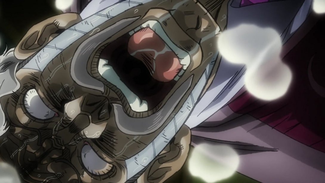
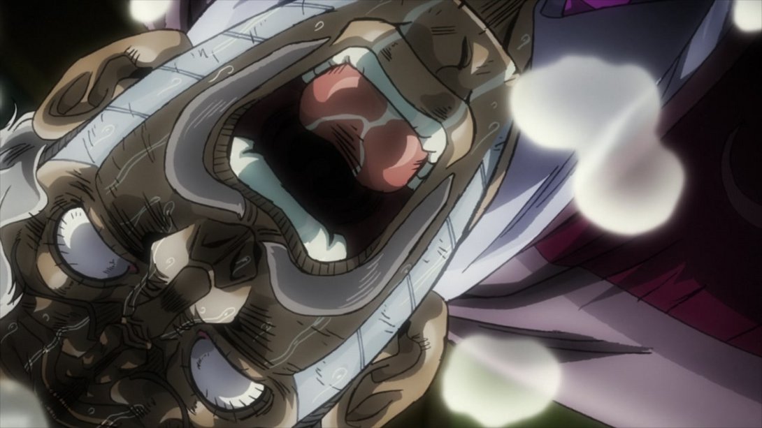
- BREAKDOWN, BREAKDOWN! This scene is more zoomed in, and the colours are slightly more muted:
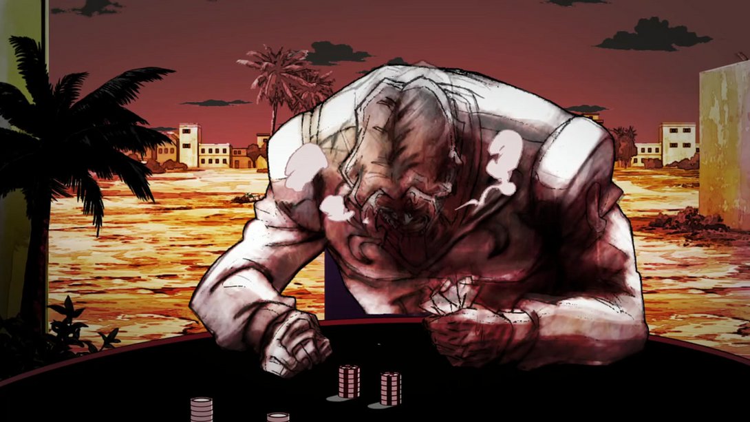
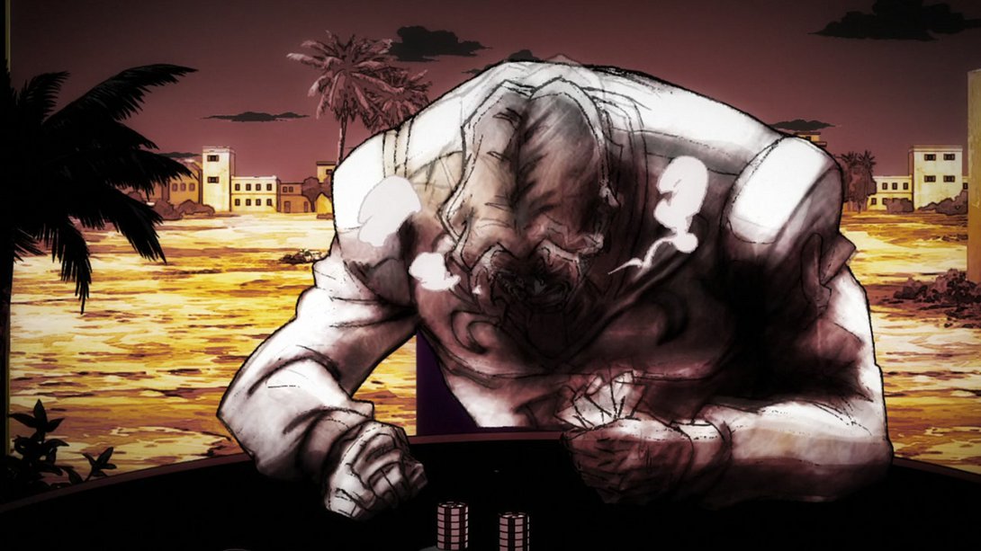
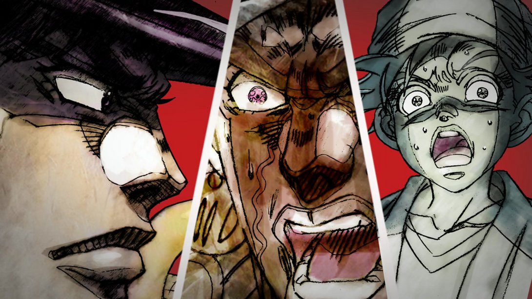
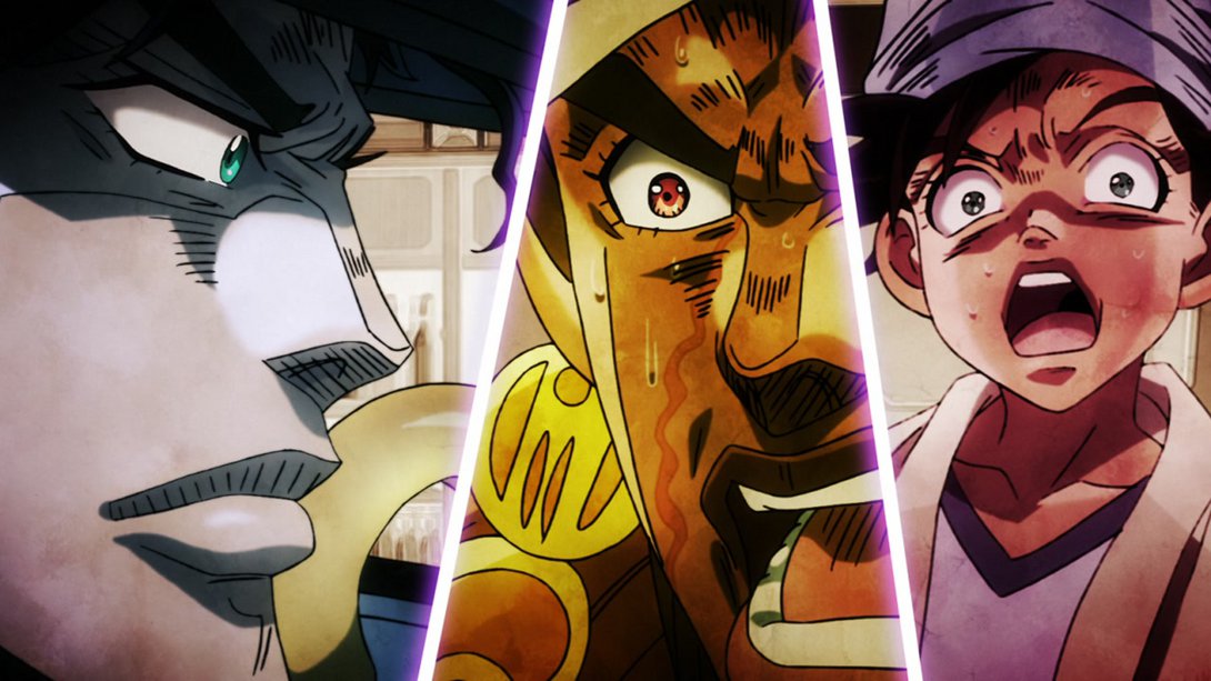
- Later in the same scene Avdol, the kid and Jotaro’s portraits also show up. The timing with which they pop up has been slightly tweaked; more interestingly, however, they were portrayed with the same rough, sketch-like style that had been used for D’Arby. This has been changed for the BDs, and the dividing lines also look slightly different. Check it out:
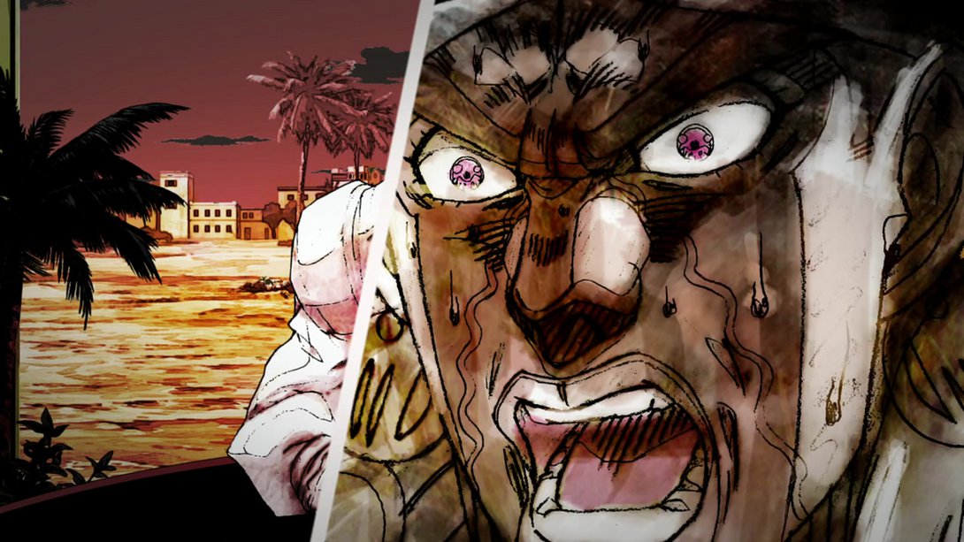
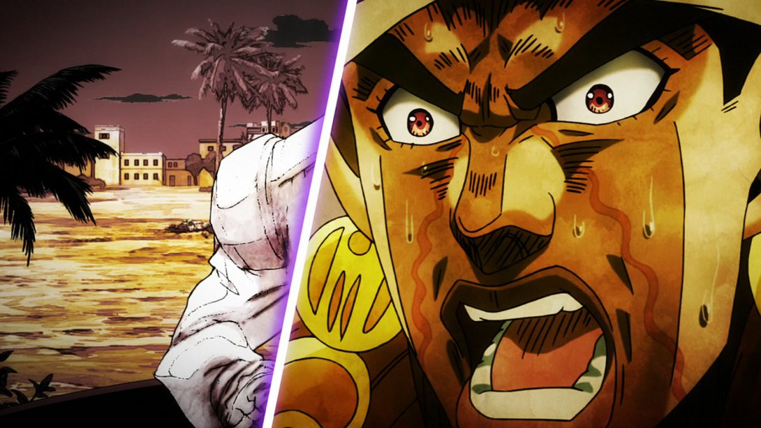
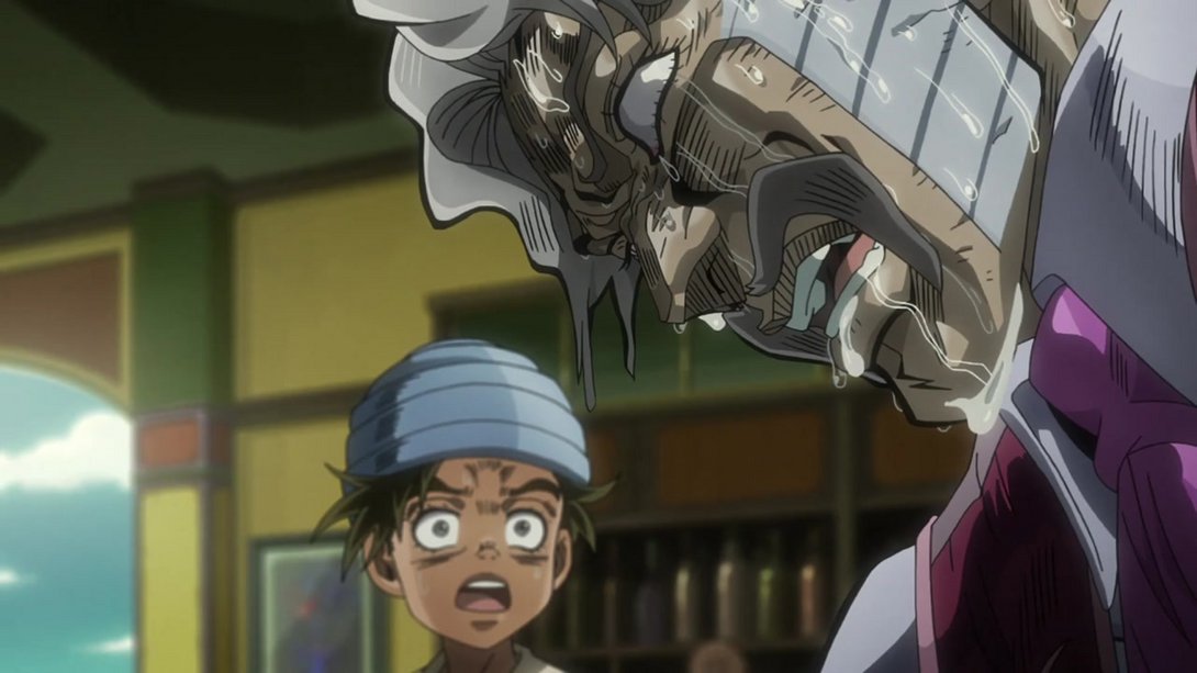
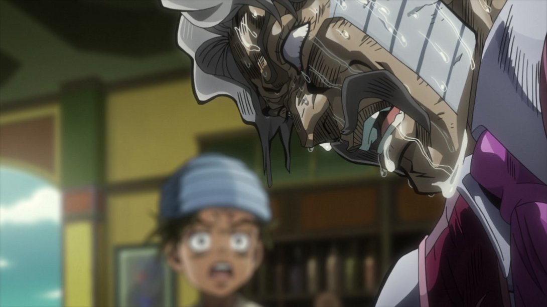
- Here the general shading has been tweaked, and the focus of the virtual camera is more dynamic, making for a much more interesting shot, in my opinion! As you can see, at the beginning of the shot the background is blurrier, while at the end it’s the opposite. Check it out:
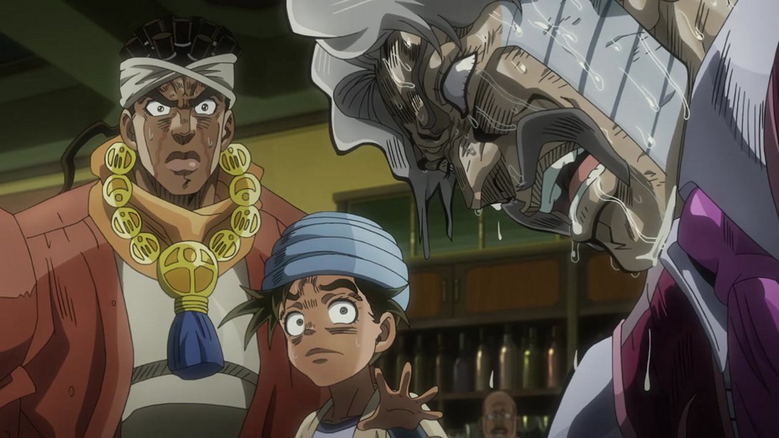
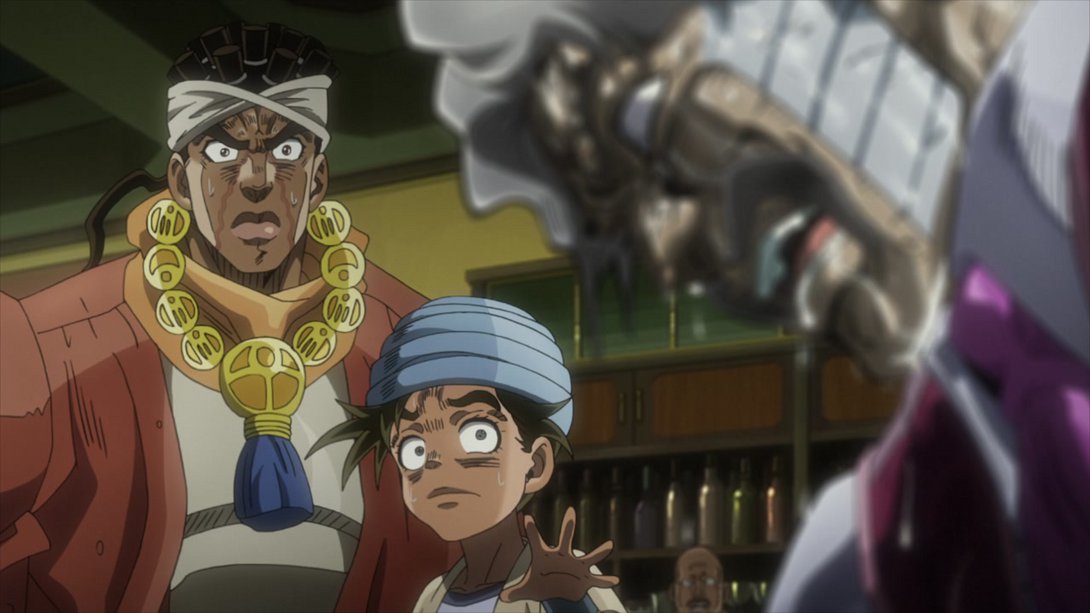
- Aaand of course, here we have a completely different shot:
- In this scene, both spirits have a sort of “aura” all around, and the scene is generally slightly blurrier:
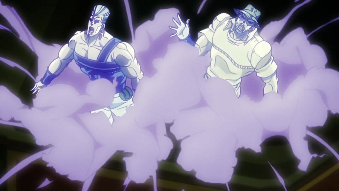
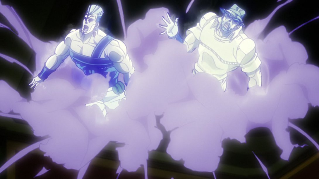
- The scene of the two spirits going back to their bodies has been, of course, animated…:
- …and, in addition, both Joseph and Polnareff have been retouched and slightly moved:
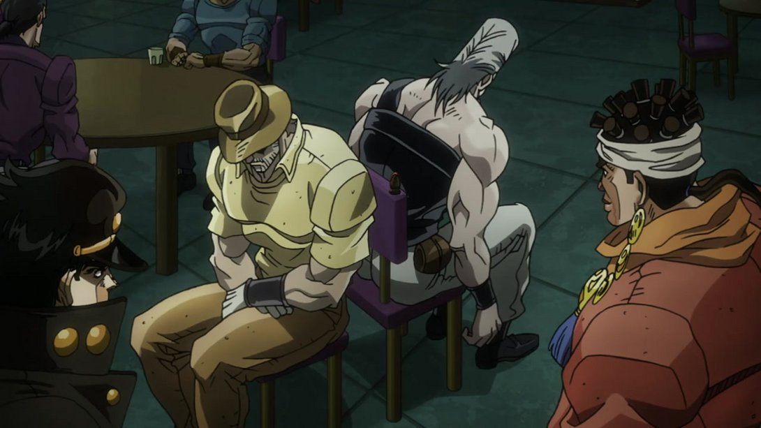
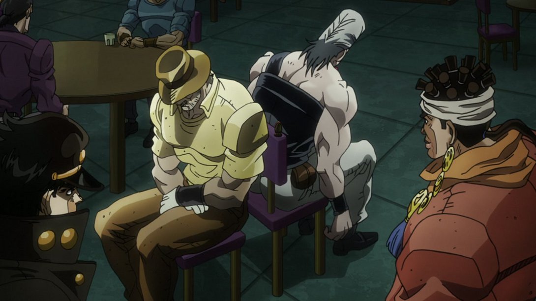
- Here, the background is brighter, the dividing line is sliiightly greener, and the shading on Polnareff has also been tweaked:
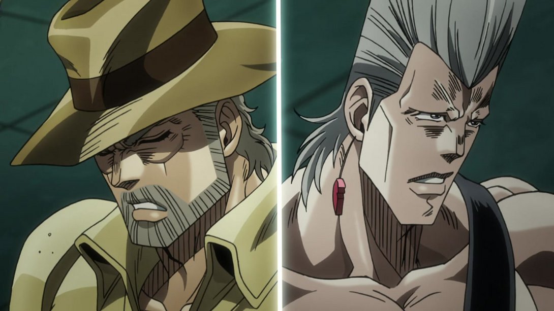
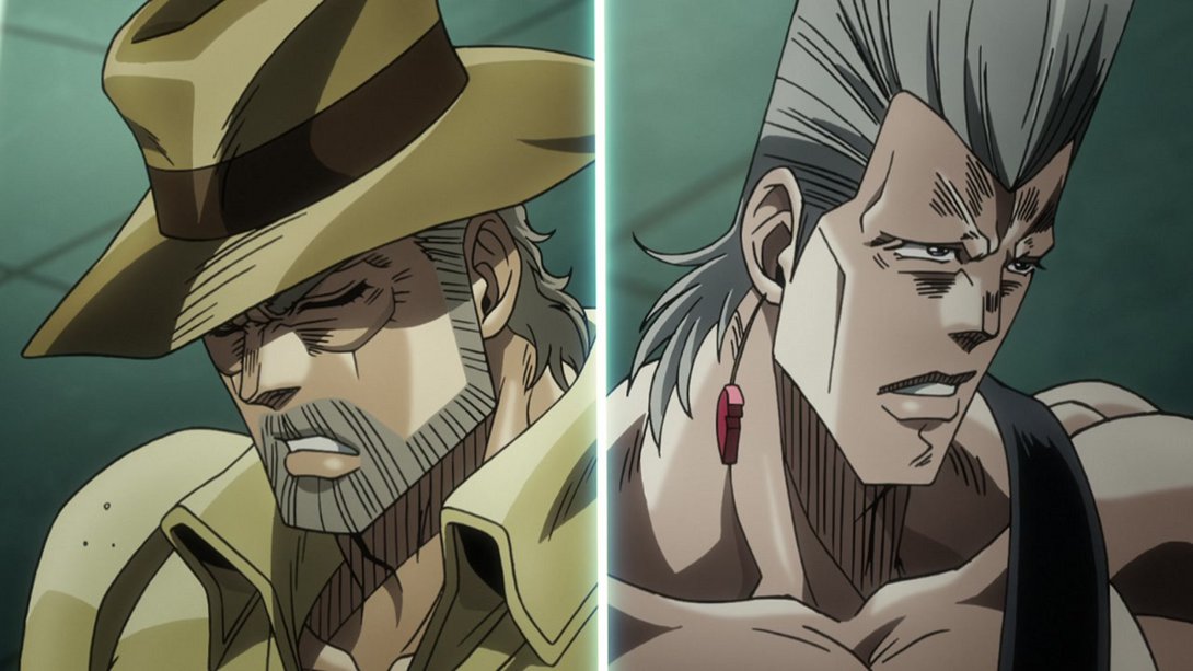
- This shot has two less cards stuck on the table…:
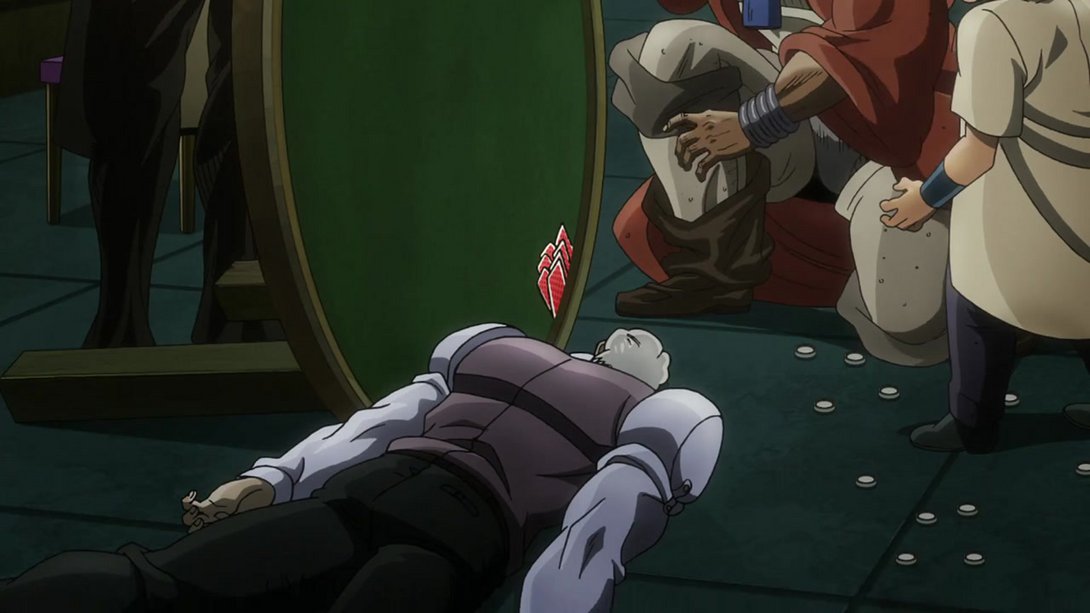

- Once again, the tip of Jotaro’s cute lil nosie has been recoloured, here:
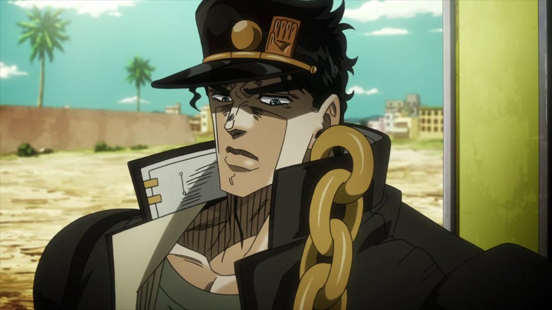
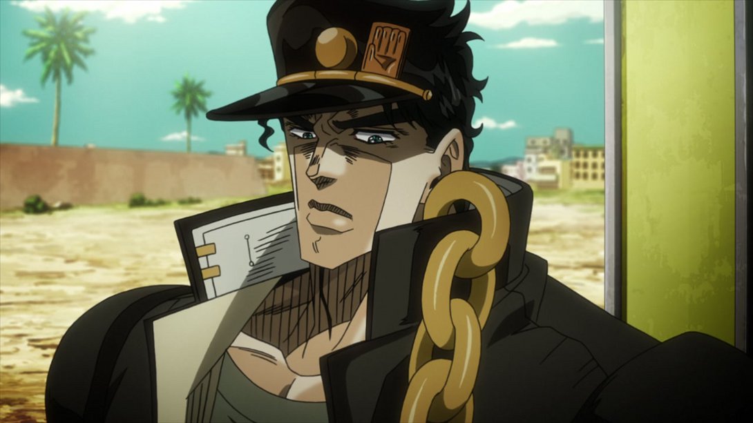
- And here, on top of a slightly tweaked mouthflap, the camera slowly zooms out as well:
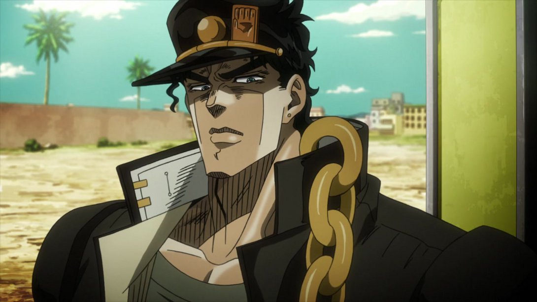

- Just… everything:
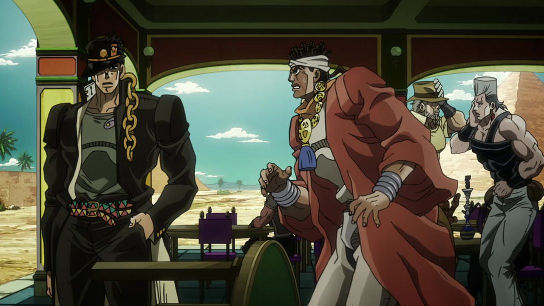
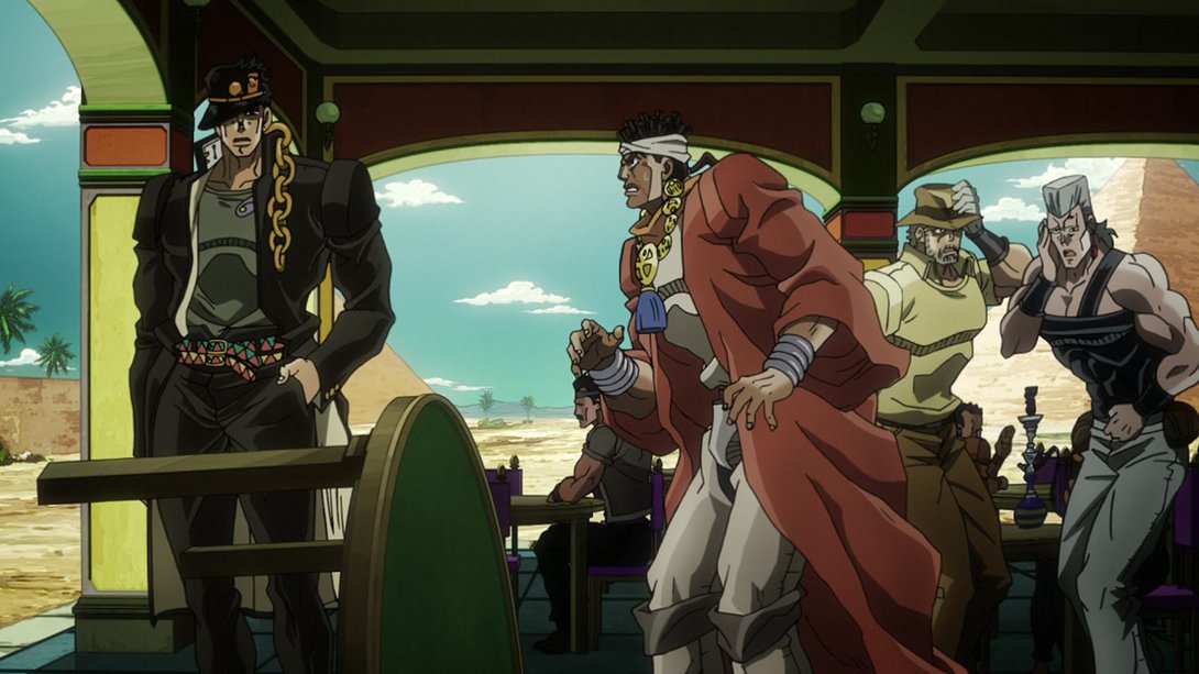
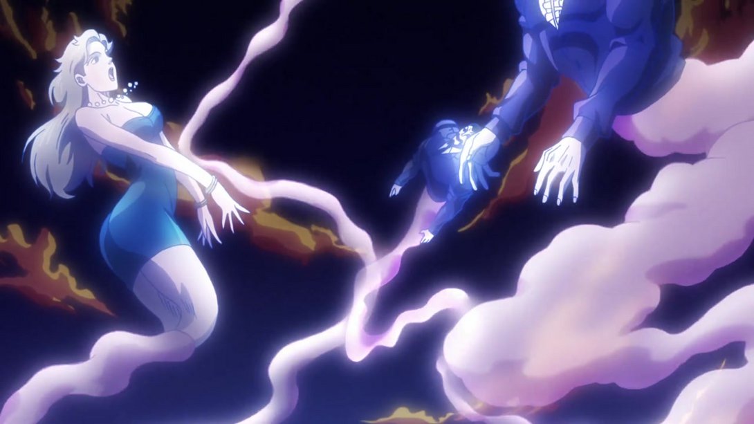
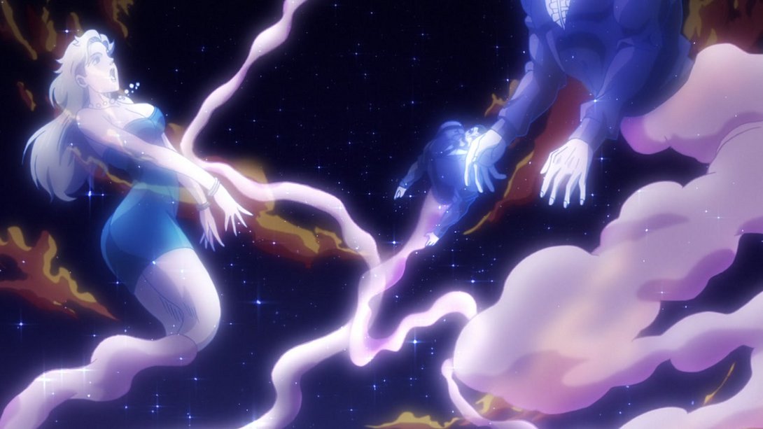
- This final shot is slightly more animated, and the sky is filled with some sort of glittery stardust sort of effect! Check it out:
- Taking a look at a couple of details, you can see that most things are slightly blurrier, and the lady on the left is also much more transparent:
Pheeew! And that concludes this humongous beast of a comparison, friends! What a ride, huh? This one officially takes the cake as the highest number of videos in a single comparison so far (a whopping sixty-two, a huge step up compared to Vento Aureo #18’s fourty-two), but it’s not the longest overall (the title still goes to Diamond is Unbreakable #27!). Either way, it was a blast to compile and I had a lot of fun seeing exactly how they improved on the episode. The end result is, in my opinion, just excellent! I hope you had a good time reading through, fellas, and I’ll see you all next time for a hopefully easier comparison - Episode #36, “Hol Horse and Boingo - Part 1”!
Ciao!

