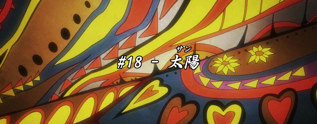
Welcome back to the next leg of our bizarre world tour, fellas! Next stop… Egypt! Or, well, almost Egypt. Today we’re going to take a brief look at Stardust Crusaders #18, “The Sun”!
Well then, without further ado…
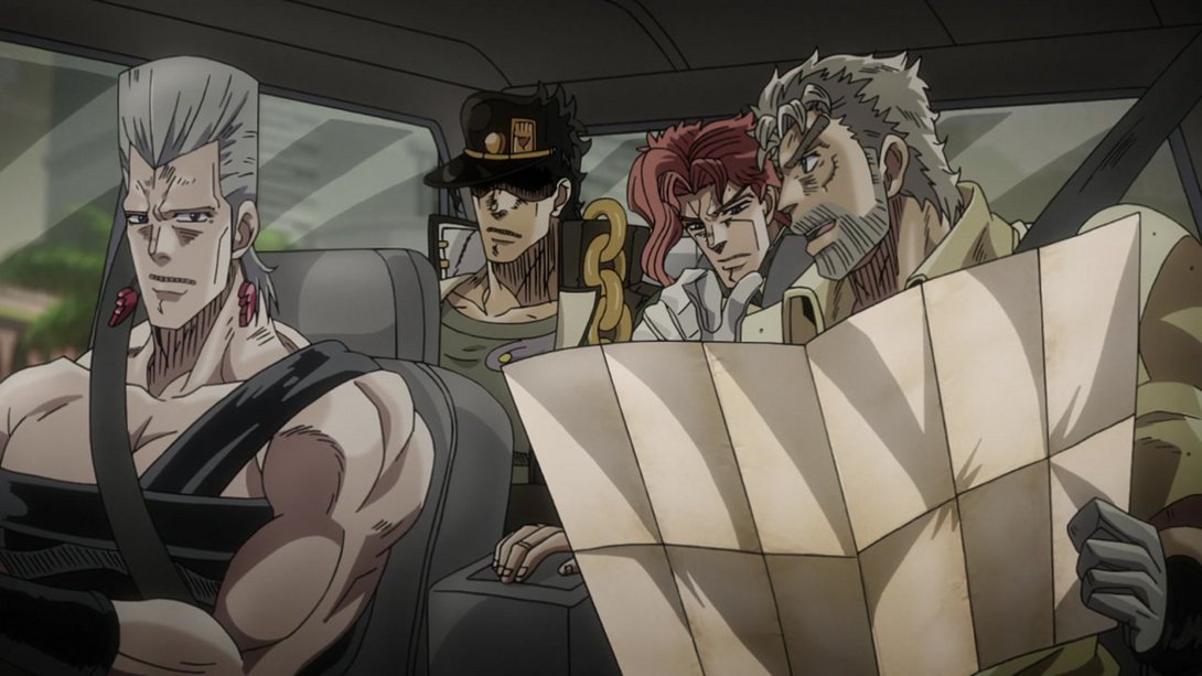
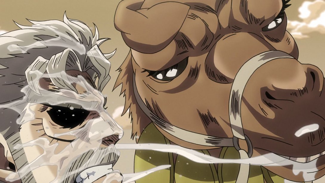
- Let’s start with a couple of minor differences! Here, the shadows under Polnareff and Joseph’s noses are darker, and Polnareff is no longer staring directly into your soul:



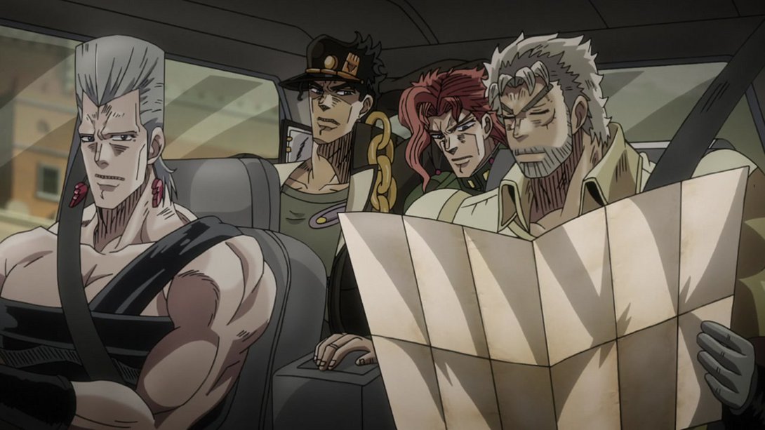
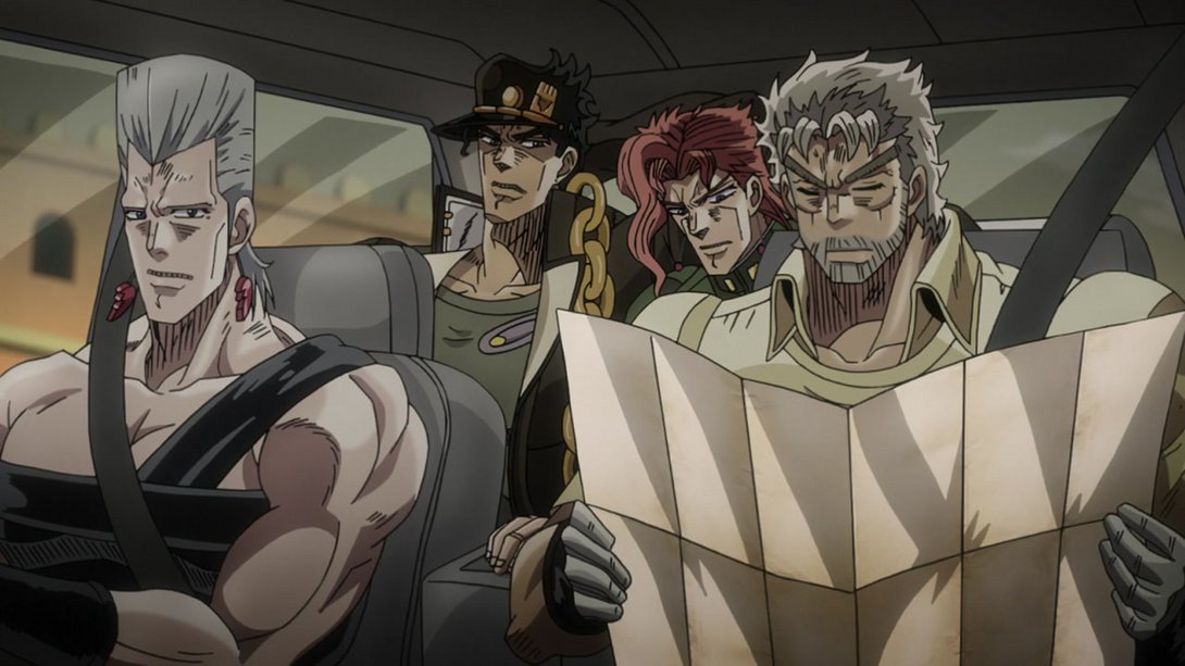
- And here, in addition to the same differences, Joseph’s face has also been (thankfully) retouched:



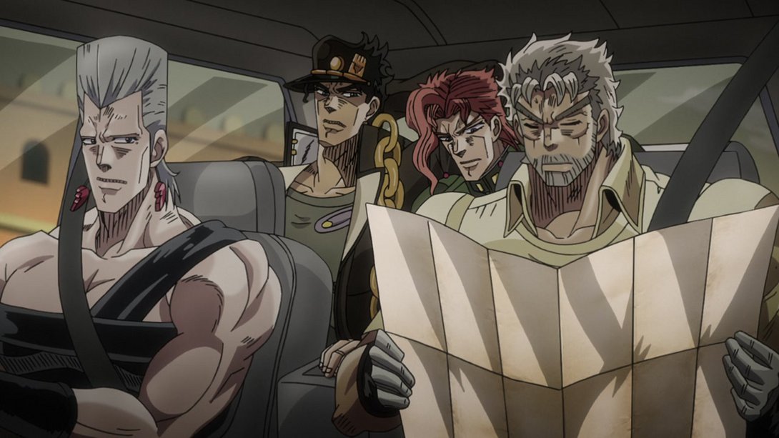
- This brief animation no longer becomes dim towards the end…:
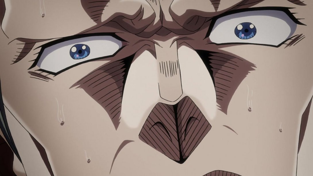
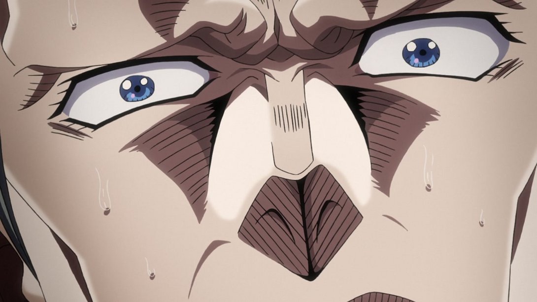
- The first few frames of this cursed animation are darker, while the rest are brighter:
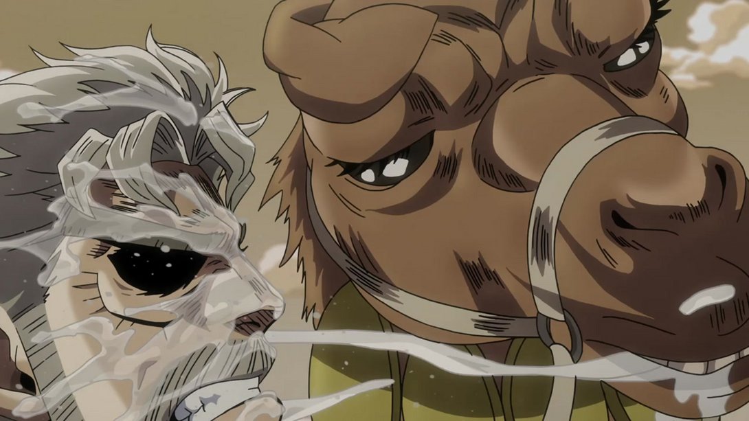
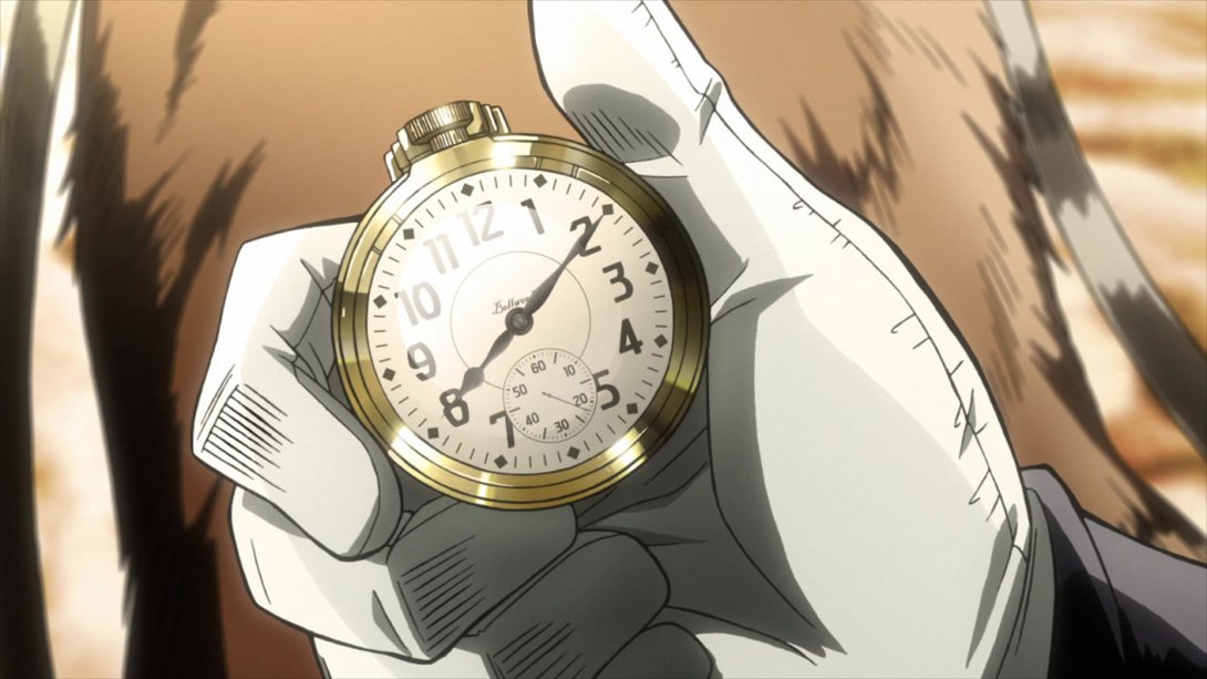
- Here we have this episode’s only substantial difference! In this scene, the top of the clock has been obviously altered, the clock itself has a couple more highlights, the little squares around the edge of the clock face are looking a little more textured and the general lighting is brighter:
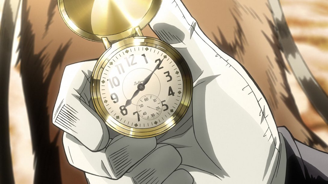
- The following two animations have a better contrast:
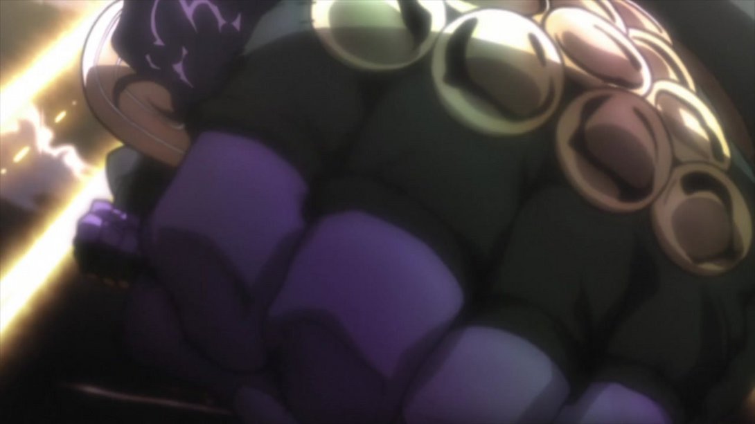

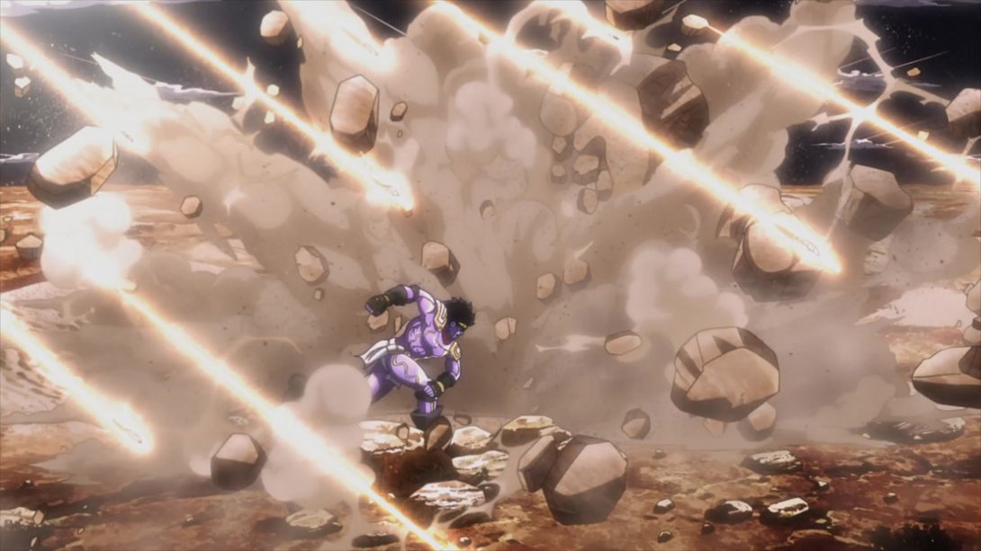
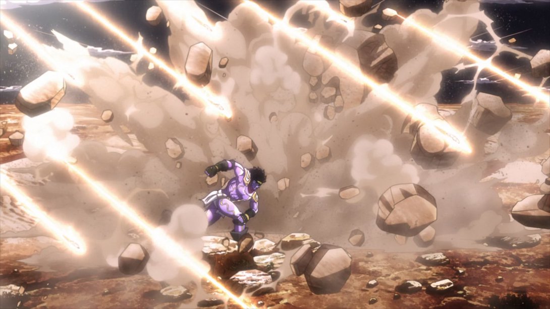
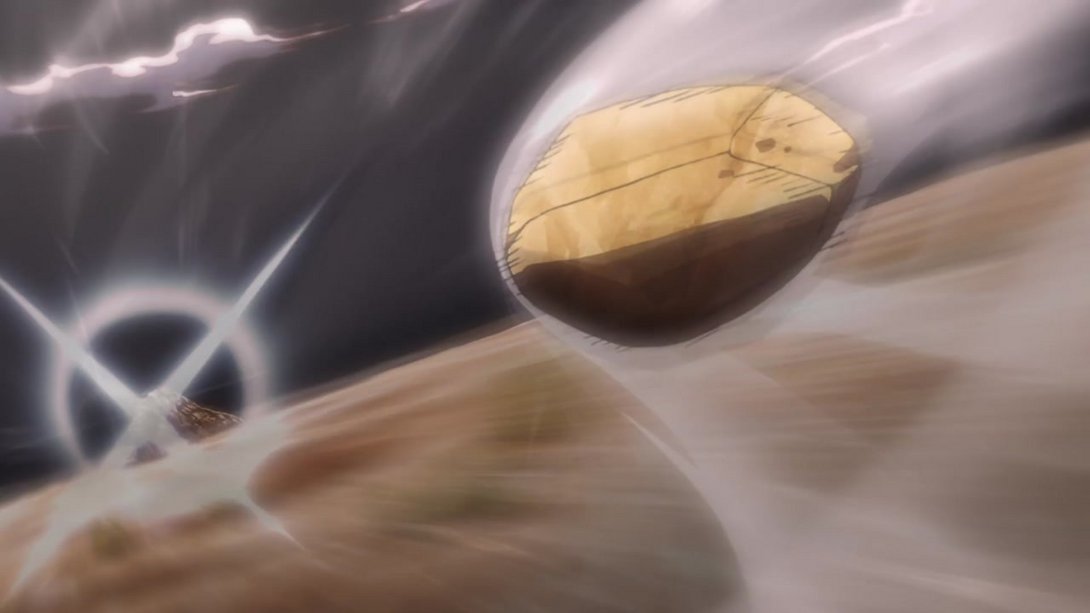
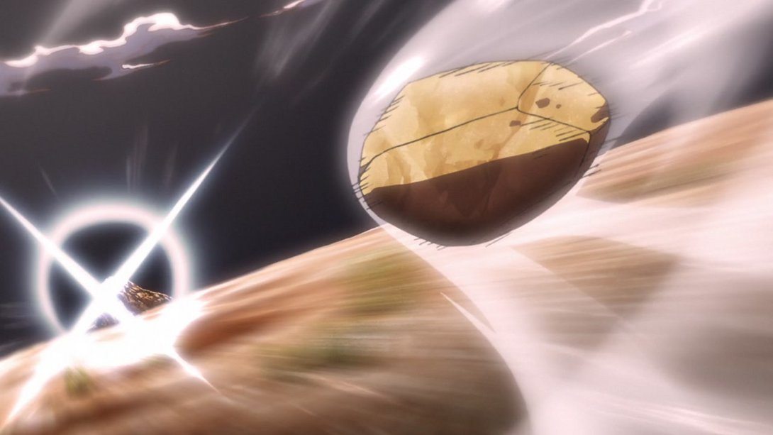
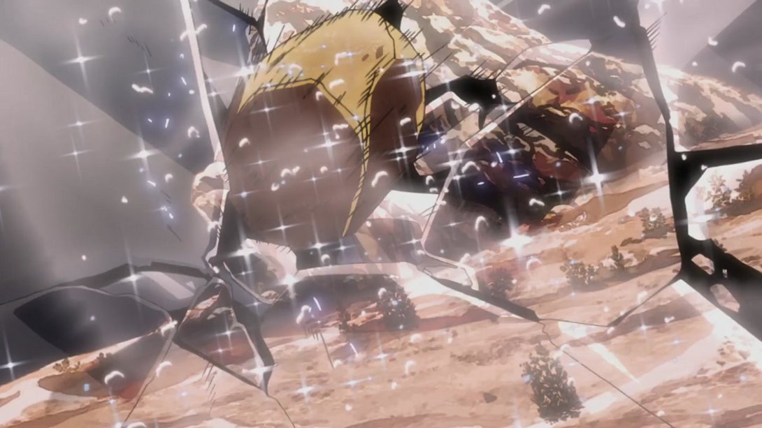
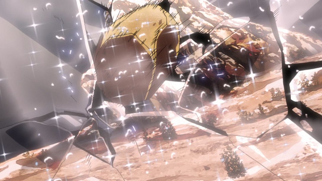
- This last animation, instead, is brighter and sharper (towards the end):
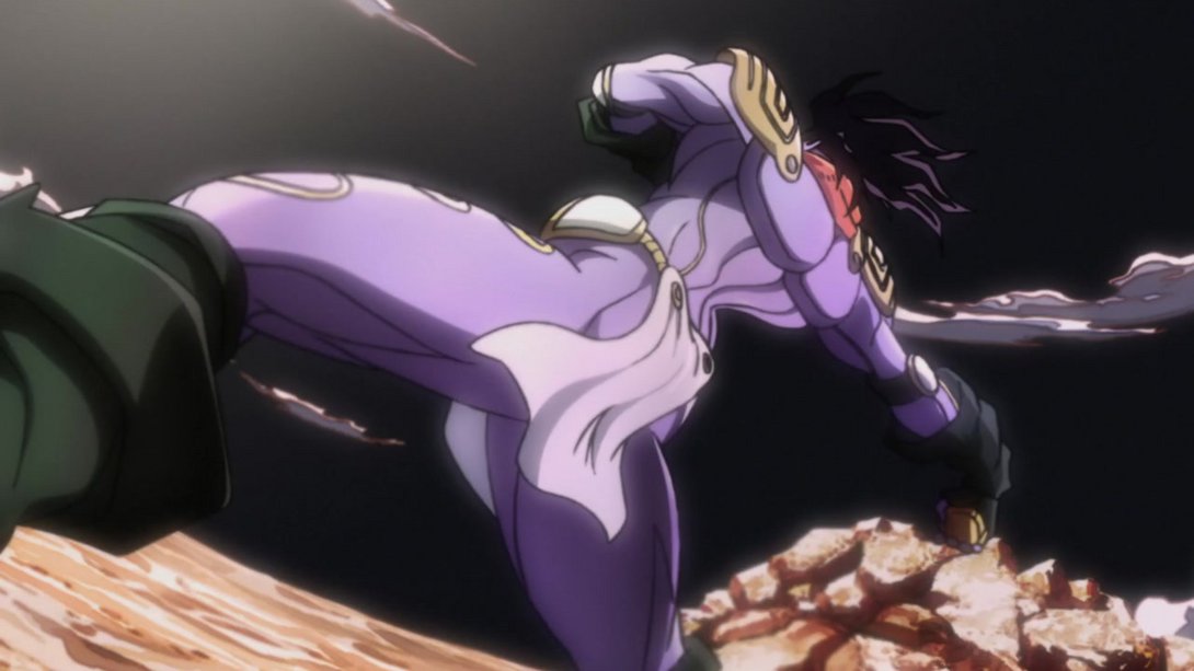
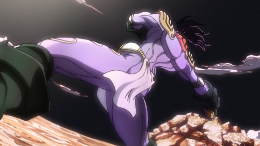
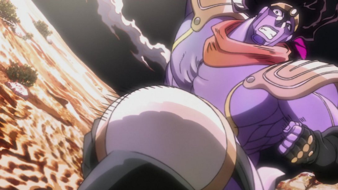
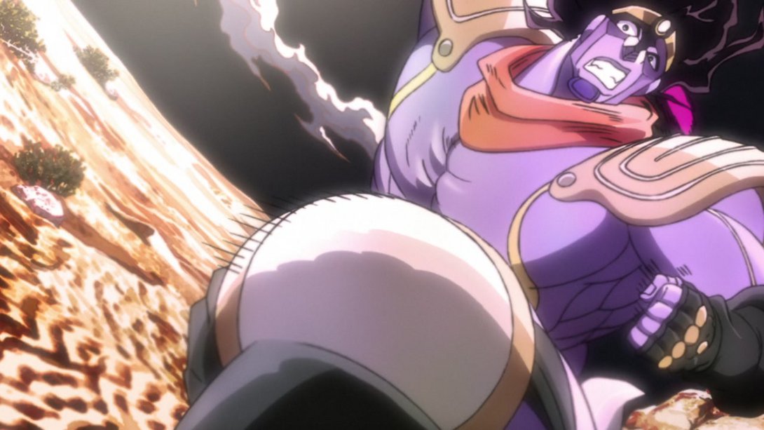
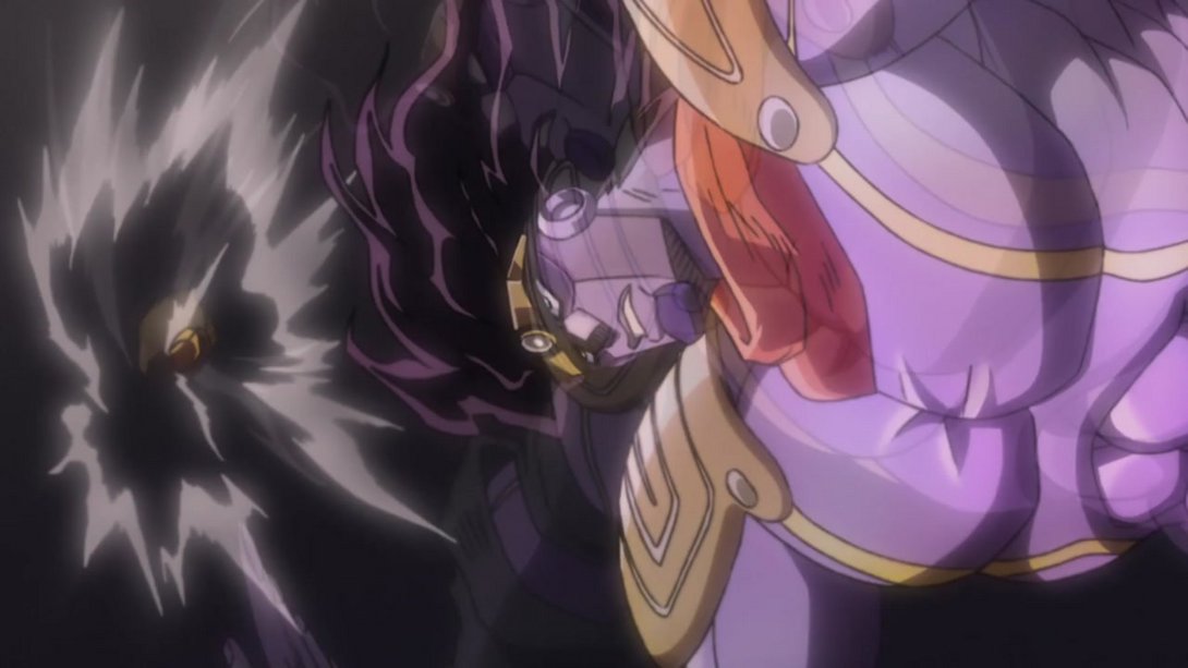
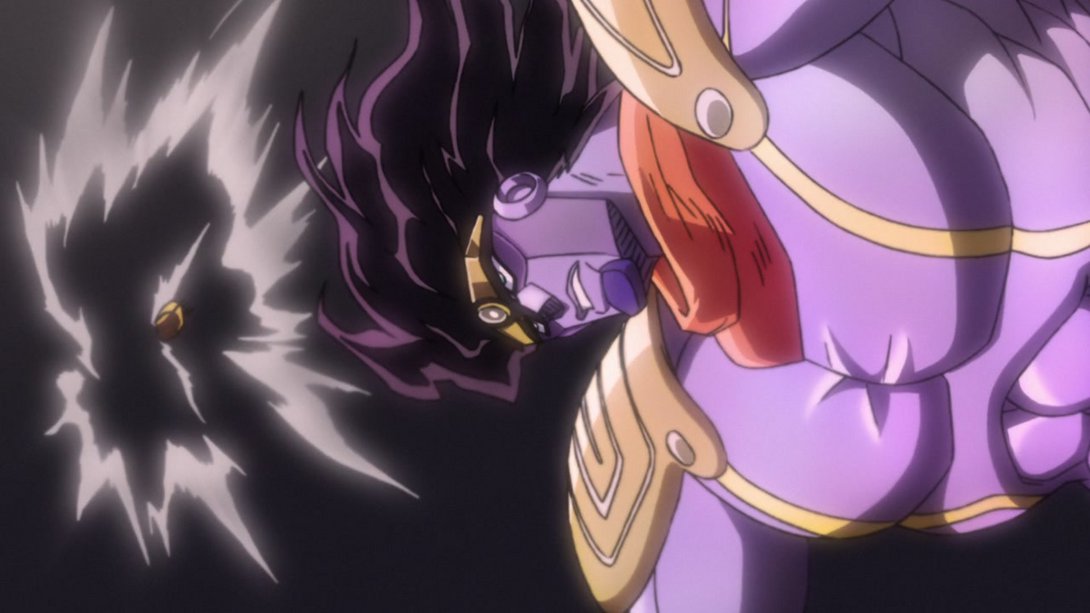
And that concludes this very brief comparison, I’m afraid! I’m honestly not surprised, though. The production in this specific episode felt pretty high, even in the TV version! Anyhow, that’s done, and on we go - I’ll meet you next week for Stardust Crusaders #19, “Death 13 - Part 1”!
Egypt is getting closer and closer!

