Hello, everyone! Welcome back for another Diamond is Unbreakable comparison. Today we’ll take a look at Episode #14, “Let’s Go Hang Out at the Mangaka’s House - Part 1”, or “The Episode with The Longest Title in JoJo History - Part 1”! Let’s get right into it.
- The first comparison for today concerns the その1 (“Part 1”) in the title, which is a little more spaced and moved to the right in the BDs:

- In this shot here, Hazamada was missing his bottom belt. This has been fixed in the BDs:
- In a bunch of TV frames, there is a red dot approximately in the top right corner, which moves together with Rohan; this was probably a remnant of the animation process, or simply a mistake. Anyway, this has been removed in the BDs:

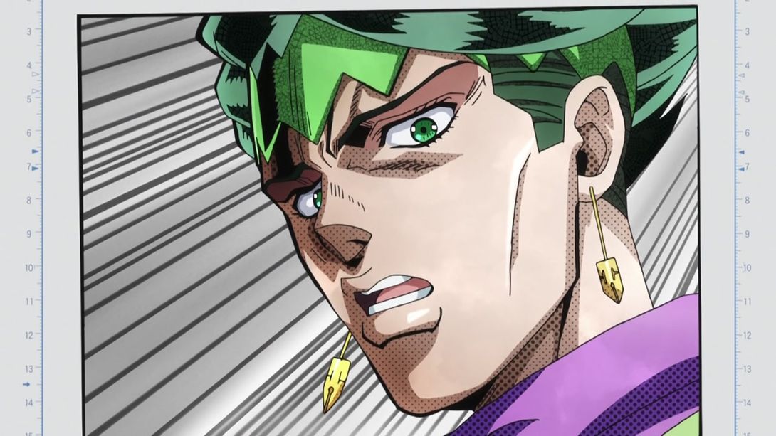
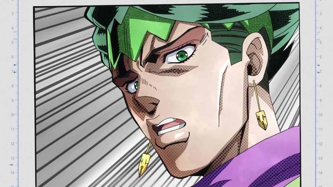
- Alright, this might get the prize for “tiniest difference ever”, but if you look very closely, in this (gorgeous) shot of Rohan, the shading on his headband is veeeeery slightly different above his left eyebrow. It’s a few pixels big, but hey… That’s my job, you know:
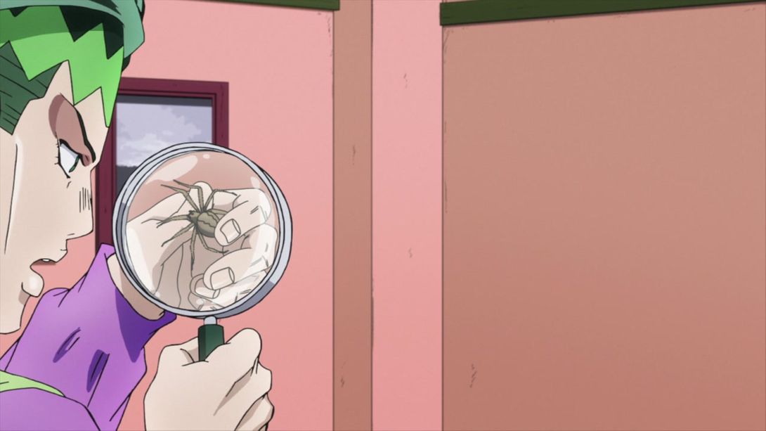
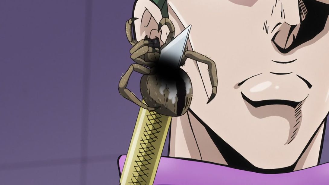
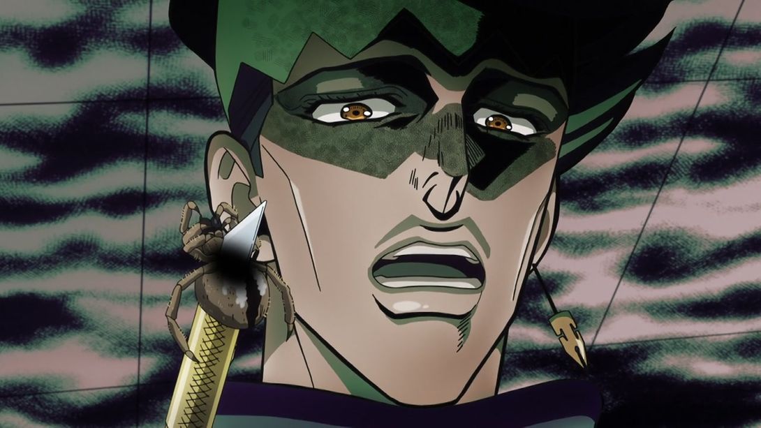
- The spider has a smaller white… Thing? I don’t know what that is, but here you go:
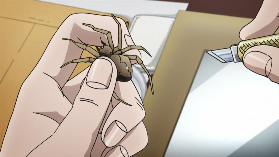

- Here we have some uncensored spider guts:
- And here, BD Hazamada and Koichi shake slightly less:
- Have some more uncensored spider:

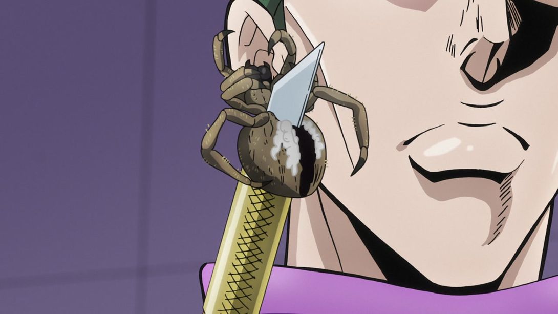
- And again here; the yellow part of the cutter is also shaded slightly differently:
- Same as the last one here, plus a slightly lighter overlay texture on top of Rohan:
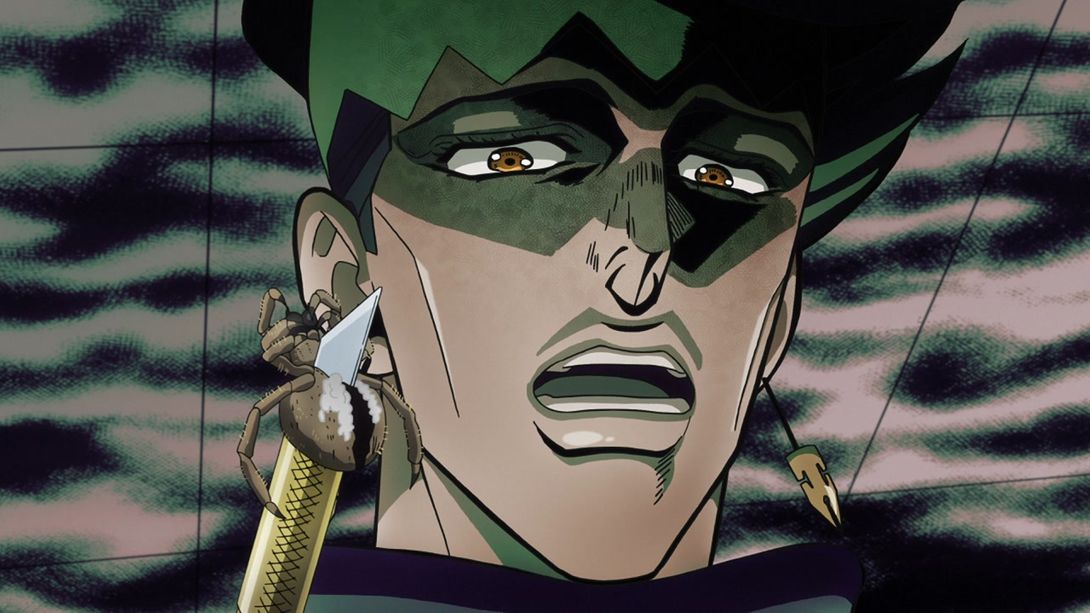
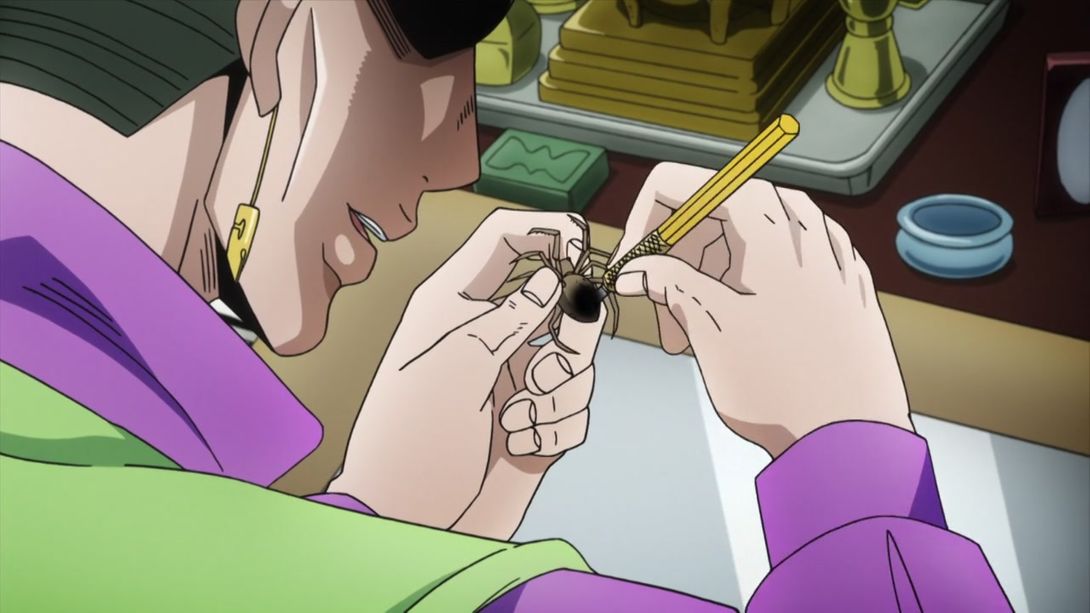
- Come on and lick that uncensored spider already:
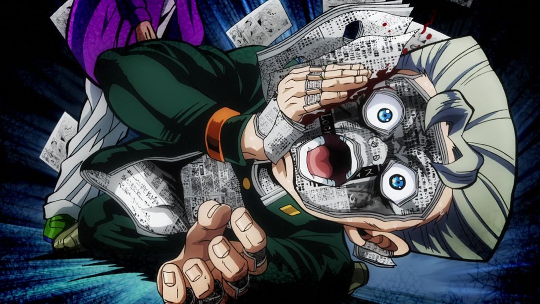
- In this very brief video, Rohan has been given a different mouth flap and the screen shakes around in a slightly different manner:
- Here, they drew the missing chest pockets on Rohan’s coat thingie, and his jaw has also been retouched:

- Rohan’s chest pockets again:

- In a couple of TV frames, Rohan’s left earring was not connected to his ear. You can guess that they fixed that in the BDs:

- In this comparison there are three differences: the trash bin on the left of the table, the… How do you call that bit of decoration that goes under the tables? Anyway, that, and Rohan’s shadow:
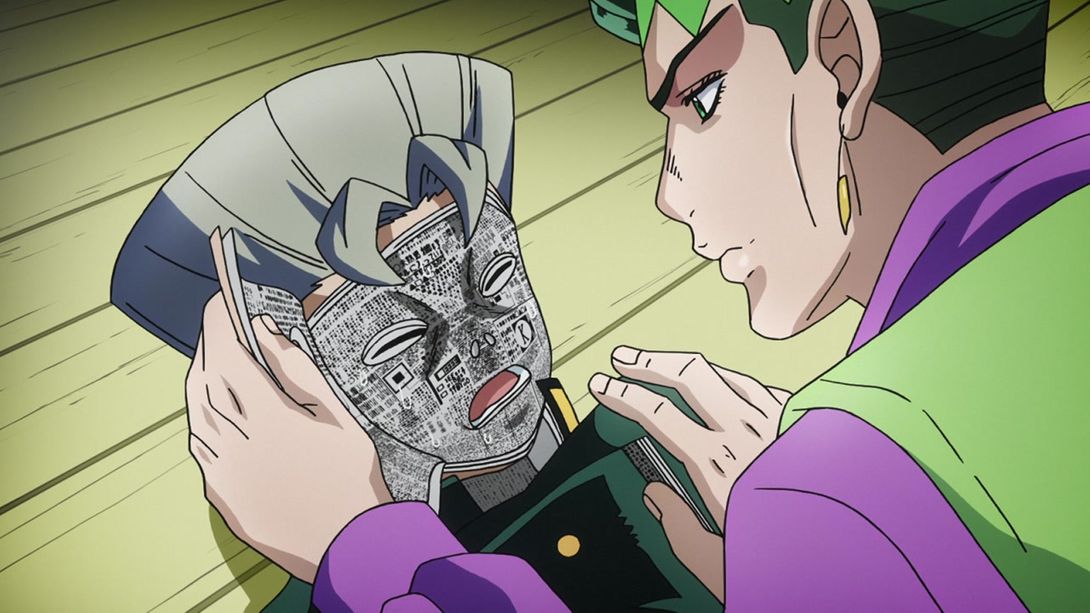
- The hole in Koichi’s chest is shaped differently here:

- And for the final frames of this scene, Rohan has a different mouth flap:
- The shading on Koichi’s eye is darker here:
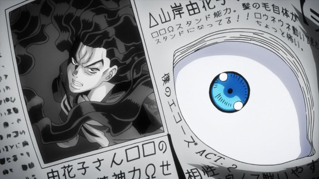
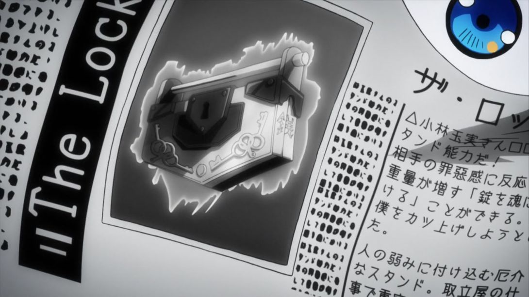
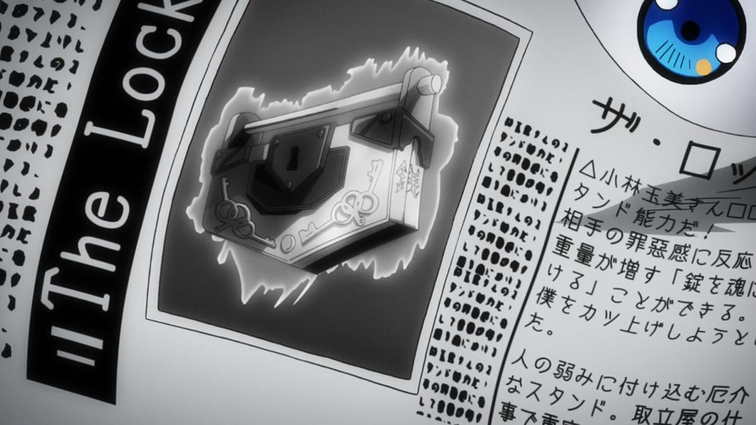
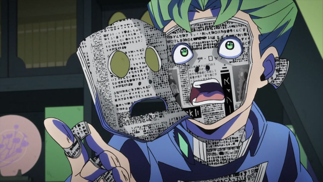
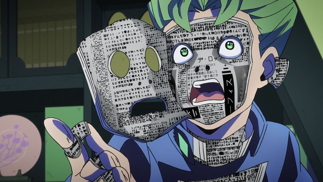
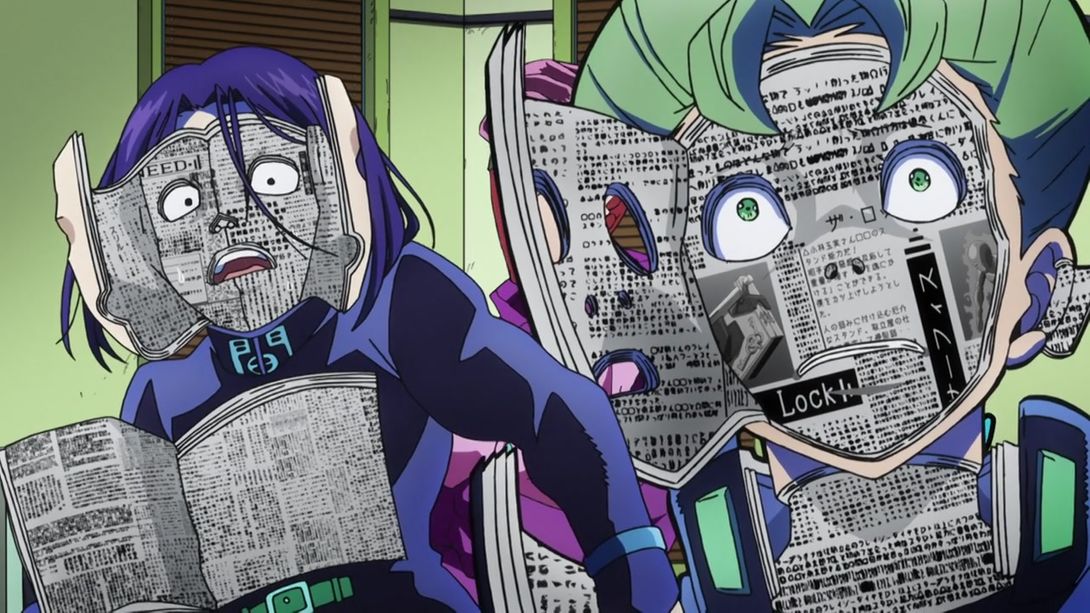
- And again here; plus, the column in the middle of his face-book (I swear to god this was not an intentional pun) is darker. As a kind anon pointed out, a character in the book itself has also been corrected: it is the last one of 小林玉実 (Kobayashi Tamami)’s name, which was spelled incorrectly as 小林玉美. Funnily enough, that last character (美) means “beautiful, pretty”, and can usually be found in female names:
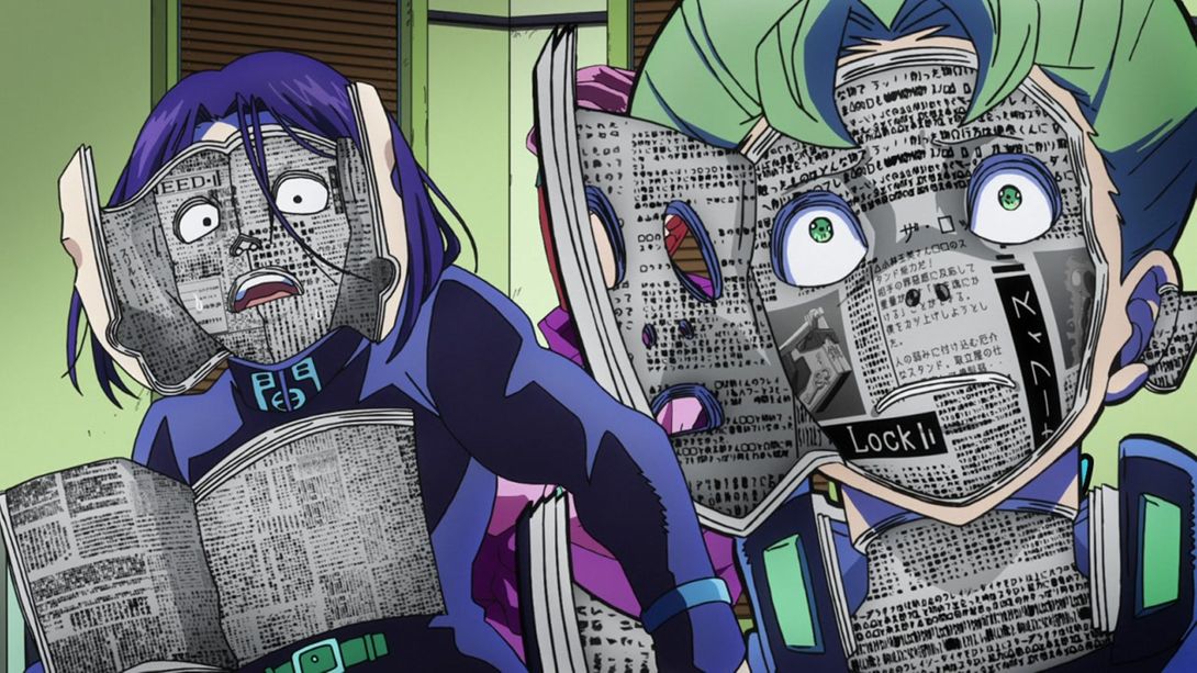
- All the shadows on Koichi’s Heaven’s Door books are darker here, and the book texture on his face (better now?) has been shifted down by a couple of pixels:
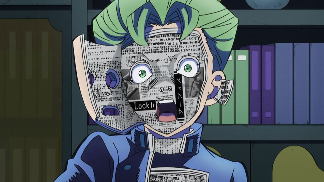
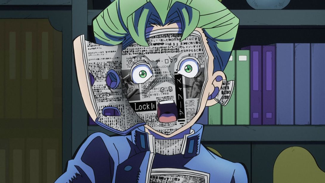
- In a bunch of scenes where Koichi is not shot straight from the front, the texture of the book on his face has been slightly warped and shaded better, to make it look less flat:
- Here, the BDs added a tiny book on Koichi’s ear:
- Here we have a shining example of the usual “sharper and brighter” business:
- Once again here, we have a warped book texture on Koichi’s face; all the remaining book textures have also been shaded better:
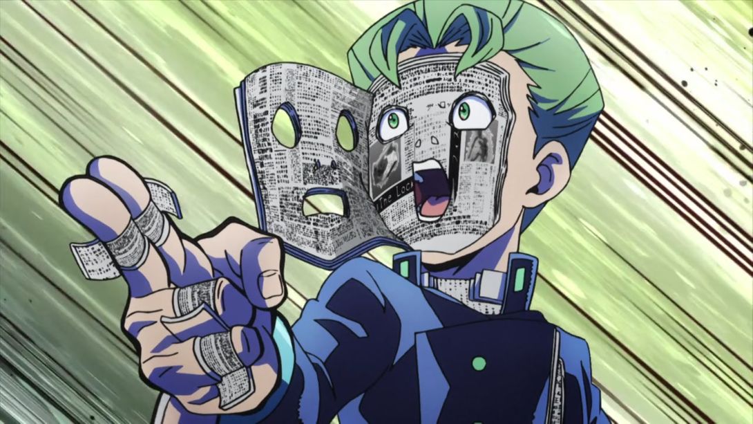
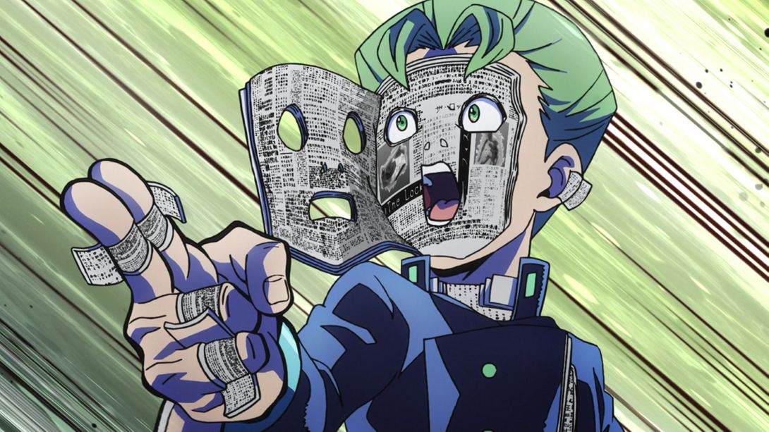
- Here, they added several tiny books on Koichi’s hands and fingers, and consequently shortened his uniform’s right sleeve:

- Here, the neck book’s missing texture has been drawn in:
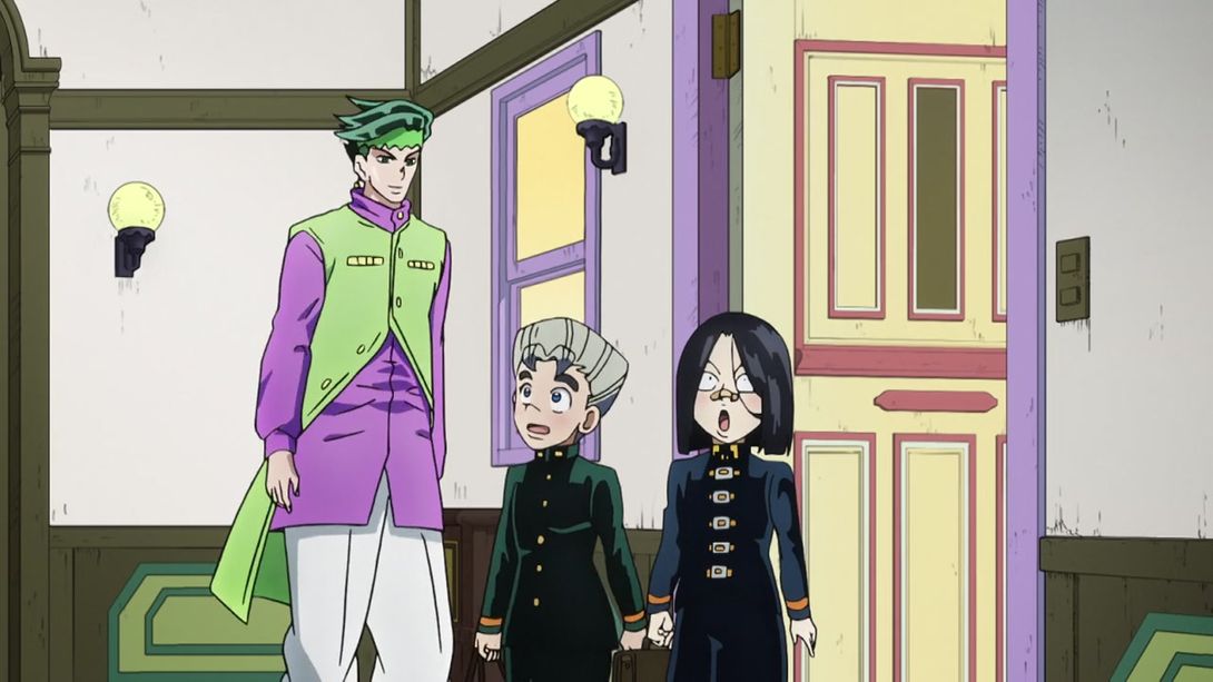
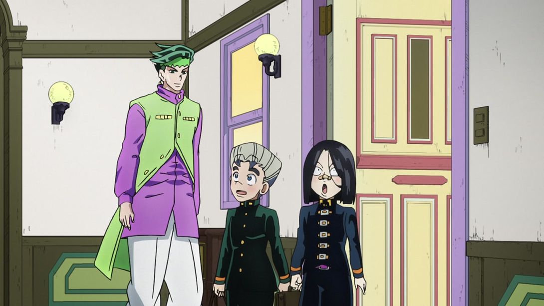
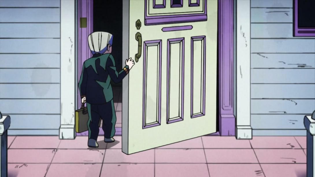
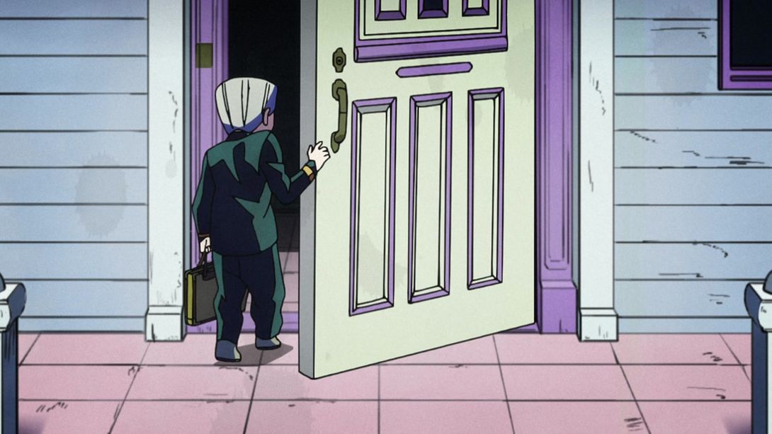
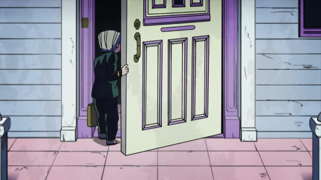
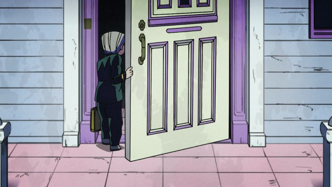
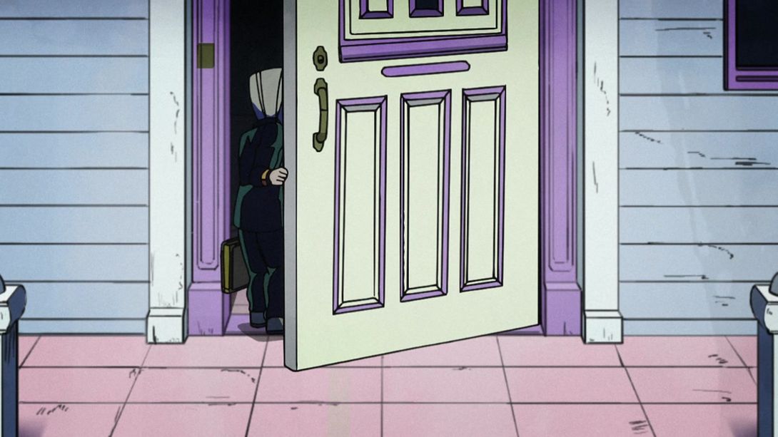
- In this scene of Koichi opening the door to Rohan’s house, there are a number of small differences. His bag is way more detailed, the door is now level with the right side, the arm bangle… thing on his right wrist is shaded differently, as he enters there is a piece of uniform which was missing the highlight and is now fixed, and some parts of the door have a brighter shading:

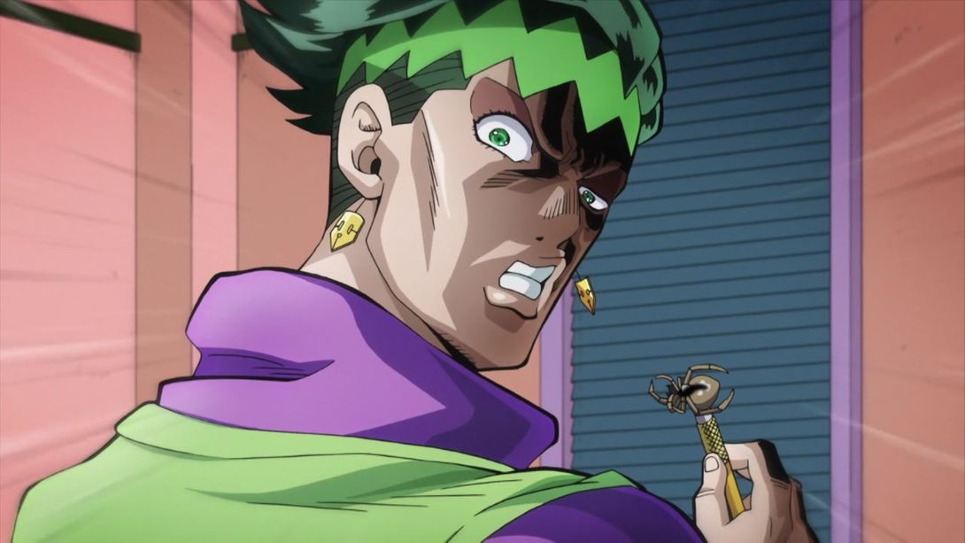
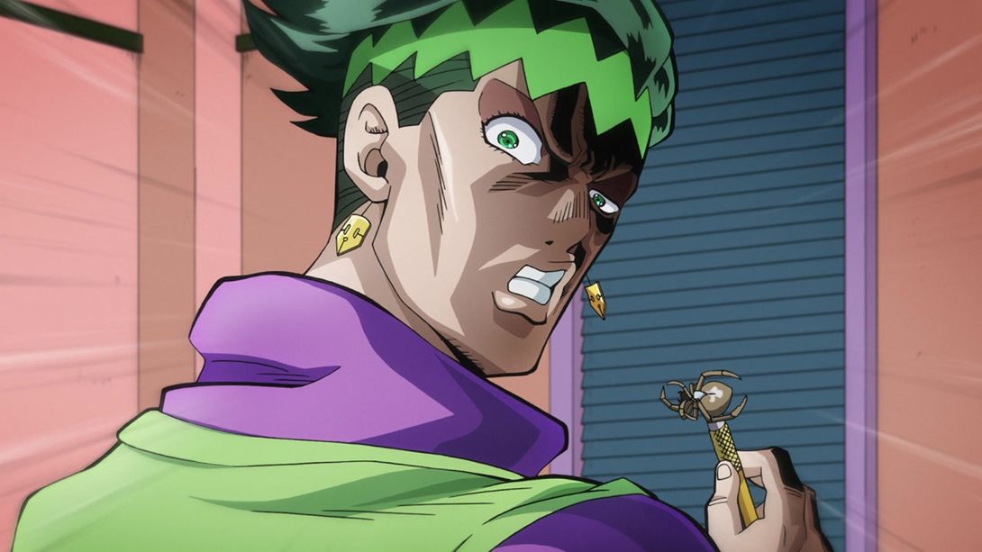
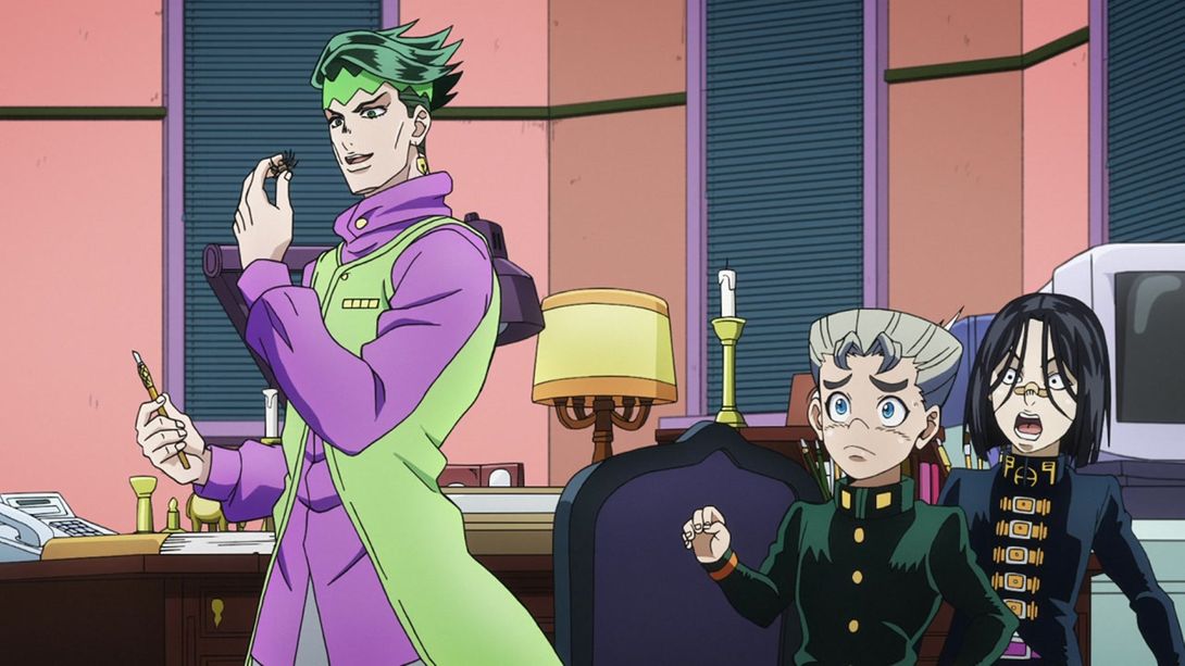
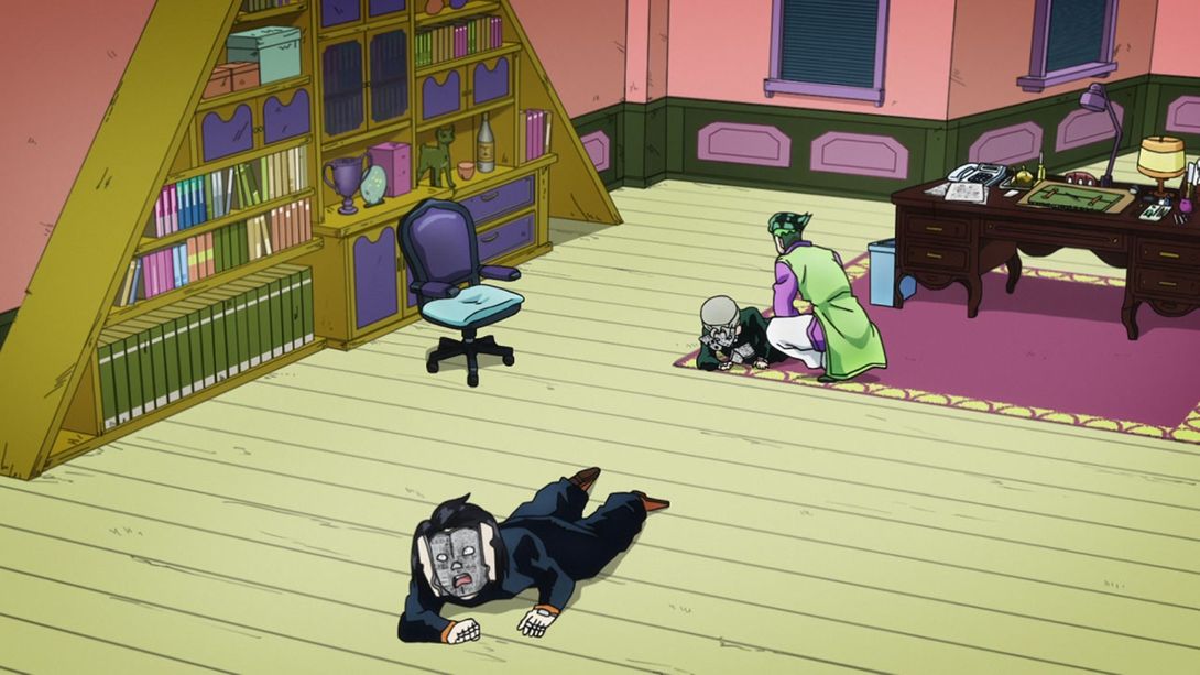
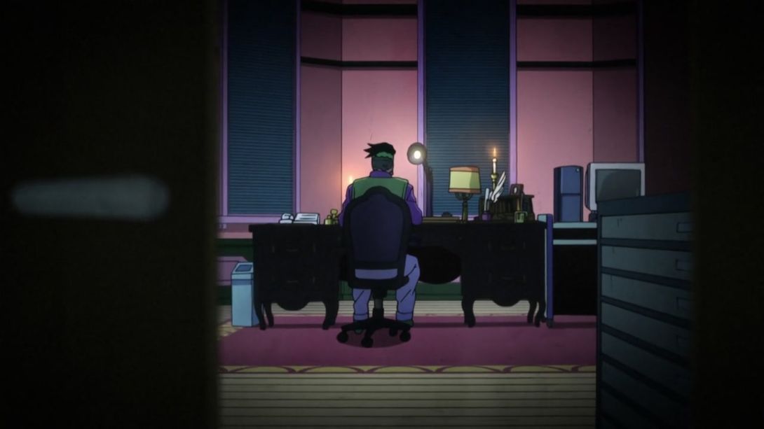
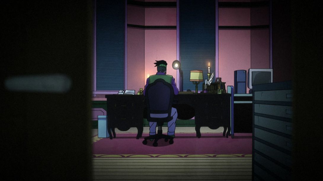
- And we close off this comparison with this shot of Rohan’s office! The thing on the right of his desk is slightly taller, and Rohan’s trash bin now complies with regular Earth perspective normatives:
And that’s it for Rohan’s first episode! I had to be honest, when I watched the TV version I noticed approximately 0% of these differences. I’m glad David Production is fixing even these very minor mistakes, though. This was a surprisingly long comparison for an episode which already looked gorgeous in the TV version! See you next time for “Let’s Go Punch a Mangaka to Death - Part 2”!
Bye!