Hello everybody, and welcome back for the second part of Red Hot Chili Pepper! Today we’ll take a look at a Dude Who Rocks Too Much and a familiar old man will pay us a visit. This is another very long comparison, so get a cup of tea, sit back and enjoy! Let’s go!
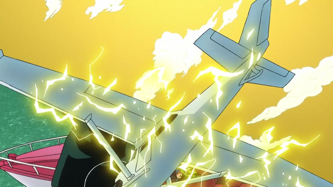
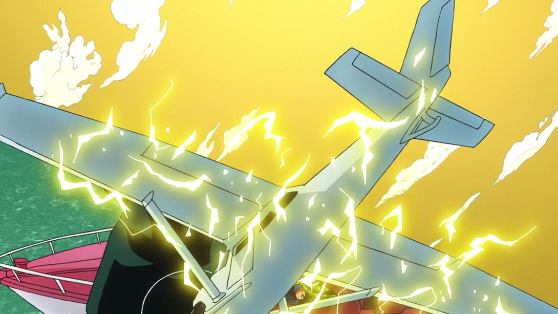
- Let’s start with a minor difference. In this transition, they changed the cloud pattern behind the plane:
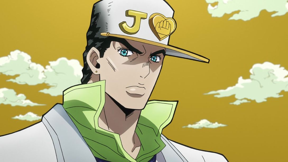
- Here, Jotaro’s neck has been darkened a bit:

- And here, as with episode one, they moved その2 (“Part 2”) slightly to the right; they also shaded… those things in the background (are they windows? Holes? We’ll never know):
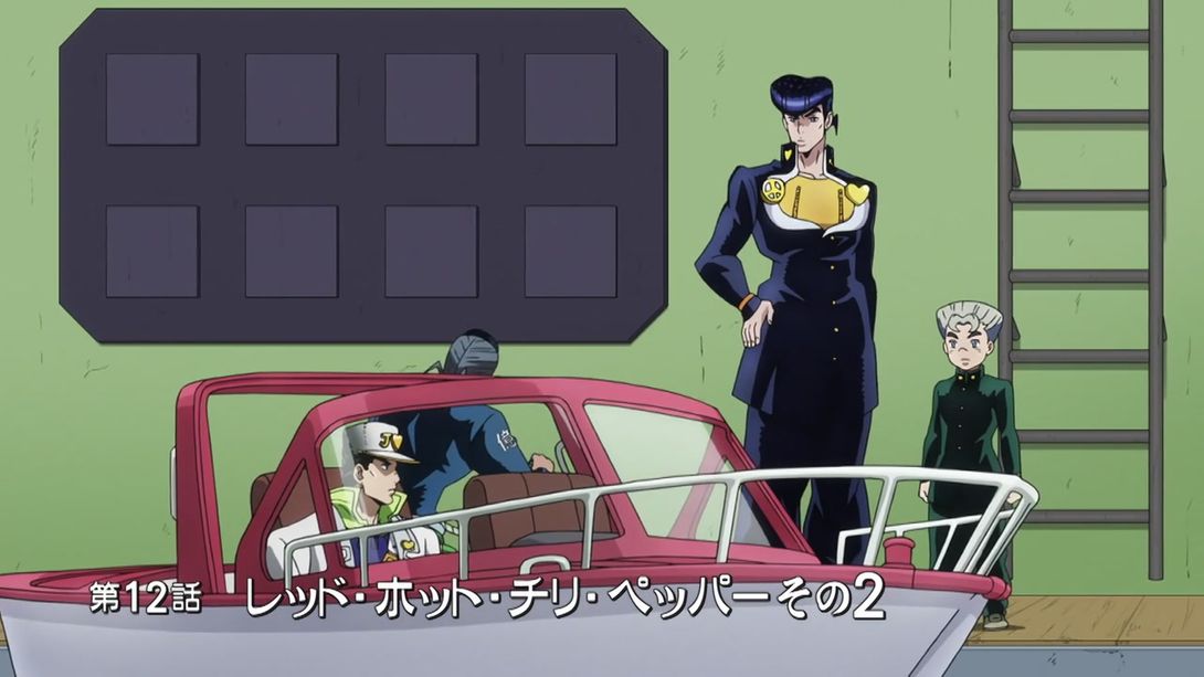
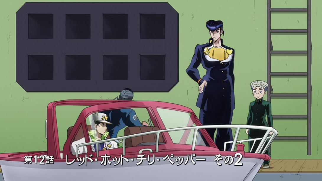
- Josuke and Koichi have been scaled down to a more reasonable size here:
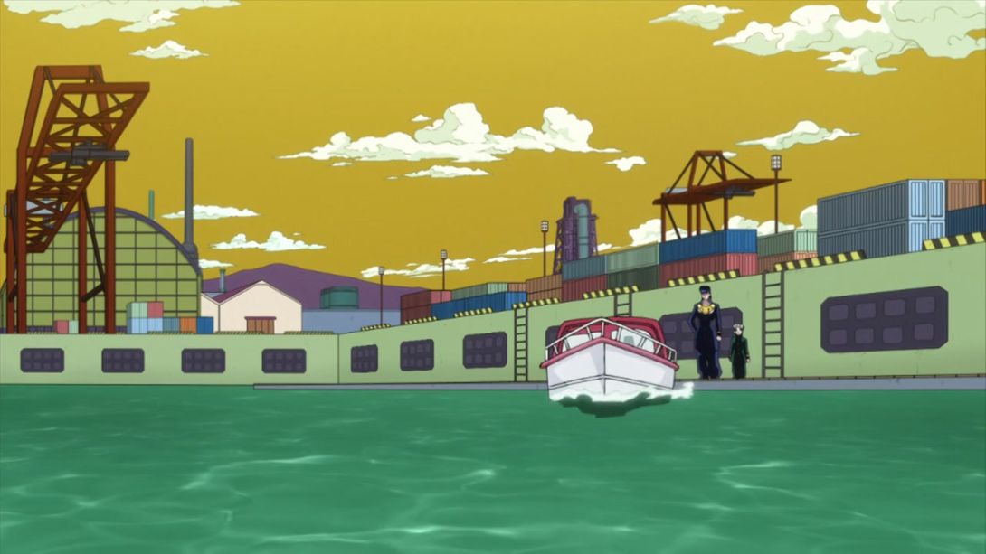
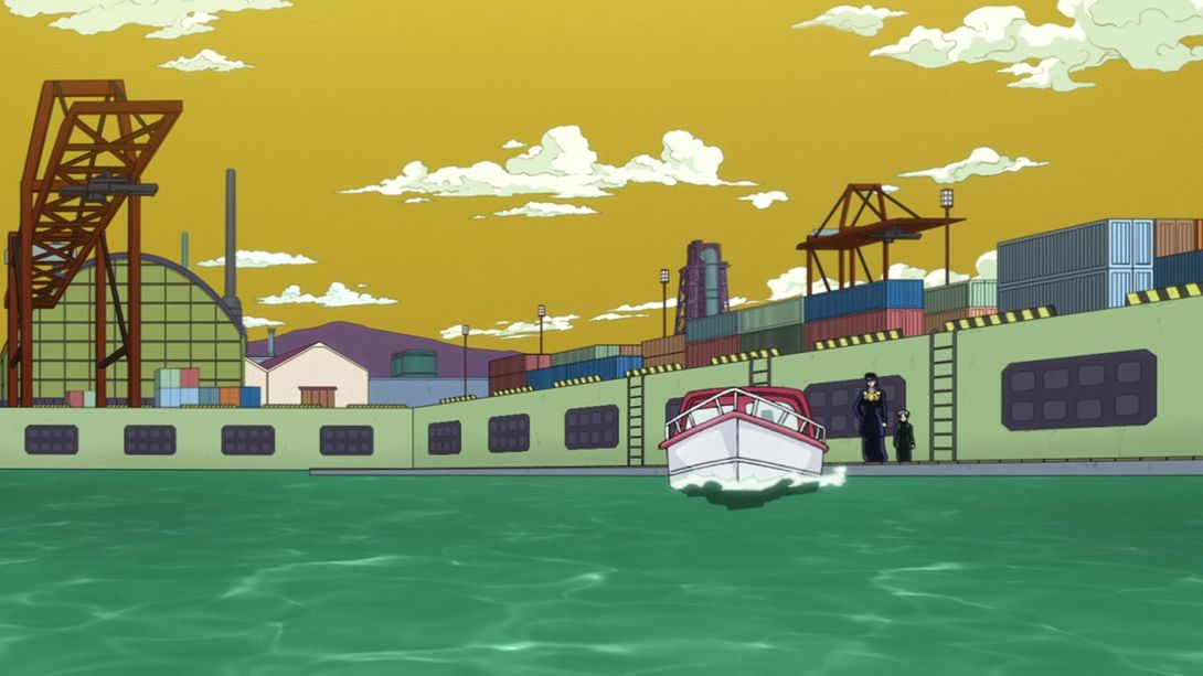
- Since this is a RHCP episode, you know there’s bound to be at least a couple of scenes which had been darkened for the TV version. This is one of them (the camera has also been moved slightly down):
- And this is another:
- Here, the BDs corrected a slight error that was present in the TV version (when moving Akira’s jaw, a couple of frames had parts of his cheek overlapping his hair and ear):
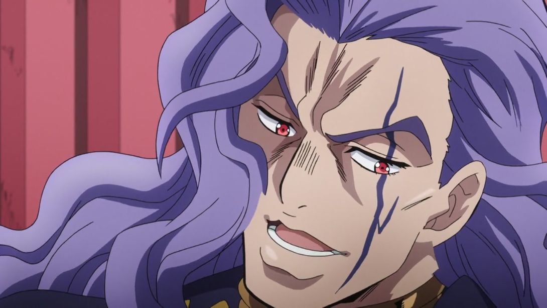

- In this animation of Akira Rocking Out™ has a couple of extra frames at the start, and his hands and face have been redrawn in a couple of places:
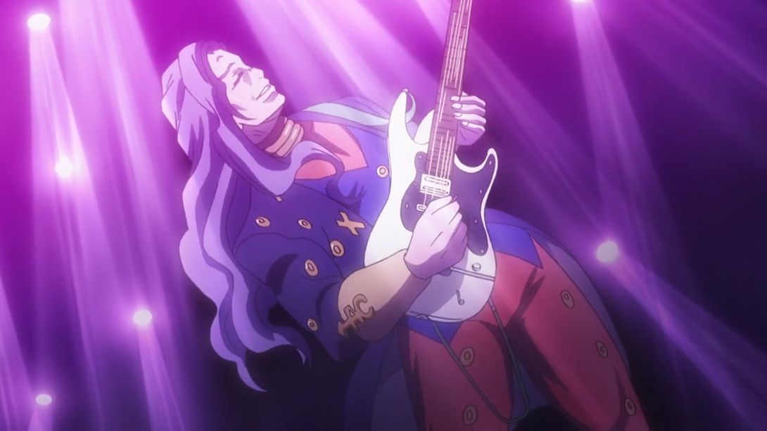
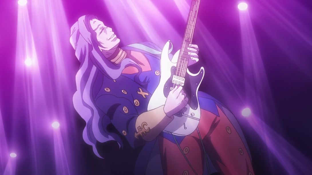
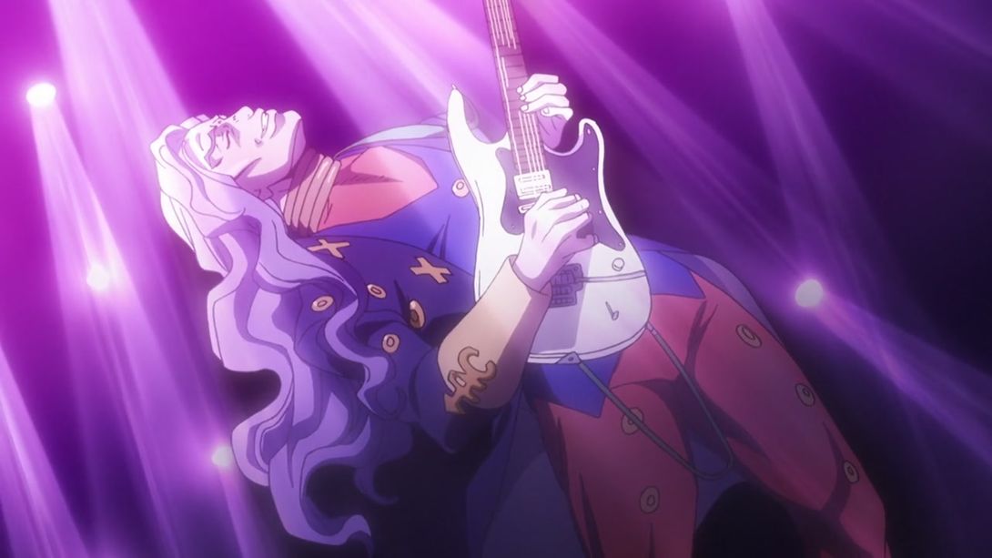

- Akira whipping out his RHCP has been redrawn as well:
- In this shot, both Akira and Josuke have been moved a bit:
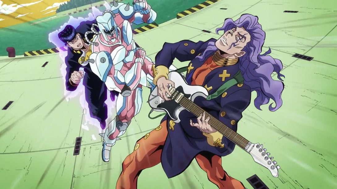
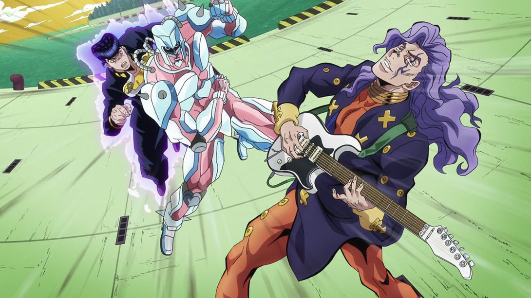
- In this animation, the camera moves down slightly more:
- In these shots, the background has been moved:
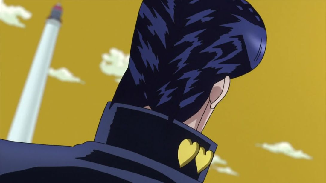
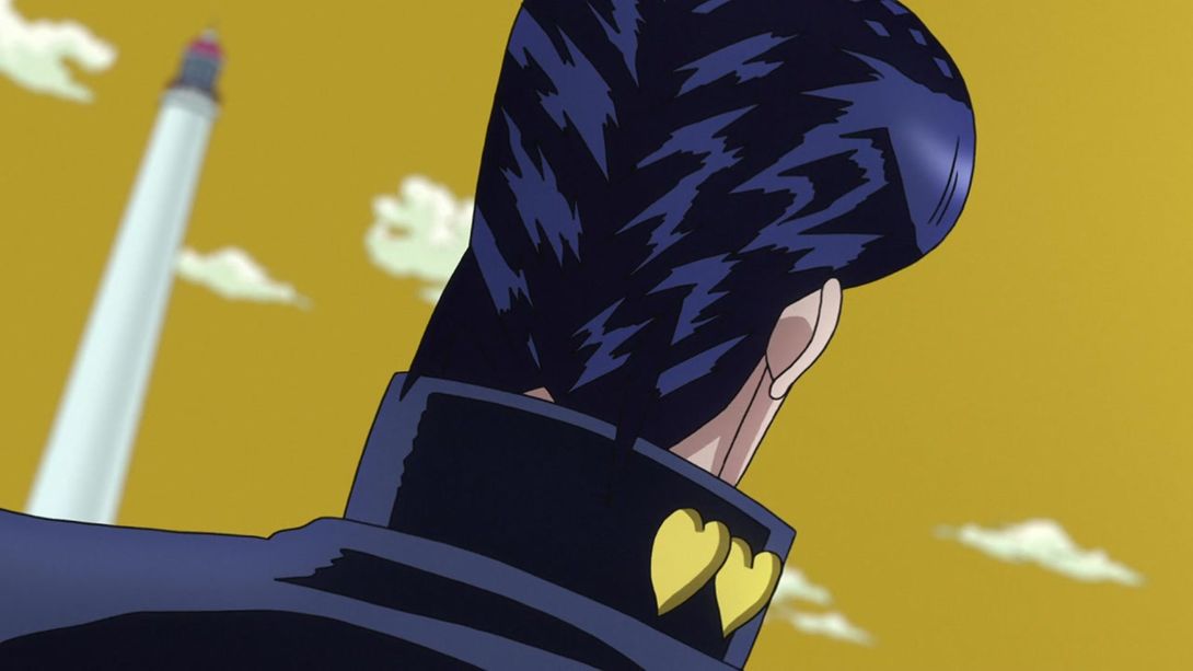
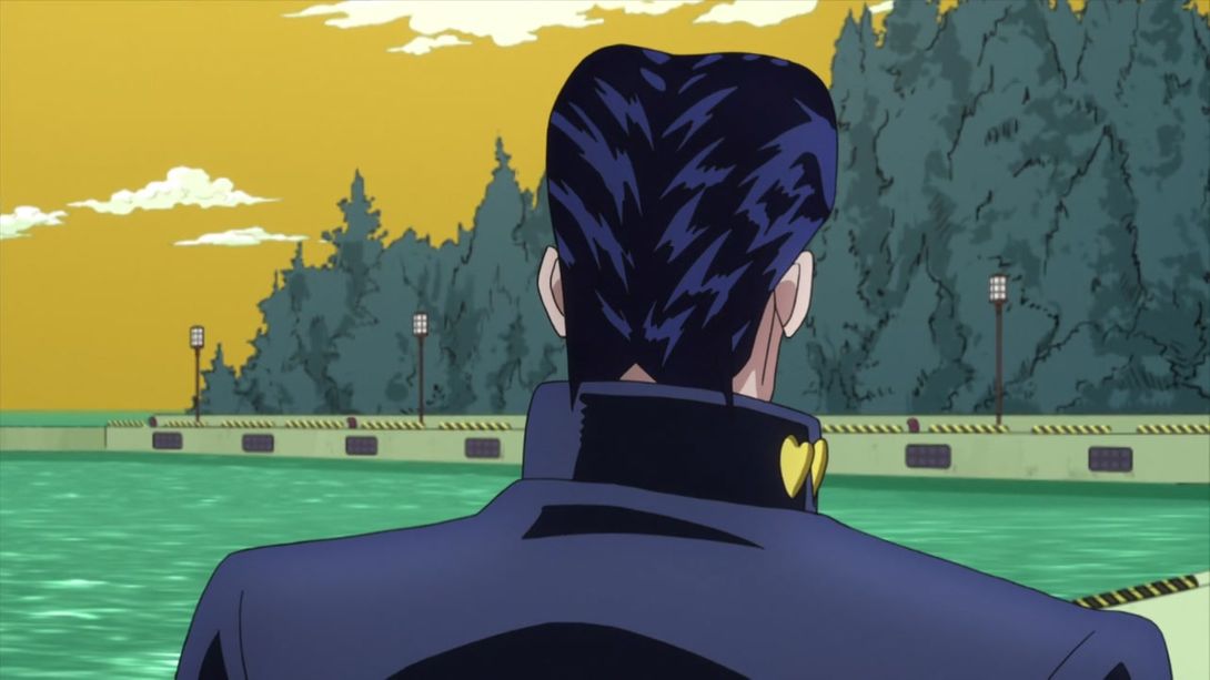
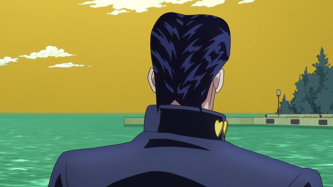
- And here, the zoom has been pulled slightly out:
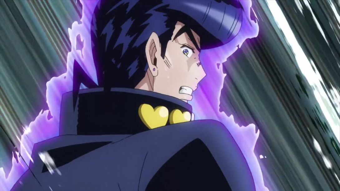
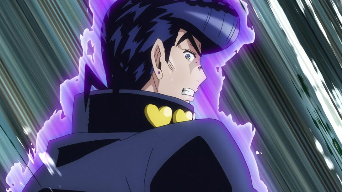
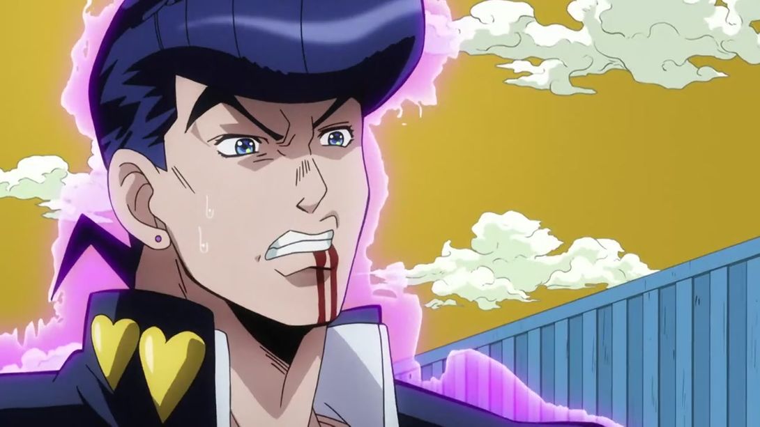
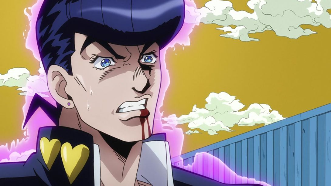
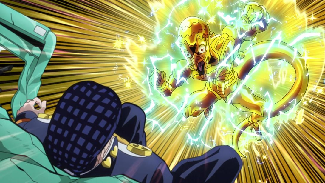
- Thankfully, both Crazy Diamond and Josuke’s faces have been completely redrawn in this scene:
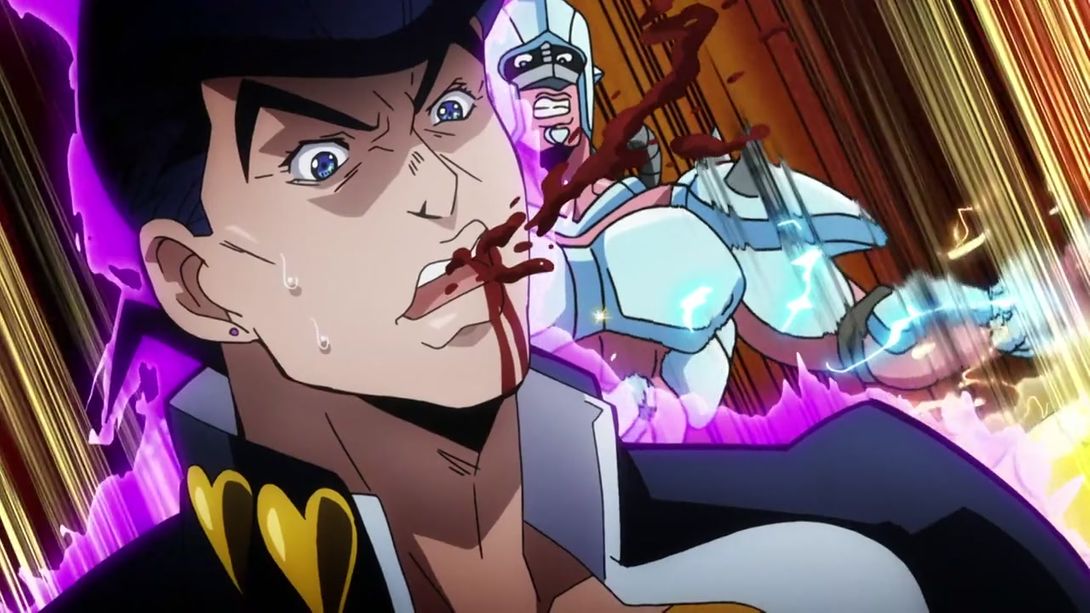
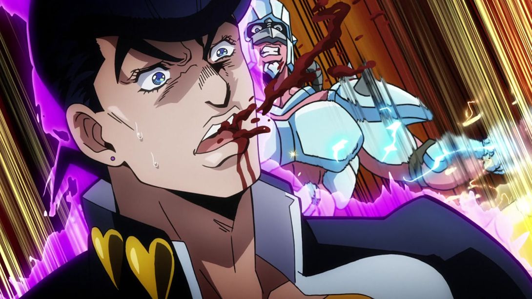
- The speed lines in this animation of Crazy Diamond trying to kick RHCP are different:
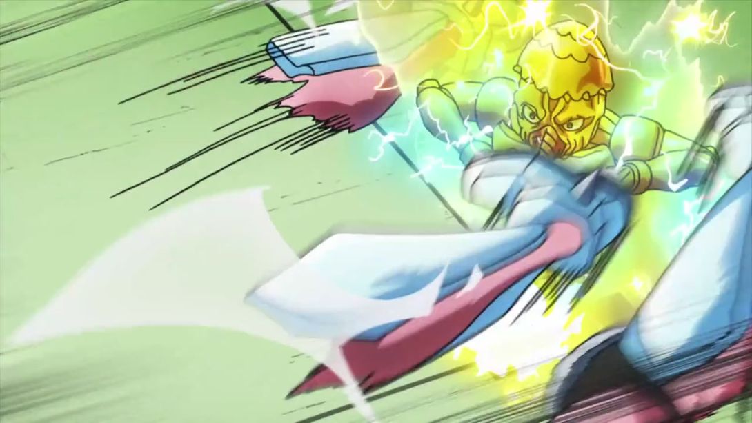
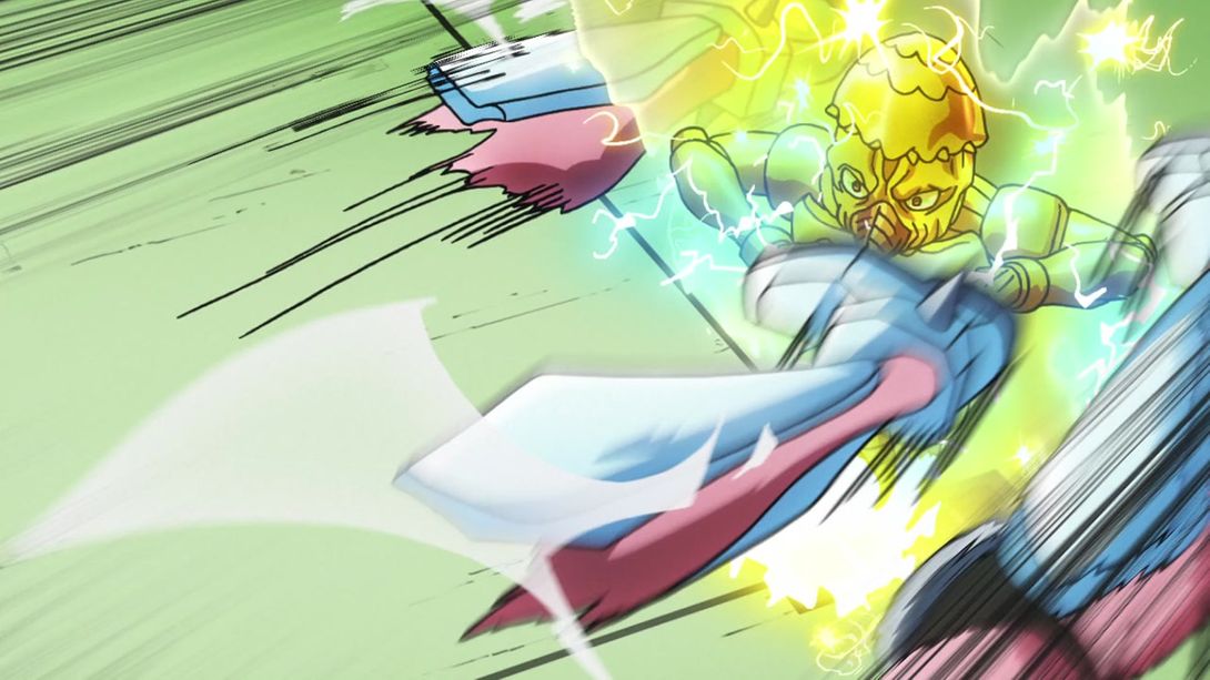
- And in this transition, Josuke has been blurred:
- And here, the image has been moved up by like ten pixels. Yeah, no, I don’t get it either:
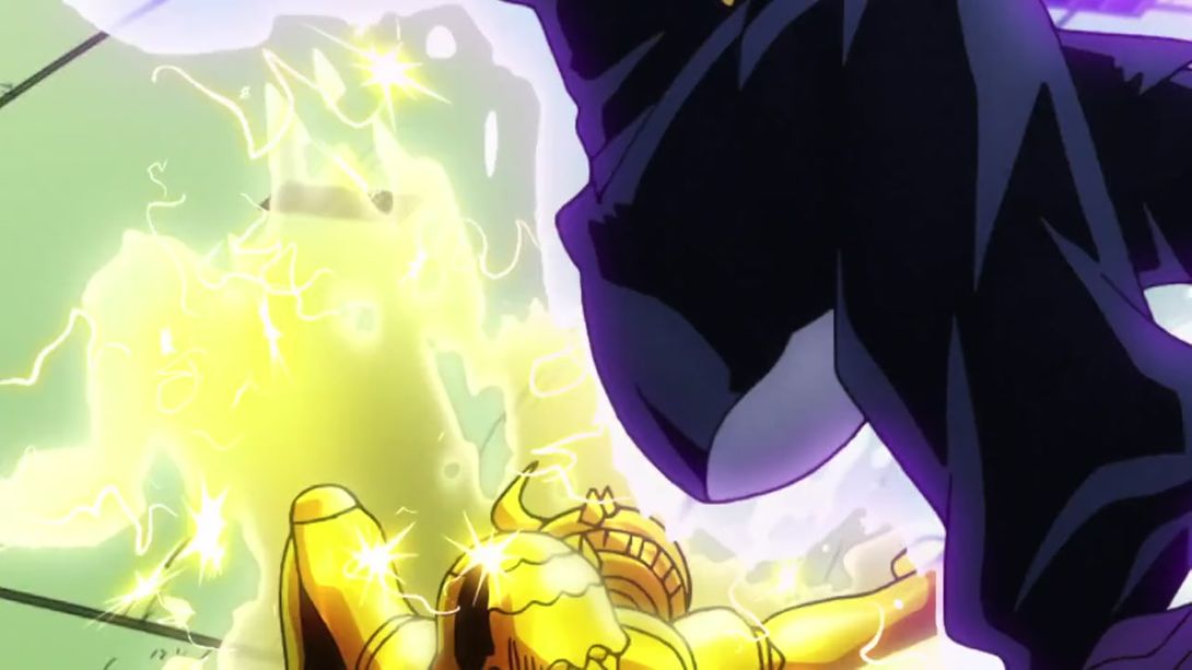
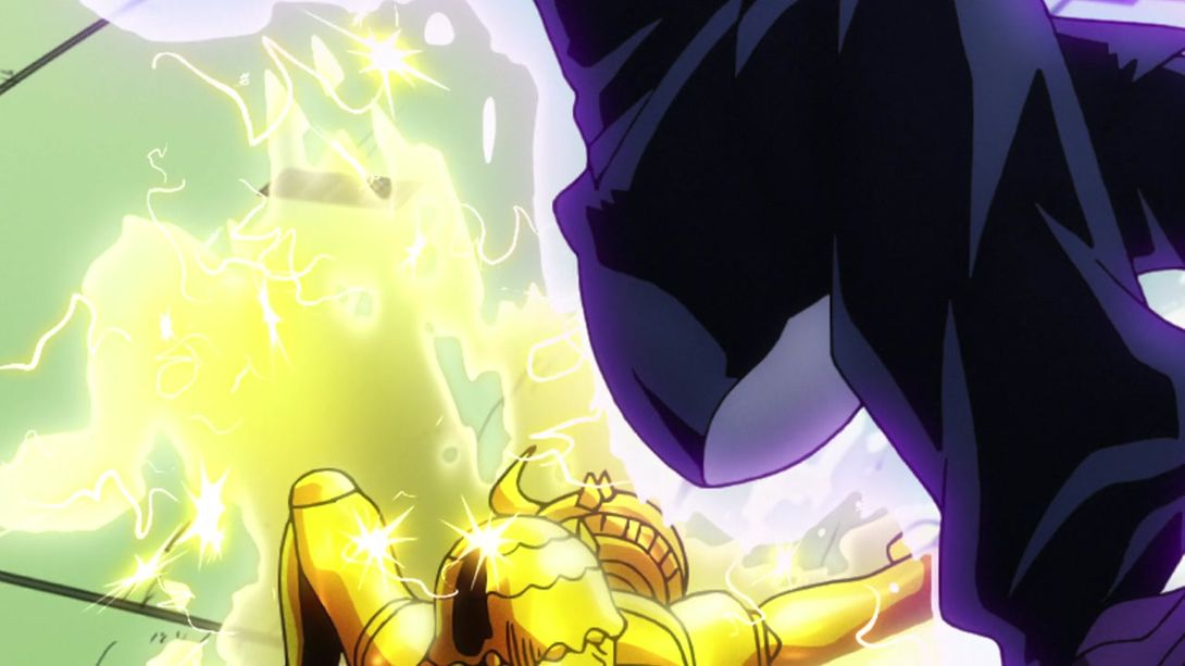
- This transition is different as well: Josuke is there in the beginning and then disappears, resulting in a more MENACING shot:
- RHCP is tinier in these two shots:
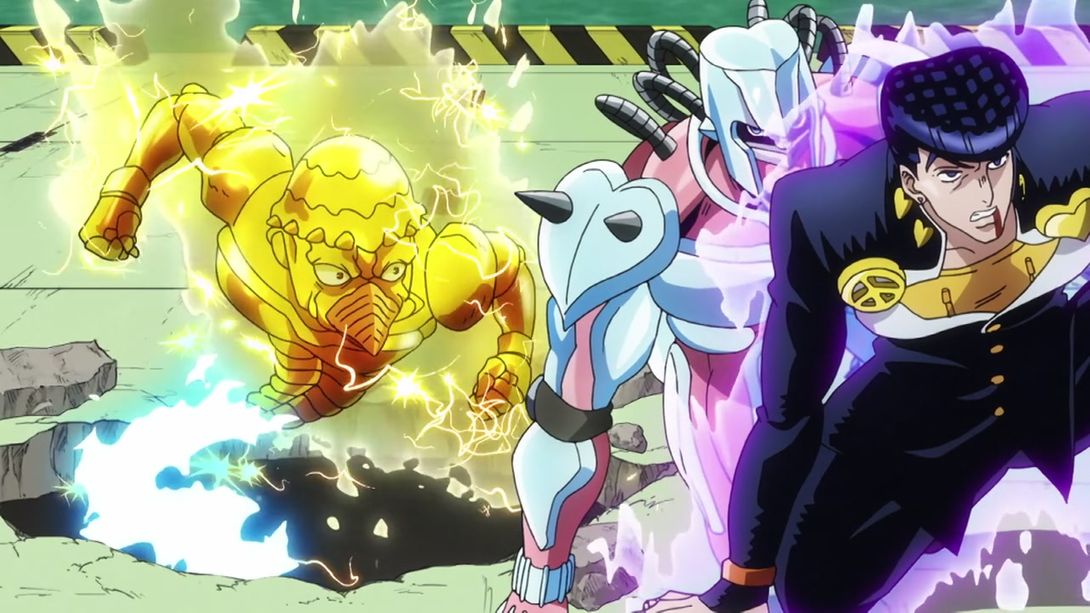
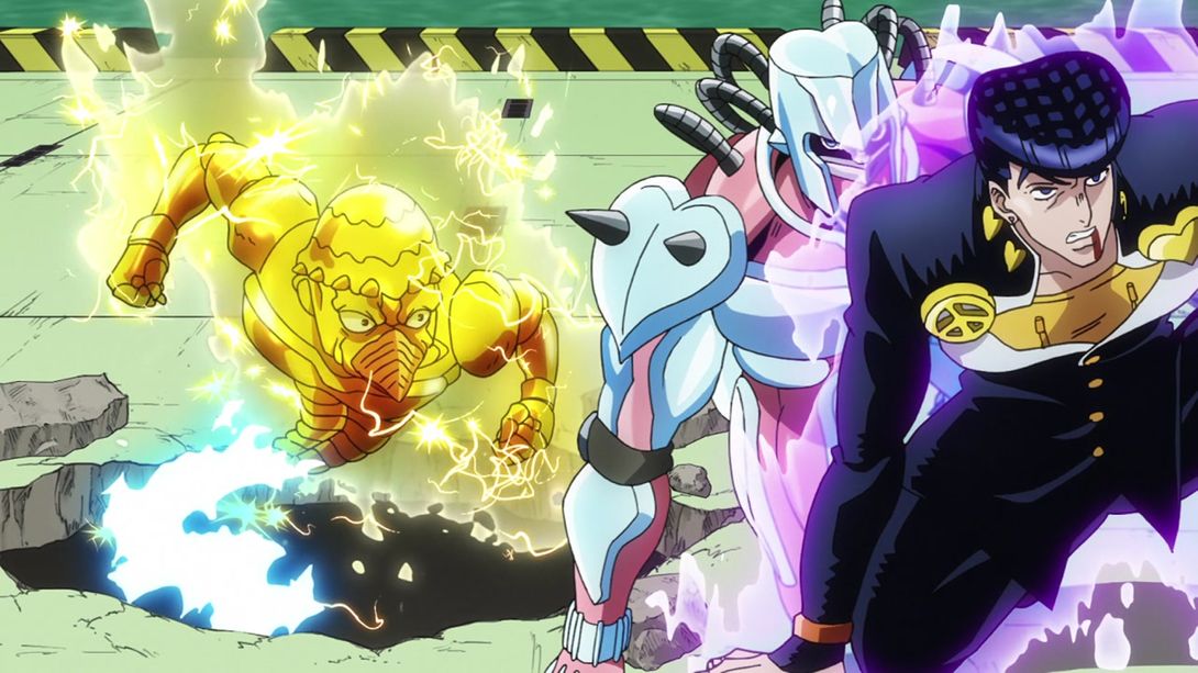
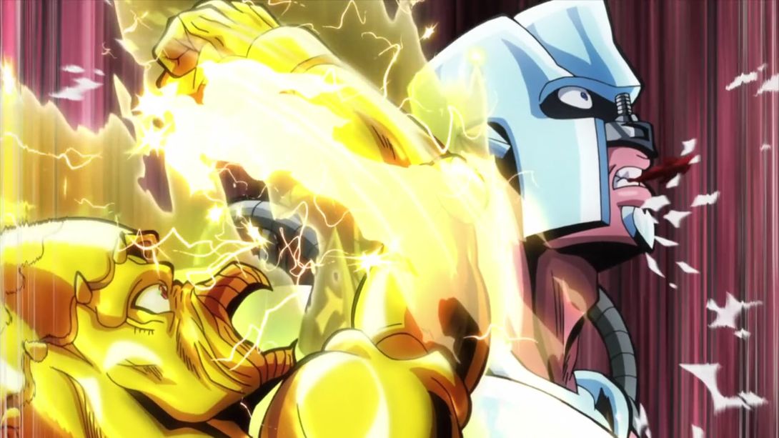
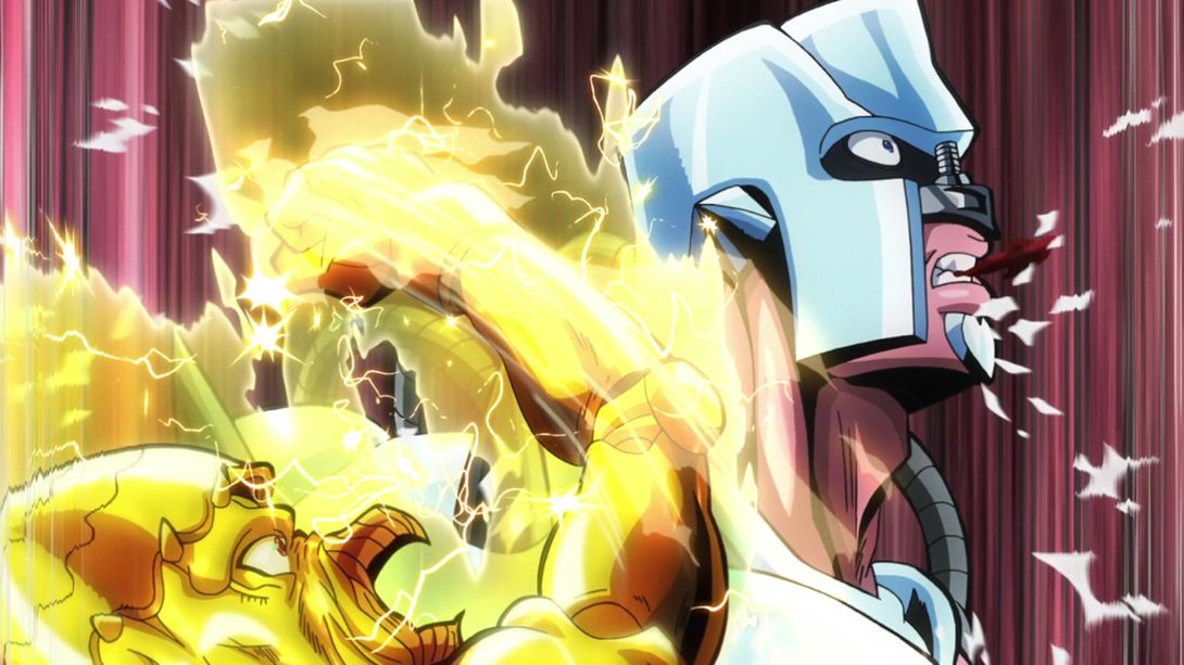
- And here he’s been moved down:
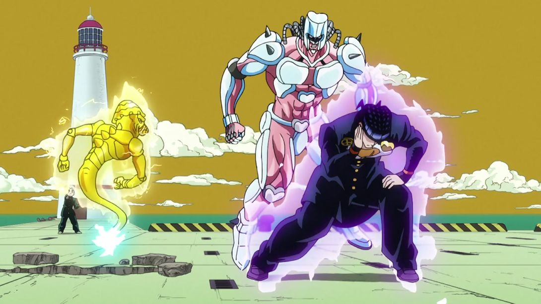
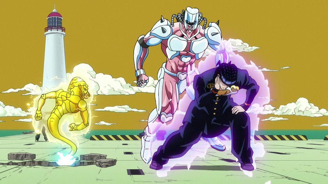
- Here, the sparks at the far right of this shot are different:
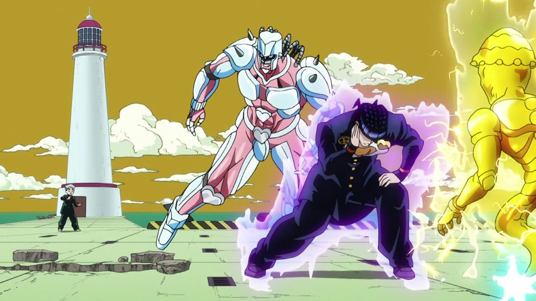
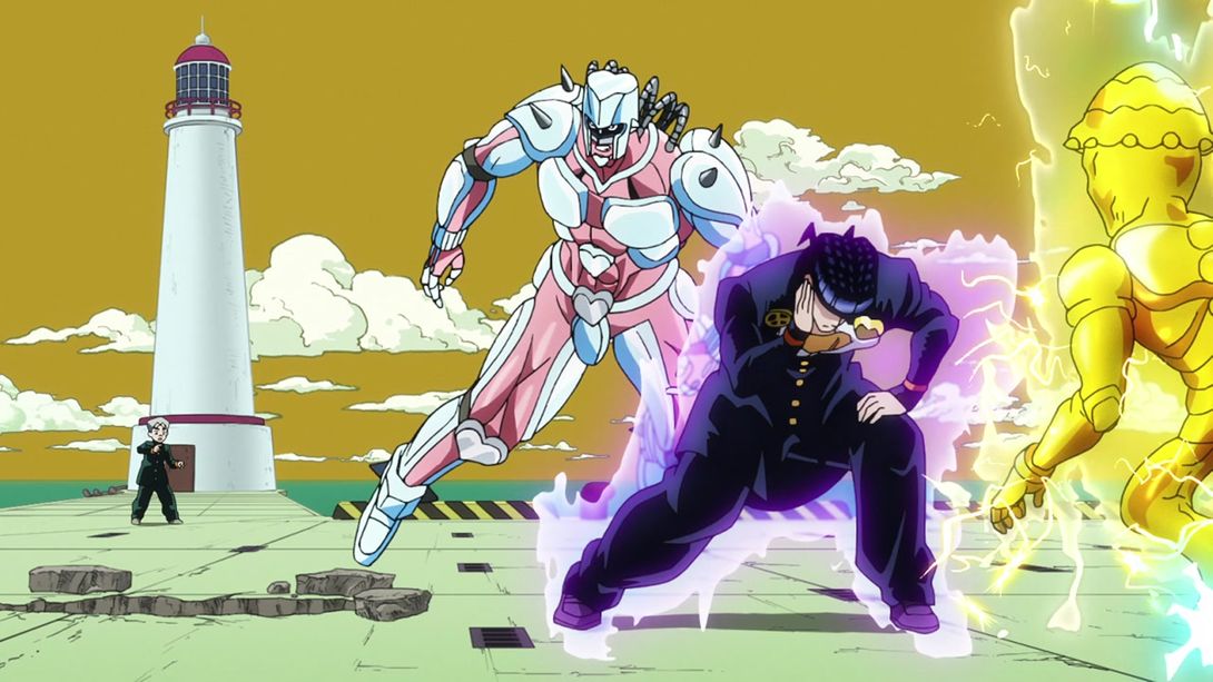
- RHCP has been moved again here:
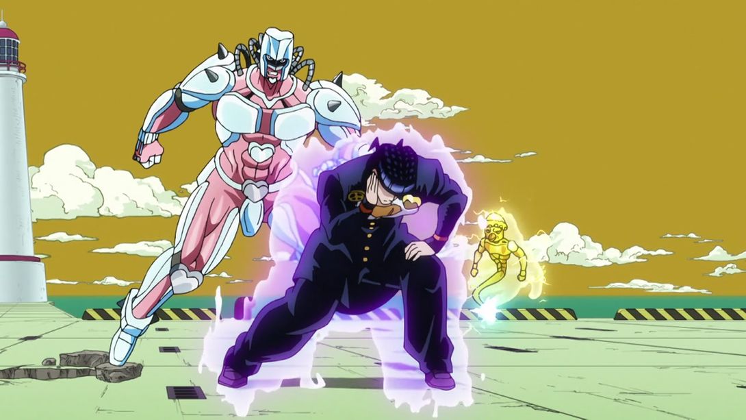

- JOSUKE! YOU FORGOT YOUR TEETH:

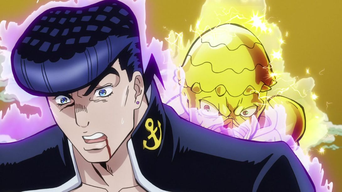
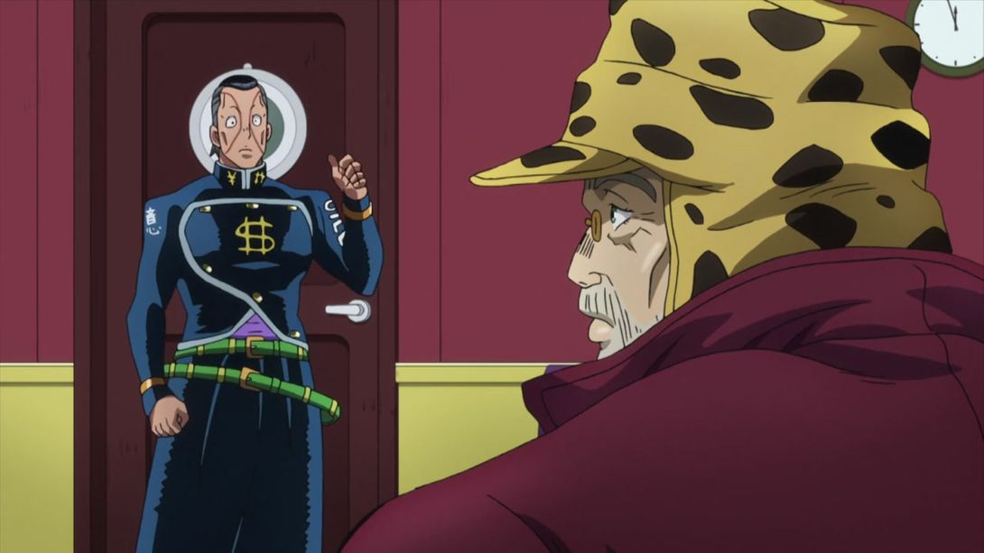
- “And then, Okuyasu suddenly realized that he was not on a magical boat trip”:
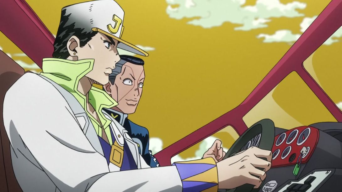


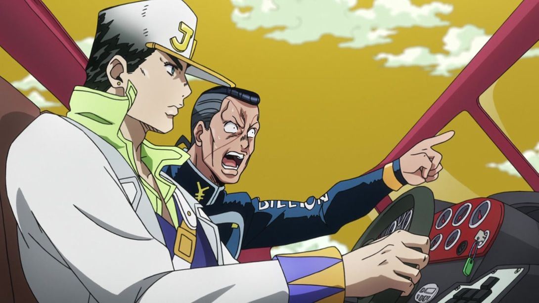

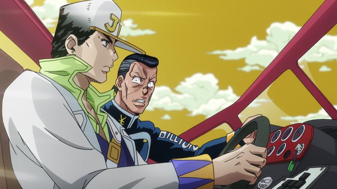
- They added some nice lighting effects in this scene:
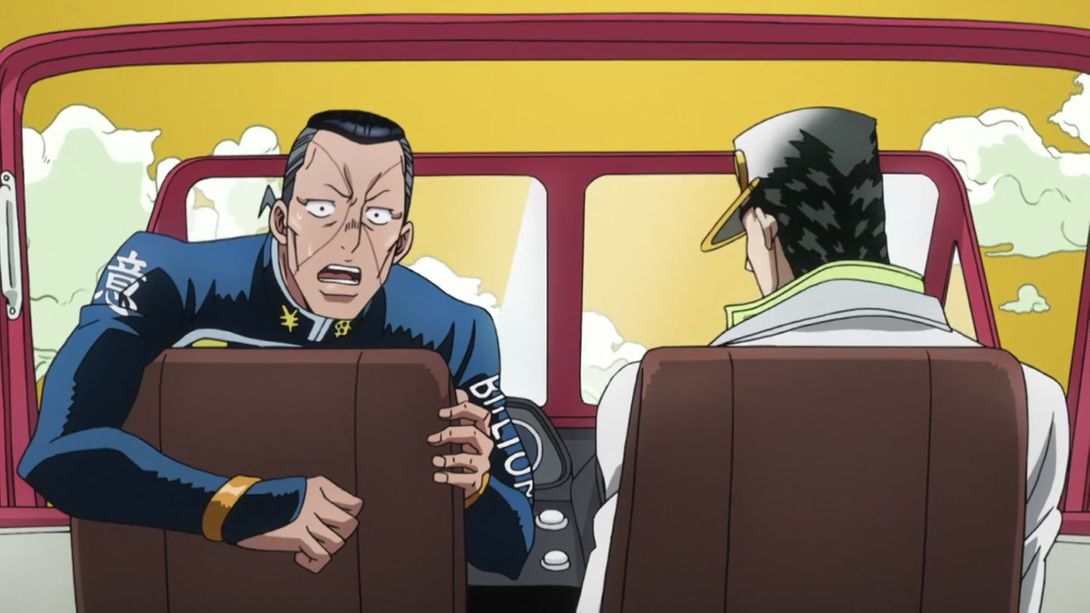
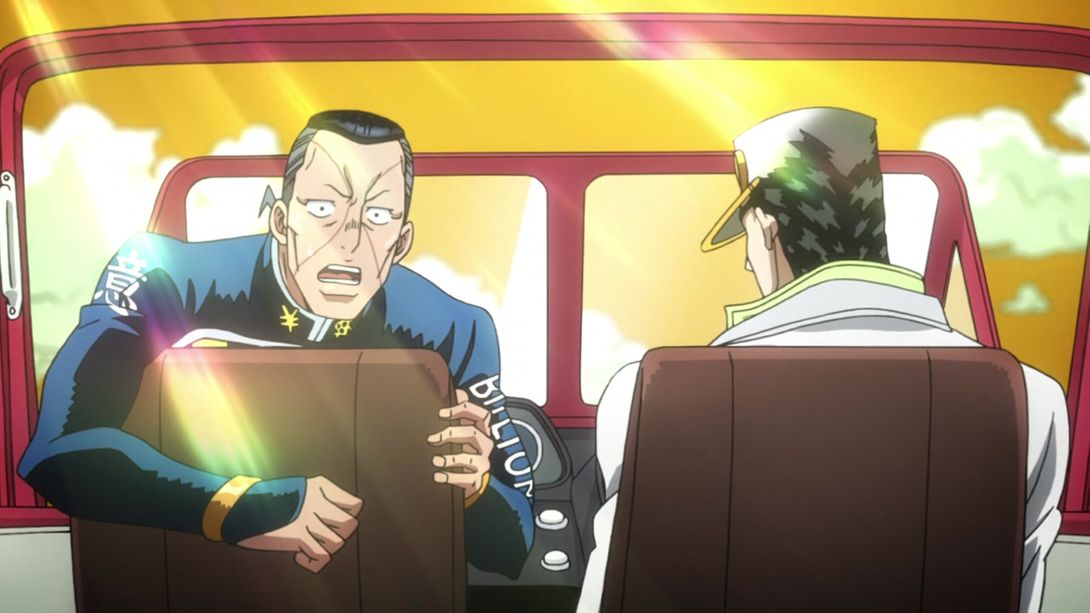
- In these two shots, they added a wristwatch on Akira’s wrist, and moved his pupil so that he’s looking at it (the TV version does look a bit weird in retrospective); in the first one RHCP has also been moved down:
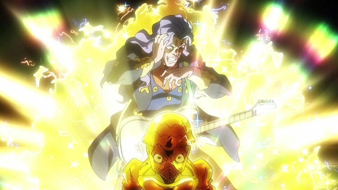
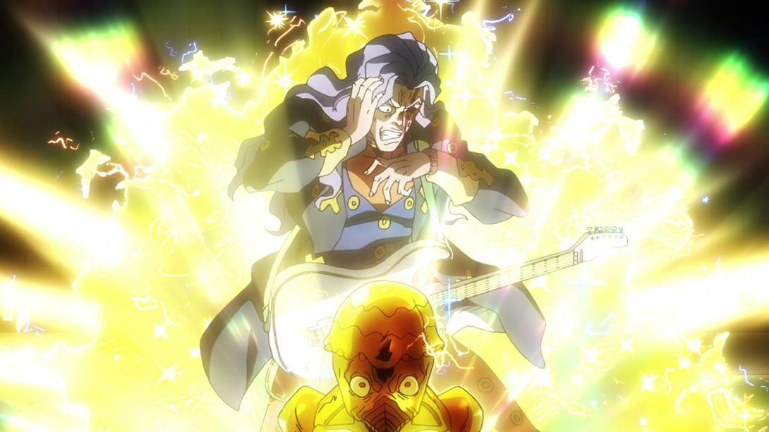
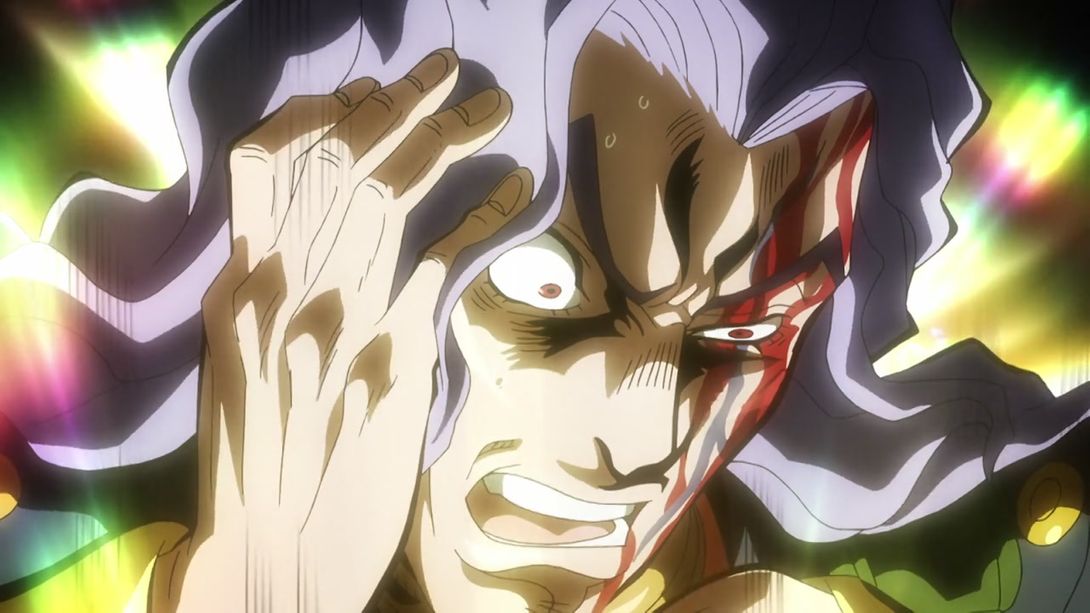
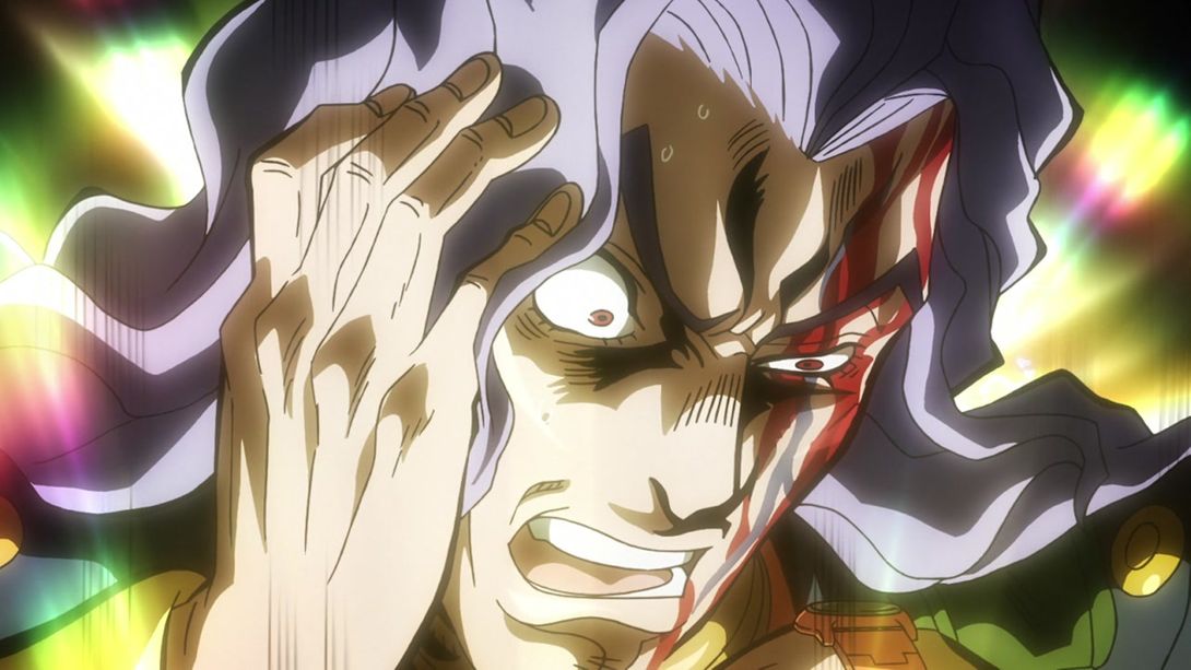
- This shot has been shaded better and the two students in the foreground have been blurred:
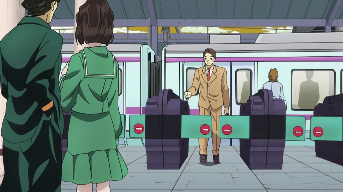
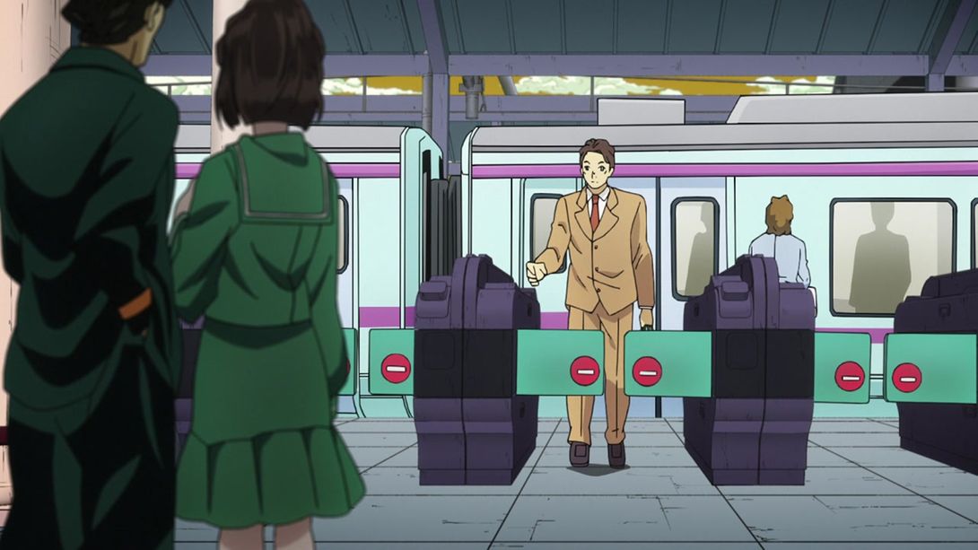
- Here they added some dust effects:
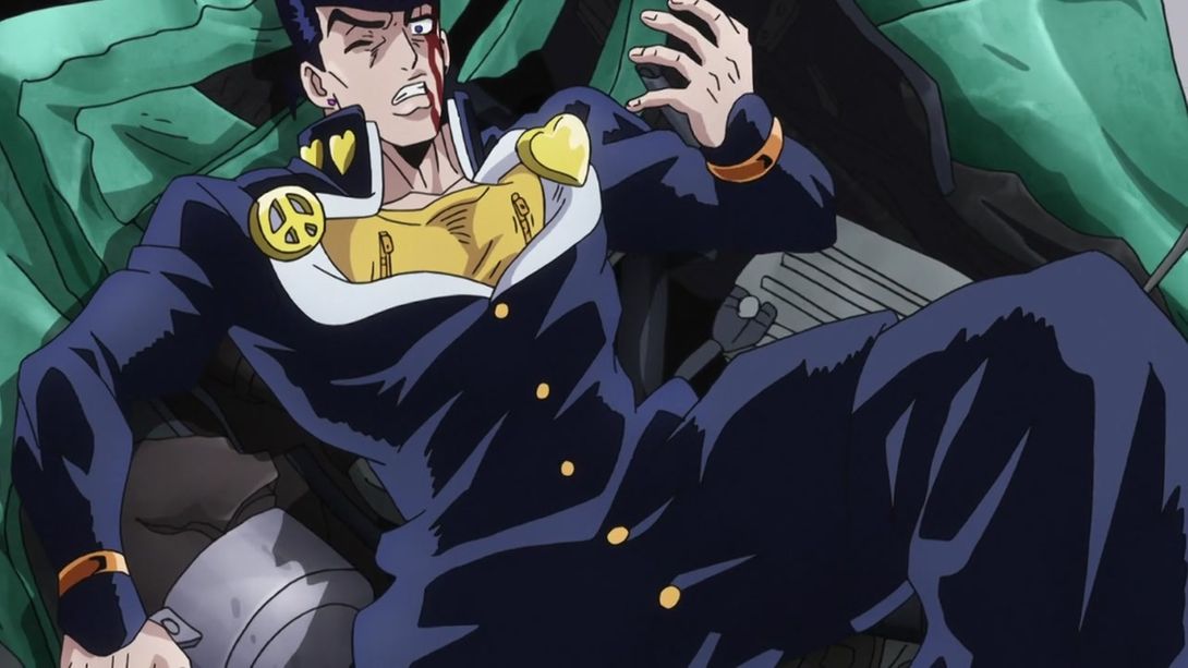
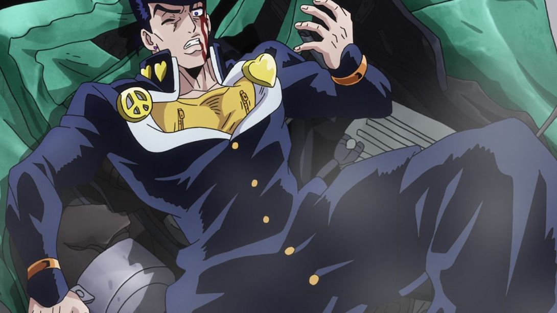
- And Akira no longer just appears there, but he slides his way in:
- RHCP has been moved again here (man, they really were not happy with any of RHCP’s original positions, were they):
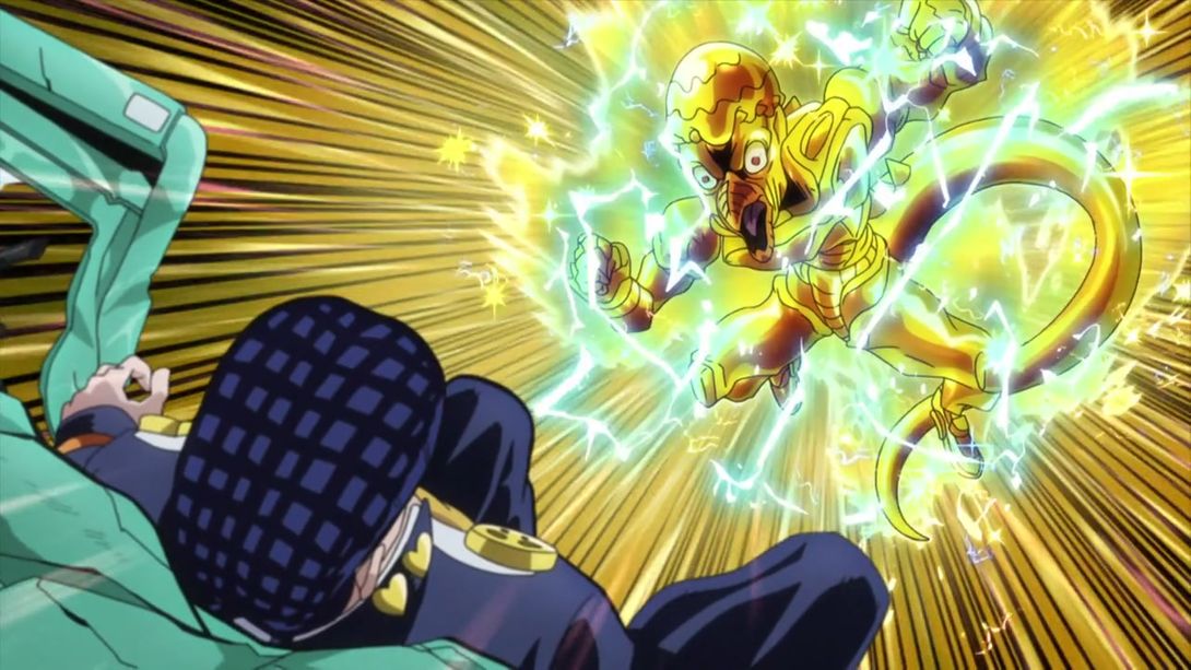
- The tire in the background has been removed, as in all likelihood it was precisely the one Josuke used to trap RHCP:
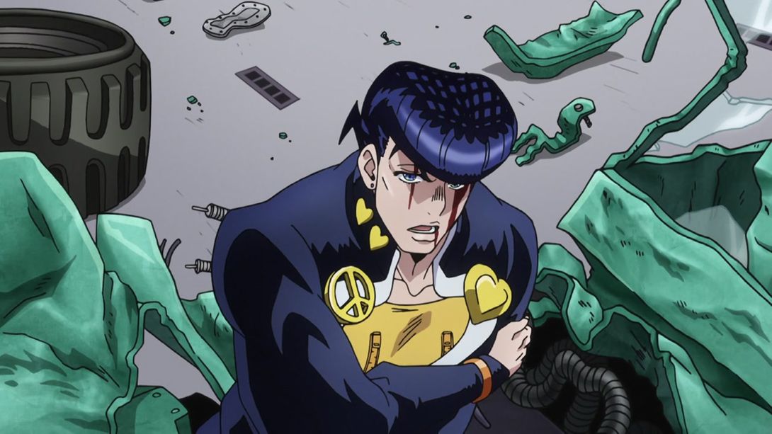
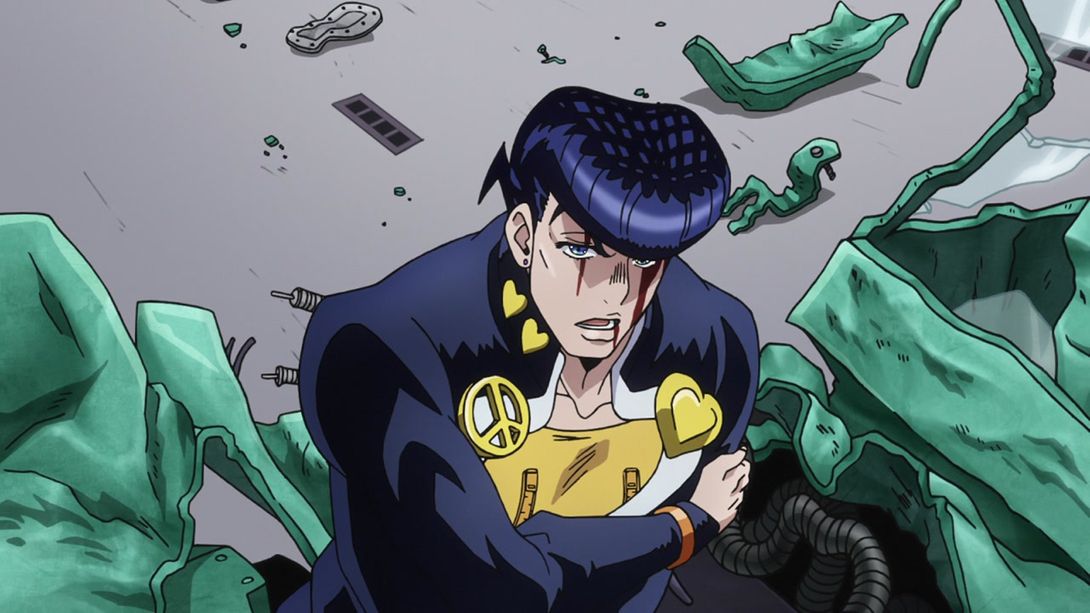
- Another very slight camera change:
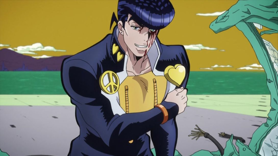
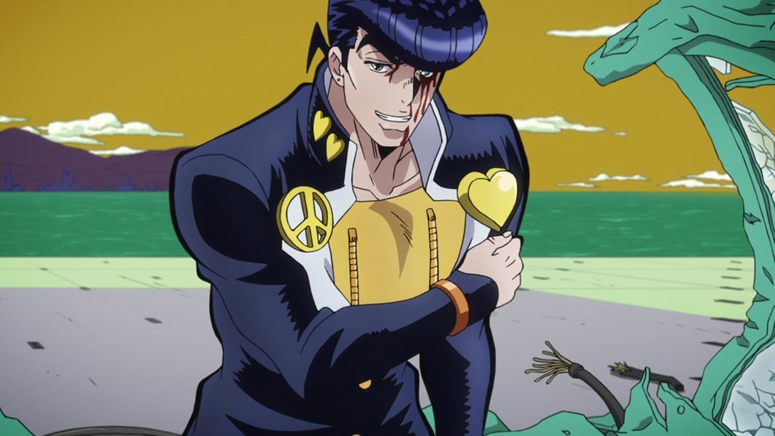
- And Koichi, who has been taking some notes from Akira, shows up:
- Akira’s guitar jack is now steel-coloured:
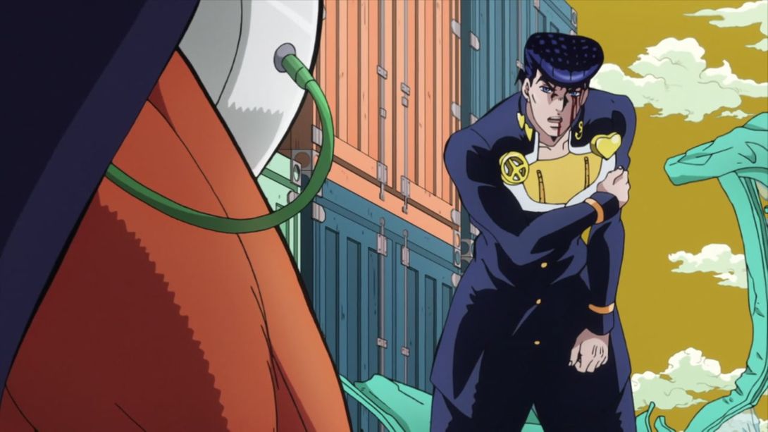
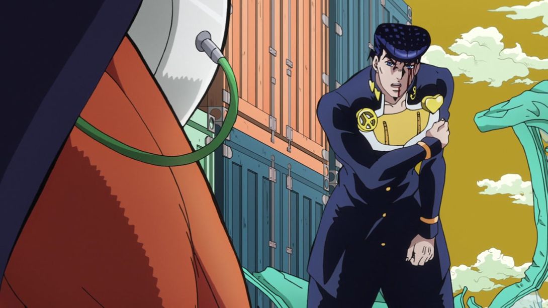
- In this shot, the shading on Josuke’s temple and cheek has been slightly retouched:
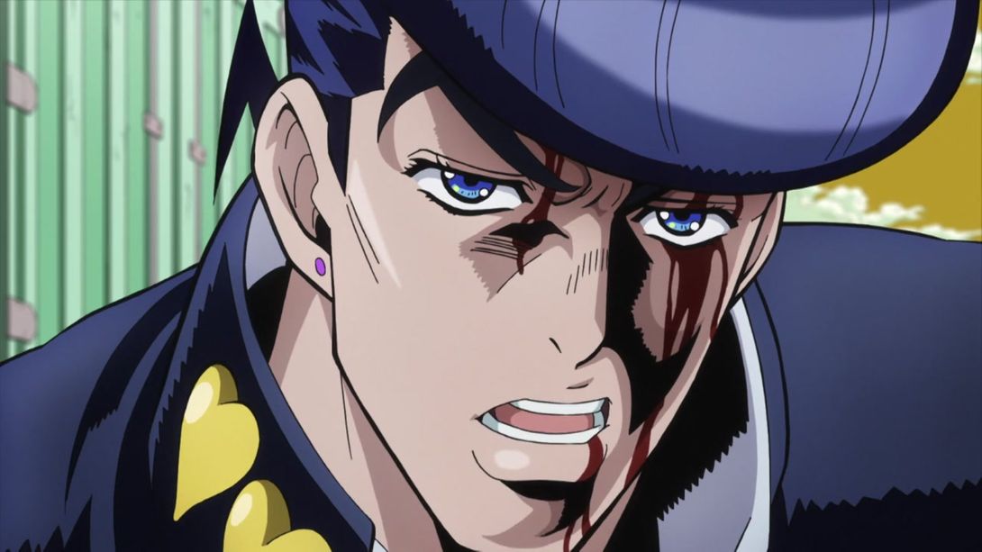

- Yet another camera change:
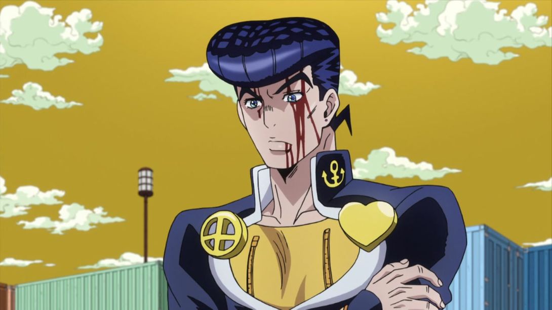
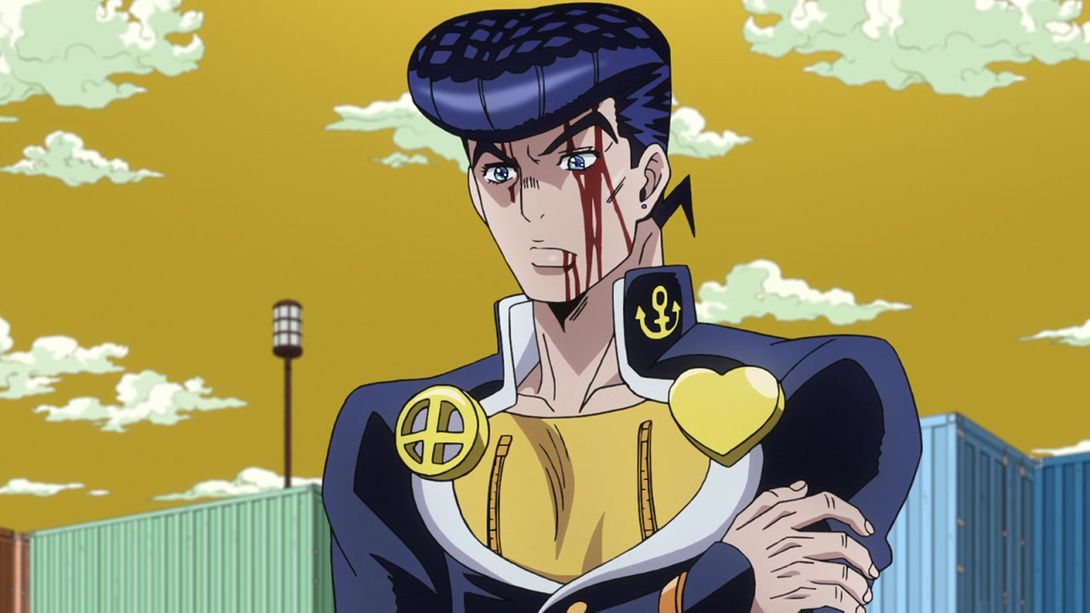
- The BDs added Echoes Act 1 scouting the area in this scene:
- Joseph’s face has been slightly retouched here:
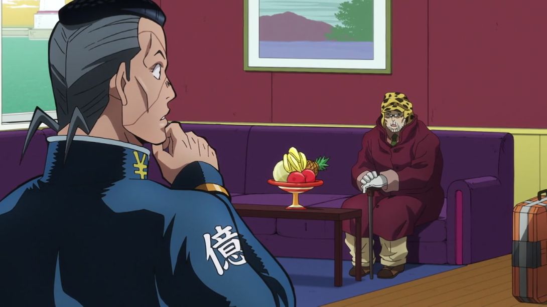

- And his mouth is a bit more closed in this shot:
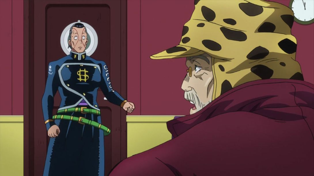

- The lower bit of Okuyasu’s shirt has also been re-shaded:

- We can see the pier and the lighthouse through the window boat here:
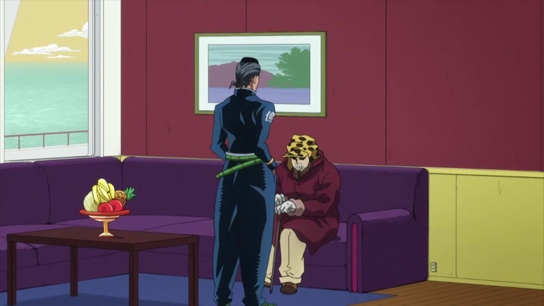
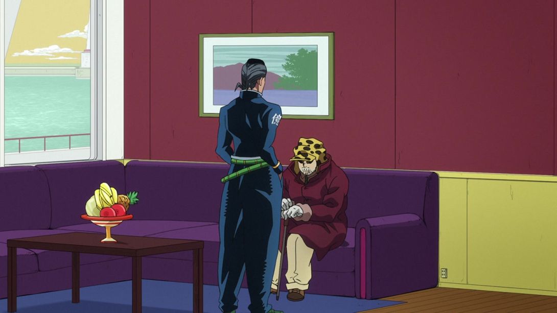
- The Traffic moves way less in this shot:
- A tiny bit of outline on Josuke’s lapel has been redrawn:
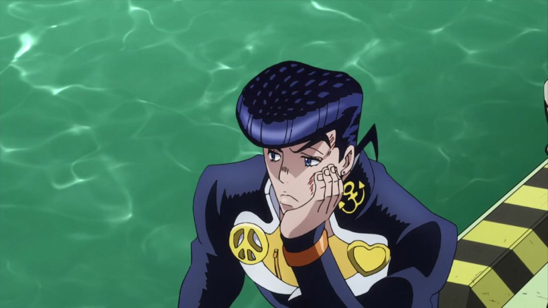

- Josuke no longer moves his body while turning his head to talk to Koichi:
- This floor is slightly more slanted in this shot:
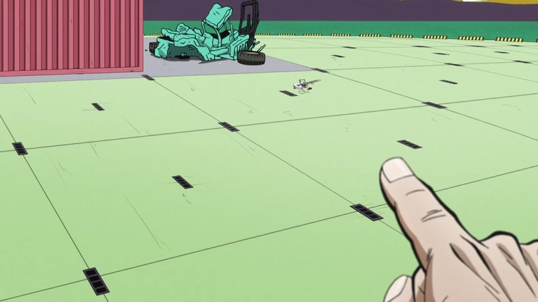
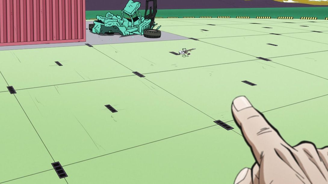
- The transition into Josuke’s eyes has been centered better:
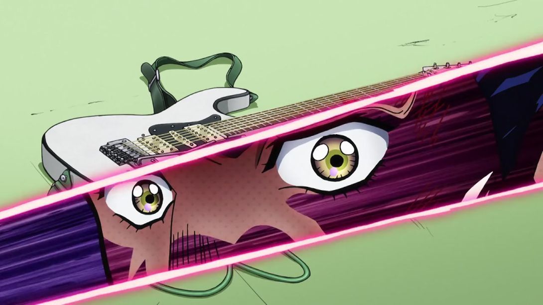
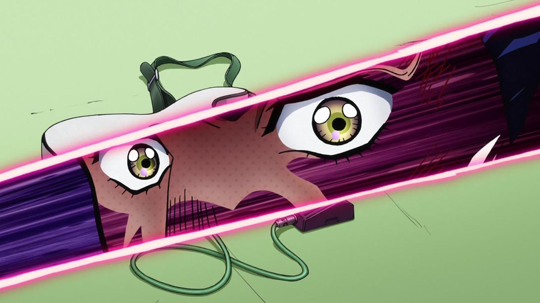
- Initially I thought this correction was a simple sweat drop being recoloured from purple to white, but as one commenter (MANDUCK) pointed out, the BDs actually made a mistake in correcting this, since it was supposed to be part of Akira’s face tattoo:
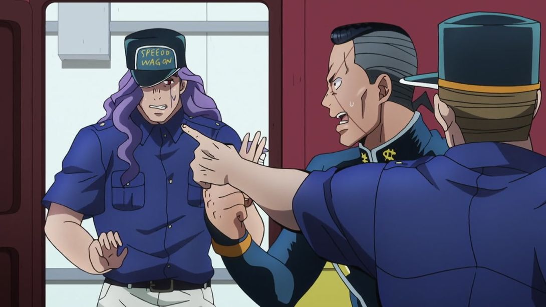

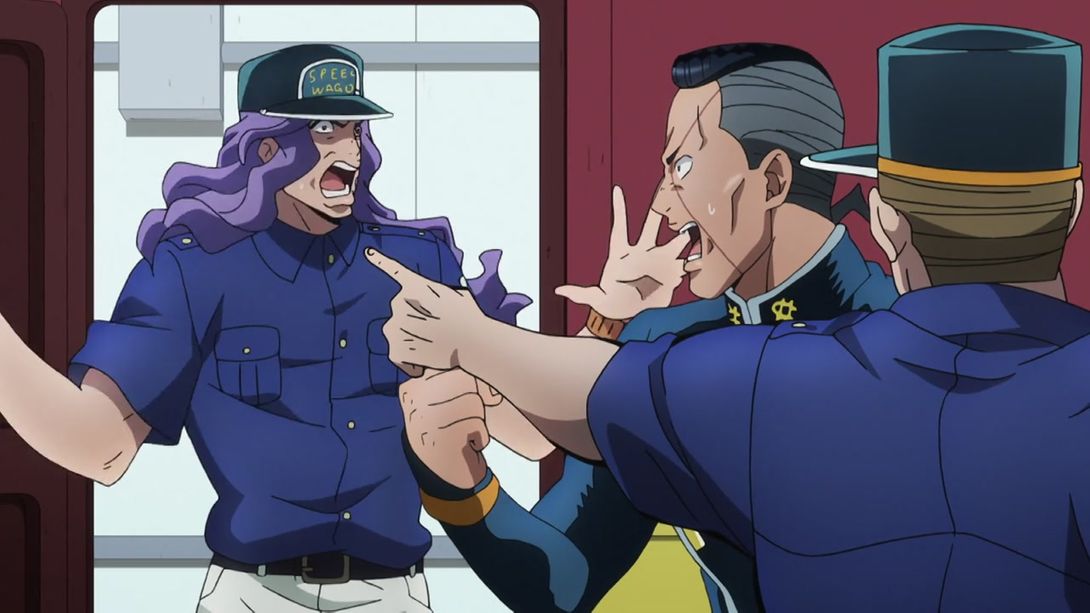
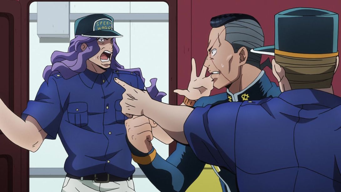
- In the TV version, Okuyasu just stands there with his mouth agape for a bunch of frames; this has been corrected in the BDs:
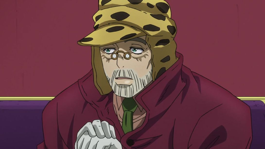
- In this shot, Joseph has been completely redrawn. He no longer looks like a frail old man, but we can see that he’s still the Huge McLargestein he was in his youth:
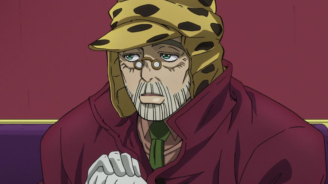
- The camera movement that frames the dying RHCP is different:
- As is the framing of this other scene:
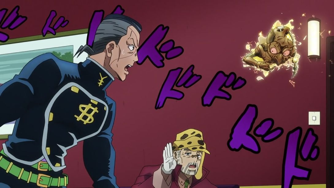
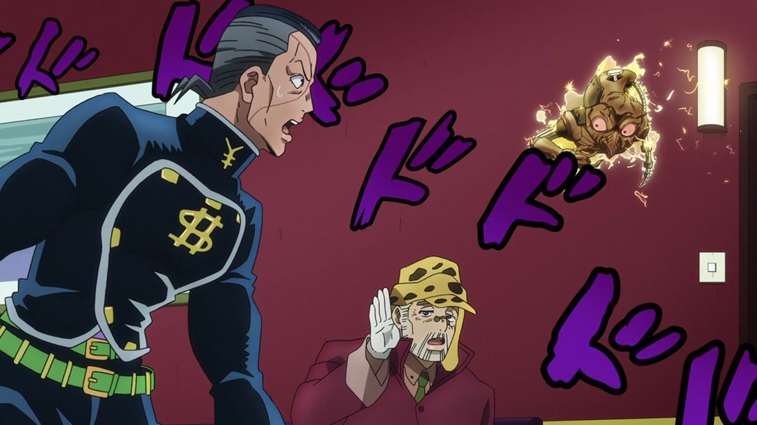
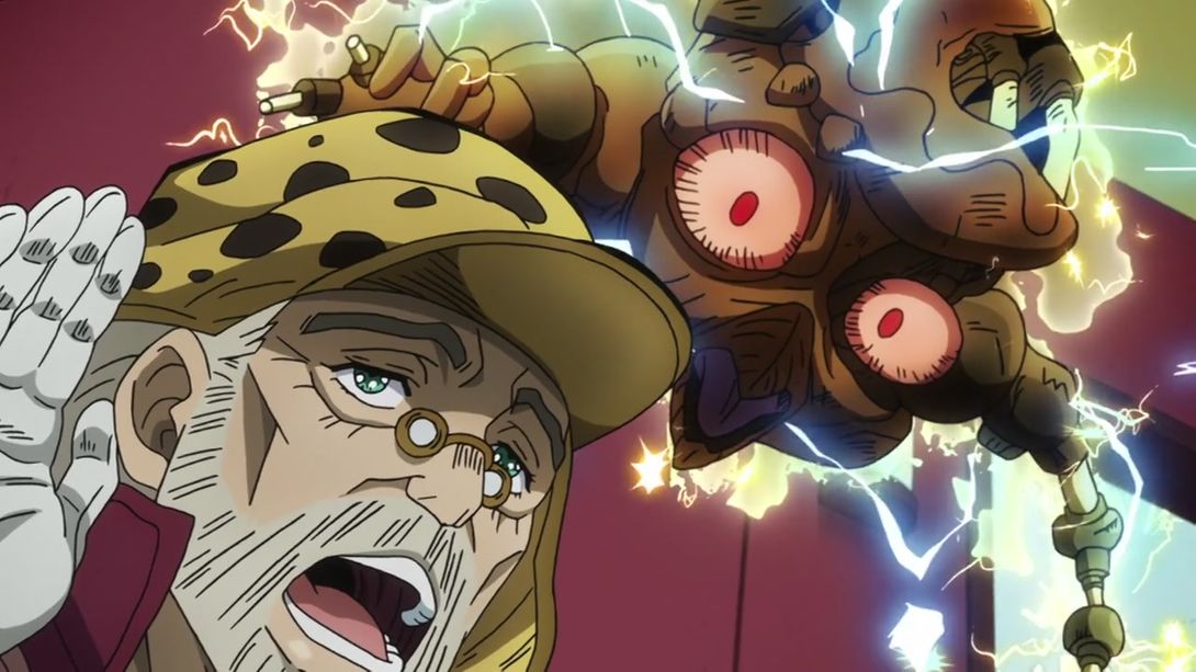
- And here, the zombified RHCP has been completely redrawn and it is ABSOLUTELY TERRIFYING:
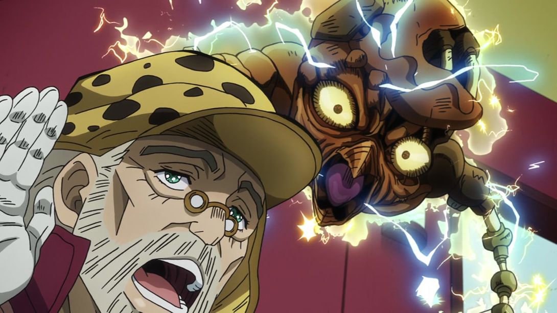
- Okuyasu punching Akira in the bracket is more DYNAMIC:
- In this scene, Akira’s eyes and the Speedwagon patch on his arm have been retouched:
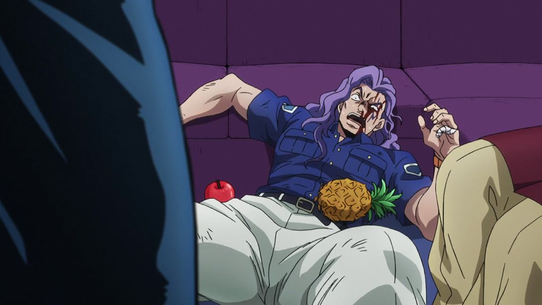
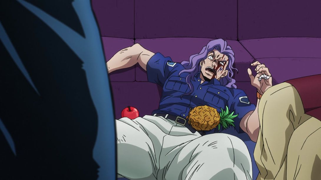
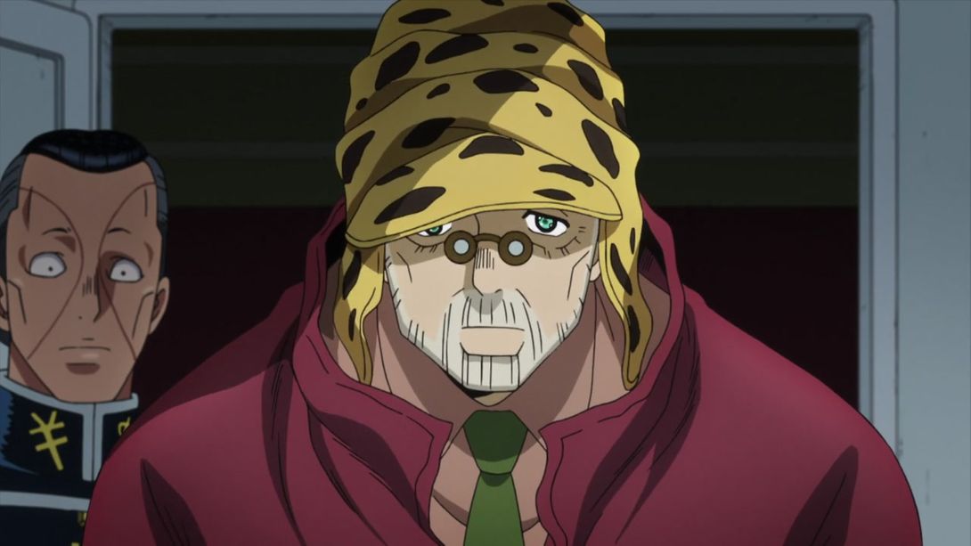
- In this scene, Joseph’s eyes have been redrawn, and as a results he looks more focused and less senile:
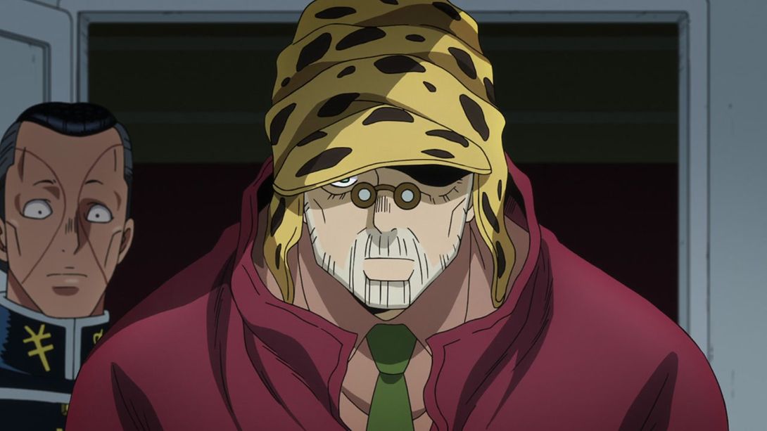
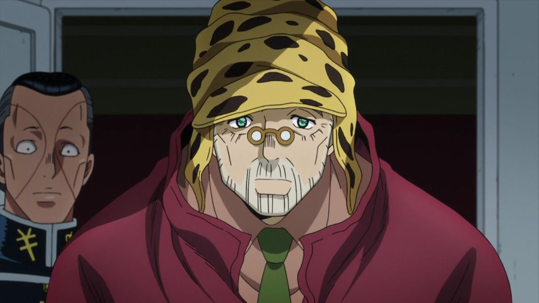
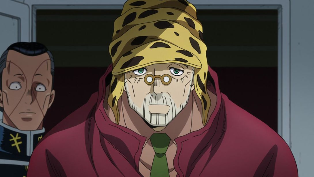

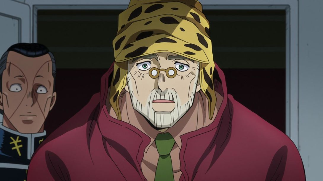
- For some reason, this red container is slightly darker in the BDs:
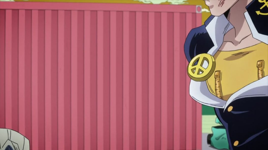
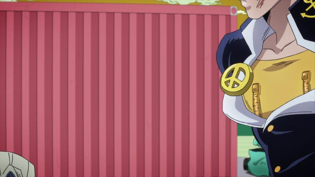
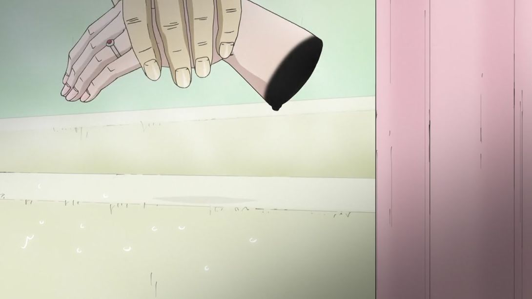
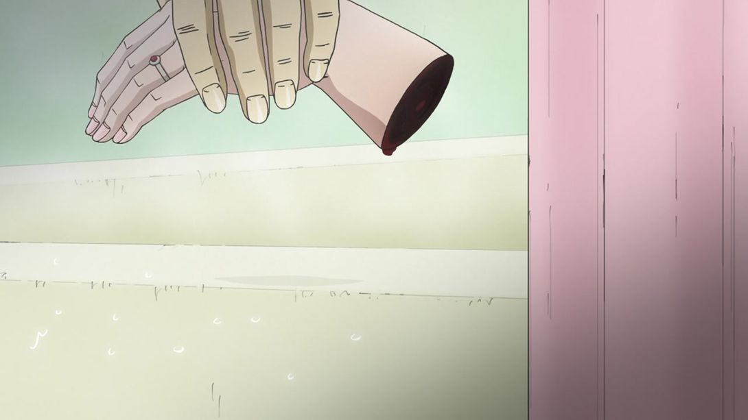
- And to finish this whole analysis, a quick look at a better shaded and uncensored chopped hand:
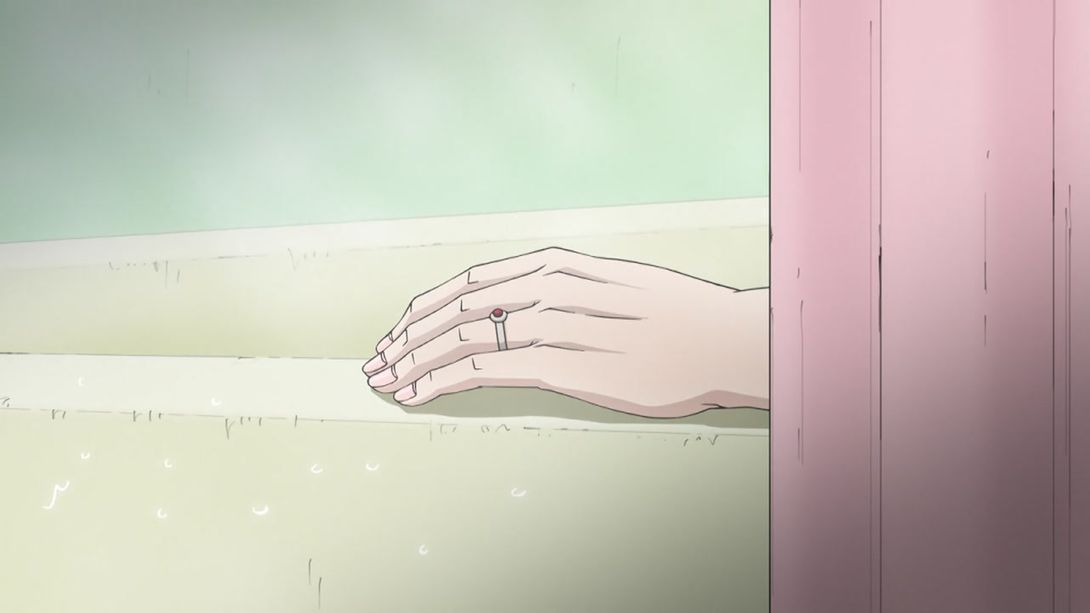
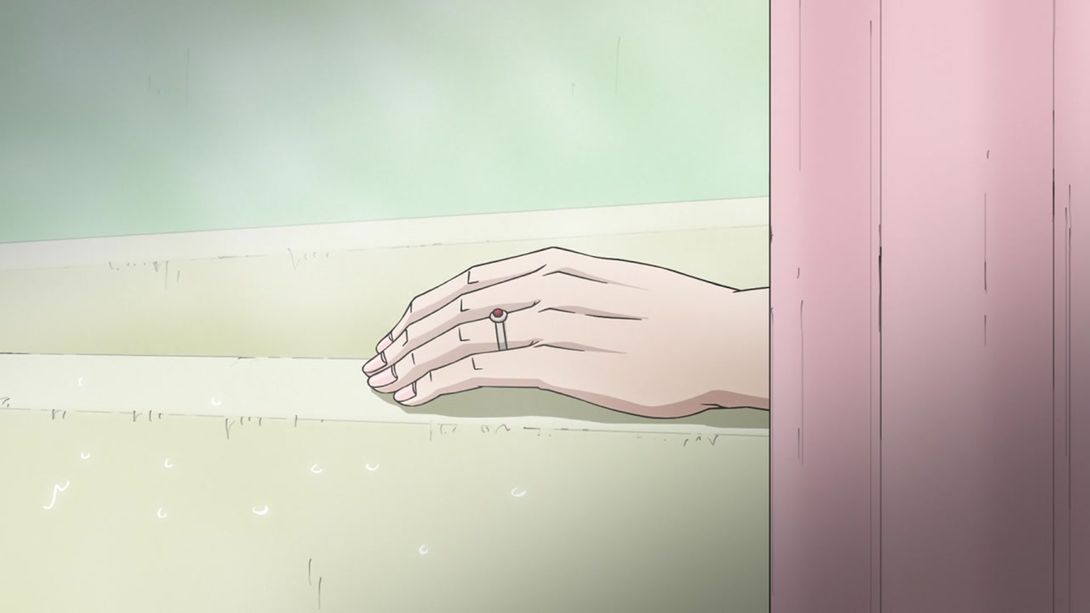
And that’s it for this episode! I have to say that it was a surprise to see even more changes here than in RHCP Part 1. When I watched the TV version I honestly thought it was a solid episode, but I’m still very pleased to see David pro pulling through and delivering some very nice, although subtle, changes. Today’s episode also wraps up BD 4, so this is going to be the last DiU episode for a while! In the meantime, we’ll go back to Phantom Blood, and we’ll slowly work our way up from there.
Thank you for reading this until the end! Take care, and see you next time!

