Hi, and welcome to this blog thing!
I started doing this silly job because I loved seeing what David production changed for the JoJo Bluray releases, but since there was nobody doing that same thing for the Diamond is Unbreakable Blurays, I decided to take on the mantle and fill this niche myself.
tl;dr: if you’re here because you’re looking for DiU BD-TV comparisons, then you’re in the right place.
Alright, let’s kick this off with a comparison of Episode #01! Seeing as this is the first thing they’ve aired, it’s pretty much a given that the animation was spot-on even in the broadcasted version, so don’t expect any major changes.
- The egg in the intro is slightly brighter:
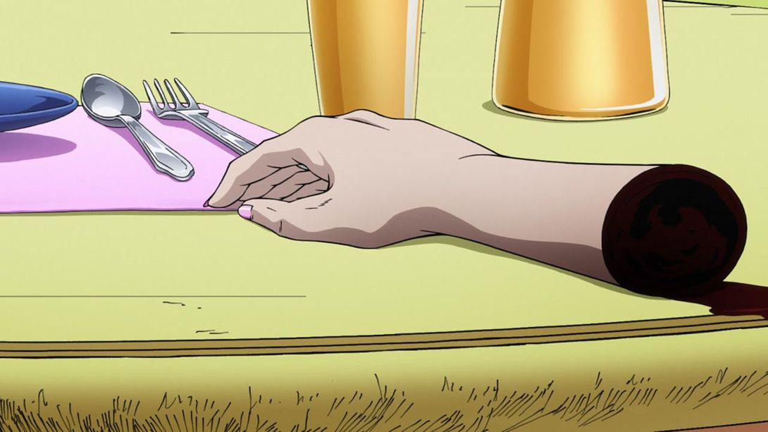
- Kira’s victim’s hand is uncensored:
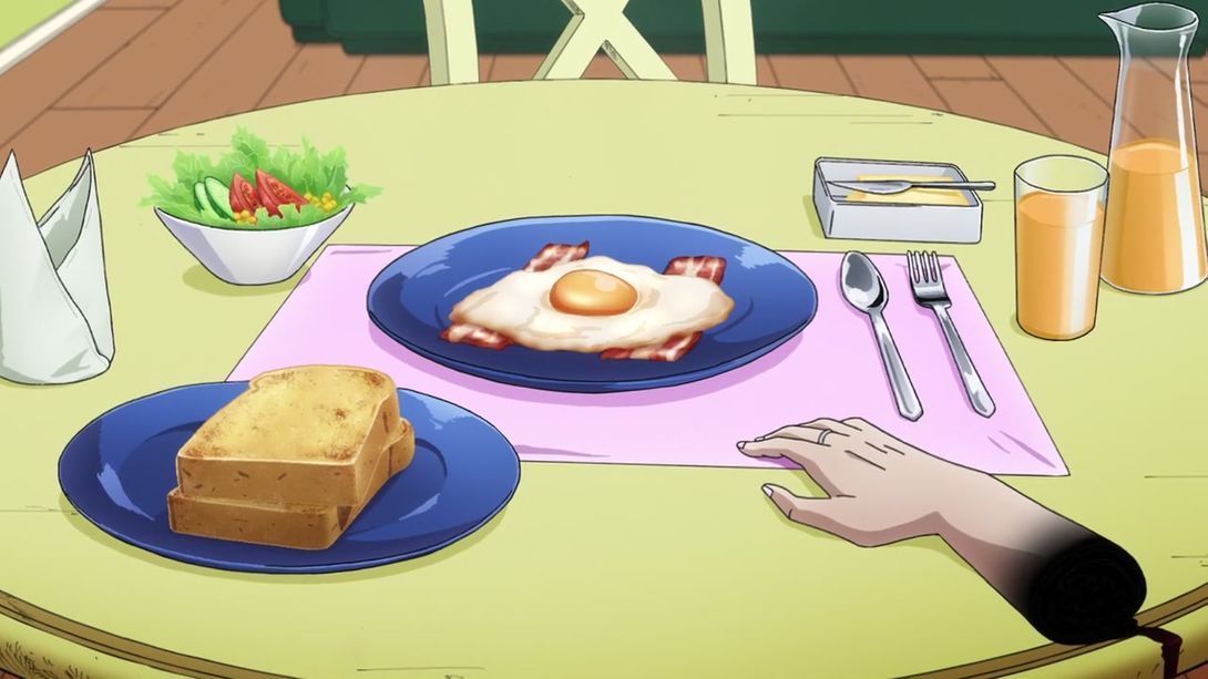
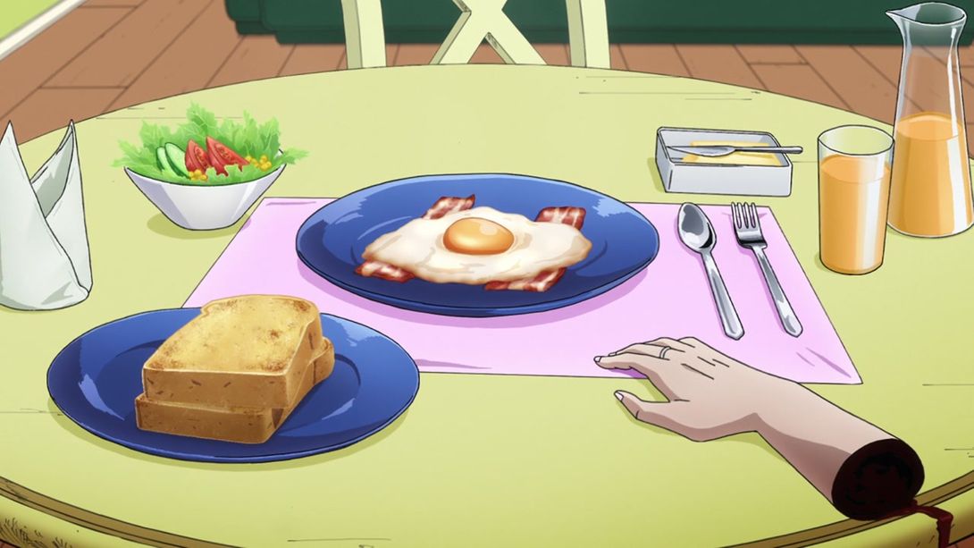
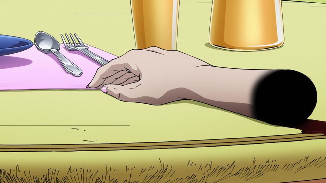
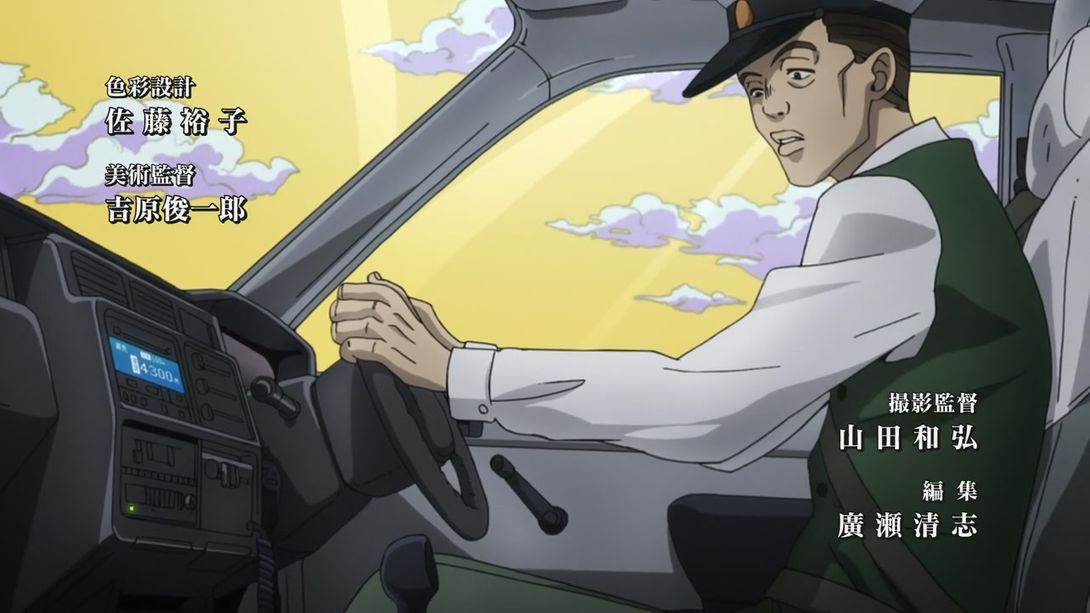
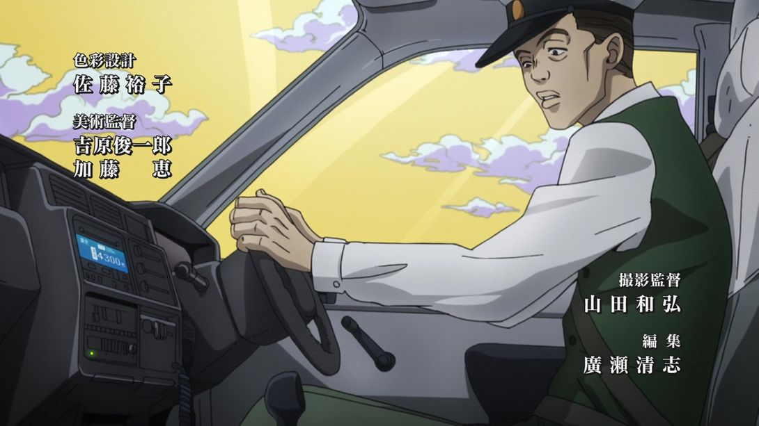
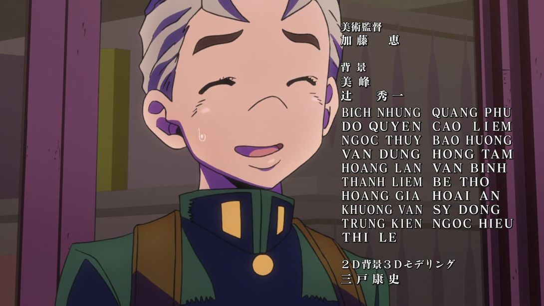
- Art director 加藤恵 (Katō Megumi) has been moved from the end credits to the opening credits:
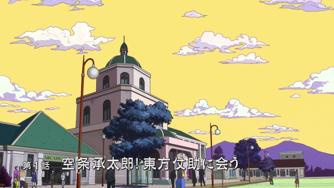
- The episode title is (very) slightly brighter:
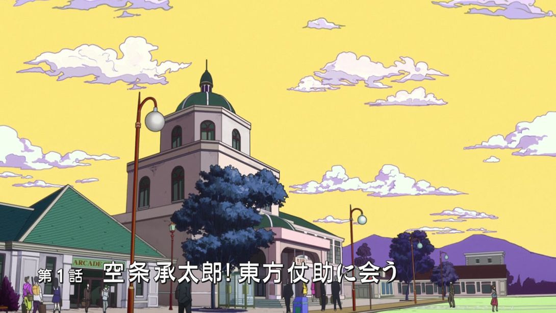
- The animation of Star Platinum catching Koichi’s things is sharper and has more vivid colors:
- Jotaro’s coattails are redrawn to be slightly less elevated and more natural-looking:
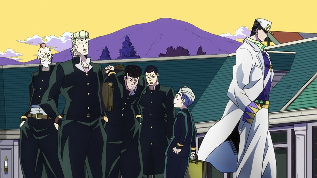
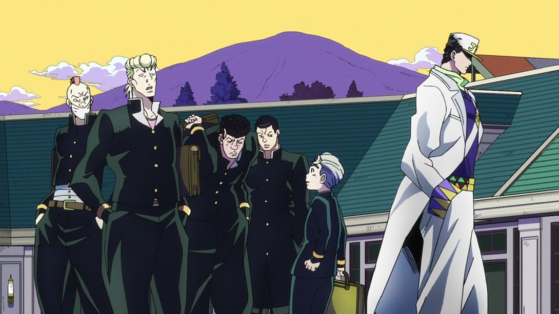
- The transition into this scene of the blonde punk grabbing the turtle is a bit longer and clearer:
- The aforementioned blonde punk has a very very slightly darker right eyebrow:

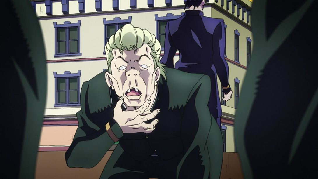
- Koichi has a thinner outer border in this scene:
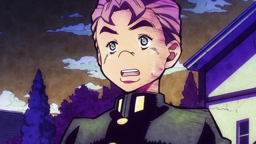
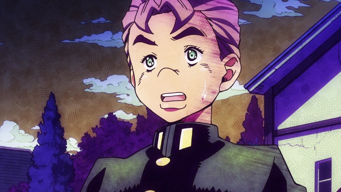
- Koichi’s mouth has been properly shaded here:
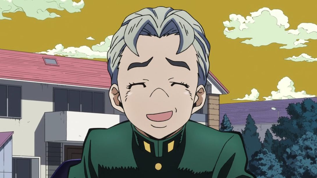
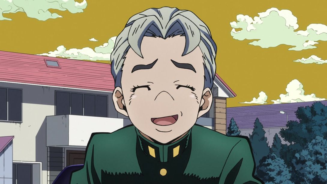
- This scene has an extra noise layer on top:
- Josuke has a bighter and pinker aura in this scene:
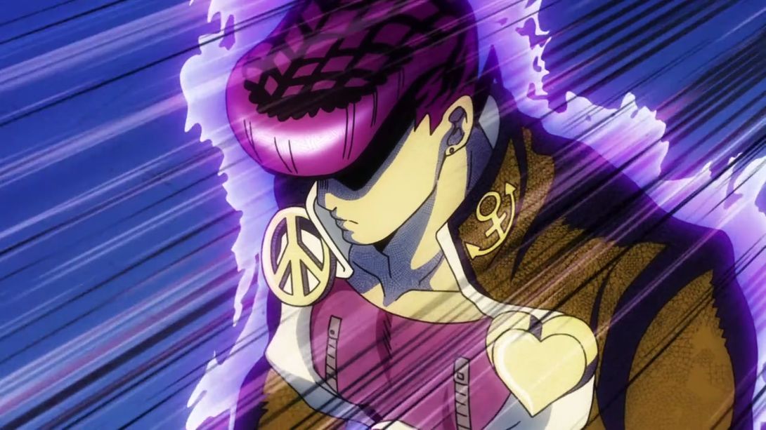
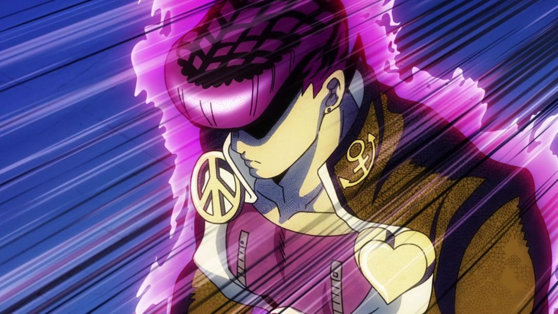
- This scene has brighter colors:
- Crazy Diamond’s punch has been uncensored (the second censoring is a bit hard to spot):
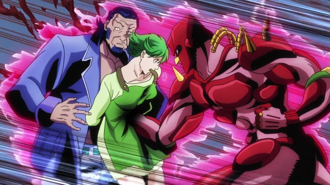
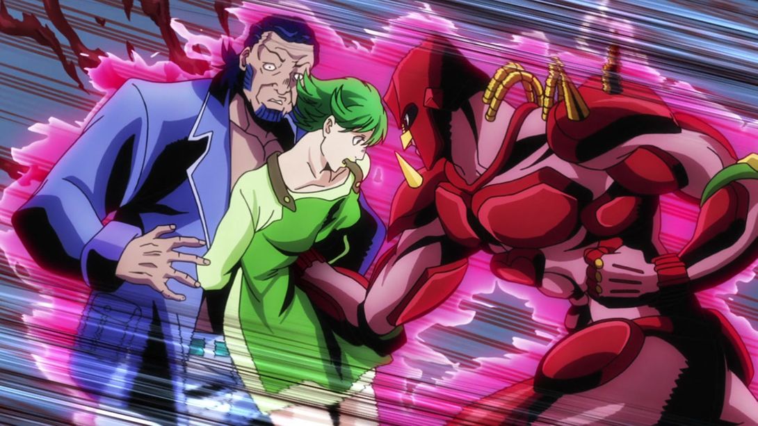
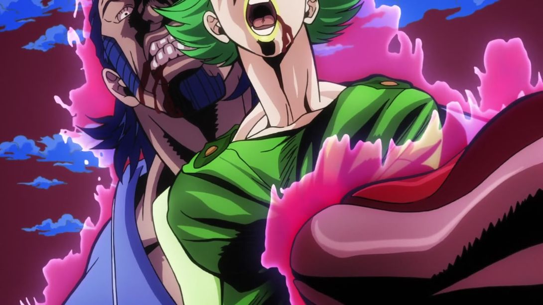
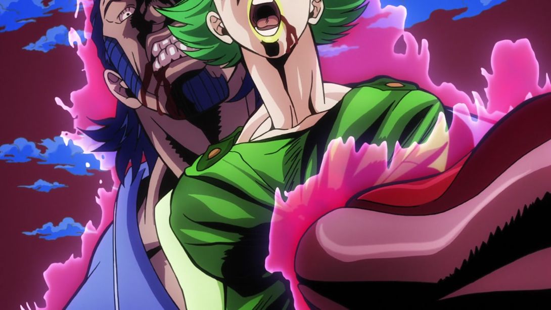
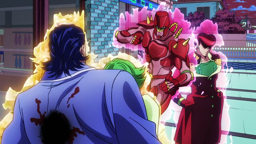
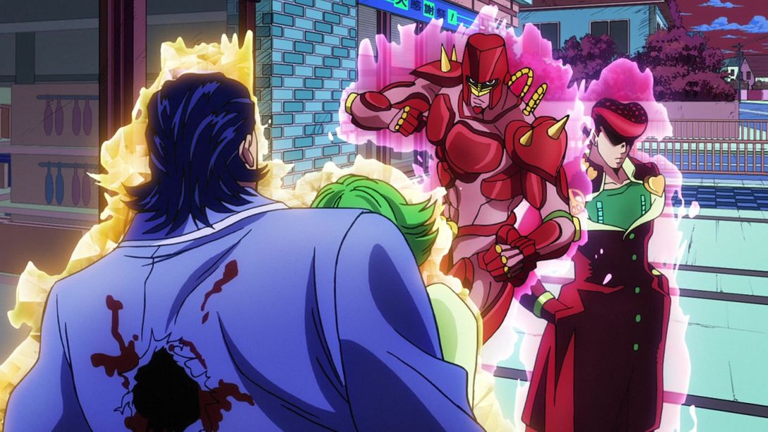
- Several people have been removed from the end credits:
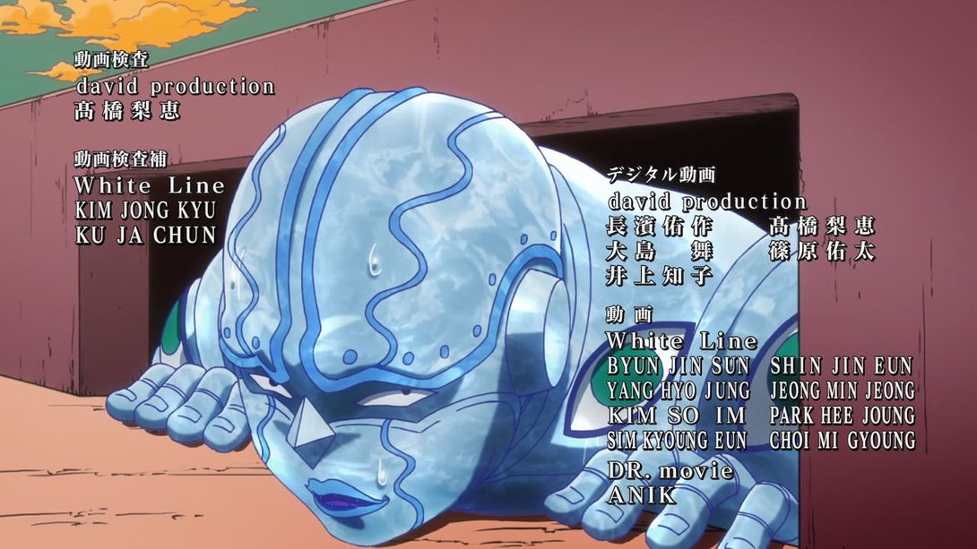
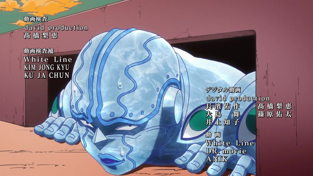
- Same as before here, plus they rewrote 仕上げ (Finishing touches) as 仕上; it’s not really a spelling mistake but more of a consistency thing, since it can be written both ways and further on they settle on the latter spelling:

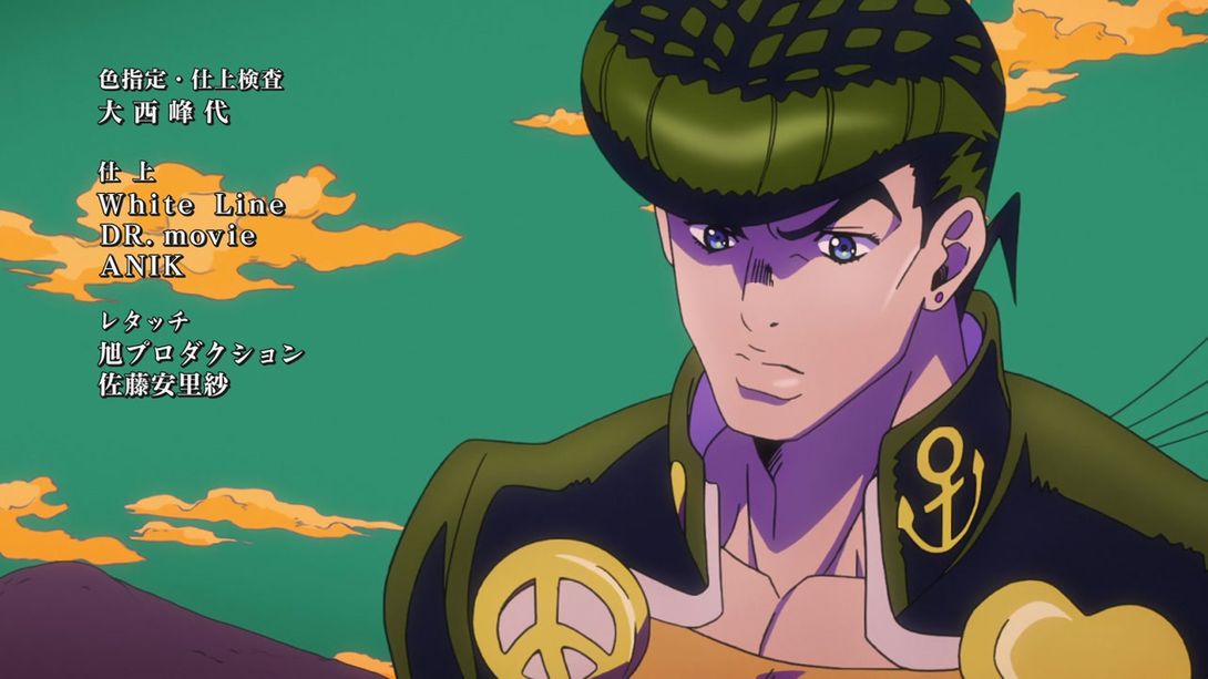
- As stated earlier, 加藤恵 (Katō Megumi) is no longer in the ending credits:
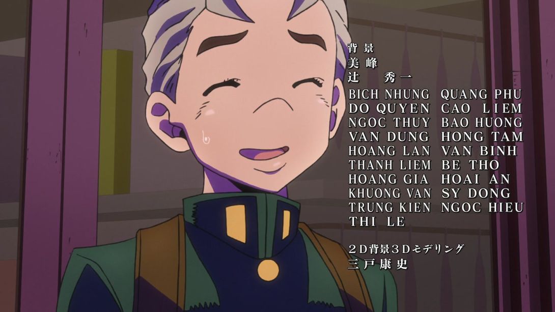
- The “next time” card is slightly brighter:
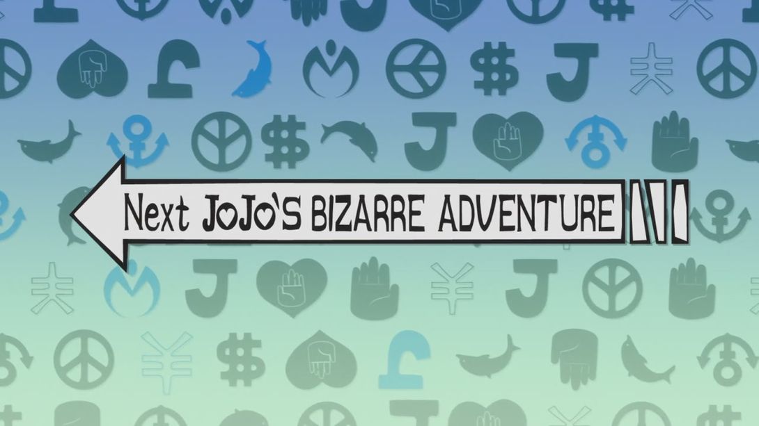
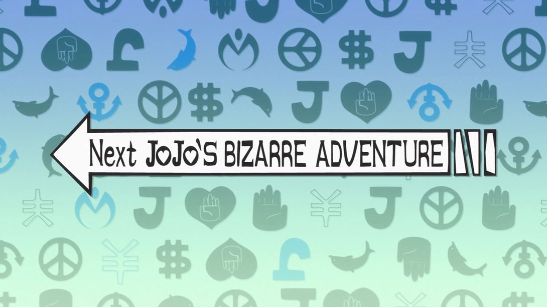
And that’s all for this episode, I’m afraid. As I said earlier, this first one didn’t have many changes: mostly colors, cleaner animations and a couple of very minor fixes.
Tune in next time for the Dog Eating Extravaganza, as we delve into the Episode #02 comparison!
Bye!
P.S.: As you might have noticed, the previous blog I used for the comparisons no longer exists. I’m afraid it is completely my bad, since I misread the hosting prices and I assumed that it would be free! Hopefully this is the last time I have to migrate to a new hosting service!

