Well well well, ladies, gentlemen, and everyone in-between… Here we are at last! The end of Battle Tendency! Are you sitting comfortably? Are you ready to say goodbye to young Joseph?
Let’s cut to the chase and get this thing going!
- Today’s first difference is this explosion, now brighter in the BD version:
- Here, Kars has been retouched, and his mouth is now open to reflect the fact that he’s beeing melted in a frigging volcano:
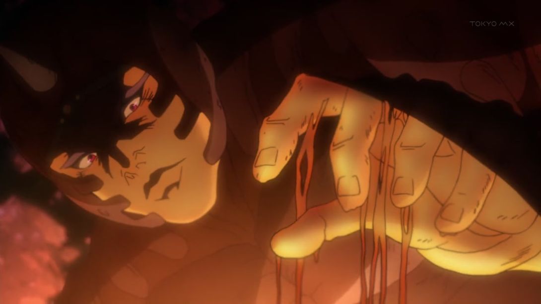
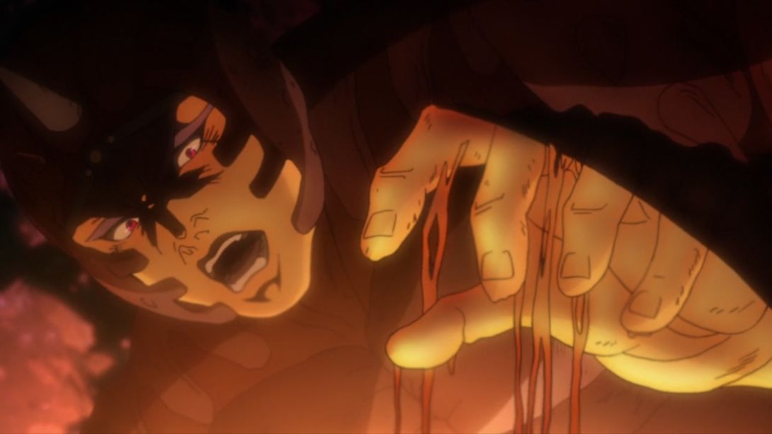
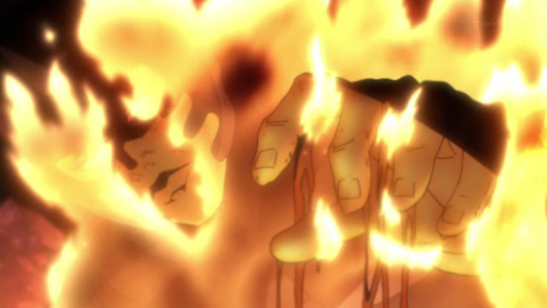

- Joseph has been redrawn here:
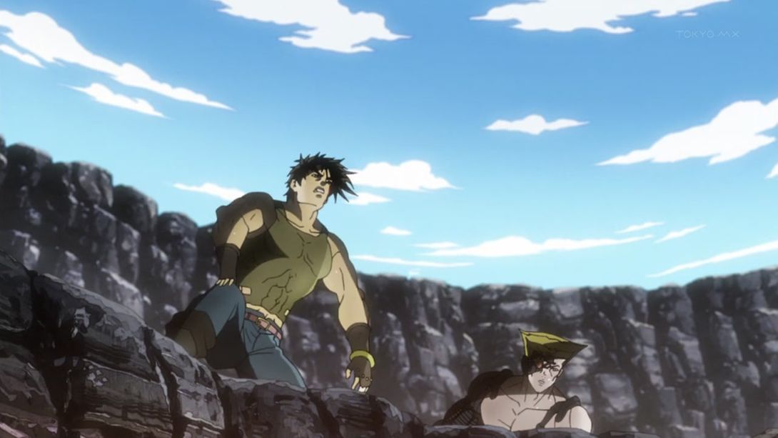

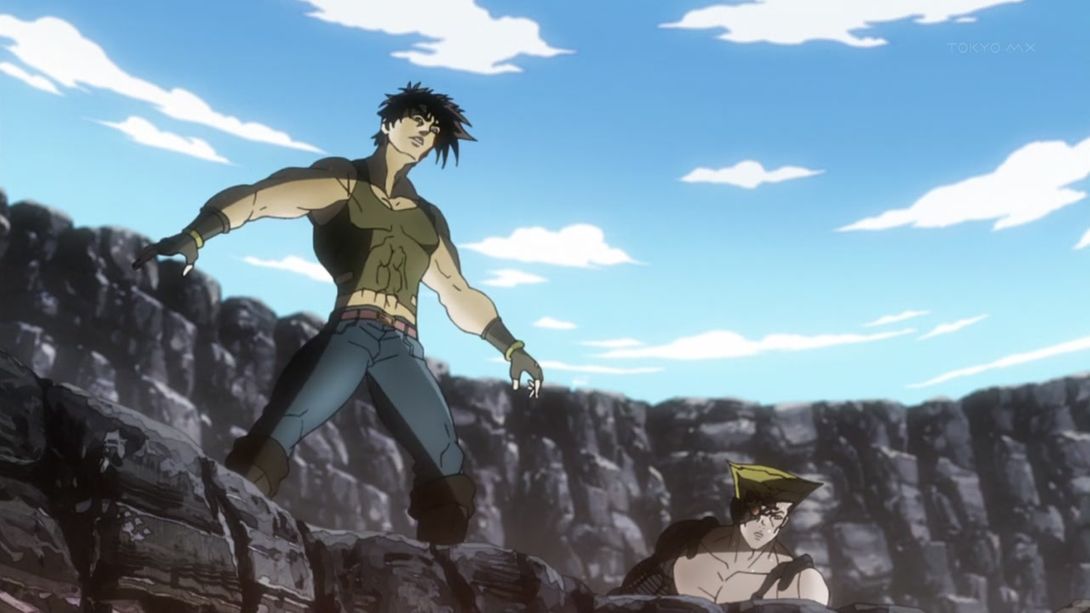
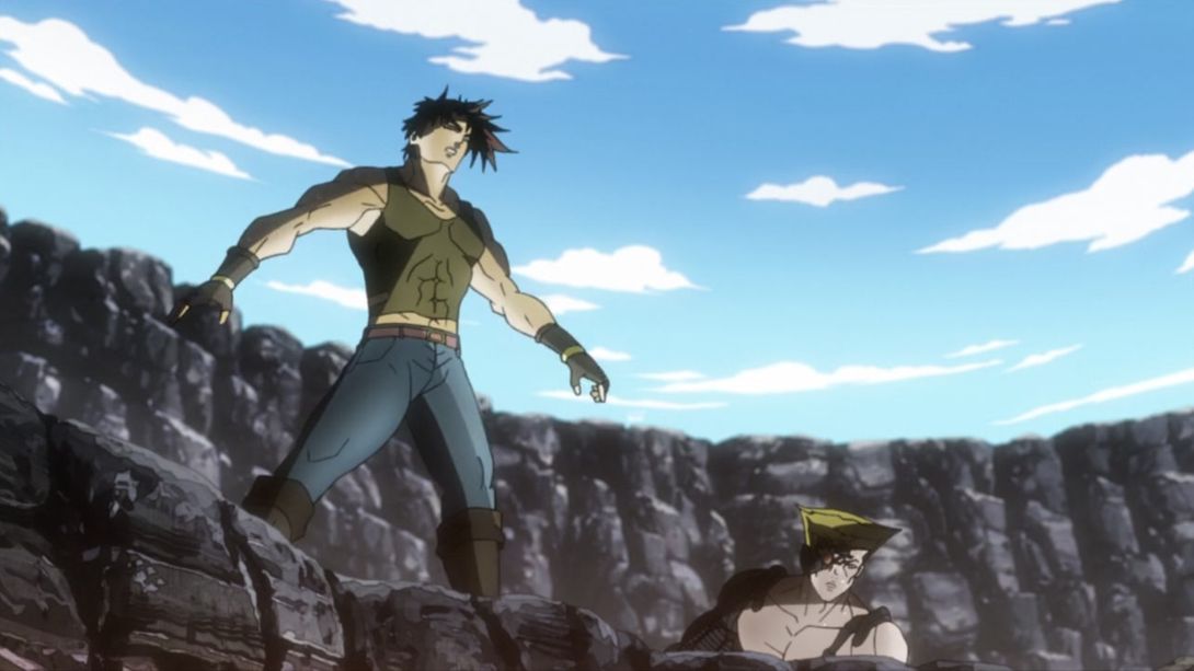
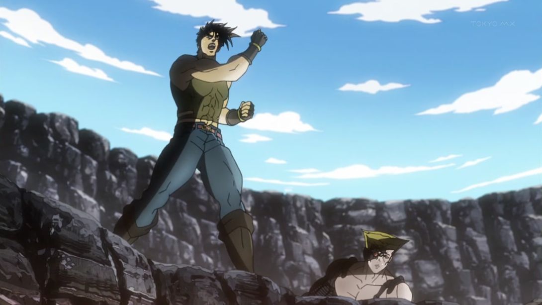
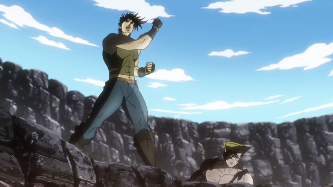
- Stroheim’s head and neck have been retouched here, and if you move the slider left and right very quickly you can see him subtly headbanging to the German national anthem (which, I’m sure, is constantly looping in his mind):

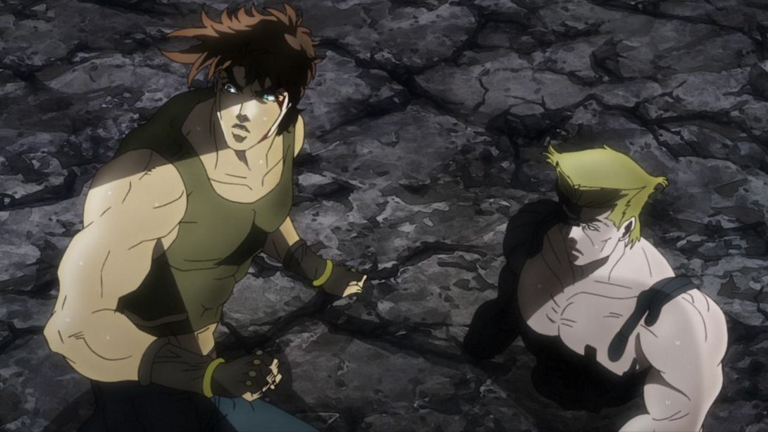
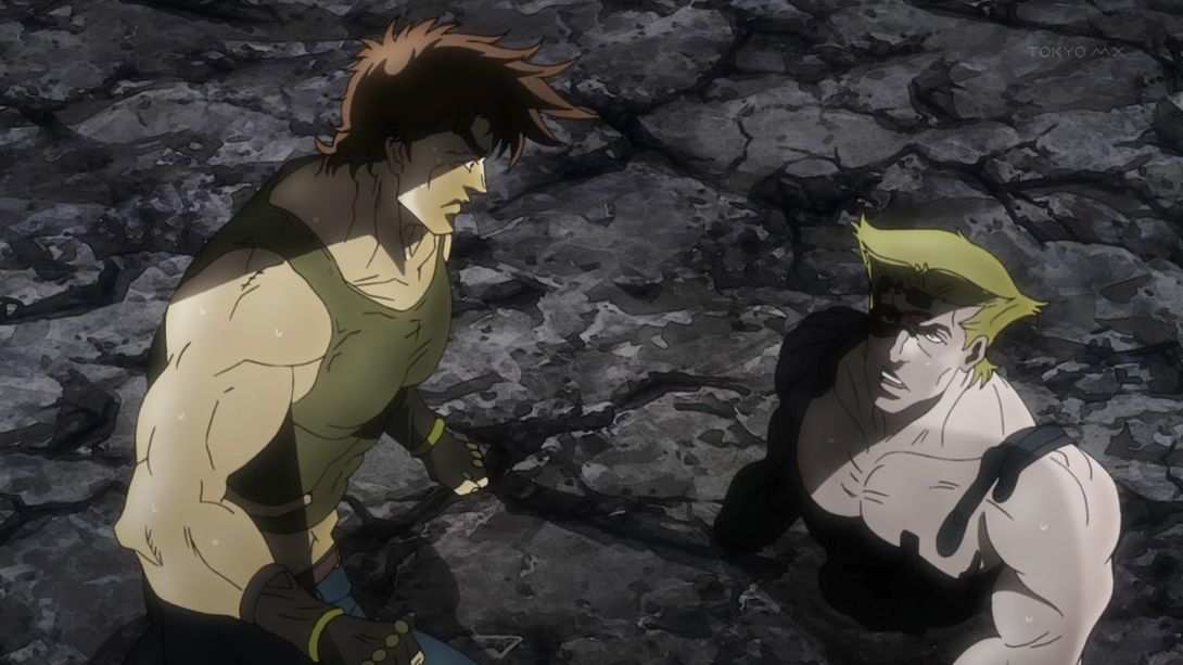
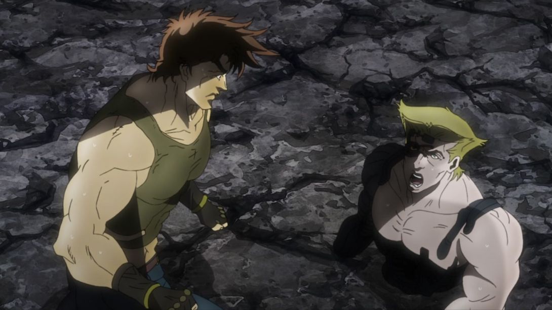
- Joseph’s neck has also been shaded a little more in some frames like this one:

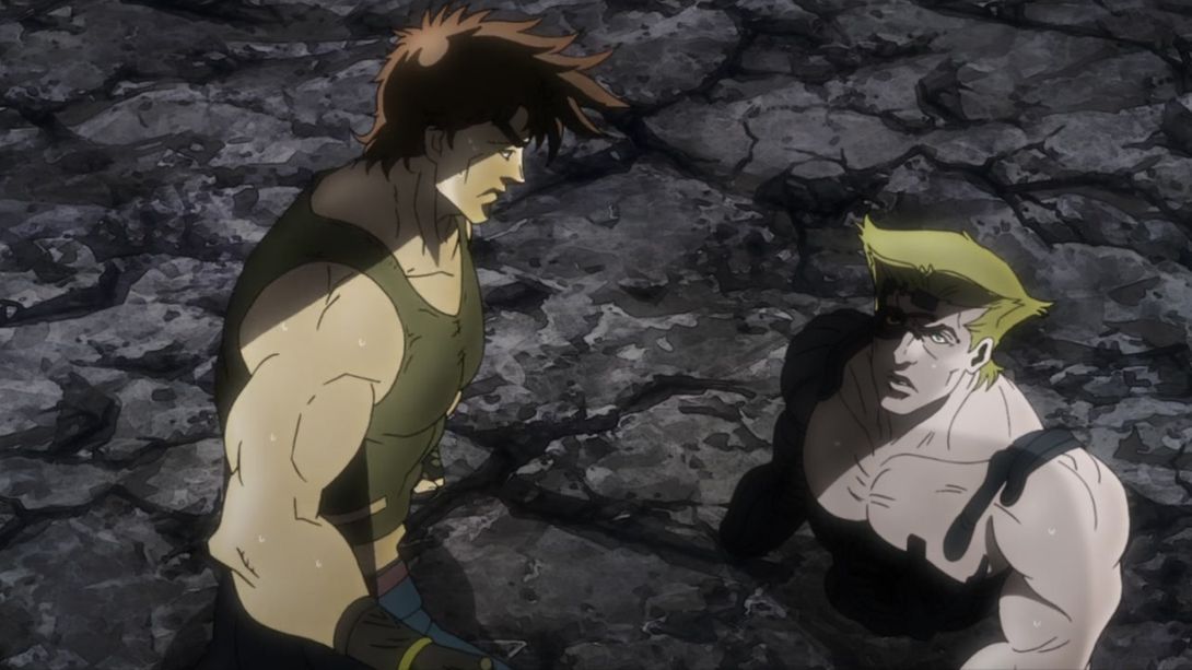
- Joseph’s arm has been uncensored here…:
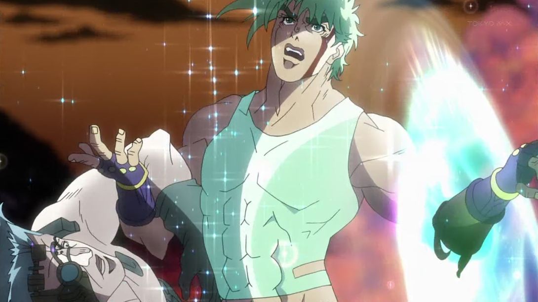
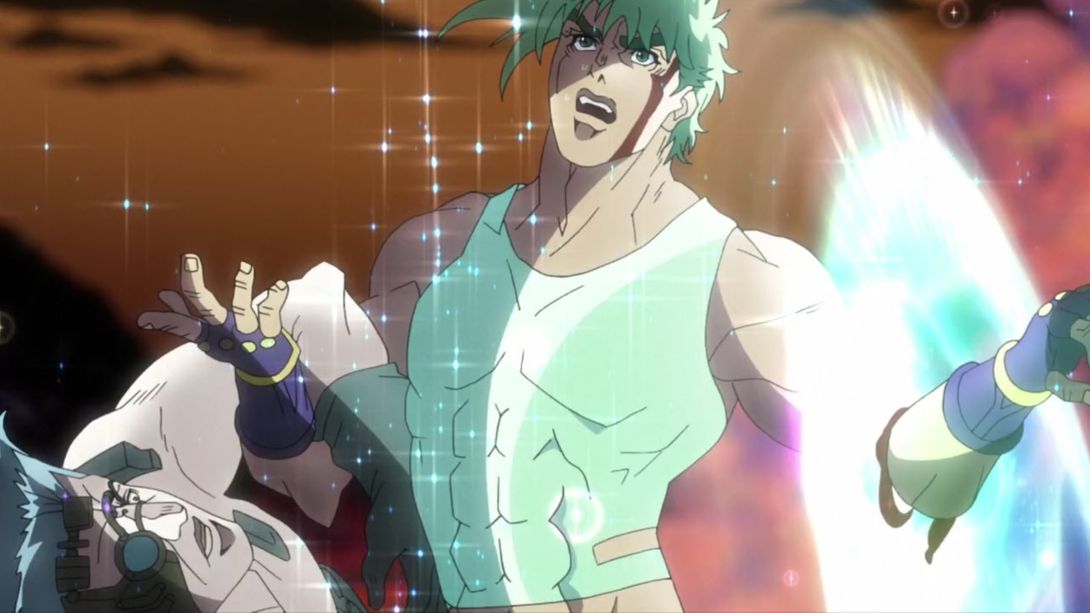
- …the onomatopoeia is also slightly different…:
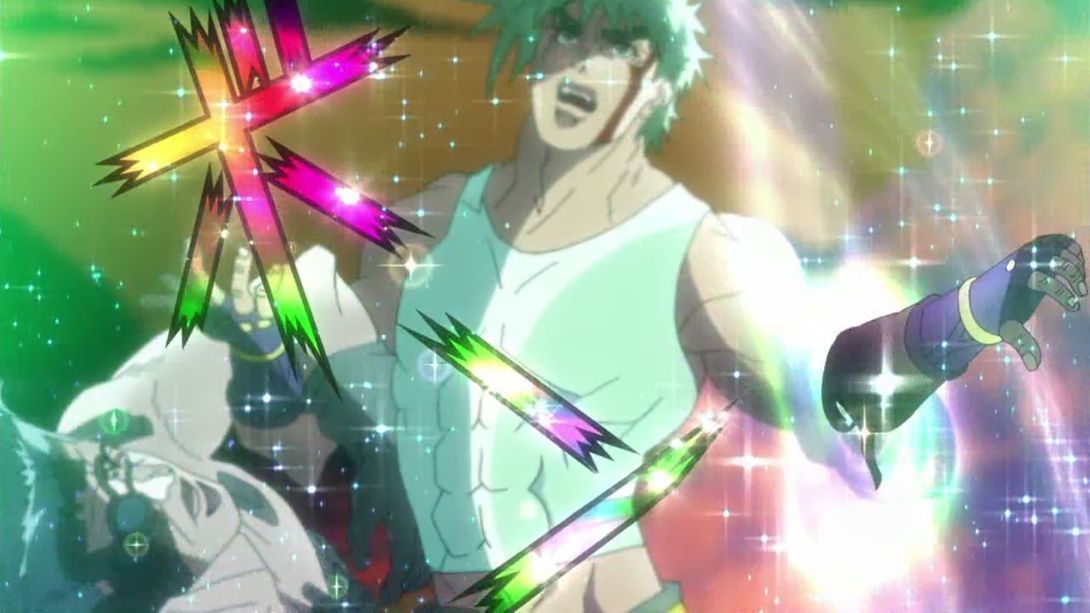
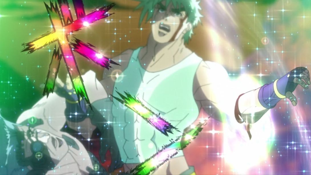
- …and towards the end of the same animation, in addition to the new blood particles, the camera has also been moved:
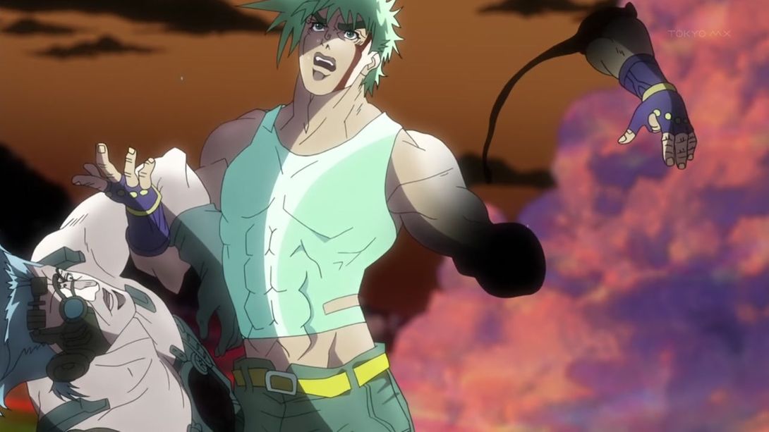
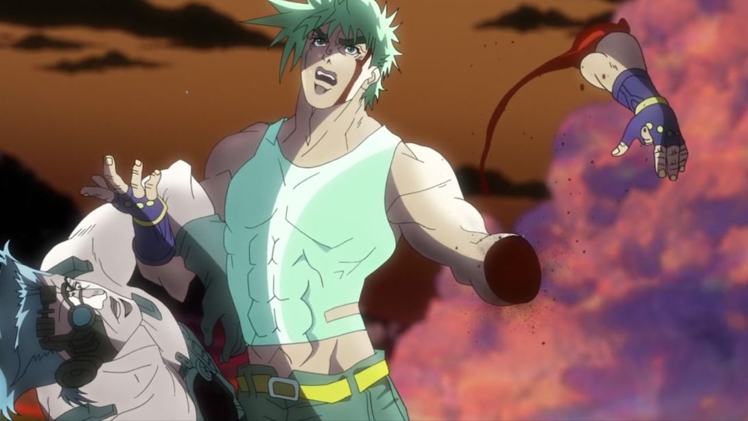
- Here, the camera is slightly different, the arm is once again uncensored and there are more blood particles:
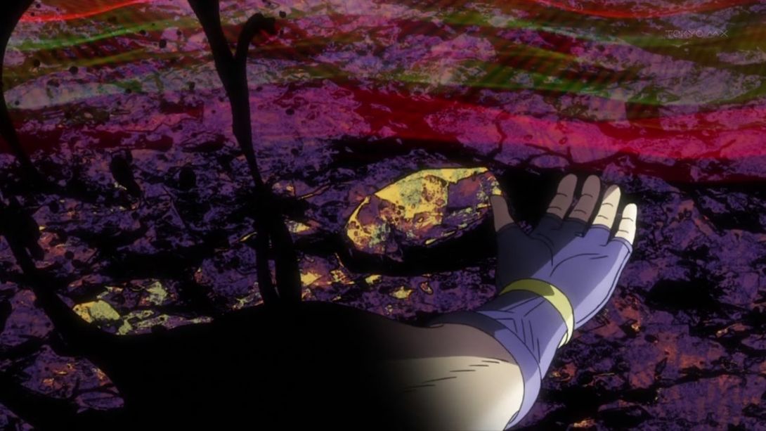
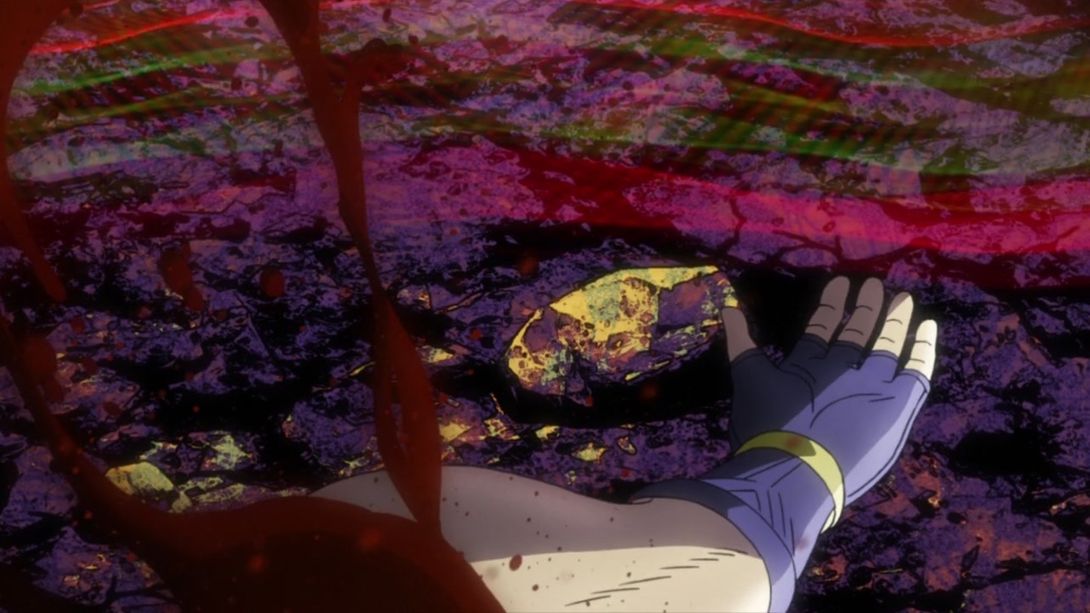
- And the shot oscillates a bit more in the BD version:
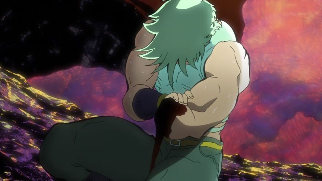
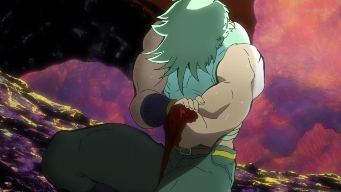
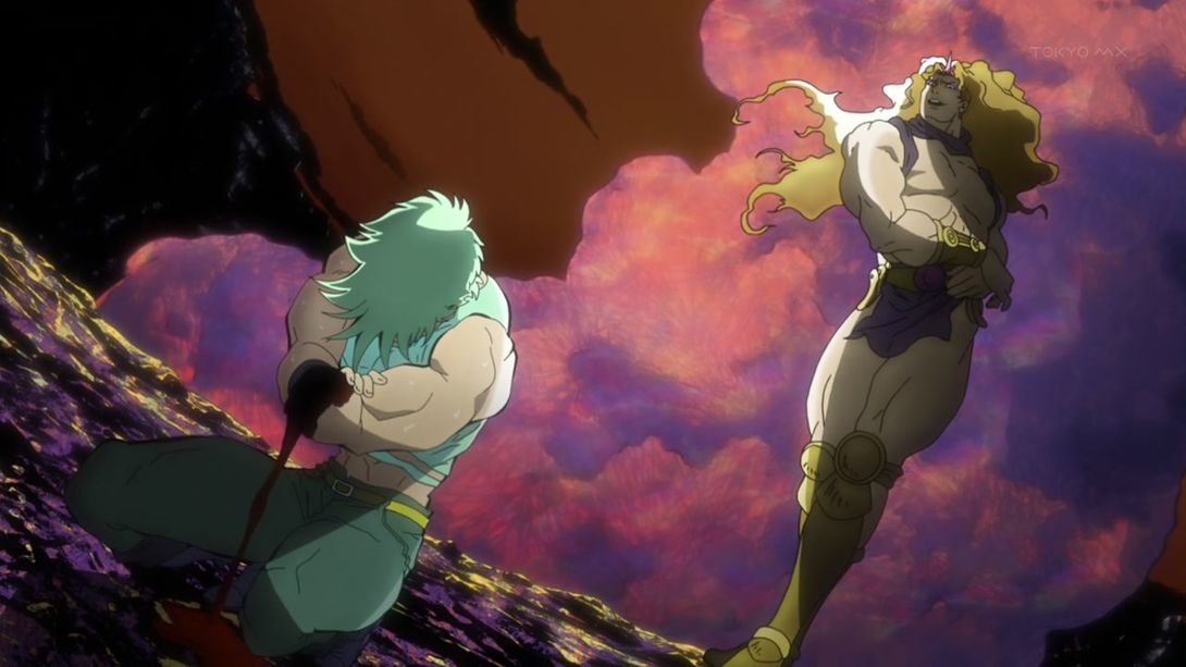
- Here’s a similar shot! The camera has been slightly moved, Joseph’s hand stump has been uncensored, there are less blood particles (weird, I know), the shaded parts are a little darker and have received the usual scratch texture overlay:
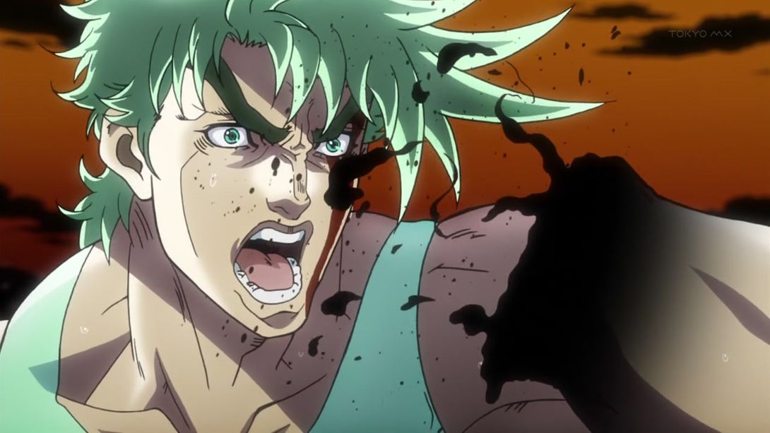
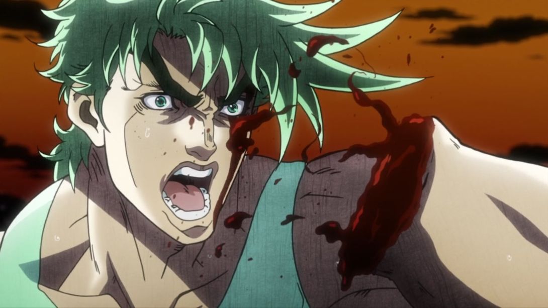
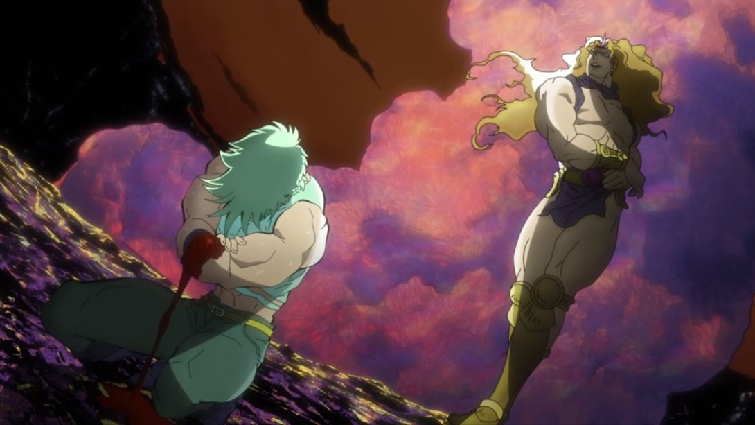
- Alright, there’s a bunch of different things here… Most things have been moved around, slightly re-shaded or recoloured, the pink blob (it’s actually a smoke cloud from the volcano, believe it or not) behind Kars has been resized slightly, Joseph’s arm stump has been uncensored again and Kars’ arm blade is now shining:
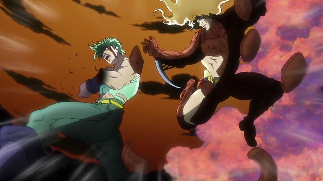
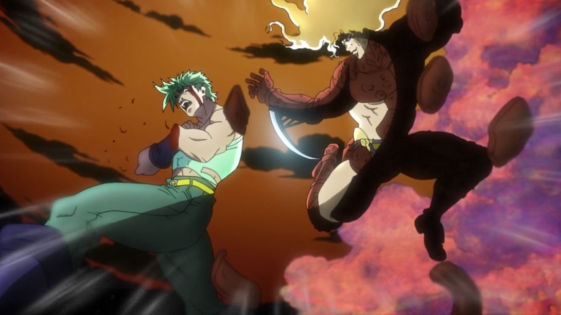
- BEWARE! THE BLOB!:
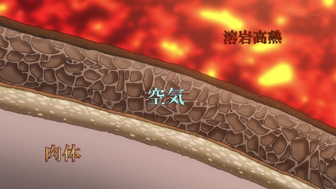
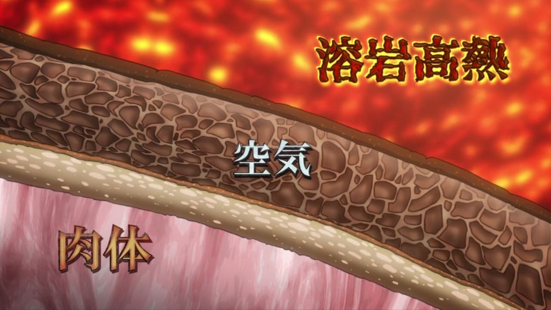
- All three sections of this diagram have different textures, the text is much bigger and now has a drop shadow:
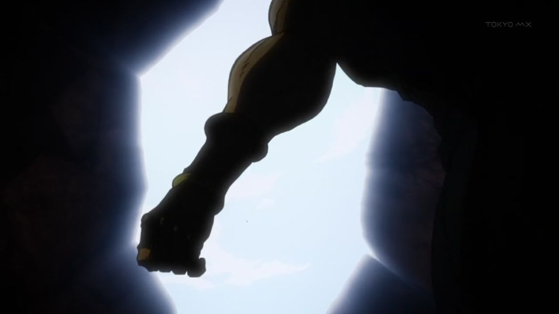
- This scene is brighter and better shaded, and the light that comes from the crack looks much better:
- As you might have noticed from the above animation, there are a couple of frames in which Joseph’s arm is lit in the wrong way, and this has been fixed in the BD:
- The Earth in this animation starts a little bit blurrier:

- And Kars has been redrawn too:
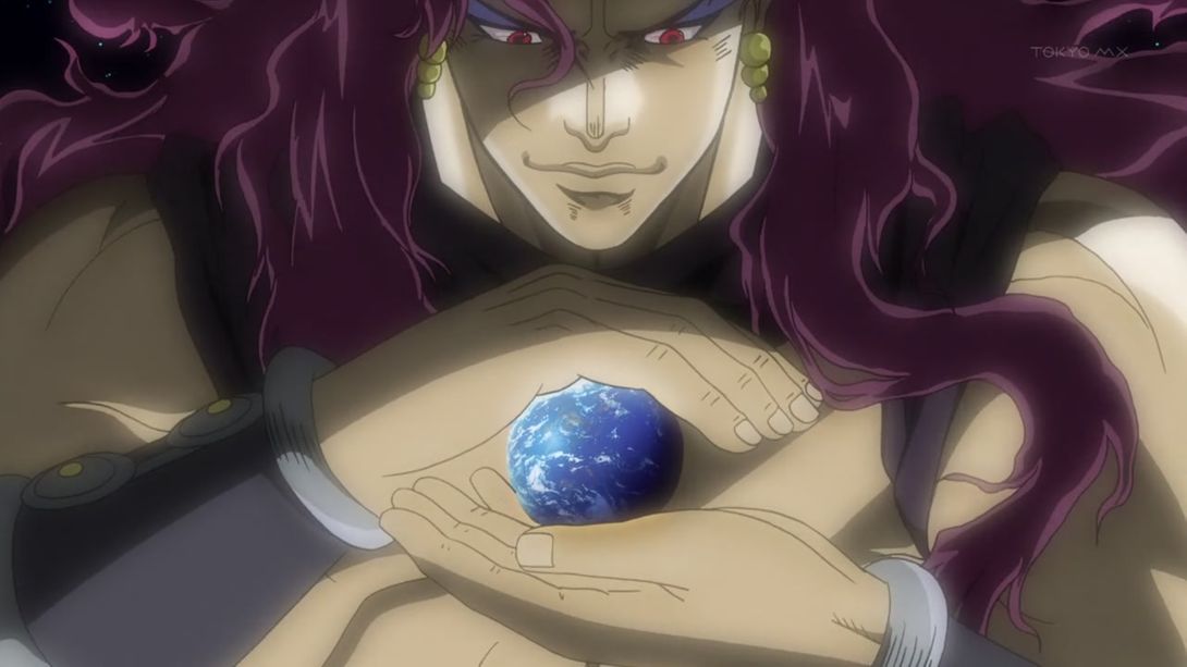
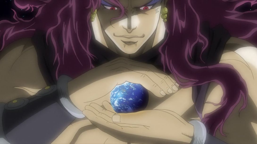
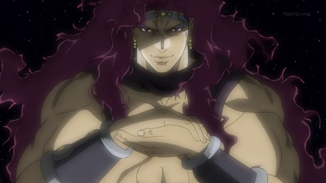
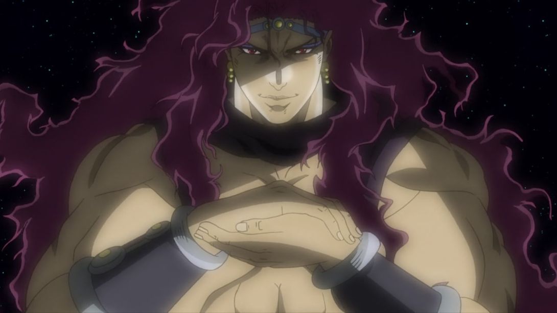
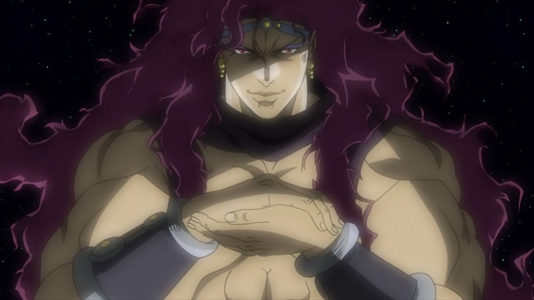
- The animation in the TV version later becomes the same as the BD version, except for the shading on the inside of Kars’ ears (very important for an omnipontent God):

- The sky is different in this scene, and Kars’ shoulder has been shaded more smoothly:
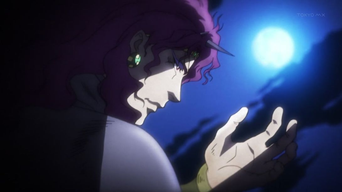
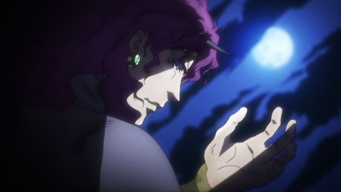
- This bit is much brighter:
- While this is a little darker (yeah, I know, it’s blurry as hell, but it’s a very brief animation. Deal with it!):
- Alright, I don’t know if this happened before, but the BD version of this episode has an entirely new bit of Kars posing majestically! Here you go:
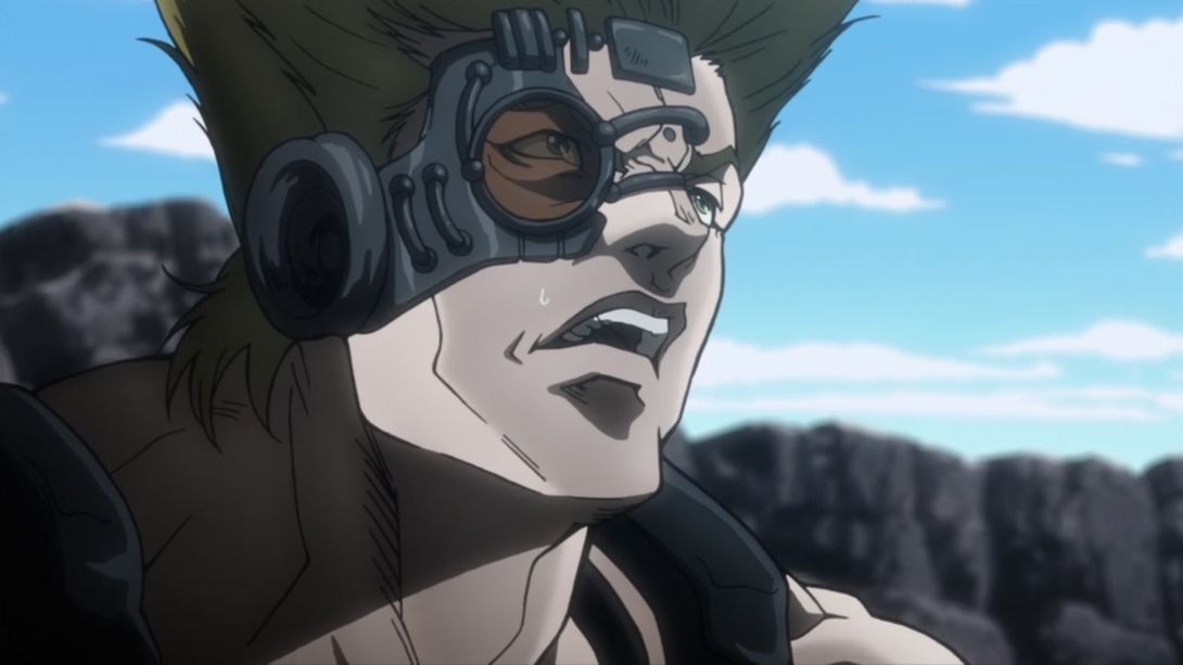
- Phew! And now for a much more dramatic, more important difference… The sweat drop on Stroheim has been moved by a few pixels:

- Here, the shading is brighter, Joseph’s arm has been uncensored as usual and the smoke on the right is thicker:
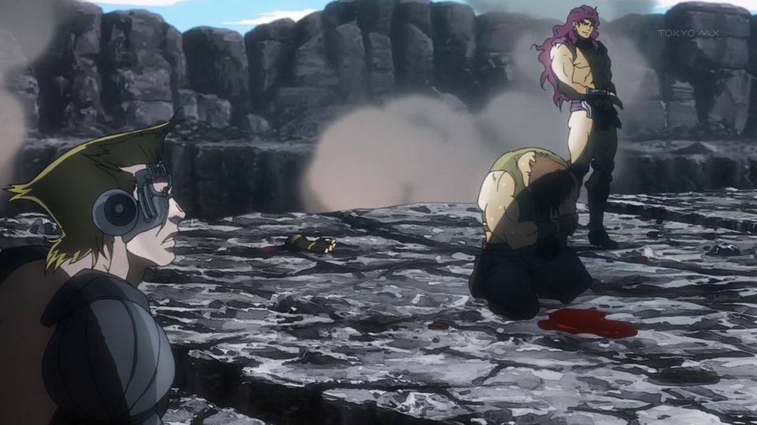
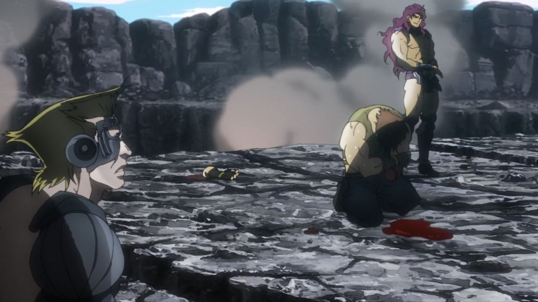
- And here, on top of the usual uncensoring, they drew in the missing arm too:
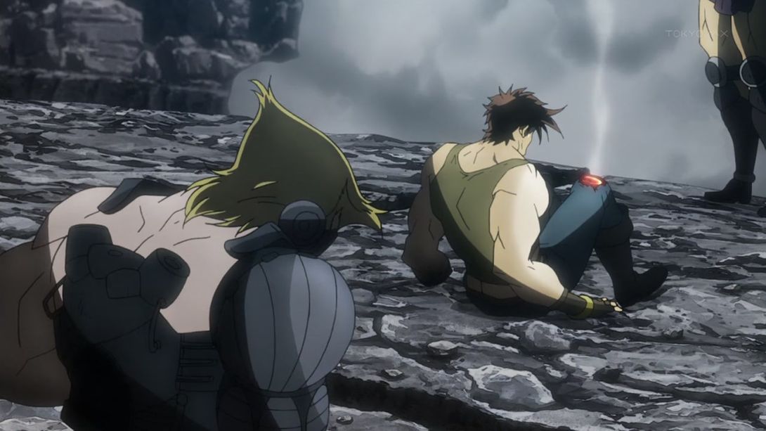
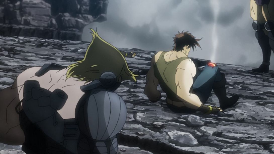
- This shot is very heavily distorted around the edges, and they drew the arm again:
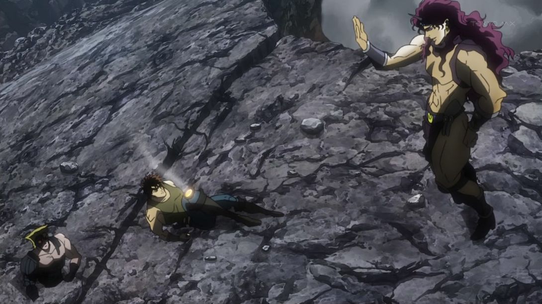
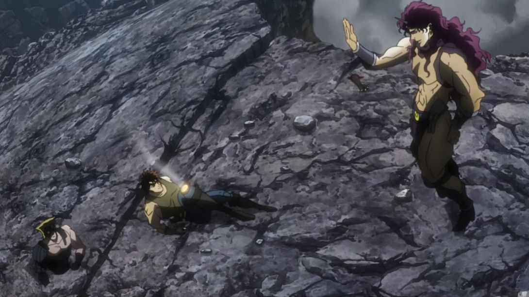
- Have another gander at that bloody stump, brothers and sisters, and also take notice of the top-left corner of this frame, which is for some reason a little brighter:
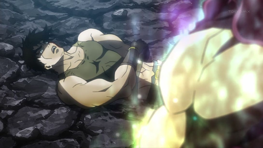
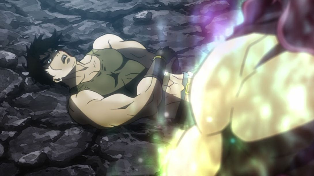
- This whole animation is different, check it out:
- Here, the lava/blood effect on Joseph’s molten knee is different, and the hamon aura surrounding Kars has also been changed:
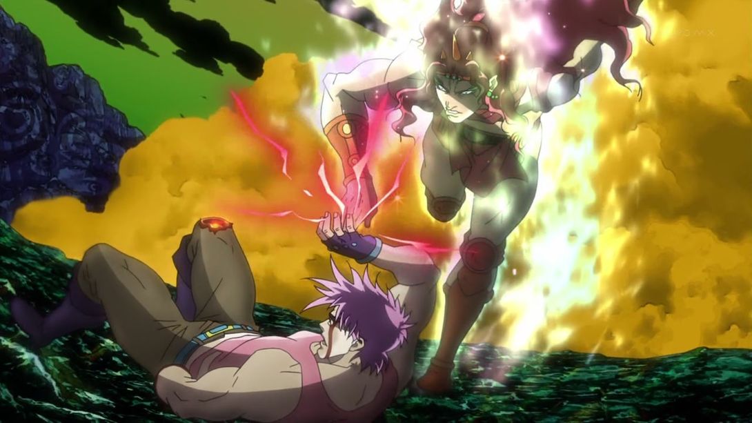
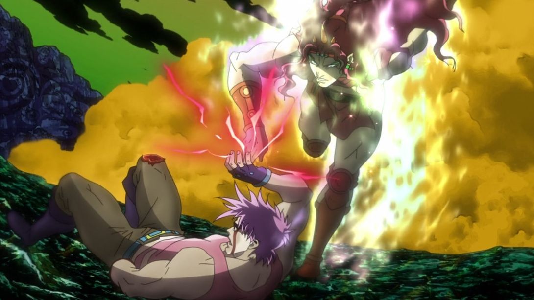
- Whew, this one has a bunch of different things! First of all, check the background, which has been shaded differently and looks less flat… Then take a look at the Aja stone, which now exists on the physical plane and therefore casts a shadow, and then marvel at Kars’ hand, which is now surrounded by a brighter and sparklier hamon aura:
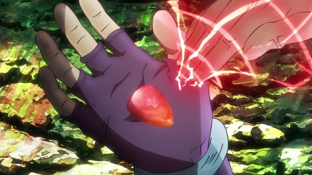
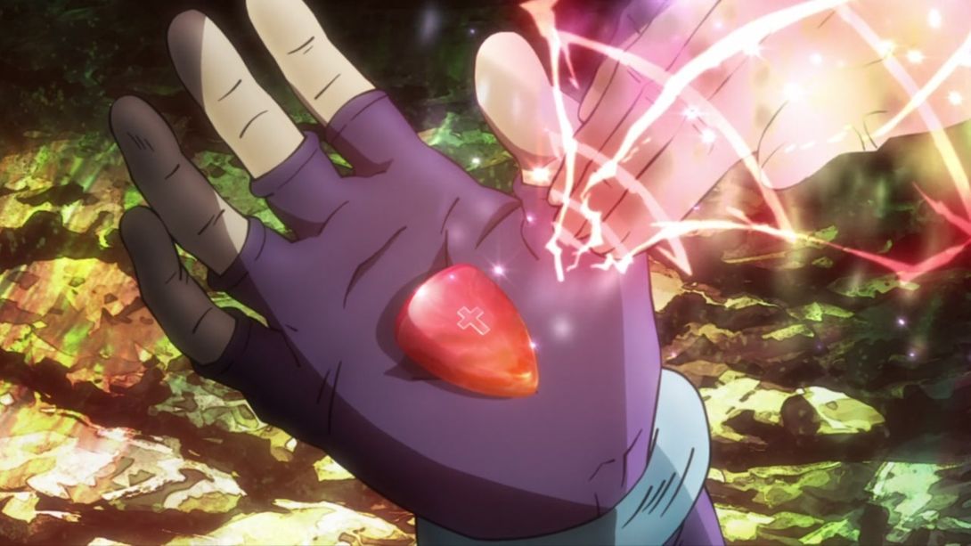
- The freeze-frame right before the eyecatch has been recoloured as well:
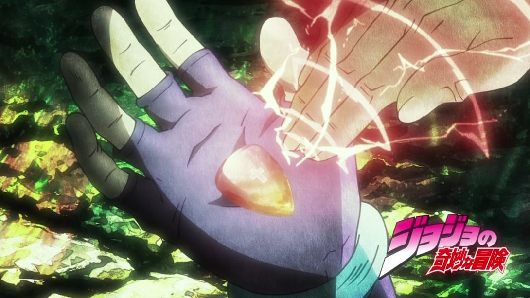
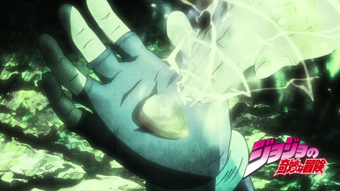
- The light effects here on the hamon ray of death are much brighter…:
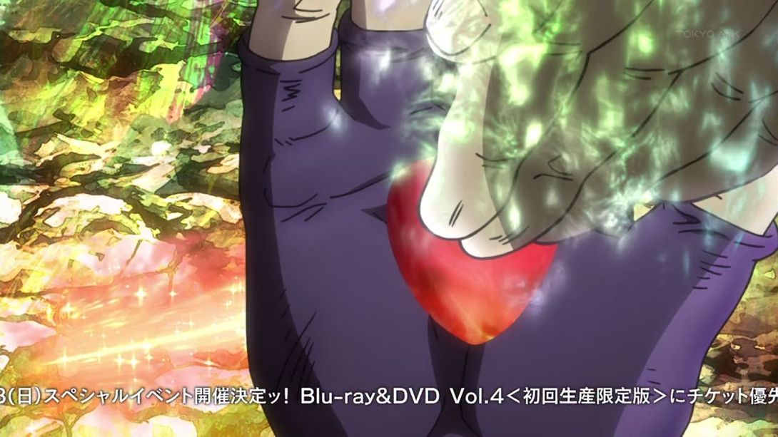
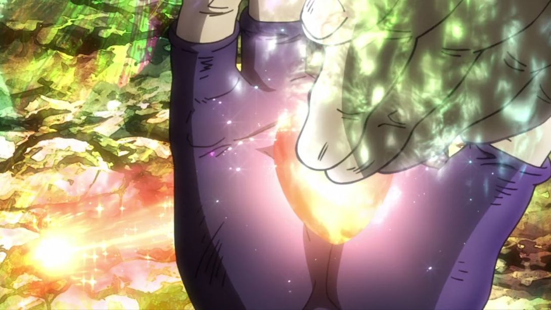
- …there are a couple of frames which were white (well, actually, grayish) in the TV version and have been drawn in, in the BD version:
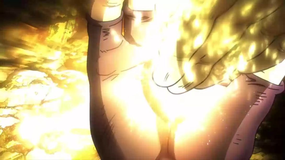
- …and the frames after Kars hits the Aja stone are also much different! It’s probably better if you look for yourself:
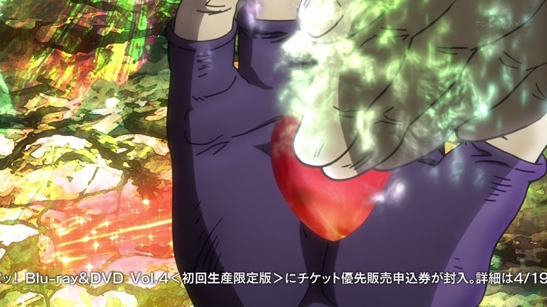
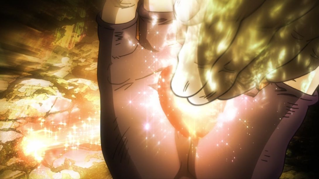
- When Joseph’s face appears in half of the frame, he’s very brightly illuminated for a couple of frames…:

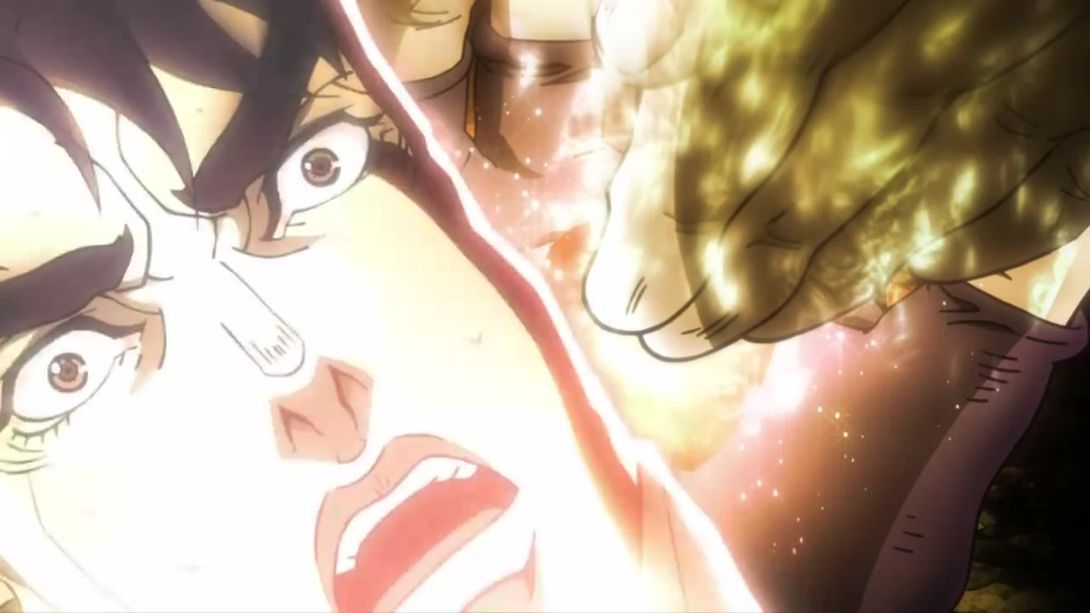
- And, as you can see above, when the bright flash subsides, Joseph’s face is lit with a different colour, there’s a new motion-blur around the edges and the dividing line-thing is also brighter:
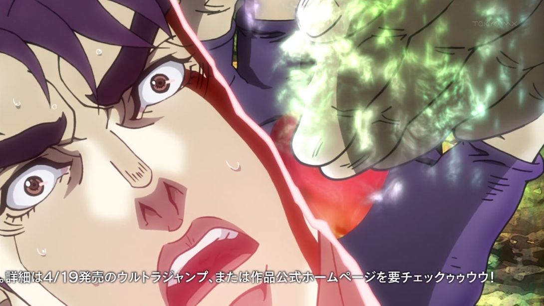
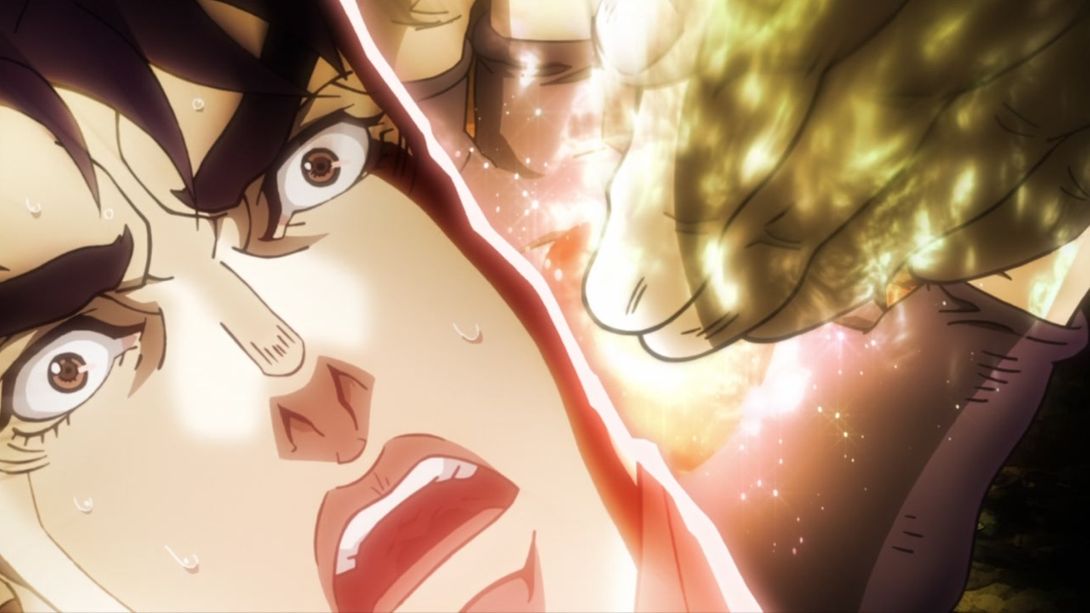
- On top of the same difference as above, this flashback scene (of like ten seconds ago) has been recoloured as well:
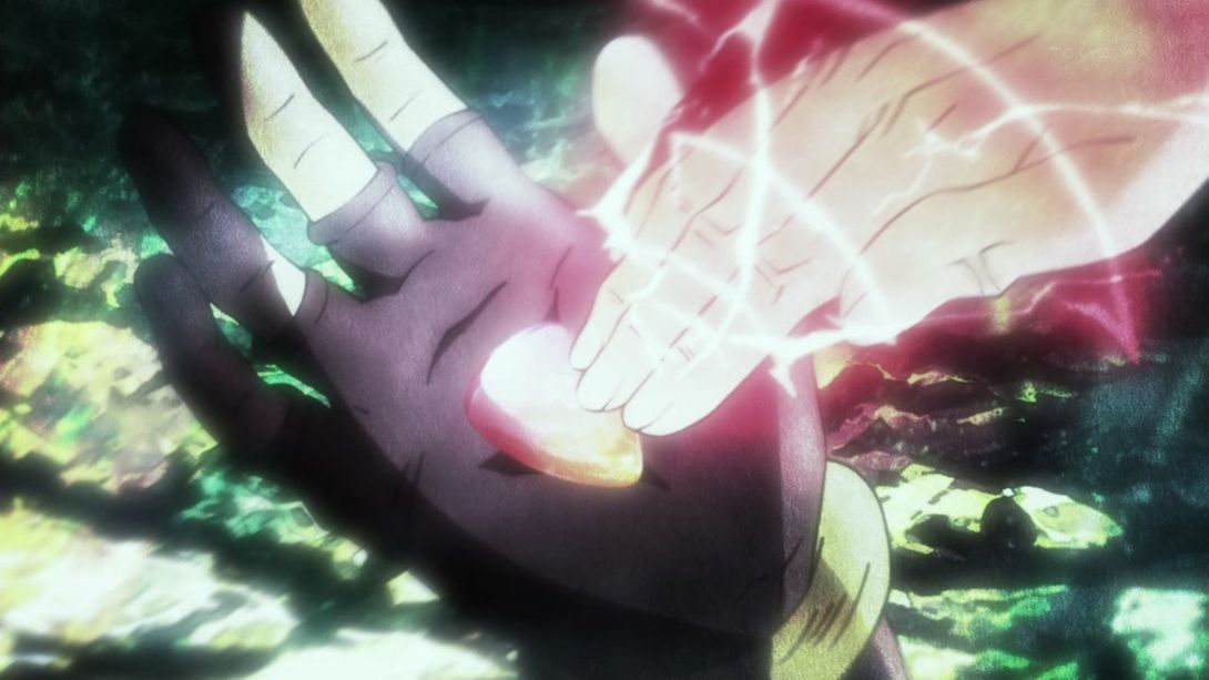
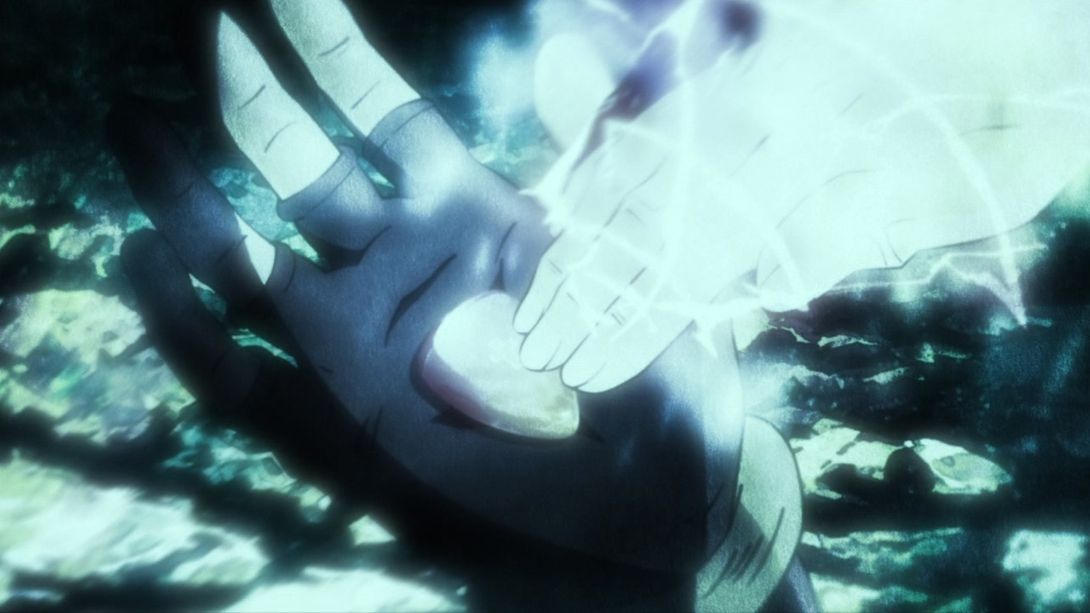
- This scene is slightly more zoomed in, the camera is moved and they added an onomatopoeia in the BD version:
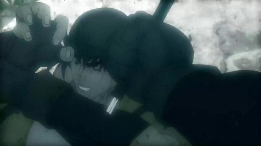
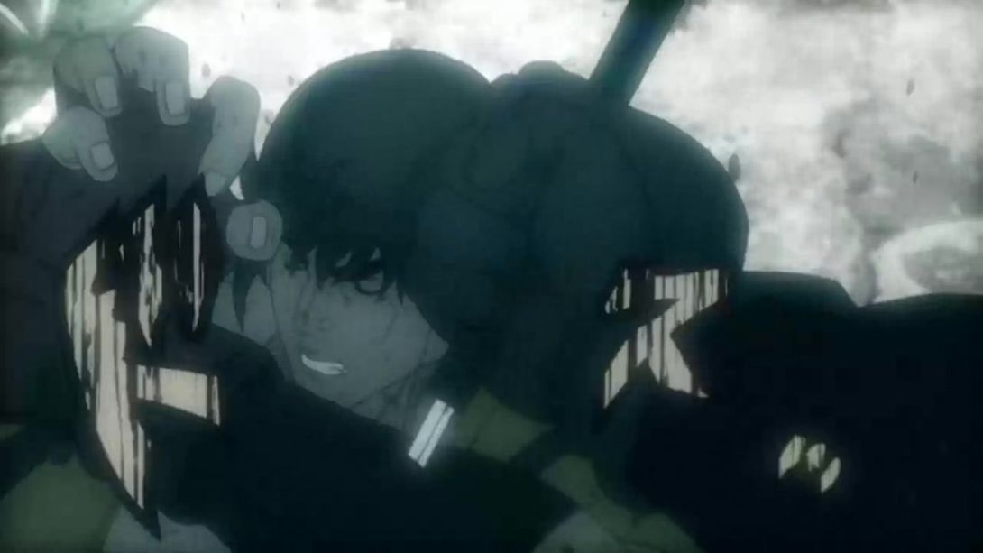
- Let’s move on with the flashabacks! ACDC now has an aura in this scene, he’s been reshaded and his right hand has been retouched and there are more blood particles:
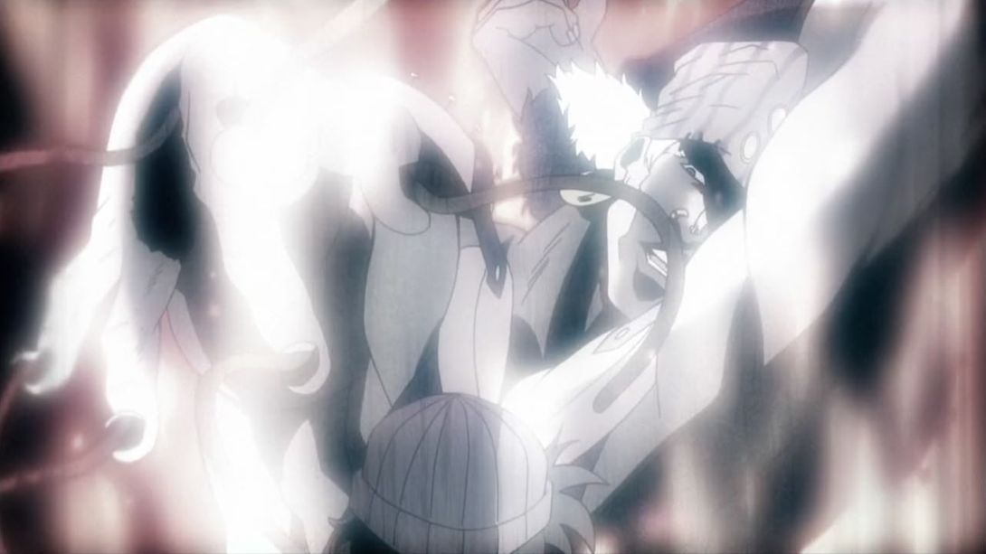
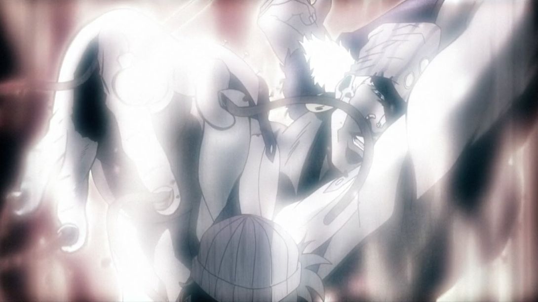
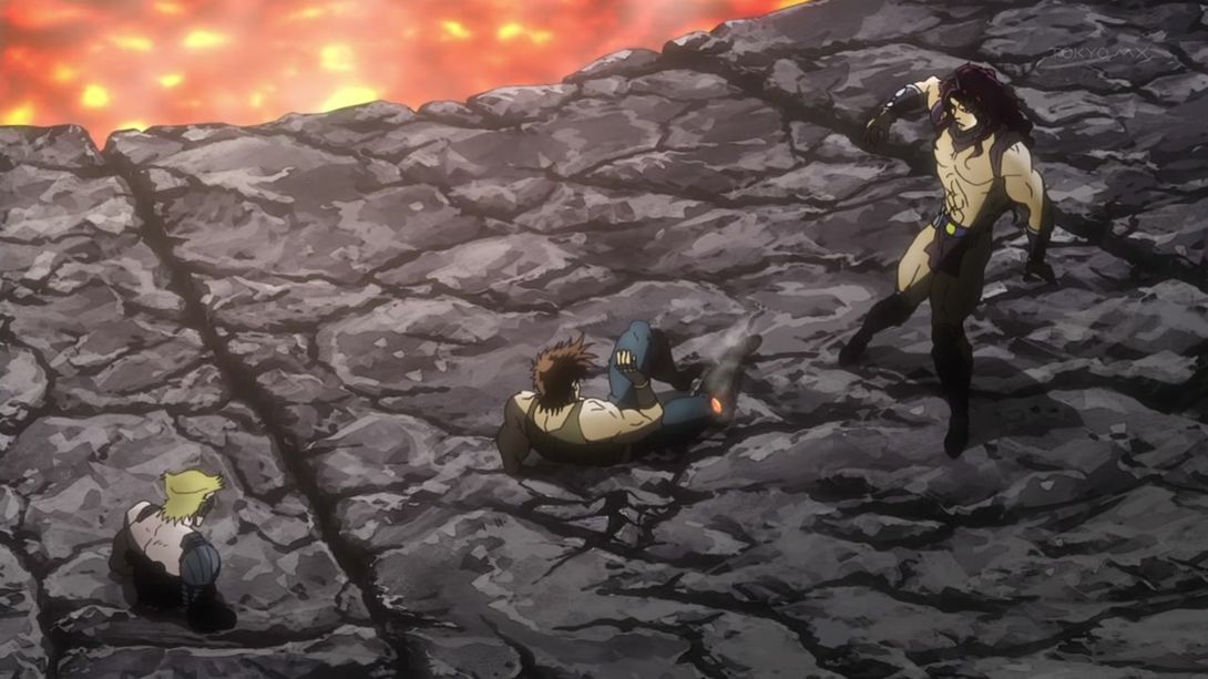
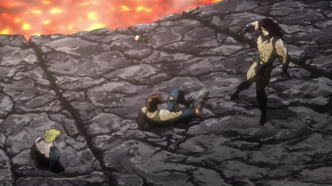
- They added the arm here, once again…:
- These two explosions are brighter and sharper:
- The dust is thicker in this scene, the dirt particles in the air are different, Stroheim’s mechanical eye shines very brightly in the sun…:
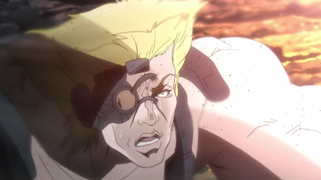
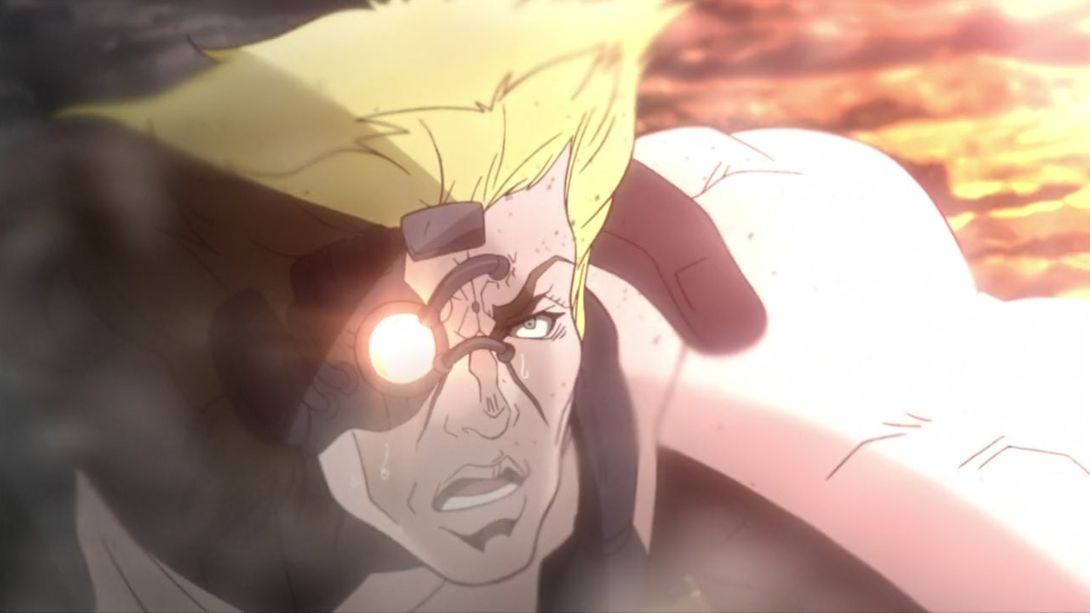
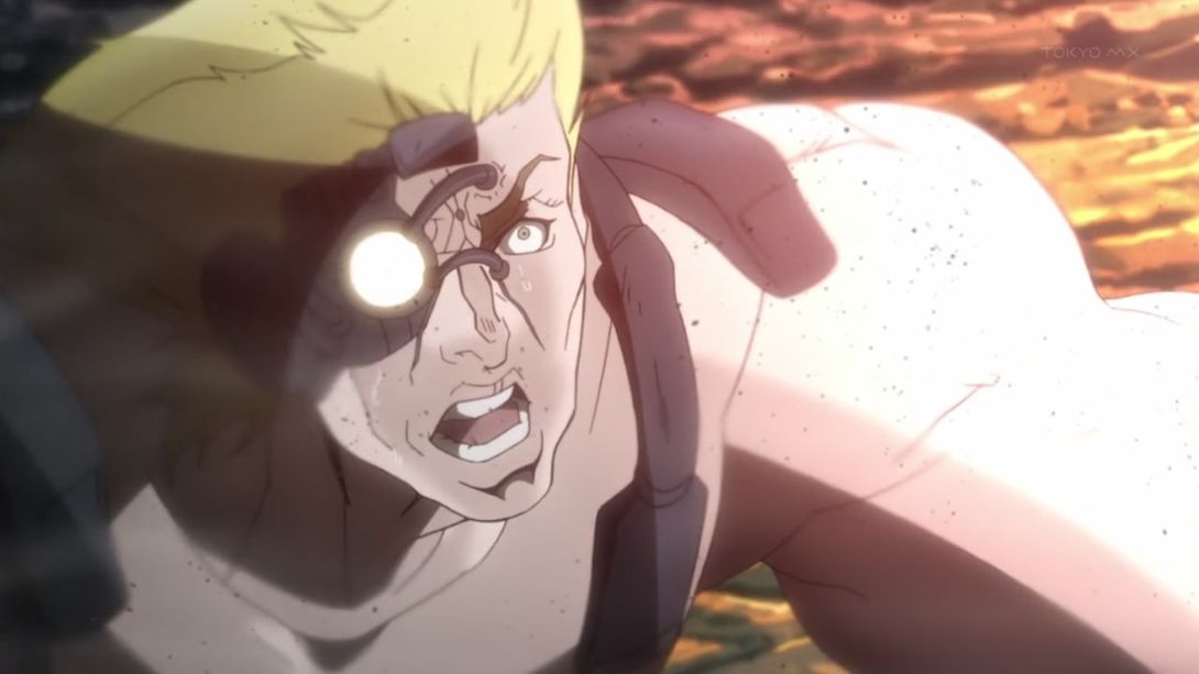
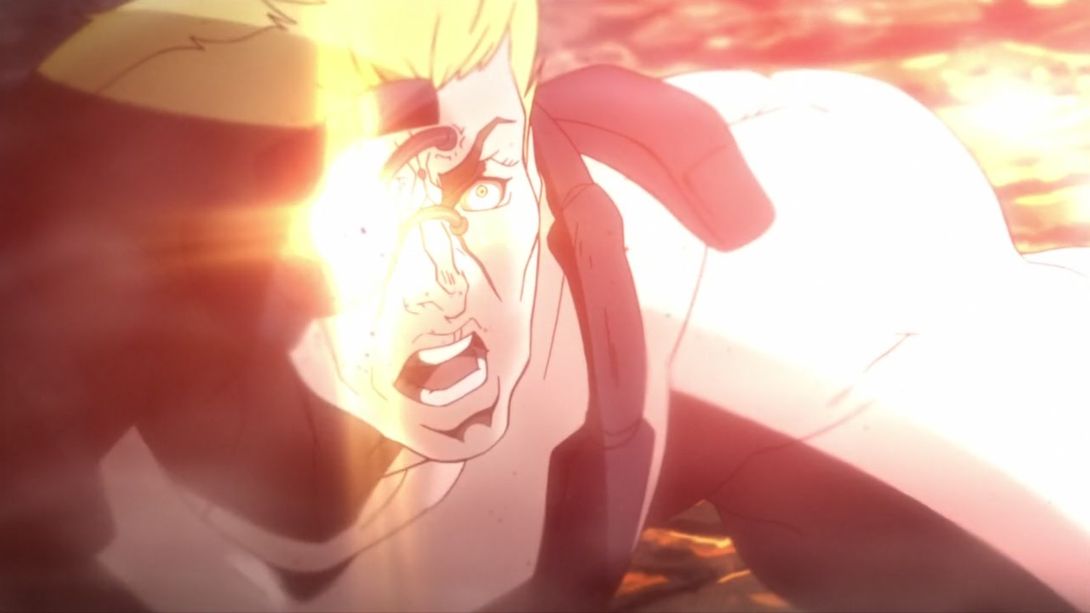
- …and the camera shakes more too:
- Joseph, Kars and Joseph’s hand have all been moved more to the center of the rock, and the camera has been moved too:
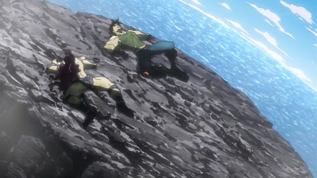
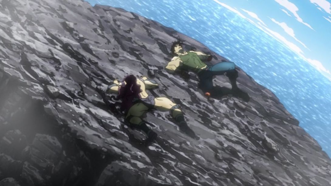
- Both have been moved and retouched, here:
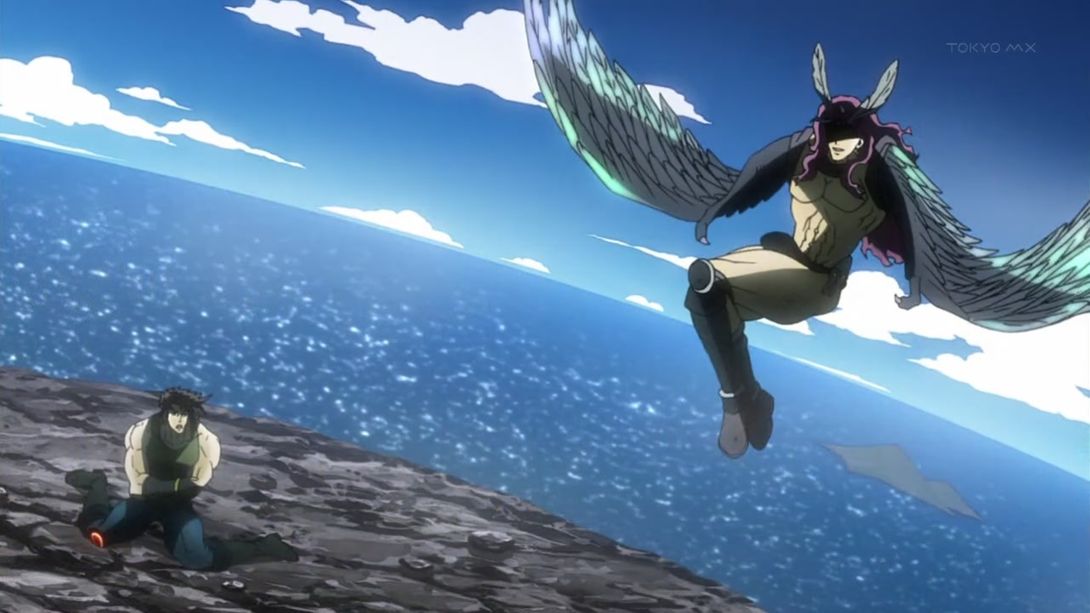
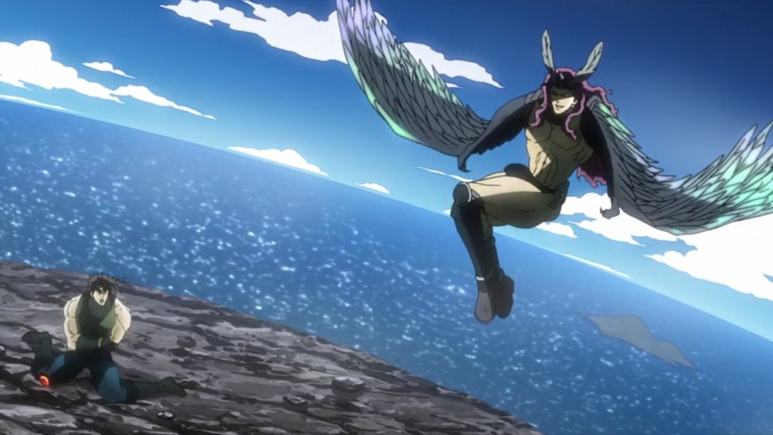
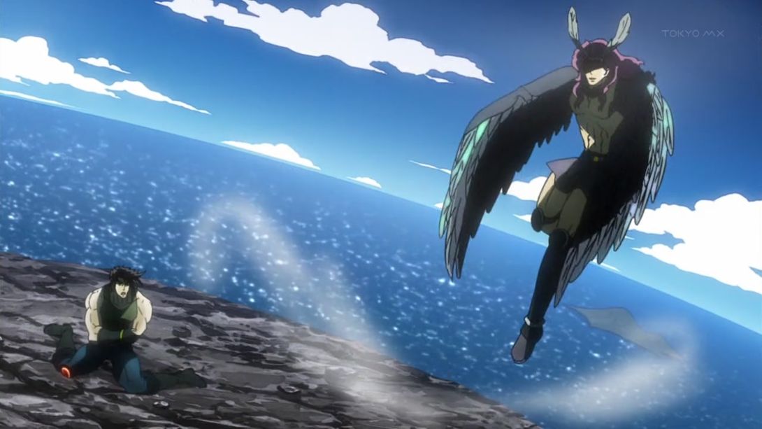
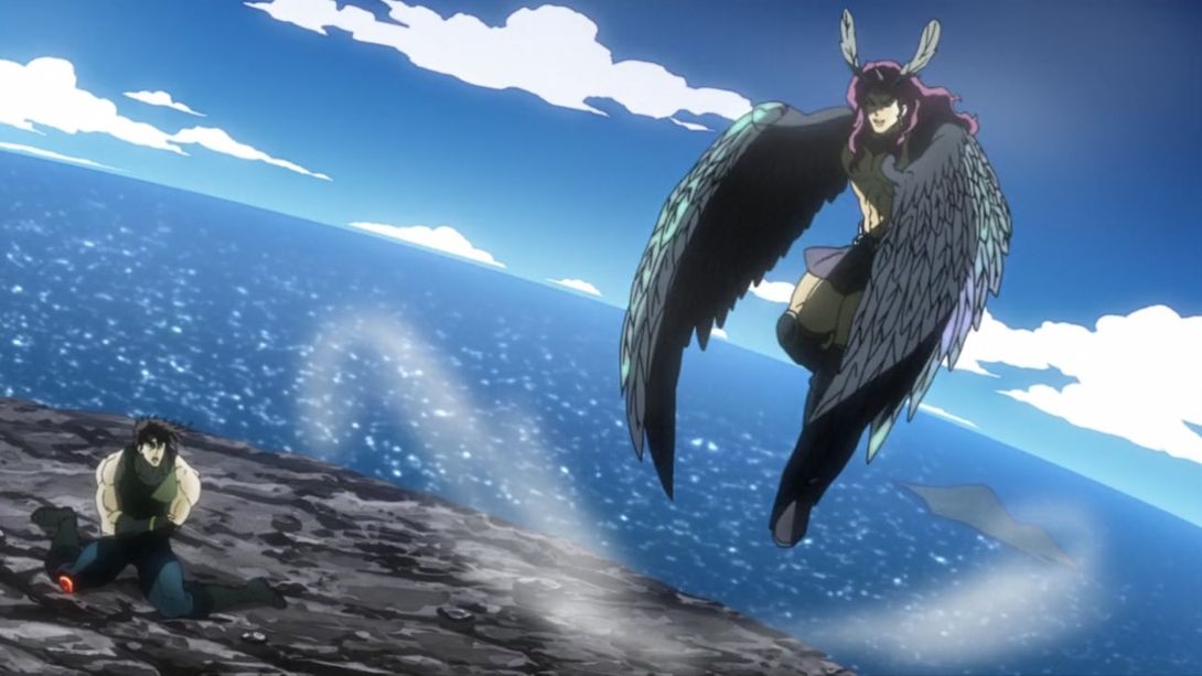
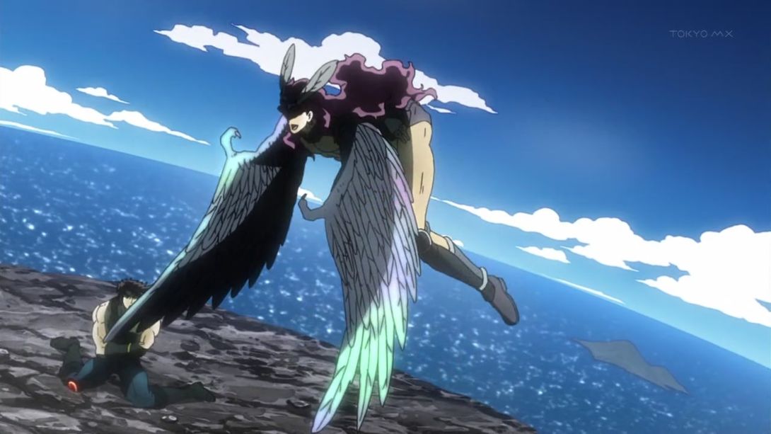
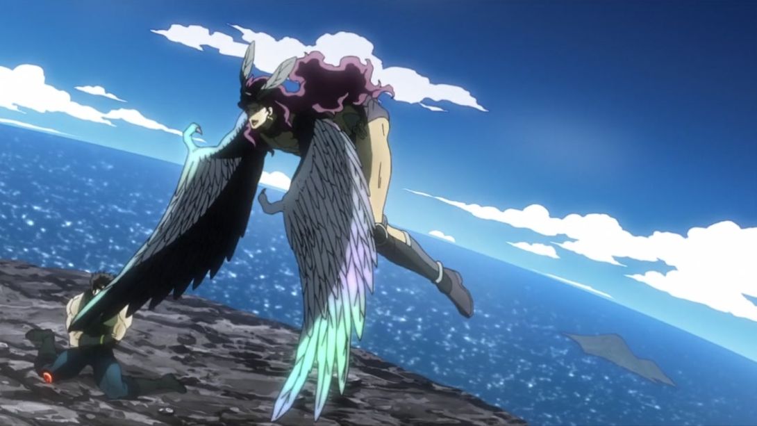
- This shot has been shaded differently (very, very subtly), Joseph’s arm stump is uncensored and the background is also different:
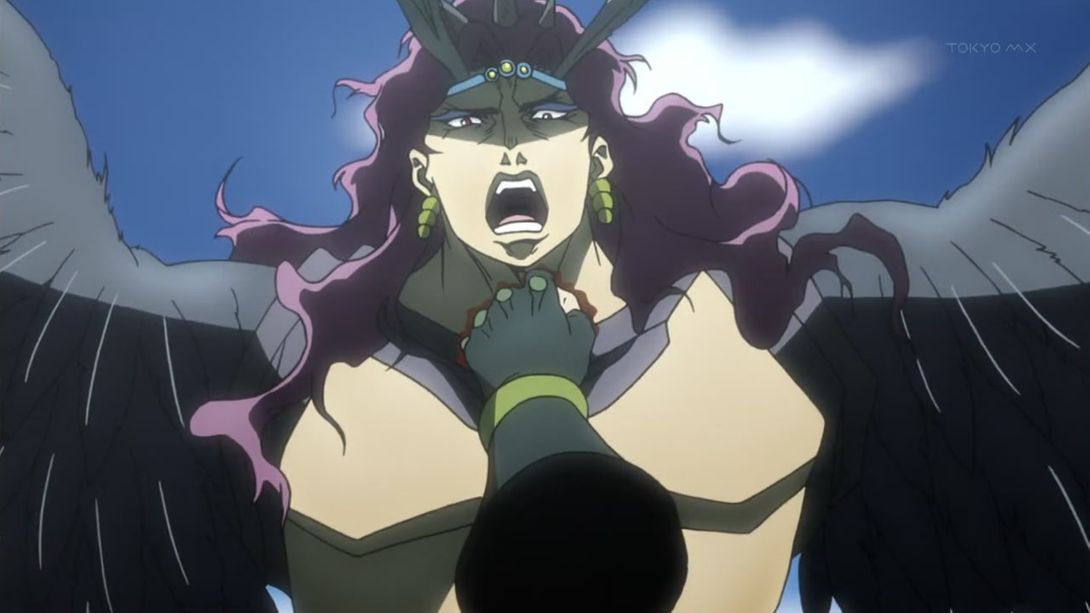
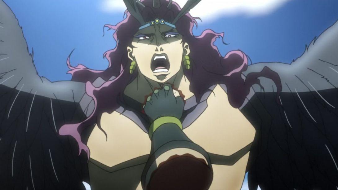
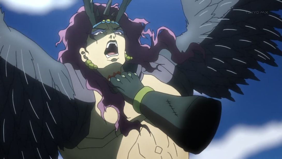
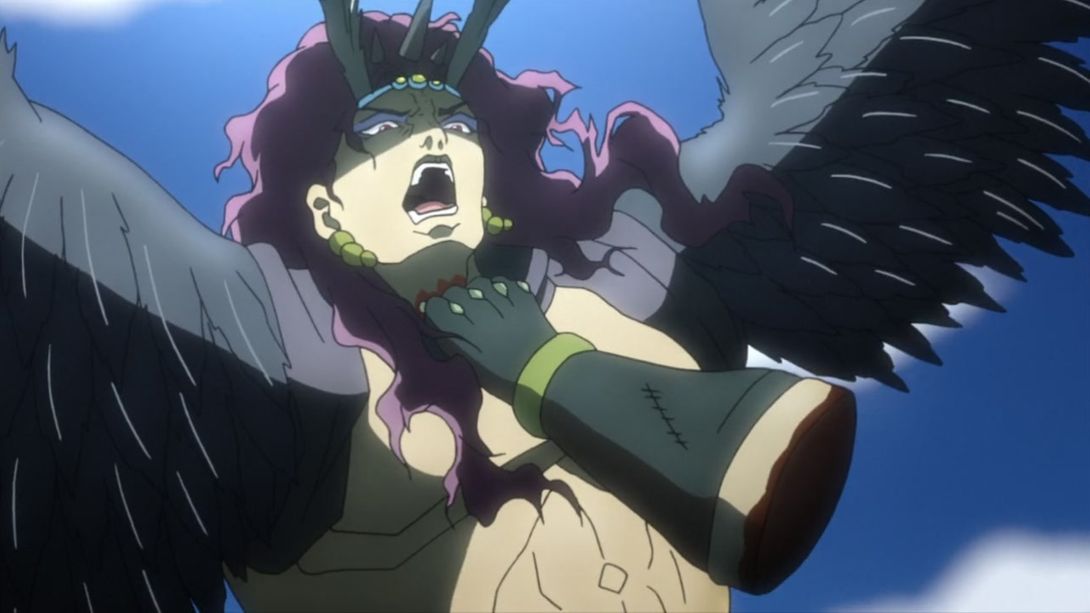
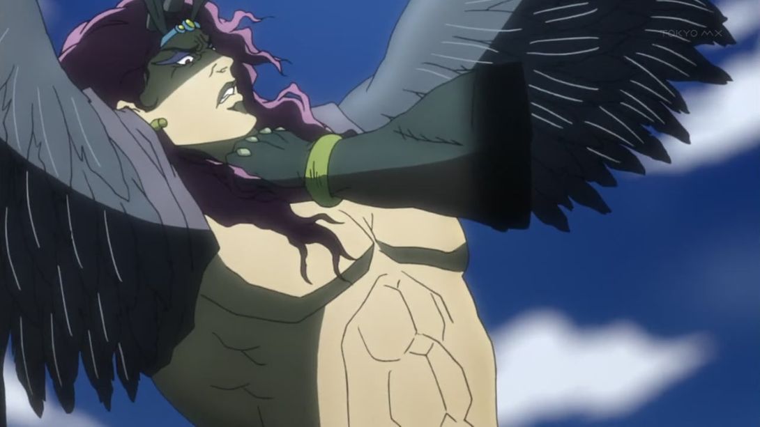
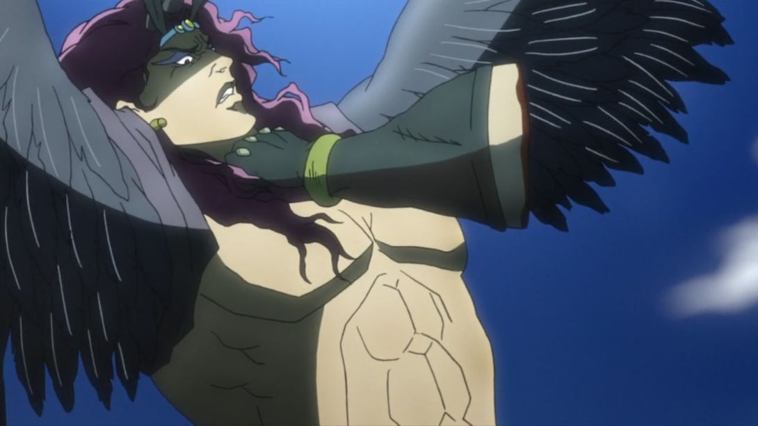
- The arm stump has been uncensored once again here, the background is different (againnnn) and the camera is more zoomed in:
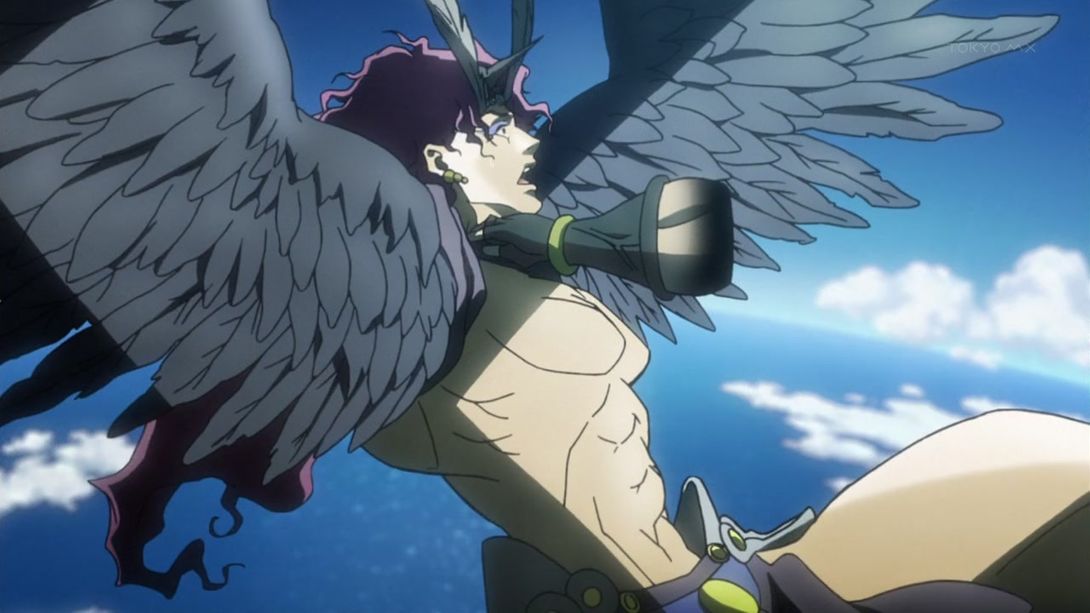
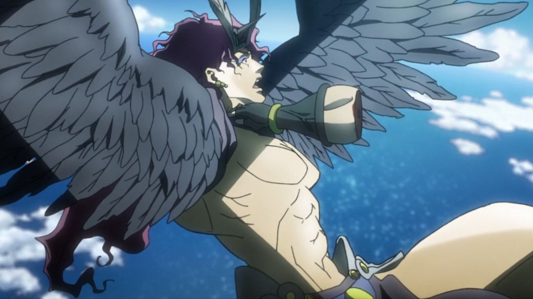
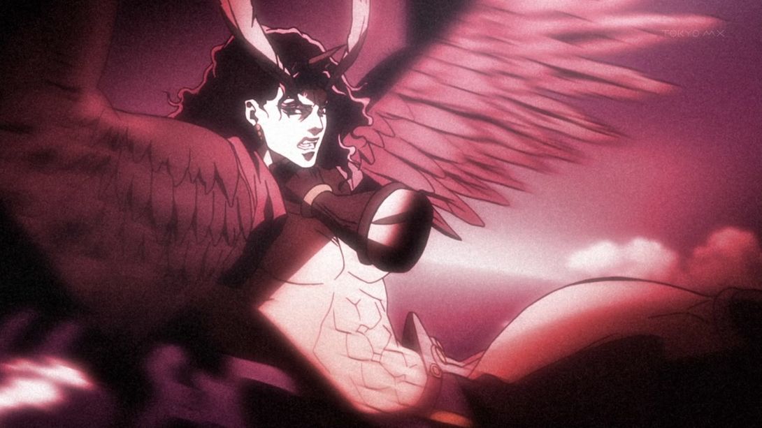
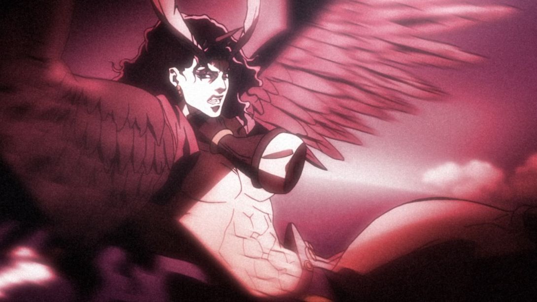
- This shot is overall less blurry, more zoomed in, the stone “trails” are much brighter and there are more… air particles???????? too:
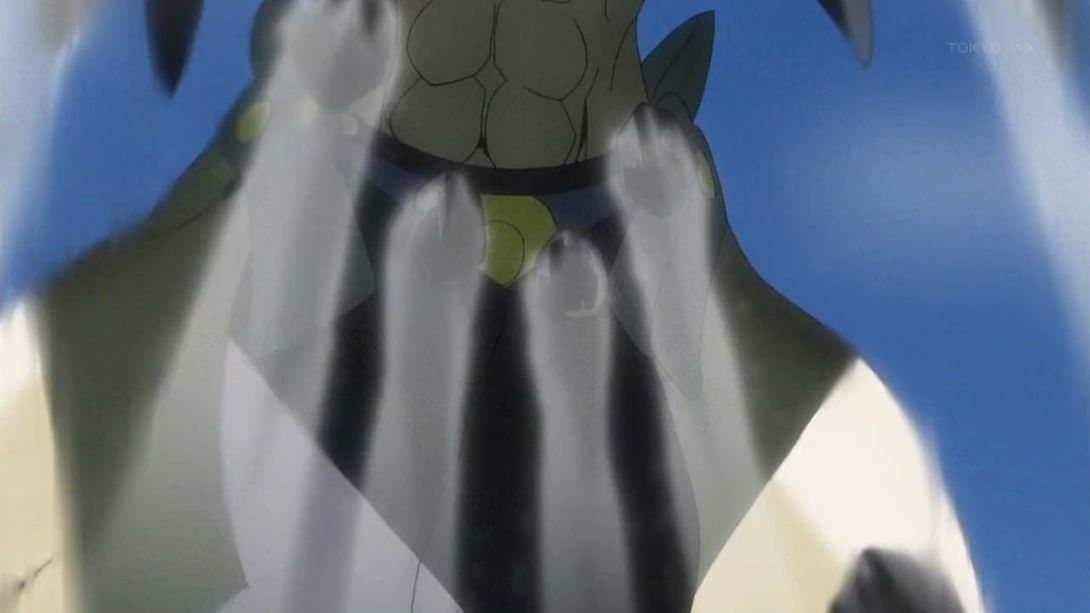
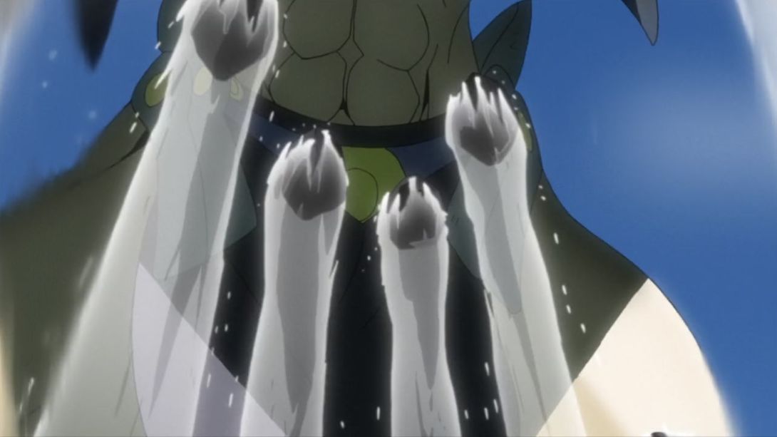
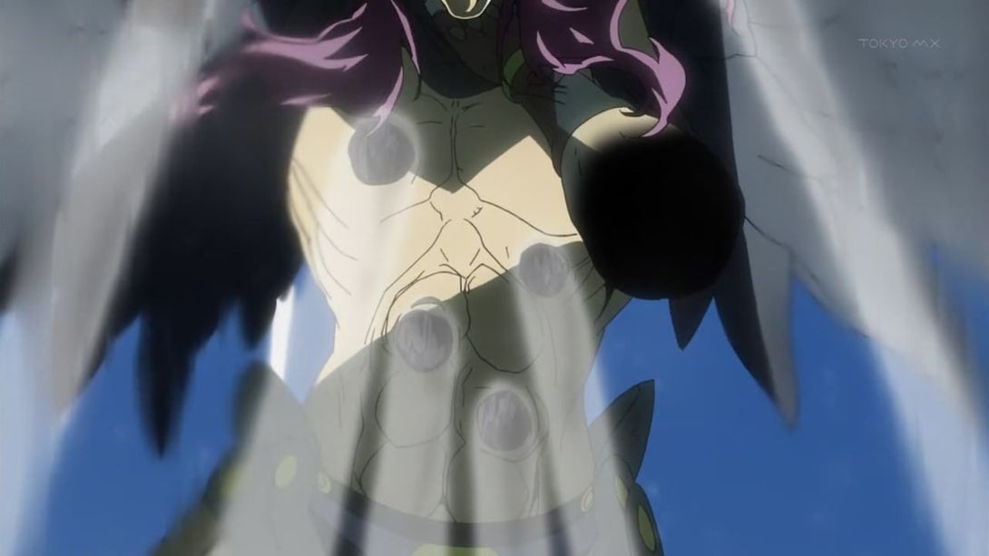
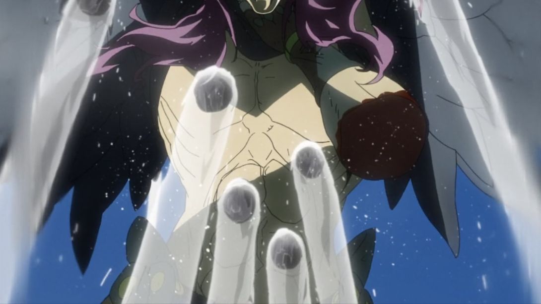
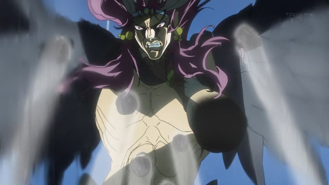
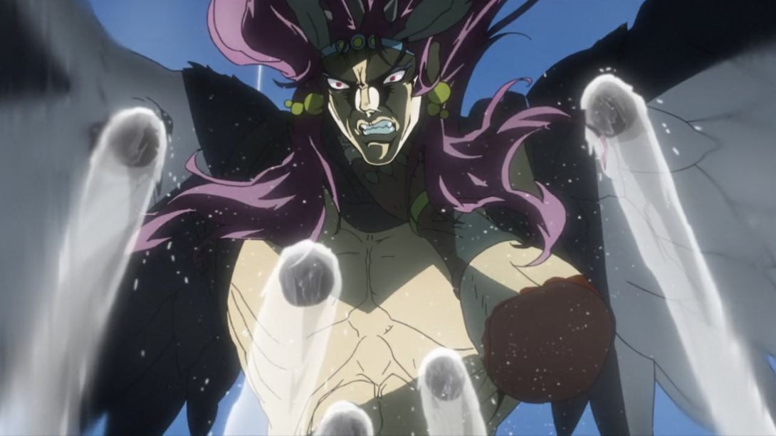
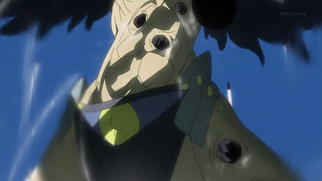
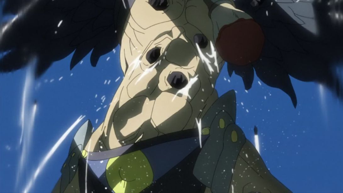
- …and the camera and lighting, at the end, are also different:
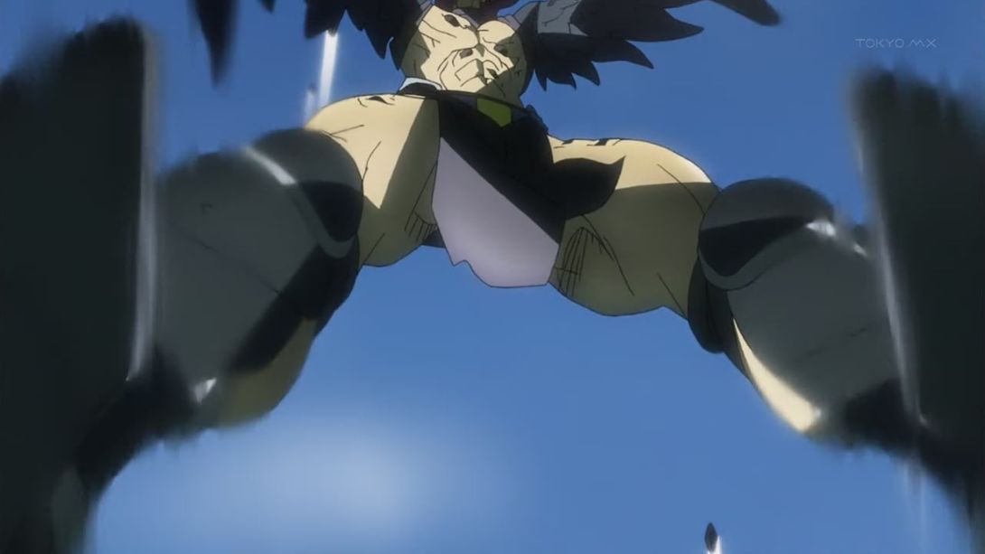
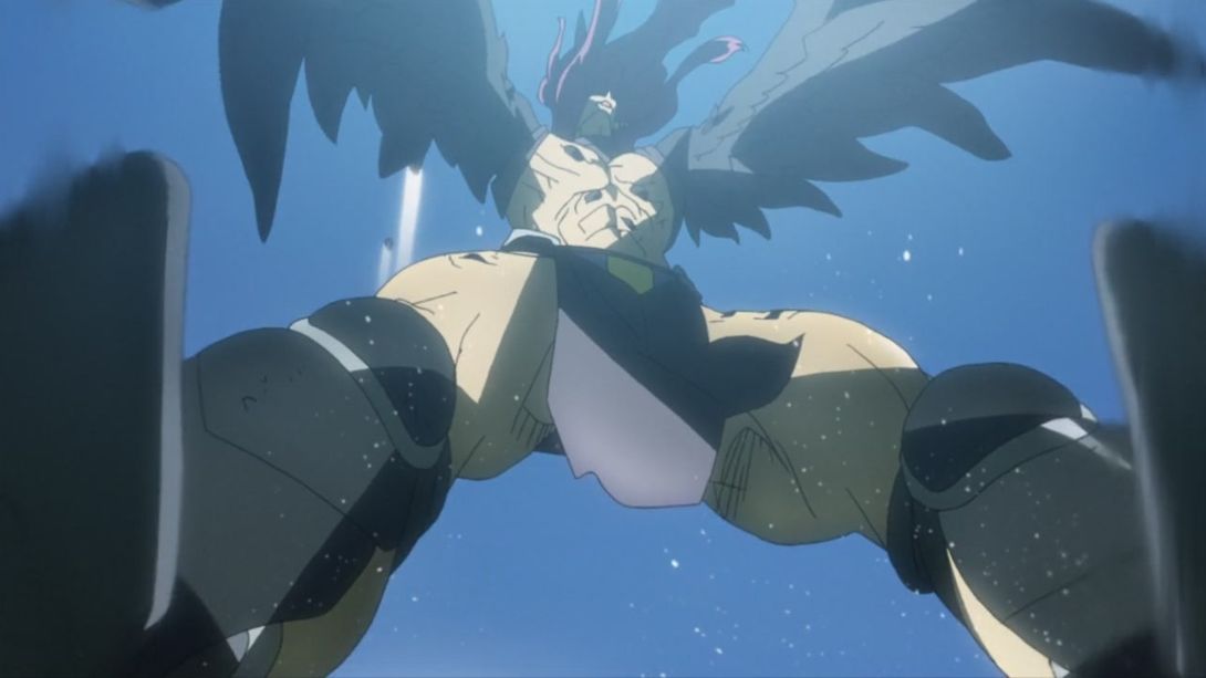
- Take a look at the whole thing, just because:
- This scene is brighter and sharper too, and there’s less of a blur along the edges:
- The camera in the following scene shakes around more…:
- …Joseph has been retouched too (a slightly different shading on his right shoulder), the dust effect is a little different…:
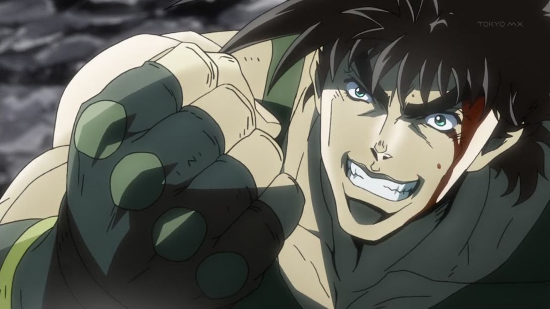
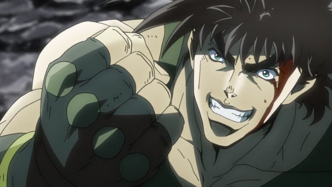
- And, as before, the stone trails are brighter here too:
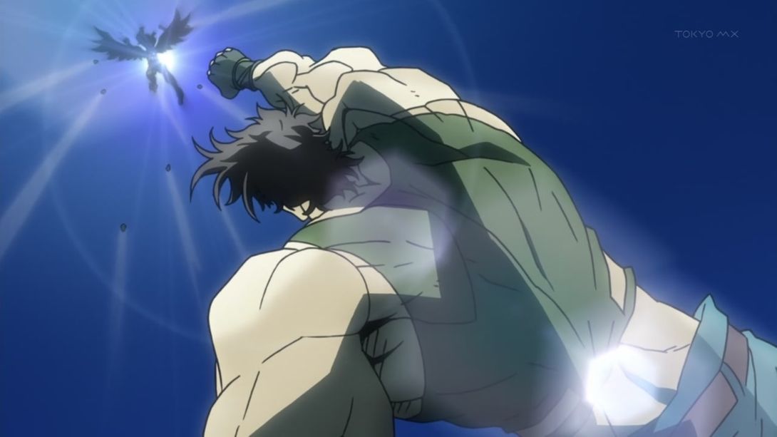
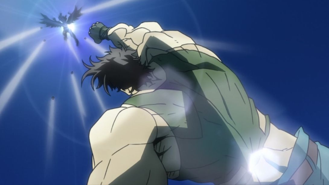
- The characters “死亡・・・” (deceased…) appear more gradually in the BD:
- R.E.O.’s eyes now have a line below them, here…:
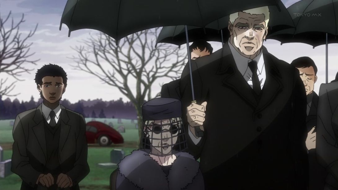
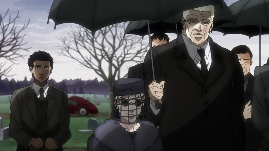
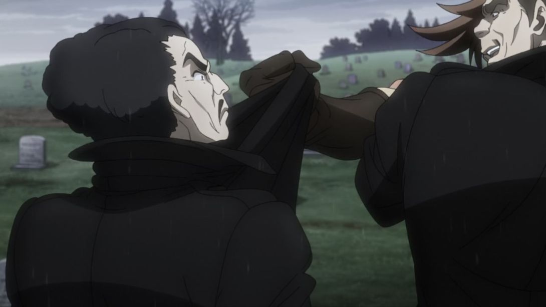
- These two randos had a small line above both of their mouths; that has been corrected in the BDs:

- This animation is a little different (there are a couple of extra frames before the zoom out, which make the transition a little less sudden):
- Everyone is bigger here:
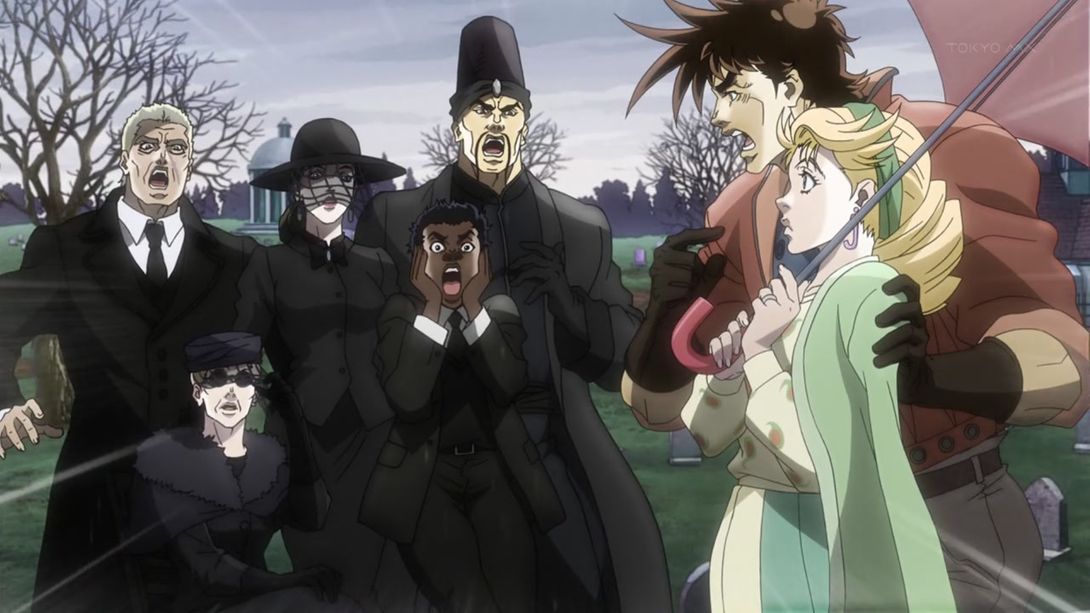
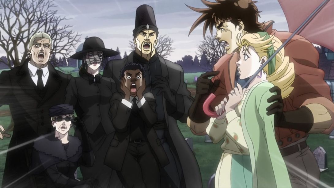
- Some frames of this random Japanese guy have been redrawn:
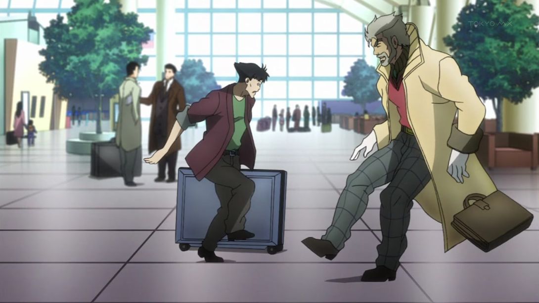
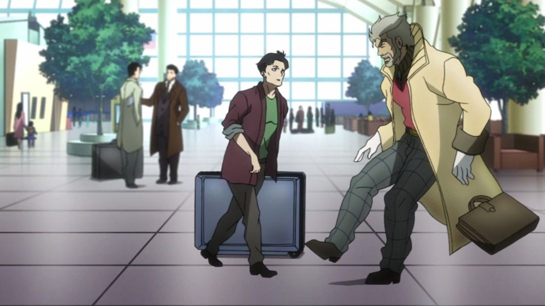
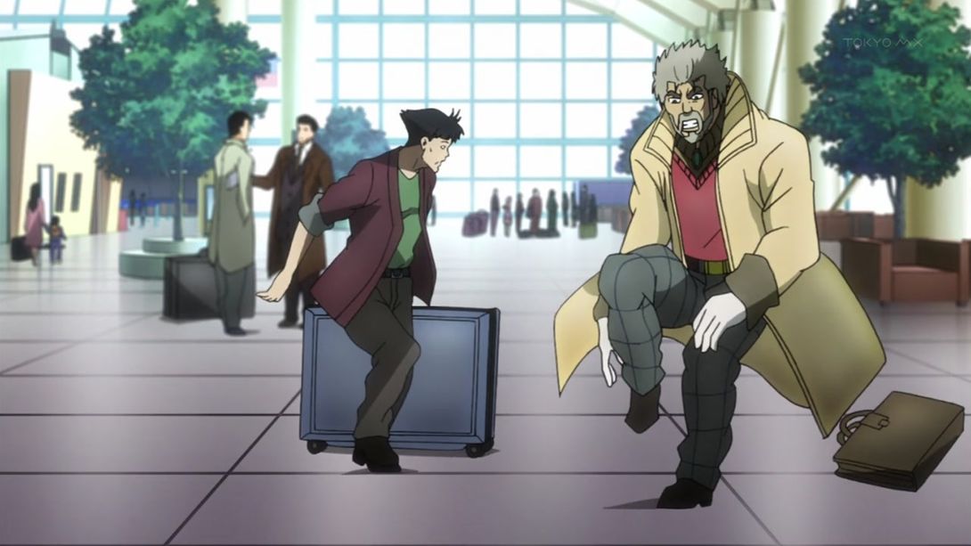
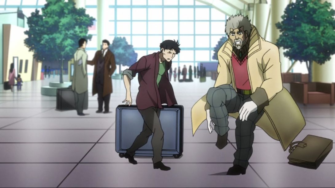
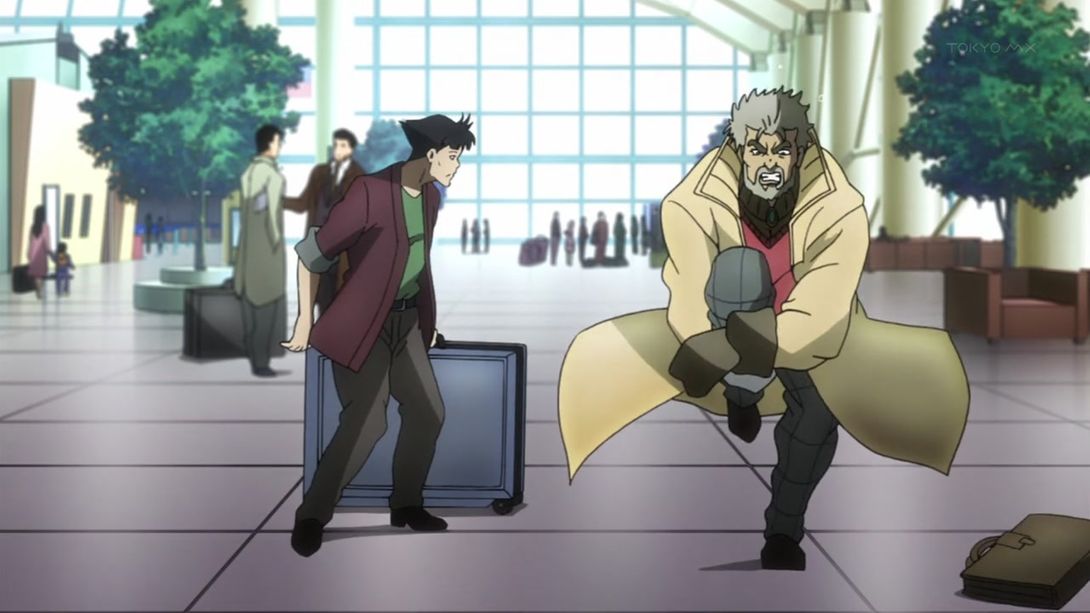
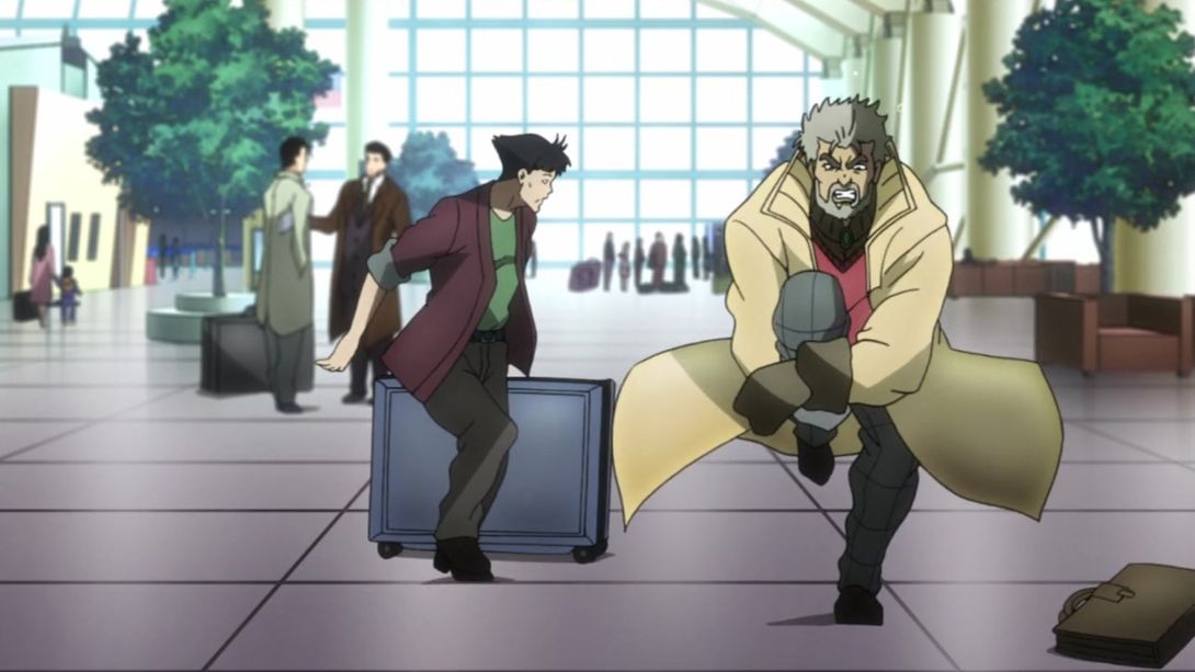
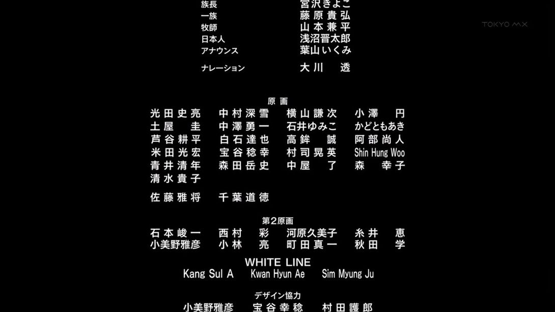
- Aha! A credit difference… And it’s not the last difference in this comparison! Let’s see… Here, one name has been corrected: 森田岳士 (Morita Takashi)’s name was previously spelled as 岳史 (both are pronounced “Takashi”, and to be fair, “岳士” is a rather irregular variant). You can find it in the center bunch of names, second column from the left, fifth name from the top:

- Let’s move on… Beyond the credits! This scene has been completely redrawn and recoloured! Have a gander for yourself:
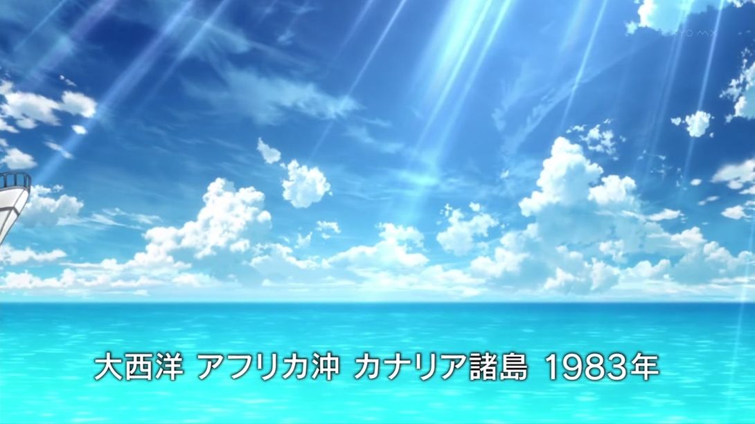
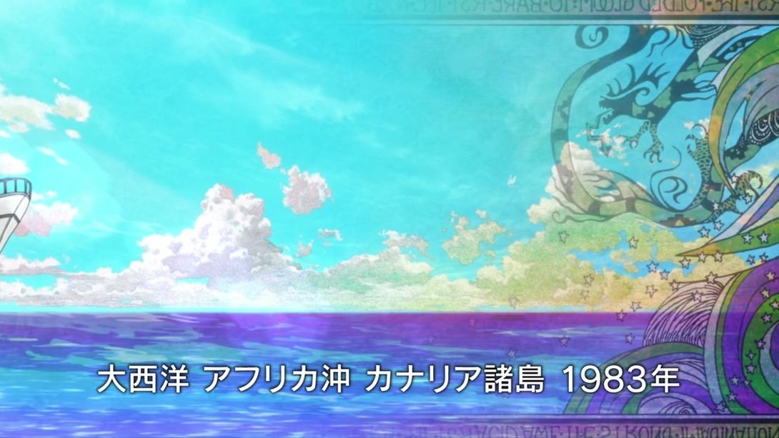
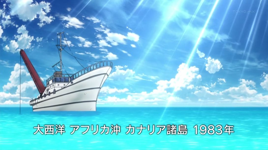
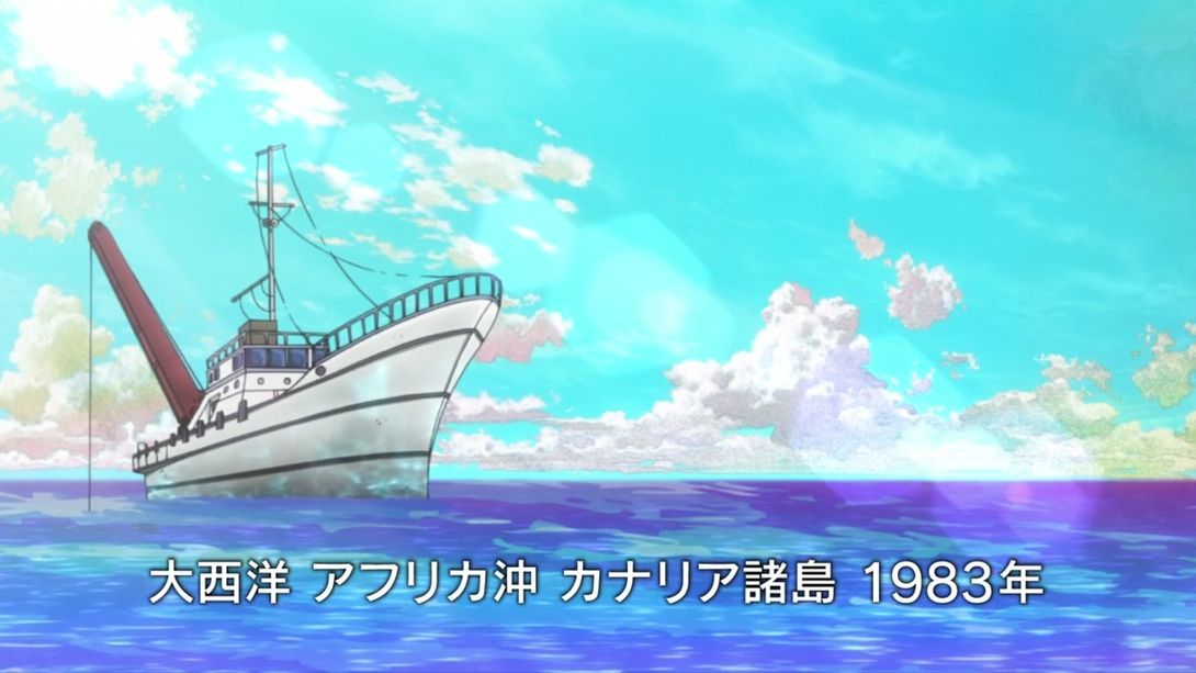
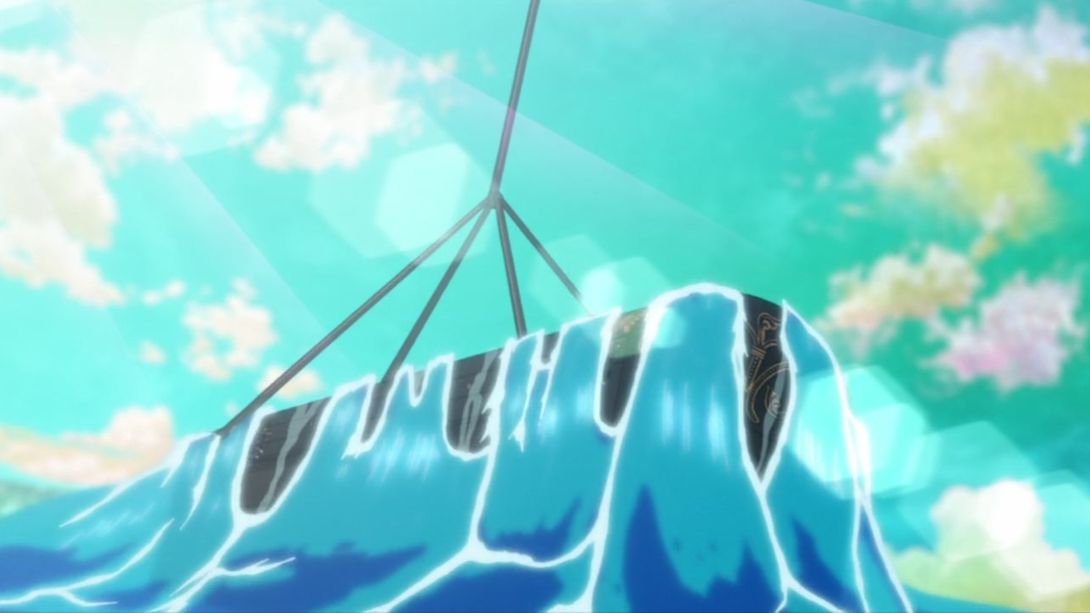
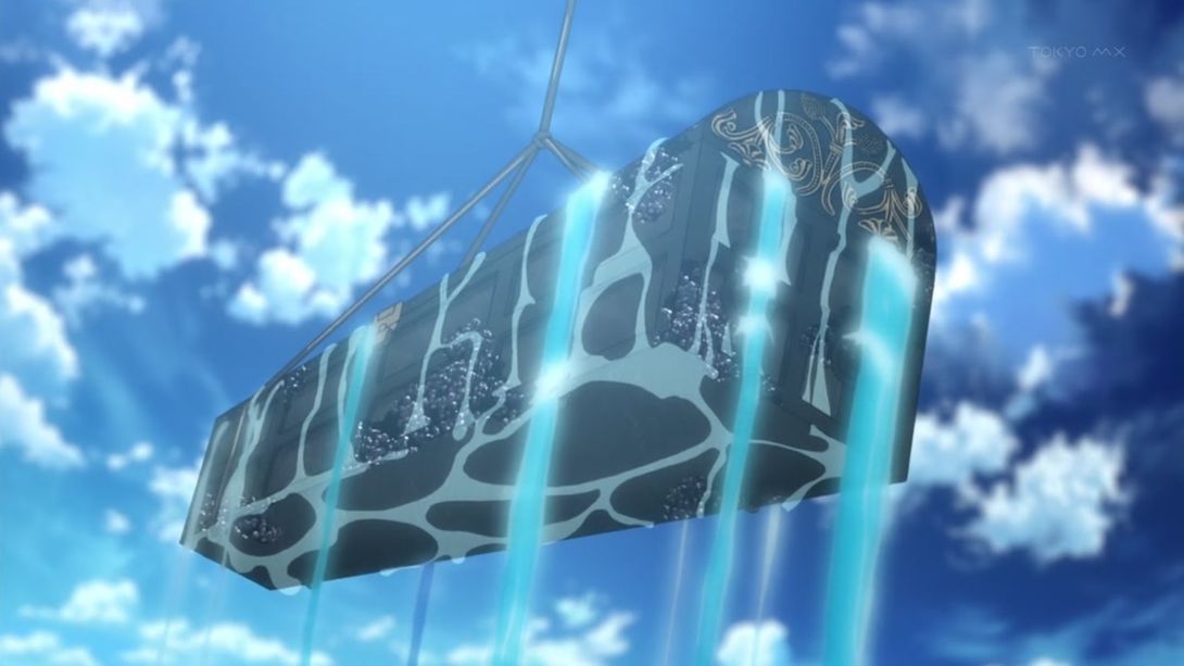
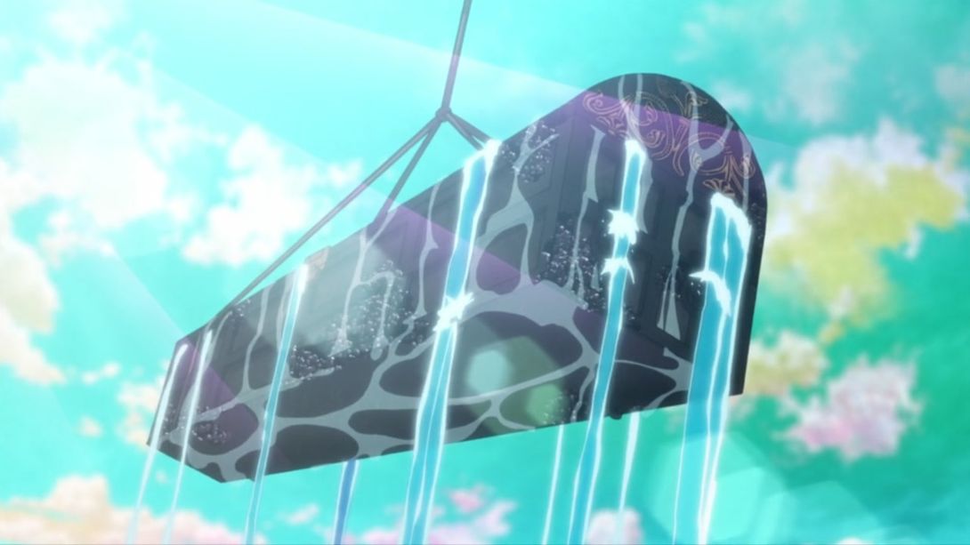
- Here, once again, the sky has been completely recoloured, there’s a new lens flare, the frame is slightly distorted along the edges, and the rope in the foreground now has sections (probably to help give it a clearer sense of motion):
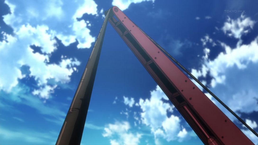
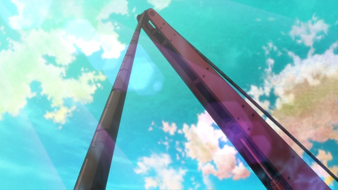
- Take all differences from the previous frame and apply them here as well! On top of that, the water is way less blurry as well:
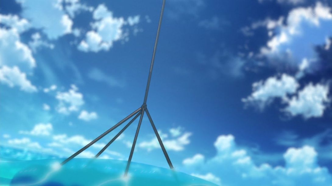
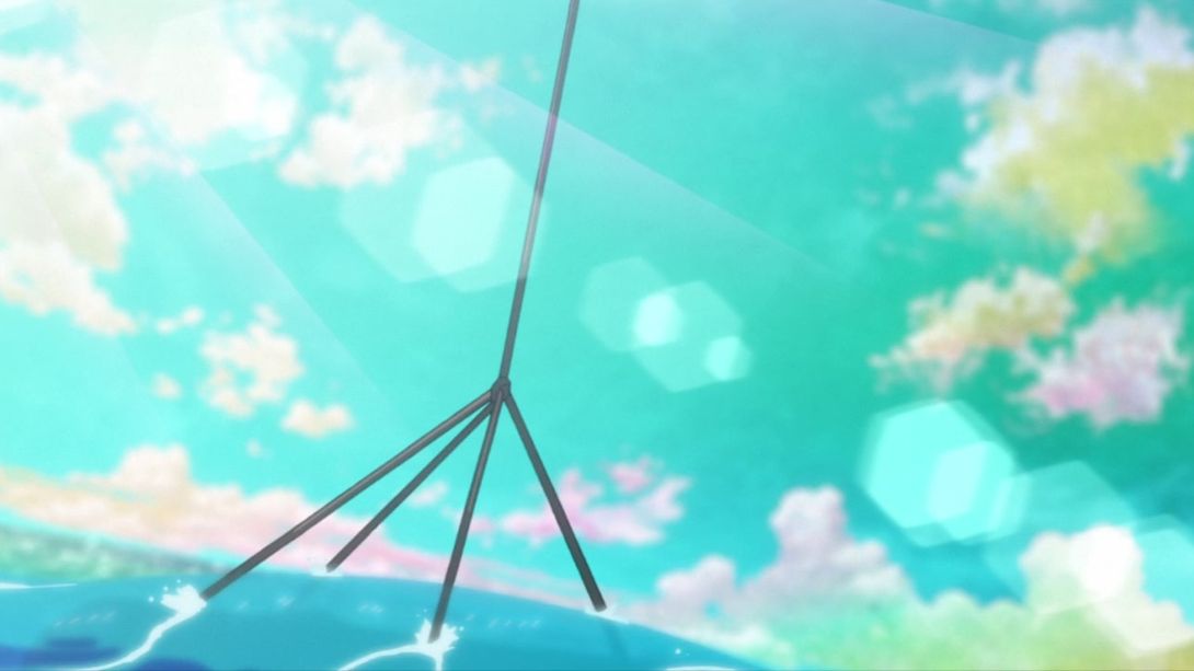
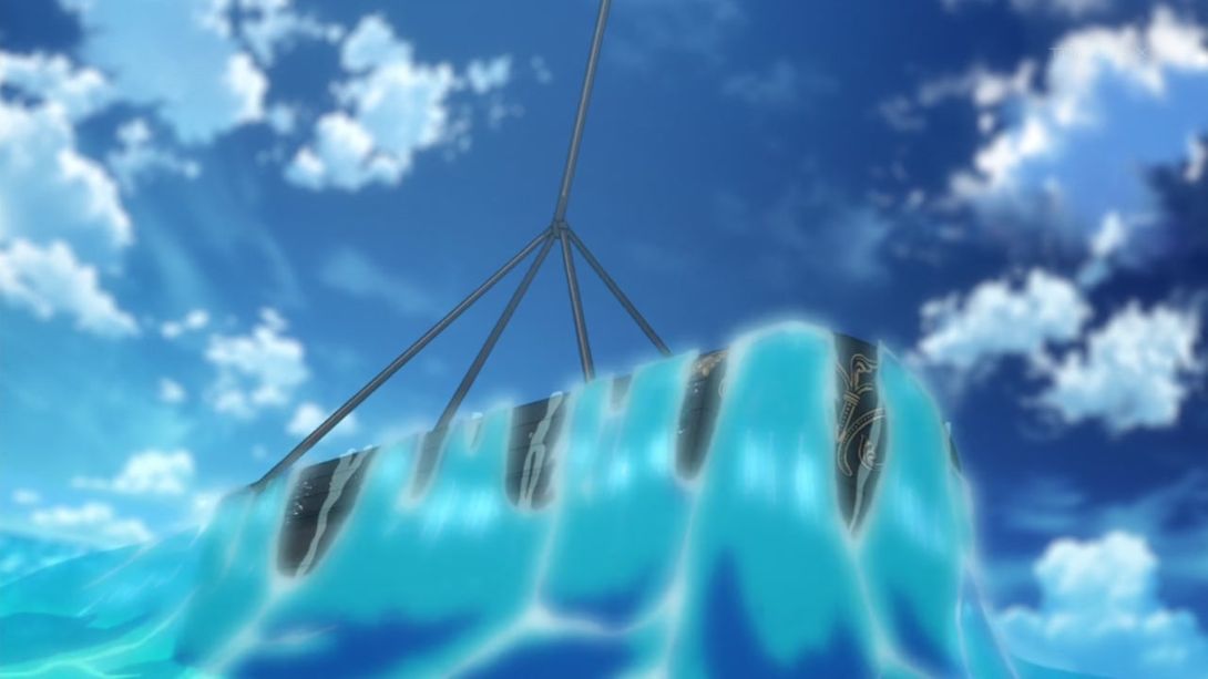
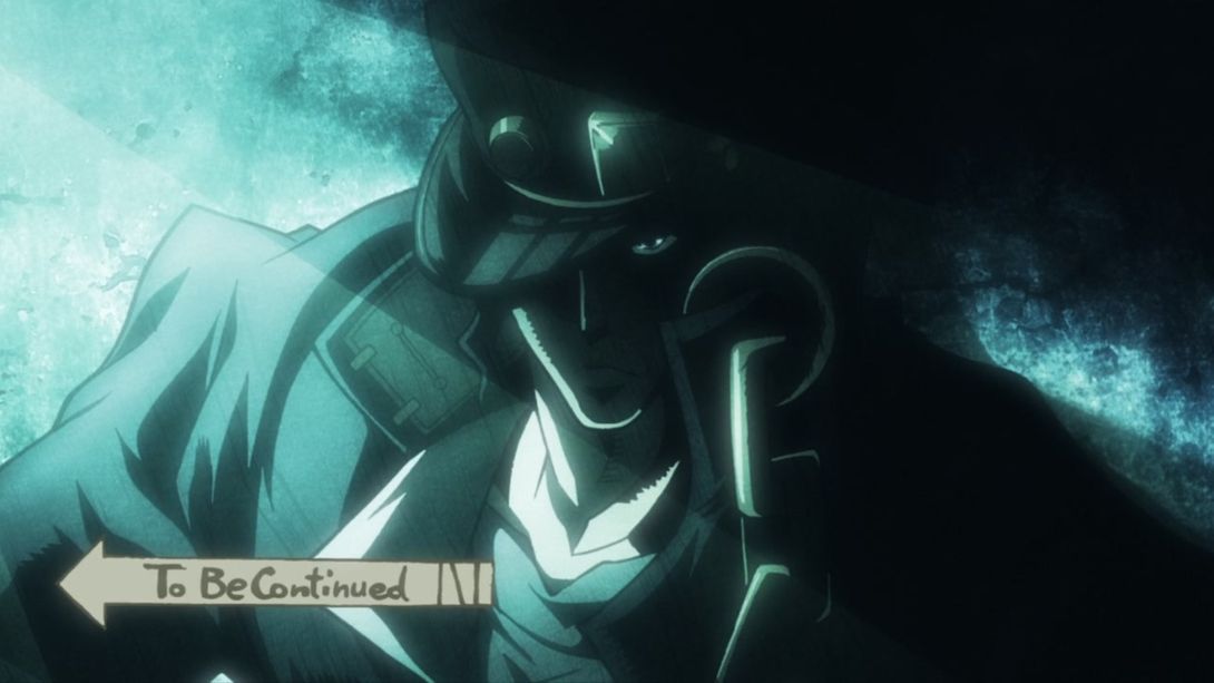
- And, good people of the court, let’s get to what is (perhaps) Battle Tendency’s most famous difference! The transition on this zoom out is much faster in the BD version, because… they added a “to be continued” arrow to it! Check it out:
Well then, friends! This is it! With this comparison, Battle Tendency is done and over with! It was quite a long, bizarre, difference-filled trip, and I hope you had fun tagging along! Y’all know what’s coming up… See you next time (in a week or so) for the Crusade of a lifetime!
Bye!

