Hello, beautiful people, and welcome back again to this quaint little blog, wherein I examine and analyze and tear apart our favourite bizarre media!
Vento Aureo’s first episode has energized me, and I decided to get to the new comparison as soon as possible… Which is why today we’re going to take a look at Battle Tendency #22, “A True Warrior”! Are you ready for the world’s most fabulous chariot race slash battle slash dick size contest? Are you ready to dive into this blog’s longest comparison to date? Strap in, grab something to eat and get ready for a long, long ride!
Let’s get started!
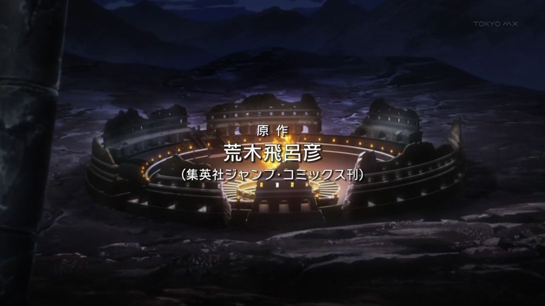
- Today’s first difference is the now missing opening credits, which in the BD version have been moved to the opening proper:
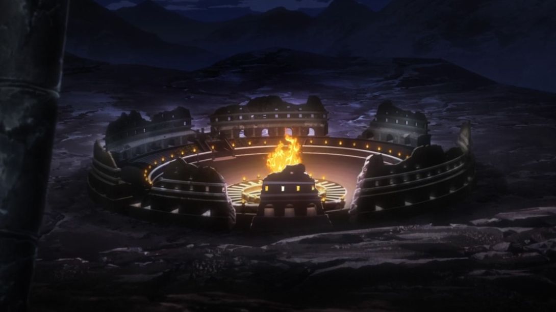
- Fireplace for Your Home v3 (now brighter and sharper):
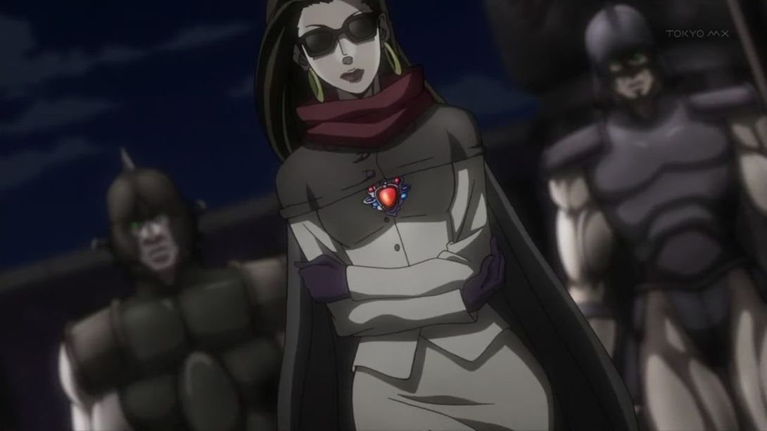
- Here, the guards standing this (admittedly not very pretty) Lisa Lisa are closer, and the background is instead a little more zoomed out:
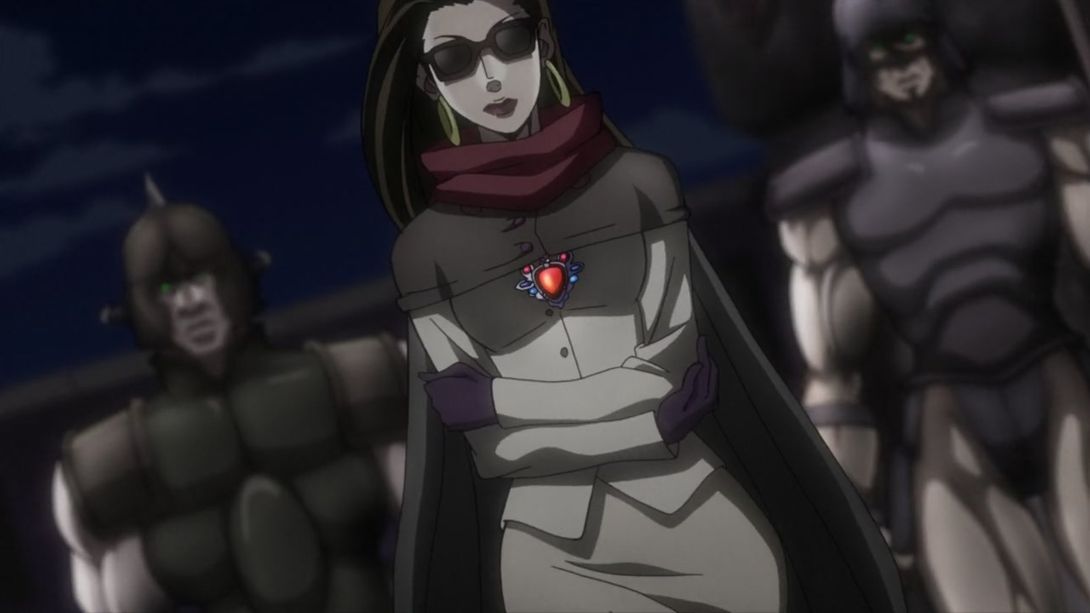
- Here, Joseph has been completely redrawn, and both him and the carriage have been also moved by a few pixels (the scratch texture overlay is also slightly different):
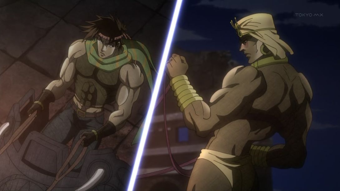
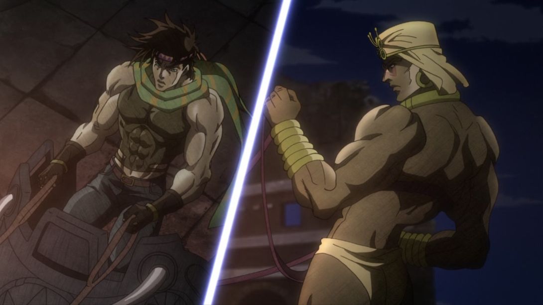
- This scene has a completely different lighting going on:
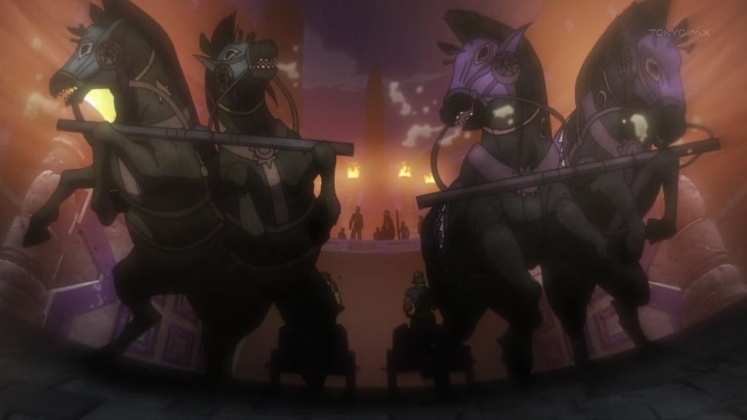
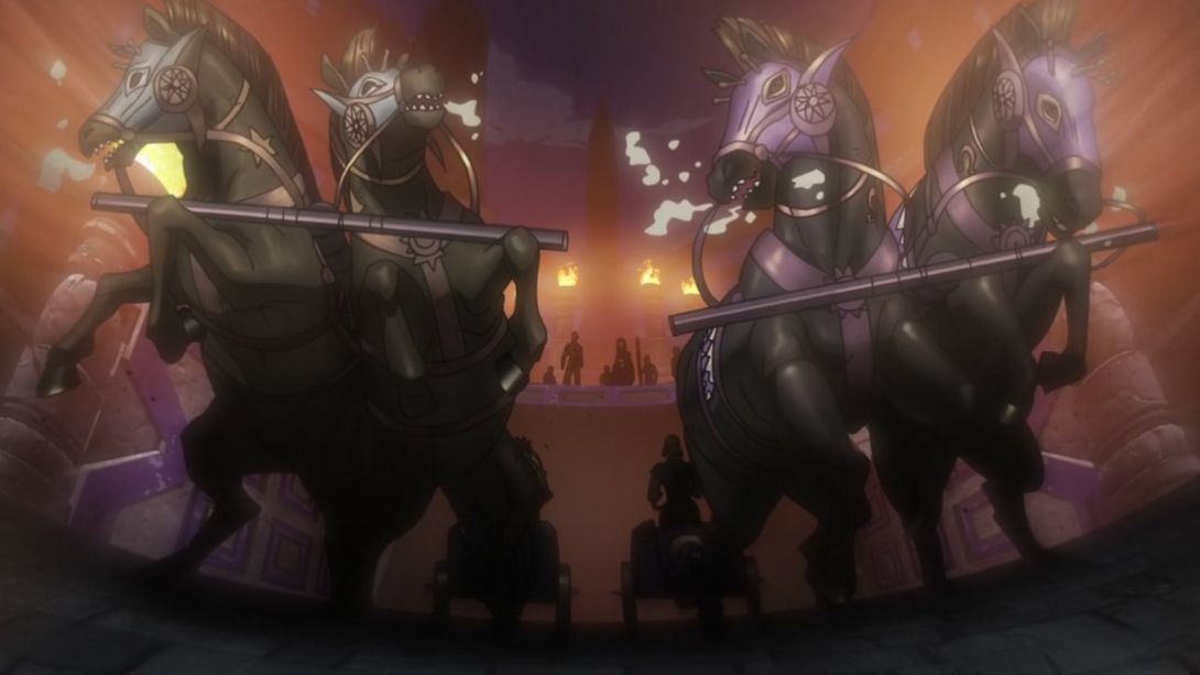
- The clouds have been moved here:
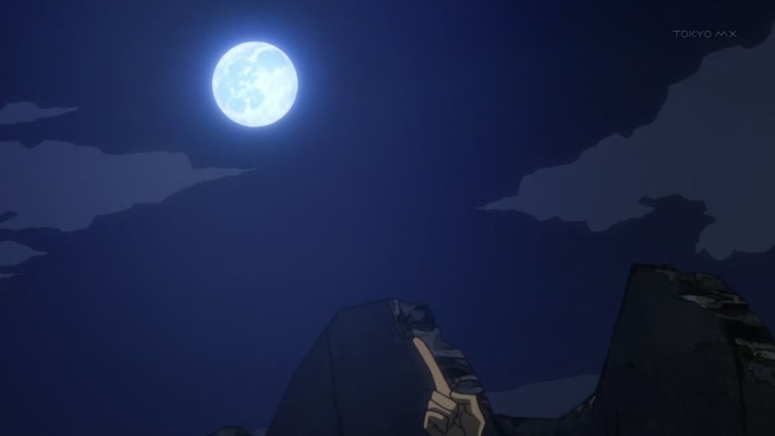
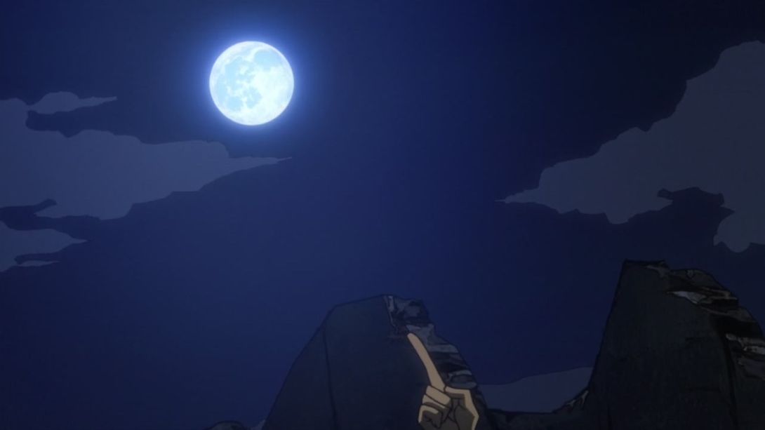
- Wham has gracefully scooted away a little bit in the BD version of this scene:
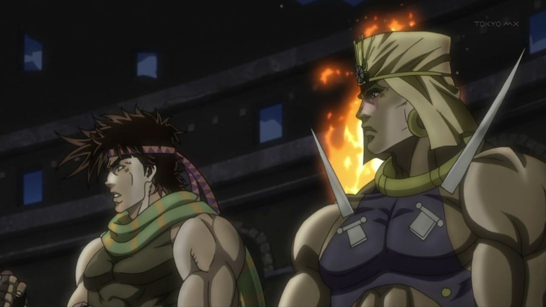
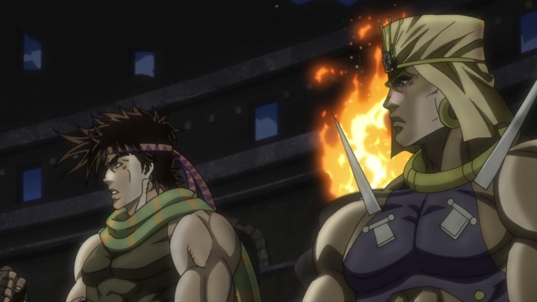
- Another wildly redrawn Joseph, for your eyes only:
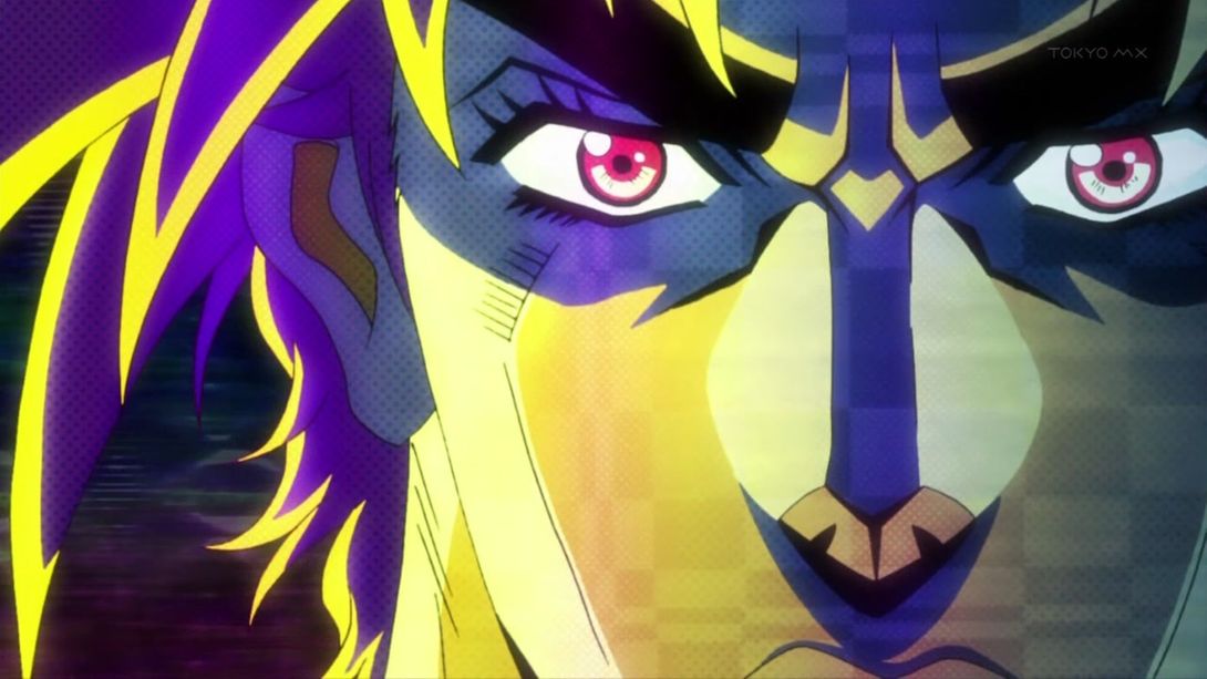
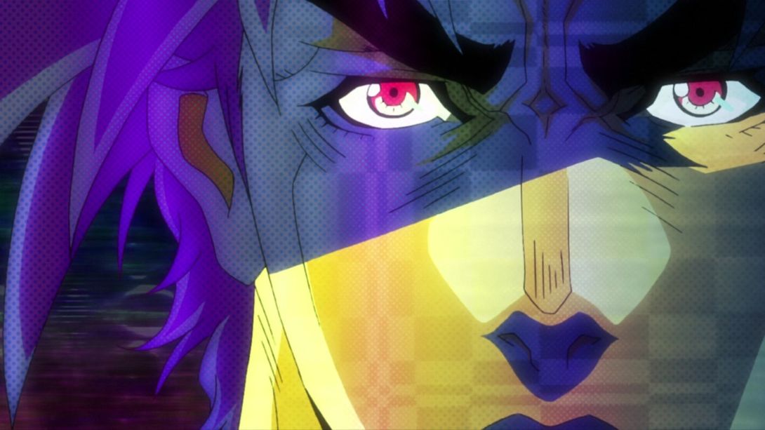
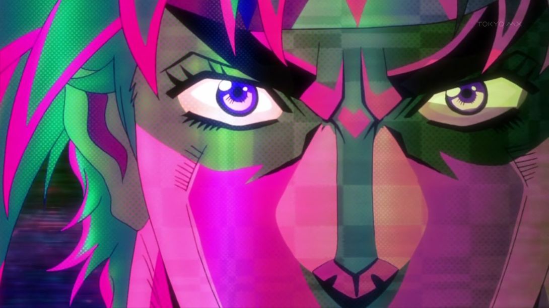
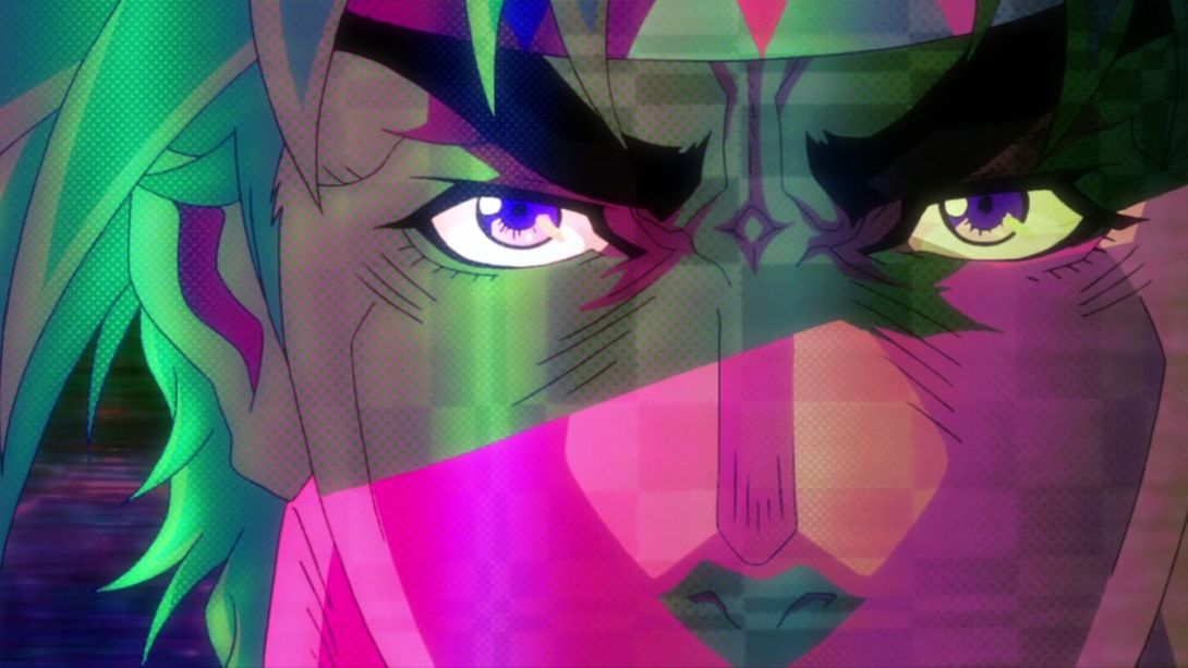
- Joseph slides in frame with a slightly different timing here:
- Here Joseph’s face has been redrawn, he’s been tilted to the left by approximately two pixels, his back is properly shaded…:
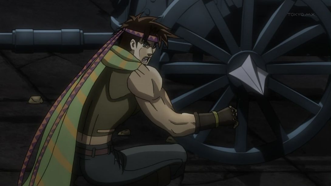
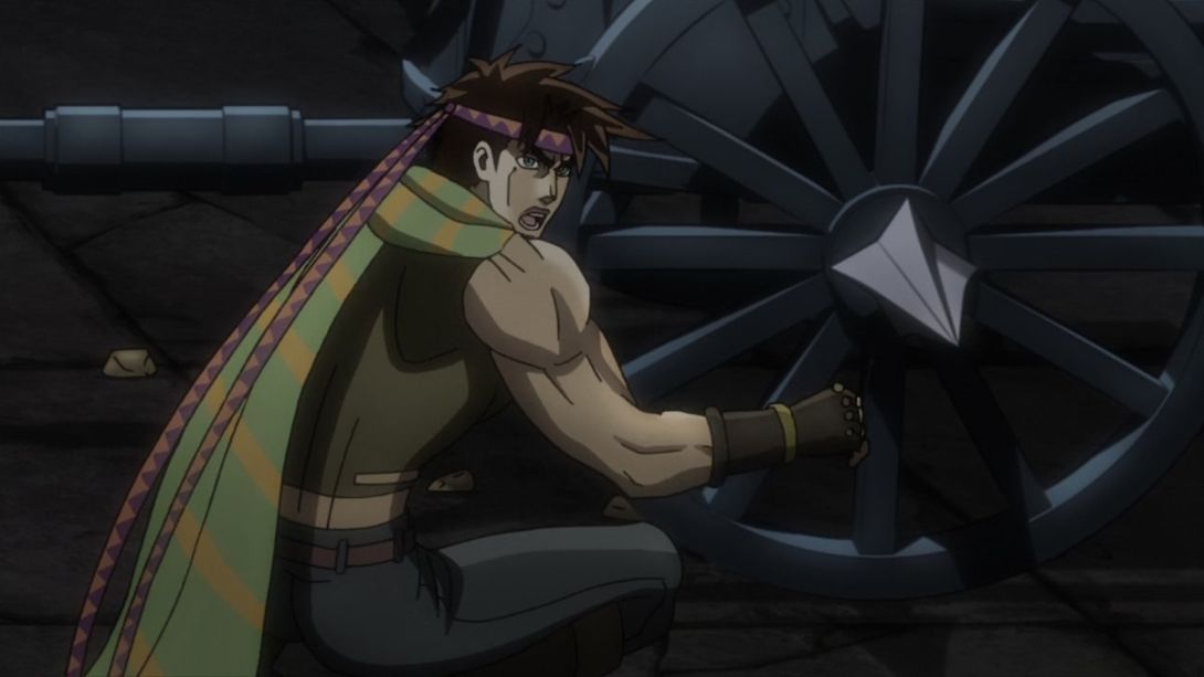
- …and here, two spots (on his forearm and on one of his knuckles) are brighter:
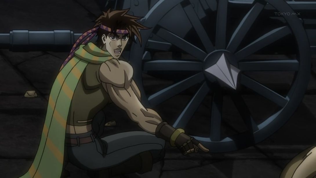
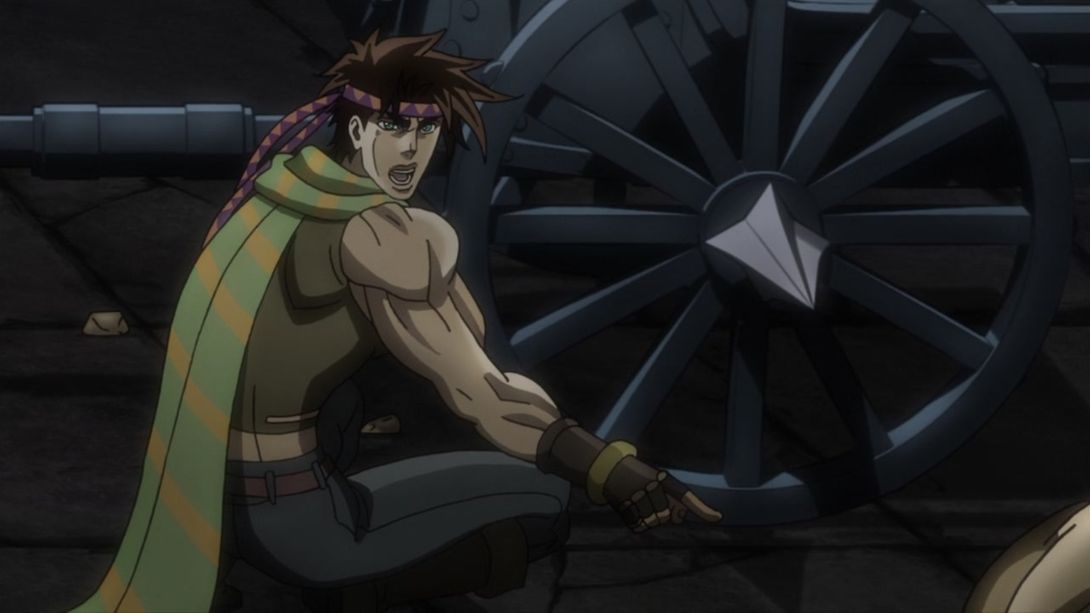
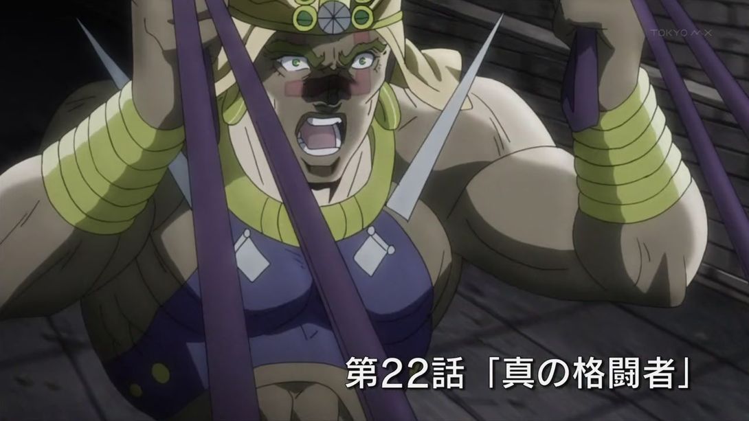
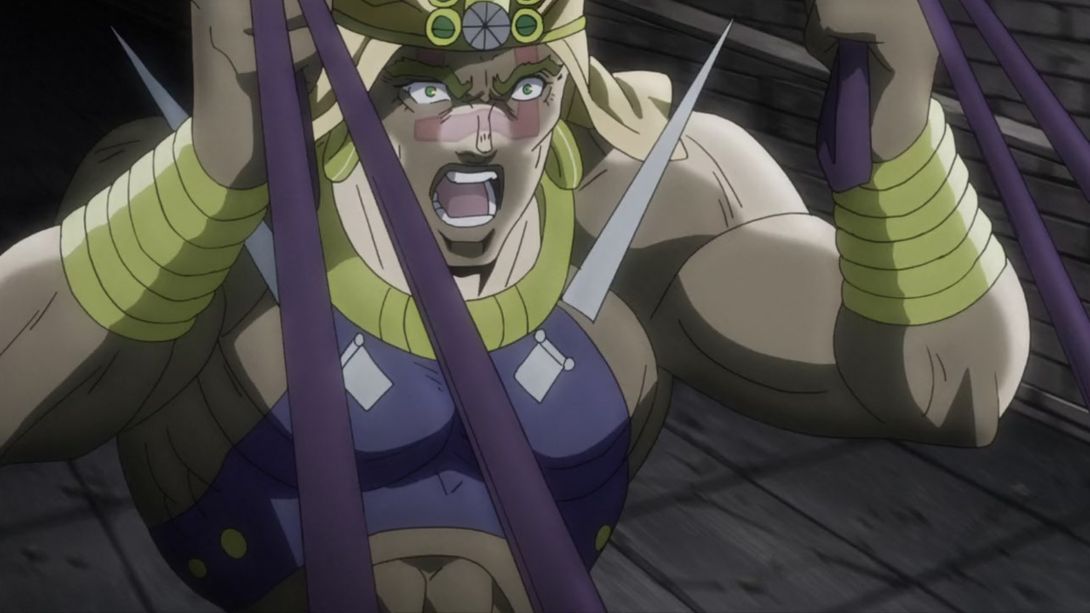
- Here, some bits on Wham have been shaded better, and the title is strangely missing (I’m assuming this is an error, since in the BD the title remains on screen for 59 frames, which is a little bit over two seconds…):
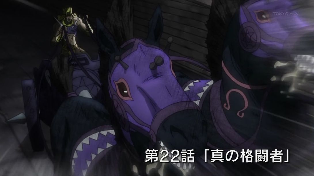
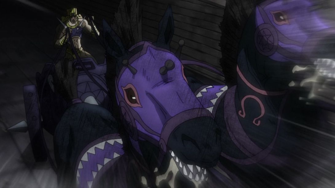
- This scene has a different lighting, an additional vignette around the edges…:
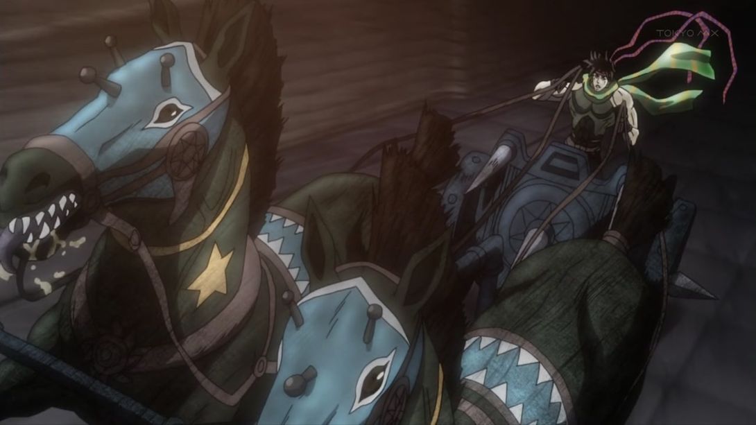
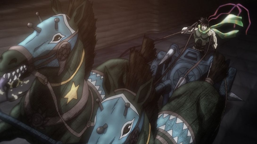
- And it’s also shaking in the BD version! Check it out:
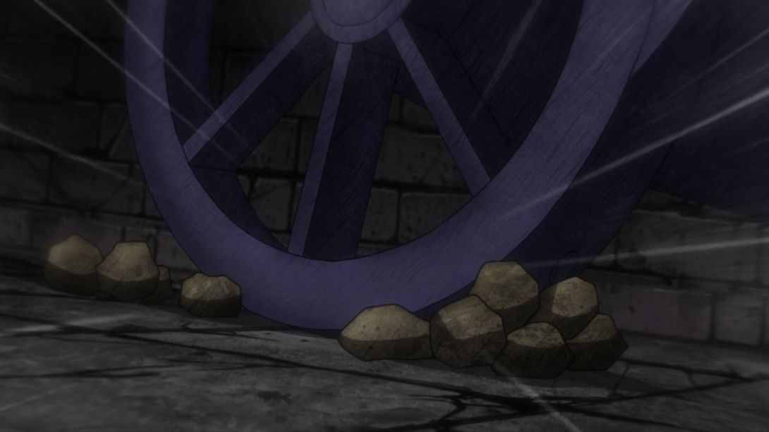
- Here, the rubble that Joseph throws near Wham’s carriage wheel is substantially bigger! I always thought that in the TV version they looked ridiculously small…:
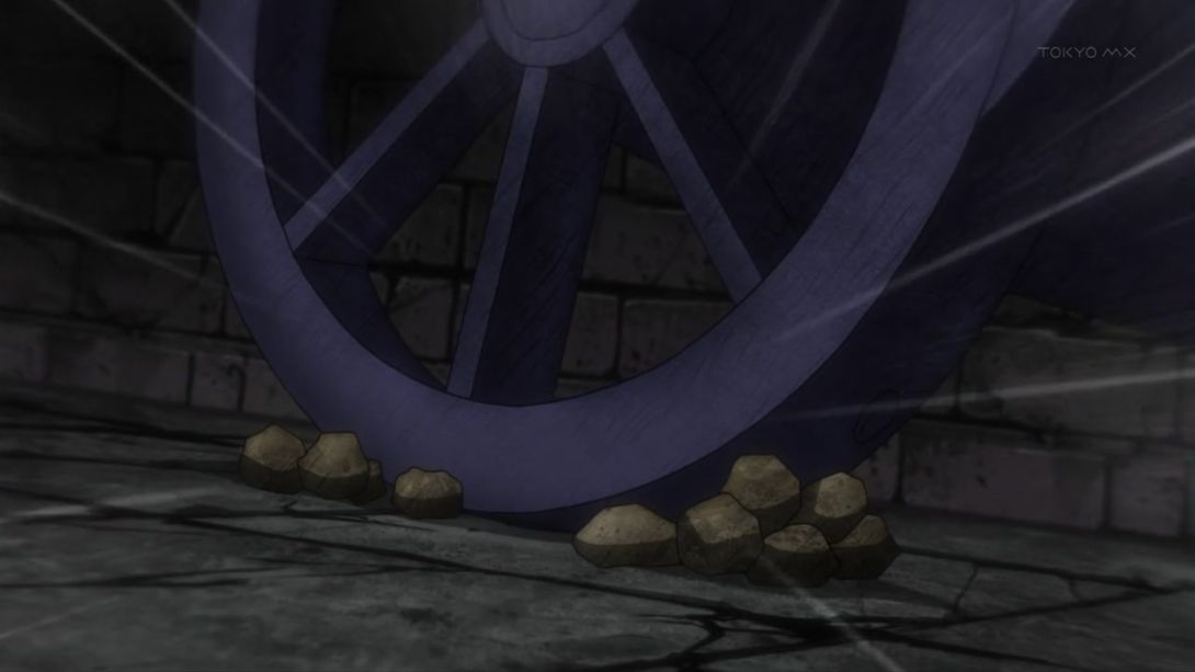
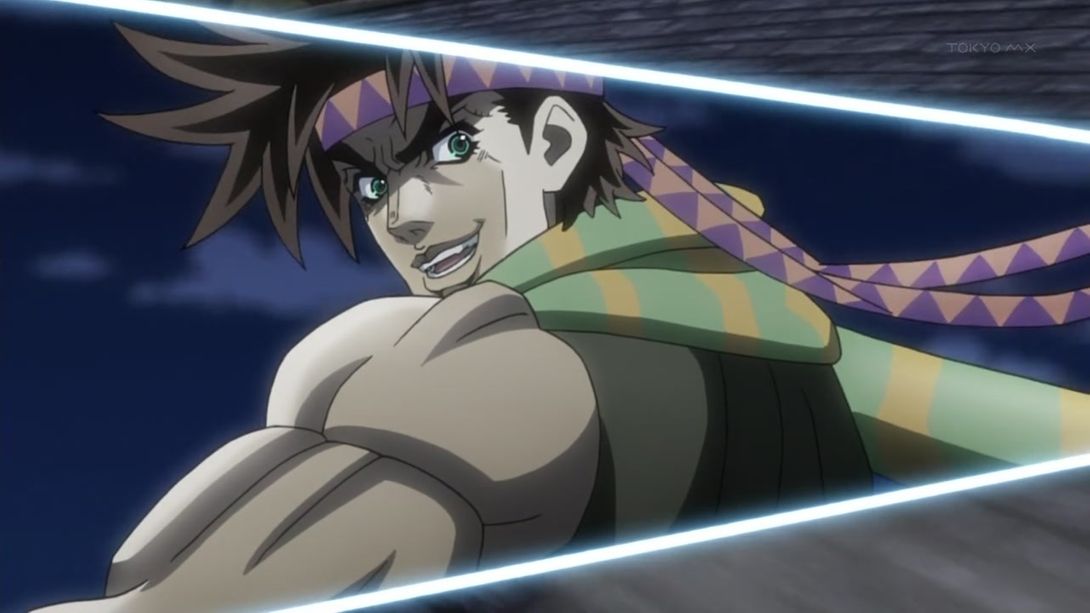
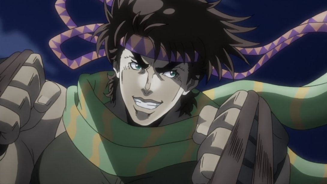
- Another completely redrawn Joseph! What joy! The triangle they’re using to split the screen is also smaller, the bandana is now behind the scarf, and a yellow bit on the scarf itself has been recoloured (although I don’t like it much):
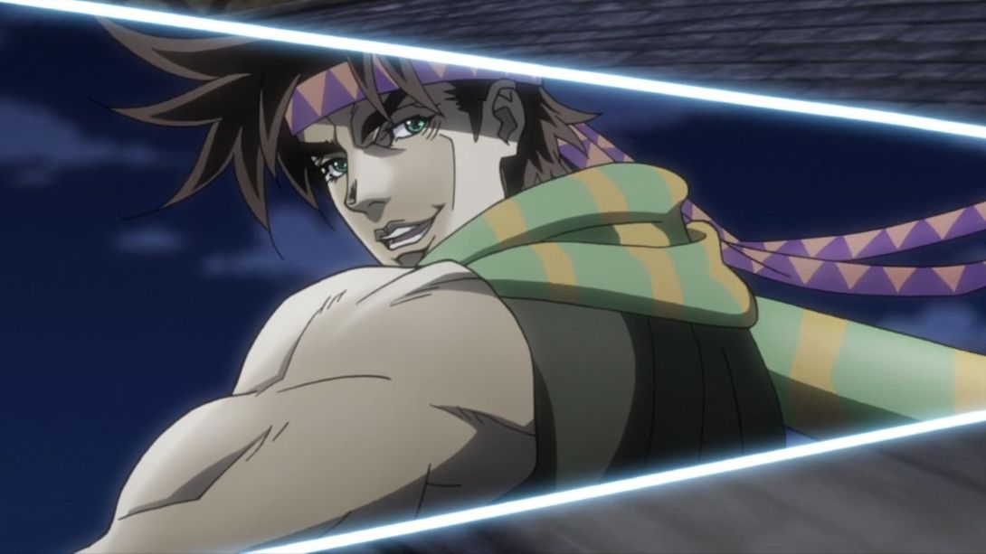
- Here, Joseph has been retouched, reshaded, and the bandana has received a makeover:
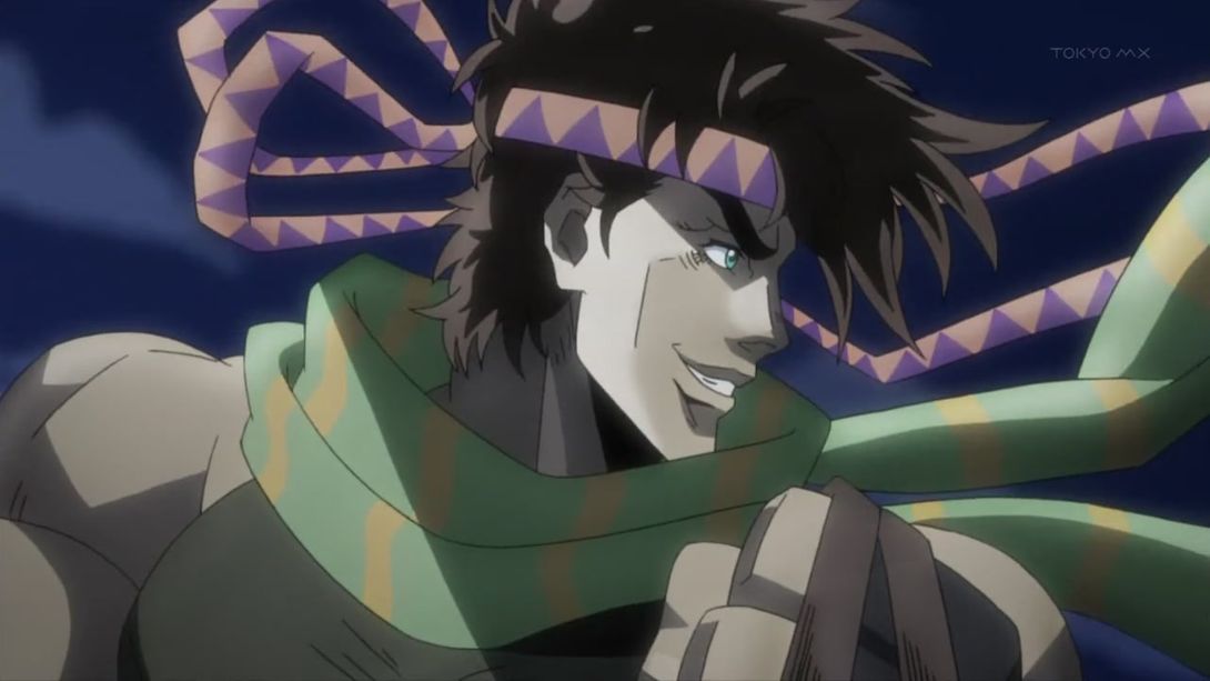
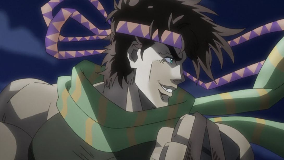
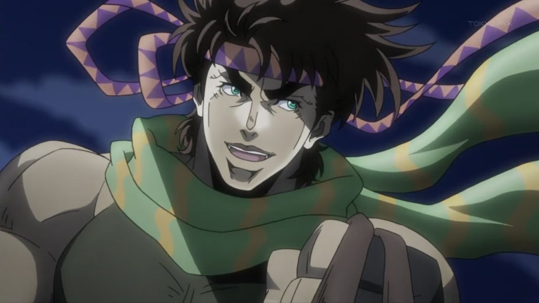
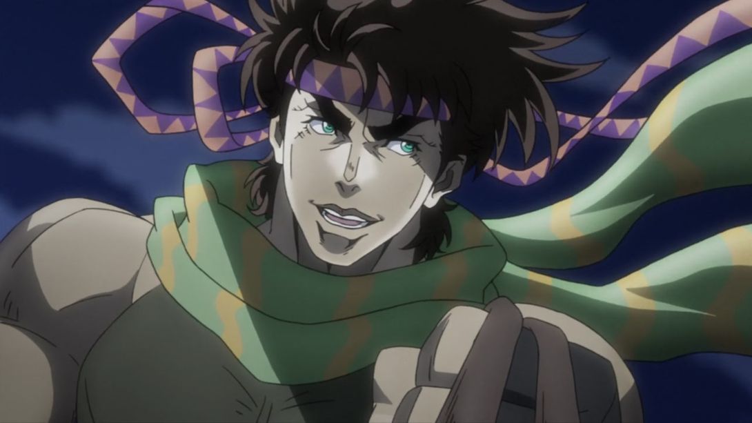
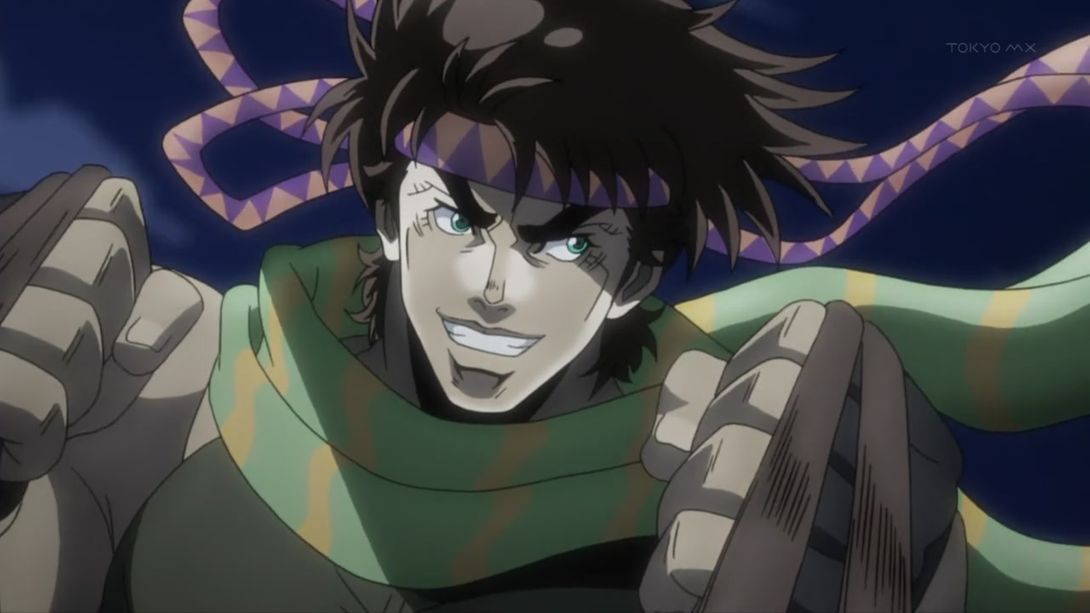
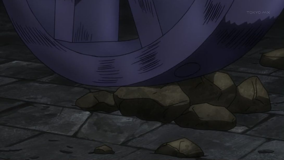
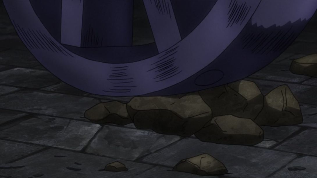
- The wheel has now been shaded more in this here scene:
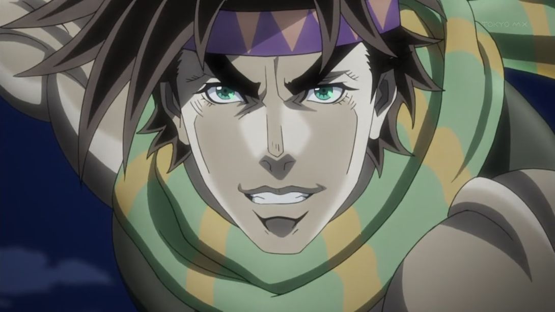
- A change of mood! Joseph is no longer grinning his smug grin here:
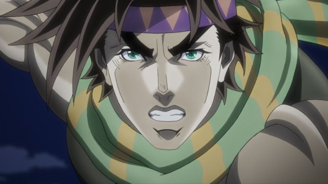
- Here, Kars has been shaded way more dramatically, and the fire looks a little brighter:
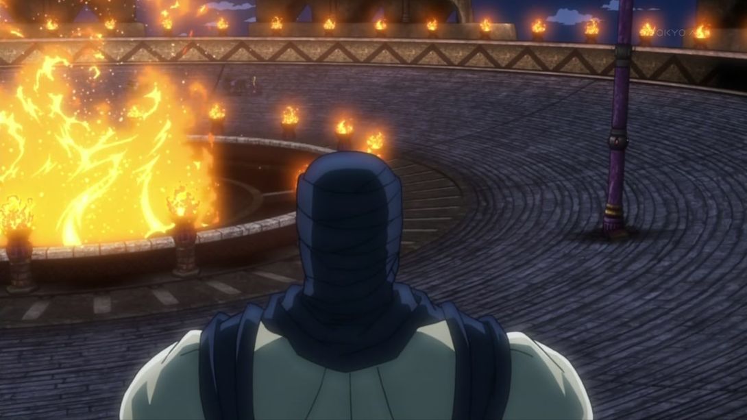
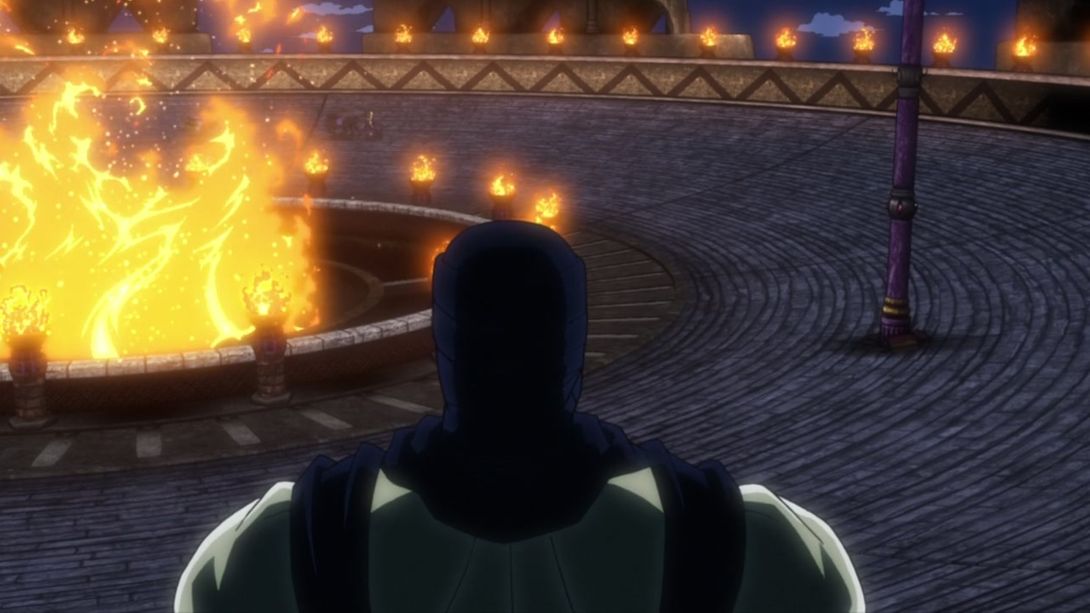
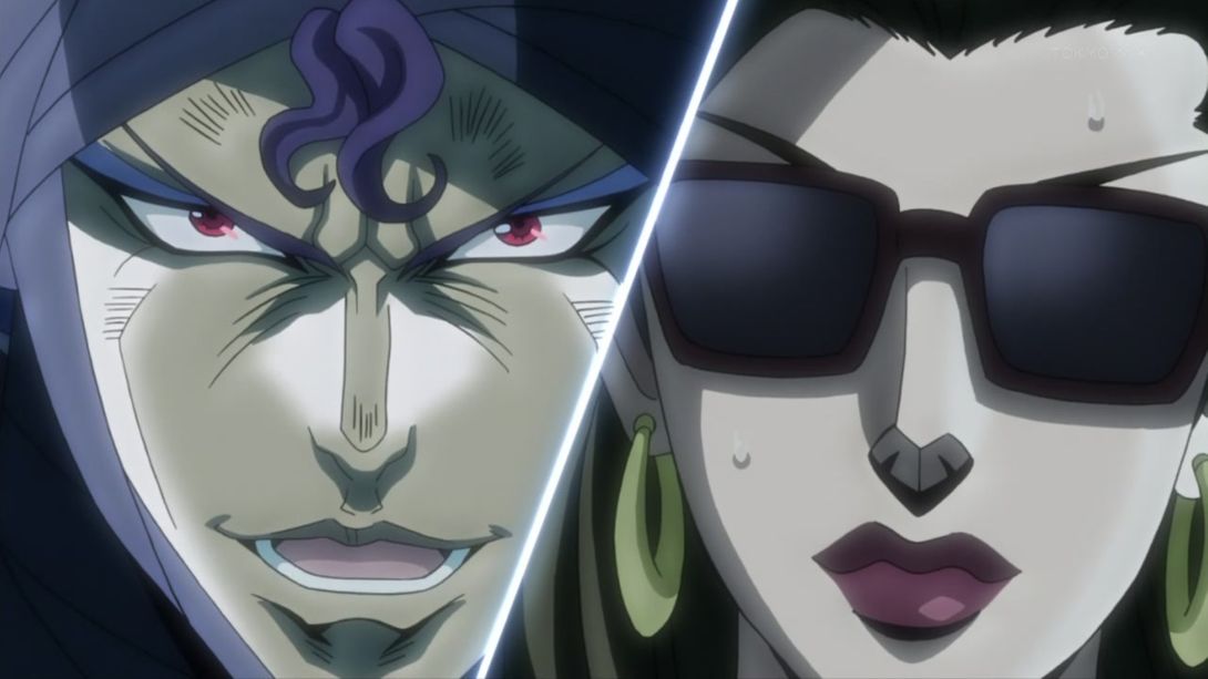
- The same dramatic lighting is reflected in this scene, in which Lisa Lisa has also been completely redrawn (and thank goodness for that)! The dividing line has also been slightly moved, and Lisa Lisa has received the same lighting makeover as Kars:
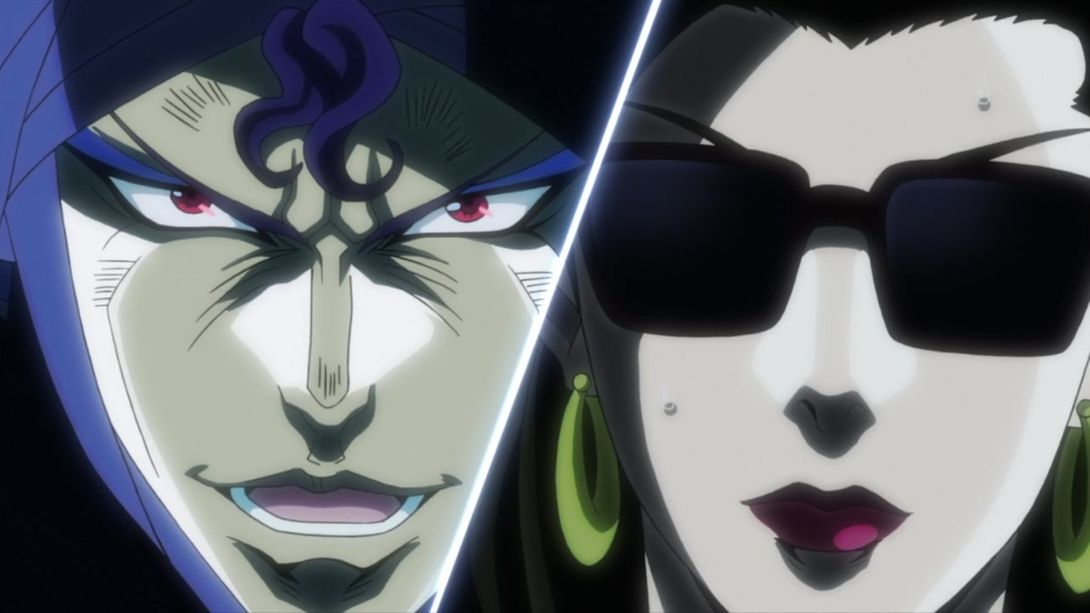
- Here, Joseph’s been moved and retouched:
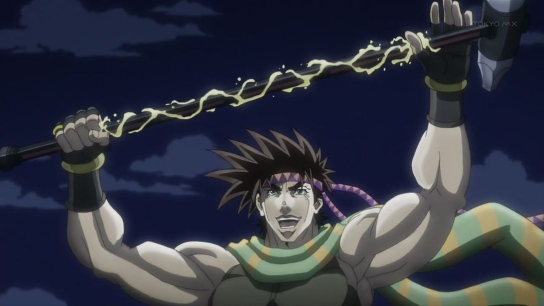
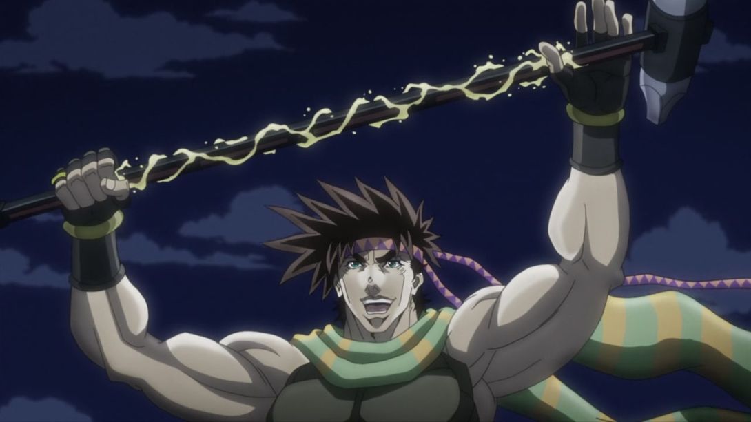
- Joseph’s chin is no longer clipping through his scarf here:
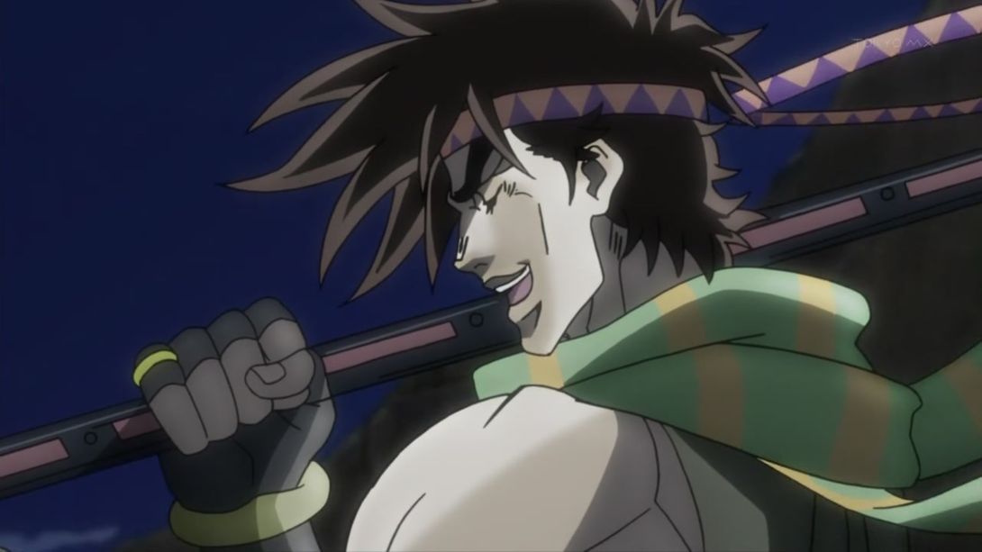

- In this scene, both pillar and man (heh, pillar man) in the foreground are bigger, and the smoke under Joseph’s carriage is also slightly different:
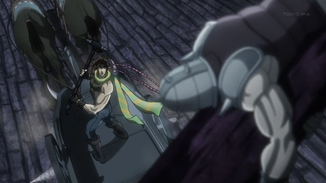
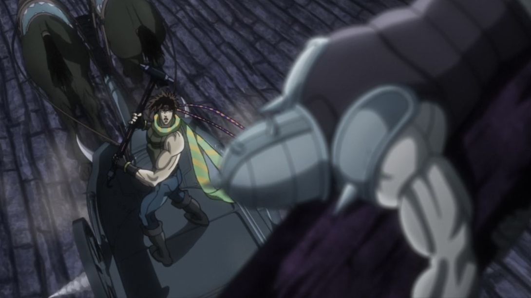
- Here, have a fantastically retouched Lisa Lisa:
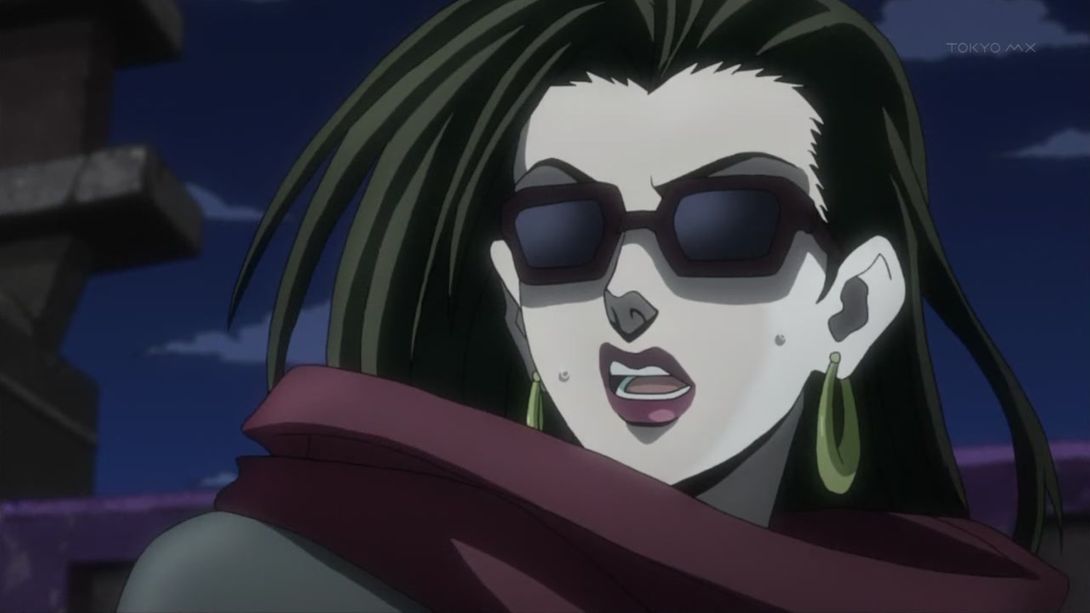
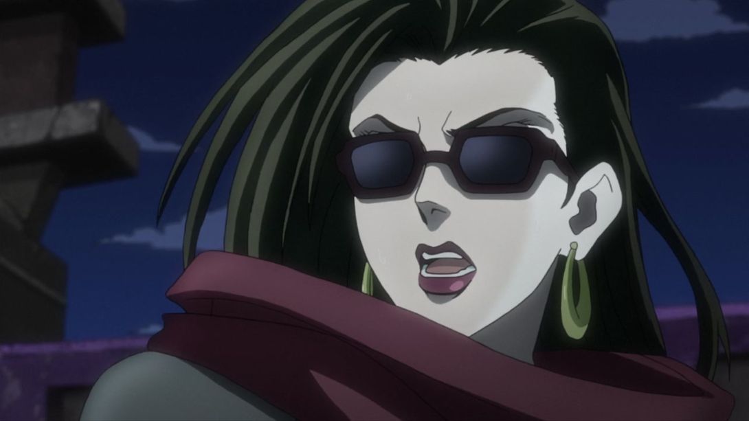
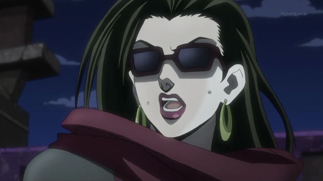
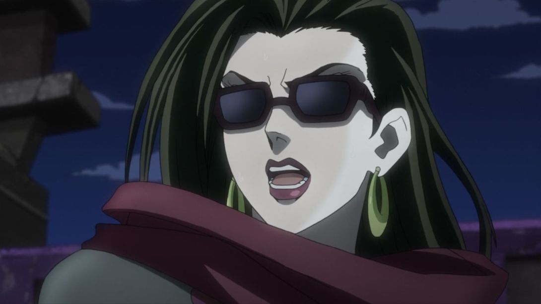
- Woo, what a difference! Joseph looks much better here and he’s also been moved a little more in the top left corner; the background is a little more blurred, and the colouring looks much more vibrant and interesting! On top of that, they added a dark vignette around the edges too:
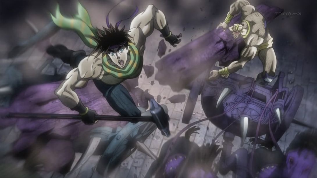
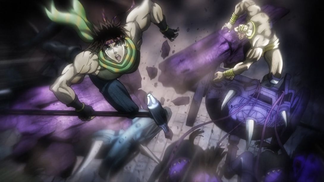
- You can see the same differences here… And Wham’s also been moved and retouched too (and the dividing line has moved with him):
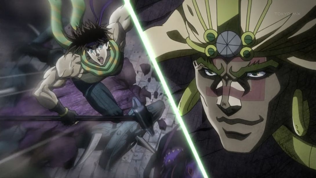
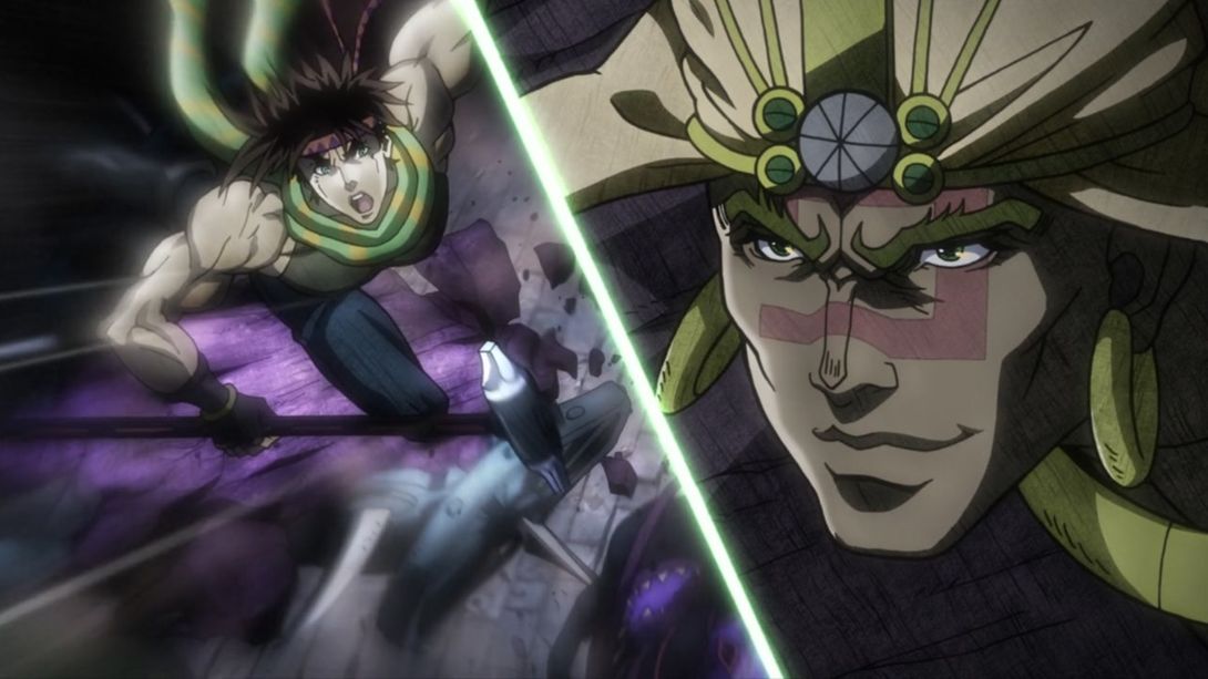
- I think this change speaks for itself…:
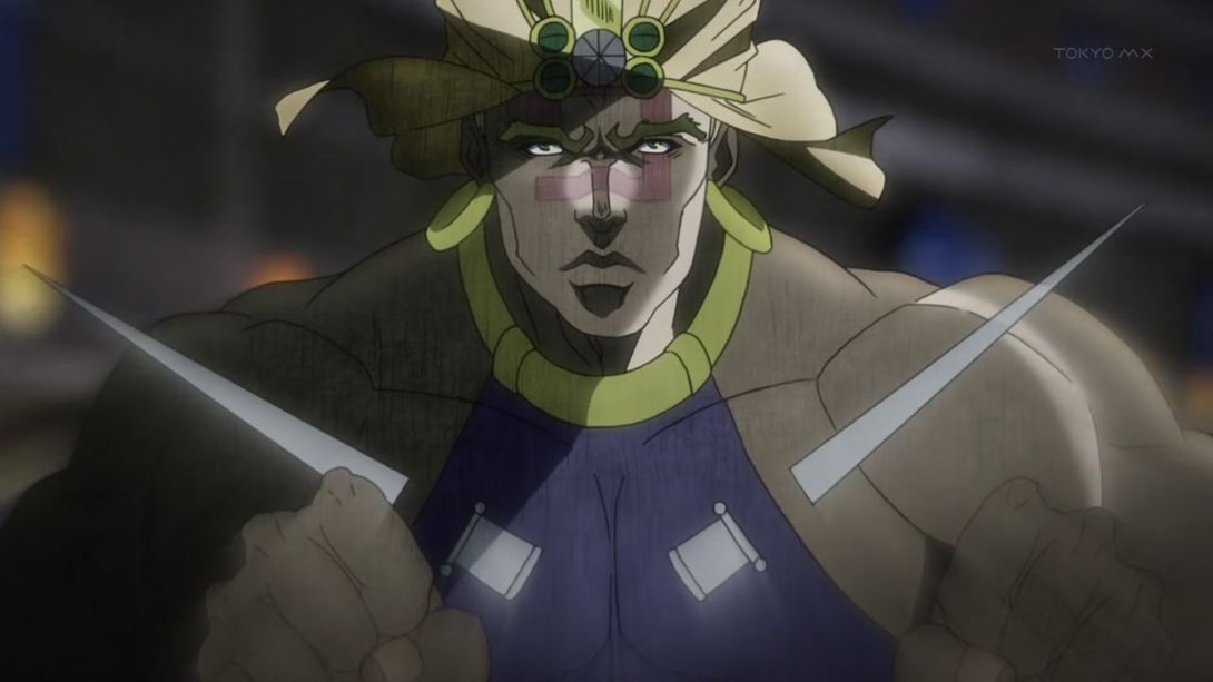
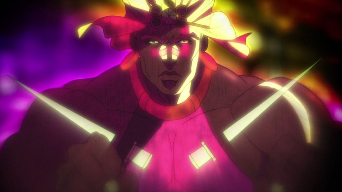
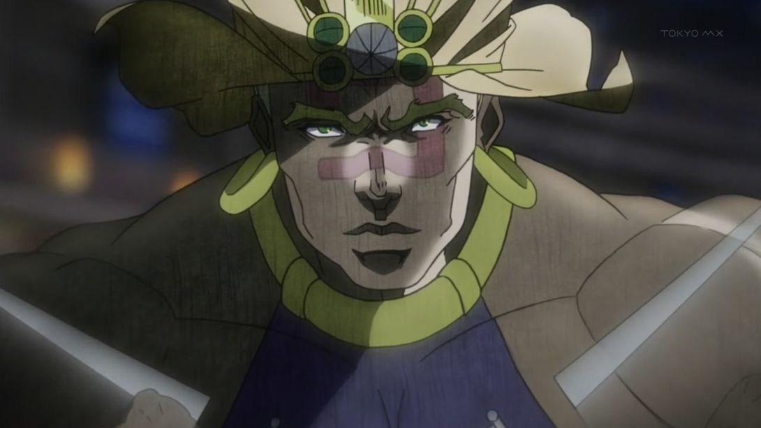
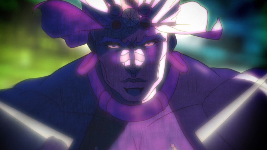
- This angry zombie mob is now much more dynamically shot:
- And this transition is also looking different:
- Here, Kars has been redrawn and looks less… blocky. The inside of Lisa Lisa’s mouth has also been recoloured:
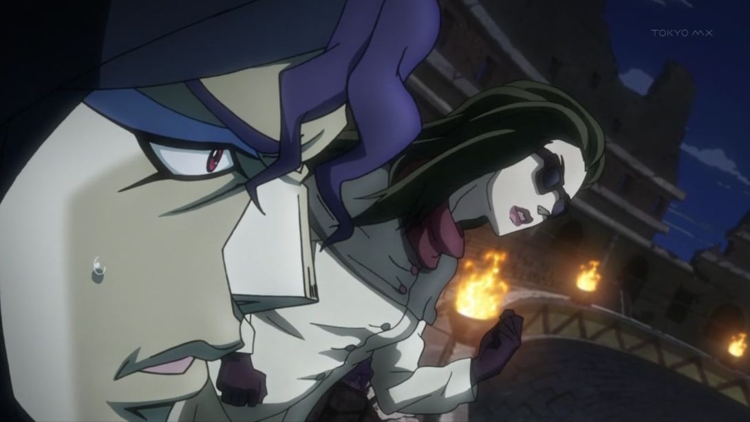
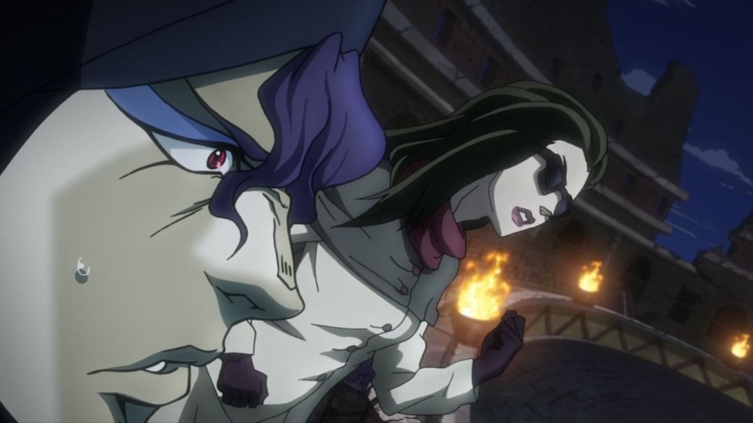
- Aah, I love animations where all frames have been redrawn… Let’s take a look:
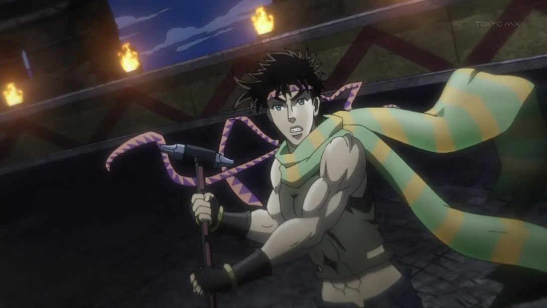
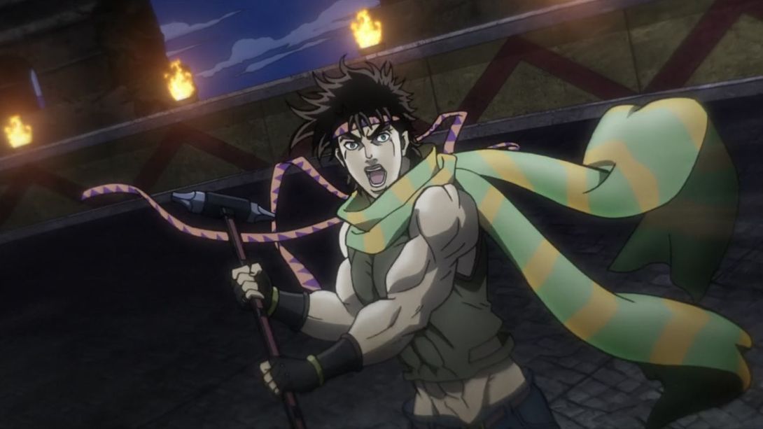
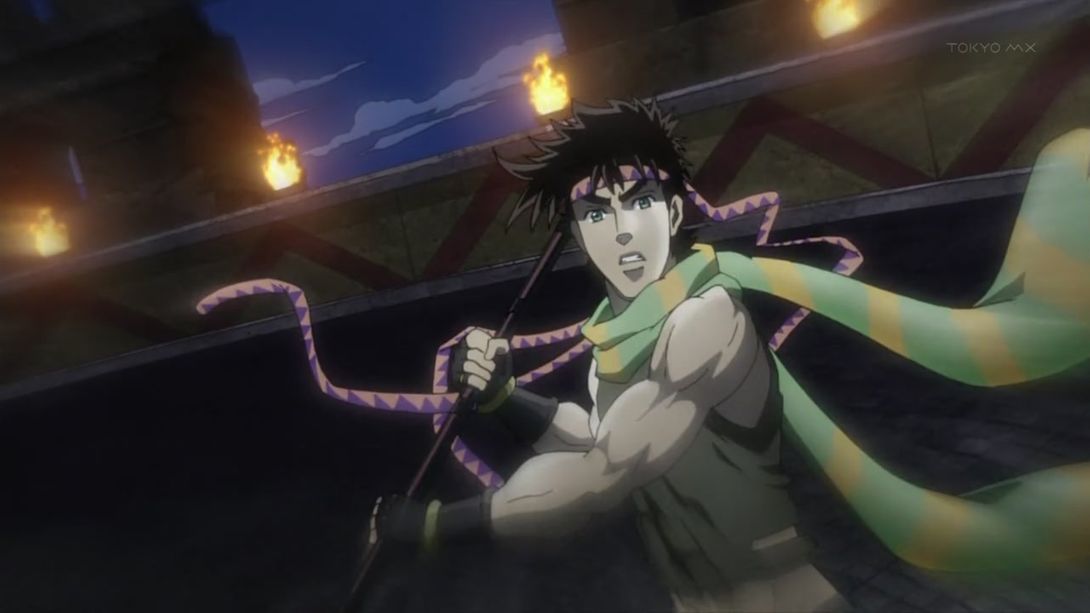
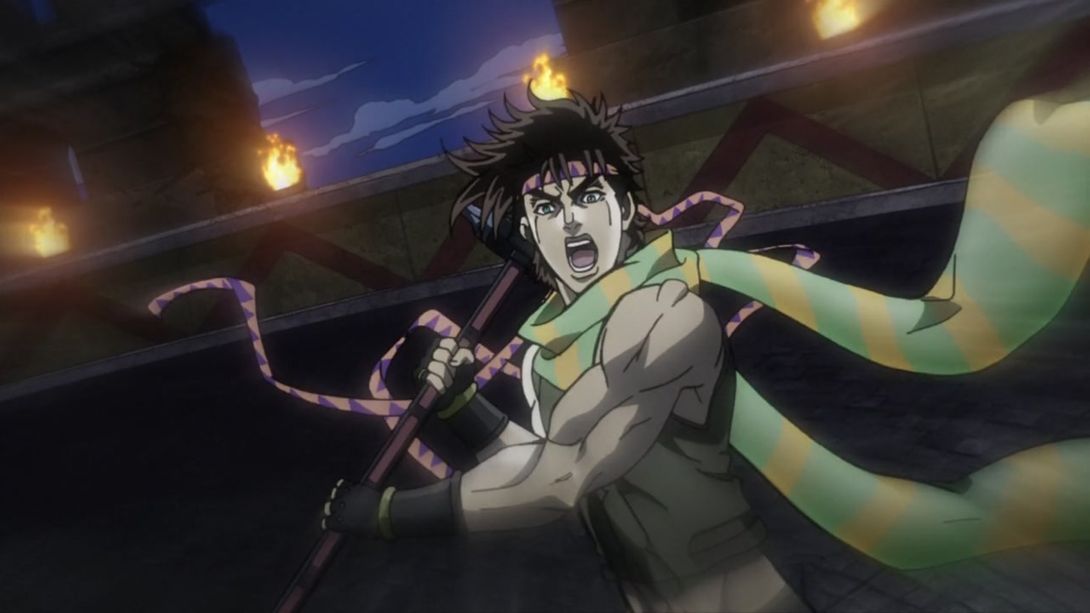
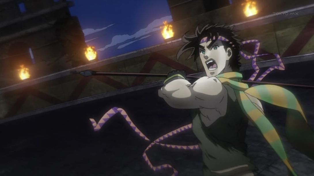
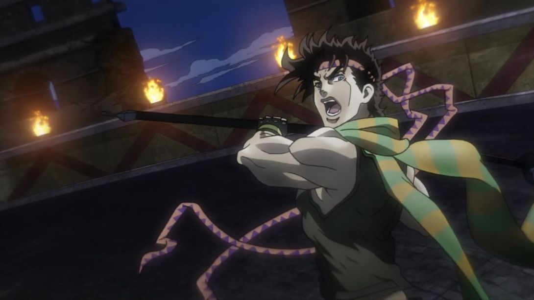
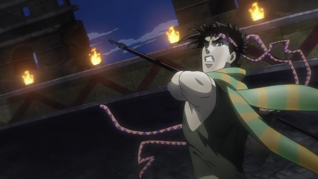
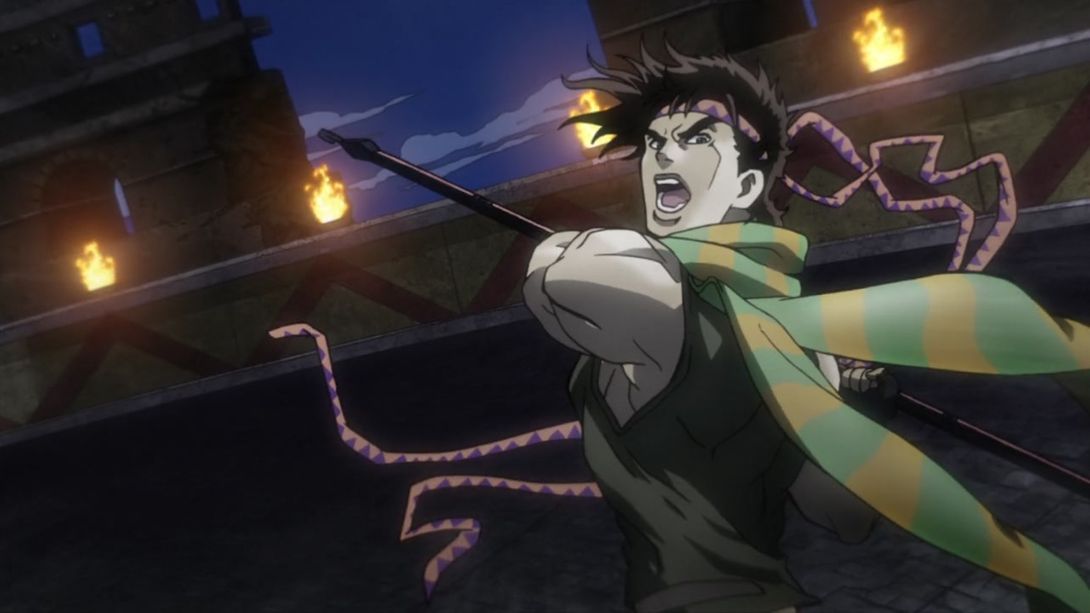
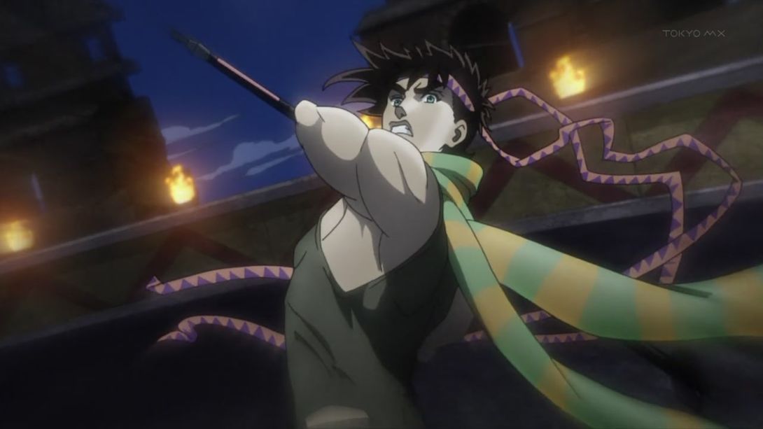
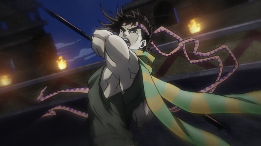
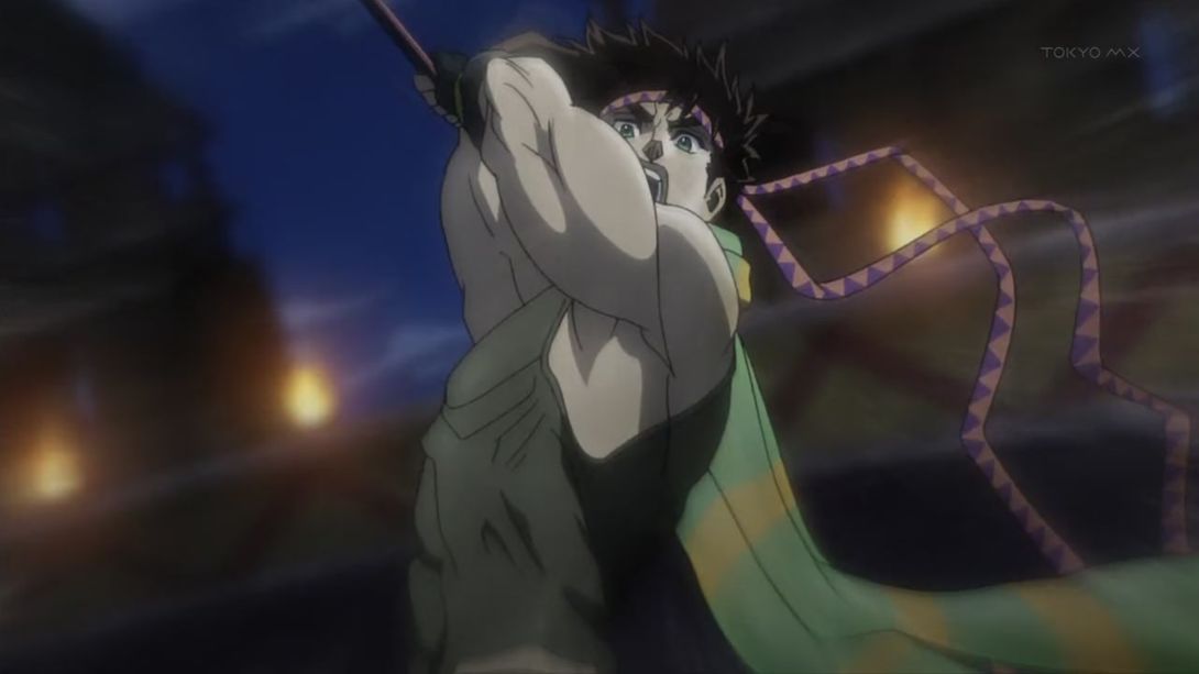
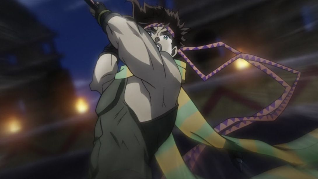
- And let’s look at it in motion…:
- Another quick brighter and sharper animation:
- A bit of skin has been properly recoloured here…:
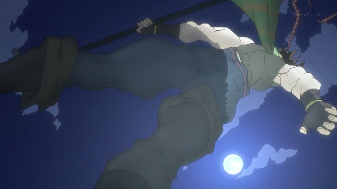
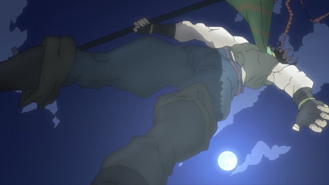
- Aaaand let’s take another deep dive! Let’s start with the fact that Joseph is now… wearing a shirt:
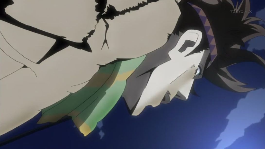
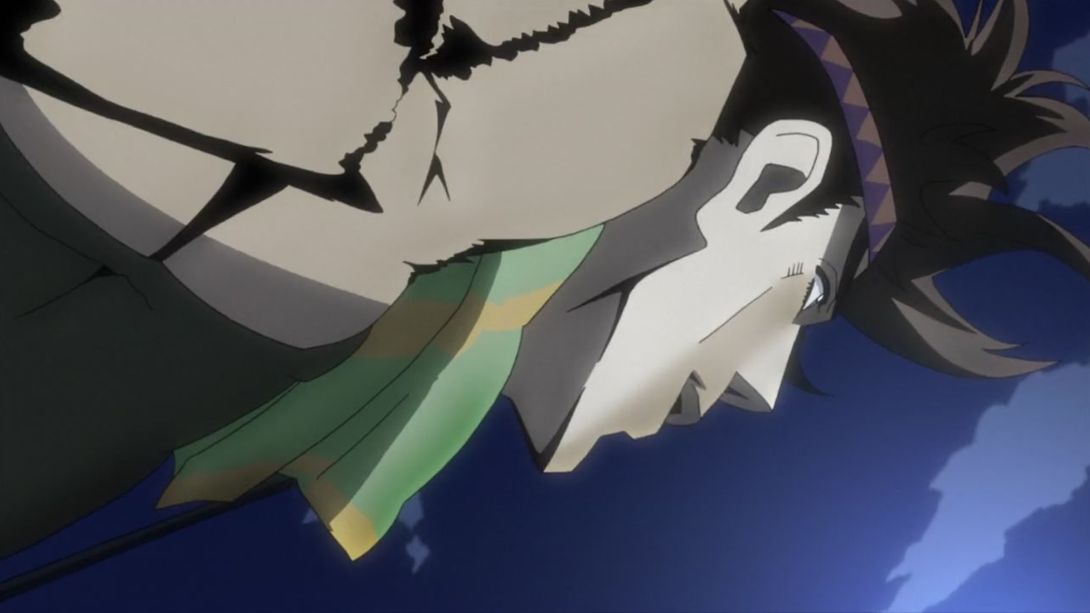
- He also looks way less happy about the whole situation:
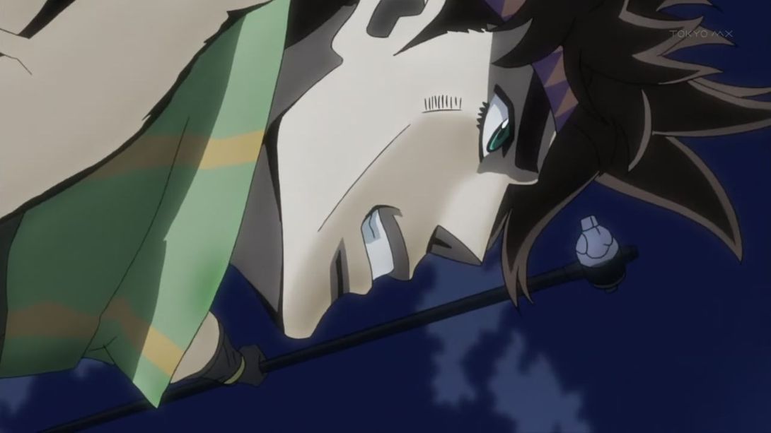
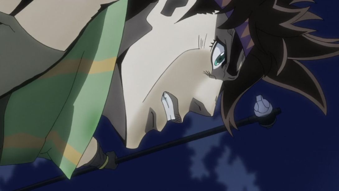
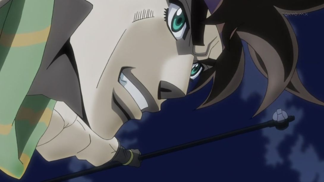
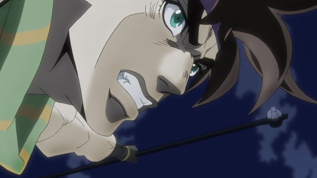
- And let’s watch it in motion:
- Wham has been slightly moved here, and his face has been redrawn as well (I’m not sure about the end result, though):
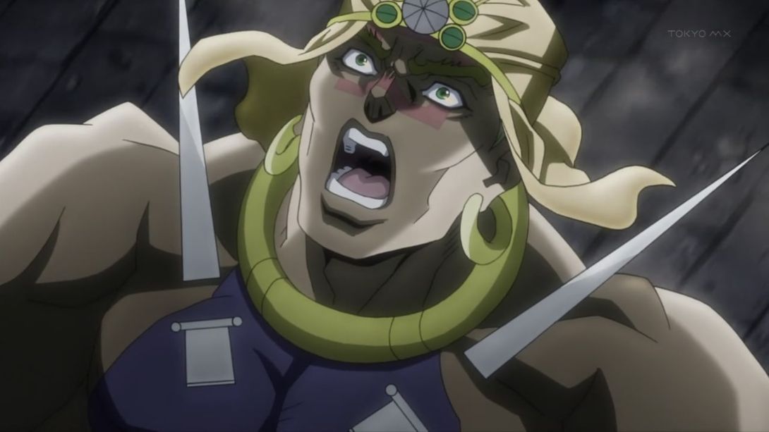
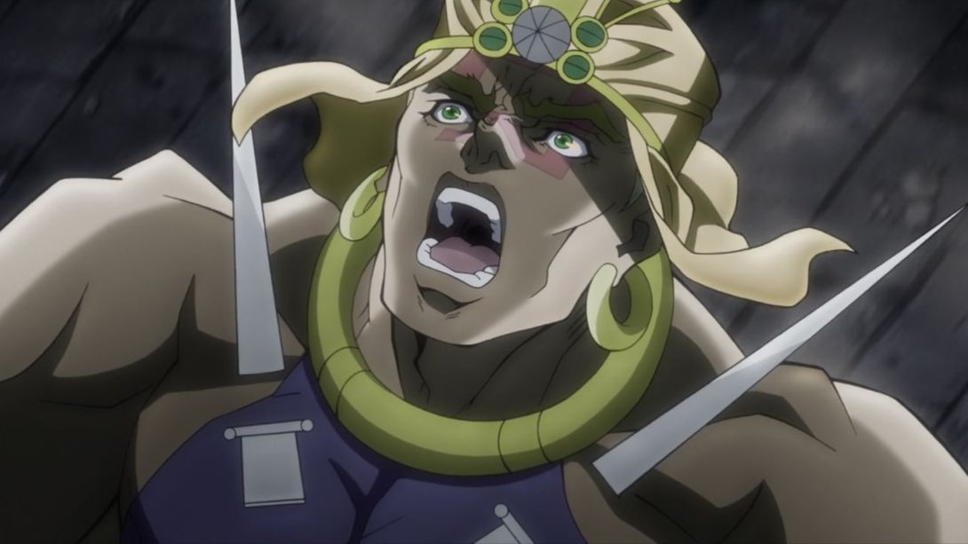
- The blur is invereted in the BD version of this scene:
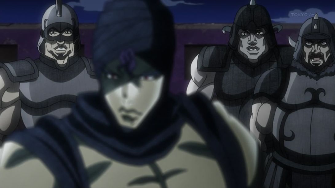

- Joseph has been redrawn, and he’s no longer falling off his damn horse:
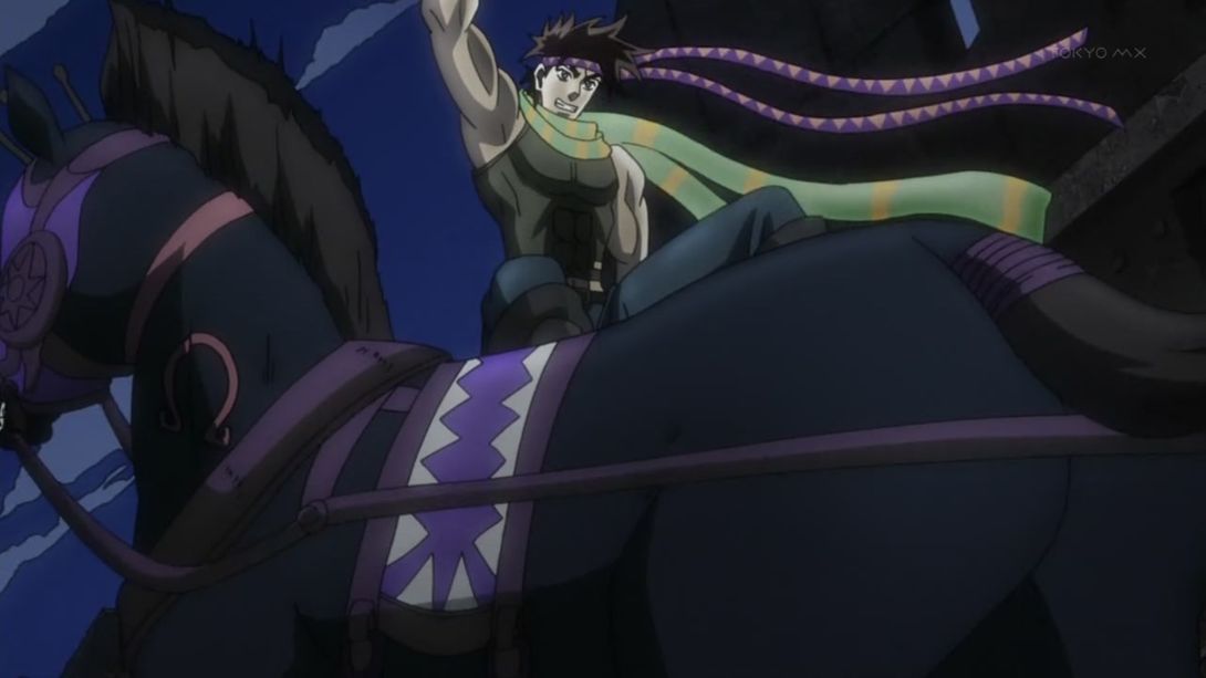
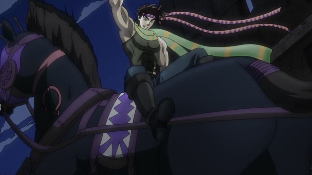
- Ah, fantastic! chef’s kiss:
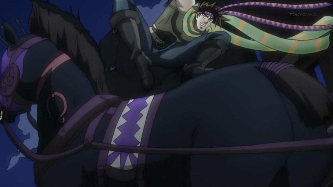
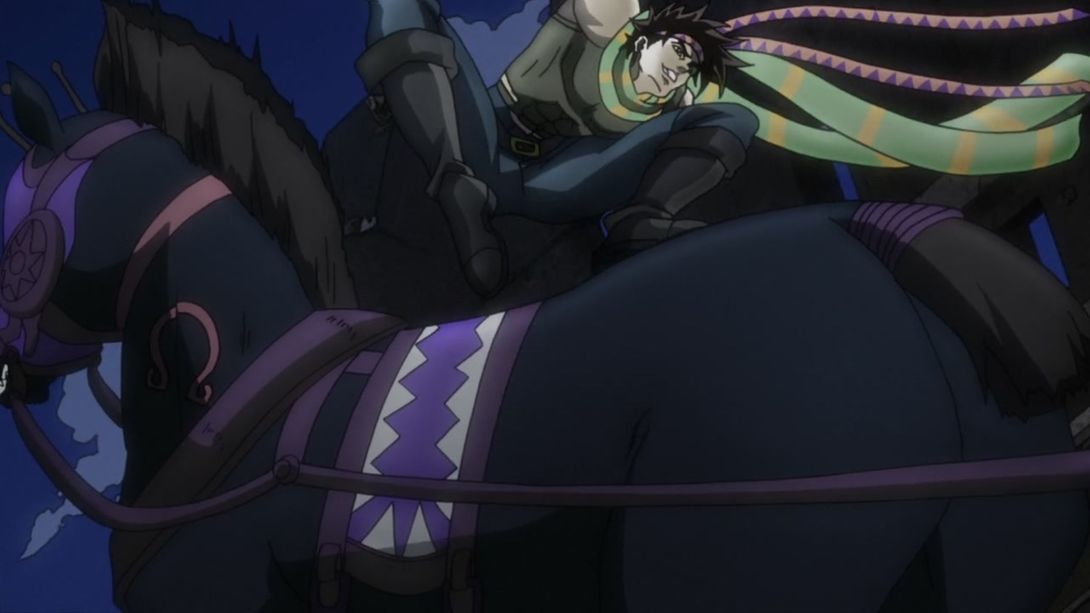
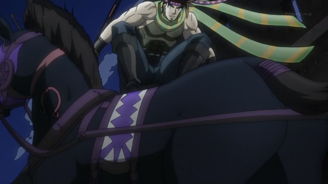
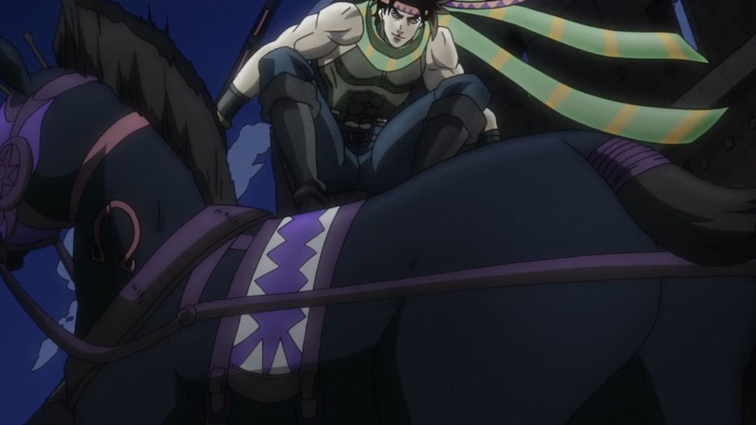
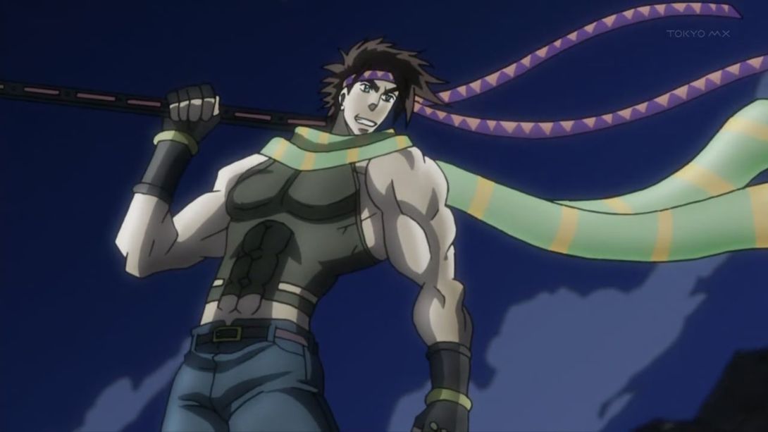
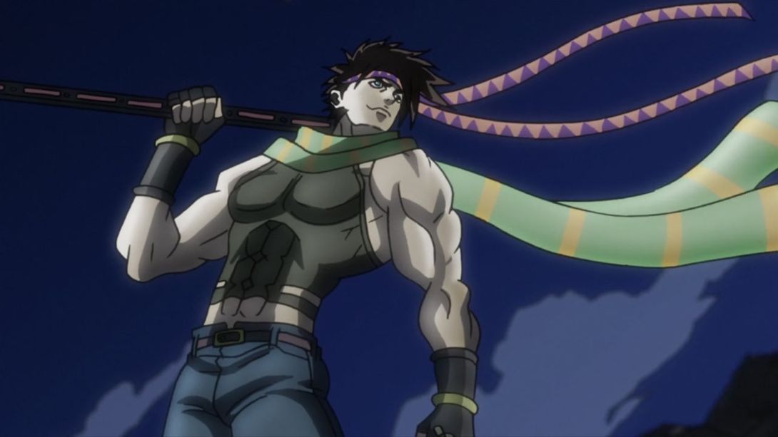
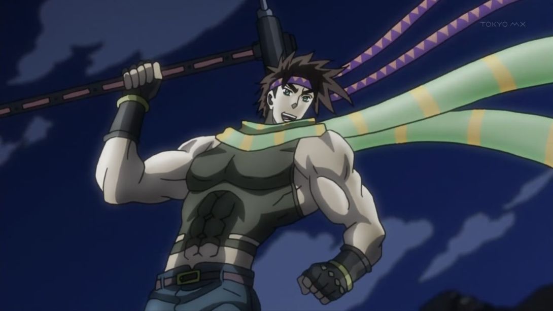
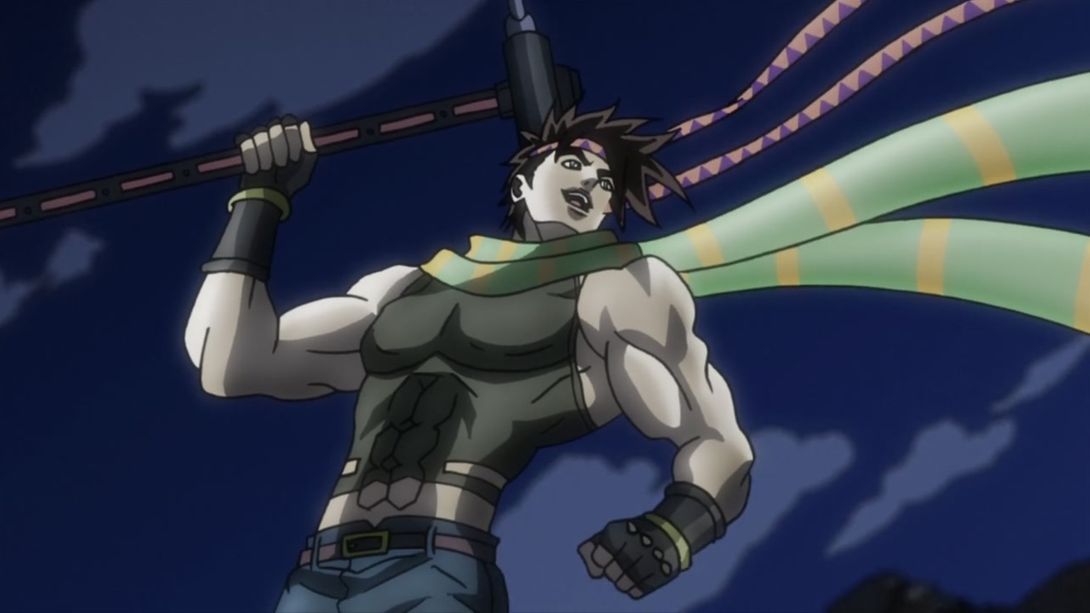
- The clouds have been moved… Again. I don’t really understand why, but here we go:
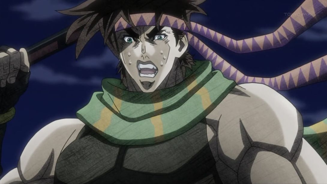

- This leg grab transition is different in the BDs…:
- …and the colour and position are also a little different:
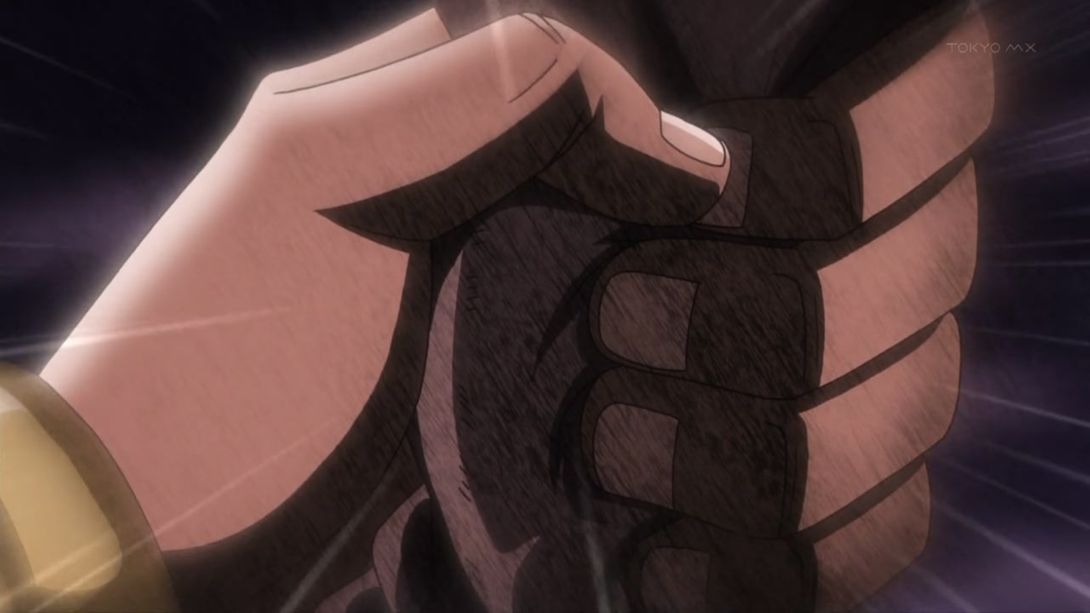
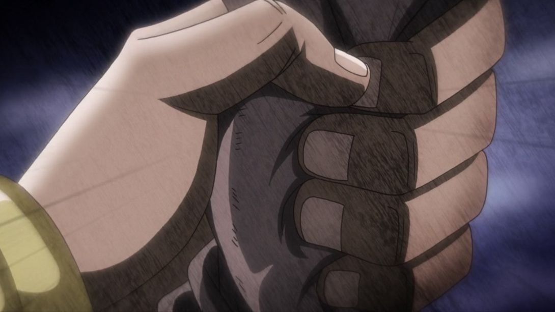
- The bit where Wham’s arm goes into the horse (god, this sentence sounds wrong) is different in the BDs:
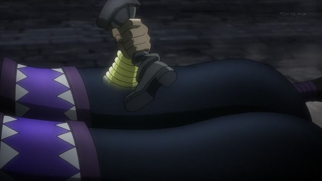
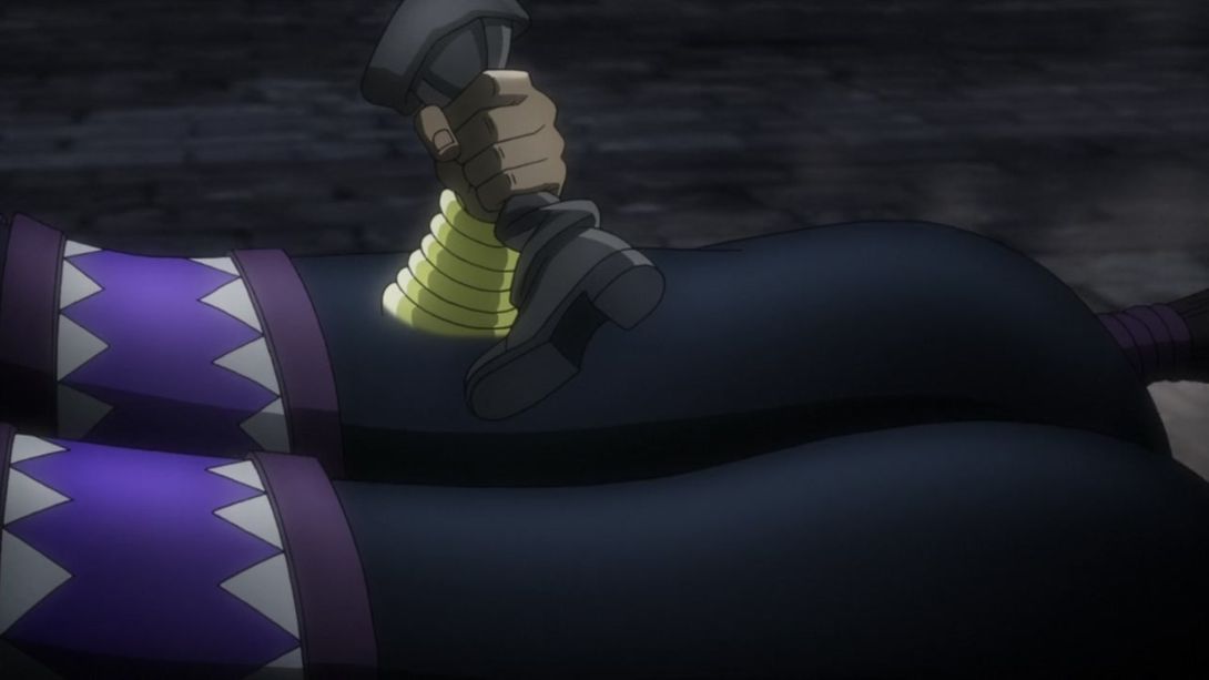
- Joseph has been moved back a tad, so that it no longer looks as if he’s hovering a little bit:
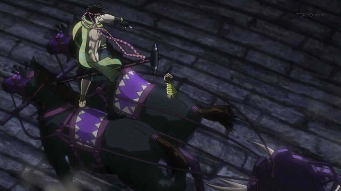
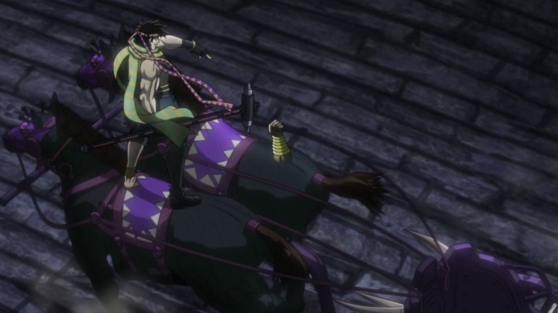
- Aaaand here we go again:
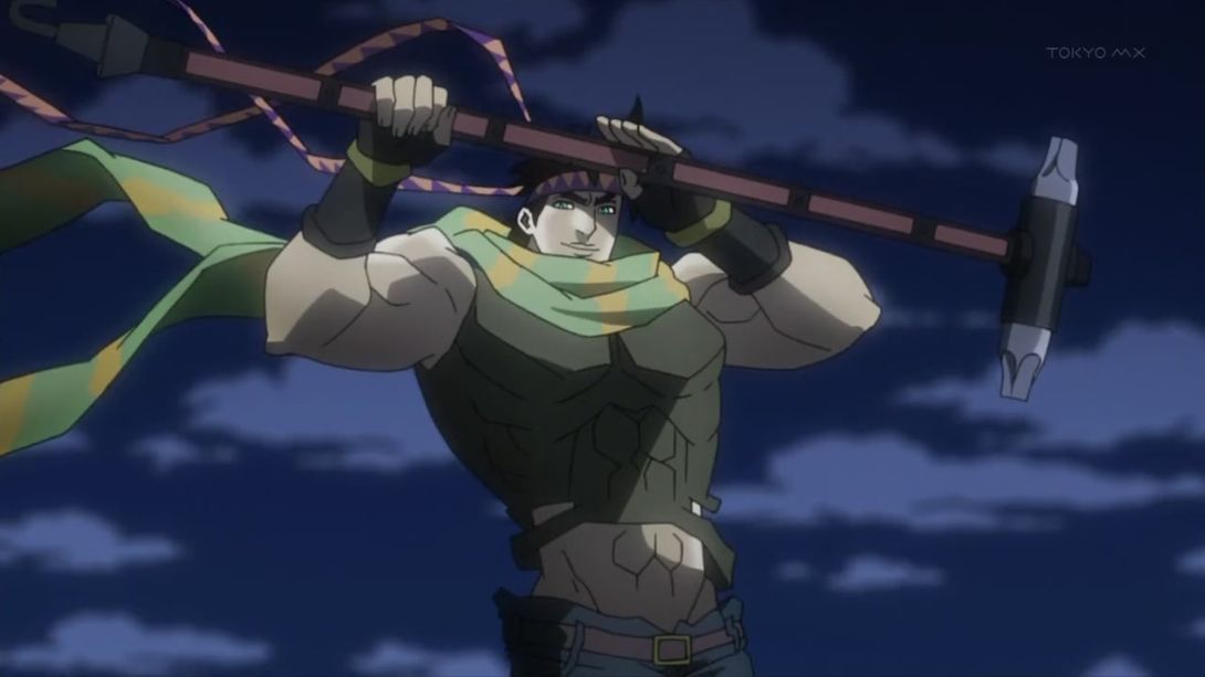
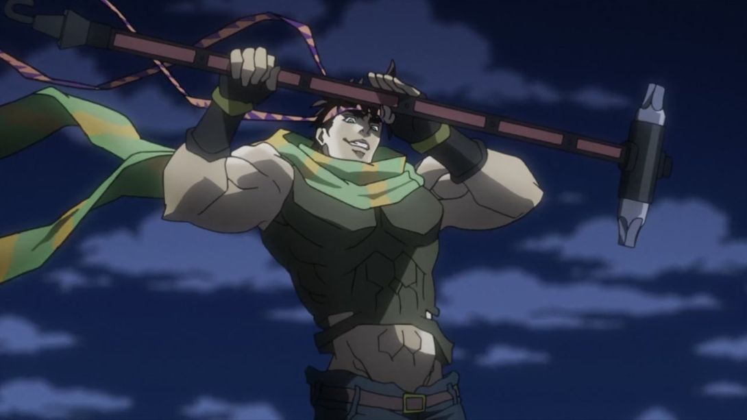
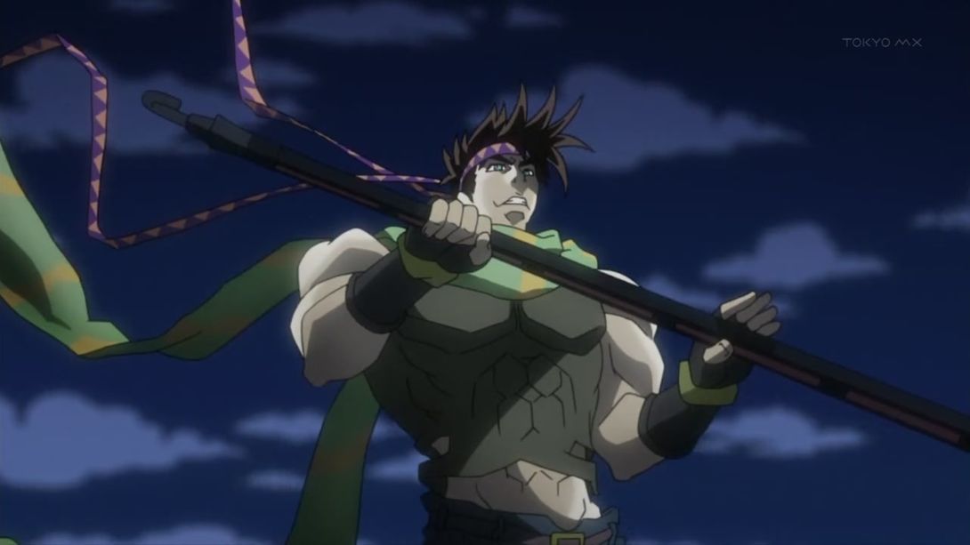
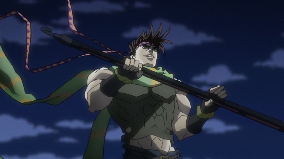
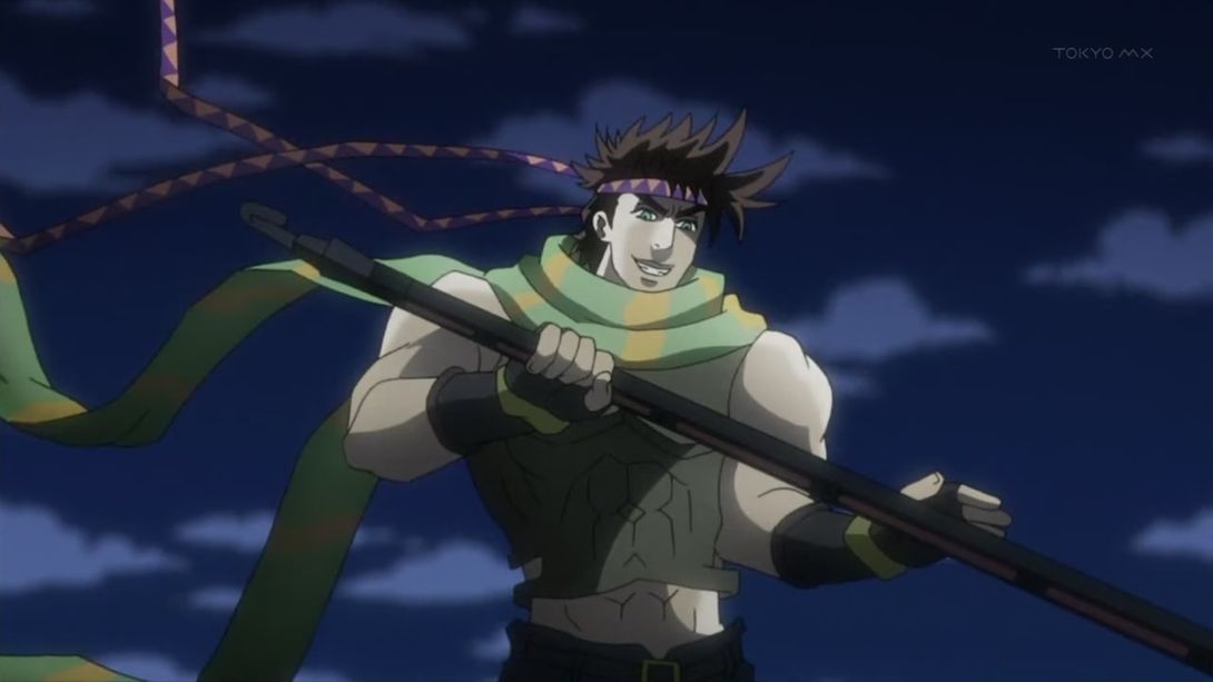
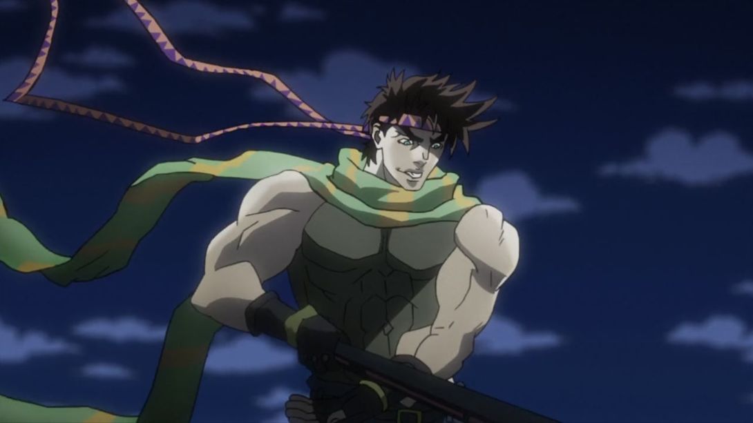
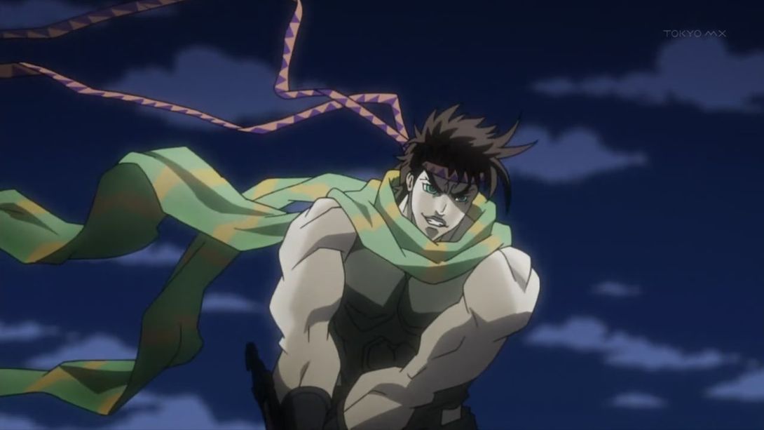
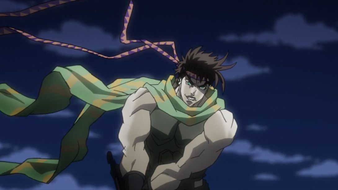
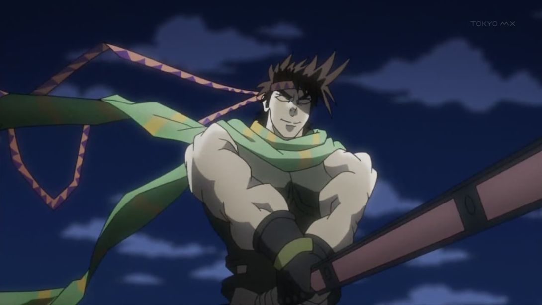
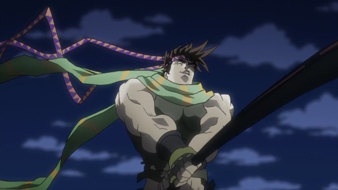
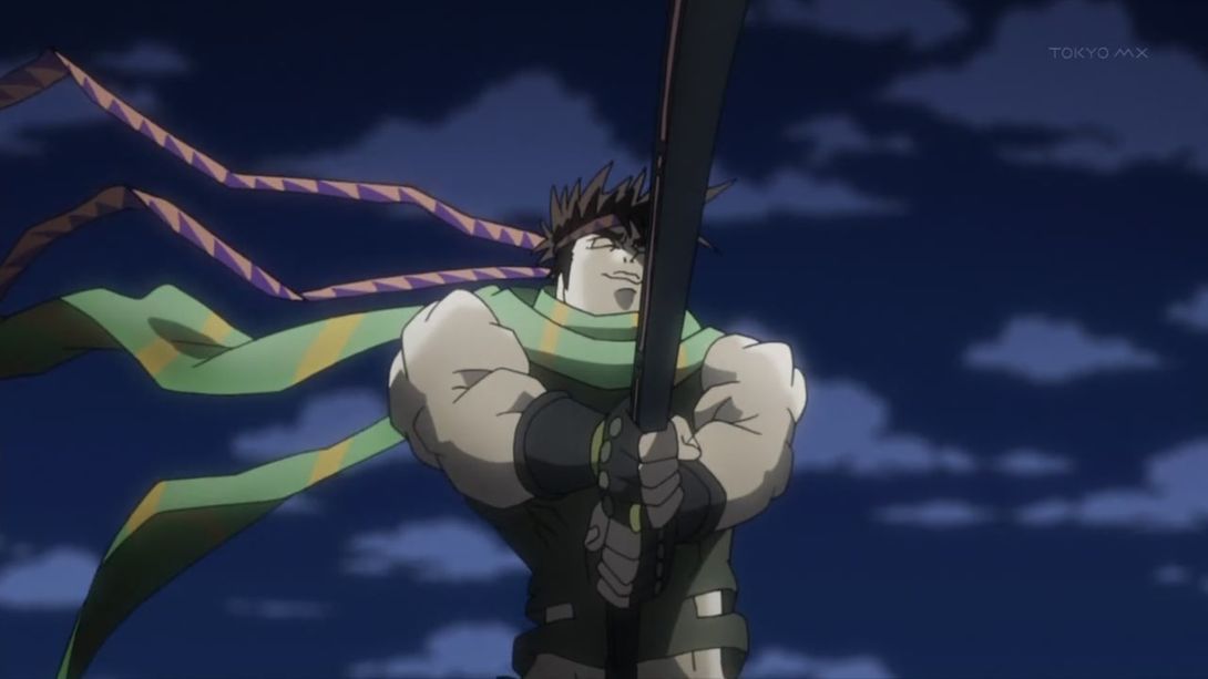
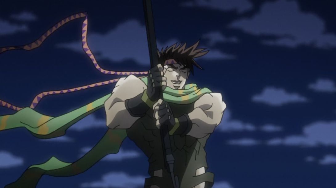
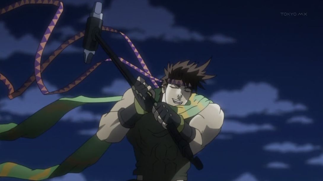
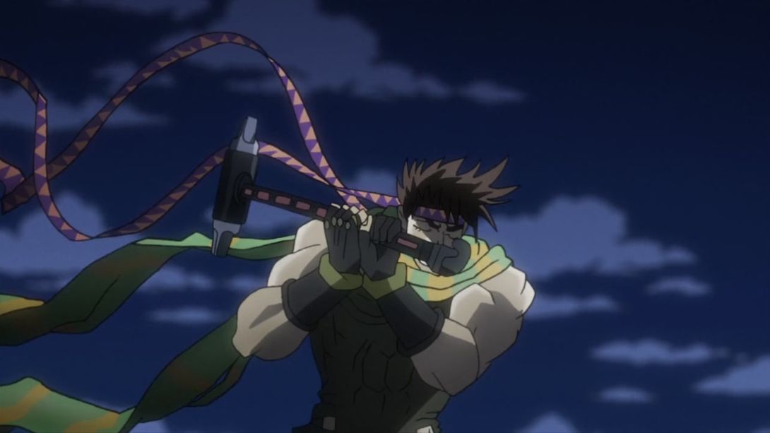
- Whew! Let’s move on… Here, Joseph is a little closer to the camera:
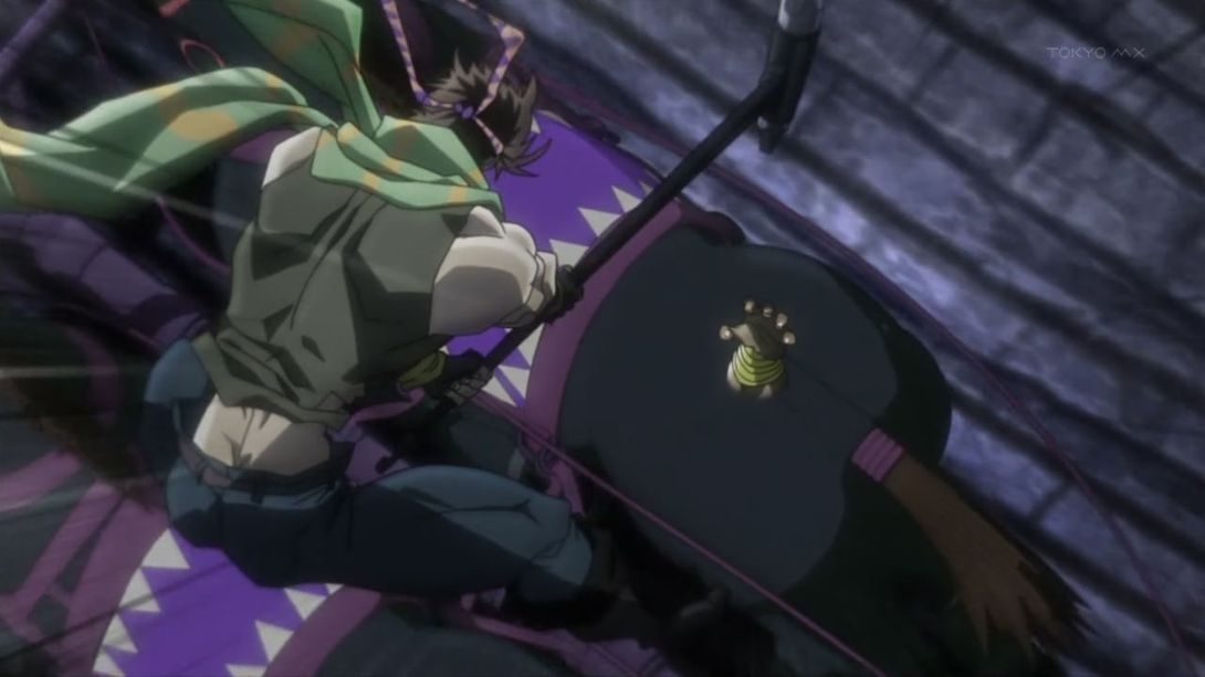
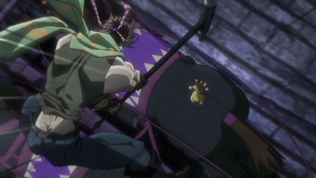
- Here we have another one of those errors that have been introduced with the redraws… Here, both Joseph and Wham have been moved more to the right, so that the scene is a little more centered (Wham’s face has also been retouched), but… Joseph is no longer holding the reins with his foot! They’re just… hovering there:
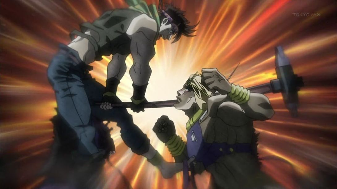
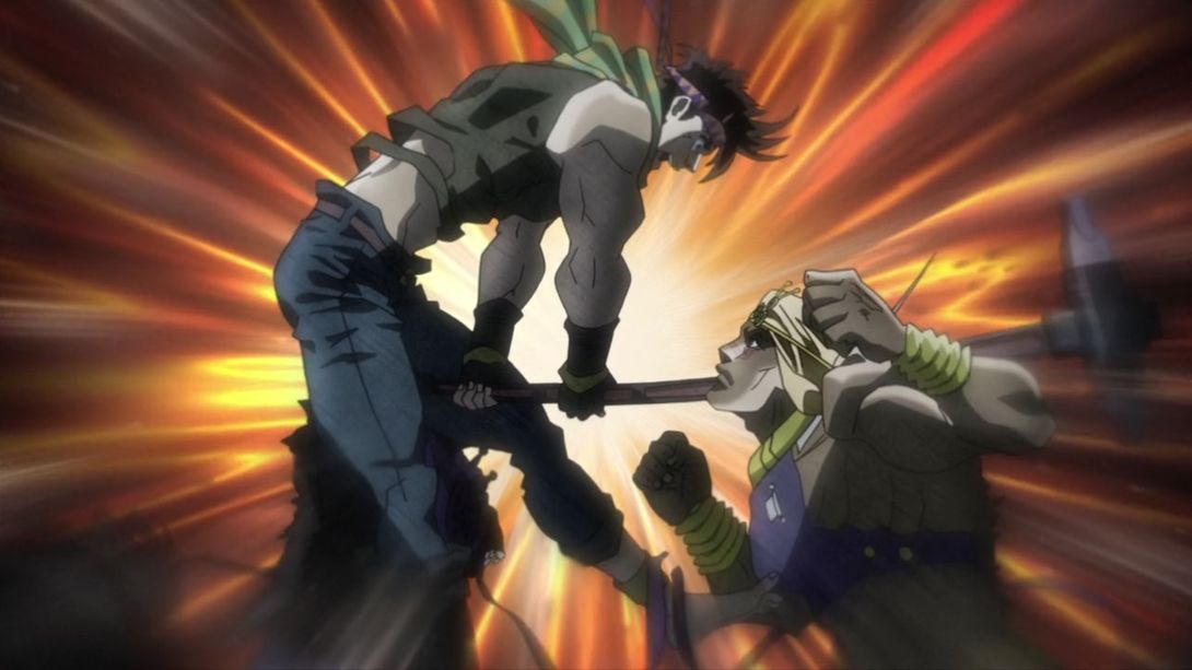
- Kars has also been moved and redrawn… And he looks a little less smug:
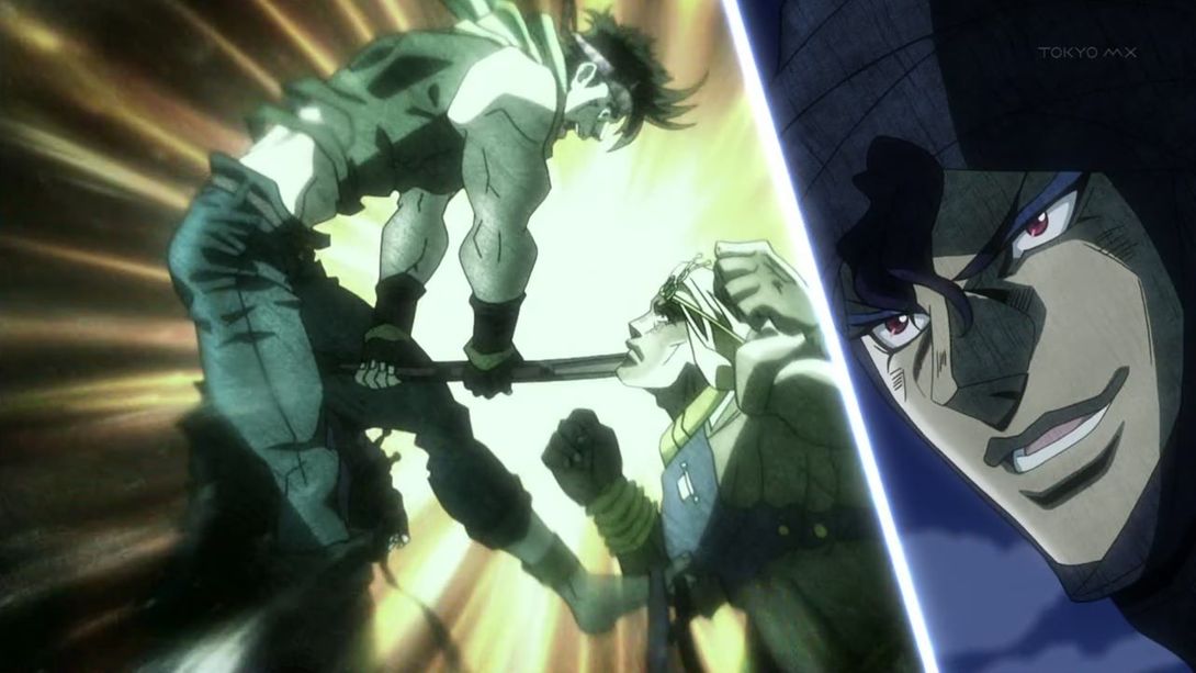
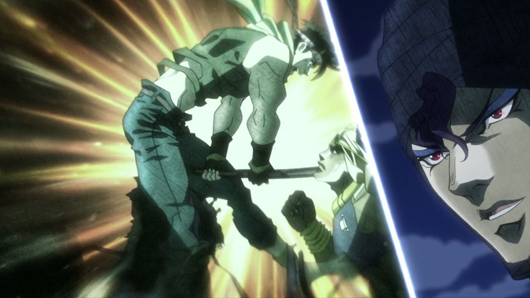
- Wham’s Holy Sandstorm is brighter and sharper too:
- Both Lisa Lisa and the camera have been moved, here:
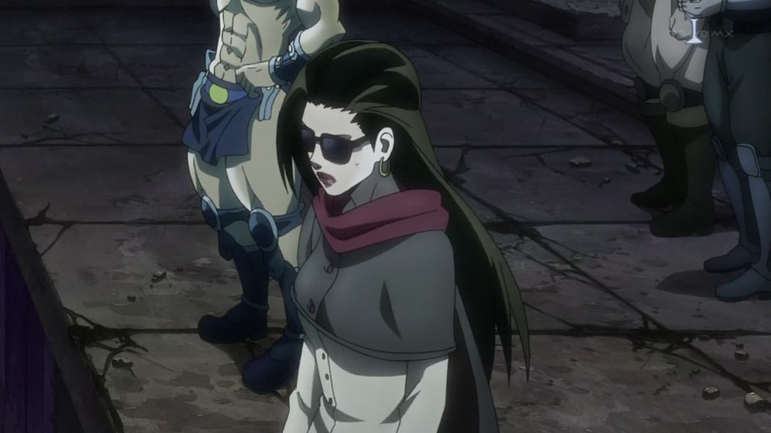
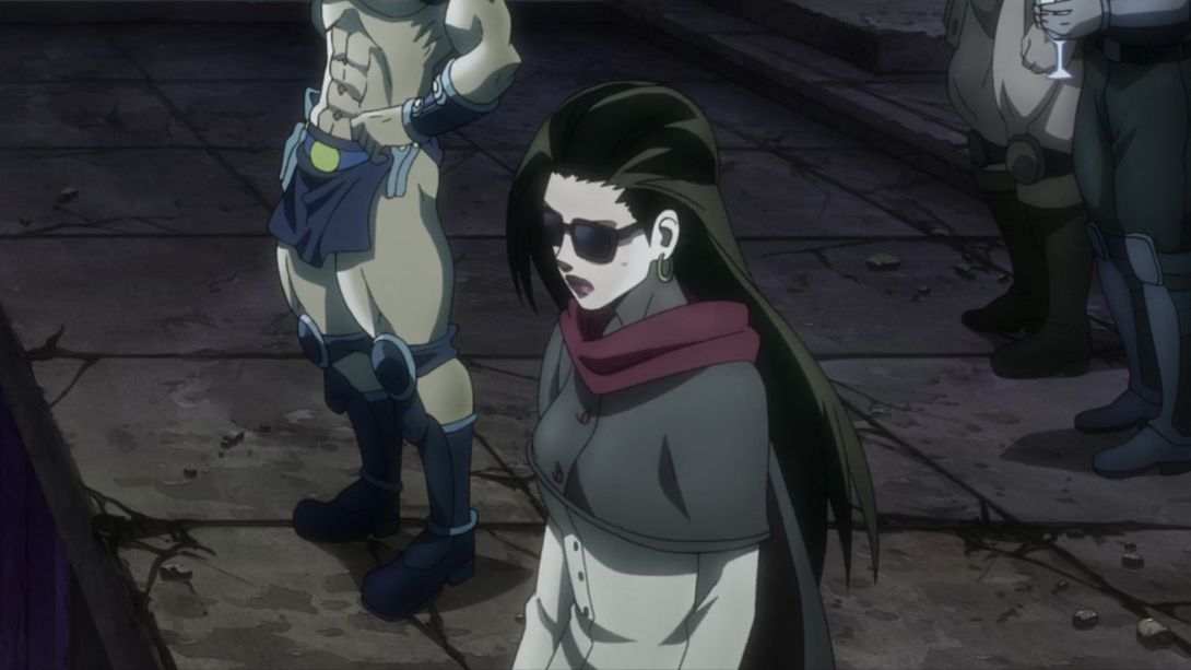
- And this glass breaks in a more convincing way:
- Kars has got a different background, here…:
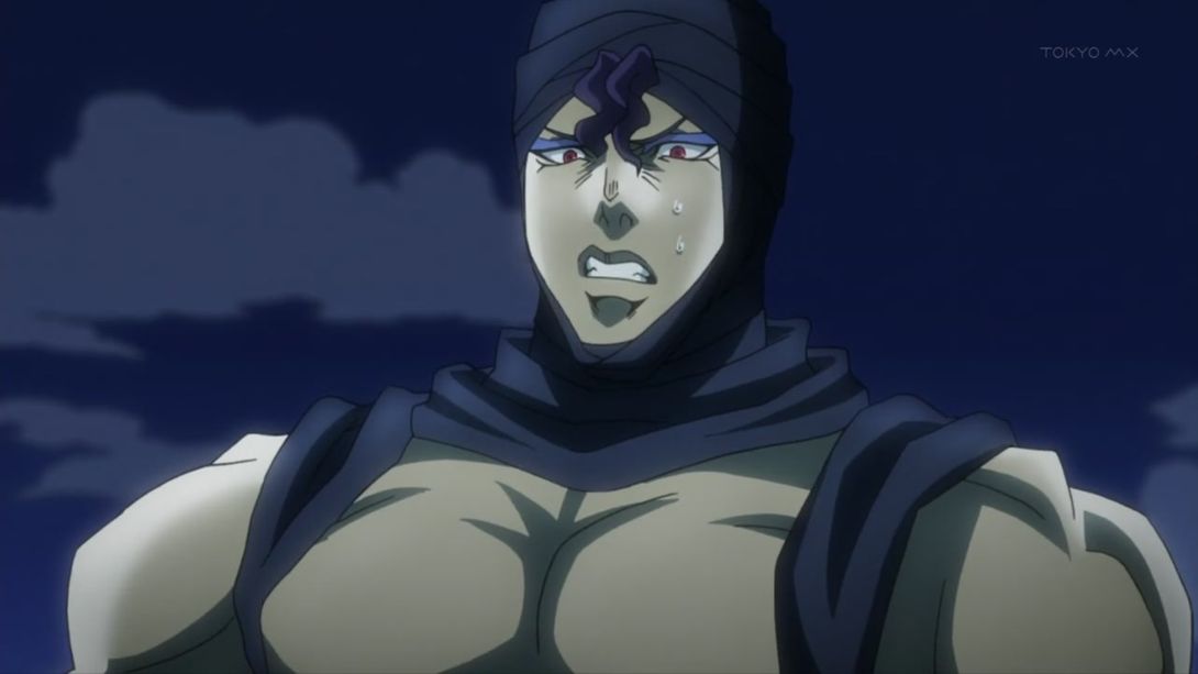
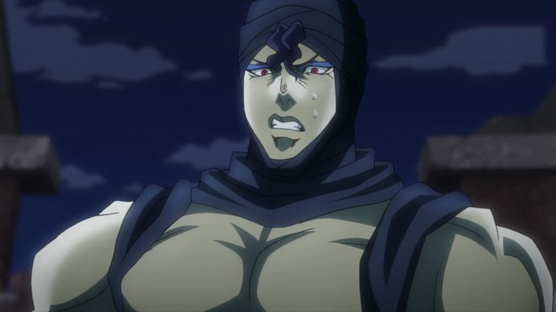
- And here, Kars is taller, he’s been retouched and the camera has also been moved:
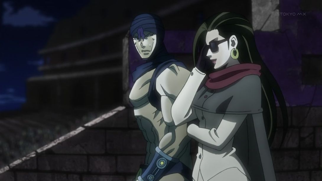
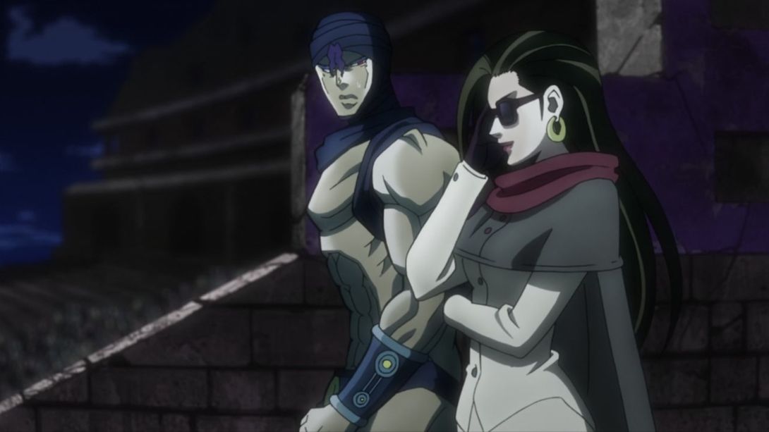
- Lisa Lisa has been redrawn here:
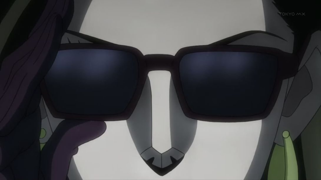
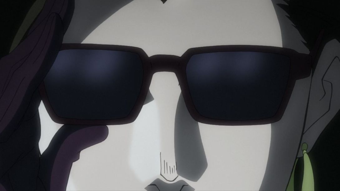
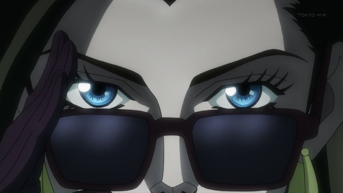
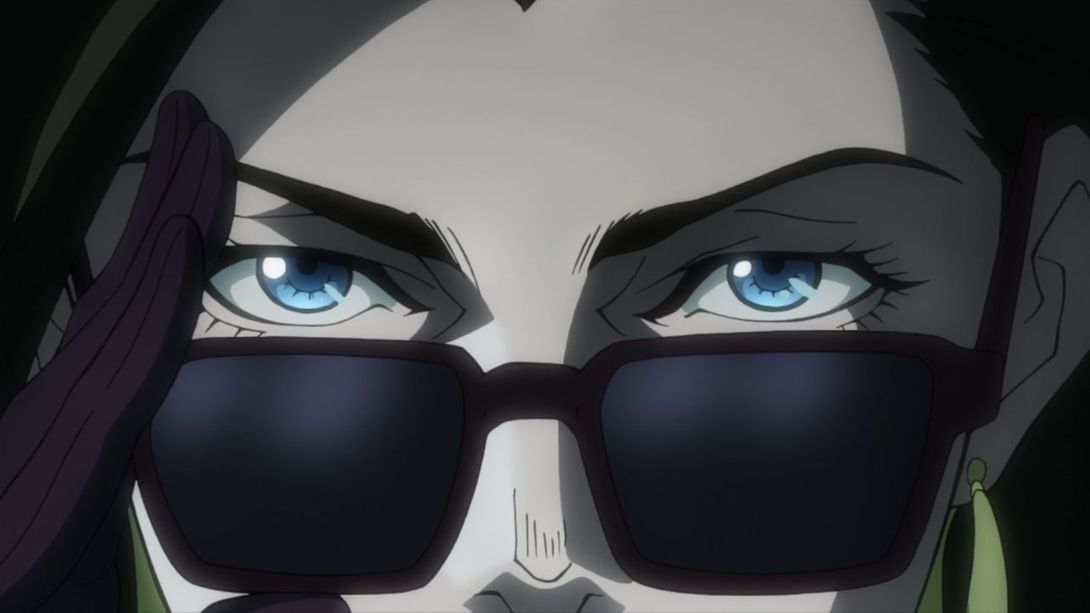
- Here, Kars’ mouth area is slightly less shaded, and the dude in the background has been removed entirely:
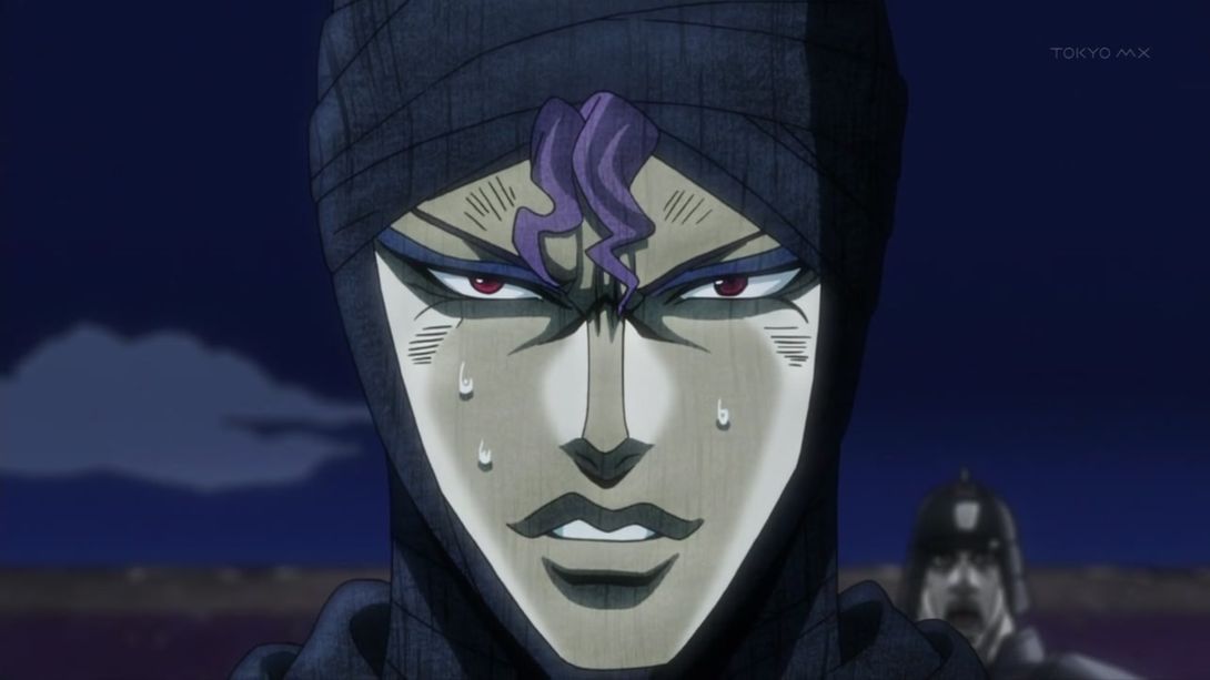
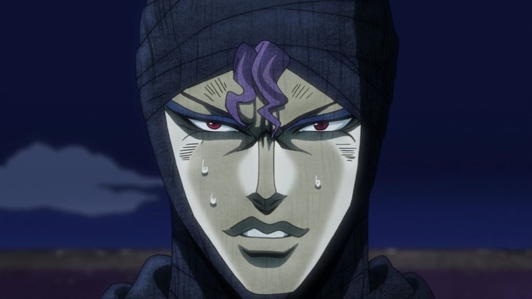
- Here, Joseph has been moved, retouched and the background is also slightly different:
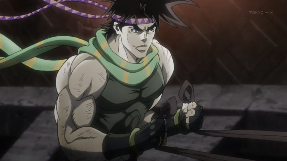
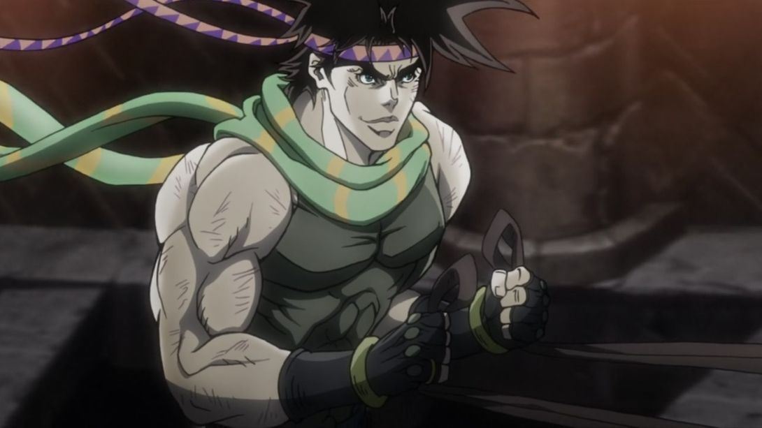
- In this scene, the transition to the… questionably animated Wham on the right side of the screen happens much later:
- And the Wham on the left side of the screen has also been shaded better:
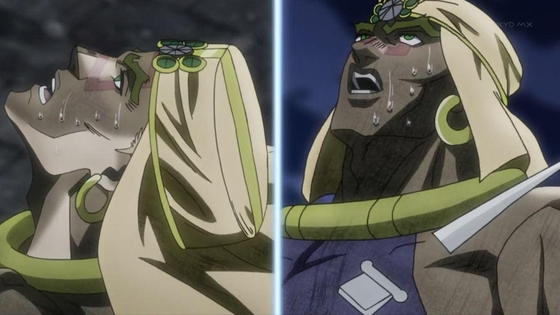
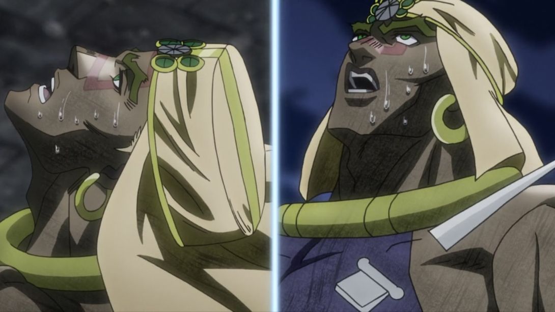
- Kars has been slightly moved and retouched here:
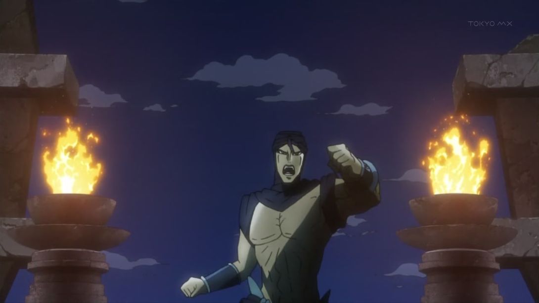
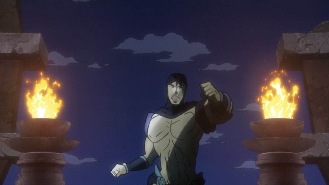
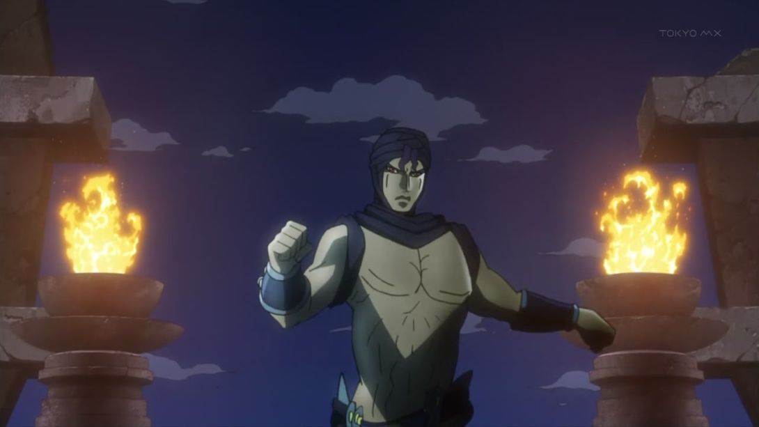
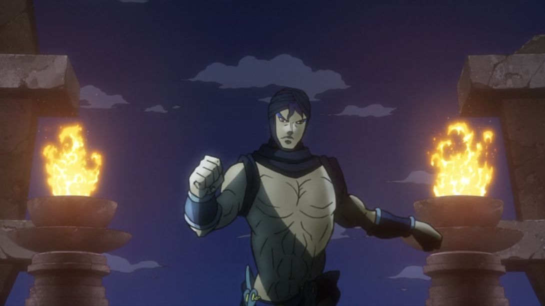
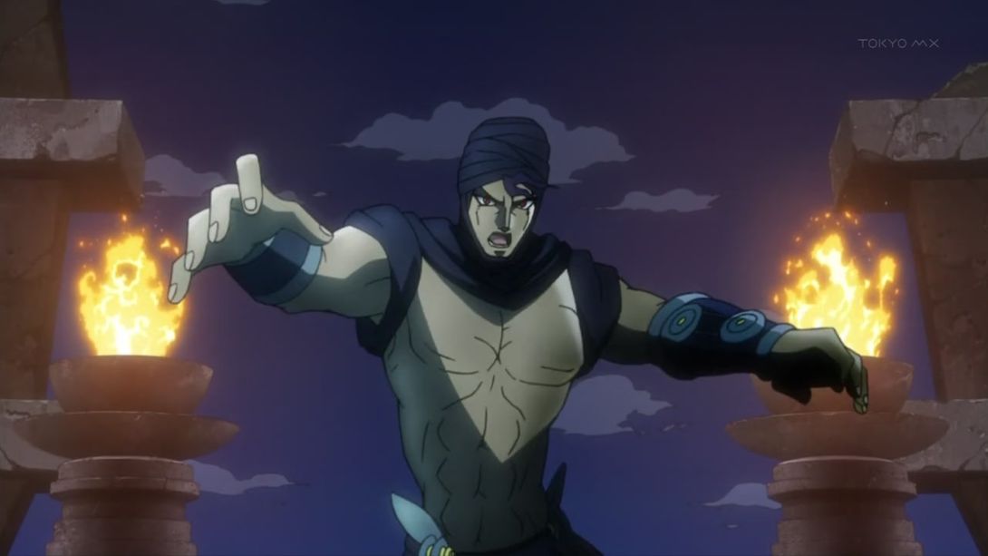
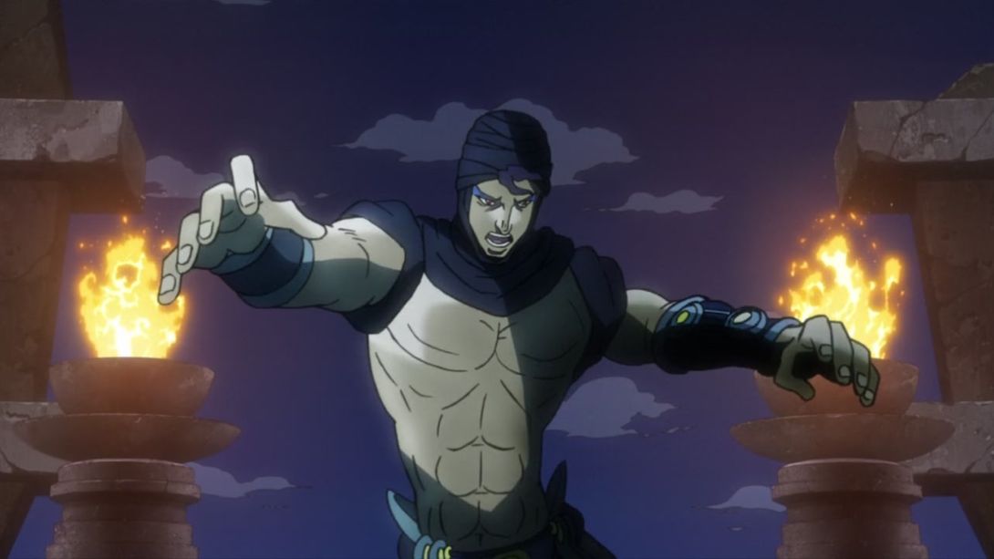
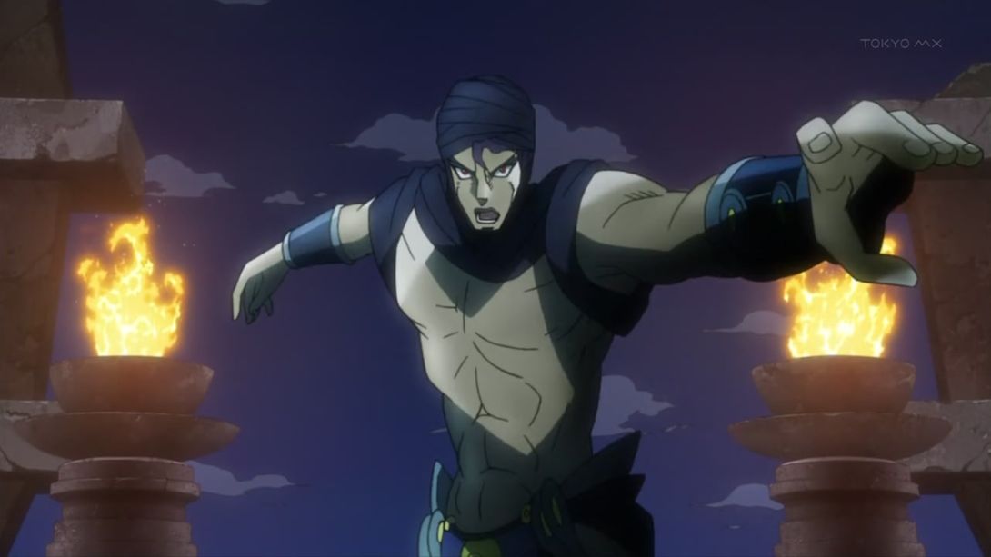
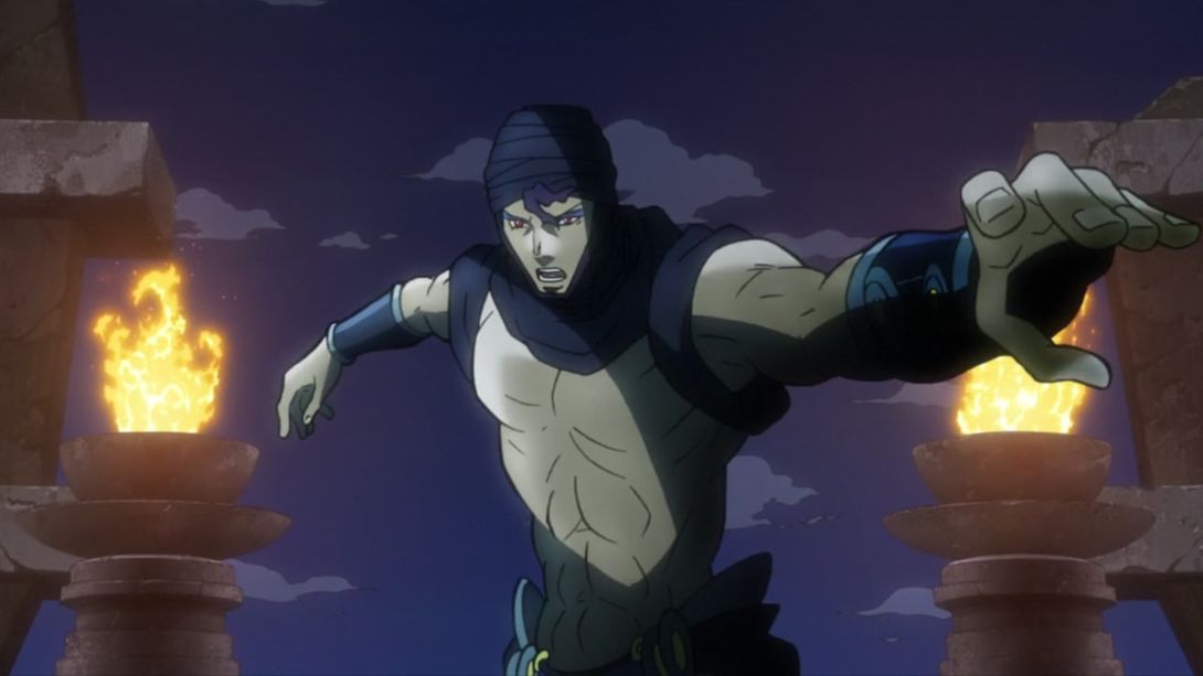
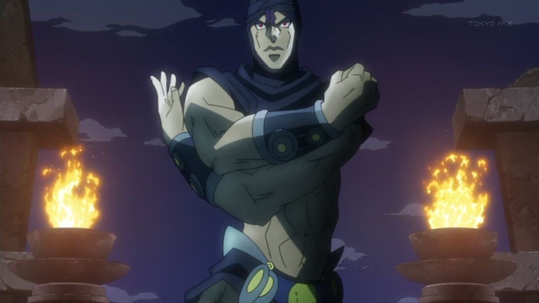
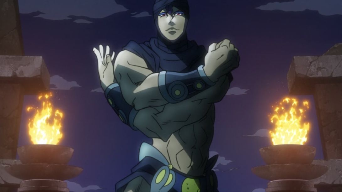
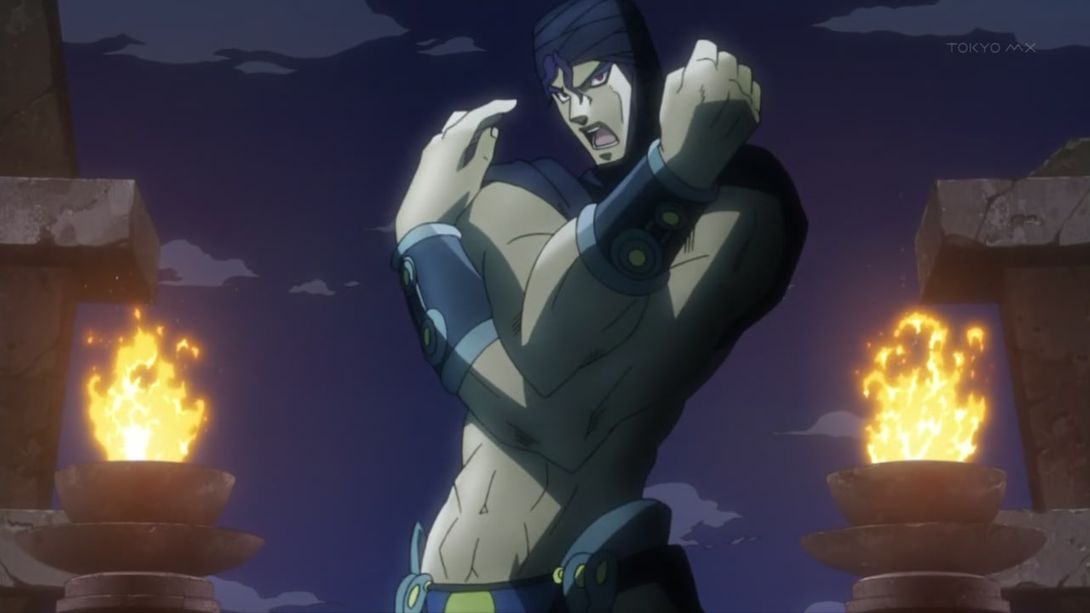
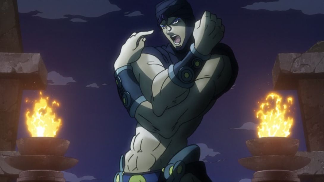
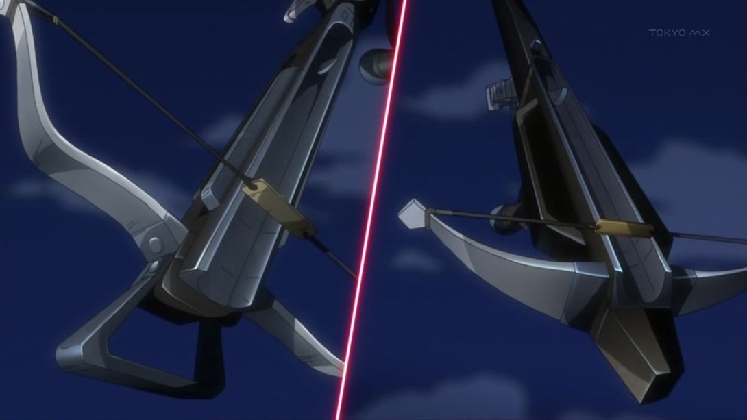
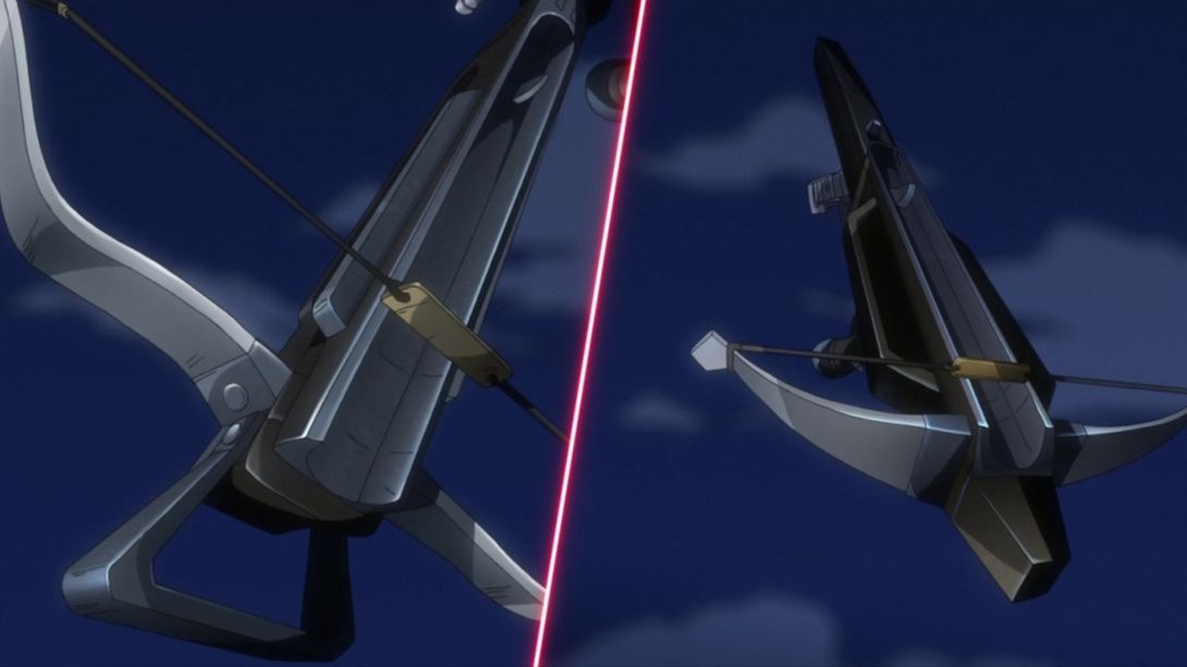
- These two crossbows have been scaled up and down (respectively):
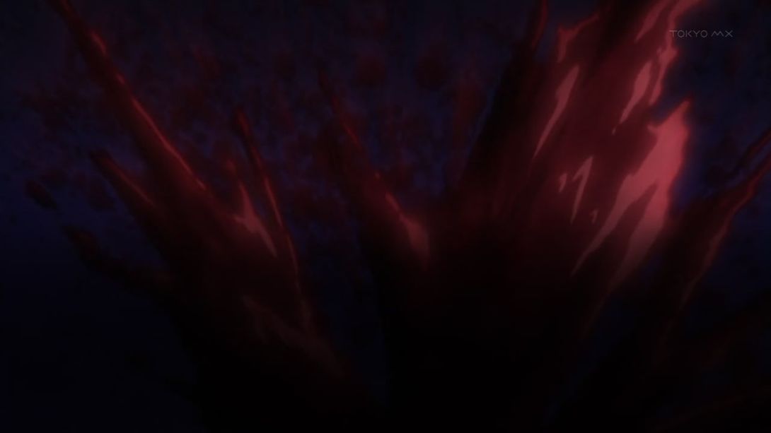
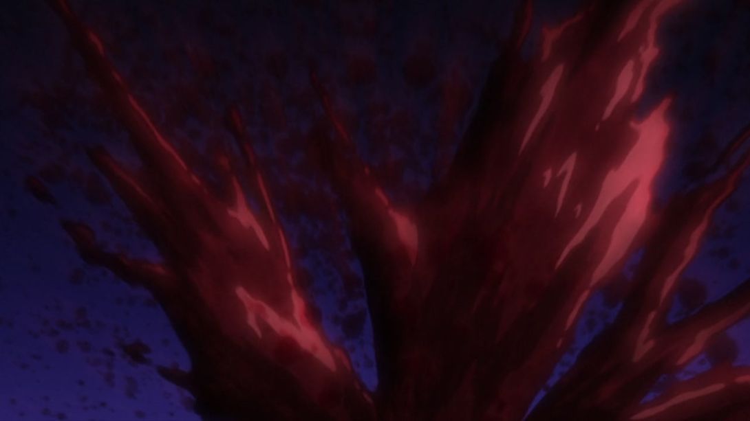
- The… blood in this scene has been… “uncensored”:
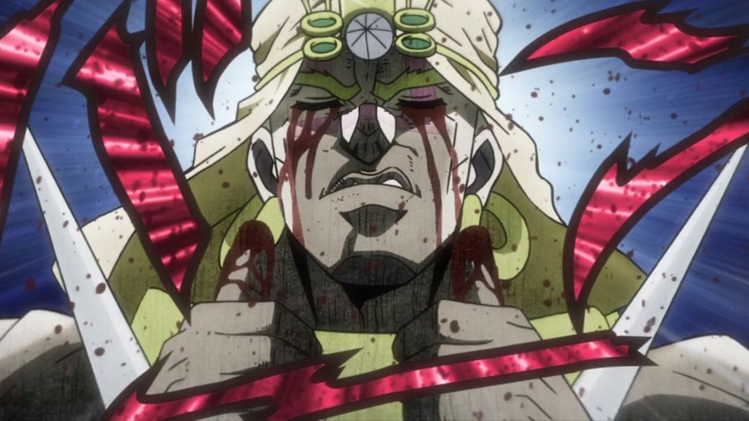
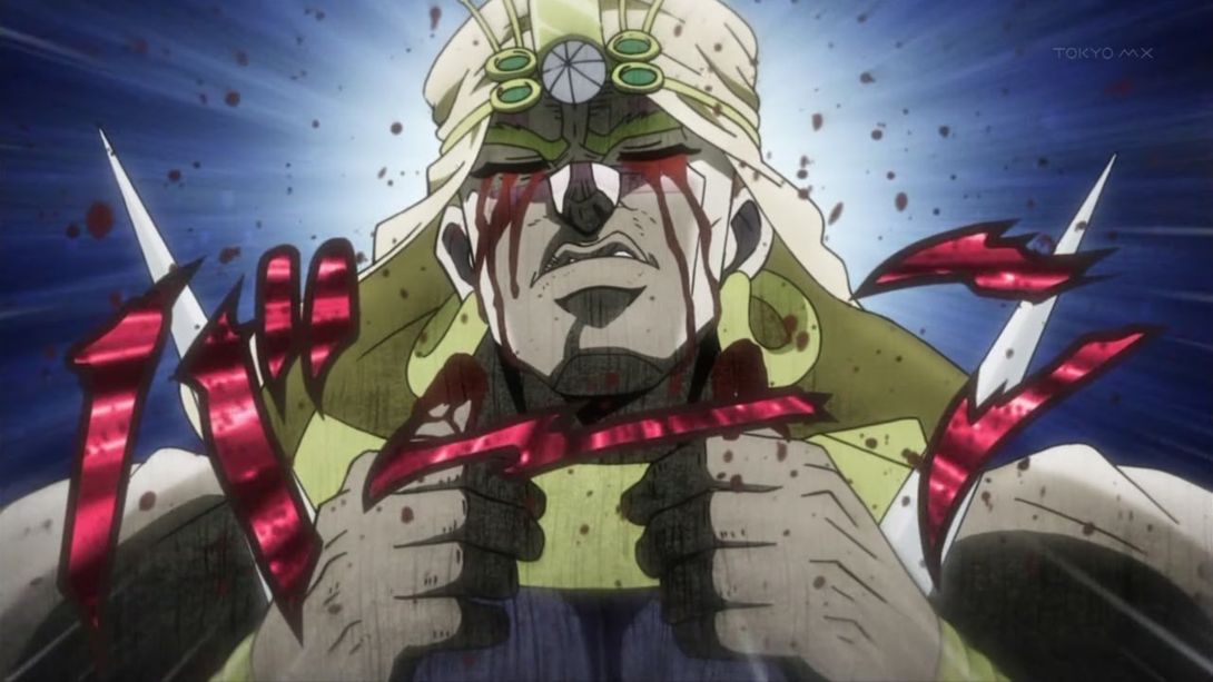
- This scene of Wham giving us a double thumbs-up has been retouched:

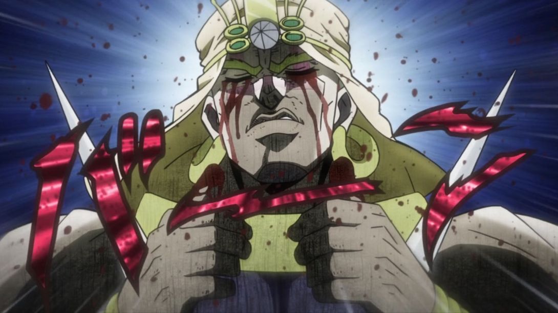
- Aaand Joseph joins the redrawn party:
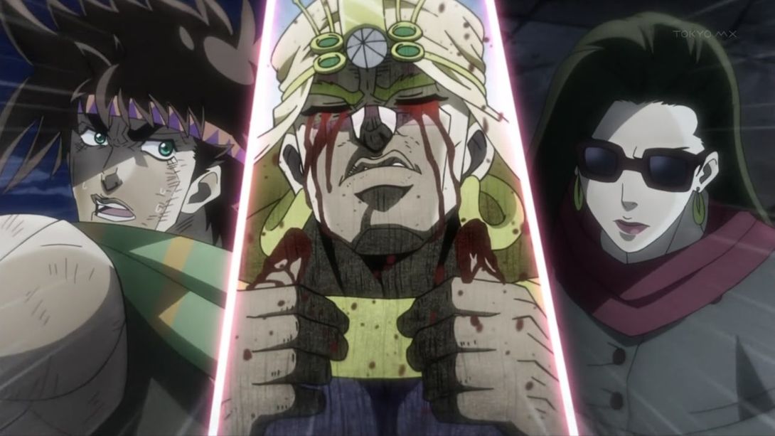
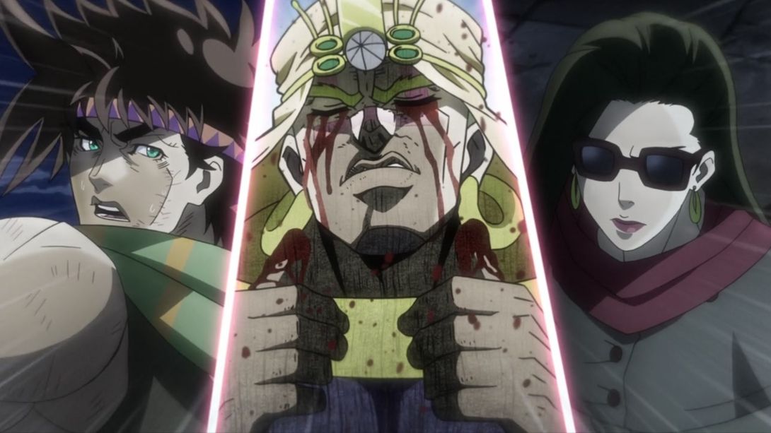
- Let’s move on to a completely, radically different thing… Joseph has been slightly retouched and reshaded, here:
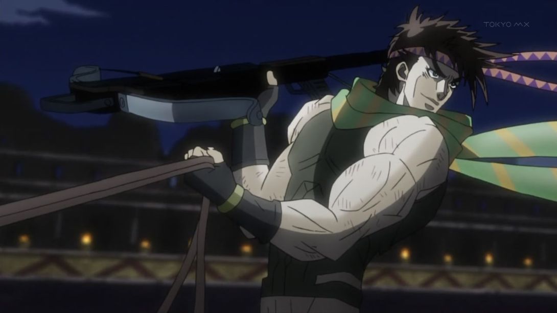
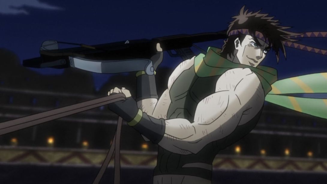
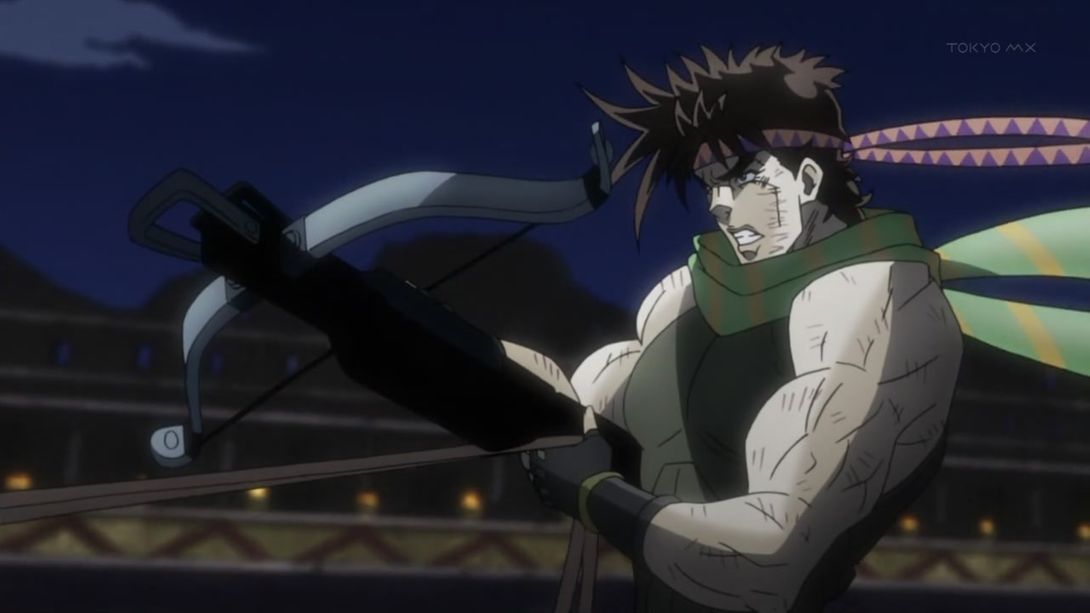
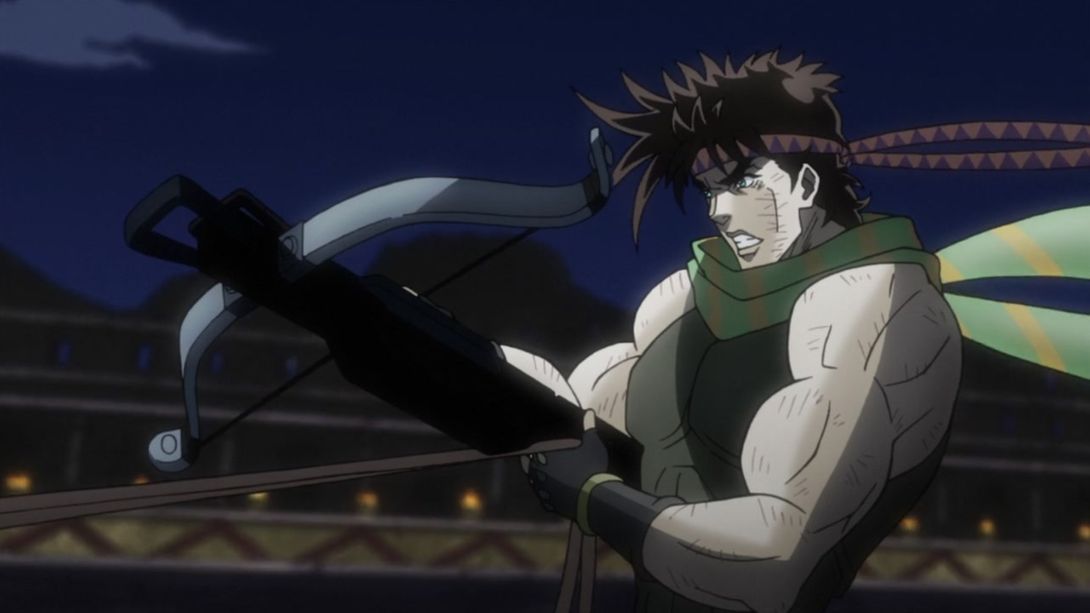
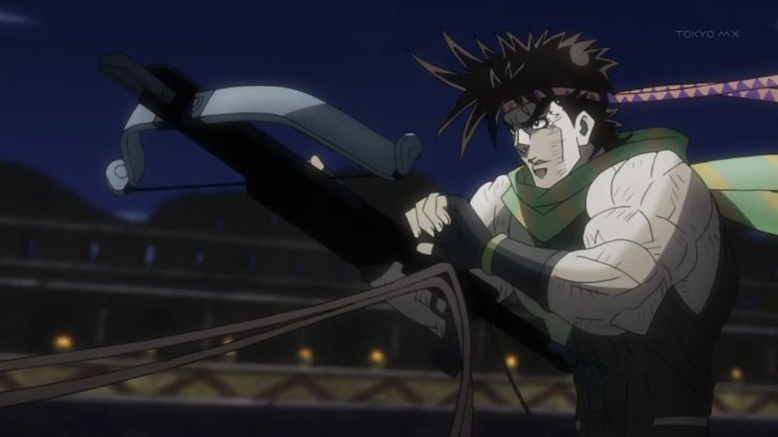
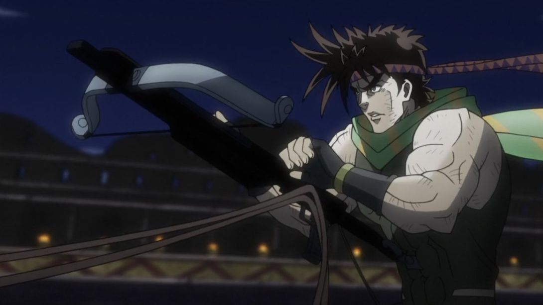
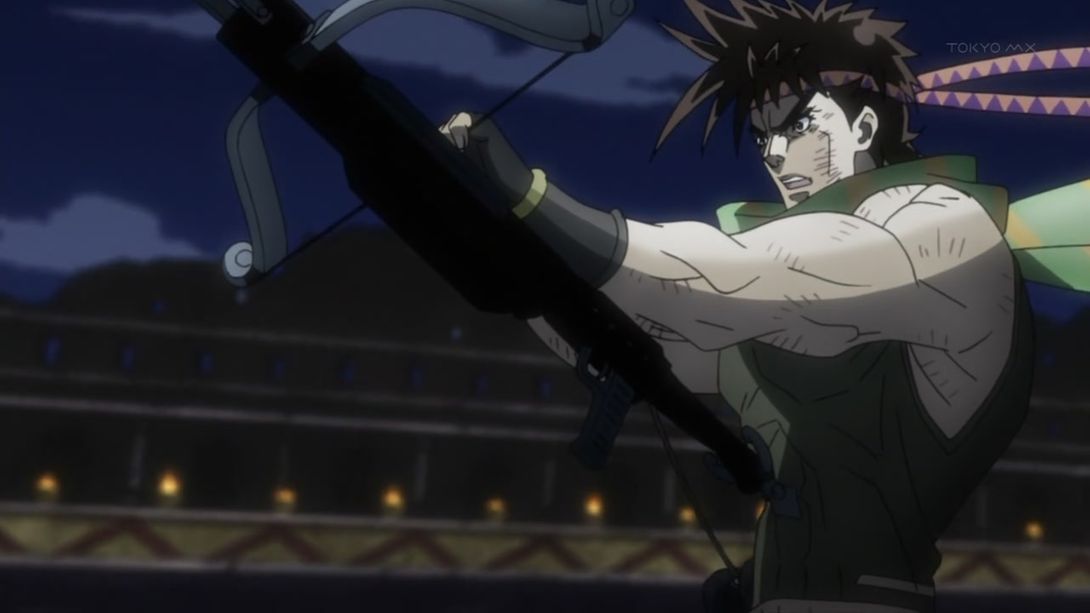
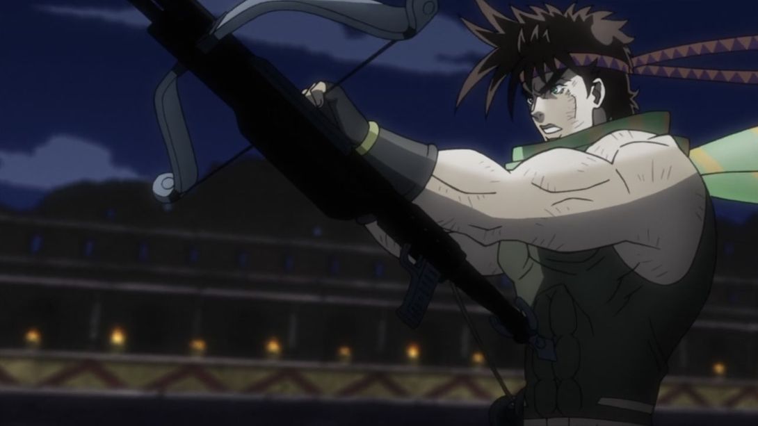
- And here, for something… horny:
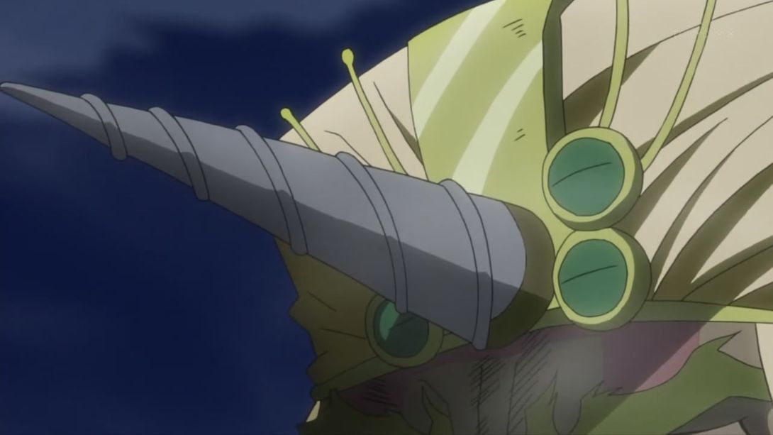
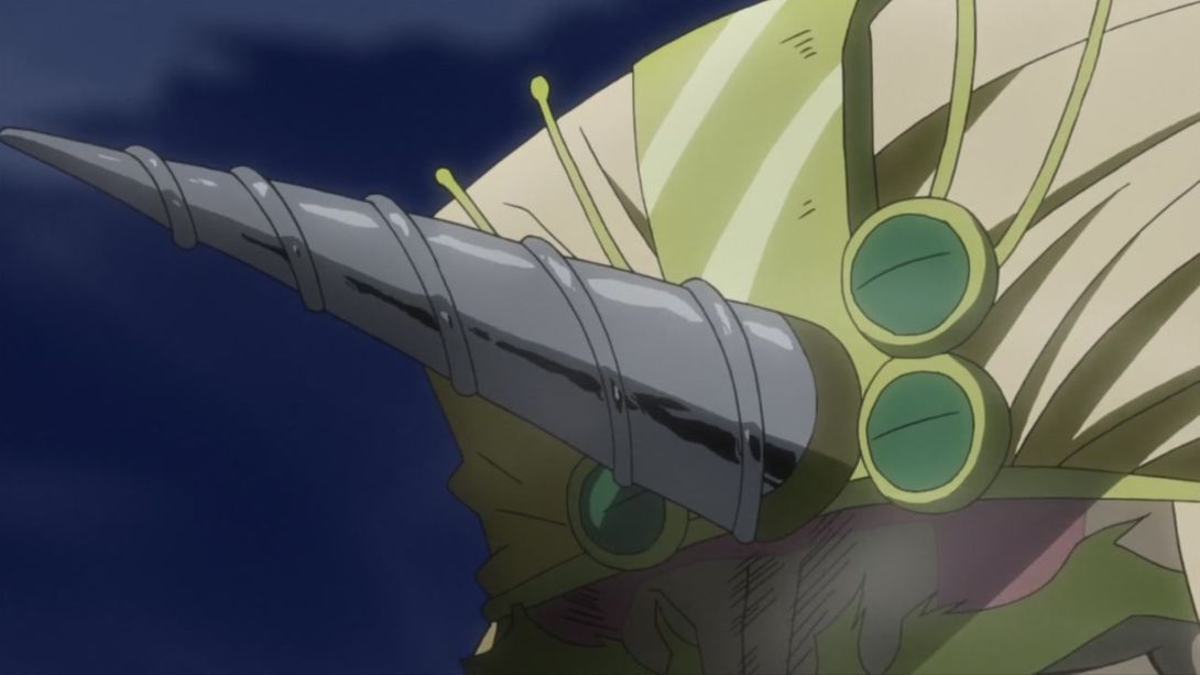
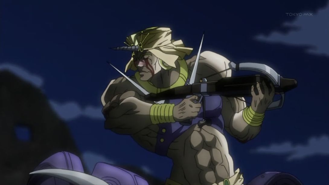
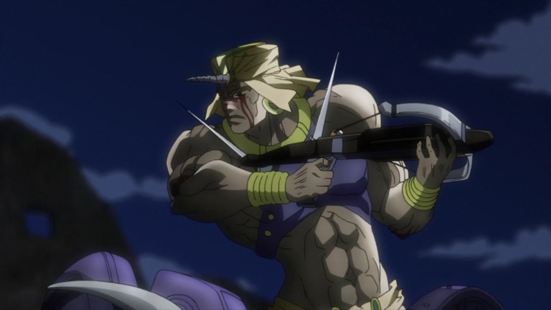
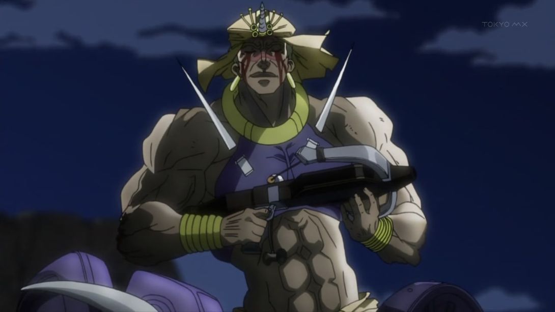
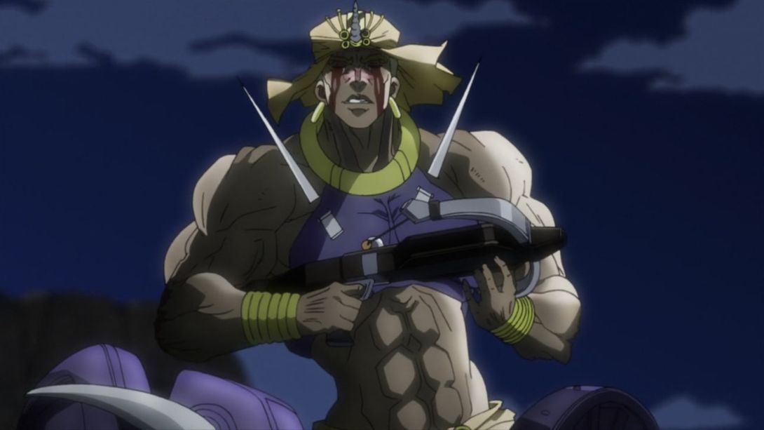
- Wham and the crossbow have both been retouched here. I’m not a crossbow expert, but that thing they removed near the trigger looked a bit… weird and out of place:
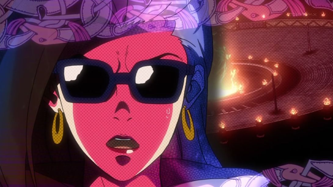
- Lisa Lisa now has bottom teeth in some frames (and her tongue has been consequently moved a little bit up):

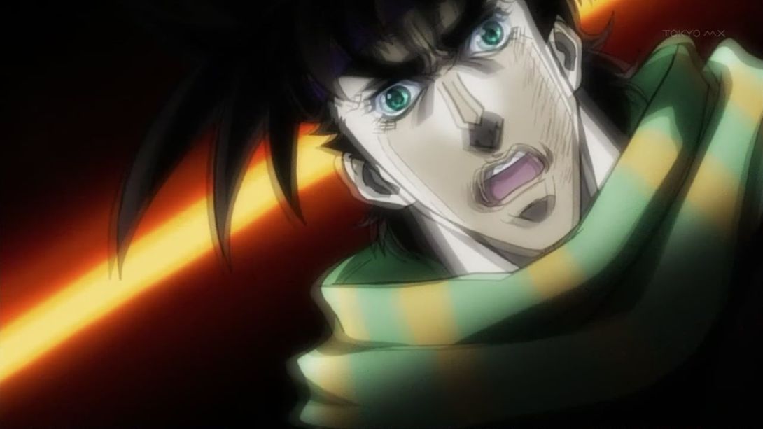
- Joseph back at it again at Krispy Kreme:

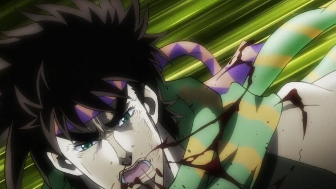
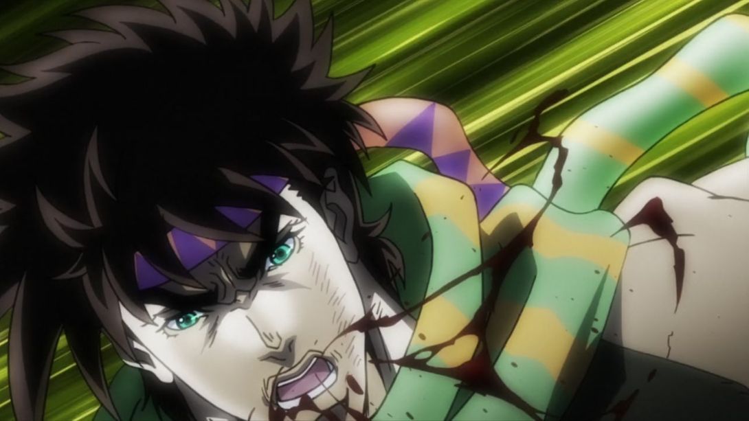
- Wham has been retouched once more here, and the background clouds have been moved a little bit to the right:
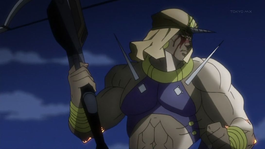
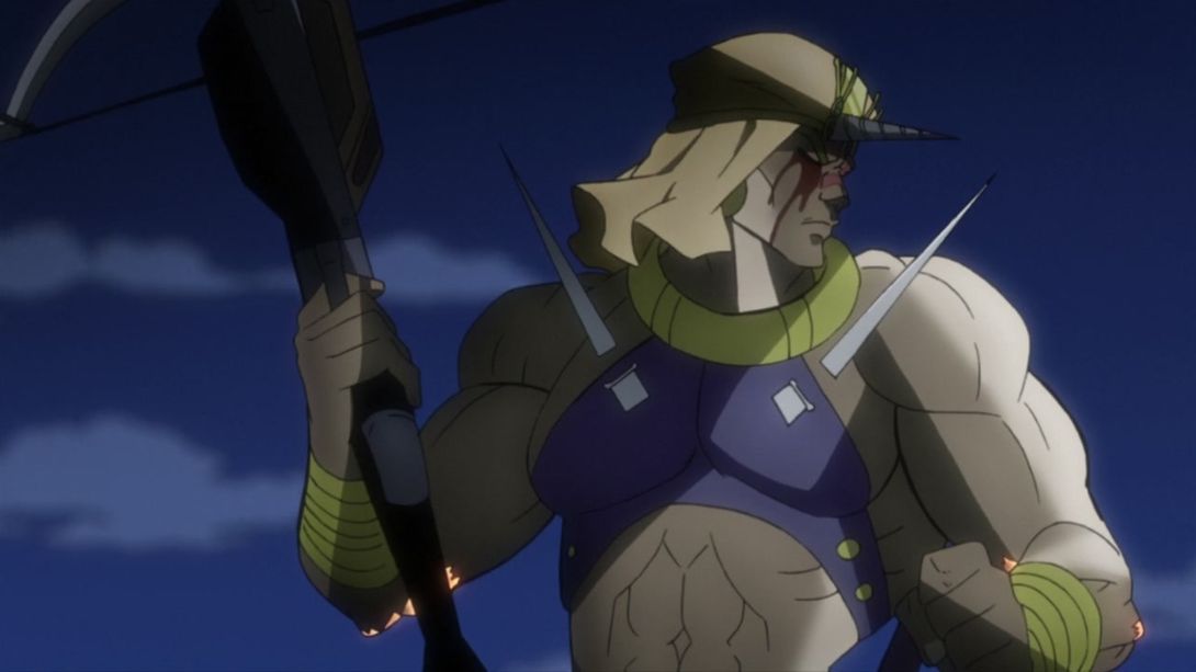
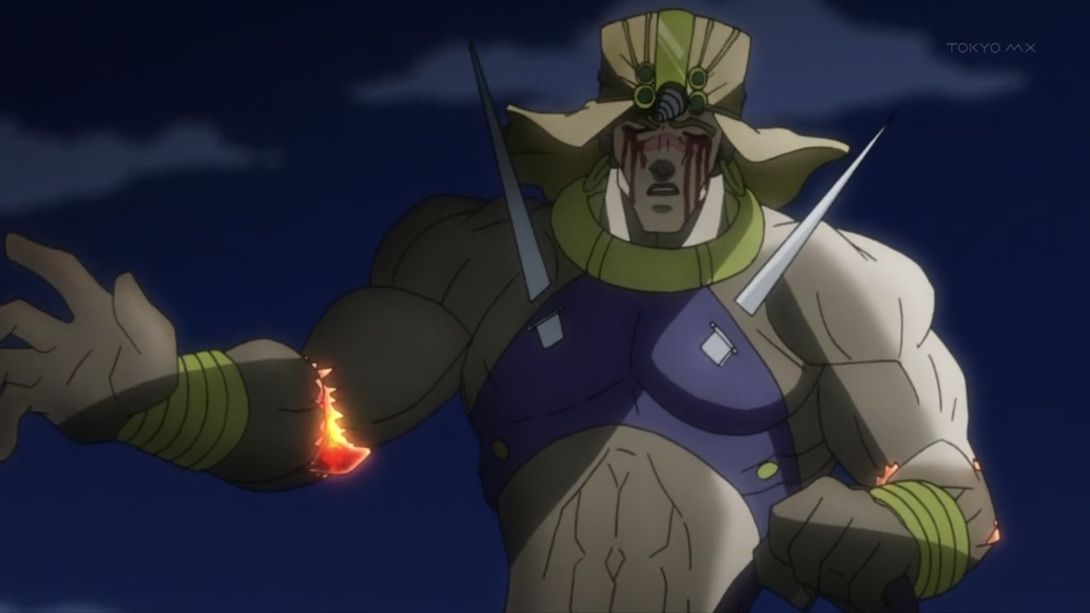
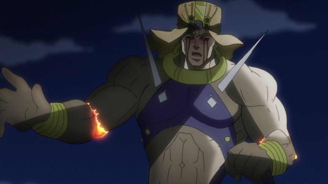
- Wham’s little nosie is now as shiny as the moon:
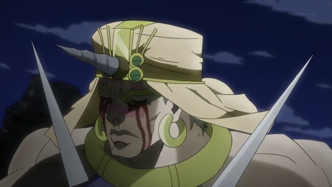
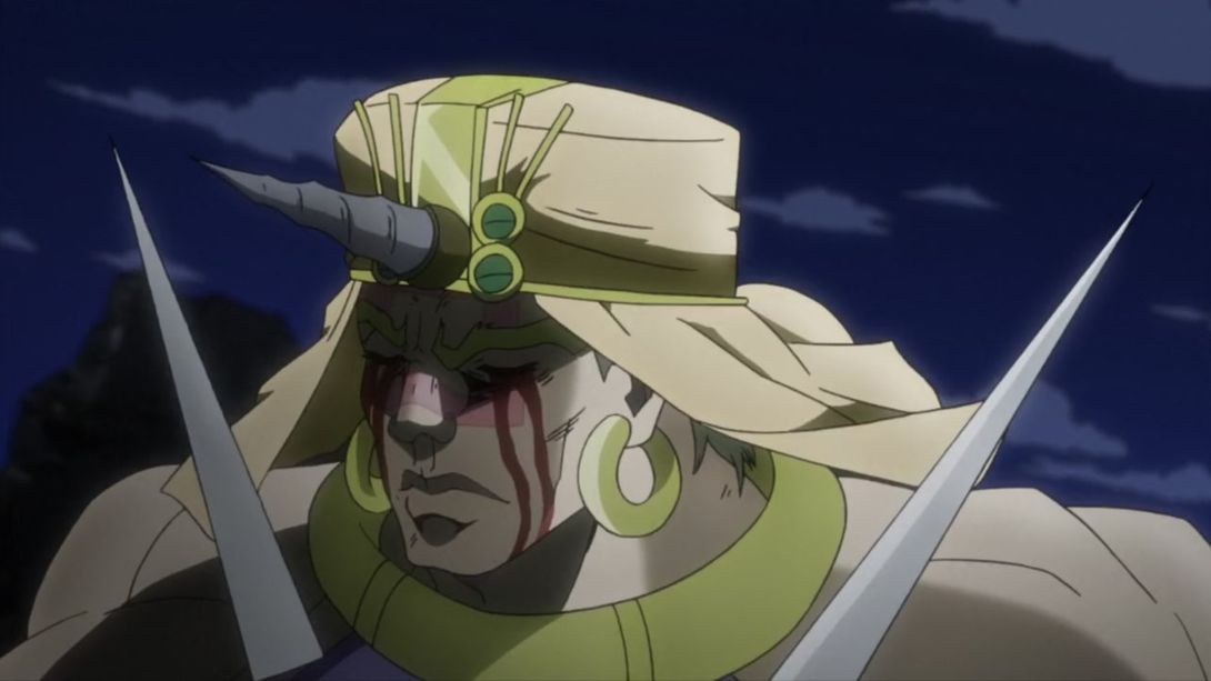
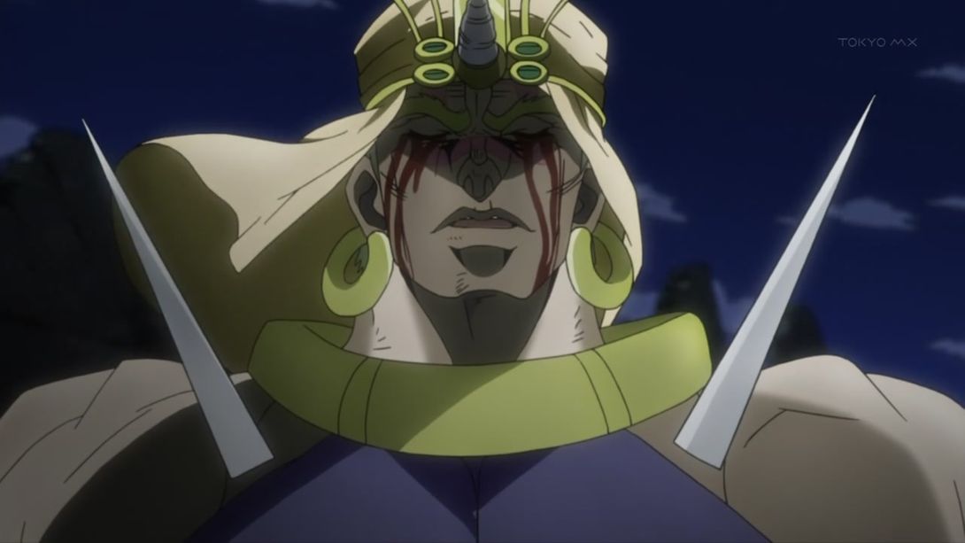
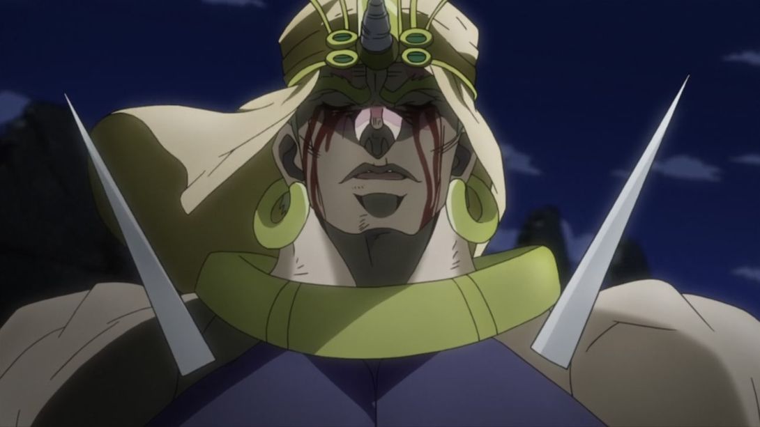
- Ok, I don’t know why, but the top band on Wham’s… turban thingie has been unshaded:
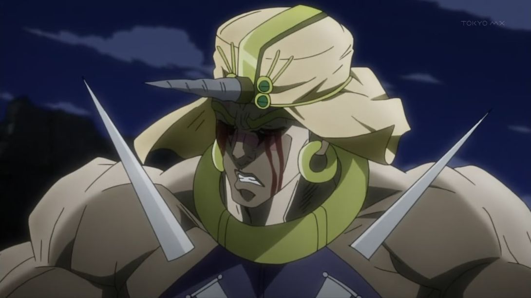
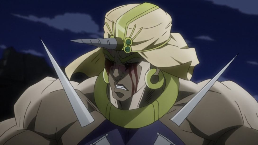
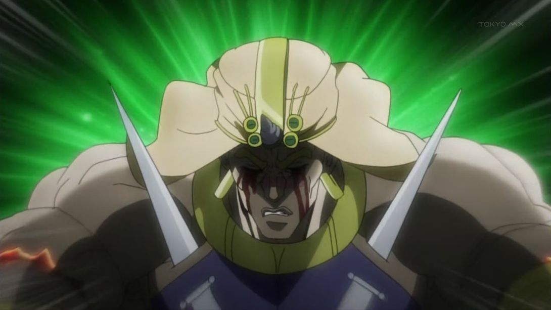

- This bit here is slightly brighter and sharper:
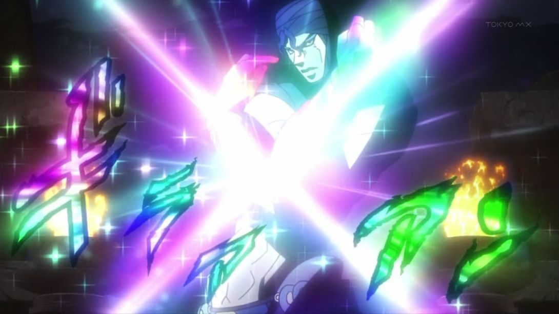
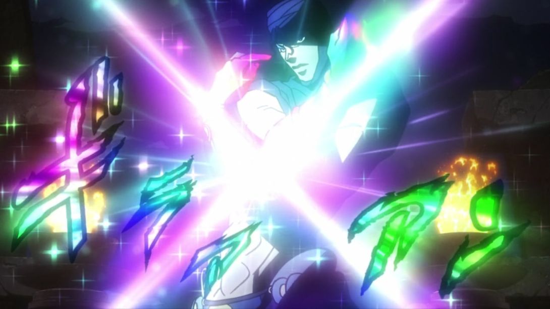
- This whole animation is a little different! It begins more zoomed in, then zooms out and changes colour, there’s less shaking and the blood spurt happens more quickly:
- The projectile shot by Joseph’s crossbow has been moved in this here shot:
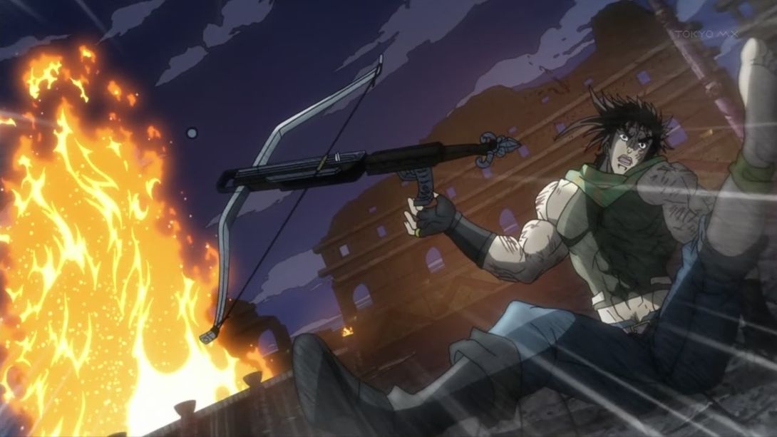

- Kars has been, once again, redrawn here, and the background has also been moved:
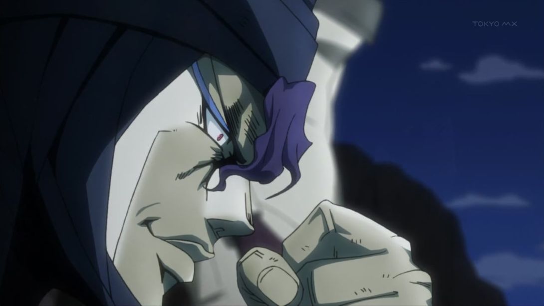
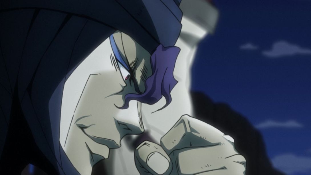
- Joseph again here… Plus, he now casts a shadow on the ground:
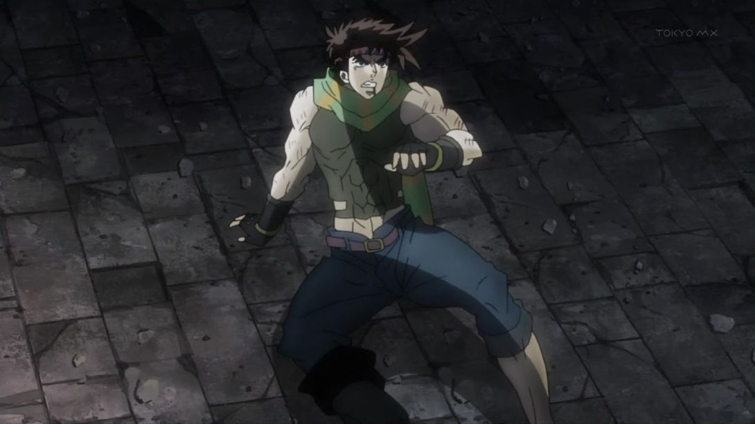
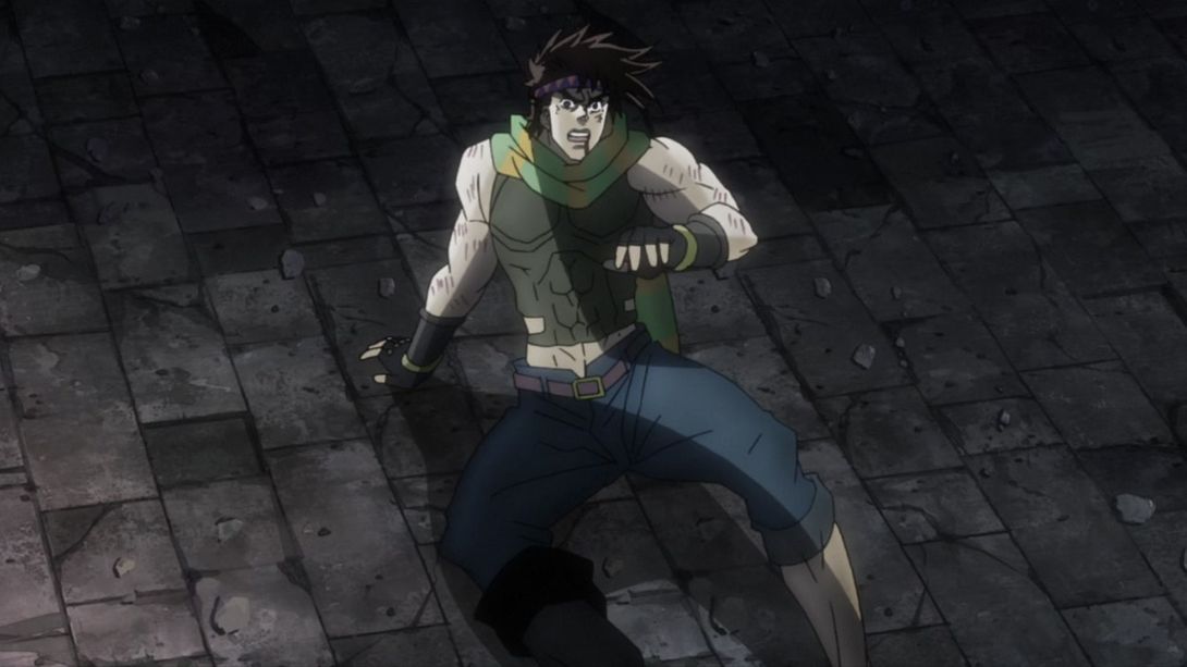
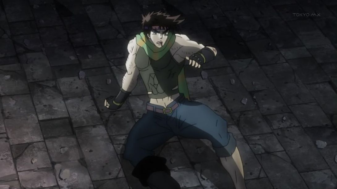
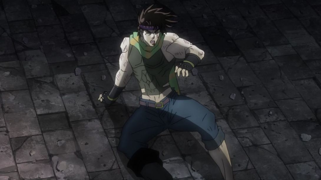
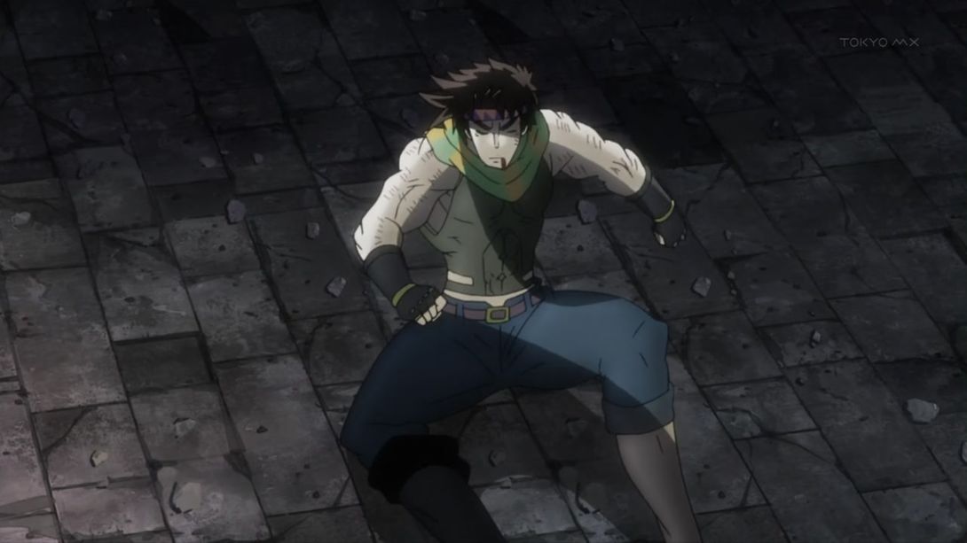
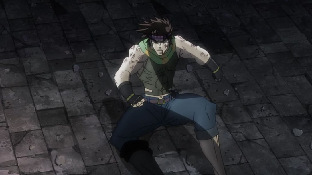
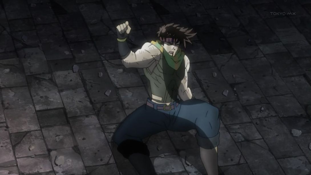
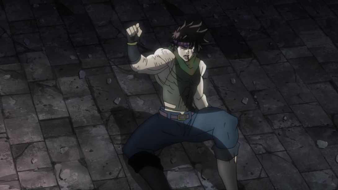
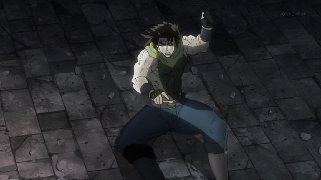
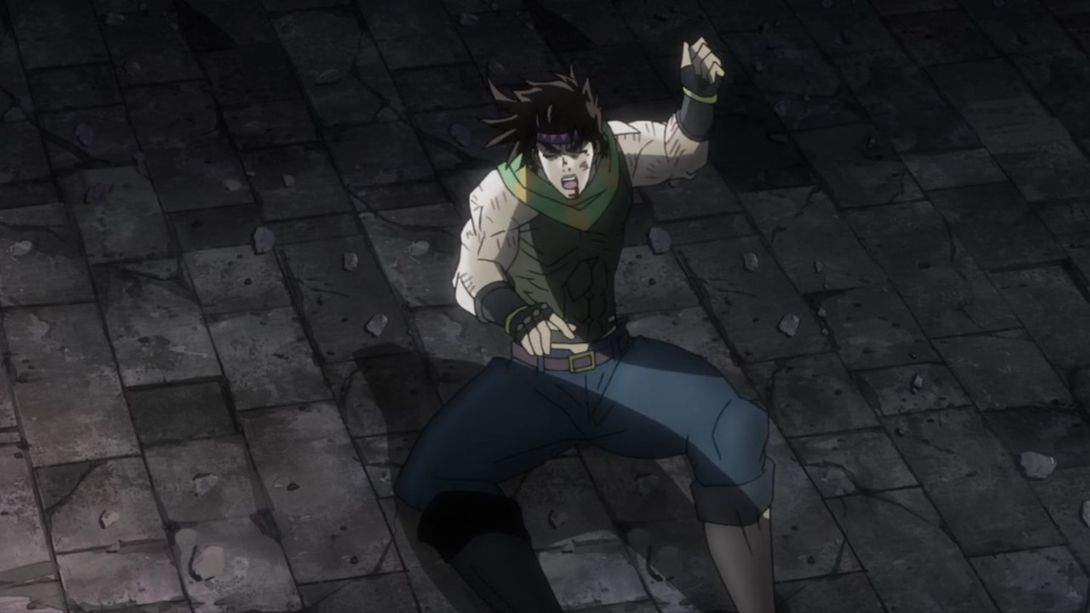

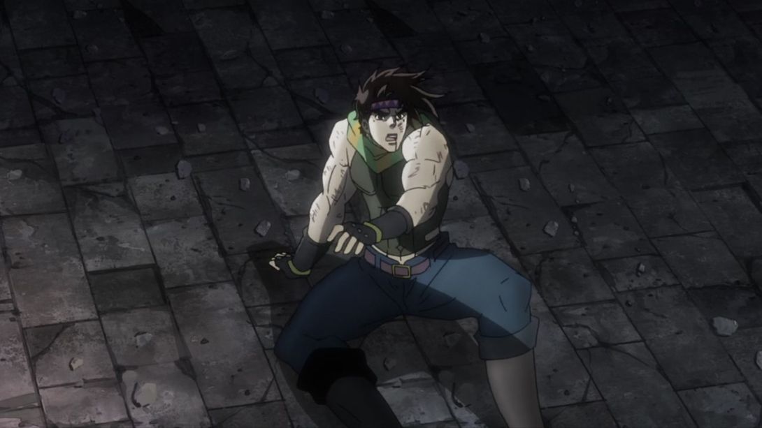
- Look at this smug son of a gun! In the first frames of this shot, everything has a redder tint, and the two corners are completely red (the overall tint normalizes a few frames later):
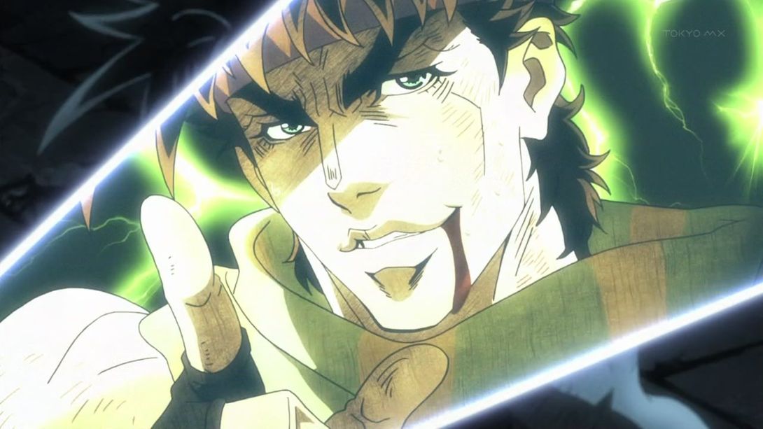
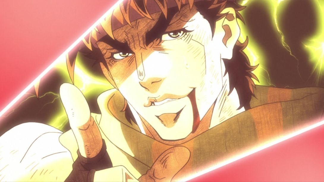
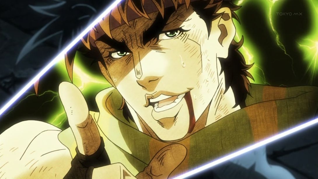
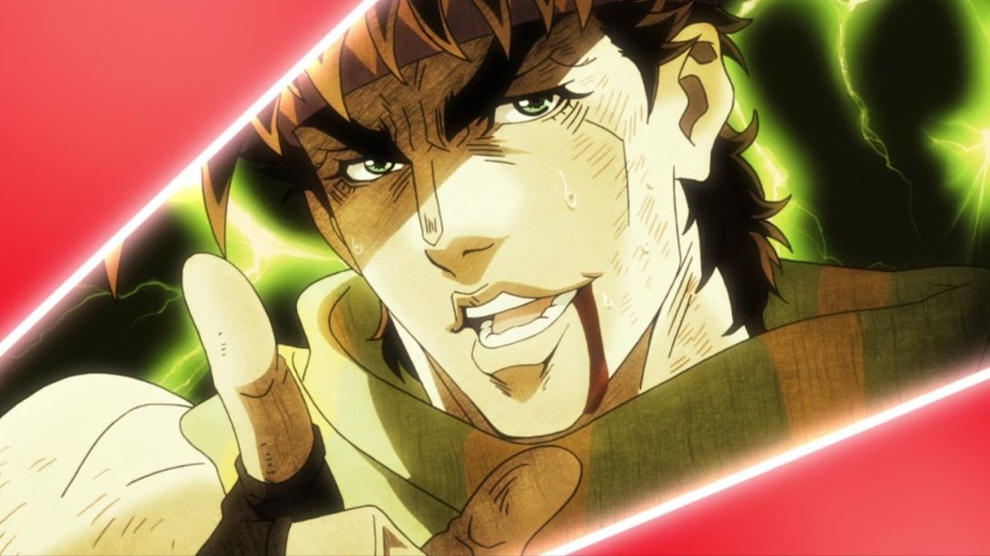
- Aaand once again with the redrawn Joseph, as before (but more smug):
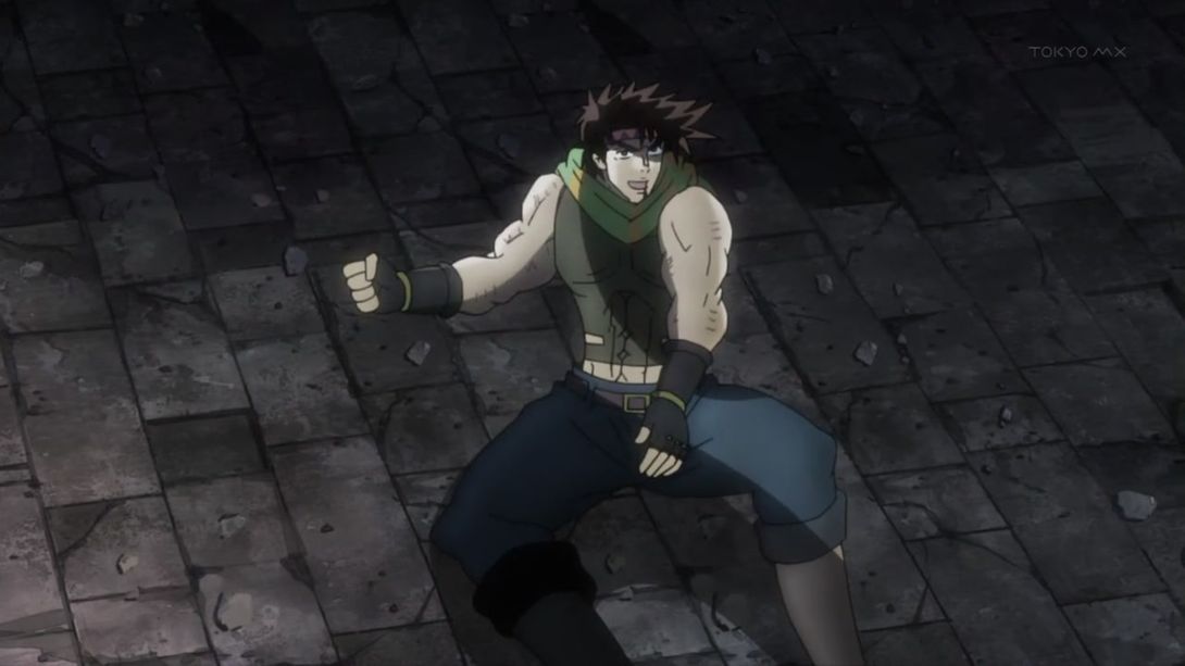
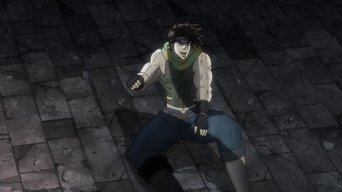
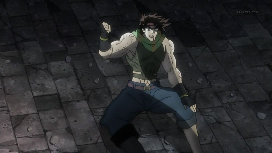
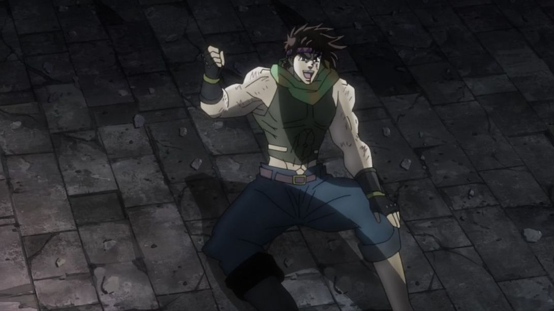
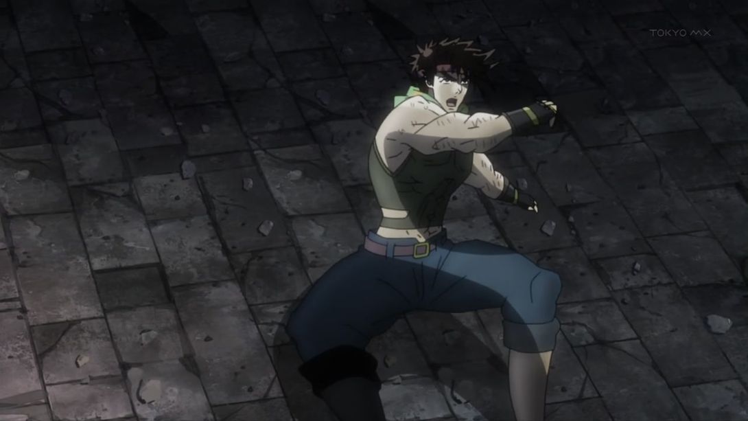

- Joseph is looking much smoother here! He no longer looks like a sketch:
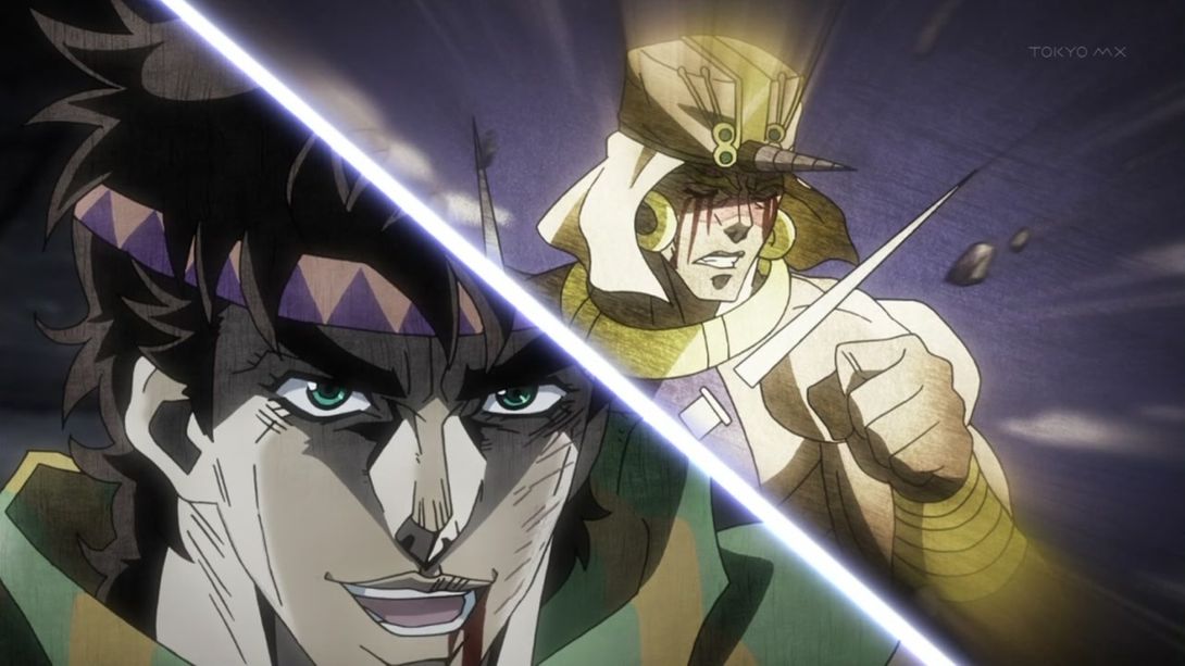
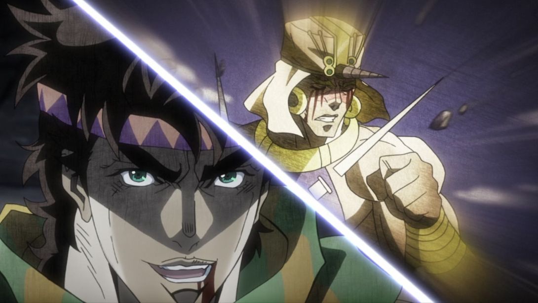
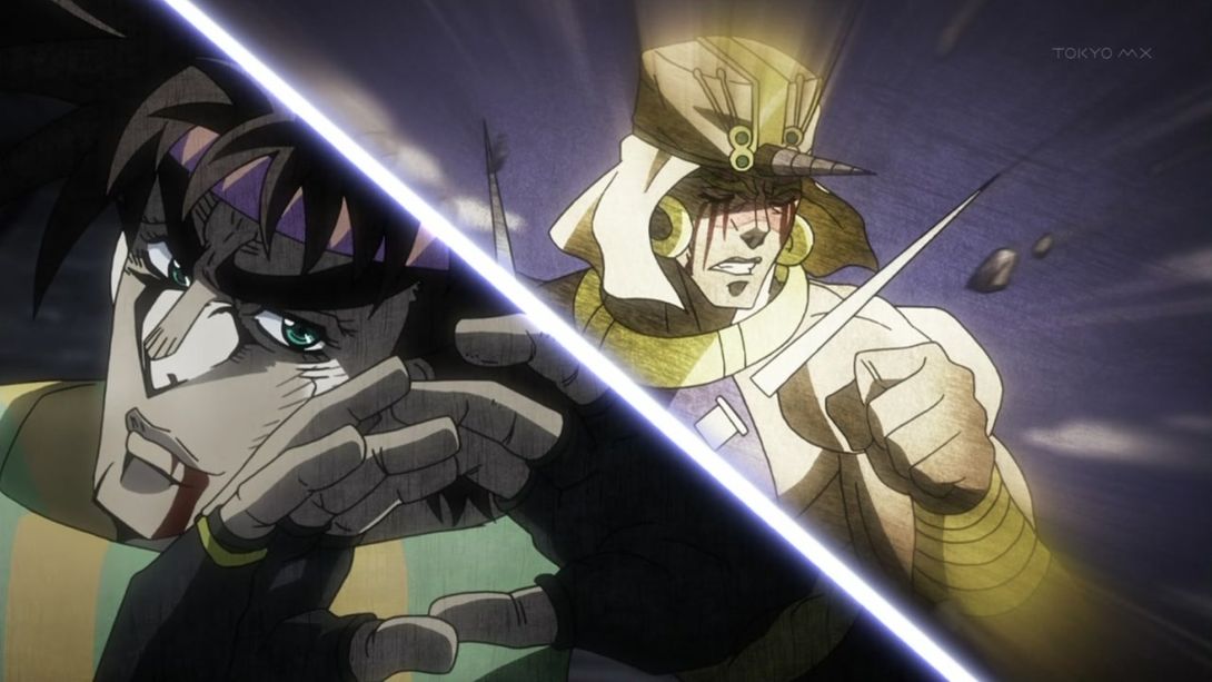
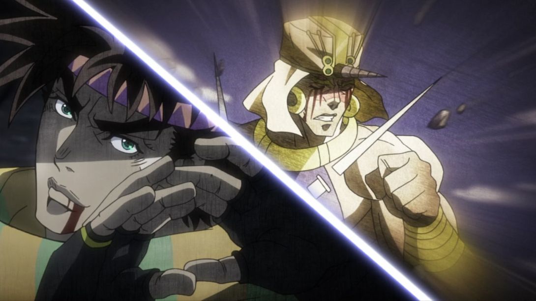
- And here, the whole picture has been moved around a tiiiiny bit (and, most notably, the two blood spurts):
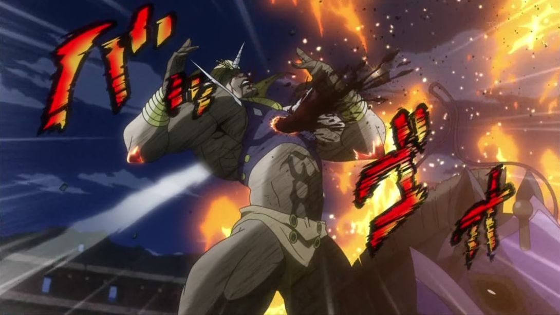

- Oh, would you look at that? Joseph again:
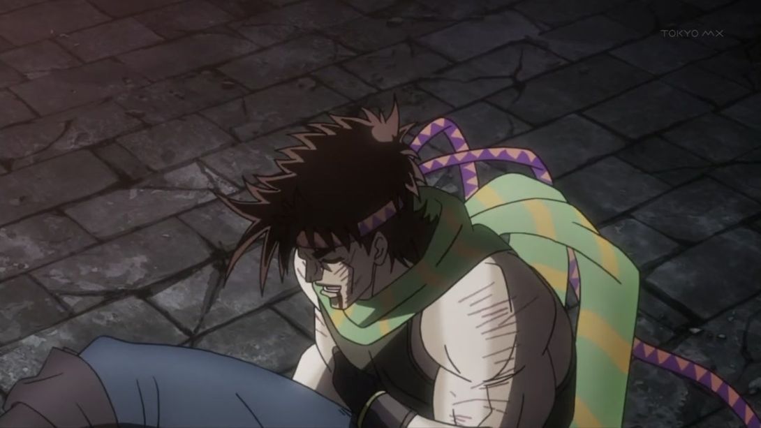
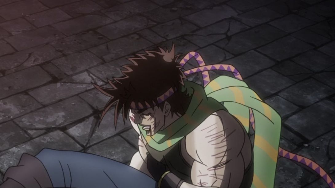
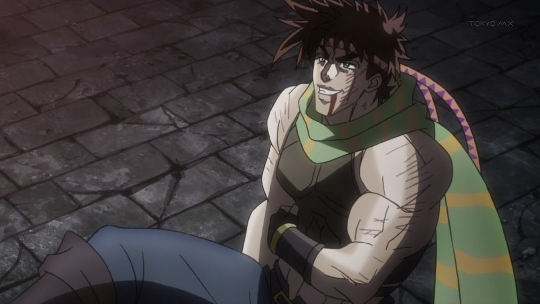
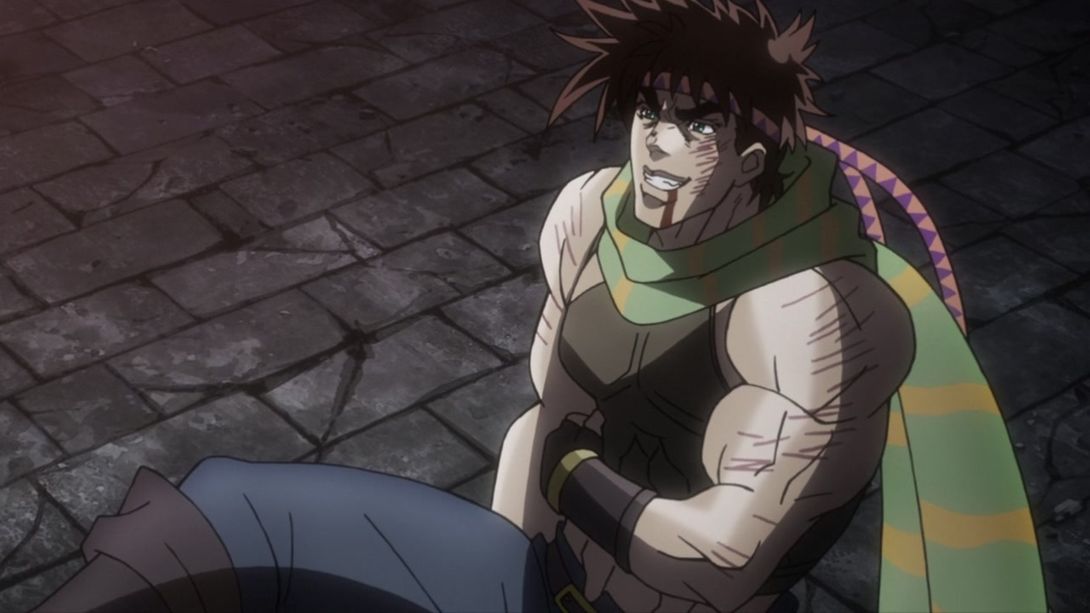
- Wham has been moved, retouched and re-shaded in some bits, and the lava/blood things have also been made a little better (more lava-like?):
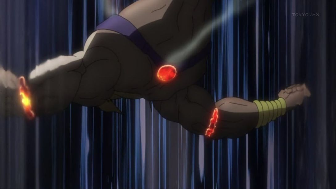
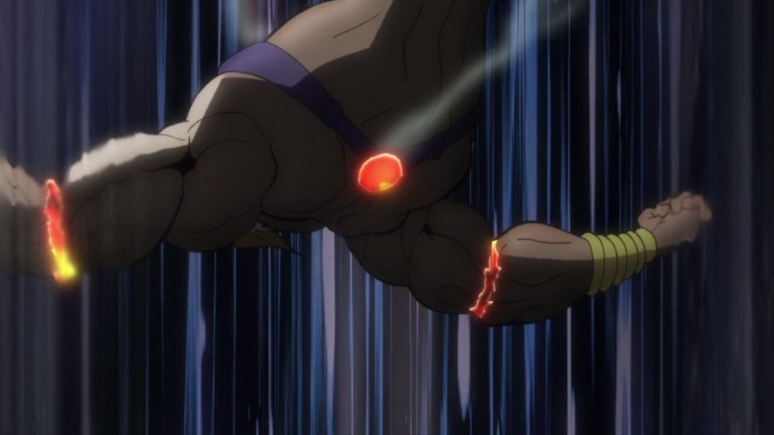
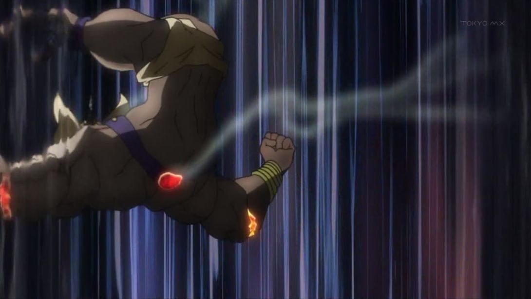
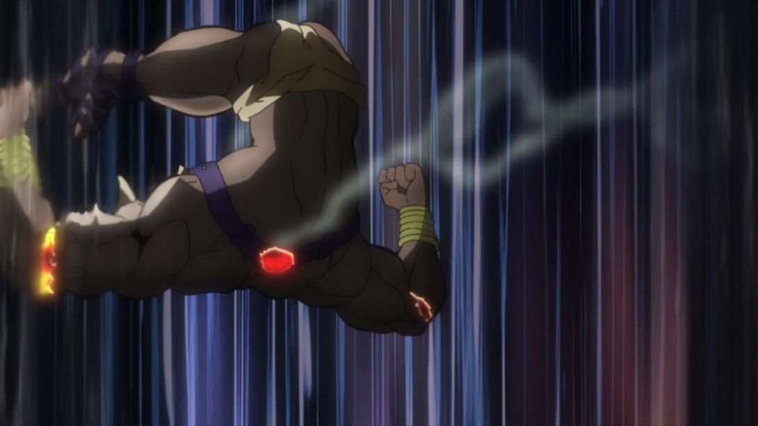
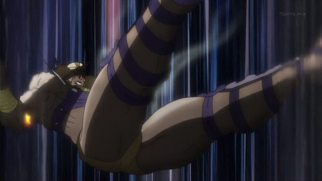
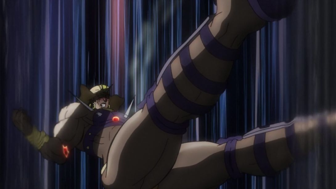
- Joseph is now looking at the camera, some details have been retouched and most things have been moved a little bit down:
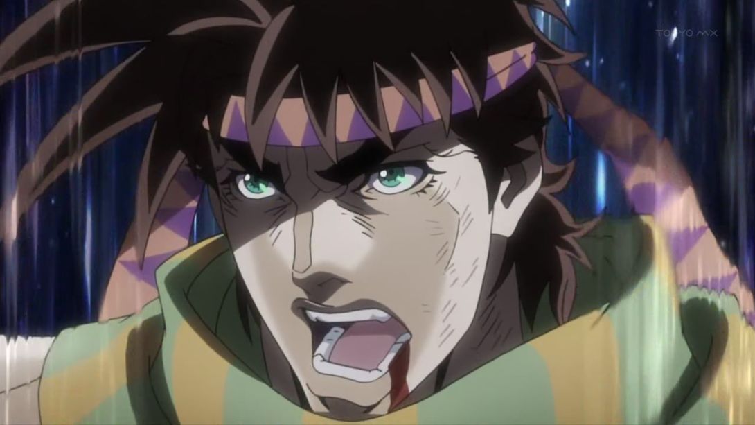
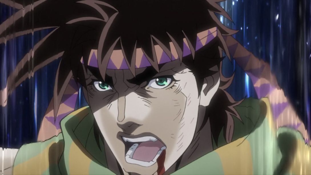
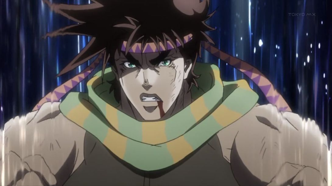
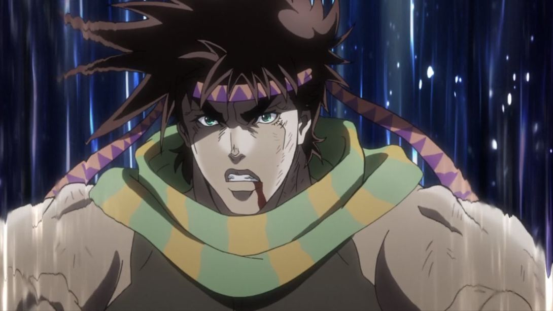
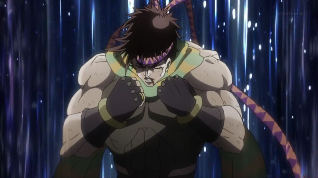
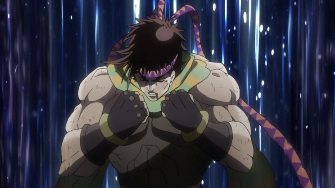
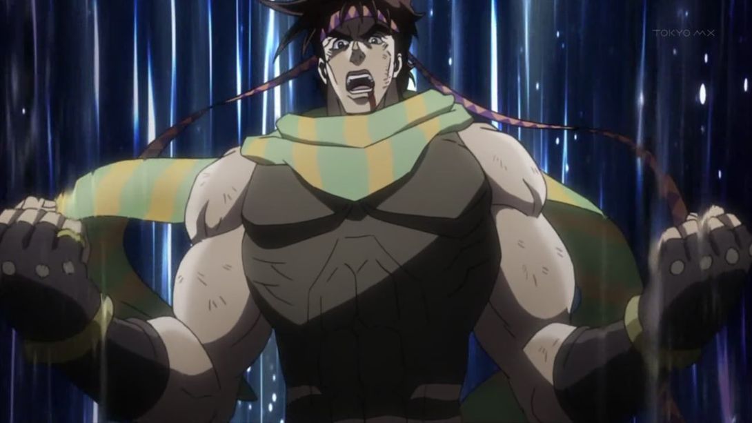
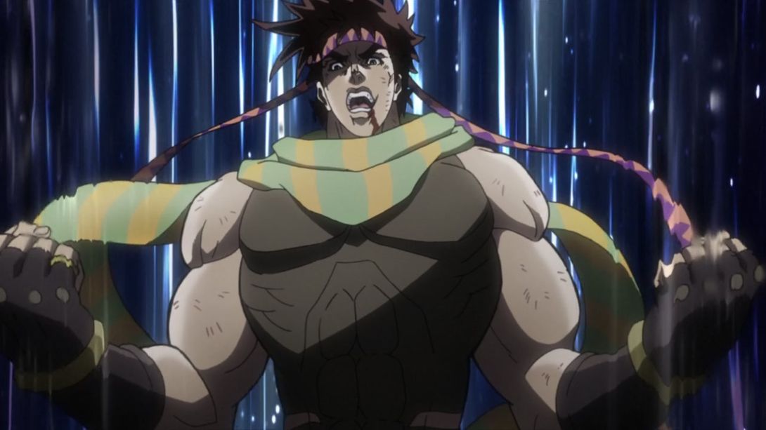
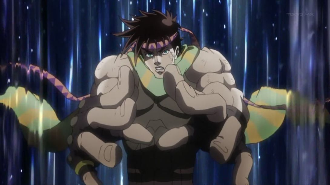
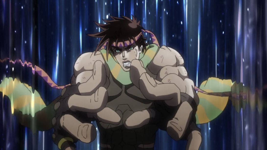
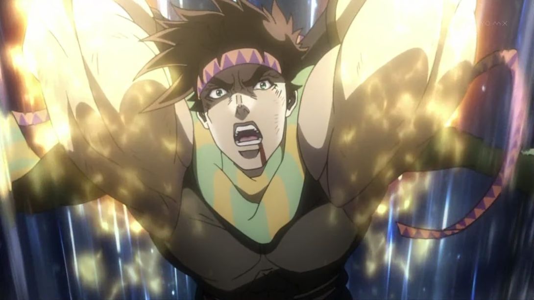
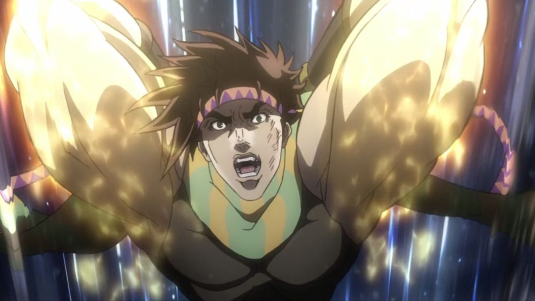
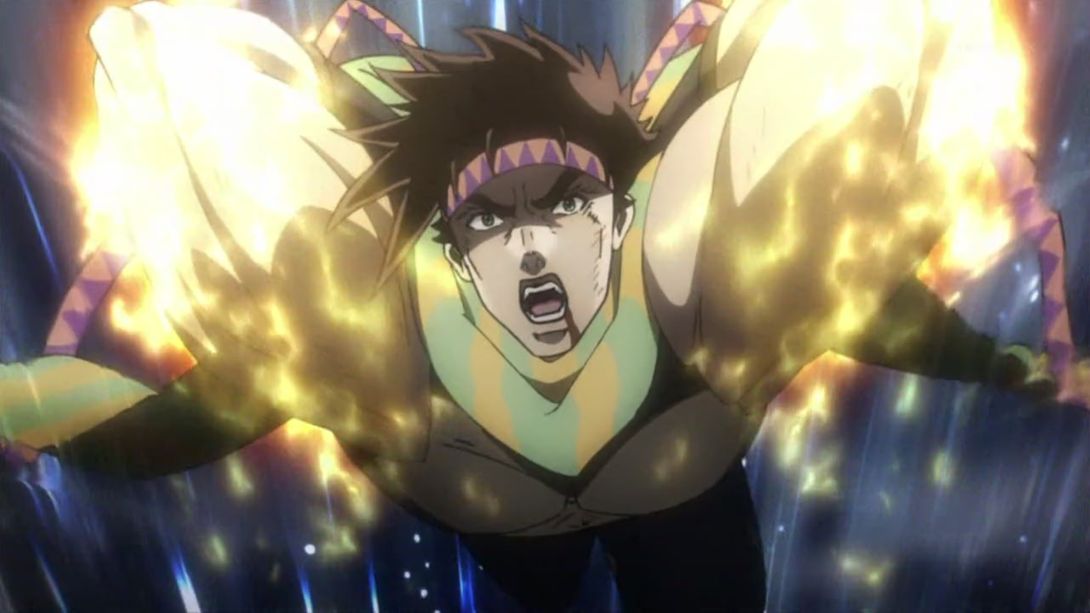
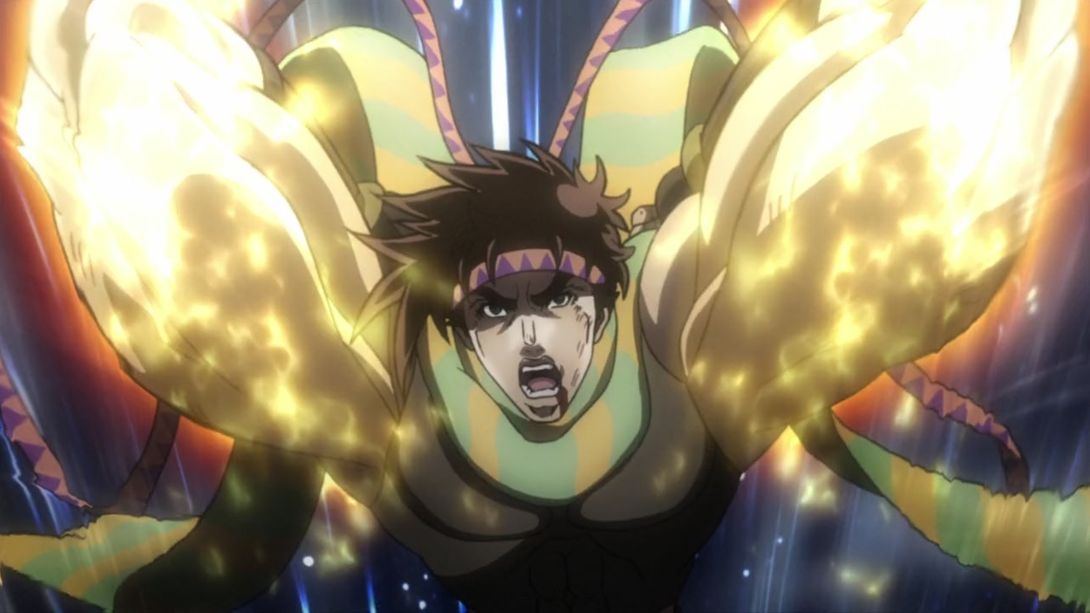
- Most frames in this animation have been redrawn:
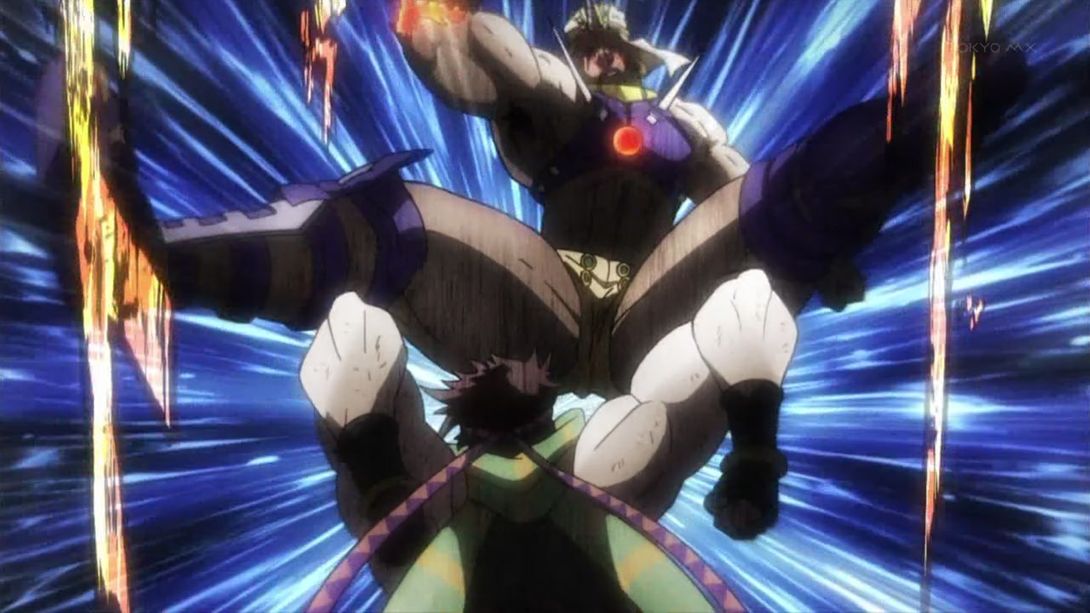
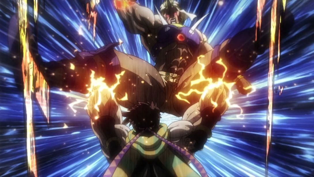
- Joseph is smaller here…:
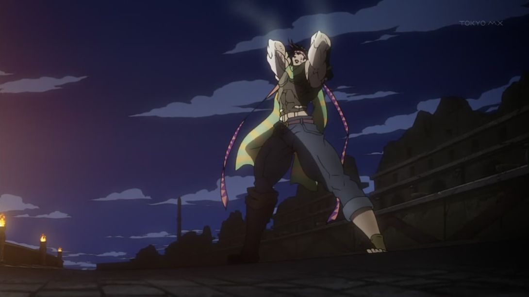
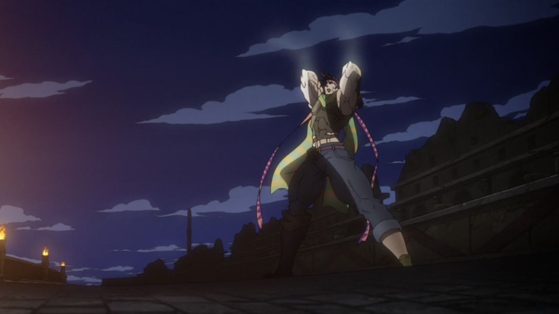
- …while Wham has been moved up:
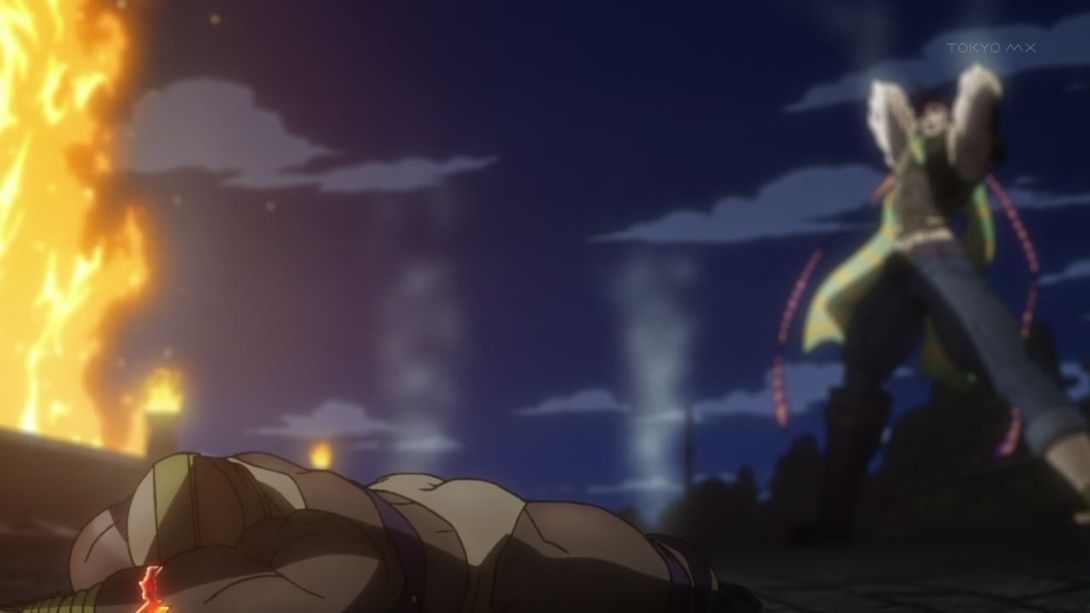
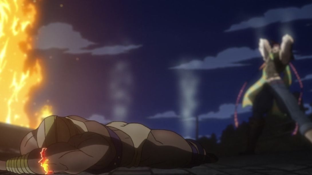
- The framing of this animation is slightly different, and a bunch of frames have been (surprise, surprise) retouched:
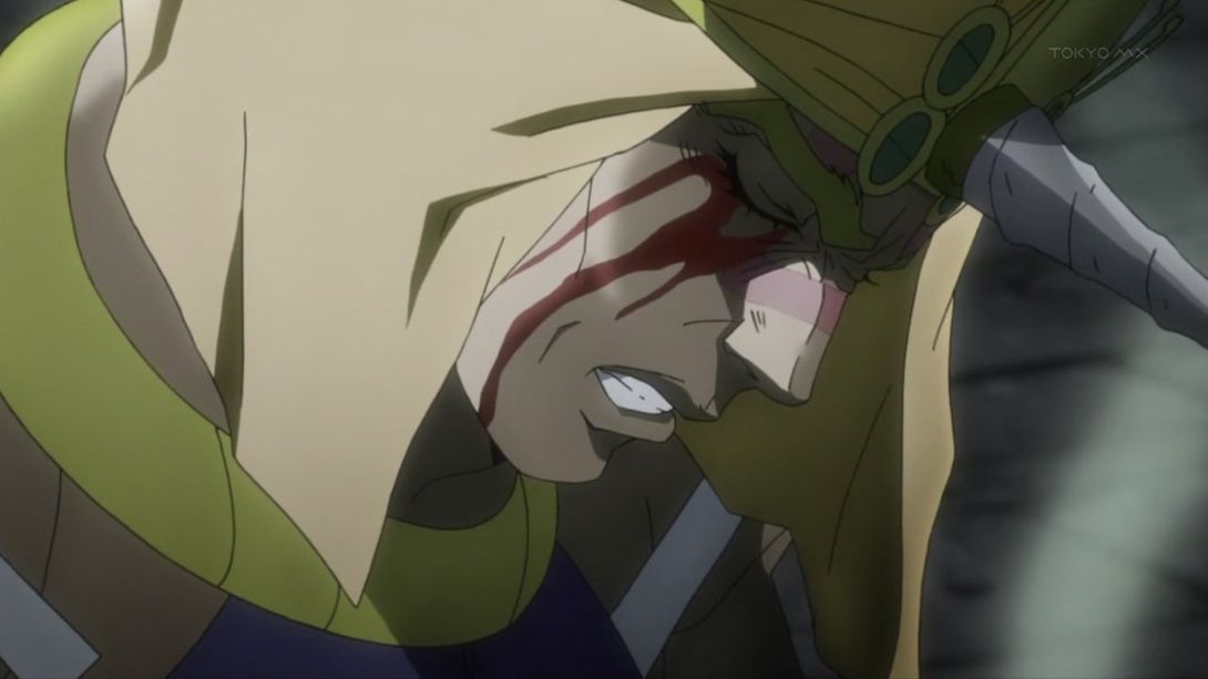
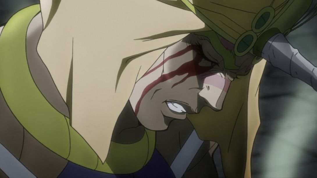
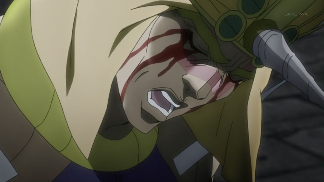
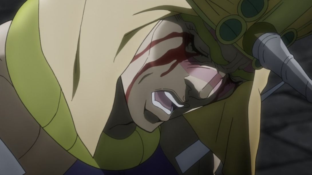
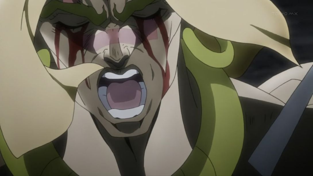
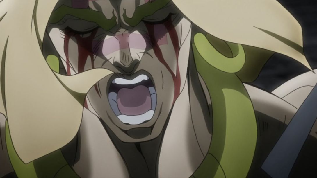
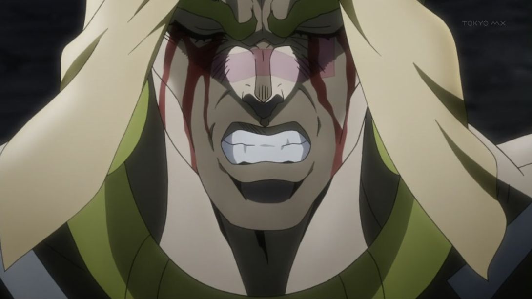
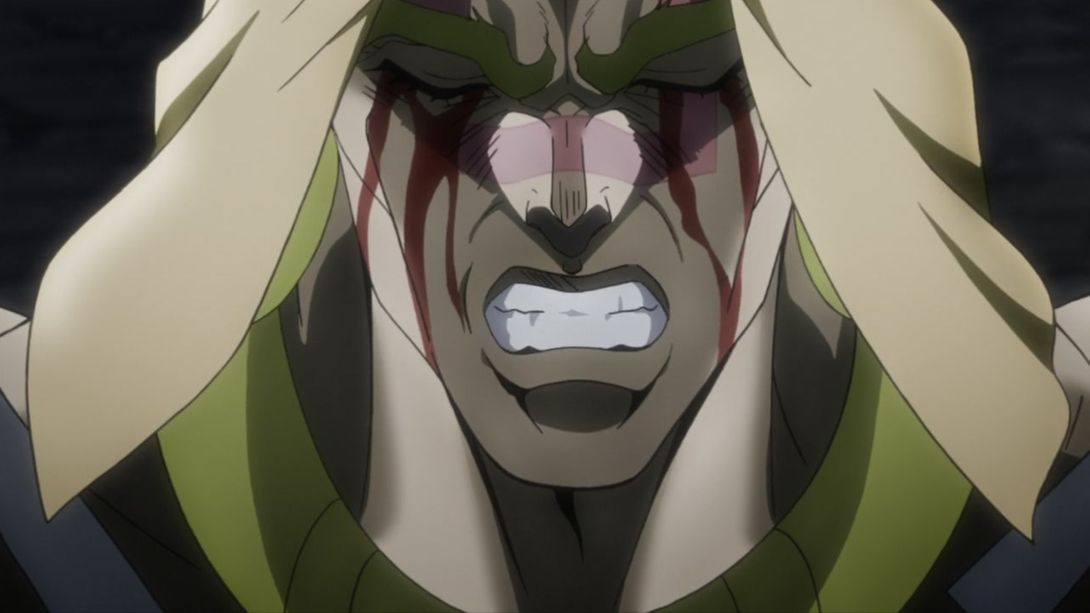
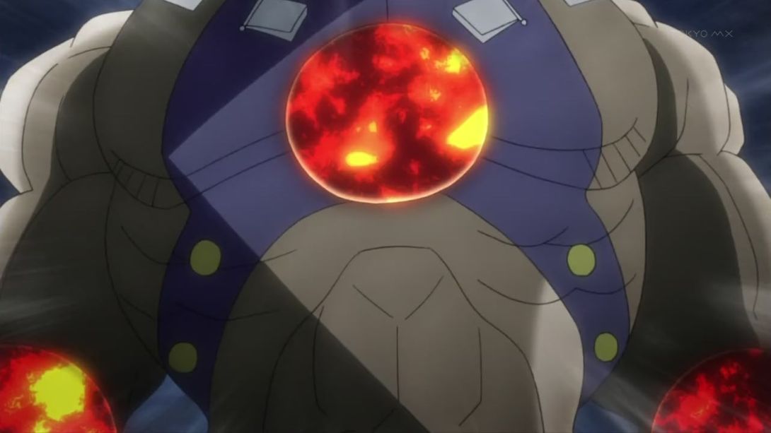
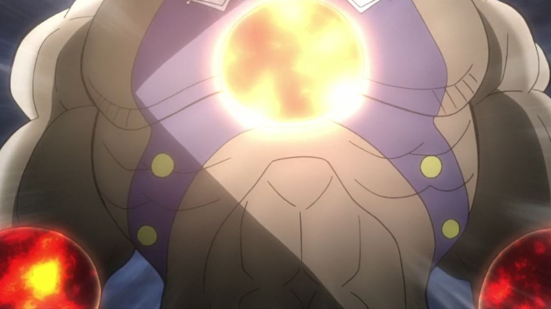
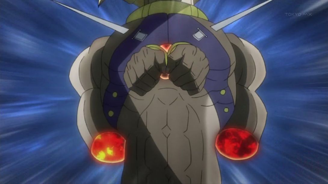
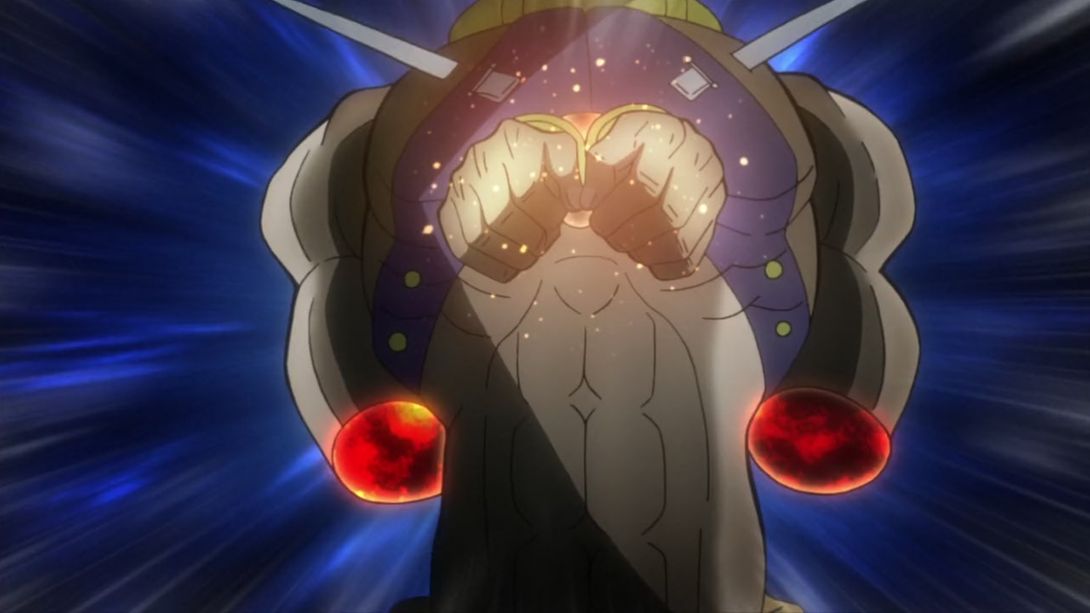
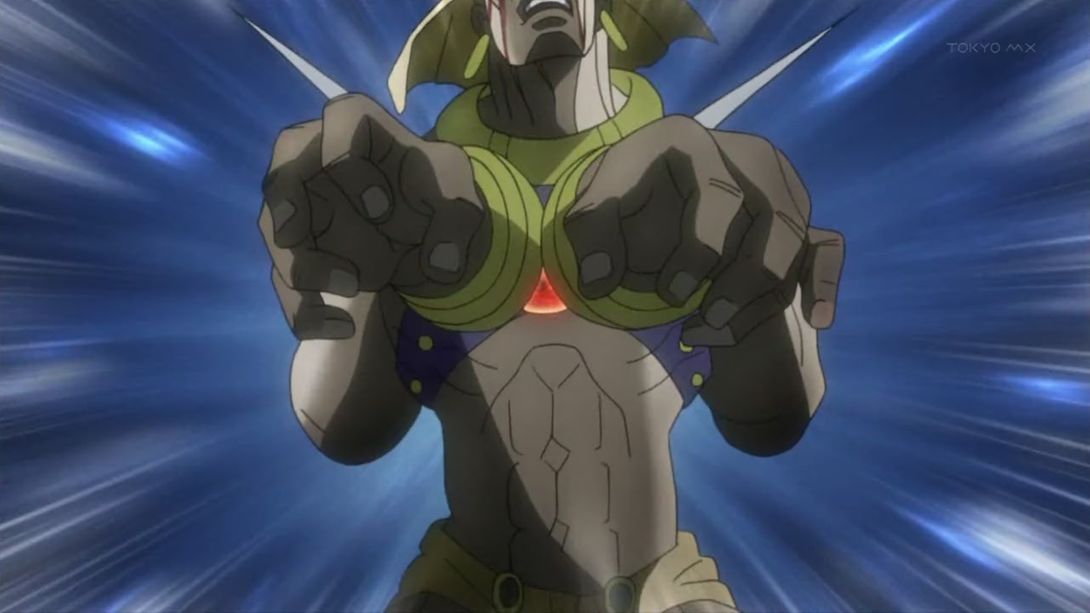
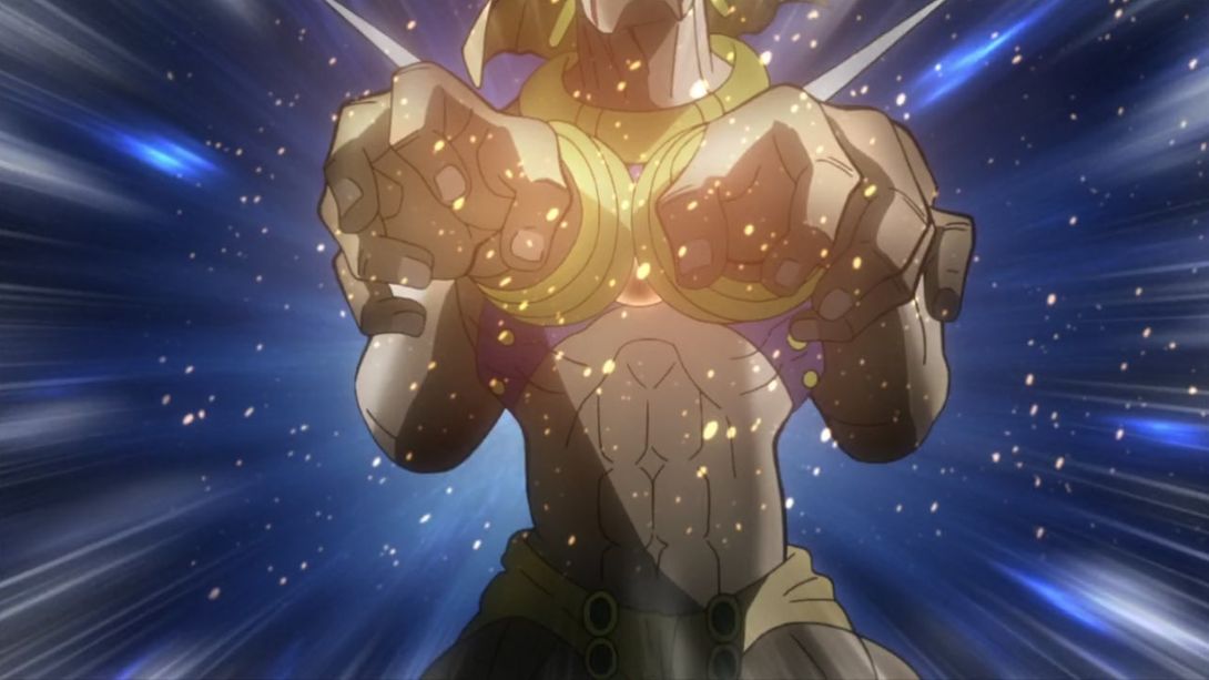
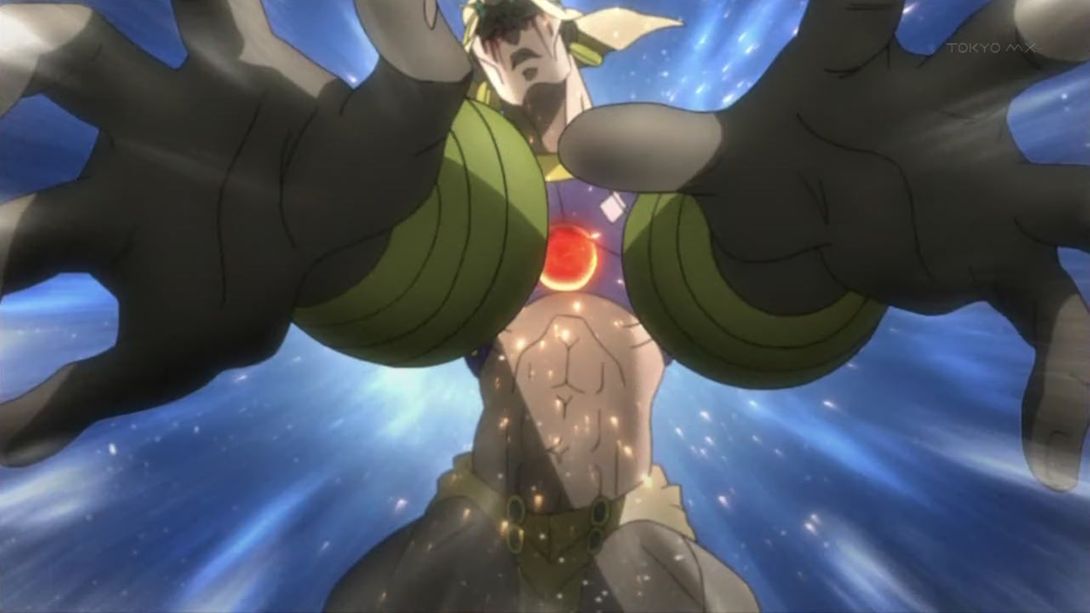
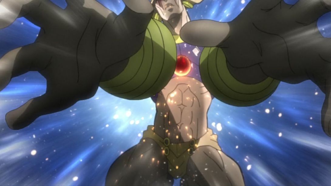
- Joseph (ft. Wham’s hands) have been moved in this scene, most lines are thinner, they’ve both received a (light and gentle) retouching treatment, and there’s a new source of light behind them (namely, the big fire in the middle of the arena):
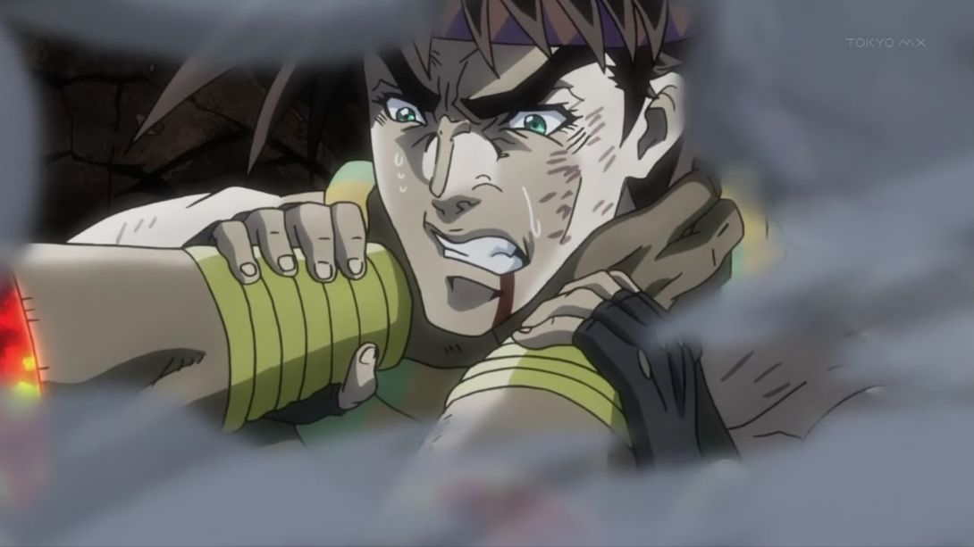
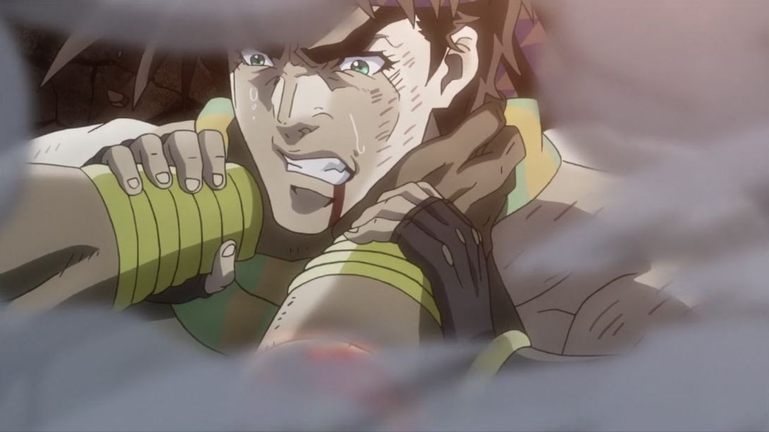
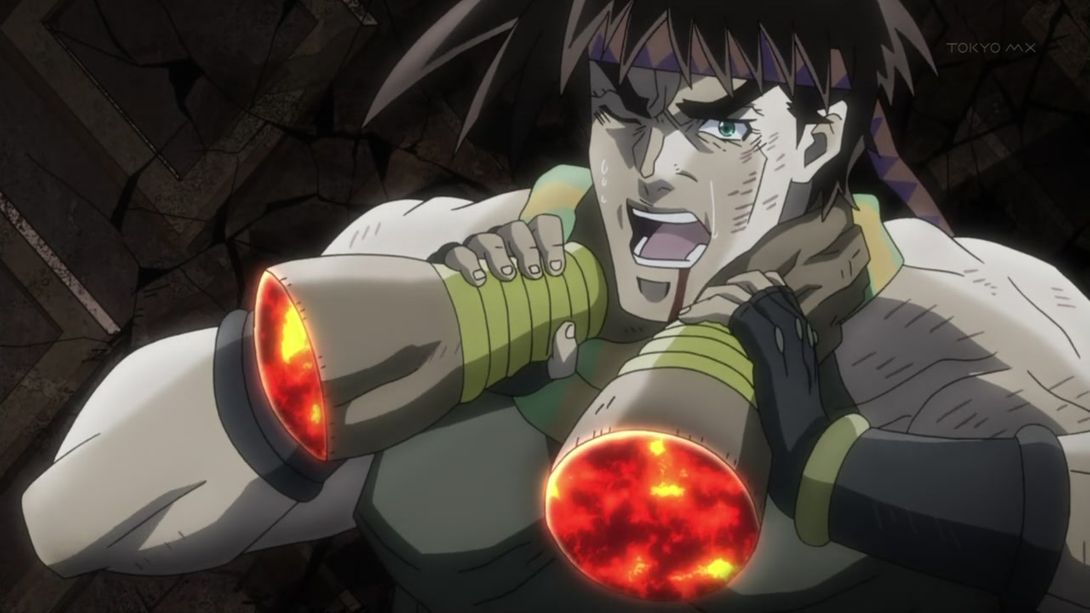
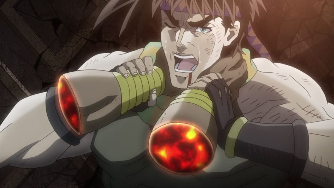
- Wham is bigger here:
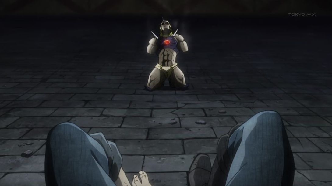
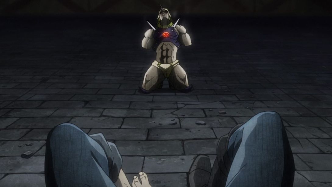
- The background behind Kars has been changed (again) here…:
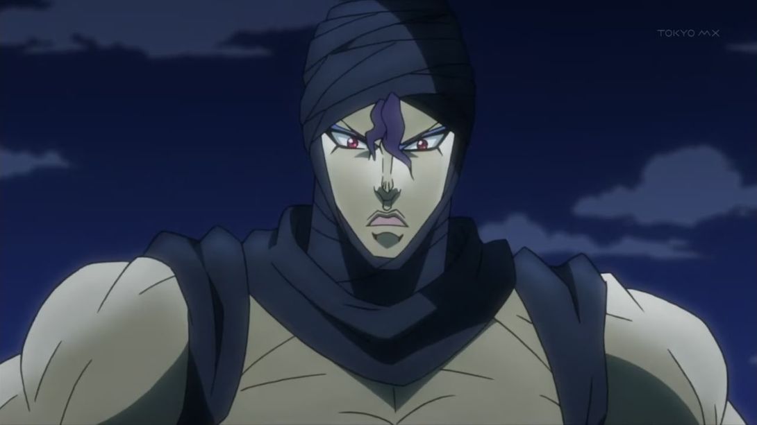
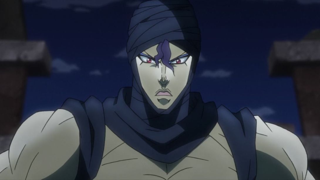
- A tiny line on Joseph’s nose (which was, presumably, an error) has been removed in the BD version:
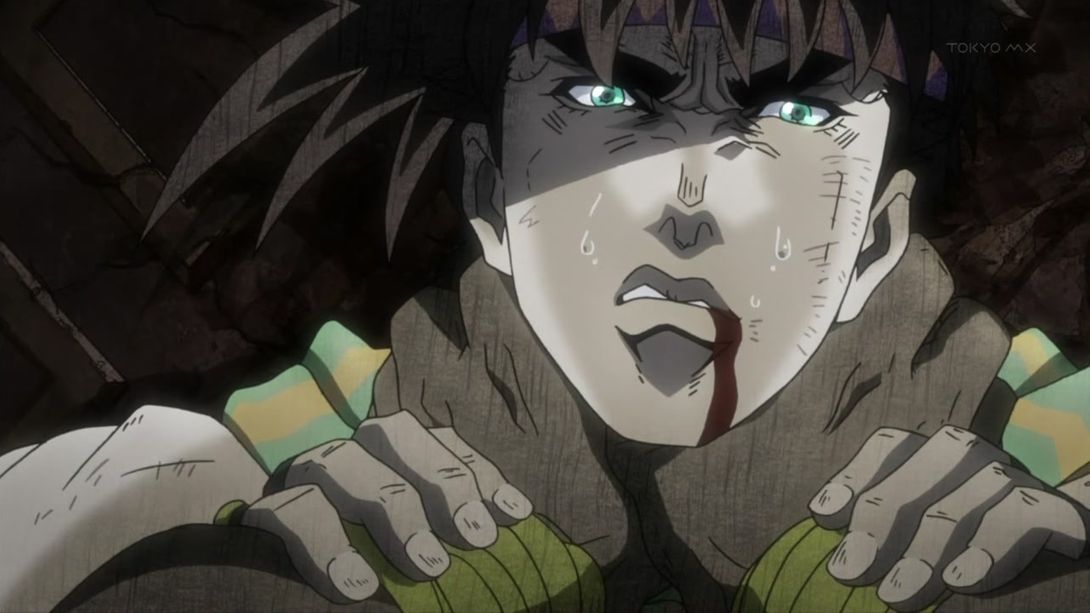
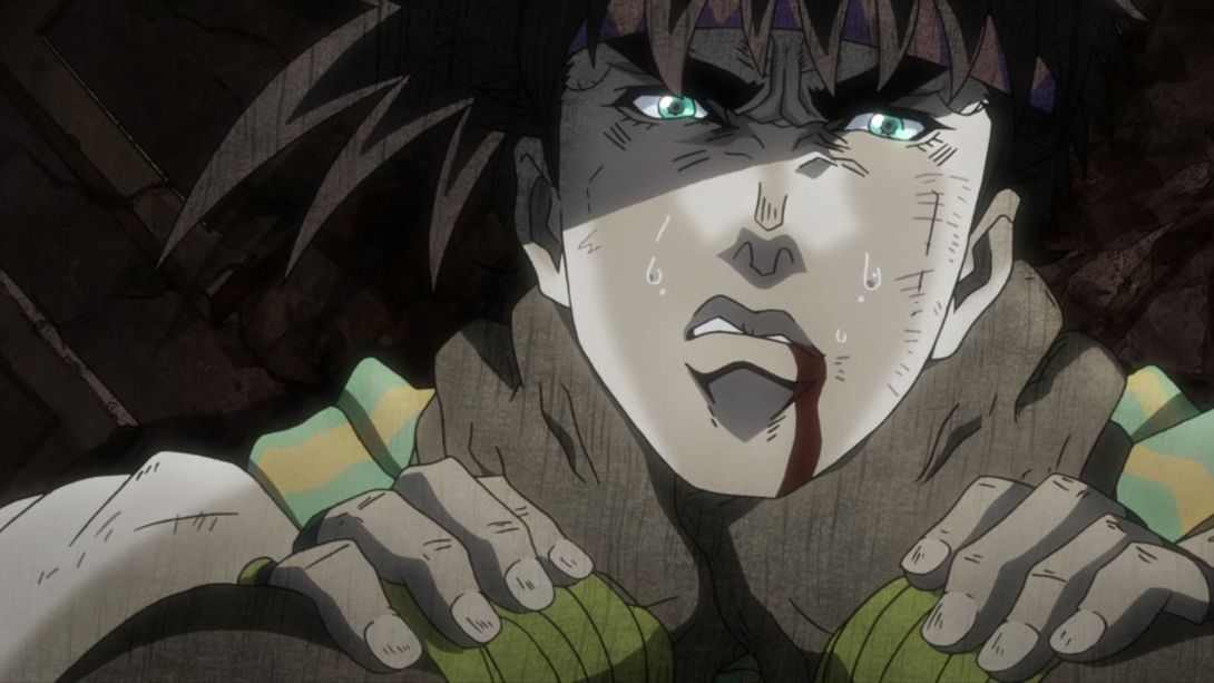
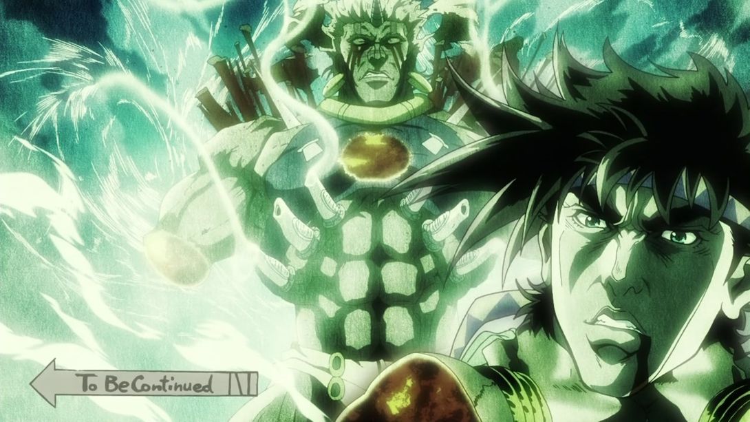
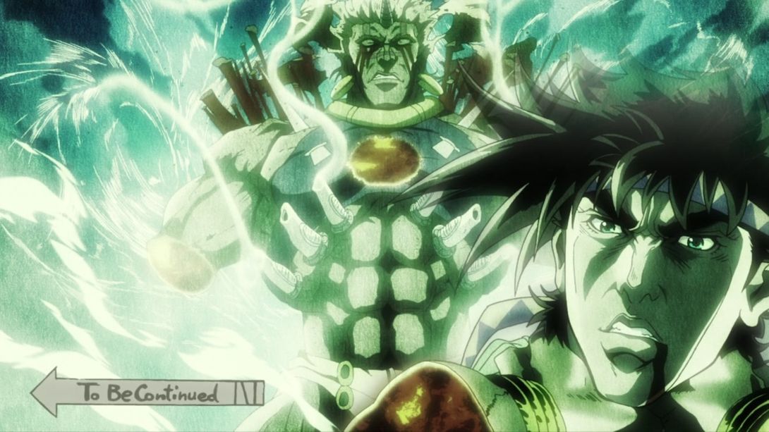
- In this scene of Wham detonating, Joseph’s overlay face slides into frame a little earlier, the green tint arrives much later…:
- And the top of Joseph’s hair is more see-through:
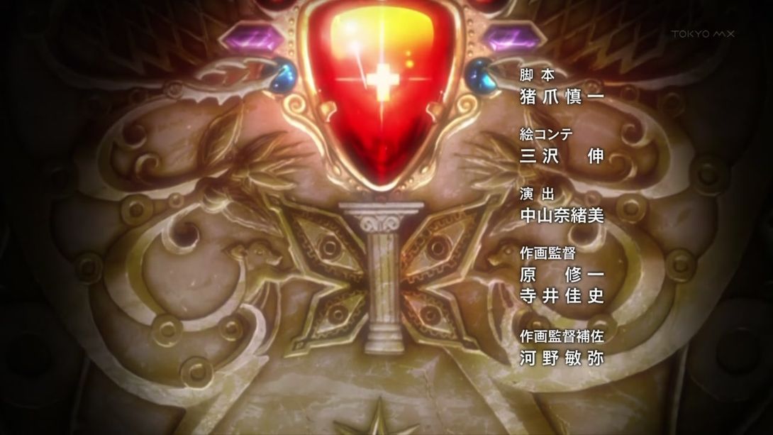
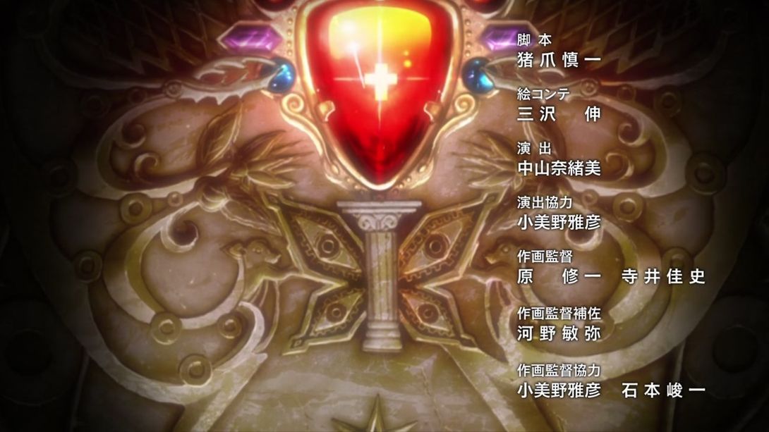
- Let’s wrap this ridiculously humongous comparison with one… credit difference! Check out the newly added 小美野雅彦 (Komino Masahiko) and 石本峻一 (Ishimoto Shun’ichi - you might remember him from Battle Tendency #19), at the bottom! Animation Director 寺井佳史 (Terai Yoshifumi) has also been moved to the right to make space for the two new arrivals:
Whew! Oh, boy, this was a long one! With 290 images and 32 videos, it is officially the longest comparison to date! I wonder which episode will be able to break this record. I can’t wait to find out… I just hope it won’t be too soon!
Well, that’s all for today, boys and girls… See you next time!

