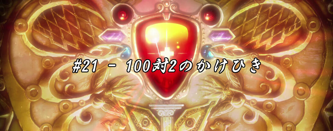
Hello hello, lovely people! Welcome to yet another (slightly late) comparison! I hope you’ve had a good two-weeks-and-something in the meantime, and I trust you’re ready to plunge into episode #21, “The 2 vs. 100 Strategy”, or “the one where not much happens at all”!
Let’s get this party started!
- For today’s exhibit A, feast your peepers on this here frame, in which we can see that Lisa Lisa’s face has been redrawn, and Joseph’s cheek lines and eyes are have also been retouched:
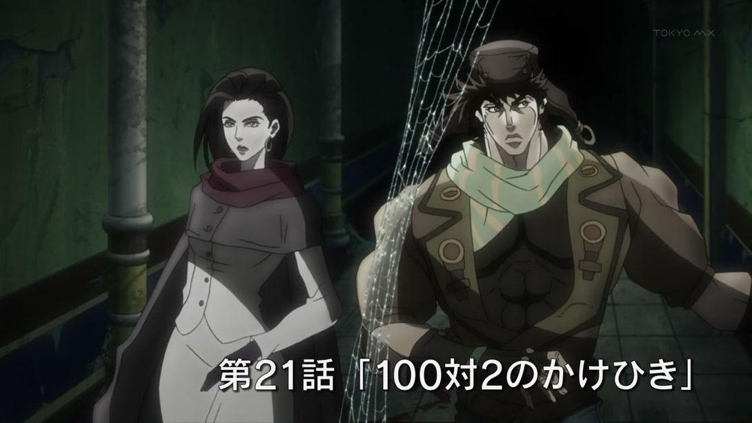
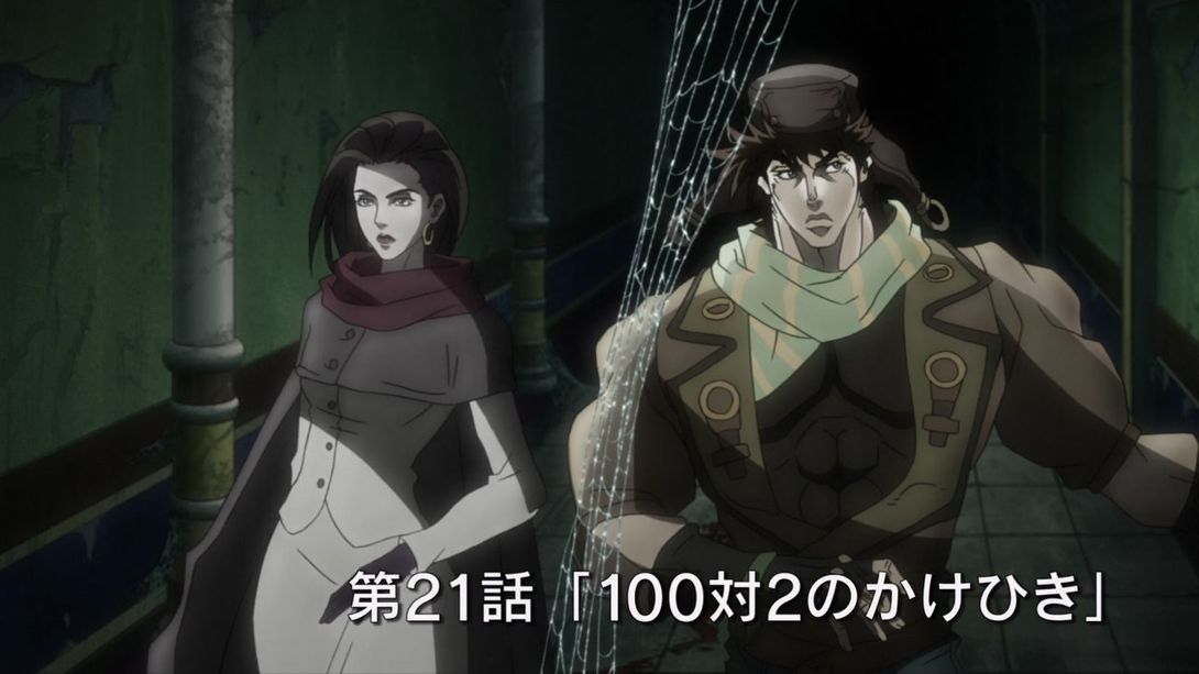
- Here, the shading on Joseph’s left shoulder has been retouched, and the background (hand included!) is more zoomed in:
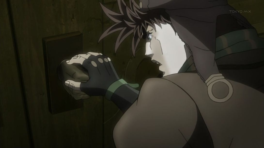
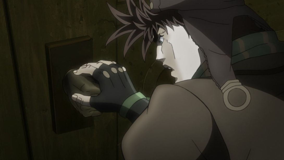
- Aaah, take a long look! Take a hard whiff! Can you feel it? Everything has been redrawn here… How majestic:
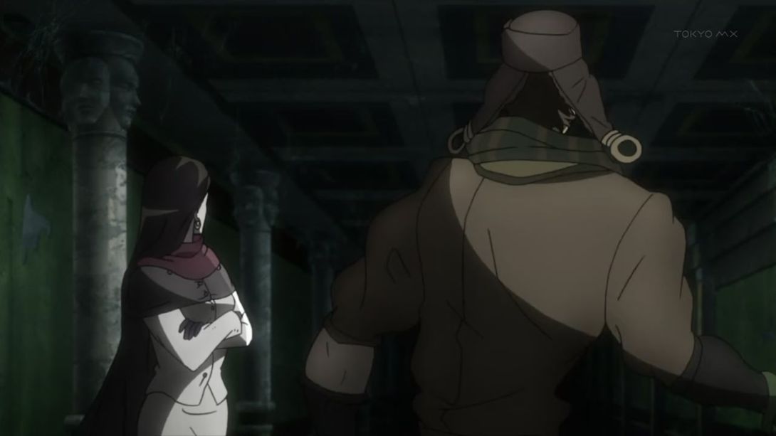
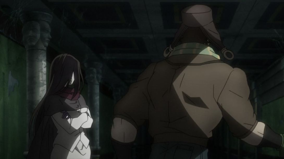
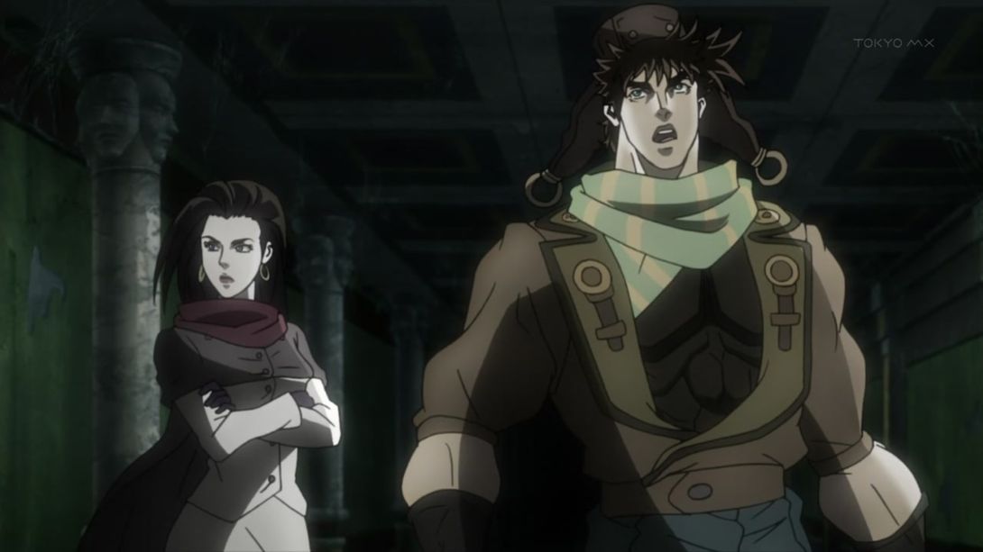
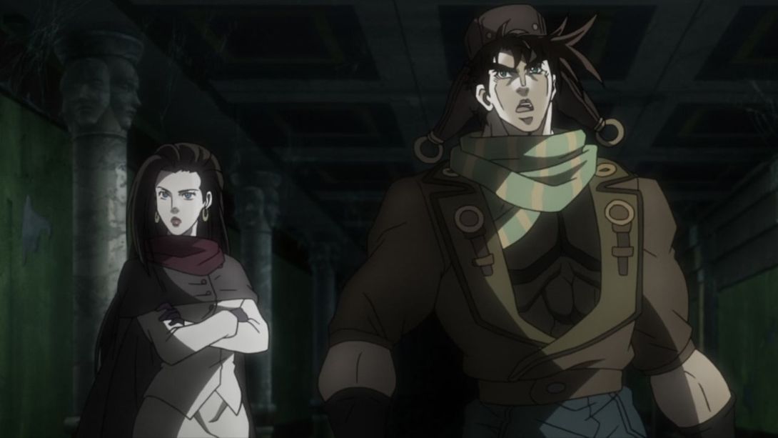
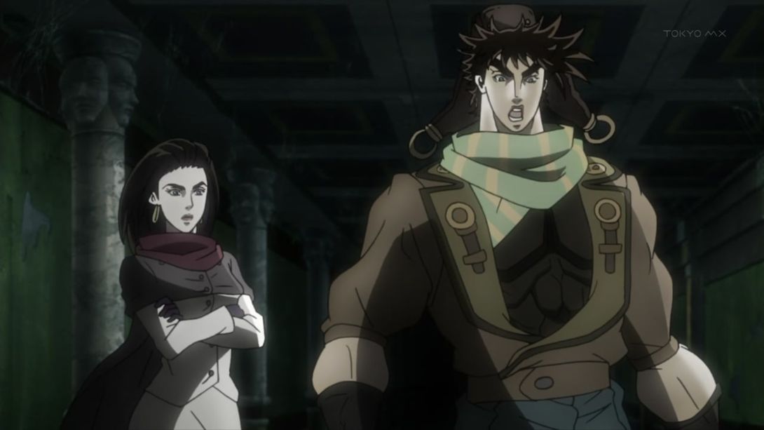
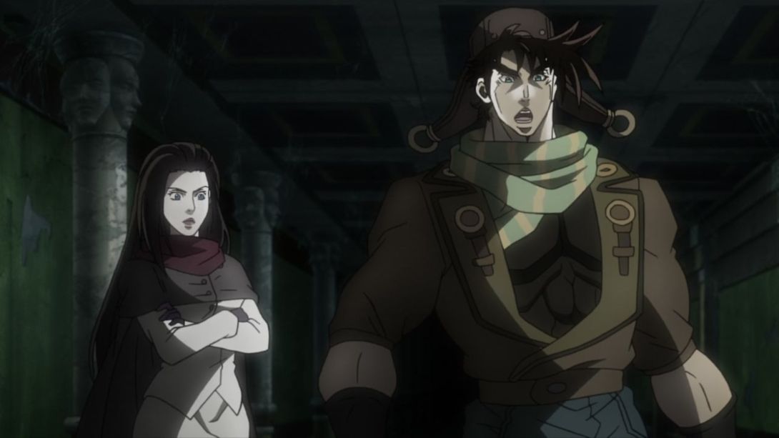
- Here, Lisa Lisa has been completely redrawn and… “Wired Beck” (yes, I had to google that) has been shaded differently:
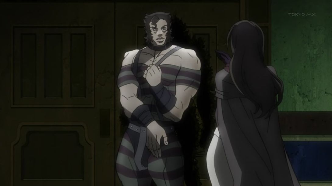
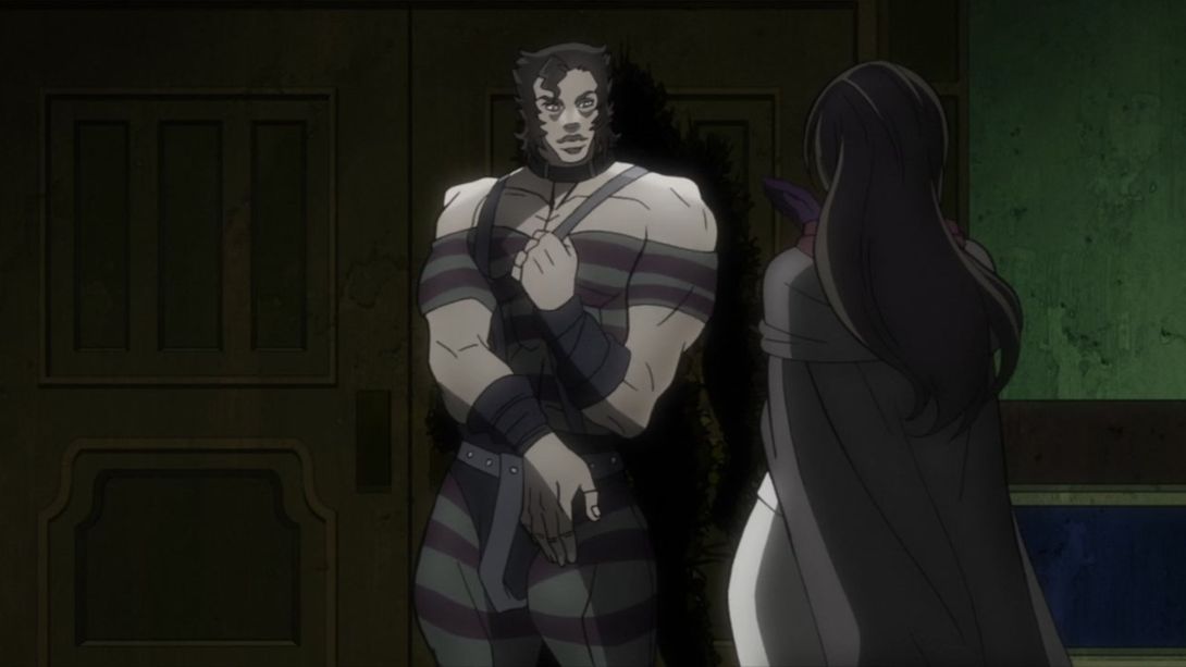
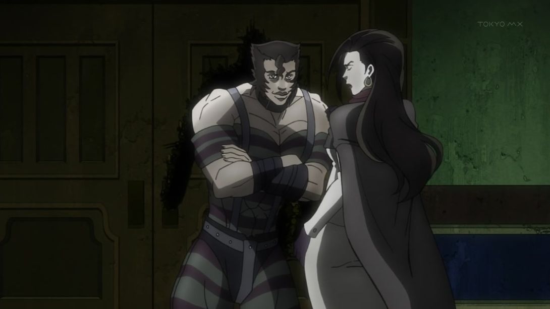
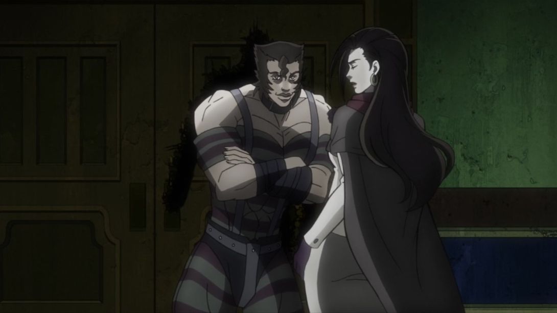
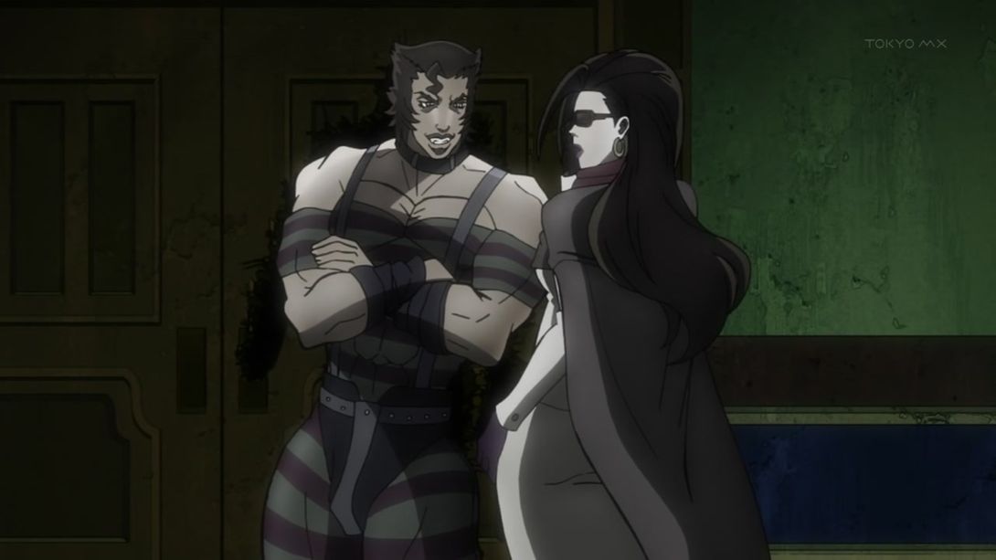
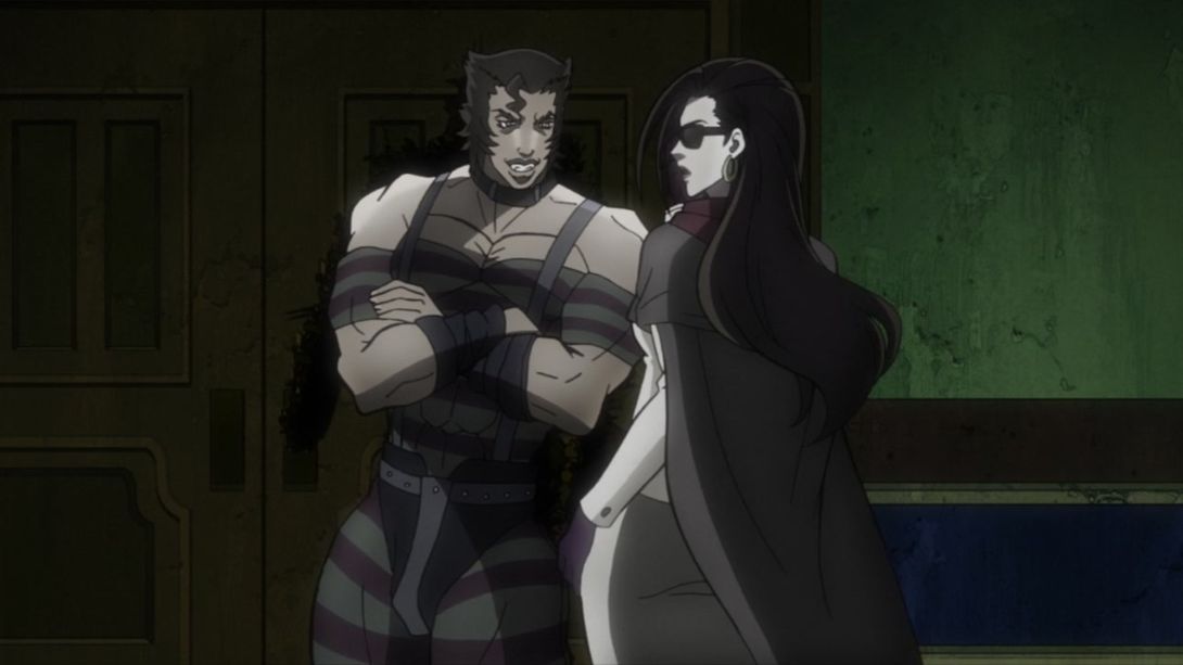
- And, at the very end of this bit, she no longer turns around to face him:
- Here, Lisa Lisa has been very heavily retouched, and the scratch texture overlay is much less visible. I hope you like to look at redrawn frames of Lisa Lisa, because hoo boy, you’re about to see a handful:
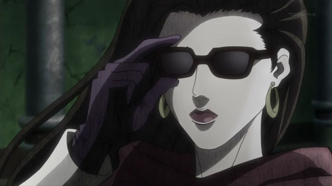
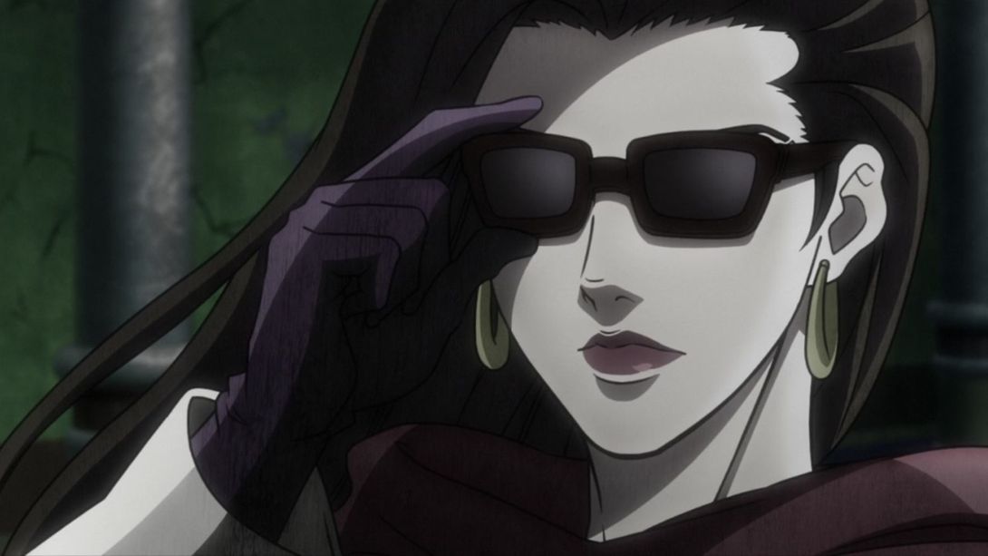
- Later on in the same scene, when… “Wired Beck” shows up on the left part of the screen, his forehead is significantly darker:
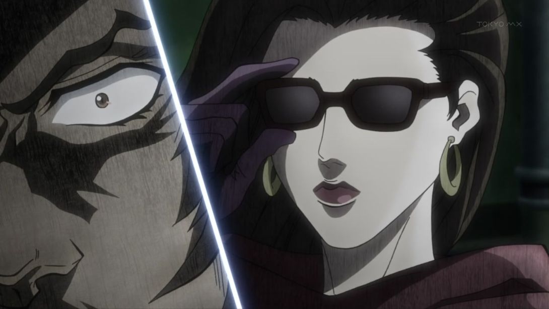
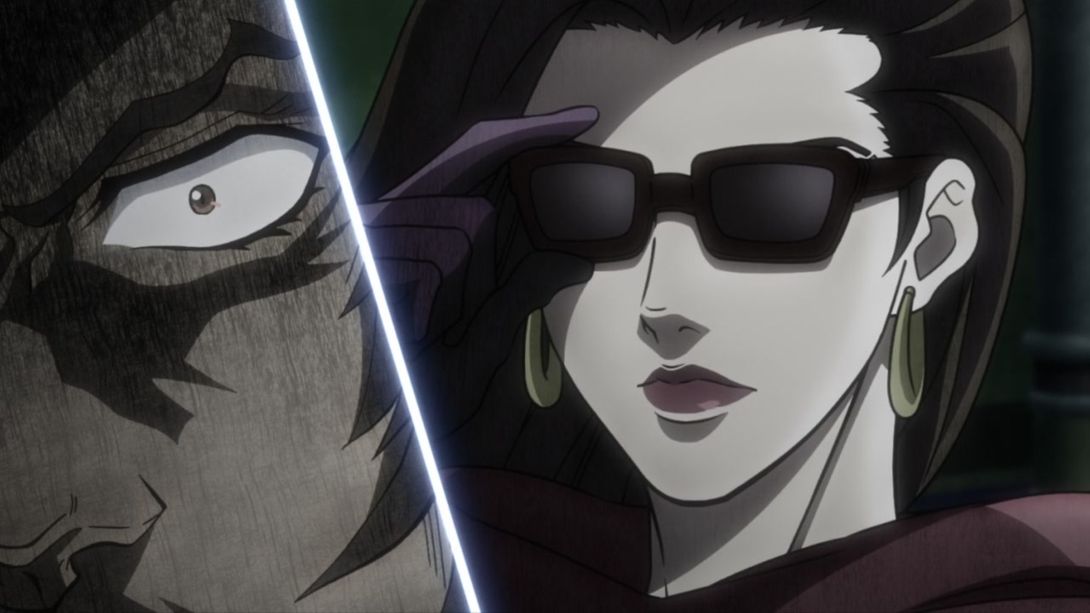
- Here, Joseph’s face slides to the right waaay more slowly:
- “Wired Beck” here has a new scratch texture overlay:
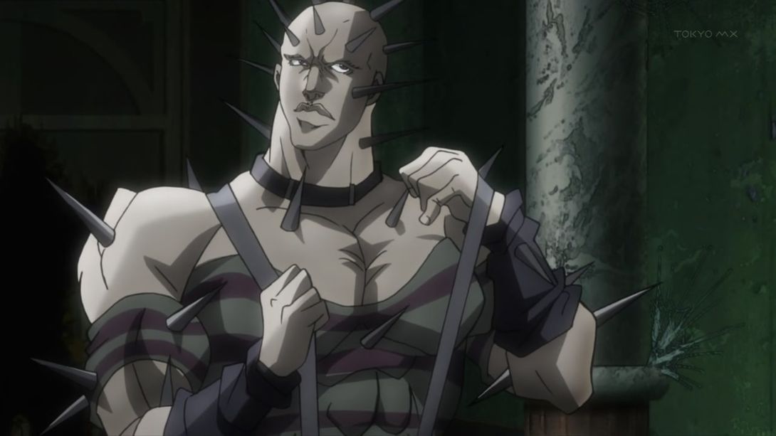
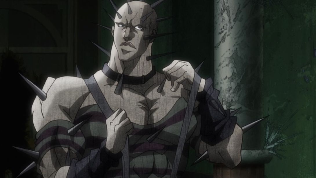
- Lisa Lisa is back at it once again:
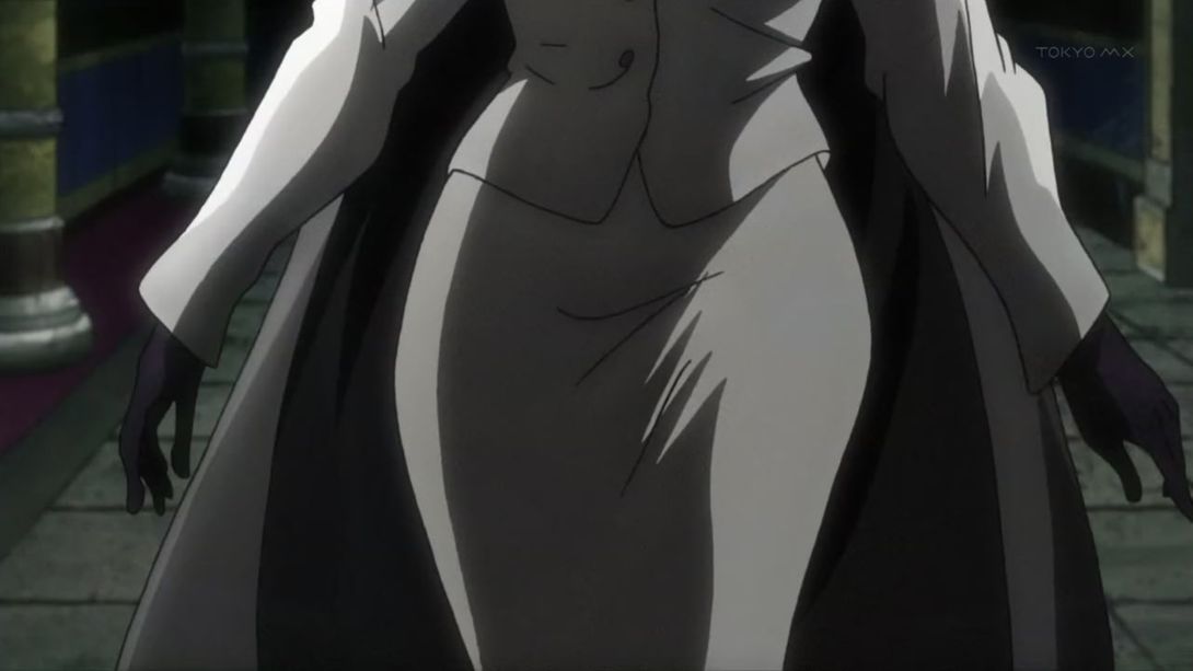
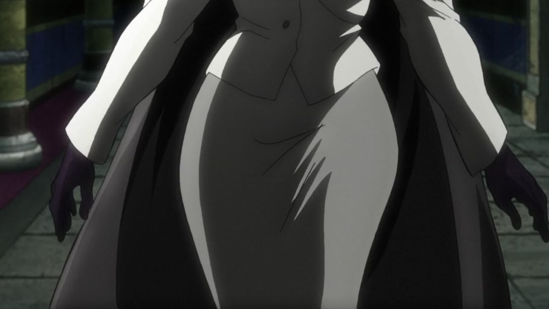
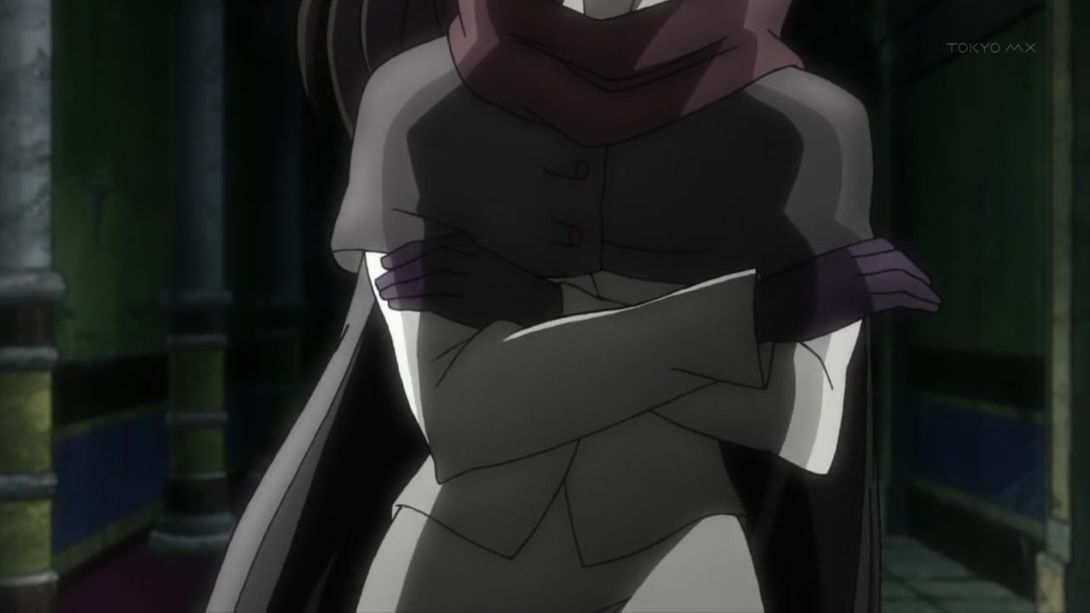
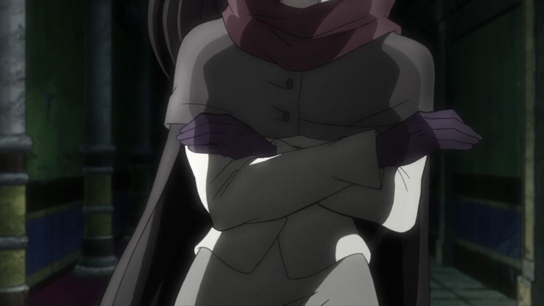
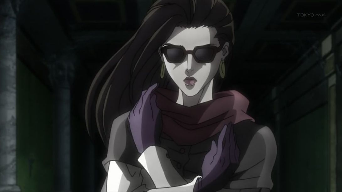
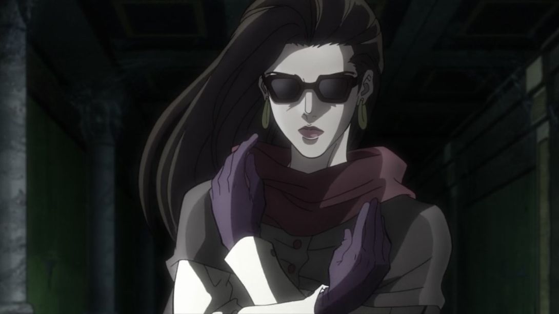
- Here, “Wired Beck”’s left shoulder has been retouched…:
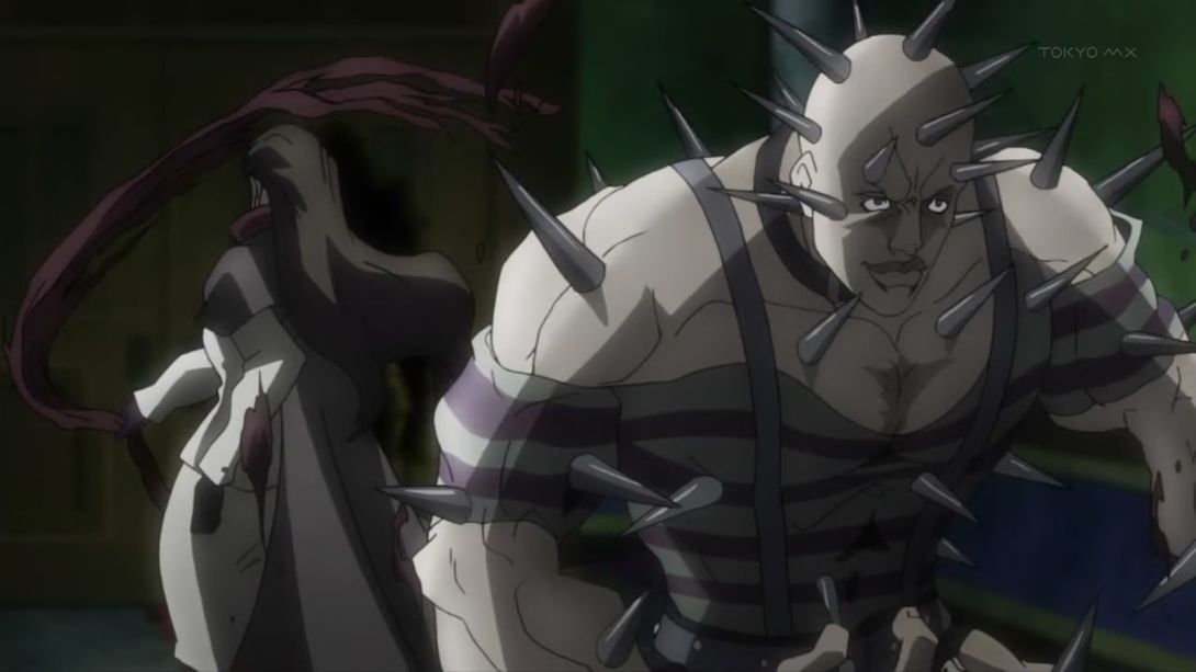
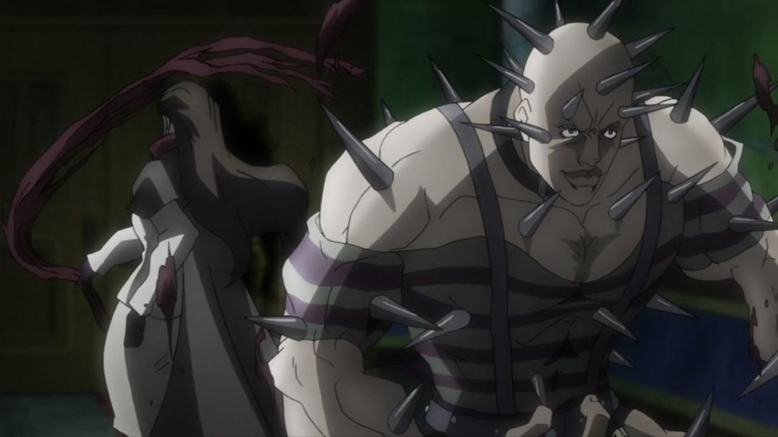
- And here, he’s got an extra thorn on his forehead, his upper lip is darker and a bunch of lines between his pecs have been retouched:
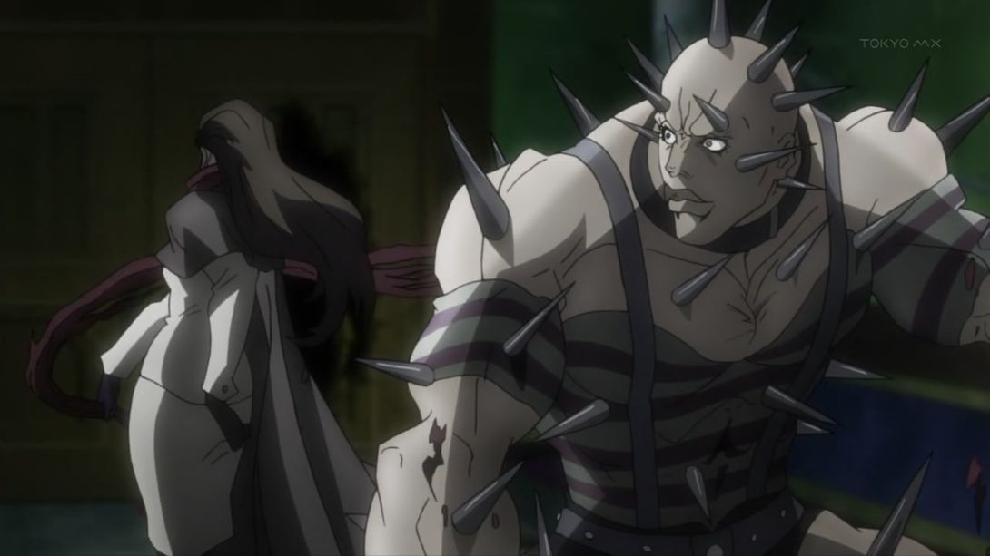
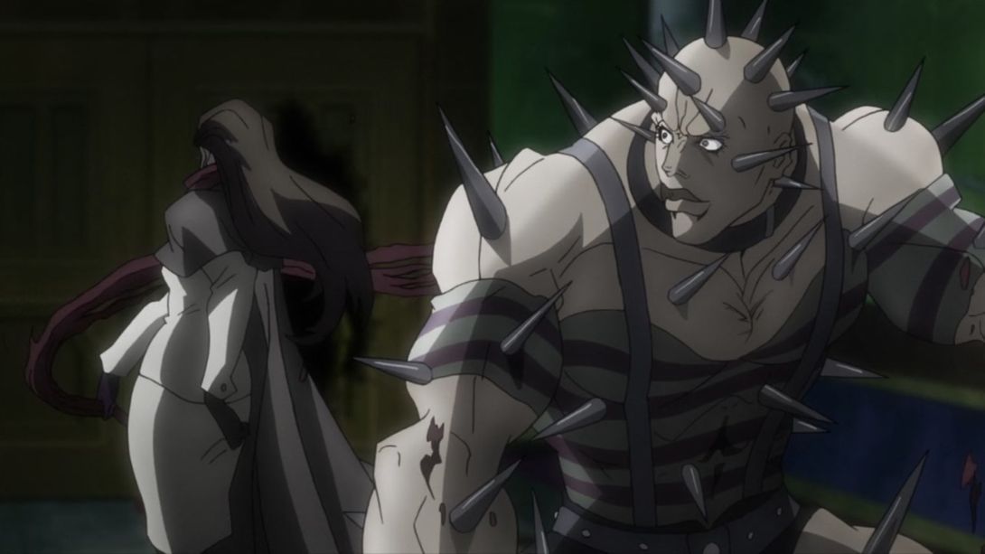
- The shading on Lisa Lisa is a little flatter here:
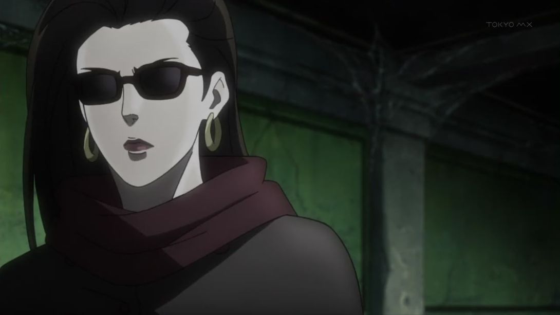
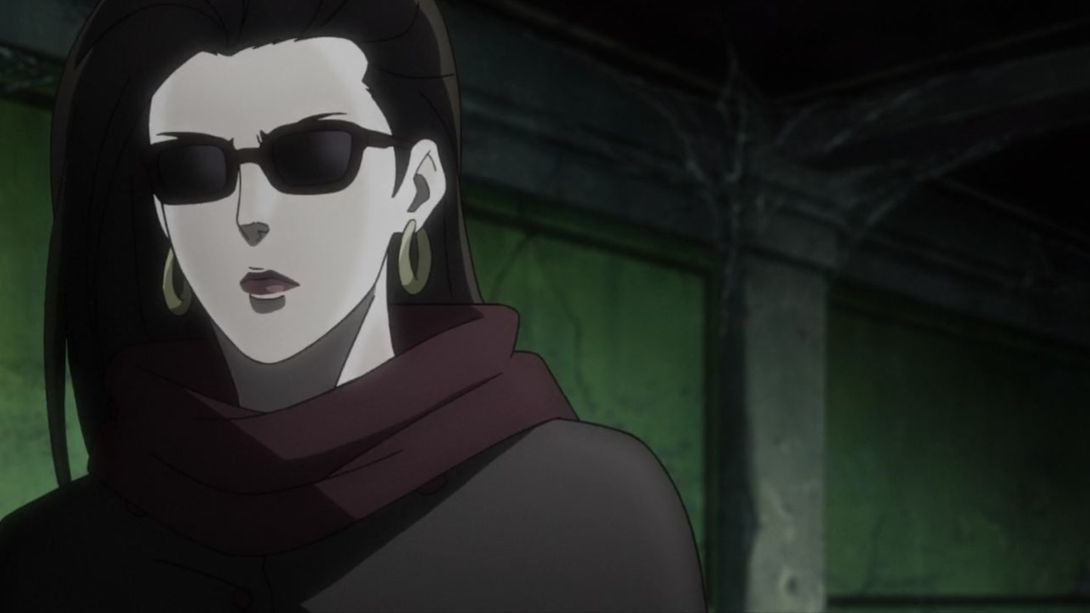
- And here, the foreground is shaded a little differently, and Lisa Lisa has been redrawn in the background:
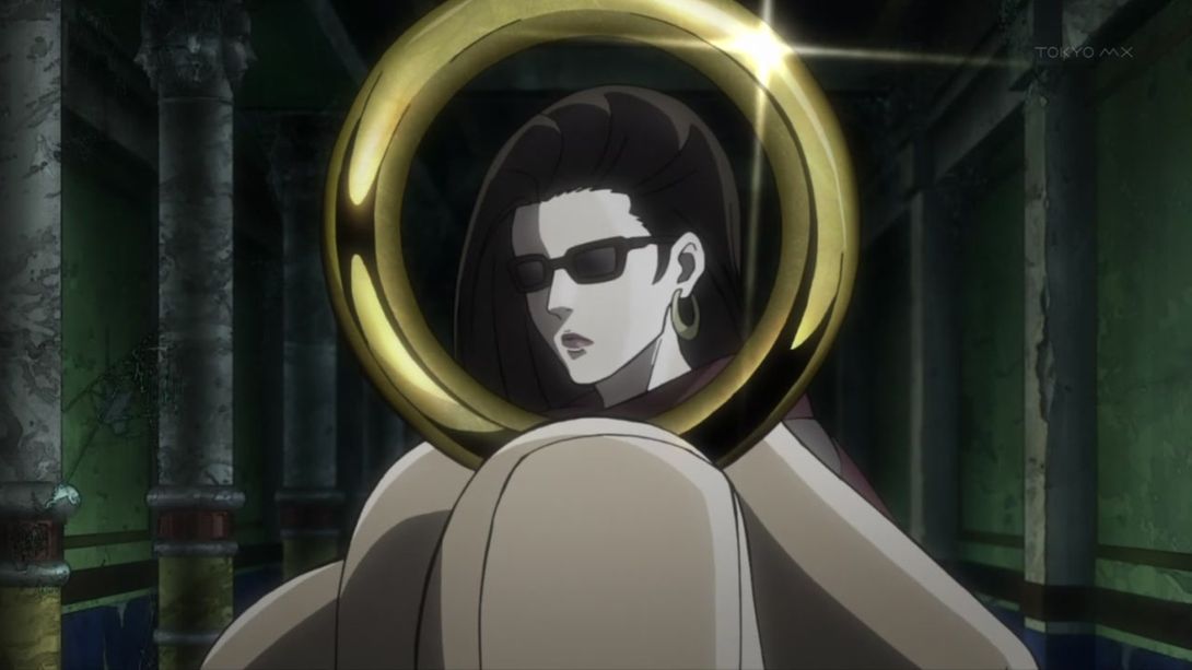
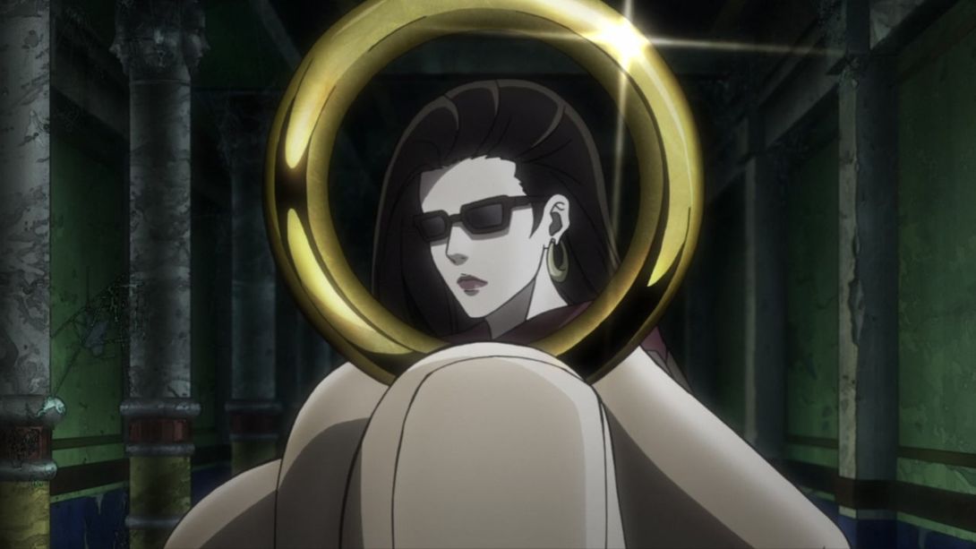
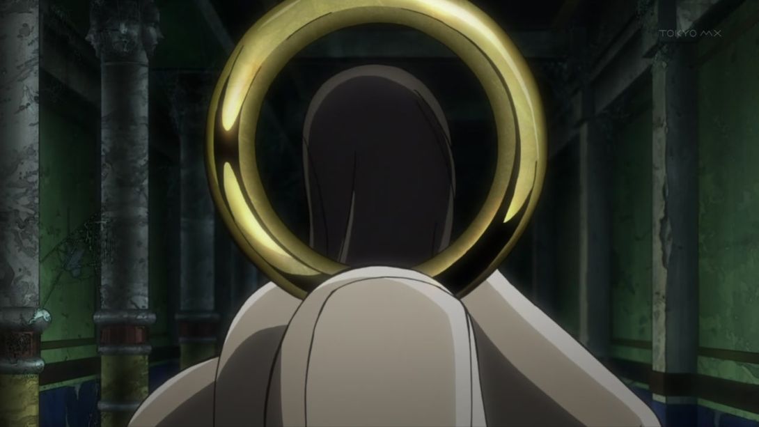
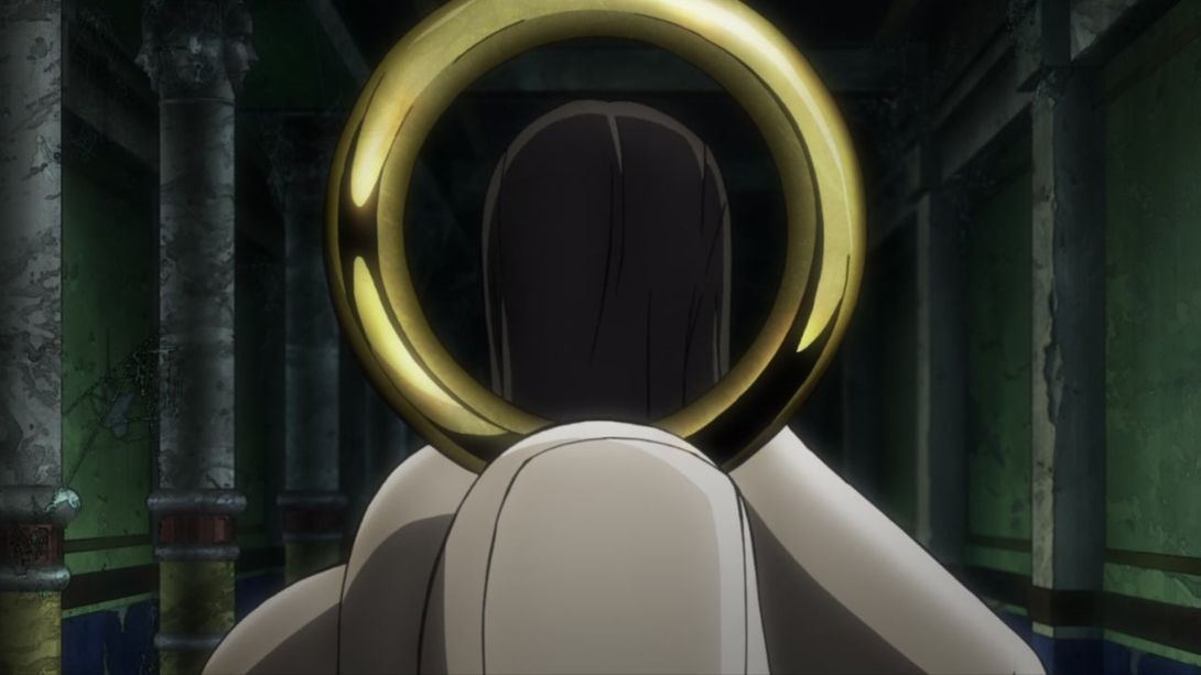
- Here, Lisa Lisa’s neck has been properly shaded, and her shades correctly cast a shadow on her face (you’ll start to notice this coming up a few more times in today’s comparison):
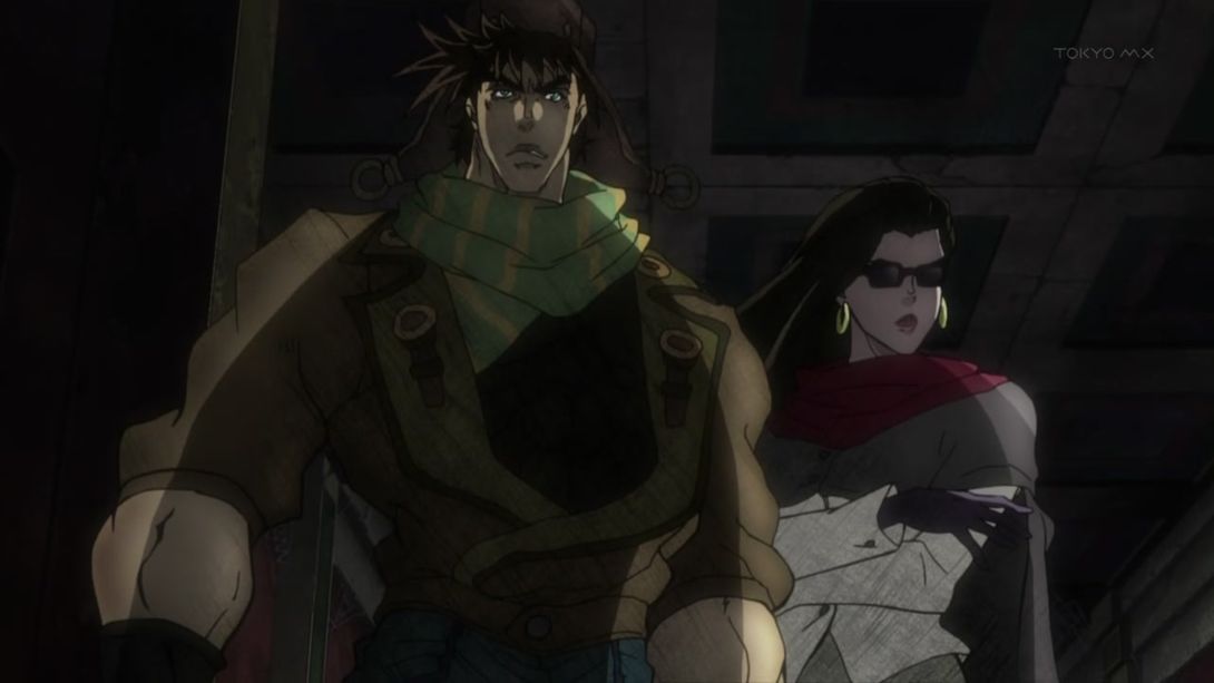
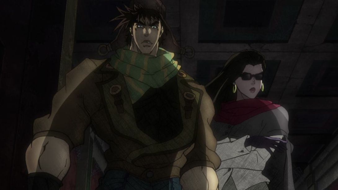
- …one such example coming right up! In addition to the added shades shade (ho ho), the shading on both is slightly different here, a few lines on Lisa Lisa’s side are a little thicker and the scratch texture overlay is lighter:
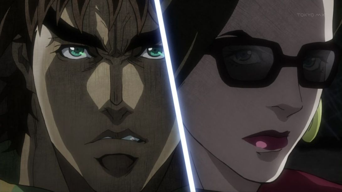
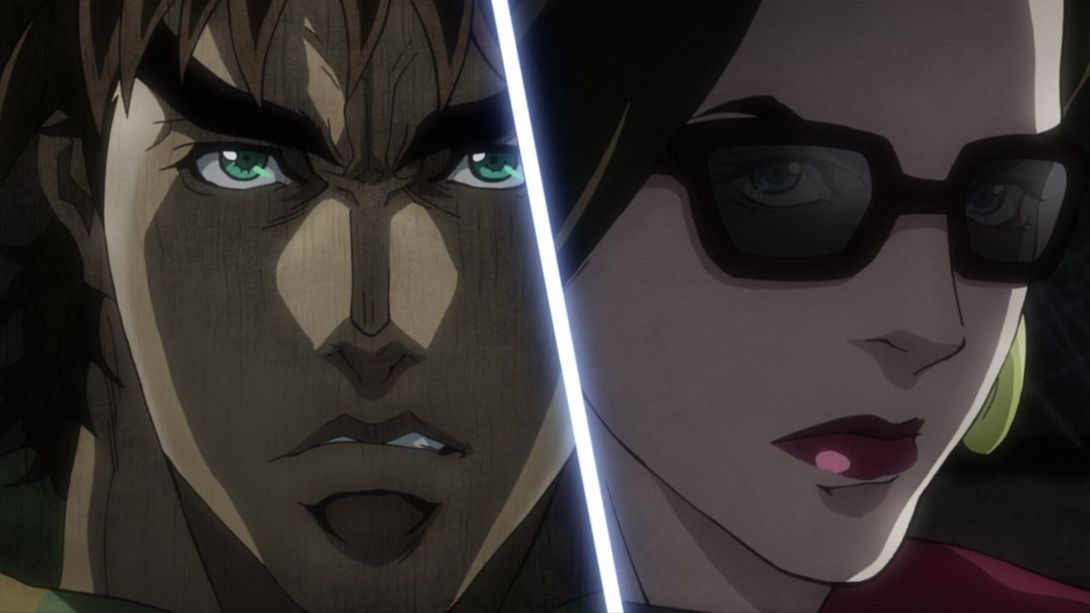
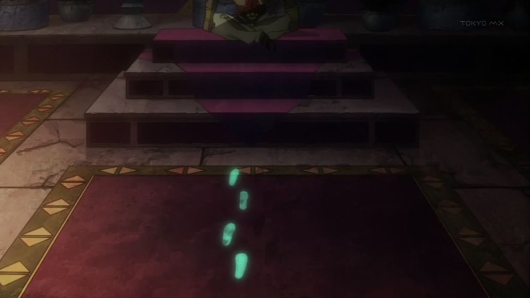
- The steps in this scene are completely different and make more sense:
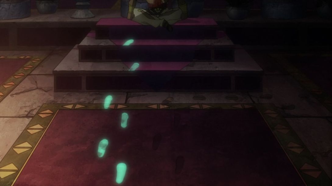
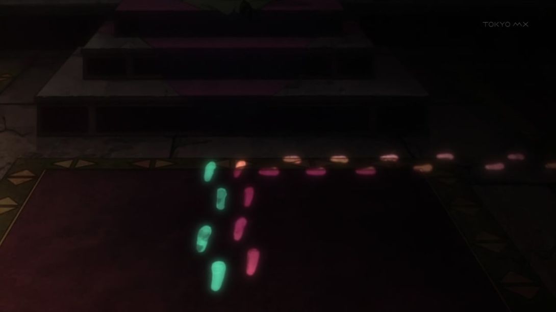
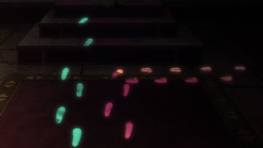
- Here, the colours on Joseph are a little flatter, and Lisa Lisa’s head has been redrawn once again:
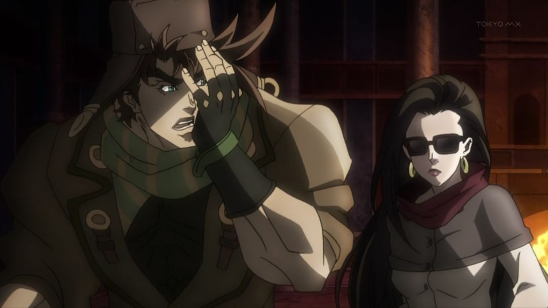
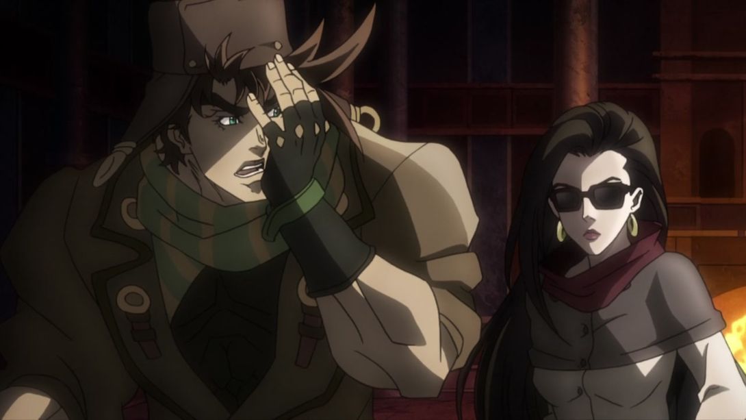
- The colours on Joseph are again a little flatter, and Kars has been retouched too:
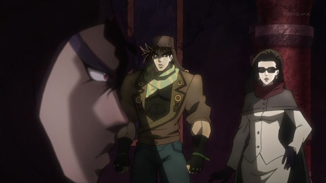
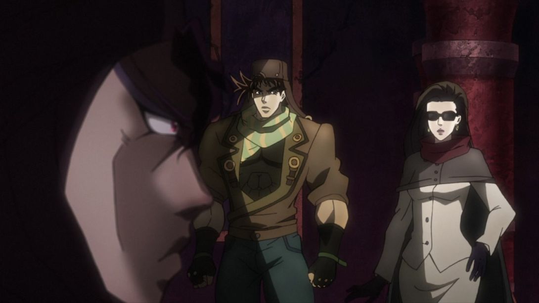
- Here, a bunch of lines on Wham’s side of the screen are thicker, and Kars is wearing a little less make-up:
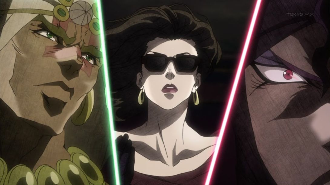

- Both Lisa Lisa and the Super Aja stone have been retouched here:

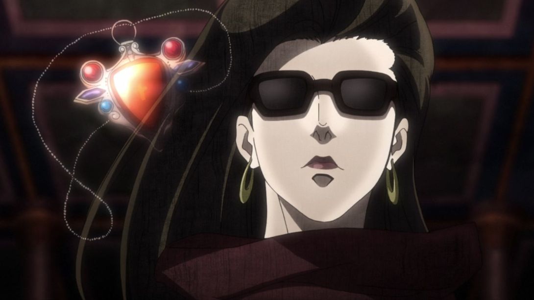
- Yes! Everything is better!:
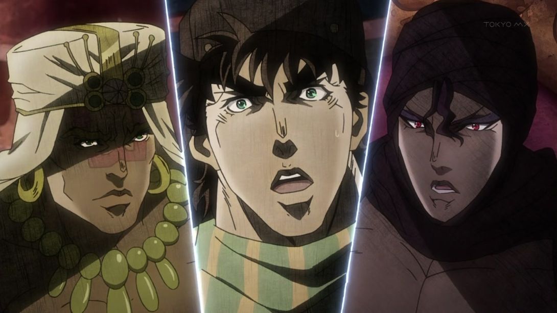
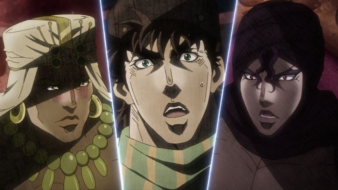
- Lisa Lisa again here:
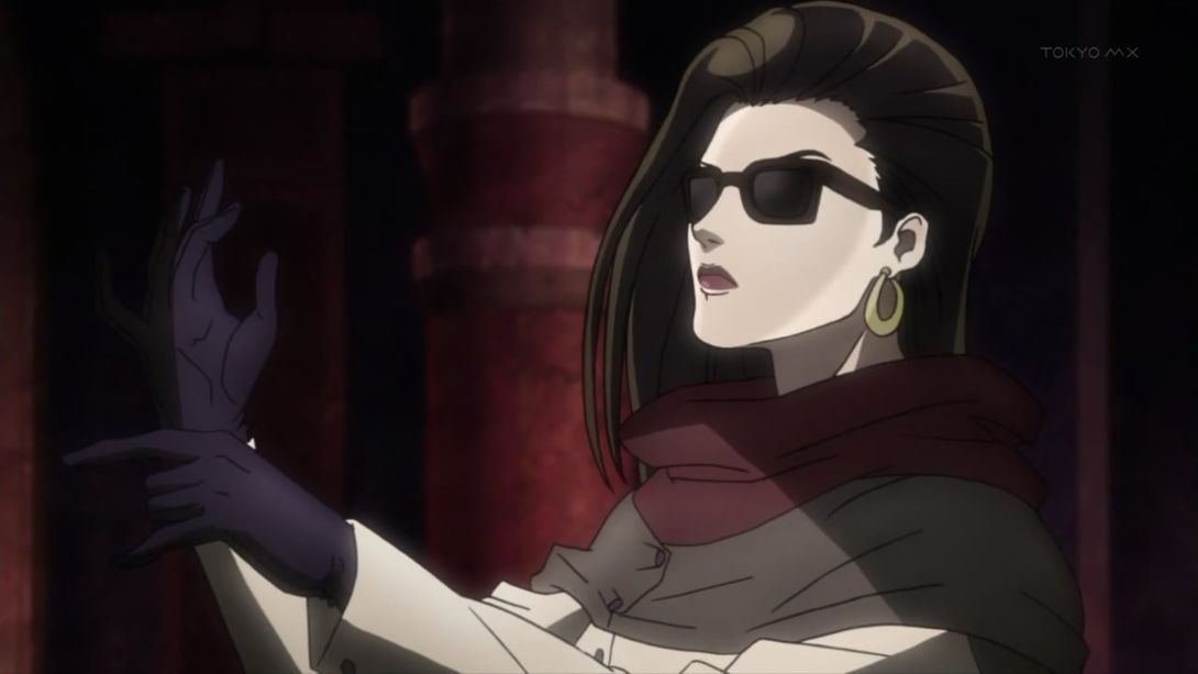
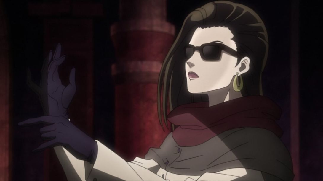
- The shades shade now make actual sense…:
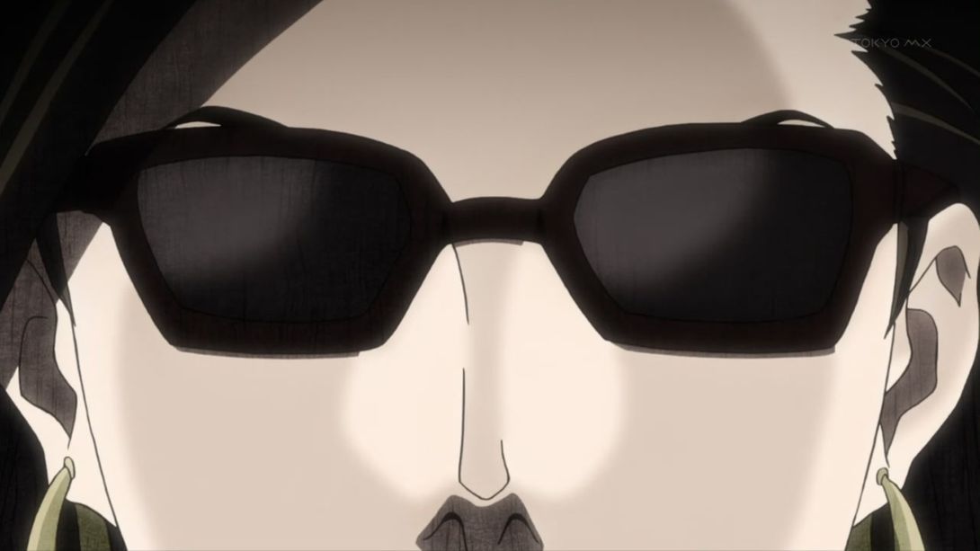
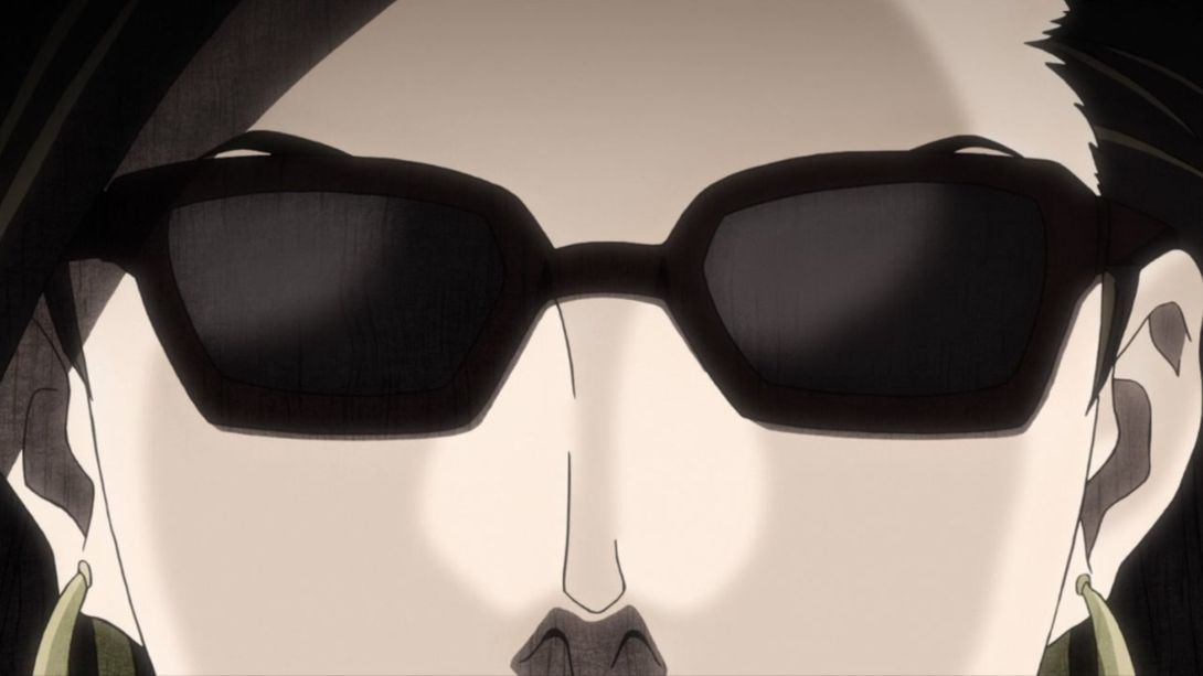
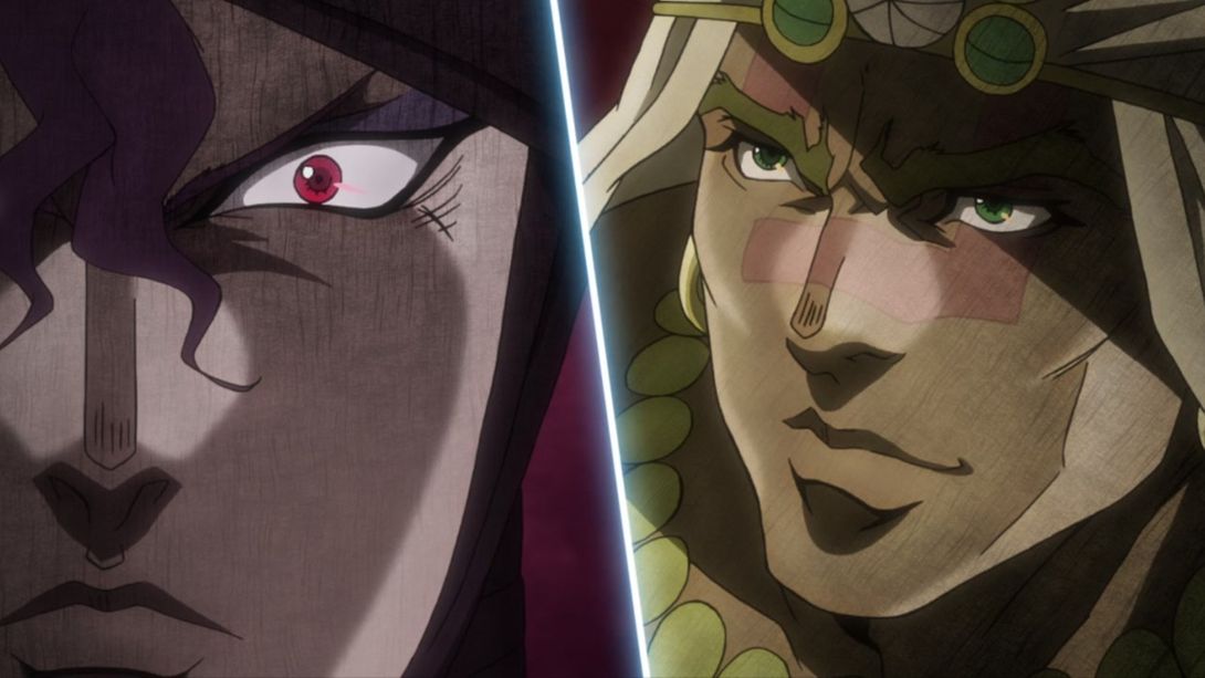
- And here, the scratch texture overlay is lighter in some areas, Kars’ pupil is slightly bigger and brighter, he’s wearing less make-up, a line on Wham’s nose is thicker and one of his eyes is brighter:
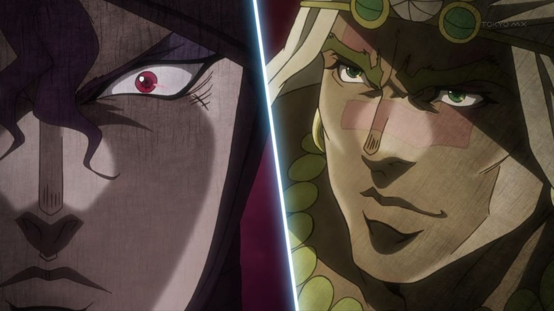
- The shadow again:
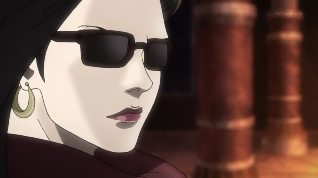
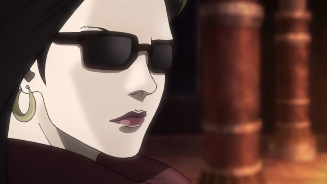
- Joseph is shorter, buffer and significantly redrawn here:
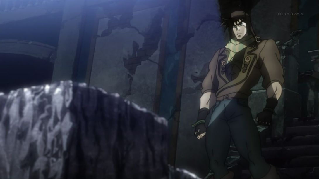
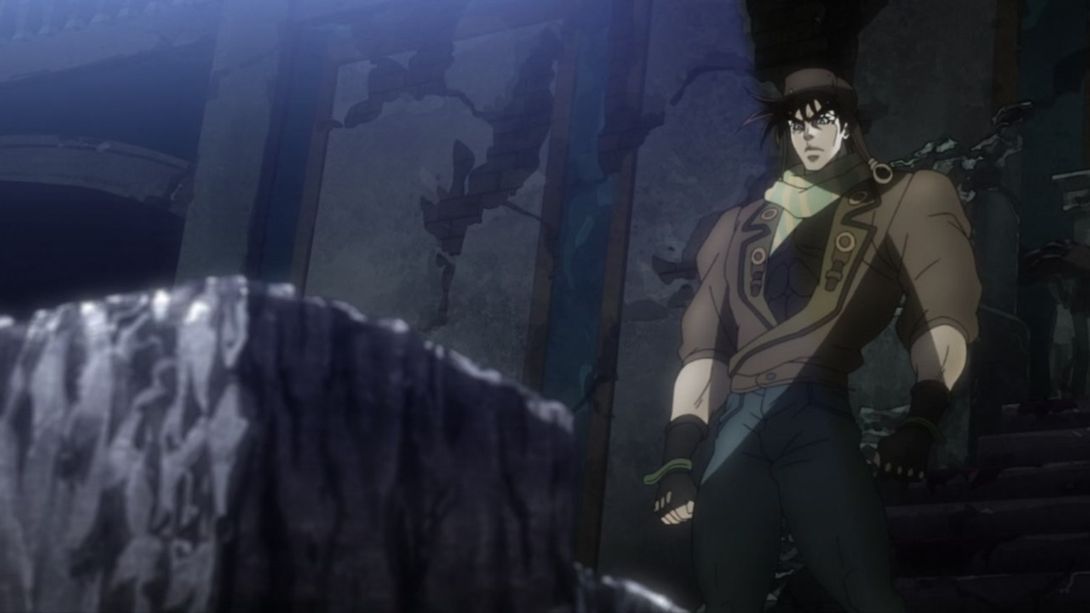
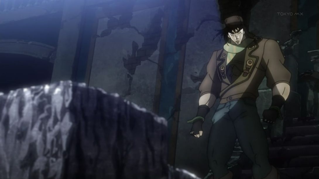
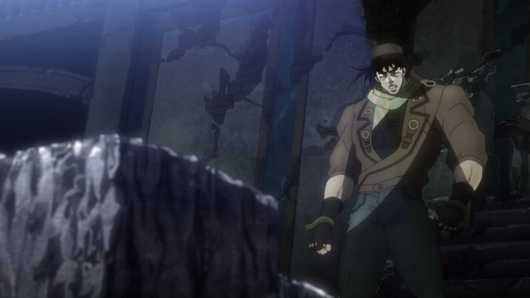
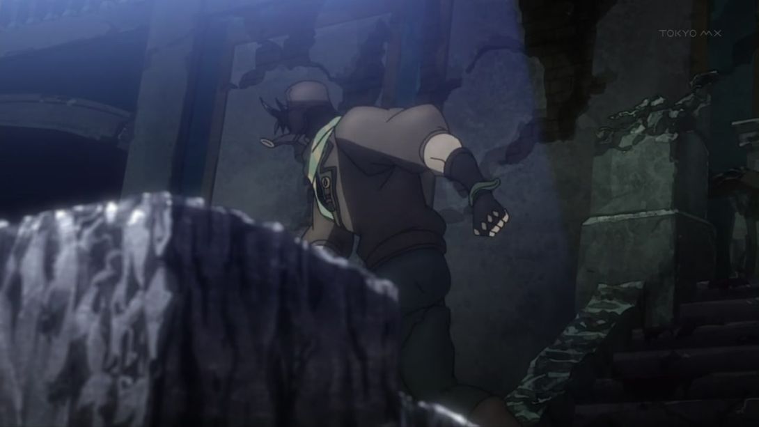
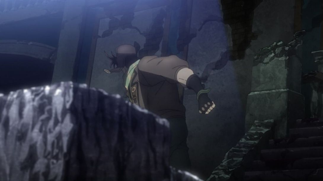
- Joseph’s been redrawn again, here:
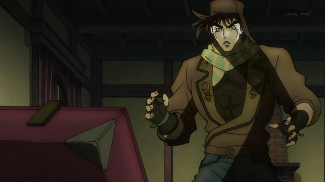
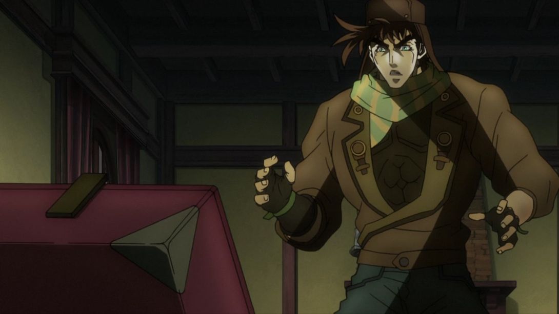
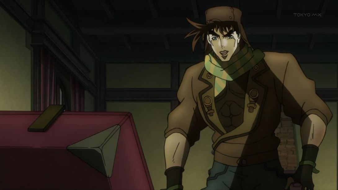
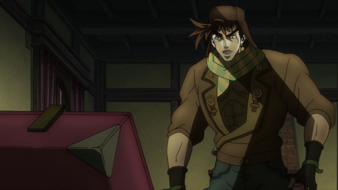
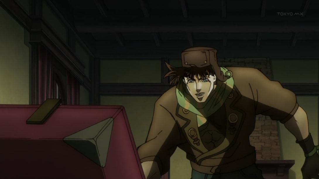
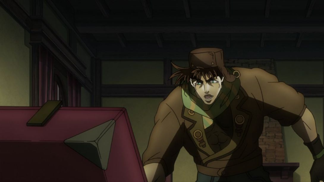
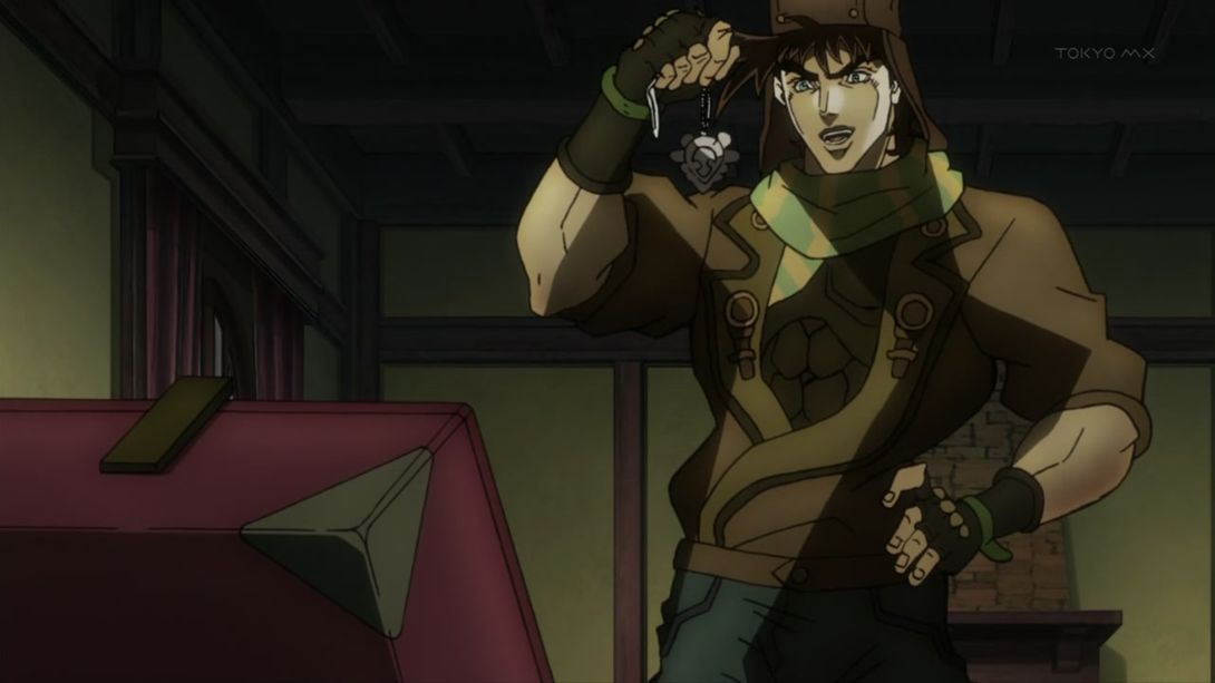
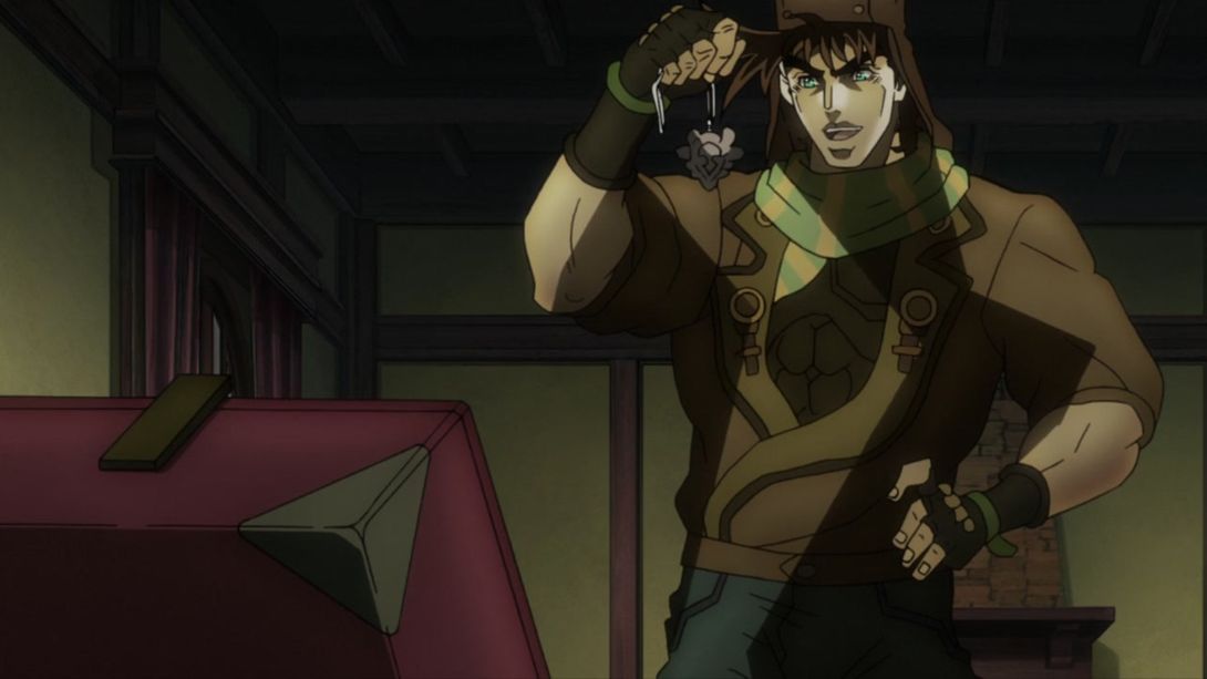
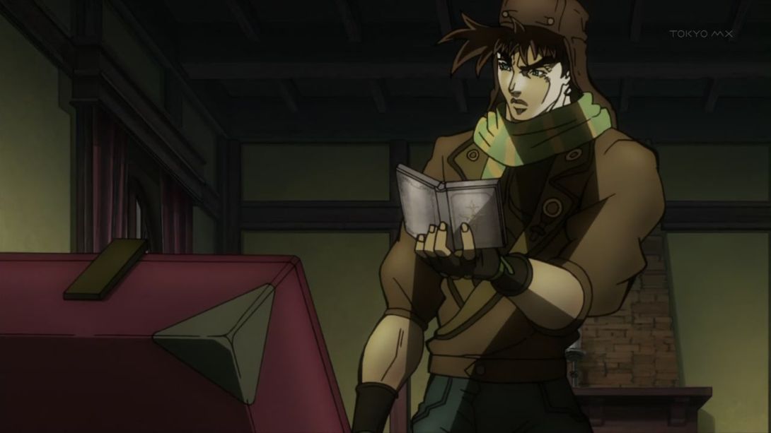
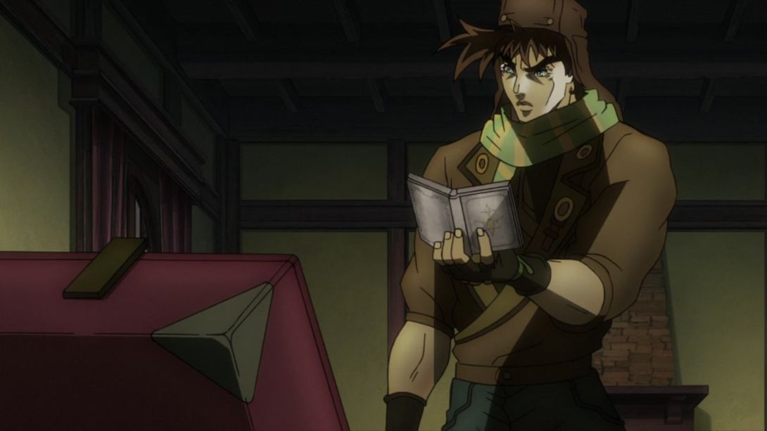
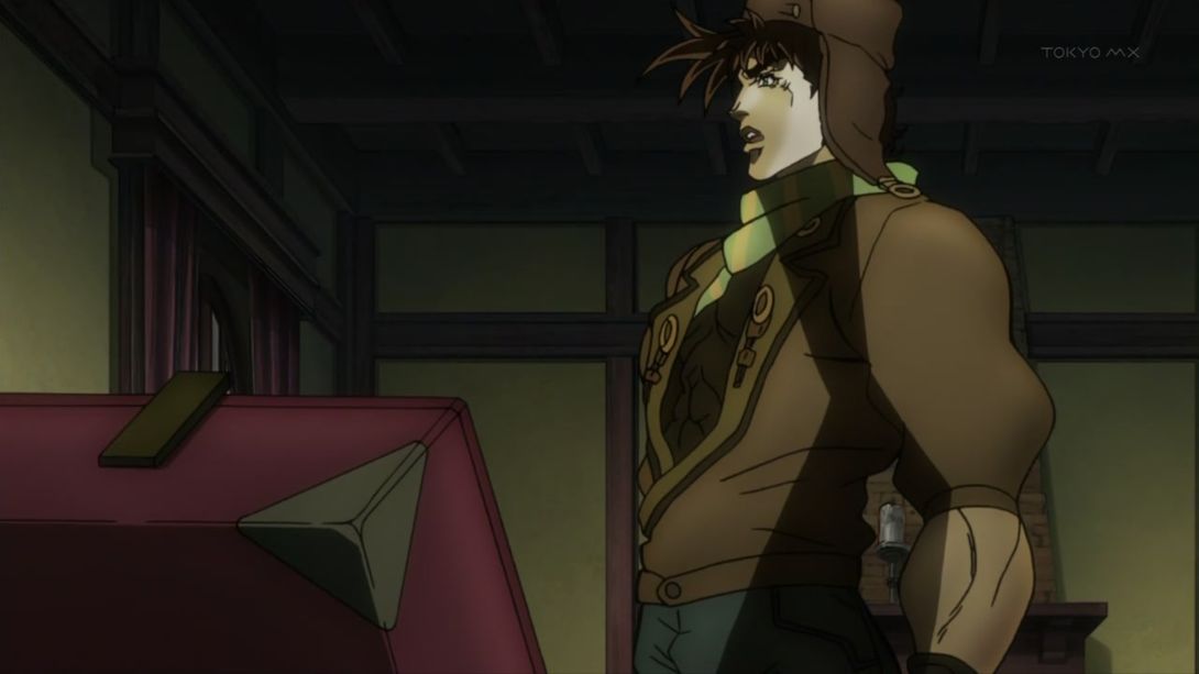
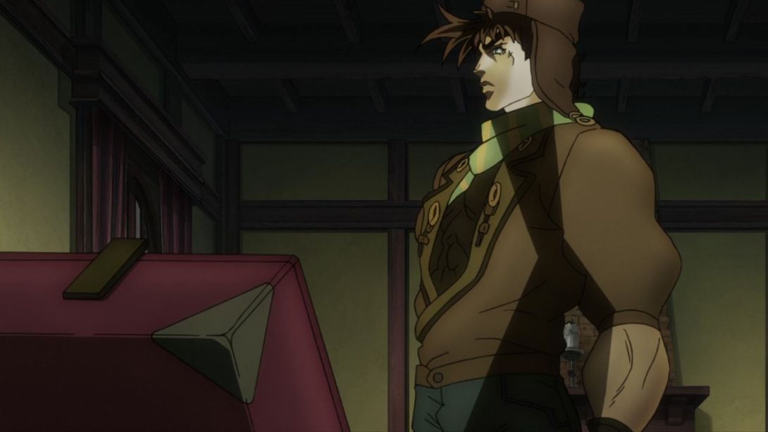
- Everything has been moved! Everything has been redrawn! The lines are thinner!:
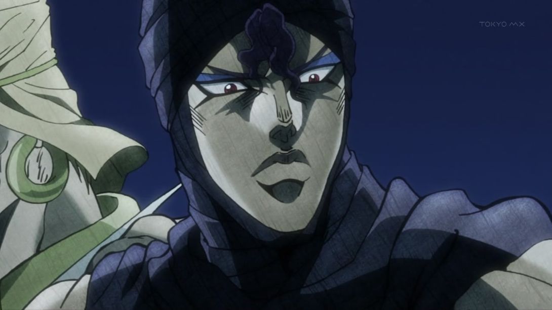
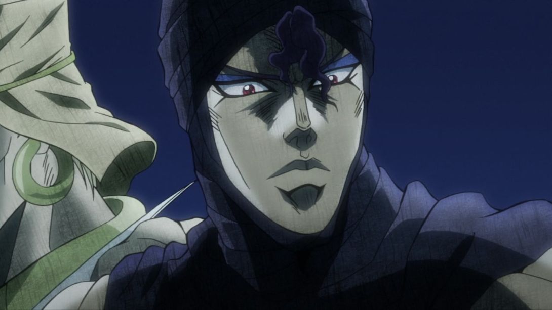
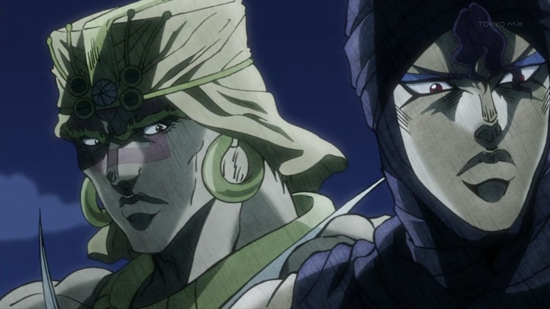
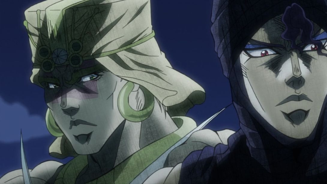
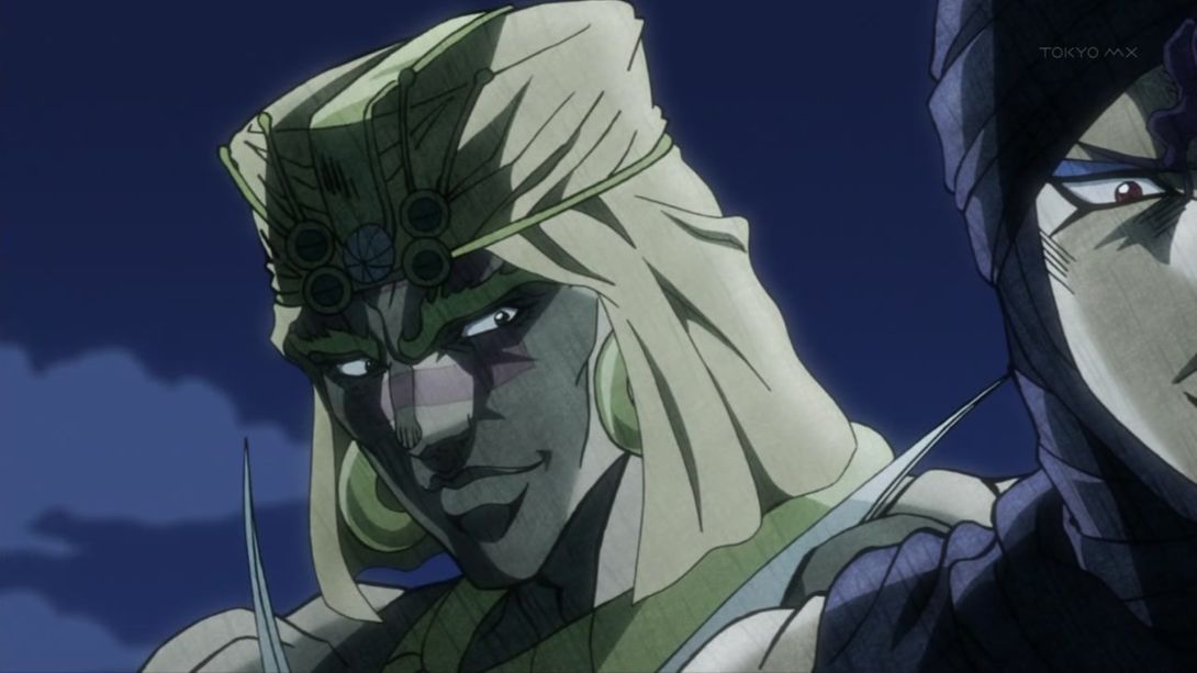
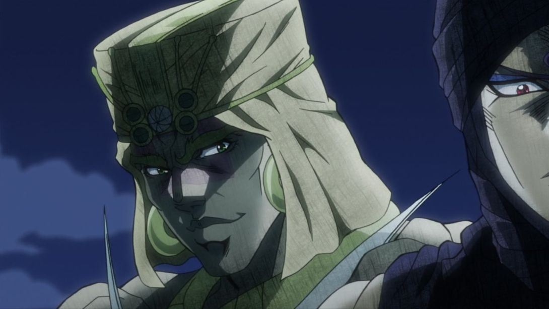
- Joseph’s nose tip and mouth have migrated south by a little bit, and his cheek line is also longer here:
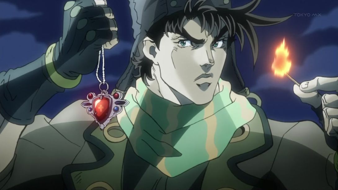
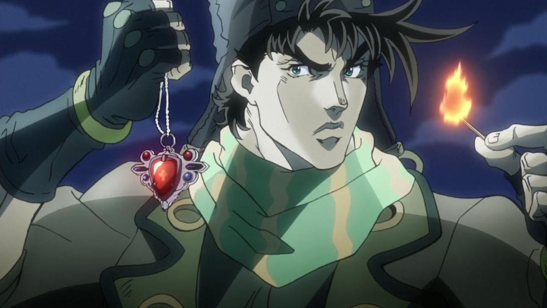
- Another Lisa Lisa redraw for your expert eyes, kind ladies and sirs:
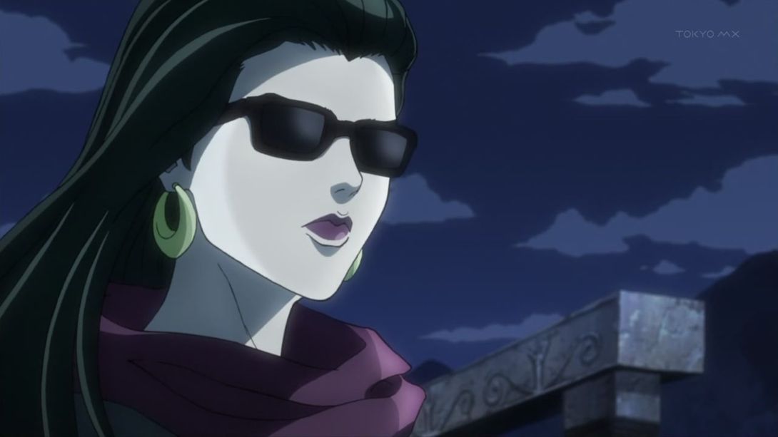
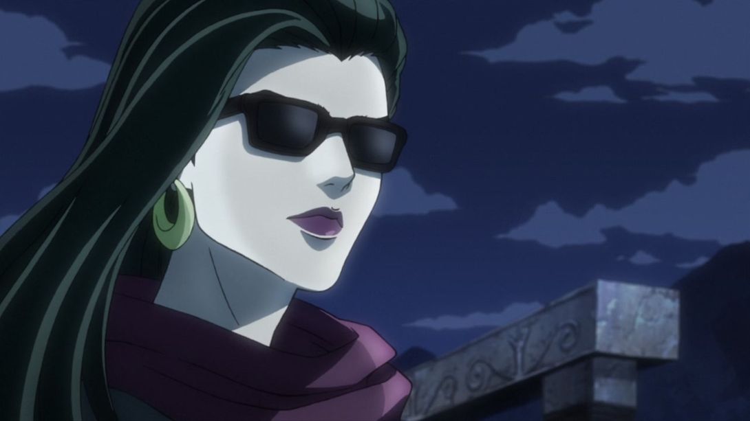
- The colours are looking a little brighter here…:
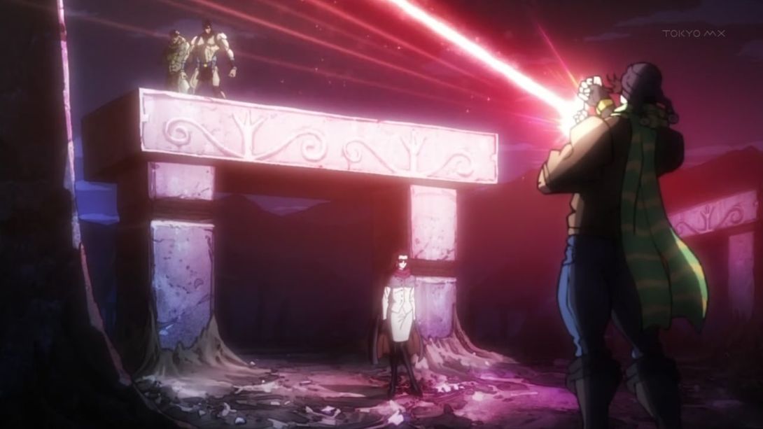
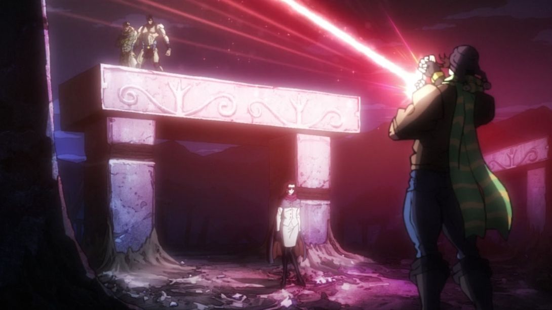
- Lisa Lisa has been redrawn here too, and she’s taller to boot:
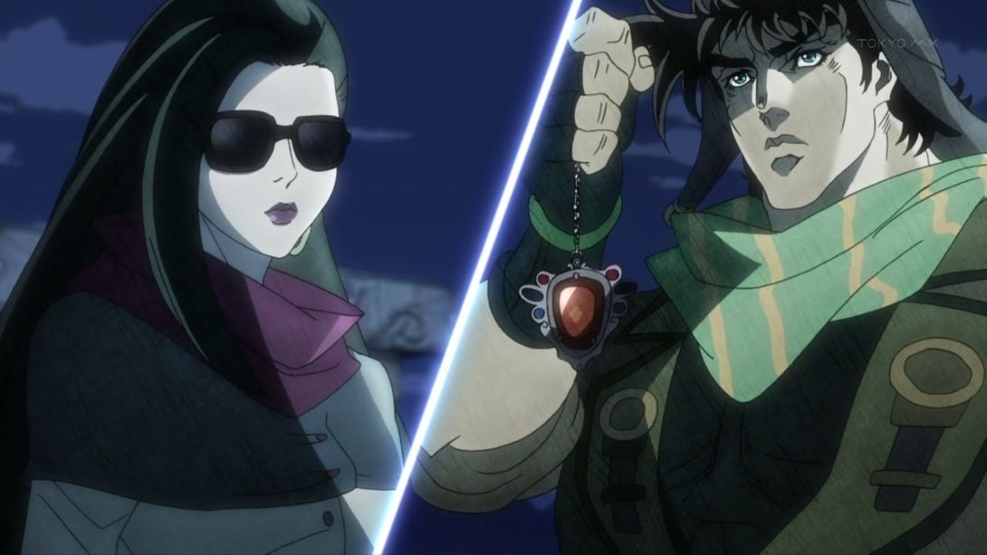
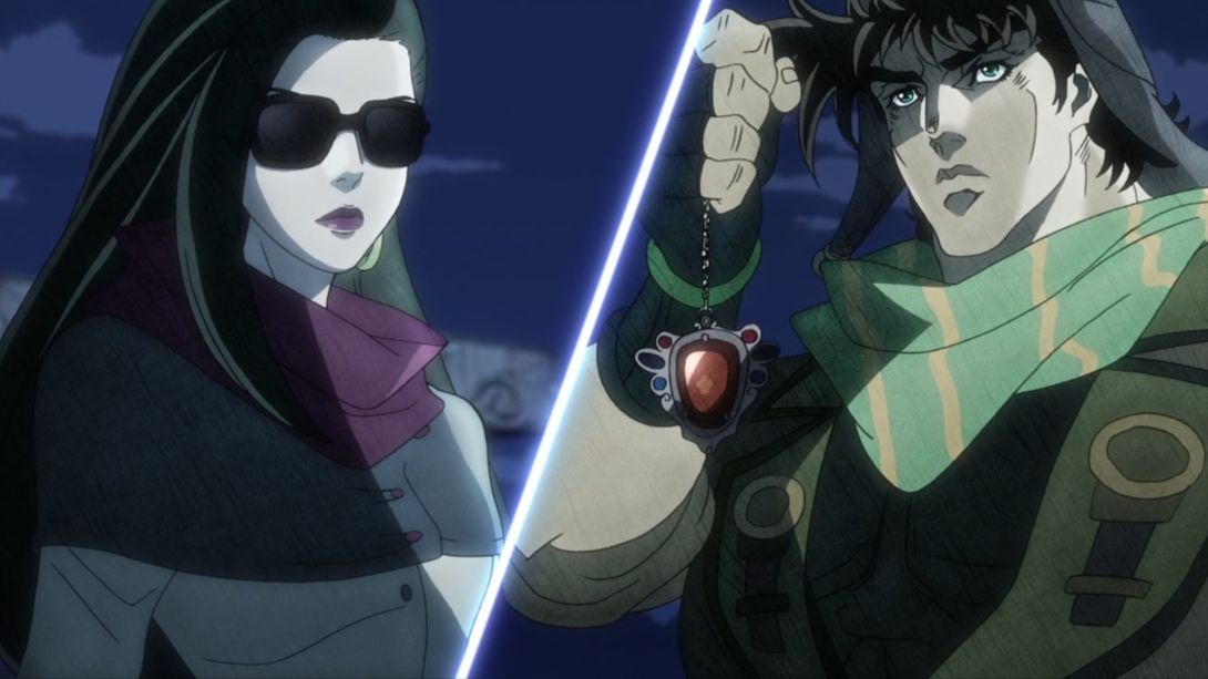
- Here, the camera has been moved up a little bit, both hands have been recoloured and reshaded, and the Super Aja stone has also been retouched:
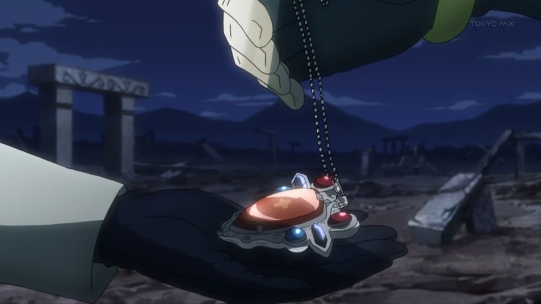
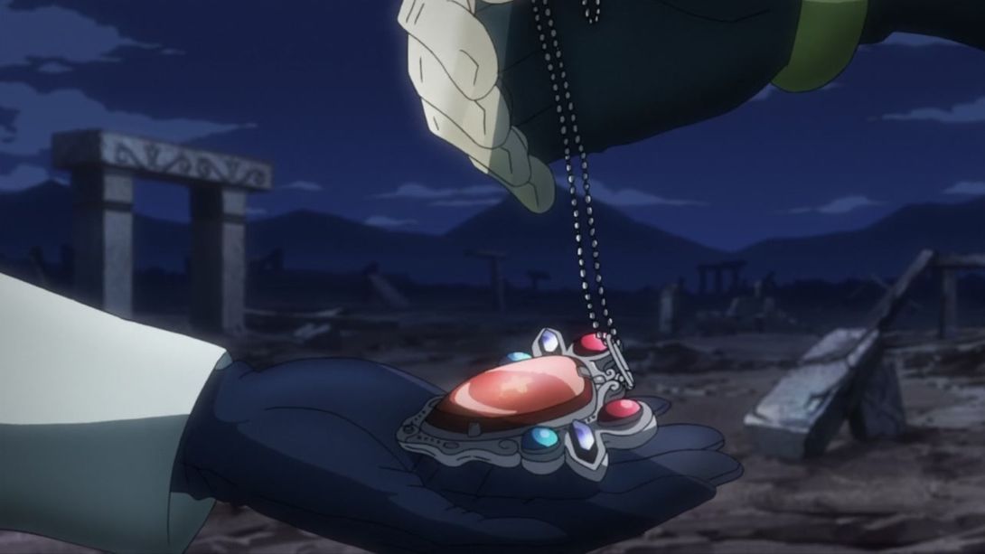
- And the book/picture album actually pushes Lisa Lisa’s hand closed, in the BDs:
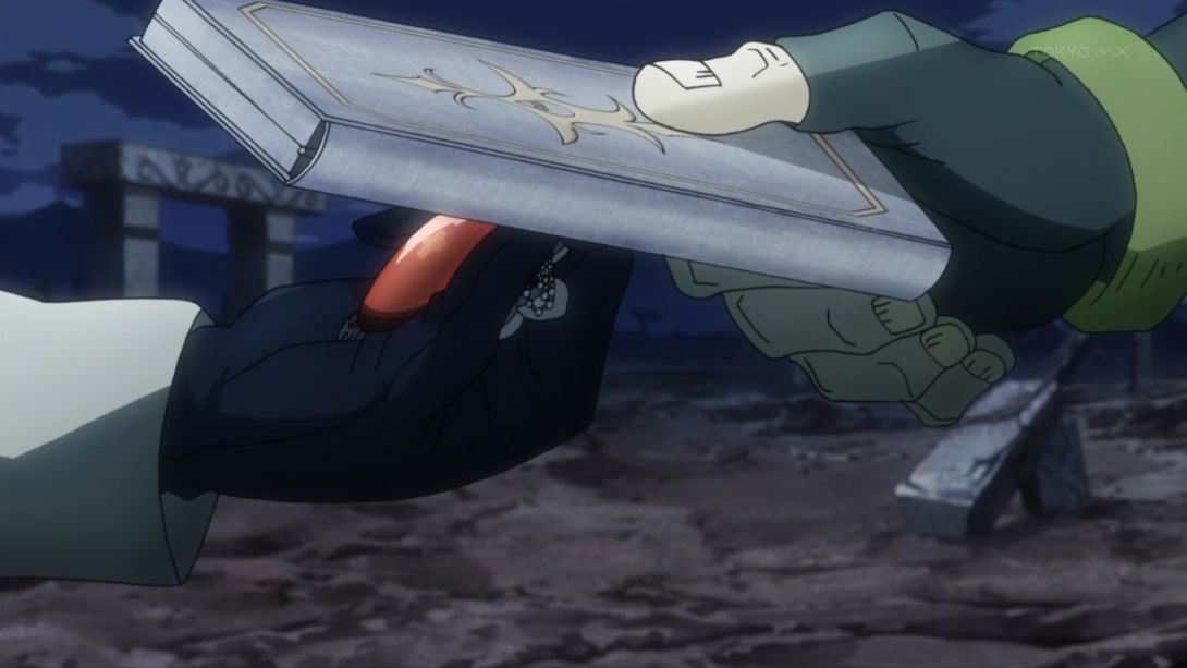
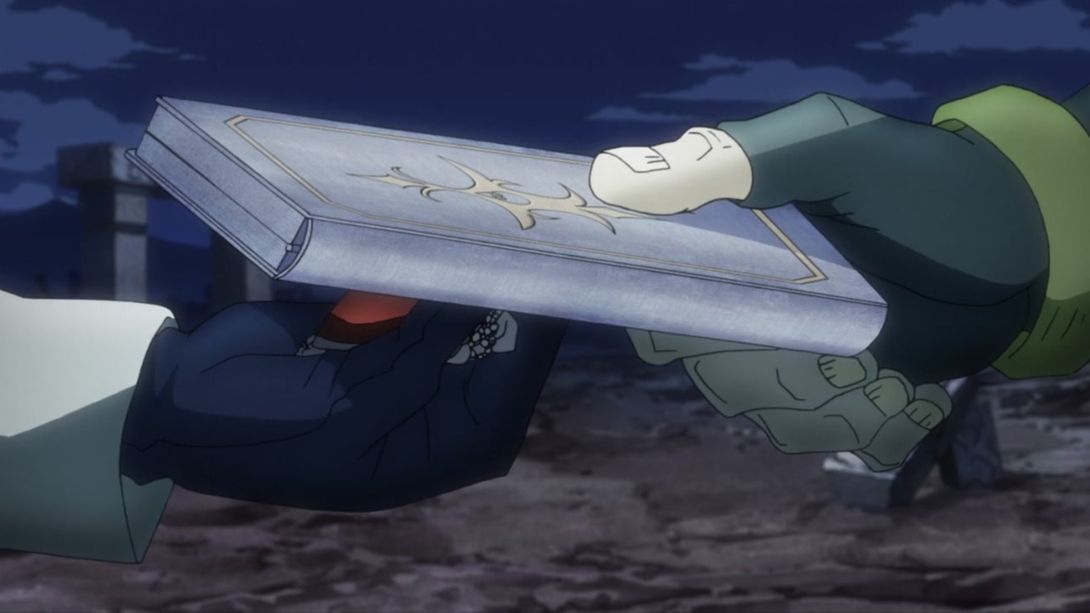
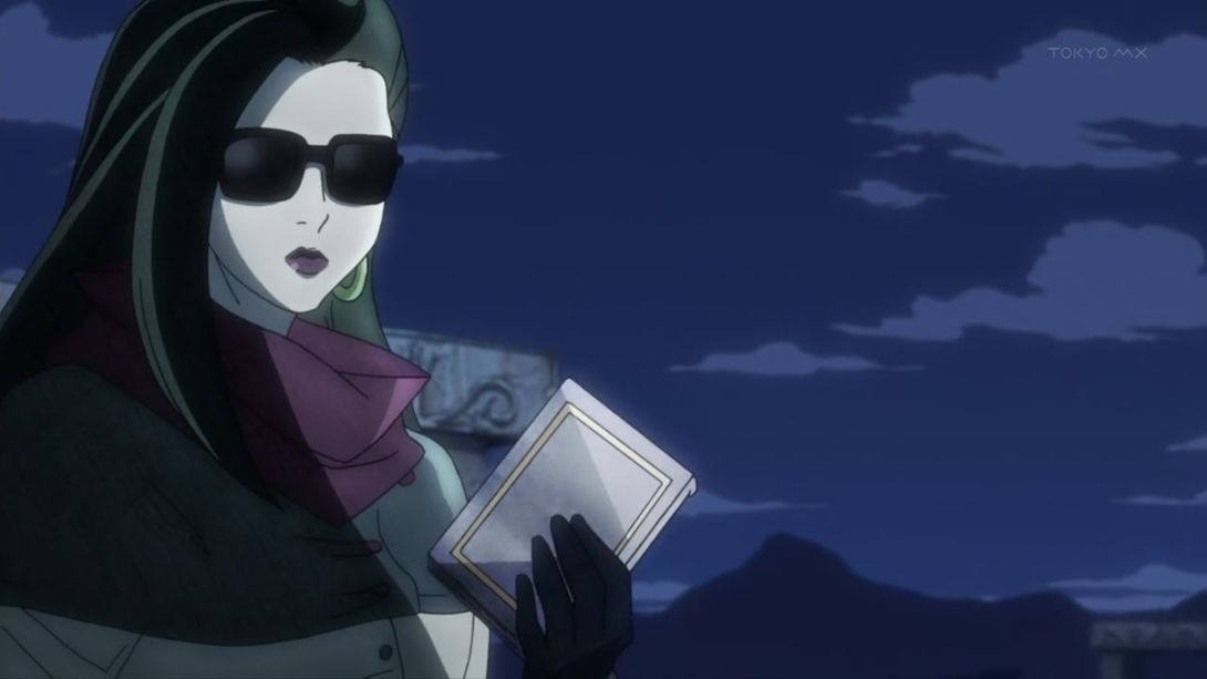
- Lisa Lisa has been redrawn prettier and taller here once again:
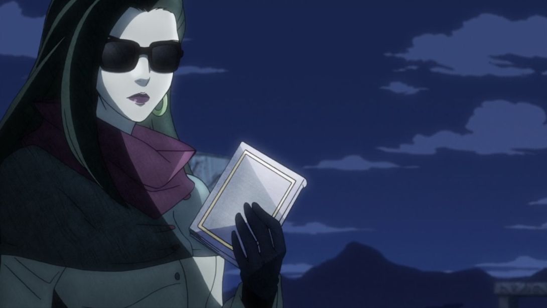
- Joseph’s forehead shadow is darker here, and his hair has a more interesting shading going on:
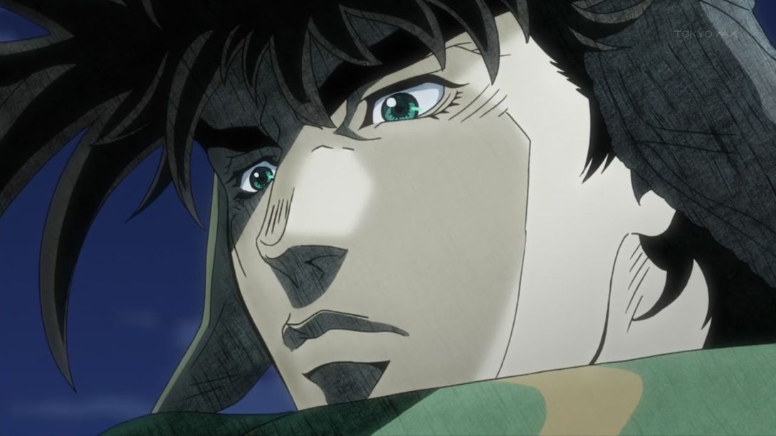
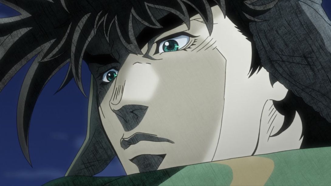
- Have some more Lisa Lisa, who is now… Holding the book in a very strange manner (from the second frame on):
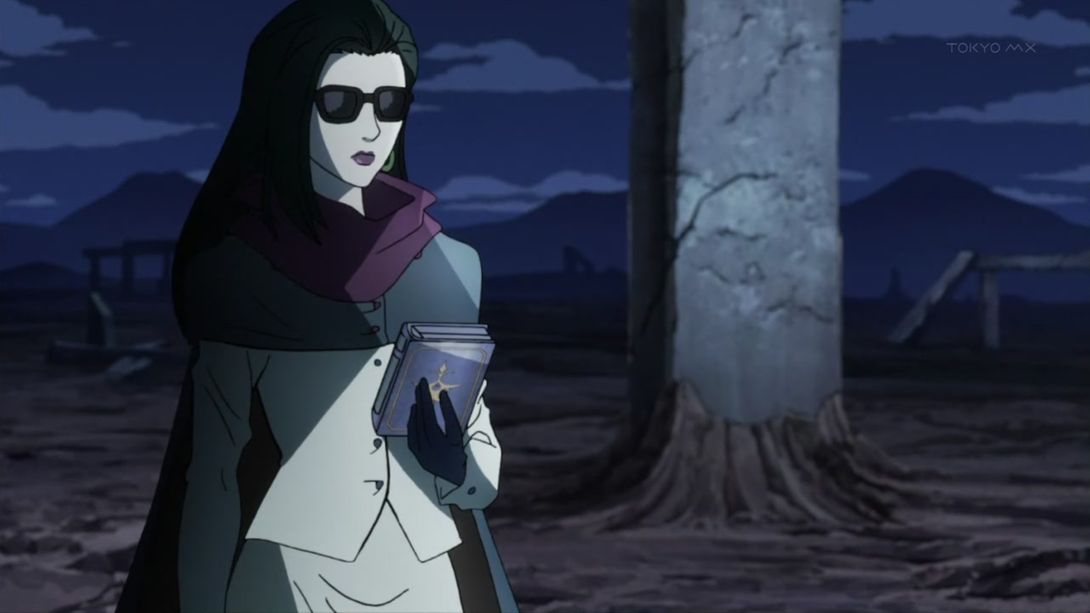
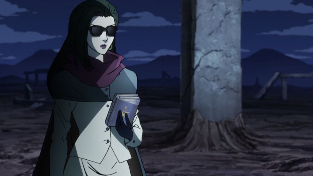
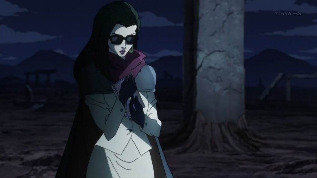
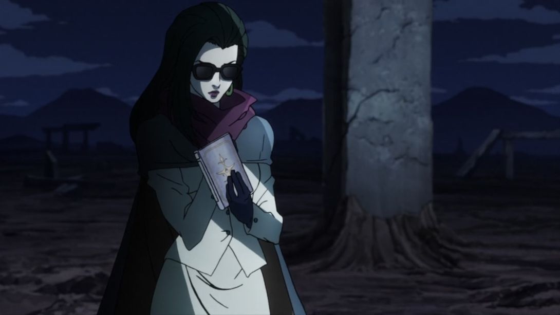
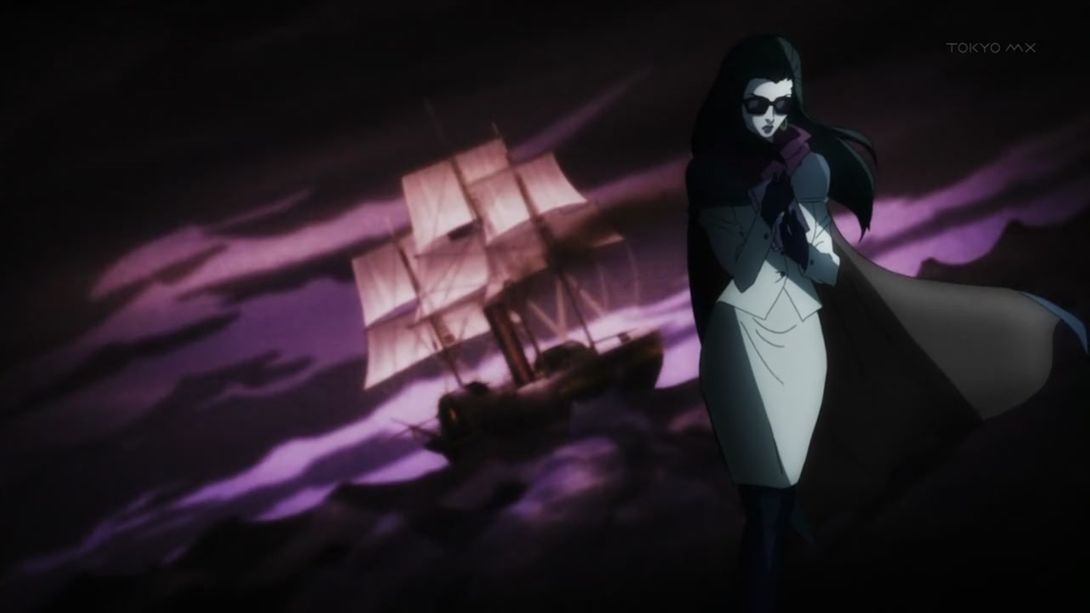
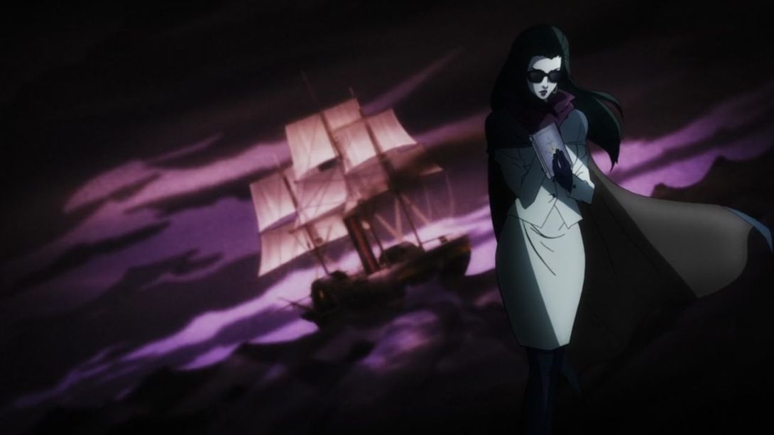
- HAVE SOME MORE LISA LISA I SAID:
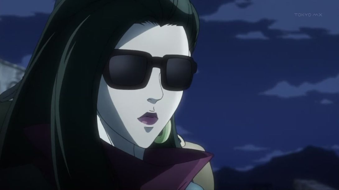
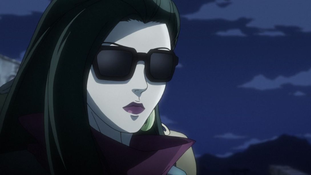
- This fire is a little brighter…:
- …While this one is completely different:
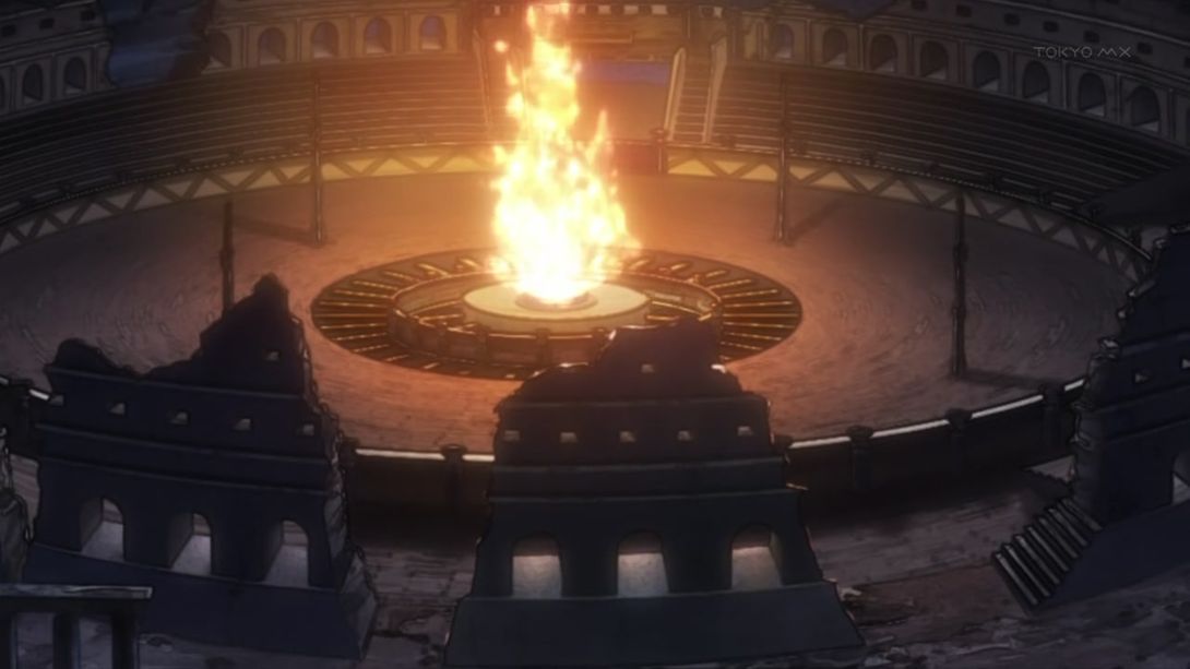
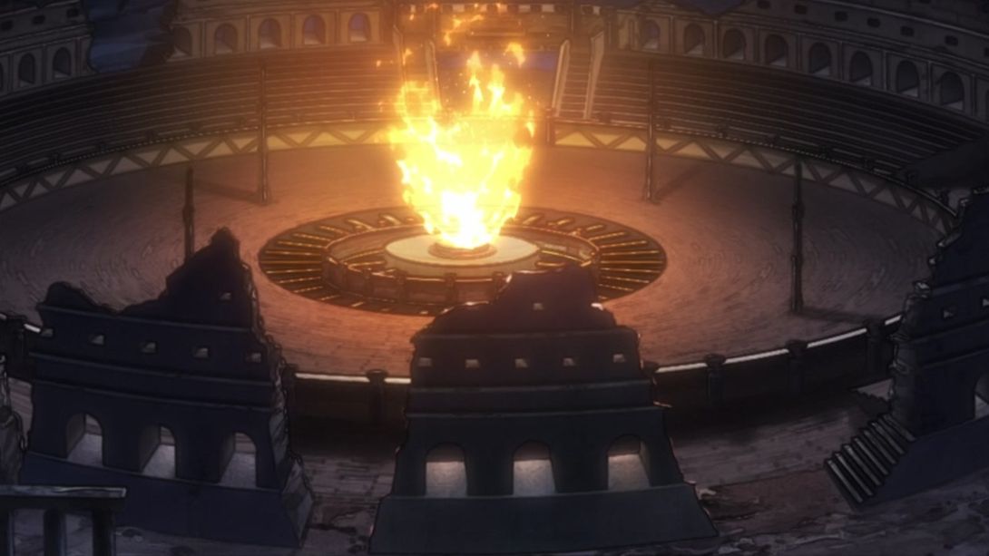
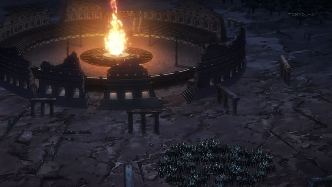
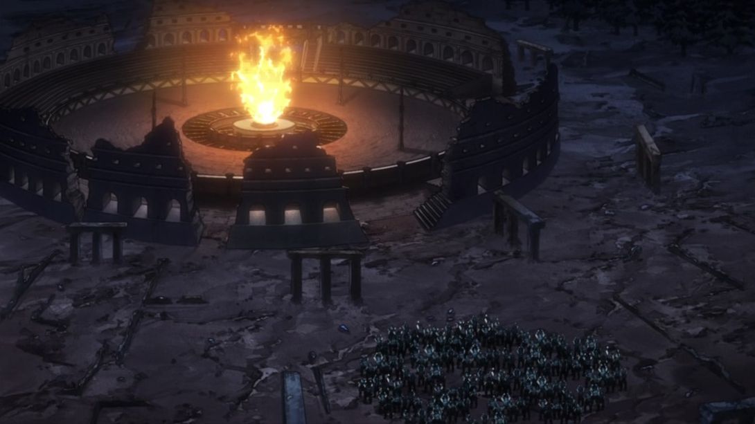
- Both Lisa Lisa and Joseph have been retouched here:
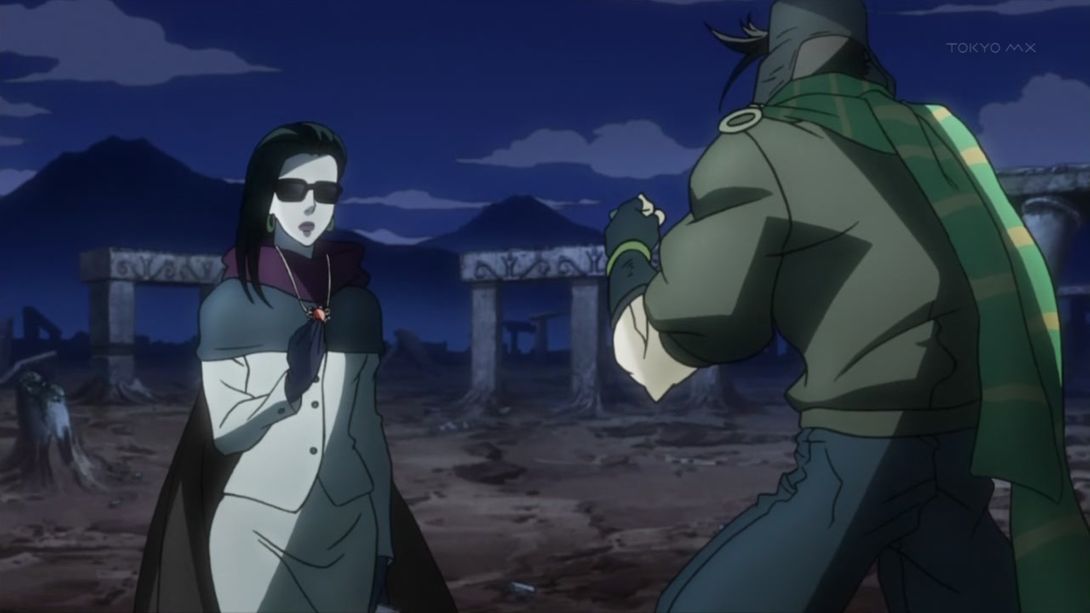
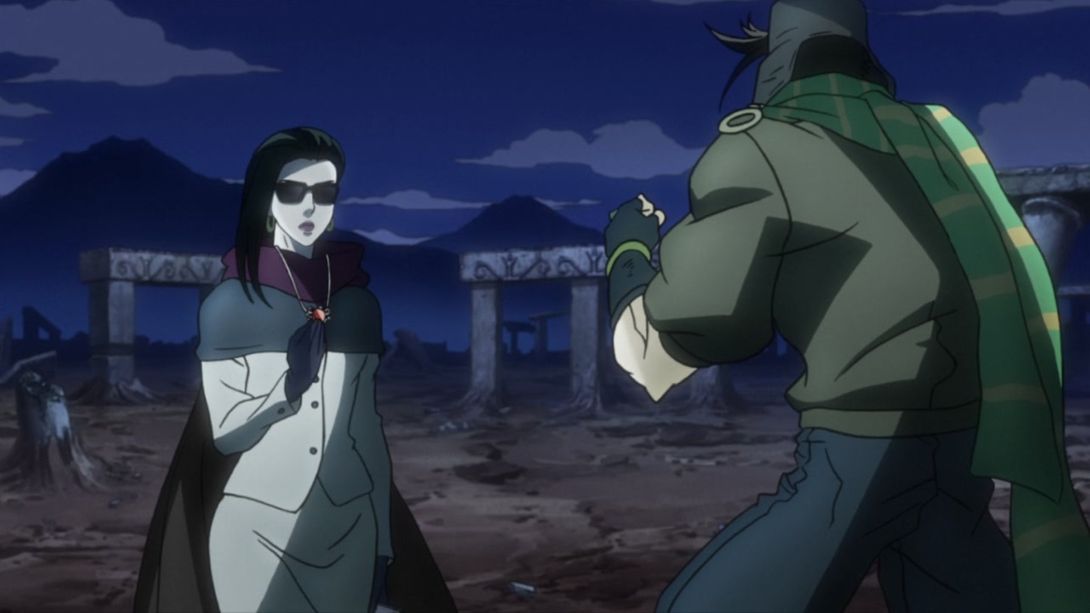
- L I S A L I S A:
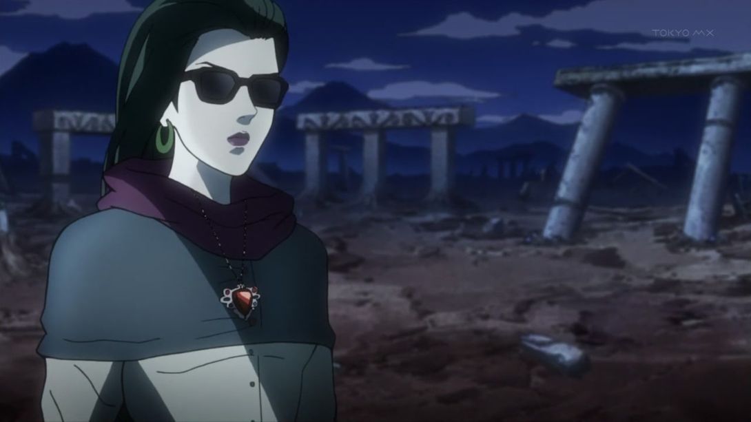
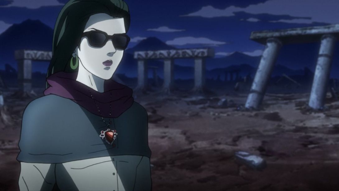
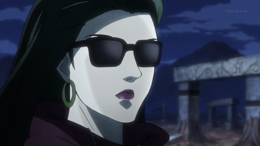

- And another wildly redrawn scene! I love these:
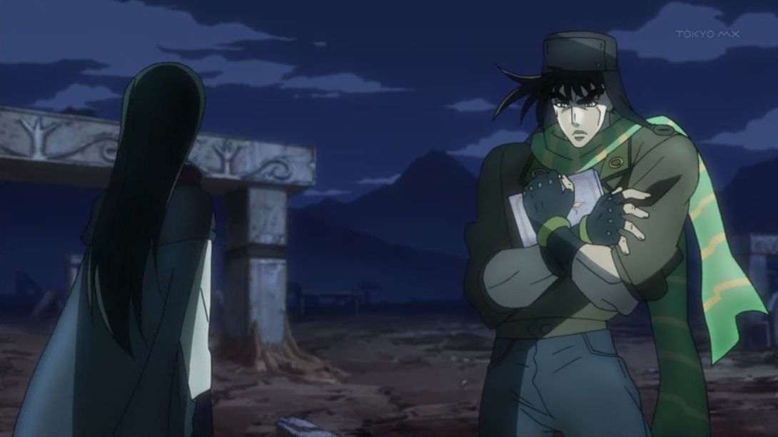
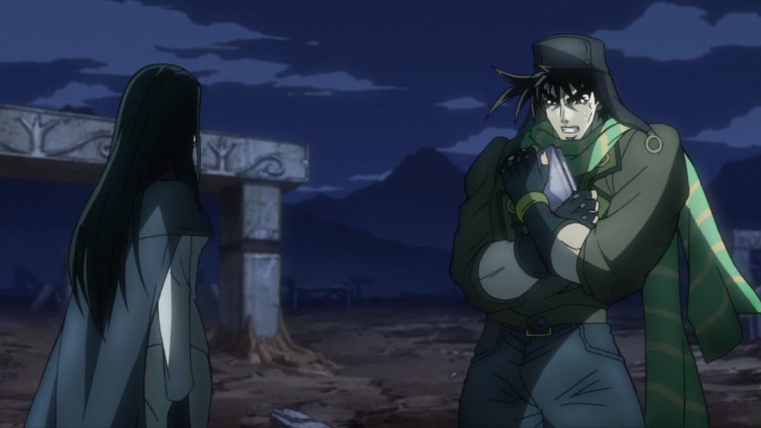
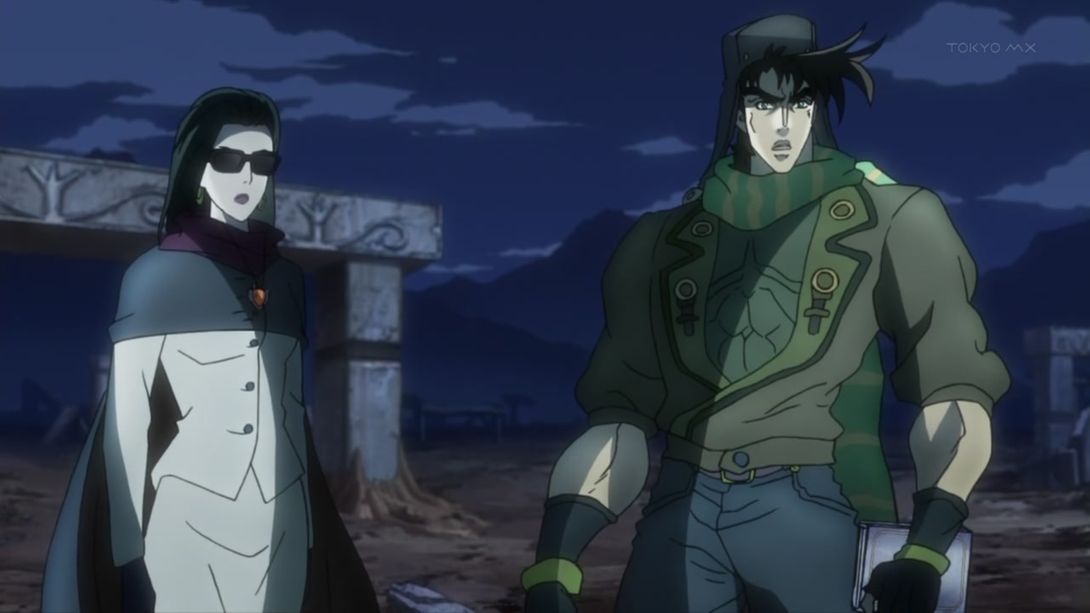
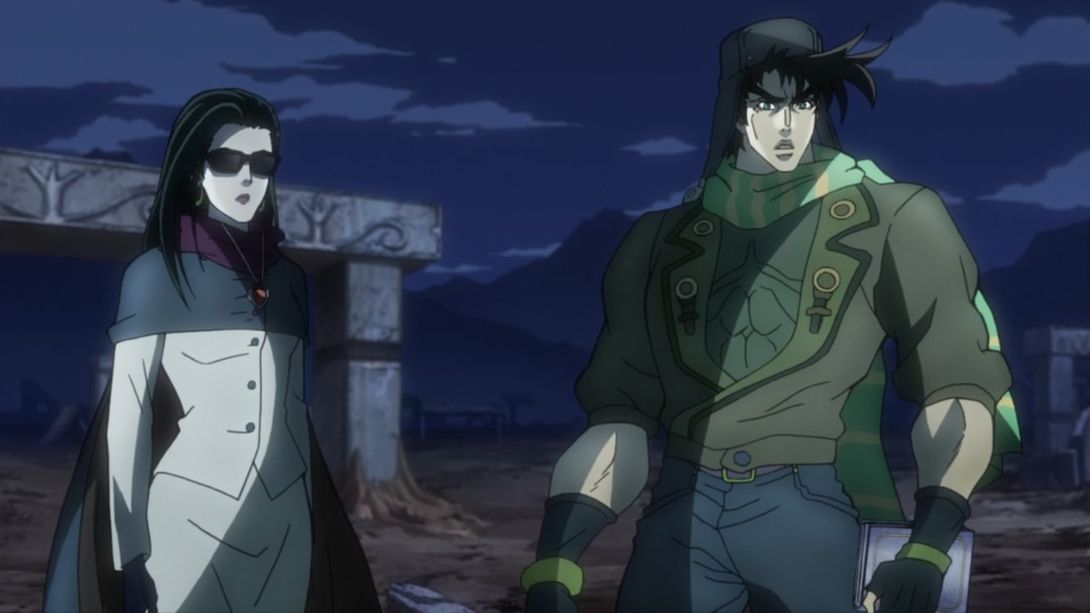
- And again here:
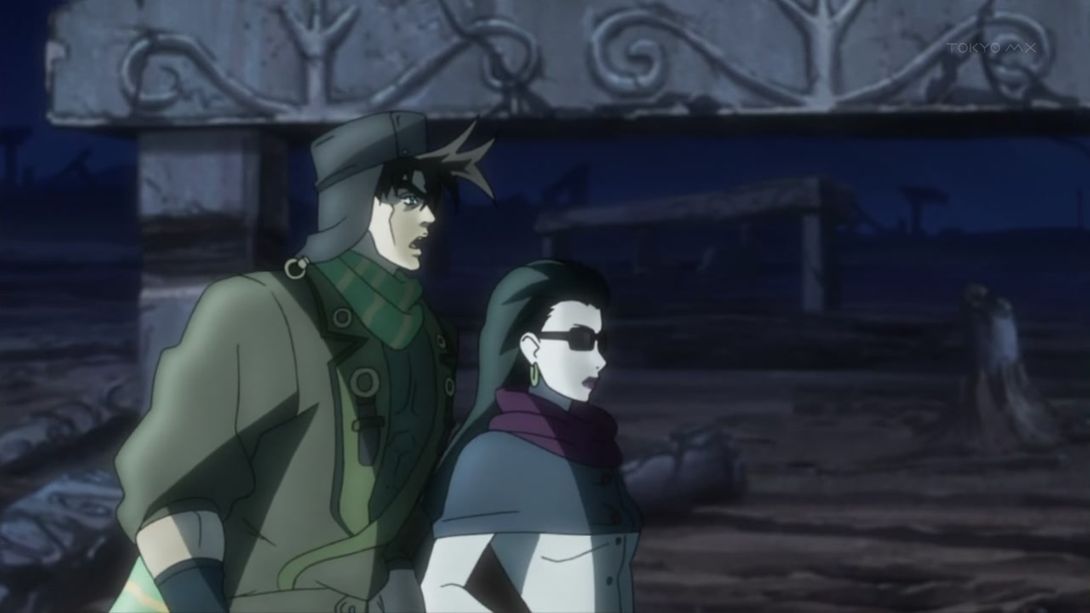
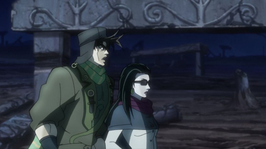
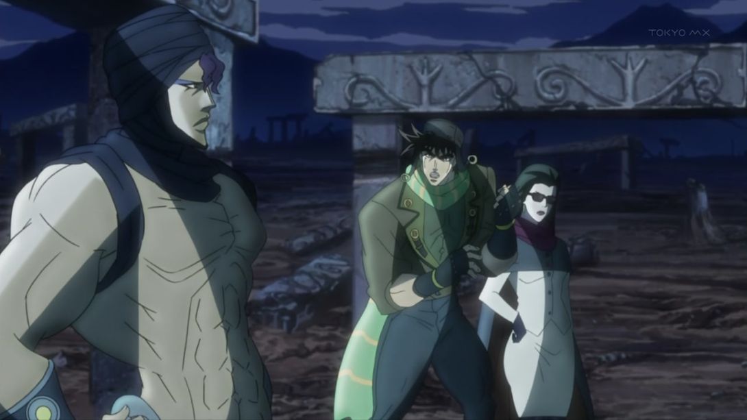
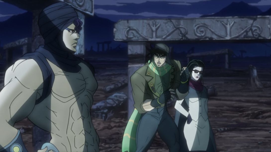
- Kars has been redrawn here, and when Wham shows up, there’s a slightly darker shading at the bottom of the frame:
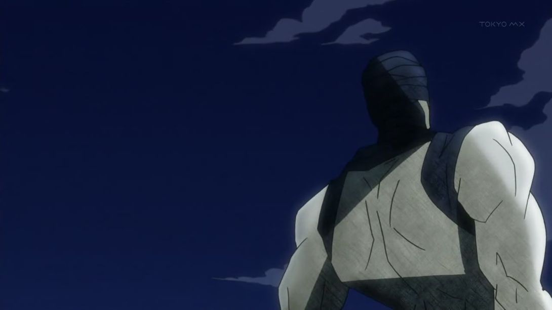
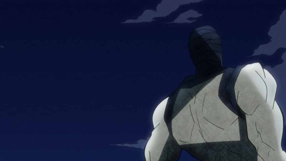
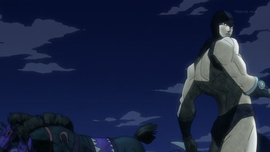
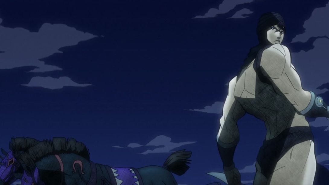
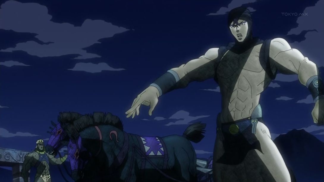
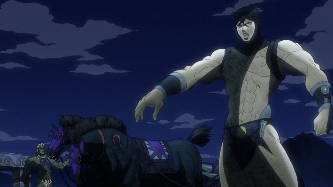
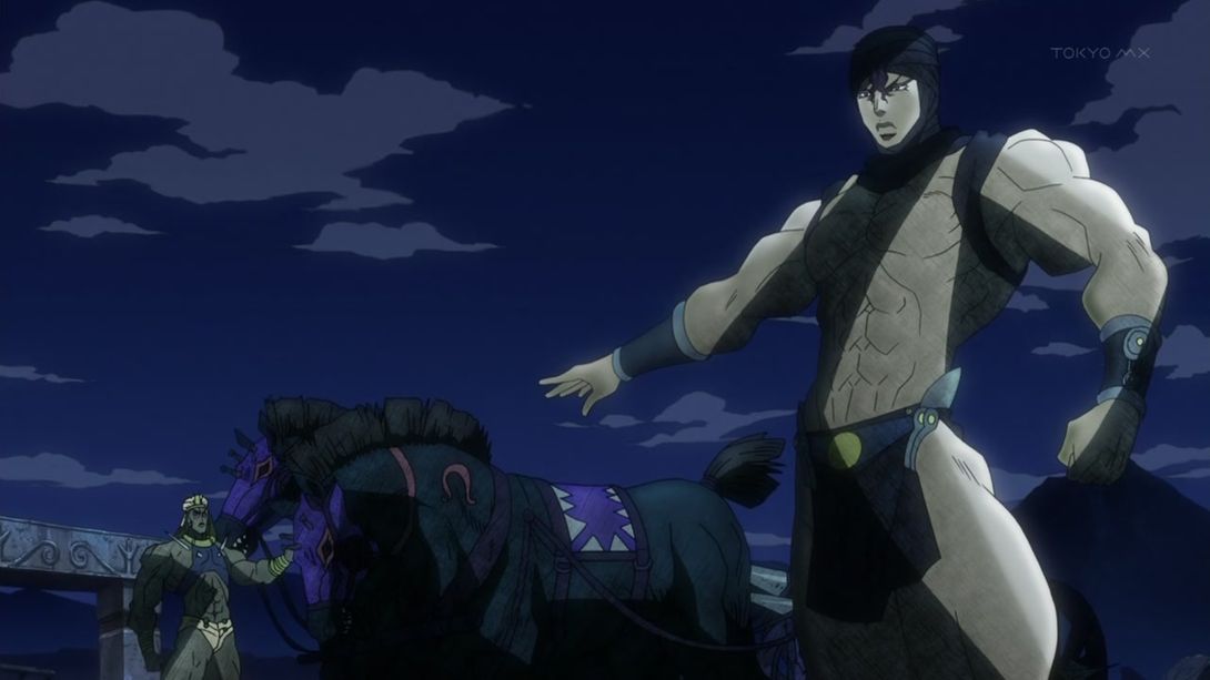
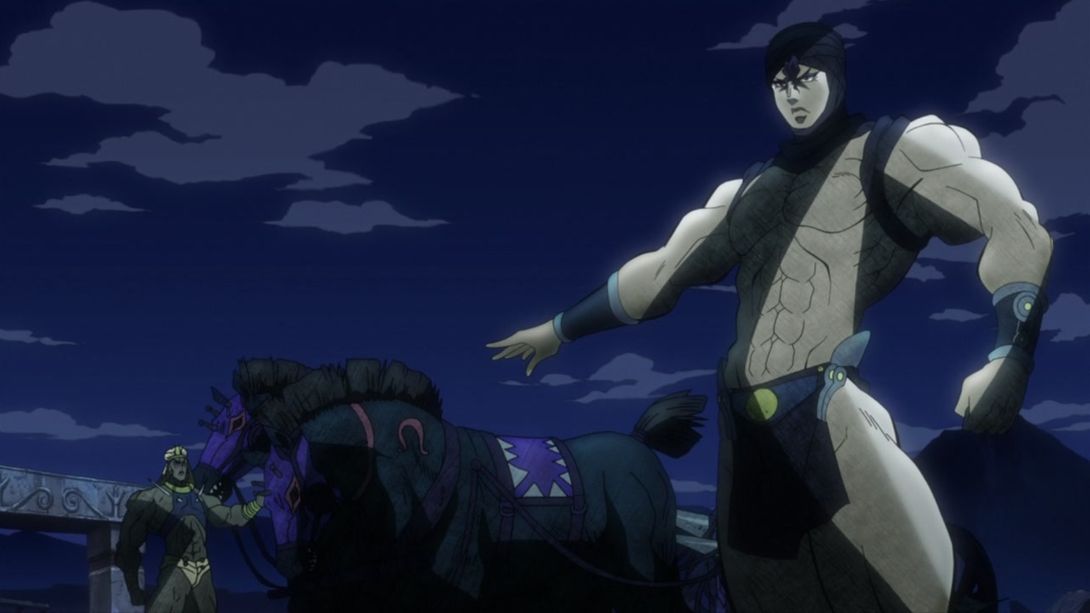
- Here all the fires are different, all the vampires have better colours and there’s more of a distortion around the edges of the frame:
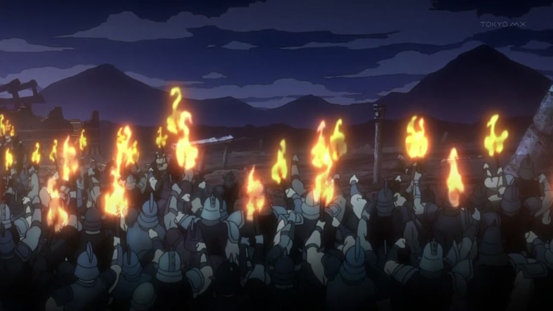
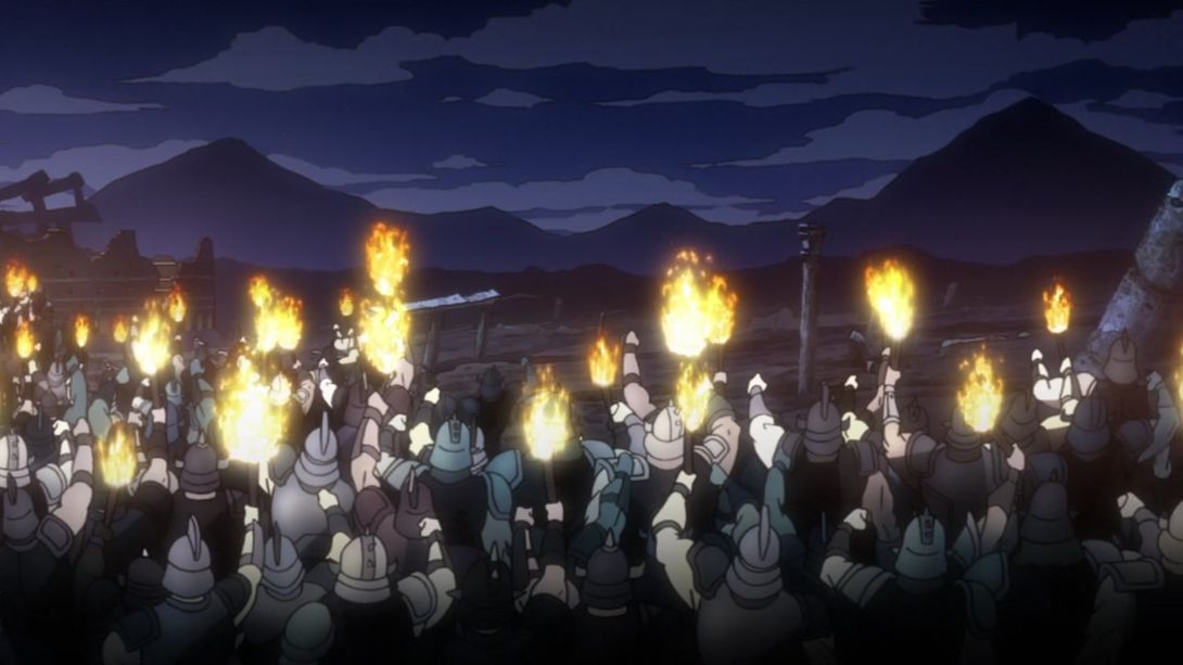
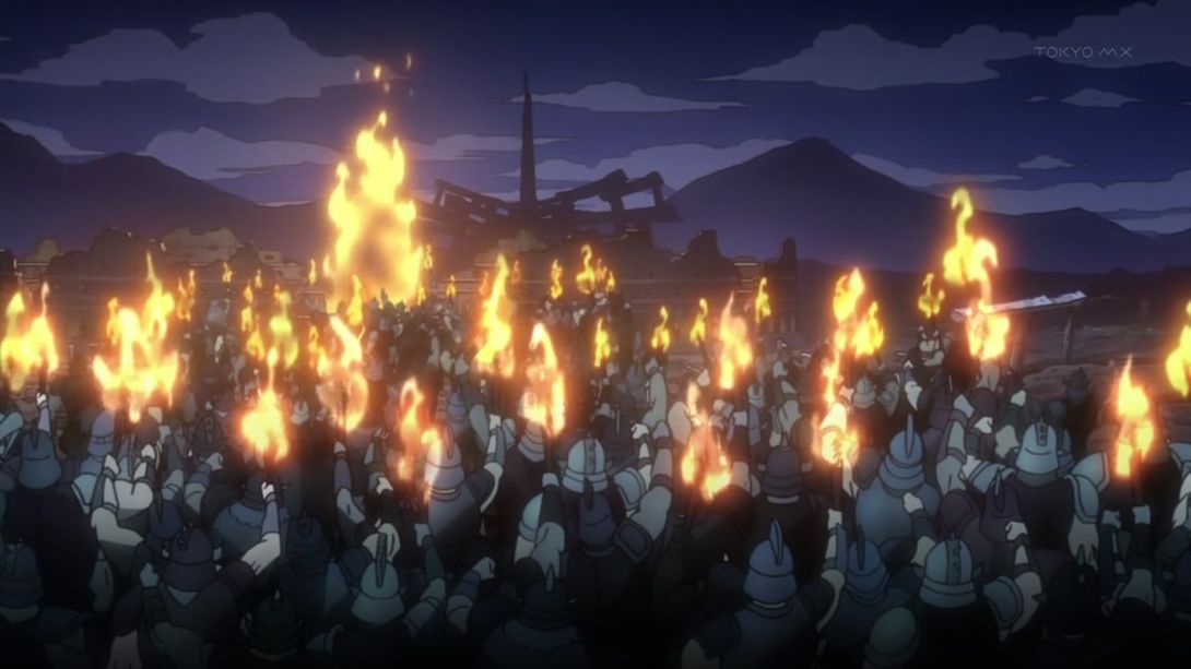
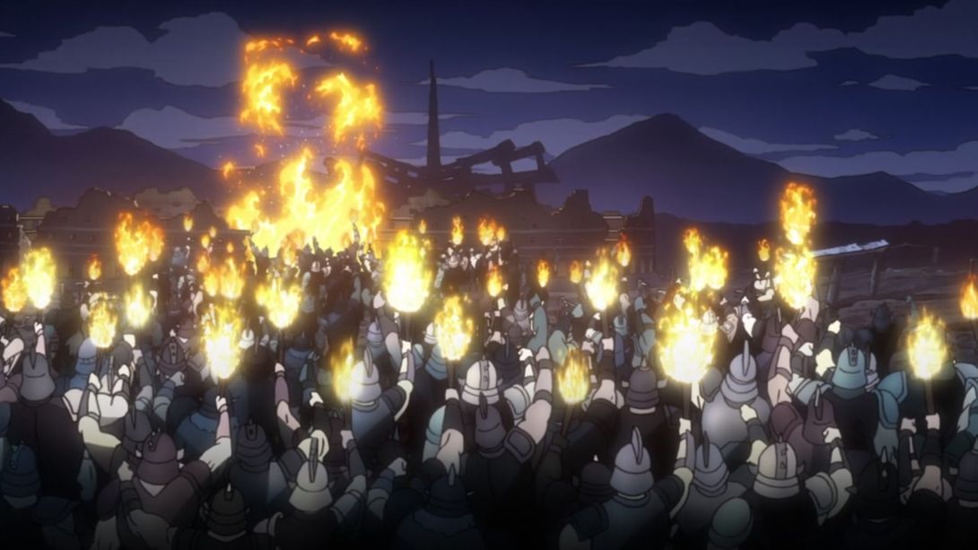
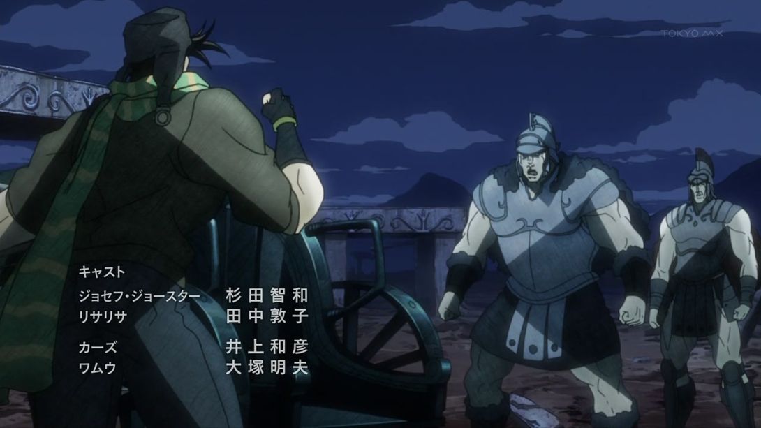
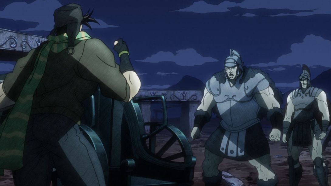
- And, for today’s last difference, the credits have been removed to this episode too, because… You guessed it! The BDs have added the regular ending at the end of the episode:
Whew! And with that, today’s comparison comes to a close. Thank you all for taking some time out of your days to visit this silly blog! I hope you enjoyed it, and I’ll see you all next time for the first part of the showdown against Wham, Battle Tendency #22 - A True Warrior!
Bye!
P.S.: IT’S ALMOST VENTO AUREO DAY BOIS

