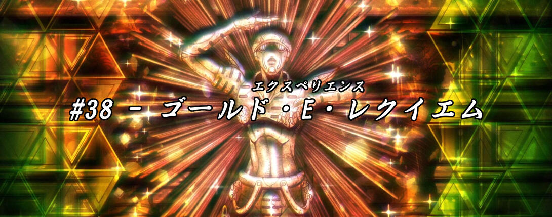
What is up my good fellas? Welcome back to this here fine establishment for out second-to-last appointment with Vento Aureo: Episode #38, “Gold Experience Requiem”! This will be a shorter and less eventful post compared to the last couple, so grab a (smaller) snack and sit back on a (smaller, less comfortable) chair, because we’re about to plunge the (relatively shallow) depths of this comparison together, friends!
Let’s go!
- Today’s first difference is this couple of animations, now beautifully rendered in all their bright & sharp details:
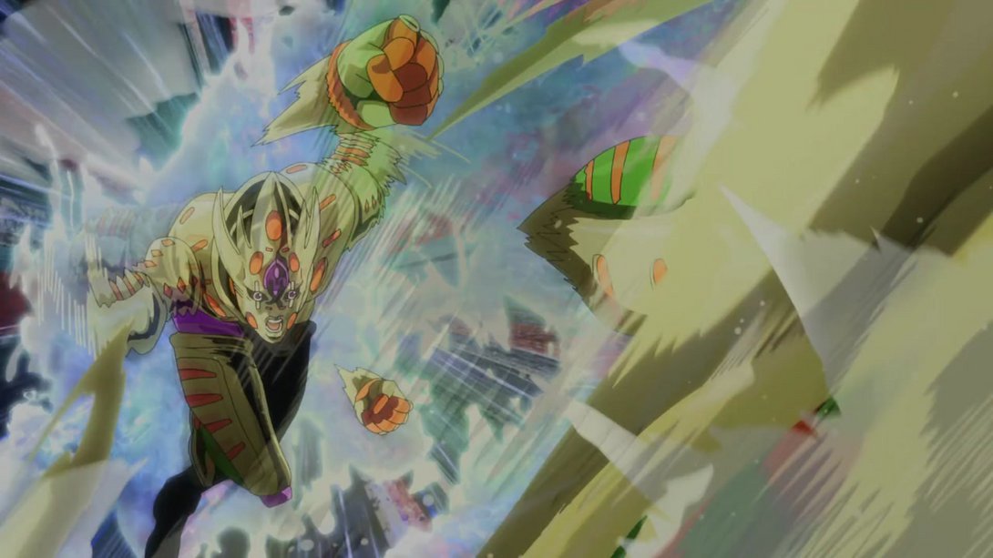
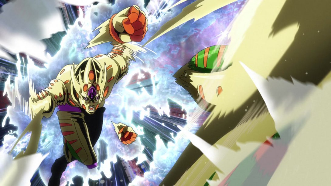
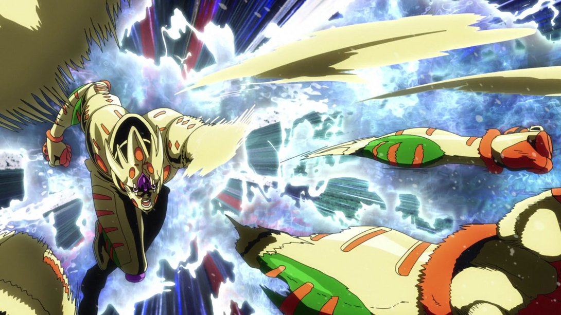
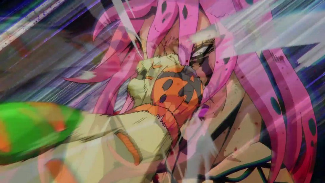
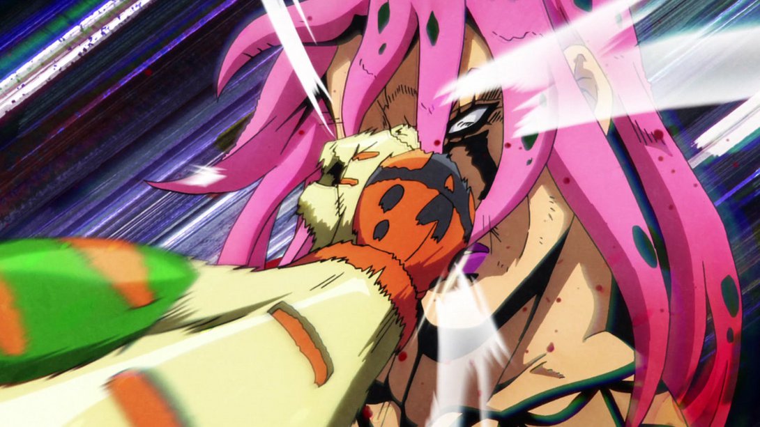
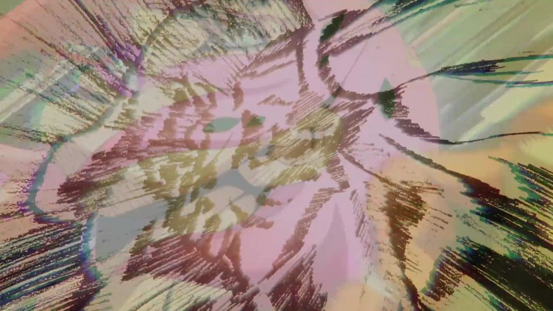
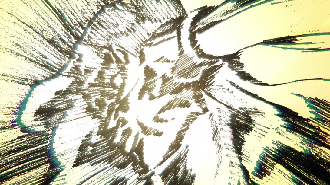
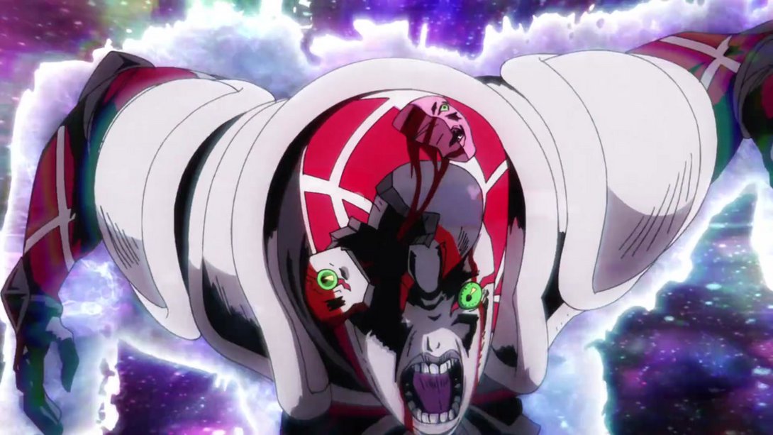
- King Crimson’s head has been retouched in some places, here…:

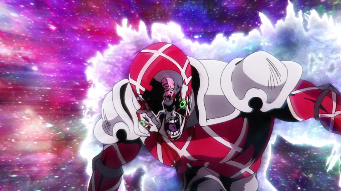
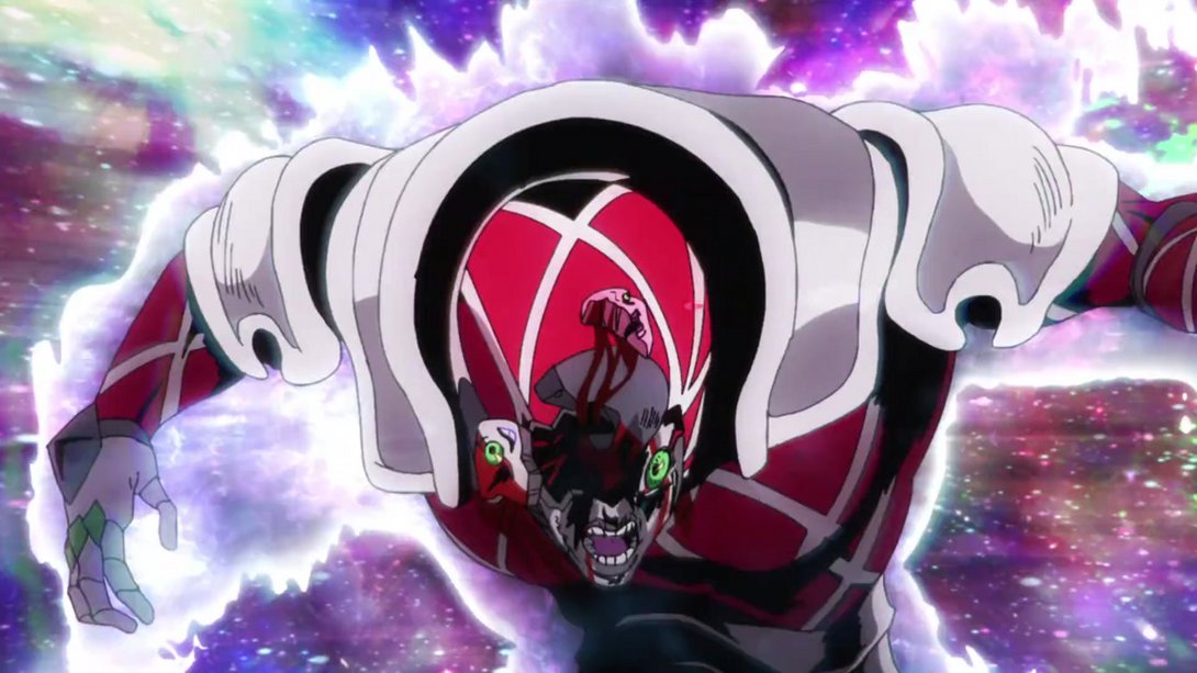
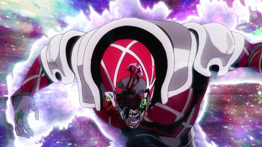

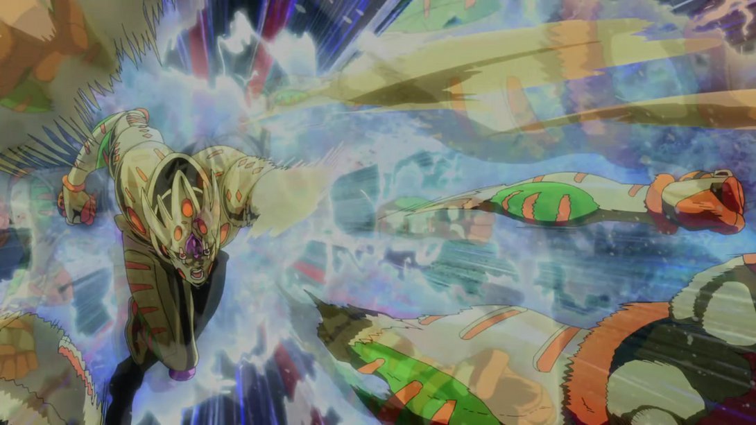
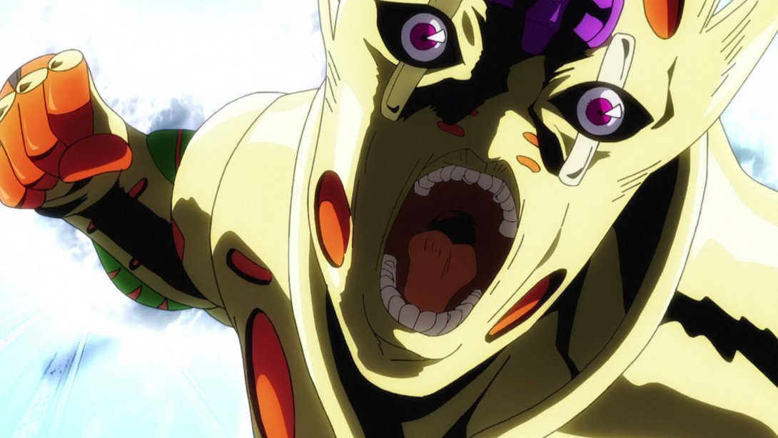
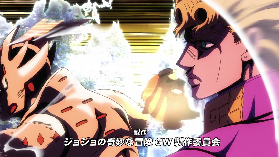
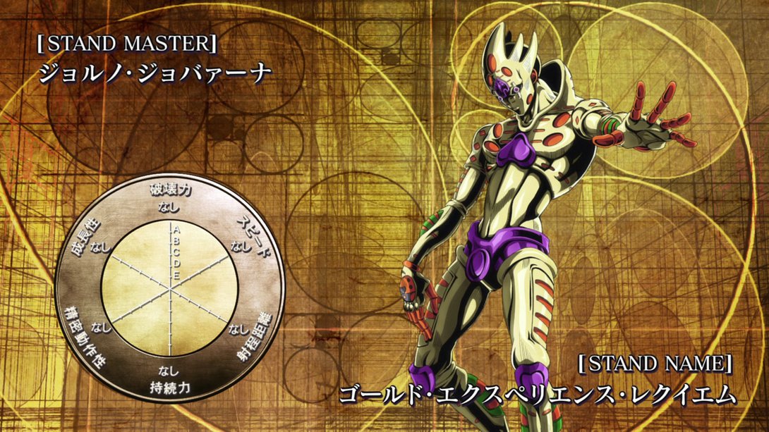
- While here it’s Gold Experience Requiem who has received a significant retouch! In addition, the background is different, there is a new distortion along the edges and its aura is also looking different in places. Forgive me the frame barrage, but there’s just A LOT to take a look at:
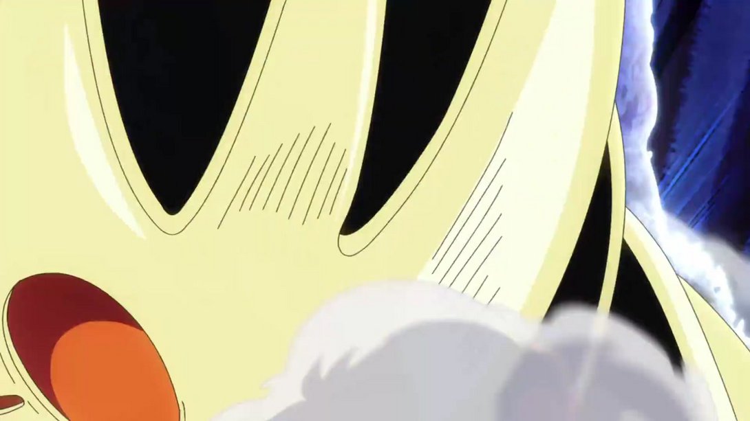
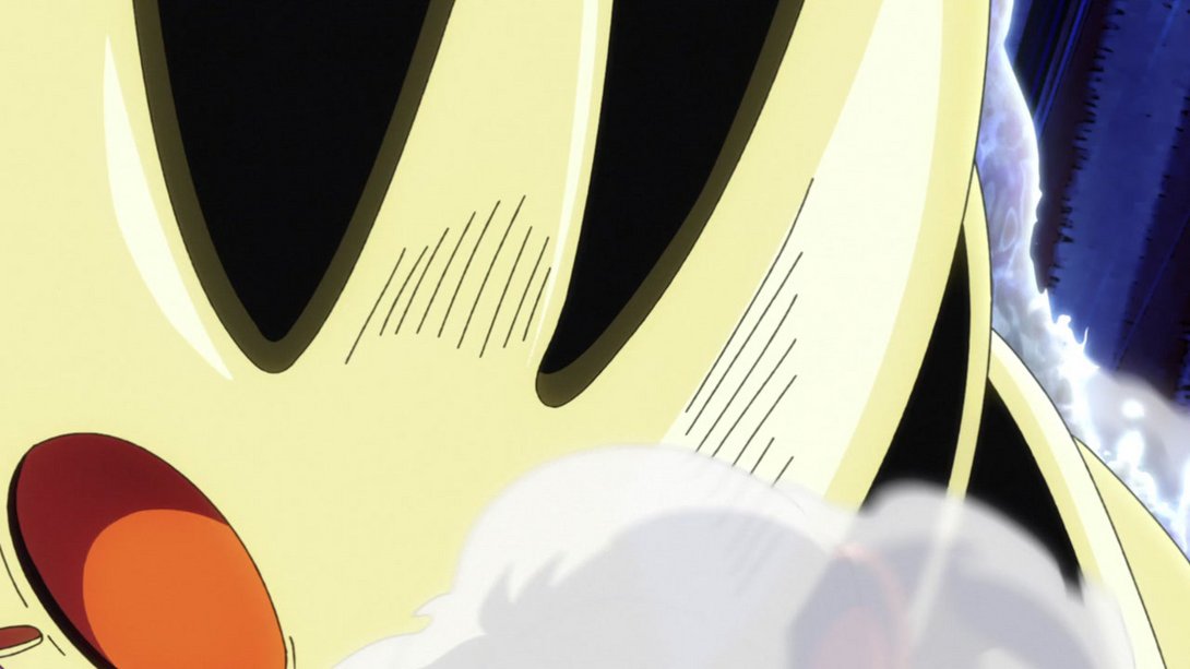
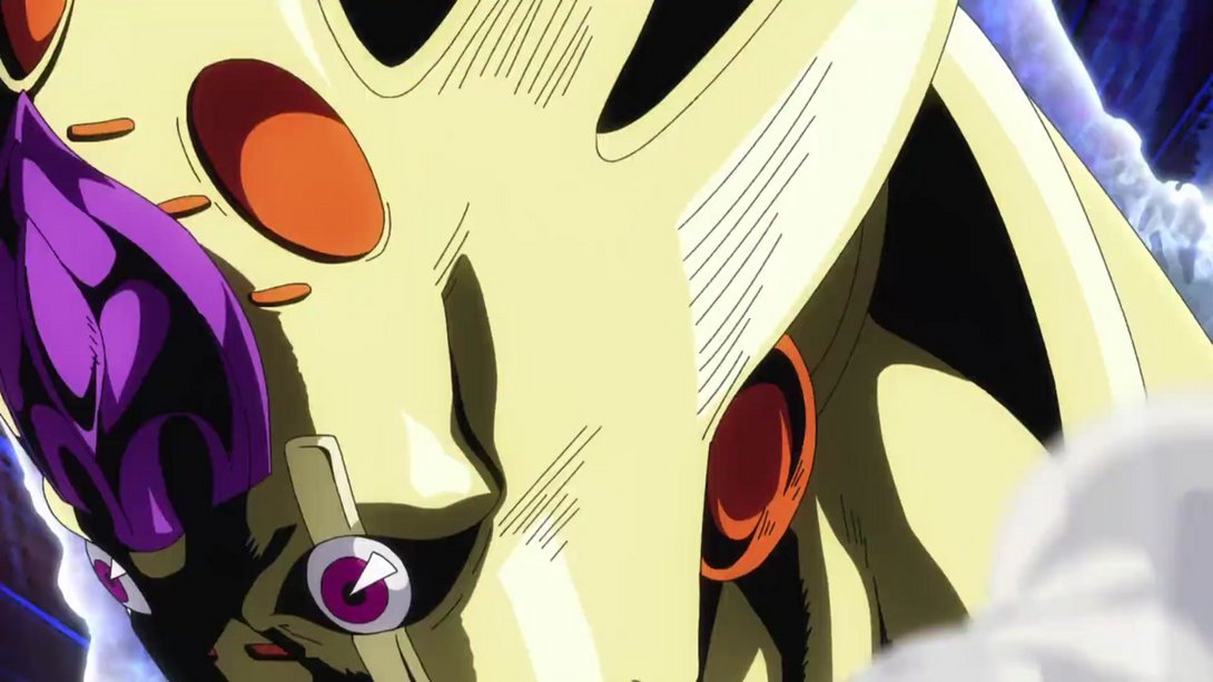
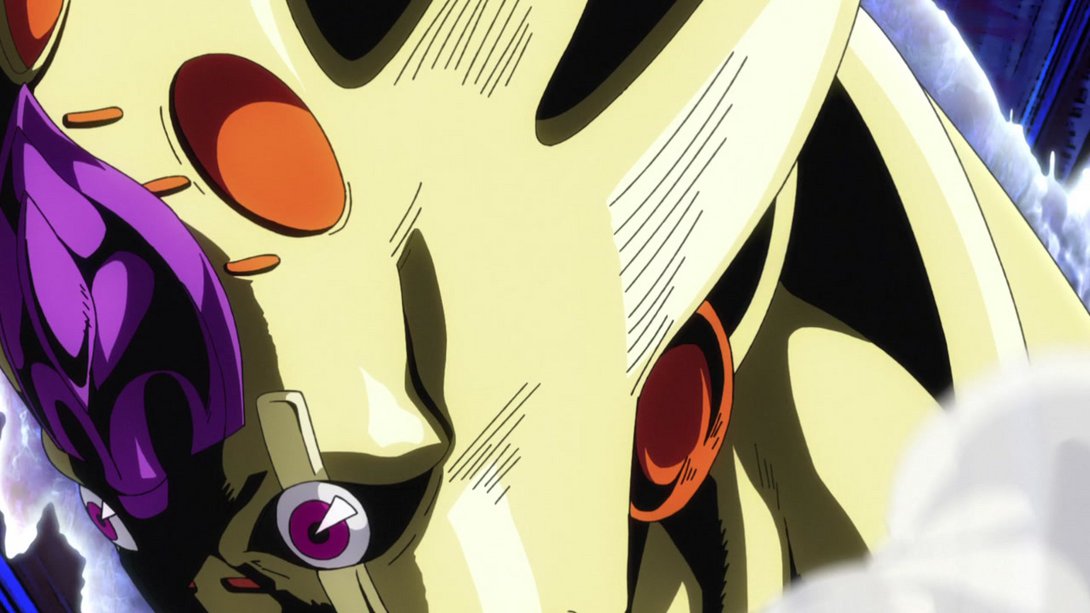
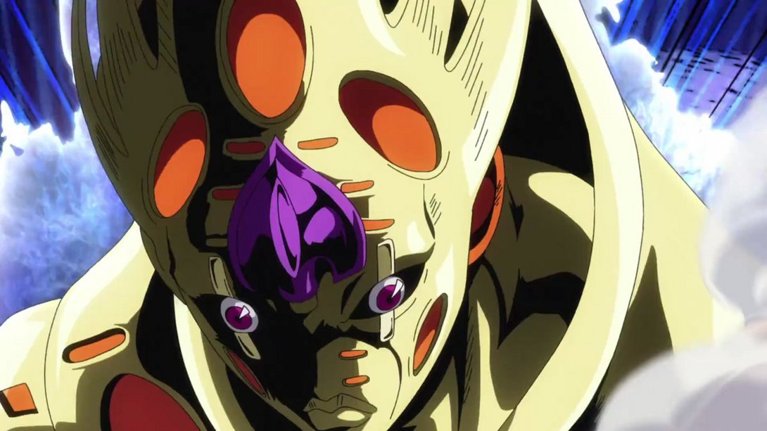
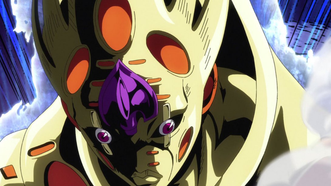
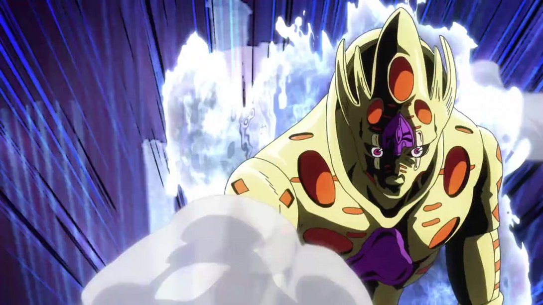
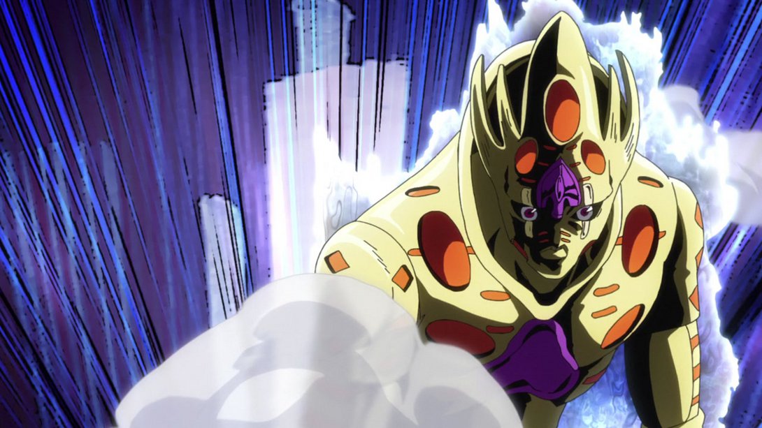
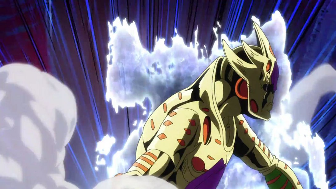
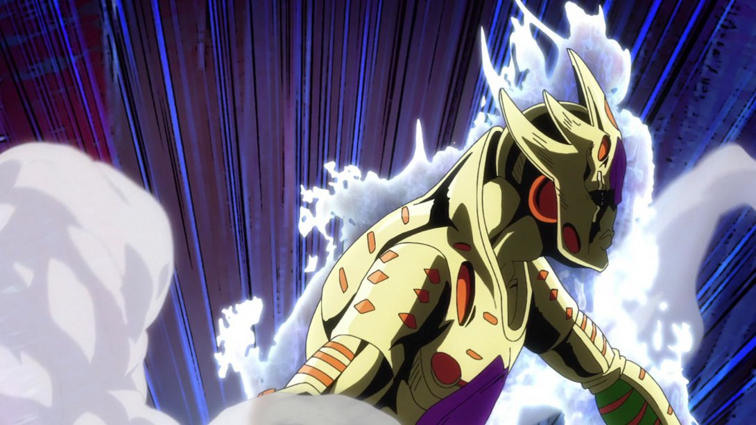
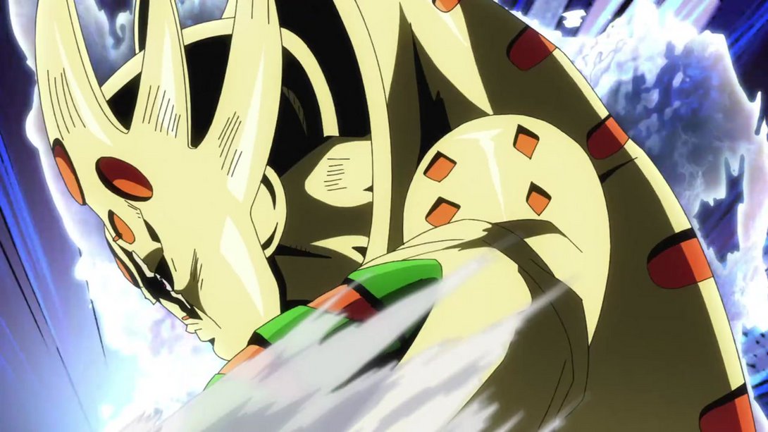
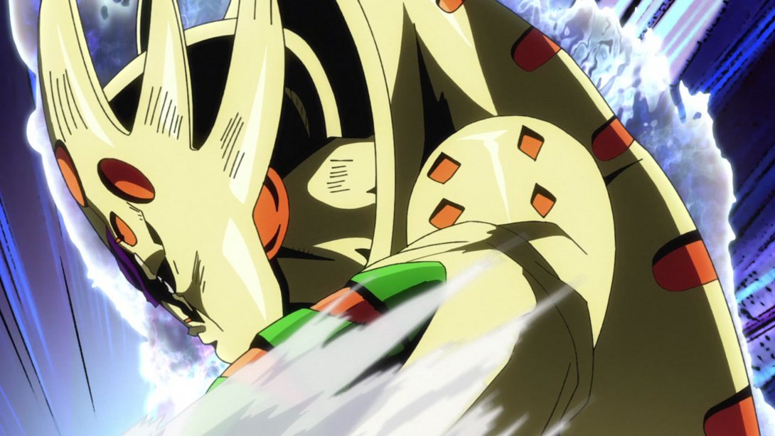
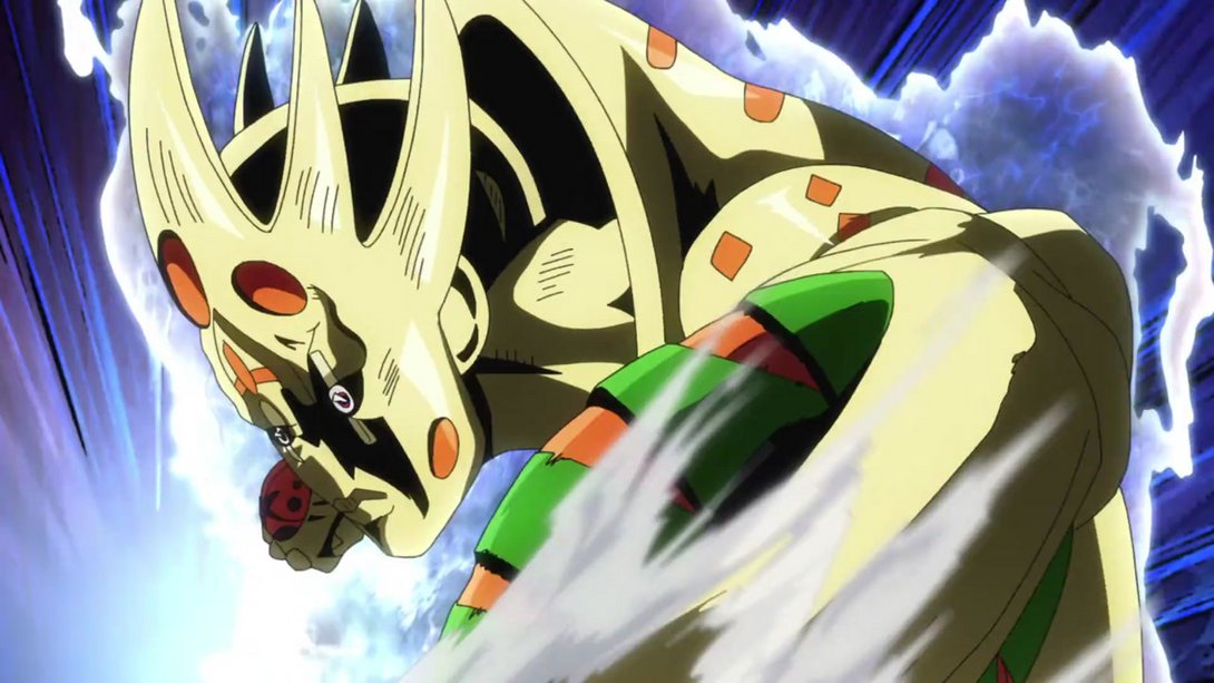
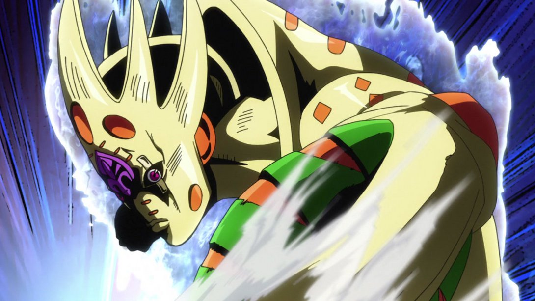
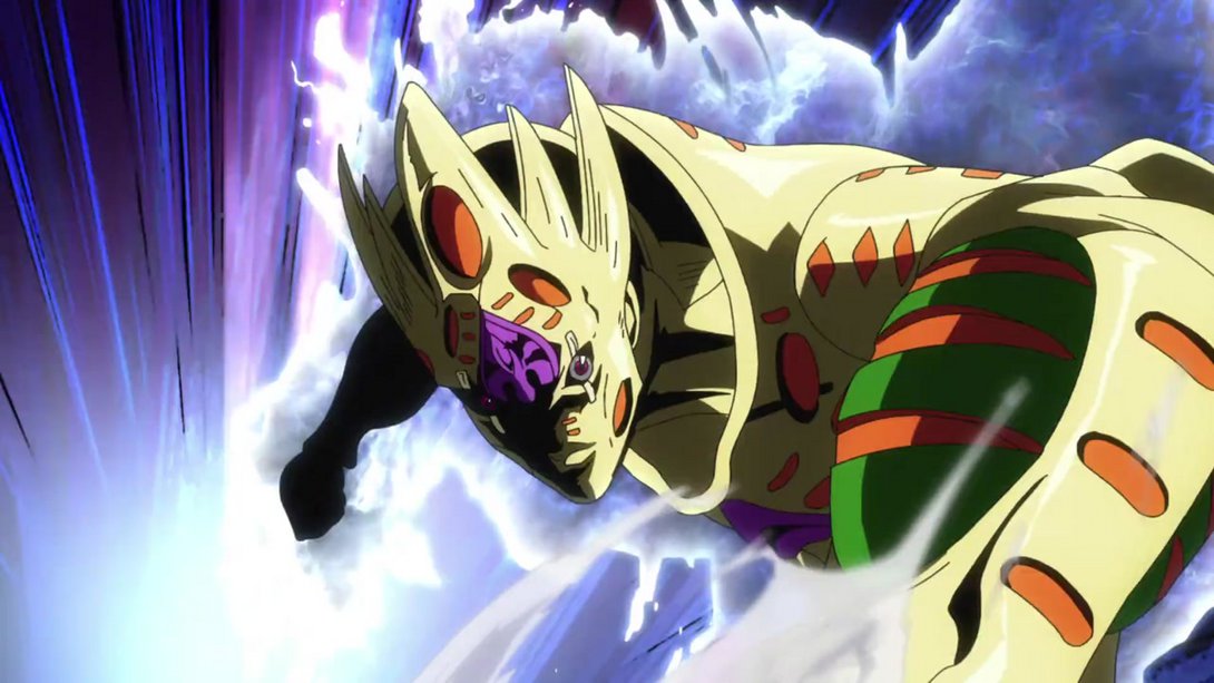
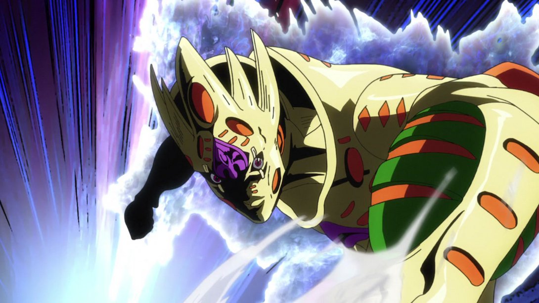
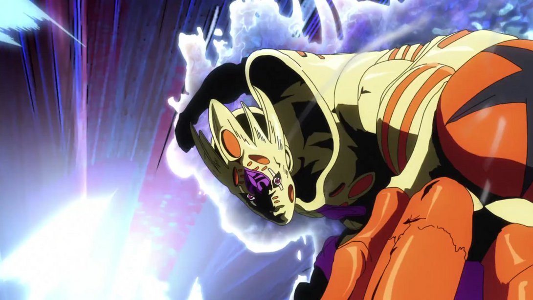
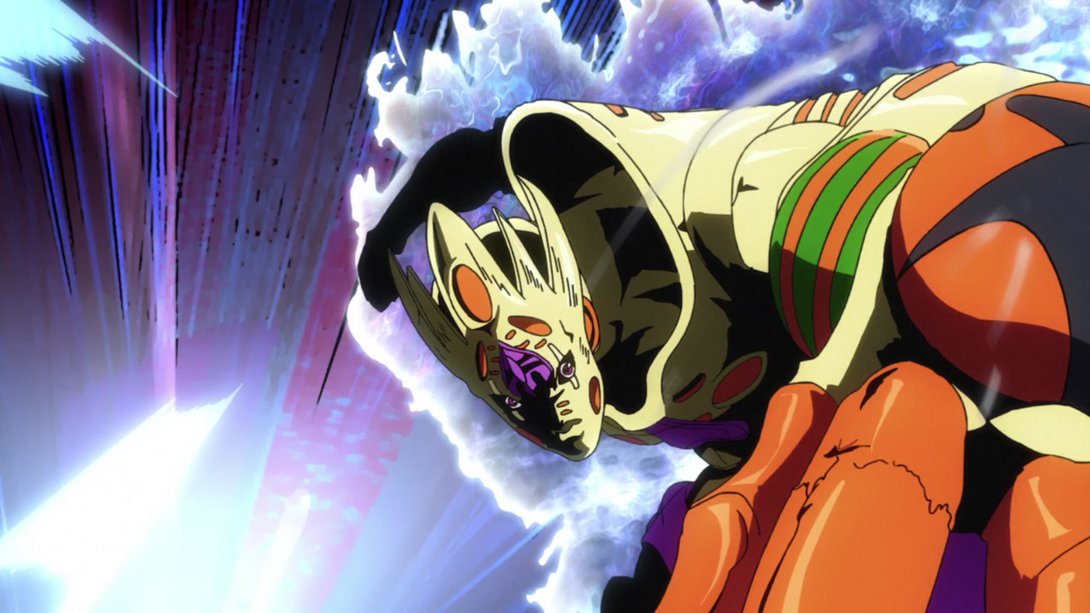
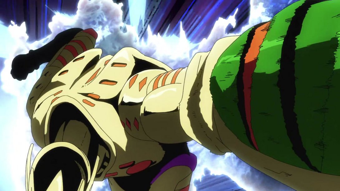
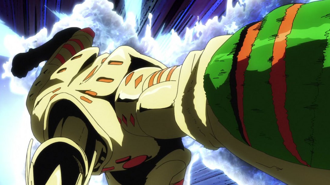
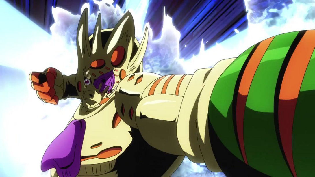
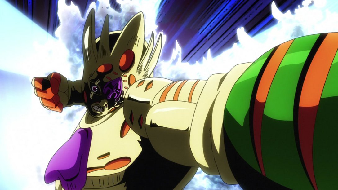
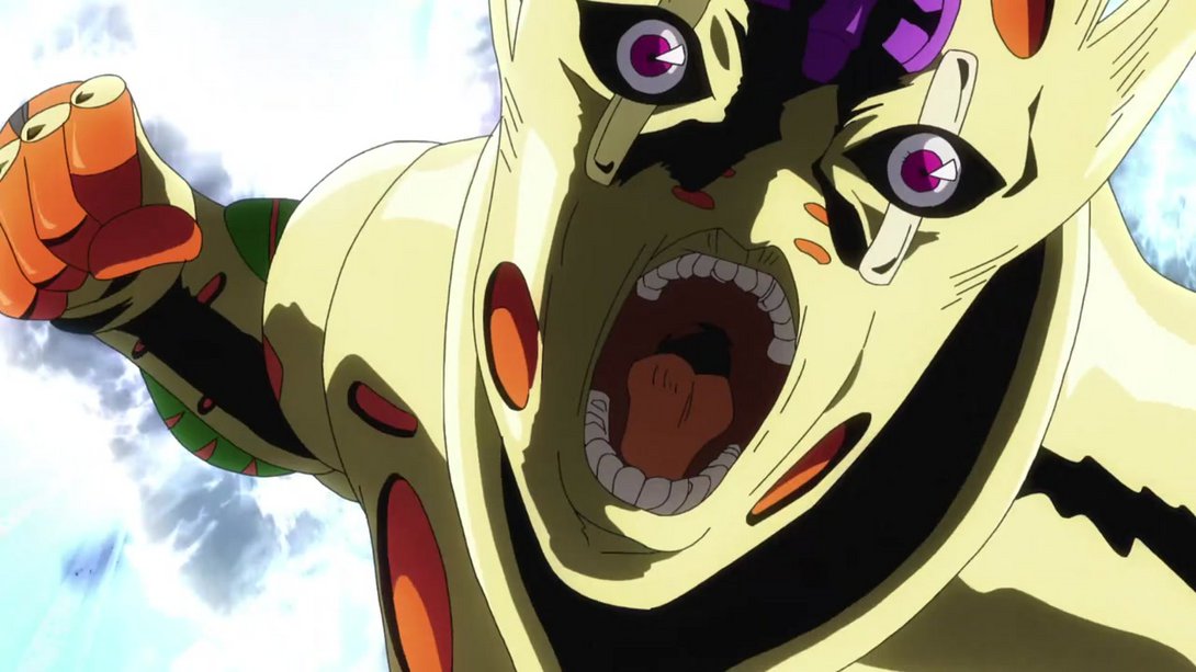
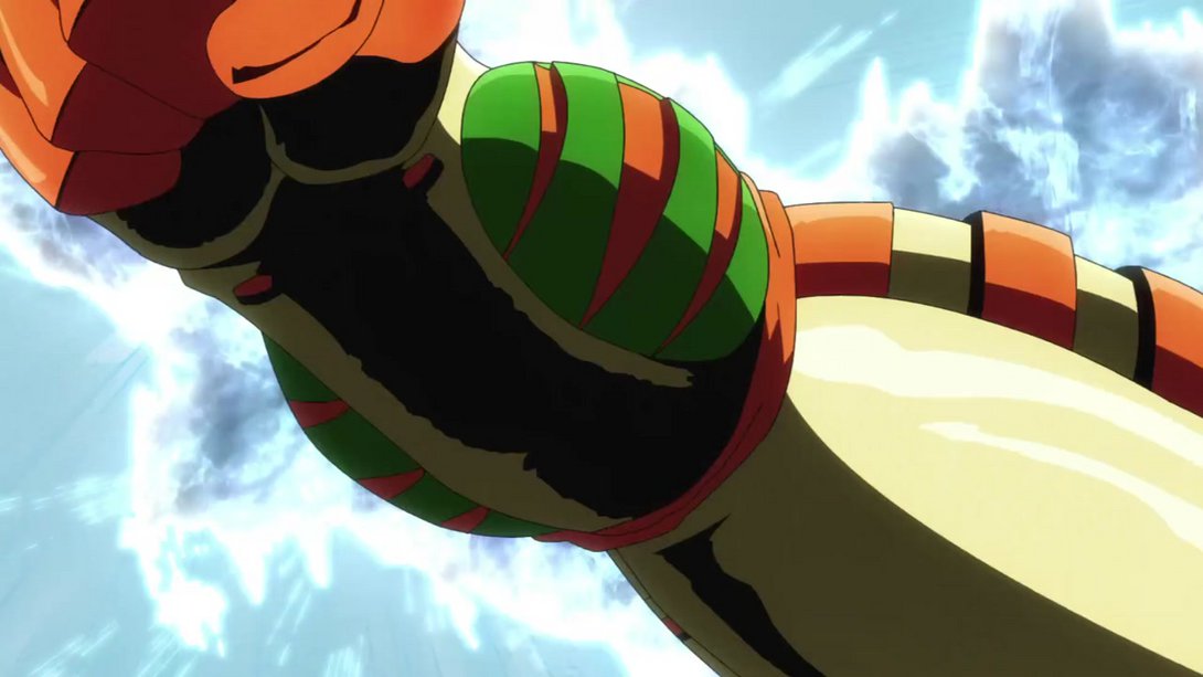
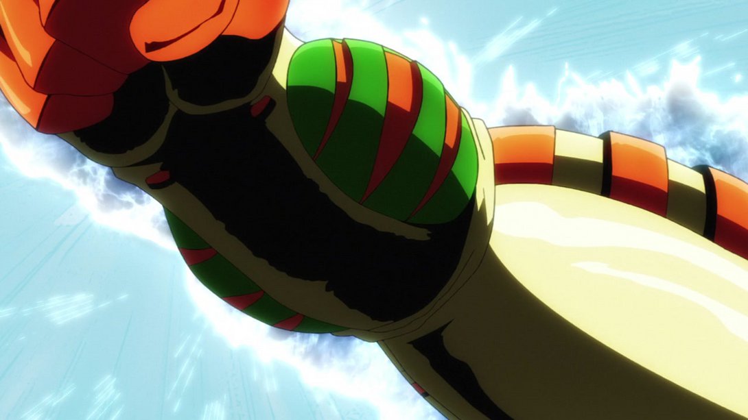
- Let’s take a look at it in motion, shall we?:
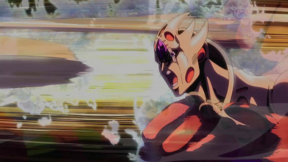
- Here we have the final version of the opening’s punch barrage, now sporting Gold Experience Requiem:
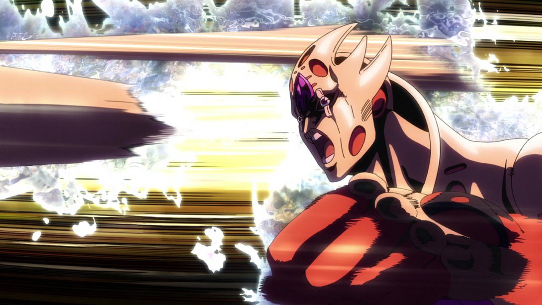
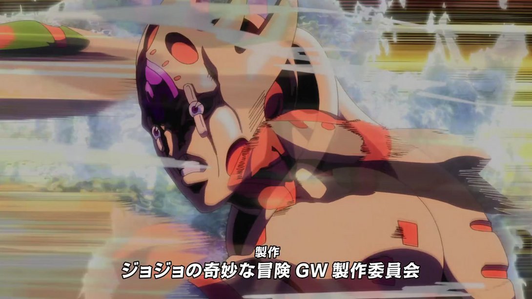
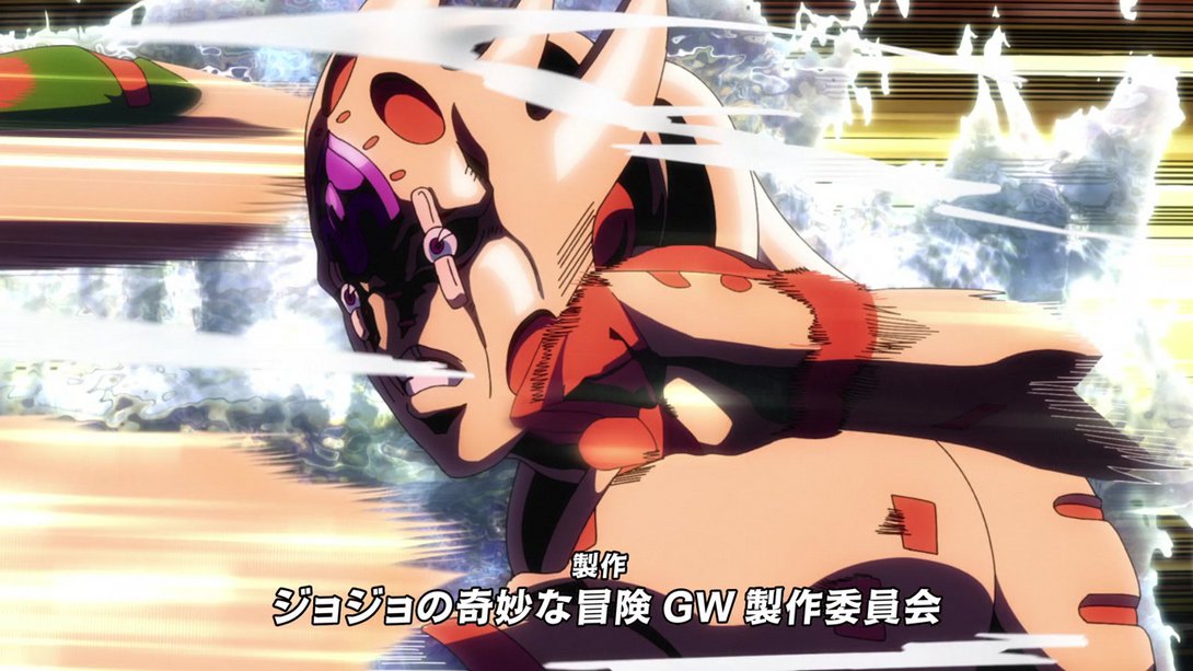
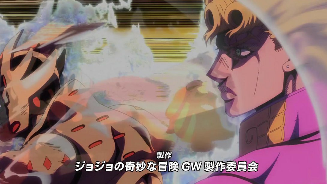
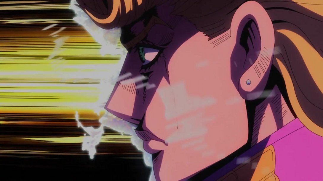
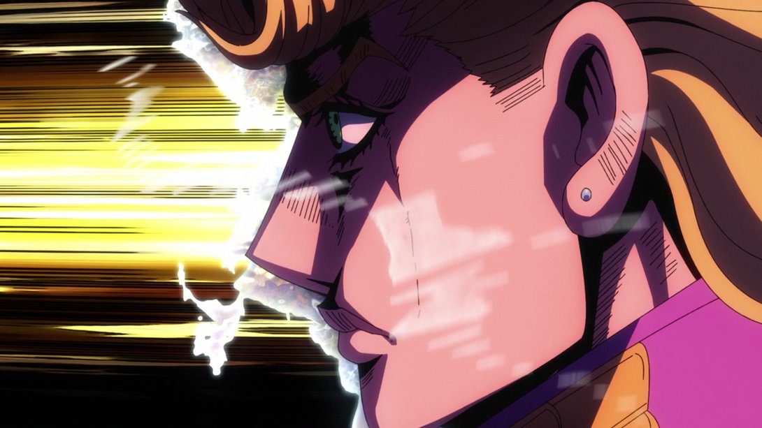
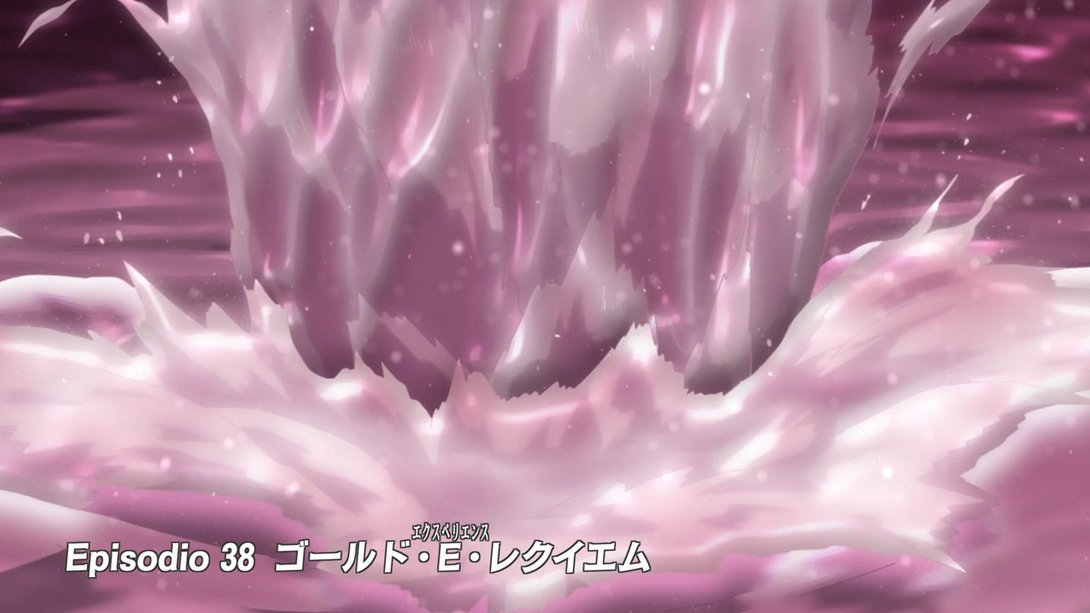
- The エクスペリエンス furigana has thicker outlines, here…:
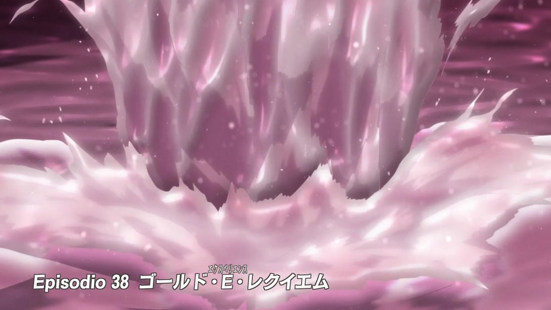
- The pool of blood is no longer static, here (making the ripple effects look less weird)…:
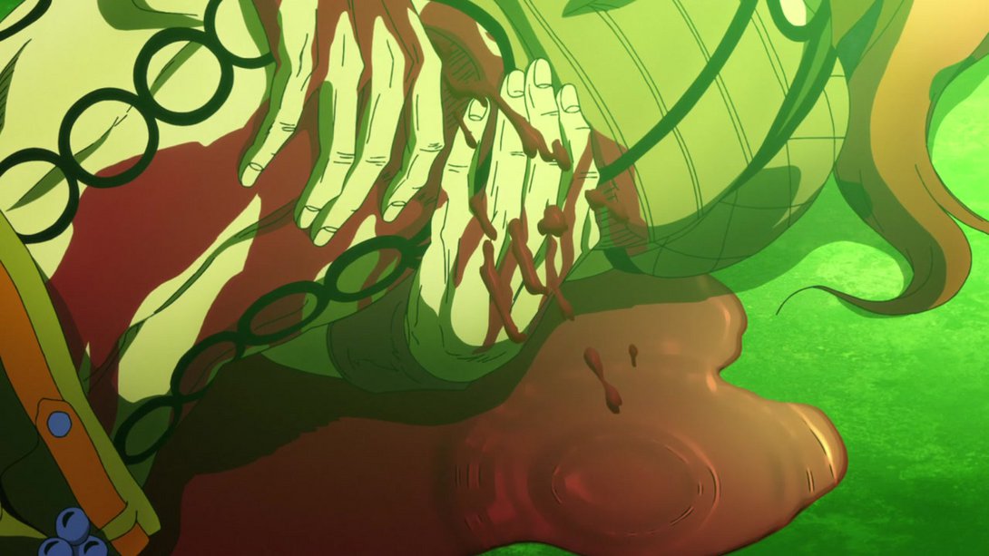
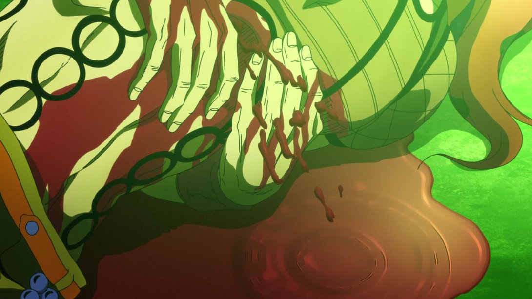
- These two bits coming up are the most interesting, for me! Here, the scene of the scalpel cutting into Diavolo’s chest has been slightly extended…:
- And here there’s an entirely new (gory) bit! The animation is strangely choppy, but we’ll take what we can get:
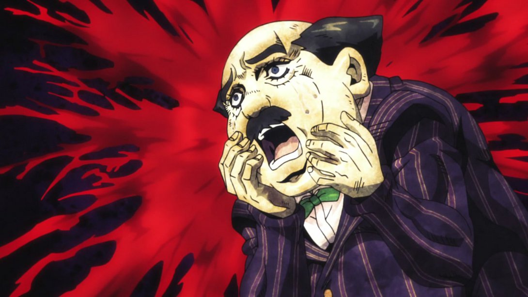
- Here, the dude’s mouth has been retouched and the colouring on the right part of the frame is slightly flatter:
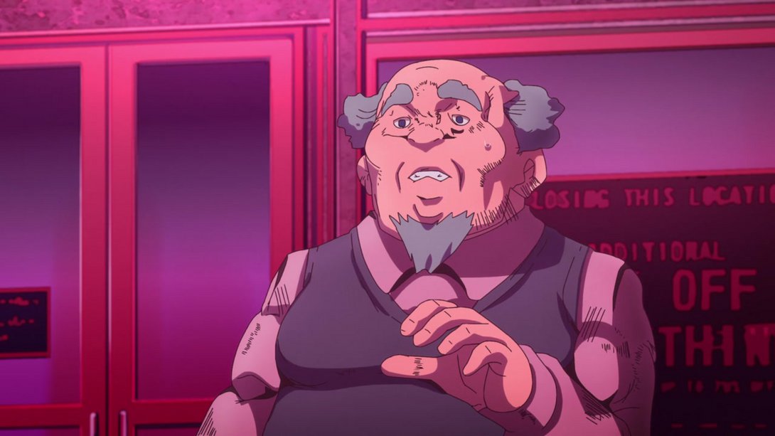
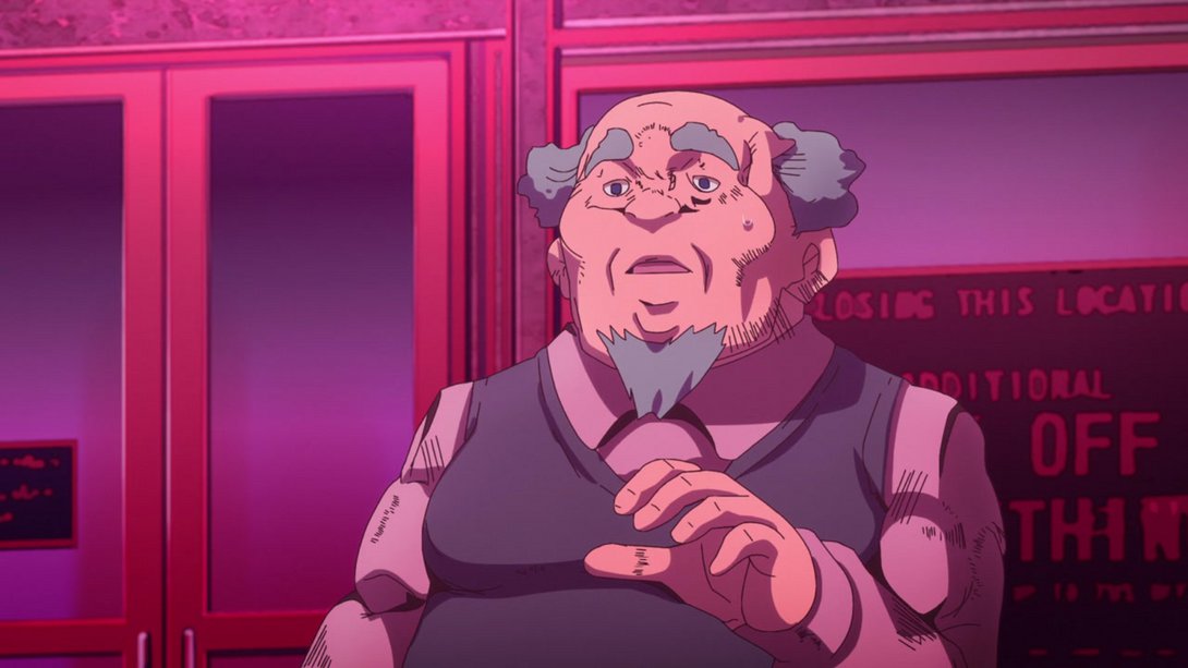
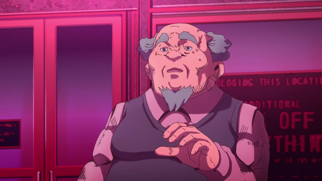
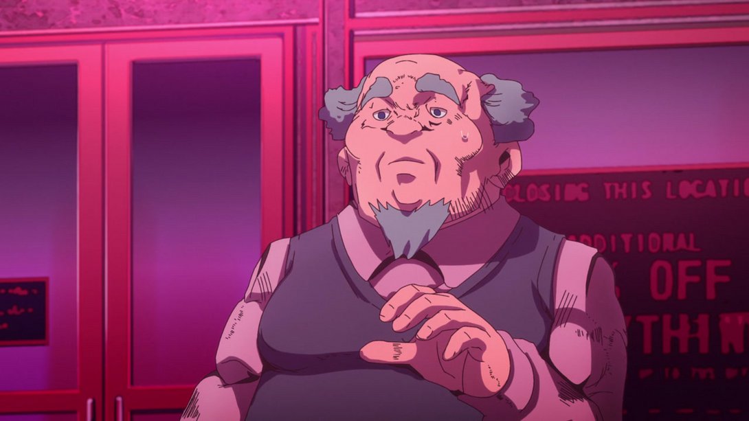
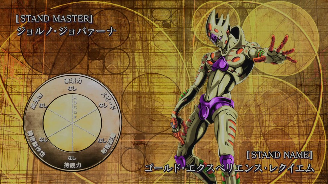
- Let’s take a look at the second-to-last eyecatch…:
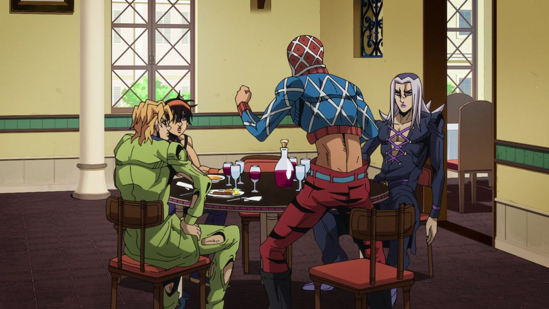
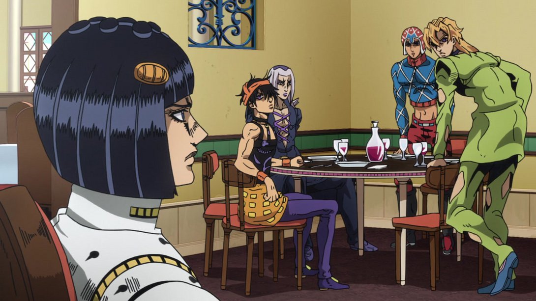
- Moving on to the second part of the episode, this scene has a different shading towards the bottom (and, in addition, the bottle in the middle of the table also casts a darker shadow):
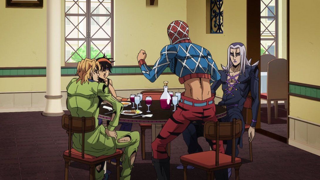
- This brief animation is brighter…:
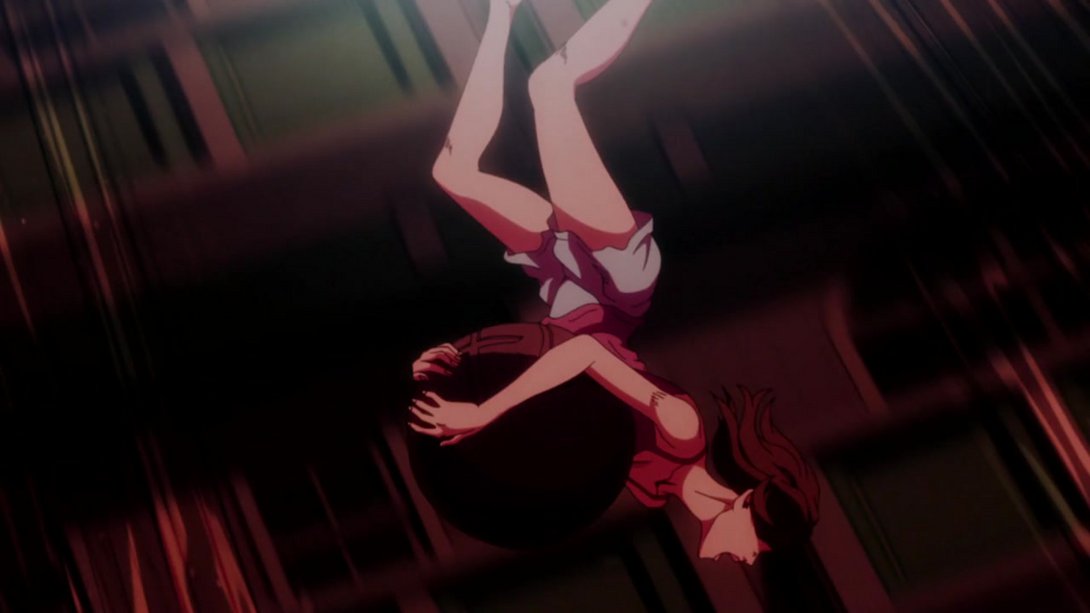
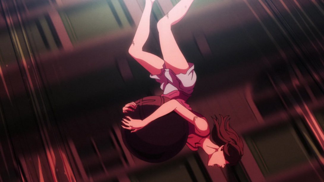
- …while this is slightly darker:
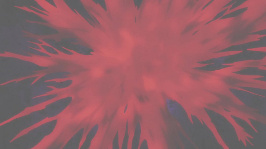
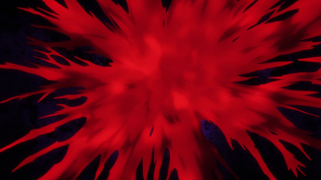
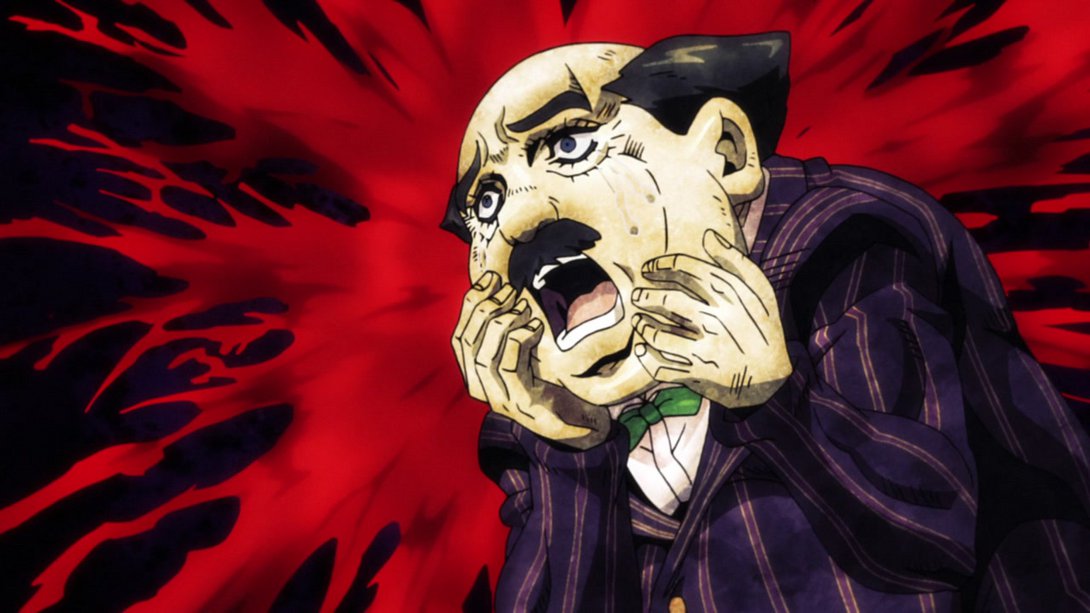
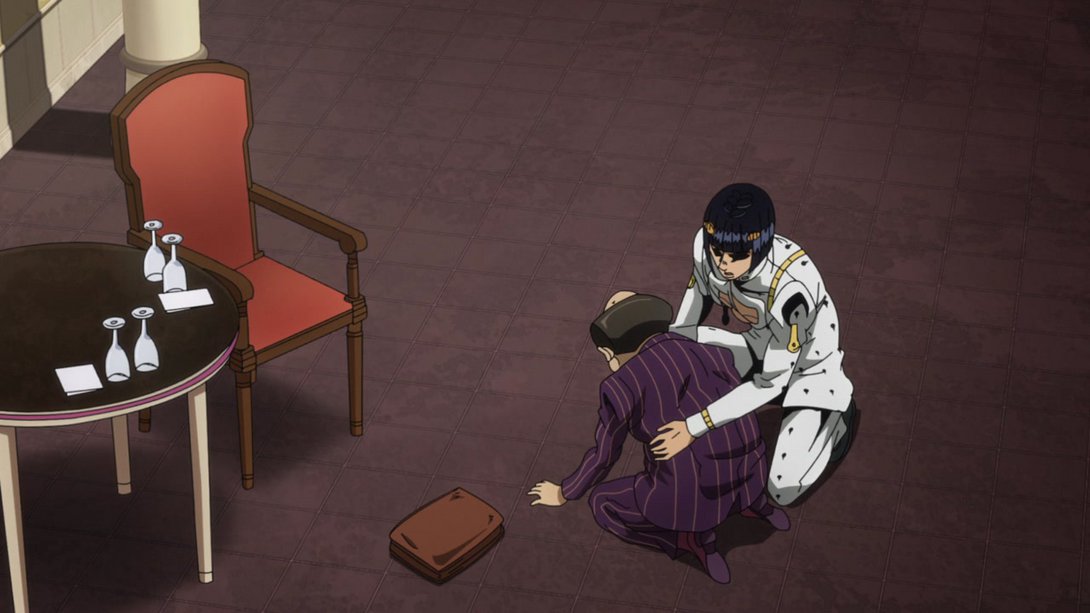
- Here, most colours are slightly flatter, there are a couple more dots on Buccellati’s back and the round table has a brighter rim:
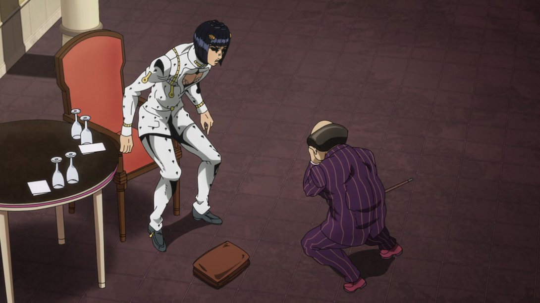
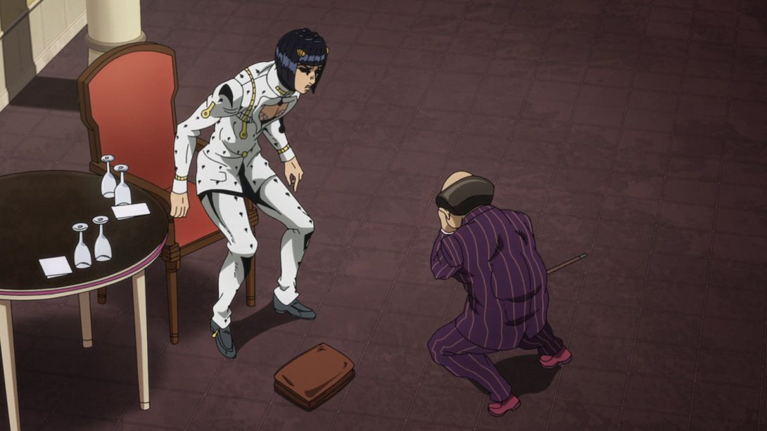
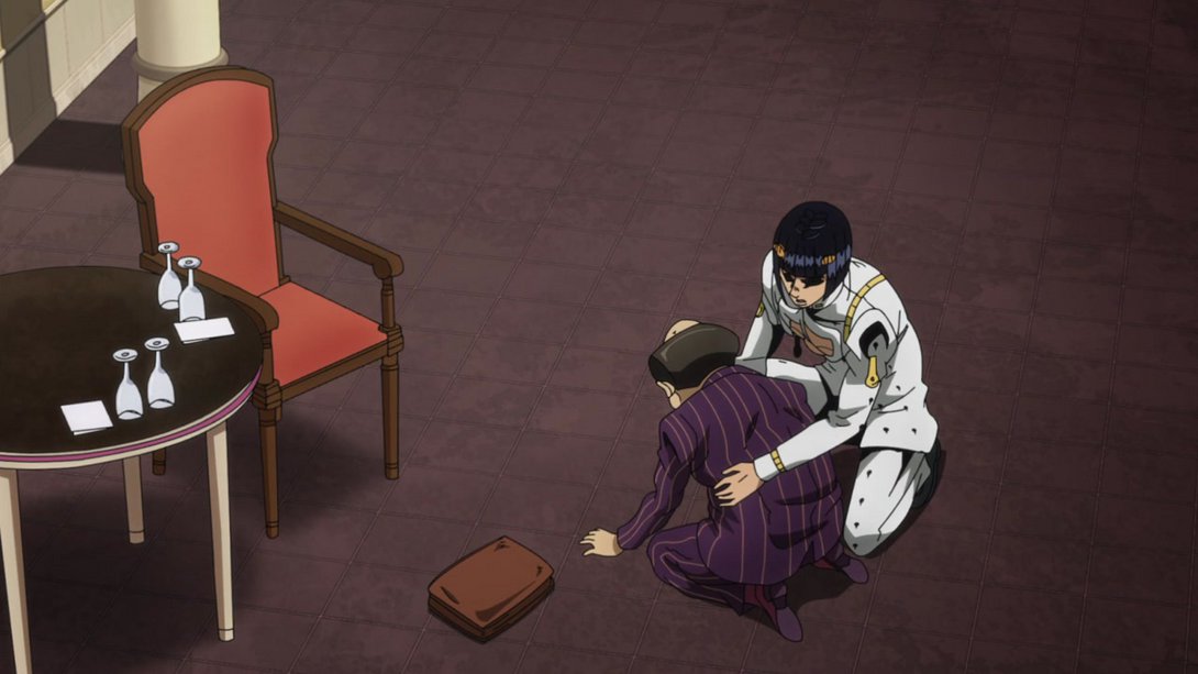
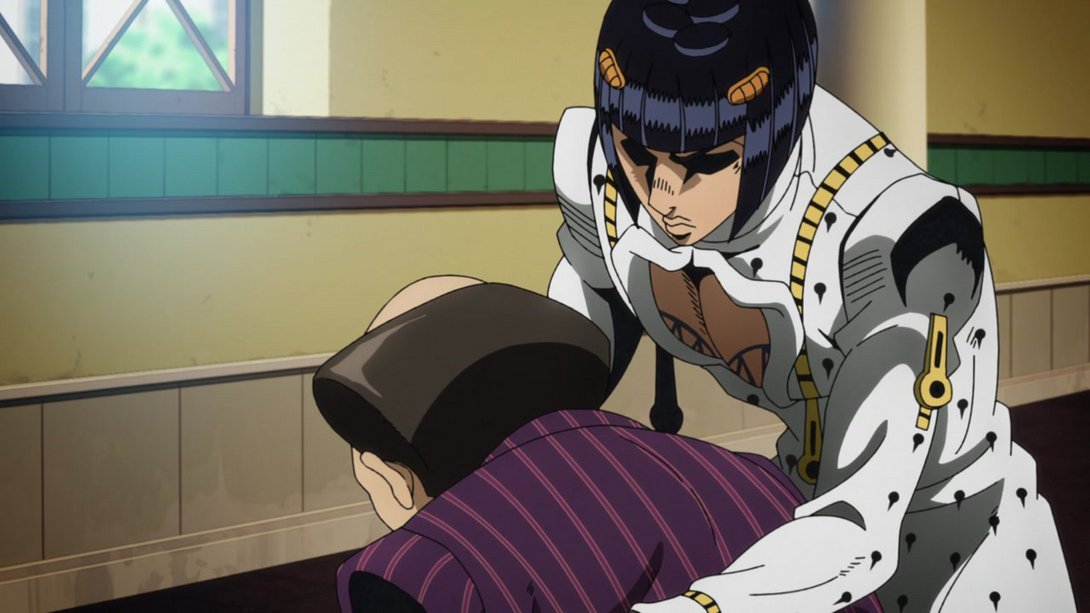
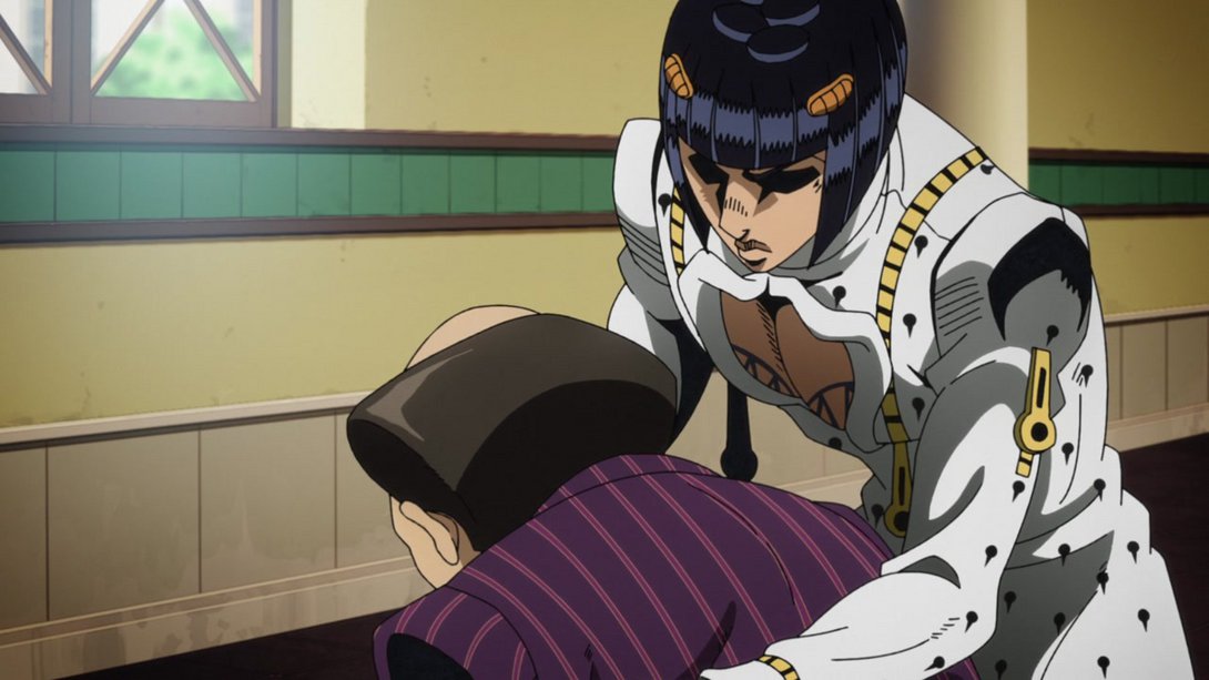
- The shading and colouring have been slightly tweaked here as well; in addition, the shadow under Buccellati’s nose is slightly darker, and the lines on his upper lip (which were missing in three frames) have been restored:
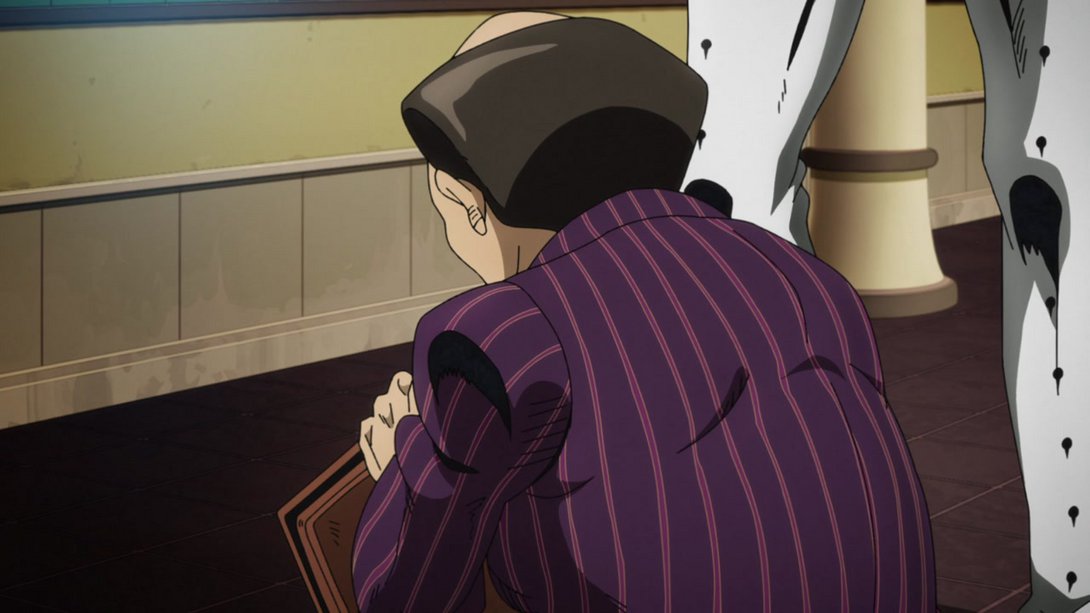
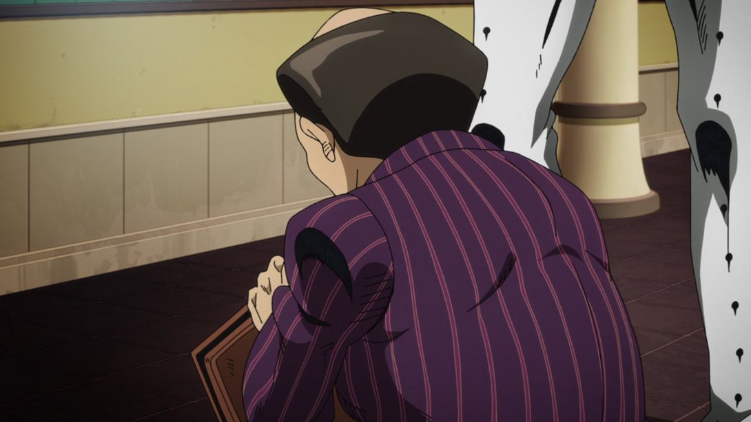
- In this scene, the background is blurrier and is now sporting a dark vignette along the bottom of the frame. In addition, the right side of the character is slightly brighter:
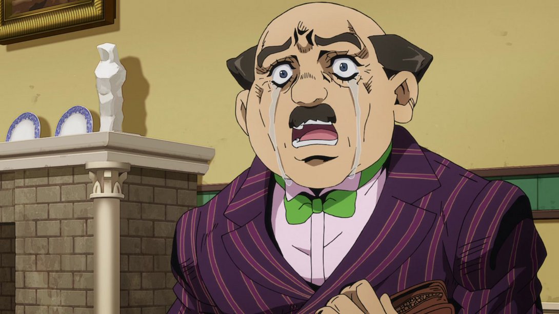
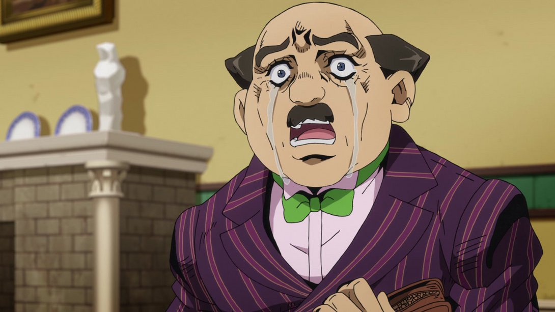
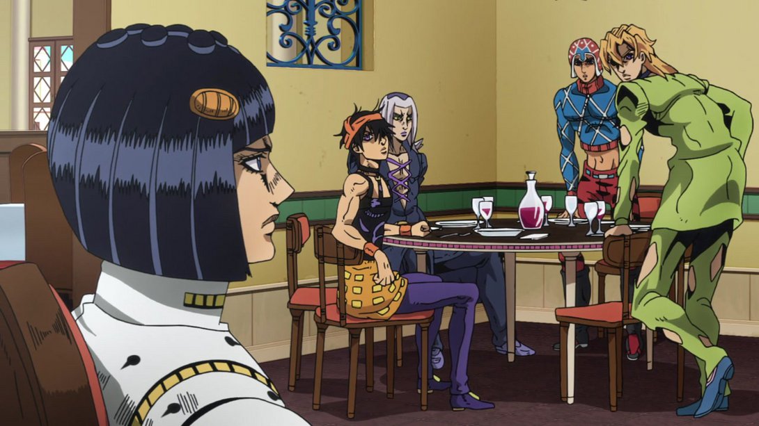
- In this beautiful scene depicting our good good boys, most lines on Abbacchio are thicker and Abbacchio’s eyes have been retouched; in addition, the shading/colouring on most things has been tweaked slightly:
And that’s it for this time, fellas! I hope you had a good time with yours truly, and meet me back here next week for the grand finale, the conlusion to this glorious arc - Vento Aureo #39, “Sleeping Slaves”!
Arrivederci!

