Hello once more, friends! Welcome back. Today we’re going to take a look at Vento Aureo #33, “His Name is Diavolo”! This is going to be a juicy one, for a change, so sit back and enjoy all these changes, fellas!
Let’s get goin’!
- In today’s first difference, Buccellati has been moved a little to the left and the lighting of the scene is different…:
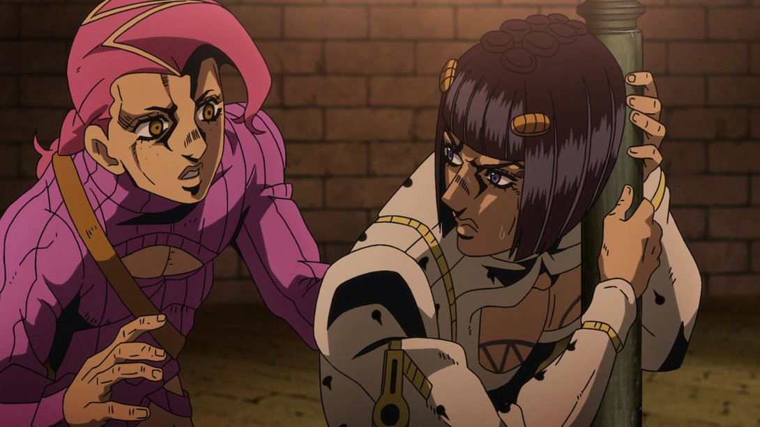
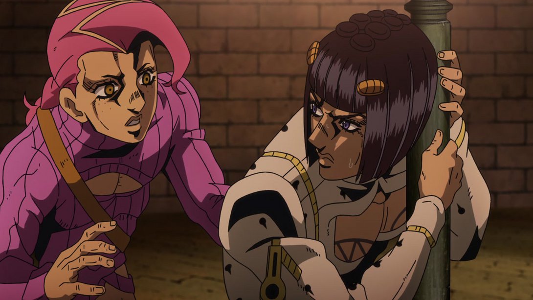
- …and, later in the same scene, his legs have been moved on the correct layer, behind the pole:
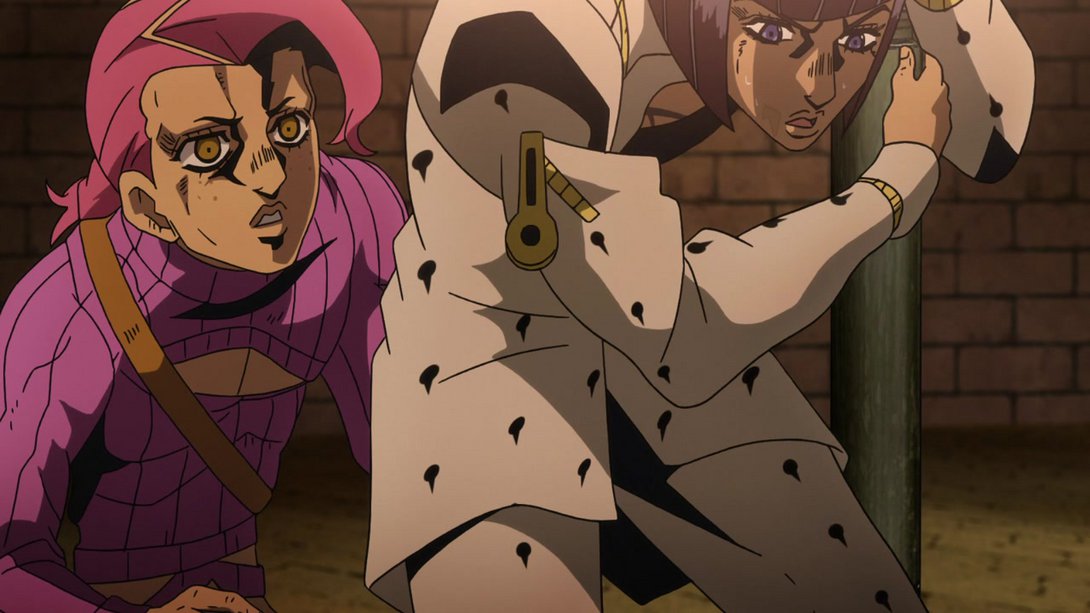
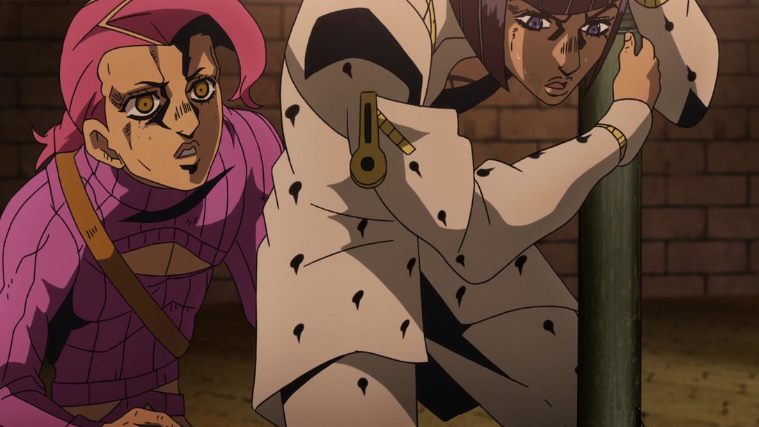
- Here Buccellati’s suit has its usual spot pattern, and most lines on both him and Doppio are a tiny, miniscule bit thicker:

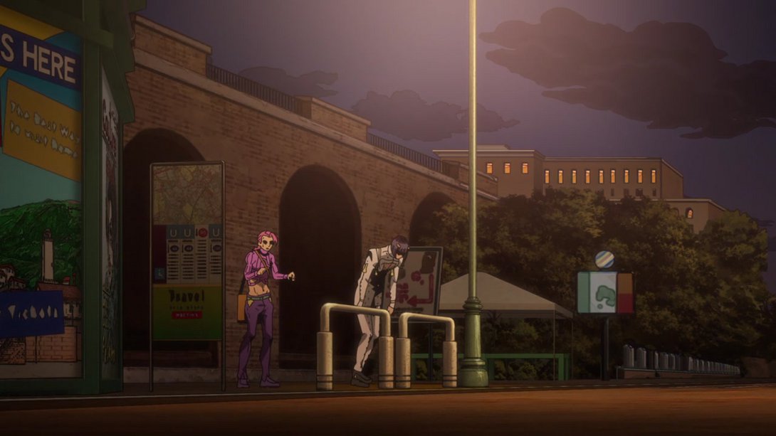
- This scene has a different lighting, Buccellati’s suit pattern is different, the pole in the foreground is darker and Doppio’s face has been retouched…:
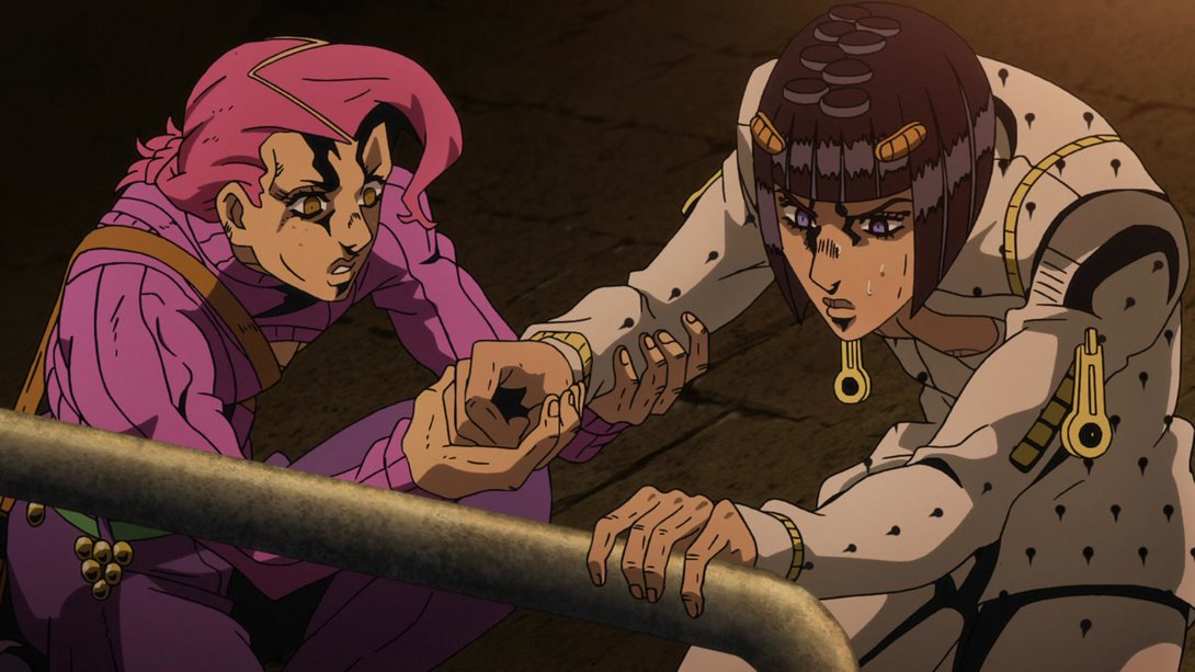
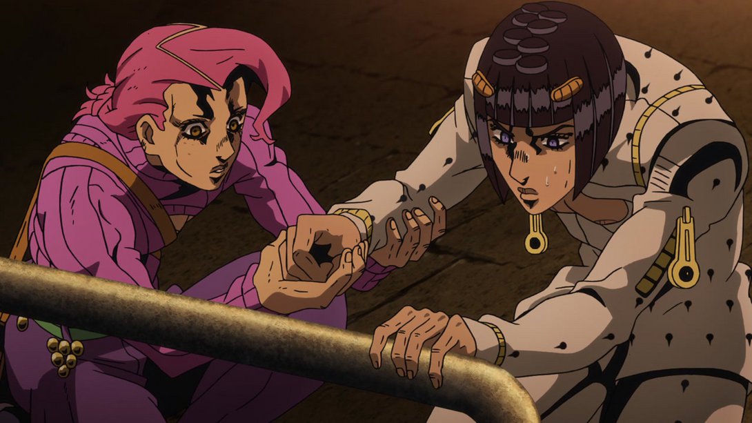
- …and, in addition to all that, it has also received some additional animation, especially at the beginning and at the end! Check it out:

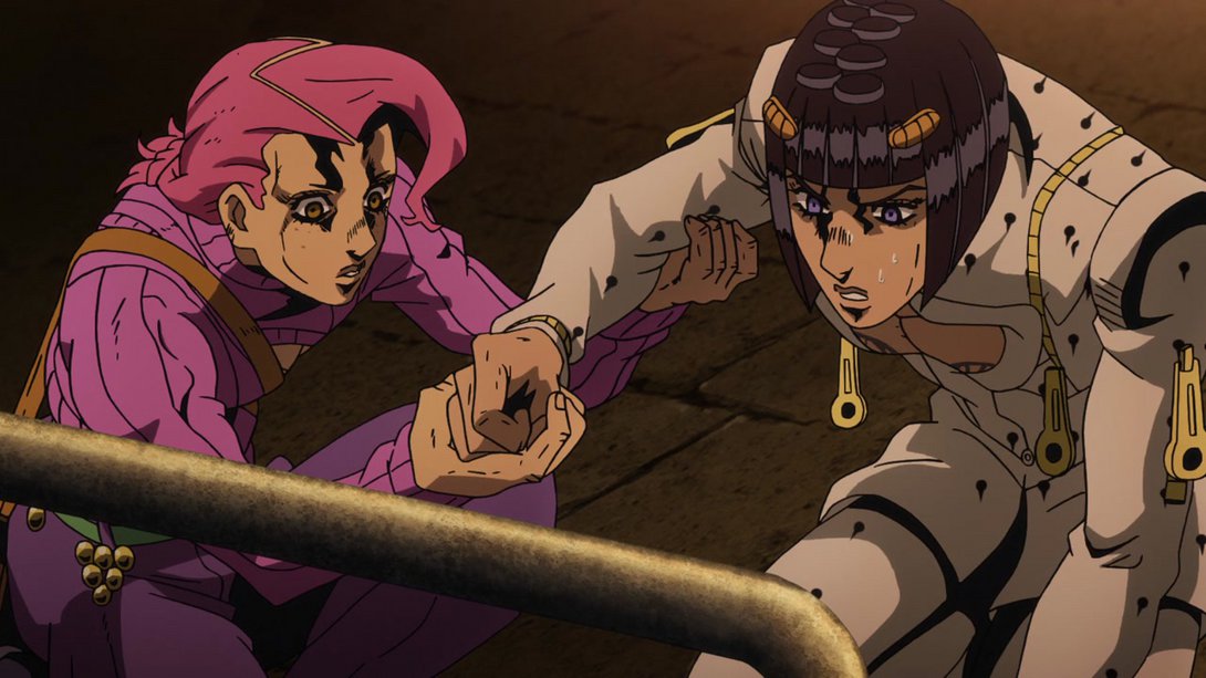
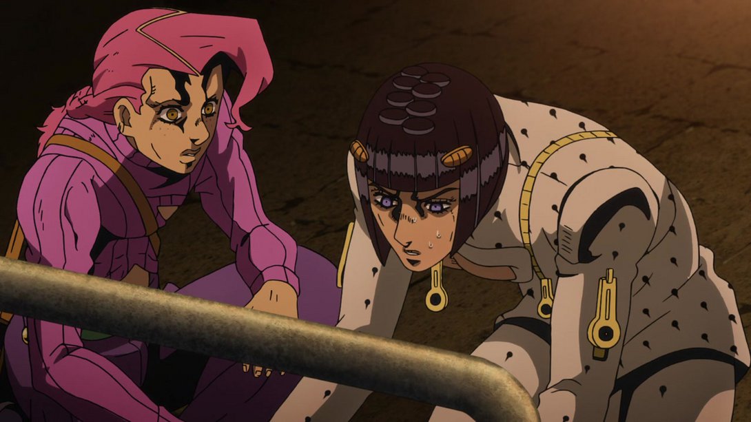
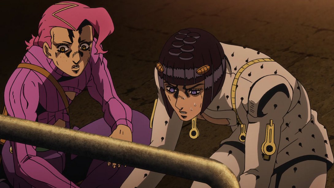
- This scene has a slightly flatter shading…:
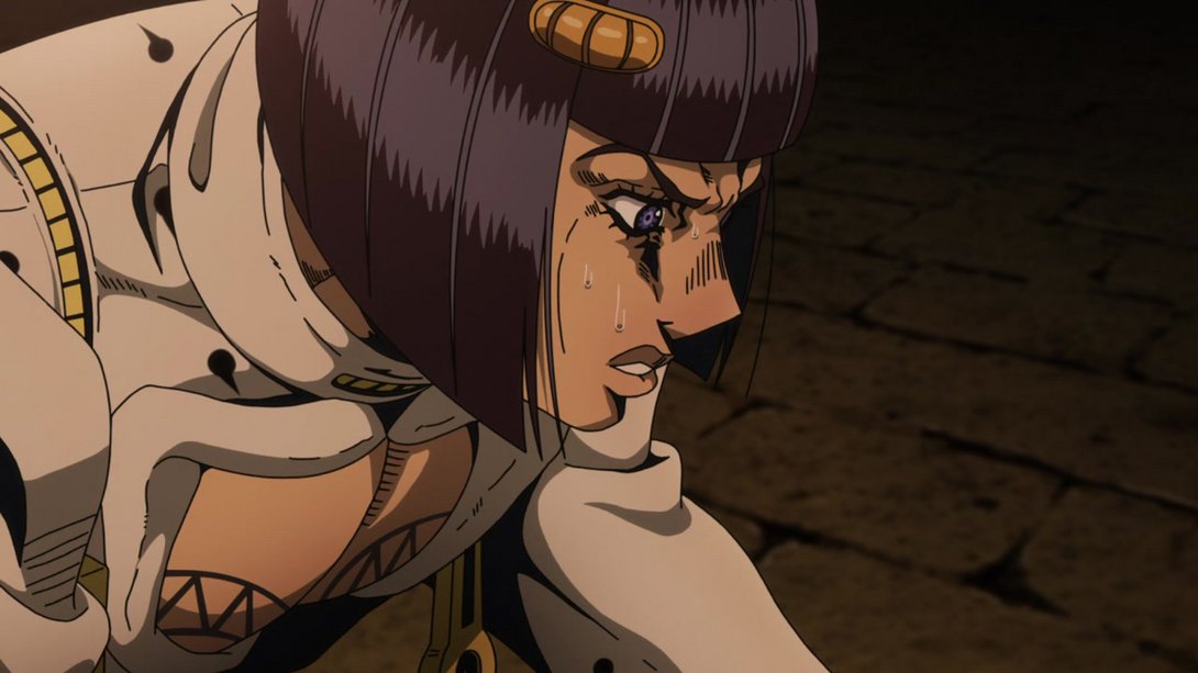
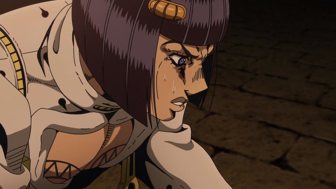
- In this scene of Mista caressing the Colosseum, the motion effects around the edges are different and the background is blurrier:
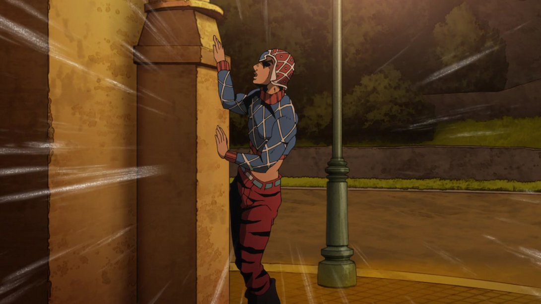
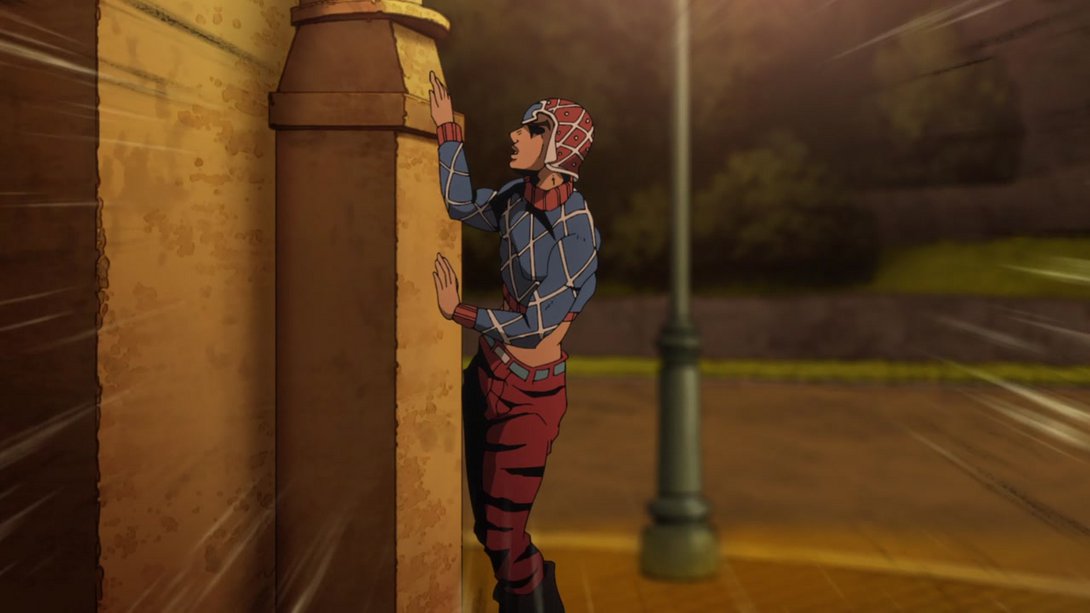
- And here both faces have been retouched; in addition, the lighting is slightly different too:
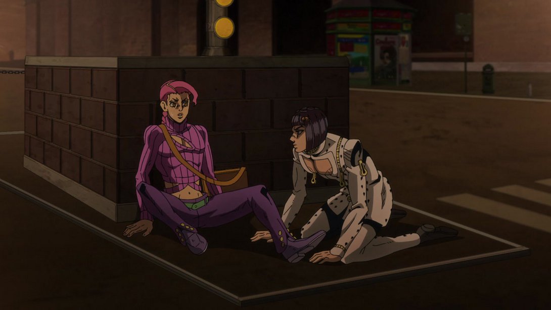
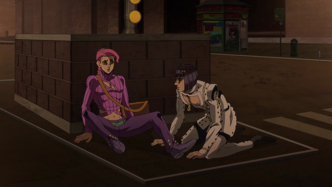
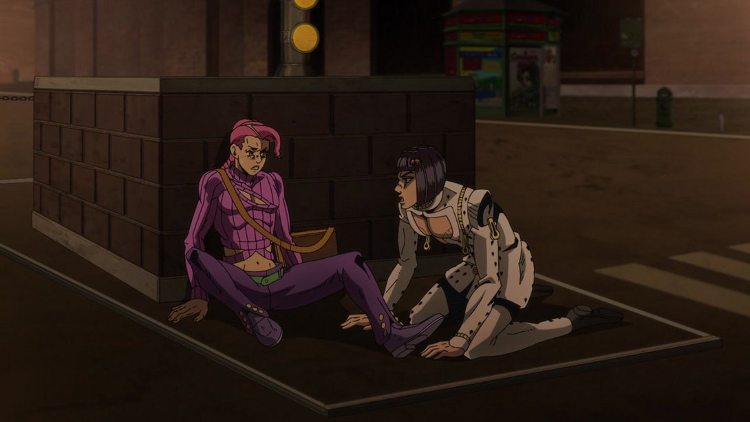
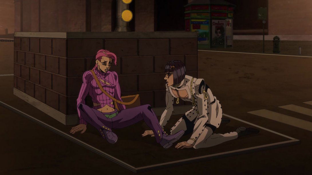
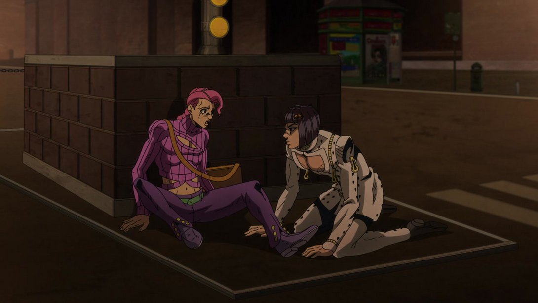
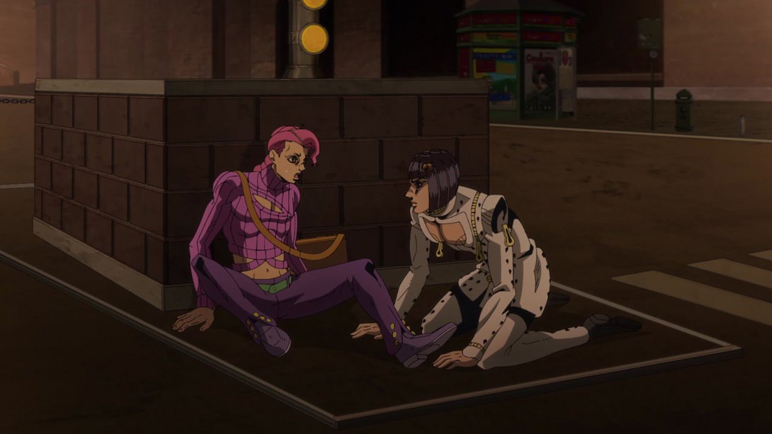
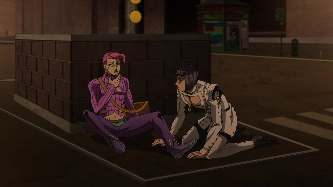

- And both of them are, once again, looking better here! In addition, the blurry distortion along the edges is much subtler:
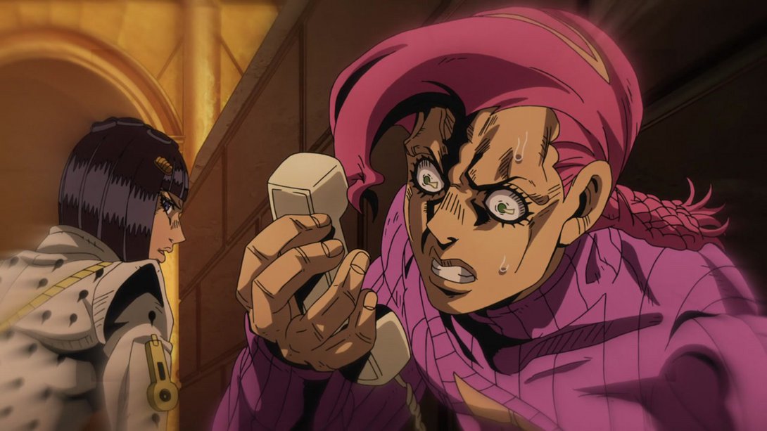
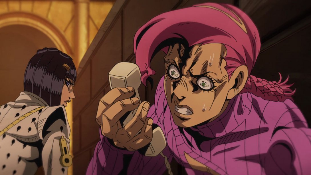
- Doppio has been lowered by a bunch of pixels here, so that it no longer looks like he’s sitting inside the wall:
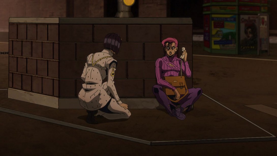
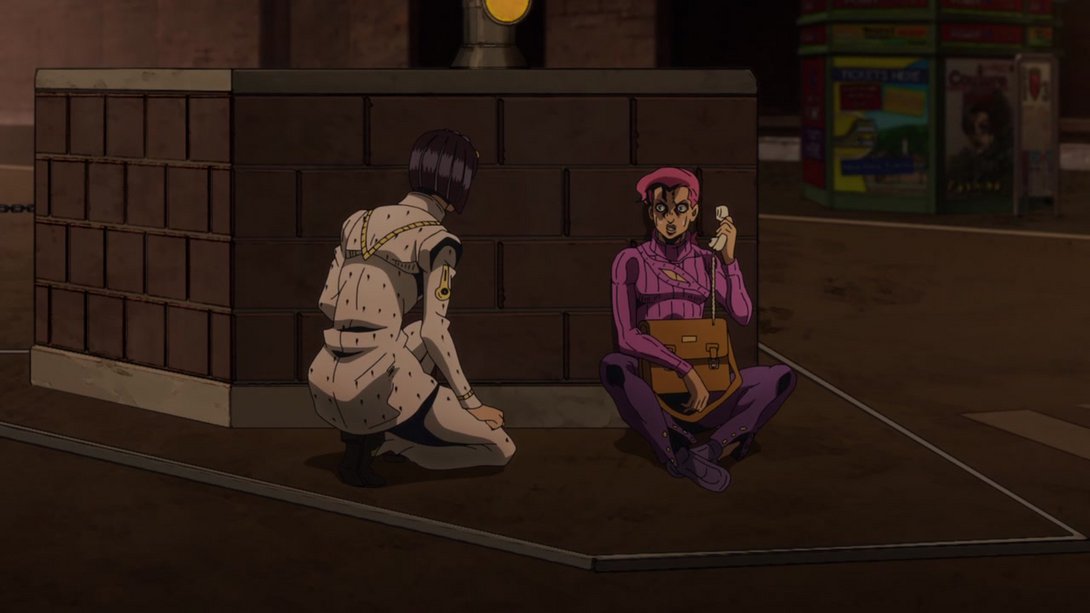
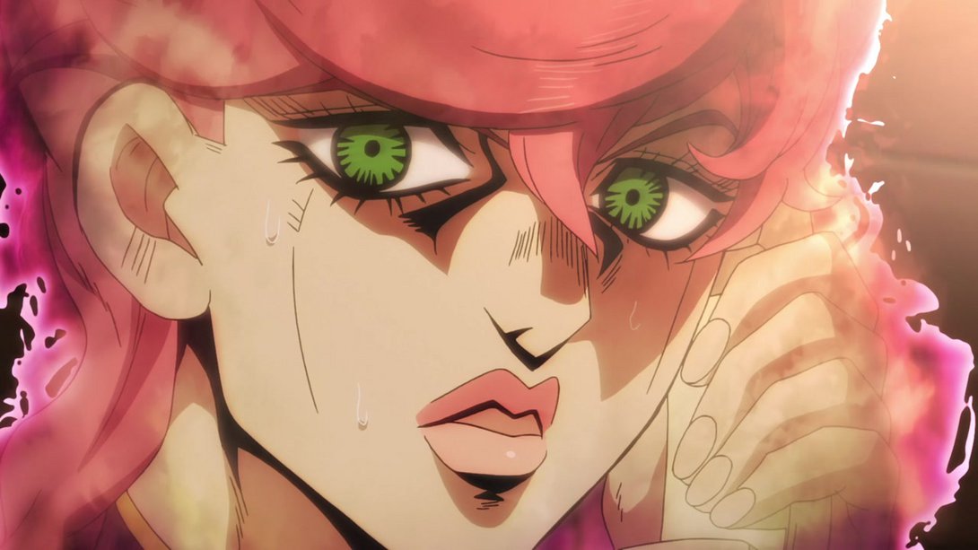
- Moving on, this scene of Doppio mysteriously morphing into Trish has a different lighting, different colours and a weaker distortion along the edges; in addition, Trish’s eyes have been retouched and a couple of bits in her aura are also looking different:
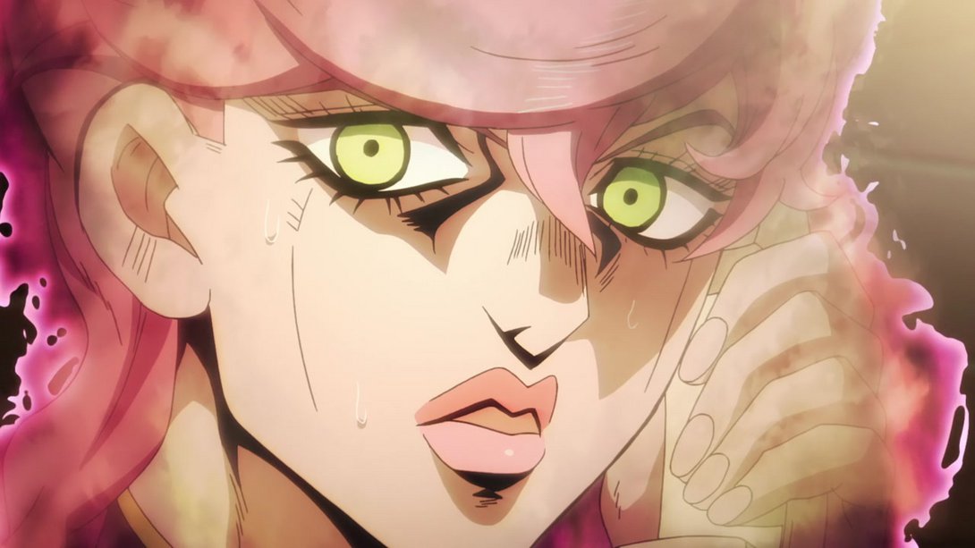
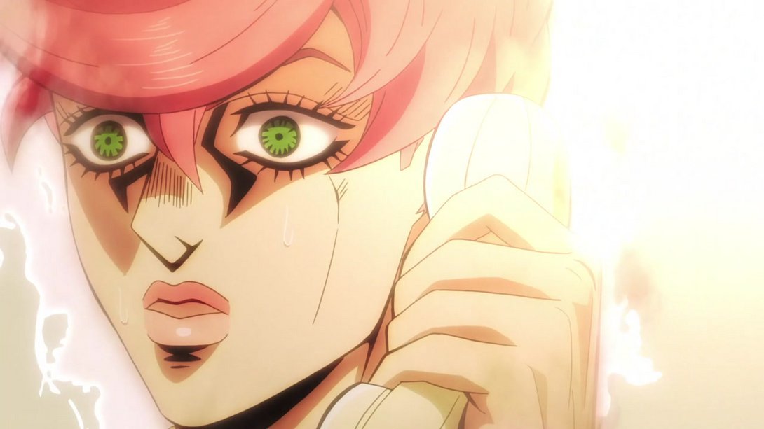
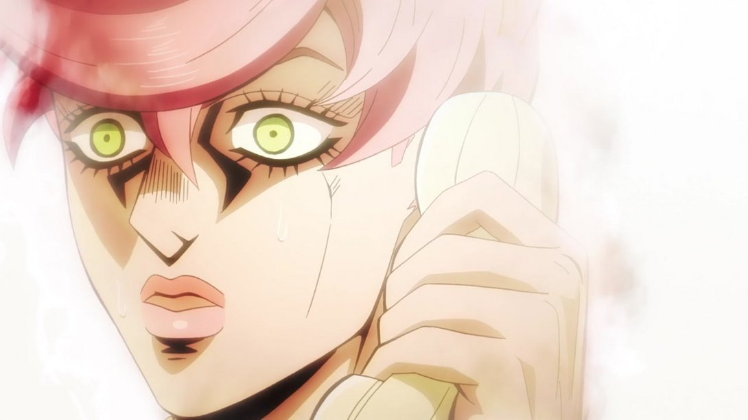
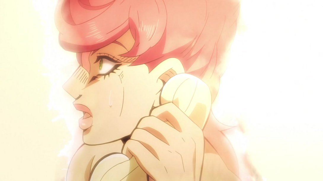
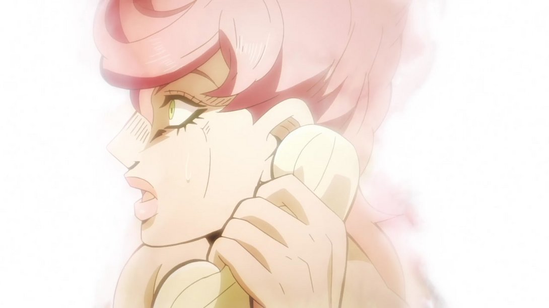
- In the transition back to Doppio, you can see that Buccellati show up a little later, and he’s blurrier and closer to the camera:
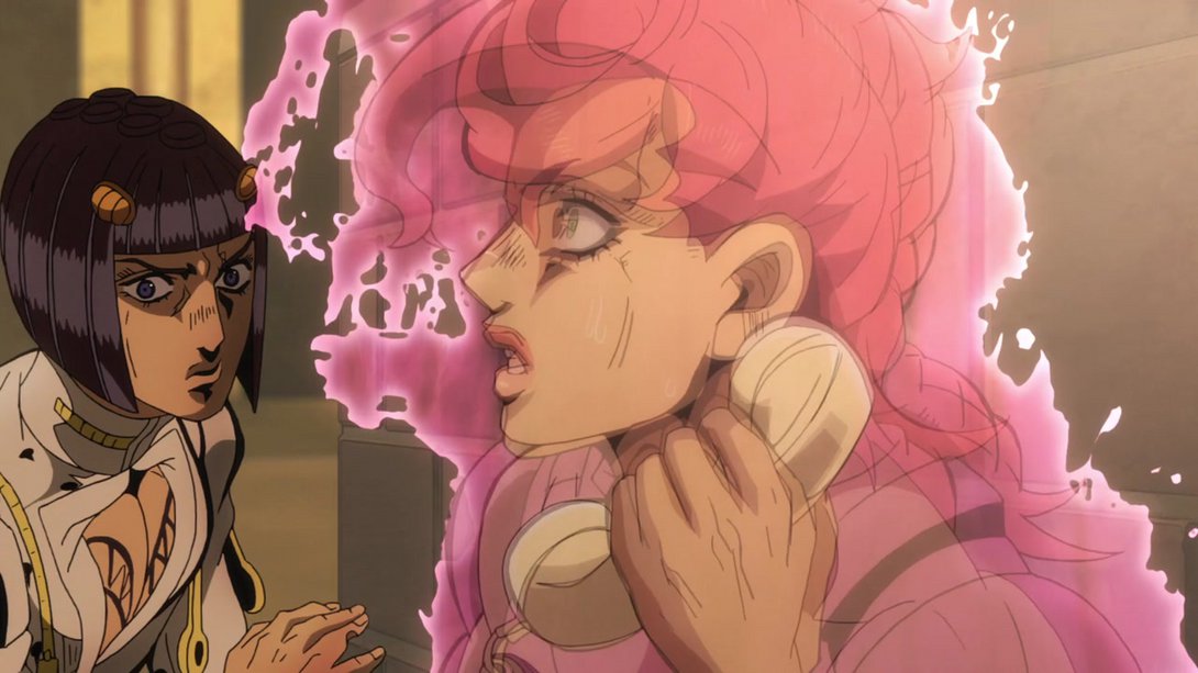
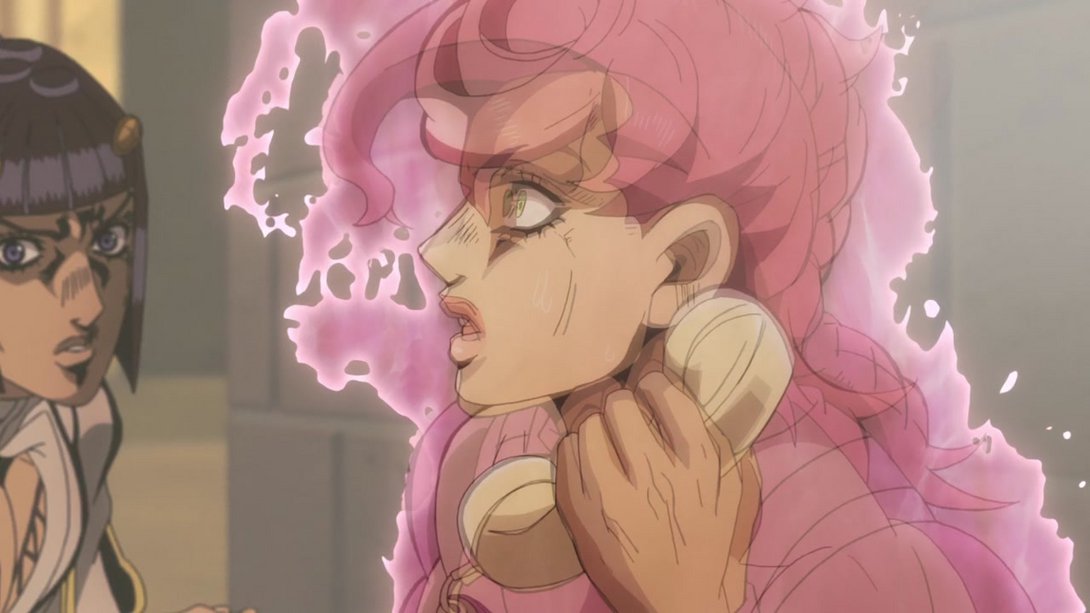
- And once she morphs back into Doppio, in addition to most of the previous changes, both him and Buccellati have also been retouched and Doppio’s aura is also slightly different:
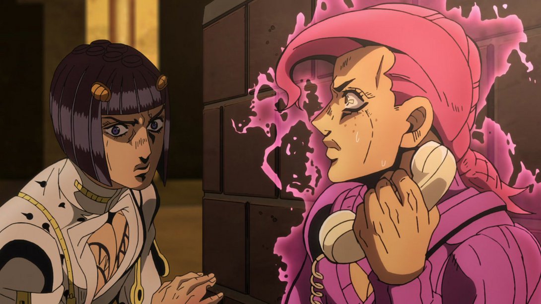
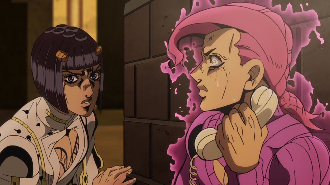
- Both Buccellati and Doppio’s eyes have been retouched here; Doppio’s aura is less square on the bottom, and the shading on both characters looks a little softer:
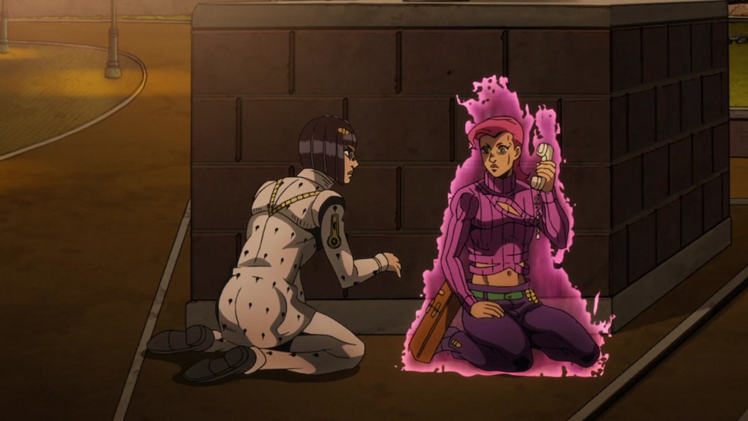
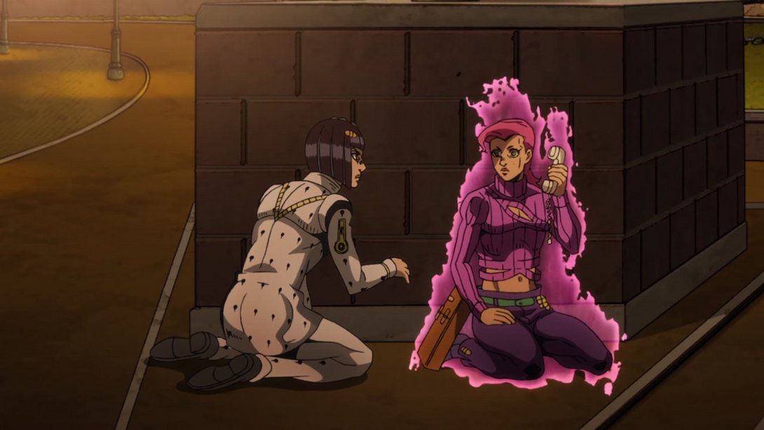
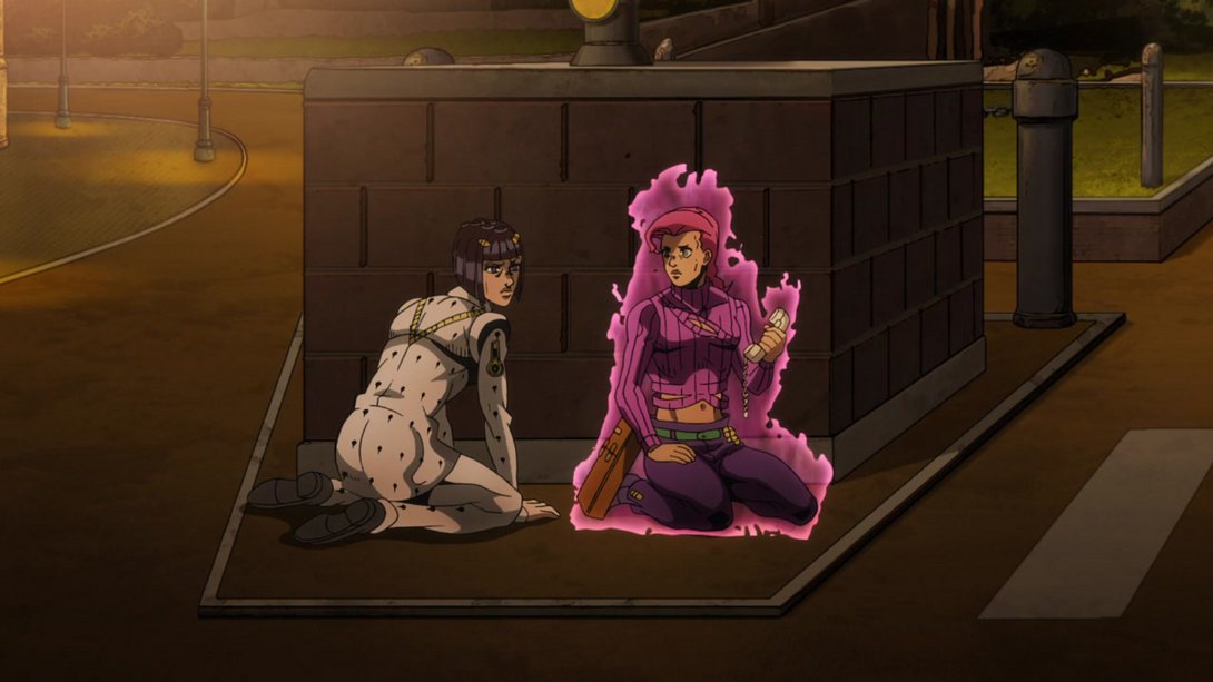

- And here, the background in the left side is much brighter, the dividing line is looking very different and the shading in both halves is softer:
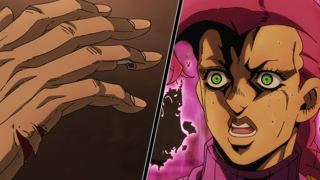
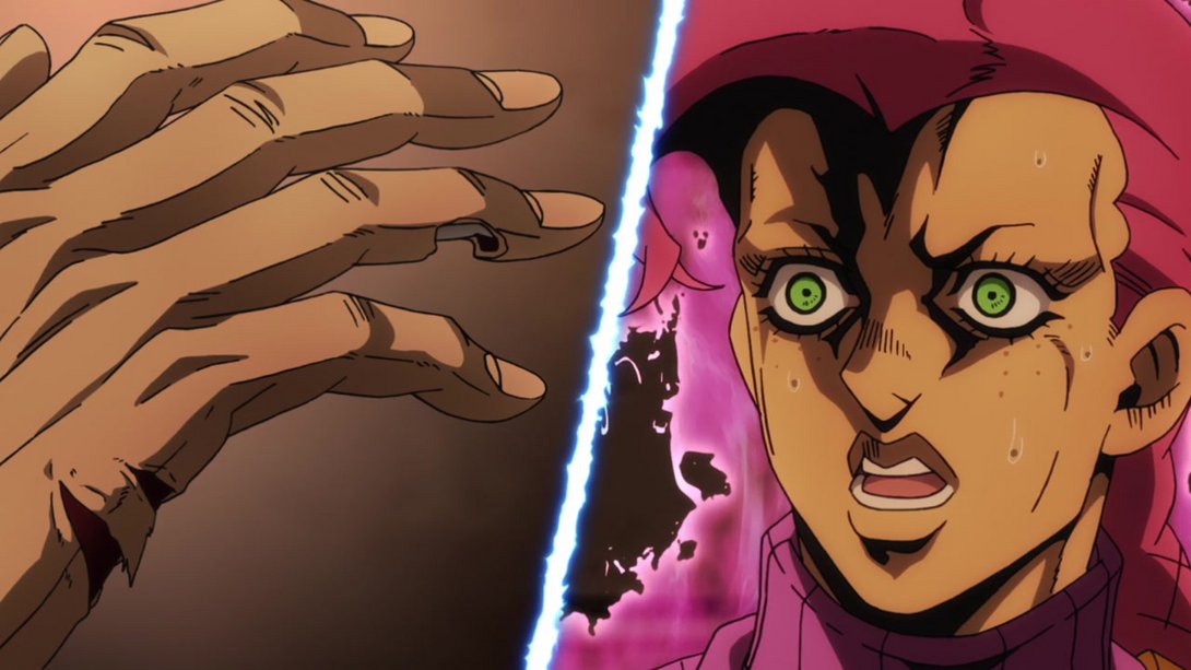
- Here, the shading on the back wall and on Doppio is sliiightly different…:
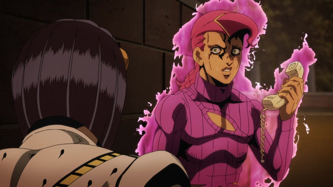
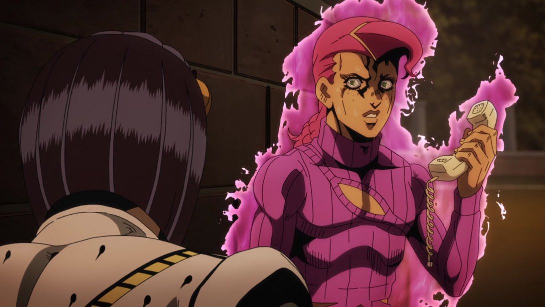
- …and the way the camera zooms on Doppio has been changed, so that the final frame is looking quite different:
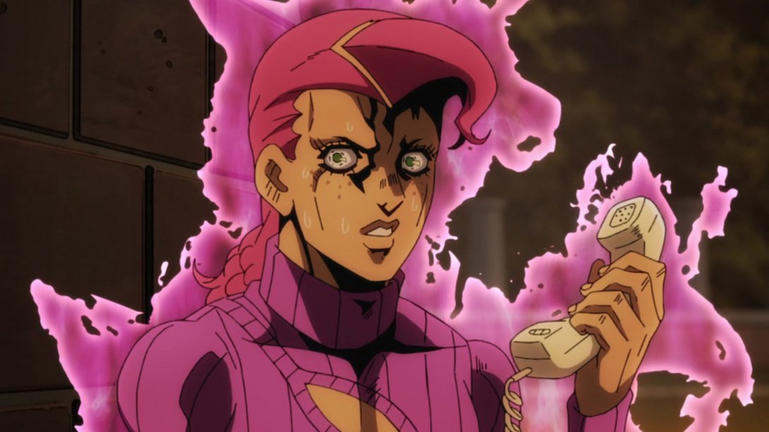
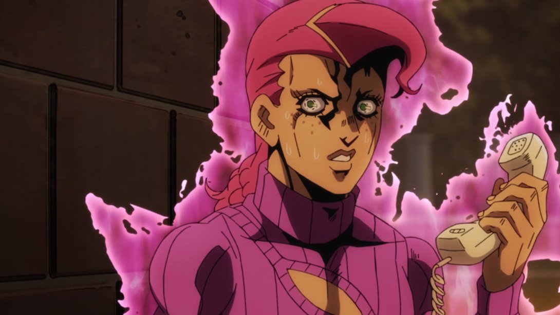
- Doppio’s aura is different here…:
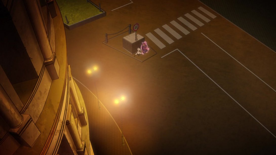
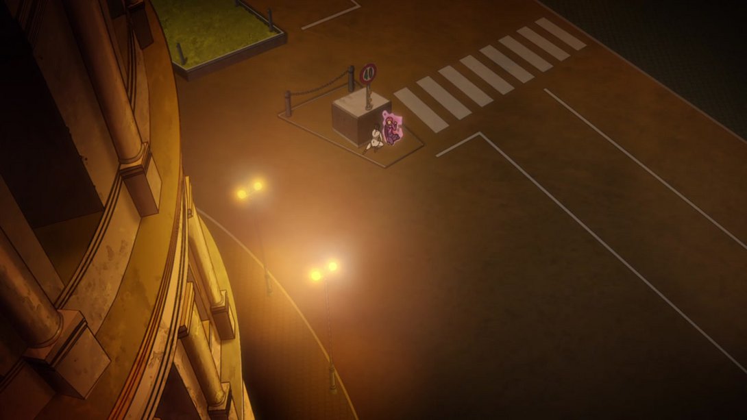
- And here as well! Plus, the colours on Doppio are a little brighter too:
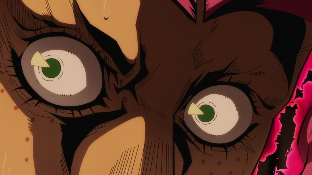
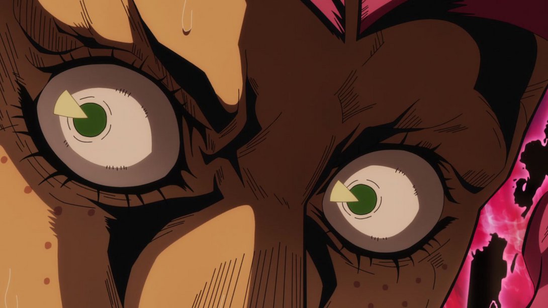
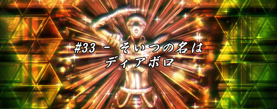
- Let’s take a look at the eyecatch, friends! No image still this time around, though, since for some reason the TV version was exactly as bright as the BD version:
- The aura in this scene is a little… choppier, for some reason:
- Here, the shading on Buccellati’s face is smoother and the darker bits on Doppio are even blacker:
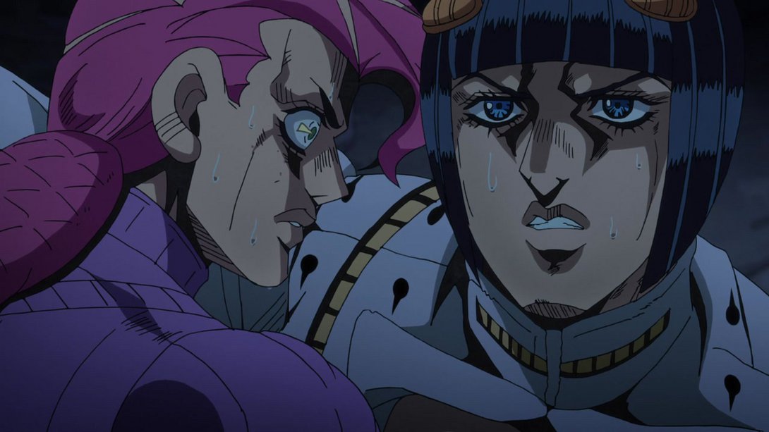
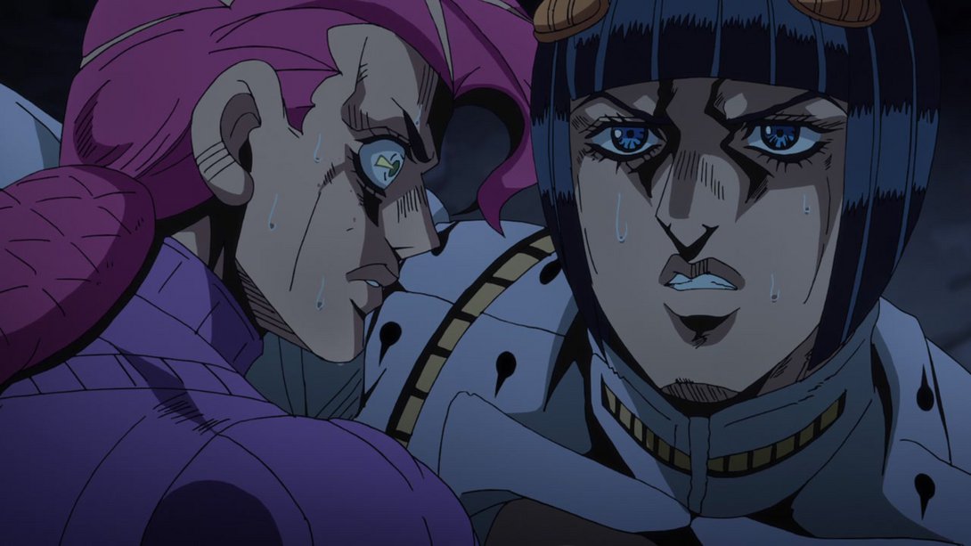
- The black is blacker here once again, and Doppio’s shading has been tweaked once again:
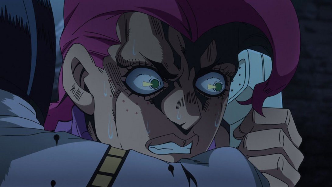
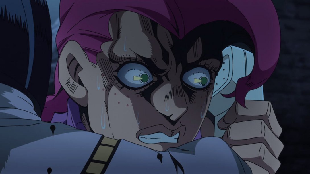
- The wall behind our beloved frenchman is blurrier here:
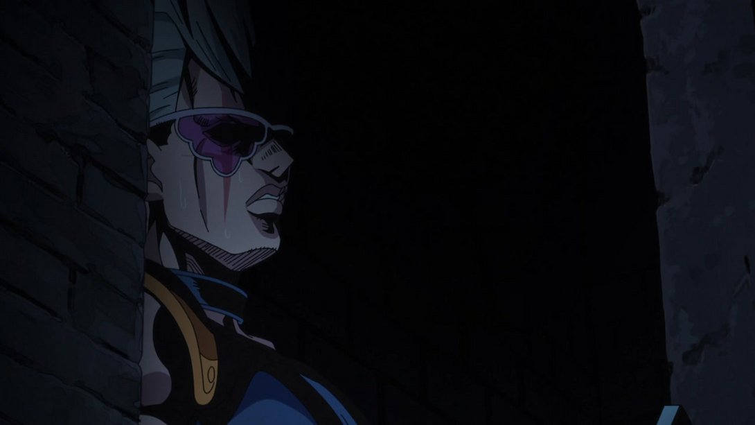
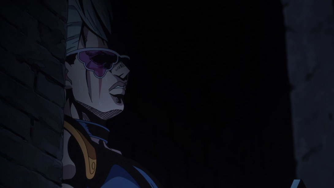
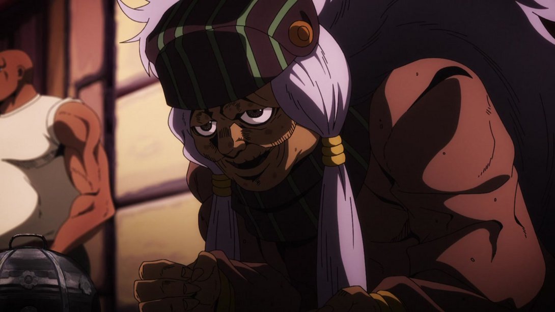
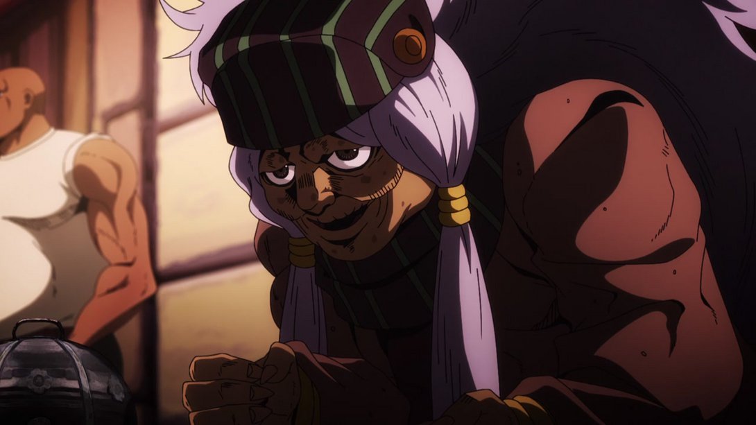
- And here, the lighting is very different and one bit of Enya’s hair has been correctly recoloured:
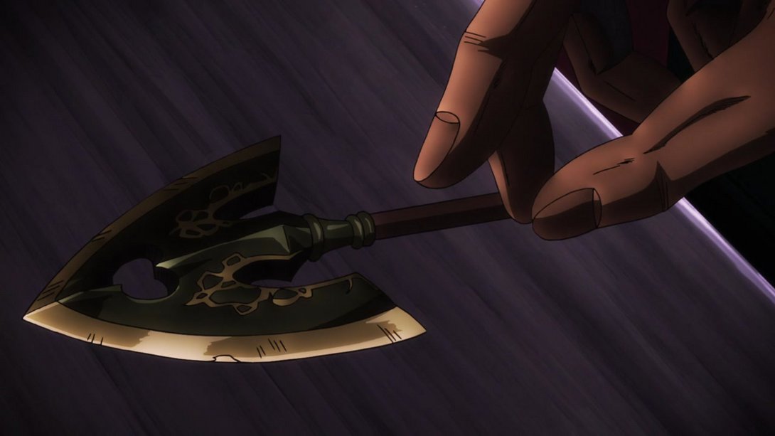
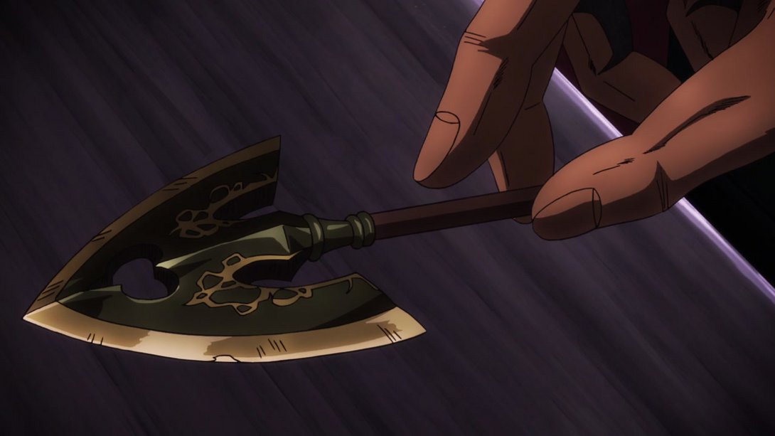
- Both the arrow and the hand have been heavily reshaded here, and the hand has been moved on the correct layer so that the middle finger is behind the arrow shaft:
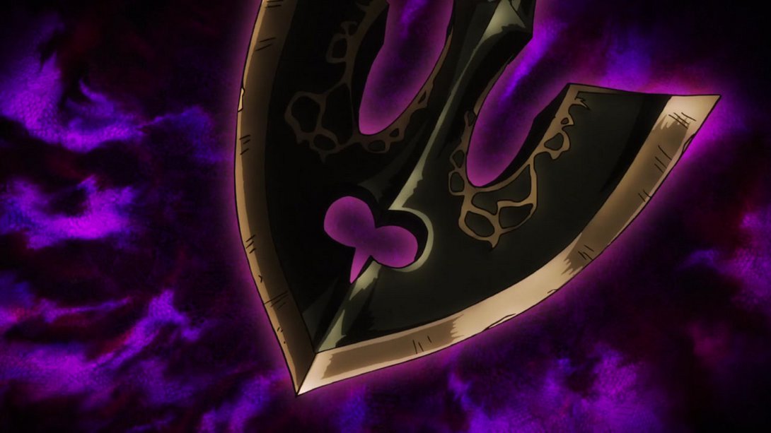

- The background is brighter here, and Jotaro has also been shaded in a flatter way:
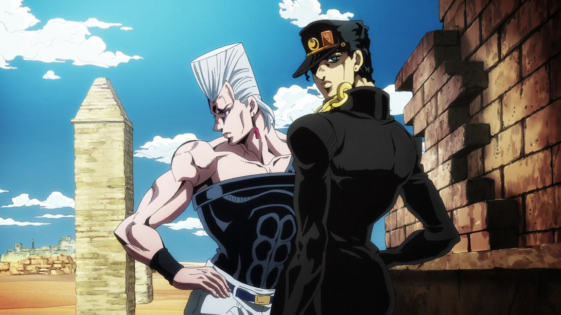
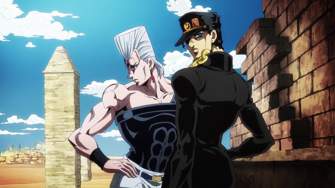
- YO look at how much more handsome our two boys have become here! Right, and the background is also not as bright:
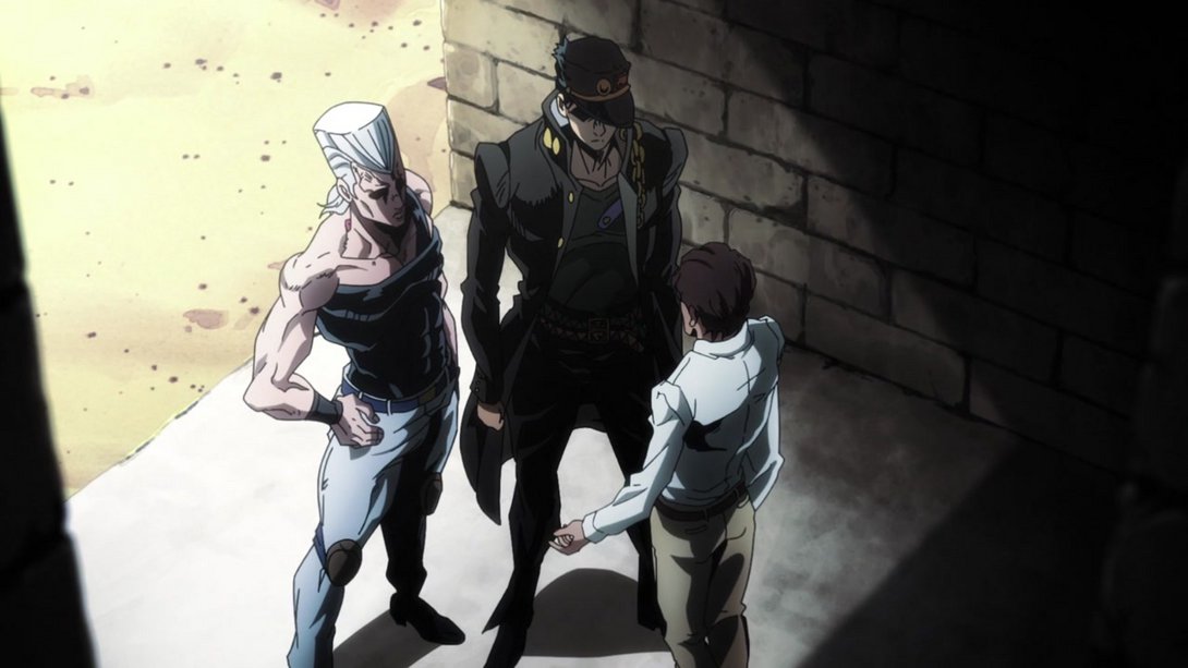
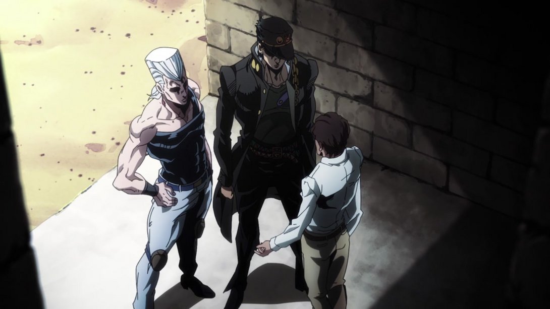
- The bottom and left edges of the frame are darker, here…
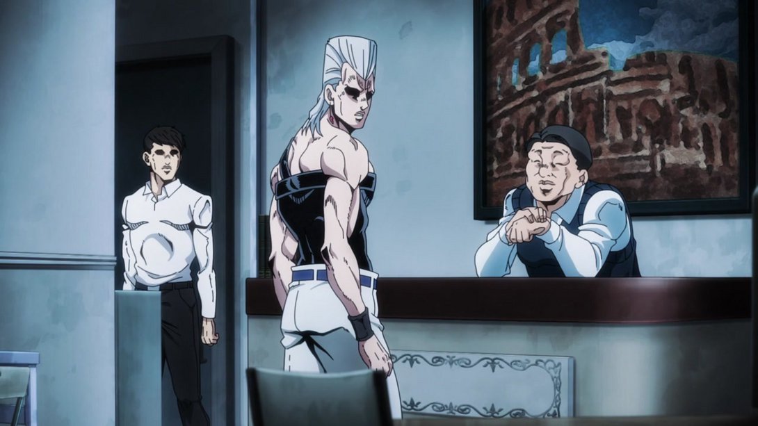
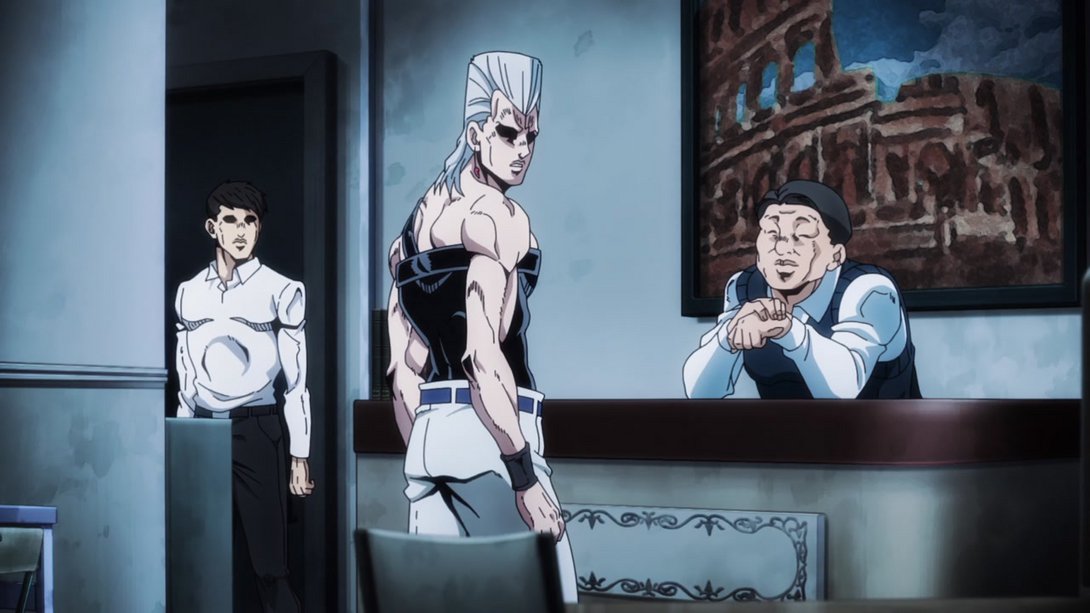
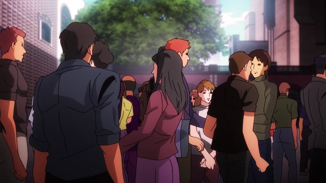
- Everyone has new clothes here (and one dude also has new hair)! And most faces have also been retouched:
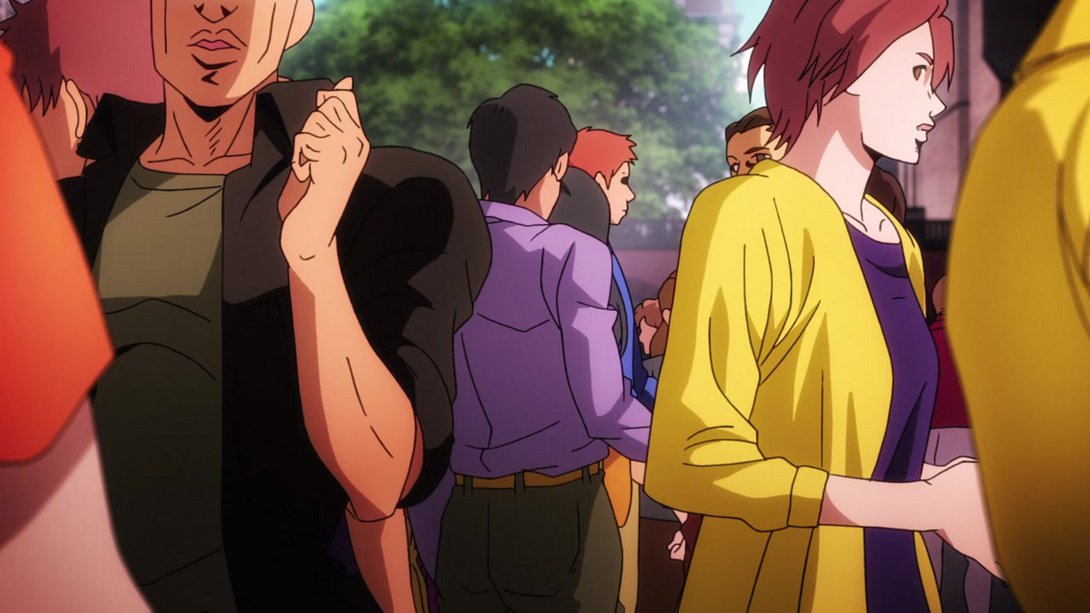
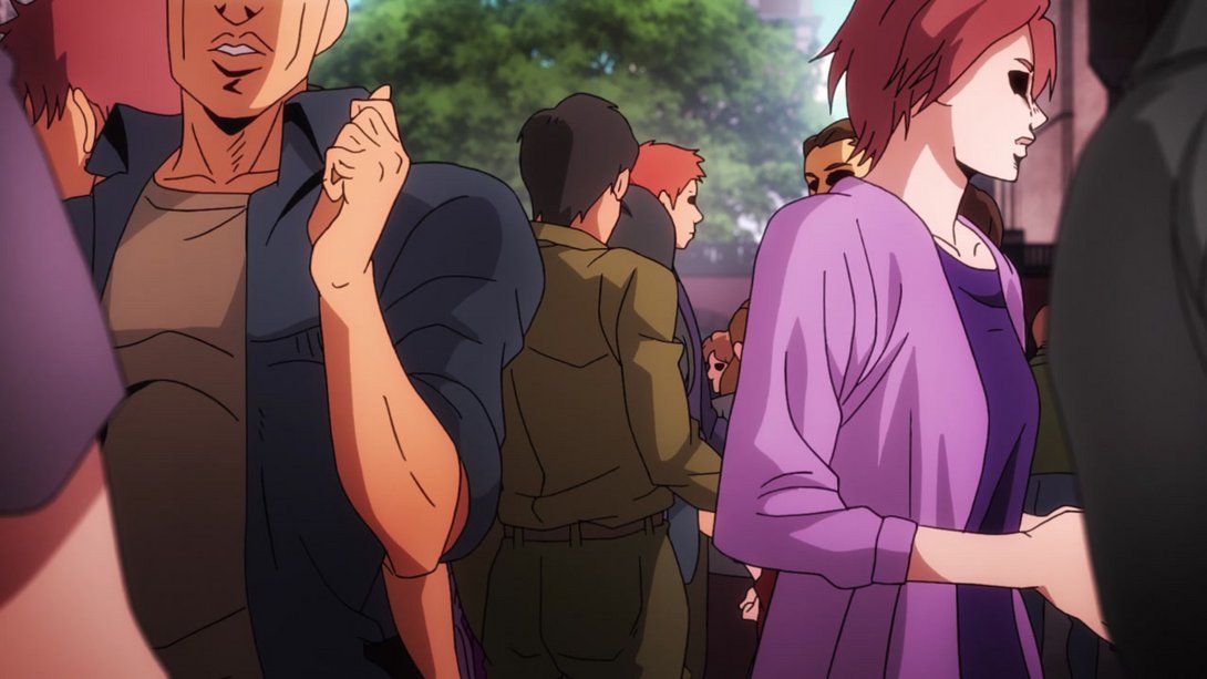
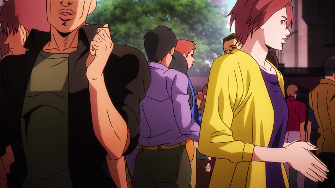
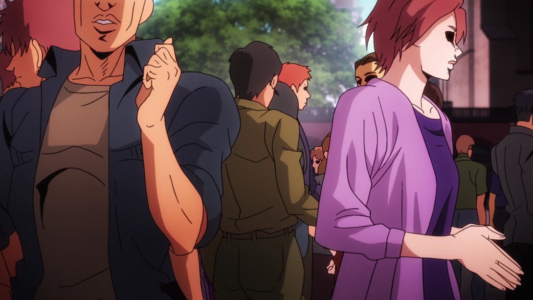
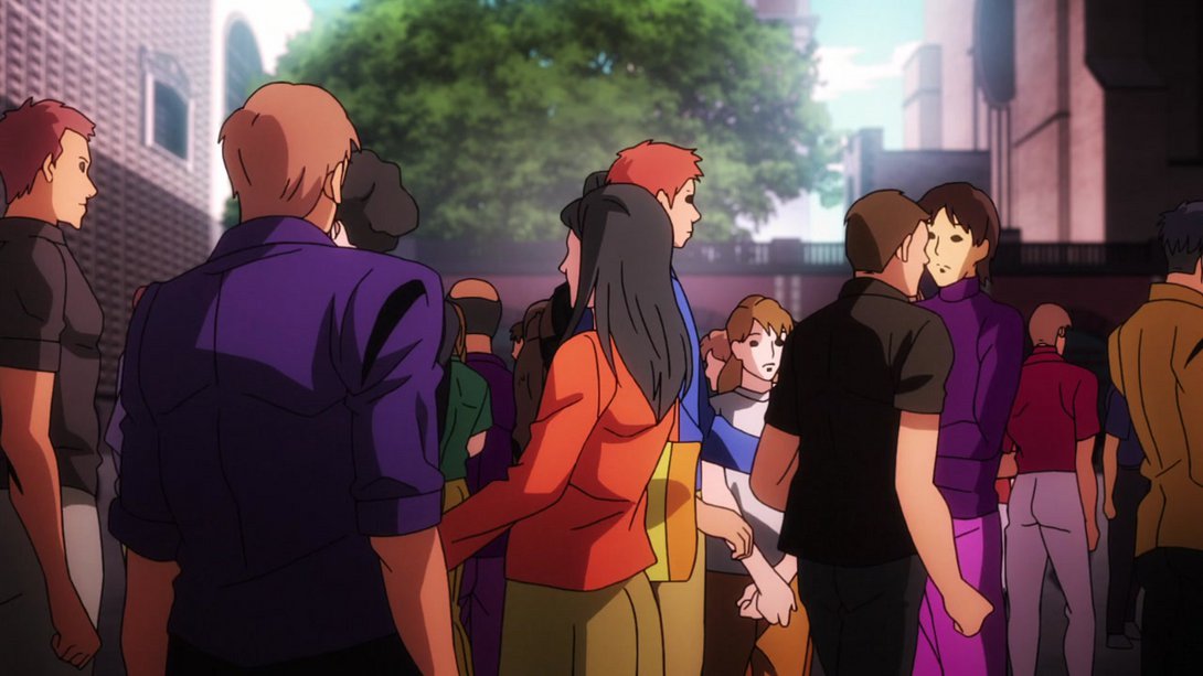
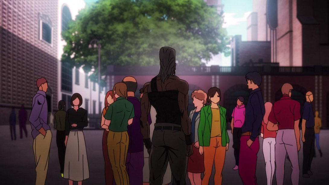
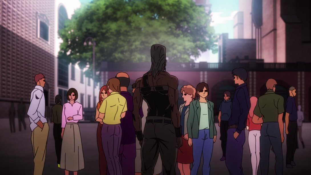
- As you saw in the previous difference, Polnareff’s weird clothes have also been retouched:

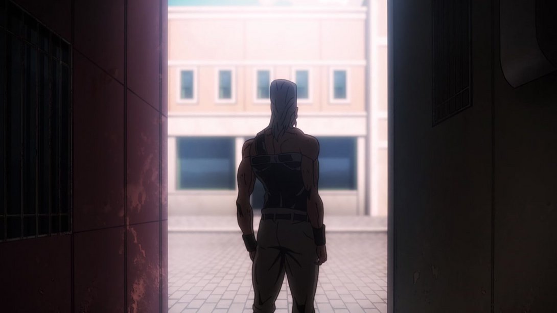
- Our precious boy has been shaded in a softer way once again here! His eyes and his mouth have also been retouched:
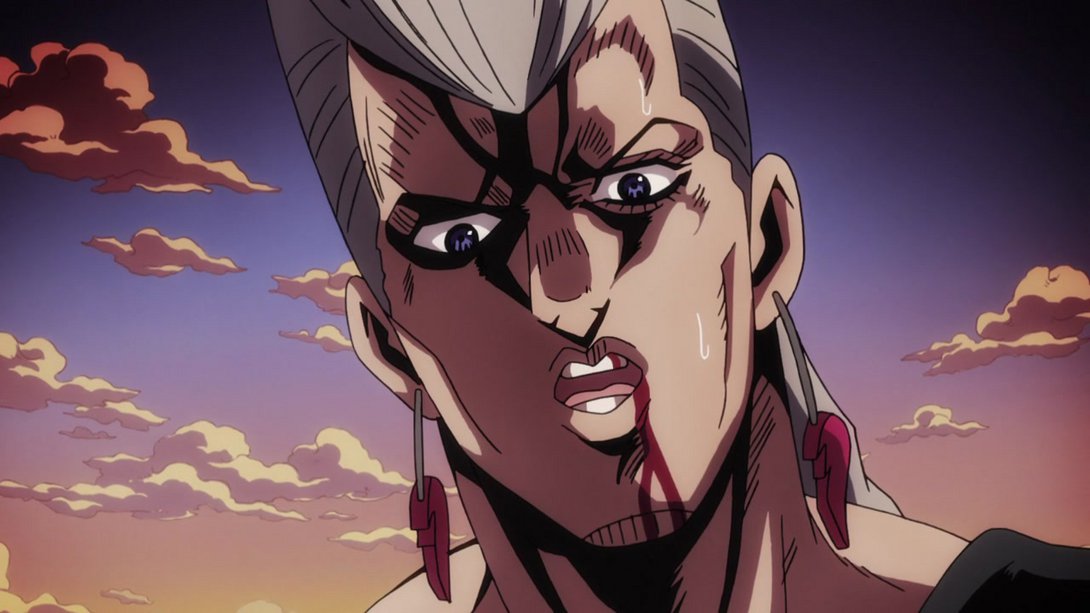
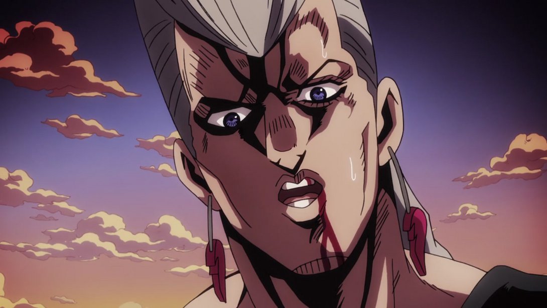
- In addition to those differences, the background effect is also brighter and a little different in the latter part of the same scene:
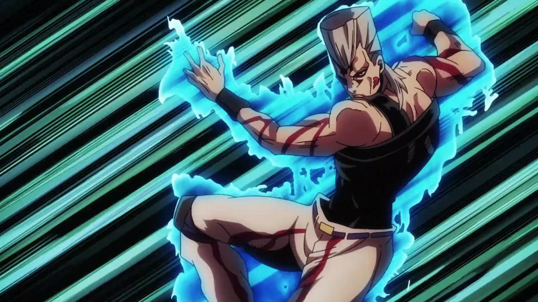
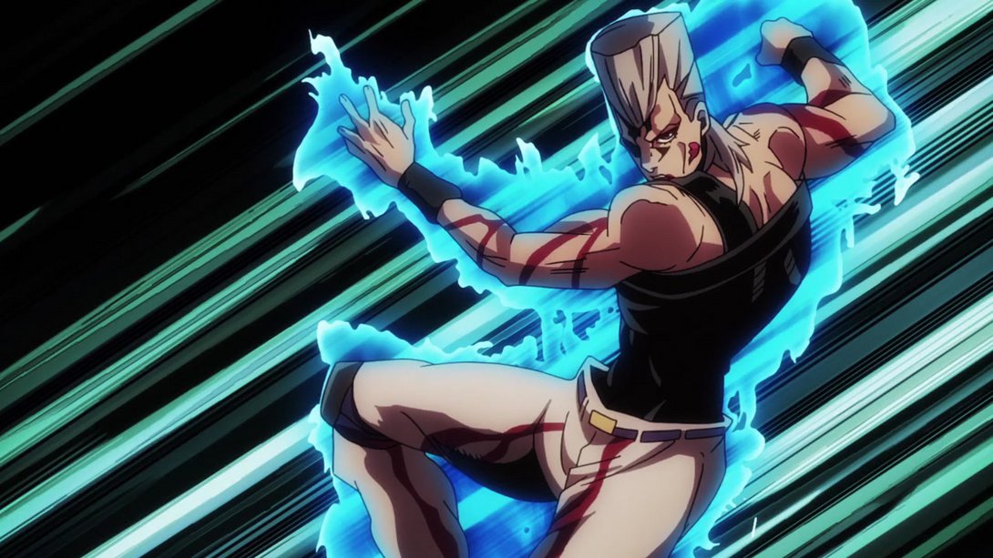
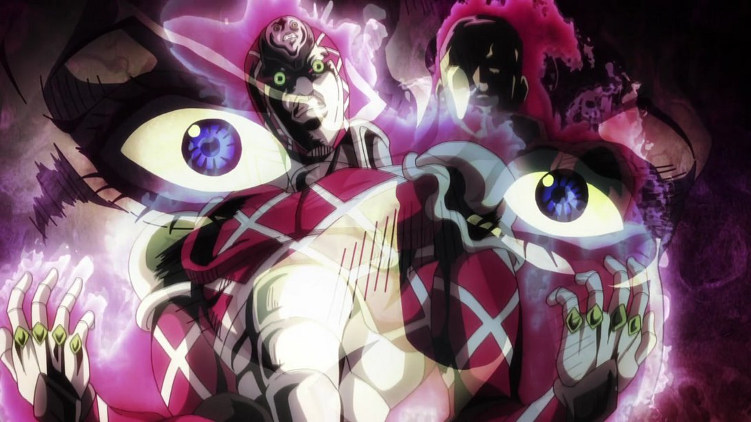
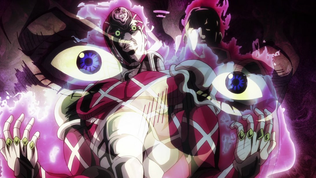
- Here, the boss and King Crimson are less blurry and their auras have been retouched:
- The wall in the foreground is blurrier, here…:
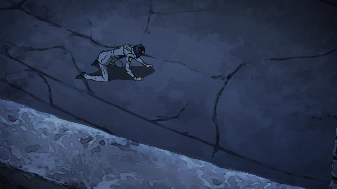
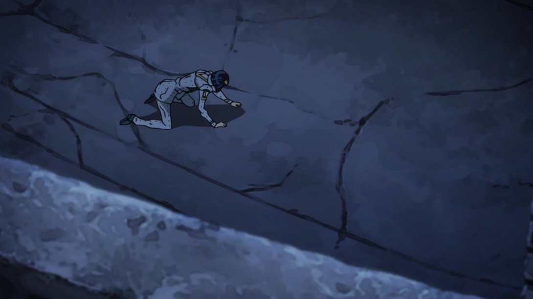
- Our boy is looking better and pointier, here:
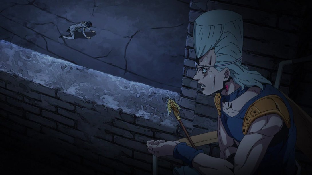
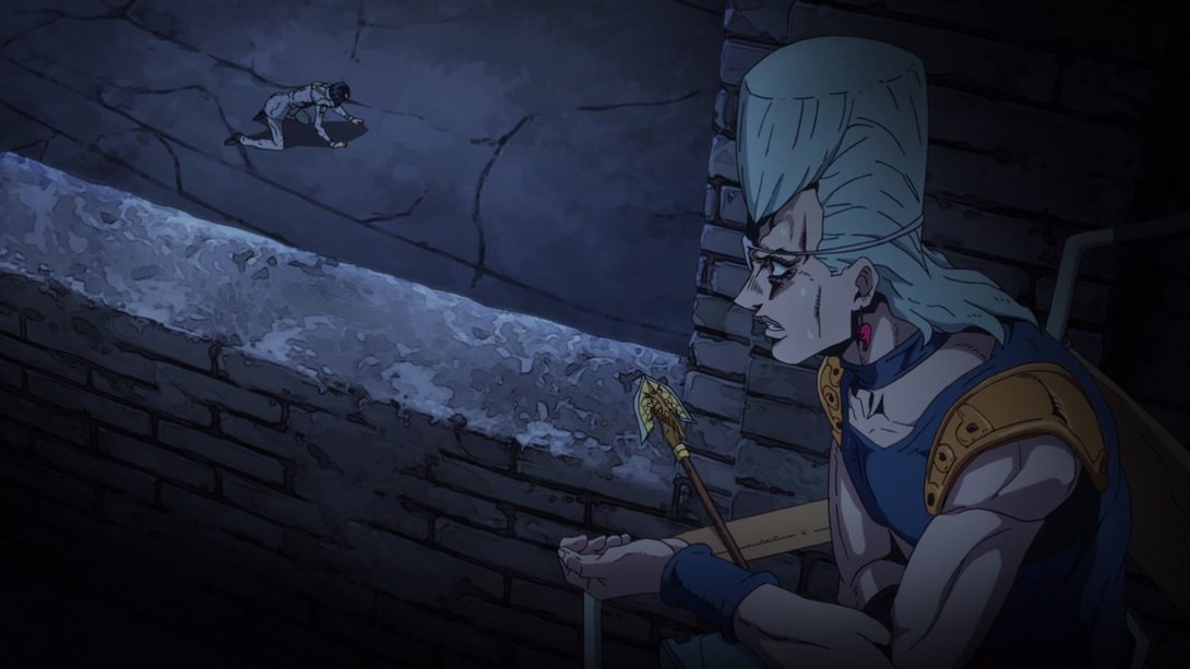
- Buccellati is looking better too, here:

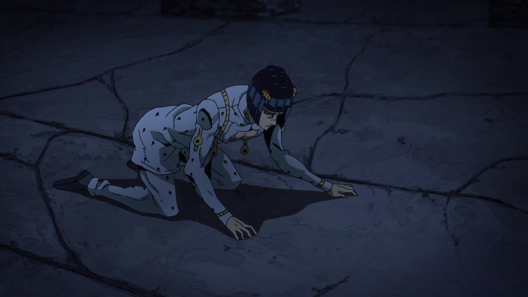
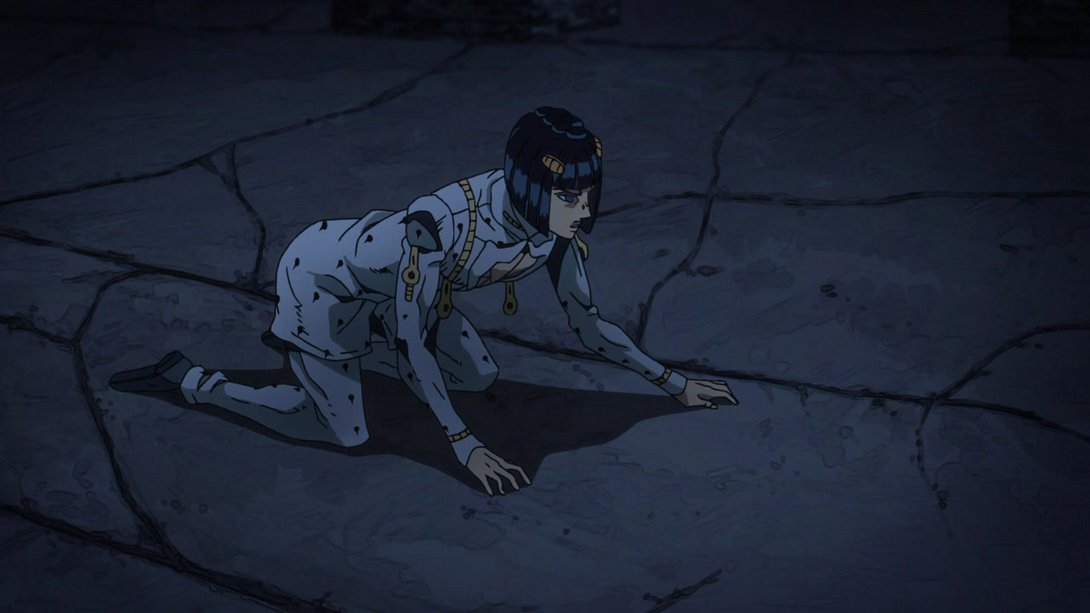
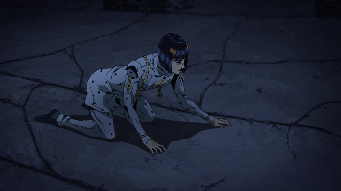
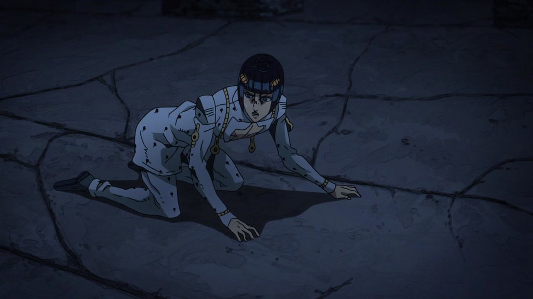
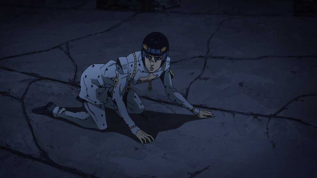
- The background is brighter, here…:
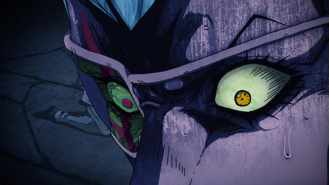
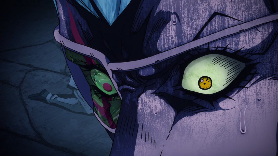
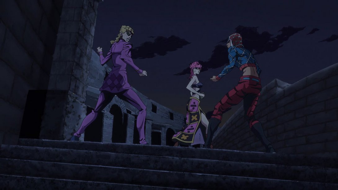
- Both Giorno and Trish’s faces have been retouched here! In addition, Trish’s skirt is also looking, uh… different? I’m not entirely sure if those lines between the squares were supposed to be there or if they mistakenly reverted to a rougher version, but here you go:
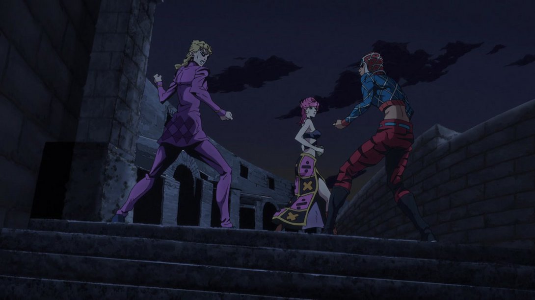
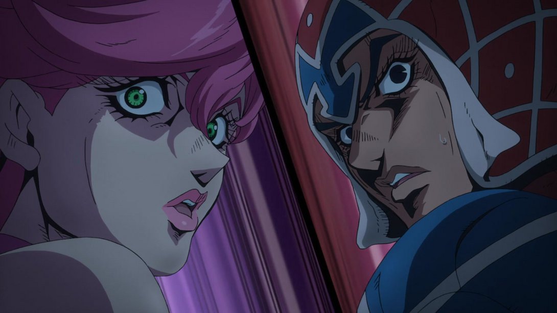
- Here, both Trish and Mista have been shaded in a more even way, the dividing line has been moved and recoloured and the background in both halves is brighter and more interesting-looking:
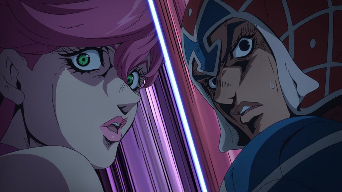
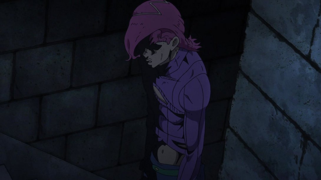
- In this incredible scene of Doppio “transforming” into Diavolo there were three frames in which his forehead had been mistakenly coloured pink; this has been fixed in the BDs:
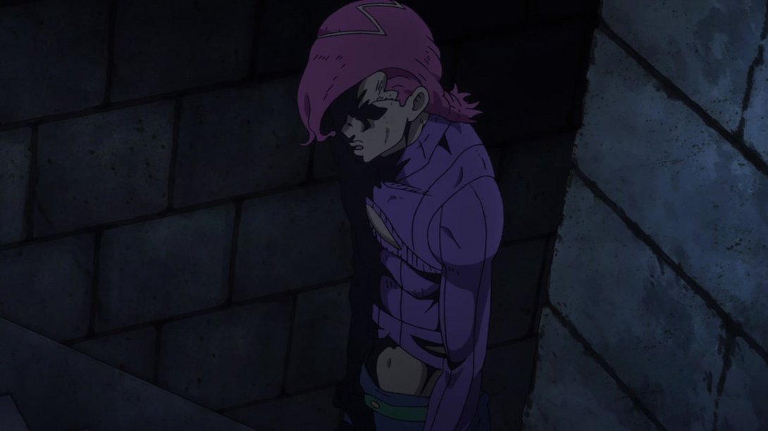
- This King Crimson animation is brighter…:
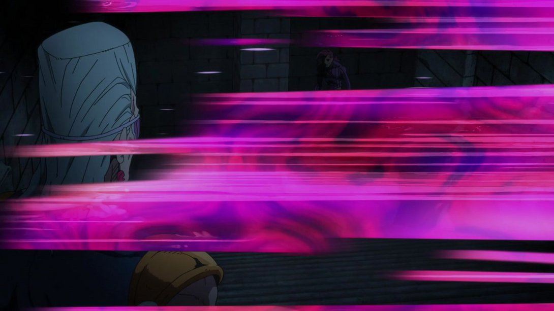
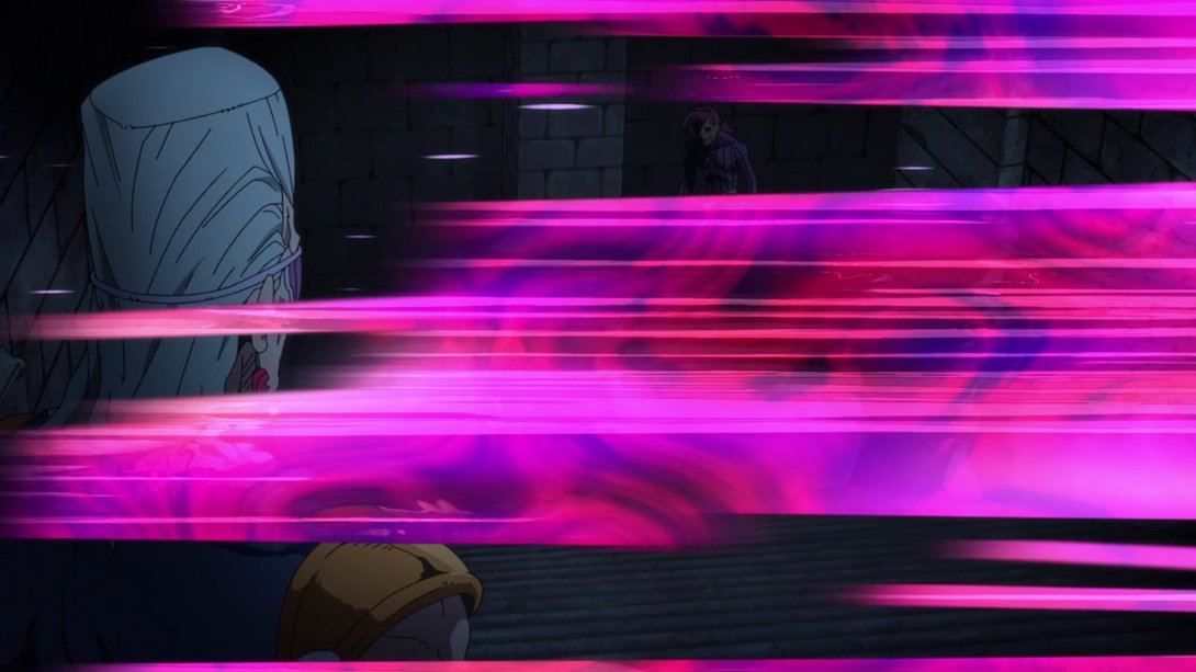
- This section has been recoloured to be more similar to the rest…:
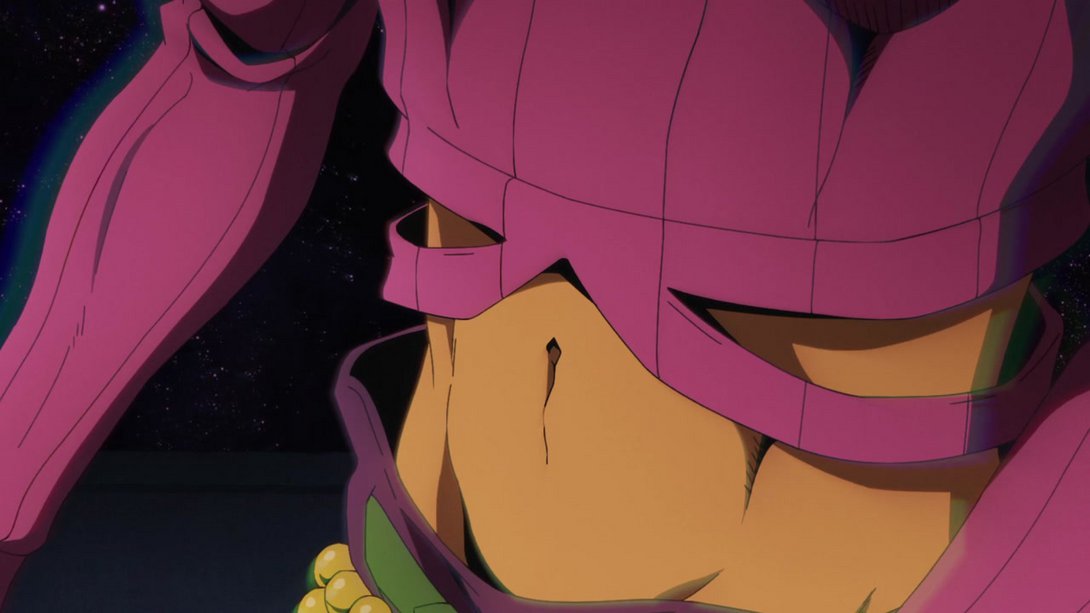
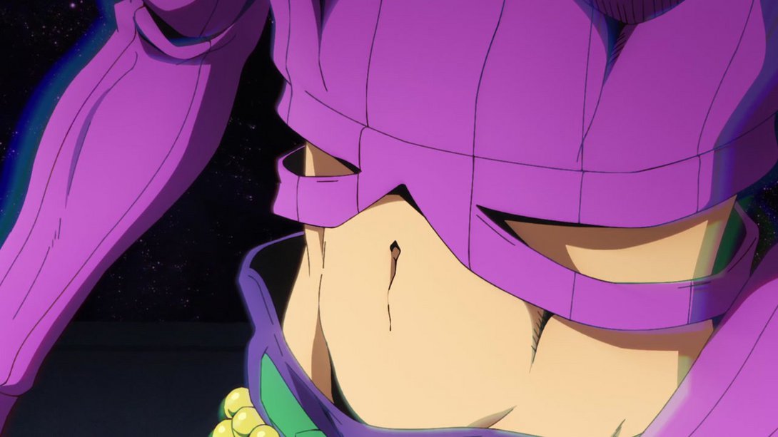
- And here, Polnareff’s head and shoulders™ have been retouched:
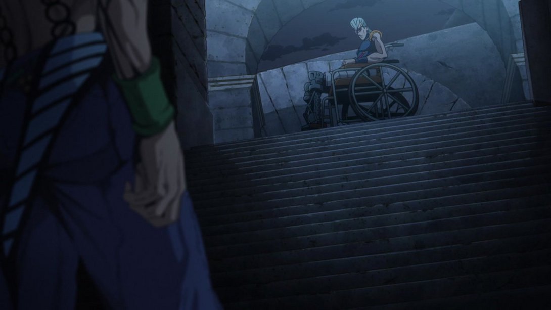
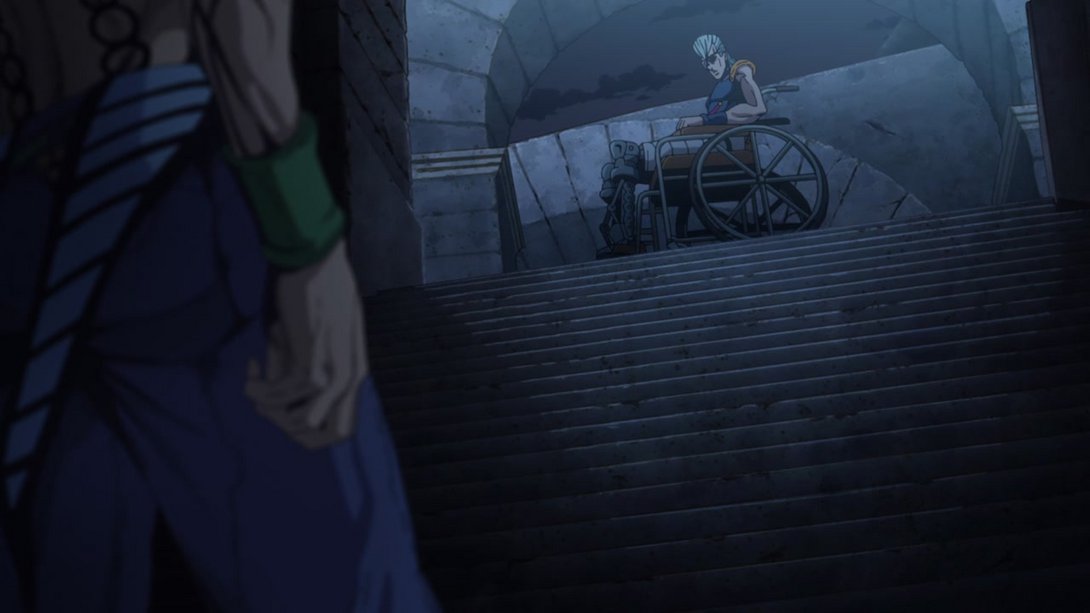
- Diavolo is no longer casting part of his shadow on thin air, here:

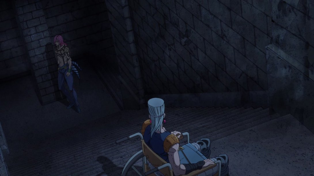
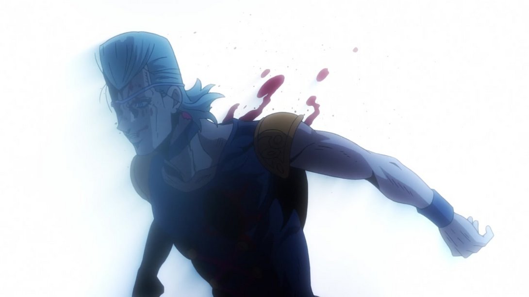
- And here, some bits of Polnareff’s blood are slightly blurrier:
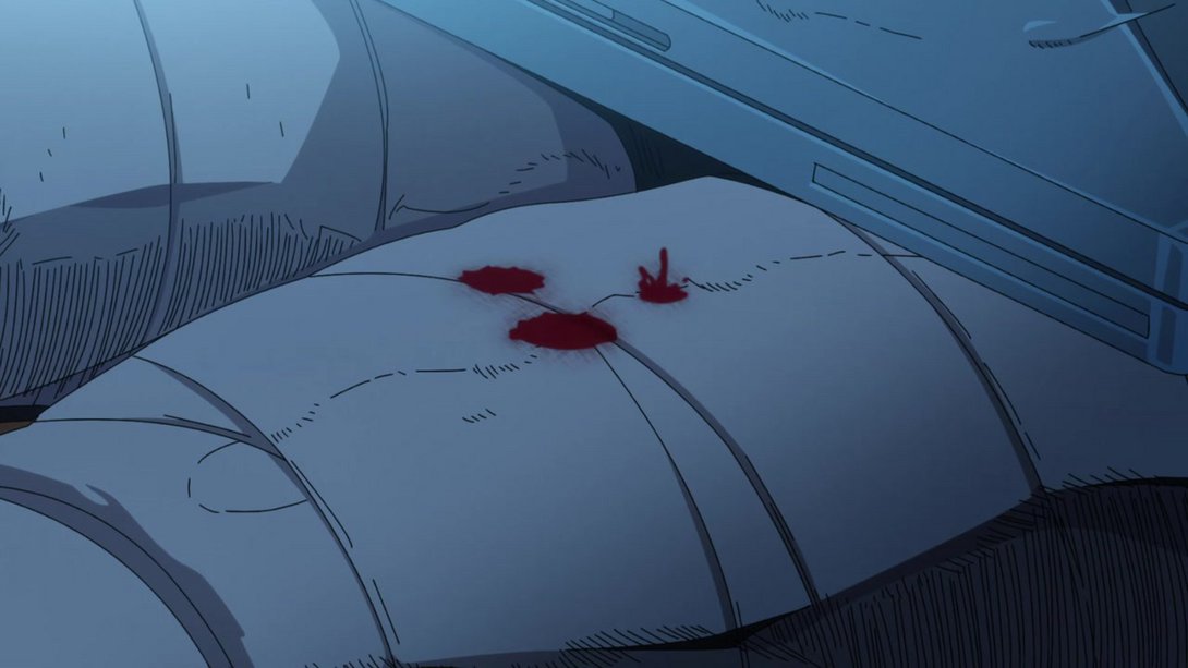
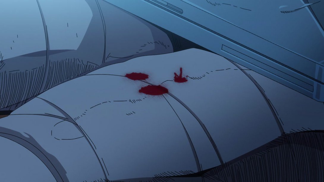

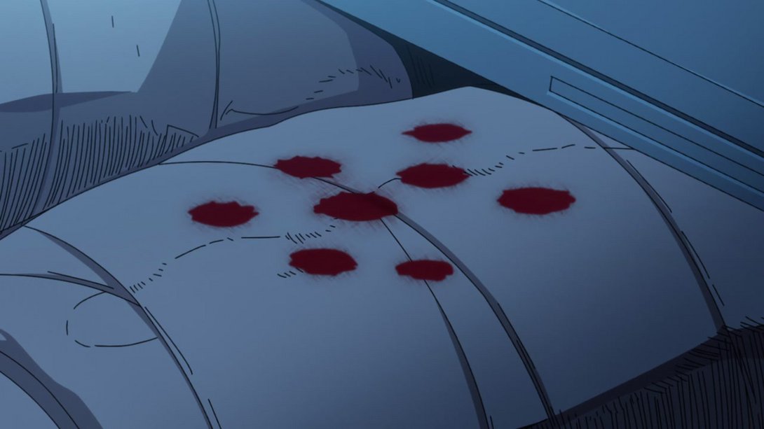
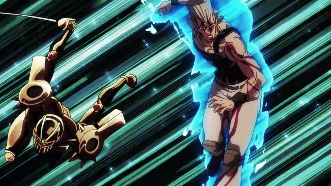
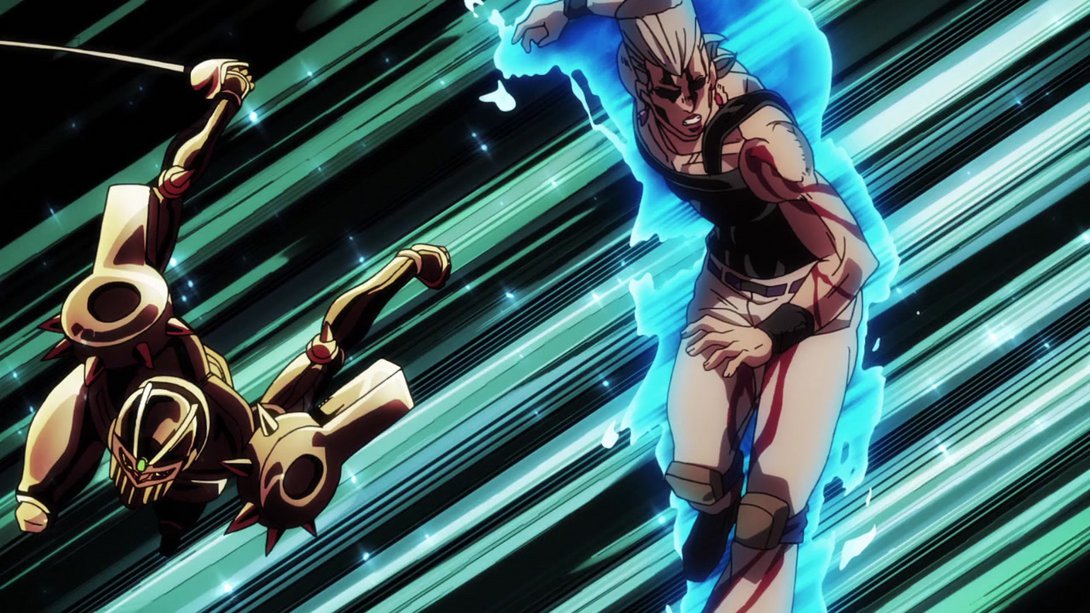
- A bunch of things have been changed in the following animation! First off, let’s take a look at the whole sequence, brighter and sharper as usual:
- And now let’s take a deeper look, shall we? First off, most colours are looking better, Polnareff has been moved up and the motion effects on the top and bottom edges of the frame are different…:
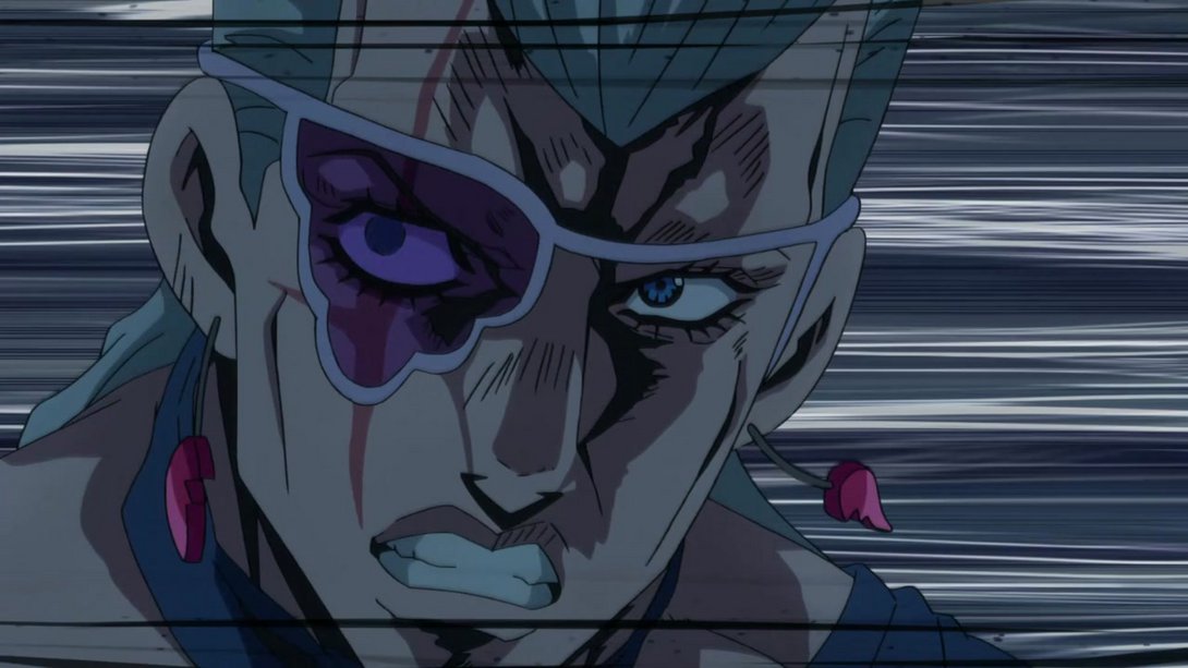
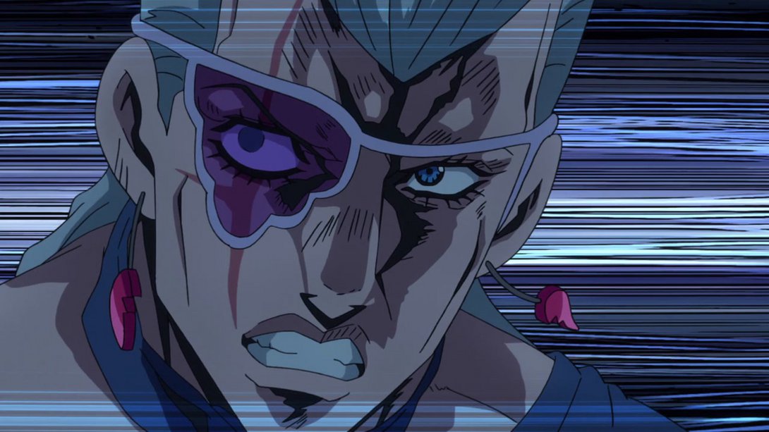
- Polnareff’s face has also been retouched in most frames, and the lines in the background now rotate to better fit the motion…:
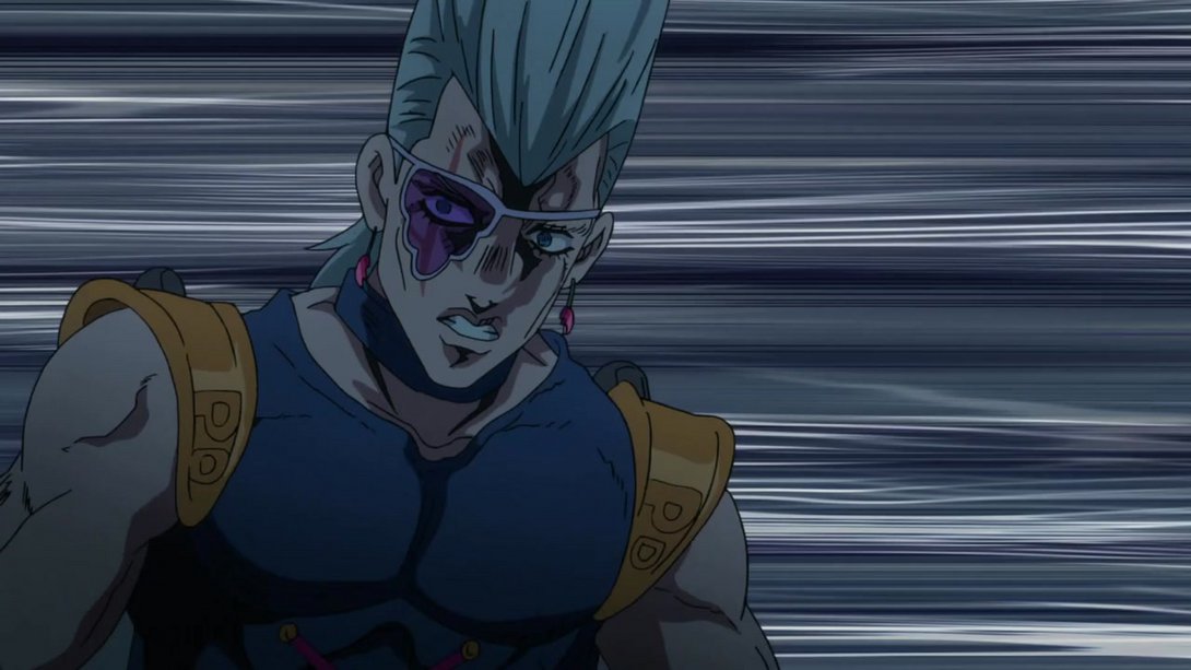
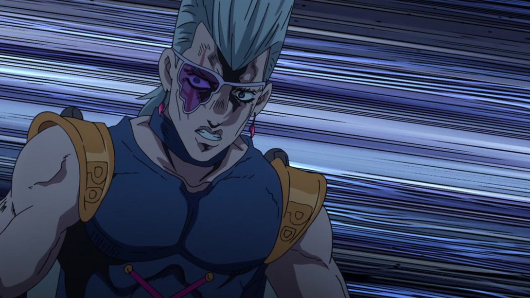
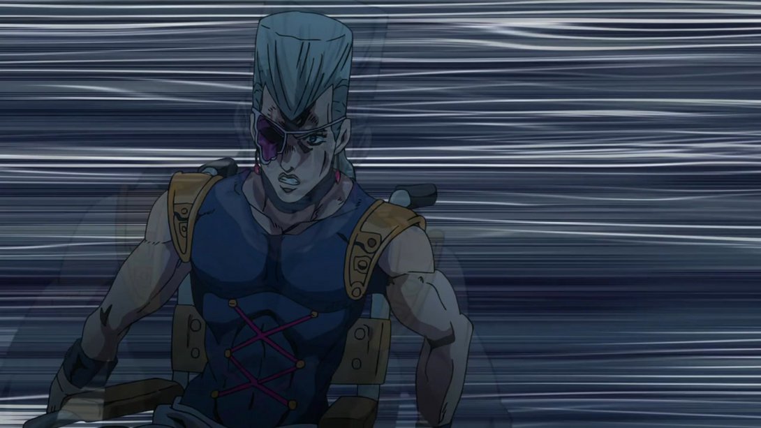
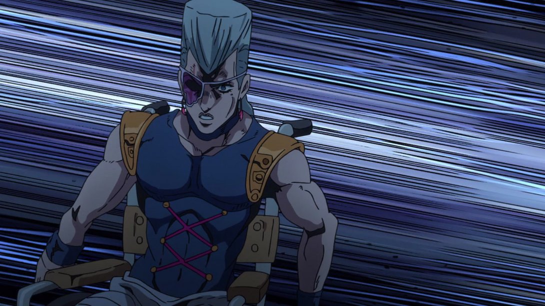
- And, at the end, the background has been recoloured too, along with a freshly retouched Polnareff:
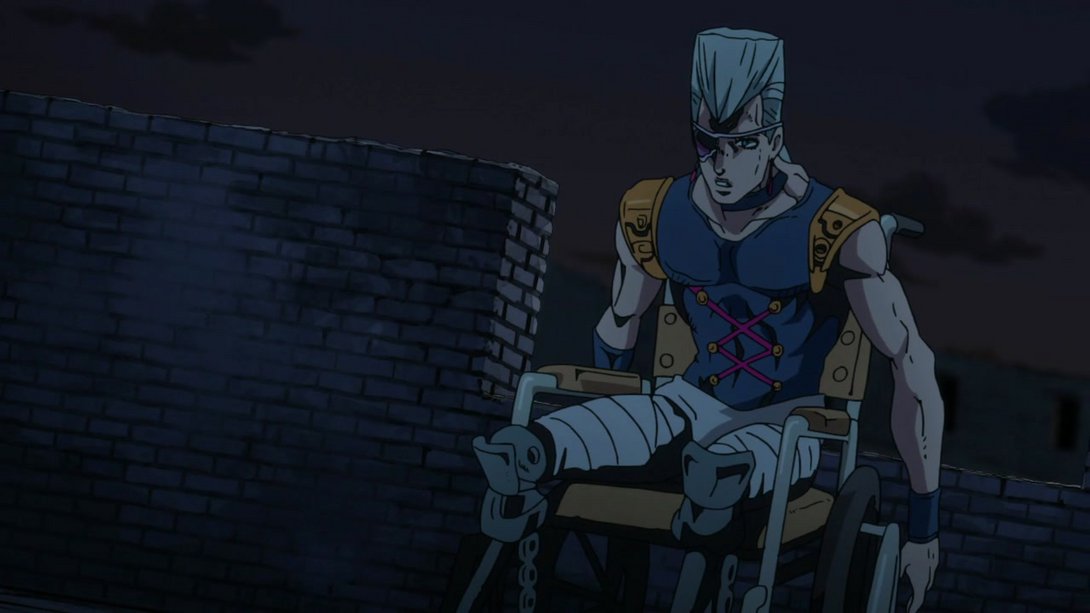
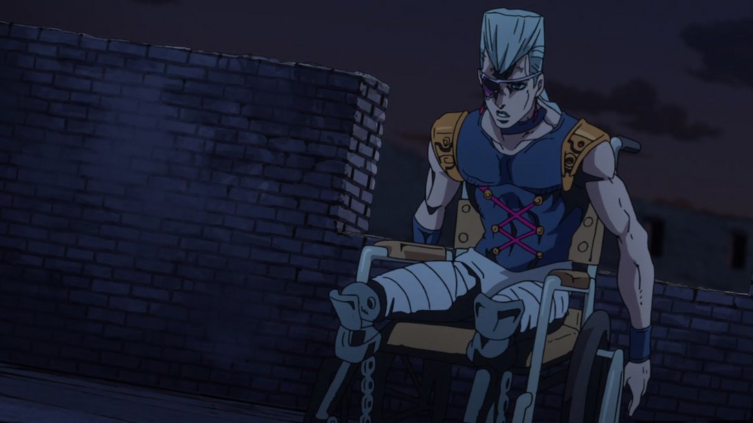
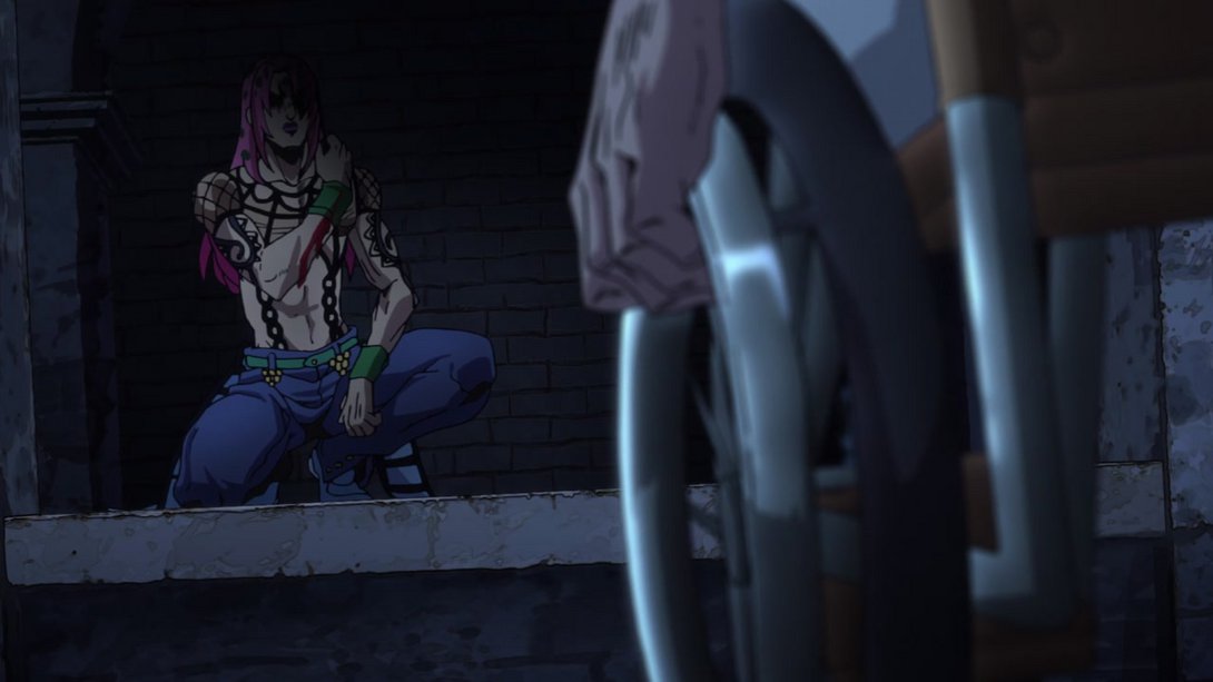
- Diavolo is looking even SEXIER in this steamy, blessed frame! Part of Polnareff’s wheelchair has also been recoloured, on the right:
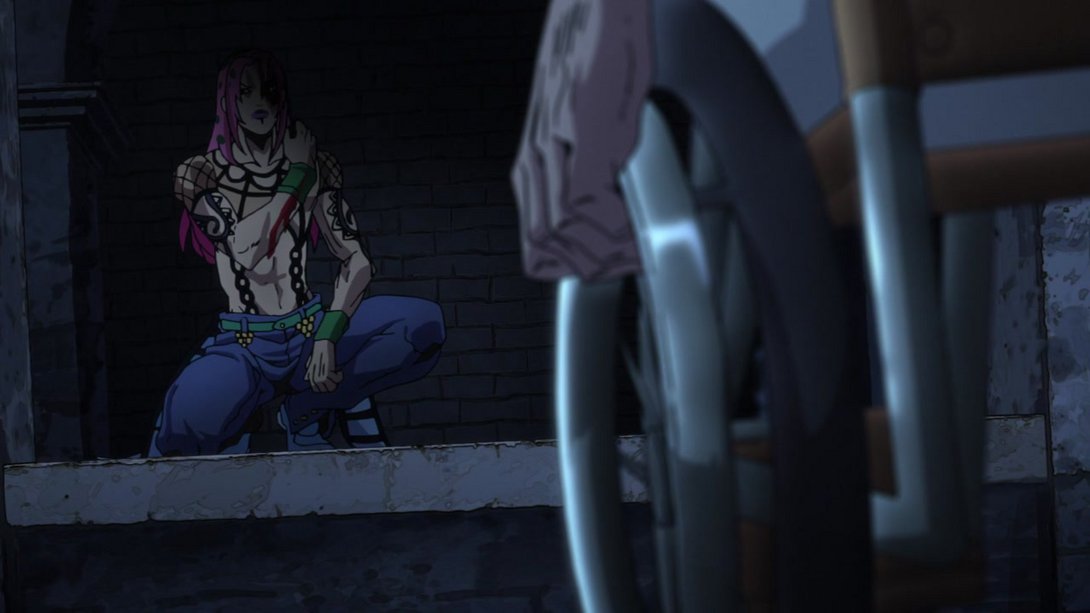
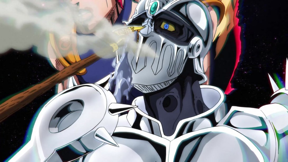
- Silver Chariot is looking significantly better here too, friends:
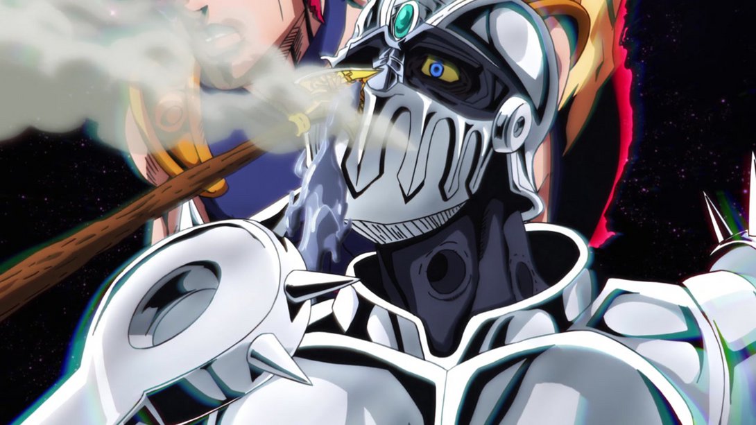
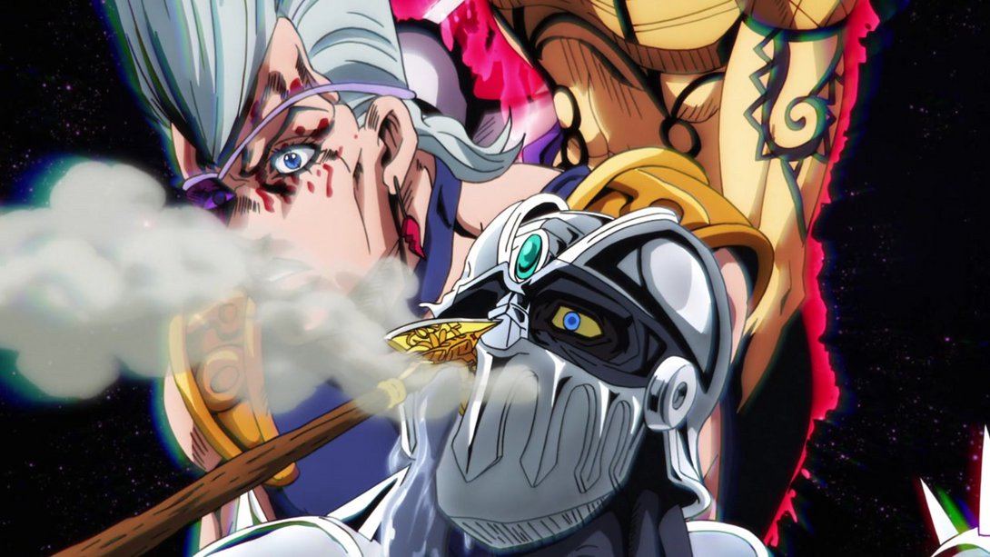
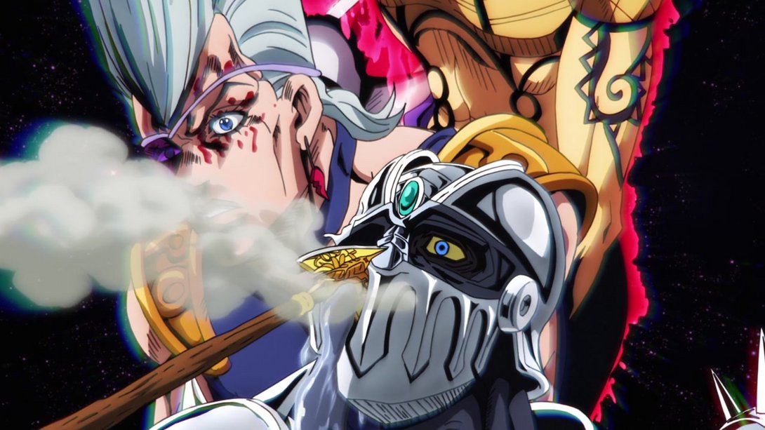
- The “center of gravity” of the background has been moved down, here, and the background itself is also looking better:
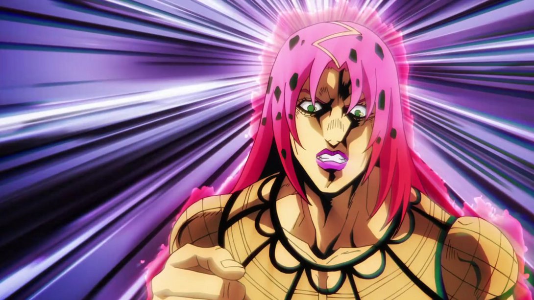
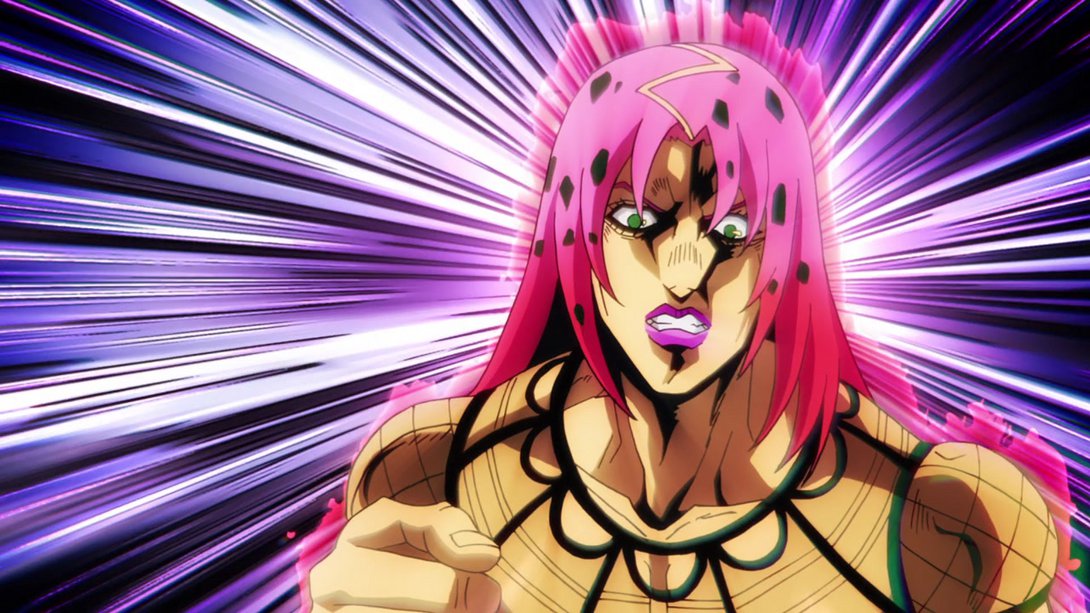
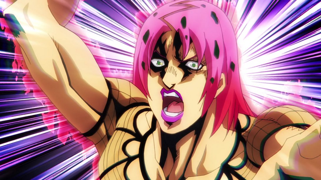
- Diavolo has also applied his lipstick better, in some frames:
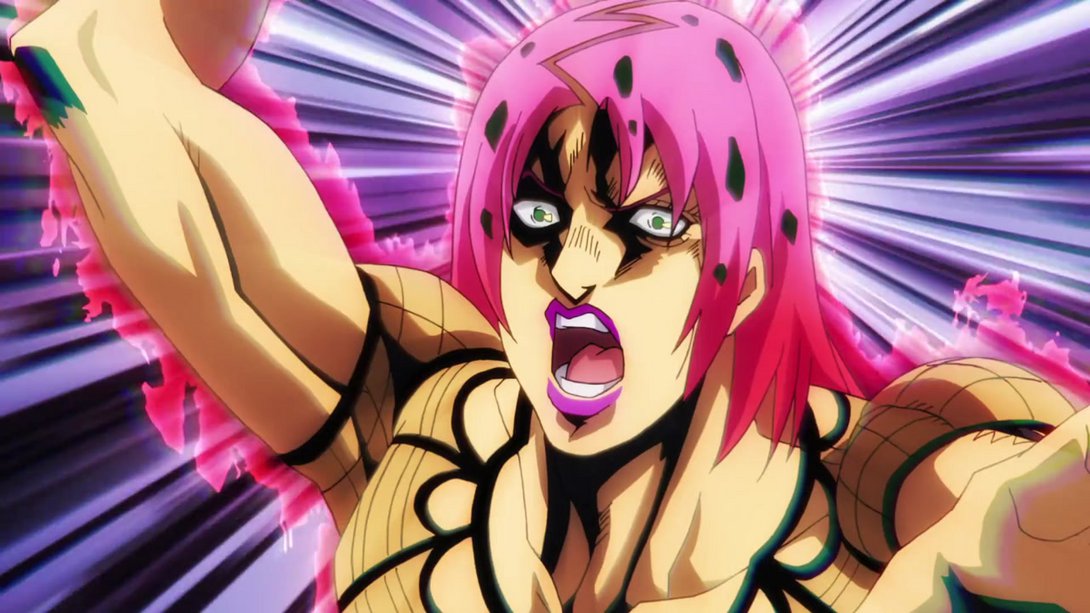
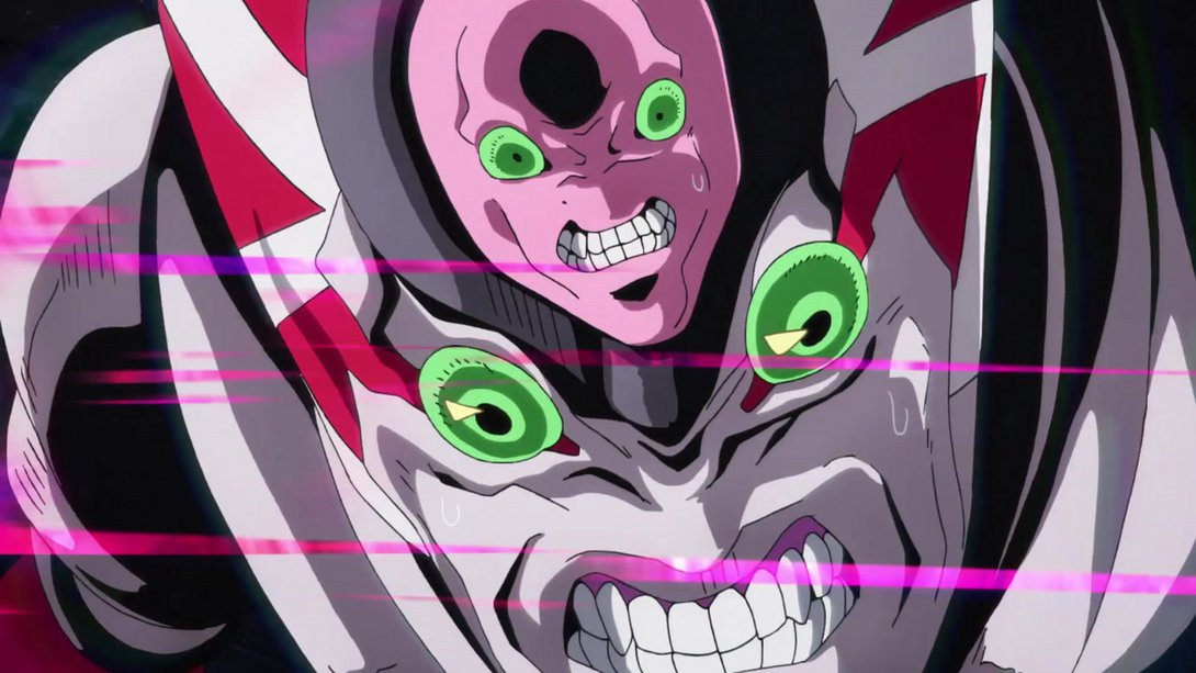
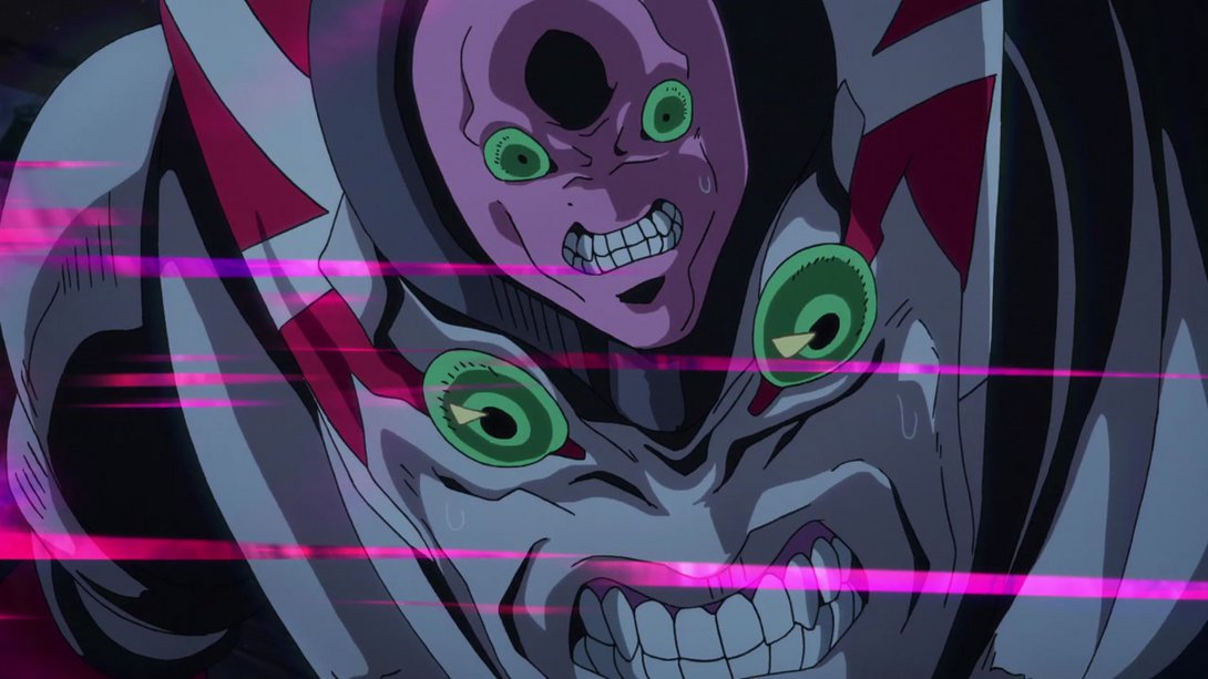
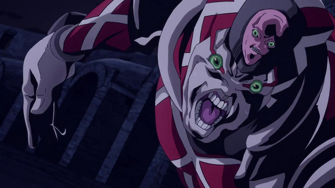
- Both King Crimson and the background have been recoloured, in this collection of very cursed KC frames…:
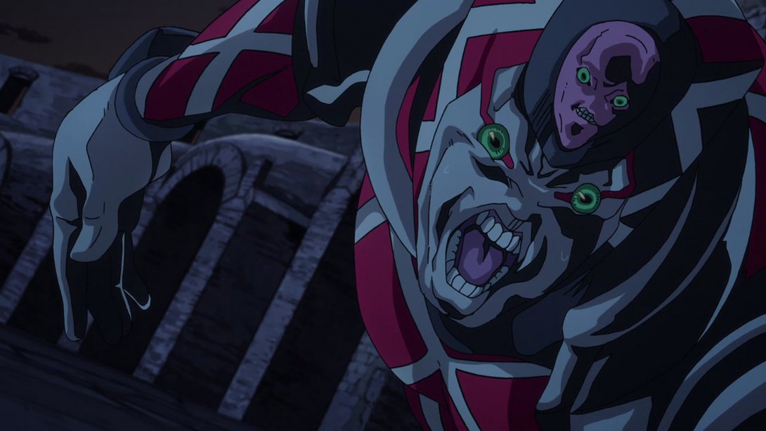
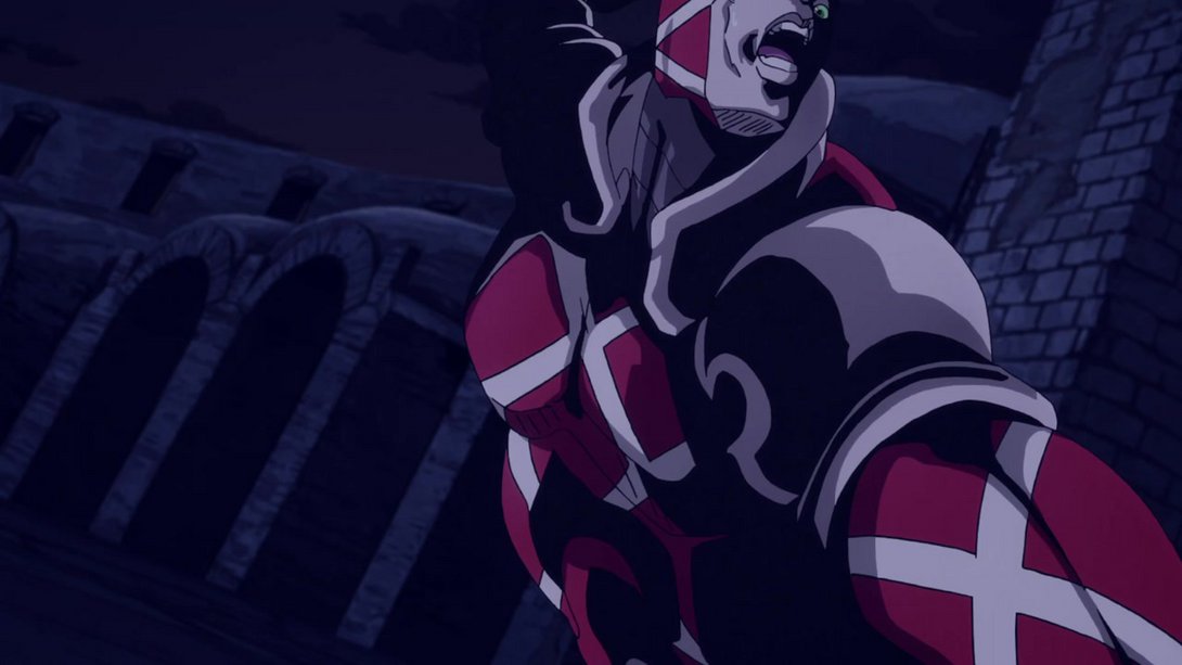
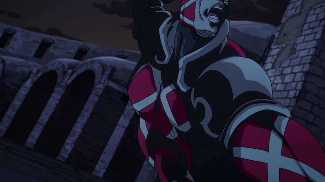
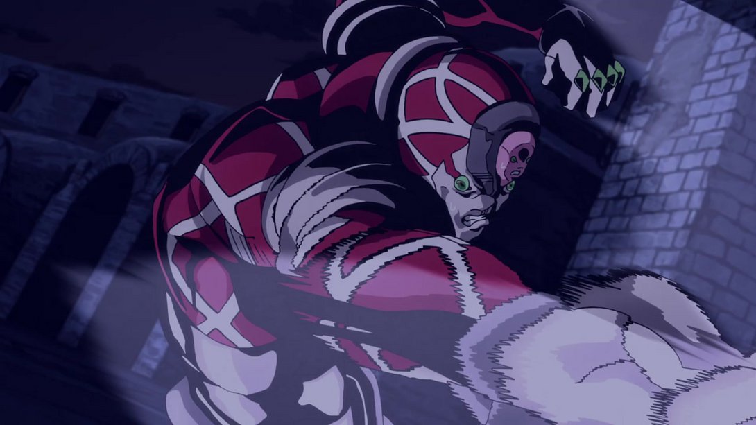
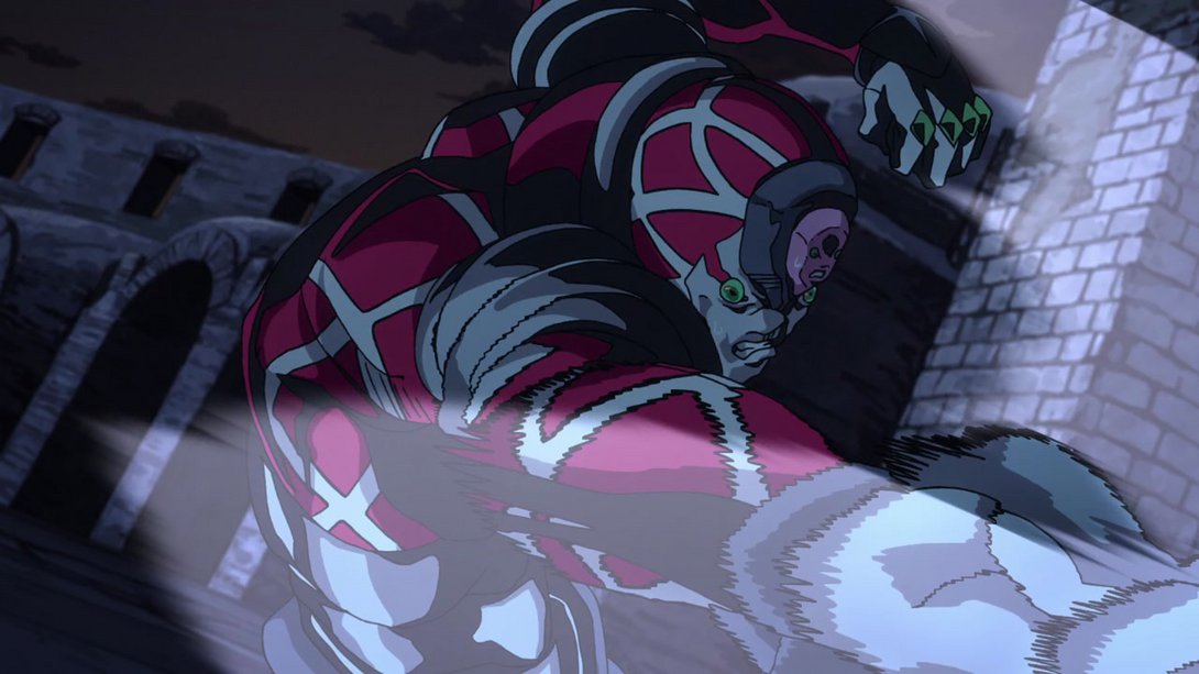
- Diavolo’s chin has been properly shaded, here:
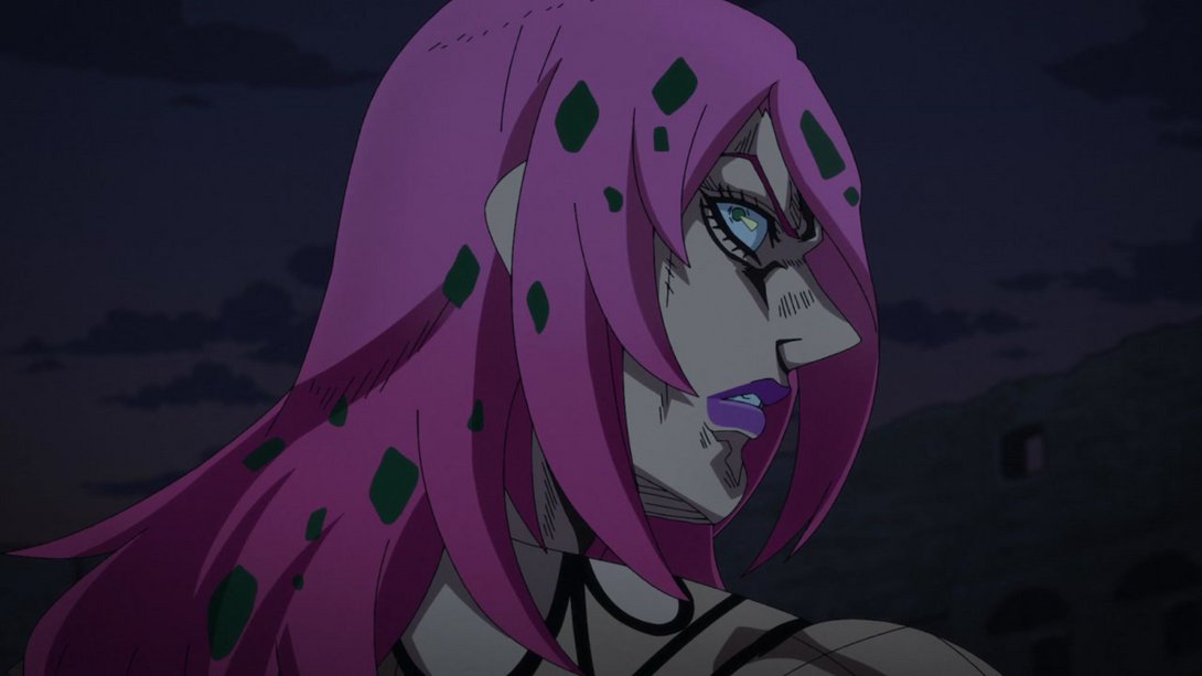
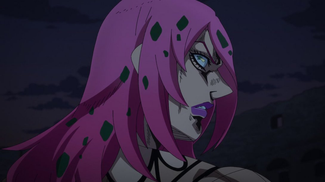
- The animation in this scene of Polnareff panting is slightly different, and he no longer stops breathing in the last 21 frames:
- In addition, the background is also blurrier:
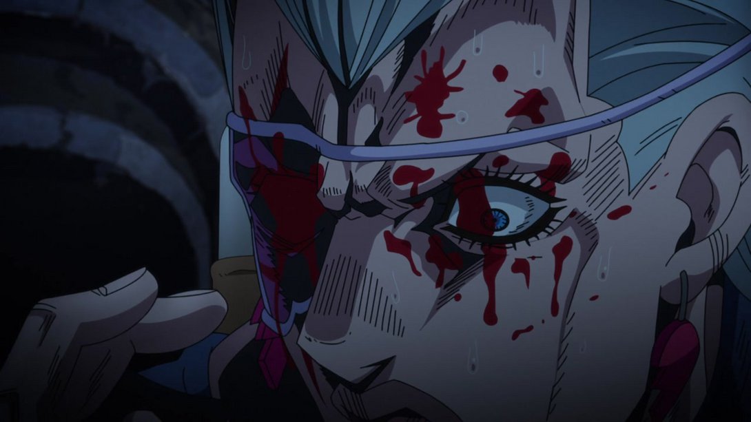
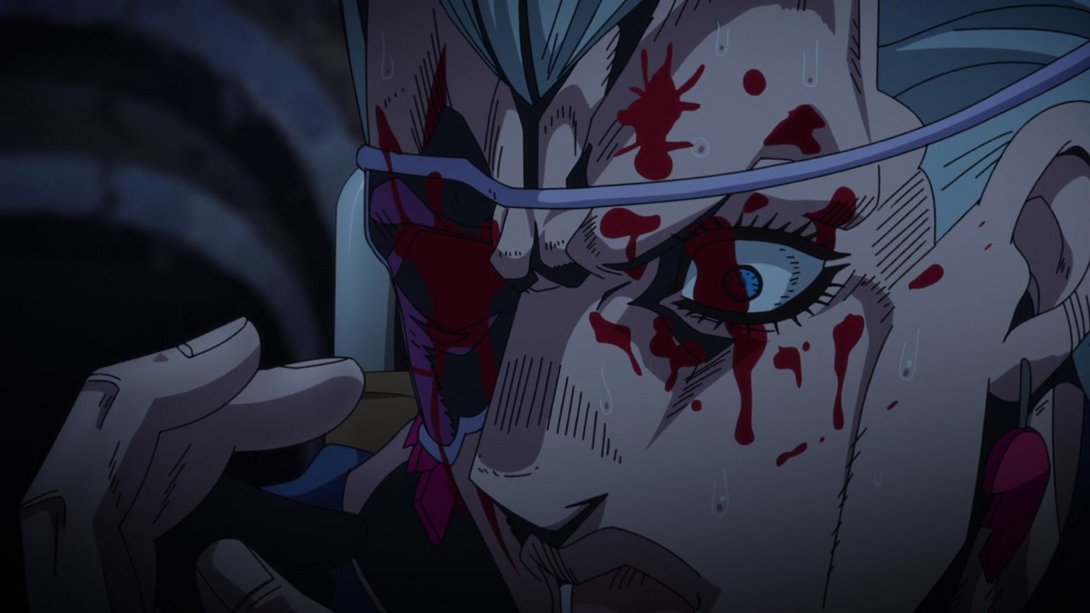
- And here, in addition to a slightly blurrier background and a different distortion along the edges, most dark bits are darker:
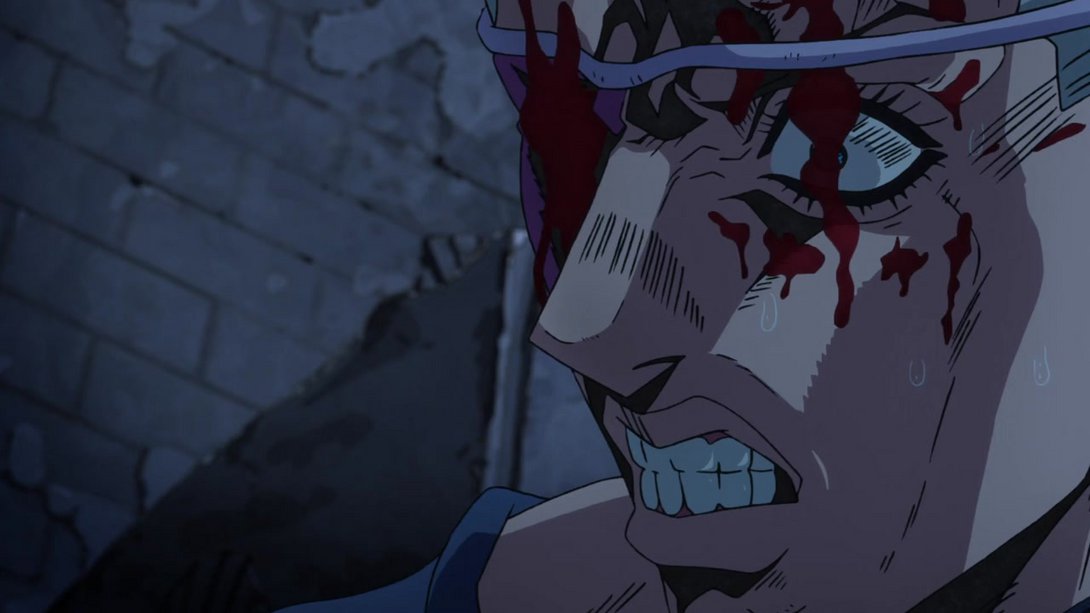
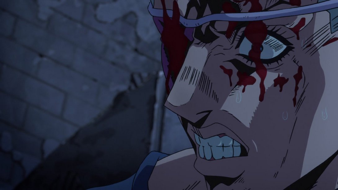
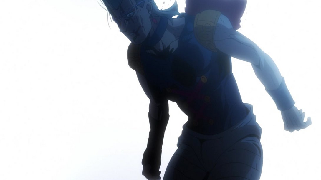
- The lighting in this scene is so much better! In addition, Polnareff’s face and chest (in the first difference only) have also been slightly retouched, and there’s also a new effect around him that makes it look like the light is coming from a big spotlight right behind him:
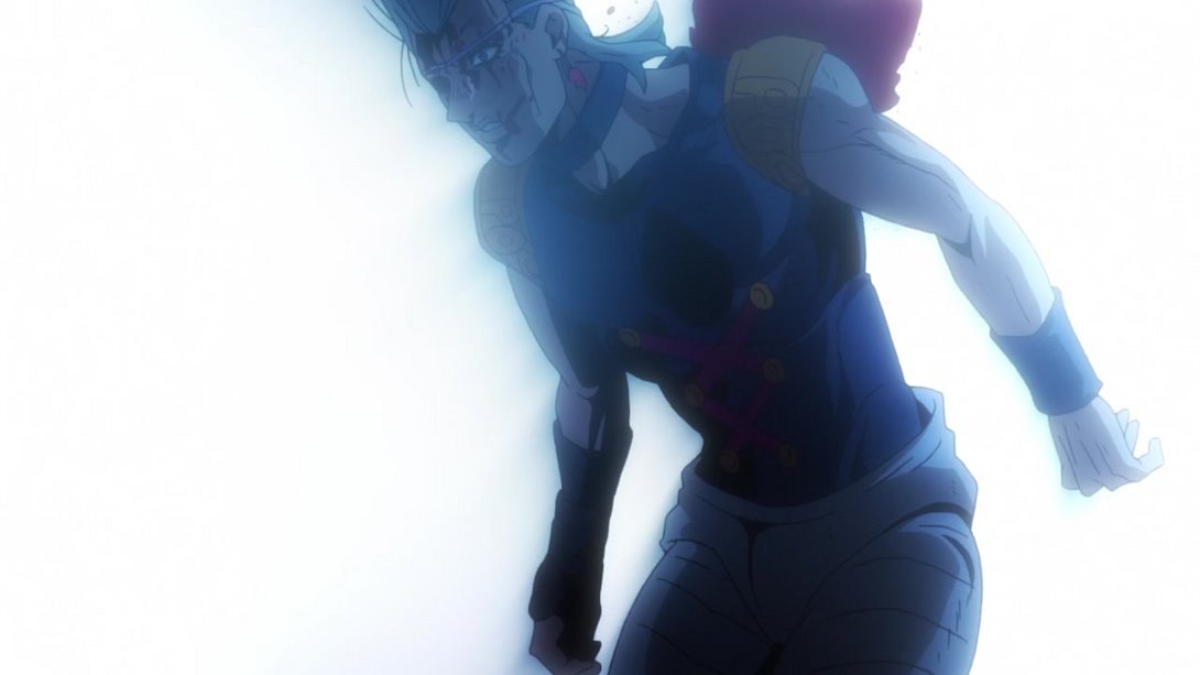
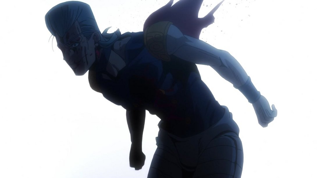
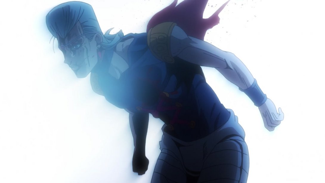
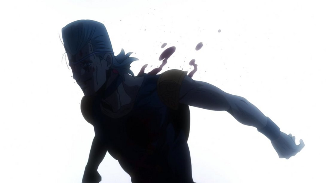
- Moving back to this cursed sexy man, this scene gives us a blurrier background, different lighting and darker darks:
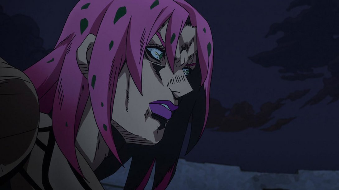
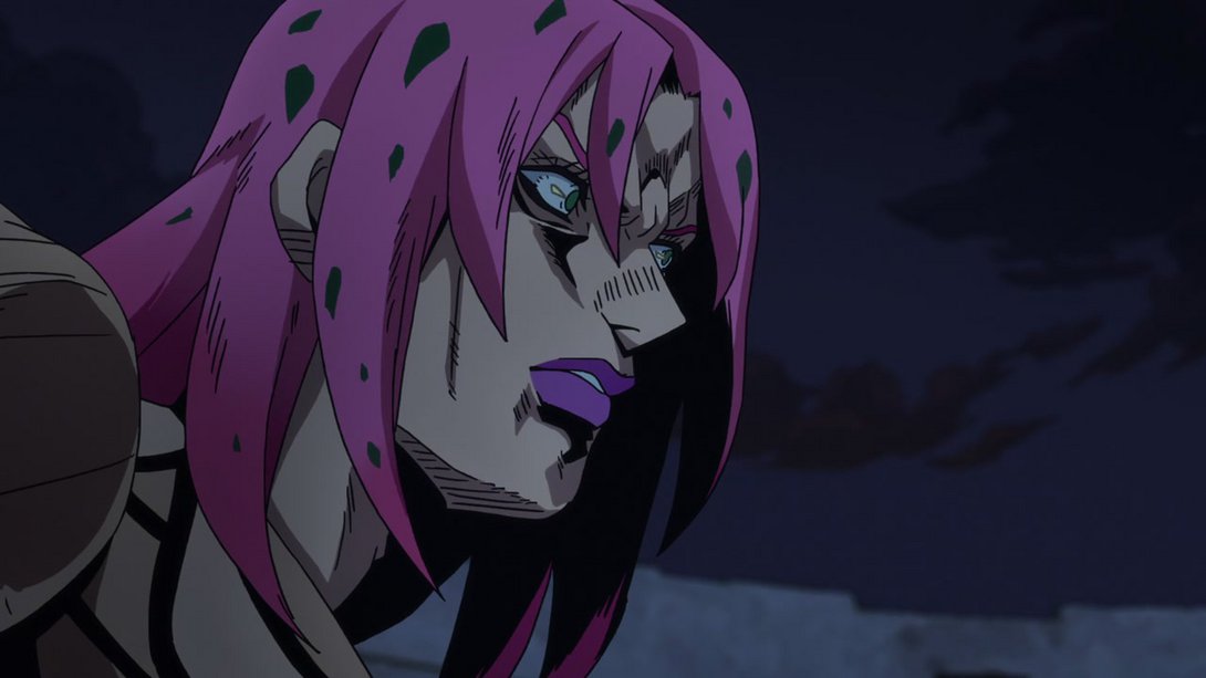
- Diavolo’s face has been once again retouched here, and his shading has also been tweaked:
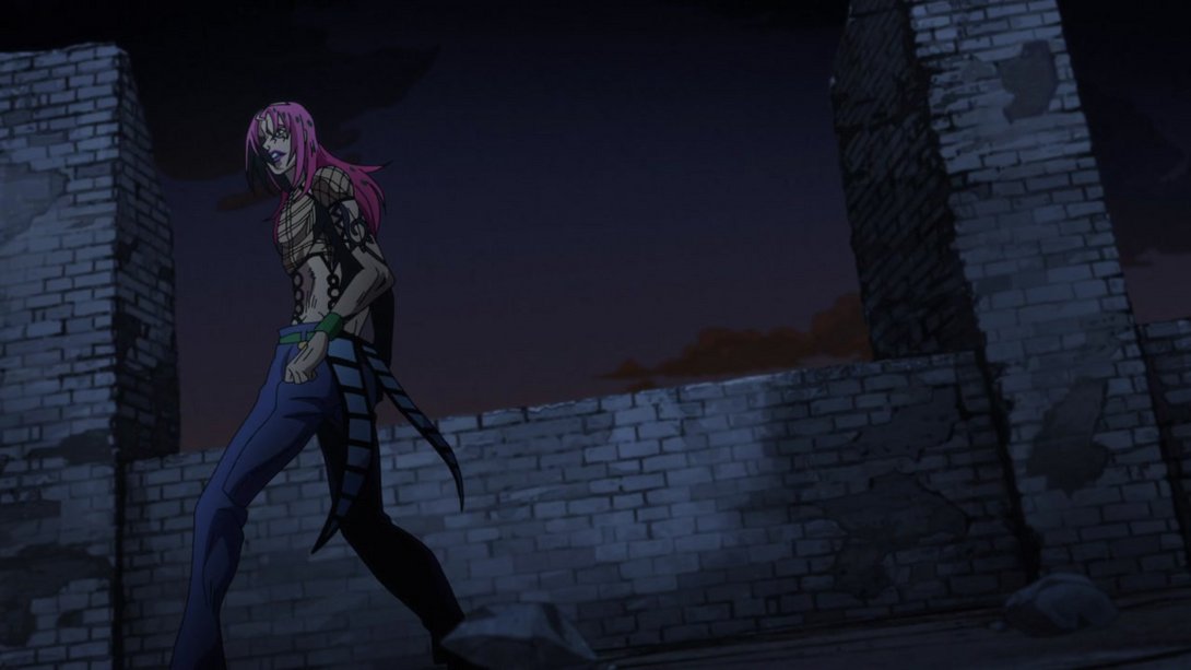
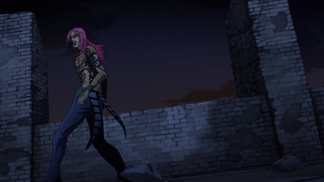
- Here, the texture on Silver Chariot Requiem is completely different, he’s now casting a shadow, the ground texture has also been changed and scrolls more quickly, giving the impression that SCR is walking faster:
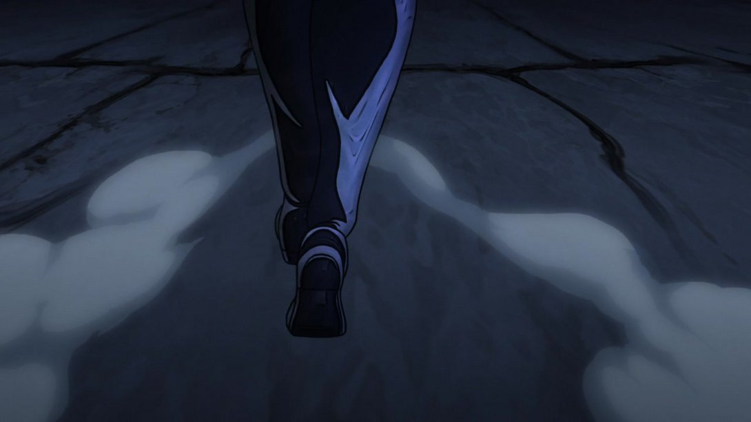
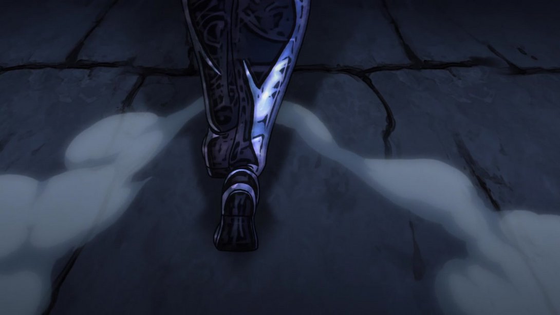
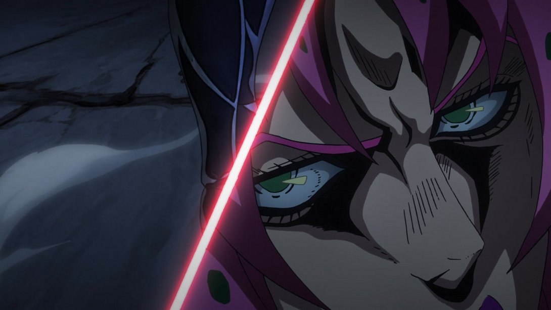
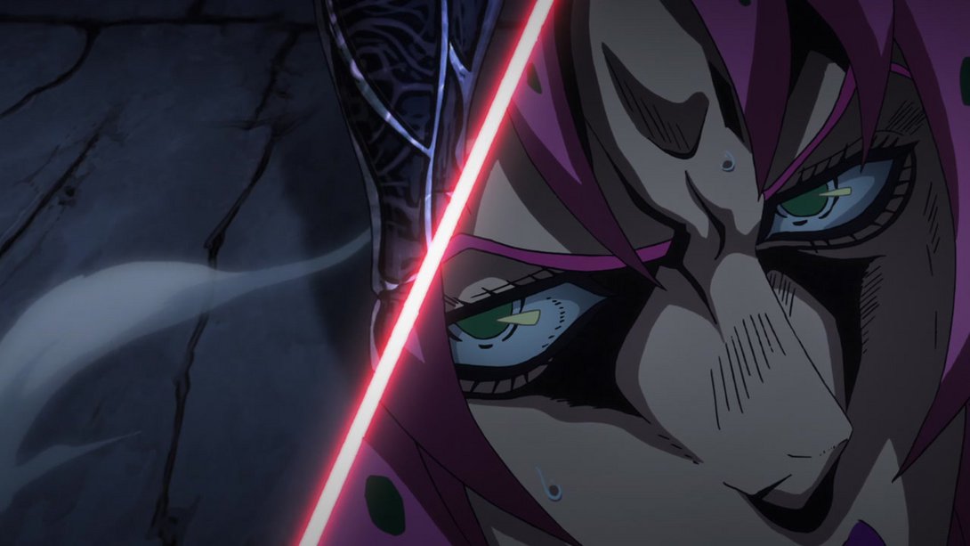
- Later on, when Diavolo shows up in the right side, both SCR and the billowing smoke have been moved and, most importantly… the Boss is sweating:
Whew! And that’s it for this lengthy comparison, friends! Now that was fun, wasn’t it? For such a good-looking episode, they sure managed to crank the dial to 11 and improved on many little things! Well, I’ll see you next time for Vento Aureo #34, “The Requiem Quietly Plays - Part 1”… We’re almost in the home stretch!
See ya!

